


.svg)
.svg)
.svg)
.svg)
.svg)


.svg)


.svg)
.svg)

Imagine this: You’ve just signed up for a new SaaS tool. The features look promising, but within minutes you’re lost in a maze of buttons, menus, and pop-ups. Chances are, you won’t stick around and you’re not alone.
In fact, 63% of customers say the onboarding experience plays a big role in whether they subscribe or buy. Another way to put it is that the majority of people expect (and pay attention to) a consistent onboarding experience. That’s huge.
Great onboarding isn’t just about showing users around. It’s also about making them feel confident, welcomed, and ready to see value fast.
To help you nail it, we’ve rounded up some of the best onboarding examples and tools that SaaS teams can learn from, as well as the whats, whys, and hows of user onboarding.
Let’s go! 🏃
TL;DR
- User onboarding is a structured guidance for users to understand and gain value from a product.
- User onboarding helps you improve retention, user confidence, and boost revenue growth.
- Welcome messages, onboarding checklists, interactive walkthroughs, tooltips and hotspots, knowledge bases and help centers, and onboarding emails are essential steps to build a successful onboarding flow.
- It’s natural to get inspiration from popular products and their onboarding journeys. However, you need to adapt these for your own user base’s needs.
- Onboarding tools like UserGuiding can help you design an effective onboarding flow without the need for coding.

What is user onboarding?
User onboarding is a structured process that helps new users understand and gain value from a product. The main goal of user onboarding is to speed up activation, establish a higher adoption rate, and reduce customer support costs.
Krystal Higgins, the author of Better Onboarding, has an even better description:
It’s a journey of acclamation and taking many actions in a product that eventually gets someone from the state where they don’t really know what’s going on yet … to one where they’re very comfortable using it and kind of one of the core users of our service or product.”
It’s a little bit of hand-holding and a bit of gently nudging without interruption. But more importantly, user onboarding directly supports business KPIs, especially activation and retention rates, as well as time-to-value.
Why is user onboarding critical?
If user onboarding’s impact on business KPIs feels vague and abstract, you’re not alone. Let’s put the theory into practice, so to speak.
Here are three reasons why you should treat user onboarding as critical to your business:
- Retention impact: 8 in 10 users say they’ve deleted an app because they didn’t know how to use it. If those apps had a strong onboarding flow, the users wouldn’t have called it quits. Chances are, they didn’t even get to the part where the app would solve their problems. That’s the danger of poor onboarding: It creates friction right when users are most excited to try your product. A clear, well-designed onboarding experience guides them past confusion and into value, turning potential drop-offs into loyal customers.
- Revenue growth: Onboarding doesn’t just keep users from leaving, it can actually boost how much they’re willing to spend. Customers who felt good about onboarding were 12% to 21% more willing to pay than the median. Think about that: Simply guiding people through your product in a clear, engaging way can make them see more value (and open up their wallets).
- User confidence: Onboarding helps users feel at home. 86% of users say they’re more likely to stay loyal to a business that invests in onboarding content that welcomes and educates them after purchase. When users feel supported from the start, their confidence grows and so does their long-term commitment to your product.
What are the key components of a successful user onboarding flow?
User onboarding isn’t the golden ticket to 100% success, but it comes pretty close.
You need it to build momentum and trust. And you can’t do that without some key onboarding flow elements.
Here’s what you need 👇
Welcome messages and signup flow
It’s important to greet users after the signup to create a good first impression. But how you greet them matters more. Users don’t want to be stuck with generic messages when all they want is to use the app and solve their problems. They don’t want to know everything about the product all at once either.
When Marina Krutchinsky, UX Leader at JPMorgan Chase, had a client struggling with this issue, she chose this:
Push secondary features to the backdrop, incorporate principles from Fogg’s behavioral model, build an organic community hub, and treat user feedback as currency.”
With the new and improved onboarding flow, Krutchinsky’s client saw an increase in their dedicated user base in a few months. These principles help you personalize the onboarding journey, which in turn helps users connect easier with what your product has to offer.
Check out this example from Duolingo 👇
.avif)
By making the user set personal goals, Duolingo adjusts the intensity and duration of lessons. It becomes a tool that fits the user’s needs, not the other way around, which makes the user more likely to return.
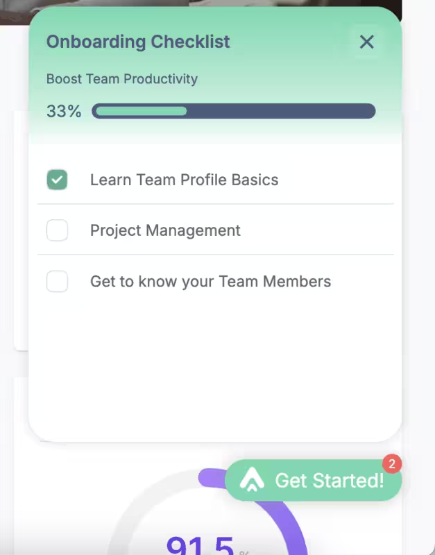
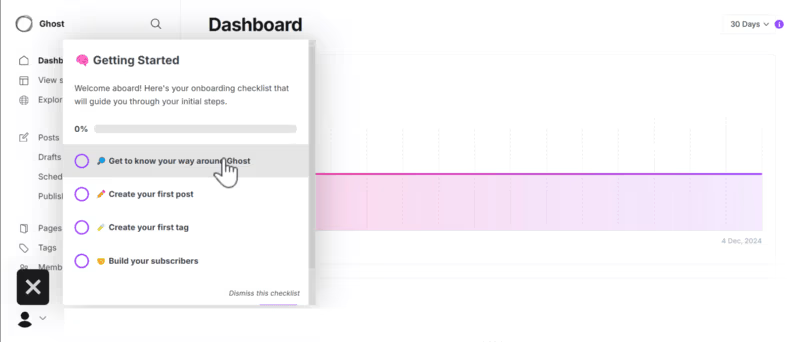
Onboarding checklists
Another way to serve your onboarding flow in the way you want users to experience your platform is onboarding checklists. These checklists establish a logical sequence to your onboarding (from setting up an account to using the key features) and create clear milestones for users.
Checklists with progress bars? Even better because users feel accomplished and motivated to learn more within the app. They don’t have to look anywhere else for answers, which helps them adopt the product faster.
According to UserGuiding's 2023 onboarding research, checklists are the second most common in-app onboarding element by 36%, following welcome screens. And for a good reason: Checklist-driven onboarding tours have seen a 67% completion rate in 2025, Ramli John reports.
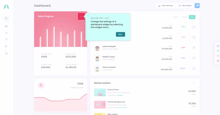
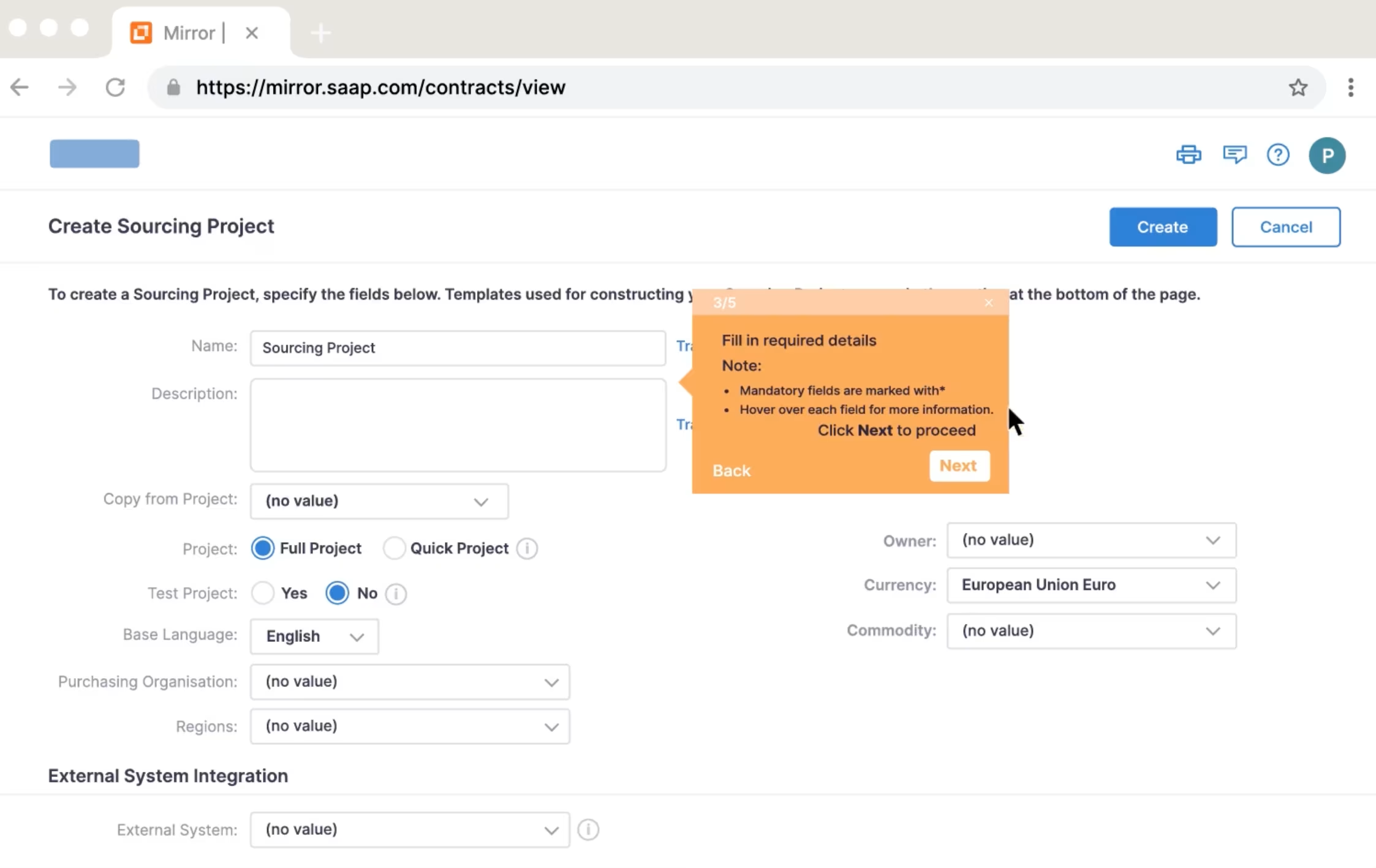
Interactive walkthroughs
Without interactive walkthroughs, most (if not all) onboarding flows are just bones without the meat. That is not to say that these flows cannot function but it leaves a lot to guesswork and most of the heavy lifting is left to users.
Interactive walkthroughs, on the other hand, guide the users through essentials of your product, step-by-step. Their value lies in the fact that the steps build to the “prize”, that is achieving their goals. You can achieve this by segmenting and personalizing the user journey.
Ramli John has a fair point:
Not everyone wants a basic walkthrough. Some want advanced tools right now. Show users through your walkthroughs that you see them as individuals, not just as numbers in your system."

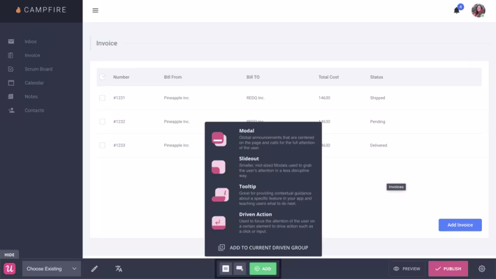
Tooltips and hotspots
Speaking of interactive walkthroughs… Tooltips and hotspots are the most popular interactive elements you can use to build your flow. These designs are meant to provide contextual help to users when a user hovers over or clicks them.

These interactive elements make your onboarding flow more accessible to your customer base, help them discover key and secondary features, and can also be used to introduce what’s new in your app.
Because they only appear when a user interacts with a specific part of the screen or with a feature, users can find the information they need to complete a task or understand a function more easily. They also don’t clutter the interface, so confusion is less likely.
Knowledge base and help centers
The best way to describe knowledge bases and help centers would be digital libraries. They store how-tos, trouble-shooting articles, and other information related to your product. Moreover, they provide self-service for users.
How?
Knowledge bases and help centers are the first stop when users have an issue. Instead of creating a ticket or chatting with an agent (AI-powered bots or humans), they use the information in these libraries and take action to solve their problems on their own first. Because the information is consolidated in one place and knowledge is “internalized,” it becomes easier for users to get the support they need faster.
Onboarding emails
Even though onboarding emails are less popular than interactive tours and guides, they are still effective – especially if you want to build an emotional connection with your user base.
You can do so much with these emails: send reminders to events, discounts, or new feature drops, educate users by answering FAQs or embedding videos, GIFs, and other visuals, and re-engage customers who have dropped with special offers, key feature benefits, or even offer a 1-1 talk with one of your customer success specialists.
Ramli John describes onboarding emails as “the untapped engine behind explosive growth” and highlights behavioral emails. He also advises to send these emails “after users hit errors, milestones, or moments of success”.
Here’s a re-engagement onboarding email from Slack👇

User onboarding examples from SaaS products that will inspire you
1- Apple Music’s personalization
Apple Music’s reputation precedes itself, but in 2024, it had the third largest market share in the music streaming market. After introducing the pricing plan, Apple Music immediately dives into the personalization. Though it’s popular to segment users based on their demographics, Apple Music has a different approach.
It asks users about their listening habits 👇
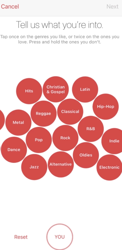
Based on how the user responds, the app then shows artists in those genres. The user gets to cherry-pick (like, love, or remove) from the screen to curate their feed. In other words, Apple Music lets users build their own experiences.
🔑 Key Takeaway: Apple Music puts personalization front and center: letting users actively shape their own listening experience from the start by curating favorite genres and artists.
2- Forest’s gamification
As a productivity and time management app, Forest has more than getting tasks done at stake. The users must feel motivated enough to put their phone down and focus. How can an app achieve that and build it into a habit?
Gamification is the correct answer. Forest helps you plan virtual (and real) trees that grow during your focus sessions and grow into a forest. You earn points, unlock different types of trees and plants, and essentially “nurture” your forest and keep yourself focused👇

It gamifies the onboarding process (and the app’s functionality) by incentivizing the user through external emotional stake.
🔑 Key Takeaways: Forest gamifies focus and it does so by tying productivity to emotional rewards by letting users grow virtual trees and build a forest, making the habit of staying off the phone both fun and motivating.
3- Duolingo’s goal setting
It’s hard to run into someone who at least hasn't heard of Duolingo. It’s a language learning platform where you can practice reading, writing, and speaking. As you complete lessons, you earn points and can rank on a leaders’ board.
The highlight of Duolingo’s onboarding flow comes partially from its cute illustrations and animations and partially from its goal setting. We’ll look at the latter👇
Essentially a subtle way to segment users, goal setting later determines the content the user sees. As they move through the lessons, they can track their progress with a progress bar and keep themselves motivated through the copy 👇
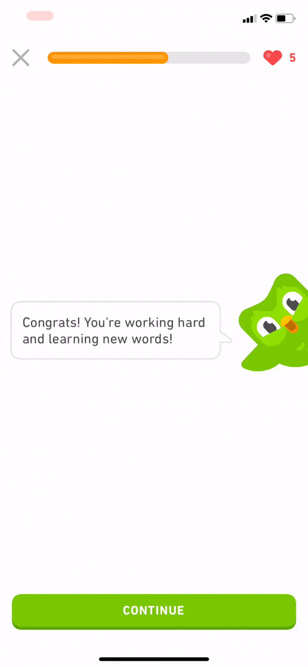
🔑 Key Takeaways: Duolingo uses goal setting as both a motivator and a subtle personalization tool, which helps users track progress, stay engaged, and get content tailored to their learning pace.
4- Notion’s segmentation
Notion is primarily known as a note-taking app but it’s so much more than that. It offers mails, websites, knowledge bases, templates, and more. That is why it’s hard to introduce every single feature in one go.
However, it’s not impossible.
Notion starts its onboarding journey with segmentation before the user has a chance to interact with any part of the interface 👇

Instead of gamifying the process, Notion chooses the straightforward option: Ask clear questions to understand user needs. They can also follow their progress during segmentation, so they’re not overwhelmed.
🔑 Key Takeaways: Notion keeps things simple: segmenting users upfront with clear questions and progress tracking to match features to their needs without overwhelming them.
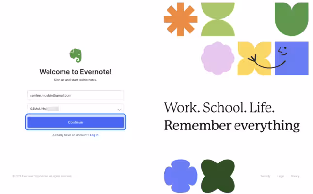
5- Evernote’s onboarding checklist
Evernote is a note-taking and task management platform where users can brainstorm, organize, and prioritize ideas, projects, and to-do lists, as well as bills and invoices. The main goal of the app is to keep individuals and teams organized so nothing falls through the cracks and becomes a headache later.
It’s important to get that point across, so the app’s welcome screen clearly lays out its benefit 👇
Because Evernote has lots of moving parts in the product, the app uses a checklist to hold the hands of a first-time user to familiarize themselves with the interface as well as the main features 👇
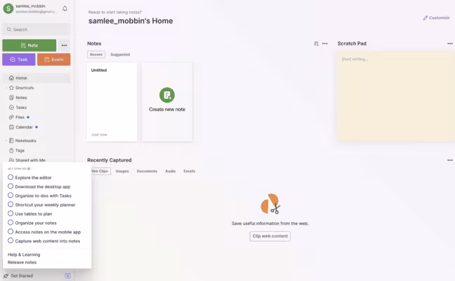
🔑 Key Takeaways: Evernote uses a clear welcome screen and a simple checklist to guide first-time users. These elements make it easy to understand the app’s value while learning its many features step by step (and contextually).
6- Canva’s segmentation
Instead of using multiple onboarding screens to segment users like Notion, Canva uses a single pop-up to personalize the content based on the user’s job title and function, such as student, non-profit, teacher, and large company 👇

This is important to show relevant content to the user and also give specific recommendations.
🔑 Key Takeaways: Canva keeps personalization quick and simple. Using a single pop-up to segment users by role and deliver tailored content and recommendations right away is efficient.
7- Asana’s minimalism
Asana is a work management platform that offers features like project tracking and management, workflows, goals, and reporting. What stands out in Asana’s onboarding flow is that there’s nothing on the screen that can cause friction.
“How?” You may ask. Check this out 👇
The onboarding flow is minimal in that it doesn’t use flowery language or over the top and dramatic visuals. The entire tour only has four steps (the ideal is to have 3–5 screens within a single tour) with minimal copy and in-app screenshots to keep things light but still informative.
🔑 Key Takeaways: Asana keeps things minimal and friction-free. Using just four simple steps with clear copy and screenshots to guide users without overwhelming them decreases the chances of frustrating (or confusing) the user.
8- Lattice’s user choice
Lattice is a mobile people management app that helps you give and receive feedback on-the-go. It’s aimed to improve team communication and health all in one platform. Its onboarding flow reflects that “on-the-go” mentality, meaning that they don’t draw out the process.
Check this out 👇
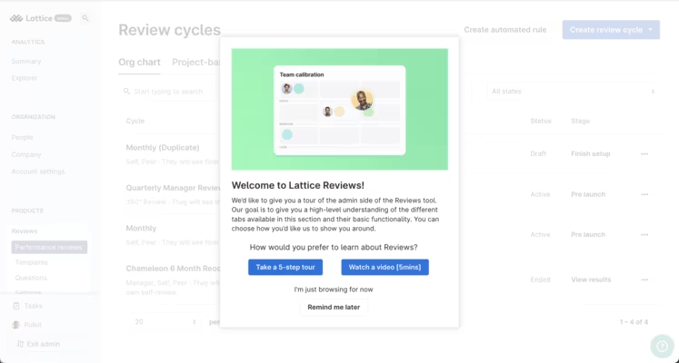
This pre-onboarding pop-up is great for two reasons: The user chooses what kind of onboarding material they want to see, and if they don’t want to see anything at all, they can skip the entire tour.
The copy also clearly tells the user what the goal of this tour is. 10/10! 🌟
🔑 Key Takeaways: Lattice’s onboarding journey respects user choice. It offers a quick pre-onboarding pop-up where users can pick their tour (or skip it entirely) while clearly stating the tour’s purpose.
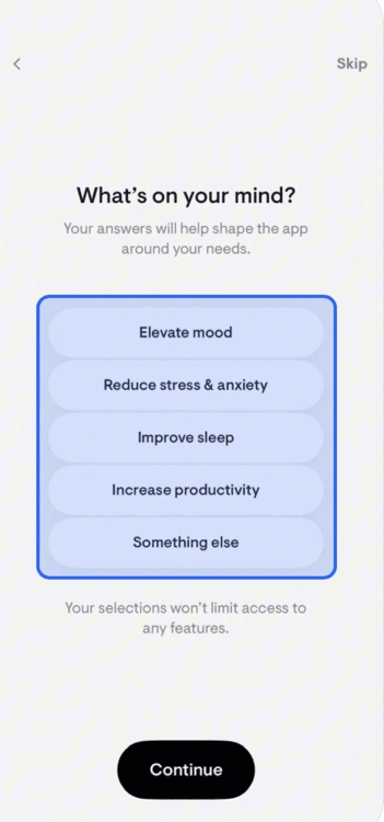
9- Monarch’s user needs
Monarch is a personal finance app with features like monthly spending tracker, budgeting, planning, and goal setting. The platform also lets you analyze your investments and collaborate with other people (advisors or friends) as well.
What Monarch does well is putting user needs above quickly introducing the app’s features. Though both are important, the users are more interested in their own reasons to use the app than in a basic onboarding tour.
In other words, it all comes down to personalizing the onboarding experience before the user sees a feature👇

The app asks the user about the user’s financial priorities, whether they manage finances with a partner or alone, and if they work with a professional for these priorities. Then, they are directed to the dashboard. Quick and hassle-free.
🔑 Key Takeaways: Monarch prioritizes personalization over feature tours. The onboarding flow focuses on asking about financial goals and context first, then directing users straight to a tailored dashboard for a quick start.
10- ClickUp’s onboarding checklist
ClickUp is advertised as “the everything app, for work.” It’s essentially a project and productivity management platform designed to track and store tasks, projects, and communications for teams and individuals.
Therefore, the onboarding reflects its multi-faceted functionality. The best way to show different capabilities in one go? Checklists, of course 👇
Though the dashboard itself lacks structure (and guidance), thankfully the onboarding checklist and AI assistant provide a direction for the user. The checklist also covers different use cases during the activation phase, which helps users unlock the app’s value more easily.
🔑 Key Takeaways: ClickUp uses checklists and an AI assistant to guide users through its many features, helping them explore different use cases and quickly realize the app’s value.
11- stoic.’s goal setting
stoic. is a journal app that aims to improve your mental health and live a happier life by reflecting and processing things through writing. It’s designed to be your “companion” because not only can you journal, but you can also understand your emotions by getting insights within the app. It has two different use cases: preparing for your day in the morning and reflecting on your day in the evening.
Similar to Duolingo’s onboarding flow, stoic.’s app onboarding encourages users to set goals so they can form a habit 👇
Instead of gamification, however, stoic. uses daily reminders (up to 3 times per day) as push notifications to keep the user engaged and focused.
🔑 Key Takeaways: stoic. builds habit formation through goal setting and daily reminders. These reminders encourage users to stay consistent with journaling and reflection by keeping the experience simple and focused.
12- Otter.ai’s hands-on experience
Otter.ai is an AI-powered transcription software that helps you record, transcribe, and summarize meetings and recordings. Because the app relies on user input, the onboarding is designed in a way to urge the user to create that input quickly.
The walkthrough immediately starts with a pop-up that explains why the user needs to take this tour: So they can record “like a pro.” 👇

Next, the app asks the user to record a demo as a “tutorial”. Instead of a step-by-step tour, Otter.ai builds its onboarding journey on users taking action, which helps them activate faster.

🔑 Key Takeaways: Otter.ai drives users to take action right away by using a quick demo recording to replace a step-by-step tour and helping them activate faster through hands-on experience.
13- Things 3’s tooltips
Things 3 is a task management app specifically designed for Apple products. It helps you plan your day, manage projects, and make progress towards your goals. You can integrate the app with your calendar to be reminded of deadlines and important dates.
The app also comes with a checklist feature for smaller tasks that aren’t quite projects so you can break down the details into manageable chunks.
Thing 3’s onboarding mainly focuses on introducing the key features through a series of screens with tooltips. It’s not as quite hands-on as Otter.ai’s flow, but the clear copy and the colorful design make up for it 👇
🔑 Key Takeaways: The onboarding flow highlights core features through clear copy and colorful tooltips. It keeps the process simple and engaging even without a hands-on walkthrough.
14- Nextdoor’s highlighted interface
Nextdoor is designed to create a social network in the neighborhood. It aims to build communities where people might not have a chance to connect with their neighbors. It offers features like real-time safety alerts, trusted local news, and neighbor-recommended favorites.
The app’s onboarding tour for businesses has only 3-steps (in addition to profile setup). Like Thing 3, Nextdoor uses tooltips to guide the user. But it also highlights specific parts of the interface to take that guidance to the next level 👇

🔑 Key Takeaways: Nextdoor keeps the tour short and simple. The 3-part onboarding tour with tooltips that spotlight key parts of the interface gives businesses clear, focused guidance.
15- Speechify’s customization
Speechify is a text-to-speech app with both mobile and desktop versions. The app’s main use case is reading text aloud to you using a computer-generated text to speech voice. For writers, the app also provides character-based voices that can help you turn physical books or printed text into audio.
Speechify’s onboarding flow is built on full customization. The app first asks the user to pick a voice and speed 👇

Then, the app asks two questions and gathers this information to finalize a personal listening plan.
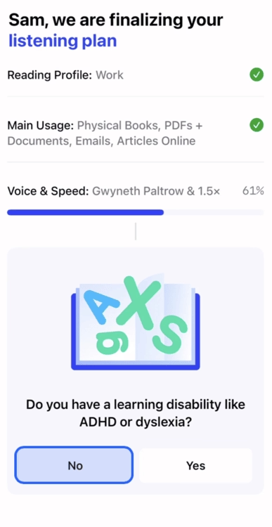
🔑 Key Takeaways: Speechify focuses on full customization, letting users choose their preferred voice and speed, then tailoring a personal listening plan based on their needs.
16- Folk’s data collection
Folk is a customer relationship management (CRM) tool designed to streamline your sales workflow from capture to closing. It does the sales search for you with AI, and provides personal outreach at scale.
The app’s onboarding is really simple and quick. With just three steps (titled “tell us about yourself”), Folk gathers information about the user’s name, whether they want to use the app for personal or business goals, and specifically asks them to pick use cases from their list 👇
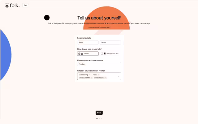
🔑 Key Takeaways: Folk’s onboarding keeps things fast and straightforward. It uses a three-step process to collect basic details and use cases so the app can immediately align with user goals.
17- Loom’s emotional connection
Loom is a screen recording app that also lets you edit and store your videos. These videos can later be shared with teams or clients and can be a good source to educate or inform them. The app aims to add “a piece of your humanity” to documents and slideshows that lack depth or nuance.
The onboarding process also has embedded Loom videos in it. Of course, so meta!
The CEO walks the user through the product, which adds that piece of humanity and emotional connection that we’ve just mentioned.
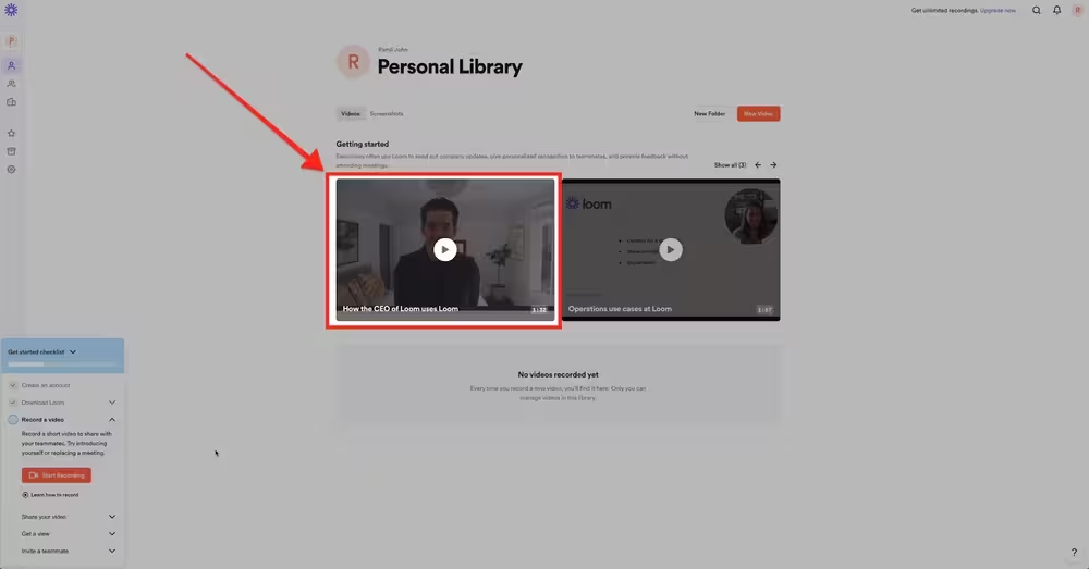
🔑 Key Takeaways: Loom’s onboarding flow uses its own product to teach, embedding videos featuring the CEO to both demonstrate functionality and create a more human, personal connection with new users.
18- Headspace’s branding
Headspace is a mental health app for meditation and sleep. It also provides expert-led meditations and tools (like podcasts, specialized meditation sessions for anxiety, etc.) as well as online therapy.
The app’s onboarding, similar to Duolingo and stoic., has goal setting at its center. It also asks users about why they want to use the app. The warm-toned interface and illustrations support the calming environment Headspace aims to create for its user base.

🔑 Key Takeaways: Headspace blends goal setting with thoughtful branding. It uses warm colors and soothing illustrations to create a calming interface that reflects its mission of supporting mindfulness and mental health.
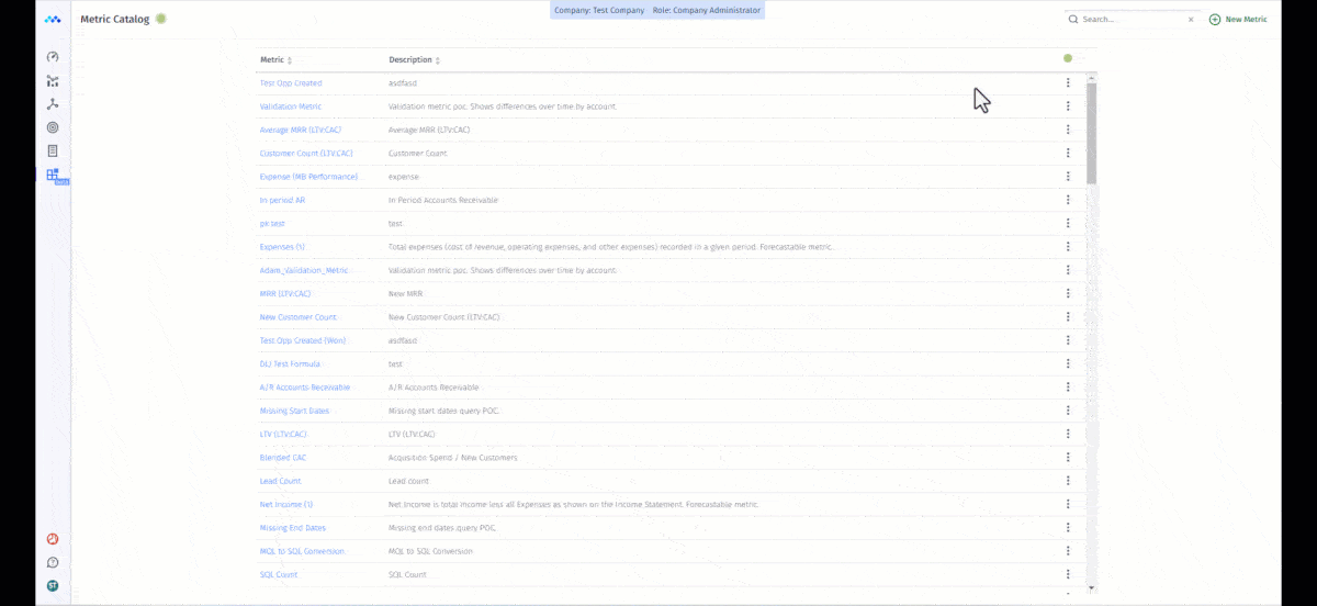
19- Zendesk’s tooltips
Zendesk is a customer service, sales, and engagement platform that offers features like unified communication, ticketing system, managing leads, and customer history. Earlier we’ve mentioned that good product tours are typically between 3–5 steps that offer value without overwhelming.
Zendesk takes this advice to heart with its 4-step onboarding tour. Moreover, it includes tooltips on every step 👇
🔑 Key Takeaways: Zendesk delivers a concise 4-step tour with helpful tooltips. It strikes the right balance between guidance and simplicity to showcase its customer service tools without overwhelming new users.
20- Mosaic’s multimedia
Mosaic’s onboarding doesn’t leave anything to chance. That is, it uses both interactive elements like tooltips and a get-started video. For an app that offers multiple use cases and key features, it’s important to eliminate confusion from the user’s mind.
Like Lattice’s options, Mosaic gives users the option to learn about the platform on their own terms 👇
🔑 Key Takeaways: Mosaic combines tooltips with a “get-started” video, giving users flexibility to explore at their own pace while ensuring clarity across its many use cases and features.
Best tools for building user onboarding
So far we’ve covered the whats and whys of user onboarding. It’s time to talk about the how. Building a user onboarding flow can be challenging, especially if your development team is small and already swamped with other projects.
Instead of being at the mercy of project timelines and long, draining hours to perfect the flow, you can actually use low-code or no-code user onboarding tools to jump-start your user engagement and retention success.
We’ve gathered the best user onboarding tools in the market for SaaS teams for you, here’s the list (so no excuses to start delivering value to customers)👇
1- UserGuiding

UserGuiding is a no-code product adoption software that helps you create onboarding checklists, tooltips, hotspots, product tours, and in-app surveys. The interactive elements we’ve discussed so far? UserGuiding offers all of them plus an AI assistant, knowledge bases, resource centers, segmentation, and analytics.
With UserGuiding, you can personalize the user journey and create interactive tours to keep users hooked from the first moment.
2- Appcues

Appcues is another popular no-code onboarding and in-app experience platform, which especially targets SaaS enterprises. Similar to UserGuiding, Appcues offers in-app messaging (in the form of notifications, pop-ups, banners, and hotspots), behavioral targeting, personalized onboarding emails, and checklists.
While UserGuiding focuses more on interactive product tours and checklists, Appcues puts emphasis on mobile push notifications and personalized emails that reach users when they take action.
3- Userpilot
Userpilot is a no-code product growth platform with features like in-app engagement, product analytics, user feedback (i.e., surveys and NPS), session replay, and mobile app notifications.
Like Appcues and UserGuiding, Userpilot offers personalized onboarding flows for SaaS but its expertise lies in engagement analytics, which is a great fit for medium-to-enterprise-sized businesses (not so much for small businesses, however).
4- Pendo
Pendo is a software experience management platform, which is a slightly fancier term for product adoption and in-app guidance. Similar to other tools on this list you’ve seen so far, Pendo has features that help you improve in-app engagement, collect user feedback, and analyze the effectiveness of your onboarding flow.
Additionally, the platform supports employee onboarding and workflow optimization. Its Orchestrate feature is designed to help you consolidate in-app guides, onboarding emails, and data to deliver a personalized user experience and communication.
5- WalkMe

WalkMe is an enterprise-level digital adoption platform (DAP) that helps you identify where workflows stop working properly and create a personalized user experience. WalkMe’s biggest selling point is that it is designed to reduce (or even better, eliminate) friction from the user journey and workflows.
With its conversational interface, WalkMe aims to automate repetitive tasks and speed up the time it takes for a user to solve their issue or find the answer they’re looking for.
6- Whatfix
Whatfix prides itself on being a scalable enterprise-level digital adoption platform with in-app training and product analytics. Its most notable features are DAP, product analytics, and Mirror.
DAP is similar to what other tools offer: onboarding flows, tooltips, and in-app announcements to improve product and feature adoption. Product analytics mainly focuses on tracking user behavior and helps you understand user journey.
Mirror, on the other hand, allows you to create mirrored environments from captured screens. It’s mainly used for employee training.
Although tools on this list like UserGuiding offer all of its key features in one app (and with a single price tag), Whatfix separates its products, so product analytics and Mirror are purchased as complementary to DAP.
7- Product Fruits
Product Fruits is an AI-powered, no-code product adoption platform that offers product tours, pop-ups, onboarding flows, and feedback widgets. Its main use cases are user onboarding and new feature introduction, to which you might say, “Doesn’t every onboarding tool in the market offer these features?”
Well, yes… On the other hand, you can still get value from Product Fruits’ features. Its Life Ring button, AI copilot, and feedback widget are really powerful.
The Life Ring button (LFB) directly connects with the help center so when users skip a tour or checklist, they can easily go back to the source material. AI copilot and feedback widgets also help with understanding users’ needs.
8- Userflow
Userflow is a no-code onboarding software you can use to build product tours, checklists, and surveys. Its main use cases are product adoption, trial conversion optimization, and user reactivation. To support these goals, Userflow offers Kanban-style flow builder, in-app announcements, AI assistant, and user segmentation.
It stands out as a fast, and easy-to-use tool with a “Userflow for Bootstrappers” plan to support emerging startups.
9- Userlane

Userlane is a no-code digital adoption platform with all the essentials you need: in-app guidance, contextual support (aka interactive elements), and integrations. Its use cases are divided into three different categories: discover, understand, and improve. Under Discover, you can find Userlane’s app discovery.
HEART analytics, which measures usage across platforms and reduces frictions, serves the Understand phase. In-app engagement suite can be found in Improve. All of these features aim to help customers as well as employees of your organization. Therefore, it’s also great for pairing with internal tools.
10- Chameleon

Chameleon is a digital adoption platform that helps you create customizable in-app tours, tooltips, and user surveys. As you can gather from its features, it’s mainly geared towards in-app experiences, user onboarding, and feature announcements.
However, it offers other valuable features like AI-powered A/B testing, embeddables, and spotlight search (CMD+K Search), as well as UX-focused analytics and segmented targeting.
Conclusion & key takeaways:
Effective onboarding means better adoption, retention, and of course, revenue for your business. Hopefully, these top product examples will guide you to create better onboarding flows. But remember that the key is to adapt to what your users need.
A cookie-cutter approach will not only fail to engage them but can also create friction that pushes them away.
For example, Apple Music immediately personalizes the experience by asking about listening habits, while Forest motivates users through gamification.
On the other hand, Notion takes a straightforward approach with segmentation questions, and Loom leans into its brand by embedding its own videos in the flow. Each of these apps shows that effective onboarding isn’t about copying a template. It’s about matching your flow to your users’ goals, context, and expectations.
The process can feel daunting and overwhelming and that’s okay. Because you can get the help you need from user onboarding tools to scale without needing heavy engineering resources.
A great onboarding flow can be created in your own terms, on your own time.
Frequently Asked Questions
What are the best user onboarding guide examples for SaaS startups?
The best onboarding examples for SaaS startups include Duolingo (goal setting), Notion (clear segmentation), Forest (gamification), and Apple Music (personalization). These highlight different ways to engage users from day one.
Which user onboarding tools improve trial-to-paid conversion rates?
Tools like UserGuiding, Appcues, Userpilot, and WalkMe improve trial-to-paid conversions by offering personalized flows, checklists, and contextual product tours that drive faster activation.
What are the top user onboarding tools (pricing and features included)?
Popular tools include:
- UserGuiding ($174/month) – no-code product tours, checklists, analytics.
- Appcues ($300/month) – personalized flows, surveys, and segmentation.
- Userpilot ($299/month) – product tours, in-app guidance, feature adoption.
- WalkMe (custom pricing) – enterprise-level onboarding with AI insights.
How do you measure activation rate using user onboarding examples?
Activation rate is measured by defining a “key action” (like creating a project in Asana or recording a demo in Otter.ai) and tracking how many new users complete it during onboarding.
What are the free user onboarding tools for small teams and startups?
Free options include UserGuiding’s free trial and Microsoft Clarity for behavior tracking, ideal for startups testing onboarding strategies with limited budgets.
What are the best user onboarding examples that reduce churn and increase retention?
Apps like Headspace (goal setting + calming design), Evernote (checklist guidance), and ClickUp (AI + onboarding checklist) show how clear, personalized onboarding reduces churn and boosts retention.
How do leading companies design user onboarding guides?
Leading companies design onboarding guides around simplicity, personalization, and early value delivery. For example, Canva uses role-based pop-ups, while Zendesk relies on a concise 4-step tour with tooltips.
Which interactive user onboarding tools are good for building checklists and product tours?
Top tools include UserGuiding, Appcues, Userpilot, and Pendo, all of which let you build interactive checklists, product tours, and tooltips to guide users through features step by step.

.png)


