
Let’s talk about hotspots.
No, not the mobile hotspots that you ask your friend to turn on when you run out of data.
Hotspots as in the UX pattern that elevates the whole user experience with just one pulsing dot, which also happens to be one of the greatest parts of user onboarding.
Don’t believe me?
You will, once you are done with this article.
So, let’s just get to it!
What are Hotspots?

A hotspot is a UX/UI pattern that aims to draw a website/app user’s attention to a specific area or spot on the screen. While a hotspot is generally used in user onboarding, it can be used for many other purposes such as minimizing the interface or making sure the user’s cognitive load is stable.
You might be thinking, “that’s it?”.
But let me just say, a simple hotspot on a webpage can make a huge difference. This underdog of a UX pattern has many qualities making it a trump card depending on your product and how you use it.
Like what?
Let’s talk about the reasons why hotspots are the secret ace of onboarding UX patterns.
Why are Hotspots good?
At this point, you may have realized that I really love hotspots.
Yes, I am an adult and yes I like clicking on pulsing dots. But so do your users. And there are 3 reasons why to that.
They are simple
A tooltip is a small textbox giving instructions, a product tour is a collection of tooltips, and a checklist is a progress tracker making sure you go through the product tour the right way.
A hotspot is a blinking dot.
It is simple, but it has the capacity to perform on the same effectiveness level when used in harmony with the other patterns. Moreover, its simplicity makes users rely on it more, especially if you have a complex interface.
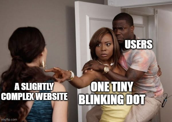
They resonate with users on an instinctual level
When a tooltip pops up, the reactive action on the users’ side is to read, which is, of course, subconsciously hard work. Scientifically speaking, less than 20% of whatever you write will be read.
So go with the blinking dot. There is no cognitive burden between a user and the action of clicking a simple animated dot. You will see the difference soon enough.
They are interactive
Perhaps the most important reason that makes hotspots good is the fact that they are way more interactive than some other UX patterns.
You have to actually click on it for a hotspot to perform its task. Incidentally, these hotspots happen to be on an actual button on a webpage most of the time. So, in the end, you get to interact with more than the pattern as a user.
Cool, no?
Now, if I was able to show you just how useful a hotspot can be, let’s take a look at some examples for inspiration.
6 Examples of Hotspots for Inspiration
Be it flashy or static, be it explanatory or informative, hotspots can be spotted on any platform. While some use it for user onboarding, others can use it for giving simple tips or displaying a new feature.
Let’s see them in action.
1- Typeform's user onboarding

With its already cool UI, Typeform makes use of hotspots during user onboarding.
Why is it good?
- By displaying several hotspots at one go, Typeform creates the impression that the onboarding is going wherever the user wants, at their own pace.
- The animation of the hotspot is far from aggressive, the color and pulsing intensity help create a calm and nice user experience.
- The “OK, got it” button pushes the user to interact with the process even though what is displayed is mere text.
2- Zakeke's condensed tool tip
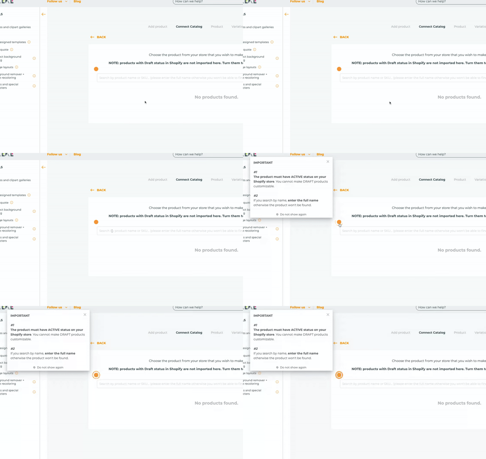
Zakeke uses a UX hotspot for an in-app message that gives the user tips on how to search on the bar and puts forth a beautiful job while at it. (It’s the UserGuiding guarantee)
Why is it good?
- Instead of putting the tip in the form of a tooltip, Zakeke uses a hotspot that produces a tooltip so that the users will know they should view the message but they don’t have to.
- Although the copy on the tooltip is rather long, Zakeke offers to not show the message again.
- By putting an “i” icon on less important hotspots and a pulsing animation on a more important one, Zakeke conveys priority
3- Krispy Kreme's Halloween theme
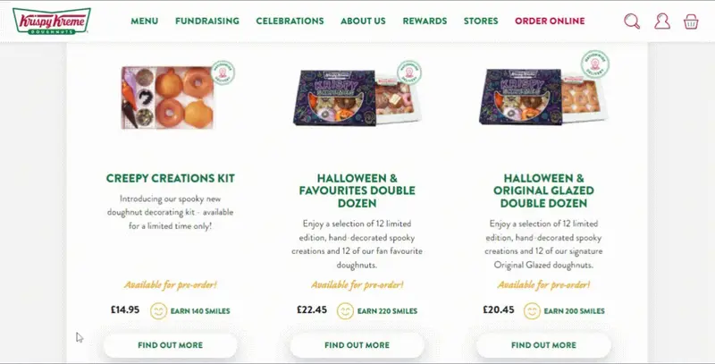
Now that it is the spooky season, Krispy Kreme not only gets us hungry for donuts with its special donut bundles but also with a fun new currency: smiles.
What’s important is that the smiles are actually hotspots.
Why is it good?
- Although there is no animation, the users innately decide to hover on top of the smiley faces, which is the exact opposite of an aggressive hotspot design.
- The smiley faces are placed strategically to make sure that even if the users don’t hover on top of them, they will see the message if they hover over “find out more”.
4- Cuepath's purchase button

Cuepath starts using hotspots even before the user onboarding starts, during the purchase process. (you can do it too 🤫)
Why is it good?
- The color, animation, and hotspot icon make it easier for the user to notice the hotspot.
- The message that appears from it is very short and CTA-oriented, which is one of the best practices when utilizing hotspots.
- By putting the hotspot right next to the purchase button, Cuepath makes sure that everyone sees their CTA.
5- SendGrid's new feature announcement

SendGrid is among the ones that use hotspots to talk about new features, which I think is genius.
Why is it good?
- The hotspot is very small and non-aggressive which reminds the users that hotspots are essentially optional.
- The message is neither short nor long, but it is great copy-wise as it makes use of bolding and other stylistics.
- It is possible to click anywhere to make the tip disappear, no need for a close icon that no one has time for.
6- Plandisc's interactive guide trigger
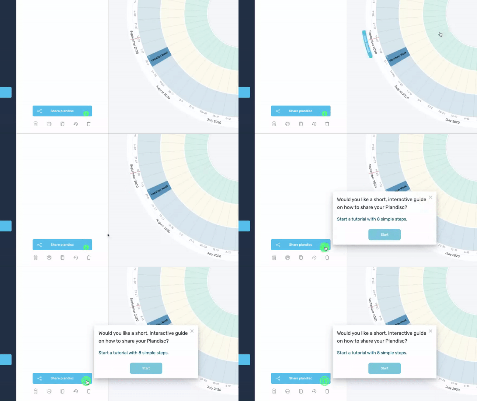
Plandisc keeps it traditional in using hotspots for user onboarding purposes. You can try that or go crazy with a certain tool I don’t even need to name 😏
Why is it good?
- Hotspot placed directly on a button rather than next to it, which is a bold but genius idea
- Hotspot animation and the color are very eye-catching, as expected from a user onboarding invitation.
- The hotspot produces a tooltip with interactivity of its own, showing how important it is to mix and match tooltips and hotspots.
Creating a UX/UI Hotspot
How to Create a Hotspot without any coding (in 5 minutes)
No coding? 5 minutes? How?
It’s the UserGuiding way.
So now, let me show you how no-code in 5 minutes works.
If you don’t have the time for that, you can watch this super short video on how to create hotspots on UserGuiding as well.
1- Type in your website
When you open UserGuiding, you will find the hotspot section on the left-hand menu, right here:
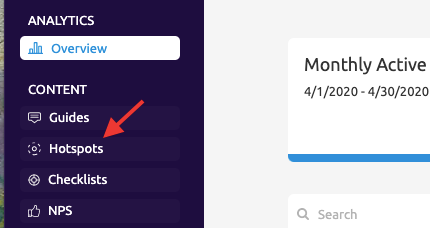
Go there and click “New Hotspot Group” on the hotspot page. Type in your website on the opening page and you are good to start creating singular or groups of hotspots.
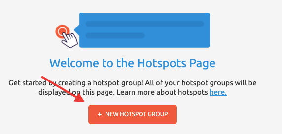
When your website is opened, name your hotspot group and pick a theme to your liking. Then simply click “+ Hotspot” to get started.
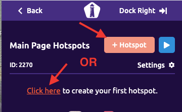
2- Place and customize your hotspots
Once you have decided where you want to put your hotspot, it is on to actually placing it there. But don’t worry, it is super easy with this quick menu.
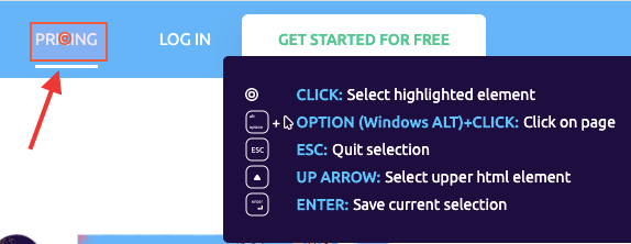
After writing whatever copy you’d like to show with your hotspot (or even embed a link if you want to) you can now customize your hotspot.
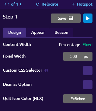
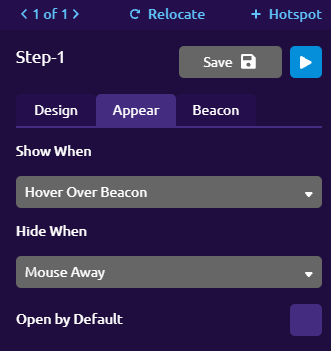
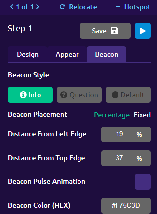
Click on "Design" to set viewport percentage and color, click on "Appear" to set up when and how the hotspot will work, and go to "Beacon" to decide beacon color, style, and even animation.
3- Save it and get it live
After you are finished with all your finishing touches, you can preview and/or save your hotspot (group).
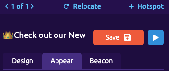
Once you have saved it, you will be able to find it on the hotspot page back in the UserGuiding Panel.
To make sure it will work on your website, go to hotspot group settings and set a container code compatible with your website and you are good to go!

Click on the “Publish changes” button and your hotspot will be live.

You can also check this article on our help center to learn more about hotspots.
Wanna try your hand at it for free?
How to Create a Hotspot in HTML, CSS and JavaScript
If you won’t be using a no-code tool like UserGuiding to create hotspots, then I have shocking news for you.
You will have to code.
We know, we know: UX designers don't have to code, right? I share the same opinion, but if you don't want a no-code tool, you might have to learn a thing or two.
Yet when you know what you are going to be coding, it is not too hard to create hotspots on HTML&CSS. The only downside is the long process. Oh, and did I mention that you will have to code? You will 😬
So then, how does it work? How can you create a hotspot using HTML, CSS, and JS?
Let’s go back to the basics.
1- HTML
HTML as we know it is the very structure of any webpage or other format of the file you want to code in. So let’s say you want to put a hotspot on an image like this:

You should start by adding your images and defining certain elements of the code. Keep in mind that using HTML is like drawing with a pencil: you can draw beautiful drawings with it but artists often use it to make an outline.
But also keep in mind that almost no artist starts without an outline. So, to use CSS or JavaScript, you need to outline with HTML first.
Once you have linked the CSS to HTML, you can move onto CSS to start, yes you guessed it, more coding.
2- CSS
If HTML is the pencil-drawn outline, CSS is everything else.
Whatever size, type of paint, or intensity of your strokes on the paper is decided on the CSS level of coding. So, you will be coding the shapes and colors of your hotspot as well as where it will be located (and way more).
Since this is the more complex part of the code, you can look up online CSS examples and even access the codes, but if you want to code it yourself it should take 1-5+ hours depending on how complex your hotspot design is.
Once you are done with the CSS, you are almost done.
But if you want to spice it up and make your hotspot interactive like all other good hotspots out there, you'll need JavaScript.
3- JavaScript
If HTML is the pencil draft and the CSS is the painting itself, then JavaScript is putting the painting on digital and animating it. Because JS is the programming language that decides how a piece of code behaves.
That is precisely why you need JavaScript if you want interactive hotspots.
Since JavaScript is even more complex and unique than CSS or HTML, there is no to-do list here. But if you are a developer and want to see how hotspots work in code, here is a great article to get hotspot codes and demos.
Of course, if you are not a developer or you just don’t think it is worth it to work for hours for a blinking dot, there is always UserGuiding to help you create hotspots in 5 minutes. I say get on board today!
Conclusion
Hotspots are secret aces of UX patterns and can be used in a handful of different use cases. But of course, the most common use case is user onboarding.
If you look for it, there are many different types of hotspots out there, all making UX better, bit by bit but surely.
And if you want to create one for your own website, you’ve got options. We know you’ll pick the right one.
Frequently Asked Questions
What is a Hotspot in UX?
A hotspot or a UX hotspot is a UX pattern that is used to signal users to click on or interact with certain areas on a website or app. This type of UX pattern can be extremely useful when used for user onboarding, and for other use cases likewise.
What are Hotspots in CSS?
CSS is the programming language used to stylize and customize the elements of a website. You can create hotspots in CSS and turn it into an interactive UX pattern using JavaScript as well.


.svg)
.svg)
.svg)
.svg)
.svg)


.svg)
.svg)


.png)


