


.svg)
.svg)
.svg)
.svg)
.svg)


.svg)


.svg)
.svg)

Are you looking for a way to improve your user onboarding? Considering that 63% of customers make a purchasing decision based on the level of onboarding support they’re likely to receive post-sale, that’s a good idea.
There are many ways to evaluate and modify the onboarding process, but one stands out from the rest: in-app guides.
In-app guides are interactive prompts or instructions that help users acclimate to your product’s key features. For SaaS businesses, they function as entry points that reduce friction and boost product adoption, so users can achieve their goals as quickly as possible.
In this article, we’ll show 20 practical examples that will inspire you to introduce or re-design your in-app guides for better user onboarding experiences. Let’s go! 🏃
TL;DR
- 23% of users engage more with a product if it uses an in-app guide.
- Most popular in-app guide formats include tooltips, walkthroughs, hotspots, checklists, resource centers, and modals.
- Personalizing the onboarding journey by segmenting users, not cluttering the UI with overlapping elements, and A/B testing to see what’s working is essential for in-app guides.
- On the other hand, showing too many guides at once, having generic instructions, and interrupting the user with unnecessary pop-ups will hurt the user’s experience.
- To create consistent and effective in-app guides, follow these steps: Define user journey, pick the right guide type, build and test with no-code tools, and analyze and reiterate.

Why are in-app guides essential?
Long story short: A company increased its engagement by 23% thanks to in-app guides.
Twenty-three percent. That’s the number of users who will stop hitting the “cancel” button and instead will feel more confident exploring your app’s features. With in-app guides, you don’t just make your onboarding journey “pretty” (to be clear, as a content writer, pretty onboarding material is one of my top priorities), but you also enable users to learn by action, which makes them more likely to stay.
Without these guides, your demos will lack the “spark,” you’ll info-dump on trial users and keep trying to get your point across like Roelof Otten did:
“But I don’t know how to include them in my onboarding!” To that, I would say, “You’re lucky that there are at least 5 different formats you can try.”
Here is the list (and we’ll go through them one by one later):
- Tooltips
- Walkthroughs
- Hotspots
- Checklists
- Modals
Key types of in-app guides (with examples)
Without learning from the best, you can’t expect your guides to do more than just hover politely on the screen. Great onboarding is more about showing users only what matters when it matters more than showing them everything all at once.
So before you build your next tooltip or walkthrough, steal a few winning moves from the pros on this list👇
Walkthroughs
Walkthroughs (or more commonly known as product walkthroughs) are step-by-step, interactive guides that help users acclimate to an app or product by completing key actions. So, why do they work?
Walkthroughs essentially help onboard new users and set the scene as directly as possible to guide them to their “Aha!” moment. Because they require user input (and encourage learning by doing), walkthroughs are the most preferred method for showing (not telling) a product’s value.
Let’s look at some examples👇

As a mental health app that focuses on meditation and sleep, Headspace’s in-app guidance has one central team: goal-setting. The app wants to personalize the user experience, so it’s actually valuable, and one of the best ways to do that is through goal-setting.
Instead of throwing the user in the middle of the features, Headspace’s walkthrough starts and ends with what matters: the users. The app asks them why they want to use Headspace, and when’s the best time for them to meditate, tailoring the entire in-app experience based on what the user prefers.
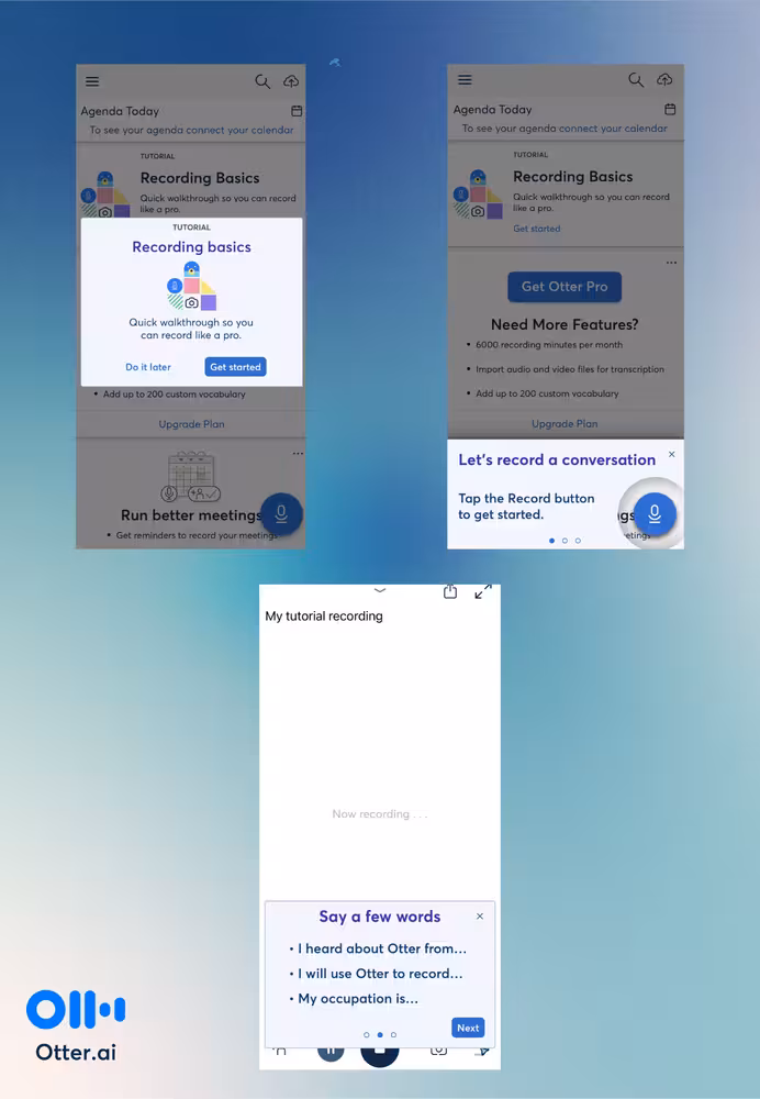
Otter.ai’s walkthrough is built on highlighting the key feature of the product, speech-to-text transcription. Instead of explaining how things work, Otter.ai encourages the user to take action immediately, which helps them activate faster. This hands-on experience has only 3 steps as well.
Mosaic is an AI-powered resource planning and management platform, so it naturally has multiple moving parts that would be hard to nail in one walkthrough. That is why it has other interactive elements like hotspots and modals.
Moreover, Mosaic gives the option to users to choose their own path: Watch an introductory video about the tool or use the tooltips to discover the key features. The walkthrough itself is short and sweet with only 3 steps.
✍️ Tip for implementation: Nobody, even the most enthusiastic user, wants to sit through an hour-long walkthrough just to get through the essentials of a product. Don’t make the mistake of thinking that you’re the exception. Keep the walkthrough steps short (the sweet spot is 3–5 steps) and use progress bars to keep the user motivated to complete the tour.
Tooltips
As one of the interactive elements that build the in-app guides and product walkthroughs, tooltips are informative messages that appear when a user hovers, clicks, or taps an element. They provide added value with contextual information and explanations, which make them ideal for navigation and clarity.
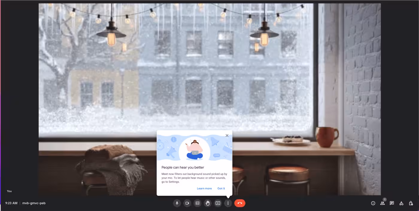
Google Meet’s tooltip is designed to communicate the latest update without pestering the user. It works because it’s not intrusive, users can learn more if they want to, giving all the power to users and how they want to shape their experience.
It also appears right where the user can toggle the background sounds, so it makes the navigation easier.
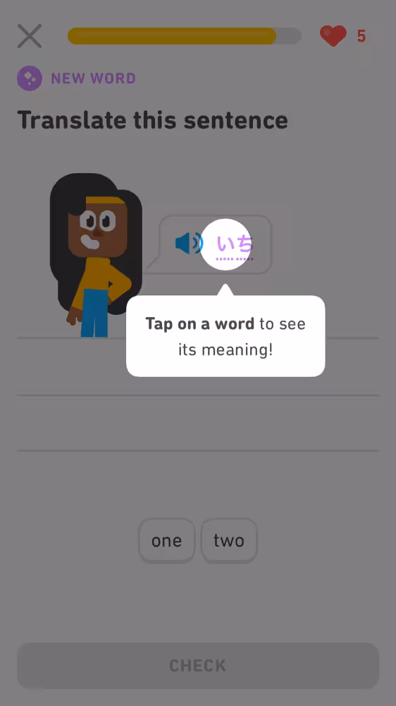
Although a language learning platform, Duolingo is most known for its social media marketing and stellar user experience (Have you seen a blog post about UI that doesn’t mention Duolingo? Don’t think so.). One of the reasons why Duolingo is a popular talking point is that the app knows how to make everything contextual.
The tooltip above works for three reasons: First, it highlights the words the user is trying to learn, so it’s relevant to the user’s experience. Second, once the user clicks on the tooltip, they get immediate value (i.e., learn the meaning of the word). Third, the user can choose not to click on the word and move on with their lesson.
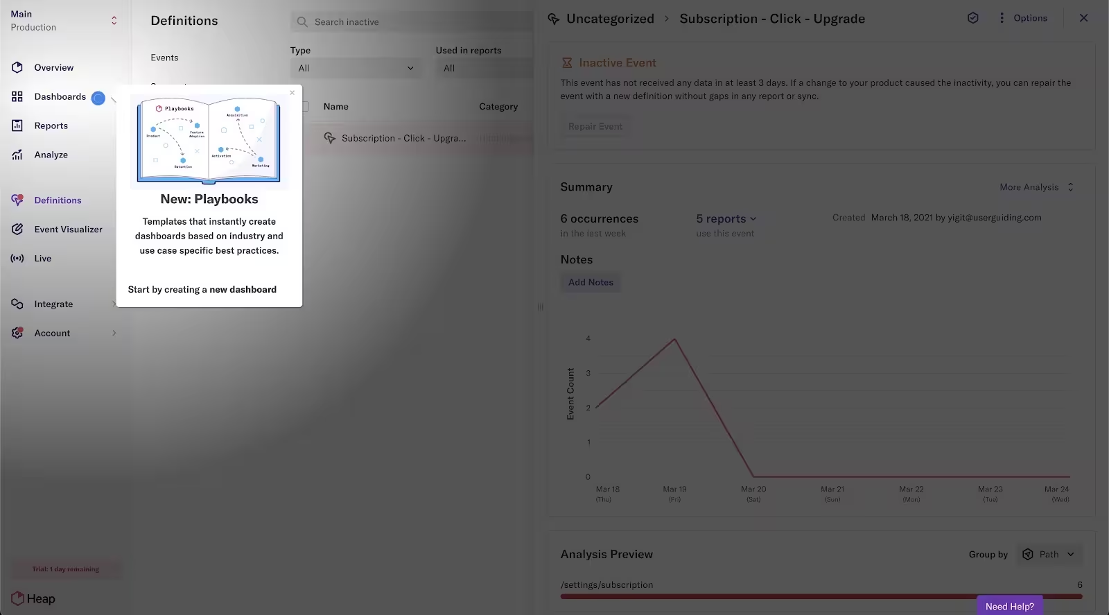
With a vignette shadow, Heap’s tooltip aims to help the user focus on the app’s newest feature release: playbooks. A mixture of tooltip and hotspot, this example keeps the update low-pressure by including a close button.
✍️ Tip for implementation: While sounds good in theory, triggering tooltips based on time usually backfires because the user might be behind your estimated time frame to complete an action, so when they see the tooltip, instead of reducing ambiguity, it’ll confuse them further.
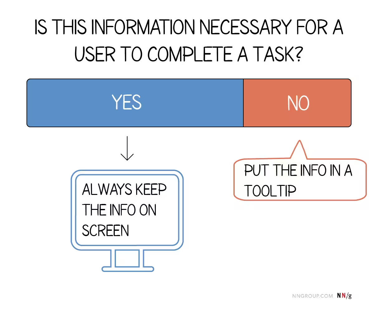
Similarly, don’t put necessary information to complete a task behind a tooltip. They work best as additional information providers, so directions or other directly actionable information shouldn’t be in a tooltip as Nielsen Norman Group advises.
Keep this infographic taped on your desk or open as a tab when you’re working on tooltips 👇
Hotspots
A hotspot is an expanding information box that educates users and promotes new features, placed on the interface to draw attention to a specific area. They appear as minimal beacons (static or with simple animations like pulsating). The whole idea behind hotspots is that they’re not intrusive and don’t block other elements on the interface that might impact the user’s experience.
Similar to tooltips, they provide contextual guidance for users such as where they need to click or what they need to do, essentially supporting the self-serve experience in SaaS.
Check out an example from SendGrid 👇
Similar to other examples in this post, SendGrid also makes the hotspot optional. Instead of vignette shadows or blocking the UI, SendGrid instead distinguishes the hotspot from the rest of the interface by choosing a contrasting color, clearly indicating where the focus should be. The copy is also to the point and simple.
Typeform builds its entire onboarding journey with hotspots. All of the steps simultaneously appear on the interface as pulsating beacons. Users can interact with the hotspots as they wish, so they’re in control of the learning process. The “got it” button adds interactivity to the process as well.
(Tip: We don’t recommend this approach if your onboarding follows a series of sequential steps as they cluster the interface and can easily confuse the user. Clear labeling is advised in that case.)
Like Duolingo, Slack is also known for its user-friendly and intuitive interface. This onboarding tour heavily uses interactive elements, including hotspots, to walk users through its new design. In addition to close and “got it” buttons, the option to go back and repeat steps is a great way to get users to their “aha! moments”.
✍️ Tip for implementation: The danger with hotspots is that you can definitely do too much. Done well, these visual cues can successfully guide your user to discover what your product is capable of. If overdone, you’ll just clutter your interface. Make sure to use them sparingly to avoid confusion.
Checklists/Setup Wizards
Onboarding checklists are a short list of tasks designed to help users set up their account, or teach them how to use a product or app.
For setup wizards, we’ll go with Norman Nielsen Group’s definition: “A wizard is a step-by-step process that allows users to put information in a prescribed order and in which subsequent steps may depend on information entered in previous ones”. They usually appear on screen as modals (which we’ll talk about in detail in a second).
Both of these elements outline the steps of your onboarding, but more importantly, they present only the information necessary at the start of the user journey. No fluff, no information overload.
Let’s start our examples with Evernote 👇
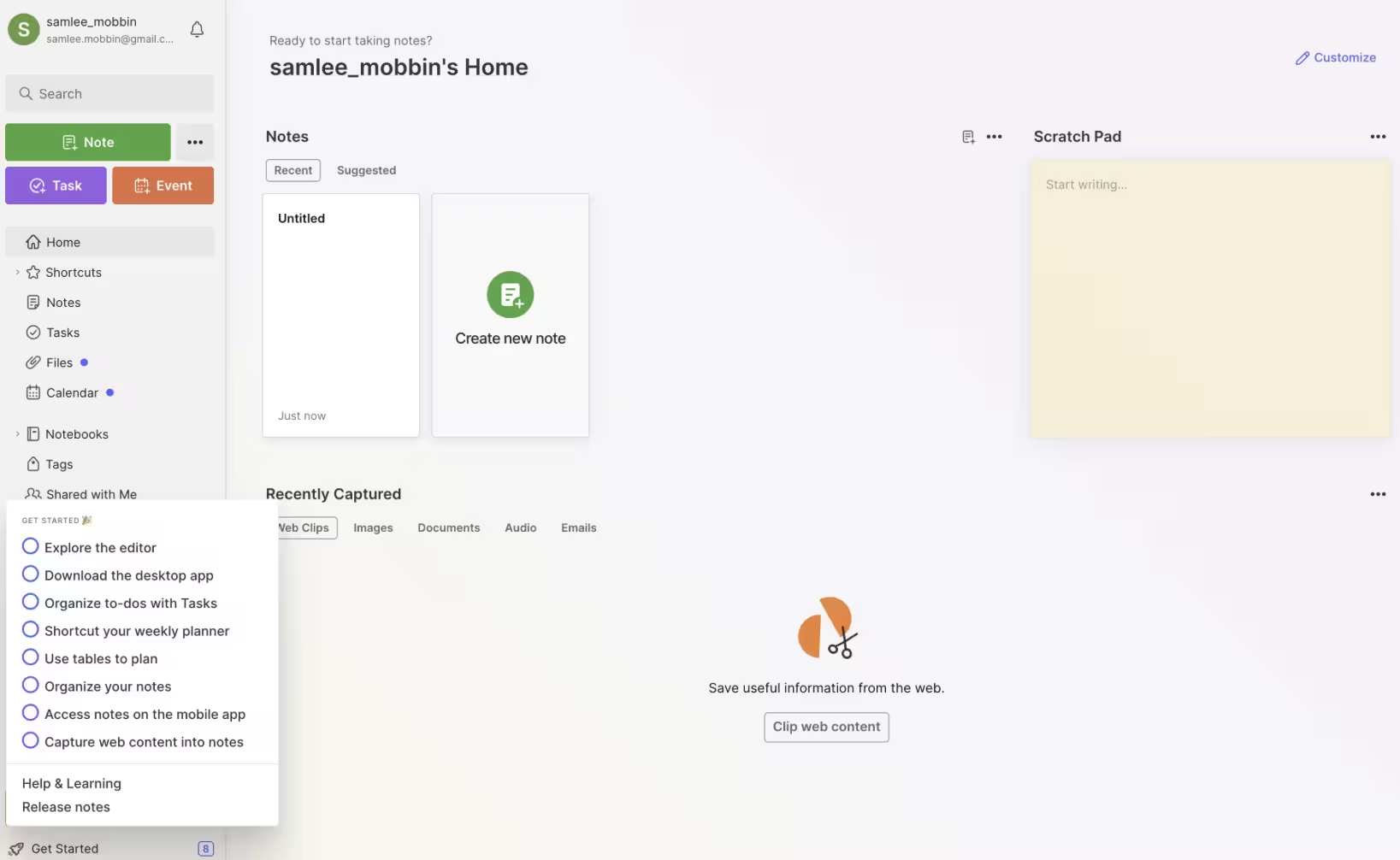
Evernote’s “get started” onboarding checklist is a great way to welcome new users to the app. The checklist both acts as an account setup and also a walkthrough of the key features. No fluff, no extra steps for the sake of adding extra steps.
Users can also mark these tasks as completed, which gives them a sense of accomplishment and boosts confidence in how they use the app.
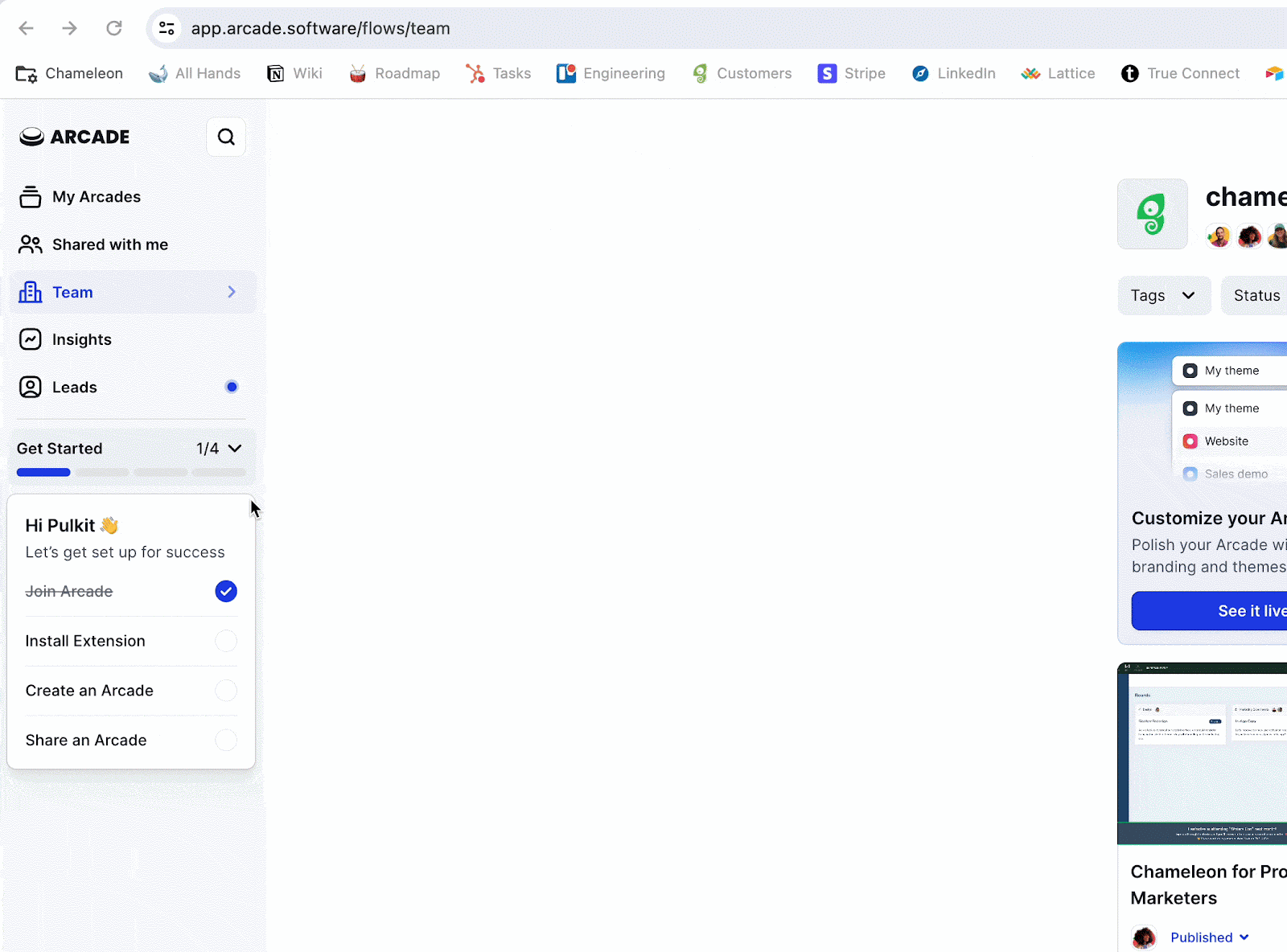
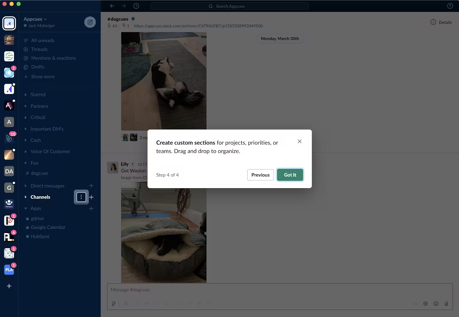
Arcade’s onboarding checklist is very similar to Evernote in what it accomplishes. But there’s an added element: A progress bar. The tasks clearly detail what the user needs to do in an actionable way, while the progress bar provides a dopamine hit to keep the momentum going.
Moreover, the checklist itself has only 4 steps, which is great for keeping the user focused.
Now, let’s talk about wizards. If you’re old enough, the words “onboarding” and “wizard” should remind you of the one and only Windows’ Merlin:
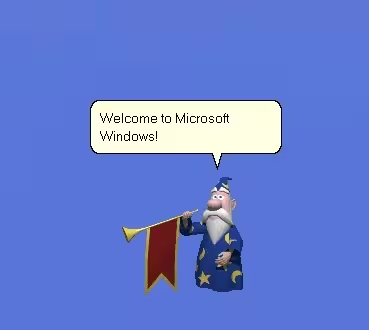
Because I was a middle schooler who used her Windows XP only to play the Sims and HTML code my next Tumblr theme, Merlin’s animations were more interesting to me than what he could do. And the list is actually stacked:
- Greeting users
- Showing software features and responding to user input
- Using gestures and movements to express emotions
Ever since its release in 1997, the setup wizards have evolved a lot but the principle has remained the same: guide users to finish their tasks and get help when needed. Here’s how Apple Face ID uses a setup wizard today 👇
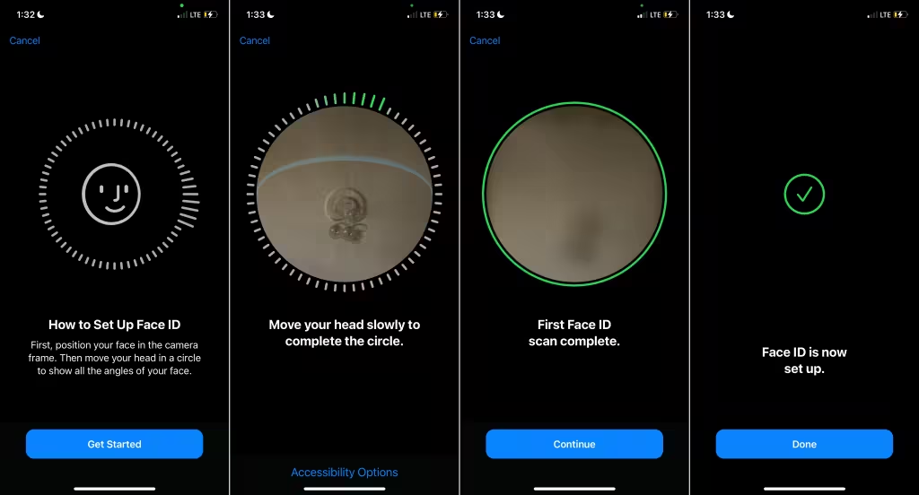
Apple doesn’t have whimsical characters and animations anymore but the idea behind the Face ID is not that different from Windows’s Merlin: “How to Setup Face ID” provides contextual help that clearly shows the path to success with the steps involved.
The user can easily navigate back (cancel button) and the absence of the “continue” button on the second screen while the user is performing the task is a preventative measure.
✍️ Tip for implementation: Want to make your in-app guide less daunting for users? Add celebratory animations, gifs, or videos when they complete checklist tasks. Also, give them a chance to provide feedback as you’ll need it to improve what you present in these elements.
Modals & Popups
Modals are web or app elements that appear in front of the interface, temporarily blocking user interaction until the user engages with it or the modal is dismissed. Popups have a similar principle: They appear over the main content of the interface, require attention and action, and provide additional information.
These elements cause friction but for a good reason. They bring all the attention to the information the modal or popup and break the onboarding sequence into manageable steps.
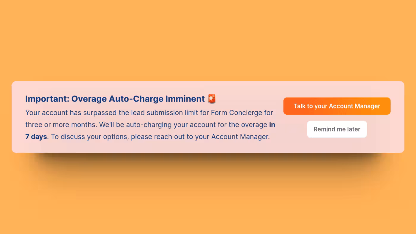
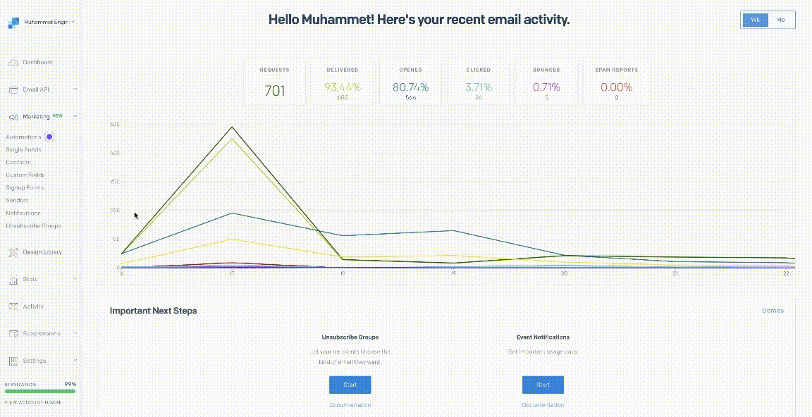
Chili Piper triggers a pop-up banner when a user reaches a feature usage limit. To avoid overcharging, the banner reminds the user to talk to their account manager or upgrade to a different plan. This event-based trigger temporarily blocks the interface but for a good reason: It provides additional information and recommended steps of action.

Similar to Chili Piper, Rydoo only shows a modal when it’s absolutely necessary. This feature update isn’t just boring text, though. The “got it” button cleverly uses an emoji and the update itself relies more on the image of the update than the text.

As a writing and editing platform, Grammarly constantly releases feature updates to serve different user segments at the same time. That’s why feature updates modals become necessary. Similar to Rydoo, Grammarly’s modal clearly communicates what’s different with a catchy image and short copy.
✍️ Tip for implementation: Because these elements cause friction and add an extra step to the onboarding (dismiss the modal or popup), they should be used sparingly. High-value updates? Absolutely. High-stake processes? Absolutely not.
Resource Centers
A resource center is a digital library of all the useful material you have of your product to engage and educate users. How-to articles, video tutorials, step-by-step guides all fall under this category.
In-app resource centers help you reduce customer support load (emails, tickets, etc.), while it becomes another tool in the user’s toolbox to find answers on their own (and therefore engage with your product more).
Check out these examples👇
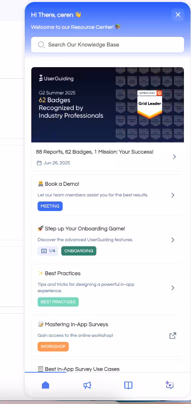
UserGuiding’s resource center isn’t just a library, it’s also a widget that can help you on the spot and where you can get the latest product updates. Users don’t have to close the app and open a new tab to get the information they need. If you struggle with high support load and low engagement, an in-app resource center could be worth a try.
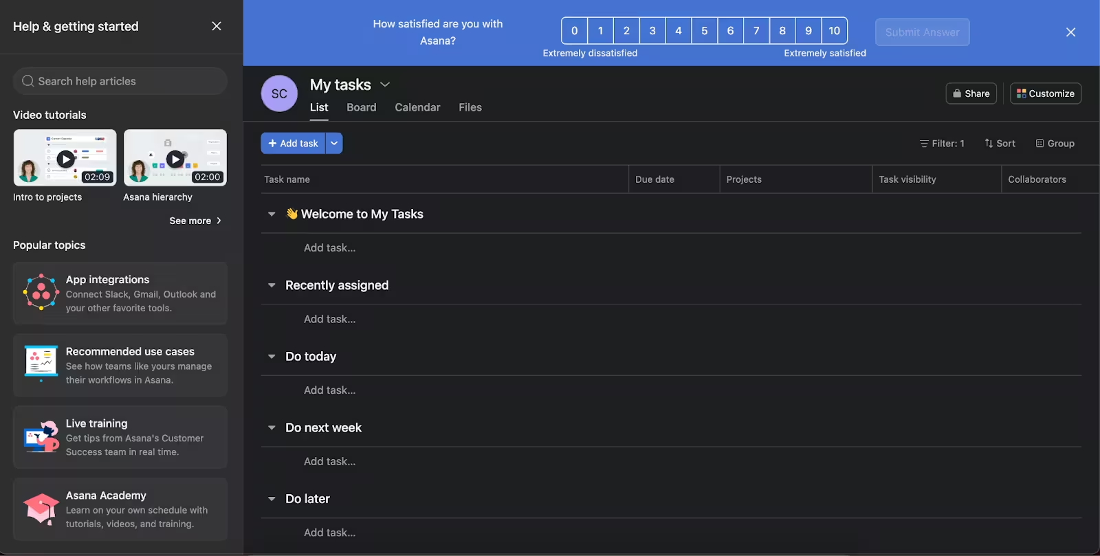
What we like about Asana’s resource center is how it uses a variation of frequently asked questions (FAQs) in multimedia format. The user can browse “popular topics” to solve their problems, watch a video tutorial without leaving the app, or join a live training with a customer success team member. You get this entire package with a couple of clicks.
In true Figma fashion, its resource center is unique in that the user starts with the base information and pre-built templates but if they need more information the question mark button gives you a menu of topics to get help from. For more advanced support, however, the app directs you to their external help center.
✍️ Tip for implementation: Make sure to include search bars and FAQs in these centers to increase the self-service effect, so users can help themselves in need of support.
Best practices for in-app guides
The top-performing in-app guides all nail four things. Nail those, and your users won’t just follow the guidance, they’ll thank you for it.
Here’s the list 👇
Personalization

“A personalized product experience” hasn’t been a trend in a really long time. In fact, 71% of customers expect it, but not many businesses know how to build it (practically speaking). Personalization can look different for each business, but there is one step that’s a must-have: user segmentation.
So, what does that look like when we’re talking about in-app guides?
It looks like this: Stop showing guides to users who never engage. Spamming won’t make them magically appear. Instead, start simple. Show these in-app guides to users who have at least interacted with them once or twice.
Ready to take it to the next level? Show them to users who regularly use your app to promote underused features.
The key is to nail down segmentation based on patterns. Instead of usage, you can also opt for demographic- or even psychographic-based segmentation.
For example, you can create an in-app guide for Chinese-speaking users who spend much more time on a feature than your English-speaking users. Similarly, you can show video tutorials (embedded in your guide) to non-technical users who would prefer watching rather than reading onboarding content.
Timing
Did you know that users spend typically around 89 seconds on an in-app guide? A minute and a half is all you get to show the value of your product. That is why it’s important to show guidance exactly when users need it, rather than relying on static timing.
Contextual triggers (like clicking a new feature, reaching a certain step, or loading a specific page) ensure your guides appear at the time of need. This approach not only captures attention within that critical 89-seconds window but also makes users more likely to understand and retain the information.
Design
Sometimes in-app guides are designed in such a way that they beat the purpose: get the user to see the value as quickly as possible. Instead, they confuse or frustrate the user.
There are two main reasons behind this: inconsistent UI and convoluted copy. When you’re designing in-app guides, you should keep clarity in mind at all times.
No overlapping elements on the dashboard, long instructions, or hard-to-see buttons. Every element should come together to minimize friction in the user journey as much as possible.
Measurement

In-app guides without analytics is just wishful thinking: You can find yourself saying “Yes, users are adopting this feature,” or “Our new product update rolled out great!” without having data to prove these statements.
Justin Chappell advises against that. “Constant iteration based on real usage data and customer feedback,” is essential, he says.
Do you want users to adopt that new feature? Track its usage. Do you need users to finish the product tour? Look closely at where they drop-off. Test different A/B variations.
Don’t fall for the “set it and forget it” trap.
Common mistakes to avoid
It would be wrong to talk about best practices without bringing up mistakes to avoid. Here are three common mistakes that you should keep an eye on👇
- Overwhelming users with too many guides: More isn’t better. In fact, most of the time, it’s just louder. When you stack tooltip after tooltip like a PowerPoint presentation from 2008, users stop reading and start hunting for the “Skip” button. Guidance should feel like a helping hand, not a pop quiz.
- Using generic, one-size-fits-all instructions: If every user sees the same tour, you’re not onboarding well. You’re just broadcasting. A power user doesn’t need the same walkthrough as a first-timer. Personalization isn’t a luxury feature anymore, it’s the baseline expectation.
- Interrupting workflows with unnecessary popups: There’s nothing more annoying than being in the zone and getting smacked with a popup that says, “Hey! Look over here instead!” Bad timing turns good guidance into friction. Help should flow with user intent, not block it. That’s why Alexander Schober advises using contextual messages that appear based on user actions, instead of time-based triggers.
How to create your own in-app guides
You’ve seen the best and you’ve seen the worst. Now, it’s time to put theory into practice and outline the steps to create your own in-app guides:
- Define user journey: Before you build any guide, map out the moments that matter. What does success look like for a new user in their first session? What actions signal hesitation or confusion? When you know the journey, you’ll know exactly where guidance belongs.
- Pick the right guide type: Not every task needs a full-blown product tour. Sometimes a hotspot, checklist, or subtle tooltip does the job better than a 10-step walkthrough. Match the format to the moment: quick nudges for simple tasks, deeper flows for complex ones.
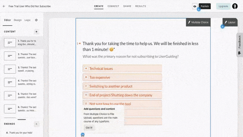
- Build and test with no-code tools: You shouldn’t need a developer to publish a tooltip. That’s where tools like UserGuiding come in — drag, drop, preview, and deploy in minutes. Launch multiple versions, test them live, and adjust on the fly without touching your codebase.
- Analyze and iterate: An in-app guide isn’t “done” just because it’s live. Watch where users drop off, skip, or convert. Those metrics are your roadmap to improvement. With UserGuiding’s analytics, you can double down on what works and ditch what doesn’t fast.
Conclusion
In-app guides aren’t just nice-to-have. They’re, in fact, the difference between users getting it and giving up. The right nudge at the right moment can turn confusion into confidence, trial users into champions, and onboarding into retention. Don’t wait for the “perfect” setup. Instead, experiment.
Try a tooltip here, a checklist there, a behavior-triggered popup where it counts. Start by testing one in-app guide in your onboarding flow today, and watch what happens.
Frequently Asked Questions
What are the best in-app guide examples for SaaS user onboarding?
The best onboarding guides use contextual tooltips, interactive walkthroughs, and progress checklists that appear based on user actions. Tools like UserGuiding and Appcues power these experiences across popular SaaS products. Slack, Notion, and Canva are often cited as top examples.
What are the in-app guide examples that improve feature adoption and reduce customer churn?
Feature highlights triggered after certain actions (like reaching a dashboard or opening a new menu) drive higher adoption. Loom and Trello use targeted nudges to surface underused features without interrupting workflows. These real-time prompts help users discover value faster, reducing dropout.
How do in-app guides compare to walkthroughs for product activation?
In-app guides are more flexible because they can appear at multiple points in the journey, while walkthroughs are typically linear. Guides adapt to user behavior, making them more effective for activation. Walkthroughs work best for first-time orientation, while guides sustain engagement over time.
What are some in-app guide examples for mobile apps with high retention rates?
Duolingo, Headspace, and Spotify use swipe-based onboarding, progress indicators, and celebratory animations to guide users through key actions. These micro-interactions make guidance feel natural rather than instructional. Mobile retention thrives when guidance blends into the experience.
What are in-app guide examples used by top SaaS companies in 2025?
Companies like HubSpot, Figma, ClickUp, and Notion use AI-triggered tooltips, onboarding checklists, and milestone rewards. Many now use personalization based on role or usage stage. Tools like UserGuiding make these setups accessible without engineering work.
What are the in-app guide examples that help non-technical users understand complex software?
Step-by-step walkthroughs with visual cues, embedded videos, and glossary-style popovers make complex tools easier to grasp. Platforms like Monday.com and QuickBooks use layered guidance that explains only what’s needed in each moment. Breaking actions into bite-sized steps prevents overwhelm.
How do implementing in-app guides versus traditional onboarding methods compare in terms of pricing?
Traditional onboarding requires live training or manual support, which scales poorly and increases staffing costs. In-app guides are a one-time setup with low maintenance and can be deployed using no-code tools like UserGuiding. The ROI is significantly higher due to automation.
What are the in-app guide examples that show successful upsell and cross-sell strategies?
SaaS products like Grammarly and Canva display upgrade prompts right after users attempt premium actions. These contextual nudges convert curiosity into purchases without aggressive popups. They work because the value is shown before the pitch appears.
What KPIs can in-app guide examples improve during customer onboarding?
In-app guides can improve activation rate, time-to-value, feature adoption, and trial-to-paid conversion. They also reduce support tickets by addressing confusion proactively. Retention and Net Promoter Score (NPS) often rise as a result.
What are the in-app guide examples with personalization features for different user segments?
Segmented onboarding flows that change based on user role, industry, or plan type are now common in tools like UserPilot and UserGuiding. For example, an admin might see setup tips while a team member sees usage shortcuts. Personalized guidance increases relevance and engagement instantly.

.png)


