


.svg)
.svg)
.svg)
.svg)
.svg)


.svg)


.svg)
.svg)


At one point or another, everyone has heard of Duolingo.
It was a good enough solution for learning foreign languages as it was, and it wasn't particularly obscure before the memes started.
But when they did, Duolingo became a social media sensation.

And just last month, our favorite murderous owl turned 10. If you ask me, there is no better time than this to go all in with an in-depth UX and user onboarding breakdown of Duolingo.
So today, let's talk about:
- What Duolingo is,
- Why its UX is important to us,
- What Duolingo's onboarding UX looks like,
- What Duolingo's overall UX looks like, and
- My verdict on Duolingo's UX
Without further ado, let's start right up with a little introduction to the language learning app.
don't have the time? Here's our quick YouTube video that covers it all ⬇️
What is Duolingo?
Duolingo is a digital gamification-based language learning app or simply an app offering a fun language learning process. By setting daily goals and using advanced educational psychology, the gamified platform helps active users ease the burdens of language learning experiences and reach intended goals within a matter of months. The gamified application also uses its infamous mascot Duo and other characters to push users to learn effectively.
Personally, having used Duolingo for over 5 years now with quite big intervals that eventually hindered my foreign language acquisition process, I cannot be an advocate of how effective it is in terms of being a gamified application.
However, I can easily say that I am a fan of the app's onboarding process and product experience.
But these are not nearly enough to explain why Duolingo's UX matters as much as it does. Let's take a closer look.
Why does Duolingo's UX matter?
Duolingo is a success story that spreads across an entire decade with its successful strategies of business model, market search, and virality.
However, a good contributor to this success was surely rooted in the user experience Duolingo offered users: gamification.
A huge part of Duolingo's user experience and onboarding user experience depends on gamification for very simple reasons. Duolingo is all about learning, something essentially associated with chores in our minds.
Because Duolingo chose to gamify, three results were observed:
👉 Users became more willing to participate,
👉 Users thus learned faster and easier,
👉 Users decided to stick around for long after being encouraged to keep going AND seeing results
So basically, the short answer to why Duolingo's UX is worth our attention is that it is one of the few mega-successful digital products out on the market (with a whopping $3.74 billion net worth) that depend heavily on gamification as a primary UX strategy.
Now, let's take a closer look at what I mean.
What does the onboarding UX look like?
Looking at it from the outside, one can hardly spot any specific onboarding UX patterns for Duolingo.
And that is exactly how smooth Duolingo onboards users.
Of course, it is not easy for any software to simply not use different onboarding UX patterns, but there are two reasons why Duolingo nails the no-onboarding onboarding:
👉 One, the product experience of the app is incredibly hand-held; users are almost always directed somewhere or another, often using slideout modals.
👉 Two, the product design is quite simplistic and smooth, letting users figure out what button does what almost entirely on themselves, thanks to simplistic microcopy and visual hierarchy.
But hey, let's not forget how smooth the signup process is.
Signup process
For mobile, Duolingo launches a 7-step signup process that helps allocate where the new learner - the user - should be in terms of language proficiency while also segmenting the users, possibly for marketing reasons.


Interestingly, the web signup process rolls a little different in terms of steps.
While the mobile signup was 7 steps, the web signup process only has 6. The difference is that the prior language knowledge step and the course overview steps in the mobile experience are taken out, and a browser notification step is added to the web flow.
There are also icons at the first step where the users are asked what brought them to Duolingo, which can be due to the fact that there is more space for images on the web.

Though we can only speculate about the need for these differences, what we know is that either way, Duolingo does a good job segmenting and tailoring content for new users at the signup stage.
It might appear a little long, but considering how much more it should've been for a language learning solution, it is a flow that users should be okay with spending a little time on.
Key Takeaways ✍️
✅ Software available on different devices might require different onboarding flows; it is a good strategy to format the content accordingly.
✅ Keeping the signup flow concise is important, but this can vary at times depending on the type of onboarding taking place.
✅ Simple looking UI design and a progress bar can go a long way in keeping users interested.
Account Signup Process
One cool thing about Duolingo is that you don't have to sign in and use the app with a profile, but its benefits are mentioned quite often by our beloved Duo.

And when you do decide to get a Duolingo profile, a second 4-step signup process takes place. The process is designed to collect data on who you are for segmentation and personalization purposes.


In the end, Duo greets users using their first name, a very first step into a highly personalized user experience.
Key Takeaways ✍️
✅ Keeping it short and concise is important for log-in signups as well; 3-step to 5-step signup processes are ideal.
✅ When done right, personalization can be a priceless contribution to customer and user loyalty; starting as soon as possible and addressing users by name is a great practice.
✅ Adding signup shortcuts like Facebook or Google login might make it easier for certain users and increase activation rates.
In-app onboarding
Inside the actual user interface of Duolingo, onboarding takes place quite subtly.
One of the most obvious instances of in-app onboarding takes place during a lesson, where a tooltip appears highlighting a specific element on the screen, urging users to touch it.

On the rest of the UI, where there is no lesson taking place, empty states are used to explain certain pages of the UI to the users. These empty states are made up of fun little illustrations and short copy to give the users a general idea of what the feature is.


Some other features are introduced using slideout modals when on the main page or via full-screen modals in between lessons.


A semi-onboarding experience takes place after completing streaks; while the streak screen itself is not necessarily an onboarding element, the copy below explaining how the streak system works can be considered a good onboarding example.
Moreover, as is the case in the second example, fun little facts and tips can be great for onboarding as well.


Key Takeaways ✍️
✅ Even when there aren't very big and obvious onboarding elements, little moments in the user experience can be utilized to onboard and engage users.
✅ Different types of onboarding UX can be used to onboard users on different stages and parts of UI.
✅ Rather than using a product tour, using empty states and modals in between the product experience can help avoid user frustration.
Email Onboarding
Duolingo doesn't necessarily seem like they have a designated onboarding flow in-app, but outside of the app and especially via mail, onboarding continues.
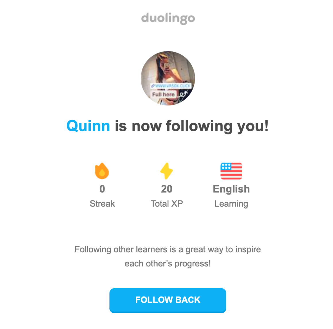
Users get streak emails every day reminding them to keep going while also getting notified every time someone follows them and for other social interactions as a part of the gamification system.

A cool piece of email sent by Duolingo is the weekly reports, showing users their stats of the week which essentially works perfectly to re-engage users who have been falling behind.

Key Takeaways ✍️
✅ No matter how intense or not, an onboarding process might be in-app; it is often beneficial to keep communicating with the users on different media as well.
✅ Social interactions and especially duly notifying users of these interactions might work as a way of grabbing users' attention on a different level.
✅ Weekly reports that are common in many B2B software emails can be a great way of reminding users of their progress and that they shouldn't lose it, as most users can easily get motivated by seeing a collection of data on themselves.
What does the overall UX look like?
Duolingo's general UX and onboarding UX merge at certain points, but if we were to separate them, what we'd have as part of the general UX would include the in-lesson milestones, preloader screens, and returning user allocation.
In-lesson milestones
It is general practice for Duolingo to include celebratory remarks and achievement milestones inside lessons, particularly when users answer correctly in a row.
Small animations of Duolingo characters talking among themselves and to the user are then prompted to create a sense of achievement.


Key Takeaways ✍️
✅ It is extremely helpful to reaffirm users every once in a while, especially if the product at hand aims to educate users in and of itself.
✅ Images and illustrations help users focus easily, so even when it is not for morale-boosting reasons, it is helpful to use images in the user experience.
✅ Humor can go a long way if your audience is up for it, don't hesitate to shape your UX according to the user base at hand.
Preloader Screens
Using fun and helpful preloader screens is almost always a good idea for most SaaS products and apps, and Duolingo does it particularly well.
Every time there is a loading screen, users get a little animation of Duo and a fun little fact about Duolingo and the language learning process.


Key Takeaways ✍️
✅ It is easily noticeable how tiny animations can make the wait easier; it's the whole idea behind preloader pages.
✅ Adding copy and especially making it extra interesting for users can help users stick around and wait for longer while also learning more about the product at hand.
Returning user allocation
Duolingo does not forget about returning users either. If, as a Duolingo user, you have not used the app for a while and returned, you would be prompted with a friendly full-screen modal that asks whether you remember what you have learned.
This is not only great practice for the sake of re-engaging users but also for UX reasons.


Key Takeaways ✍️
✅ Creating a separate UX for returning users is a way of showing that you care; it is important to give off the right message while also actively retaining users.
✅ Returning user UX can help re-segment users and thus makes it easier for the users to adapt to the app once again.
Duolingo's UX and onboarding UX: the verdict
It is not the easiest task to put Duolingo under the microscope when it is UX that we are investigating.
This is because Duolingo has a very unique way of approaching user onboarding and learning experiences that it takes expertise to know what exactly is going on in the developers' minds.
But if we are to lay a verdict on Duolingo's onboarding and overall UX, here are some key takeaways:
👉 Duolingo does a great job onboarding users by hiding the fact that they are, in fact, being onboarded; there are very subtle and quite scarce examples of onboarding since the nature of the app allows it.
👉 Duolingo has a very simplistic and minimally designed UI that lets onboarding UX and other UX elements naturally interact with users; through empty states, tooltips, and full-screen modals, users barely even notice any disruption to their learning experiences.
👉 Duolingo seems to be nailing personalization and gamification, which are the very reasons why I felt the need to conduct a UX case study on Duolingo. The more personalized and gamified the app is, the more it retains its customers and gains new ones.
Conclusion
Call it virality, call it a hard-earned success; Duolingo is easily one of the most famous apps on the market today.
My personal opinion is that it owes a lot of this fame not only to its infamous push notifications but also to its exceptional user experience; both for onboarding and for overall.
While there is a lot to point out as successful examples in the UX of the Duolingo app and website, there is no magic wand to turn your own product's UX into something as unique and effortlessly effective as Duo's. To achieve what they have achieved, what's best is to move forward and keep in mind what they have done, not apply it word by word.

.png)


