Product tours kiss and tell everything about your product.
If you have a poor product tour, you might experience a slight increase in your churn rate.
If you don’t have one… it might even cost you more customers.
But you are here, and whether it’s to learn about product tours or execute what you already know on the subject…
It’s time to get our hands dirty with product tours 💥
TL;DR
- Product tours enable users to take a look around a product and understand how it can help improve their workflow.
- In order to create an effective product tour, you must bear the following in mind:
- During the product tour, always emphasize the product value proposition because users need to grasp the functional set of tools you offer so that they can visualize how these features align with their goals.
- Each use case your product involves should have a separate product tour so that user segments who have different pain points don’t go through the same experience.
- These tours (no matter the use case) should include a structure that’s easy to follow with short copies so that users can effortlessly go from one step to another without any frustration.
- If you have a simple, no-brainer product, you might think that it doesn’t need an explanation of this sort… but it does, at least for inexperienced users. Here are some of the reasons why you need to implement product tours:
- You want your users to understand what you offer and bring to the table through your features and functions.
- You aim to be a self-service business that enables users to explore on their own and not rely on customer support every time.
- You wish to see an increase in the number of conversions and experience an increase in the churn rate at the same time.
- You aim to see from your customers’ point of view and pinpoint each hardship quickly to improve them.
- A product tour can include multiple elements, including:
- welcome screens to greet users,
- tooltips to offer contextual information,
- modals and overlays to explain more detailed sections,
- hotspots to draw attention to a specific on-screen area,
- in-app surveys to collect feedback.
- The best practices to follow when creating a product tour involve:
- Back and next buttons because they enable users to navigate through the tour at their own pace.
- Exit and dismiss buttons because they allow users to come back to the tour at their convenience.
- Interactive elements because they increase engagement as users get a hands-on product experience.
- Personalization because it provides users with the most relevant content and steps based on their goals and expectations.
- The most effective product tour software are:
- UserGuiding,
- Tango,
- WalkMe,
- Pendo,
- and Intercom.
- Even if these product tour software are the best in town, there are a couple of more things you should consider during the decision process, such as:
- the freedom your solution allows for customization,
- the UX patterns your solution provides for product tours,
- the data integrations your solution already has in its pocket,
- the pricing your solution implements for your business.
What is a product tour?
A product tour is a UX pattern that virtually guides users through the basics of a product or service to help users understand the core features and functionality.
It often appears after users sign up or first log in to an application in the form of an interactive walkthrough and guided introduction to a digital product.
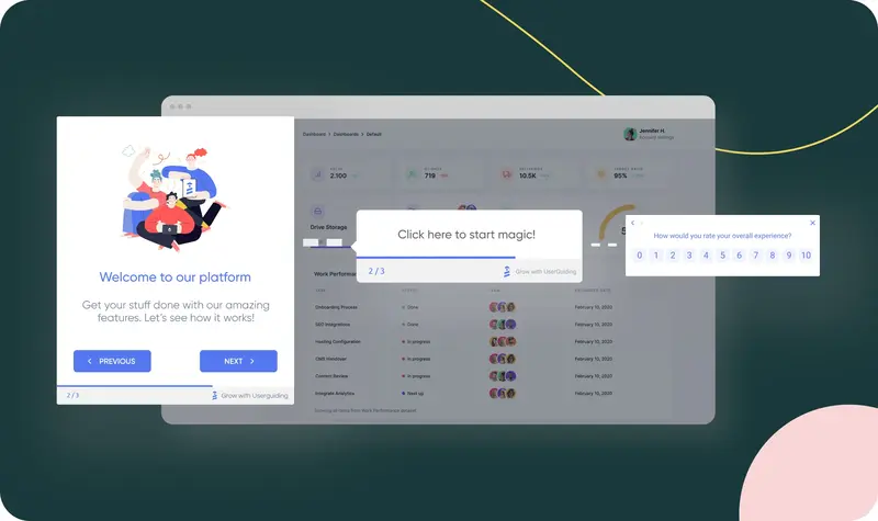
Let’s check a product tour example from UserGuiding: You can see the screens with interactive elements as steps that showcase features and benefits one by one.
Each step in product tours has one aim: Ensuring that users quickly grasp how to use the product and achieve their goals.
What makes a product tour effective?
As interactive content generates up to five times more views than static content, the former plays an important role in engaging users without a doubt.
Including interactive content within, product tours are powerful tools that function as a quick reference guide to clarify a product’s flow and value for users.
In order to create an effective product tour through which users quickly understand and engage with a product, you should combine clarity, relevance, and engagement.
Here are the items that you should bear in mind when designing an effective product tour:
A focus on product’s value proposition
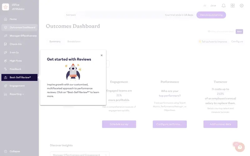
A product tour visualizes how the product benefits users and solves their problems.
This doesn’t necessarily mean that it should pick up only on the on-screen elements for users to grasp the product’s structure and features.
Thus, you can create an actionable strategy for your product tour when you harmonize a product’s core features with benefits, user goals, and quick wins.
Let’s hear the story of George, a product manager, who managed to reduce his product’s time-to-first-value (TTFV) from 2 days to 45 minutes only after communicating the product’s value proposition throughout the product tour:
A personalized approach for use cases

Unfortunately, one product tour cannot rule them all.
When 66% of customers expect companies to understand their unique needs, you must take a personalized approach toward different use cases in a product tour to make it more relevant and impactful.
In order to adopt this approach and adjust product tours, you can utilize segmentation which helps you identify different user segments to pinpoint different goals and challenges.
With a tool as powerful as segmentation, resulting in up to a 50% increase in conversion rate, you can tailor an effective product tour experience to ensure users see the product's value in the context of their needs.
For example, Kyle, CMO at Jellyfish, shares that they have over 15 product tours based on user persona, use case, product, and solution and still plan to add more due to the significant increase they experienced in the number of engaged visitors, CTA clicks, and click-through rates.
A brief and easy-to-follow flow

Just like how the length of a product tour flow affects the completion rate (4 steps maximum to score a high completion rate), so do the long and complex instructions.
Let me bring in the statistics 👇
According to Intercom’s collected data, only 34% of users see the fifth step in a product tour, leading to the conclusion that you should break down long product tours into shorter ones.
Using clear and concise content in product tours improves read rates and has a positive impact on engagement.
Long product tours and complex statements, on the other hand, generate user frustration and affect onboarding negatively, which is one of the three leading causes of churn by 23%.
Do you need a product tour?
As the risk is high (40-60% of users drop out after signing up if they don’t understand how to use the product due to poor onboarding), the answer should be yes, even for simple applications.
In ProductLed Podcast, the product-led growth expert Wes Bush conveys the importance of product tours for digital products by saying the following:
“If you have a multi-product business, a product tour at the beginning of your onboarding can be a game changer because you can catapult users into the areas of the product they care most about.”
Not my words, but I do agree 💯
It’s time to focus on the reasons why you need product tours from top to bottom:
You want users to know your value
Nowadays, consumers have high standards when it comes to purchasing a digital product, as they tend to consider whether they get good value for the money.
In order to make them stick with a product, one needs to showcase how valuable that product is and what it promises to deliver in terms of benefits and functions.
The most secure and fastest way to convey the immediate value of a product is… product tours that highlight its key features.
Clear roadmap of functions that product tours involve pave the way for users to achieve quick wins and accelerate time-to-value.
You want to be a self-serve business
With 67% of customers preferring self-service over live support, it’s hard to neglect the need to encourage self-sufficiency.
In order to offer a self-serve experience instead of external resources and support queries, the step to take is to build and optimize a solid medium in this area, such as product tours.
In this case, interactive product tours as a self-service medium enable users to learn by doing and reduce support tickets with maximum customer satisfaction.
If you don’t want to see yourself joining 95% of businesses that witness an increase in self-service requests (by already providing such an experience to them), you can check our ebook on becoming a self-serve SaaS business (only in 5 steps) 👈
You want to fuel the conversions and avoid the churn
As the primary reason for churn is lying about the product performance (according to customers 🤭), product tours become a powerful tool that can convey the effectiveness of the product.
In addition to hindering churn, product tours also increase conversion rates since interactive content generates twice as many conversions as passive content like user manuals.
You want to know your users better
Product tours work like a two-way machine for users and products.
These tours not only offer users a clear path based on their preferences but also learn from users to provide valuable insights to feed the product.
With 70% of customers stating that their journey depends on how they are treated, products need to improve based on user behavior and preferences.
Here, product tours can be a lifesaver since a survey can be added to the end of the sequence to collect feedback and track user behavior.
UI Elements of Product Tours
An effective product tour is made of several elements… including:
Welcome Screens
A welcome screen is the user interface element that introduces users to the platform and generally includes a button to start the product tour.
It also involves items (both textually and visually) to create expectations for the next step that users will take.
In many cases, the next step is a product tour, but it can also be a checklist, a code window to confirm your email, or a video to watch before learning the basics.
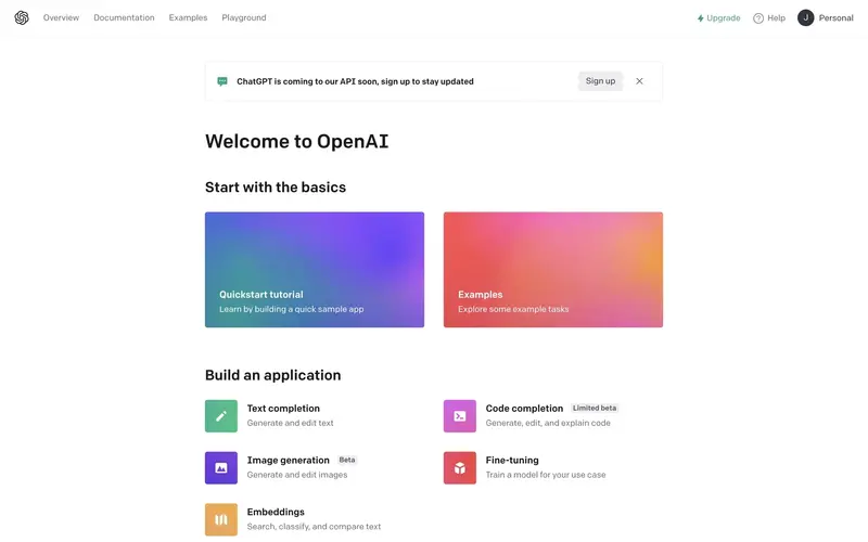
For example, OpenAI greets users on the main page after they sign up and offers them two paths to learning the basics.
✅ What’s good in this example?
- It provides two learning paths for two types of users: experienced and inexperienced. While the former can skip the whole interaction, the latter can choose to start with a product tour or select examples to get inspired.
- It uses colorful images as the background, making both of the options stand out from the rest of the page.
- Both screens include a description of the content they enclose to ensure that users make the right choice.
❌ What could be better?
- Instead of on-page, it could be viewed on a pop-up to guarantee that users follow a structured path and don’t get distracted.
Tooltips
Tooltips are the user interface elements that draw attention to specific components of the screen.
These elements can provide users with contextual information on key features and sometimes are used to offer additional information regarding the whole interaction.
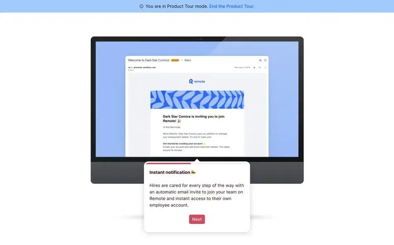
This example shows how Remote highlights a specific part of the screen and explains how the notifications function through a tooltip.
✅ What’s good in this example?
- The location of the tooltip draws enough attention and looks easy on the eye, thanks to the color contrast.
- It has a progress bar that encourages users to continue.
❌ What could be better?
- It doesn’t have a back button.
Modals/Overlays
Modals and overlays are large pop-ups that communicate information by covering the platform’s main window (with a transparent layer behind).
These elements are also helpful when you don’t want users to stray away from the main page when you’re announcing campaigns, new features, and special offers.
You can see product tours utilizing them at the beginning or end since they are useful for introducing and summarizing the whole interaction.
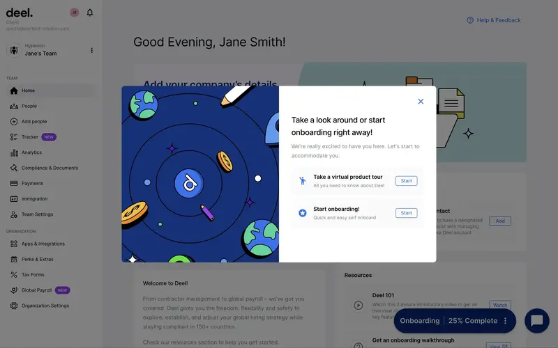
Deel, for instance, uses modals after users complete the sign-up process to help them choose their next course of action: starting the onboarding process or the product tour.
✅ What’s good in this example?
- The main page is generally preferred by new users, so a pop-up urging them to start a product tour is a good idea.
- The modal greets users and has a concise copy that conveys the mission.
- It provides users with two choices and doesn’t force them to start and complete the tour; it gives them freedom in choosing their next action and full control of the timing with the close button.
❌ What could be better?
- Nothing.
Progress Indicators
Progress indicators are elements that display the user’s progress throughout the product tour; they take the form of a series of steps, a progress bar, or a checklist.
These elements measure how far users are into the process and encourage them to see the finish line.
You can see them display a percentage of the completed items or the number of steps left in product tours.
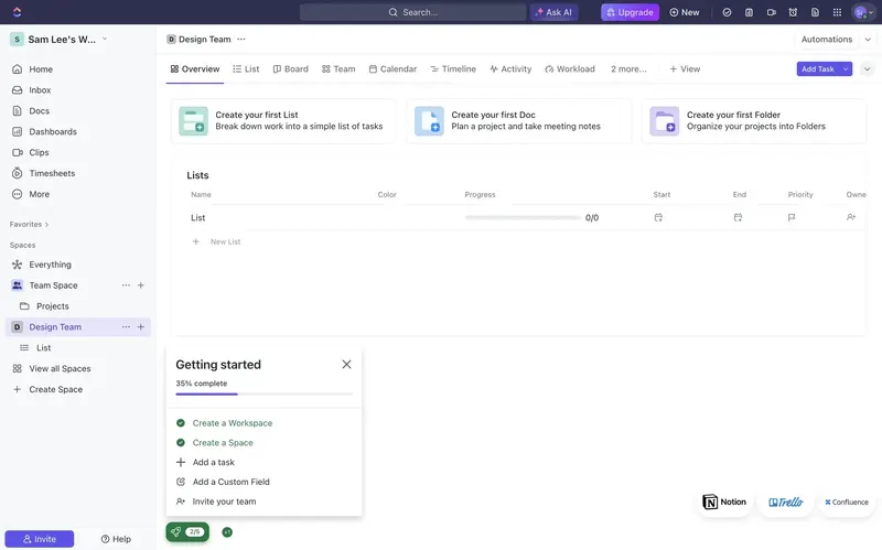
In this example, ClickUp provides users with a roadmap of 5 steps in the form of a checklist, shows which steps are completed with a check mark, and involves a progress bar that advances based on the progress.
✅ What’s good in this example?
- The checklist has a progress bar that visualizes progress and encourages users to complete all the items.
- The copy is short and clear.
❌ What could be better?
- The location of the checklist could be attached to the sidebar for easy navigation, or the color of the modal could be more striking.
Hotspots
Hotspots are small elements that blink on the UI to attract users' attention and encourage them to click on them for further information.
These elements also enable users to explore the product independently, leading their attention to certain points when triggered.
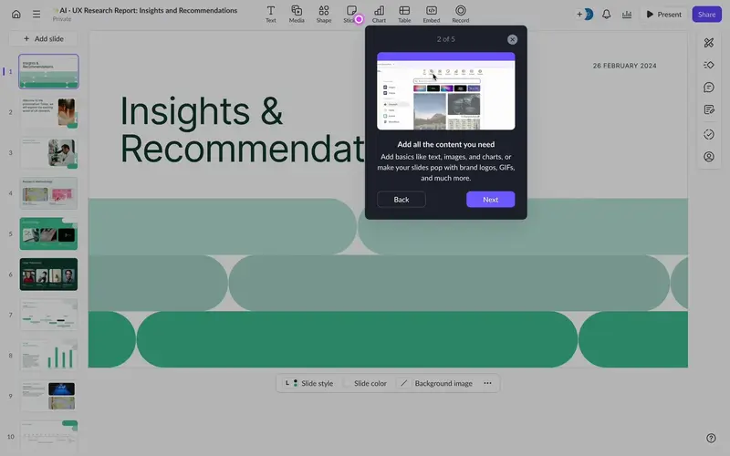
In this example, Pitch utilizes a hotspot to direct user attention to a certain element on-screen.
Upon coming across a hotspot, users usually click on the spot that blinks continuously and learn more about the steps that the product wants users to take.
✅ What’s good in this example?
- The hotspot triggers a modal that provides users with contextual information and relevant visual materials.
- The product tour is short (5 steps) and consists of a concise copy.
- There are back and next buttons.
❌ What could be better?
- The destination could be highlighted with a small transparent area.
In-App Surveys
In-app surveys are feedback mechanisms that collect user’s opinions within the product (without disturbing the user experience).
These elements can appear as follows:
- Customer experience surveys (as star rating, open-ended questions, 1-10 scale, and emojis),
- Customer satisfaction score (CSAT),
- Net promoter score (NPS).
You can see these elements, often at the end of a product tour or in the middle of a specific interaction, to acquire users' ideas about the tour they just took.
Collecting valuable insights facilitates gauging user satisfaction, identifying pain points, and bringing user expectations together in real time; this process also effectively improves product tours with user-centric actions.
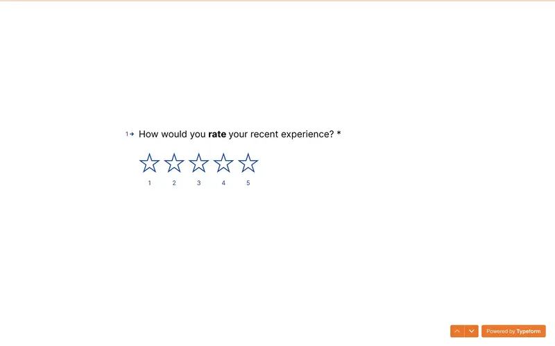
After creating a survey as a part of a guided tour, Typeform asks users to leave a review regarding the experience.
This survey continues with more questions, including an NPS and open-ended questions to learn about the suggestions users will make.
✅ What’s good in this example?
- The questions are on a blank page that leaves no room for distraction.
- It is also a short and to-the-point question.
- It asks for feedback after the first quick win with the product to ensure that users can review their latest experience.
❌ What could be better?
- Instead of covering the whole page, it could be displayed in a pop-up modal.
Top Product Tour Examples And Best Practices
Now, let me start listing the ingredients of a great product tour so that you don’t have a haunted house of lengthy product tours as Ramli John described:
Add next/back buttons
Product tours require users to complete a number of steps.
The most efficient way to assure that users finish the tour is providing them with a linear learning flow through next and back buttons.
These buttons allow users to navigate through the product tour at their own speed and ensure that they can go back to a step to recall its ingredients.
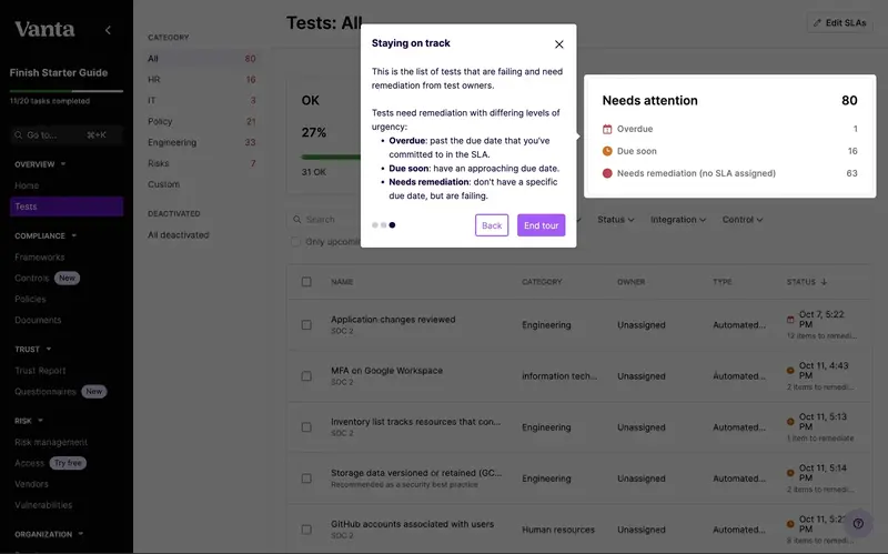
For example, Vanta includes next and back buttons on a tooltip to enable users going back and forth between the steps the product tour has, allowing them to follow the guide with a concentrated mind in their own time.
✅ What’s good in this example?
- The page behind the tooltip and the highlighted section is darkened to draw more attention to the step.
- The tour is short, with only 3 steps.
❌ What could be better?
- The content could include less text.
Add exit/dismiss options
What makes a product tour productive for users is providing them with a room of freedom in their experience.
Offering digital accessibility, exit and dismiss options allows users to start and finish the product tour at their convenience.
These options are usually displayed as close (X) or “Skip” buttons.
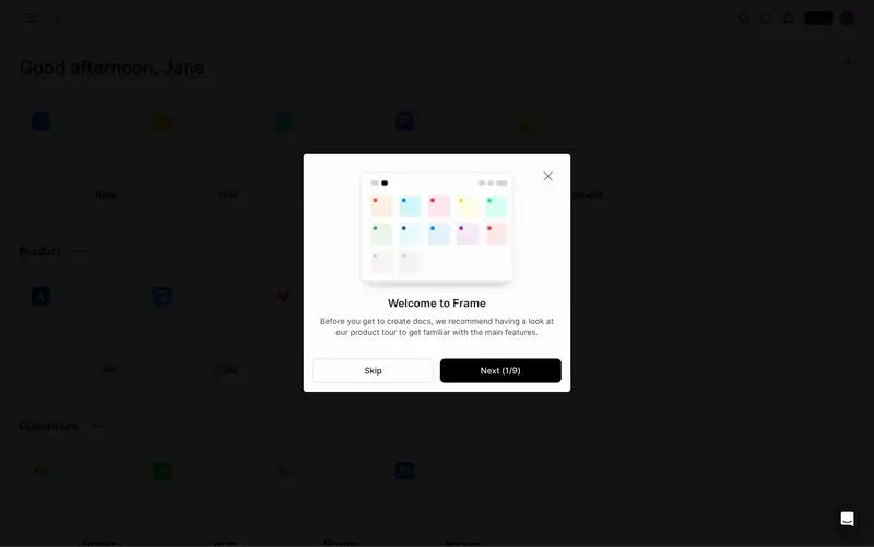
Frame’s example shows how to implement exit buttons for product tours, allowing users to take a breather after onboarding before starting a product tour.
✅ What’s good in this example?
- It has two options for exit: skip button and close button.
- It greets users with a welcome and has a clear copy.
❌ What could be better?
- The tour is too long for users to finish without any disruption.
Use interactive Elements
Want to guess the secret ingredient of any good product interaction?
Interactivity 💯
Product tours need interactive elements in order to differentiate from long and lengthy manuals.
Since these elements make product tours more engaging and practical, 86% of buyers prefer interactive content.
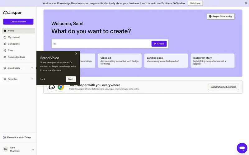
Jasper makes use of a significant interactive element: tooltips.
With it, Jasper aims to focus users on each necessary section and provide clear explanations regarding the relevant section, reducing ambiguity and guiding users.
✅ What’s good in this example?
- The tour is short and has only 4 steps.
- It also has next and close buttons.
- The tooltip’s background stands out from the main page, drawing more attention.
❌ What could be better?
- Instead of repeating the name of the section, it could involve benefits in a short call to action.
Personalize the experience
It’s no surprise that 80% of customers are more inclined to do business with an organization that delivers tailored experiences since personalization significantly increases their likelihood of understanding and valuing the product.
Thus, personalization becomes essential to product tours—shaping the tour to individual users’ needs, preferences, and goals.
The most efficient way to align user needs with a product is by utilizing user feedback and behavior throughout the tour.
Check Readymag’s example ⬇️
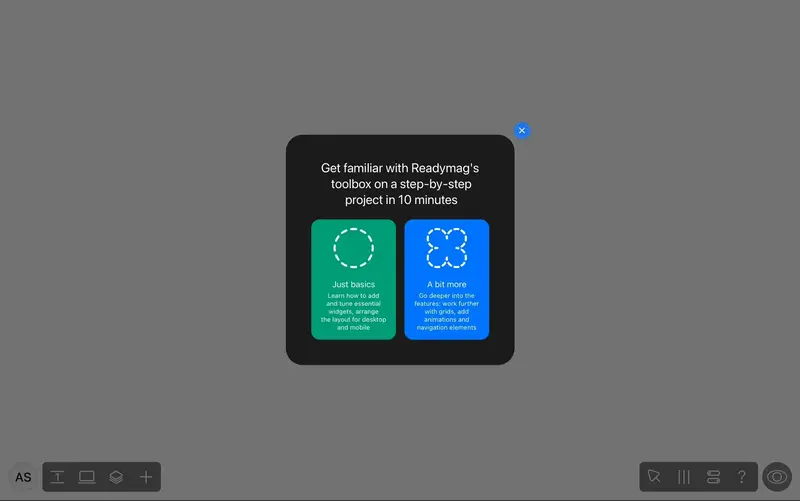
Before starting the product tour, Readymag asks users to choose their preferred proficiency level for the tour they’ll soon participate in.
This segmentation gives users a more personalized experience, offering them a path based on their prior knowledge and background.
✅ What’s good in this example?
- It doesn’t push experienced users to go through a tour whose content they are already familiar with.
- It has a skip button.
- The blackened background draws attention to the modal.
- The copy is crystal clear.
❌ What could be better?
- The colors for the options could be more vivid.
Best Product Tour Tools
Now that the importance of product tours is crystal clear, let’s move on to the best tools on the market to create them:
UserGuiding
- G2 Score: 4.7 ⭐ (469 reviews)

UserGuiding is a product adoption platform that does wonders with product tours.
First of all, it supports several multimedia materials to ensure that there are no missing visuals that help highlight the path to Aha! Moment.
Just like multimedia, there are also a lot of UX elements that UserGuiding provides, such as tooltips, hotspots, and in-app surveys.
Involving these elements in a product tour (and ensuring that each item on our list above is checked ⬆️) guarantees product success and customer satisfaction at the same time.
Here, give UserGuiding’s product tours a try for free 👈
Tango
- G2 Score: 4.7 ⭐ (423 reviews)
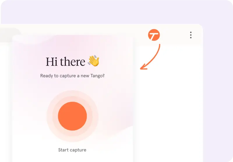
Tango is a software training platform that focuses on product tours.
In order to create one, Tango follows each action on the screen and records them through its browser extension.
Upon finishing the recording, it generates a step-by-step product tour showcasing each click for users to follow through.
However, its famous orange pin and box (for providing guidance over on-screen elements) doesn’t support customization and is used as it is.

WalkMe
- G2 Score: 4.5 ⭐ (462 reviews)
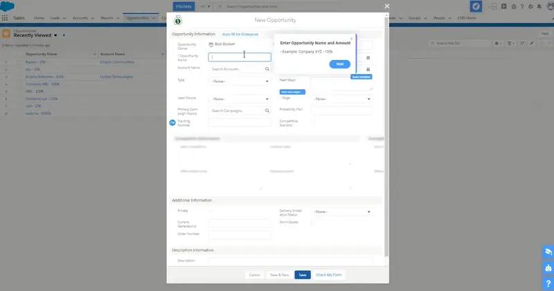
WalkMe is a digital adoption platform that provides in-app guidance through product tours.
These step-by-step guides that enhance user experience include: tooltips that you can arrange based on your preferences, hotspots that you can add to an on-screen item, and surveys to gather feedback from your users.

Pendo
- G2 Score: 4.4 ⭐ (1475 reviews)
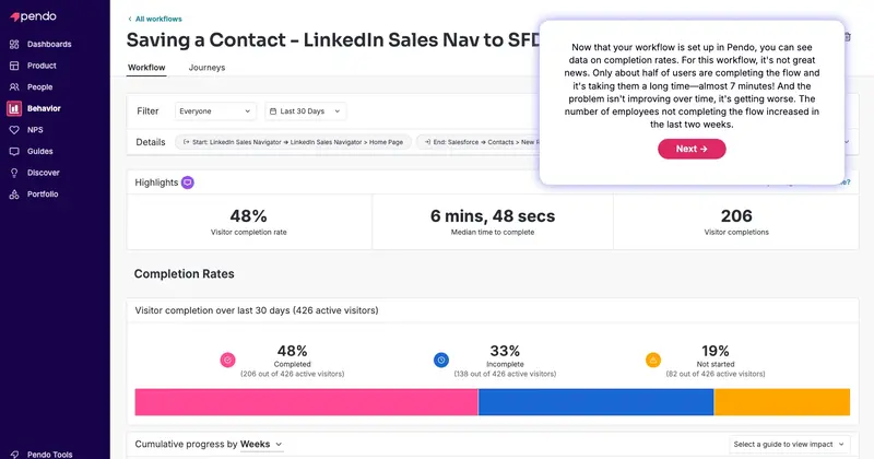
Pendo is a platform designed for product experience.
In this product experience, Pendo focuses on product analytics to better guide teams who need to understand customers through data.
Thus, if what you are looking for is a comprehensive analytics platform on which you can also create and manage product tours, Pendo is a match!
One thing to keep in mind is that Pendo doesn’t have very scalable pricing plans; you might want to book a demo with an alternative before purchasing.

Intercom
- G2 Score: 4.5 ⭐ (3273 reviews)
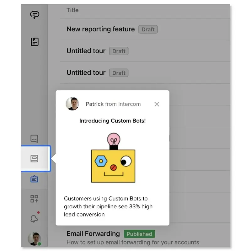
Intercom is essentially a customer service platform, but it also involves product tours as a feature.
Due to its support-oriented nature, it is a good choice for businesses that need to simplify support-related use cases, such as chat and ticket management.
However, if you’re looking forward to implementing its product tours for user and product onboarding, you might be disappointed by its limited ability.

What to consider while choosing your product tour software
Once you know how to design a product tour, the next step is to choose powerful software to support your wishes.
Here are some items you should consider during this process:
Building the product tour with customization options
First things first, product tours need customization for several reasons:
- continue brand identity,
- offer personalized experiences,
- create an on-point tour with your theming and branding,
- and utilize segmentation for better relevance.
As an example, here is what UserGuiding’s customization section looks like:
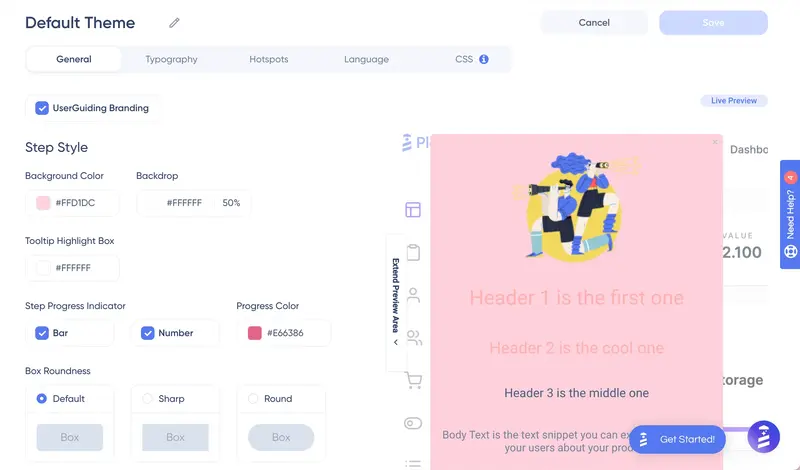
Some of the components of this page are like the following:
👉color code boxes for background, backdrop, tooltip, progress indicator, and buttons
👉shape preferences for boxes and buttons
👉width settings
👉text style preferences
👉hotspot preferences (shape, color, style, animation)
👉blanks for the preferred language
👉CSS section.
With the segmentation feature located on another page to divide users into segments and target specific audiences, UserGuiding stays on the top of the game for product tours.
Never settle for the less 💯
Covering the elements within the platform
Another point to consider when picking a product tour tool is the UX elements it involves.
Why?
Because these elements will be little tour guides that frequently appear in the product tour; they will show users the way around the product.
You might think the more the merrier, but (except for the essentials) the variety of elements that you need to use differ based on the product type, complexity of the product, and use case.
Here comes a full list of elements based on their role in the product tours:
✔️Tooltips: These elements provide concise, targeted guidance without interrupting users’ workflow and encourage them to click on a specific item.
✔️Hotspots: These elements guide users and urge them to discover an item’s functionality by pulsing on a specific area or feature.
✔️Modals and Overlays: These elements take over part of the screen to provide detailed information or instructions, especially right after the sign-up process to explain the dashboard layout and navigation.
✔️Progress Indicators: These elements show users how far they progress in the tour and motivate them to complete it.
✔️Checklists: These elements break down the process after the product tour into manageable steps and allow users to track their progress.
Such a coincidence that all these features (and more!) are available at UserGuiding 🤭
Integrating other tools for data
Integration is also a big deal for product tours since it enables data-driven personalization.
Thus, you should visit the integration pages of each product on your list and see if you can transfer your data resources to that platform.
Keep in mind that integration will allow you to deliver tailored experiences that match their specific needs and track user behavior.
Pricing
Pricing is a critical factor when evaluating product tour tools because it directly impacts a company's ability to adopt and scale the solution.
Pricing should scale with usage or features to support business growth without becoming a financial burden; you might prioritize product tour tools with flexible pricing models, such as per-user or usage-based pricing.
It might be useful to remember that many digital products require an additional payment for optional features or custom integrations.
For product tours, the most logical step would be to decide on the features you need, list them down, and compare these tools based on the pricing (plus any additional features you set your eyes on).
Conclusion
Product tours are the backbone of product exploration.
For this reason alone, you should invest in a good product tour software and create one for your digital product.
Talking about product tours, have you met UserGuiding yet? 👈
Frequently Asked Questions
How long should a product tour be?
An effective product tour should be no longer than 4 steps; however, for complex products, you might consider breaking each necessary section down and creating a new tour for that specific section.
What is the functionality of a product tour?
Product tours help users understand how a product works and visualize how the product aligns with their needs, workflows, and expectations.


.svg)
.svg)
.svg)
.svg)
.svg)


.svg)
.svg)


.png)


