
I don't know about you, but I spend a lot of time in help centers.
It's probably because I have a hard time fully understanding the steps that are involved and getting used to these constantly changing apps, services, and products. It might also be because I work for UserGuiding, a company whose software can actually make help centers.
Whatever the reason, all this time might just have turned me into the equivalent of a restaurant critic, but for help centers. As a user myself, I know what I expect from a help center; a clear, user-driven language, voice search, easy-to-follow instructions, and an interface that's quick and engaging enough to show me what I need.
So today, in this article, I will be talking about the best help center examples from familiar services that offer solutions to tons of user problems each day.
Let's get to know some of the greatest ones without further delay.
1- Facebook
I had to help my mom with her Facebook account the other day. Until that day, I can't say I had to look for Facebook's help center a lot but when I did, the ease of use and the comprehensive directions that I found did not surprise me. At all.

When you need help from Facebook for a particular problem you're facing, you are instantly introduced to a fast and accessible self-service. With its plain and simple blue/white design, the page appeals to the eye and makes it easier to know where to go.
When you click on help & support from the toolbar, you can report a problem, view your support inbox, or quickly access the help center.
The help center link instantly takes you to an ocean of information consisting of a wide range of topics and issues.
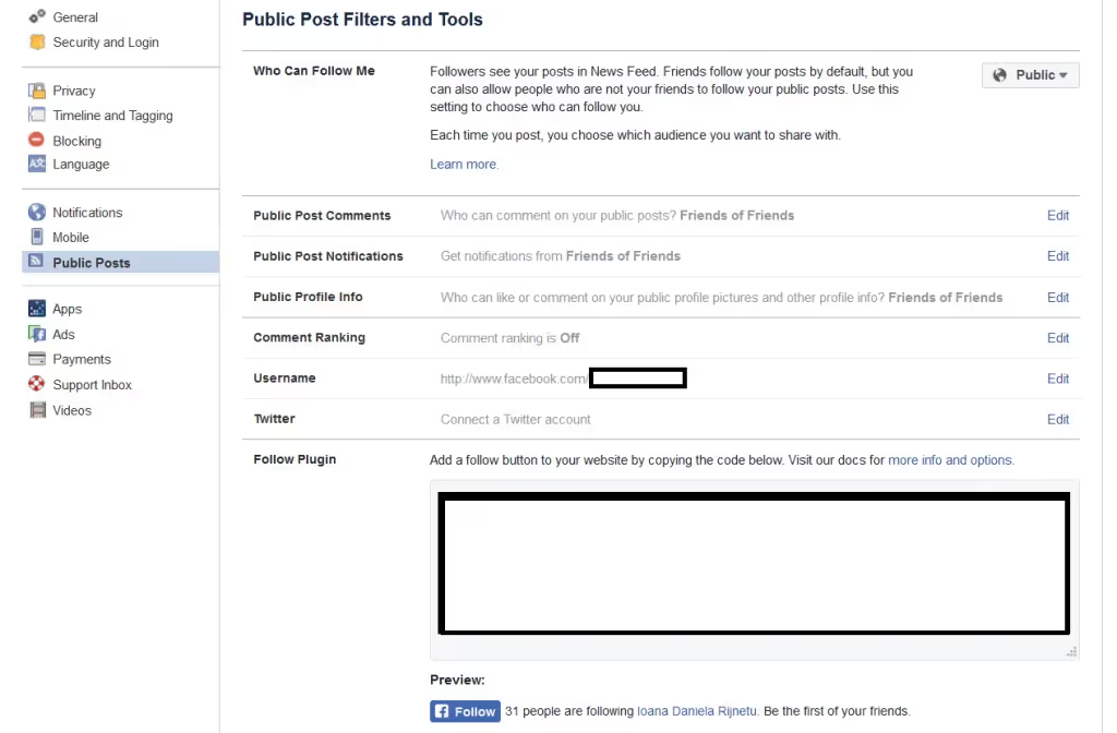
Here, you'll find a menu that shows categorizations of problem areas. Just take a moment to look at the 1st person language common questions and the very clear & spottable titles right there.
Once you're done choosing from numerous options -you can also search for your own with the help of the search bar- that indicates the pain points; you can make yourself feel at home by using that tremendous self-service mechanism the help center offers you. Finally, you can contact the representatives via email or quick notes and let them know what you are dealing with for further assistance.
Going back to my mother's problem, she was just wondering how to eliminate a horrible picture she was tagged in. Phew.
2- Instagram
Another social media platform that's a big part of people's lives is Instagram.
Instagram, too goes for a clean and straightforward help center design that doesn't distract the user from the essential focus and provides a bunch of well-written, relevant, and easy-to-understand support articles once you click on the little ''Help'' right there at the bottom.

I also find it worth mentioning that both the contact page and the help center provide instant language translation that just requires a single click to be activated.
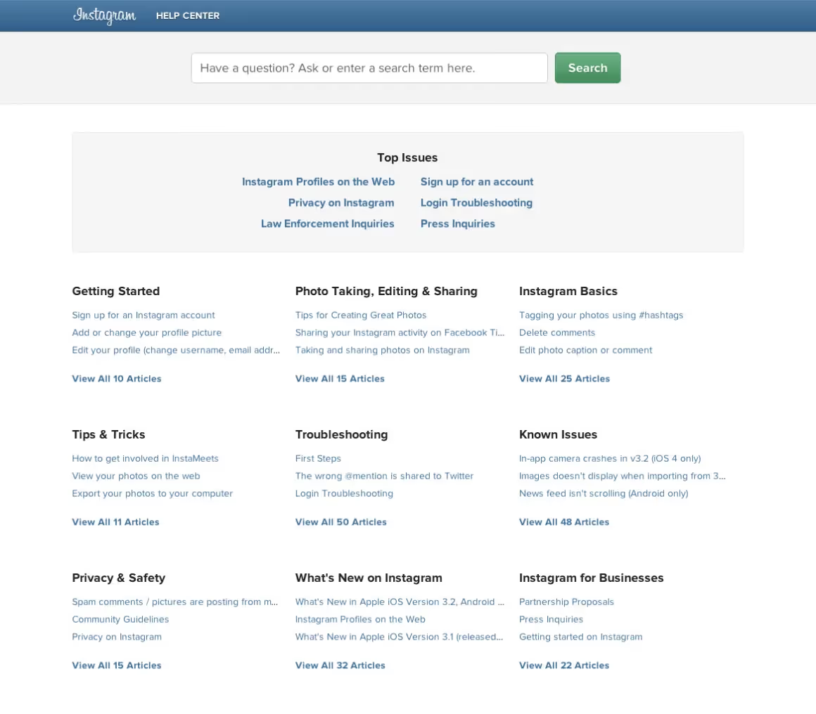
These support center articles are basically what makes Instagram work so smoothly and effectively and are loved by many.
Recently the app has also optimized its Help Center for mobile devices, which is, believe me, a huge deal since the majority of the users are using Instagram via their smartphones and are not exactly willing to solve a problem elsewhere.
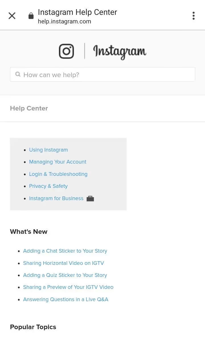
I recently had a problem with one of the new features that came along when I updated the app. It was about adding those popular quiz stickers to your stories; all of my friends were doing it, and I couldn't fall behind!
The moment I checked Instagram's help center for mobile devices, I saw that What's New right there. What a joy. The solution to my problem was standing right there in front of me and I didn't even have to bother searching for it.
Genius. Am I right?
3- Vimeo
Let me begin by saying that Vimeo is my favorite video-streaming site of all time. I've been nearly using it for five or six years now. In addition to all the great content the platform offers you, when it comes to introducing you to its help center, it again does a pretty good job.
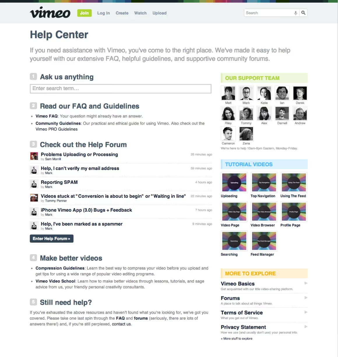
I love it when a platform sticks with its brand image and public appearance while building a help center that works.
Let me elaborate on that.
Vimeo is all about great videos, short films clips, and more. And with their support center, they chose a similar way to help their beloved users. As you can see, numerous video tutorials address users' problems, and all are grouped in an easily accessible area.
What's more, there is a library of helpful information ranging from community forums to guidelines & how-to videos.
Another must-have for me that Vimeo has is the clear organization of content and the comfort of knowing you'll quickly find what you're looking for. The whole dream package, right? It gets even better when you're an easily distracted person like me since Vimeo uses eye-catching bold fonts and vivid colors in its help center.
4- Headspace
I obviously cannot go on with this list without mentioning Headspace. You may or may not be familiar with the app, so let me give you a brief explanation.
The name speaks for itself, really. Headspace is an excellent meditation app that almost gives you a virtual hug when you need some space. For your head. You get it.
And of course, an app that provides a mindful experience for users who are willing to take a few minutes a day to concentrate on their state of mind and reduce their anxiety a bit MUST have a mindful help center.
You might be asking yourself ''A mindful what?''
Let me show you the exceptional service I'm talking about.
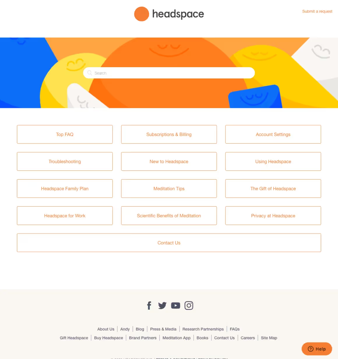
Help centers and customer support pages are supposed to be easy to read and very far from being complex or mentally tiring and that's exactly what Headspaces achieves right there.
The bright and soft tones of orange, white, blue, and yellow and the minimal design of the overall page already make you feel that whatever you're having a problem with is about to be resolved.
I just can't help but love that variety of options offering help for everyone ranging from newbies, those already using the app, those who wish to use the app for work purposes, and families that want everyone to be involved!
Users can also use the search bar for further questions or submit a request with a single click. And, I can't stress this enough, what kind of a meditation app would Headspace be if it didn't offer ease of use and cute design elements that makes people feel good while introducing its help center to them?!
5- Zoom
Zoom has been a life-changer for everybody across the globe since... You know since when. 😷
The platform has always been one of the favorites for hosting online meetings, joining classes, video conferencing, or keeping in touch with loved ones.
However, like every other digital service user out there, Zoom users also have particular issues with the platform, whether resulting from their lack of experience and confusion with the platform or simple technical glitches that can be solved with help.
So, how does Zoom help its users?
Here's how.
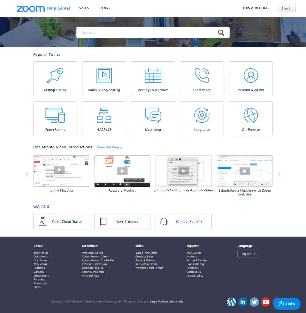
Zoom's help center does an excellent job addressing the possible user questions by providing quick video tutorials that literally take a minute to solve the issue. I find this very important since I don't have the patience to sit and watch a 10-minute help center video, and I believe many people are like me. Even the words ''One Minute Video Introductions'' make me feel like my headache is about to wear off. Just what a relief.
Another thing I love about this help center is how the most popular topics are categorized and shown in titles, providing ease of use and an overall design that's not difficult to follow and understand.
I'm sure all these would be enough to solve customer pain points, but users are also provided with Zoom Cloud Status, Live Training, and Contact Support options for further assistance.
6- Shopify
Shopify is again one platform that sticks with simplicity and aims to make things straightforward.
Once you visit the Shopify Help Center, you instantly see an in detail list of help areas neatly categorized and titled. This sort of beautiful categorization can help your page look more organized and clear and help the users find what they're looking for easily and in an instant.
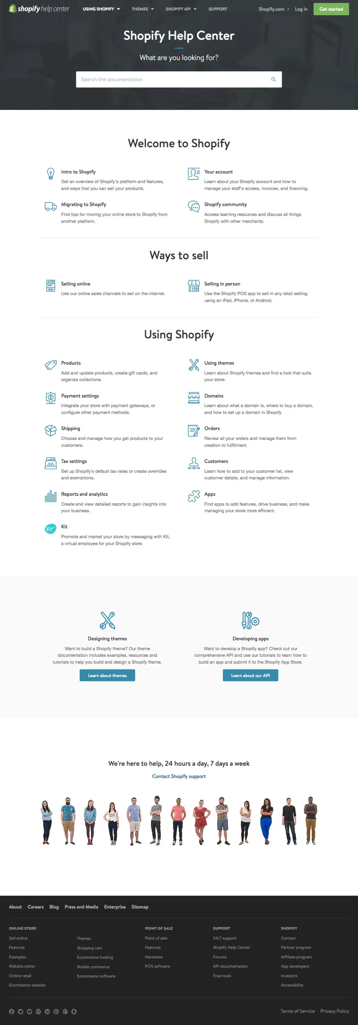
As you can see and appreciate yourself, the search bar is well placed, and those who had to use it will agree with me when I say that it's swift and context-aware. Plus, there are no distracting and unnecessary graphics, animations, or extra colors involved. On the contrary, there is just pure and helpful content.
Also, I don't know about you, but I love seeing the customer support team members below the support page. What's up with them? They have no right to make people feel at home, am I right? 😆
It's just a beautiful little detail that enables people to see smiling faces willing to help them right away and helps the page look more engaging and inspiring.
7- Spotify
Next is another wildly popular platform: Spotify.
Let me begin by saying that a platform as popular as Spotify sure has a lot to deal with each day. However, no matter how great a job Spotify does with paying attention to security, possible data loss cases, or information validations, users still have endless questions that need answers.
So, how Spotify handles these millions of users with different pain points is remarkable.
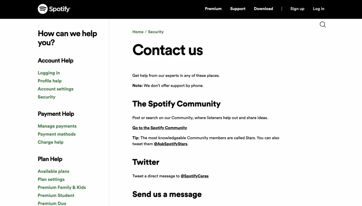
For a platform as cool as Spotify, I wouldn't expect anything different from those stylish, bold black font and the green tone that goes perfectly with it.
And naturally, the cool colors and a support page that's simple to navigate are not everything Spotify has to offer.
The quick takeaways on the left side of the page make it a lot easier to choose what you came for in that the problematic areas are categorized within the most popular titles: Account, Payment, Plans, App, Device, and Data & Privacy.
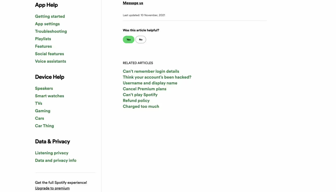
Once you click on the title you choose, you are introduced to a library of well-written, visually appealing, and relevant support center articles that really stand out from their competitors and help you get right back on your 14809 hours of listening to The Weeknd after solving your problem!
Users can contact Spotify via message, email or share their ideas about the platform by joining their community for further assistance.
8- Apple Support
I invite you to think about Apple's success for a second. Considering that more than half of the world's population owns at least one Apple product, it blows my mind how Apple manages to keep customers happy and keep returning again and again.
Their online help center is a vital step along the brand's success journey, if not the key factor.
I mean, just take a look at this.
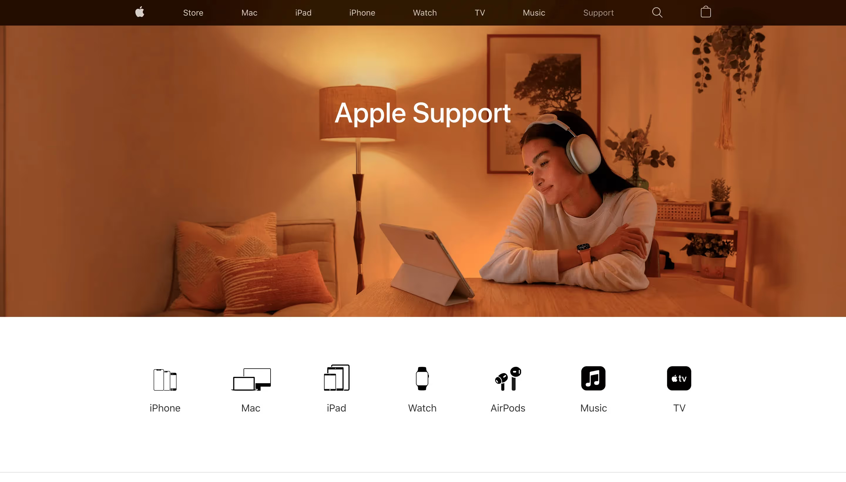
Just like the case with its products, Apple sticks with the beauty of minimal design in its support page as well.
Before talking about the technical perks, I'd like to take a moment to appreciate the photograph that's chosen to welcome the upset user who's suffering from a problem. The photo that Apple decided to go with has dim yellow light coming from a tall reading lamp, radiating peace and calmness. Now, Apple could have easily gone for a technical photograph located in an office, call center, or a workspace in general. But no, they went for the comfort and coziness that comes with the home environment. The purpose here? To make people feel like they are heard, understood, and guided.
Moving on to the features, the page did an excellent job categorizing seven devices to provide more relevant help to the user and guide them to product-specific pages. This makes sense because I, too, wouldn't want to bother wasting time looking for information for my Ipad -scrolling down and down- on a more generalized page.
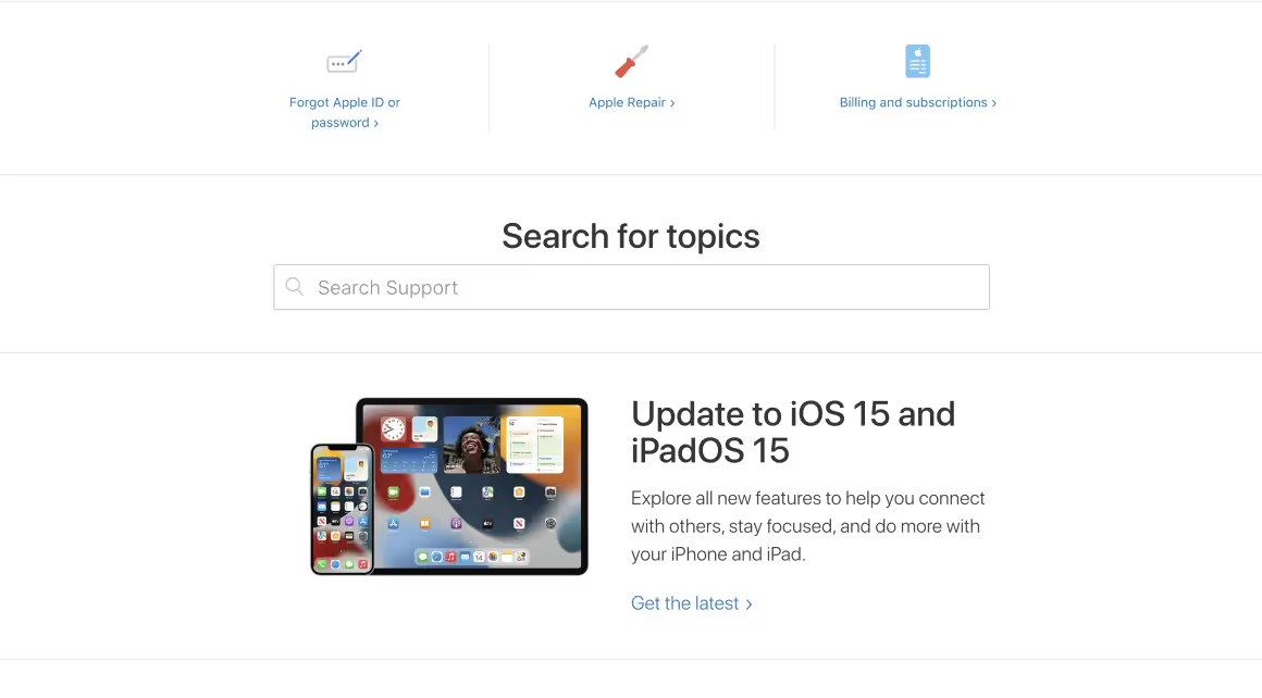
Below this page, there are three quick widespread problems that the user can benefit from with a single click. These options include Apple ID or password loss, Apple product repairs, and payment plans.
Right below those, the search bar is ideally located in the middle of the page, making it easy to spot while keeping distractions away.
You can tell by now that Apple enables you to rock this support page by making it relatively easy because they want you to figure it out for yourself. However, they do provide numerous ways to get in contact with a real person -I had to mention it- almost instantly for those who wish to go that way. So, in addition to a perfectly easy-to-find solution page and real human support, Apple is easily one of everyone's favorites.
9- Grammarly
Grammarly has been with me through thick and thin. I've written essays, got tons of A's, sent fancy e-mails, submitted applications for this and that. Even as I'm writing this, Grammarly is here to help me. I literally cannot think of any other companionship that....OK, now I'm being dramatic.
But, seriously though, Grammarly does a great job improving our daily life activities and giving us a hand by sharing our workload.
The friendliness and the workload sharing part is, I'm sure, will be agreed by many when it comes to talking about asking Grammarly's help for our problems. But what happens when I'm suffering from a particular issue caused BY Grammarly?
Well, I can assure you, things don't turn around. Not even one bit.
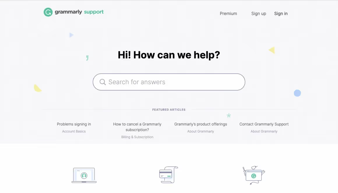
At first glance, this help center has everything you need; it includes a well-located distraction-free search bar, some iconography that indicates separate categories, and featured popular articles that are a click away from solving your problem.
With a bright clean space that makes sure minimalism and class are involved, Grammarly has no time for annoying colors or imagery that confuses the users away.
Without getting the page too messy or crowded, users can help themselves out easily and in no time.
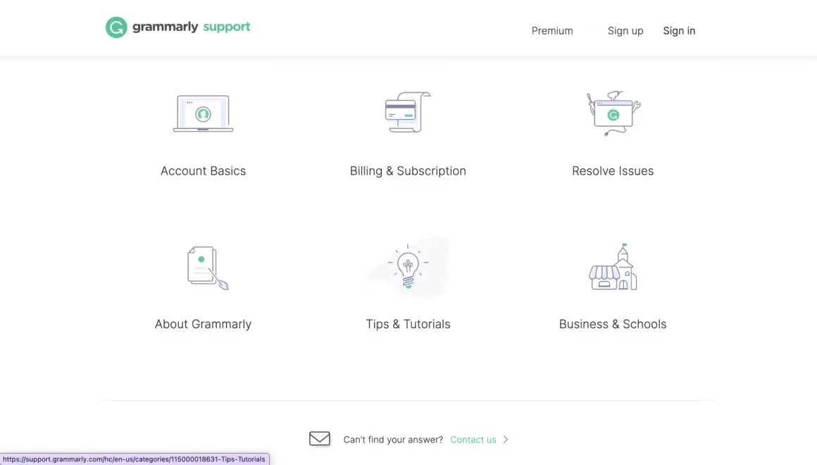
I also find it very important that the page includes a Tips & Tutorials section which I personally use and find very helpful in preventing possible confusion.
At the bottom of the page, Grammarly, after all the help it can give you, still offers contact information for you to reach out for your further questions and gets a cheer from me!
Final Word
I hope this article inspired you to make changes and enhance your current support page. Even better, if you haven’t come up with one yet and are ready to expose yourself to numerous examples, this article will give you some of the best muses to get inspired from.
Stay safe and see you next time.
Keep engaging, finding new ways to engage, and never stop testing!
Frequently Asked Questions
What is a good help center?
A help center is a website that's built and designed to assist customers in the problems they face. And a good help center must be adequate to allow the users to help themselves and easily and quickly find the answers to their questions. This can be achieved by adding problem-specific, relevant articles, feedback forms, a list of questions, various instructions that are easy to navigate, and contact information-email addresses to the page.
How do you build a good help center?
You can build one without having to code by using UserGuiding. Sign up for a free trial today, play around a bit, and see if it's helpful.


.svg)
.svg)
.svg)
.svg)
.svg)


.svg)
.svg)


.png)


