We've analyzed 100+ user onboarding flows of user-favorite SaaS and software products of the last year, all the way down to their building blocks.
Here's what we found:
Top Insights
- Though 97% of companies find onboarding crucial for growth, only 40% of them are satisfied with their existing onboarding experience.
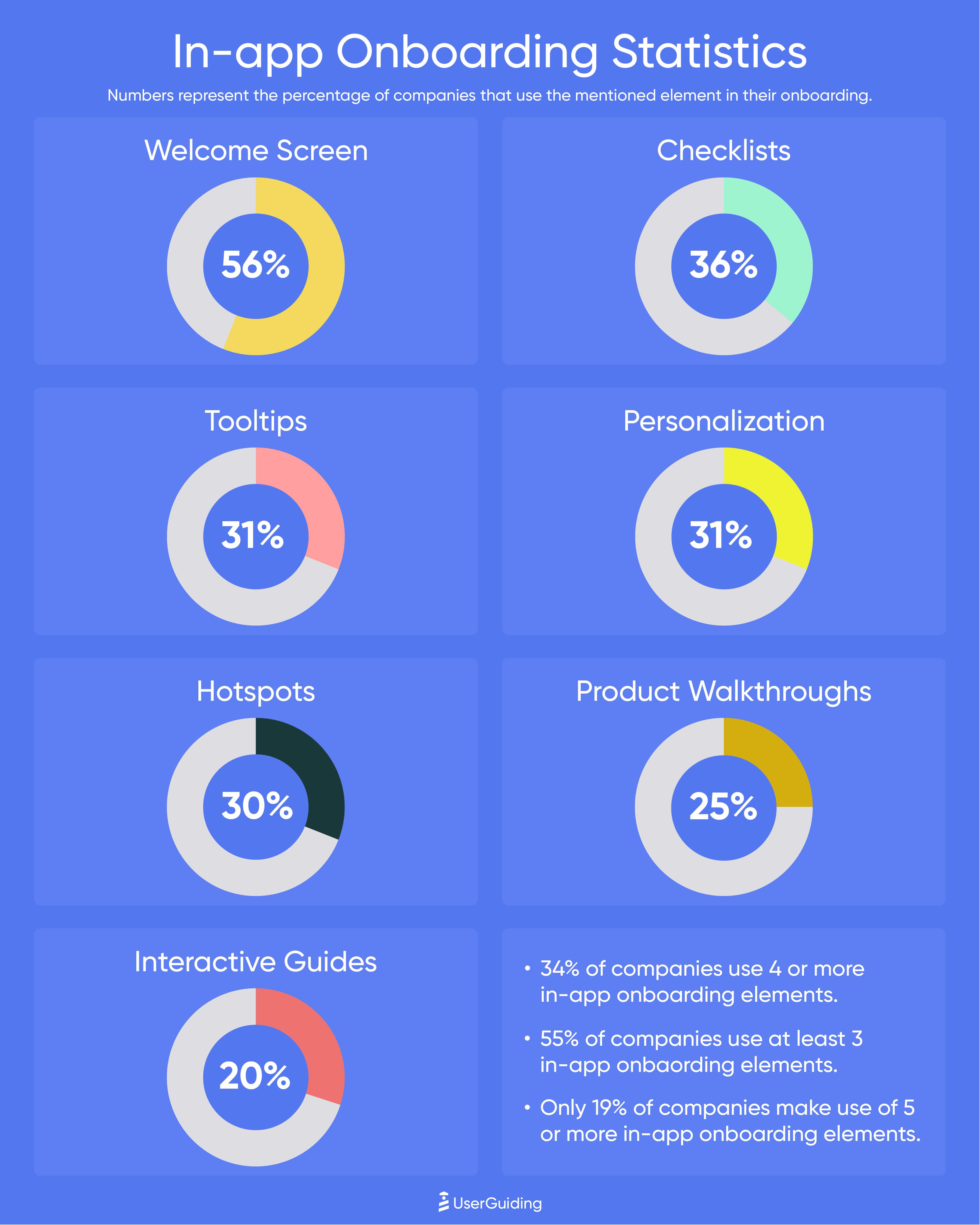
- While 55% of companies use at least 3 in-app onboarding elements, 34% uses at least 4, and only 19% uses more than 5 different in-app onboarding material.
- The most common in-app onboarding element turns out to be welcome screens with a 56% adoption rate, followed by checklists (36%), tooltips (31%), and hotspots (30%).
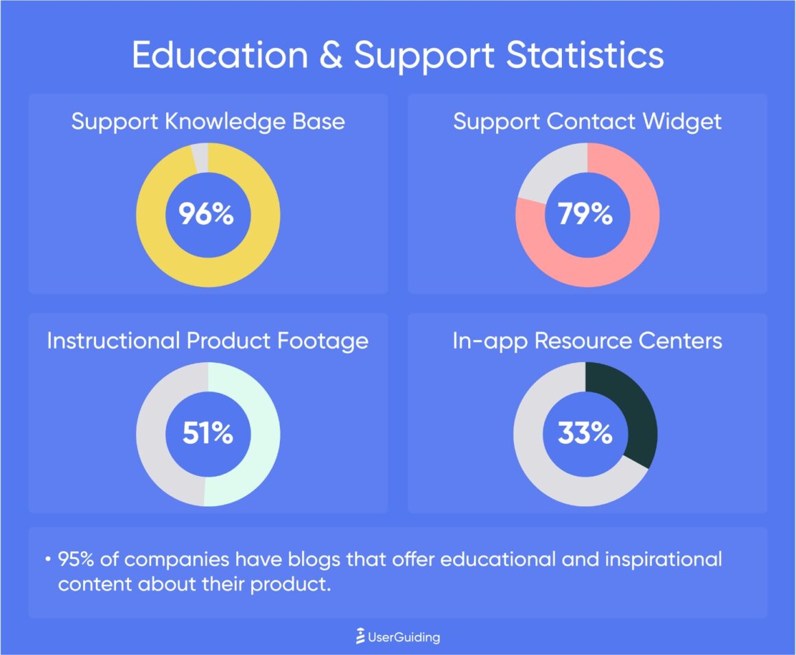
- 96% of companies make use of support knowledge bases.
- A similar proportion of companies (95%) offer educational content about their product on their blogs.
- Though many companies prefer e-mail onboarding (34%) at the beginning of the user’s journey, only 15% of companies send follow-up emails based on usage and performance.
Don't have the time? Here's our recap video ⬇️
Hotjar, Notion, Zapier, Calendly, ClickUp, Buffer, Figma.
These are just a few of dozens of products that achieved outstanding growth in the last couple of years.
That's not their only similarity, though.
The crushing majority of products that had exponential growth over a short time have seamless user experiences that Wow! and Aha! users left and right.
One thing is for sure:
If you're looking for consistent growth and user satisfaction, having a good UX is a must.
And a good user onboarding process is a precondition of that.
Why Is Onboarding Crucial?
Before the study methodology and results, let’s first clarify one thing:
Why is onboarding that important?
We’re in the product-led growth era; almost every company offers a free trial if they don’t already have a freemium plan.
Contrary to the traditional sales-led growth model, in which the sales agents are responsible for persuading the leads and accompanying them through each and every step of the funnel, in the PLG model, the leads try out the product and see the value of the product by themselves.
This then shortens the persuasion process for the sales substantially and decreases customer acquisition costs (CAC).
But here is the catch:
For your users to understand the value of a product in a short trial period, the product must offer a good onboarding experience.
If you don’t provide a thorough guide to your customers, then they might find it difficult to use, or miss a feature that might normally be a reason for preference.
This is one of the biggest dealbreakers for many. Including your users ⬇️
97% of companies say that good user onboarding is crucial for better growth, but only 40% of companies are satisfied with their existing user onboarding experience. ⚠️
Methodology
For this study, we’ve selected the fast-growing SaaS companies of 2021 and 2022 with free trials and/or freemium plans.
We’ve spent a significant amount of time in the product during the first experience to come across each and every SaaS onboarding material and checked later on for more in-app content and e-mails.
In terms of service/product types, we tried to be inclusive as much as possible.
Among the products examined, there were analytics tools, knowledge management tools, project management tools, cloud storage solutions, CRM systems, marketing & sales automation tools, work communication tools, web development platforms, design tools, and performance tracking tools.
Finally, we’ve categorized the onboarding materials as follows:
✅ In-app interactive content,
✅ Educational content, and
✅ Off-app e-mail engagement
Providing Free Access to Your Product
Whether it is with a freemium or free trial, easy -and free- access to your product is important.
Because once people get the taste of your product, they’re more likely to buy it.
Just like watching the teaser of a movie.
You don’t get access to the full movie before buying a ticket, but you see enough to understand that it might be worth going and seeing.
Demo calls and meetings have similar effects too, but they target a more specific audience with expectations and questions about the product. Free trials/freemium plans, on the other hand, appeal to almost anyone interested in the product, which means you can target a bigger audience and get more leads.
Also, you can still arrange demo calls/meetings with your qualified leads to improve their user experience and keep them in the sales funnel.
Freemium Vs. Free Trial
Okay, you’re convinced to go with a “free something” plan.
But now, you cannot decide whether to offer the full product free for a short period of time and ask for a subscription for further usage or offer certain features of the product free forever and demand payment to access the rest of them.
Unfortunately, there’s no quick solution to this dilemma.
The answer depends on 4 things:
👉 Your market strategy
👉 Market conditions and competition -a.k.a. Ocean conditions
👉 Your target audience
👉 Your product’s time-to-value
Let's take a closer look at each:
1- Market Strategy
In the SaaS industry, there are 3 popular growth strategies: differentiated strategy, dominant strategy, and disruptive strategy.
A company with a differentiated strategy:
- Doesn’t fear the giants in the market.
- Targets a specific group of customers and offers services for them.
- Charges significantly more for its services.
➡️ Due to the specialization, products and/or services tend to be complex and hard to understand alone, which means freemium plans can be unproductive and ineffectual for companies with differentiated strategies.
A company with a dominant strategy:
- Targets a bigger audience.
- Charges less to be the first choice of users.
- Offers less complex services / has an easy-to-use product.
➡️ Who offers more for free gets the users. If your total available market (TAM) is large enough, you can go with freemium.
A company with a disruptive strategy:
- Offers solutions to the most common problems.
- Doesn’t charge much.
- Has an easy-to-use product.
➡️ Most SaaS companies prefer this strategy. The main idea can be summed up as offering a simpler and more budget-friendly alternative to the market.
As the product is less specialized and professional, it’s easier to understand and use the product all alone; with a good onboarding experience and a freemium plan, it draws customers like a magnet.
2- Ocean Conditions
According to the “Blue Ocean Strategy”, competition is overstated and unnecessary.
Industry conditions are not unchangeable givens; on the contrary, they’re created by the actors withinside.
In short, there are 2 types of oceans in this theory:
Red ocean and blue ocean 🌊
🔴 Red ocean refers to a marketplace where actors overbear one another in order to meet the existing demand and get a bigger share of the market instead of creating new demand and increasing the radius of action.
🔵 Whereas the blue ocean refers to a marketplace that expands and creates demand constantly, therefore providing growth opportunities to each and every actor.
If you’re creating a new demand, you must make sure you’re explaining why your new solution is important to your target audience and educating them.
Otherwise, people will not understand how your product can help them.
Therefore, you might want to go with free trials + sales-led demo meetings. Freemium might cost you a lot of users.
But if you’re competing in a red ocean, it means your leads have ideas about your product and how you can help them. Yet as you have tens of competitors, you need to offer more for less if you want to be chosen amongst others.
Thus, you should go with freemium.
3- Target Audience
👉 If you appeal to a large market with a relatively low contract value, you should consider having a freemium model.
👉 But if you address a smaller market with larger contracts, you should go with free trials, as long-time freemium users can cost you a lot.
4- Time-To-Value
Finally, you must consider how long it takes your users to get an "aha!" moment with your product.
👉 If people need help implementing a solution you offer, you should go with a free trial.
👉 But if you have a simpler product that immediately impresses users, you can opt for freemium.
As for our research:
✅ Among more than 100 products we examined, 63% of them had freemium plans, while 37% offered free trials.
Onboarding UX Patterns
A good user onboarding UX consists of a mix of various in and off-app content that guides users to success.
As well as product tours and tooltips, support articles, and videos, email outreach based on user activity are crucial too.
The smoother you onboard users through different materials, the more likely they are to subscribe 🔔
55% of fast-growing companies utilized at least 3 onboarding elements.
Now, let’s have a closer look at each onboarding element 🔎
In-App Interactive Elements
Welcome Screens
56% of fast-growing companies used welcome screens in their onboarding.
You will not have a second chance to leave a good first impression on your users.
So you better greet them sincerely.
It’s important to keep in mind that first-time users do not spend much time in order to understand how a product works.
They tend to shoot a glance, and if they find the product difficult to use and/or don't see educational content anywhere around the app/page, they may throw it away, never to be touched again.
At this point, offering a product tour isn’t enough.
You need to make sure that a user comes across it, or at least they should be notified about it, which can be achieved with a well-designed welcome screen.
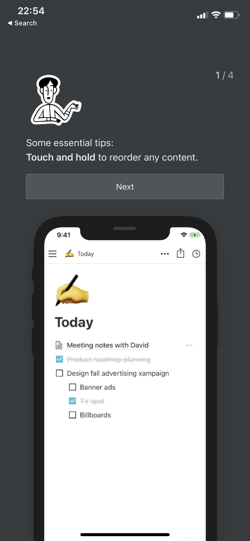
We see welcome screens religiously used in mobile apps, like how Notion gives you some essential tips in a 4-step onboarding screen:
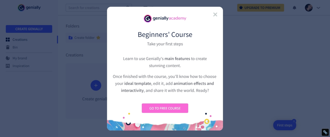
But it also is utilized in many web apps, take Genially for example:
Here’s an example from Evernote, a note-taking & organizing tool. It looks clean and simple, just welcoming new users. But it’s actually more than that. As you can see, there’s a progress bar on top of the notification. Once you click on get started, you’re asked to answer a few questions to get a tailored onboarding experience.
➡️ What brings you to Evernote? (work, school, personal)
➡️ Where will you use Evernote? (tablet, web browser, desktop app, mobile app)
➡️How do you plan to use Evernote? (note-taking, to-do lists, planning)
According to your answers, the app shows you the most relevant information, such as tooltips and interactive guides for specific tasks.
Product Walkthroughs
25% of the companies in our research used in-app product walkthroughs.
A product walkthrough is basically a set of tooltips and/or hotspots that introduces the UI and product features to the users.
The main purpose is to warm the user to the interface by showing which tools are where on the dashboard.

⚠️ Product walkthroughs should be short and precise. You can create different walkthroughs for different screens. Compounding every tooltip into one long walkthrough could scare users off as it wouldn’t leave time to digest and process the information.
Interactive Guides
20% of the onboarding flows we've examined had interactive guides.
Interactive guides are one of the most popular onboarding elements adopted by SaaS companies nowadays.
They show to complete a particular task, such as creating a to-do list or adding a new event to the calendar, prompting the user to take action at each step.
The difference between a product walkthrough and an interactive guide is the level of interaction with the user and the type of information provided.
While walkthroughs do not necessarily interact with users actively, interactive guides wait for them to complete an action on the interface, such as clicking on a button, entering an input, etc.
Also, guides give information about how to complete a specific action, whereas walkthroughs do not explain further steps, only show the basics.
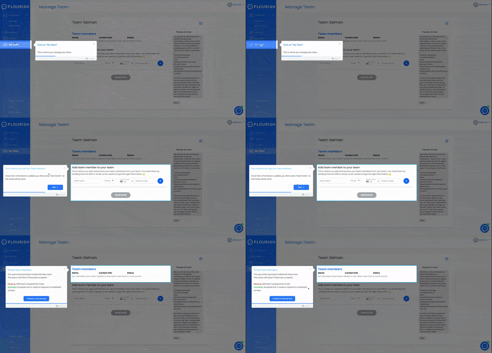
Here’s an example from Flourish, a Swedish SaaS company.
They mark and highlight the relevant buttons/parts to the task and wait for you to click if necessary before continuing.
In less than 5 steps, you’re good to go. It’s short but informative enough.
If you wonder how they planned their user onboarding and reported visible growth with UserGuiding, check here 👈
Tooltips
31% of fast-growing companies utilized tooltips.
Tooltips, as the name suggests, are short explanations and/or pro tips about tools and/or specific buttons on the UI.
They can be triggered when the user clicks on either a button or a selected area.
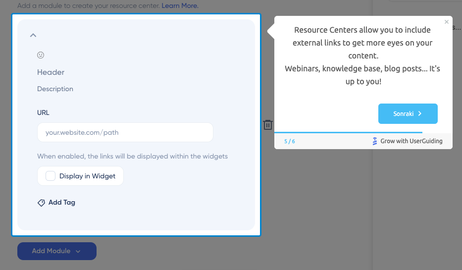
✔️ Make sure you don’t over-explain tools/buttons that are already obvious and understandable such as “Save” or “Share”.
✔️Try to give pro tips that are handy and/or inspirational for users.
✔️ Create action-driven tooltips that save the last action done by the user.
Onboarding Checklists/ Setup Wizards
36% of fast-growing companies had checklists or setup wizards available.
According to our research, onboarding checklists are the most adopted in-app onboarding material after welcome screens.
It’s because they increase the probability of a user completing other onboarding tasks such as filling in personal information, inviting others, and taking the product tour.
Everything is about user psychology, actually.
Technology, especially software products, can be intimidating from time to time.
Too many small things to do and details to remember.
Even setting up a new account can be daunting. Have you added a profile photo?
Verified your email address?
Confirmed your payment method?
Though they are small and relatively insignificant tasks that don’t take more than a few minutes in total, it sounds like too much work.
Checklists come into play at this point.
They remind you the most important things with simple bullet points.
You don’t have to remember everything; you can just go and check the list 😉 Also, the satisfaction that comes with crossing out something from a list is incomparable.

Let’s examine how Keyhole increased its conversions by 550% with checklists.
They use checklists to improve the user experience by reminding and showing what step to take next.
In the end, users do not skip any step and get the best results while also tracking their progress and getting motivated.
Hotspots
30% of the companies in our research had hotspots in their UI.
A hotspot is a flashy blinking UX/UI pattern that aims to draw attention to a particular place on the screen.
It’s a simple, fun, and catchy dot, in other words.
You can explain how to use a tool, convey an important tooltip, inform about a new feature, or simply remind about a discount. The sky is the limit!
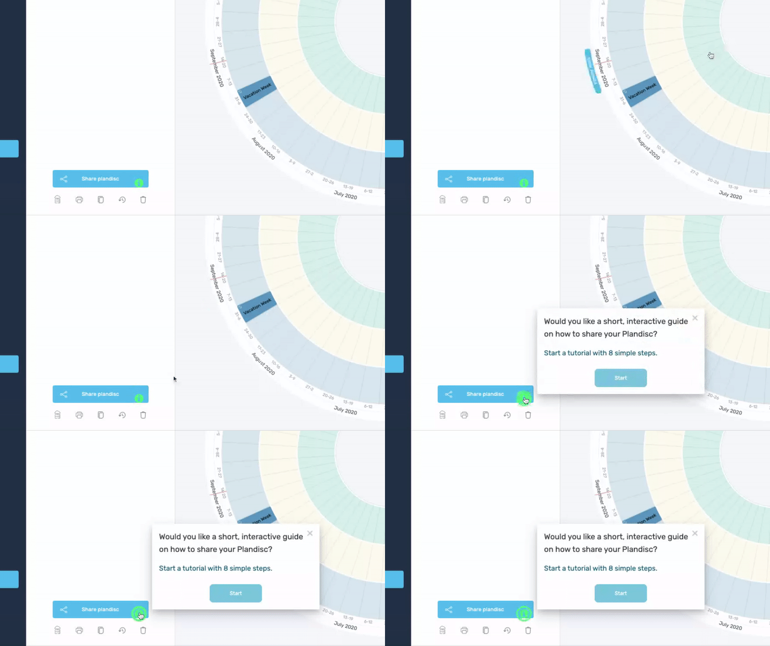
Here Plandisc, a cyclical calendar tool, triggers a hotspot to onboard a user with an interactive guide.
Offer product tours on your welcome page as much as you want, and add guides to your checklists; you won't find anything more engaging than a little flashy hotspot.
Check out more cool hotspot examples here 👈
Personalization
31% of the companies in our research personalized their in-app content.
People expect different things from the very same products most of the time.
Some use note-taking apps for creating to-do lists, others for planning reasons, for example.
Even users who choose to use a product for similar reasons have very different user journeys. One PM integrates Google Calendar with a project management tool to create separate events for meetings; another PM prefers to get a Slack notification.
The more information you get from a user during their onboarding process, the better and more relevant content you suggest to them.
So, personalization is important. It keeps users engaged and active.
In order to create personalized onboarding content, you need information about your users themselves, their (work) environment, and their motives for using your product.
You can start by asking the following questions:
➡️ Which sector/industry are you currently working in?
➡️ What’s your job title/position?
➡️ What brings you to …? / How do you plan to use …?
➡️ Which of the following SaaS products do you use?
Educational Support
Onboarding doesn’t end with product tours, interactive guides, tooltips, and hotspots.
They can be thought of as 101 training to get started with the product.
Users need additional resources and/or platforms to learn more about the product and seek answers to specific questions and/or solutions to bugs and errors.
Support Knowledge Base
96% of the companies in our research had knowledge bases for customer support.
More than 70% of customers prefer to find answers to their questions by themselves instead of with human assistance. So, a good support knowledge base is the backbone of a support team.
The support knowledge base consists of different types of content, such as;
✔️ How-to articles
✔️ Ste-by-step guides
✔️ FAQs
✔️Introductory articles
✔️ Explanatory videos
✔️ Handbooks, etc.
Instructional Product Footage
51% of fast-growing companies utilized instructional product footage.
Instructional product footage is video content that shows how to use a certain feature of the product.
It can be about creating a new event in a calendar, merging different documents, or changing the password to your account.
They tend to be short and explanatory.
In the video, someone from the support team walks you through each step of the process, ensuring that you know which button to click when.
⚠️ Instructional product footage is recorded for simple tasks and most common problems, such as resetting passwords or changing email addresses.
👉 If you want to read further on training videos, let’s take you here 👈
In-App Resource Centers
1 out of 3 companies in our research had in-app resource centers.
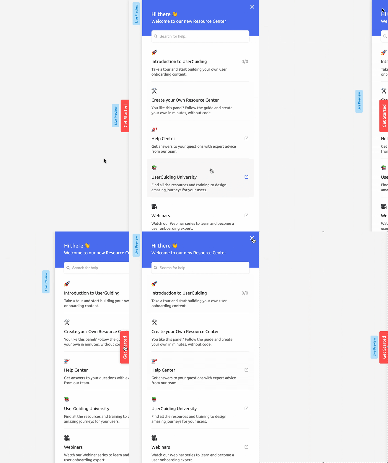
In-app resource centers are, as the name suggests, places where you can gather all your informative content and onboarding material, such as tutorial series, support articles, webinars, and e-books together and keep them organized.
The main purpose is to create some kind of a reference book for users.
Whether they’re looking for external links, support articles, or onboarding checklists, they should be able to find all the relevant content in one place: in the resource center.
Blogs
According to our research, 95% of businesses have blogs that contain educational and inspirational content about their products.
But why is that the case?
We talked about the PLG trend up in the beginning, do you remember?
That’s why.
“Product that sells itself” is our motto.
We offer free trials and/or freemium plans, work on a more user-friendly UI, moreover improve the user experience with high-end onboarding content.
But how are they going to work and turn into revenue if we don’t have enough leads?
Good content brings qualified leads.
In time, your audience will value your content more and be more willing to interact with your business.
They’ll favor your content over others, and start to trust your brand. Once they need your services, they’ll have no doubts about the quality of your product.
E-Mail Engagement
📈34% of fast-growing companies carry out e-mail onboarding campaigns, but only 15% of the companies reach out to their users based on their usage and performance.
It’s not easy to turn leads into customers, especially if you have tens of thousands of rivals in the market.
No one would like to lose potential customers due to the lack of engagement.
Actually, it might be the worst reason.
Someone finds your product and signs up for a free trial, but then poof! They lose into thin air, never to come back again till their trial ends.
Maybe they would fall in love with your product if they had tried it properly.
Maybe they would adore your onboarding material if they had spent enough time in the app/webpage.
Maybe they would go with a premium plan if they had…
The never-ending what-if series.
Well, your hands are not tied, actually.
You can regain the interest of users that vanish in their trial periods by conducting an email campaign consistent with your onboarding content.
➡️ Welcome new users with helpful resources such as 101 articles and how-to videos.
➡️ Make sure you use sincere and friendly language. First impressions are everything.
➡️ Briefly restate the value of your product and/or service. Remind them why they were interested in it right in the first place.
➡️ Invite them to complete the onboarding process. Tell what’s left from their checklist.
What Does All This Mean For Your Business?
User engagement and product adoption are two of the biggest components of a product's success, and they're both heavily aligned with the quality of your user onboarding.
The majority of fast-growing companies have the same vision when it comes to their growth, so they set up interdepartmental teams for creating and optimizing their onboarding flows, or even hire product/UX designers to tend to user onboarding alone.
If your aim is to replicate these companies' success to a degree, you also need to spend a considerable amount of time creating and optimizing a user onboarding flow to make sure your new users have a clear path to their Aha moments.
One statistic before I go:
Did you know that you can save up to 95% development time when creating user onboarding flows if you use a 3rd-party user onboarding software like UserGuiding?


.svg)
.svg)
.svg)
.svg)
.svg)


.svg)
.svg)


.png)


