As a user, did you encounter pop-ups that annoyed you so much that you immediately left the website to discover less interruptive sellers or service providers?
It reminds me of the open-air market in my hometown, where the sellers behind the stalls were shouting at me to buy from them. It was a marketing strategy that was actually a failure. I was feeling like I was forced to buy their tomatoes or whatever they sell, and it was too much for me.
I want to choose the best tomatoes in the market without someone trying pretty wildly to make me buy their products.
At the end of the day, that was the main reason I gave up shopping there and preferred supermarkets.
Pop-ups were discredited as a result of the horrible pop-ups undermining the UX and UI design criteria. By this, I refer to the ones which take you to another website or dictate you to act contrary to your intent to visit the page.
And Google realized how they hamper the user experience.
As a result, in 2016, they decided to improve the situation by making the websites with annoying pop-ups rank lower.
Although these examples are stories of disappointment in terms of marketing, pop-ups are not necessarily that bad.
On the contrary, they can raise the conversion rates of your website. According to Sumo’s detailed analysis, average-performing pop-ups have a conversion rate of 3.09%, and the rate is much better for top-performing pop-ups.

But why use pop-ups if their user-friendliness is controversial?
They make what you want your users to do fast and easily. We are sure our attention spans are much shorter than before, so they grab attention and help you convert.
Here are some reasons to include them on your website:
✅ Collect e-mail addresses,
✅ Gain more leads,
✅ Smooth user onboarding,
✅ Restore drop-out carts,
✅ Promote new products or assets,
✅ Boost demo sign-ups,
✅ Segment your email list,
✅ Suggest related products,
✅ Ask users to submit a question
How to create pop-ups that convert?
Pop-ups should offer value. Instead of saying just “come and buy it” you should convince the users by offering value, adding something to their lives.
For example, you can offer a coupon or a discount code in return for their e-mail addresses. Maybe you can share an e-book or a free source of information that would make your user content.
1. Timing is important
Give your users enough time to explore your value themselves instead of insisting on them.
You might prefer scroll-triggered pop-ups to let the users accommodate themselves on the landing page.
2. Pop-ups should follow your branding design
You wouldn't want to show the users a pop-up that doesn't comply with the look of the rest of your website. At this point, the design of the pop-up is important.
Creating a pop-up that seems like another website would make the user uncomfortable and prone to hit the exit button.
3. Target audience
Instead of using the same pop-ups on each page, create alternatives in accordance with the behavior of the users.
In other words, use different messages and CTAs for different stages of the user experience. For example, an e-mail pop-up would be great on the landing page but recovering abandoned carts would appear anywhere.
Or another example, you wouldn't want to show a picture of a top tank on the page dedicated to jeans as the user has already shown a sign that they are interested in jeans.
4. CTA should be clear and visible
CTA buttons are to grab the attention of the users. You can achieve it by using contrasting colors and using catchy copy.
5. Don’t be annoying
As I said earlier, pop-ups can be extremely annoying if they are not used wisely.
You should give the users enough opportunity to dismiss the pop-up and browse through your website at their own pace. Don't try to trick them with less visible exit buttons or sticky pop-ups if you don't want to be seen as lame and unreliable.
6. Include a limited number of input fields
More than one input field in a pop-up can overwhelm users.
If you need their e-mail address for your special offer, ask only for it and leave asking for their age, gender, and other things for later. Pop-ups are meant to appear and disappear from our screens fast, not to stay in the middle of the page, delaying our interaction with the landing page forever.
7. Responsive pop-ups win
In each aspect of your website, you should consider responsive design.
Mobile devices usurped our online experience. So, a pop-up half visible on the screen of my iPhone would lead me to leave that website forever.
8. Be kind and respectful
This one is critical. You won't want to flip off if a user doesn't want to subscribe to your email list, right?
Also, refrain from showing the same pop-up again and again if the user has already said clearly "no" to your offer. No means no, you know.
Let's look at some real-world examples following these rules.
Great Pop-up Examples from e-commerce Websites
1. Lego

Lego welcomes you with an informative pop-up about the structure of the website.
It encourages you to choose your side and continue easily with your aim of visiting their website. It functions as a navigation panel to take you where you wish to go.
The CTA buttons are distinct from the rest of the pop-up and carry a clear message.
It is so simple yet effective.
2. Marks and Spencer

Marks and Spencer applies a different modal in their e-commerce website. Instead of placing the pop-up in the middle, they put it on the bottom right corner of the landing page.
More importantly, it doesn't appear the minute you step inside. It is a time-based pop-up waiting for you to take action. If you don't, the pop-up offers you a free shopping option. The CTA takes you to a sign-up page which is a pretty cool way of generating leads.
3. Larq

Larq follows a similar strategy for pop-ups on their website.
It takes a good amount of time to see the pop-up with a discount offer. All you need to do is fill the box with your email address.
The design of the pop-up has the same color scheme, and a similar theme is used across the website.
Also, note how they made the exit button of the pop-up visible by its contrasting color with the background image.
4. Burrow

Burrow uses a yes/no pop-up which makes it a lot simpler.
As an e-commerce website for furniture and interior design, they use a photo of a person lying on a couch. It's a well-known fact that using an image of someone's face on a website increases the chance of a conversion.
And it fits with the overall concept.
5. Revelry

Revelry goes further and asks for more information about the user instead of including only an email field.
Adding more elements other than the input field to the pop-ups is risky, but Revelry makes it great. It uses radio buttons and keeps it as simple as possible.
It makes creating customer segments easier and sending targeted e-mails to the users.
The button color is green which tempts the users to click on it.
Great Pop-up Examples from SaaS and B2B Websites
1. Zendesk

Zendesk is one of the greatest SaaS companies based in the US, and its website is as great as its products.
The time-based pop-up appears in the middle and offers a demo screening without asking you anything. If you click on the CTA button, it takes you to a registration form.
It is a subtle way of using a pop-up that converts.
2. Mailchimp

Mailchimp's pop-up proves how kind copy works. It asks you to take a survey and gives you the options with polite CTA buttons.
The image and the message are so simple. Just the logo and the short message do what most pop-ups cannot achieve with complexity.
3. Iterable

Iterable announces the early bird tickets for its event with a pop-up on the bottom left corner of the page.
It is not at the forefront as it is not a pop-up aimed at email marketing, but it is still visible thanks to its bold colors. As it is an advertisement for a related event, it doesn't ask for the users' email addresses.
Also, you can easily dismiss it or continue browsing the website without the need to close the pop-up as it doesn't interfere with your journey on the page.
4. Optin Monster

The exit-intent pop-up on OptinMonster's website is pretty convincing not to leave the page.
In line with its business modal, it seems to be successful at turning the visitors into leads with this pop-up.
According to Popup Smart, exit intent popups "341% increase in email list subscribers, 290% increase in form building efforts, 53% of abandoning visitors back and 4.1% increase in sales conversions".
5. CoSchedule
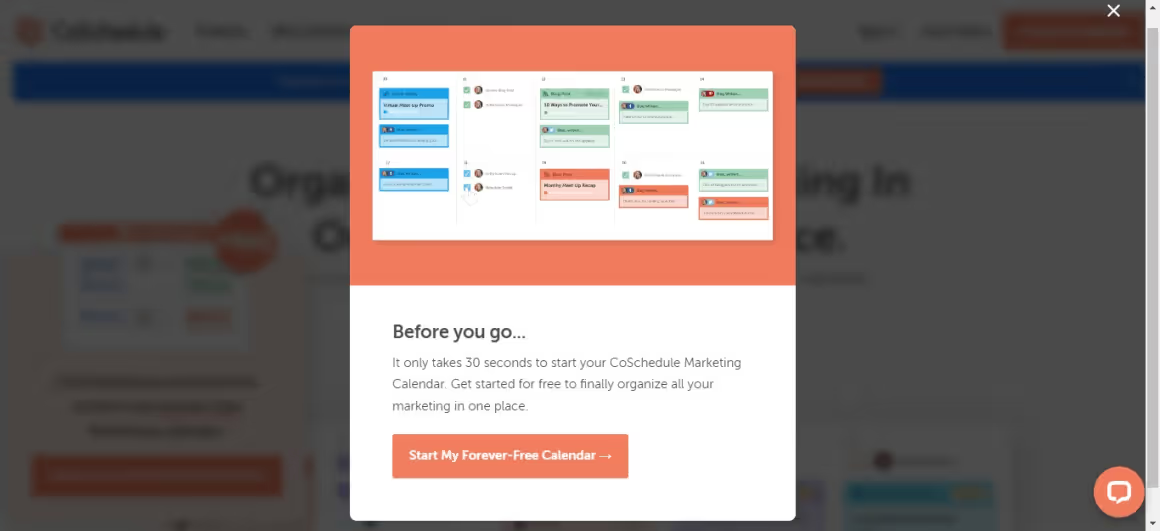
Another perfect example of exit intent pop-ups comes from CoSchedule, a SaaS product for organizing marketing operations.
It highlights its value of being a free forever product just before you click on the exit button in your browser.
The image in the pop-up and the content grabs your attention. Using a screenshot of the software does well in this example.
Great Pop-up Examples from Media and Blogs
1. The Guardian

The Guardian utilizes a pop-up banner on its landing page to raise funds.
The color of the pop-up highly contrasts with the page's colors, and the CTA buttons are visible enough to convince you to support them.
You might think its copy is a bit too long, but considering the website users who visit it to consume written content, it makes sense.
2. The New Yorker

The online media giant, The New Yorker, presents its subscription plan with a pop-up, too.
It follows unique and well-known design elements such as font and brand logo.
3. VeryGoodCopy

VeryGoodCopy is an email newsletter and blog focusing on content writing and marketing.
It shows a pop-up the minute you visit the landing page. It might be a bit too fast, but as the website's main objective is to gather email subscribers, it seems like it works.
It's a pretty big modal presenting the perks of subscribing to the mailing list. What is more appealing is the use of social proof on the left half of the pop-up. Including a photo of the owner of the quote is also convincing.
It makes the visitor believe in what value you will add to their life.
4. America's Test Kitchen

As for images, it is important to use them wisely too.
Venngage's report on visual content marketing shows that 40% of marketers believe in the efficiency of original graphic content. So it would be better not to trust stock images in your popup design.
America’s Test Kitchen shows high-quality images of faces and delicious food that would inspire an amateur cook.
Wrap Up
You are probably hesitant to use modal popups on your website because of all the annoyance they cause when used inefficiently.
But give them a chance to turn your potential customers into loyal fans of your product and decrease the bounce rate.
For a successful pop-up, consider adding valuable content to it and choose the right trigger type.
With A/B testing, you can see what works for you.
Frequently Asked Questions
What do you write on a pop-up website?
Along with the design of your pop-up, it is crucial to write appealing copy for pop-ups. It would be best if you aimed at being creative and addressing your users' intent to make them take action. Also, the message should make the users feel exclusive and personal. For example, check out Allbird's copy for the pop-up, which makes it stand out. It is hard to say no to its candid headline and the promise to be the "first" to hear about new products.
What is an example of a pop-up?
The most common example of a pop-up is the small window appearing on your screen while browsing almost every website to ask you if you accept cookies. GDPR (general data protection regulation) pop-ups generally give you two options: accepting or declining the cookies, which allows the website to store your data.
What are the types of popups?
There are several types of pop-ups based on their intent, trigger type, or the time of its popping up, such as: Time-based pop-ups, welcome mat pop-ups, scroll popups, hello bar pop-ups, exit popups, and click event pop-ups


.svg)
.svg)
.svg)
.svg)
.svg)


.svg)
.svg)


.png)


