A couple of years ago I've been to a modern art museum.
In hindsight, the art thing was a phase for me. But what I figured out later was permanent.
When I first entered the museum, my friends insisted that we join the tour. Meanwhile, I just wanted to see this one piece that was on the exhibition's posters.
I know, I know. I was straight-up pretentious.
But the thing is, I was there to see that one piece and it felt like the tour wasn't getting there.
So I left the group.
When I found the piece I was looking for (an untitled painting by Maro Michalakakos) I saw there was a label next to it that told me all I wanted to know about it.
In a matter of 2 minutes, the rest of the group arrived. And guess what happened?
The guide said exactly what was written on the label.
My point is, sometimes tours suck, and we should all be able to do whatever we wanna do while also not missing out on anything.
And that people, is what contextual onboarding is all about.
Let's take a look.
What is Contextual Onboarding?
Contextual onboarding is, as the name gives it away, the type of onboarding that takes place in a context; for example, during the initial onboarding, right after signup, and when the user clicks on a certain button. By utilizing contextual onboarding, it is possible to personalize onboarding flows without actually having to change the standard onboarding.
How, you ask?
By dividing your onboarding into bits and pieces that people can choose and put in the right order according to their needs.
But hey, we'll talk all about that in a second. Let's first answer the million-dollar question.
Why is it important?
Let me give you a list of questions that equal "why does contextual onboarding matter?"
👉 Why does getting your users to actually learn your product matter?
👉 Why do onboarding completion rates matter?
👉 Why is it important to check on users who are skipping onboarding?
The answer to all is: because you want to keep your users.
And to keep them, you need to make sure they know your product (keep in mind that 80% will delete your product if they don't understand how to use it)
But how are you going to do that?
Oh, if only there was a magical way of making sure your users wouldn't get bored learning ALL about your product. If only there was a way of keeping them interested by actually showing them what they care about.
Well, there obviously is a way. Duh, it's contextual learning.
And there are 3 reasons why it is perfect for a satisfactory user experience.
1- It meets the users where they are when they are ready
It is called contextual for a reason.
Contextual onboarding is meeting the users when and where they want to meet. And believe me, all users want something else, just like they all have their own cognitive load.
When a first-time user starts using a jack-of-all-trades kind of tool like Canva, would it be a good move to walk them through everything with a product tour?
Or is it better to ask them what they want to do before getting to the target locations on a product?
Maybe let them stray around and then explain interesting bits on the way?
A long product tour on a big product is what kills a good user onboarding experience, that's all we know for sure.
Bring the learning where they are. Turn it into a contextual experience.
2- It is short and to the point
Educational content is never fun. Not after school.
One thing contextual guidance has and a big chunky product tour lacks is simplicity in the educational content.
When the onboarding itself is to the point, it is hard to NOT keep the copy to the point. And I mean it.
If done right, contextual guidance is no longer than 7 tooltips, has a progress bar, and uses really (really) short copy.
Getting your users familiar with your product shouldn't take a novel, after all.
Really want to explain something to its core? that's what a knowledge base is for. Check out some good examples.
3- It all makes up a customized onboarding tour
What makes contextual guidance any better than a product guide?
That it is the same thing, just more digestible.
Utilizing contextual onboarding doesn't necessarily mean getting rid of your product tour. It just means dividing into meaningful chunks.
The best thing is, by doing so, you get to give every individual user a personalized experience.
"But what if they don't go through all the contextual onboarding flows?"
Well, they don't have to.
If you really want to promote a specific feature there are tons of ways for that (in-app modals, e-mails, hotspots, a knowledge base, you name it). Just don't mess up the initial onboarding UX, you can make up for it later.
Now, you're thinking, "that's cool and all, but how do I make it work?"
Let's get to that.

How does Contextual Onboarding work?
Essentially, contextual onboarding is no different from your good ol' product walkthrough. Like I said above, it's just a separated version.
In fact, contextual guidance requires the very same onboarding UX patterns a product tour would require. From tooltips to in-app modals and hotspots, it's all the same. It's just the way they are timed and placed that differs.
With a no-code tool, you can set certain requirements for a user to come across a certain onboarding flow; conditions like a user's user segment, their progress through the rest of the onboarding, and which pages in a website they visit all play a role.
But hey, let's see all that in practice.
5 Examples of Contextual Onboarding Experiences in UX
1- Ghostwriter.ai
Ghostwriter.ai, a great tool for AI-powered user targeting has quite the unique onboarding flow.
Being a fairly complicated tool, Ghostwriter.ai has a handful of features with their respective pages withing the software. Every time a user ventures into a feature page, they get a beautiful contextual onboarding UX.
Take a look for yourself.
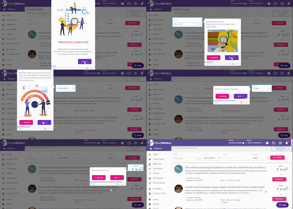

What's even cooler is that being a contextual experience, each individual guide has its own progress marker. Throw in a couple of cool gifs and the users are already learning!
2- ClickUp
I was already a fan of ClickUp before seeing how they work their contextual onboarding UX, but now I am in love.
Here are two cool instances of contextual onboarding.
When a Clickup user keeps skipping onboarding, they are prompted with this genius overlay window:

The other good instance is this overlay window that is triggered if a user is not using a specific feature that might be useful to them:

The onboarding not only looks into user segments but also the features each user utilizes and with what frequency. Brilliant.
3- SendGrid
Keeping it original, SendGrid uses a beacon and a hotspot to let users know of a new feature.
Rather than announcing it with a big overlay window on the main page, they go wait for the hands-on part of the user experience to make sure it is in context.

What all of us should be thriving for, no?
4- Evernote
Evernote is known for its cool onboarding UX as it is, but looking at the flow closer especially on the mobile version, it is safe to say that they went for a contextual experience.
Evernote makes good use of empty states as well as free onboarding UX, but every now and then they use tooltips as well.
And they are perfect for getting new users to try out the entire tool.
This one for example, appears when the user opens the bar below. With no progress marker, the user is given confidence that it won't take much time so it is easier to learn.

5- Flourish
Flourish makes use of a great onboarding UX pattern that has become popular recently, and magically, it turns the user experience into a contextual one.
I'm talking about checklists.
By inserting interactive guides into the onboarding checklist, Flourish lets new users decide what they want to learn first. Because each guide is a separate onboarding UX, users have no trouble focusing.

Now, I bet you are pretty much inspired to try your hand at contextual onboarding yourself.
"But how?"
Practically, we know how contextual onboarding UX works but how does it come to life exactly?
With a lot of code.
That is, if you don't have a good no-code tool. Well, I know one.
And, how do I do it with UserGuiding?
A contextual onboarding flow is easy peasy lemon squeezy as long as you have a good no-code tool, like UserGuiding.
After signing up, it takes three easy steps to create a contextual onboarding, however long or short it is.
Let's take a look.
1- Create a guide
Let's say your contextual onboarding flow is an in-app modal that appears when users scroll through your main page on your website.
Don't let it intimidate you, it's actually pretty easy with UserGuiding.
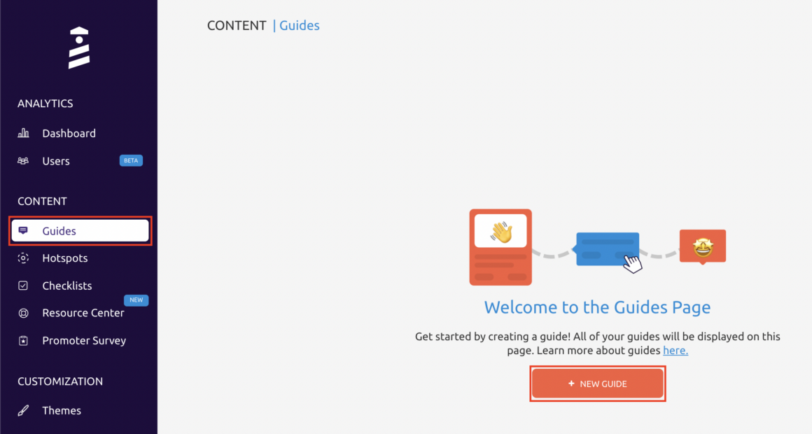
Go to the “Guides” tab on UserGuiding and click on the “New Guide” button.
After typing in your website you are ready to start.
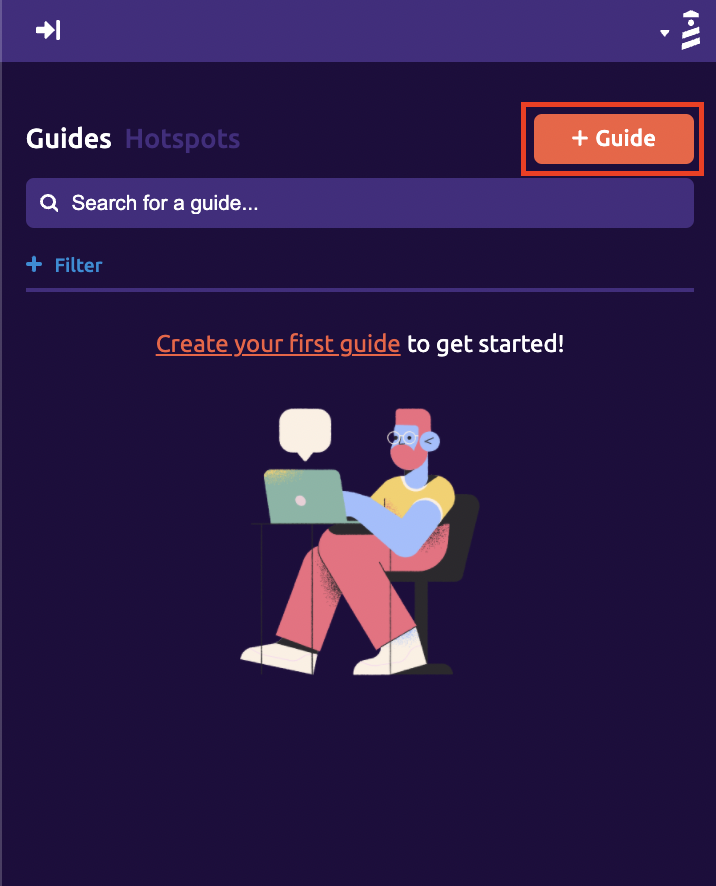
On the sidebar that appears on the website, click on “+ Guide” to start.
2- Pick and customize
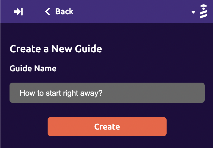
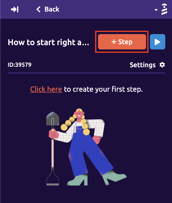
Name your guide and click on the “ + Step” button to pick the UX pattern you want to use.
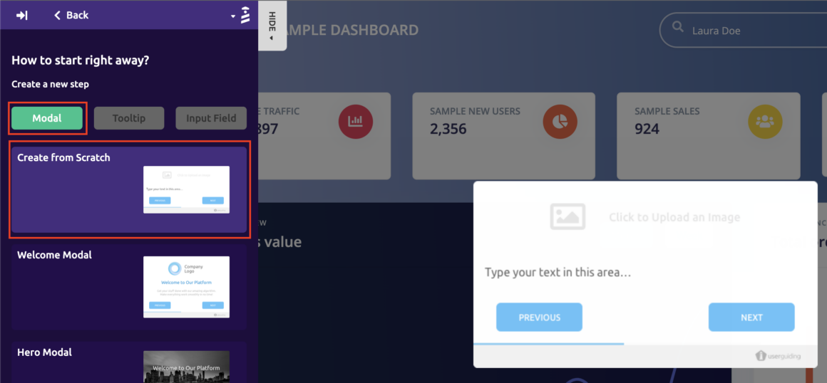
Click on the “Modal” button and pick the onboarding UX/UI pattern on the list. Anything from welcome modals to hero modals and other overlay windows. You choose.
If you want to, you can add different steps to spice it up or leave it as it is.
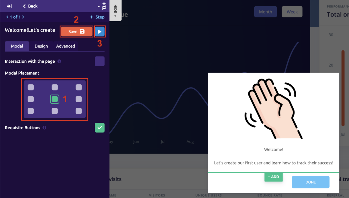
Pick the modal placement and save your progress. You can always preview it by hitting the play button.
3- Save and publish
Finished customizing? Time to do the settings.

Find your new guide and click on the Settings button.
To actually make it contextual, there are some other settings you can use depending on how targetted you want your UX pattern to be.
👉 You can easily choose the target locations you want the guide to appear on,

👉 The audience segment you want to show the guide,

👉 You can choose whether you want your guide to be triggered automatically or when a specific action is performed,

👉 Or you can schedule your guide to appear.

After adding your container code to the settings, your guide will be activated.
And you're good to go.
If I know code at all - and I do know a thing or two - that was hours' worth of coding. Days, if your developers aren't experienced.
5 minutes with UserGuiding. Give it a try (for free).
Conclusion
The future of onboarding UX is contextual onboarding.
As the human attention span keeps getting shorter and shorter, there is just no point in forcing a walkthrough onto your users. Let them access the knowledge in contextual locations and times, you will see the benefits.
Now go put them guides where they belong!


.svg)
.svg)
.svg)
.svg)
.svg)


.svg)
.svg)


.png)


