


.svg)
.svg)
.svg)
.svg)
.svg)


.svg)


.svg)
.svg)

Tooltips are everywhere for those who are paying attention.
However, when we see them all the time, they can easily blend into the background, and we start to overlook their importance and value. Eventually, it becomes harder to distinguish between effective tooltips and those that are poorly designed.
In this article, we’ll…
- explore the most common use cases for tooltips,
- analyze real-world examples of successful implementations, and
- provide insights that you can use to improve your own tooltips.
Let’s get started and learn how to create tooltips that truly make a difference!
TL;DR
- A tooltip is a UI element that looks like a small box and contains informative texts, and sometimes visuals, about another UI element or a product feature.
- Tooltips can be used for:
- Explaining product features or functions.
- Offering additional information to users without making the UI crowded.
- Creating onboarding flows, such as product tours.
- Explaining error messages and offering solutions.
- Improving data input accuracy for forms, surveys, etc.
- Announcing new features and promoting under-used features.
- Solving potential problems before they occur through providing inline help.
- Communicating user insights, statistics, and motivational prompts.
- Encouraging upsells, add-ons, and certain user actions.
- Enhancing accessibility and explaining icons/symbols.
- Indicating user progress and status.
- Improving gamification.
- Informing the user about discounts, campaigns, or promoting certain plans.
- You can create all these types of tooltips with UserGuiding in just a few minutes —no coding or long tutorials are required!

What are tooltips?
Tooltips are compact, contextual elements that provide users with information, guidance, or prompts when interacting with an interface. They increase usability and reduce user confusion.
Here’s an example tooltip:
As you can see in this example, a tooltip pops up to offer additional information without interrupting the user’s navigation. It highlights the capabilities of the comparison feature and includes examples of what can be compared, offering clear guidance.
22 Inspiring Tooltips Examples for Different Use Cases
Tooltips are highly versatile UI elements that serve multiple purposes across different domains. Here are some of the most common use cases and well-implemented real-world examples 👇🏻
Tooltip Use Case #1: Explaining Features or Functions
💡 According to statistics, 55% of customers would stop using a product or service they don’t understand.
Even if your users come to your product with a specific use case or a need –and they’re aware of your product’s capabilities and promises– they can still face difficulties and adoption barriers.
Sometimes, your product is less self-explanatory than you assume it is…
Plus, in most cases, users are not aware of your product's full potential, which means you need to introduce and explain the features/tools for them to see its value.
1. Tooltip Example from Flowla
Flowla is a sales enablement tool that is widely used by sales, customer success, and revenue teams to create digital customer journeys and boost sales.
Here’s one of their many tooltips:
In this example, Flowla shows the user where to find the editing and previewing modes and how to change between them. Although the “Edit” and “Preview” buttons might seem self-explanatory, they can be hard to detect at first glance.
Thus, Flowla highlights and introduces them right at the beginning, once the onboarding tour is finished and the user is ready to start creating their journeys.
✅ What’s good in this example?
- It doesn’t assume the user sees every UI button and knows their meaning.
- Good copy formatting: 2 paragraphs/sentences for 2 buttons –easy to read.
- Creative CTA button.
❌ What’s -not really- good in this example?
- This tooltip is the last step of the onboarding tour and setup, so the title fits that context. However, as a standalone element, it may confuse users who skip the checklist order, so the title could focus more on editing and previewing features.
⚡ Flowla increased its user activation rates by 24% by adding tooltips and a product tour into the onboarding process.
👉🏻 Read Flowla’s success story here.
👉🏻 And start your free trial with UserGuiding here to create your very own tooltips!
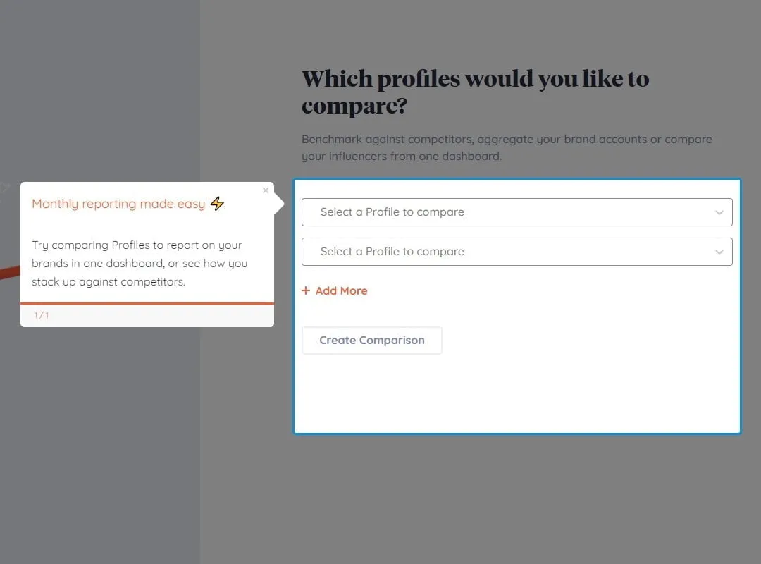
2. Tooltip Example from Keyhole
Keyhole is a social listening and influencer marketing platform that helps you measure and monitor the success of your marketing campaigns.
Here’s how they use tooltips:
Keyhole knows that in order for its users to see the full value of its product, it needs to make sure that the users link and track their social media accounts. But it can be too big of a commitment for some users…
So, Keyhole uses a tooltip to encourage users and explain what they can achieve once they’ve taken the step and linked their social media accounts.
✅ What’s good in this example?
- Clear value proposition.
- Good copy formatting with bolds, different color titles, and emojis.
❌ What’s -not really- good in this example?
- Absolutely nothing!
👉🏻 Read Keyhole’s success story here.
👉🏻 And start your free trial with UserGuiding here to create your very own tooltips!
Tooltip Use Case #2: Reducing Cognitive Load
Tooltips are small, valuable information boxes that ensure smooth and contextual guidance for your users right inside your product. Plus, as they display information only when needed, they keep the interface clean and user-friendly.
They do not intimidate and scare away the users, like lengthy instructions and product documentation. Even if they provide the same information at the core, tooltips present it in a more digestible, sympathetic way.
(In most cases, anyway.)
3. Tooltip Example from Upwork
Upwork is a popular online freelancing platform that connects businesses with independent professionals and freelancers.
Given its professional nature, the platform has many screens, forms, and features.
One might even say too many.
However, to enhance the UX and prevent potential frictions, Upwork provides explanatory tooltips for almost all of these features, forms, and screens.
Here are some of them:
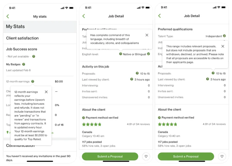
Here, you see two different screens: the first displays a tooltip from the personal account statistics page, which highlights metrics like success rate, earnings, and badges. The second screen (tooltips 2 and 3) showcases a job opening details page.
Each category includes tooltips that activate when users click or hover over the relevant UI elements. These tooltips include information such as definitions, explanations, and useful examples.
✅ What’s good in this example?
- The hover-triggered tooltips let users access information precisely when they need it.
- Relevant and explanatory copy.
❌ What’s -not really- good in this example?
- There is no formatting in the copy: no list, bold, or title usage whatsoever.
- Too much information in one tooltip. Tooltips should be short and easy to digest.
4. Tooltip Example from Canva
Canva, one of the most popular graphic design tools, uses tooltips to tuck away helpful details that aren’t always needed, keeping the interface clean but still easy to understand.
Like this:
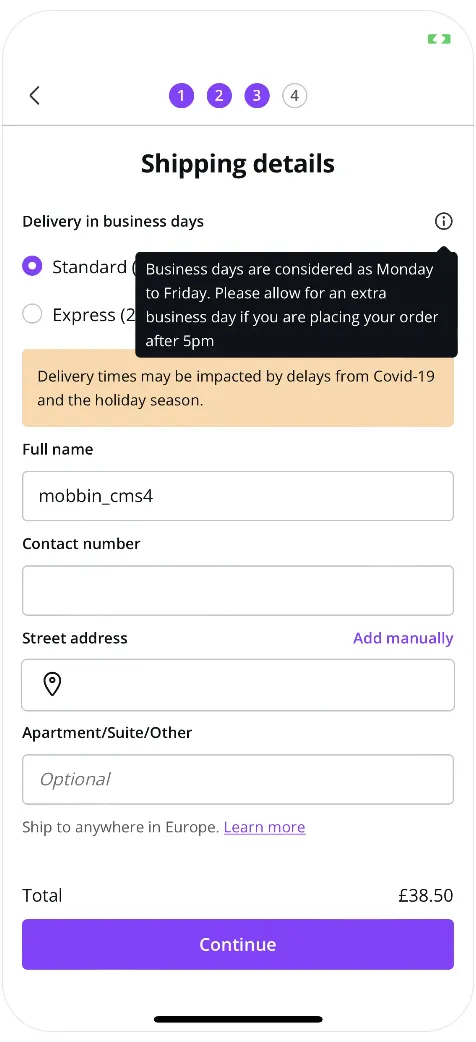
Here, you see the shipment and delivery screen for print designs. Next to the “business days” expression, there's a hover-over tooltip that explains what days and hours are considered “business days”.
While “business day” is generally a clear term, some users might wonder if it ends at 6 PM or whether Saturday counts. To avoid confusion, Canva includes a tooltip to clarify.
After all, we're only human, and it’s easy to make assumptions or forget details.
A small reminder like this helps prevent misunderstandings.
✅ What’s good in this example?
- Clarifies any potential confusion and sets a clear standard.
- Ensures that the user calculates the estimated delivery time correctly based on the time they place their order.
❌ What’s -not really- good in this example?
- Nothing!
Tooltip Use Case #3: Guiding Users Through Onboarding
One of the most common uses of tooltips is for user onboarding and product tours. Their informative, contextual, and concise nature makes them the perfect UI element for providing step-by-step guidance during a user’s first interaction with a product.
💡 Yet, you need to be careful while using tooltips and creating product tours or onboarding flows. Because according to studies, a complicated onboarding process will drive 74% of potential customers away.
Here are some good examples we can learn from when it comes to using tooltips for onboarding purposes 👇🏻
5. Tooltip Example from Todoist
Todoist is a task management tool that enables you to create to-do lists, set reminders, and prioritize projects.
While the tool has a very user-friendly and intuitive interface, it doesn’t assume the user is already familiar with task management tools. Instead, it provides a thorough onboarding process to guide and educate them every step of the way.
Here are some tooltips from Todoist’s onboarding:
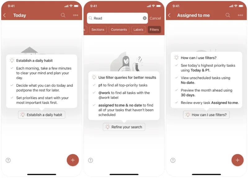
Todoist takes user onboarding and education seriously.
Rather than offering a generic product tour, it provides a series of detailed tooltips that explain each feature. As shown here, each tooltip includes pro tips and shortcuts, highlighting the advanced capabilities of the relevant feature.
✅ What’s good in this example?
- Well-formatted copy with titles, icons, bullet lists, and bolds.
- Practical and advanced tips that show the full potential of the features.
❌ What’s -not really- good in this example?
- The onboarding flow doesn't have a set sequence linking the tooltips together. If users don't follow a specific path, some features and tooltips might not make sense to the user.
6. Tooltip Example from Meetup
Meetup is a platform where you can find social events, gatherings, activities, or local groups to meet and connect with like-minded people.
Here’s the platform’s onboarding tour:
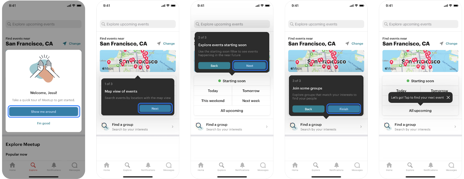
As you can see, the tour begins with a welcome screen (which has very original and engaging CTA buttons, by the way) and then continues with tooltips.
Each tooltip has a title and then a short explanation or a value proposition. There’s also a progress bar and an option to go back, in case something doesn’t click right away.
Additionally, beyond the initial product tour tooltips, there are tooltips for UI buttons and features that weren’t covered in the tour. This way, even if the tour doesn’t go over every UI element, users are still presented with helpful tooltips later on.
✅ What’s good in this example?
- Friendly and engaging tone.
- Short and to-the-point product tour (and tooltips) that doesn’t bore the user by going over every UI element.
- Good use of colors –contrasting and eye-catching!
❌ What’s -not really- good in this example?
If we were to find a flaw, it would be the lack of an exit icon on the tooltips during the product tour. However, since the tour only consists of three steps and there's a progress bar, so it’s not that big of a deal, actually…
Tooltip Use Case #4: Explaining Error Messages
Another time we see tooltips is when an error occurs. Tooltips can be used to provide more details about why an error occurred and how to fix it.
7. Tooltip Example from Duolingo
Duolingo, the language learning platform, uses a tooltip to explain a very common error: an already-taken username:
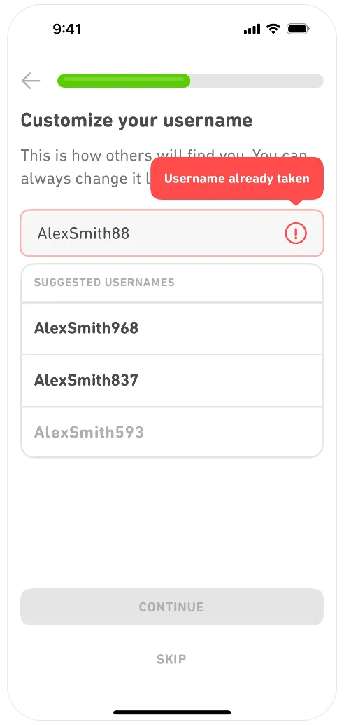
There can be several reasons for a username not being accepted:
- It might be too short or too long.
- It might contain special characters.
- It might already be used by another user.
And they all require a different action to solve the issue.
If the user doesn’t want to use the autogenerated usernames by the product, then she needs to know what is wrong with the username they’ve chosen and how they can fix it.
That’s why this tooltip is important and useful.
✅ What’s good in this example?
- Brand-aligned and eye-catching design.
❌ What’s -not really- good in this example?
- Nothing, as there’s not much to praise or criticize about this tooltip.
Tooltip Use Case #5: Improving Data Input Accuracy
Another way to guide users through errors is by preventing them from happening in the first place by explaining what should be entered in each input box.
You can use tooltips to assist users in correctly filling out forms and offer context-sensitive tips.
8. Tooltip Example from N26
N26 is a German bank, and here’s the screen you see when you open a bank account and apply for a physical card:
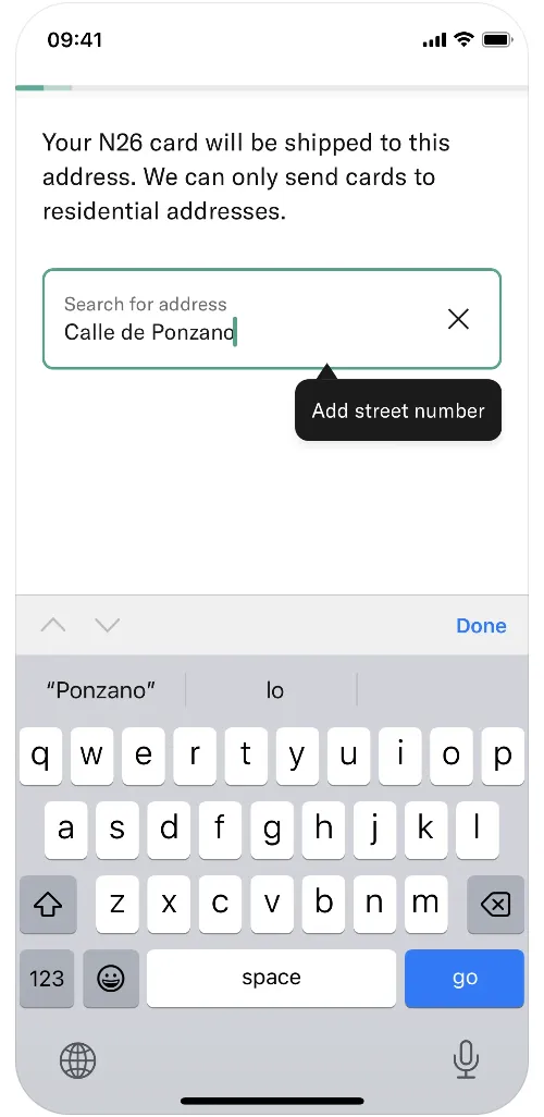
Bank cards are official documents that can't be sent just anywhere or delivered to everyone.
You need to provide a valid, accessible address and collect the card personally. In other words, if you enter an incorrect address and the delivery company can't find it, you'll waste your day waiting at home…
These addresses are also crucial for the bank to standardize and track customer information.
To assist you, the shipping company, and to maintain a standardized system for managing customer data, N26 prompts users to provide any missing address details, such as the street number.
✅ What’s good in this example?
- Encourages the user to add the missing details.
❌ What’s -not really- good in this example?
- There could be an example address input within the brackets.
9. Tooltip Example from Wolt
Wolt is a food-delivery company that operates in many different countries, and here’s their payment details screen:
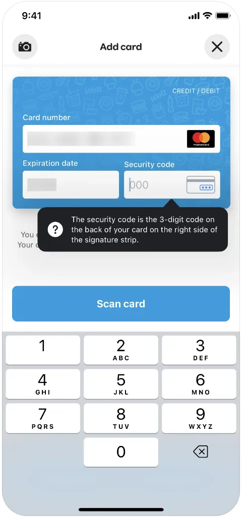
Like many shopping websites that aim to prevent frustration when entering card information, Wolt provides clear directions on where and how to find the security code.
We enter the security code every time we input our card details, yet most of us still pause for a split second, wondering what it was, every time we see the empty box—let's admit it...
✅ What’s good in this example?
- A very clear description of where to find the security code.
❌ What’s -not really- good in this example?
- The security code is often referred to as CVC or CVV. The tooltip could include these abbreviations for users who are familiar with them.
Tooltip Use Case #6: Highlighting Hidden Features
You can use tooltips to draw attention to your lesser-known feature or to announce and promote your newly added features in the interface.
Tooltips are especially handy when you want to boost engagement for a feature that isn’t a major release or standalone update that requires shiny, potentially distracting announcement modals.
10. Tooltip Example from Etsy
Etsy is an online marketplace that allows individual sellers to create storefronts and sell a wide range of products.
Here’s how they use a tooltip to announce a new feature:
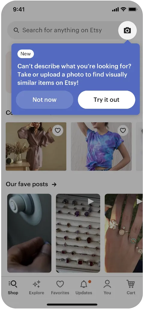
As you can see here, Etsy introduces its new search-by-image feature by dimming the background and highlighting the camera icon, which represents the new feature.
A “new” icon on the tooltip ensures the user understands that this is a completely new feature, not just an enhancement.
The tooltip’s copy is friendly and relatable, helping users connect with the problem the feature solves. Additionally, the tooltip encourages users to try out the new feature with a CTA button.
✅ What’s good in this example?
- Resonating and original announcement copy.
- CTA to motivate the user to engage with the feature.
- Background dimming and the “new” icon really catch the attention.
❌ What’s -not really- good in this example?
- Not. A. Single. Thing. 💯
11. Tooltip Example from Notion
Another example of a new feature announcement tooltip comes from Notion, the productivity and note-taking platform that many of us have used (or are still using) at some point in our lives.
Unlike Etsy, Notion doesn't dim the background to highlight its new feature. Instead, it frames the feature with a shiny, pulsating border.
Also, when you put a black tooltip on a white background, you do not really worry about grabbing the user's attention with a dimmed background —the tooltip naturally stands out
✅ What’s good in this example?
- Eye-catching color contrast in the tooltip and shiny frame around the feature.
❌ What’s -not really- good in this example?
- Some of the use cases and/or customization possibilities could be mentioned in the tooltip as an example.
Tooltip Use Case #7: Providing Inline Help
Tooltips can be used to answer potential questions and/or clarify certain UI elements and concepts that can be new to the user.
By providing immediate help within your product, you prevent users from leaving the app to search for answers or contact support. Let’s face it – most people won’t return to a product if they can’t find what they need right away, and they’re not likely to reach out to support unless absolutely necessary.
Once a user leaves due to confusion, it might be the last time you see them...
So, now do you see why it’s so important to offer the help they need directly within the product?
12. Tooltip Example from Vivid
Vivid is a modern banking startup that offers financial services through a mobile app. They distinguish themselves from traditional banks with features like immediate cashback and rewards.
And here’s how they clarify these concepts to their customers with a tooltip:
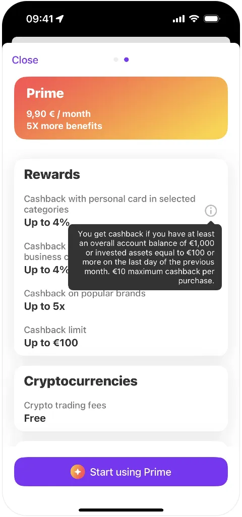
Tooltips like this are crucial for managing user expectations, especially when a feature involves specific criteria and limits, such as Vivid's cashback program.
Without in-app reminders, users may feel misled if they forget the terms they agreed to during account setup, potentially leading to frustration or mistrust.
By using tooltips to explain the conditions and caps on cashback rewards, Vivid preempts confusion and ensures transparency. This approach helps users feel informed, reduces the likelihood of misunderstandings, and maintains trust in the service.
✅ What’s good in this example?
- Very explanatory and answers all the potential questions a user might have.
❌ What’s -not really- good in this example?
- While the tooltip isn’t overly wordy, its sentence structure might make it harder to grasp at a glance. To enhance readability and ensure quick understanding, the content could be broken down into shorter sentences or presented in a list format.
13. Tooltip Example from Thrive Market
Thrive Market is an American organic food delivery company.
Here’s how they introduce and explain their “Smart Pick” feature to their new users:
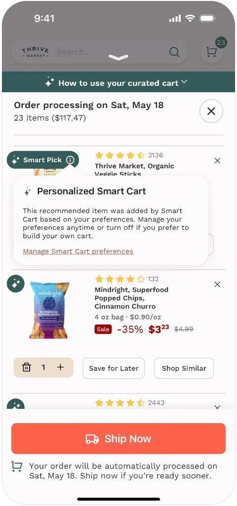
Smart Pick is a personalized product recommendation feature that adds items to the users’ carts based on their previous purchases, shopping habits, and preferences.
While it can be an amazing and very time-saving feature for some users, I think you can see how problematic and frustrating it can be for others to see items in their carts that they did not add.
So, in order not to frustrate users with surprise items on their carts, Thrive Market provides a tooltip explaining the feature to the users.
The tooltip also includes a hyperlink to the related settings page, where users can change their preferences about the feature and opt out of receiving personalized item suggestions.
✅ What’s good in this example?
- Transparent and explanatory tooltip.
- Hyperlink to the settings page.
❌ What’s -not really- good in this example?
- In addition to the hyperlink, there could be a CTA button for quick turn-off.
Tooltip Use Case #8: Offering Usage Metrics or Insights
Tooltips can be a powerful way to share actionable statistics with your users. By displaying insights derived from their actions or usage data, you help users understand their engagement and progress.
Additionally, you can inspire new users by showcasing potential achievements based on data from others. This approach not only informs but also motivates the users to further engage with your product.
14. Tooltip Example from Thrive Market
Here’s another tooltip example from Thrive Market that fits this use case:
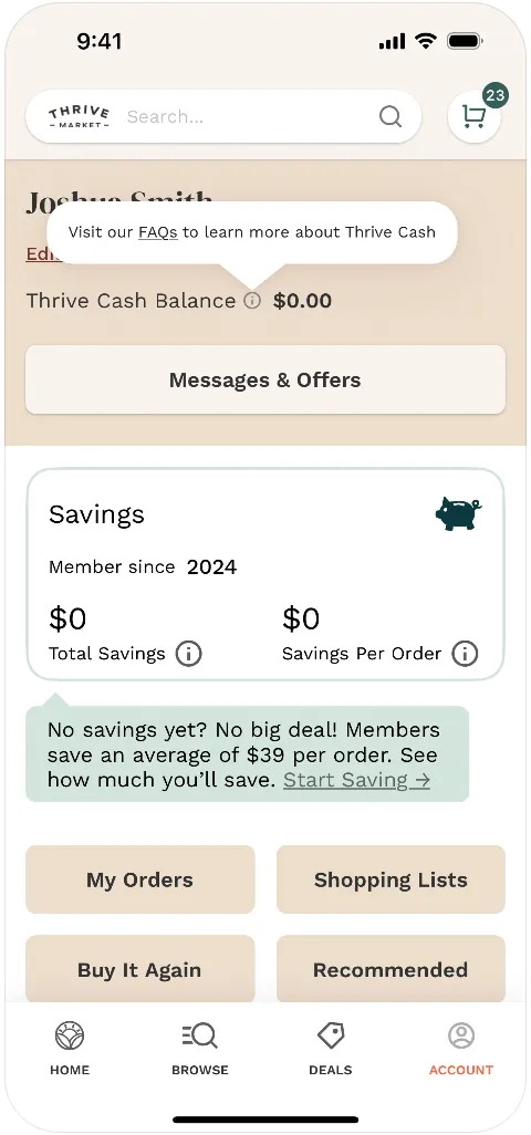
One of Thrive Market's most important features and promises is the Savings. But it’s tricky to keep a new user when they haven’t saved much –or anything at all, yet.
To keep new users engaged and excited about the product, Thrive Market leverages the power of social proof and tangible benefits. By showcasing data on how much existing customers save with each order, Thrive Market not only demonstrates the value of their service but also motivates new users to stay and experience those benefits for themselves.
This data-driven approach helps build trust and keeps potential customers intrigued by what they stand to gain 📈📈
✅ What’s good in this example?
- Friendly and motivating tone.
- The statistics set realistic expectations for users and encourage them to continue using the product.
- The hyperlink takes the user to a more detailed and explanatory page.
❌ What’s -not really- good in this example?
- This time, nothing.
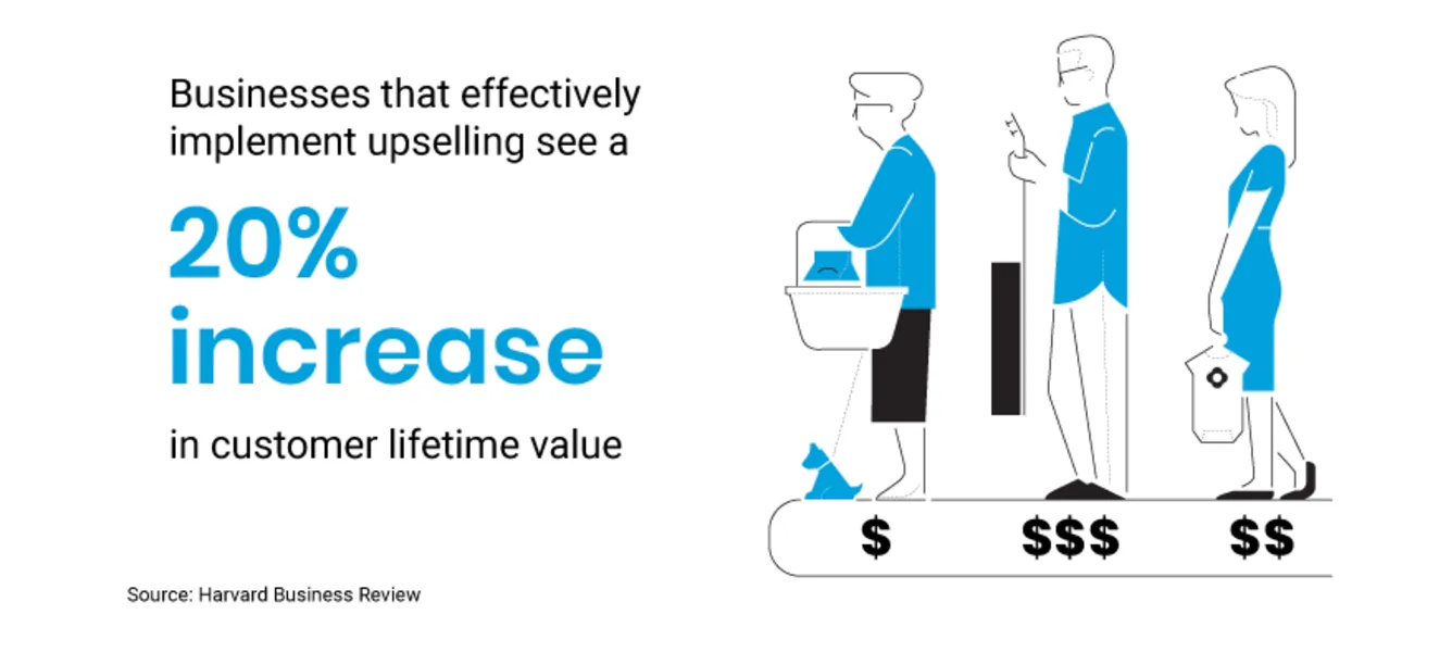
Tooltip Use Case #9: Encouraging Action or Upselling
You can use tooltips to encourage users to take action, such as trying out a premium feature or getting an add-on based on their usage pattern and needs.
Studies say that the right upselling strategies increase the customer lifetime value 👇🏻
15. Tooltip Example from Spark Mail
Spark Mail is a productivity-focused email service that organizes emails with features like smart inbox, and tools for collaboration, such as shared inboxes and drafts.
And here’s how they promote their premium email prioritization feature with a tooltip:
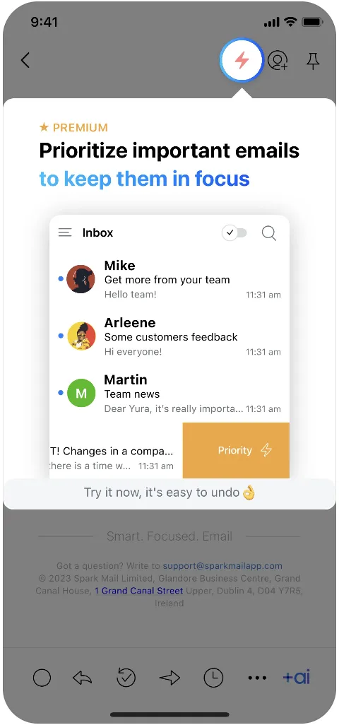
The tooltip uses a visual example to show how the feature works, instead of just explaining it with text. Plus, it’s paired with a bold, colorful title and a motivational CTA, making it more design-focused and eye-catching than your typical text-heavy tooltip.
✅ What’s good in this example?
- Draws a lot of attention with the dimmed background and the big, colorful title.
- Incorporates visuals.
- Motivates and reassures the user at the end.
❌ What’s -not really- good in this example?
- Absolutely nothing.
16. Tooltip Example from Ofo
You can use tooltips to encourage certain actions other than upgrading or purchasing an add-on, as well. Like, parking in a certain area 👇🏻
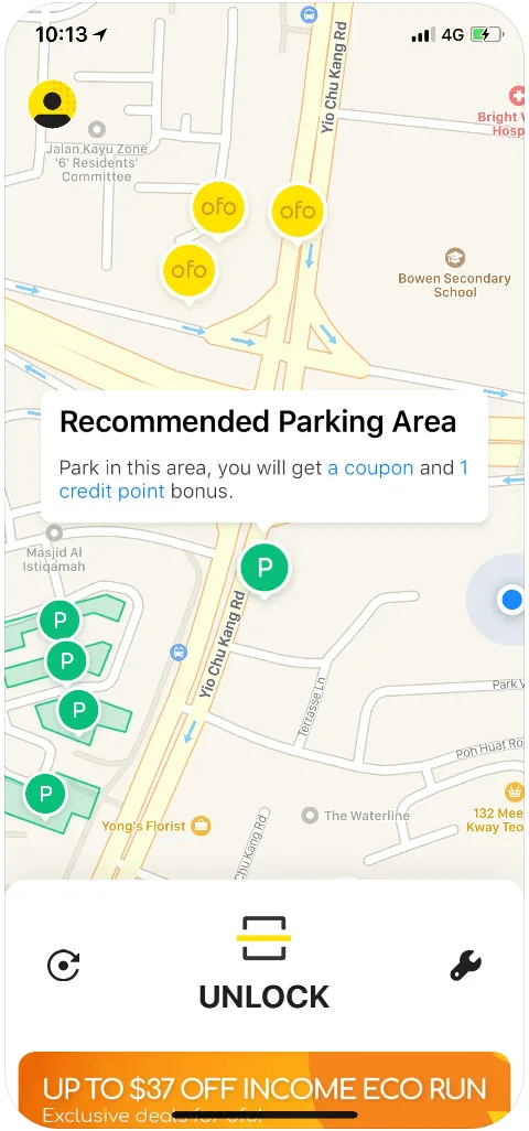
Ofo was a dockless bike-sharing system where users could rent bikes using a mobile app, without needing to return them to a fixed station.
Although the company does not exist anymore, they had a good tooltip, so, why not talk about it, right?
To make Ofo more accessible in crowded areas, the app recommended specific parking zones for users to return bikes. To encourage people to park in these areas, Ofo offered coupons and credit points, making it more rewarding for users.
The app used tooltips to remind users about these incentives.
✅ What’s good in this example?
- Tangible motivation to take the encouraged action.
- Hyperlinks providing detailed explanations of how the coupons and credits work.
❌ What’s -not really- good in this example?
- It’s a good and plain tooltip.
Tooltip Use Case #10: Enhancing Accessibility
Tooltips don’t always have to be elaborate or packed with marketing messages.
They can simply serve as straightforward labels, offering brief descriptions of a feature or UI element for accessibility purposes. Their main goal is to make interfaces more intuitive and accessible to all users, especially those with disabilities, without distracting from the main content.
These simple tooltips can enhance user experience by providing clarity without overcomplicating the design or product messaging.
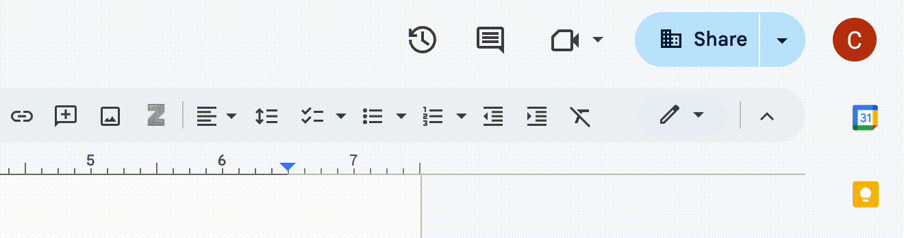
17. Tooltip Example from Google Docs
Even widely recognized icons can sometimes leave users guessing, especially if they're unfamiliar with the software or just tired...
That’s where tooltips come in —they provide a simple, helpful cue about the function of a feature without overwhelming the user. For example, when using Google Docs, you don’t need a lengthy explanation about why you should indent a paragraph; you just want a quick reminder of which icon does that.
✅ What’s good in this example?
- Simply reminds/informs the user with no fluff or design.
- Gives the shortcuts, if available.
❌ What’s -not really- good in this example?
- Nothing.
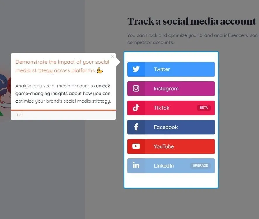
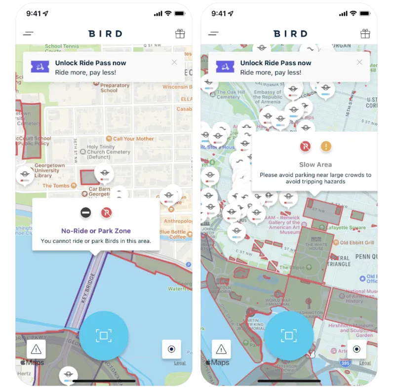
18. Tooltip Example from Bird
Bird is an electric bike and scooter sharing system (that still exists, unlike Ofo).
And here’s how they use tooltips to enhance accessibility for their users:
Bird, like many other transportation vehicle-sharing platforms, has specific rules and recommendations for where users can park their vehicles. To make it easy for users to understand where they can and cannot (or should and should not) park, Bird uses a color-coded map system.
This visual approach helps users quickly identify authorized parking zones and avoid parking in restricted areas. However, this system might not be very intuitive and meaningful for first-time users.
Thus, Bird uses tooltips to explain the system and the meanings of the different color areas and icons on the city map.
✅ What’s good in this example?
- Tooltips explain both the icons and the colors on the map.
- Clearly distinguishes between rules and recommendations for parking.
❌ What’s -not really- good in this example?
- An exit icon on the tooltips could improve the UX. Clicking outside the tooltip to close it, especially on a map, can feel awkward and might unintentionally take the user to a different part of the map.
Tooltip Use Case #11: Indicating Progress or Status
Tooltips are an effective way to inform users about the progress of their actions or the current status of a task. Whether it's the completion of a form, an ongoing download, or the progress of a process, tooltips can give real-time updates.
19. Tooltip Example from Duolingo
Duolingo uses a tooltip to show the next streak milestone on the calendar to show how the user is progressing and also to motivate them to continue:
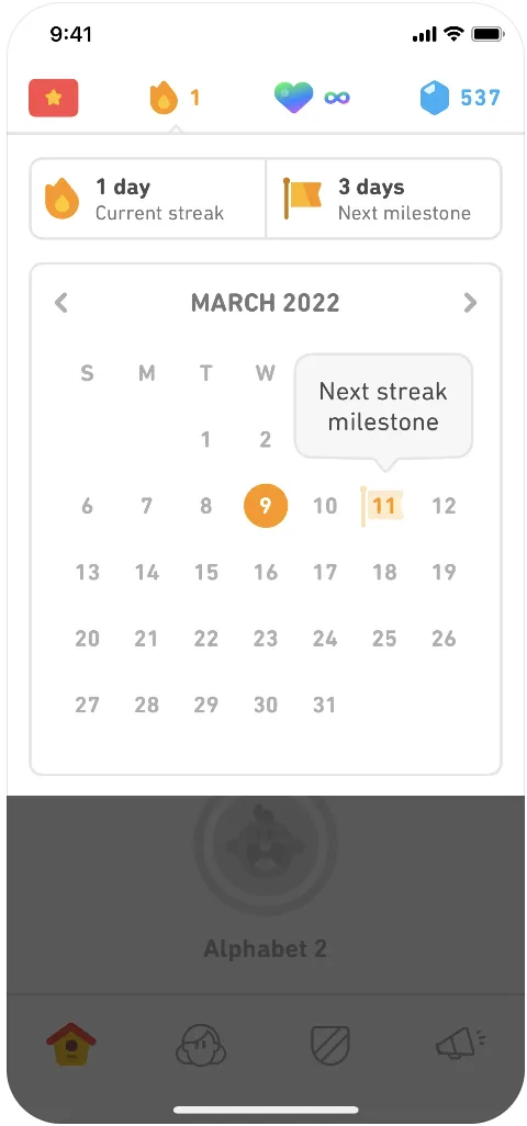
Streaks are a big motivator for many Duolingo users, driving them to study daily and stay engaged with the app. This gamification feature makes learning feel more rewarding and helps users stay consistent.
However, when you're just starting out, streaks don't feel as important since there's little to lose. As your streak grows, though, it becomes more meaningful.
To help users get to that point, Duolingo actively encourages them to keep going by showing their next streak goal on the calendar. By seeing this on the calendar, the streak feels more real and closer.
✅ What’s good in this example?
- Informs the user about their progress.
- Motivates to further engage with and use the product.
❌ What’s -not really- good in this example?
- Nothing.
20. Tooltip Example from Instacart
Instacart is a grocery delivery and pick-up service. Additionally, Instacart offers a membership program called "Instacart+," which provides benefits such as free delivery on orders over a certain amount and reduced service fees.
Here’s how Instacart uses tooltips to showcase the tangible benefits of Instacart+:
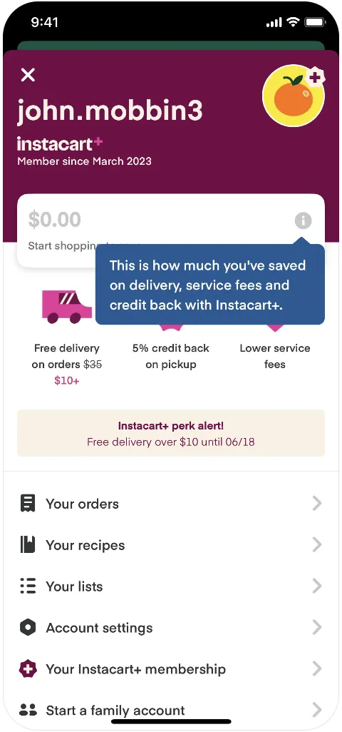
Instacart+ is designed to deliver value through its promise of free delivery on orders above $35, helping users save on delivery and service fees.
To keep track of these savings and highlight the benefits of the subscription, the app prominently displays a balance on the main page that shows the total amount saved from previous orders. As this balance grows with each purchase, users are reminded of the ongoing value they receive from their membership, which helps reinforce their decision to continue using the service.
And Instacart uses a hover-over tooltip to verbalize this value to the user.
✅ What’s good in this example?
- Constant -but not distracting- value reminder.
❌ What’s -not really- good in this example?
- A motivating CTA, like the one in the Thrive Market tooltip, could be included for those with zero balance.
Tooltip Use Case #12: Improving Gamification
Tooltips can enhance gamification by guiding users toward milestones or rewards and providing timely tips or reminders about achievable goals.
21. Tooltip Example from Duolingo
Here we are, with another tooltip from Duolingo (the last one, I promise).
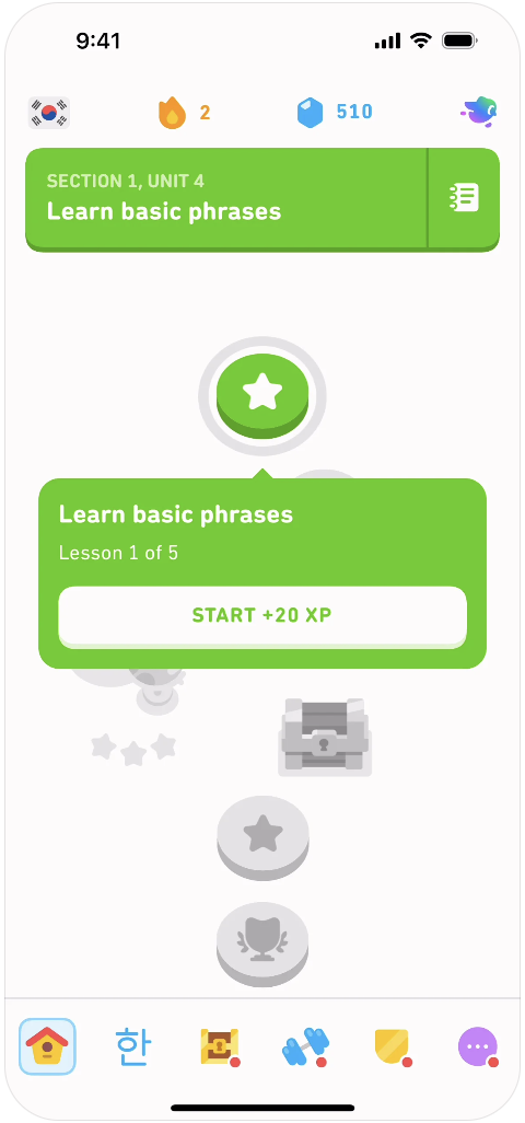
Although Duolingo's subject prioritization and example sentences are sometimes critiqued, no one can deny the brilliant structure of its courses. With units, sections, and lessons divided into neat categories, every small accomplishment gives you that sweet sense of achievement.
Plus, there's the fun, unlockable course map that visually represents your progress.
Duolingo gives its 110% when it comes to gamification; we’ve already talked about that.
But Duolingo doesn’t leave things up to chance when it comes to reminding you of your progress. It doesn’t just hope you remember your XP or how many lessons you need to finish to unlock the next icon.
Nope.
Tooltips are there to gently nudge you along, reminding you of the XP you’ll earn when you complete a lesson and how many lessons stand between you and the next section.
So, yeah. Tooltips are a key player in Duolingo’s gamification strategy.
If you’re interested in other examples of gamification, let’s take you here 👈🏻
✅ What’s good in this example?
- The title of the next course is the title of the tooltip.
- The gamified motivation (XPs) is a clickable CTA that takes you to the lesson.
- There’s a progress bar stating how many lessons are before the next section.
❌ What’s -not really- good in this example?
- Again, nothing…
Tooltip Use Case #13: Contextual Marketing
Tooltips are useful for promoting certain plans, campaigns, coupons, and such, as well.
A good example of contextual marketing through tooltips is when websites use them to notify users about seasonal promotions or flash sales, ensuring they don’t miss out on time-sensitive deals.
Additionally, tooltips can be used to encourage sign-ups for premium plans or memberships, providing details about exclusive benefits.
22. Tooltip Example from Brainly
Brainly is an AI-powered homework help platform, and here’s their upsell encouragement tooltip:
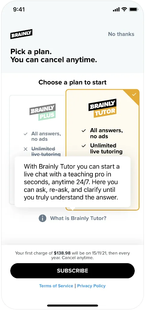
As you can see here, Brainly uses a tooltip to highlight its premium plan and features. The tooltip not only explains the included capabilities of the premium plan but also really stresses the value it offers to the customer.
“Ask, re-ask, and clarify until you truly understand the answer.”
The tooltip pops up right on the plans and subscription screen, which is perfect timing. It keeps the excitement alive and gives that little extra push to consider the higher-tier plan.
✅ What’s good in this example?
- Convincing value proposition.
- Great timing and placement.
❌ What’s -not really- good in this example?
- There could be some formatting (bolds, italics, etc.) or even emojis to increase the dramatic effect of the value proposition.
To Wrap Up…
There are several ways you can use a tooltip.
If you want to start using tooltips for one (or more) of the purposes we’ve covered so far, with a no-code tool like UserGuiding, you can have your tooltips up and running in minutes —no coding experience required!
Whether you want to create product tours, announce new features, or offer advanced tips, UserGuiding lets you design any type of tooltip. From buttons and hyperlinks to visuals, you can easily customize your tooltips to fit your needs.
Frequently Asked Questions
What is an example of a tooltip?
A tooltip is a UI element that provides contextual information and guidance to the user. It typically appears when the user hovers over or clicks on a specific UI element or feature. Tooltips can offer various types of content, such as advanced tips, explanations for settings, promotional codes, or value propositions. They usually consist of plain text but may also include visuals, buttons, or hyperlinks. The design and complexity of a tooltip can vary depending on its specific use case.

.png)


