
Have you ever had the experience of using a new product, but having no idea what to do?
It can be a frustrating feeling. You see value in the product and are excited to use it, but it's just not clear how to get started.
More often than not, users in this situation will end up churning. We've all done it!
So how can you save your product from succumbing to this unhappy fate? 🤔
You do that by adding a user onboarding checklist that explains which steps a user needs to take, and in which order.
But how do you build such a checklist? What needs to go into it? What should it look like?
That's what we'll discuss in today's article.
TL;DR
- A user onboarding checklist is a short list of tasks that new customers need to complete in order to become active product users.
- They're essential for SaaS companies because they help new users learn the ropes, engage with the product, and get retained for the long-term.
- A typical checklist has 3-5 items, including various elements of your product tour, the action required in order for the user to activate, and some sort of welcome or account set-up.
- Good checklists are personalized to each individual user segment. Doing this properly requires a large amount of research and a deep understanding of the user journey.
- Metrics like checklist completion rate and activation rate are there to show you if you're on the right lines with your checklist design.
- Avoid using static checklists and overwhelming users with too many checklist steps.
- It's faster and cheaper to build checklists with a third-party tool than it is to build them in-house.
- The best no-code checklist-building tool is UserGuiding. Other good options include Chameleon and Userpilot.
What is a User Onboarding Checklist?
Let's start with a quick definition. You can read the definition below or watch the following video:
A user onboarding checklist is a list of 3-5 tasks that a new user needs to complete in order to learn how your product works.
It looks like this beautiful example shared by Jeremy Blaze:

The checklist tasks normally correlate with the steps needed in order for a user to activate: to experience the value of your product first-hand.
As users fulfill tasks, they are checked off the list, one by one. This gives the user a feeling of satisfaction and motivates them to do the next task.
The benefits of a user onboarding checklist are:
- Streamlined onboarding: Users find your entire onboarding process more intuitive, because it's clear which actions to take when they log into your product for the first time.
- Higher activation rate: By walking users through the steps they need to activate one by one, you naturally increase the chances of users activating.
- Improved user satisfaction: When users have a good first impression of your product, know what to do, and experience value quickly, they are generally satisfied with their user onboarding experience.
- Reduced churn: Since it's so easy for users to get the value from your product that they came for, they're unlikely to churn any time soon
Checklists are also a way to implement gamification in onboarding.
There's something game-like about checking things off from your list as you complete tasks – almost as if you were completing a quest to slay 10 bears in World of Warcraft!

And gamification, when done well, is a great way to boost user engagement.
A study found that using gamification resulted in a 54% increase in trial usage and a 15% increase in buy clicks.
Why Every SaaS Company Needs a User Onboarding Checklist
We've already discussed how onboarding checklists simplify the customer journey for new users by showing them where to go and what to use.
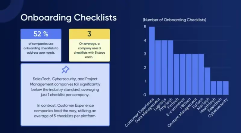
And indeed, 52% of companies are already using checklists to address these user needs, as we highlighted in our adoption report:
But the biggest reason why every SaaS company needs a checklist is simply this: you can't afford NOT to have one.
Don't believe me? Here are some mind-blowing stats from SMS Country that might make you reconsider:
- A complicated onboarding process will drive 74% of potential customers away
- 55% of customers would stop using a product or service they don’t understand
- 75% of users abandon an app within the first week if it is difficult to use
Sobering, right?
The reality is that we live in an economy in which users expect to have a smooth onboarding experience, as a matter of course.
Put another way: having an onboarding checklist is table stakes for a SaaS company – not something that really makes you stand out from the crowd.
The new SaaS world is firmly product-led. Users expect to be able to have free trials of products before they buy them – so you'd better make that trial experience as smooth as possible by incorporating a checklist!
Founder of Product Led, Wes Bush, recently ran a poll on LinkedIn to see just how many people prefer to use a free trial before buying a SaaS product.
The results speak for themselves:
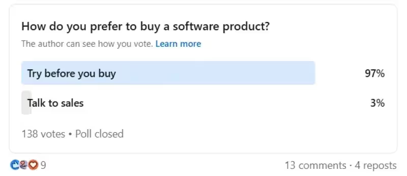
It follows that SaaS companies who aren't investing in making the trial experience for their customers as smooth as possible are leaving money on the table.
The Essential Components of a User Onboarding Checklist
Now that you know why an onboarding checklist is so important, let's explore the components that you might consider including in your checklist.
Welcome and Account Setup
In the context of your entire onboarding flow, your onboarding checklist will generally flow a welcome screen, in which you greet the new user by name and re-iterate what your product does.
Here's a great example of a welcome screen from Jasper that does both of those things:
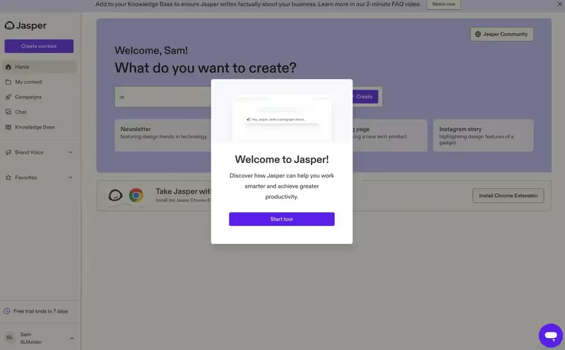
That being said, there's nothing wrong with including some friendly, welcoming copy on your checklist, together with a summary of your value proposition.
Look how Uxcel does this in their onboarding checklist:
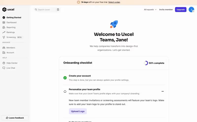
What we like about this example:
- It greets the user, Jane, by name
- There's a fun icon that suggests dynamism, growth and progress
- The copy in the header is concise and to the point
- It stresses "transformation," which is language that is emotive and often used in copywriting to drive conversions
Once you've welcomed your user with your checklist, the next step is to provide clear instructions so that they can set up their account correctly.
Depending on your brand, this might entail:
- Installing a snippet of code so that your product works on their site
- Adding seats for team members
- Uploading their company logo and branding
- Putting in their billing information
Look how Bonsai accomplishes this in this example:
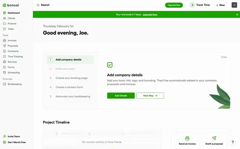
Observe how the checklist invites the user to invite their team, and then rewards them with a nice green checkmark once that has been done.
And in the adding company details step, there is a clear description of which details to add, and the green CTA button to add the details stands out nicely from the rest of the UI.
All in all, an excellent user experience!
Product Tour or Interactive Guide
Once your user has been shown how to add their basic details to your platform, it's time to walk them through your key features using a product tour.
You can (and should) add elements of the product tour to your onboarding checklist.
The biggest mistake I see companies making here is to throw all their features at the user in one go. This is about as attractive as someone telling you their entire life story on a first date. Don't do it!
A better approach is to only share what the user needs to know in order to experience value.
To ensure that the product tour part of your checklist is as interactive and engaging as possible:
- Cover as few features as you possibly can
- Ensure those features are as relevant to the customer's specific use case as possible
- Don't just have customers watch a video on how to use the features; actually walk them through the features, step by step
Take a look at how Remote's product tour works:
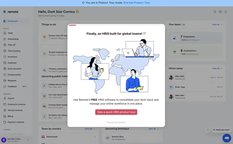
This first modal announces the product tour.
Note that you can end the product tour at any time by clicking on the text at the top of the page. This is good for ensuring that the product tour isn't too intrusive.
On the next screen, Remote gives you the choice of which part of their product to take a look at:
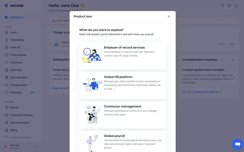
This is far better than having an onboarding checklist throw all the features at a new user at once.
Instead, the user can simply click on what they find most interesting.
First Task Completion
The culmination of your product tour is activation. This is the moment that your customer uses your product to get the value they came for.
From the user's perspective, it's a real milestone: they completed a significant task using your product.
And from your perspective, having a user active is an extremely good predictor of that user being retained – which translates into more monthly subscription payments for your SaaS company!
So it definitely makes sense to include the point of activation in your onboarding checklist as one of the items. That way, you reduce the chances of a user forgetting to activate.
Here at UserGuiding, for example, our users activate once they've installed our code snippet. So we include that as one of the items on our onboarding checklist:

But what exactly constitutes user activation?
Well, that varies from product to product.
Here's an extract from Wes Bush's book, Product-Led Playbook. In the top-left and bottom-right corners, you can see some examples of activation for some popular products:
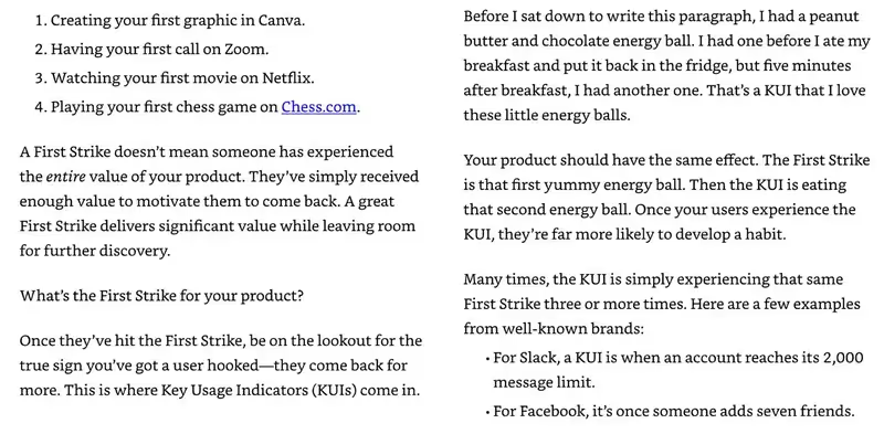
Wes Bush refers to activation as a "First Strike," which is quite a nice emotive way of making the point.
Remember also, though, that activation also varies by user segment – even for multiple users of the same product.
So for example, a project manager using Notion is going to be interested in using the software to create process documentation.
But an accountant in the same company probably cares much more about the billing section of Notion than about the process documentation!
Value is relative to the needs of the user – so make sure you take this into account in your onboarding checklist and only highlight the features that an individual user needs in order to activate!
Knowledge Base or Support Introduction
The last thing your onboarding checklist should accomplish is to show users where they can go if they get stuck.
Classically, this would mean pointing them towards at least one of the following:
- Your knowledge base
- Your help widget
- A list of FAQs
- Video tutorials
- Live support
Remember the purpose of the onboarding checklist: to ensure that your users know what to do inside your product and aren't sitting around thinking "I'm stuck."
Introducing users to your support resources is an extension of this type of onboarding philosophy. You want your users to feel like they always know where to turn to in the event that they don't know what to do.
Here's a great example from Attio of how to introduce users to support resources in an onboarding checklist:
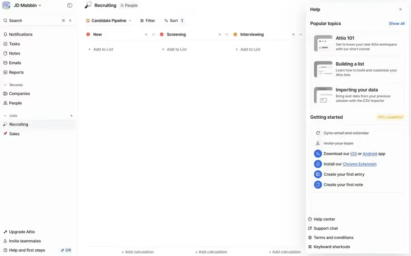
Do you see the little icons for help center and support chat, just below the action items in the checklist?
It's subtle enough not to be annoying, but visible enough so that the user knows where to go if they get stuck.
I also like this example from Circle:

Note how the checklist encourages the user to join the Circle community.
Wanna bet that that community contains some help forums, together with some friendly people who can point the new user in the right direction if they get stuck?
Yep. It's self-service support, par excellence.
Feedback Collection
After the onboarding checklist is complete, it's a good idea to ask your user for feedback to see how they found the process of onboarding.
Of course, the best sign that the onboarding was a success is that the user is still on your platform and hasn't churned! 🤣
Cynical humor aside, you should take the opportunity to check in with the user and see what they thought of your onboarding checklist.
This will give you valuable information so that you can improve the checklist experience in the future.
For example, you could use a template like this one, and publish this as an in-app survey directly after the onboarding checklist:

If your users agree that your website is easy to navigate, that's a good sign that your checklist was doing its job properly.
If not, it's back to the drawing board!
Best Practices to Create an Effective User Onboarding Checklist
Define your ideal user journey
Before you can know which product features to highlight in your onboarding checklists, you'll first need to understand the user journey for each customer segment.
To understand how your customers are currently using your product, it's wise to schedule customer development interviews in which you delve deep into what problem your customers are trying to solve.
It's also a good idea to use something like Clarity or Hotjar so that you can track where people are clicking inside your product.
These are just two tools that are commonly used by businesses to figure out their user journey. Here's a graphic from CX Network's State of Customer Journey Success report for 2024-25 showing how other companies are figuring out their customer journey:

Note that there's a distinction here between the journey your customers are currently on and the one you would like them to take. Those two things aren't always exactly the same.
So reflect on the differences between how your customers are currently using your product and how you would like them to use it.
Are there some core features that you know from customer development interviews are important to users, but they're just not adopting them?
These are some great features to highlight in an onboarding checklist.
Map out critical milestones and touchpoints
Along the customer journey, your users are going to reach important milestones. Typical ones are:
- Initial sign-up: when the customer makes a trial account and logs in to your product for the first time
- The Aha Moment: when the user has an emotional realization that your product could hypothetically be value for them
- Activation: when the user actually experiences the value of your product first-hand, often by using one or more features that are key for their user segment
- Payment: The first time your customer pays for a monthly subscription
- Referral: When a customer refers a friend to your platform for the first time – a common sign that they have become a power user
- Churn: The moment when a customer leaves your platform
It's common sense that these milestones will vary from industry to industry, and business to business.
But it's less commonly appreciated that they'll also likely vary from segment to segment, as well.
In the context of an onboarding checklist, activation is the most important user journey milestone to take into account.
Because it's activation that should be the ultimate goal of your checklist. If you know what constitutes activation for a particular user segment, if you give them a checklist item that equates to activation, then they will activate.
For some ideas on how to figure out what constitutes activation for each user segment, check out this post.
Test and iterate based on user feedback and analytics
Even if you conduct hundreds of customer development interviews and map out your user journey perfectly, you won't get your onboarding checklist right the first time.
So it's important that you're open to learning and refining your approach as you go.
It's a great idea to send users who complete your checklist an in-app survey to see what they thought of it. If they didn't like the checklist, follow up with a second, more qualitative survey, or schedule a call with the customer to figure out what you can improve.
In terms of analytics, pay attention to your checklist completion rate. The more people complete the checklist, the better designed it is.
And it's also worth looking at your activation rate. Remember that the key product task associated with activation should always be somewhere on your onboarding checklist.
So if lots of users are churning before they activate, it could be a sign that your onboarding checklist needs some work.
Most SaaS companies get this kind of data inside their dashboard. If yours doesn't have it, you can also consider using a product analytics tool.
And speaking of tools…
Top Tools to Help You Build an Onboarding Checklist
Ready to start implementing onboarding checklists in your business?
There's just one more decision you need to make. And it's an important one. What technology are you going to use to build your checklists?
You could build your onboarding checklists yourself, in-house.
The big advantage of that is that you get full control of the process. You can literally make your checklist appear and behave however you wish.
Leopard-skin branding? Green lasers pointing in all directions to celebrate when a user completes a task? If that's your jam, go for it!
But the downside is that it will cost you a small fortune. Developers don't exactly come cheap.
And there's the opportunity cost to consider as well. Every hour your devs spend building a checklist is an hour they're not spending building core product features.
So most SaaS companies choose to buy, not build. It's cheaper and faster.
Here are three of the most popular tools you can choose from.
1. UserGuiding
- G2: 4.7⭐ (469 reviews)

UserGuiding is a leading no-code digital adoption solution.
Because UserGuiding doesn't require code to use, anyone can build a checklist in a matter of minutes – even your non-technical product managers.
This frees up your developers' time to work on your core product.
UserGuiding checklists can be populated with guides, which are brief, interactive walkthroughs of certain product features.
Guides can be either:
- Modals: rectangular boxes that contain helpful information about how to use a feature
- Tooltips: smaller snippets of text that appear next to an "i" icon that's adjacent to a feature
If your customers get stuck with your checklist, UserGuiding will let you help them further by creating:
- A help center
- A knowledge base
- An AI assistant
Want to see what your users think of your checklist? Use UserGuiding's survey feature to make an in-app survey, and ask your users directly.
You can also use the product analytics feature to find out how many users completed a particular checklist.
And you can even create multiple checklists for different user segments, automatically segment users, and assign them a checklist based on the segment they're in!
Pretty powerful, eh?
And UserGuiding's pricing starts from only $174 per month.
No-brainer? We think so.
2. Chameleon
- G2: 4.4 ⭐ (262 reviews)

Like UserGuiding, Chameleon will let you build checklists without having to code. As its name suggests, you can customize the look and feel of your checklists to your heart's content.
And, similarly to UserGuiding, you can fill your checklist with guides for various features, and refer your users to additional help resources when they get stuck.
Here, you start to see some of the differences between these checklist tools.
Chameleon will let you refer users to a resource center and an AI assistant, but not a knowledge base.
Chameleon does have a neat feature called a Helpbar, which is basically a search function that you can add to your product for free. So that's another nice help resource to have, if your users get stuck.
The biggest technical difference in terms of how these two platforms treat checklists is that UserGuiding has a dedicated checklist building feature, whereas Chameleon treats checklists as one type of "launcher."
Chameleon defines launchers as "highly customizable in-product widgets," and you can use them as either checklists or help menus.
Chameleon's pricing starts from $279 per month – so quite a bit more pricey than UserGuiding.
3. Userpilot
- G2: 4.6 ⭐ (625 reviews)

Userpilot is primarily a product analytics tool these days, but it will also let you build checklists without code, similar to UserGuiding and Chameleon.
Again, you can add guides, hotspots, tooltips and modals to your checklists and get your customers to walk through them, step by step.
Userpilot shines compared to the other tools in this list in terms of how deeply you can analyze the effectiveness of your checklists.
For example, you can track both the performance of your checklist and the downstream impact it has on the rest of the customer journey.
There are also more fancy analytics like funnel charts, retention tables and path tracking. So you could technically work out how much of a correlation there is between a user segment completing the onboarding checklist and being retained.
Userpilot is less good in terms of offering further help to users who get stuck with checklist items. There's no ability to create a knowledge base, and no AI assistant either.
Further along the user journey, UserGuiding would let you make in-app announcements about new features, share product updates in-app, and then create a checklist to walk users through the updates.
Userpilot can handle the checklist part of that, but not the in-app announcement or product updates parts.
Userpilot pricing starts from $249 per month.
Real-Life Examples of Successful Onboarding Checklists
Oof, that was a lot of theory!
To make things a bit more practical, let's take a look at how other companies are currently using onboarding checklists successfully.
Spinach AI
Spinach AI is an AI meeting assistant which helps schedule meetings, summarizes the conversation and automates post-meeting tasks.
Here's a video of their onboarding checklist:
Watch as the checklist prompts Serra to add her details, then connect her calendar, and then select the meetings she wants to use Spinach AI for.
Those steps are listed as numbered steps towards the top of the screen.
The whole UX is smooth and easy. At no point does the user feel unsure of what to do next.
HeyGen
HeyGen is an AI video generation tool.
They have a rather unusual take on the onboarding checklist, with each step appearing left to right, rather than in a widget at the bottom right of the screen:
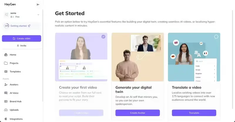
As users progress through each step, the steps they've completed fade.
Again, it's clear from the UX what users should do, and the color contrast makes the CTA buttons stand out, inviting users to take the next step.
A Not-So-Good User Onboarding Checklist Example
Having given you two examples to emulate, let's look at a different type of example – something to avoid.
PostHog is a platform for developers that provides product analytics, feature flags, session replays and surveys.
Their onboarding checklist UI is confusing, to say the least.
When you log in, you're greeted by this blank slate:
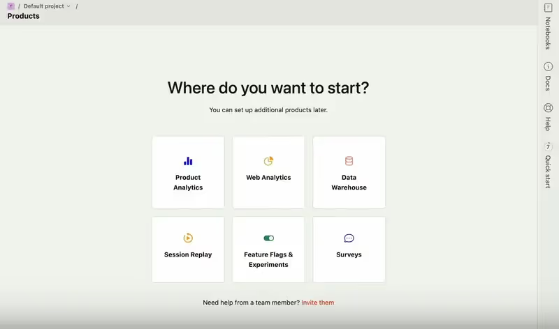
Any idea where the onboarding checklist is?
Any guesses?
Well, take a look at the right-hand menu. There's a section of that which says "Quick start" – but it's sideways, so it's hard to read.
Click on that, and this is what pops up:
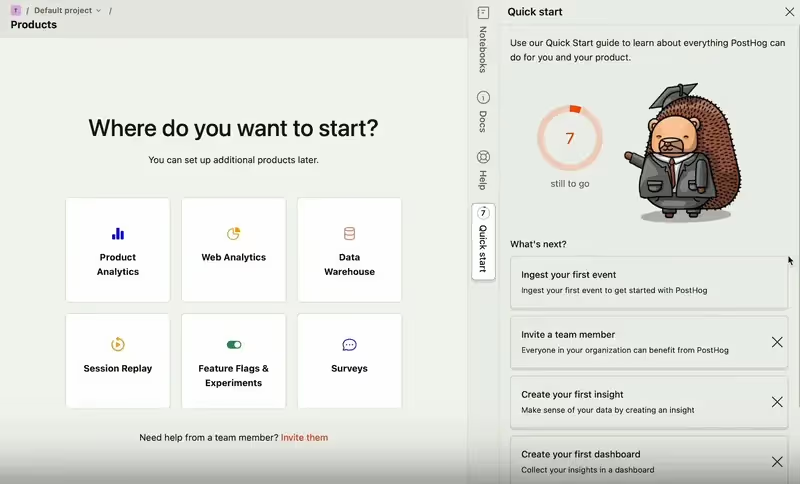
Put the slightly creepy bear to one side, and the checklist is ok from this point onwards.
But how many users are going to find that?
My guess is: not many.
Common Mistakes to Avoid with Onboarding Checklists
Overwhelming users with too many steps
Sometimes, when SaaS companies start getting into onboarding checklists for the first time, they get a bit carried away.
It's all well and good trying to make a comprehensive checklist, but adding too many steps is just going to overwhelm your users.
Perfect example: this checklist from 15Five:
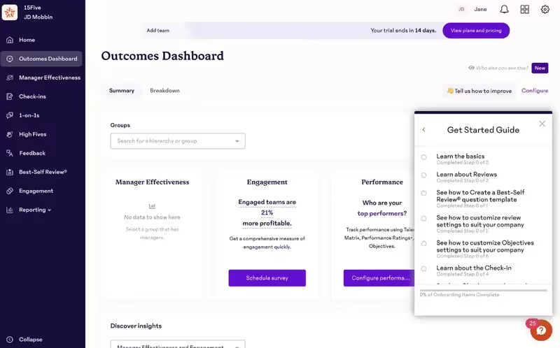
Each of these steps has multiple steps – sometimes as many as 6!
And you can see that the list even continues after these first 6 bullet points!
That's an absurd amount of friction to give a new user. Research suggests that an onboarding process that's too complicated will drive as many as 74% of new customers away.
Stick to 3-5 checklist items. That's enough to show someone the ropes, but not so many that you'll overwhelm them.
Lack of personalization or relevance
Another classic mistake is to give all your users the same onboarding checklist.
And it seems that it's a popular mistake, if this survey on LinkedIn is anything to go by:
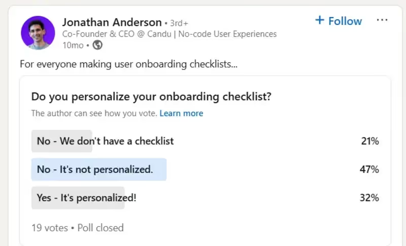
Think about how your company uses Slack.
Do you use it in the same way that your boss uses it? Or your boss' boss?
I'm willing to bet that they're much more likely to use the admin and payment parts of Slack than you are.
So how silly would it be if Slack treated all user types equally and gave everyone the same onboarding checklist? It makes no sense.
A far better approach is to create multiple checklists for different user personas. Assign users to a segment on the basis of the information they provide during sign-up and the welcome survey – and then ensure that they get a checklist that's actually useful for them.
As we said in our recent adoption report: the more checklists you have, the more diverse the range of use cases you can support.

Don't use a static checklist
Onboarding checklists can be static or interactive.
A static checklist is one that doesn't change as onboarding tasks are completed.
By contrast, an interactive one does change, perhaps by
- Showing a green checkmark next to the completed item
- Having the completed item turn a different color, especially a pale color like gray
- Striking through the completed item with a line
All of these examples demonstrate progress to the user, and, as such, are motivating.
So you should never use a static checklist – always use an interactive one instead.
How to use UserGuiding to create user onboarding checklists
Creating a checklist on UserGuiding is extremely straightforward and can be done in a matter of minutes.
Let me show you how it's done.
First, log into your UserGuiding account.
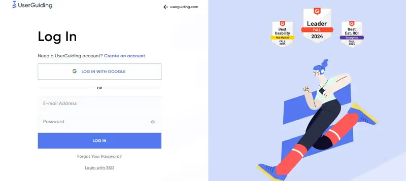
Head over to the Guides section and make sure you've created a handful of guides for your features.
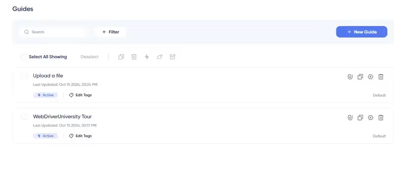
If you haven't already got some Guides ready to go, click on New Guide, select which page you want to add your guide to, and follow the on-screen instructions.

Next, head over to the Checklist section. Create a checklist and give it a suitable name.
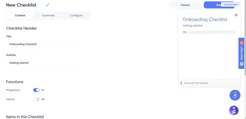
Scroll down to where it says "Items in the Checklist" and click "Add Item" to add your Guides to the checklist.
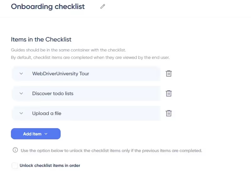
You can play around with the order of the items by clicking and dragging the little dots on the left of each guide, until you get things just right.

UserGuiding will also let you customize the color, look, and feel of your checklist. Simply click the tab that says "Customize" at the top.

Then, play around with the settings until you're happy.

When you're done, don't forget to click on the big green button that says "Publish Changes!" That way, you can see your work.

Ready to Build a Checklist For Your Business?
Having read this article, you should now know:
- What onboarding checklists are
- Why they're essential, particularly for SaaS companies
- What elements can be included in checklists
- Which checklist best practices to follow and which examples to emulate
- Which common errors to avoid and which examples to steer clear from
If you're ready to take the next step and want to start implementing checklists today, we encourage you to check out UserGuiding.
You can use it to create onboarding checklists without coding, and it provides better bang for your buck than both Chameleon and UserGuiding.
Try it today for free – and see for yourself.
Frequently Asked Questions
What is an Onboarding Checklist?
An onboarding checklist is a checklist that is displayed to a new user in order to get them to their "Aha!" moments.
Why should I use an Onboarding Checklist?
An onboarding checklist gives your users a sense of commitment and reward while getting them to their "Aha!" moments, also helps them get a sense of direction during the onboarding process.
How can I create an Onboarding Checklist?
You can easily create an onboarding checklist for your product with a 3rd party user onboarding tool such as UserGuiding, along with many other onboarding elements.


.svg)
.svg)
.svg)
.svg)
.svg)


.svg)
.svg)


.png)


