


.svg)
.svg)
.svg)
.svg)
.svg)


.svg)


.svg)
.svg)

Healthcare tools are often complex, high-stakes, and workflow-heavy, so the way companies guide new users can make or break adoption.
In this case study, we break down how 13 HealthTech platforms onboard their users, what they do well, where they fall short, and what you can learn from them when designing your own onboarding experience.
Here are the highlights for those short on time 👇🏻
TL;DR
- Ensora Health: structured onboarding experience with clear checklists and interactive tutorials. A strong example of prioritizing basic vs. advanced product education through two separate checklists.
- Carepatron: well-structured in-app resource center with easy-to-read overlay guides and accessible video tutorials.
- Healthie: highly organized onboarding checklist with sub-tasks and interactive tutorials that support step-by-step self-education.
- Tebra: polished pre-recorded interactive(ish) demo flows and a well-organized tutorial gallery grouped by product.
- SimplyBook.me: clean setup flow supported by a focused essentials-only video playlist that quickly gets users up to speed.
- Noterro: lightweight onboarding strengthened by Lucy, the in-app AI assistant that gives clear, step-by-step help on demand.
- NextGen EHR: use-case–based, personalized demo experience where feature relevance is ranked and video walkthroughs are curated accordingly.
- Jane App: offers a tutorial video gallery to support non-trial onboarding, though the structure is less clear and videos are outdated.
- Zanda: provides recent, well-categorized video guides with strong visual cues that make workflow follow-along easy.
- Doxy.me: uses empty states for FAQs and embedded app guidance.
- IntakeQ: relies on minimal in-app guidance and an unstructured help center while sending (too many) onboarding emails that offer little value.
- Charity Tracker: has no in-app guidance, confusing sample accounts, and a single long 2-hour training video that’s overwhelming for new users.
- ClinicSense: provides video walkthroughs for only 4 out of 17 features, resulting in limited product education and major content gaps.

Good HealthTech onboarding examples to draw inspiration from
Ensora Health
Ensora Health is an EHR and practice-management platform built specifically for mental health and rehab practitioners.
It follows a product-led strategy and offers a 21-day free trial, allowing potential customers to explore the platform and experience its value firsthand.
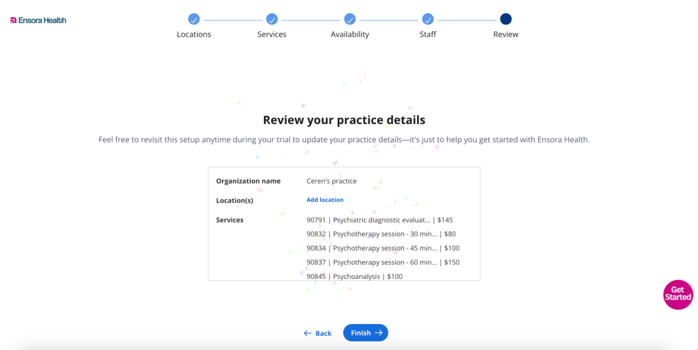
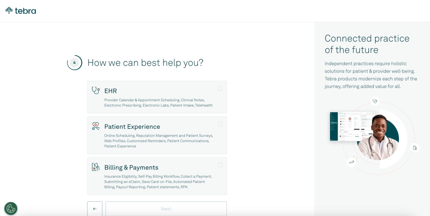
To help trial users reach their Aha! moments quickly, and without losing interest or feeling overwhelmed, Ensora Health provides a quick guided setup. The setup consists of five steps and enables trial users to configure their practice so they can explore the product’s full potential more easily.
However, the setup isn’t final.
Users can edit it later, or even skip the basic setup entirely and access the platform immediately.
Let’s see what awaits you once you finish (or skip) the setup and step into the platform. 👇🏻
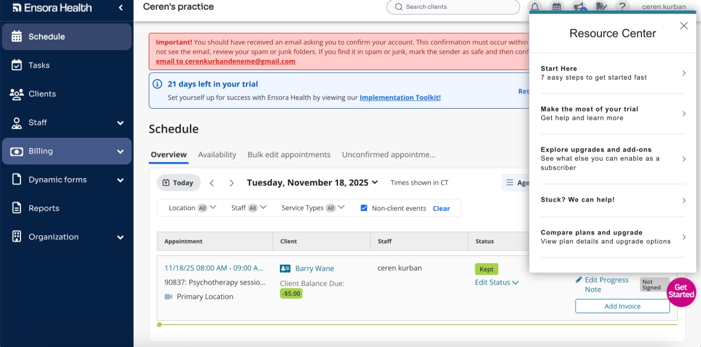
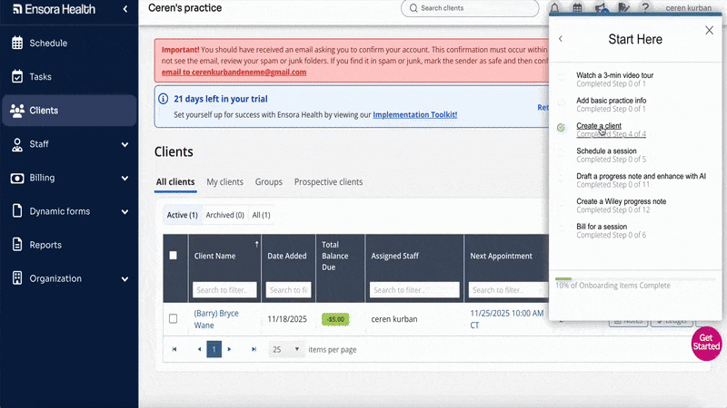
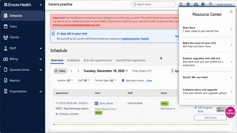
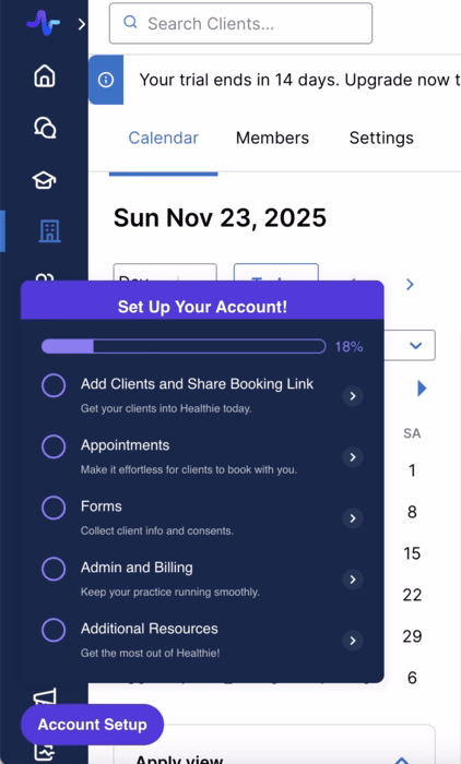
In-app resource center and onboarding checklists
When you first enter the platform, the resource center greets you. The first item within it is an onboarding checklist encouraging users to “start here” and get familiar with the platform in seven easy steps.
The resource center isn’t tucked away.
Even if you close it, the widget remains visible as a bright pink “Get Started” icon, pretty hard to miss.
This ensures new users aren’t left on their own to hunt down onboarding materials.
The initial onboarding checklist consists of seven tasks, ranging from “Watch a 3-min video tour” to “Bill for a session.”
While users don’t need to complete these tasks in order and there’s no gradual disclosure, the tasks still follow a logical path: adding practice info, creating clients, scheduling sessions, and finally billing.
Here’s what the checklist looks like:
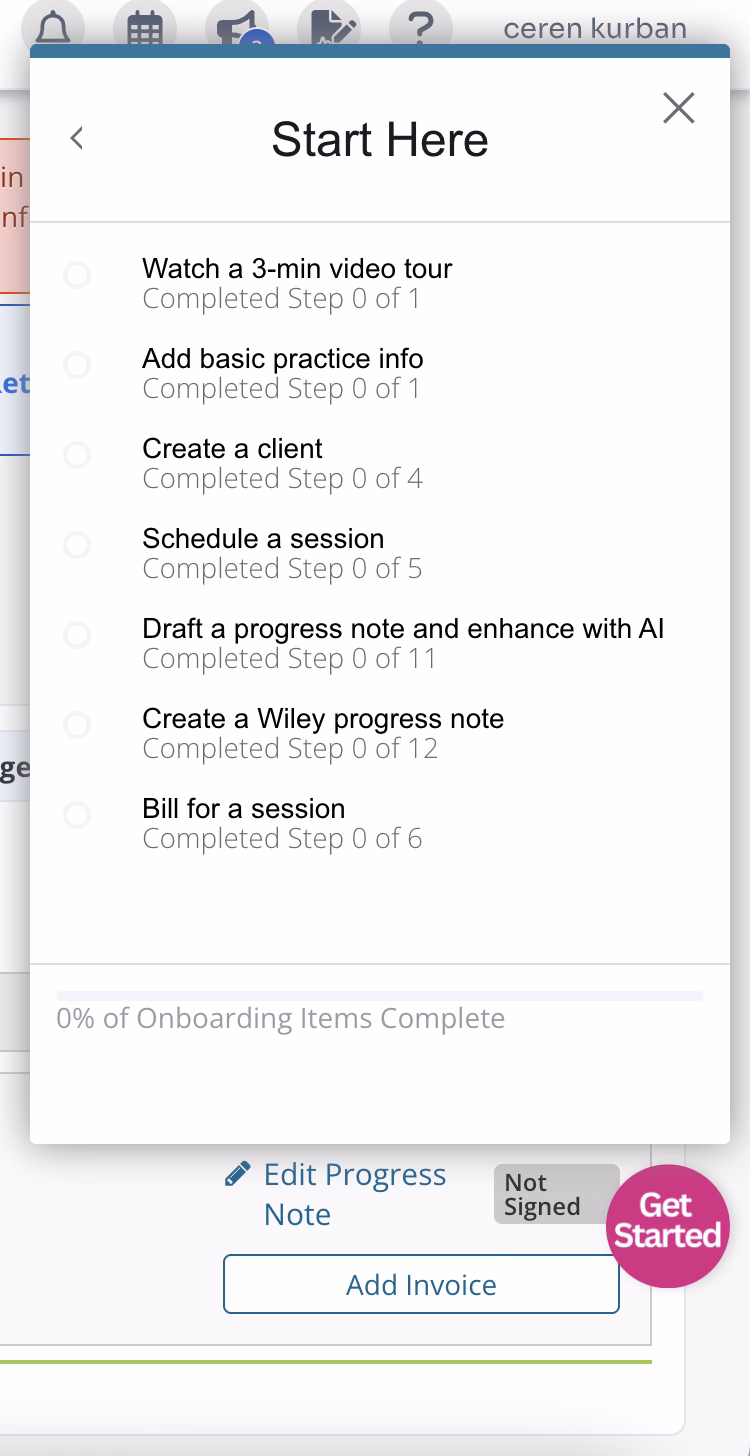
As you can see, there’s a progress bar at the bottom of the checklist, along with individual progress indicators for each task.
You can quickly see how many steps a task includes and estimate how long it might take to complete.
However, even though the checklist updates your progress within a task, if you leave a task halfway through, you can’t resume from where you stopped, the tour restarts from the first step.
So we’re not entirely sure how useful the progress tracker for steps actually is. 👀
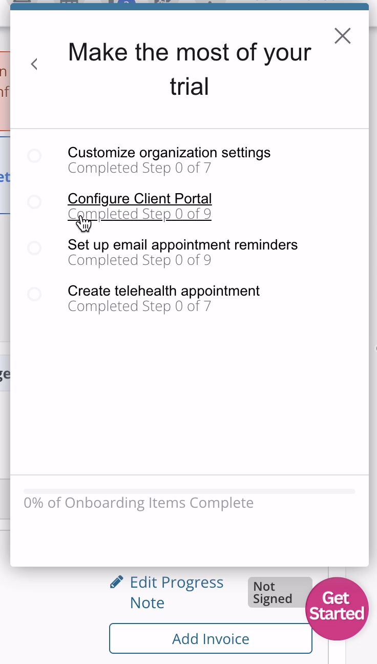
There’s also a second checklist in the resource center for more advanced features.
Here’s what that one looks like:
Interactive guides and pop-up pre-recorded tours
Each task in the initial onboarding checklist launches an interactive tutorial that walks the user through completing that task. These tutorials use tooltips with action-oriented copy and provide short explanations when needed.
Steps requiring user interaction are also skippable.
For example, if a step asks you to enter patient information but you’re not ready to do that yet, you can skip it and continue to see the rest of the workflow.
Here’s an example tutorial on how to schedule an appointment:
The tasks in the advanced-feature checklist also include onboarding guidance, but not in the same interactive way.
Since many advanced features involve extensive clicking, page navigation, or require existing data on the platform, creating traditional interactive walkthroughs would be tricky.
So, Ensora Health instead offers pre-recorded, semi-interactive popup tours.
You can still navigate through the pages and click on elements, but everything moves faster, and you can’t get lost midway through.
Here’s an example that demonstrates telehealth appointments:
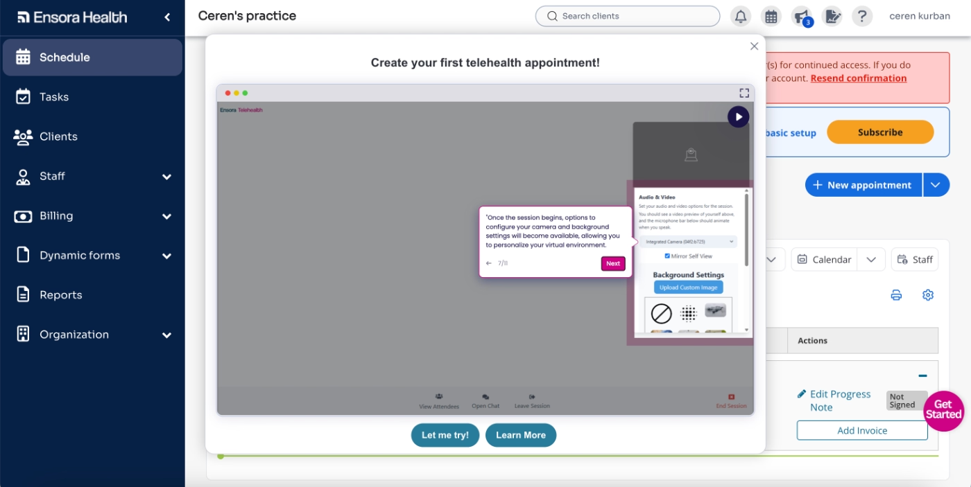
Each popup also includes CTAs prompting users to read more about the feature in a help-center article or try the feature directly, taking them to the appropriate section of the platform.
Contextual guidance with tooltips
Checklists and tutorials aren’t the only forms of guidance Ensora Health provides for new users.
While these help users get started and gain familiarity with the platform, some areas require more ongoing support, especially where input standardization and accuracy are crucial.
For these situations, Ensora Health uses hover-over tooltips, like this one here:
Upsell and premium feature promotion
One more thing Ensora Health does well during onboarding is offering upgrade information without pushing users to upgrade prematurely.
In the resource center, users first encounter the basic onboarding checklist, then the advanced features checklist.
After completing these, and after users have tried all available features in the free trial, there’s a section for upgrades and add-ons.
Each upgrade or add-on triggers a popup explaining the feature and its use case.
Best practices in this onboarding flow:
✅ A quick setup flow that creates a sense of commitment but doesn’t scare trial users away, since it’s skippable and editable later.
✅ Two separate checklists (one for basics and one for advanced features) so users aren’t overwhelmed, and can see how many steps each walkthrough will include before starting.
✅ Interactive walkthrough steps that require user action are skippable, letting users learn the flow without being forced to set things up immediately.
✅ Features with lengthy workflows or those requiring existing data (e.g., patient info) are demonstrated through pre-recorded sandbox-style tours, reducing friction and frustration.
✅ Critical information that benefits from repeated visibility, such as guidelines for form inputs, is delivered through hover-over tooltips rather than one-time walkthroughs.
Carepatron
Carepatron is a healthcare practice management platform that provides tools for online patient scheduling, billing, and overall patient file management.
They also offer a free 30-day trial (quite generous, we must say) aligning with their product-led growth strategy.
To access the trial, users complete a brief four-step setup flow that collects basic information about their practice and use case.
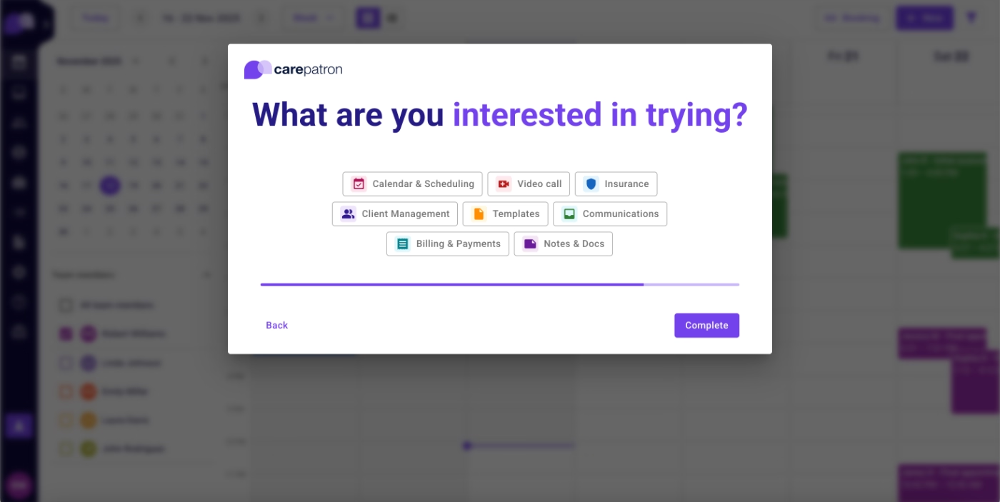
Here’s what Carepatron offers during the trial to support onboarding and user education:
Onboarding checklist
Carepatron welcomes new users with an onboarding checklist.
Their checklist is even more visually prominent than Ensora Health’s as they dim the background and open the checklist directly in the sidebar, instead of launching a full resource center.
Here’s what the checklist looks like:
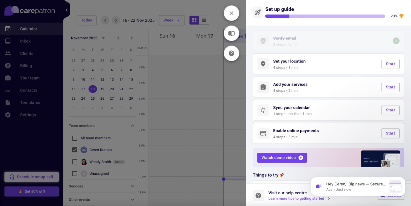
There are five items on the checklist, one of which is already checked off (verification), since it’s required before accessing the platform.
The tasks are necessary to begin using the platform, but they don’t meaningfully guide trial users toward their Aha! moments. They focus more on setting up the practice profile rather than activating key features.
Because these tasks aren’t focused on feature activation, they don’t trigger detailed walkthroughs or multi-step tutorials like Ensora Health’s checklist items.
When you click a CTA, such as the “Start” button next to “Sync your calendar”, you’re taken to the relevant page and shown a simple tooltip highlighting the button that initiates the relevant task.
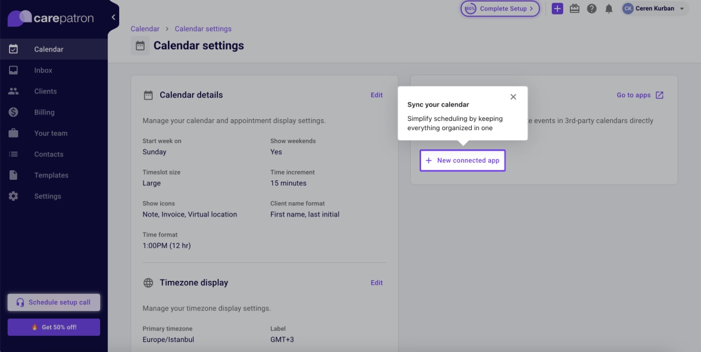
But this one tooltip is not guaranteed for all the tasks, as well.
For example, you do not see a tooltip on the relevant page for the task “Add your services”.
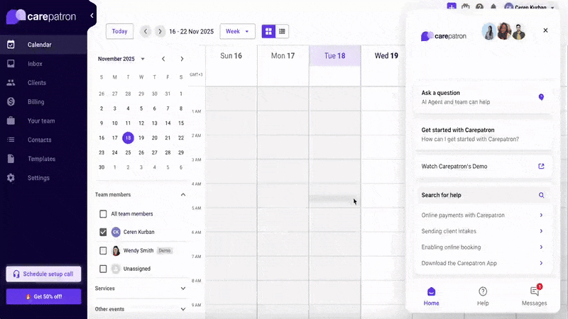
In-app resource center
Carepatron doesn’t offer interactive tutorials, but that doesn’t mean they leave new users without guidance.
Instead, they gather important getting-started guides and basic feature documentation into a “Getting Started” category in their in-app resource center.
This collection includes eight articles.
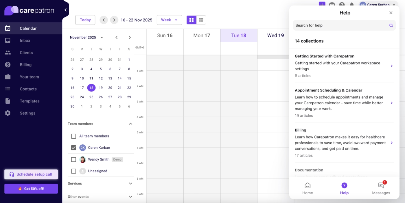
The articles include videos, actionable steps, checklists, and plenty of visuals to help contextualize the information.
Even though these guides aren’t interactive like Ensora Health’s tutorials, they still provide a smooth learning experience, as they open as an overlay on the platform, so users can read instructions without leaving the app or switching between tabs.
Here’s an example article from the help center:
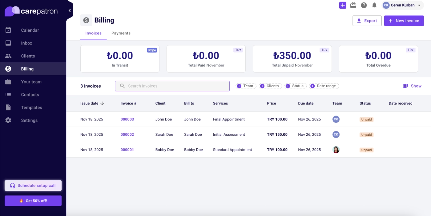
Sample data and dashboards
Where Ensora Health uses pre-recorded demo environments to work around the need for existing data in advanced feature flows, Carepatron takes a different approach: they provide sample data directly in the platform.
This allows users to explore features freely and understand capabilities without needing to enter real patient information first.
Here’s an example patient information page with mock data:
And here’s a sample billing dashboard with mock invoices:
Best practices in this onboarding flow:
✅ The onboarding checklist begins with one item already completed, giving users an immediate sense of progress and motivation.
✅ Each checklist item includes an estimated completion time, helping reduce perceived effort and mental load.
✅ The in-app resource center organizes articles both by “getting started” needs and by feature/use-case, making it easy for users to find what they need.
✅ Sample data enables new users to meaningfully explore the platform and understand its value without having to do upfront data entry.
Healthie
Healthie is an EHR and telehealth platform that offers a 14-day free trial. During this trial, they place strong emphasis on showcasing the platform’s capabilities and workflows through a structured and detailed onboarding flow.
When you first sign up, a welcome pop-up modal greets you with a short demo video that introduces the platform’s value and core use cases.
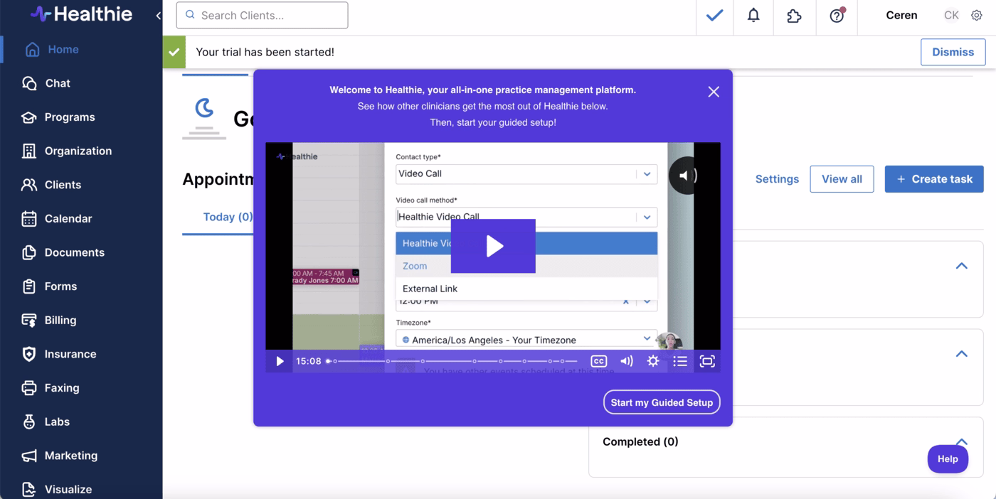
Below the modal, there’s a CTA button labeled “Start my guided setup”.
Clicking this button opens another pop-up containing several highlighted onboarding guides. From here, you can immediately launch your first interactive tutorial based on the feature you’re most interested in, or dismiss the modal and explore the rest of the onboarding materials at your own pace.

Here’s what Healthie offers beyond this quick, friendly introduction…
Onboarding checklist
Like the other examples we’ve seen, Healthie also brings onboarding front and center with a structured checklist.
The checklist contains five main items, each representing a key feature category such as Forms, Appointments, and Billing.
However, each checklist item acts as a category, not a single task. When clicked, it expands into several subtasks that guide users through detailed workflows within that feature set.
For example, here are the subtasks under the Appointments category:
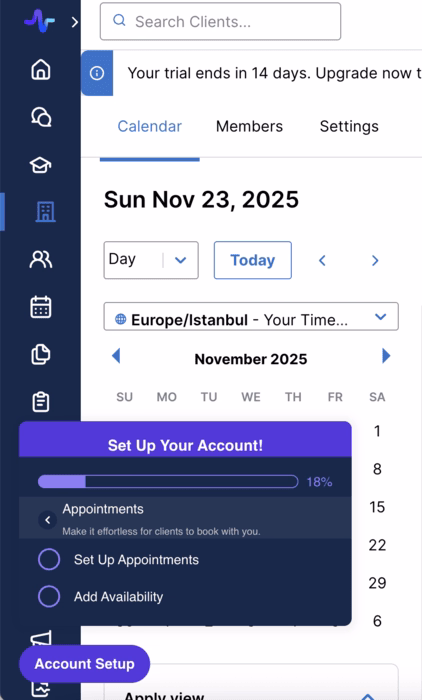
This nested structure allows Healthie to break down large, complex features into manageable learning modules.
It also prevents cognitive overload.
Users aren’t immediately presented with a long list of tasks, yet still have access to thorough step-by-step guidance when they open a category.
Interactive tutorials
Each subtask in the checklist triggers an interactive walk-through, similar in style to Ensora Health’s approach. These guides use short, action-oriented tooltips designed to demonstrate how workflows function, rather than diving into advanced tips or heavy explanations.
At the end of each tutorial, users are directed to a relevant help center article for more detailed information, a nice handoff from guided experience to self-paced learning.
Here’s an example tutorial for creating a form:

The tutorials themselves are concise and easy to complete.
However, Healthie does not include progress indicators or step counters, either in the tooltip UI or in the checklist, so users don’t have a sense of how many steps remain.
For some users, this can create mild uncertainty when going through the longer guides.
Still, the celebratory modal at the end of each tutorial adds a delightful moment of positive reinforcement. 🎉
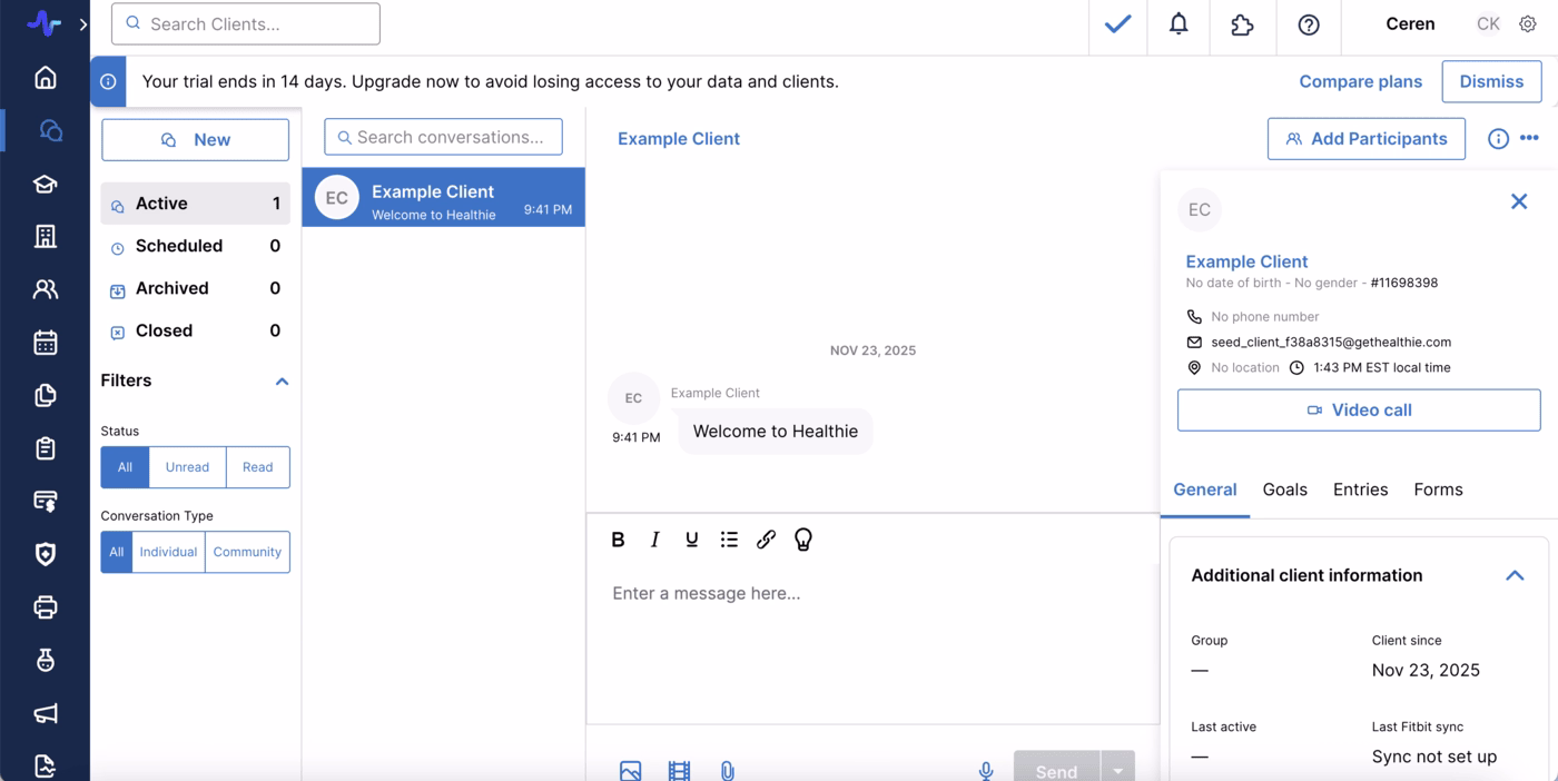
Sample data
Like Carepatron, Healthie offers in-app sample data that allows users to experiment with features without needing to manually input patient information first.
This makes it easy for trial users to quickly understand how messaging works, see how notifications are displayed, and explore different patient records.
Here’s an example of a mock patient profile and chat history:
Best practices in this onboarding flow:
✅ The initial use-case survey reassures users that all tutorials remain accessible later, while immediately directing them to the feature that matters most to them.
✅ Each walkthrough ends with a link to relevant help documentation, allowing users to dive deeper into more nuanced questions after completing the high-level guide.
✅ Although the onboarding checklist contains a large number of tasks, the hierarchical structure keeps it from overwhelming users on first glance, as the subtasks appear only when users are ready to explore them.
✅ Sample data dramatically improves early-stage exploration, especially for platforms like EHRs, where real functionality cannot be fully understood without content in the system.
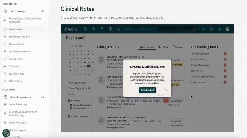
Tebra
Tebra is an all-in-one practice management and patient engagement platform designed for independent healthcare practices. It offers a broad suite of products, including scheduling, billing, telehealth, patient intake, marketing, and reputation management, each with numerous features and workflows.
Because of this extensive product ecosystem, it would be nearly impossible to surface every onboarding resource or walkthrough inside the app during a first-time user session.
Instead, Tebra takes a different approach and pre-records guided product tours and presents them in a centralized, always-accessible onboarding gallery.
Since Tebra does not offer a traditional free trial, these detailed tours function as a self-serve demo environment.
They allow potential customers to explore the platform’s capabilities on their own, even before talking to sales.
Pre-recorded onboarding flows
As mentioned, Tebra offers many products with deep feature sets, which makes its tour gallery quite extensive. To help visitors quickly find the most relevant guides, Tebra begins with a brief recommendation survey.
This survey asks about the user’s role, goals, and workflows, then suggests the product tours that best match their needs.
After completing the survey, users are taken to the full gallery, with recommended tours pinned to the top. Of course, users can still browse the complete list if they want to explore more broadly.
Tebra’s pre-recorded tours vary in length, between 6 and 16 steps.
The guides use tooltips that appear as you move through each step. The tone and structure of these tooltips vary:
- Some are action-oriented, prompting you to click a button or navigate to a different page.
- Others contain longer-form explanations, covering use cases, workflow logic, or how a particular feature ties into common practice operations.
This dual approach makes the tours suitable both for functional onboarding and high-level product education.

Because these tours effectively serve as unscheduled demos, they also incorporate subtle sales messaging.
That’s why many steps include a short embedded video in the corner of the screen, featuring a Tebra team member explaining value propositions, recommended workflows, or differentiators.
Here’s an extended example:
Best practices in this onboarding flow:
✅ The initial recommendation survey quickly narrows down the most relevant tours, reducing friction and helping users find the right capabilities without unnecessary browsing.
✅ Keeping all tours accessible in a central gallery ensures users can revisit walkthroughs anytime.
✅ The embedded video commentary in the tours adds a human layer to the experience and reinforces key value propositions without requiring a live sales call
SimplyBook.me
SimplyBook.me is an online appointment scheduling and booking platform used by service-based businesses across industries, including healthcare.
During the initial account setup, SimplyBook.me goes beyond basic configuration.
They incorporate a small amount of brand personalization and customization so users can immediately see their own style reflected in their account, even on the freemium tier or during the trial.
This creates a subtle sense of ownership early on.
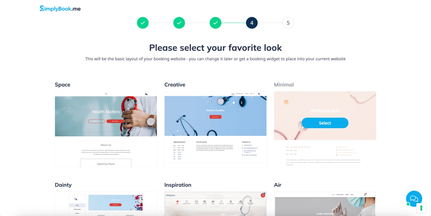
Another thing SimplyBook.me does differently from the previous tools is adding a bit of fun and personality to the onboarding experience.
After completing the setup flow, users see a playful, animated loading screen.
“You have chosen to install the best booking system in the world and evidently it takes a few seconds to create such a system. Just take a sip of your coffee and use the time to think how this can benefit your business” ☕☕

Setup guide and product tour
SimplyBook.me offers a short setup tour, but it’s important to clarify, it’s a setup overview, not a feature walkthrough or interactive tutorial.
The tour highlights where key settings and features are located rather than showing how they work or prompting users to complete actions.

Here’s an example tooltip from the tour:

Because the tour doesn’t navigate users into specific pages, only pointing out where things can be accessed from the homepage and left sidebar, it’s extremely quick to complete.
Users can return to the relevant settings and configure everything at their own pace, without feeling rushed by the tour.
Welcome page and onboarding videos
SimplyBook.me doesn’t provide step-by-step walkthroughs for its main features. Instead, it relies on a curated onboarding video playlist and a dedicated welcome page that users can revisit anytime.

Onboarding doesn’t have to mean interactive tooltips only.
While interactive guidance is popular, it’s not the sole approach, and SimplyBook.me embraces this by investing heavily in video-based education.
Each video in the playlist is short, practical, and focused on a specific goal or problem, making them easy for new users to digest.
Use of empty state for guidance
Beyond the welcome page and video playlist (which act almost like a lightweight onboarding checklist), SimplyBook.me also uses empty states throughout the app to provide guidance.
For example, on the custom feature configuration page, the empty state clearly explains what custom features are and how they work.
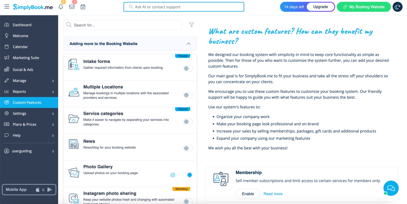
Additionally, each custom feature page includes detailed copy on the right-hand side, explaining what the feature does, how to configure it, and, when applicable, how to subscribe to an add-on plan.
This turns empty states into multipurpose spaces for onboarding content, feature education, and gentle upsell opportunities.

Best practices in this onboarding flow:
✅ YouTube-style videos, which are typically overlooked in onboarding, are highlighted and organized into a dedicated playlist on a persistent welcome page, making them more visible and easier for new users to engage with.
✅ Multiple learning formats are offered for different user preferences: short videos for visual learners and written explanations for those who prefer reading.
✅ Empty states are used effectively to provide in-context explanations and setup guidance, ensuring users receive helpful information without leaving the app for help center documentation.
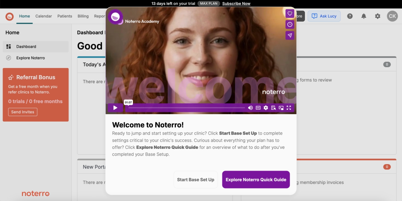
Noterro
Noterro is a practice management and scheduling platform built for massage therapists, physiotherapists, chiropractors, and other wellness professionals.
On first login, Noterro welcomes new users with a short orientation video presented in a modal pop-up. This immediate overview helps users quickly understand the platform’s core value.
Once the video ends, users can choose between guided onboarding or exploring the product independently.
Here’s what Noterro offers if you choose to get guidance:
Onboarding checklist
Noterro provides multiple onboarding checklists based on the platform’s key feature areas: charting, billing, online booking, and mobile appointments. Each checklist contains 3–6 steps aimed at helping users configure essential parts of their workspace.
Here are the first two checklists:
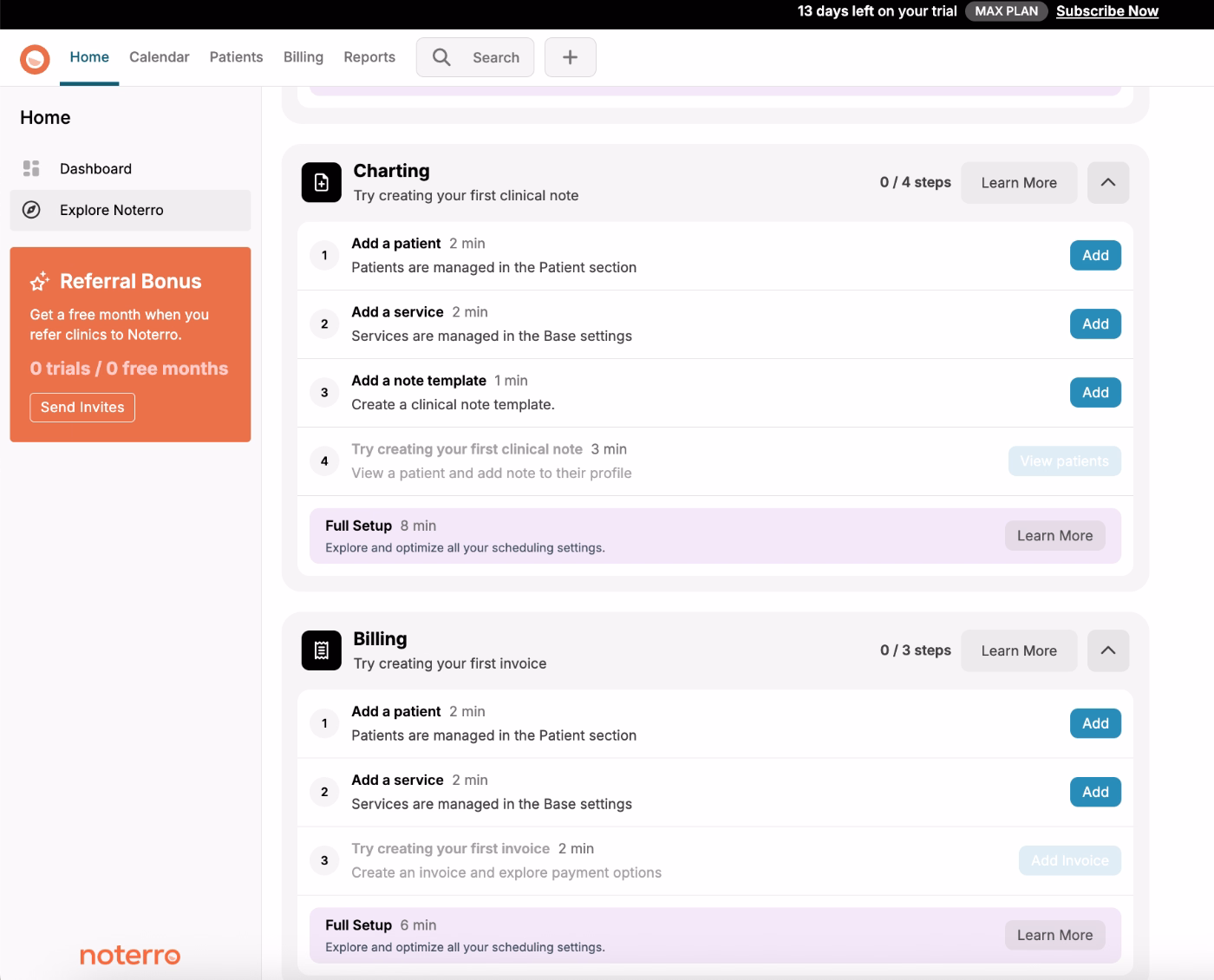
However, here’s the catch, as you might have already noticed as well, some of the items on the checklists are the same.
Completing a shared task in one checklist automatically checks it off in the others.
This has both advantages and drawbacks:
👍🏻 Pros: Users focused on a single workflow (e.g., billing) can follow just one checklist and still complete the universal setup tasks without switching between lists.
👎🏻 Cons: The repeated items can make the checklists appear longer or more overwhelming at first glance, even though many tasks overlap.
Noterro could improve clarity with onboarding personalization (e.g., a quick “what do you want to set up first?” survey) or by grouping shared tasks into a core checklist.
Still, since overlapping tasks are only completed once, the friction here is relatively small, just an area with room for refinement.
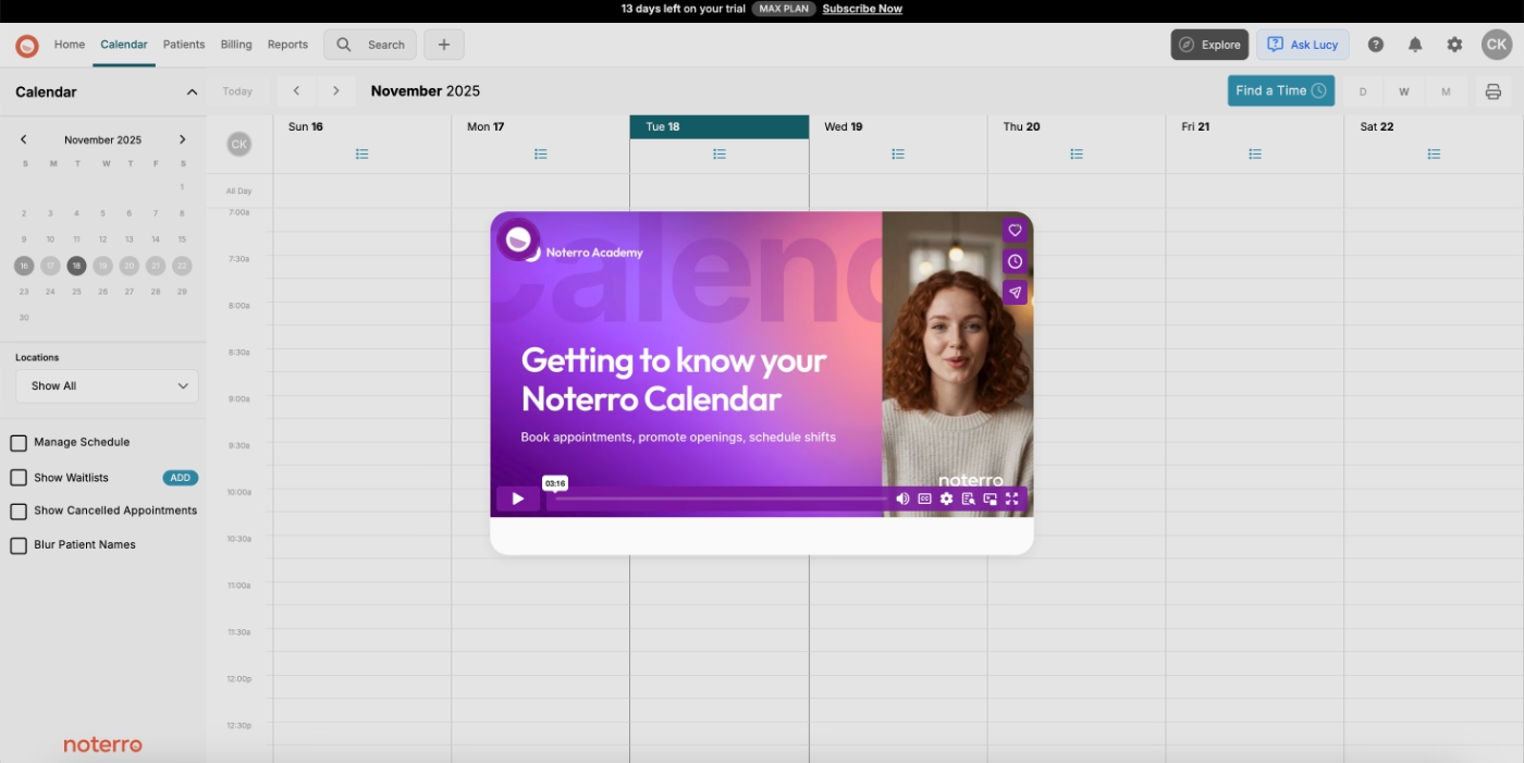
Video onboarding modals
Each task in the checklist triggers a modal containing a feature-specific video tutorial. These videos cover:
- how to complete the task,
- how the feature works,
- setup details, and
- best practices or use cases.
Because these videos deliver more depth than the shorter clips used by SimplyBook.me, their average length falls around 3–5 minutes.
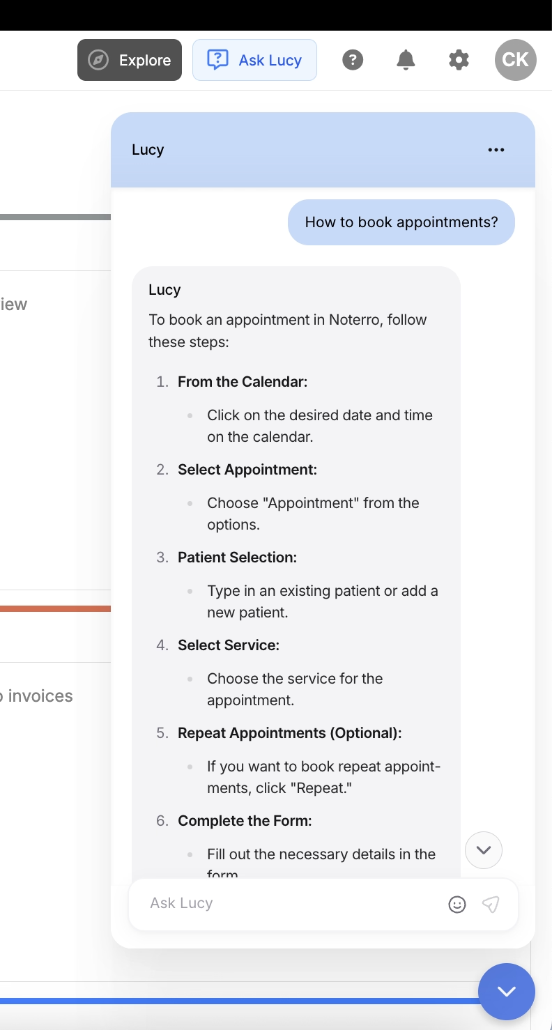
AI assistant
Though a little unorthodox, some might argue, Noterro’s in-app AI assistant Lucy can also be counted among Noterro’s in-app onboarding and training strategies.
Right on the top bar, there’s the “Ask Lucy” button, which triggers the AI assistant.
You can ask Lucy questions about how to do things in the app, and she answers in a step-by-step format with clear instructions and explanations.
Here’s an example conversation with Lucy, asking for help to book appointments:
Email onboarding
Noterro’s emails are also worth looking at.
Now, onboarding emails can be tricky and easily get pretty annoying pretty fast (of which we’ll see an example in a minute 👀).
But that is not the case with Noterro’s onboarding emails, hence the good example.
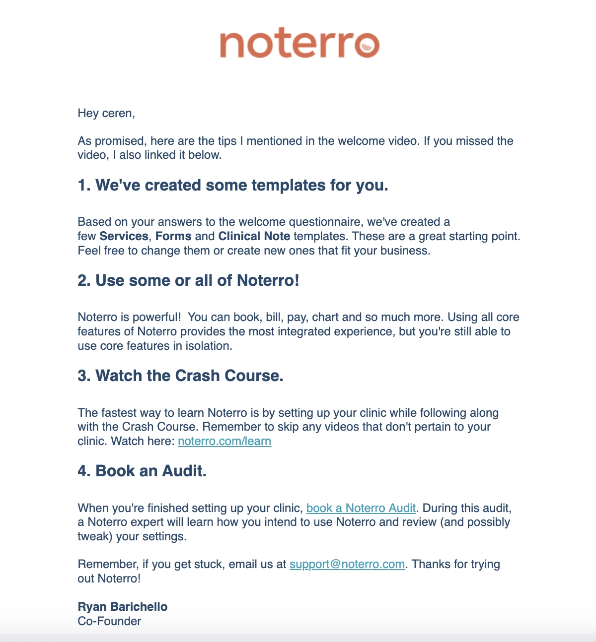
Here’s the first onboarding email Noterro sends to its new users:

As you can see, Noterro keeps the email very short and to the point.
It welcomes the new users, introduces the Noterro Settings playlist on YouTube, and highlights some of the popular features/ capabilities loved and used frequently by their existing users.
Later on, they send another email which reads as follows:
The email opens by reminding the user about their welcome video and lists the tips they shared/mentioned in that video as promised.
This whole “Hi, we talked about something and now I’m delivering what I mentioned back then” moment adds a very personal touch, and it also nudges the user to engage with the video if they haven’t already.
Best practices in this onboarding flow:
✅ The “Ask Lucy” chatbot icon is very eye-catching and feels genuinely inviting, encouraging users to ask for more information or support right inside the app.
✅ The onboarding emails highlight important resources and best practices, offering real value to the user. They also don’t feel promotional at all, which reinforces Noterro’s customer-centric approach.
NextGen EHR
NextGen is an electronic health record (EHR) and practice management platform designed for medical groups, clinics, and multi-specialty organizations.
Because it’s a complex, feature-heavy product, they don’t offer free trials or encourage total self-discovery. That would likely overwhelm new users and leave confusing first impressions.
Instead, they guide (potential) customers through personalized, pre-recorded demo videos.
How, you’re asking?
Let’s take a look 👇🏻
Use case-based demo videos
If you’re considering the enterprise plan (or if you’re just a curious clicker who explores every subpage) you’ll stumble upon a self-guided demo experience.
Why this isn’t highlighted on the homepage or offered to customers with fewer than 10 providers… we don’t know. Everyone else is referred to generic animated demo videos.
But anyway.
For enterprise prospects, NextGen personalizes the product demo based on users’ desired use cases and features of interest.
To do that, NextGen asks you to rank the importance of different features/use cases.
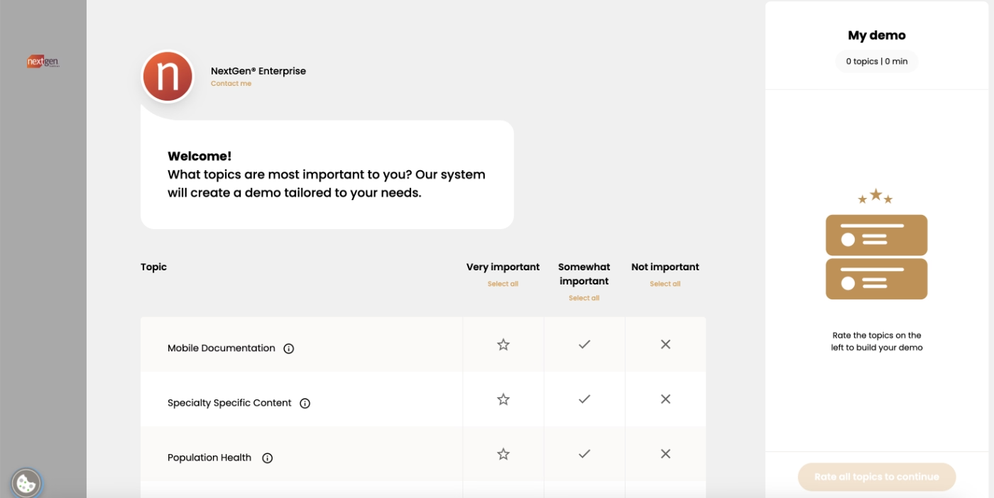
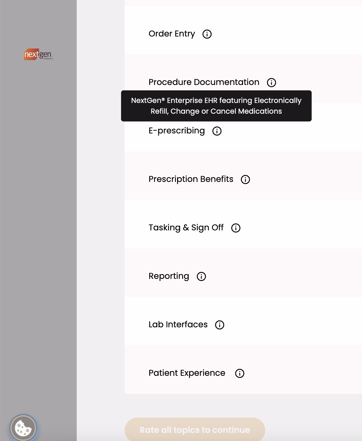
In order to make sure everyone understands the terminology used in the survey, NextGen includes hover-over tooltips that briefly explain each feature or use case.
Here’s an example for e-prescribing:
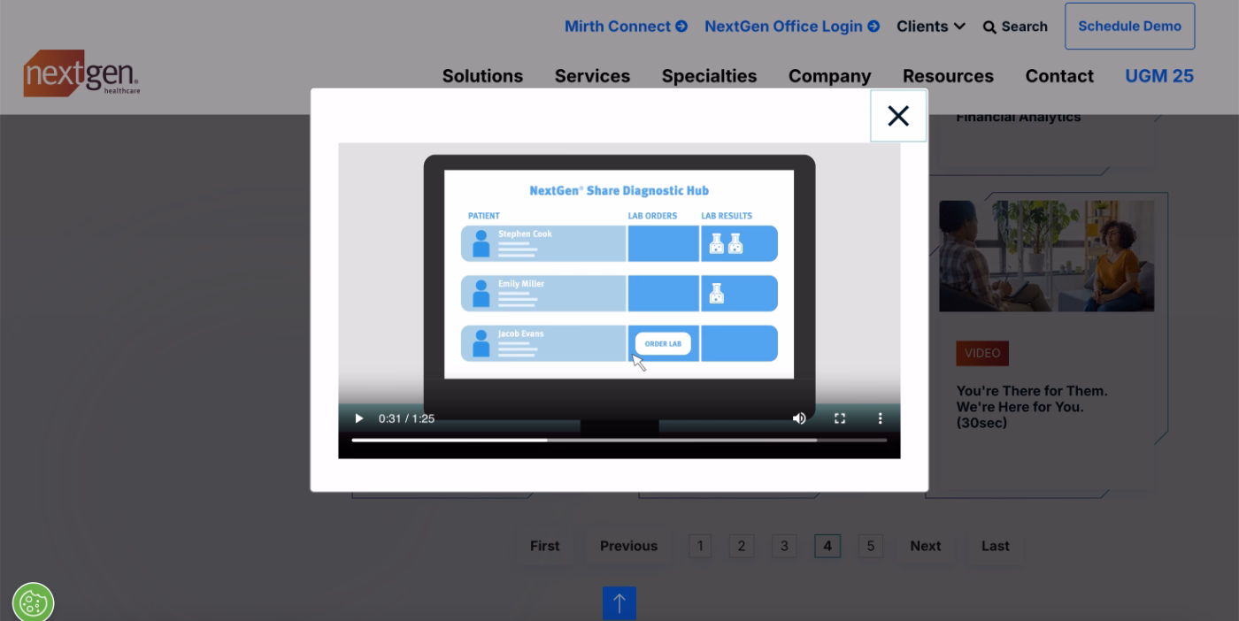
Once you rank each item (very important, somewhat important, not important), NextGen automatically curates a video playlist showing how the platform solves the problems and needs you care about most.
Although the entire experience is called a “demo,” the videos are actually feature and workflow overviews that share best practices and show how to get the most out of each capability.
Demo on paper, onboarding at heart. 🫶🏻
Which is why we included them in this onboarding case study.
Best practices in this onboarding flow:
✅ The interest survey personalizes the demo experience and helps users invest their time and attention where it matters most. The simple “very important / somewhat important / not important” scale is an effective way to prioritize feature education that may potentially have a direct impact on conversion/activation.
✅ The survey also acts as subtle feature promotion. Even if a user isn’t interested in a capability right now, they’re still introduced to its potential and value through the list.
✅ The feature overviews are short, focused, and practical, covering real workflows, potential use cases, and pro tips for getting more value from the platform.
Honorable Mentions -a.k.a. neither good nor bad examples
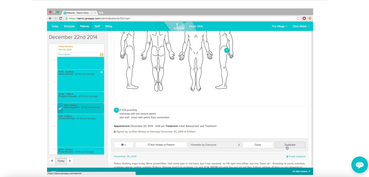
Jane App
Jane App is a practice management and scheduling platform designed for health and wellness professionals.
Here’s what it offers in terms of onboarding and user guidance 👇🏻
Demo and tutorial video gallery
Similar to Tebra, Jane App also doesn’t offer a free trial and instead relies heavily on scheduled demos. But they clearly understand that this approach isn’t exactly everyone’s favorite thing, especially as nearly every industry continues shifting toward self-exploration via free trials and freemium plans.
To bridge that gap a little, Jane App offers a gallery of demo and tutorial videos.
However… the structure of this gallery is a bit, well, chaotic.
There are two main categories, demo videos and tutorial videos, but the differences between them are not very clear. Both categories contain videos explaining product functionalities, yet neither category seems tied to a persona, specific workflow, or meaningful use case.
Everything feels mixed together.
Here’s a look at their tutorial gallery:
(most videos range from 3–10 minutes)
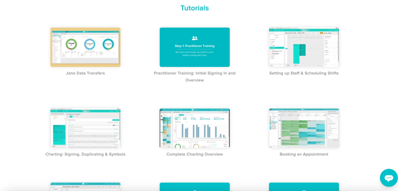
As mentioned, all of these are pre-recorded videos; there’s no interactivity, no step-by-step guidance, and no sense of self-discovery. But the bigger concern is that the videos appear noticeably outdated.
The UI shown in them looks old, and in at least one video, the on-screen date reads 2014...
Now, even if the workflows haven't changed drastically since then (which feels unlikely), this outdated presentation raises understandable concerns for (potential) customers.
If the tutorials don’t feel current, it’s fair for users to question how accurate or relevant the content still is.
What needs to be improved in this onboarding flow:
➡️ The video gallery needs to be re-organized in a way that makes sense to users, not in a random order of videos but in video categories of features, use cases, workflows, or products.
➡️ The demos and tutorials should have meaningful differences between them. One can be more detailed and encompass different features/capabilities, and the other can be shorter and more focused.
➡️ The video content should be updated more regularly; even if the app itself doesn’t change, the materials should feel recent and relevant to the user when they see it.
A for the idea, D for the implementation. 🗒️
Zanda
Zanda is a practice management and scheduling platform designed for healthcare and wellness professionals, offering tools for appointments, charting, billing, and patient communication.
And they, too, onboard their new users with video guides, mostly.
Video guides
Zanda’s walkthrough videos appear inside what looks like an in-app resource center shown right after account setup.
However, despite the in-app appearance, neither videos nor the help articles actually run within the product, they both open in a separate browser tab.
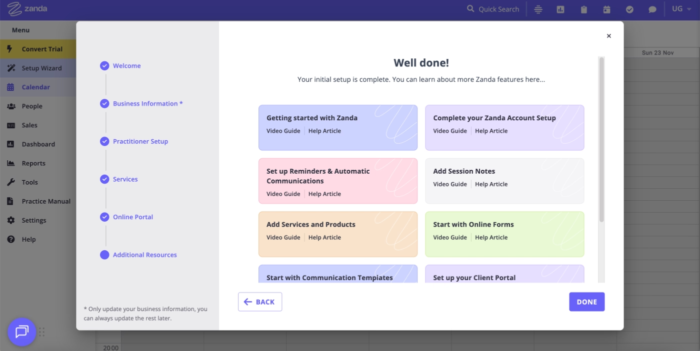
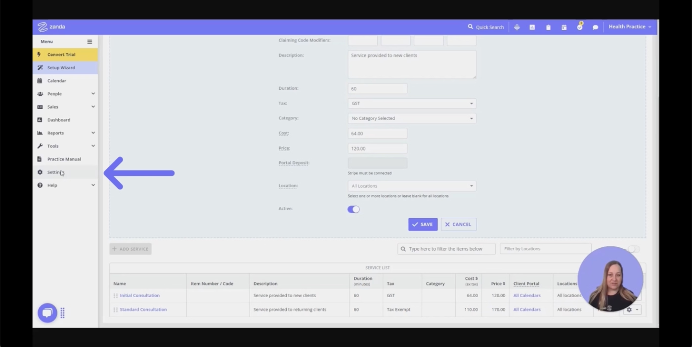
The videos, however, are recent and up to date, especially compared to Jane App’s outdated library. They’re also better categorized, with clear groupings around features and workflows, making the gallery much easier to navigate.
To further improve accessibility, Zanda also includes additional visual cues in the videos, highlighting click areas and navigational steps, so users can follow along more easily while watching.
What needs to be improved in this flow:
➡️ Videos and articles could function fully within the app rather than redirecting users to external pages, which would create a more cohesive onboarding experience.
Doxy.me
Doxy.me is a telemedicine platform that allows healthcare providers to run browser-based virtual visits.
Here’s how they educate and onboard their new users:
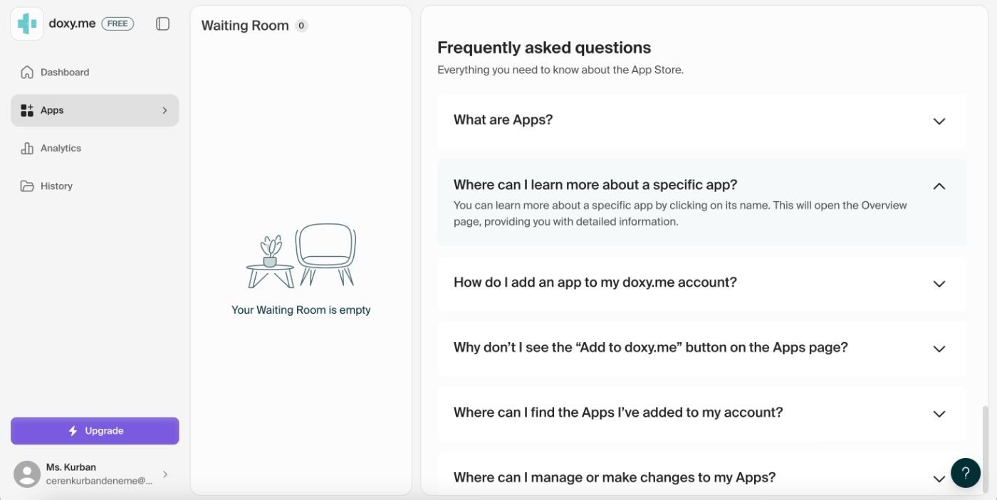
In-app frequently asked questions section
Doxy.me uses the empty state of their product to surface key training materials and essential “getting started” information for new users.
One way they do this is by displaying frequently asked questions right inside the app, so users immediately get answers to common concerns the moment they first interact with the platform.
Embedded guidance for apps
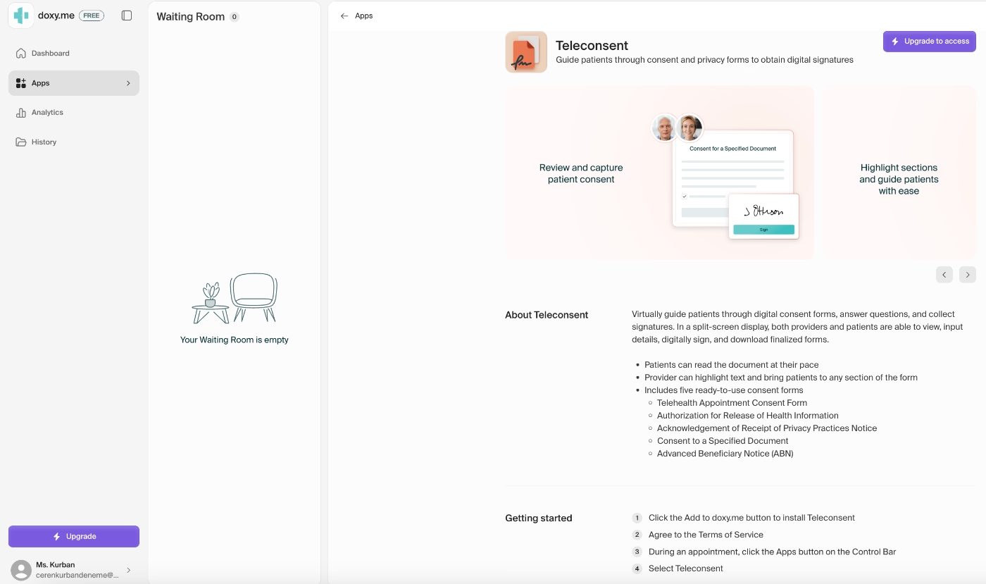
The FAQs are great for preventing simple, avoidable issues and addressing top-of-mind questions, but they don’t dive into the specifics of each app or feature.
For that kind of detail, Doxy.me uses the empty state within each individual app tile.
When you click into an app, a short embedded guidance panel opens in the sidebar with:
- a quick explanation of the app’s use case,
- a list of its capabilities, and
- simple instructions to help users start using it right away.
What needs to be improved in this flow:
➡️ The FAQs and short introduction-style info boxes are genuinely helpful but they’re very text-heavy and don’t support different learning styles. Once the user starts populating the workspace, these “empty state helpers” won’t be visible anymore, and the text-heavy guidance might feel crowded or easy to ignore.
A bit more variety in content format (short videos, visuals, GIFs, or interactive tooltips) could make the experience much more engaging and accessible.
Insufficient HealthTech onboarding examples to learn lessons from
IntakeQ
IntakeQ is an online form and electronic signature tool built for therapists, primary care providers, counselors, and other healthcare professionals.
The product’s capabilities seem simple and intuitive, and the interface is indeed basic and relatively easy to navigate. This simplicity is likely what IntakeQ relies on, given they offer almost no in-app guidance.
Here’s what they provide 👇🏻
Insufficient in-app guidance
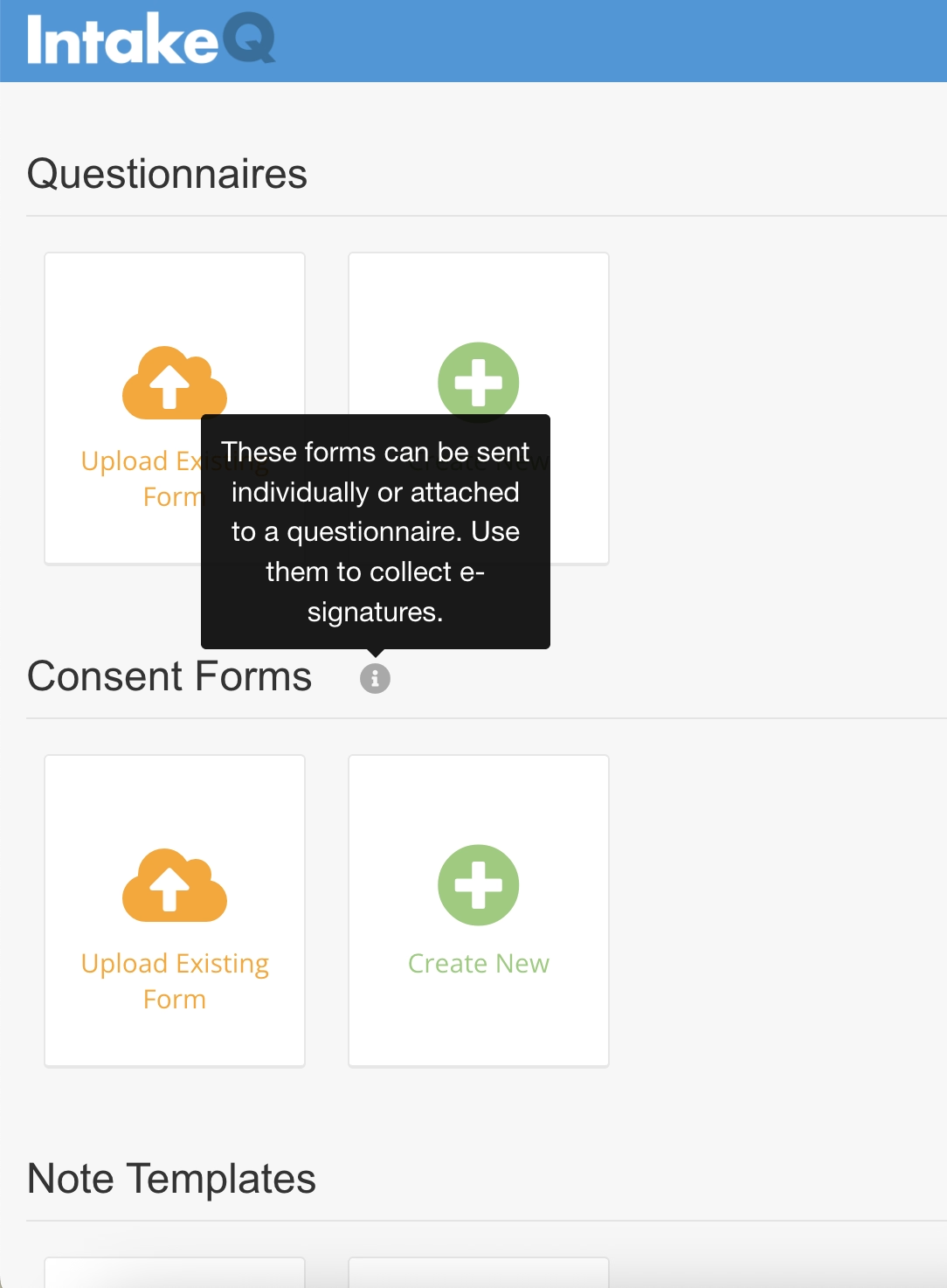
You can create several types of forms with IntakeQ, run audit trails, collect signatures, take notes, manage clients/patients, create reports, and even handle taxes.
There are many hidden features, actually, but there’s no in-app guidance or feature promotion to help new users discover them or understand what they do.
The only meaningful in-app guidance visible is a hover-over tooltip on the homepage for consent forms.
It’s actually a helpful tooltip with valuable guidance.
Just the only one, though.
Not-so-helpful in-app help center
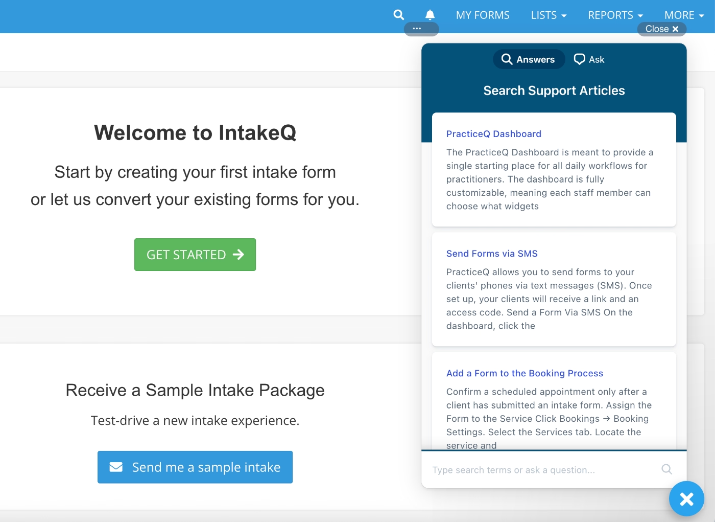
IntakeQ does make its help center accessible inside the product through a widget, which is great for quick access.
However, there’s no thoughtful categorization that groups important basics together for new users, organizes information by feature, or highlights FAQs.
If you have a specific question, you might find an article by typing it in manually.
But if you’re simply trying to learn more about the product, explore features, or understand what’s possible, this help center does nothing to guide or inspire.
If you don’t know what to search for, or don’t yet know the words to describe your problem, you won’t discover anything useful.
It’s not motivating for self-discovery at all.
Spammy onboarding emails
When an app gives you no in-app guidance, you might expect them to be equally quiet over email, but IntakeQ does the opposite.
Immediately after creating an account, users receive three emails at once. None of them are account verification or essential setup emails.
- The first one is very generic, but let’s call it a welcome email. Fine.
- The second is an invitation to an in-person demo… before you’ve seen the tool.
- The third is a “limited-time” discount offer… again, before you’ve made a single form in the app or even verified your email.

Worst practices in this onboarding flow:
❌ There’s no product tour to introduce lesser-known features or explain how to get real value from the platform.
❌ The in-app help center is difficult to navigate and not designed for product education, only for solving immediate issues.
❌ The “onboarding” emails lack value and demand too much commitment too early, before the user has explored the product. It leaves a poor impression and doesn’t feel customer-centric.
Charity Tracker
Charity Tracker is a case and referral management tool. While it is mostly used by non-profit organizations and communities/ agencies, they also list healthcare organizations and hospitals among their target audiences.
The app is especially useful for social services referrals.
However, the tool suffers from a very outdated UI and no in-app guidance at all, which makes adoption unnecessarily difficult.
Here’s what the problem with Charity Tracker’s onboarding is:
No in-app guidance
As mentioned, the app offers zero in-app guidance.
No onboarding. No setup guide. No static information or empty-state training. No tooltips. No nothing.
Here’s what you see when you first enroll:
(The home page…)
Confusing demo accounts
To make exploration easier and risk-free, Charity Tracker offers sample accounts, yes, entire accounts, not sample data with your own account, so that users can test the platform without feeling nervous about accidentally publishing something or referring a real person.
These sample accounts’ email addresses and passwords are listed publicly on the product education page.
Here’s what one of them looks like:
Poorly organized tutorials
You might be thinking: Wait, you said there’s no onboarding, but then you mentioned a product education page, what’s that about?
Well… yes. There is a product education page, and it does contain onboarding and training content.
However, every bit of training is stuffed into one long, 2-hour tutorial video.
The video is kind of time-stamped, and you can jump to specific features through the list below the video, which links to the relevant moments.
However:
- Nothing is highlighted as “essentials” or “basics” for new users.
- The time-stamp list is basically just a giant list of all features, actually.
- Reading the list doesn’t help you understand what matters first or what’s core to the app.
This leads to two possible user experiences:
- You pick random parts, learn some things, and miss many others.
- You feel decision paralysis and likely abandon the training altogether because watching a 2-hour video as a brand-new user is a big ask.
Worst practices in this onboarding flow:
❌ Providing full sample accounts (email + password) instead of offering sample data within the user’s own account adds unnecessary friction as it means users juggling multiple logins.
❌ There is absolutely no in-app guidance that helps with navigation.
❌ The training being one giant video instead of 20 shorter, focused ones increases mental load and dramatically reduces engagement.
❌ There is no prioritization of information on the training page, nothing that helps new users quickly get started with the essentials.
ClinicSense
ClinicSense is a practice management platform that offers tools for scheduling, online booking, treatment notes, invoicing, and client communication.
Similar to many other HealthTech platforms we’ve covered so far, ClinicSense also relies on video content for user education and product training.
However, the problem they (or rather, their users) face isn’t about choosing video-based onboarding but rather how little of it they offer…
Limited feature demos
ClinicSense has a lot of features, 17 listed on their website, to be exact. And even if some of those “features” could arguably be grouped together under a single training module, it’s definitely not something you can cover with only four walkthrough videos.
ClinicSense currently provides detailed training for just four features:
- online booking
- scheduling & calendar
- treatment notes
- online forms
But other equally important features like appointment reminders, invoicing, client referrals, and wellness check-ins don’t have any video onboarding material at all.
For (potential) customers who want to evaluate these capabilities, this creates a pretty significant knowledge gap.
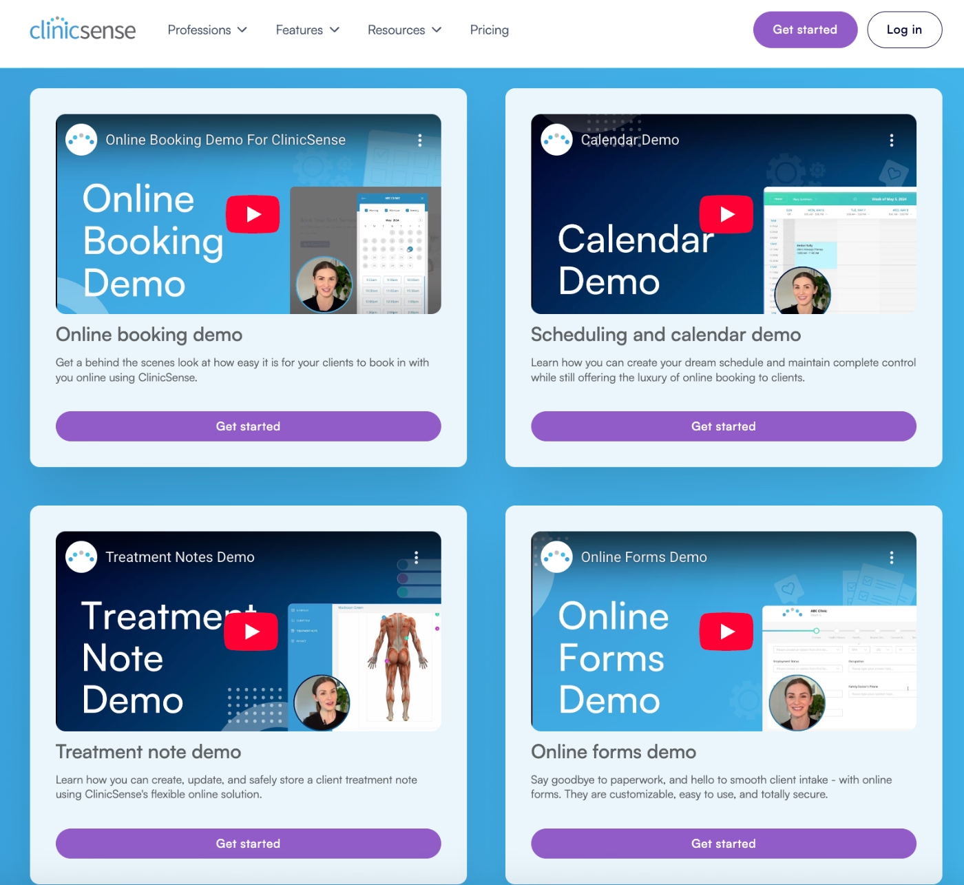
Worst practices in this onboarding flow:
❌ Only 4 video demos for a product with 17 features creates major blind spots for new or evaluating users.
❌ Important features (like invoicing or reminders) have zero visibility in onboarding, forcing users to self-discover or dig through the website.
What to do (and what not to do) while onboarding for HealthTech products

.png)


