Are you looking for a solution to ensure that users fully understand how to get the most value out of your product?
Well, you came to the right place.
Using engaging interactive walkthroughs can enhance several metrics related to:
- product adoption,
- user retention,
- user satisfaction, and
- user activation (check how Opinew increased it by 10% here 👈).
This guide will help you understand the basics of interactive walkthroughs, how they differ from traditional guides (even modern product tours), how many categories they divide into, and how you can create each from scratch (several inspirations involved).
TL;DR
- Interactive walkthroughs are mediums that walk users through products, accelerating time to value by helping them realize product value.
- Interactive walkthroughs divide into three categories:
- step-by-step guides,
- tooltips and pop-ups,
- video walkthroughs.
- You can make an informed decision between these categories based on your needs.
- Interactive walkthroughs have many benefits compared to traditional guides, as the former promotes user engagement rather than relying on static documentation.
- There are several more reasons why you need interactive walkthroughs, including a better user retention rate, higher product adoption, and fewer customer support tickets.
- Regardless of your walkthrough choice, when it’s time to create one, you should always:
- welcome your users,
- show them around your product in stages,
- be clear and concise with your explanation,
- customize the user interface elements,
- and end the process with a powerful call to action.
- Some of the best working practices for creating an interactive walkthrough involve:
- proving your value by focusing on your use (not your product),
- defining your Aha! moment clear enough to harmonize with your walkthrough,
- conveying each message in a clear manner and through short sentences,
- starting a feedback loop with users to maintain an improvement cycle on walkthroughs.
- UserGuiding can help you create an effective interactive walkthrough without coding.
What is an Interactive Walkthrough?
An interactive walkthrough is a step-by-step tutorial embedded within a digital product (such as a website, software, or app). It helps users understand how the product fully functions, increasing user engagement and efficiency.
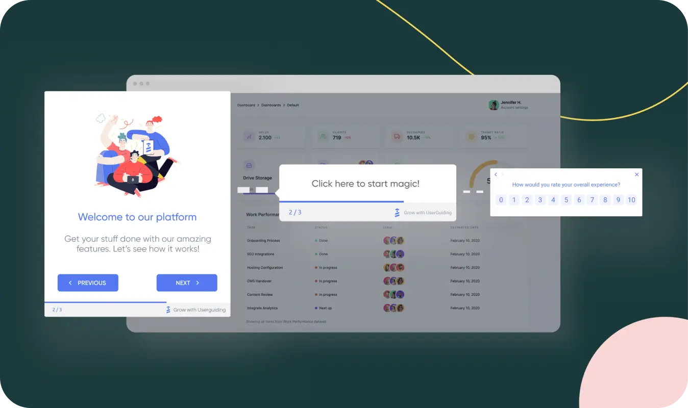
For example, this image from UserGuiding breaks down some of the essential elements that make a walkthrough interactive, lined up as a welcome announcement modal, tooltip, and survey.
These elements get users to interact with the product more through various means (such as informing them about their next step, calling them to perform an action, and leaving product-related feedback) and help the average completion rate for a product tour reach 61%.
Why do you need interactive walkthroughs?
There are several reasons why you should adopt interactive walkthroughs, including the following:
1- Engage with your users for higher adoption
Interactive walkthroughs allow users to gain hands-on experience via interactive user interface elements that go through the product.
Upon learning how your product works, users can (re)discover your features with more confidence now that they know what to do, where to go, and how to implement them.
Ultimately, this sequence of learning, starting to use, and accomplishing goals promotes a higher adoption rate.
You can check out how Indicata increased its adoption rate after utilizing UserGuiding here 👈
2- Improve the learning process for retention
Interactive walkthroughs enhance the learning experience for users since they simplify the display and explanation of the core items that users need to utilize for maximum performance.
Showing how users can derive value from your product step-by-step, interactive walkthroughs enable them to adopt your core features in a record time.
Understanding that your product can address your users’ needs increases the chance of them coming back to use your product, creating product stickiness and growing customer retention.
If you want to get inspired, you can read how Plandisc improved their user retention by using UserGuiding’s tooltips and hotspots.
3- Minimize support tickets with a better understanding
Another benefit of interactive walkthroughs is that these guides can reduce user confusion by providing real-time assistance at critical points, no matter how complex your product or features are.
Interactive walkthroughs provide clear navigation to ensure that users don’t get stuck during the discovery phase, which is extremely helpful when users need instant help.
This assistance alone reduces the need for support as users can find answers 24/7 through interactive walkthroughs that are always accessible.
Want to see how Cuepath decreased the number of support calls they got by 72% after deploying UserGuiding’s interactive UX elements?
3 Main Types of Interactive Walkthroughs
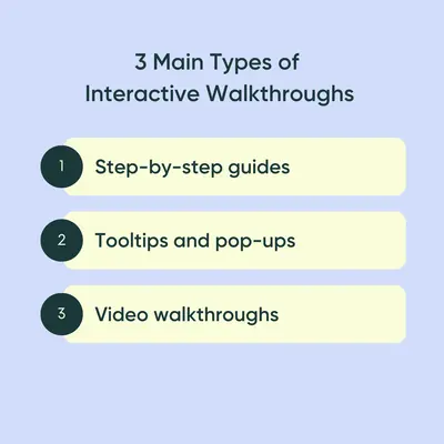
Upon understanding what interactive walkthroughs are, let’s dive deeper into the three main types that you can choose from or mix for even better results:
1- Step-by-step guides
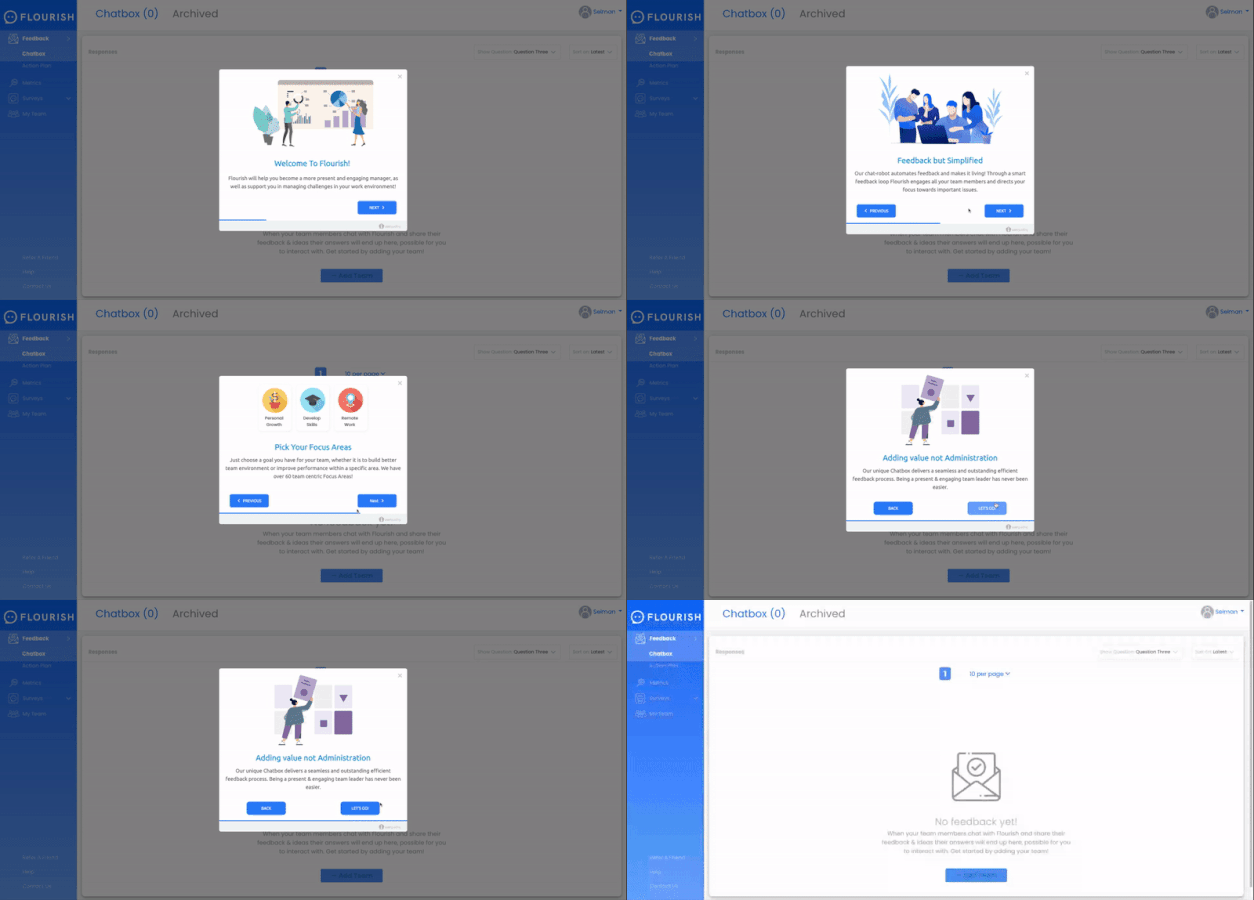
Step-by-step guides show users through a sequence of actions to ensure that they understand each feature your product offers.
These guides significantly reduce the effort users spend on learning and discovering, through hands-on experience, how to get the most value out of a complex product.
This type of interactive guide is particularly helpful for onboarding new users and introducing new features.
When creating a step-by-step guide, you shouldn’t add every detail in one because a product tour with 2-5 steps has an overall completion rate of 34%, the rate decreasing at every step.
Thus, it suggests that the more steps a guide has, the less engagement the guide generates.
How to create a step-by-step guide
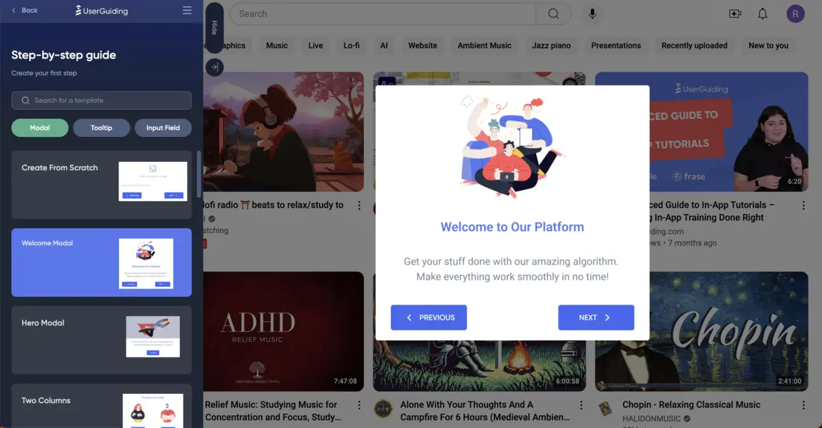
1- Welcome users to your platform
First, you must create a guide and choose your first modal to welcome your users to your platform, YouTube in this case.
2- Customize each guide item
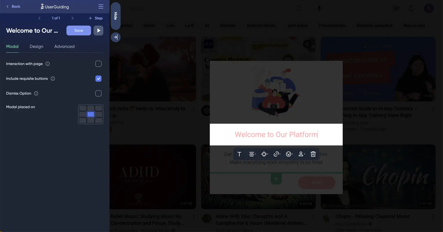
To customize your welcome modal, you can replace the order of each item on the screen—I chose to proceed with the default options (image, header, main text, and buttons).
Regardless of your order, you should ensure that items display your brand look and convey your brand voice.
Let’s start with playing with the text so you can welcome your users with a friendly tone while making a strong introduction explaining exactly what YouTube does.
For this step, you need to click on the header and body, respectively, and fill in the blanks.
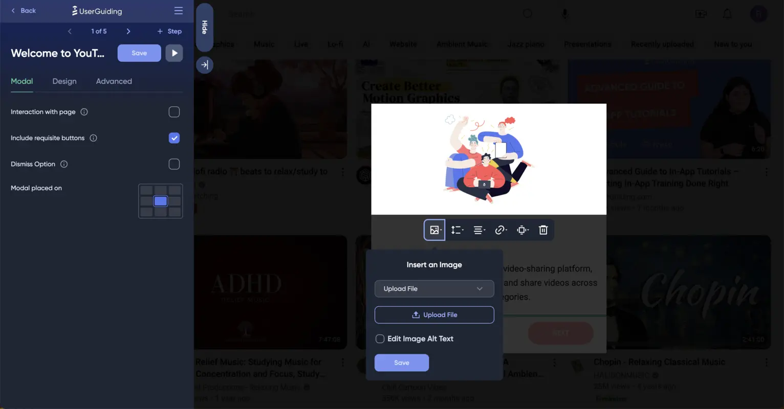
Upon finalizing the header and text, you can change the welcome modal’s default image to YouTube’s logo by clicking on the image, then the image box, and choosing a proper way to insert an image.
Noticing how the button stands out with a pinkish color, you might want to customize it as well to fit your general theme.
You can edit the color of your buttons by going to the Themes section (from the main application) and finding the Primary Buttons part.
I also opted to change the Tooltip Highlight Box because I wanted the whole sequence to match YouTube’s color scheme.
During this customization process, don’t worry about mistakes because UserGuiding provides you with a real-time preview area where you can see the elements you edit.
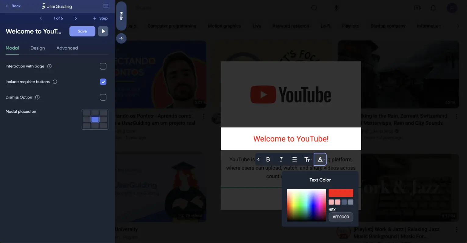
Now, all there is left for customization is the color of the text on your welcome modal, which you can quickly change by clicking on the text, then the Text from the menu, and choosing the Text Color button on the right:
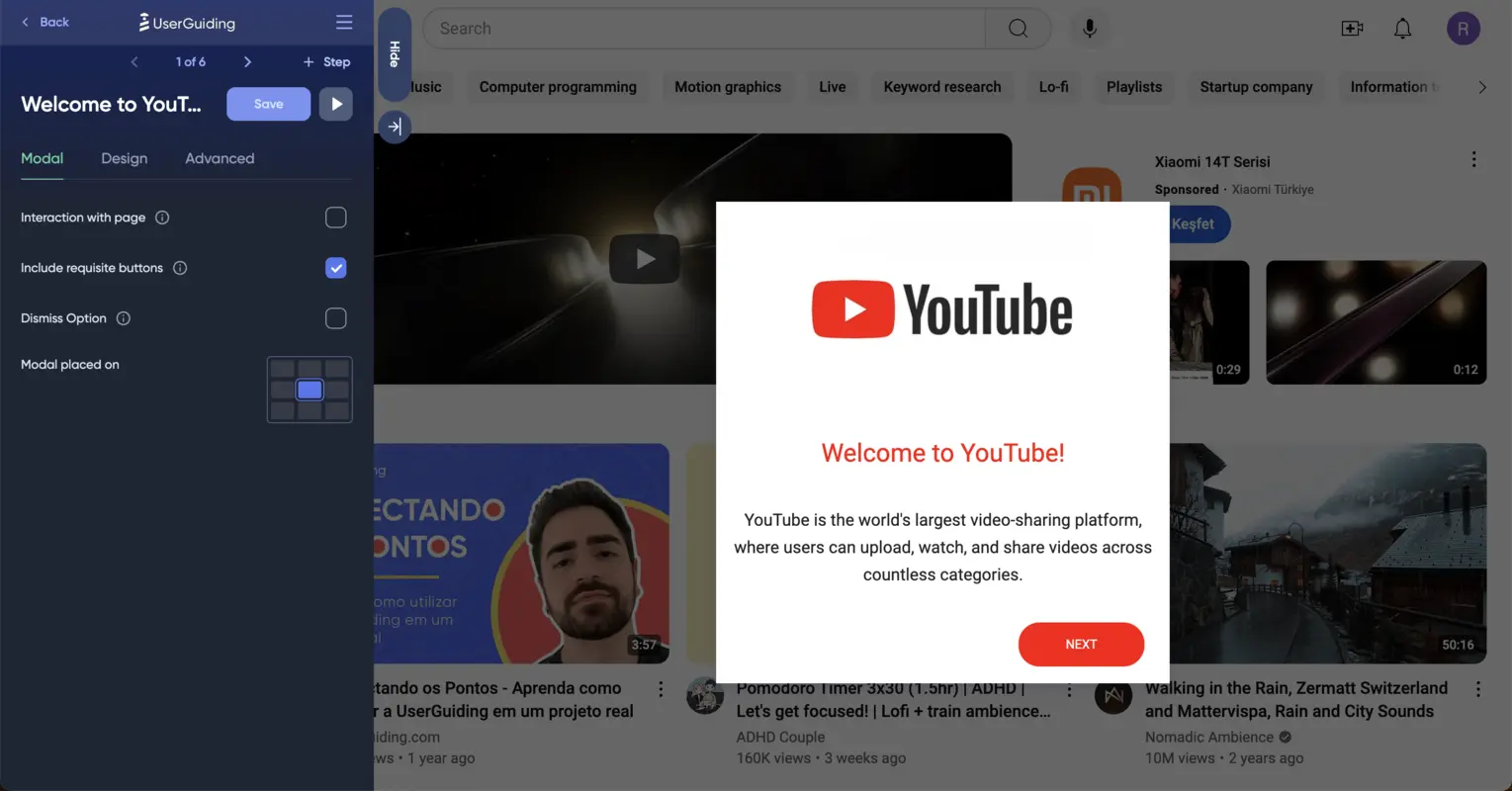
After saving your changes, this is how your screen will look:
3- Add one step for segmentation after welcoming users
After saving your welcome modal, you should add your second step, dividing your users into your use cases and urging them to take the right action.
For this segmentation, I chose a Two Columns modal that helps divide users into two different groups.
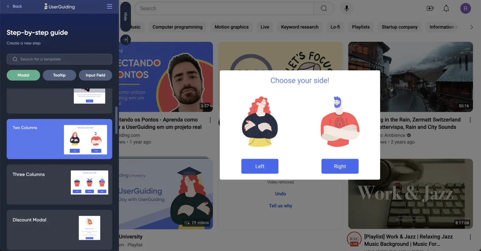
With this modal, you need to create two sequences that will prompt separate actions; I chose watching and uploading for YouTube.
After customizing the modal (just like I did in the first step), you should ensure that users are capable of following their path based on their choice.
To add a special route for the first option takers, you can click on the button and choose the fourth icon, “Click Actions,” which will lead you to a variety of options.
I went ahead with “Go to a Custom Step” because I want to hide the upcoming steps from the users who choose the second option, Upload.
Using this technique, I linked two steps to the first option and one step to the second option.
Here, the number of steps you add can change depending on the complexity of your platform, the length of your instructions, and even the type of your user base.
However, remember that to-the-point guides will have a higher completion rate than lengthy guides with plenty of steps.
4- Make sure the following steps are easy to follow
Adding steps to your guides, you should keep in mind that the location of your steps (in this case, modals) matters.
The tip here is to prioritize putting steps close to where you need your users to take action.
For example, I chose to locate the steps after the segmentation modal (except for the ending modal) in accordance with the places users should focus on.
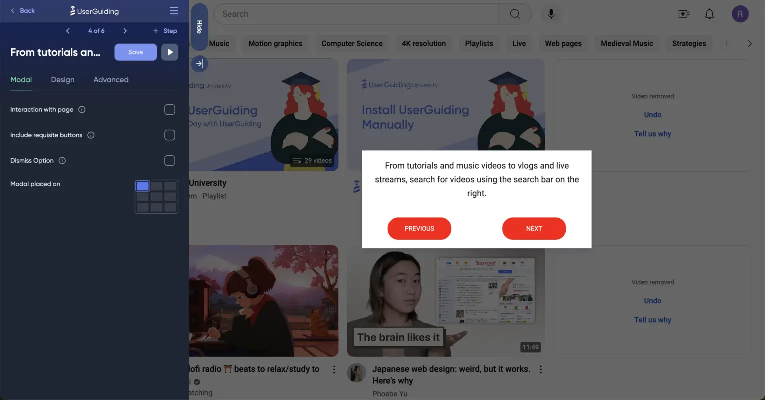
To do so, go to UserGuiding’s section on the right, find the “Modal Placed On” part, and choose based on the user interface.
5-Add an ending modal for completion
After finishing the steps, you should add a modal for your audience to thank them for finishing the guide.
You can also use this opportunity to provide them with more resources; for example, you can add another guide, display an HTML, embed a video, or buttons that lead to a URL and survey.
Here is how the step-by-step guides we created look in the preview form (for both segments):
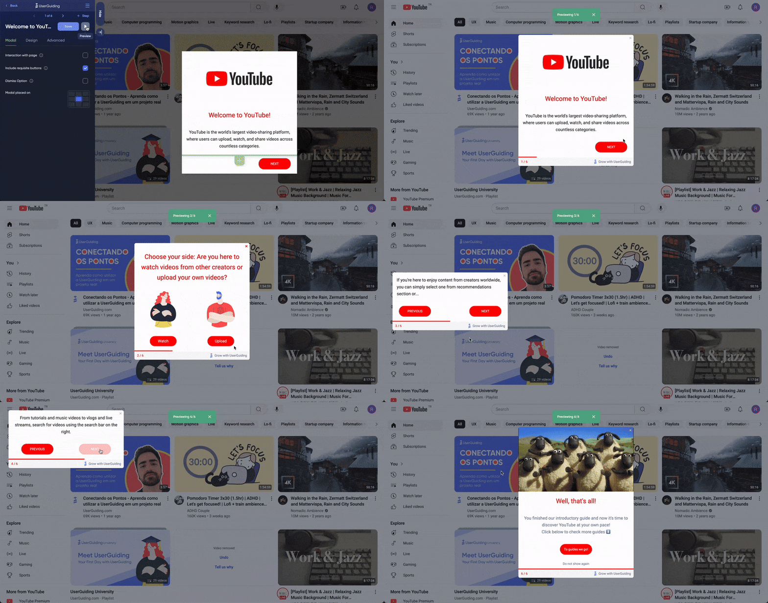

Inspiring step-by-step guide examples
1- Straico
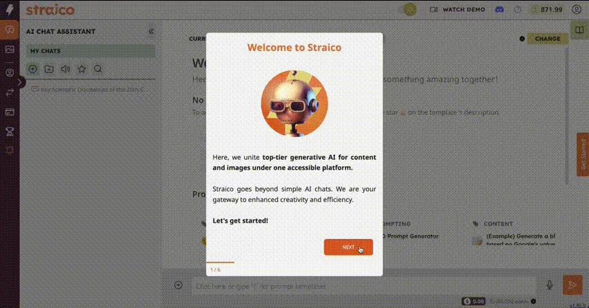
Straico introduces new users to the platform with the help of a short step-by-step guide.
This interactive guide explains how users can derive meaning from using Straico.
Check how it first welcomes users and urges them to get started!
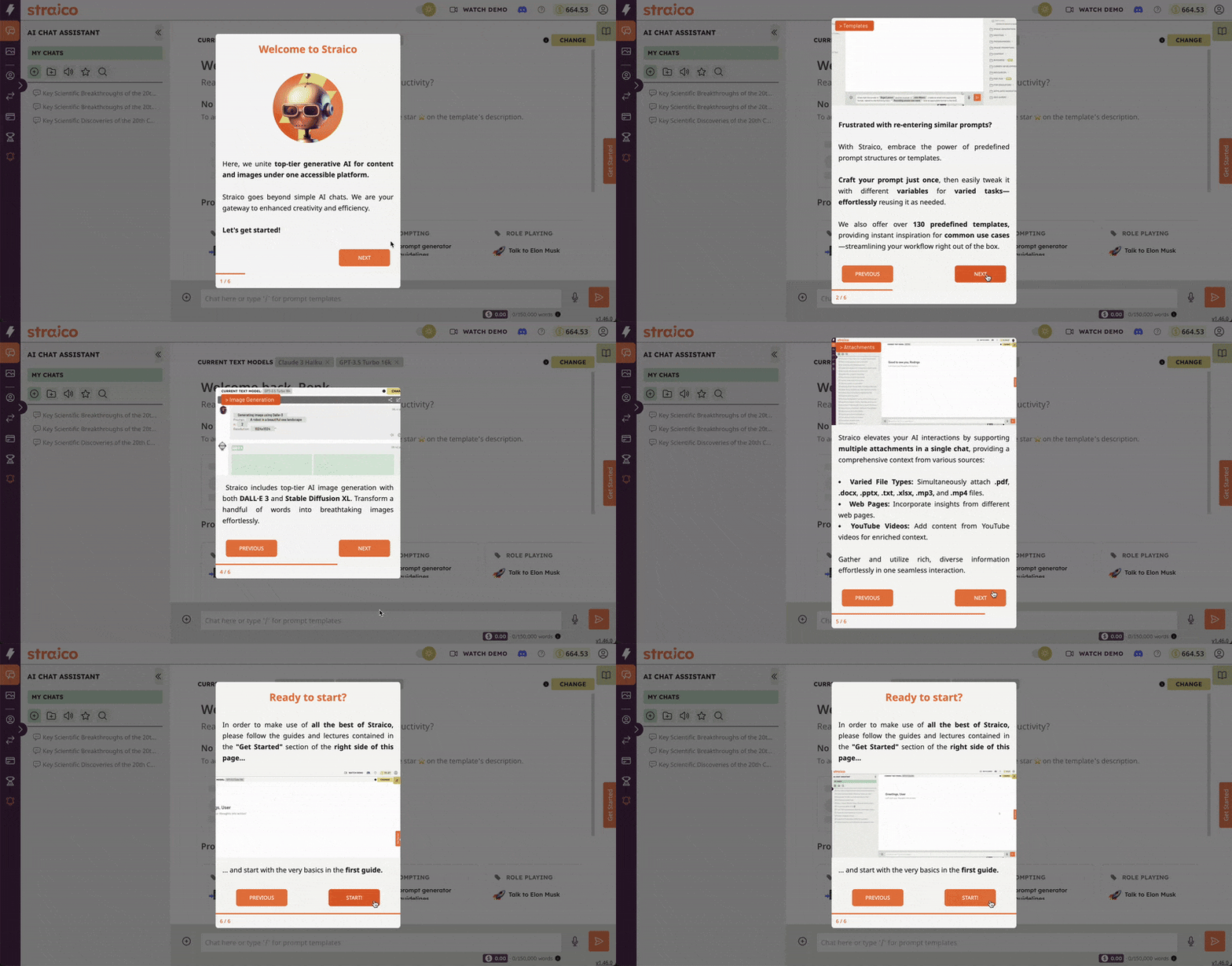
Moving on, the guide explains what users can achieve when utilizing Straico; the best part is that after the welcome modal, the guide involves GIFs in each step to help users grasp the platform's functionality more easily.
See the whole step-by-step guide in action here ⬇️
✅ What’s good in this example?
- It welcomes users when they first land on the platform and then starts the guide.
- Dismissing the welcome screen, it has only 5 steps for users to follow.
- Each step has a relevant GIF to help users to grab the essential information instantly.
- It is customized and on-brand with Straico’s general theme and color scheme.
❌ What’s -not really- good in this example?
- Some of the steps include too much information and long sentences.
2- Loom
Loom is a screen recorder tool that enhances productivity for teams to communicate both internally and externally.
In this example, Loom takes users by the hand and shows them around their platform through an interactive step-by-step guide.
This interactive guide aims to teach new users how to benefit from the platform and eliminate user frustration at the very beginning.
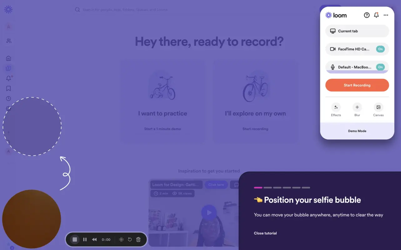
The first step explains how to position the selfie bubble so that new users understand they can benefit from the drag-and-drop functionality when recording.
This step also has a location where users should pull the selfie bubble to proceed to the next step.
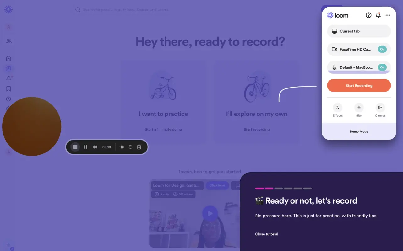
The second step is where the value of Loom is directly visualized since it encourages users to start recording their first Loom with tips; it also guides users to the section with recording settings through a white arrow to urge them to start recording.
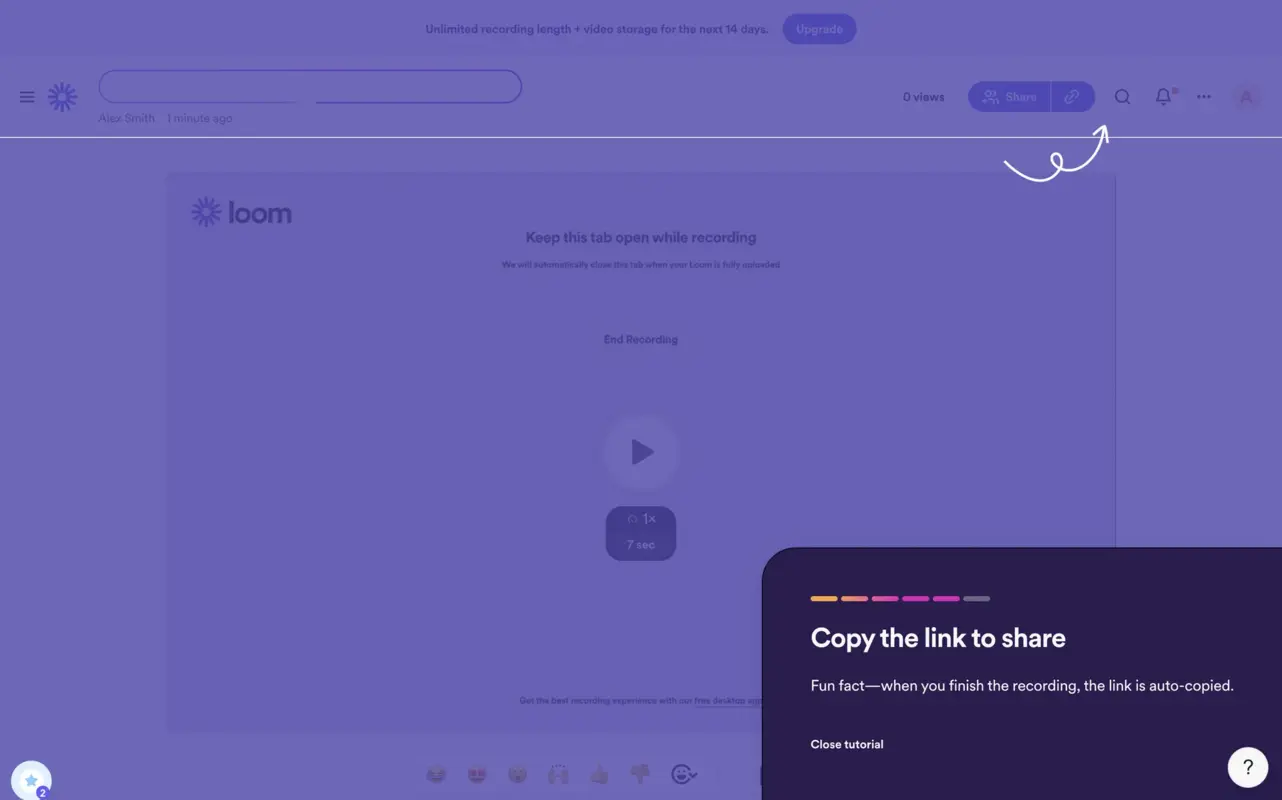
The last step is to copy and share the recording link, which is an activation point for Loom.
Through a step-by-step guide that conveys what the product offers with several interactive elements (like the drag-and-drop selfie bubble and recording section with buttons), Loom enables users to see core features in action and repeat them as soon as they finish signing up.
✅ What’s good in this example?
- It has really short sentences with clear call to actions for each step.
- It includes a close button for users who want to skip.
- It uses emojis to draw attention to a specific area and keep the journey easy-on-the-eye.
❌ What’s -not really- good in this example?
- No previous button.
3- Dropbox Paper
Dropbox Paper starts an interactive walkthrough the moment users get in the document to help them get started right away.
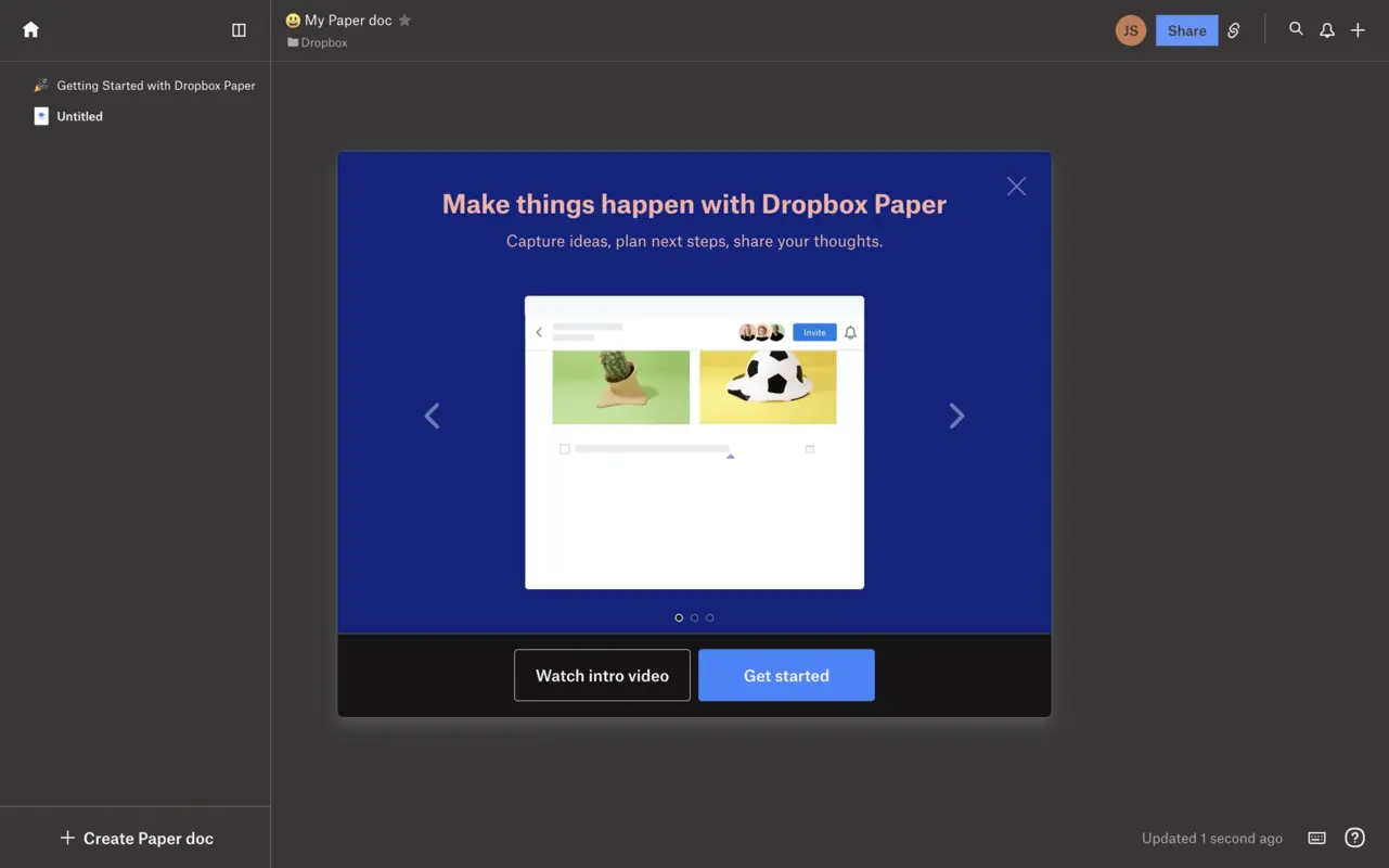
Dropbox Paper communicates what users can do on the platform with a short guide that displays visual materials along with a clear and concise copy.
This guide also contains several actions on its interface, such as a skip button and resource button linked to an external introductory video.
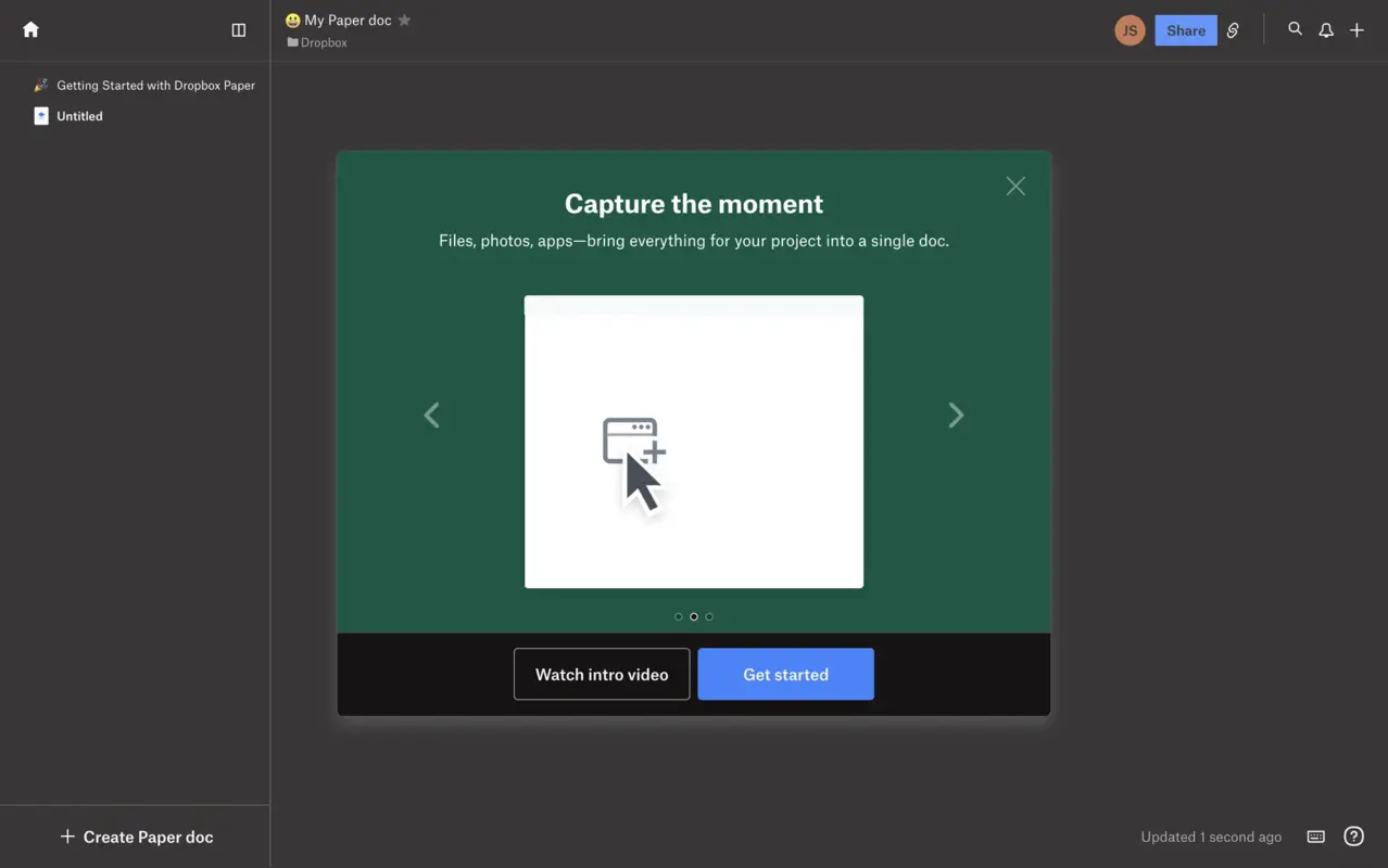
The next step explains the platform's main benefit by introducing the types of materials users can utilize within Dropbox’s documents.
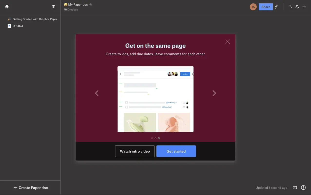
Dropbox ends the walkthrough with another slogan summarizing the last benefit, conveying what users can do through this platform.
Within the short copy, the guide highlights how to increase productivity using this document, touching upon one of the core value items.
✅ What’s good in this example?
- Each step includes a visual element to highlight the copy.
- It uses contradictive colors that stand out from the background.
- It includes clear call to action phrases and short copies that convey what users can do within the platform.
- It has the option to close the guide, and go back and forth between steps.
❌ What’s -not really- good in this example?
- It involves a direct link to an introductory video, but disrupting the user experience and sending them away from the guide isn’t a solid action.
2- Tooltips and pop-ups
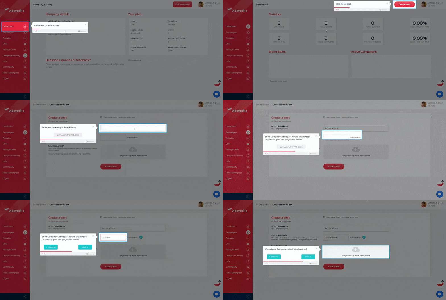
Tooltips and pop-ups are useful for providing users with contextual guidance since they can be triggered by user actions or specific locations within the interface.
Promoting hands-on interactivity, tooltips, and pop-ups draw attention to specific user interface elements with a beacon and explanation that assists users.
These items allow personalization because they can be tailored to user segments, use cases, and experience levels.
Since users are 38% more likely to complete a walkthrough triggered by an event they just completed, you can benefit from tooltips and pop-ups for contextual engagement in your walkthrough right after a relevant tour is completed or a checklist item is cleared.
How to create tooltips and pop-ups
For this type of interactive walkthrough, I picked Canva, whose Aha! Moment relies on users creating (and finishing) their first design.
So, the first step of our short walkthrough involves welcoming users with a welcome pop-up.
1- Create a welcome pop-up for new users and introduce your tool
Through UserGuiding’s Themes section, I did the following:
- adjust the button colors based on Canva’s logo,
- enable the progress bar and step numbers,
- and play with the shapes of boxes, moving with a rounder shape this time.
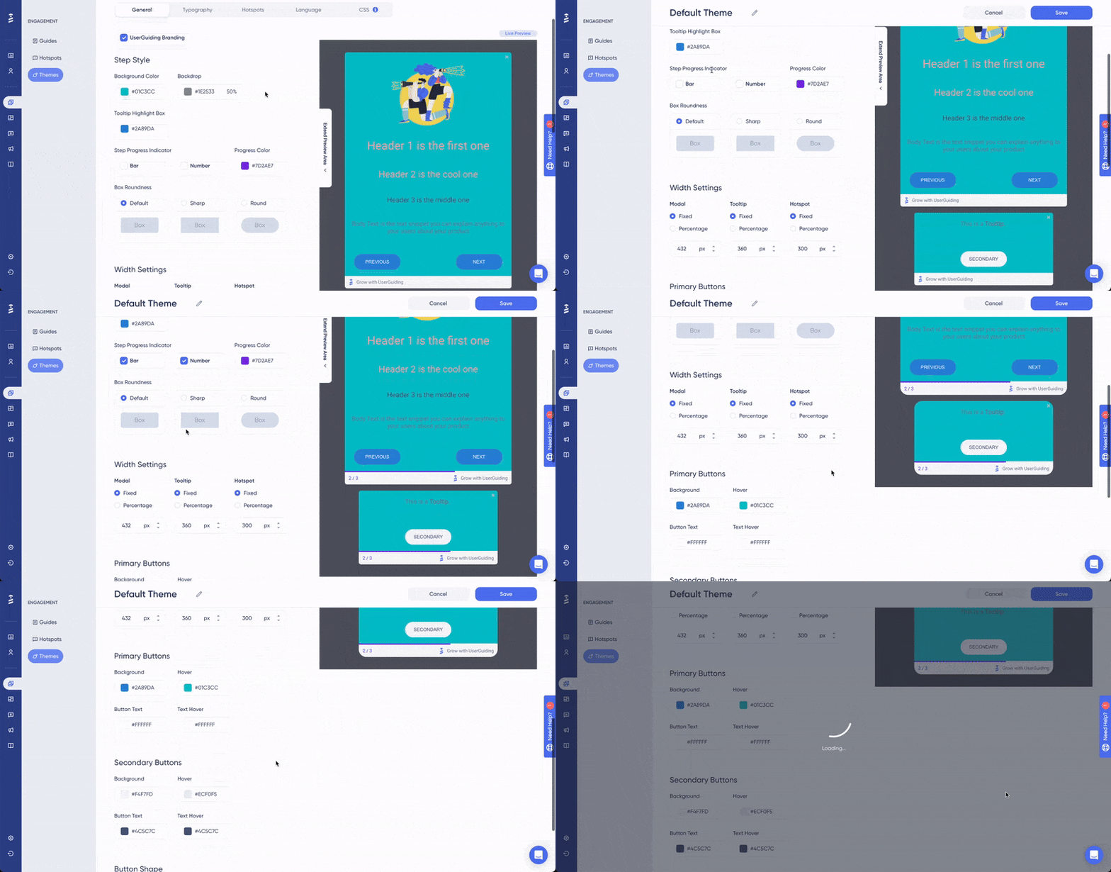
Moving onto the sidebar, you should once again focus on customization because reflecting your brand’s look and feel and creating consistency in this matter improves your brand awareness.
2- Add a tooltip to your sequence and show around your platform
For the second step, you should start employing tooltips and display your core features for your new users.
By checking each feature you offer, your audience will understand your offerings and be able to try it out themselves through interactive UI elements.
The first tooltip you use should tell your users about the main page of your platform since it will be the place they will frequently visit after logging in.
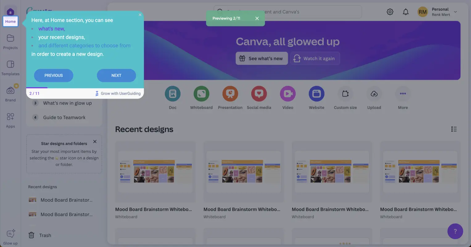
After using a tooltip with a brief description, you should guide users through the actions you want them to take, slowly enabling interactivity with the page.
Here are the steps you can stick to in order to make the rest of the walkthrough easy to follow:
- Urge users to take a step towards realizing value in your product through your main feature, creating a design in Canva’s case.
- Fill in the blanks for new users if there are any upcoming steps with choices that need explanation prior to taking any action, just like step four.
- Opt for either making all choices available and allowing them to choose or limiting the number of options; then, prompt them toward the selection area via tooltips.
- After selection, direct them to the page where they will perform the key features of your product; check our Canva walkthrough below.
- Introduce these key features to them one by one, along with some tips that can simplify this adaptation and adoption process.
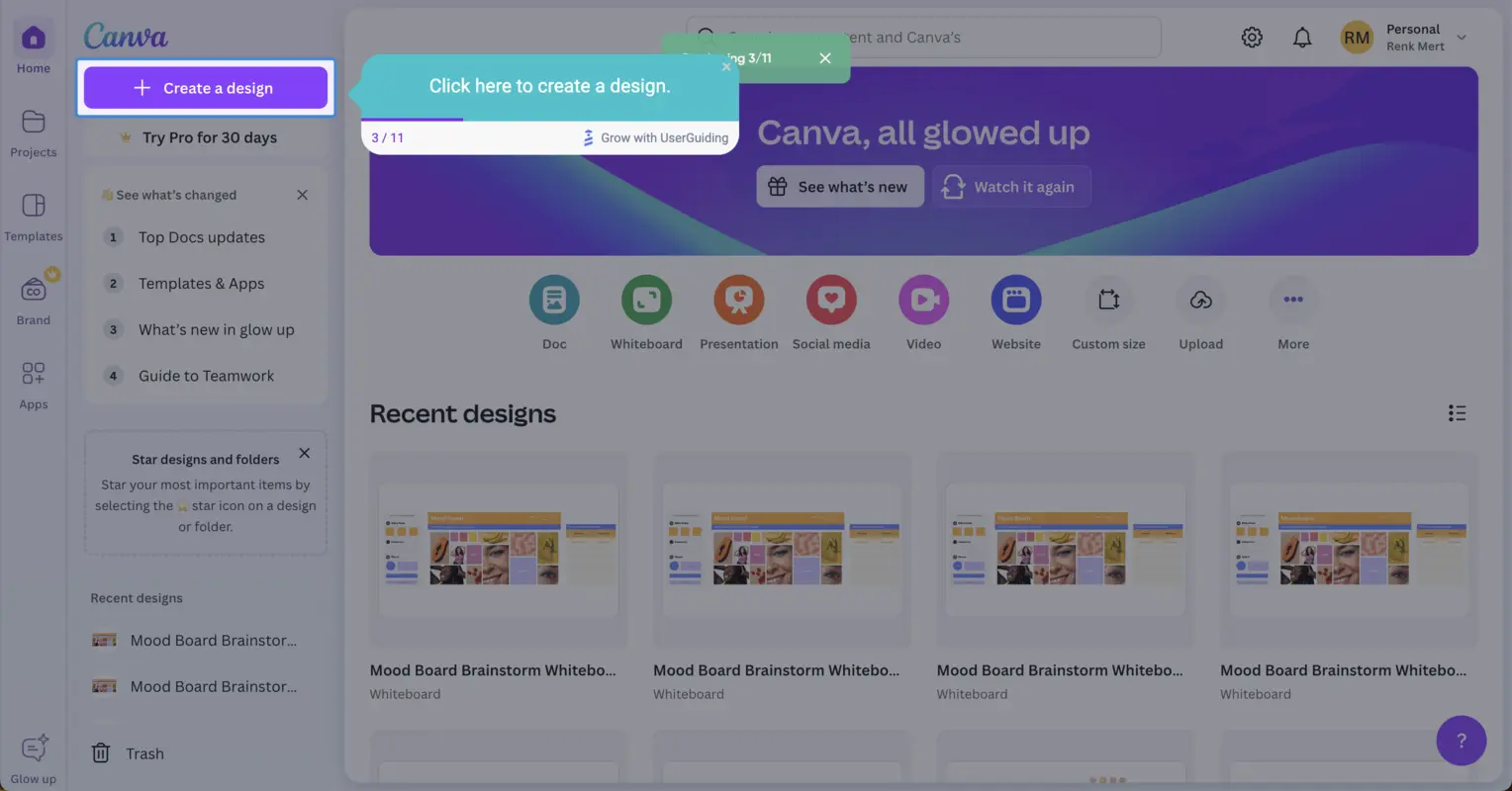
After introducing each necessary UI element, you should end the walkthrough with a modal that will propose some actions to your audience to help them reach their Aha moment.
For this case, it can be to encourage them to create their first design (or play with the current elements on the page to get the basics) on the moodboard (or any design you prompted them to choose during the selection process).
This sequence could benefit from an onboarding checklist that displays the actions you want users to perform for them to follow after the interactive walkthrough ends.
In another scenario where you opt for users to start the design process on a blank canvas (with a create from scratch button), you could also encourage them to finish their first design and share it, starting user activation.
In the example below, the first button ensures that users stay on the same page to work on the design, while the second button takes them to the help center, where they can find more information on any design-related topic they have in mind.
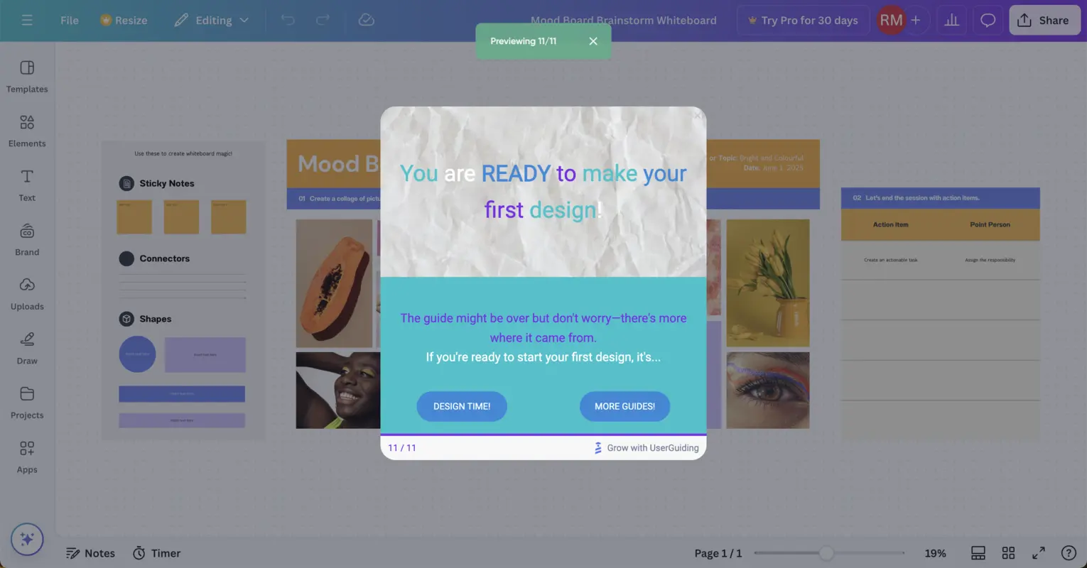
You can also continue adding steps to this interactive walkthrough for other sections, but I kept it short and simple to help new users quickly experience the product's value.
Inspiring tooltips and pop-ups examples
1- Canva
Due to its more features-packed interface, Canva is an application that uses tooltips and pop-ups.
As a combination, tooltips and pop-ups are extremely useful when users trigger a specific point, as they can guide users to features they haven’t discovered yet or help them with tips during the design process to eliminate confusion.
Just like any other interactive walkthrough, Canva first welcomes users to the design studio using a welcome pop-up.
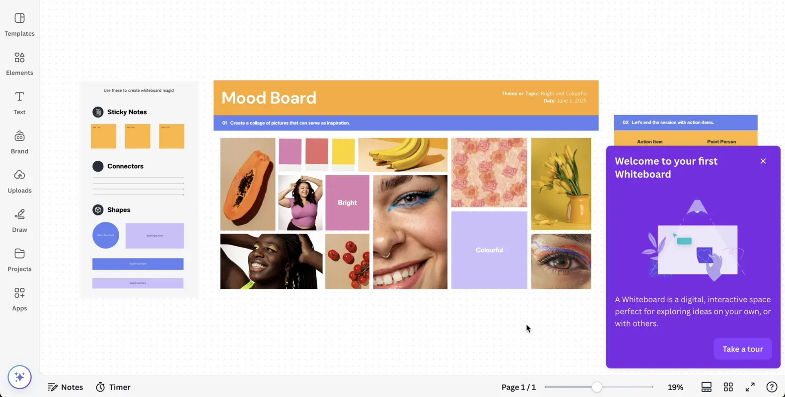
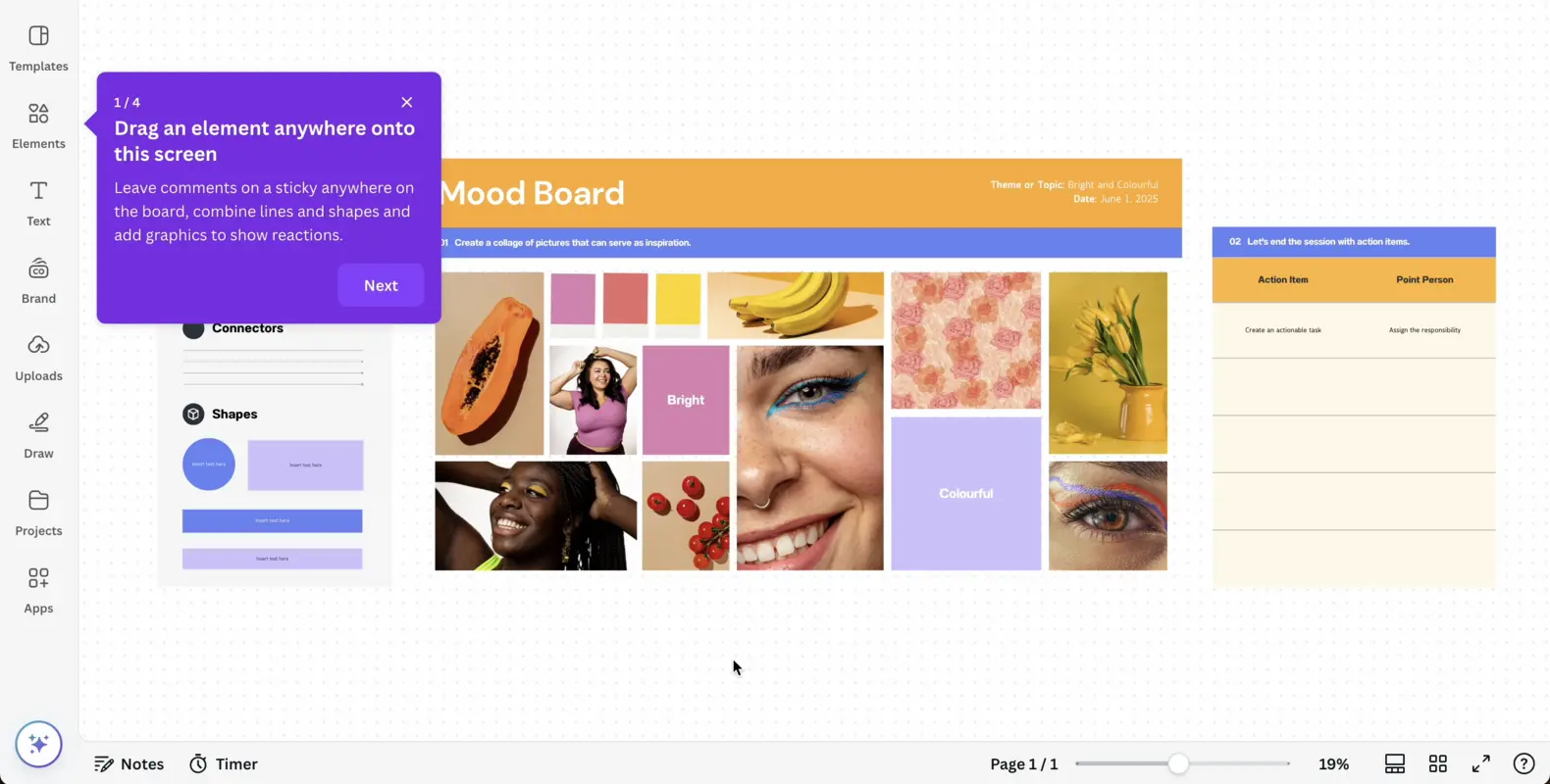
The next steps of this interactive walkthrough involve tooltips and pop-ups, which Canva uses to inform users about the functionality of their workspace. With these steps, Canva explains how to use basic elements within the application.
✅ What’s good in this example?
- It has a welcome screen, close button, and call to action button to start the walkthrough.
- It gives sufficient information on how to navigate through the interface and introduces the essential features through tooltips.
- It is a 4-step guide and provides users with clear and concise instructions for each feature.
❌ What’s -not really- good in this example?
- Nothing.
2- Jasper
Jasper is an AI platform for marketing, accelerating marketing processes, and automating workflows.
In this example, Jasper encourages users to tour the renovated interface of the editor page, which involves some of Jasper's core features.
Through a short interactive walkthrough, Jasper aims to help new users understand how to utilize the main features and reengage old users by urging them to interact with the fresh interface.
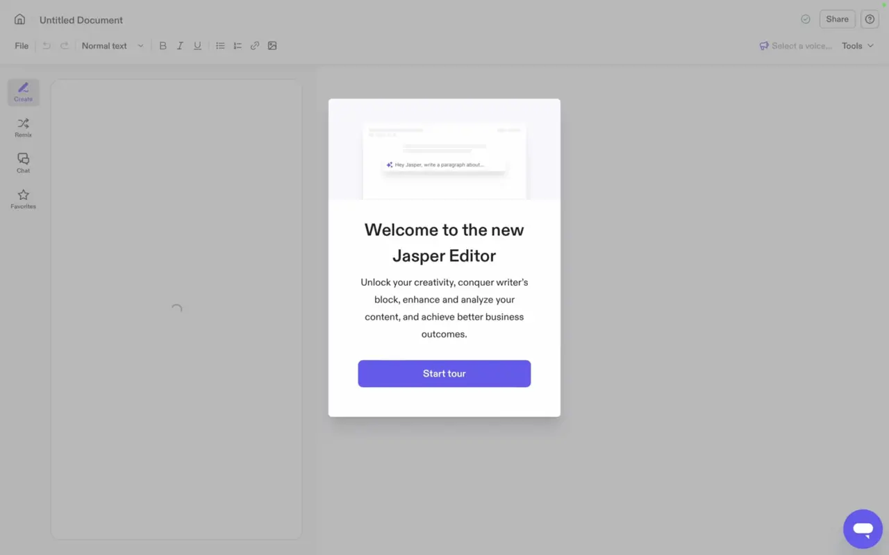
First, the pop-up welcome screen greets users to the new editor page and lists the benefits that this page can help them achieve.
With a simple and non-skippable call-to-action button, the interactive tour starts.
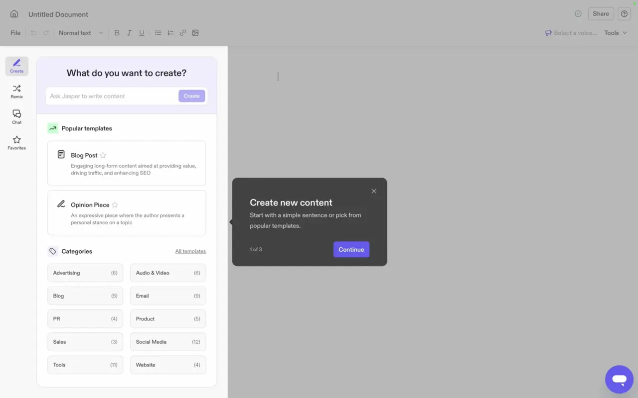
After users opt to start the tour, a tooltip pops up and locates the segment of the creation feature.
The first of three steps fills users in on the usage of this specific feature through short tips.
✅ What’s good in this example?
- It selects a specific portion of the screen to provide information about the functionality of the elements inside.
- It has three short steps with to-the-point instructions.
❌ What’s -not really- good in this example?
- It could harmony some benefits within the instructions.
3- Coda
Coda starts with a pop-up that urges users to learn how to benefit from the tool.
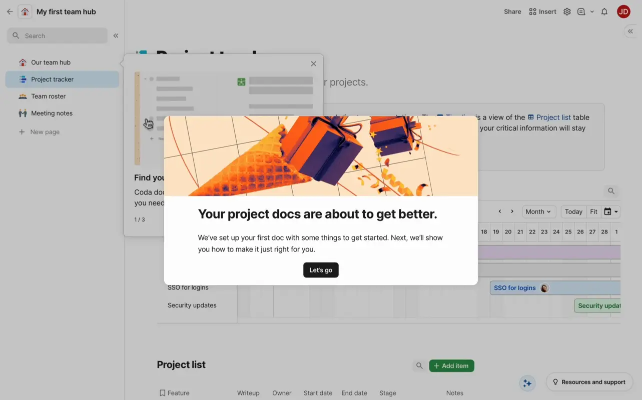
Note that this interactive walkthrough is non-skippable since it demonstrates the platform's main feature, ensuring new users understand the core value right from the start.
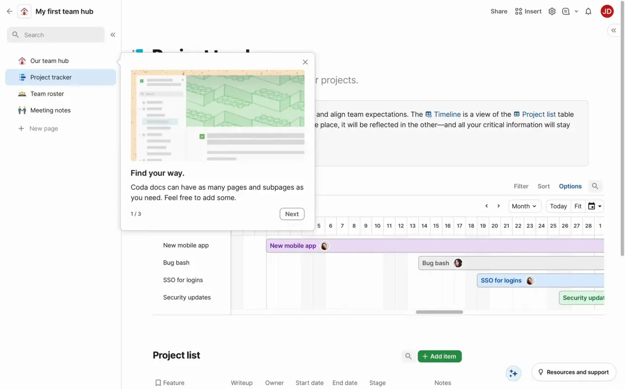
After clicking the call to action button, the walkthrough starts with a tooltip showing each document has pages and subpages to ensure that users eliminate a pain point and use it to their advantage to organize pages.
The tooltip also includes visuals with short animations to visualize the effectiveness of this specific function.
✅ What’s good in this example?
- It has three short steps with benefits and introductions of the sections.
- Each step includes short copies and relevant visuals for better understanding.
- Tooltips are skippable with previous and next buttons.
❌ What’s -not really- good in this example?
- Instead of stating the benefits on the first screen, the walkthrough could start with a welcome screen.
3- Video walkthroughs
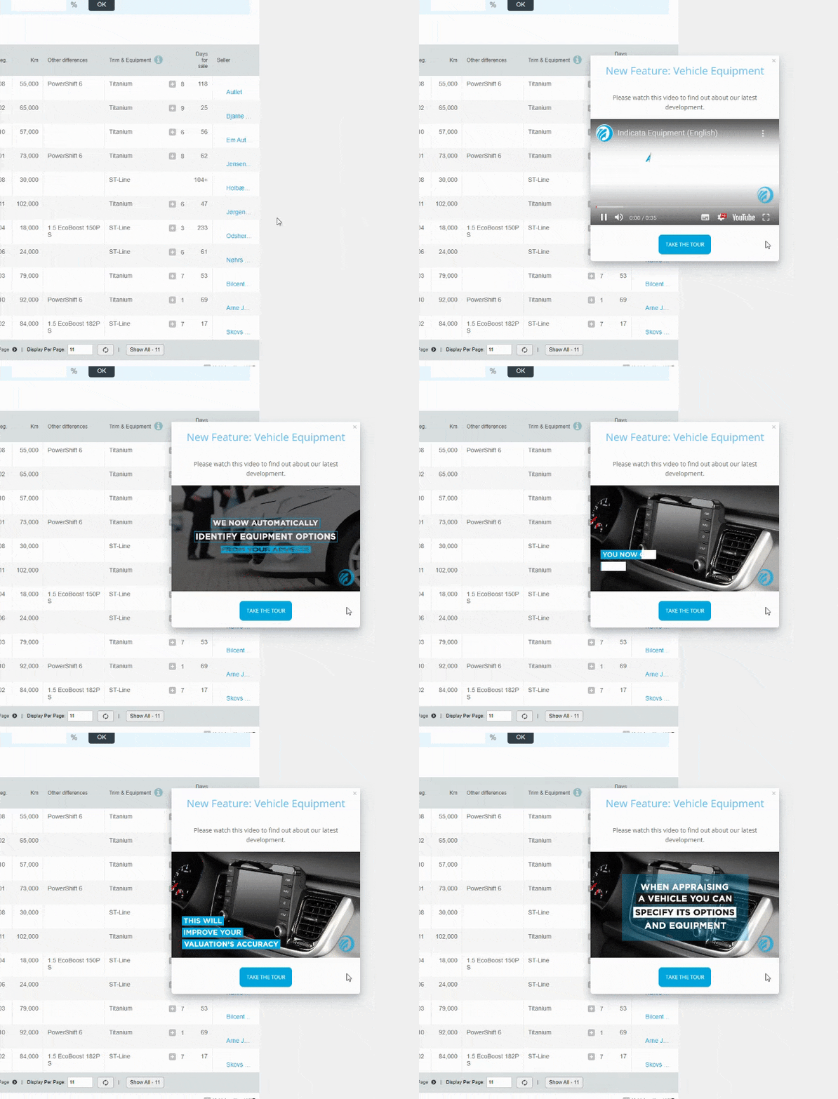
Videos play an essential role in increasing the user understanding of a product or service, state 94% of marketers.
Identically, video walkthroughs provide users with videos that have educational content inside so that they can pause, replay, and ultimately understand the mechanics of each step that will get them to success at their pace.
Thanks to video walkthroughs, users can follow a sequence of actions via video to ensure that they don’t miss a single step before performing actual tasks within the product themselves.
How to create video walkthroughs
For video walkthroughs, I selected Grammarly, whose Aha moment involves pointing out grammar and spelling errors and improving them with suggestions.
Welcome users, keep it short and add an instructional video
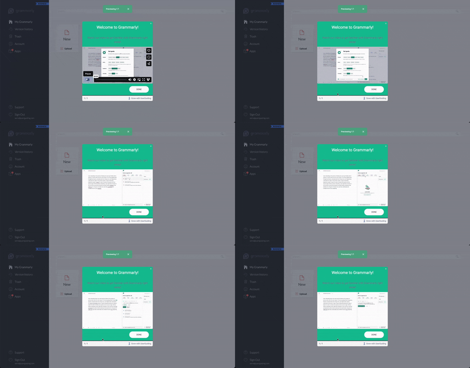
As video walkthroughs should be to the point and easy to follow, I deployed one announcement modal that greeted the users and showed them around the product at the same time.
After welcoming users, the modal should display an on-point video for them to view, understand core product value, and replay if they are confused.
Check how the modal below ticks both of the requirements by greeting users and showing them the ropes around Grammarly through a video ⬇️
Inspiring video walkthrough examples
1- Canva
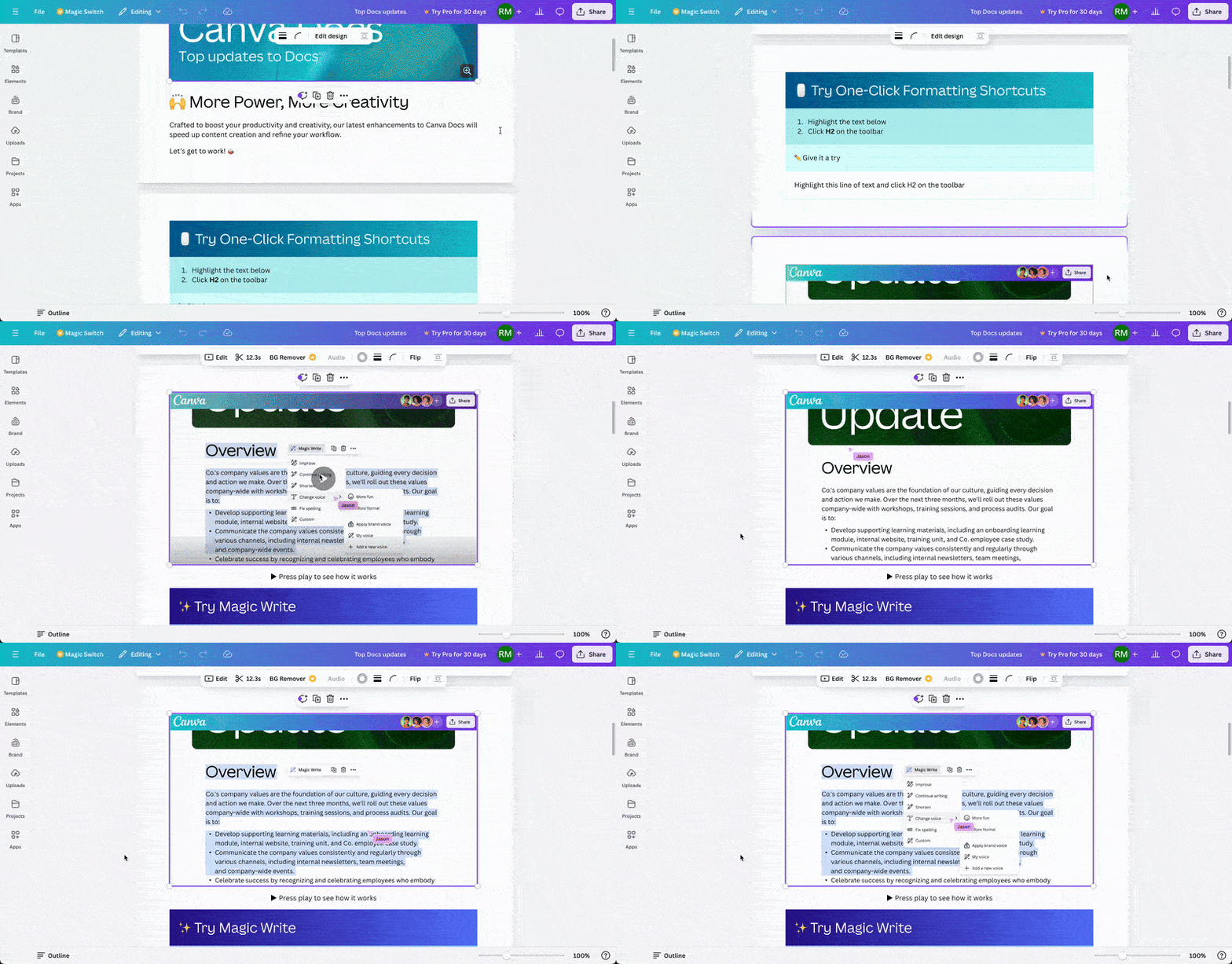
This interactive walkthrough includes videos instead of other UI elements. It is perfect for notifying users about changes or updates—which is exactly what Canva does.
Canva uses videos for its new feature enhancements, where users can employ artificial intelligence to improve the quality of their work.
Check how Canva embeds videos to walkthroughs to help users understand feature updates:
✅ What’s good in this example?
- It includes examples of each new function in action for users to see their value and adopt them faster.
- It gives users the power to pause and replay.
- Along with the how-to videos, it includes short copies with bullet points to help users understand these features and encourage them to try them out.
❌ What’s -not really- good in this example?
- Nothing.
2- Coda
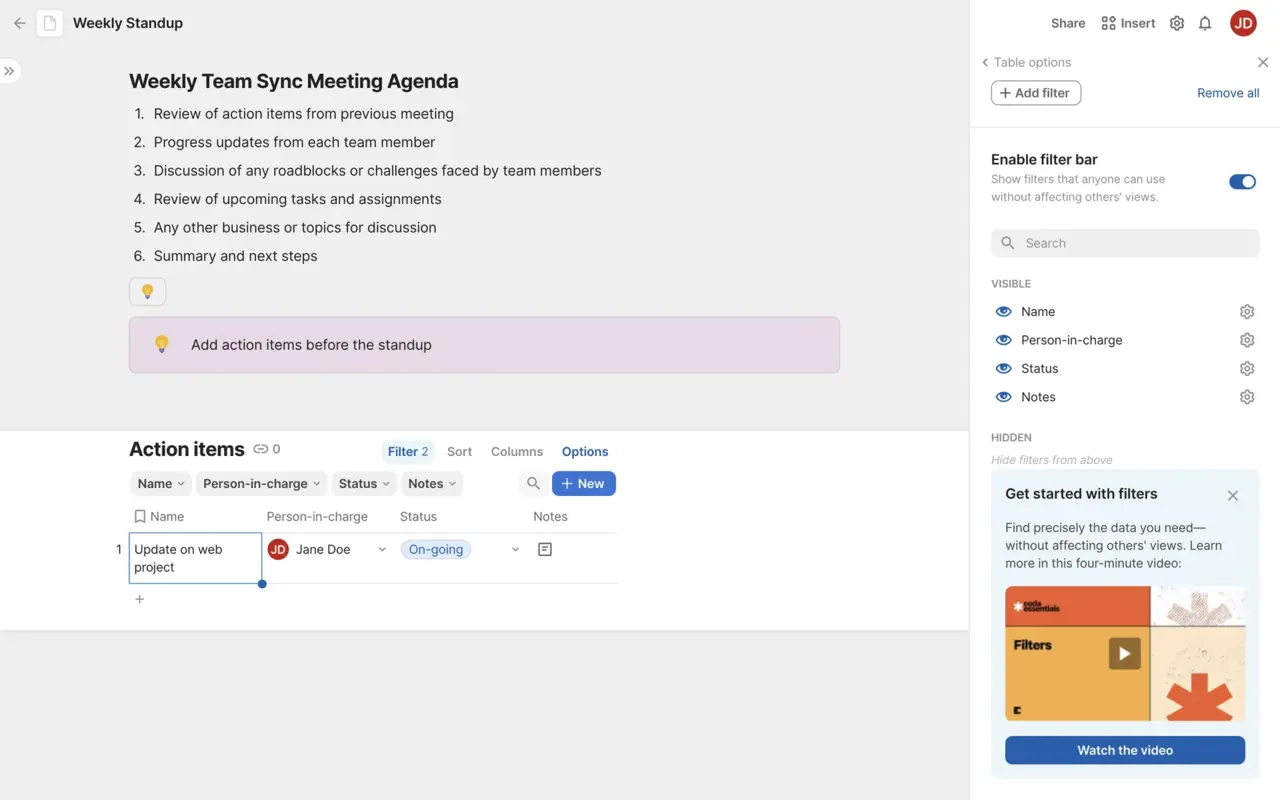
Coda prefers to move forward with a video walkthrough to convey users how to create a filter on the platform.
After users start customizing their to-do lists, Coda offers them a video walkthrough that covers the basics of filters, shows around the UI, and touches upon the functions that users utilize during this process.
✅ What’s good in this example?
- It provides contextual help to users as it is located within the section that’s relevant to the feature being used.
- It is up to users to interact with the guide.
- It is highlighted with a different color from the background to draw attention.
❌ What’s -not really- good in this example?
- Nothing.
3- Intercom
Intercom provides new users with a start guide in the form of a checklist.
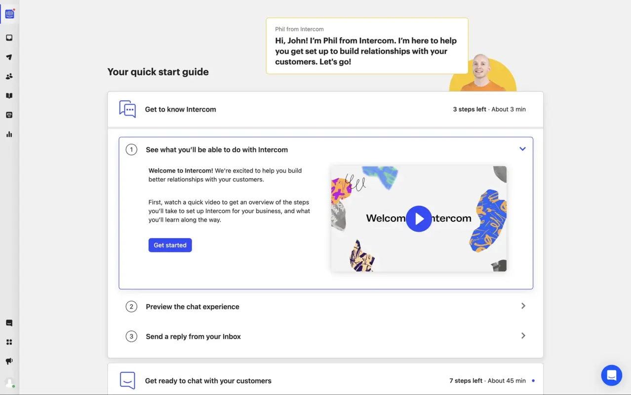
The first item on this checklist starts a video walkthrough for users to get to know Intercom, what they can expect from it, and how to utilize it effectively.
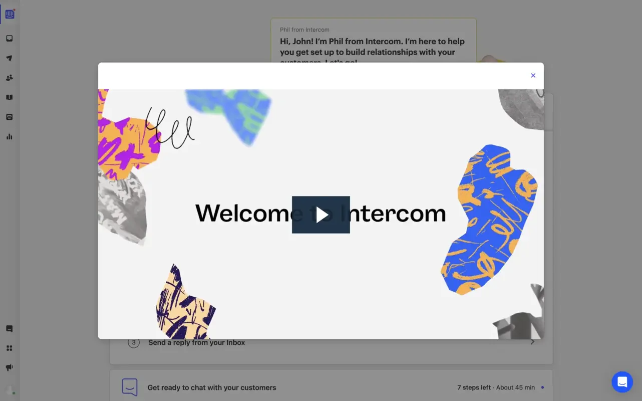
After users click on the start button, the video walkthrough pops up on the screen and provides them with an overview of the product.
The video also has a close button for those who wish to return to it later rather than watch it the moment they land on the checklist.
✅ What’s good in this example?
- It benefits from gamification, as it's embedded in a checklist to ensure that users follow through and watch the video to learn the basics.
- It starts with a welcome screen.
❌ What’s -not really- good in this example?
- The design of the pop-up modal looks sketchy; it could be more fitted.
Recap Section
- Interactive walkthroughs divide into three types:
- step-by-step guides,
- tooltips and pop-ups,
- video walkthroughs.
- In order to create a step-by-step guide from scratch, you should:
- start with a welcome screen to greet users and welcome them to your platform,
- customize each component of the guide to fit your brand theme and get users more familiar with your product,
- add a step for segmentation to be able to provide users with unique tours based on their needs,
- simplify all of steps for easy navigation and no interruption in user focus,
- end with a completion modal to congratulate users upon finishing the walkthrough.
- In order to create an interactive walkthrough with tooltips and pop-ups, you should:
- welcome users with a pop-up screen to make them feel welcomed,
- introduce your platform on the same pop-up,
- utilize multiple tooltips as steps to highlight core elements,
- explain each element’s function on their respective tooltip for users to grasp what it does and how they can benefit from it.
- In order to create a video walkthrough, you should:
- greet users with a welcome modal,
- have a minimum number of steps,
- add an instructional video that users can freely pause and replay, taking from A to Z for a specific feature or touring your whole product.
How to choose among these three?
Well, the answer depends on your needs.
👉Step-by-step guides are great for breaking down complex processes that require user action or when users need to follow a sequence to achieve a goal.
These interactive guides walk users through tasks to fully grasp the functionality. They guarantee that users will also be able to perform tasks within the product afterward.
👉Tooltips and pop-ups are great for providing quick and contextual help when users interact with specific elements or features within the product.
With these elements, you can offer in-the-moment guidance right when the user needs it. This is especially useful for explaining individual buttons or features without disrupting the overall flow of using the product.
👉Video walkthroughs are great for visual demonstrations of complex workflows.
Video walkthroughs allow users to watch and absorb information at their own pace without needing to interact, such as giving an overview of the product or feature without overwhelming the user with actions to perform.
Interactive Walkthroughs vs Traditional Tutorials
Interactive walkthroughs are different than traditional tutorials like product tours.
Product tours consist of long sequences that display all product features in one go, creating user frustration.
Unlike interactive walkthroughs, these tours don’t involve personalization items for every user segment you have.
Interactive walkthroughs are interactive in-app tutorials that provide users with on-screen elements that help users understand your product value proposition through the features you offer, simplifying the onboarding and exploration process.
You can customize interactive walkthroughs based on your audience segment to respond to your user base’s needs.
Best Practices for Creating Effective Interactive Walkthroughs
Upon learning how to create 3 types of interactive walkthroughs, it’s time to check the best practices that you should adopt during the creation process:
1- Put the use in the center, not your product
One great practice to ALWAYS keep in mind when creating a walkthrough, whether interactive or not, is concentrating on the benefits customers will get from your product.
The mistake in the other practice is putting your product in the center and introducing it to your audience. This can be rather impractical since new users have short attention spans and wish to see how they can benefit from your product as quickly as possible.
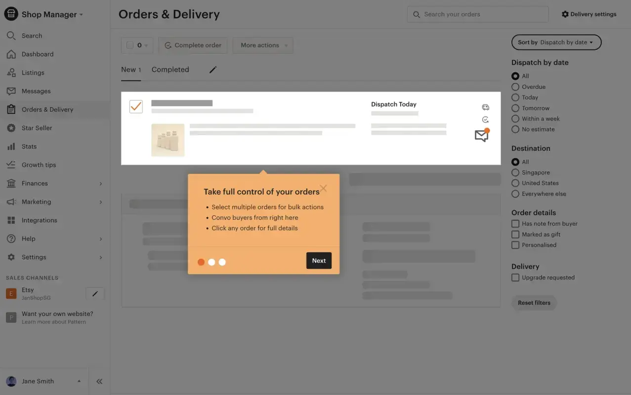
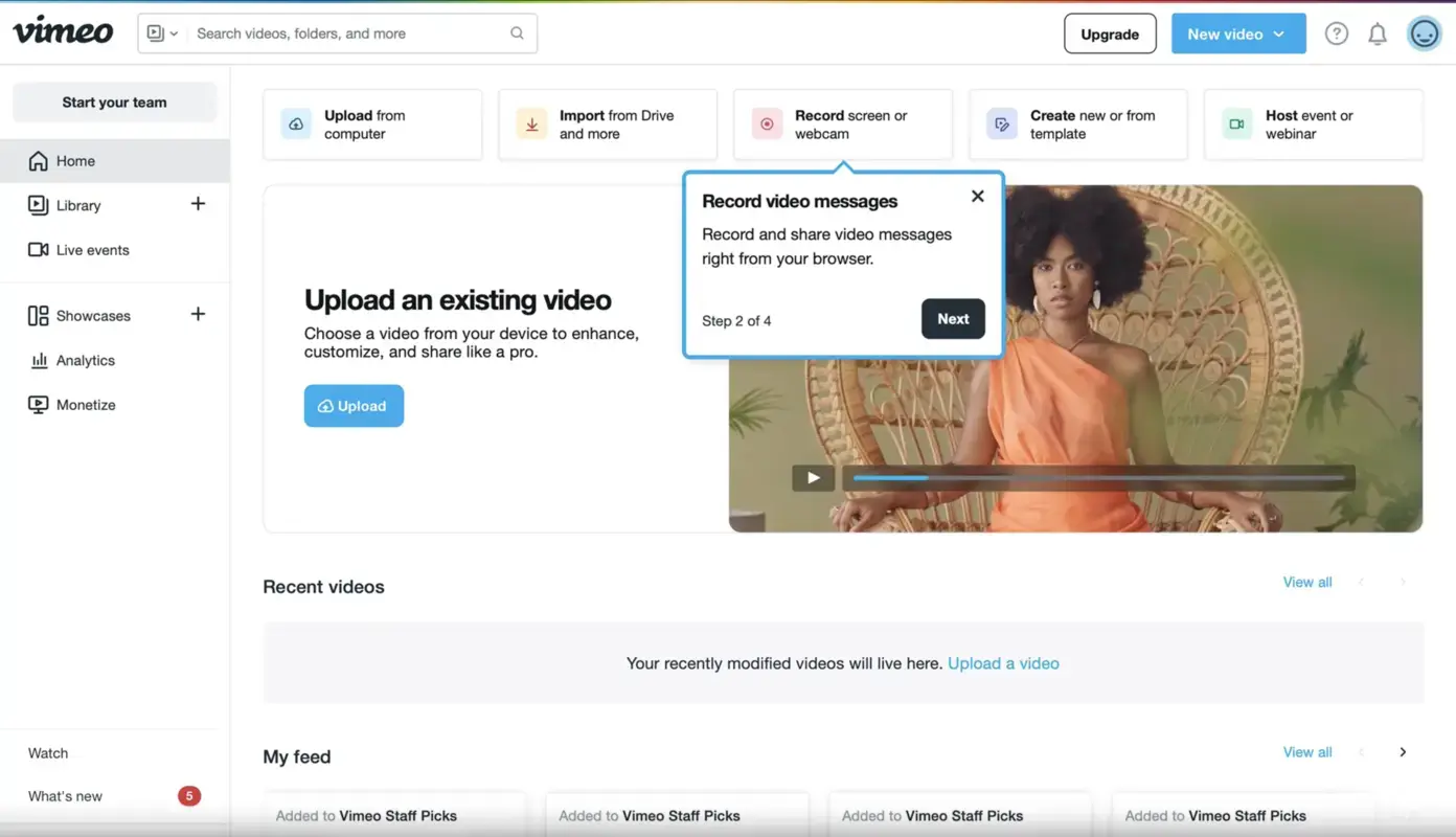
What's good in this example?
👍Skippable walkthrough.
👍Bullet points with short function descriptions.
👍Short walkthrough with 3 steps.
What could be better?
👎There could be more short sentences and fewer bullet points.
👎Some steps can be provided with images, at least the progress step examples part.
2- Define your Aha Moment clearly
To create a fulfilling interactive walkthrough, you need to take users from the beginning to the finish line, explaining the value they can get from each element of the process.
You should pay attention to harmonizing these steps, ensuring that this process has complementary elements that revolve around your Aha Moment.
Thanks to this combination, users will be able to understand how your product can solve their problem and adopt it, paving the way for user activation.
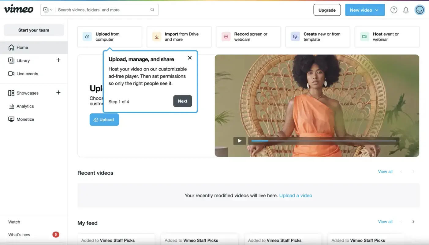
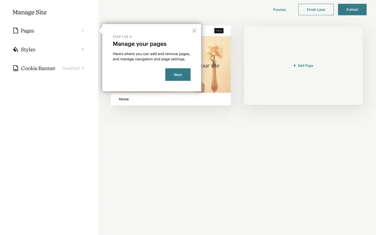
What's good in this example?
👍Skippable walkthrough.
👍Clear and concise copy.
👍Short walkthrough with 4 steps.
What could be better?
👎The feature descriptions explain what users can do, but they could also touch upon the benefits, such as simplicity and time efficiency.
👎There could be visual materials within the walkthrough.
3- Make it digestible with clear and concise instructions
One thing you should remind yourself when creating an interactive walkthrough is the overall style, which impacts readability and continuation.
To elevate your guide, you need to guarantee a walkthrough with short explanations that are on-point and able to direct users to the main features without any confusion.
Thus, you should avoid using any jargon and complex syntax that might hinder the learning process and create a steep learning curve for your audience.

What's good in this example?
👍Skippable walkthrough.
👍Clear and concise copy.
👍Short walkthrough with 4 steps.
What could be better?
👎The copy could take a more user-focused approach instead of highlighting the product functionality only.
4- Incorporate feedback mechanisms
Deploying feedback mechanisms and being open to feedback that can help you improve your users' learning process is an important step that many usually miss.
Don’t be one of them and actively collect feedback from your users in order to understand if your interactive walkthrough is easy to go through and adoptable from their point of view.
You can even add one more question to your survey sequence that comes up after onboarding and learn what made the process harder for them in detail.
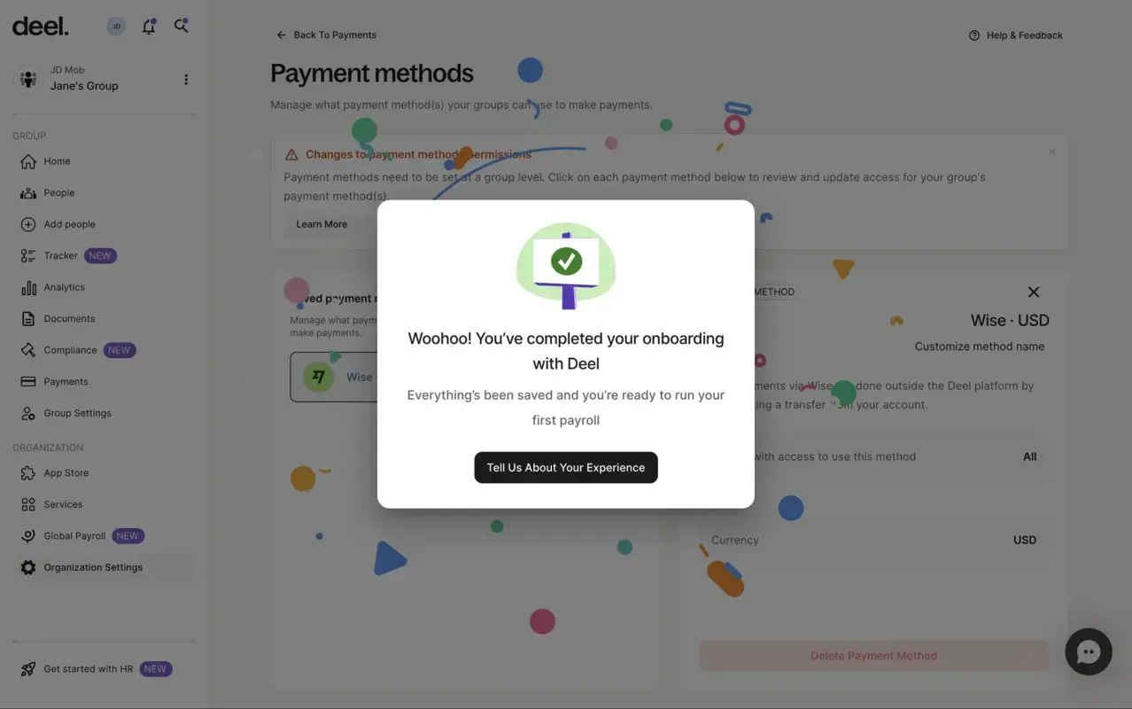
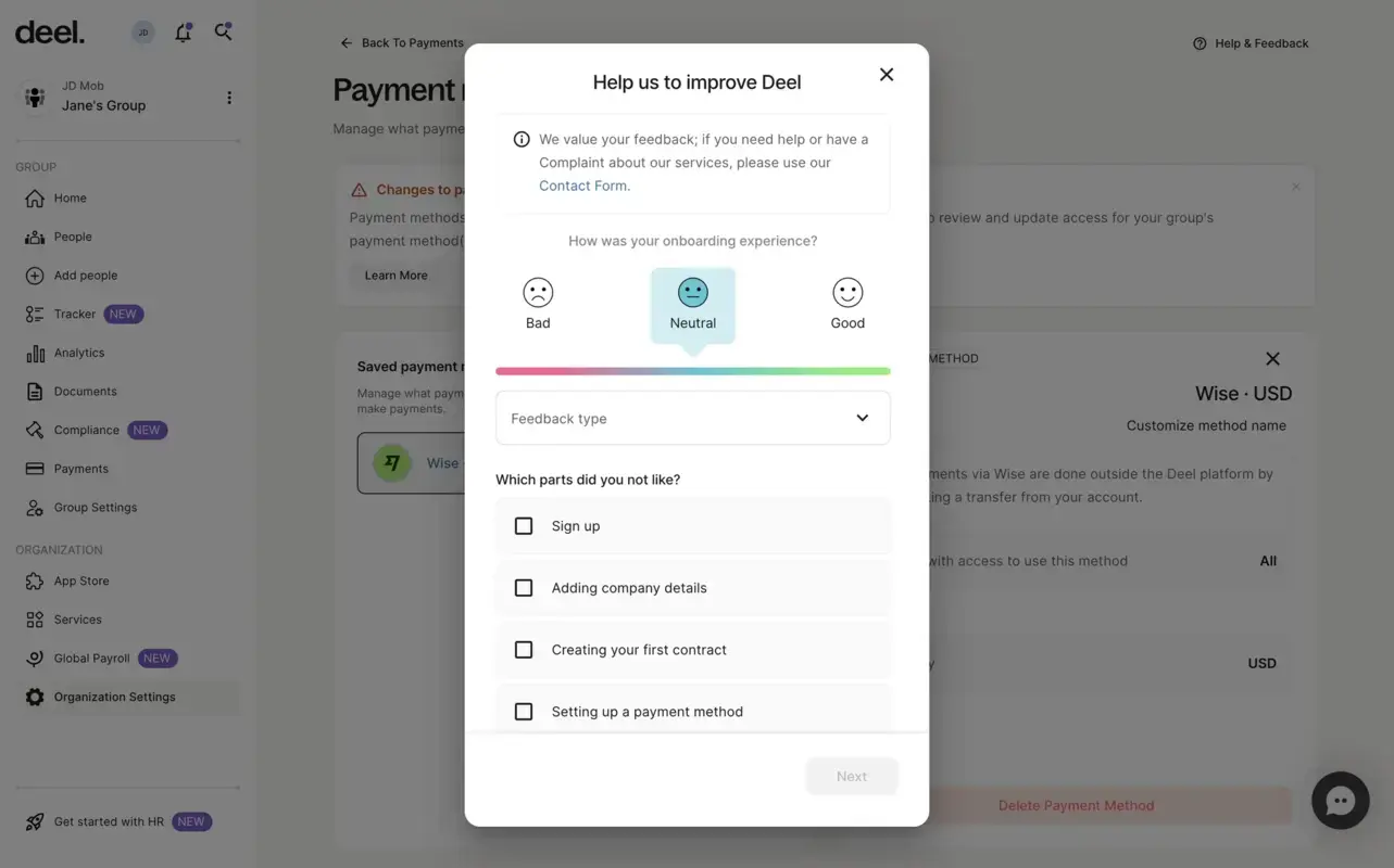
What's good in this example?
👍Three types of feedback surveys are available in one.
👍Short form with short questions.
What could be better?
👎The feedback pop-up that appears after finishing the onboarding module can have a close button for users to skip.
What is Interactive Walkthrough Software?
Interactive walkthrough software is a tool for providing users with experiences within digital products such as websites, apps, or software.
These experiences guide users through tasks and features, providing real-time, hands-on instruction embedded directly in the product interface.
5 Best Interactive Walkthrough Tools for High Adoption
1- UserGuiding
- G2 Score: 4.7 ⭐(432 reviews)
UserGuiding is a no-code product adoption platform that can help you create interactive walkthroughs of all kinds.
Using UserGuiding, you can improve user retention and engagement with interactive walkthroughs that allow users to directly engage with the product, unlike static tutorials.
With a hands-on approach like this, UserGuiding helps users familiarize themselves with complex features or workflows more efficiently.
Plus, this platform can support all three types of interactive walkthroughs, simplifying the creation and running process at the same time.
👉 You can try out UserGuiding’s interactive walkthroughs for free!

2- Appcues
- G2 Score: 4.6 ⭐(324 reviews)
Appcues is a product experience platform that can help you employ interactive walkthroughs directly within your application.
Providing you with the ability to create all three types of interactive walkthroughs, Appcues can help you both onboard new users to your key features and introduce new processes.
Appcues simplifies the creation process for dynamic step-by-step experiences, reducing the time teams spend on this task and boosting productivity.

3- Userflow
- G2 Score: 4.8 ⭐(103 reviews)
Focusing on user onboarding, Userflow enables you to create custom interactive walkthroughs.
With Userflow, you can quickly design and deploy personalized user experiences that guide users through key features.
Whether it’s simplifying onboarding or improving product adoption, Userflow makes it easy to deliver step-by-step guidance.

4- Tango
- G2 Score: 4.8 ⭐(199 reviews)
Tango is a software training walkthrough tool that generates a walkthrough by following your actions as you go over the process.
Through the browser extension or desktop software, it captures your steps to produce a walkthrough that displays links, annotations, descriptions, and screenshots.
Later on, you have the opportunity to customize your walkthrough with different fonts, images, and notes through capable editing tools that Tango provides.
Moreover, this platform enables you to pin your guide to any spot you wish on your product's user interface.

5- Scribehow
- G2 Score: 4.8 ⭐(225 reviews)
Scribehow is a tool for turning any web, desktop, or mobile process into a step-by-step guide.
Like Tango, Scribehow automatically captures your screen. The customization process starts after a walkthrough, but this one has more elements you can benefit from than Tango.
For example, you can use AI for the title and description, add tips and alerts, and smoothly redact sensitive company data through automatic and manual redaction.

Long Story Short…
If you’re sick of lengthy manual guides that take readers' time and provide poor value, interactive walkthroughs will be like a breath of fresh air for your business.
Unlike non-interactive guides, interactive walkthroughs go hand in hand with product adoption—helping users get familiar with your product in no time.
All there is left for you to choose the type of your walkthrough, where you’ll benefit from it, and which solution you’ll pick to employ.
Shhh… Let me give you a secret: You can find all the answers above ⬆️
Try UserGuiding now for free to see if it meets your needs for an interactive walkthrough.
Frequently Asked Questions
What is an interactive walkthrough?
An interactive walkthrough is a step-by-step guide that helps users see your product value and enables them to engage with your product features even during their first interaction.
What are the best interactive walkthrough tools?
The best interactive walkthrough tools include the product adoption platform UserGuiding, product experience tool Appcues, and user onboarding software Userflow.
What is interactive walkthrough software?
Interactive walkthrough software is a digital solution that streamlines the learning process for first-time users and reduces the amount of time spent on creating educational guides for product and onboarding teams.


.svg)
.svg)
.svg)
.svg)
.svg)


.svg)
.svg)


.png)


