.svg)
.svg)
.svg)
.svg)
.svg)


.svg)


.svg)
.svg)

Launching a new feature is like throwing an epic party —but forgetting to send out the invites. You’ve got everything set up: the perfect playlist, great food, fun activities…
But if no one shows up, it doesn’t matter how fantastic the party is.
The same thing can happen with your feature release.
You’ve built something amazing, but now you must ensure that your users discover it, get excited about it, and actually engage with it.
If you're feeling a bit stuck —wondering where to announce it, how to make it exciting, and why engagement isn’t where you want it to be— you’re not alone.
Feature launches can easily get lost in the noise.
But here's the good news: with the right approach, you can turn a quiet launch into a moment your users won’t want to miss.
In this guide, we'll list some examples from SaaS companies that know how to make a feature release pop.
Ready for some inspiration? Let’s get started!
TL;DR
- You can announce your new feature through your:
- Some in-product announcement methods include:
- Announcement modals (with text or visuals),
- Announcement banners,
- Slideout modals and decks,
- Tooltips, and
- Hotspots.
- The best practices of great feature announcement are:
- Relevant timing and placement,
- Clear and concise microcopy writing,
- Active CTA usage,
- Incorporating visual elements,
- Maintaining the company image and tone,
- Utilizing gamification,
- Providing detailed learning opportunities for users who are interested in,
- Combining different announcement methods and strategies.
- UserGuiding is a product adoption and user onboarding tool that can help you create announcement modals, tooltips, hotspots, and product updates pages without writing a single line of code!

11 New Feature Announcement Examples
There are many ways to announce a new feature. You can utilize:
- Tooltips,
- Hotspots,
- Emails,
- Announcement Banners,
- Welcome Banners,
- In-App Messages,
- Release Notes,
- Changelog Entries,
- Social Media Posts, and
- Blog Posts.
The methods you choose for announcing a new feature will largely depend on the scope of the update/feature, its complexity, and the amount of information/education you want to provide your users.
A minor tweak might only require a subtle notification, while a significant release could need a more comprehensive rollout strategy.
You also don’t have to stick with just one method.
It’s actually more effective to mix and match different approaches based on the features and the needs of your user base.
Now that we’ve covered the theory, let’s see some real-world examples 👇🏻
Announcement Modal with Text: TimeSolv
TimeSolv is a legal time tracking and billing solution used by many law firms, individual lawyers, consultants, and accountants.
Here’s how they announced their new feature: TimeSolvPay

💡 There are 3 great practices to take from TimeSolv's feature announcement:
- Placing & timing,
- Microcopy, and
- CTA usage.
TimeSolv triggers this feature announcement when a user visits the payment dashboard, which ensures perfect placing & timing.
By showing it at the moment the user is already focused on payments, they avoid interrupting unrelated tasks. This strategic timing helps maximize engagement since the user is primed to learn about the new payment feature right when it’s most relevant.
The microcopy in the announcement is concise and clear. TimeSolv keeps the text short, neat, and well-organized.
It focuses only on the key points of the new feature and provides the essential information without overwhelming the user. It also anticipates and answers any potential questions users might have.
At the end of the announcement, a clear call to action directs users to the feature immediately. This prevents them from having to search the UI for the feature and makes engaging with it seamless.
Standout Product Updates Page: UserGuiding
UserGuiding is a product adoption and user onboarding platform that enables you to create engaging in-app experiences, as well as standalone knowledge bases and product updates pages.
Talking about product updates pages, here’s how UserGuiding’s is structured:

💡 What you can learn from UserGuiding's feature announcements:
- Announcement Categorization: UserGuiding organizes its product updates into clear categories like New Feature, UX Improvement, Integrations, and News. This makes it easier for users to quickly find the specific information they’re looking for without having to sift through irrelevant updates.
- Use of Visuals and Explanatory Videos: Each release note includes UI images or videos that explain the finer details and use cases of the new feature. These visual aids help users better understand how to use the feature, adding clarity and reducing confusion.

- Skimmable and Structured Microcopy: The text is organized with subheadings, which allows users to easily skim through the content. Key points and value propositions are highlighted so that users can grasp the important information at a glance.
PLUS, at the end of each release note, there's a feedback section where users can leave comments or emoji reactions. So, with its feature announcements, UserGuiding not only announces new features but also encourages user feedback.
Achieving two goals in one go, one can even say!
Would you like to create a similar hub for your product updates and release notes?
Announcement Modal with a Video: Indicata
Indicata is a leading provider of real-time data solutions for the automotive industry, focusing on used car market insights.
They help dealerships and manufacturers optimize stock, improve pricing strategies, and make informed decisions based on current market trends.
See how they announced their new feature, vehicle equipment, here 👈
💡 What makes Indicata's feature announcement successful is:
- Trigger method,
- Video content and
- CTA to interactive product tour.
Indicata triggers the announcement modal when a user hovers over or clicks on the new feature. This method ensures minimal distraction, as it allows users to engage with the announcement at their own will.
This feature might also look very self-explanatory to some users. So by keeping the announcement and additional information behind a hotspot, Indicata ensures that users can decide whether they want to learn more.
The announcement modal includes a concise 30-second video that introduces the new feature.
This video provides a quick overview and highlights key functionalities, all without requiring users to navigate to additional articles or release notes.
Finally, the modal features a clear call to action that prompts users to take a product tour. This interactive tour allows users to explore the feature in action and provides an opportunity to learn more while actively trying it out.
Slideout Announcement Modal: Grove HR
Grove HR is an all-in-one HR platform that offers a comprehensive suite of tools for recruitment, performance management, employee engagement, and more.
They utilize different methods and tools to announce their new features. For example, here’s their announcement with a video:

And here’s their announcement with a slideout modal:

💡 What you can learn from Grove HR about feature announcements is:
- Multimodality, and
- Friendly microcopy writing.
Grove HR utilizes different announcement modals for various features. Some updates require more hype and detailed explanations (guides or videos, even), while others only need friendly heads-up messages.
Balancing the level of detail is crucial; explaining a basic feature or small update with extensive tours and shiny announcement banners can irritate users. Conversely, leaving significant features or extensive updates unexplained can confuse users and harm engagement.
Grove HR also employs a warm and engaging tone in their announcements. Even small slideout notifications with brief microcopy are crafted to make users feel happy and excited.
This is especially effective because they often frame their features as long-awaited updates or feature requests, which fosters a sense of community and anticipation.
Multi-Channel Announcement: UserGuiding
UserGuiding is another company that embraces multimodality, but it takes it a step further by employing a multi-channel approach to announce its new features.
Here’s what we mean by a multi-channel approach 👇🏻


The channels UserGuiding uses to announce its features include:
- Email,
- Social media platforms,
- Product updates page,
- Blog articles,
- Website banners, and
- In-App announcement modals.
If you want to inform your users about the groundbreaking new feature that they have been requesting for quite some time, you need to meet them where they are.
Which is everywhere!
Of course, just as you wouldn’t throw confetti for a minor bug fix, you shouldn’t generate a major buzz across all channels for a small UX enhancement.
💡 But when it comes to significant updates that warrant calling your product V2.0 or highly requested features from both your existing customers and leads, go all out! Who knows, you might even win back some of those customers who have churned.
In-app Announcement: Duolingo
Duolingo is like that aunt who pops up at family gatherings, always eager for us to visit her more often. We all know she’s there, and while we check in on her occasionally, we often forget to visit.
Still, she loves us deeply and always expects our return, which makes us feel a connection that sometimes feels closer than with our immediate family.
Just Like Duo.
And here’s how Duo encourages users to visit and announces a new feature:

The notification features Duolingo's signature playful voice in the microcopy. This unique tone makes the announcement both interesting and fun while also helping to maintain user engagement.
So Duolingo also reinforces its brand personality through this in-app announcement copy.
What Duolingo does here is provide only the announcement and forward users to additional resources for more information. This can be seen as an engagement strategy aimed at increasing the visibility of the release notes while also optimizing the learning experience.
It caters to users who have the time, energy, and interest to delve deeper rather than overwhelming all users during an announcement campaign.
⚠️ However, this approach could also be risky, as you might lose some of the potential user engagement. And in cases of user errors or frustration, you'll still bear the responsibility, even if it stems from a lack of user initiative.
So, be cautious about how you present additional information.
💡 The key practices you can learn from Duolingo are:
- Creating and maintaining a unique voice across all your copy.
- Reserving additional details and explanations for those who want them.
Email Announcement: Contrast
Contrast is a webinar tool that enables you to host and repurpose webinars and Q&A sessions.
And here’s their email announcing their new homepage and HubSpot integration:

The first announcement is about the updated homepage.
They create a friendly and engaging narrative about the inspiration behind their new homepage design. This story outlines the motivations driving the redesign while connecting with potential users.
This approach can even be interpreted as a subtle sales pitch, emphasizing the benefits of the new design –or a demo– in a relatable way.
And at the end, there’s a CTA taking the reader to the product.
Then comes the announcement of the next release: HubSpot integration 👇🏻

Here, they address a potential pain point for the reader: the uncertainty surrounding engagement levels among webinar attendees.
They then explain how their new integration resolves this issue and provide brief examples of its functionality. To enhance understanding, they include a GIF showcasing the feature in action right at the beginning of the announcement, as well.
And as they do with their other announcement in the email, they attach a CTA at the end that directs the reader to the product.
💡 Best practices that should inspire you here include:
- A resonating and pain-point-oriented narrative,
- Separate announcement boxes and CTAs for different features and updates, and
- Best practices and pro tips articles linked to the email.
Announcement Deck with UI Images: Phrase
Phrase is a localization and translation project management tool that enables translators to create, manage and automate translation.
And here’s how they announced their new feature update:

This is a slideout announcement modal, similar to the one used by Grove HR.
However, Phrase seizes the opportunity to not only announce the feature but also explain how users can activate it. So, they provide additional details about the settings through a second slideout modal that follows the initial announcement.
And here’s that modal:

Now, if you click on “X” or anywhere else on the UI, you can close the announcement modal without viewing the second explanation modal, making it optional. However, if you’re curious about how to activate this feature and manage the access settings, you can find detailed steps in this second modal.
Since people don’t regularly visit the settings page without a specific reason, and because this new feature/update is minor, they opted not to create a unique guide or checklist. Instead, they managed in-app education through announcement modals.
They also incorporated a screenshot from the UI to help users easily identify the feature themselves and make any necessary changes.
💡 What you can learn from Phrase’s example is that you can:
- Provide user education through announcement modals,
- Bundle a few announcement modals together and create decks.
Tooltip Announcement with Use Cases: Notion
You’ve probably used Notion at some point in your personal or professional life, whether as a knowledge base at work or for organizing your travel plans and personal wiki.
It’s the go-to tool for keeping everything in one place.
Whether you want to jot down notes, organize tasks, or create to-do lists.
And here’s how they introduced backlinks 👇🏻

They utilized a tooltip.
First, they provide a brief explanation of the feature in one concise sentence, then follow up with instructions on how to create a backlink.
The commands are bolded, and there’s a clear list with a few emojis to add a touch of fun. This format makes it easy to read or skim through, even if it appears lengthy at first.
Additionally, they include use cases and best practices in the subsequent tooltip. By dividing the information into two separate tooltips, they avoid overwhelming the user with a long, technical announcement banner.
This approach makes the information more digestible and user-friendly.
💡 So, here are the key takeaways to inspire your own announcement tooltips from Notion’s approach:
- Divide lengthy information into different sections
- Format the long copy in a skimmable structure with lists and bolded text
Announcement Modal with Gamified Elements: Canva
Canva is a user-friendly graphic design platform that empowers you to create stunning visuals without needing advanced design skills.
Whether you’re making social media graphics, presentations, posters, or even infographics, Canva provides a vast library of templates, images, and fonts to help bring your ideas to life.
And because it’s a design tool, it creates a visual feast —true poetry in motion— when announcing new features:
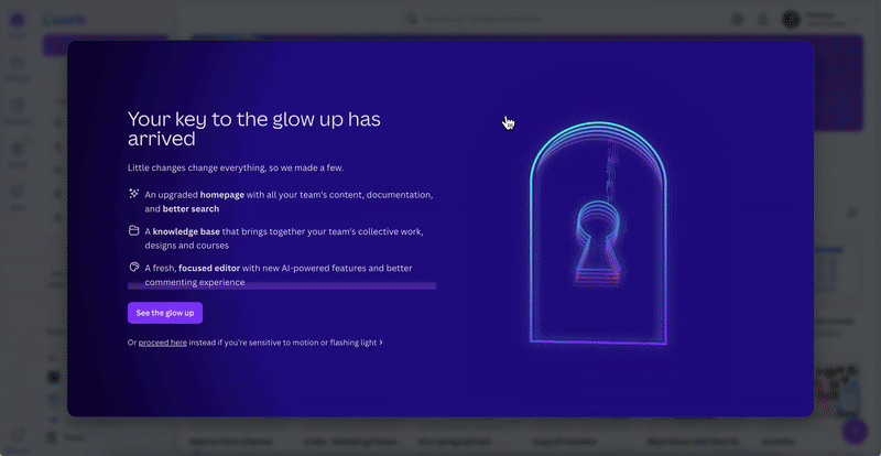
This “glow up” announcement warmly welcomes users to the platform. It features a vibrant list of new features and updates, along with a gamified key. Users are taken through neon-colored gates, creating a journey that feels like entering Wonderland, and it ends with a burst of confetti on the screen.
However, instead of jumping straight into a product tour or release notes, a checklist of presentations about the new features and updates appears on the left side of the page:

Would we expect to see an explanation, tooltip, hotspot, or any informative UI element detailing what just happened after such an impressive introduction to discover the glow-up?
Absolutely.
Can a checklist for onboarding new features also be effective?
Well, why not?
2 things you can steal from Canva’s feature announcement:
- The idea to incorporate gamification with your announcements
- The checklist format to bring your educational materials about new features –even if they’re not interactive guides!!
Announcement Bar: Airtable
Airtable is a cloud-based collaboration and app-building platform.
And this is how they announced their new AI solutions:

When you enter the Airtable website, an announcement bar at the top of the page greets you and shares the latest updates. While it doesn’t immediately appear to be a feature announcement, it captures your attention.
And when you click on the link, it forwards you to this news article about their new App Library 👇🏻

This is a detailed press release that includes example use cases, success stories, customer data, and feature explanations. So it’s different than a release note or an in-app announcement modal.
However, it's an important article that could influence the decisions of leads or potential customers, which is why it’s promoted with an announcement bar at the top of the landing page.
💡 What might inspire you about Airtable’s announcement is:
- Promoting news articles or press releases of features, and
- Using the landing page space to do so.
In Short…
There are many ways you can talk about your new feature.
And many places, too.
Starting with your product itself, social media accounts, blog, product updates page, website…
Yet, first, you need to decide:
- Will you run a multi-channel/multi-modal announcement campaign?
- How much buzz do you want to create around the announcement?
- What level of detail will you provide in your announcement copy?
- What visuals will you incorporate into your announcement, if any?
Then, you can select the best practices we've explored so far and transform your ideas into a successful feature announcement project.
And whether you go for product updates pages, tooltips, slideout modals, welcome modals, checklists, or announcement bars, you can utilize UserGuiding to create them within seconds.
UserGuiding is a no-code tool that has NO learning curve, so you do not need to worry about losing time to learn how to navigate around the platform and use the features.
🚀 Start your free trial now, and see for yourself!
Frequently Asked Questions
How do you write an announcement for a new product?
When writing a new product announcement, consider the technical background of your users and adjust the use of technical language or jargon accordingly. If it’s not a changelog, keep it minimal. Structure the content with subheadings, bold text, or lists for readability, and include feature visuals. Tailor the details based on the announcement format, such as tooltips or emails.
How do I announce a new feature?
Announcing a new feature depends on where you want to share it —within the product, through a blog, on a product updates page, via email, or social media. Based on the platform, you can choose the right format, such as tooltips, hotspots, or banners for in-app announcements. The copy and detail level should align with the medium you’re using.
What's the most effective way to introduce new features to existing users?
The most effective way to introduce new features is through contextual, in-app guidance tailored to user behavior and intent. This means surfacing the right message at the right time through feature tooltips, onboarding checklists, or guided tours that appear when a user is most likely to benefit from the new functionality. For best results, you should pair these with supporting channels like email or release notes.

.png)