Picture the scene:
You've invested thousands upon thousands of dollars into researching your audience's pain points and building a beautiful app that serves their needs.
After months of work, you launch, and…

Nothing happens! Hardly anyone wants to use your app, and users are disengaged.
To prevent this nightmare scenario from happening to you, you'd better learn:
- What in-app engagement is
- How you measure it
- And how you can boost it
And that's what we'll explore together in this article today.
TL;DR
- Engagement is when customers use your product frequently and get value from it.
- It's affected by the quality of your UX design and onboarding, and is critical for all the pirate metrics apart from acquisition.
- To measure engagement, divide the number of engaged users by the number of total users, and multiply by 100. Think carefully about how you define "engaged user" for your app, based on the frequency a user logs in and which features they're using.
- Other ways to measure engagement include heatmaps, looking at your retention rate, using tools like Amplitude to gauge user behavior, or even looking at reviews on external websites.
- You can boost your engagement rate by improving your onboarding, personalizing the UX, adding gamification and mapping the user journey to locate problem areas.
- Common barriers to engagement include a complex registration process, a lack of social integration, invasive ads and poor use of notifications.
- UserGuiding can help you boost your engagement by building tooltips and hotspots, giving customers in-app surveys and providing contextual support.
What is In-App Engagement?
First things first, a quick definition, just to make sure we're on the same page.
When we talk about product engagement, we mean that your users are using your product on a regular basis and are getting value out of it. So some signs of engagement are when users:
- Spend a lot of time logged in to your product
- Adopt all major features
- Adopt any secondary features that you launch
- Actively participate in the community inside your product
- Make your product a repeatable part of their workflow
- Build dependencies around your product, such as integrations
When we talk about "in-app" engagement, we're specifically referring to the engagement that takes place inside an app – so normally gated behind some sort of login. Your app could be a web app, or a mobile app.
By definition, in-app engagement excludes engagement that takes place outside of your app, such as on your blog or your Youtube channel.
What affects engagement in-app?
In-app engagement varies from user to user, and from user segment to user segment.
That being said, there are tons of factors within your control that affect the overall level of engagement. These include:
- UX design: how well your app is designed, and how smooth and seamless the user experience feels. A unified color scheme and a simple navigational structure go a long way here.
- Onboarding: think of this as synonymous with user education – which is an ongoing process throughout the customer journey. The better your users understand your product, the more engaged they will be.
- Customer support: a great way to make users disengage is by not providing support when they need it. Conversely, you can engage users more by providing contextual support in-app and access to agents for more complex cases.
- Strategic targeting: customers will be more engaged if they feel that you're solving a problem that really matters to them. Doing this properly begins with market research, how you define your value proposition, and how you position your product in order to target the users that you can help.
Why Does In-App Engagement Matter?
Having engaged users is a game-changer for any business.
In-app engagement can positively impact all of the pirate metrics, with the exception of acquisition.
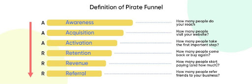
For example:
- If users are highly engaged with a product, they're more likely to activate
- They're much more likely to use lots of features, build internal processes around your product and be retained for a long time
- Engaged users are generally happy with your product, like using it and are likely to refer their friends to you
- All these factors ultimately lead to more revenue for your business
The converse situation doesn't really bear thinking about. Low engagement means less activation, less retention, fewer referrals and less revenue.
So yes, in-app engagement is a big deal!
How to Measure In-App Engagement
You now know what in-app engagement is, so which metrics, data and tools should you use to measure it?
In-app engagement rate formula
The formula to measure in-app engagement seems simple enough, at first glance:
In-App Engagement Rate = (Number of Engaged Users / Total Users) x 100
But the devil is in the details! How are we to define what an "engaged" user is?
One school of thought is to equate an engaged user with an active user.
So an active user is one that logs into your product. It follows that a daily active user, or DAU, is a user that logs in every day, while a monthly active user, or MAU, is one that logs in at least once a month.
I think you can make a convincing case that a DAU is an engaged user, but what about a MAU? Is someone who only uses your product once a month really engaging with it?
The answer depends on your product and what value it provides. Some products, like social media websites, are explicitly designed to be used every day, whereas others, like banking apps, are not.
If MAUs and DAUs seem like they're at two extreme ends of a spectrum, you could also consider equating engaged users with users who are active on a weekly basis, so WAUs.
Or even combine both DAUs and MAUs to get another measure of engagement:

Alternatively, you could look at the problem completely differently and think of engagement in terms of value. By this way of thinking, a user is engaged if they are repeatedly gaining value from your product in some way.
"Gaining value" might mean using your core features on a recurrent basis. It might mean participating in your internal community. It really depends on your app.
Complicating this picture further still, you can think about in-app engagement at the level of your whole app, at the level of an individual segment, or at the level of an individual feature.
And the data will also depend on the time frame you use: you could calculate engagement over a week, a month, or even a year.
So while the formula for calculating in-app engagement is straightforward, exactly how you implement it will depend on how your app measures value, which user cohort you're measuring, which feature and over which time frame.
What’s a good in-app engagement rate?
This is a much simpler question.
Benchmarks across the internet suggest that a good in-app engagement rate is between 1% and 5%.
Anything above that should be considered excellent, even industry-leading.
Key metrics that correlate with in-app engagement
As well as measuring your in-app engagement rate itself, there are other metrics that correlate with being an app that does a good job of engaging its user base. These metrics include:
- Session length: this is the average amount of time that a user spends in one session on your app.
- Feature usage: this is the number of customers that are using one or more important features.
- Retention rate: think of this as the percentage of users that you retain from one month to the next
- Churn rate: this is the inverse of retention rate – so any users who are not retained are considered to have churned.
An engaging product will have a high session length, high feature usage, high retention and low churn.
Tools for measuring in-app engagement
Most SaaS companies can get the data related to the metrics in the previous section in their app's dashboard. But beyond your dashboard, it's worth looking into some external platforms that can help you gather quantifiable data around engagement.
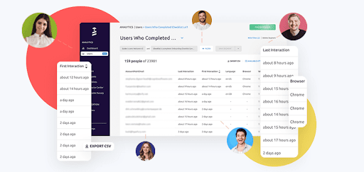
For example, onboarding tools like UserGuiding come with a suite of behavioral analytics tools that will let you identify goals (eg the number of customers using a certain feature) and then track how many customers use the features you want:
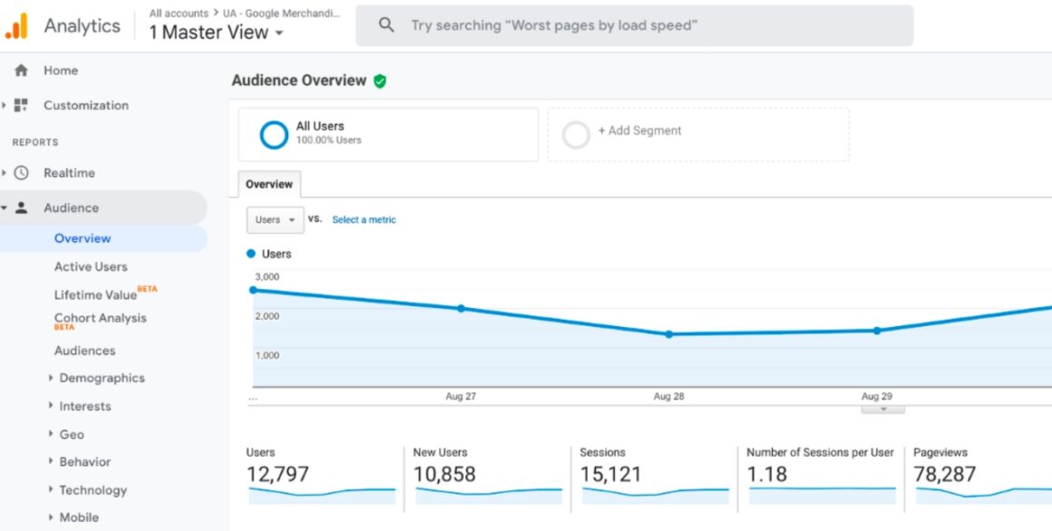
For session length, you can't go wrong with good, old-fashioned Google Analytics:
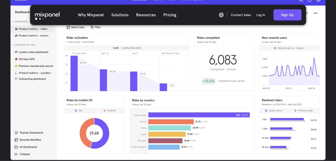
And many SaaS companies use Mixpanel or Amplitude (or both) in the back-end to access product metrics, visualize the user journey and where people drop off, and see what's driving user behavior by segment:
Other ways to gauge in-app engagement
Beyond the above tools, there are also some more subtle ways to gauge in-app engagement that you should be aware of.
For example, you can look at your reviews on industry platforms such as G2, Capterra, Gartner, TrustRadius or even Google Reviews.
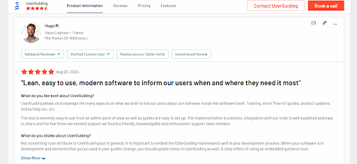
The more reviews you have, and the higher the average rating, the more likely it is that you have an engaged user base.
Using a heat map tool like Hotjar is enough neat way to figure out where in your app your users are engaging with most:
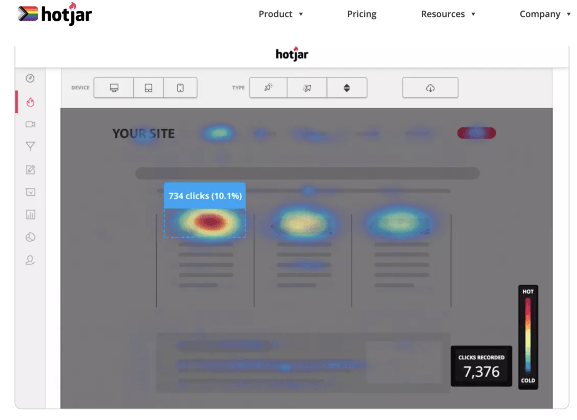
That's because Hotjar will let you create a heat map that shows you a visual picture of where users click the most.
Clicks don't always equate to engagement (rage clicks, anyone?), but they often correlate with it.
If you want to understand how engaged your audience is, a simple way is to simply ask them for their opinion on your product.
The classic method of doing this is to send users (or user segments) an NPS survey inside your app, which looks something like this:

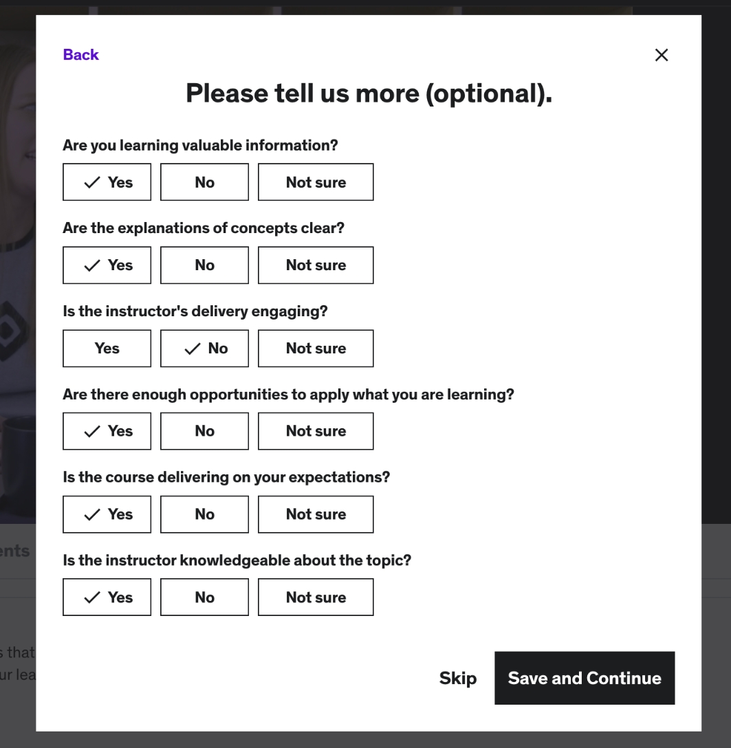
If you need more detail about their reasons for being engaged or disengaged, you can also follow that survey up with a qualitative survey to get more color:
I would also argue that a high referral rate is a good sign of an engaged user base. We generally don't refer our friends to products unless we're using them regularly and deriving value from them.
Strategies to Enhance In-App Engagement
Let's say that you've used the metrics, data and tools we shared to measure your in-app engagement, but aren't getting the results you wanted. How can you boost engagement?
Here are some strategies that you can try.
User journey mapping for understanding user behavior
A user journey map is a visual representation of all the stages that a typical user goes through on their journey through your product, from when they first become aware of it to the day that they decide to churn.
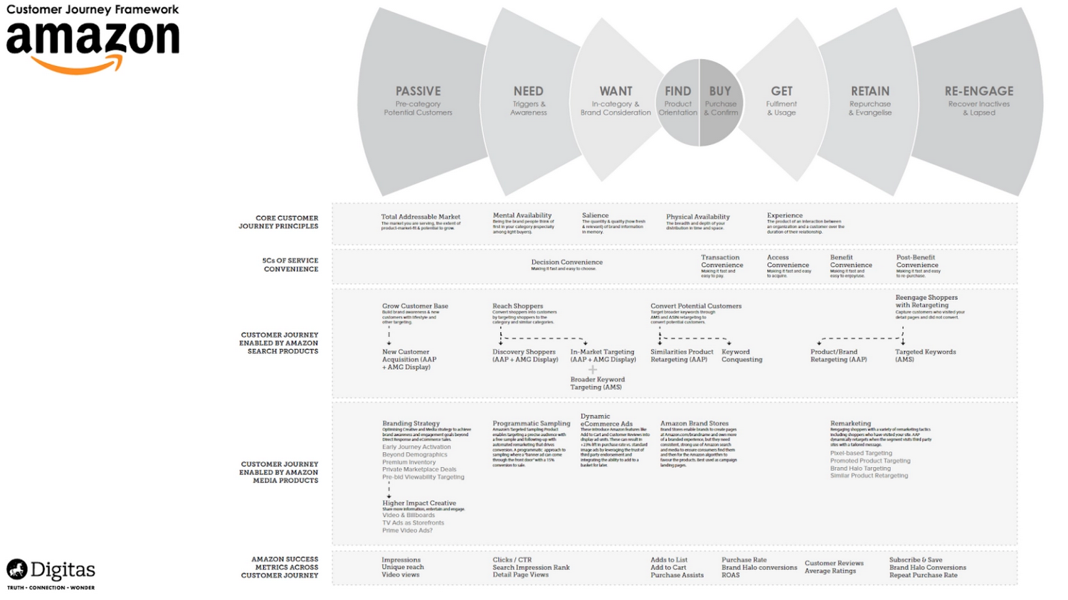
(By the way, if you want to create a user journey map for your business, we have a guide on how to do that here.)
The value of user mapping in terms of boosting engagement is that your user map will split up your user journey into stages, and you'll be able to see visually how many users drop off at each stage of the process.
If you have one particular stage where a lot of users drop off, this is great information for showing you which part of your user flow needs work.
Creating tailored experiences for personalization
We live in an age in which people expect the products they use to intimately understand their personal needs, as a matter of course. If that's not the case, the majority of consumers are all too happy to churn – and look for another product.
So you can boost engagement by avoiding giving generic product experiences wherever you can, and instead focusing on personalizing the UX where possible.
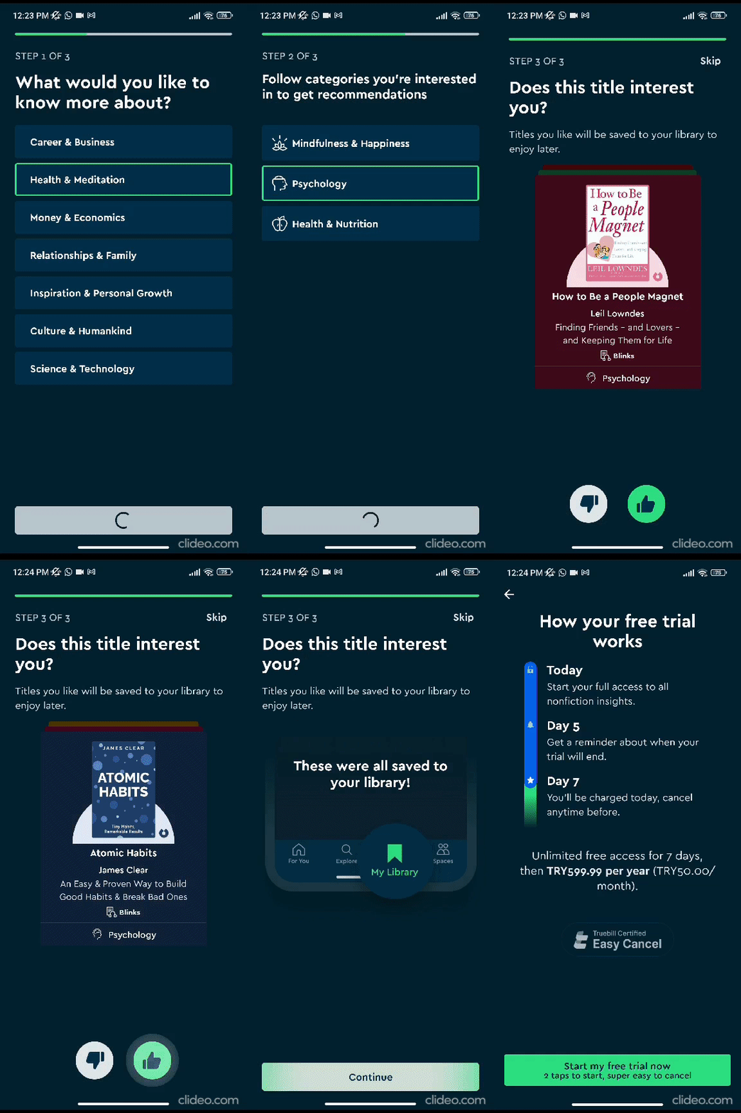
Classically, digital products will use their welcome screen and/or sign-up flow to get a few questions about how customers want to use their product, and then assign them a segment accordingly.
Here's how Blinkist does it in their welcome screen:
Leveraging user data for better targeting
This next strategy goes hand-in-hand with the previous one.
Let's imagine you're a project management app that serves SMEs.
You have one particular feature that allows users to change the type of project management board from Kanban to Waterfall. Let's call it Feature X.
But, through looking at your behavioral analytics tools, you observe that only the project managers themselves are using this feature. Regular users, even company owners, are busy with other things.
This is useful targeting data in terms of how you position Feature X.
For example, when announcing updates to Feature X, you could use UserGuiding to only serve the announcement to users in the project manager segment.
You could also craft your announcement copy accordingly so that it speaks to the specific needs of project managers to change the board type when they want to try out Waterfall instead of Kanban.
These changes are likely to boost engagement, because you won't be showing Feature X to users who don't care about it, and you'll be positioning it to specifically appeal to project manager users.
Guiding new users to value with effective onboarding
Onboarding is arguably the single best way to improve engagement across your app.
For example, you could use a tooltip to highlight a new feature:
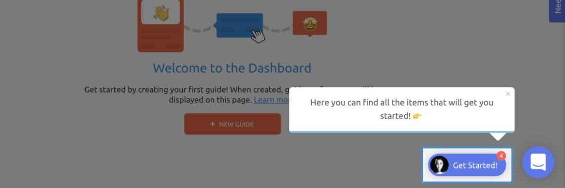
If you want an even more subtle approach, a hotspot is a great alternative to a tooltip:

And don't forget to give new users to your app a product tour with a checklist that highlights the most important features:
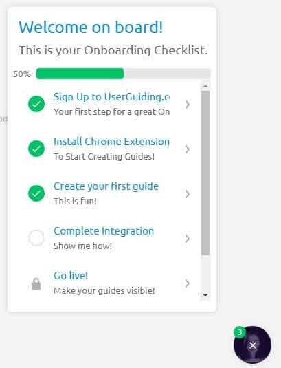
All of these onboarding elements (and more!) can be built using our tool, UserGuiding, without having to code. Check it out, if that would be helpful.
Adding fun elements of gamification
You know what all humans love to do? Play.
We have an instinctive drive to play as children, and even as adults, I'm prepared to bet that some of the most meaningful experiences you can remember involve some sort of play.
It follows that adding some element of play to your product will make users more engaged. Here are some ways you can do this:
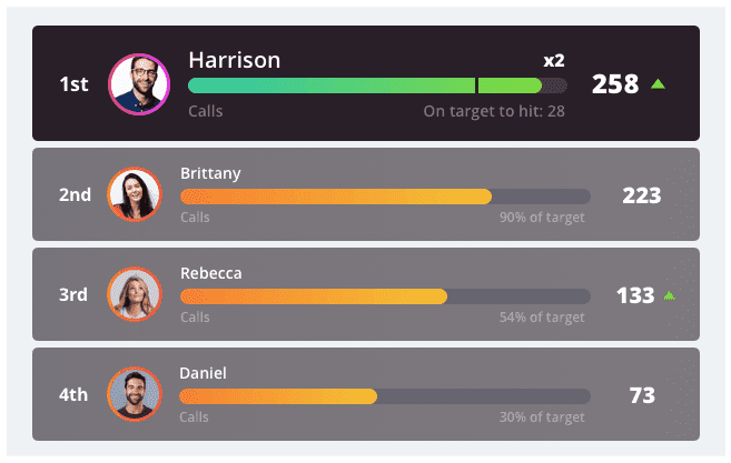
You can create a leaderboard system with points gained from completing key actions inside your product:
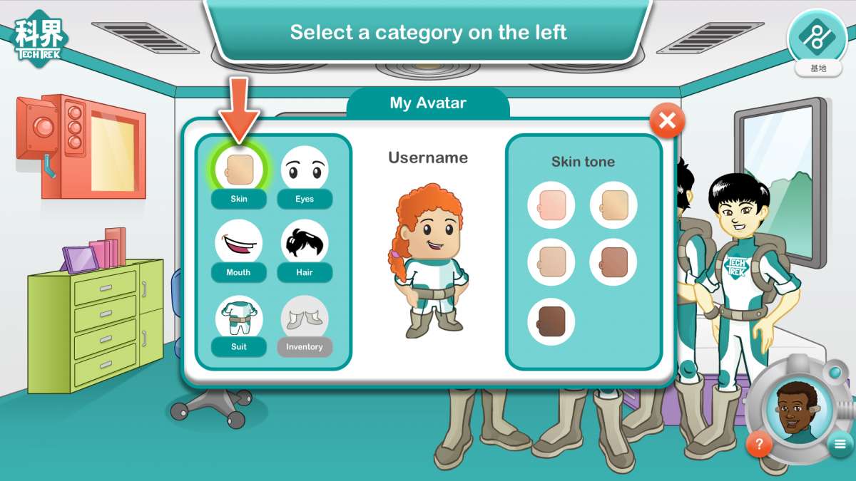
You can ask users to choose a character at the beginning of their product journey, as if they were creating an avatar on World of Warcraft:
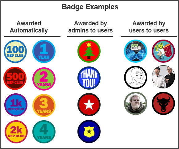
Or you can assign users badges when they complete certain challenges or achieve a certain status level in your app:
Lots of potential with this one: it's a personal favorite!
Delivering timely and relevant messages
One of the best times to send users messages is right after they sign up for your app.
Ever received a really helpful email sequence right after you sign up for something that tells you exactly how to get the most value from it? I know I have.
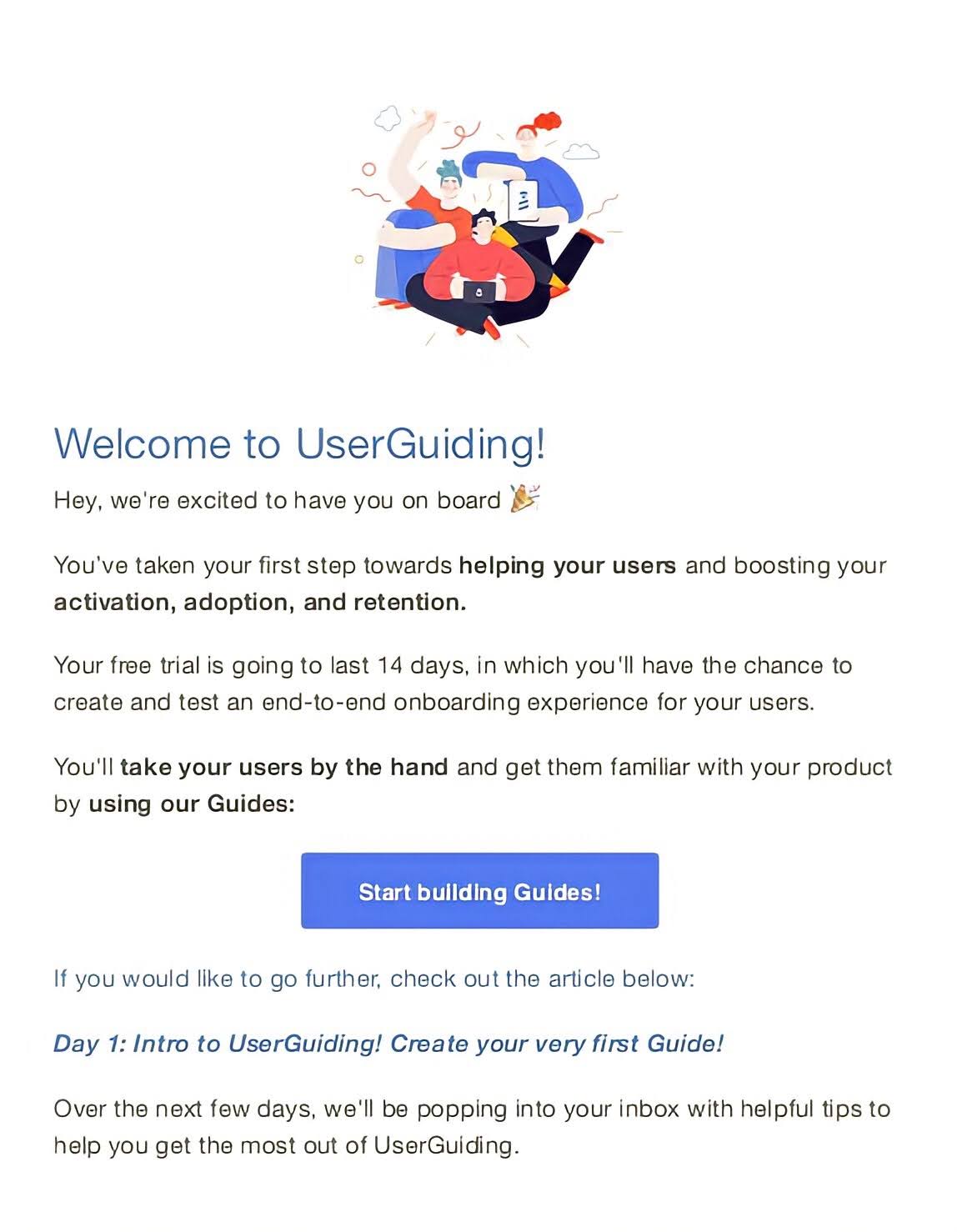
Bonus points if the messaging is tailored in such a way to be relevant to whichever segment you're targeting!
Another way you can do this is in your app itself.
You could consider sending a modal to a particular user segment announcing that you have an upcoming webinar about a feature that you know is important to them.

Participating in your community is bound to lead that segment to engage more with your app in general.
A/B testing for optimization
Let's be real: you won't create an app that engages users right out of the gate, and even if you try some of the tips we've given in this article, not all of them will work for every business all of the time.
So it's essential that you adopt a perspective of gradual, iterative learning through trial and error.
One of the most scientific ways you can test improvements to your product is by conducting A/B tests.
Here, you run two versions of your product concurrently, version A and version B, and you see which version performs better with users.
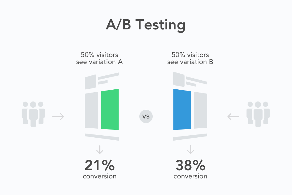
Examples of elements you could test to improve engagement include:
- Copywriting
- Colors
- Positioning of key UX elements
- The type of onboarding UI used to attract attention to a certain feature
- CTAs
Remember, if one of these little experiments results in a 1% improvement to engagement, but you conduct one such experiment every week, all those small changes will really start to add up over time.
4 Common Barriers To High In-App Engagement
Even if you adopt the engagement strategies we recommended in the previous section, you're likely to run into at least one of the following barriers to engagement at some point in your app's journey.
Complex registration process
Many companies put off users from engaging with their app by forcing them to go through a tedious, bureaucratic sign-up process that involves lengthy forms.
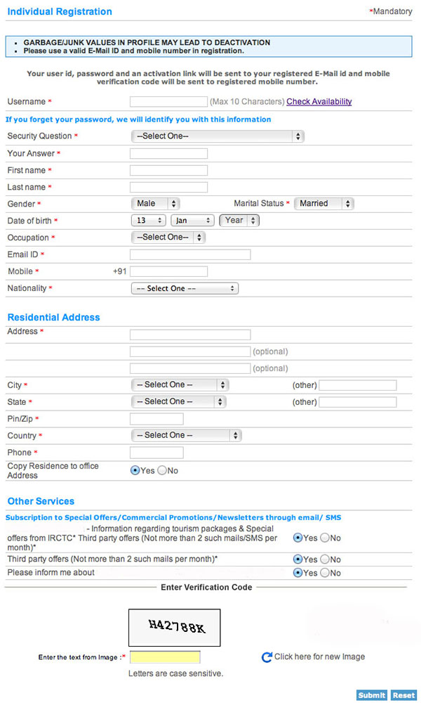
To ensure that you're not one of those companies, consider doing the following:
- If there are any questions that you need to ask users that you can ask after they've signed up (segmentation questions being the best example here), do that. Keep questions before the sign-up to an absolute minimum.
- Allow users to sign up using their existing Google account, instead of having to create a new account with you.
- Don't clutter your sign-up page. Keep it smooth, minimalistic and only include one CTA.
- Only add friction to your sign-up process when it's absolutely necessary. For example, if you're signing up users for a banking app, regulations probably dictate that you'll need to go through some bureaucracy that isn't necessary for a food delivery app.
Lack of social integration
Humans are social creatures, and so if your app has no social component, it's naturally going to be less engaging. Here are some ways you can boost engagement by adding social elements:
- Even if you personally don't like social media, give users the option to share their experiences on their social media app of choice.
- Add demo data from fake users so that your app doesn't seem completely devoid of social interaction when a user first signs up.
- Reward users with badges for engaging with other users or for getting their friends to sign up.
- Integrate your app with one or more communication apps (this might include something like Slack), and make it easy for users to have your app send notifications to that app every day.
Invasive ads
This is a common one, and it's a tricky one to solve as a product owner.
Let's look at it from a user's perspective: imagine you're using a mobile fitness app, and you're bombarded with ads in multiple locations on every single page.
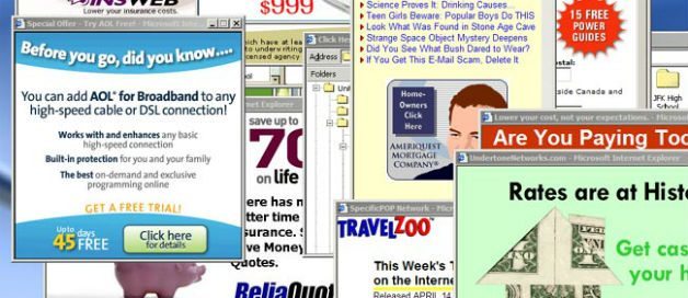
It can make for a frustrating user experience, especially if those ads are large modals or videos that autoplay.
But it's a tricky one for businesses that monetize using ads, as you need users to click on the ads in order to make money, but you also don't want the UX to be off-putting from having too many ads.
To find the right balance, try the following:
- Limit ads to one on each page, at most
- Ensure that any modals that appear don't take up the whole screen
- Allow users to close ads by tapping on an X icon if they want to
Too many notifications (or too few)
Similarly, there's a temptation for some product owners to bombard users with notifications about everything under the sun.
It's extremely annoying for users when they're got limited time, are trying to do something important with your product, and are then hit with 2-3 modals that open and block the whole screen.
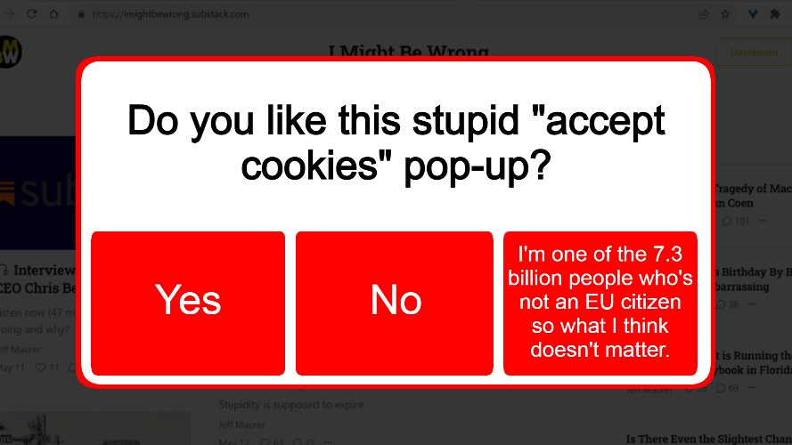
GDPR, cookie notifications, and forms that appear to get users to sign up for newsletters are some of the worst offenders here, in my experience.
Or, on mobile, you could also envisage a situation where your app sends push notifications multiple times per day. Again, annoying and distracting for your users.
On the other hand, sending some notifications is important for engagement, right? You want users to know when important actions on your product have been completed, or when another user inside your app sends them a message.
So try to find a middle ground here between sending too many notifications and not sending any at all.
App Engagement Examples for Inspiration
Want to see how other apps get their users to be more engaged?
Here are 3 simple examples that you can emulate.
Quora
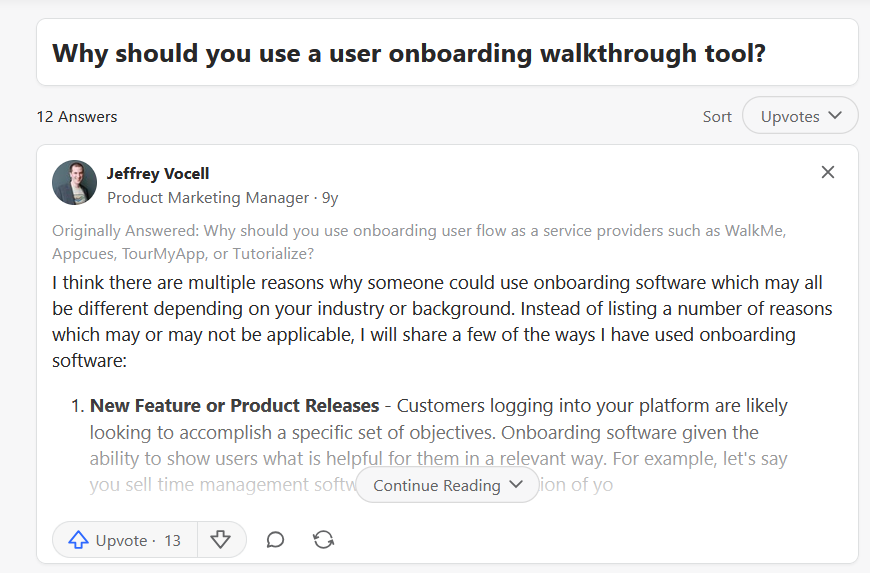
Quora makes it super easy for users to engage with content posted by other users. If you remember from the previous section, we talked about how important it is to include some social element in your app, and Quora does this really well here.
Just from this one answer, you can choose to:
- Give it an upvote
- Hit "continue reading" to see more of the answer
- Choose from different ways to sort the answers that people have given
Duolingo
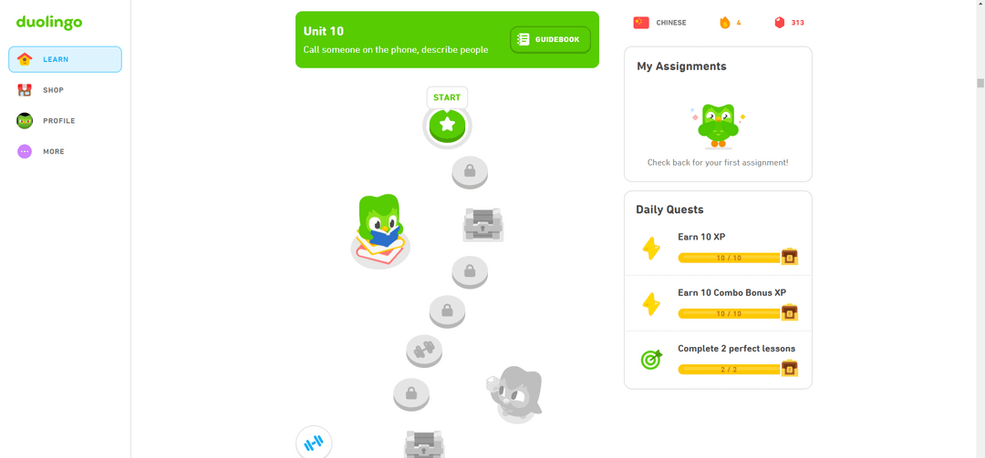
This is a nice example of engagement through gamification from Duolingo.
The user can choose to do one or more daily quests in order to advance their language learning.
The more progress they make, the more gated features they will unlock as a reward.
It turns something that can be challenging (learning a new language) into something that feels more like a video game than studying.
Usersnap
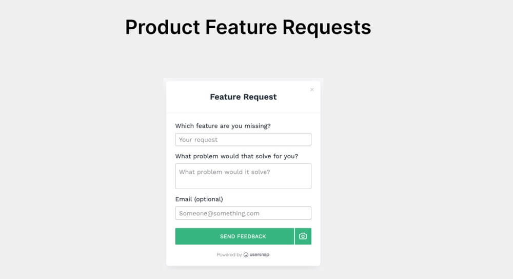
Nothing says engagement quite like a user who requests another feature.
The people who do this only do so because they use the product, already think it's good, but think it could be even better. If they didn't like the product, they'd go somewhere else to get the functionality they're seeking.
Usersnap's form makes requesting a new feature extremely easy. Look how clean and minimalistic this form is.
Even the email field is optional, which removes a level of friction for the user if they want to request the feature anonymously.
Summary
We hope that you've enjoyed learning about in-app engagement in this article. You should now know:
- What it is
- How to measure it
- How to boost it
- What some common stumbling blocks are
- And which examples from other companies you can borrow from
As far as boosting your engagement numbers goes, it might be worth your time to check out UserGuiding as a tool to help with that.
You can use it to create in-app surveys, product tours, hotspots, tooltips and in-app resource centers without having to code. Pretty neat, huh?
You can create a trial account for free if you fancy playing around with it for a bit.
Frequently Asked Questions
What counts as engagement?
It varies by platform, but examples include:
- Commenting
- Requesting features
- Frequent usage
- Adopting new features
- Integrating your app with their workflow
What is a good engagement rate?
Anything between 1-5% is good, and anything above that is outstanding.
How do I make my app more engaging?
Try adding gamification elements, social elements, reducing the length of the sign-up process, personalizing the UX and improving your onboarding.


.svg)
.svg)
.svg)
.svg)
.svg)


.svg)
.svg)


.png)


