Last Wednesday, I spent fifteen minutes on the phone explaining to my sister how Microsoft Word works.
And only on the sixteenth minute, I realized she wasn’t on the computer. She was just sitting there chilling, listening to me as she ate.

So, I needed to explain everything once more. On the computer this time.
I walked her through the basics, telling her to click on things as we went on. And somehow, just somehow, she got it all in under 5 minutes.
Now, my sister is no genius.
But I would like to think that it was the teaching method that made the difference.
Let’s be real. Learning a new skill is always hard. And doing it through user manuals… is not really helpful.
“But hey, isn’t there a better way?”
Yes, there is, and we call it an interactive guide. And today we will:
- Go over what an interactive guide is,
- Discuss why it matters for your product,
- Look at some great interactive guide examples,
- Find out how to build the perfect interactive guide in 5 steps, and
- Explore the best interactive guide software
Without further ado, let’s dive into it.
What is an interactive guide?
An interactive guide is a user or employee onboarding method that makes sure to actively include the user/employee in the process of learning on a website, app, or product. By getting users to actually interact with the website/app interface itself, the learning experience becomes more memorable and effective.
So, metaphorically speaking, an interactive user guide is a lot like a driving instructor.
The only difference is that the users don’t pass, but they reach success with your product. That is if your interactive guide is good enough.
But hey, you don’t have to take driving lessons to drive in real life, do you really need interactive guides? 🤔
The answer is yes. Let me explain why.

Why does my app need an on-screen interactive guide?
It’s true.
Legally, you don’t really have to take driving lessons to take the driving exam.
But that’s for the people who already know how to drive. They just need the certification.
In our case, however, no one is going to show up saying, “ah, yes. I know exactly how to use your brand new product.”
Because what we are dealing with is users, and the product you have is probably not MS Word.
You can’t just take it for granted that the users will know or understand your product by themselves. Even brands like Apple or Google don’t assume everyone knows how to use their products.
Be it the most famous or the most obscure product, there is always a need for user guiding, and it is the cherry on top when it is interactive.
But let’s look into other reasons as well 😁
1- Traditional onboarding isn’t good enough
When I say traditional onboarding I don’t mean user manuals and long instruction pages. We are well past those nightmares (we are, right?).
What I mean instead is long product tours and static tooltips that just end up annoying users. Of course, I am not saying throw them in the trash and spit on ‘em.
All I’m saying is, add a bit of spice.
Get them interactive. Hand-hold your users. They deserve it.
2- The more interactive the better
You decided to go interactive? Don’t shy away from it. Go all in.
The more interactive the better.
Some user onboardings start off great with a lot of interactivity, only to turn into static text later on. To avoid that there is one simple solution.
Spread the interactivity everywhere.
Of course, it is easier said than done. But it is your call to make according to the product at hand.
Is it a complex product that calls for a lot of tooltips along the way?
Use hotspots, tooltips, and checklists. Even better, put your interactive guides into checklists (wait, you could do that?)
What matters is that you see interactivity as a broad onboarding strategy for better user success, not just some cool-looking feature that’ll do very little in terms of numbers.
3- Not many are doing it
You heard it right. This is your call to be a pioneer.
“Wait, why isn’t everyone doing it?” could be what you are thinking. The unexpectedly simple reason is, it sounds expensive.
But the thing is, we are not talking about big AIs and massive pieces of code here. There are very very easy ways of bringing interactivity to your onboarding.
Like what?
Here are some great examples of interactive guides.
3 Great Interactive Guide Examples
As I just mentioned above, there is a stigma around interactivity. We all tend to think it is expensive and hard to do.
But these interactive guide examples I’m about to show you beg to differ.
1- Flourish
Flourish is a dream product for any manager who is looking to build powerful teams and do it in a simple way.
Since they promise to be simple, the onboarding has to be easy and short as well. But above all, it has to be engaging. Enter interactive guides.
Using UserGuiding’s interactive guide feature, Flourish reported visible growth.
Let’s take a look at the miracle elixir to their complexity problem.
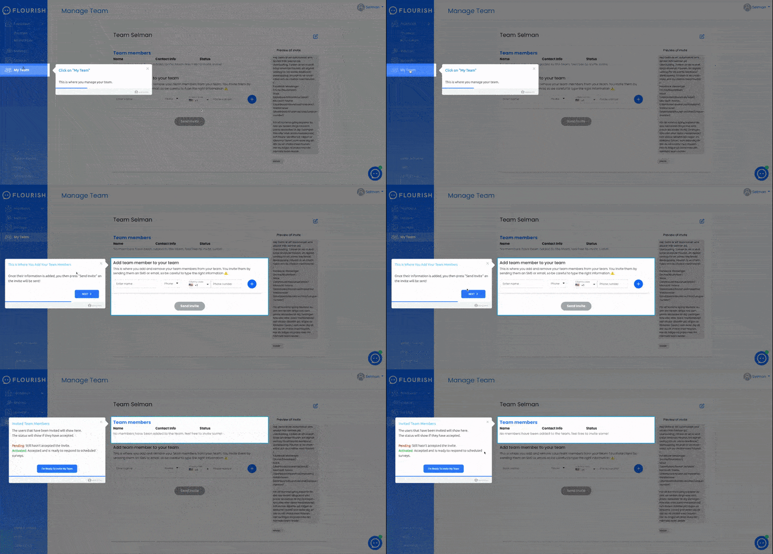
Flourish does it right by using tooltips and a checklist to utilize their interactive guide. And the progress bar is the cherry on top.
Wanna know what else Flourish managed with UserGuiding?
2- Ajar
Property management platform Ajar needed a solution for their onboarding process. And they happened to find one with an interactive guide feature.
And this is what they came up with.

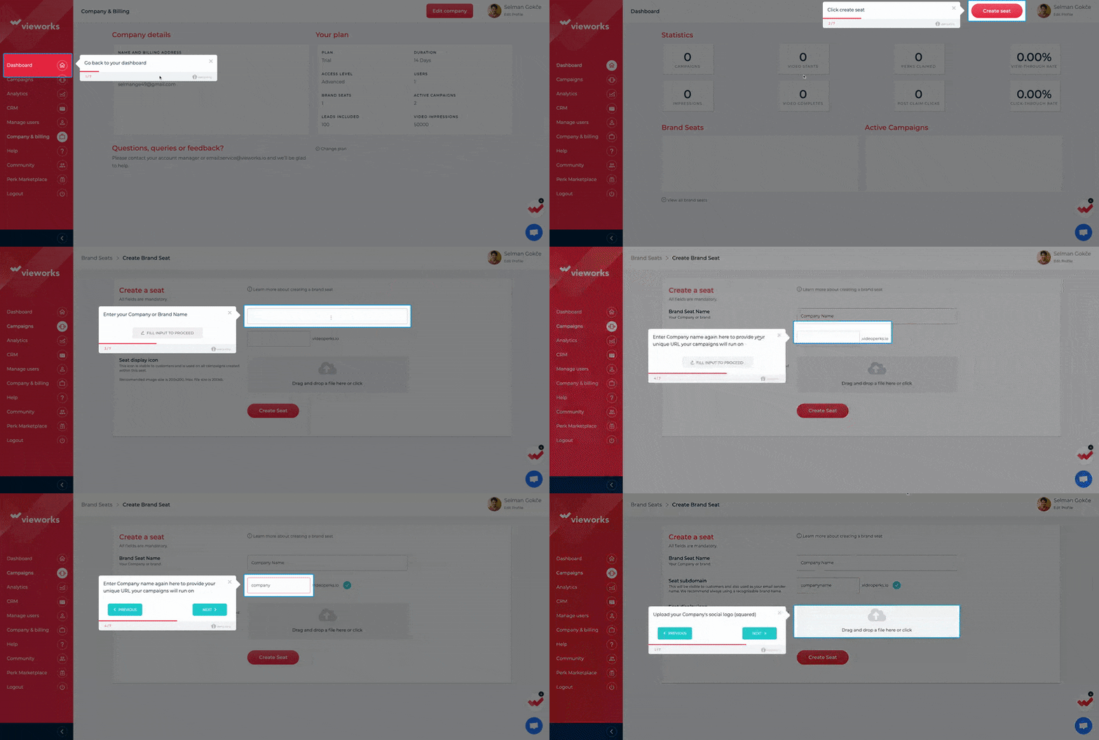
By leading users exactly where they need to be by darkening the background, using tooltips in the right places, and of course, a checklist to follow the process, Ajar shows us that interactivity doesn’t have to be expensive to be good.
They managed a lot more if you want to know 😉
3- Vieworks
Vieworks was in the search for a tool that would solve their onboarding and customer support problem - the problem being, the users getting lost.
And if your problem is that serious, you sure do need some interactivity woven into your onboarding process.
So, Vieworks started using UserGuiding and I don’t think they got disappointed.
Look at this.

View more works from Vieworks?
How to create an interactive guide in 5 steps
Like what you saw above?
You can do it too (better, even 🤫). So, now let’s talk about how you can create an interactive guide with and without a 3rd party tool.
1- Analyze user behavior
It would be a tad bit risky to prepare a user guide without considering what the user might feel about it, no?
Considering that an interactive guide is even more user-oriented, it would be a fatal mistake to skip this step.
So, the first and arguably the most important step is analyzing users’ behavior.
“And how do I do that?”
First things first, know your product and know your users.
Some companies may make the mistake of handling these two separately, but it is important to keep in mind that persona expectations change according to the product.
Does a CEO see Netflix differently?
Nope. They are there to stream content in their free time. Why would they see it differently than any of us?
After figuring out your customer personas in relation to your business and product, it is time to look deeper into your customers’ needs and expectations.
And what better way there is than user testing?
There are many different types f user testing that you can choose according to your product type, but among the most effective for creating interactive guides are:
- Eye movement tracking - by tracking the subject’s eye movements you can easily figure out where users tend to look at and look for information the most so that you can decide the order of your guide or the placement of popups
- Heatmap testing - essentially similar to the eye movement tracking test, heatmap testing can show you where your users tend to click, how long it takes for them to do so, or where they expect a certain button to be
- A/B testing - one of the most commonly used user testing methods, A/B testing is generally conducted to choose between two options. However, it can come in handy for interactive guide creation in deciding a final version
2- Plot the best course for users
After analyzing users’ behavior, you have all the necessary information to come up with a user course for your interactive guide.
And it is up to you to come up with the best one.
How do you do it? Work with the whole company.
It is essentially the developers’ job to plot the onboarding process, or maybe your product team is onto it with a third-party onboarding tool.
Chances are, the first draft will suck. And what’s worse is you may not even realize it.
To avoid this, the best call is to run it up with the whole team and the whole company. Ask for opinions, let other teams tell you what might be added or removed. After all, unity is key.
And while you are at it, don’t forget to run user testing on this step too. Remember, with every change, there arises a need for testing as well.
3- Create a plan
You can’t just create one guide and say “here ya go” to your users. Well, actually you can. But it would most probably fail to meet goals.
When creating any guide, there are certain criteria to consider, like user segmentation, user lifecycle, and many more.
To avoid slip-ups, it’s best to plan everything ahead of time.
Who is going to see what interactive guide? What action will trigger a certain guide step? What steps should be separated for existing users and new users?
These are all questions to ask when preparing your interactive guide(s). And the best way to handle them is putting ‘em all in your good ol’ user journey map.
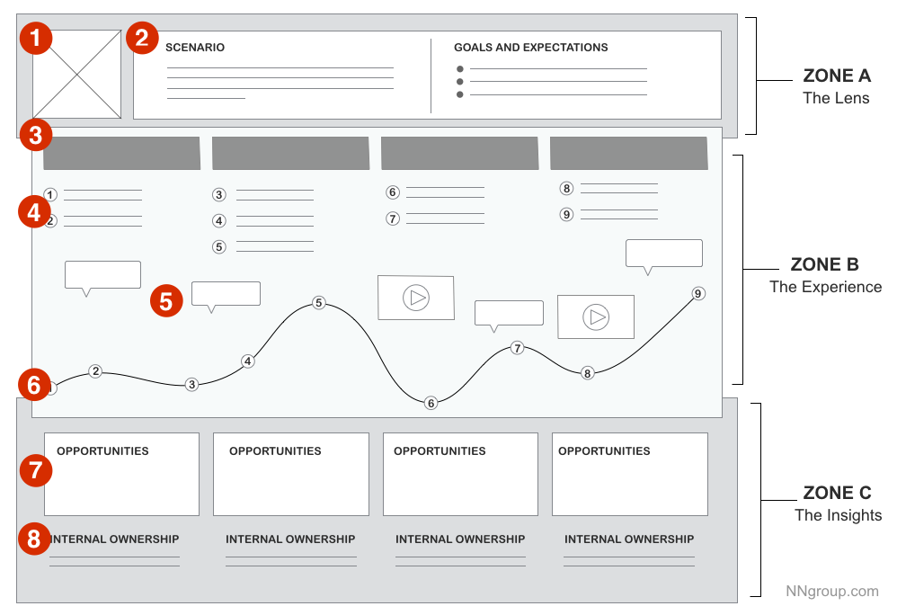
The good news is, you can do it in three simple steps:
- Define your user persona
- Decide on your users’ touchpoints
- Visualize the journey
Wanna know more about it? Take a look at our article on user journey mapping. 😉
4- Put it into action
All the material you need is set and you are ready to actually create an interactive guide now. Wait, but how?
You can either do it in-house or use a third-party onboarding tool.
While in-house has a cool ring to it, not every single one of us has the funds for it. It’s a big task, after all, my developer buddies would know.
But if you are still in for it, the process is simple - unlike the work itself. Take all the material you have collected and give it to your developer. Then code code code. Moving on.
If you are not one to deal with the extra work and prefer a quick, affordable, and simple solution, you need a third-party tool. Click here to jump to the best onboarding tools part of this article.
5- Optimize it regularly
Whether you opted for in-house or third-party solutions, one thing is certain. You have to maintain your guides properly. And when it’s interactive, it’s even more important.
The question again, is of course, how.
And the answer is pretty simple. Revise the prior steps.
Of course, it is important to note that thanks to various options like analytics and segmentation, interactive guide optimization and maintenance is way easier with an onboarding third-party tool.
In case you haven’t realized it, I am a big third-party tool fan. Most are no-code and can get your business done in a matter of minutes.
Wonder what my favorite is?
The Best Interactive Guide Software: UserGuiding
I might be very very slightly biased here, but I’ll say it: UserGuiding is the ultimate software for interactive guides.
And believe me, I can back this up.
1- It’s no-code
Coding is where in-house loses against third-party tools.
Cuz’ there’s none in most third-party tools.
And that is what makes it so much better. Think about it.
Would you rather have developers work on coding to create a very crucial onboarding process or would you have the people who actually know user needs and expectations work on it thanks to no-code?
We all know the answer.
2- Strong analytics and segmentation features
There are two very important requirements for a successful and smooth onboarding: good analytics and segmentation.
Even when you have the ultimate interactive guide, it is doomed to fail if you don’t specialize it for the right users and track how it’s doing.
UserGuiding helps you do exactly these things with its powerful analytics and user segmentation features. Of course, the ultimate interactive guide too 😉
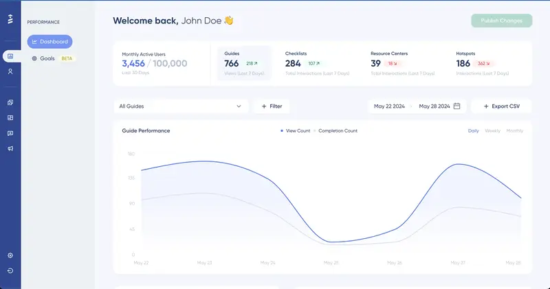
3- Guides - and much more
So, we already know that you can create a mean interactive guide with UserGuiding.
But there is more.
With UserGuiding you can create product tours, checklists, NPS surveys, hotspots, and now a resource center too. Just like this one 👉

Apart from all this, there are also powerful integrations, customization options, and another obviously very appealing factor: affordability.
Great tool, huh? Wanna see more of its features?
Conclusion
An interactive guide is a big gun in your arsenal, as long as you maintain it well and know who gets their hands on it.
My personal advice as a person well acquainted with onboarding processes would be to adopt that third-party tool you’ve been wanting to adopt right now.
And if you know a thing or two about interactive guides and onboarding, I bet you will get on board with UserGuiding.
Frequently Asked Questions
How do I create an online user guide?
You can create an online user guide using no-code third-party tools or you can do it in-house. Of course, since most companies don't have developers that can focus on anything other than their product, a third-party tool is the way to go.
What is an interactive walkthrough?
An interactive walkthrough or an interactive guide is an onboarding mechanism that focuses more on engaging the users than a traditional one. By actively including the users in the learning process, an interactive walkthrough/guide can achieve better and long-lasting user education.
How can I make my content more interactive?
Interactive content may vary depending on your product, the image of your brand, and many other qualities of your business. However, it is true that the future is interactive. You can start getting more interactive with interactive guides for your user onboarding.


.svg)
.svg)
.svg)
.svg)
.svg)


.svg)
.svg)


.png)


