.svg)
.svg)
.svg)
.svg)
.svg)


.svg)


.svg)
.svg)

Struggling to keep your users engaged through the entire product adoption walkthrough?
Feeling like your standard walkthroughs aren’t addressing the specific needs and goals of your users?
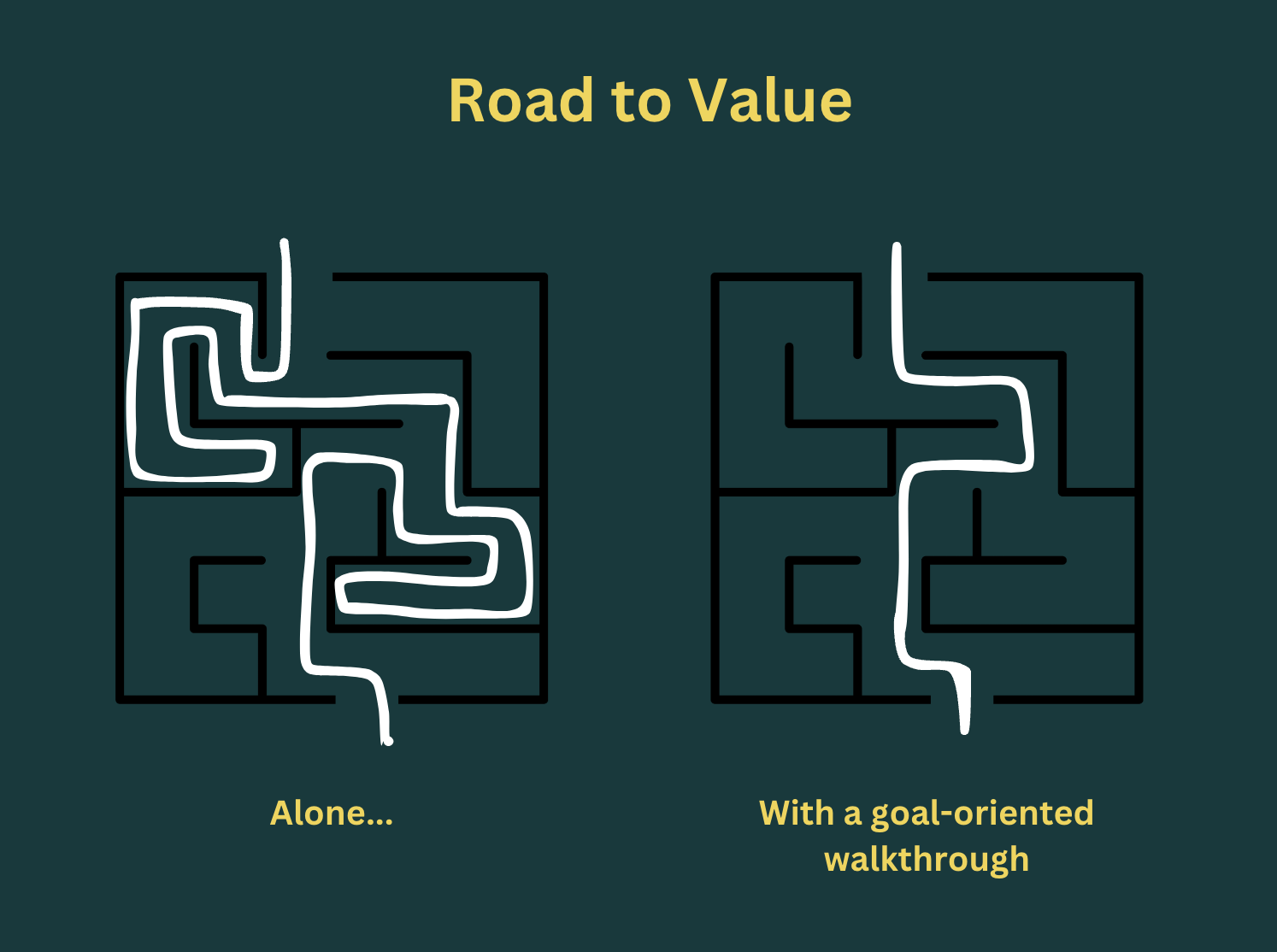
You're not alone.
Many find that traditional walkthroughs often fall short because they lack focus on individual user objectives, leading to disengagement and frustration.
What you need is a goal-oriented product walkthrough.
Instead of presenting a one-size-fits-all guide, goal-oriented walkthroughs tailor the experience to guide users efficiently toward their unique goals.
It’s all about getting users to their “aha” moment faster, improving their overall satisfaction, and ultimately driving product adoption.
(But you already know that if you’re here.)
So, without further ado, let’s see how you can create your very own goal-oriented product adoption walkthroughs.
TL;DR
- Goal-oriented product adoption walkthroughs enable you to:
- Reduce Time to Value (TTV),
- Increase feature discovery and activation,
- And ultimately ensure higher conversion and adoption.
- To create goal-oriented product walkthroughs, you need to:
- Detect the needs and use cases of your target audience and user base,
- Match your features with these use cases/ needs,
- Identify key user actions that prove your value to your new users,
- Create personalized walkthroughs to ensure these key user actions are taken,
- Set SMART goals for your walkthroughs to assess their success and effectiveness,
- Update and optimize your walkthroughs based on A/B and usability test results, as well as user feedback.
- Best practices of goal-oriented product walkthroughs include:
- Keeping the design clear and compatible with the overall brand/product,
- Incorporating visuals and interactive elements,
- Writing an engaging and unique microcopy for the walkthrough steps,
- Formatting the microcopy with bolds, and bullet lists,
- Customizing the CTAs and button copies,
- Narrowing down the scope and focusing on only key actions,
- Prioritizing value delivery over feature coverage,
- Personalization.

Why Do You Need A Goal-Oriented Product Adoption Walkthrough?
Your users come to your product because they want to achieve something, not because your product has a very cutesy look –unless it’s a design inspiration app…
They have a job to be done on their hands, a goal.
You need to show (and prove) that your product is what they’re looking for right within your app.
Yes, all your marketing copy, sales copy, social media posts, company blog, and use case articles might be talking about the value you provide to your users.
However, once you grab a potential customer’s attention and get them to try out your product, you need to show them how they can achieve their goals and get this aforementioned value.
This requires a goal-oriented approach to onboarding and product walkthroughs.
Before discussing how to adopt and implement this approach, let’s first explore what you can achieve with a goal-oriented product adoption walkthrough 👇🏻
Reduce Time to Value (TTV)
TTV is one of the most popular product adoption metrics.
It’s the time it takes for a user to reach their “Aha!” moment, where they clearly recognize and understand the value of your product.
However, it can be tricky and time-consuming for users to reach there.
Why? Because:
- First-time users are already disoriented and lost most of the time,
- Trial users have limited time with the product,
- New users have little reason to stick with your product until they see the value in it as they have not invested much time and effort in cumulating/migrating data.
It can take forever for your users to find value in your product without your guidance.
However, as a goal-oriented product walkthrough:
- Understands the user and their needs,
- Showcases the most important product features for their use case,
- Guides them with interactive steps to complete a key action,
- Reminds and provides value right after welcoming them,
You can reduce TTV significantly.
Increase Key Feature Discovery and Activation
Key feature activation refers to the moment when a user engages with a specific, critical feature of your product that is crucial to delivering its core value.
It’s related to the “Aha!” moment, but not totally the same.
Various key features might need to be discovered and used for a user to see a product's total value.
So, key feature activation is just one step on the path to achieving the “Aha!” moment.
With targeted and goal-oriented product walkthroughs, you can increase key feature activation rates.
Because they ensure you:
- Offer personalized experiences and ensure user satisfaction,
- Provide immediate value by demonstrating key features early,
- Simplify the learning process and reduce confusion on how to use key features,
- Keep users motivated to explore key features with interactive guidance,
- Avoid lengthy onboarding by delivering value quickly, so users can invest their time and energy in trying the product themselves.
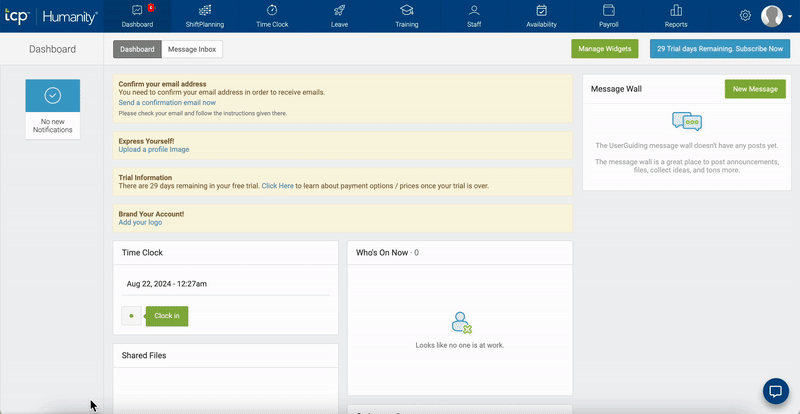
👉🏻Flowla increased its user activation rates by 24% after adopting UserGuiding and implementing effective and goal-oriented product tours and tooltips.
Here’s a sneak peek of their product walkthrough:
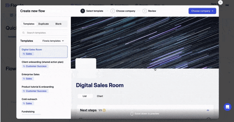
Check out their full success story.
Start with Defining Clear Goals (for Yourself and Your Users)
We almost always refer to user goals when we talk about goal-oriented onboarding.
However, their goals are also your goals, to some extent.
☝🏻 They want to save time and energy while working on a design.
🫵🏻 You want them to invite their teammates and create collaborated projects.
☝🏻 They want to get user insights.
🫵🏻 You want them to create in-app surveys or send out survey emails.
To know what your users' goals are and how you can chime them with your goals, first, you need to:
Understand your target audience and their needs
There are different ways to learn more about your target audience/ user base.
- Create social media polls to learn about popular problems and alternative solutions to them,
- You can conduct in-depth interviews with your loyal customers,
- Send out (in-app) surveys to your user base about their use cases,
- Analyze your feature adoption data, etc. etc.
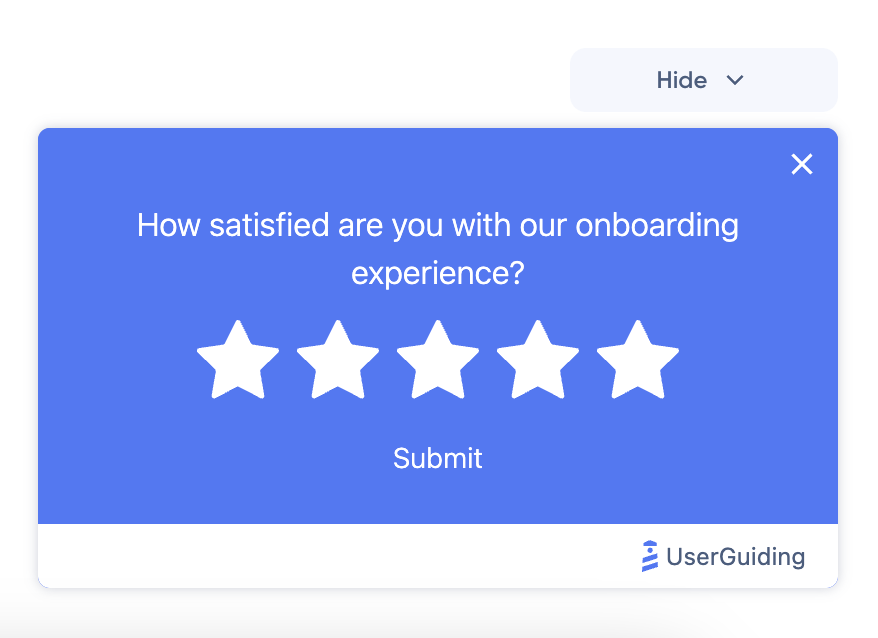
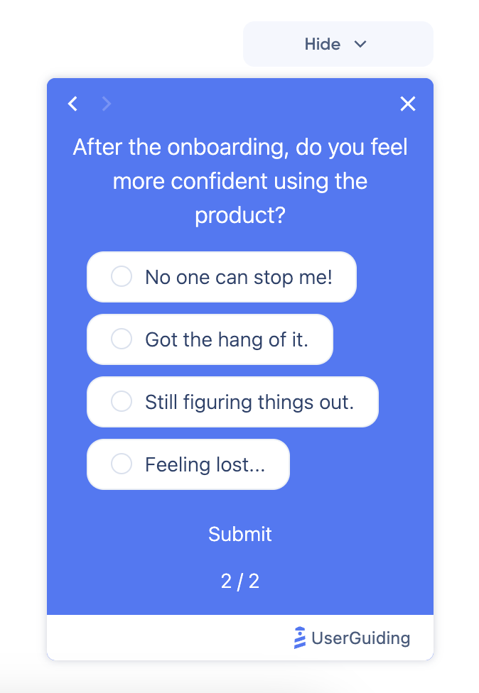
Once you get some insights about your (potential) customers, their problems, needs, goals, and expertise level; you can utilize this information to offer personalized and goal-oriented walkthroughs.
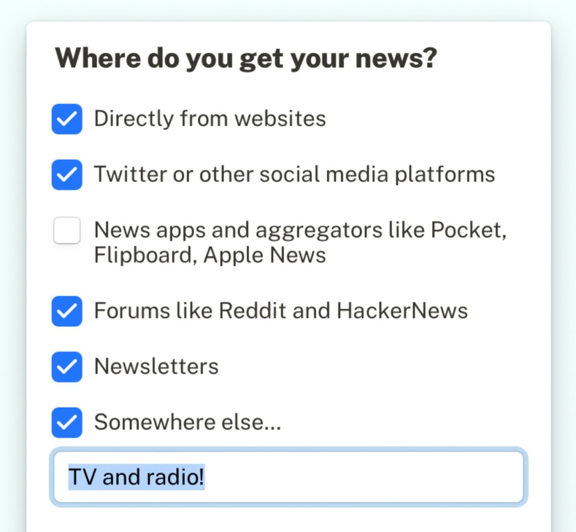
And to get those insights, you can create onboarding surveys like this:
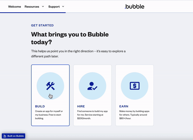
This:
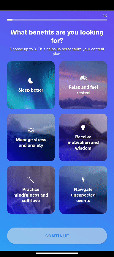
Or this:
Identify key user actions and desired outcomes
You know your audience, congrats!
Now it’s time to make sure they truly know you.
For that, you need each user to activate key features for their specific use cases and goals, and get successful outcomes upon their feature activation.
For example, for a fitness and wellness app, user goals and key user actions for these goals can be:
Improving Cardiovascular Health:
- Logging a cardio exercise
- Setting and tracking heart rate goals
- Completing a cardio challenge
Gaining Muscle Flexibility:
- Completing a stretching routine
- Adding a flexibility exercise to the daily routine
- Logging range-of-motion measurements
Optimizing Diet:
- Logging meals (e.g., entering breakfast)
- Saving and creating custom recipes
- Setting nutritional goals
Once you've identified the key user actions that will drive your users toward their "Aha!" moment and facilitate product adoption, you can develop tailored walkthroughs and guides for them.
Set specific, measurable, achievable, relevant, and time-bound (SMART) goals
To determine if your walkthroughs are effectively enhancing product adoption, you need to establish SMART goals and track your progress with the right adoption metrics.
Here’s what it means:
- Specific: Clearly state what you want to achieve.
- Measurable: Set criteria to track progress.
- Achievable: Ensure the goal is realistic.
- Relevant: Align with your broader objectives.
- Time-bound: Set a deadline to stay on track.
A SMART goal isn’t just about users completing a step; it’s about ensuring they do so in a way that benefits both them and your business.
For example, instead of just aiming for users to complete a setup, you could set a SMART goal like, "80% of users will create their first project within the first 10 minutes of using the tool."
This is specific, measurable, achievable, relevant, and time-bound. If you’re hitting this target, your walkthrough is working. If not, you know exactly where to adjust.
Focus on Creating a User-friendly Design
Product walkthroughs enable you to communicate value to your users, as well as provide contextual guidance and education.
However, if your walkthroughs are designed in a way that:
- Overwhelms users with complex or irrelevant information,
- Disrupts the flow with inconsistent visual cues,
- Fails to engage with interactive or dynamic content,
- Is excessively lengthy with too many steps,
you won’t fully realize their potential, regardless of how valuable the information may be.
To prevent that, you can 👇🏻
Keep your walkthrough steps clear and concise
Of course, you can add bullet lists, videos, additional links, to your walkthrough steps.
And they are beneficial for several reasons, as well.
However, only include these elements if they genuinely add value.
The clearer and more concise your steps are, the more likely users are to complete the walkthrough without skipping parts.
Avoid adding extras just for the sake of it; focus on making each step straightforward and easy to follow.
Like this:

This:
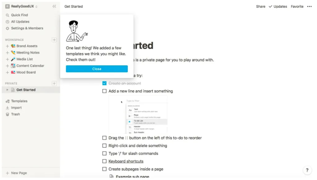
Or this:
As you can see, "clear and concise" doesn’t have to mean soulless or boring.
You can still incorporate colors, emojis, and small design elements to make your walkthrough steps recognizable and engaging.
The goal is to ensure they are easily skimmable and to the point, without sacrificing their visual appeal and uniqueness.
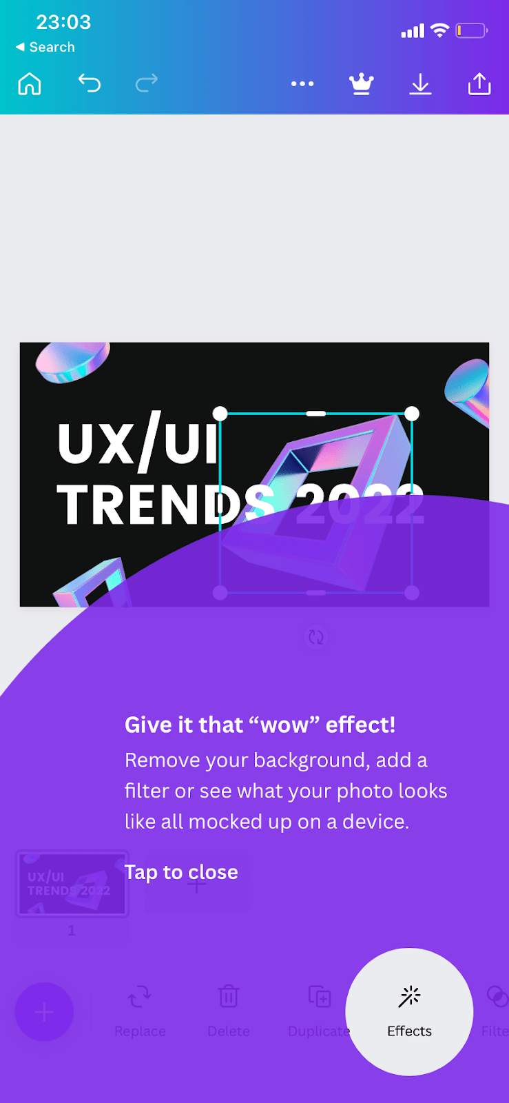
Add interactive elements for higher engagement
For a fully interactive walkthrough experience, you can arrange your steps so the tour pauses until the user completes each action.
For example, if you're demonstrating how to create a new project, ensure the walkthrough doesn’t progress until the user names the project or adds an assignee.
This approach not only enhances engagement but also provides a more effective learning experience.
As B. Franklin says, “Tell me, and I forget. Teach me, and I remember. Involve me, and I learn”.
Use the Power of Visuals and Microcopy
We said visuals and formatting methods are beneficial in many ways.
For example, you can use visuals (videos, gifs, infographics, diagrams) to:
- Provide more detailed explanations for complex steps,
- Show demonstrations of how to complete a step,
- Highlight key actions with annotated screenshots,
- Illustrate workflows.
And good formatting (bolds, italics, bullet lists, headings) to:
- Increase the readability of lengthy walkthrough steps,
- Divide information within one step into manageable sections,
- Draw attention to keywords/ main points,
- Incorporate white space to reduce visual clutter.
However, there are a few key considerations to keep in mind when using visuals in your design and formatting in your microcopy 👇🏻
Design branded and easy-to-follow walkthrough
Your product adoption walkthrough should reflect your brand’s identity.
Consistent use of colors, fonts, and design elements helps users feel comfortable and familiar with your product.
You wouldn’t confuse Slack’s design with Notion’s design even if I showed them without a brand logo, would you?
How about Discord’s design with Canva?
You can opt for a clean and simple design with a limited color palette and minimal eye-catching elements, creating a modern and sleek look.
Alternatively, you might choose a shiny, extravagant design featuring numerous emojis, vivid colors, and special effects.
What's important is that your design (and tone) align with your product, website, and social media – essentially, your overall brand image and design choices.
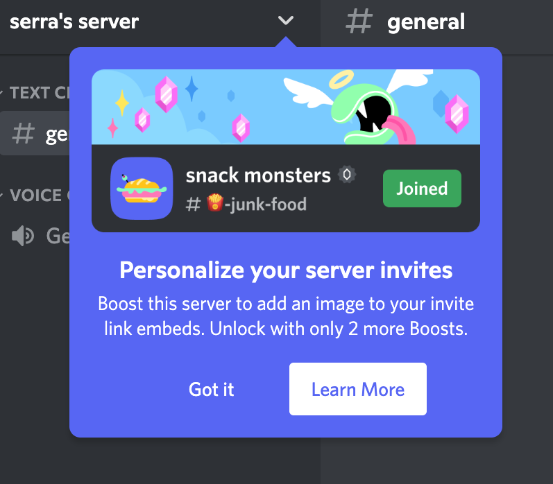
Here are the examples from Discord and Canva:
Another thing you should pay attention to with your walkthrough designs is their flowability and smoothness.
Are you dimming the background light? (Please do)
Are you going back and forth between different pages/dashboards? (Please don’t)
The flow of the walkthrough steps should be easy on the eye and the mind, really. You can also add back/next buttons for those who couldn’t keep up, as well.
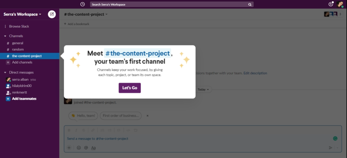
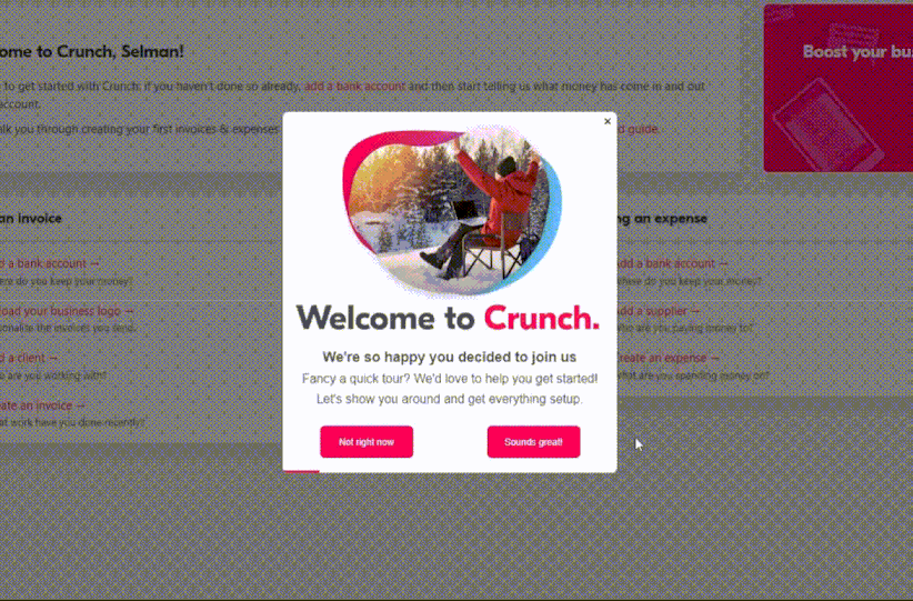
Look how coherent and smooth this walkthrough from Crunch looks:
Or this one from CitizenShipper:
They both have:
- Previous and next buttons,
- Progress bar,
- Dimmed background and highlighted area.
Smooth and easy to follow!
Create engaging narratives
Product adoption walkthroughs are essentially microcopies and narratives at their core.
Yes, design and flow are important.
But not as much as the actual message of your walkthrough.
(Promise, it’s not a marketer’s bias 🤞🏻)
If your language is dull and bland, and your walkthrough microcopy lacks an engaging and catchy element, users will close the walkthrough after just a few steps.
Because people connect with stories, not just instructions.
You don’t need to enroll in a creative writing class and come up with novel-like walkthrough steps.
Even saying, "Let’s add your first task to kickstart your project’s success," instead of "Click here to add a task," can make the process feel more personal and motivating.
Or instead of "Set your notification preferences," you can say, "Choose how you want to stay updated."
Here’s a nice example:
Write effective call-to-actions (CTAs) and buttons
The previous and next buttons are pretty functional.
But let’s face it —they are not very original or unique and can even be boring sometimes.
Writing your own CTA buttons can motivate the users to click on them.
For example, don’t you want to click on this CTA just a little bit? 👇🏻
If you have a more professional tone across your other copies on your product and website, then you can go with a slightly less quirky but still original CTA/buttons like this:
Or even this:

Anything different than another “next” button could do the job!
Test and Optimize Your Product Adoption Walkthrough
Even if you assign your best copywriter and product designer to the project, they cannot create the most effective and usable walkthrough that provides the most value to users on their first attempt.
That’s just the nature of things.
In order to optimize your product walkthroughs for better adoption, you need to:
Conduct usability tests and A/B tests
Testing is crucial both before and after a UX design launch.
Before fully launching a walkthrough, you can utilize usability tests to observe where users struggle, what confuses them, and where they drop off.
This hands-on approach often uncovers issues that may have been overlooked during the design phase.
For example, if users frequently skip a step in your walkthrough, it might indicate that the step is unclear or perhaps even unnecessary.
And once the walkthrough is live, ongoing A/B testing can be used to make small tweaks and changes, ensuring the walkthrough remains effective and up-to-date.
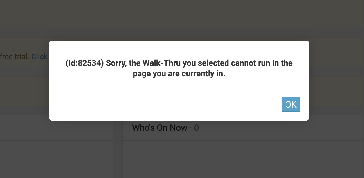
⚠️ Usability tests are particularly crucial if you're coding your own walkthroughs, guides, and tooltips, rather than relying on third-party no-code tools. Custom-coded solutions are often more prone to technical errors, making thorough testing essential to catch and fix any issues early on.
Receiving a message like this probably would not be very pleasant for a user:
Or being left hanging in the middle of the tour with no subsequent steps, even after clicking the "Next" button…
Gather user feedback
Another valuable tool you can use to detect areas for improvement and optimization on your walkthroughs is user feedback.
User surveys, I mean.
After users complete your walkthrough, you can ask them what they thought.
- Was it helpful?
- Was anything unclear?
- Did they feel more confident using the product afterward?
With a quick in-app survey, you can get responses to all these questions.
Once you add follow-up questions, of course.
Best Practices for Goal-Oriented Walkthroughs
Before wrapping up, let’s touch on some more practices you can adopt to polish your walkthroughs.
Keep your walkthrough focused
Long, drawn-out walkthroughs can lose users’ interest quickly.
Keep your walkthrough concise, focusing only on the most important steps.
Users should feel that every step is necessary and that they’re making progress toward their goals.
Additionally, you can break down complex tasks into smaller, manageable segments –different guides on the onboarding checklist, for example.
Prioritize value delivery
Your walkthrough should always emphasize the value of your product, but it’s crucial to focus on the value that’s relevant to each specific user based on their needs and use cases.
If users don’t immediately see how your product benefits them, they might abandon the walkthrough and become skeptical of the value of other guides and tooltips you provide.
Not every feature is valuable to every user.
So avoid overwhelming them with detailed explanations of every little feature. Instead, highlight the key features that address their immediate needs.
If you believe other features could be useful, you can introduce them later with additional tooltips.
However, your primary goal is to show users the core value that meets their needs, ensuring they adopt your product effectively.

Personalize the experience
We’ve emphasized the importance of being goal-oriented, direct, and targeted throughout this article.
Achieving this often involves a degree of personalization.
If you have only one user persona with a single goal and use case, a single product walkthrough may suffice. However, this is rarely the case.
Once you’ve identified various use cases and aligned your features with these needs, it’s essential to create tailored walkthroughs for each user type. This approach ensures that your walkthroughs address the specific needs and goals of different users effectively.
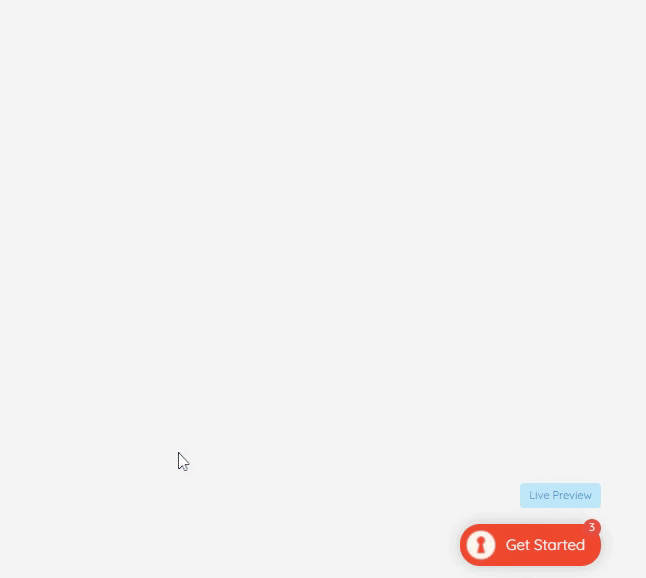
And you can trigger these different, personalized walkthroughs like this👇🏻

To Sum Up…
A product walkthrough is an amazing tool for user engagement.
With a product walkthrough, you can:
- Welcome New Users
- Showcase the UI
- Demonstrate Basic Features
- Create a Structured Introduction
However, a goal-oriented product walkthrough is a step up from the traditional walkthrough.
It’s your secret weapon for product adoption.
Because with a goal-oriented product walkthrough, you can:
- Decrease Time to Value
- Guide Users to Their Aha Moment Quickly
- Enhance Personalization
- Drive Effective Adoption
And now you know how to get started with this super-effective tool!
If you need more examples before designing your walkthrough, here are 8 inspiring product tour examples!

.png)