
The human body is a miraculous thing.
From the brain to each tiny red blood cell, from the bones in your legs to the cartilage in your neck, each part of the body works together in perfect harmony so that you can function from day to day.
Strange as it may sound, a great digital product is much the same.
Really outstanding digital products consist of a number of systems – ranging from sales and marketing to code and onboarding UI elements.
The better that these systems work in harmony, the more of a success your product will be.
So in this article, we'll build out this metaphor further, going through a successful business' vital systems one by one so that you have a model to emulate.
Let's get right into it.
TL;DR
- A digital product is any product that's intangible, based on technology, and sold online.
- The backbone of a successful digital product is market research and persona work. These enable you to craft a compelling value proposition and construct an MVP as the smallest possible version of delivering that value to your users.
- The best digital businesses offer an engaging, intuitive user experience – which is a bit like the soul of your product. You can achieve this by optimizing your information architecture, personalizing the UX for each user segment, and designing with accessibility in mind.
- Your marketing strategy is like a muscle that will help your business grow. Focus on one channel, don't set too much store by a fancy launch, and don't forget to use your product itself as a marketing tool to engage new users and prevent them from churning.
- Choosing the right metrics for your business will give you the vital signs that show if your organization is in good health. Track your goals on a monthly basis using a mixture of quantitative and qualitative data, and never stop testing or iterating.
- UserGuiding can help you retain more users by creating product tours, highlighting important features with hotspots, sending in-app surveys to measure user sentiment, and more.
What is a digital product?
First things first, a brief definition, just to make sure we're on the same page here.
A digital product is, very simply, a product that's based on digital technology that's sold online.
Digital products are:
- Intangible, which is to say they don't have a physical form
- Both created and consumed online
- Designed to be created once and then sold innumerable times
So some examples of digital products could be:
- An ebook
- An online course
- A downloadable song
- A content library of stock photos
- A database of email addresses
- A SaaS product (like UserGuiding)
Let's explore the anatomy of digital products like these.
Creating the Backbone: A Strong Foundation for a Digital Product
Your backbone holds your entire body together.
Put another way, without it, you would collapse into a sack of meat!
In business, there are certain fundamentals that perform the same role as a backbone does in the body.
You forget them at your peril – since they're the basis on which everything else is built.
Here are some examples of backbone activities:
Conducting Market Research
Assuming you're launching a product for which there's already an existing market, it's intelligent to begin by analyzing your competitors and seeing what they're doing.
No product exists in a vacuum; taking a look at your competitors will help you understand what your customers' expectations are and how you can position yourself as a better option than what's already out there.
For each competitor, make a note of the following:
- What are their product's main features? Which features are they lacking?
- How do they position themselves in the marketplace? What unique value do they pitch themselves as bringing to the table?
- Which marketing channels are they present on? Which marketing channels are they not present on?
- How expensive is their product? How are they packaging it, and do they offer any pricing tiers?
On the basis of this work, you should then conduct a SWOT analysis in light of your position in the market. What are your strengths, weaknesses, opportunities, and threats?

For example, if you see that three of your competitors have launched a key feature that you're lacking, you could perceive this both as a weakness of yours and an opportunity to improve.
It's important to conduct this analysis on a regular basis. Tech markets move quickly, and the analysis that you did 6 months ago might not necessarily be accurate.
Developing a User Persona
You can't have a successful product without knowing who exactly you're serving.
Developing a user persona begins with interviewing customers to understand their needs, pain points, and desires.
Spend at least half an hour one-on-one with at least 100 customers (or prospective customers). In those conversations, focus on:
- Doing more listening than talking
- Focusing more on their pain points than on your product
- Taking copious notes
- Paying attention to whenever they get emotional
Once you've conducted a few interviews, start to look for patterns.
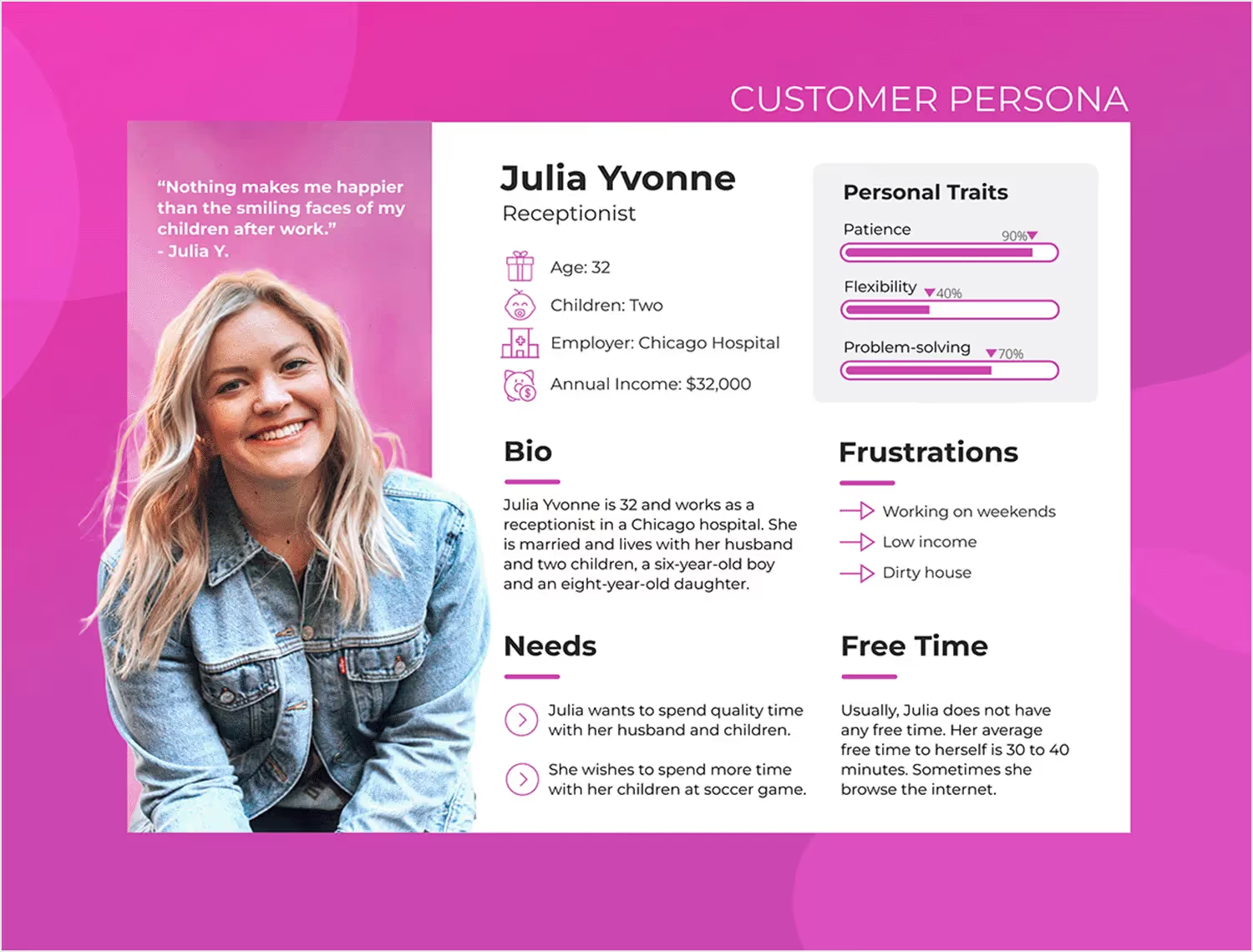
For example, if 15 of your customers are teachers and one is a bus driver, assume that your main persona is going to be a teacher.
Or if 25 of your users are in Italy but 3 are in Slovenia, assume that your persona is based in Italy.
From here, you can start to group the patterns that you're seeing under:
- Demographic information (e.g., age, gender)
- Psychographic information (e.g., interests, values)
- Pain points
Your aim, especially in the early days of your company, is to come up with ONE persona to focus your attention towards. This is because you have limited resources, and you are more likely to exhaust those if you spread yourself across multiple personas and try to be something for everybody.
Persona work should be done by your founders, and it should be repeated at regular intervals throughout the life of your product.
Defining a Value Proposition
Together with your market research, the interviews you conduct with your customers should give you enough information to craft a unique value proposition and communicate it effectively.
Here are some pointers to help you do that:
- A value proposition should be unique. In other words, focus on what makes your offering different from the competition that you've researched.
- It's not a mission statement. A mission statement speaks to why you're doing what you're doing, whereas a value proposition articulates why your offering is valuable for users.
- Speak your customers' language. In the majority of cases, this means you want to speak simply and straightforwardly, without using technical jargon – unless you're selling to developers or large enterprises.
- Demonstrate an understanding of the problem you're solving, together with the pain points the problem causes your customers and how they feel about it.
- Use the word "you" as frequently as possible in order to connect with your audience.
For example, Spotify's value proposition is that it allows just about anybody to listen to all their music seamlessly in one place, without ads.
Or as, my colleague, Ceren wrote once: “to party without disruption 🪩🕺🏼”
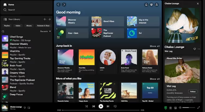
It's different from something like YouTube in that there's no video content, just audio, and it's easier to repeat tracks.
Defining Success For Your Digital Product
You can't know whether your business has been a success without firstly defining what you're aiming at.
There are two things to think about here: your mission and your vision for the financial future of your product.
Your mission is the "why" behind what you're doing.
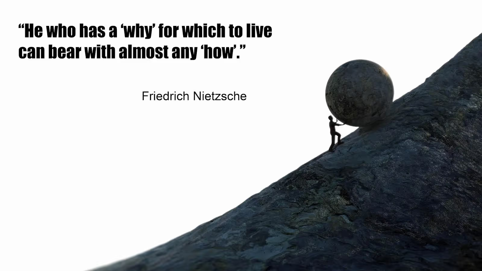
It goes beyond simply defining who you want to help and how. The word "mission" conjures up more challenging questions like what aspect of your personal journey got you into this industry and what legacy you want to leave.
Your mission could be something quite simple, such as wanting to create an extra income stream so that you can spend more time with your family. Missions absolutely do not have to be grandiose in order to be personally meaningful.
It could also be something more complex, such as wanting to change how people listen to music online, or introducing a new type of font to revolutionize typography. It's really up to you.
On the financial side, there are, again, lots of different ways to think about success. None of these are objectively right or wrong; they depend on your personal goals.
Here are some examples:
- Selling your product for a certain sum of money in order to retire
- Turning your product into a long-term cash cow
- Selling 4 licenses a month at $250 each in order to make an extra $1000 a month
- A passion project that covers its costs
- Turning your business into a publicly-owned company with an IPO
Developing your Minimum Viable Product
Have you heard the term MVP before?
I'm not talking about Most Valuable Player here in a basketball context, as cool as that is 😊
I'm talking about your Minimum Viable Product. This is a term that came out of Silicon Valley and has become a must-know for new business owners and product leaders.
Think of your MVP as the smallest, simplest possible version of your product that adds value for your users.

Since value is relative, it might still be quite complicated. For example, an MVP for a banking app would probably take quite a while to build just because of how tightly that industry is regulated and due to the officious standards of most banks.
But in the majority of cases, the MVP should be something that you can build quickly and easily.
Here's why: your MVP won't get everything right the first time. It's really more of a tool to test your assumptions than it is a final version of your product.
If you spend 1 year coding the first version of your product but then find that no one wants to use it, that would be a huge waste of time and money.
So, an MVP allows you to create something of value, quickly put it into users' hands, test your assumptions, and then iterate to create a better version of your product.
It's a major part of the backbone on which the rest of your product will be built.
Adding A Soul: An Engaging User Experience
Your soul allows other people to connect to you. It's the part of you that lights up when you're in love or talking about something that you're passionate about.
In the same way, a well-designed UI makes it easy for users to connect to your digital product and feel like you understand their needs.
Let's explore some practical ways that you can optimize your user experience.
Make the User Interface Intuitive
A great digital product is easy to use, to the point that it feels intuitive – even for someone who's never seen it before.
Easier said than done, though, from a product designer's perspective.
We all know what an intuitive product feels like, but how do you achieve that feeling in practice?
The first rule to follow here is to follow a clear visual hierarchy. This means that you can use color, font size, and space to draw the customer's eye to what matters first:
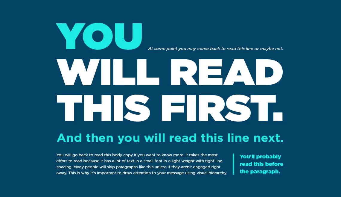
Next, ensure that you prioritize usability above all else. For example, don't block a core feature with a modal that doesn't have an X that the user can click on to close it – even if your marketing team tells you that the modal is important.
This links nicely to another principle of good UX design, which is to give the user control over their experience.
For example, we sometimes see well-intentioned companies create product tours that can't be skipped. While trying to onboard your users is laudable, if the user wants to skip the tour and they can't, that's just going to make them frustrated.
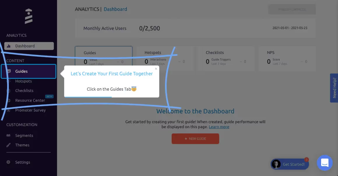
As far as your visual design goes, stay as consistent as you can. Use the same fonts and colors throughout so that your product feels like one coherent whole instead of a patchwork quilt of disparate features that have been awkwardly woven together.
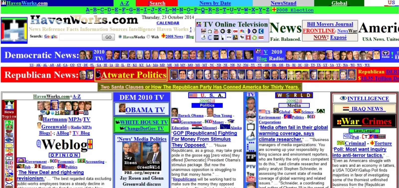
Simplicity is king here: use white space wherever you can to break text down and make it easier to read. And also ensure that any fonts you use are easy to skim-read, as opposed to convoluted Gothic scripts in italics!

Probably not the easiest text to read…
Information Architecture
Information architecture is the science of organizing digital content for optimal usability.
For example, you'll want to group the pages on your website together into logical categories so that users can easily browse around and find what they want:
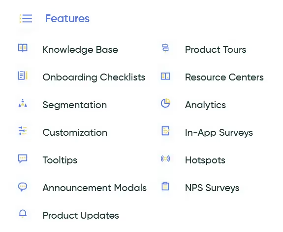
One of the best tools you have at your disposal here is your navigation bars, both the top navigation and the footer navigation.
Take a look at your analytics, see what users need the most often, and ensure that those pages are represented in your navigation bars – particularly the top navigation.
Your top navigation is also a good place for any important CTAs, like signing up for a demo, in the case of SaaS businesses.

A good principle to follow here when organizing your information is to be mindful of your audience's cognitive load. Don't overwhelm them by giving them too much information at once.
Instead, give them just enough information to keep them engaged and allow them to solve whatever problem they have, and let them explore on their own terms, as they please.
Responsiveness is also worth bearing in mind here. We live in an era of multiple devices, so your digital product probably needs to work just as well on mobile and tablet as it does on desktop.
Segmentation and Personalization
Another important way to increase the odds of users feeling connected to your product is to personalize the customer experience according to the segment they're in.
A common practice in the SaaS world is to gauge what segment to assign a user to based on that user's behavior during the sign-up and onboarding phase.
For example, you might consider giving new users a welcome screen at the beginning of their journey and then segmenting them based on their answers to the questions you ask them.

There are lots of ways in which this information might be useful for you:
- If a feature is particularly important for one user segment and wholly irrelevant for another, you can set your product marketing up in a way that the feature only gets advertised to the relevant segment.
- You can analyze user behavior (feature usage, NPS score, churn rate etc) by segment, rather than looking at your users as a whole. This allows you to better understand why certain users and user segments behave in the way they do.
- You can set up in-app surveys and then send them to one segment at a time, or exclude a particular segment, if that segment isn't relevant.
- If you have one segment that's paying for premium access, you could announce a new feature to that segment before your other segments.
These are just a few examples – you're really only limited by your imagination here.
Accessibility: Ensuring Inclusivity
Accessibility is a growing trend in product design. This is a good thing, as it's important that all types of people are able to engage with your product.
Here are a few concrete suggestions for how to make your digital product more accessible.
Use enough color contrast to make your text readable, but not so much contrast that the brightness is glaring for people with autism.

Consider using alt text for images, which can be read aloud by screen readers to help those who have visual impairments or blindness.

When designing downloadable pdfs, include versions with larger fonts that maximize readability.
And finally, consider adding captions to your videos. Users who are deaf or hard of hearing will thank you.
The Muscular System: A Growth Strategy
If you want your muscles to grow, you'll need to spend a lot of time in the gym, eat well and get plenty of rest.
Likewise, in order to get your business to grow, you'll need to adopt an intelligent approach to selling and marketing your digital product.
Let's look at how this can be done.
Product Launch and GTM Strategy
Before you officially launch your product, you should think carefully about how you want to take it to market. In marketing jargon, how you take your product to market is referred to as your "Go-To-Market Strategy," or GTM for short.
In my experience, the biggest mistake entrepreneurs make here is that they try to select too many channels at once.
"Facebook, Instagram, Google Ads and SEO? Sure, we can handle all that with a founding team of two people, right?"
Wrong.
It's smarter to choose one platform, based on where your users hang out as determined by your market research, and concentrate all your efforts on that. Otherwise, you'll spread your resources too thinly.
You should craft how you think about your messaging to the single channel that you choose. For example:
- A company selling on Instagram should have their messaging be led by the quality of their images, with perhaps a few short reels thrown in here and there.
- If you're selling on Google Ads, it's much more important that the content on your product pages is clear and follows Google's guidelines, since Google's bots will be scanning those pages and using them as the basis for their ad copy.
- If you're planning to get most of your early customers from podcasts, you'll have to think about how you want to position your product and then practice verbally delivering snappy one-liners or memorable descriptions of the value you offer.
- If you're a SaaS company, there's a lot to be said for focusing your efforts around a ProductHunt launch. Done correctly, this can generate a lot of buzz.
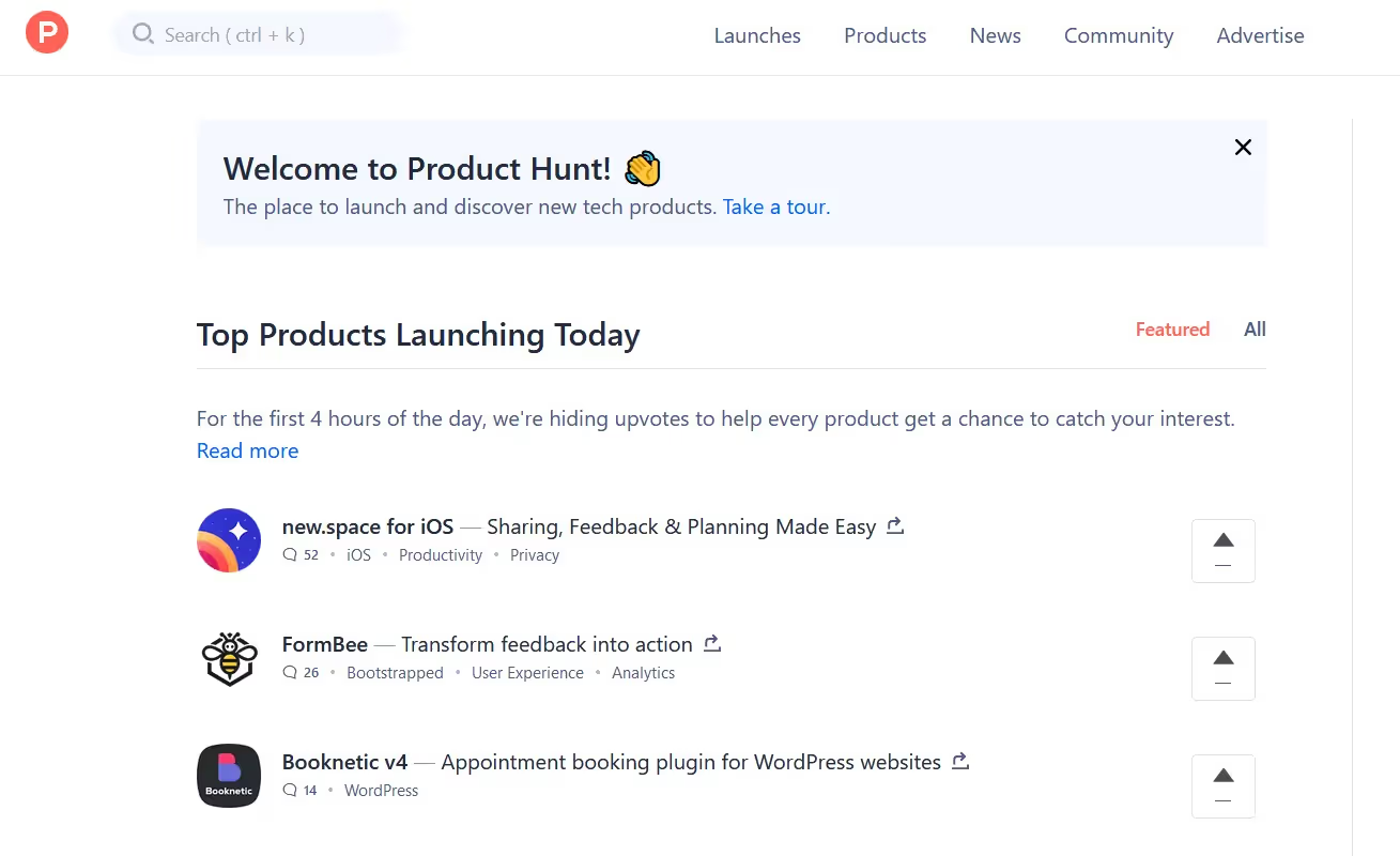
All that being said, I've found that most businesses get their first few customers from their extended network. It's likely to be people who know you and trust you, or friends of friends.
And the first few customers are also likely to require high-touch marketing. In other words, you'll need to connect with them in numerous ways, numerous times (so perhaps 4 times on Instagram, 2 times on email and then 1 call) before they're ready to buy.
I also wouldn't expect too much from a product launch. Sure, it can feel great to officially launch something you've put a lot of work into, but there are few product launches that really generate a huge number of customers.
Start-up marketing is normally a slow, iterative game. Sounds less sexy than a hyped-up launch, but that's the reality.
Product Adoption and Retention
Thinking more outside the box, there are other ways to grow your business, beyond simply acquiring new clients.
In particular, it's important to minimize your churn rate when you do get sign-ups for your digital product. Otherwise you'll immediately lose any users that you gain through marketing activities.
Seamless First-Time User Experience
You can boost retention by offering your users a seamless first-time experience. For example:
- Allow users to sign up using their existing Google account, rather than creating a new account
- Keep the number of fields in the sign-up form to a minimum
- If you can ask any questions in the sign-up process after the user has created an account, instead of before, do that
- Ensure that all CTAs you use (and especially sign-up CTAs) deliver what they promise
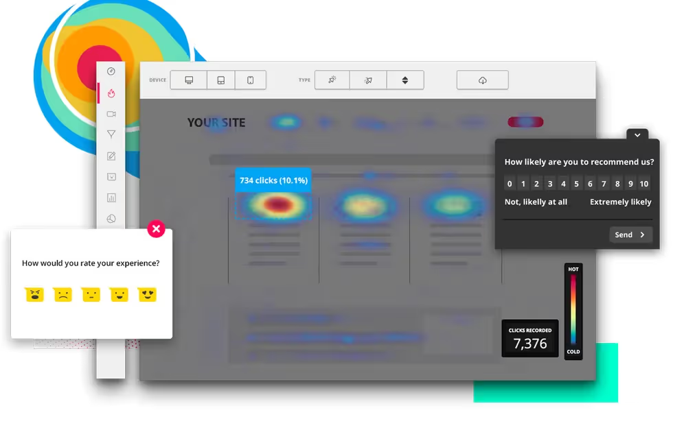
There are various product-discovery tools on the market that will make this easier for you. Hotjar, for instance, shows you where your users are clicking, enabling you to work out which are your most important CTA buttons.
Product Tours and Walkthroughs
Once the user is inside your product, you also want their onboarding experience to be smooth.
Our software, UserGuiding, can help with that.
You can use it to create a product tour that walks the user through the steps they need to take in order to activate, one by one. And you can actually build this tour without having to code, which is pretty cool.
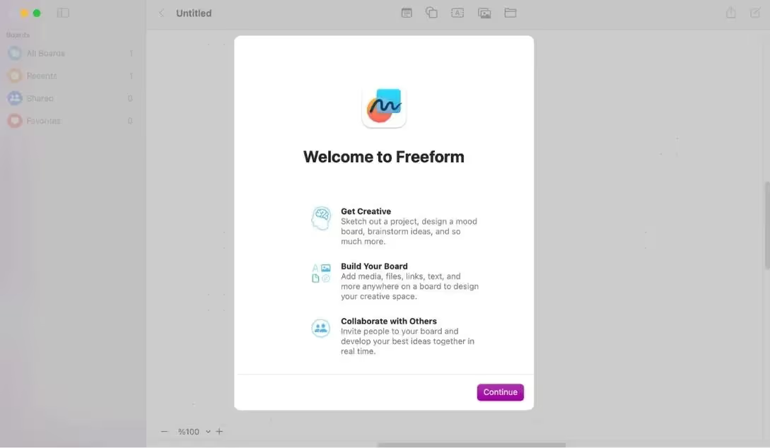
Start by greeting your user with a welcome screen:
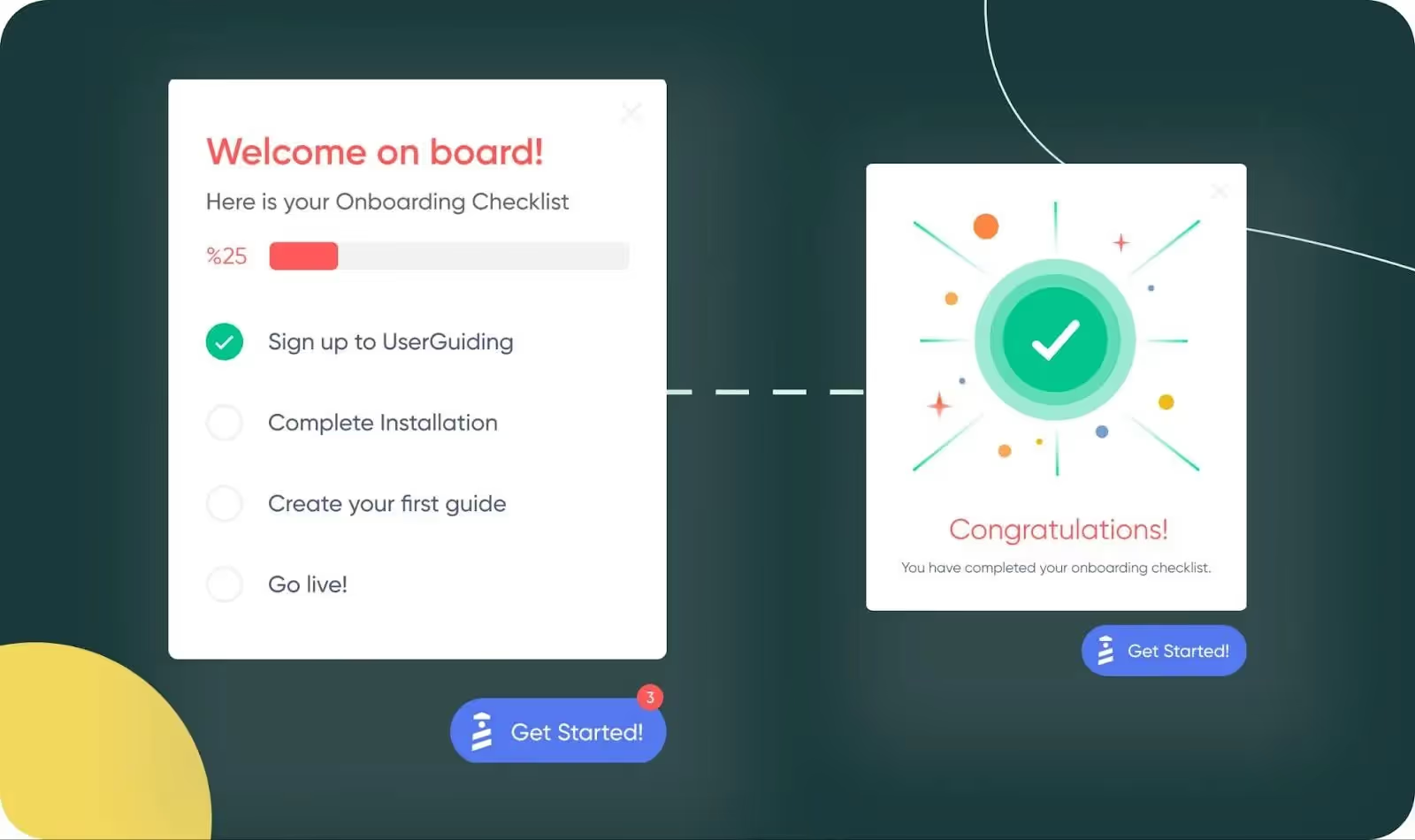
Then give them a checklist that contains the activities they'll need to complete in order to activate:

Ensure that the checklist gives them credit for any actions they've already taken – this is motivational:
Feature Discovery and Adoption
Further along the user journey, after activation, a well-designed digital product makes it easy for users to identify important features, learn how to use them and adopt them.
Again, this is something our software can help you with.
For example, you could announce a new feature in-app to a user segment for whom it's relevant:
Then you could use a hotspot or tooltip to highlight to those users where the feature is and how to use it:

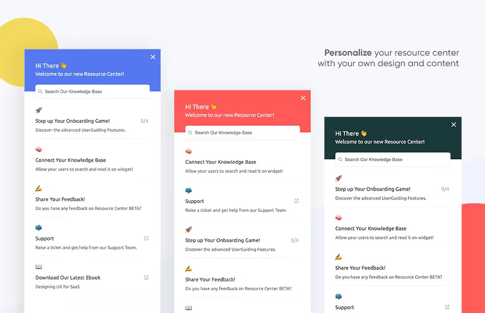
If users have any trouble with the feature, you can point them to an in-app resource center that empowers them to answer their own questions, without having to go through the hassle of speaking with a customer support agent:
And if you're still seeing in your analytics that users are having a problem with the new feature, you can even send them surveys in-app to help diagnose what the problem is and improve their product experience:

Customer Loyalty Programs
You can further boost retention by offering loyalty programs to customers who stick around and engage in your community. For example:
- You might make a certain cheaper pricing tier only accessible to users who have paid for a certain number of months.
- You could consider giving discounts or free services to customers who refer a certain number of their friends to you.
- Taking the previous idea further, you could even offer a revenue-share arrangement to customers who bring on their friends as new users, turning them into affiliates.
- You might offer users online badges for reaching certain tiers of your community.
- You could also send particularly loyal customers some swag in the mail.
The Vital Signs: Measurement of Success and Iteration
If you go to the hospital, the medical team will measure your vital signs to see where you're in good health and which parts of your body need attention.
Businesses are no different. In order to succeed, you need to measure the effect of your actions on the most important metrics, and then iterate until you get the results you want.
(Ok, let's hope your doctor isn't solely working on the basis of trial and error… but you get what I mean!)
Key Performance Indicators For Digital Products
You can't measure the success of your digital product without identifying the most important metrics and then tracking them on a regular (normally monthly) basis.
In business jargon, these metrics are often referred to as "Key Performance Indicators," or KPIs for short.
There are hundreds of metrics you could choose. Don't make the mistake of tracking all of them at once — otherwise you'll just overwhelm yourself.
Instead, focus on the most important ones for digital businesses:
- Customer Churn Rate
- Customer Lifetime Value (CLV)
- Monthly Recurring Revenue (MRR)
- Annual Recurring Revenue (ARR)
- Committed Monthly Recurring Revenue (CMRR)
- Cash on Hand
- Customer Acquisition Cost (CAC)
- Revenue Churn
- Net Promoter Score (NPS)
- Customer Retention Rate
We have an article that goes into detail about these metrics, what SaaS KPIs mean and how to track them.
Goal Tracking and User Behavior Analysis
In order to see whether you're on track, you'll need two types of data, both of which are equally valuable:
- Quantitative data is data that you can quantify, so anything involving numbers.
- Qualitative data is the more right-brained data that tells the story of the why behind the numbers.
There are a huge number of product analytics and customer feedback tools you can use to gather this data. You can find full details about these in the two links in the previous sentence.
To help you pick from the list of tools, I would suggest the following to get started:
Quantitative data:
- Google Analytics – for tracking website visitors, key actions and traffic sources
- Ahrefs – for tracking SEO rankings
- Amplitude or Mixpanel – for tracking product data and in-app behavior
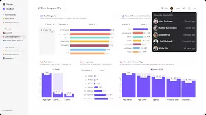
Qualitative data:
- Hotjar – for heat maps that show you where users are clicking
- UserGuiding – for in-app surveys
A/B Testing and Experimentation
If you gather the above data and look at the metrics we suggested, you'll inevitably find that you don't get things right the first time. And that's entirely normal.
Remember back to when we suggested that you make an MVP as the smallest working version of your product?
Digital products are constantly evolving and changing. Your MVP is just the beginning: it's the basis for the rest of your product journey.
Product teams commonly work in agile cycles, where they release a section of the product, test it rigorously, see what's working, and iterate accordingly.
You can apply the same type of thinking to your business as a whole.
See yourself a bit like a mad scientist. You can run experiments and A/B tests, look at the data to see what's working, and then adapt accordingly.
This is a humbling experience, and you'll fail much more than you'll succeed. But the products that ultimately make it are the ones led by people who were willing to put their egos to one side and fail repeatedly until they got what they wanted.
Wrapping up
Building a great digital product isn't easy, but nor is having a healthy body.
Your body needs a strong foundation, an emotionally open soul, muscles to help you grow and tackle the world and all the vital signs to be pointing in the right direction.
By the same token, your product is built on a well-researched value proposition, has an emotionally-engaging interface, and grows via an intelligent GTM strategy that incorporates retention. And you track the vital signs of your business through a good choice of metrics, quantitative and qualitative data.
Our software, UserGuiding, can help you with the retention part of that equation. You can use it to build product tours, create tooltips, send in-app surveys, or offer contextual help in-app via a resource center.
You can sign up for a trial account here for free and see if it's a good fit for your needs. What have you got to lose?


.svg)
.svg)
.svg)
.svg)
.svg)


.svg)
.svg)


.png)


