You've probably heard about Seth Godin's well-known saying:
"People do not buy goods and services, they buy relations, stories and magic."
Seth Godin
Yes, it might have become a cliche now, but I couldn't agree more with it when it comes to in-product communication.
The communication style you employ in your product tells your users a story. You create a narrative within the world of the product with words and images. In this way, you communicate the value of your app.
User engagement depends on several factors, such as the UX design of your product, users' understanding of what is valuable in a product etc. etc. But each of these factors takes us to the key factor of user engagement: the story of your product built through communication.
In this article, I will try to explain how you can improve engagement rates by building a better relationship with your users via in-app communication.
TL;DR
- In-product communication is part of the UX of the products and increases user engagement through product and feature adoption.
- To maximize in-product communication, you should integrate some elements in your product and use them wisely such as:
- In-app surveys: To understand user needs and expectations.
- Update announcement: To let users know about changes about the product.
- Feature announcements: To encourage your users adopt new features.
- In-app widgets for support: To help users quickly and efficiently with chat bots.
- Hotspots/ tooltips: To send product messages about information and updates to the users.
- Resource centers: To help users use your product more efficiently and free of problems.
- Modals for notifications: To ask for permission to send notifications on their mobile or desktop device.
- UserGuiding is a no-code tool for user onboarding and feature adoption. Indicata increased feature adoption rate to 47% by using it across its product to explain new as well as the old features which are a bit complex for the users while using them for the first time.
Besides the PR playbook you prepared for your product, in-app communication is where you can prove its value most effectively and directly.
What Is In-App Communication?
In-app communication or in-product messaging is the set of conversations between the app user and the product to understand and/or improve the user experience in the app.
Actually, it's a broad term and includes all elements that aim to connect with the users. It may consist of support chats, in-app surveys, and product announcements to enhance customer experience and increase feature adoption rates.
Push notifications, on the other hand, are a bit different from in-app messages as they are delivered outside the scope of the user's direct interaction with your app. And if what you are looking for is this, you might find this article useful.
If we are okay with these definitions, let's go on with the ways to master in-product marketing strategy and communication.
How to Maximize In-Product Communication the Right Way
In this section, I will provide some details and real-life examples of each of them so that you can turn your product into a success story.
1- In-app Surveys
Surveys are great tools for improving customer experience. Asking users what do they like or dislike about the product is a reliable way to make changes to it. You can get tons of information about app behaviors, users' pain points, and bad user feedback about the app.
Also, in-app surveys help you segment your users via questions about them, like demographics or their aim of using the product.
You can either send surveys via e-mail or ask them questions within the app. And the second option is a part of the in-app communication you are trying to advance.
For example, Genially utilizes a survey modal to understand its users' motivation for using the product.
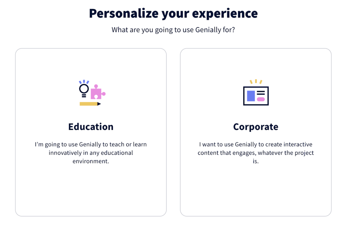
By this, it offers a personalized message and UX to the users from the very beginning of the onboarding process in the app.
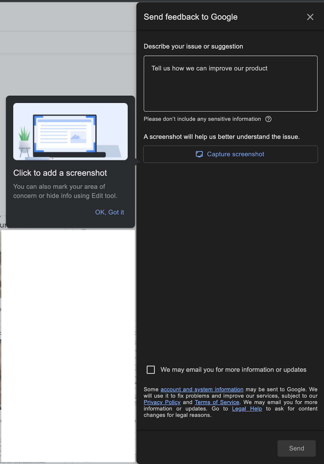
Google Drive chooses to show a feedback form to report issues. It is perfect for getting detailed information about the problem with user screenshots and explanations. It's also very promising that the support team will deal with the problem directly.
2- Update Announcements
You need to let your users know about any changes related to them. Terms of use can be one of these things.
Registration forms generally include a checkbox to agree to the terms of use, and these documents are long legal texts most of the time.
Personally, I never read them, but this is not advice.
If you really want to inform your users about them, you can find a way to summarize them like a TL;DR notice.
Look how Adobe gave me notice about the changes in terms of use.
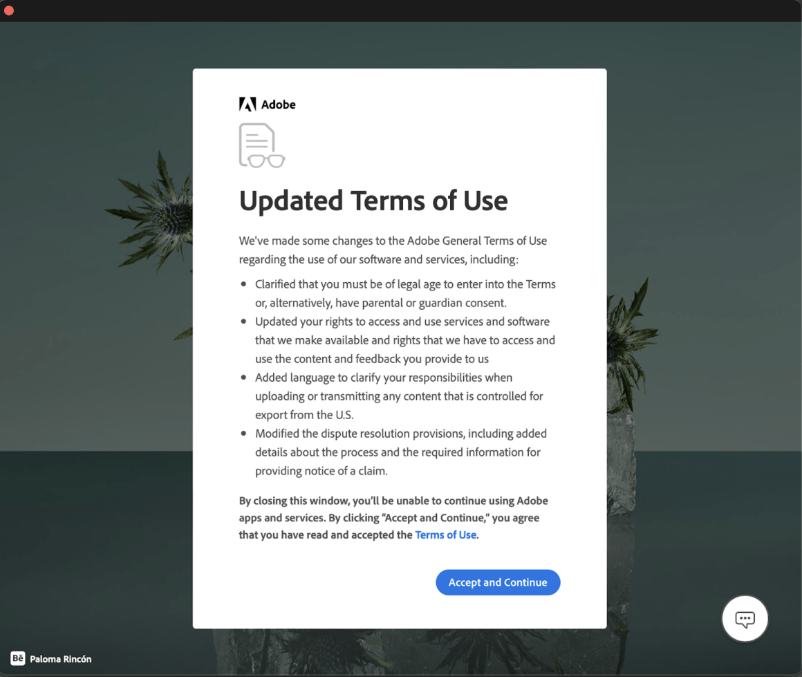
It's short content with simple and comprehensible language, which is the best way to communicate with your users no matter what the topic is.
3- Feature Announcements
Thanks to in-app messages for feature announcements, you can increase feature/product adoption rates quickly.
It's a good idea to explain what's new in the product and encourage users to give it a try with a modal or hotspot.
Canva recently released its new "Quick Create" feature, and let me know about it while I was using the app.

The short copy, explanatory image, and clear CTA button drew my attention and convinced me to experiment with the new feature.
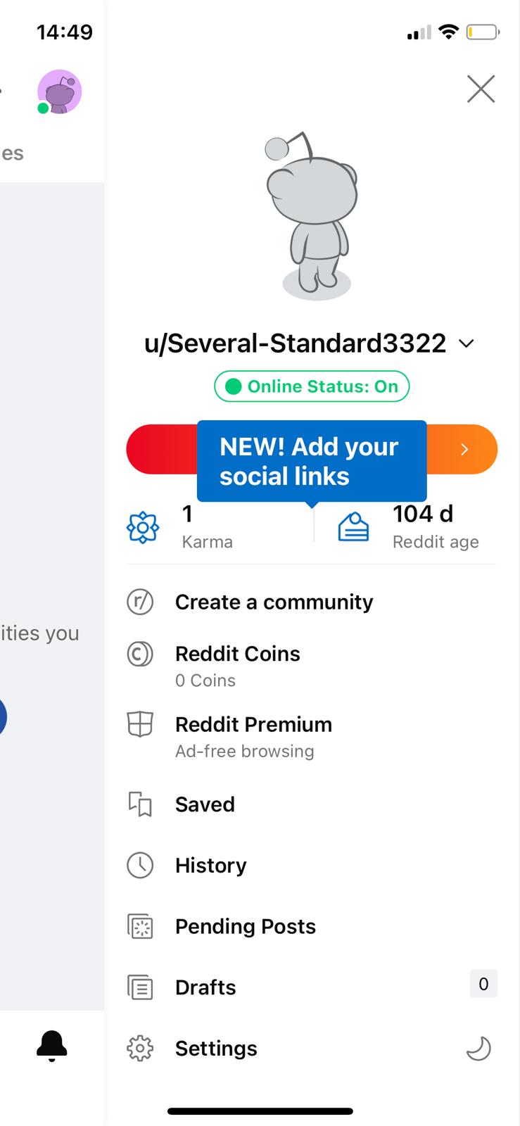
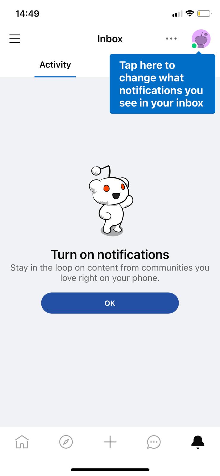
Reddit utilizes tooltips to announce feature releases and increase the adoption rate of all features within the app. As you see, they are also clear, informative, and encouraging.
4- In-app chatbots for support
Chatbots are the saviors of customer support teams and your app.
They are always ready to provide the best solution quickly and wisely. Although you might want to contact a real person to solve your problem, it is probably best if you give a chatbot a chance because they are actually handier. You don't have to wait for a customer support representative to answer your basic questions about the product.
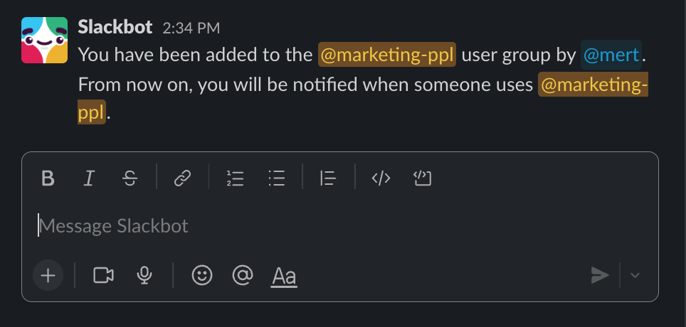
Slack's Slackbot notifies you as if it is one of your team members whenever needed. You can ask questions about it and get the gist of updates about Slack as well as your team.
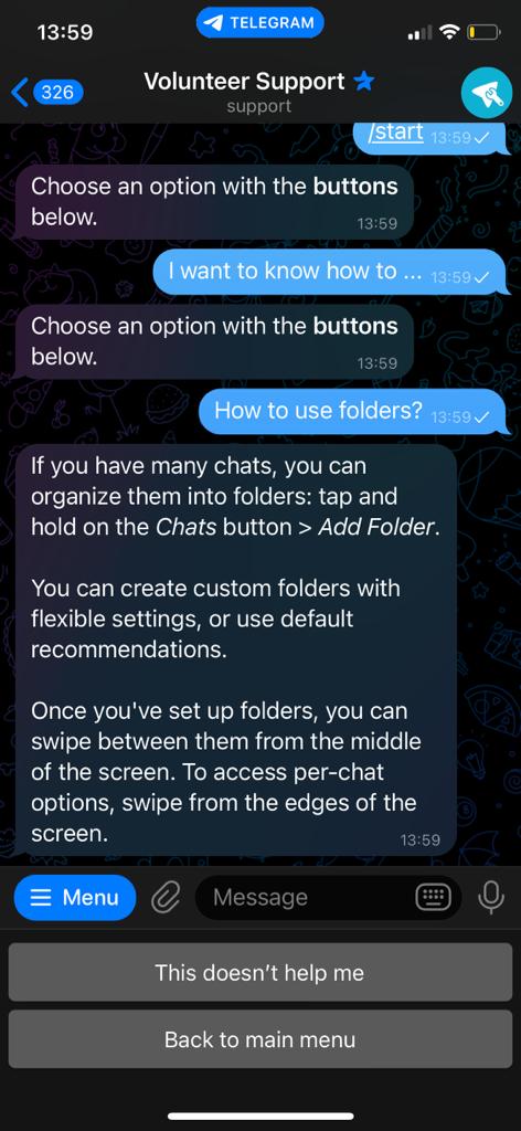
Telegram's support chat is also a good example of utilizing robots to reduce the number of support tickets on the success team and enhance the product experience.
Before directing you to a volunteer representative, Telegram opens up a chat box to help you with your problem, and most of the time, the answer is readily available.
5- Onboarding Hotspots/ Tooltips
The user onboarding process starts when your users interact with your product. So, the communication strategy you follow during the onboarding is important.
Native tooltips and hotspots help your users understand how to use and get the most out of your product.
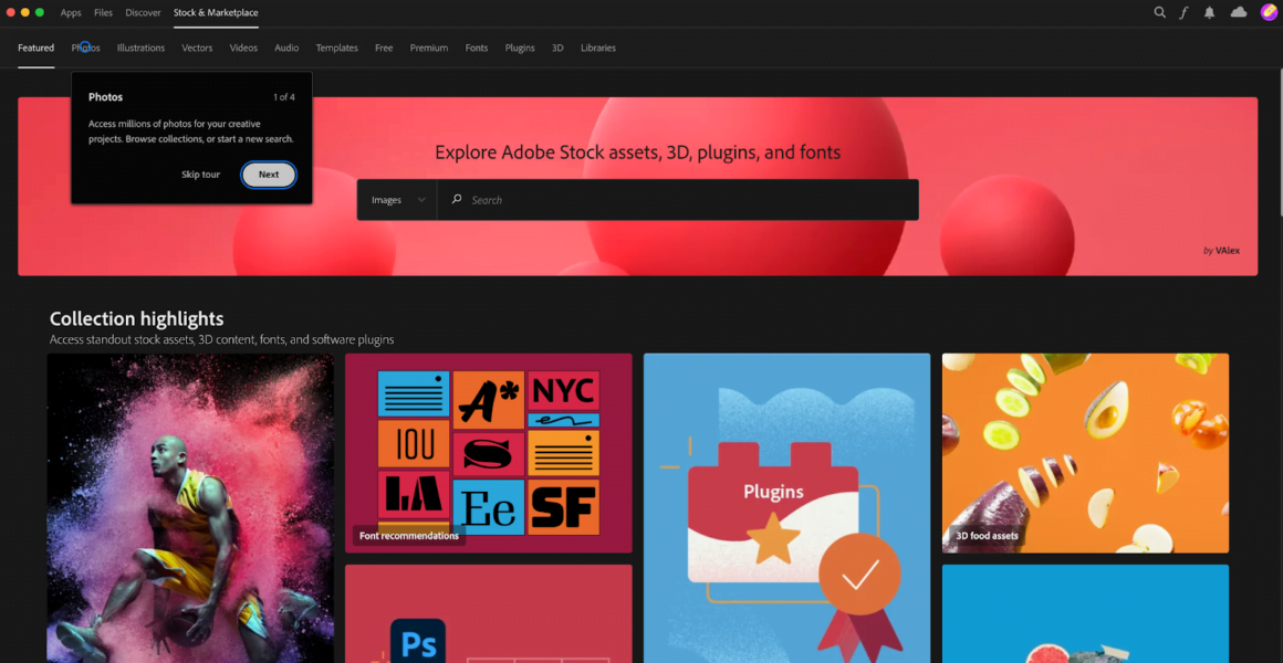
For example, Adobe Creative Cloud takes you on tour around the app with hotspots and contextual messaging.
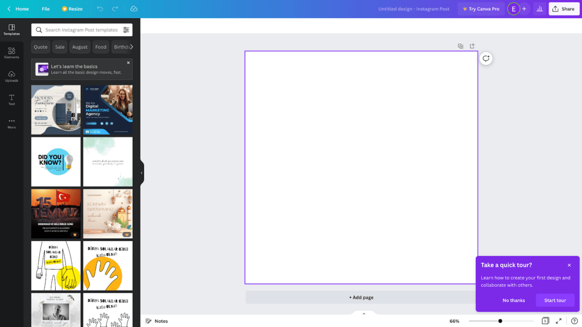
Similarly, Canva asks if you want a product tour with a hotspot.
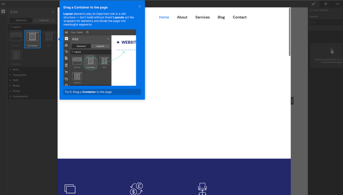
Webflow's informative tooltips let the user complete some tasks to raise the level of interaction with the app during the onboarding process.
6- Resource centers
Another form of communication you can go for within the product is resource centers. A comprehensive resource center with the right information set can provide you with more engaged users.
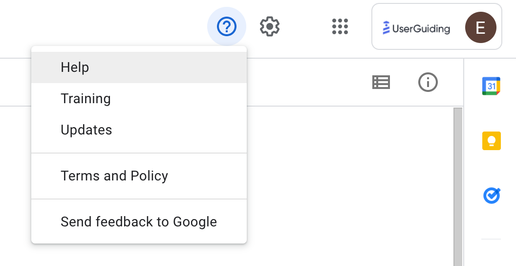
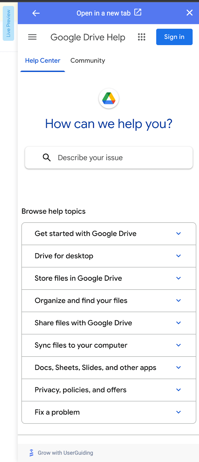
Check out Google Drive's resource center full of how-to articles and, most importantly, a search box. It is easy to navigate within the widget.

7- Modals for Notifications
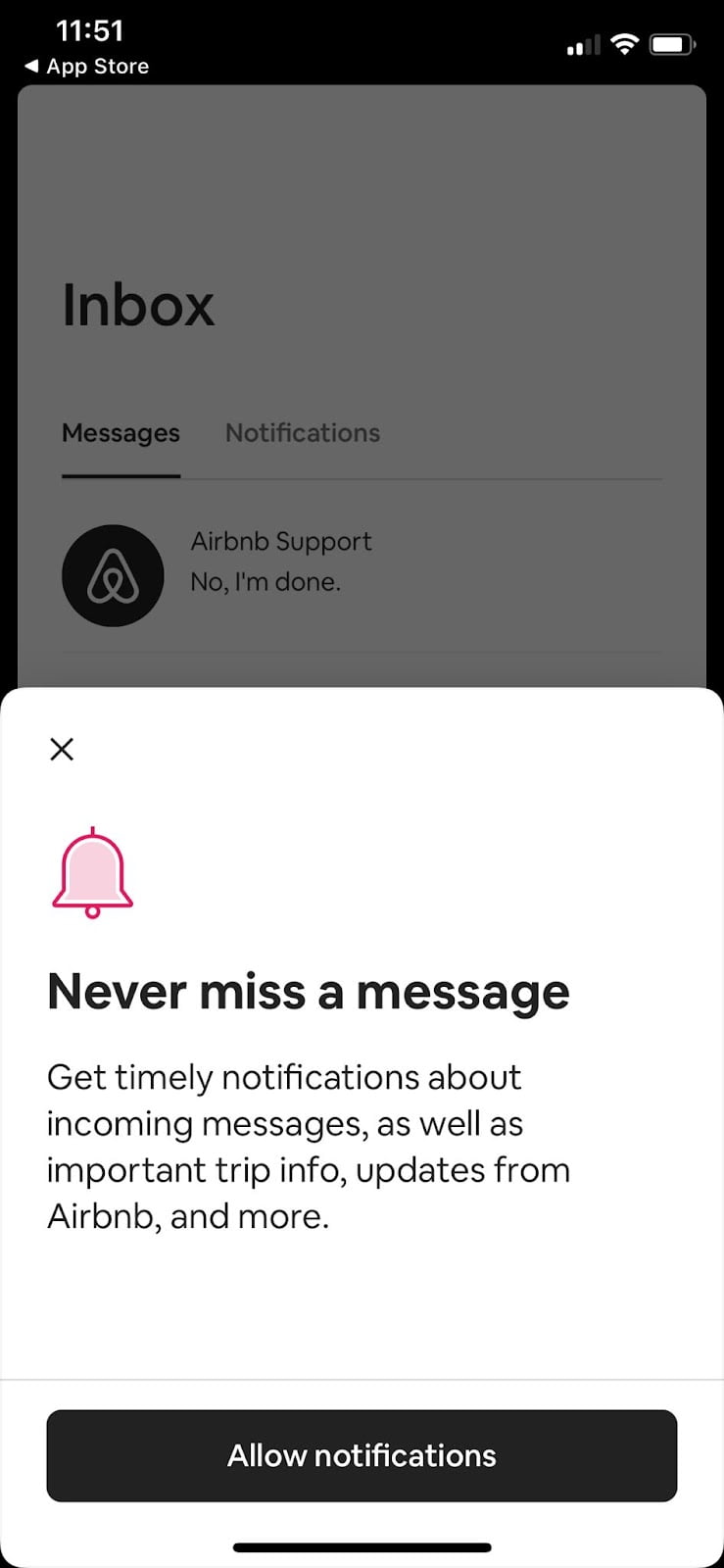
Pop-up models for notification permissions within apps are pretty much annoying to me most of the time. As a user, I wouldn't say I like getting dozens of push notifications daily, so I generally don't allow notifications. But, if you find a way to convince me with a sincere copy and a good-looking modal, I can't resist it and click on the allow button on impulse.
I find AirBnB's way of doing it quite inspiring. See the wording and the CTA button; both are simple but effective.
In-Product Communication Software - UserGuiding
UserGuiding enables product teams to boost in-app communication via constant value delivery.
It is a no-code tool that you can integrate within your digital product hassle-free. Some of its features for in-app communication include:
- Tooltips, modals & banners
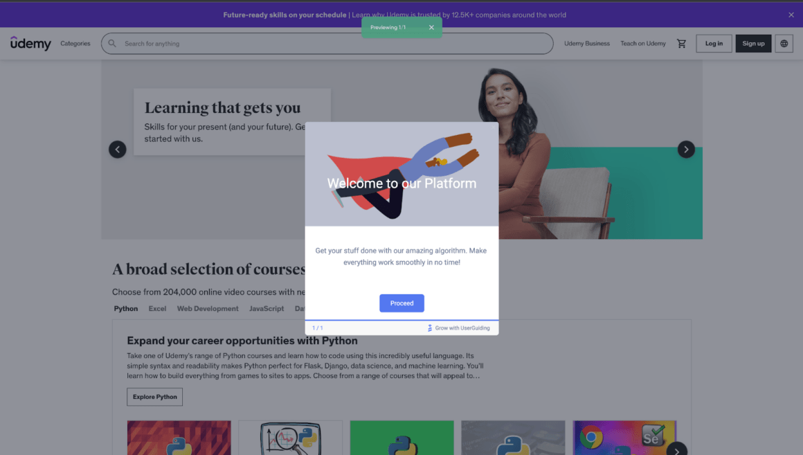
- Product tours/walkthroughs
- Segmentation for contextual onboarding
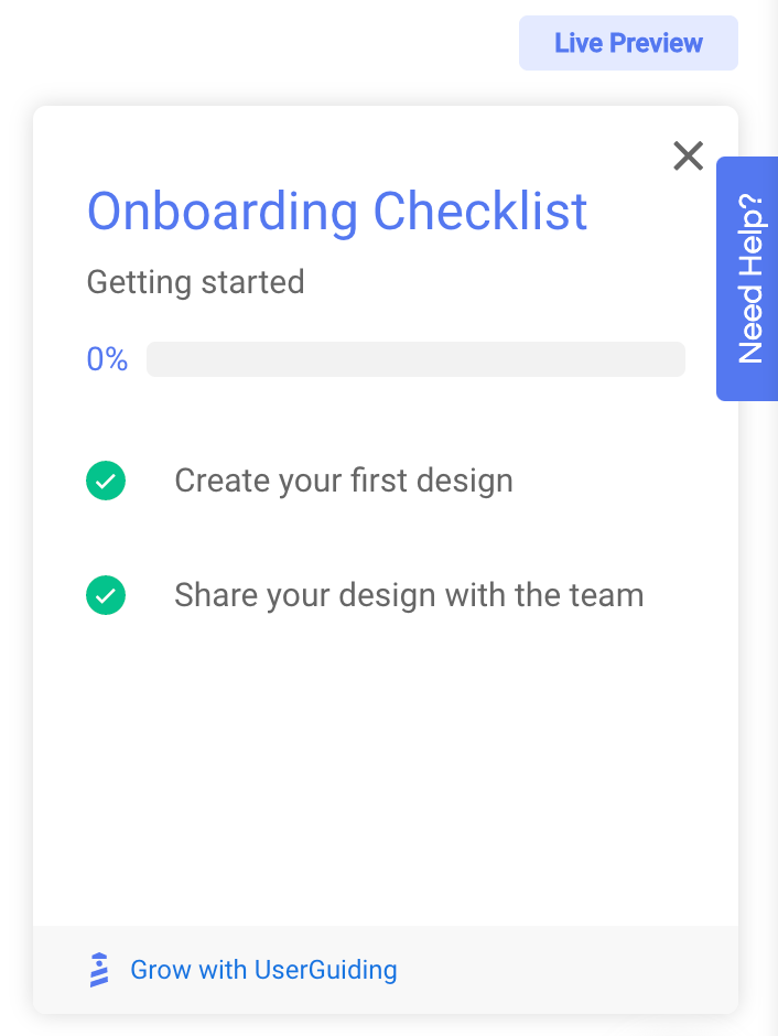
- Net Promoter Score Surveys (NPS)

- Resource centers that can trigger external knowledge bases inside the digital product
And here is how Indicata achieved a 47% feature adoption rate with UserGuiding:
Indicata is a used vehicle inventory management tool for car dealers. Their main problem was their users were not experiencing its full value. Also, they realized that the churners overlooked new features.
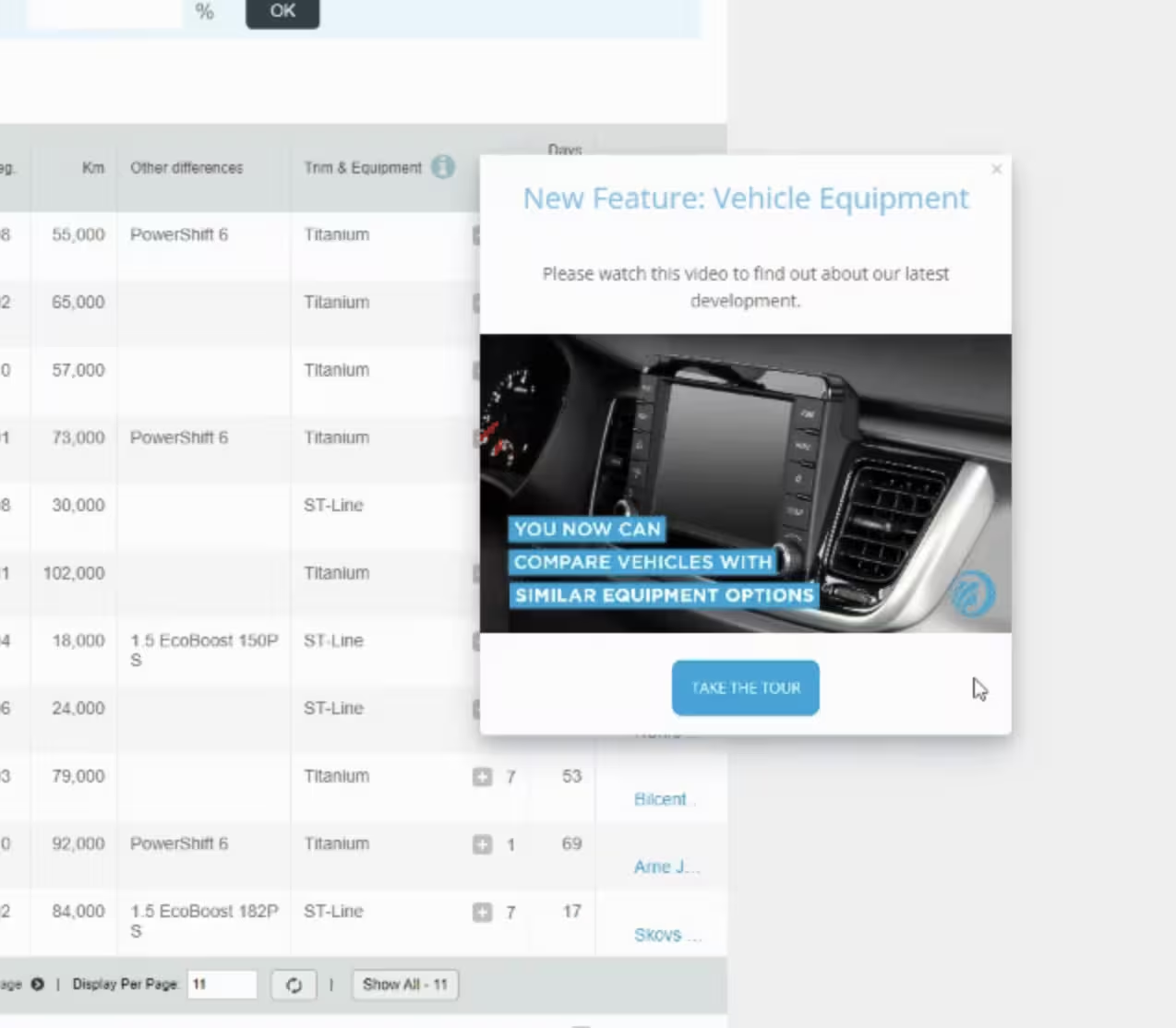

With UserGuiding, they created in-app modals and onboarding materials in 11 different languages for 13 different markets, displaying engaging interactive content to improve product adoption.
Check out UserGuiding's feature-rich world here and take a look at UserGuiding's solutions for feature adoption here ⬇️
Frequently Asked Questions
What is the best way to have open communication with your app's users?
Users are prone to develop feelings for the products over time. And they wish to feel valued while using and appreciating the product. So, it is two-way communication between you and your users. As with all kinds of communications, in-app communication needs to be done openly. For effective communication, you can ask your users what they want, understand their pain points, share your insufficiencies, and show good intentions to them. For example, if you don't let them know about any changes in the product, including legal issues, it damages your liability and users' commitment to your product.
How can you engage app users on a daily basis?
To engage app users daily, employ a strategy to be in contact with them as much as possible while using the app. In-app messages or in-app communication allows you to keep your relationship with the users strong and close. Some tools to do this include conducting NPS surveys, displaying banners and modals routinely, and creating a useful resource center.


.svg)
.svg)
.svg)
.svg)
.svg)


.svg)
.svg)


.png)


