.svg)
.svg)
.svg)
.svg)
.svg)


.svg)


.svg)
.svg)

It might be just me, but I love exploring the nuts and bolts of a product for the first time. You start a trial or subscribe to a product for a reason, and seeing what it can offer for your business can be a game-changer.
This, of course, is not as common as you might think.
In fact, it is pretty rare.
Why?
Some companies completely overlook how impactful product tours are and just throw a bunch of onboarding materials at the customer without encouraging them to take action within the product itself.
This is a recipe for disaster.
Or, as Wes Bush outlines in his Bowling Alley Framework, it is your ball going straight into the gutter.
If you want to knock down as many pins as possible, you’ll need bumpers. In this case, these are the bumpers to bump your customer back into the lane.
If designed well, this will be your product tour.
Here’s what Bush has to say👇
“Product tours are the ultimate product bumper. They eliminate distractions and give you only a few important options … I recommend using a ‘focus mode’ that hides background elements to minimize the initial number of choices … By eliminating the number of decisions a new user has to make, you increase the likelihood that they will make the right decision.”
In short, your job is to nudge the new user in the right direction to see your product’s value as quickly as possible.
And this article will make your job so much easier.
We’ll skip the basics and dive right into real-life examples to get you inspired.
Ready, set, go!
Don’t have the time for a deep dive just yet? Don’t worry, I’ve got you covered.
Read the TL;DR version instead👇
TL;DR
- Product tours help users become familiar with the interface and features of a product.
- To create better tours, you should use interactive elements like tooltips, hotspots, and checklists.
- To avoid creating confusing or overwhelming product tours, make sure that every step is intentional and leads the user in the right direction. Unless your product is very complex, avoid long tours and long copy.
- Product tour software like UserGuiding can help you create contextual and attention-grabbing tours.

What is a product tour?
Product tours are a sequence of user experience patterns designed to guide users through an onboarding process that helps them become familiar with the interface and the product itself.
Ideally, a product tour begins with a modal window, includes several steps, and acts as an interactive guide when needed.
However, there’s no one-size-fits-all approach to creating the ideal onboarding experience.
I can hear you say, “Aysenur, you’re just describing product walkthroughs!”
And you’re not entirely wrong.
The main difference between product tours and product walkthroughs is that interactive walkthroughs are longer and include step-by-step tasks within the product.
Ready to get inspired? Check out these 15 great examples👇
15 Great Product Tour Examples to Get Inspired
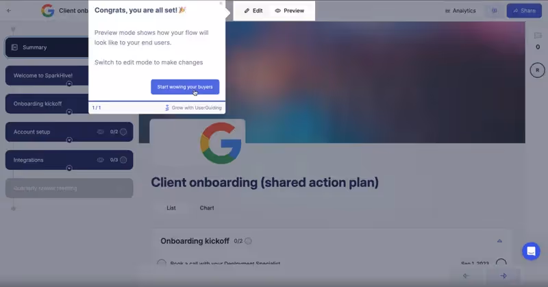
1- UserGuiding
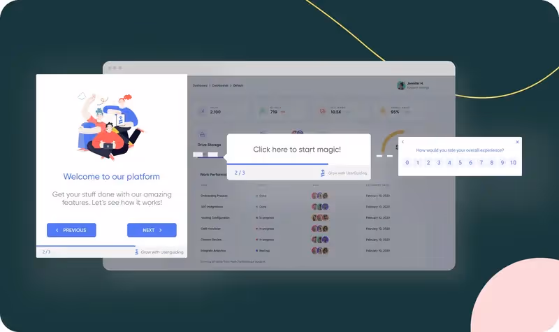
Did you know that self-serve product tours have a 123% higher completion rate compared to tours that appear at random?
This means that building the option for guidance through interactive UX elements like hotspots, tooltips, or in-app surveys is one of the most effective ways to encourage users.
And UserGuiding is the perfect tool for that.
UserGuiding helps you create step-by-step product tours with interactive elements and multimedia like emojis, screenshots, GIFs, and even videos.

The best part? UserGuiding allows the user to opt out of the tour.
They can return anytime they want, of course, but considering that interactive and voluntary product tours perform better, this is something to keep in mind for sure.
What makes UserGuiding a good example?
✅ It is very easy to turn patterns into interactive action steps with UserGuiding. For example, if you notice that users keep getting stuck at certain places and ask the same questions, you can address those issues by creating guides.
✅ Progress bars, progress bars, progress bars. According to a study by Chameleon.io, product tours with progress indicators improve the completion rate by 12%. Showing how much of the tour remains and how the user progresses will encourage them to engage. UserGuiding does this exceptionally well:
Want to try it on your own?
🚀Give UserGuiding’s product tours a try for free🚀
Short tip! ➡️ If you wish to make your product tours more immersive, you should segment your users for a more personalized experience. This will also make your platform easier to understand based on which features the user is most likely to interact with.
2- Grammarly
In my humble opinion, a product tour list without Grammarly is incomplete. Their marketing material is dazzling, for sure, but people tend to overlook how good their product tours are.
See it for yourself👇
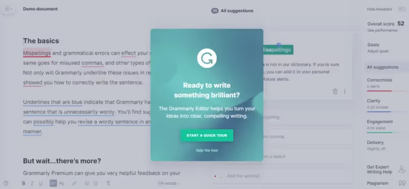
Notice anything important? Don’t be shy, take a closer look.
The user can choose to start the quick tour or use the skip button and discover the app on their own. In other words, the user enters the “playground mode.”

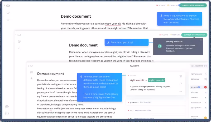
The best part? The way Grammarly’s demo document works with the tour is just like how it works outside of the demo, highlighting mistakes with those underlined spots, just like hotspots.
What makes Grammarly a good example?
✅ The demo document gives a chance to new users to experience what the tool offers without investing too much time or energy by uploading a document. It is a quick and easy way to remove the initial fraction and encourage users to take action within the app.
✅ Users are in control. Instead of a product-first approach, Grammarly prioritizes the user experience. If the user feels ready to start the product tour, they can interact with the core features immediately. If not, they can just skip the tour and explore the product on their own.
Short tip! ➡️ If you want your users to explore key features, guide them through the app in a logical sequence. After one hotspot, lead them naturally to the next, helping them discover features they might have missed. See Grammarly’s example below:
3- Flowla
Flowla is a sales enablement tool that offers interactive and personalized spaces for sales, customer success teams and their buyers.
They knew that their initial product tour was too complicated and not as engaging as they wanted. And these are big no-nos in user engagement.
Ramli John, the founder of Delight Path, has the perfect analogy for this: “You probably experienced this at a restaurant with 100s of menu items,” he says, “You’re likely overwhelmed with what to eat.”
It’s the same for user onboarding.
If you give too many choices to the user during the product tour, they will be overwhelmed. They will find it hard to make a decision. Eventually, they will run out of patience and they’ll leave!
Ramli John advises breaking complex tasks into smaller steps and ideally limiting the product tour to 3 to 5 steps.
Now, check this out👇
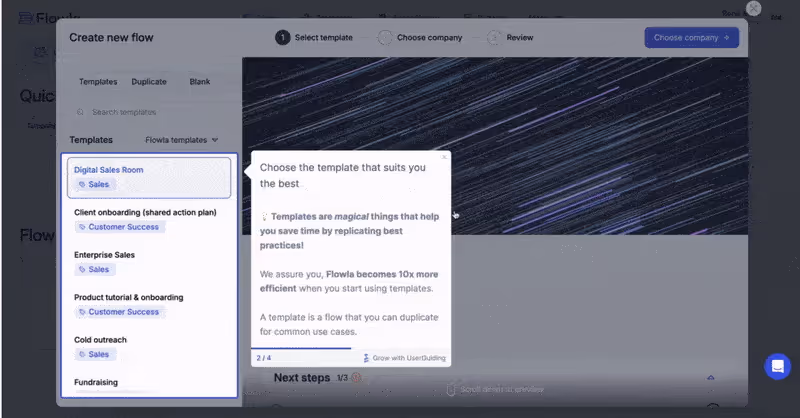
What makes Flowla a good example?
✅ It’s short and sweet. No complex tasks or asking the user to complete multiple actions at once.
✅ Every step includes a “call to action” which makes it easier for users to perform that key action as the hotspot highlights the next step.
Short tip! ➡️ If you want to increase engagement, avoid long product tours with multiple essential steps. Hide fields or features they don’t necessarily need and keep the tour between 3 to 5 steps to ensure that the user can follow the actions they need to do.
4- Airtable
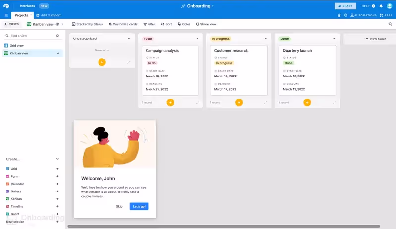
Airtable is a cloud-based platform to share and create databases and workflows. The app offers contextual guidance during onboarding for new users and introduces the main features in a digestible form.
Similar to all the examples I’ve shared so far, Airtable also gives control to the user and allows them to skip or go back to previous steps👇
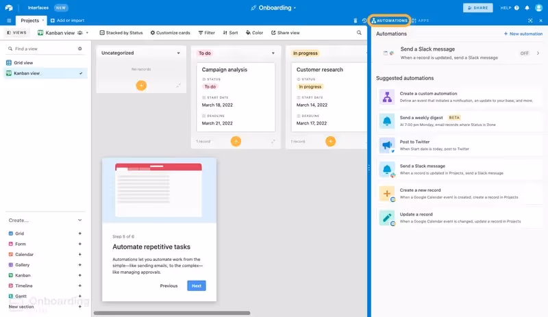
In other words, the user is in control of their progress. This is a great opportunity to engage users early on without overwhelming them. It is also a relatively short tour with 6 steps.
What makes Airtable a good example?
✅ In addition to a “skip” button, Airtable also gives users the option to go back to previous steps so they can familiarize themselves with key actions and features better.
✅ The tour is relatively short and makes it easy to follow progress thanks to easily digestible hotspots and tooltips.
Short tip! ➡️ The only bad thing about this tour is how the elements are highlighted. It is so easy to miss the yellow outline border and blend in with the rest of the design. So if you want to make sure that users don’t miss out on essential features, highlight elements with a distinct border or hotspot that stands out from the rest of the UI patterns.
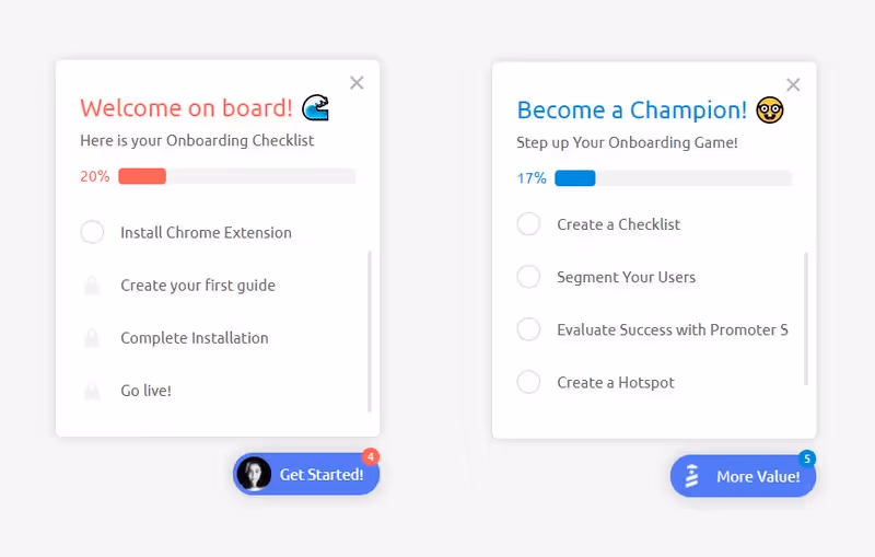
5- Grove HR
There is no one-size-fits-all when it comes to product tours. Interactive elements like hotspots and video tutorials are necessary, for sure, but you can always take things to the next level.
This is exactly what Grove HR does. In addition to the interactive elements, Grove HR uses an onboarding checklist to help users follow a very specific sequence👇
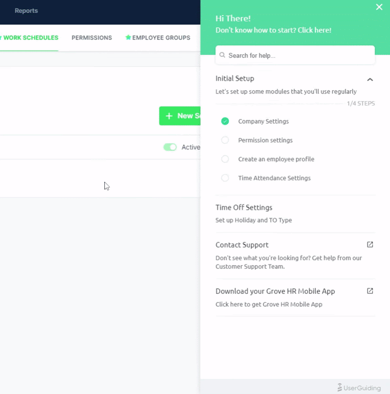
Grove HR makes onboarding easier by giving users a checklist to follow. It also increases the chances of onboarding completion while also keeping the onboarding flow compact.
What makes Grove HR a good example?
✅ Checklists are a great and popular way to help users get through onboarding, and Grove HR does a fantastic job of using them to make sure everything gets done.
✅ Similar to Airtable, Grove HR also gives users the option to skip steps or the tour itself. They can access these interactive guides through their resource center whenever they want.
Short tip! ➡️ If you want users to access onboarding materials even after the initial tour is complete, make sure to create a resource center. This will help you keep every onboarding related material or “how to” articles in one place while allowing the user to search through them before they contact the support team. It fosters self-learning in the best way possible!
6- HubSpot

HubSpot’s product is on the longer side with 7 steps. However, this is easily justifiable.
The tour lets you experience what it’s like using HubSpot and goes through main features without pointing out any unnecessary features. Anything that the user does not need for initial setup is cleverly hidden.
The plain text without any GIFs, screenshots, or video tutorials might be boring for some but it is actually very effective.
If HubSpot used multimedia elements, it could potentially confuse users especially in a straightforward product tour like this.
Sometimes a simple design with plain text is enough and you don’t have to be dramatic. Besides, the pulsating highlight gets the job done: It gives the onboarding a dynamic feel while introducing the main features.
What makes HubSpot a good example?
✅ Minimal media, a clear copy, and an interactive highlight can go a long way. HubSpot ensures that their product tour is easily accessible for all user segments and covers all the essentials.
✅ Because the tour focuses on the main features, you immediately experience what it’s like to work with HubSpot which helps you see the product’s value.
Short tip! ➡️ If you want an initial product tour that is simple, make sure to use a concise copy that shows the user what’s happening with each feature.
7- Vieworks

I included Vieworks on this list because this product tour is interactive from start to finish.
The steps are clearly highlighted and the progress bar helps the user see their activity.
But the most important part is that users are not encouraged to act after they are shown the features. Instead, Viework’s product tour holds their hand as they perform the tasks.
What makes Vieworks a good example?
✅ Interactivity is key. Both the welcome modal and highlighting relevant sections for specific features make learning stick and ensure that the user completes the key action when they need to.
✅ The progress bar visualizes the user’s progress and gives them a sense of achievement.
Short tip! ➡️ If you want users to contextualize the features as soon as possible, ask them to complete essential tasks as you’re guiding them through the product. Visual cues like progress bars and UI modals are super useful for this.
8- Intercom
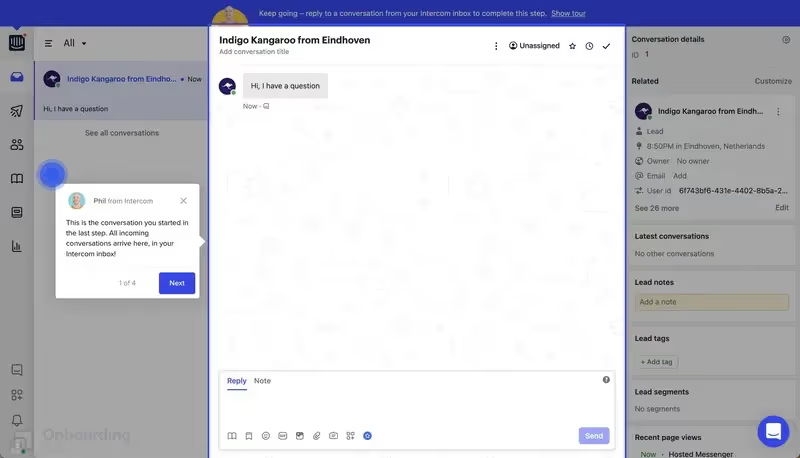
Personalization always wins. Product tours are no exception. If people see that there is a “human” behind the tour that will guide them, and not just automated messages, they will feel more comfortable going through with the tour or asking for help when needed.
Adding personalization with small touches like this does not make the tour complicated and enriches the user experience.
What makes Intercom a good example?
✅ Short product tour with only 4 steps that keep the focus on essential features. All of these features are highlighted with pulsing hotspots to distinguish them from the rest of the UI.
✅ Personalization with clear guidelines. The personalization adds the “human” touch while short texts of the hotspots keep the focus on the key tasks.
Short tip! ➡️ If you want to establish a personal connection with your users, consider adding a photo and name to your interactive elements like Intercom.
9- Ghostwriter.ai

Ghostwriter is an AI tool that helps companies better understand their customers; cross-channel and in different languages.
Their onboarding was not attention-grabbing so they chose to use UserGuiding’s no-code guides and tooltips. It helped them reduce creating and updating onboarding material by 62%.
👉 Pssst… You can read more about their success story here.
The tooltips are triggered when users hover over the highlighted areas which helps them to focus easily.
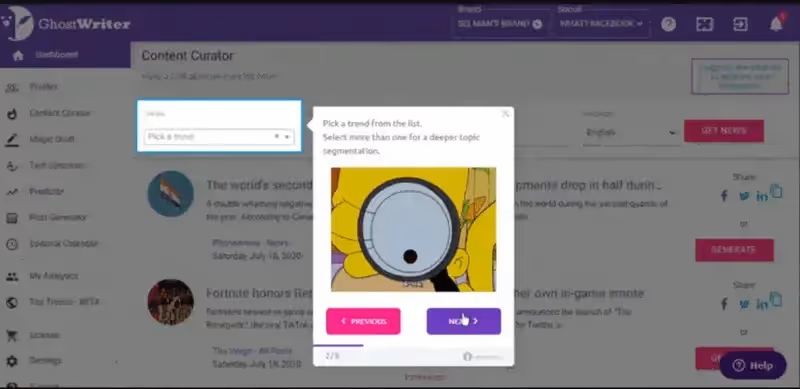
Since Ghostwriter.ai’s product tour is on the longer side with 8 steps, they include GIFs and short copy to keep engagement high.
What makes Ghostwriter.ai a good example?
✅ By highlighting the tooltips and using engaging visuals and copy, Ghostwriter.ai proves that product tours don’t have to be boring.
✅ A progress bar and a skip button can change how a user feels about your tour. You empower your users and they feel more confident in completing the onboarding.
Short tip! ➡️ If you want to add an element of fun to your tour, consider using visuals like GIFs and emojis within your tour. However, only do so if your audience is okay with this tone. Otherwise, it will be off-putting.
10- Chargebee
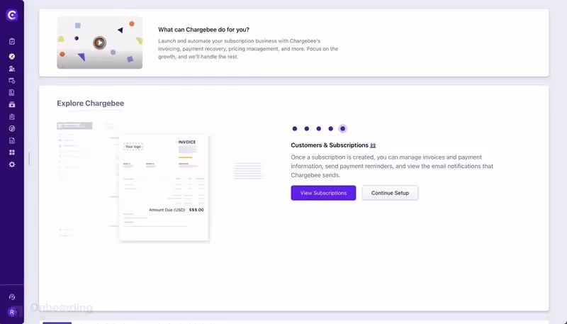
What I love the most about Chargebee’s product tour is that you’re not required to sign up for anything. These days, you’re asked to sign up for a free trial or pay for a subscription to see what the product looks like.
Then your inbox gets flooded with promotion emails because you had to sign up for 5 different products. It gets very annoying very quickly.
Chargebee lets you see the product for yourself, so you can decide to subscribe for it later. And it’s a game-changer for sure.
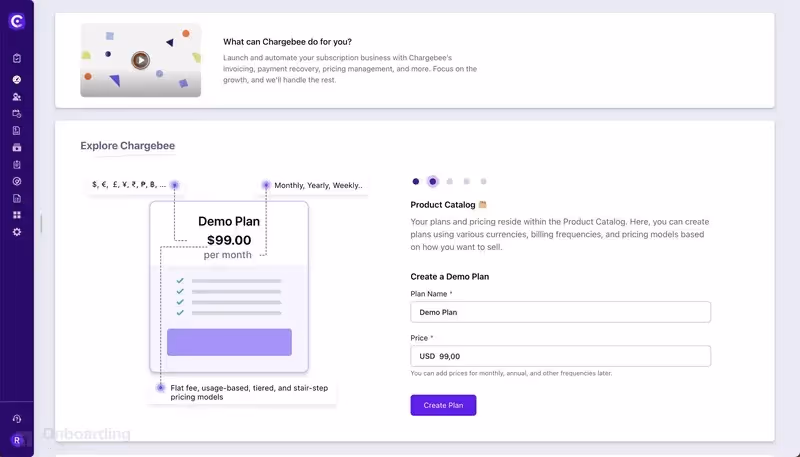
The product tour is also unique in the way it introduces features: You are given three different setup options and each one links to a different feature.
What makes Chargebee a good example?
✅ Follow-up actions at the end of the tour are a great way to engage users early on and help them explore the features of your product.
✅ No sign-up hassle shows the prospective customers that Chargebee cares about their experience more than anything.
Short tip! ➡️ If you want to personalize your product tour even more, you can give different setup options to the users and let them explore different features based on their selection.
11- Trello
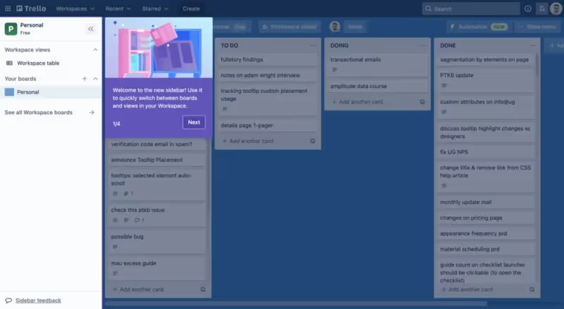
This is a bit different but Trello is a great example to show that product tours should not be limited to the initial user onboarding process.
You should always consider whether a product tour would be beneficial for different contexts: Trello, for example, leverages the tour to introduce their new navigation bar.
After all, what is better than a short and super-focused product tour to show (and not tell) the nuts and bolts of a new feature or change to the design?
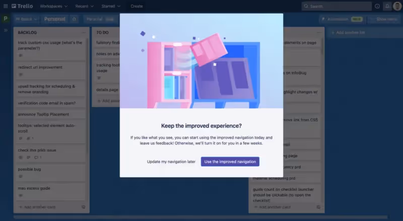
This is even better: At the end of the 4-step tour, Trello asks the user whether they would want to switch to the “improved” navigation, prompting a key action right after Trello shows the value of the improvement.
What makes Trello a good example?
✅ Creating a product tour for something other than the initial customer onboarding experience. Product tours can work within different contexts as long as you keep them engaging and relevant.
✅ Giving the option to switch to the new navigation bar. Not only is this user-centric, but it also lets users experience the change before they make a decision.
Short tip! ➡️ If you want users to adopt new features or changes faster, try creating product tours specifically for those changes. Instead of limiting product tours for new user onboarding, include them for specific context to maximize engagement.
12- TimeSolv
The more complex the tool, the more inclusive your product tour should be in terms of features.
This is the case for TimeSolv.

So… how does TimeSolv create product tours?
First of all, they have around ten different collapse bars as part of their UI. So, they have to go through each element to make sure everything fits well. This is where highlight focus, short copy, and previous-next buttons come into play.
As we’ve discussed, longer product tours need interactivity. But it gets harder to keep the user focused with each step added.
TimeSolv’s best friend will be your best friend, too: progress bars.
Progress bars give a sense of achievement and duration to users, so they can situate themselves easily.
What makes TimeSolv a good example?
✅ TimeSolv is a complex product with multiple moving parts, so it is essential to minimize distractions during the product tour. Short copy, highlight focus, and ability to move back and forth are essential.
✅ With a longer product tour like this, you have to help the users situate themselves. This is done best with progress bars.
Short tip! ➡️ If you want your users to be in control of the pacing of the tour, include progress bars and previous-next buttons. Happier customers mean happier you!
Make your users happier in a couple minutes with UserGuiding’s no-code product tours! From interactive elements to user guides, you can create a personalized and focused experience for all of your users.
🚀Try UserGuiding’s product tours today🚀
13- Typeform

If we used a fun meter with each of these amazing product tours, TypeForm would reach the max on that meter.
With its doodles and laid-back voice, Typeform creates a low-stakes and friendly environment for the entire tour.
Instead of sounding so business-like and distant, Typeform’s voice actually makes every key action doable.
The tour also starts with a demo-like environment, like Grammarly, and uses hotspots and beacons to direct the users to the way they would be most interested in.
What makes Typeform a good example?
✅ There are many ways to bring a user-first approach. But one of the most efficient ways is using a casual tone and adding cute visuals for sure. This helps users see that the tour is doable and the product is more approachable.
✅ A demo-type environment gives the users a hands-on experience, so the transition is easier and the information becomes easier to recall.
Short tip! ➡️ If you want to remove mental blocks from users’ minds to complete the tour, make sure to include illustrations (keeping the branding in mind, of course) and use a casual tone.
14- Loom
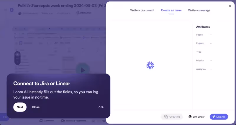
Move forward or get left behind. This is what more and more product tours will look like: AI-assisted or AI-powered to show what the product can do and explain features in a tone that the user prefers.
We see the first steps of it with Loom. The messaging is clear in each step and AI is doing the heavy lifting—from writing documents to creating an issue in Jira.
You get the work done faster thanks to how convenient Loom’s product tour is.
What makes Loom a good example?
✅ Loom’s product tour highlights the AI's value with simple, clear messaging that emphasizes how it streamlines tasks like writing documents or creating issues in Jira or Linear.
✅ By focusing on “one-click” features and “ready-to-share” documents, Loom makes users feel empowered and excited to get started with their AI-powered workflow.
Short tip! ➡️ Use clear, engaging messaging and a positive, excited tone to highlight the key benefits of your product, making it easy for users to see how it simplifies tasks and boosts productivity from the start.
15- Lattice
Aakash Gupta talks about the biggest mistakes when it comes to onboarding on his podcast Product Growth. “Instead of jumping straight to product tours, start by understanding user goals and challenges through research,” he says, “Think of onboarding as building a bridge—without knowing where users want to go, you risk leading them to the wrong destination.”
It sounds clear and simple on paper. But in reality, this is hard to pull off.
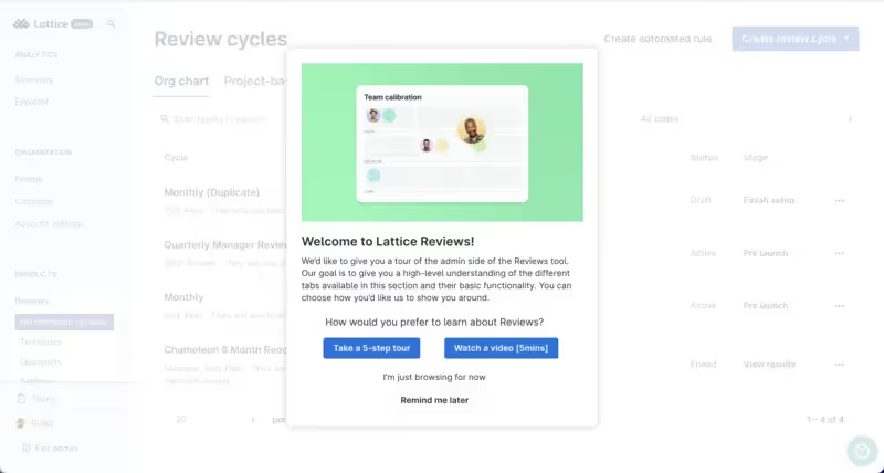
Luckily, we have Lattice as an example to lead us!
Lattice starts with a friendly “Let’s get you started!”. The user can either choose to watch a 5-minute video tutorial or take a 5-step tour.
This is exactly what Gupta talks about.
Lattice’s product tour offers these choices because it understands user goals: A hands-on experience or a more “chill” and low-stakes one.
What makes Lattice a good example?
✅ Lattice's product tour adapts to different learning styles by offering users a choice between a step-by-step walkthrough or a short video.
✅ The onboarding process maintains a friendly, pressure-free vibe, letting users feel in control of how they engage with the platform.
Short tip! ➡️ Offer users a choice in how they want to engage with your product tour—whether through a step-by-step guide or a brief video—so they can learn at their own pace and feel in control of the experience.
2 Bad Product Tour Examples to Avoid
This article wouldn’t be complete without the good, the bad, and the ugly.
Because sometimes the best way to learn a thing is to see the mistakes others have made before you, so you can avoid them.
See why these product tour examples fail👇
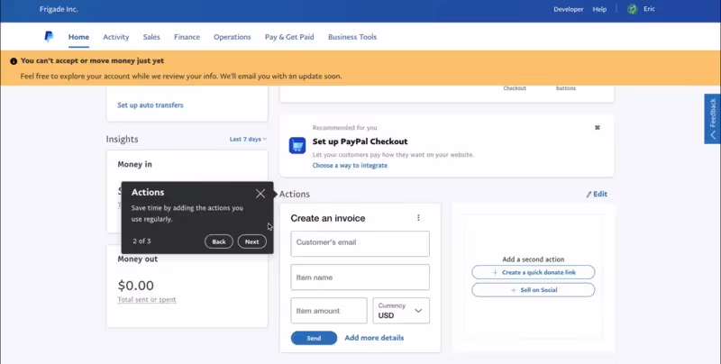
It’s hard to be unaware of PayPal. In 2024, the company’s estimated revenue was $31.45 billion. So naturally, you expect this tech giant to have a smooth product tour, right?
Sorry to burst your bubble, but you’re wrong. But this is a good thing because even big tech companies like PayPal mess up such a crucial step of the customer journey.
❌ What’s wrong with this tour?
Although the black tooltip can easily be seen by users, it is not very appealing per se. The copy is short but does not instruct the user in terms of how to take action: “Save time by adding the actions you use regularly,” is not a clear guide.
The call to action button is a simple “OK”.
My question is, “Is this really a call to action? Or PayPal just throws information at me, hoping it will stick?” It does not capture interest at all.
Moreover, the highlighted tour areas are already clearly labeled and the user has to scroll to see where the next tooltip is.
This poor scrolling will confuse the user’s location at best, or they will end the tour and quit the app at worst.
Tsk tsk—Paypal, you can do better.
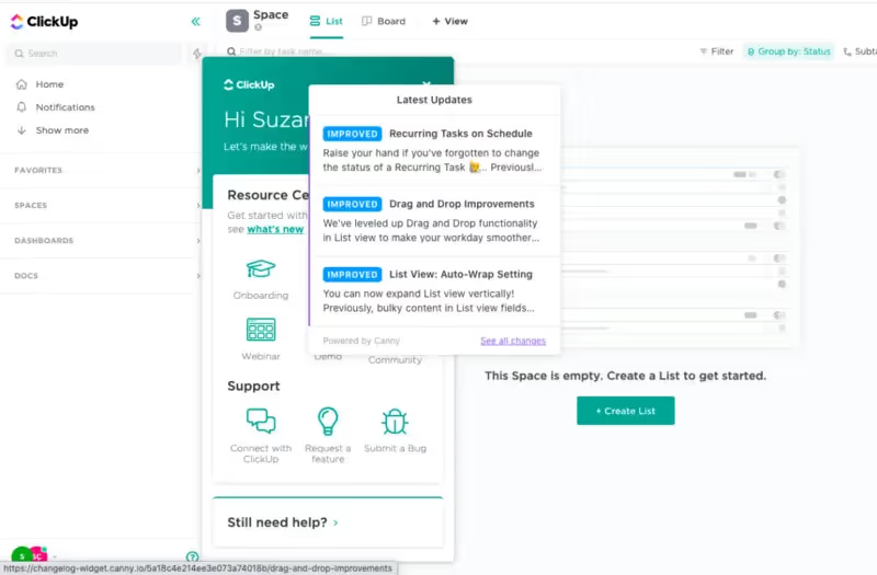
ClickUp’s UI looks very… crowded.
Take a second to look at ClickUp’s product tour and tell me you’re not overwhelmed.
There’s a lot going on: Greetings, latest updates, a call to action to create a list…
While I encourage a short and snappy tour, this does not mean that you should sacrifice the looks of your tour.
❌ What’s wrong with this tour?
The resource center and new feature update modal clash. You can’t really read what’s included on the resource center and the latest updates section requires you to open a new window to read the entire update—which eventually interrupts the user’s experience (and activity) within the app.
Be enthusiastic about guiding users, but not too enthusiastic perhaps.
Conclusion
Let’s wrap up our discussion👇
There are many ways to create product tours. The most important thing to keep in mind, though, is that you have to lead users in the right direction. Therefore, your product tour should create a clear and engaging map for them.
Remember that the look of your tour will change based on the use case: user onboarding, new feature announcements, or improvements.
You can keep it simple or include as many doodles, GIFs, and interactive elements as you’d like.
The decision is up to you.
Good luck and may the power of product tours be with you! ⚡
Frequently Asked Questions
What is an example of a product tour?
An example of a product tour is when you first sign up for a project management tool like Trello. When you log in for the first time, a pop-up or interactive guide might walk you through setting up your first board, creating lists, adding cards, and assigning tasks.
The tour might use tooltips or overlays to show you where certain features are located, such as how to invite team members or how to set deadlines.
This type of product tour ensures that users understand the basics of the product without feeling overwhelmed, making it easier for them to get started and use the tool effectively.

.png)