


.svg)
.svg)
.svg)
.svg)
.svg)


.svg)


.svg)
.svg)

It may sound dramatic but onboarding screens determine if users keep your product or not. In fact, 25% of users abandon an app after one use if they can’t understand its value immediately.
Not just users, but developers have reached this consensus as well: 5 out of 5 Reddit users believe that onboarding screens make a difference in retaining users for short- and long-term success.
So how can you put your best foot forward to not lose your users to competitors? Or even better: How can you create a well-designed onboarding screen to welcome the users to your app and make them stay?
In this article, we’ll cover what onboarding screens are, different types of onboarding screens and their purposes, as well as best practices and examples to get you inspired.
Ready, set, go! 🏃
TL;DR
- Onboarding screens help users understand the value of your product. They are the first few screens that introduce the app to the user after installation.
- There are six different onboarding screens depending on its purpose: welcome screens, video screens, questionnaire/survey screens, tutorial screens, gamified screens, and value proposition screens.
- Starting with a clear onboarding goal, focusing on the app’s benefits to users instead of features, adding interactive elements and personalization, fast load times, and regularly reiterating the process are crucial steps in designing onboarding screens.
- Common mistakes of designing onboarding screens include overloading users with too many screens, asking for unnecessary information too early, focusing on features instead of benefits, and not testing the onboarding flow with real users.

What is an onboarding screen?
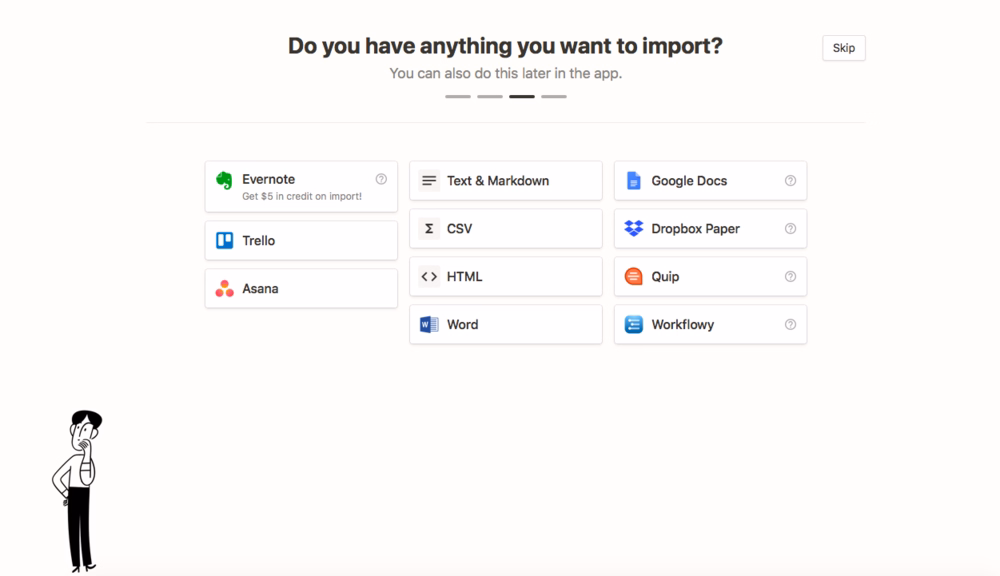
An onboarding screen, also known as welcome screen or introduction screen, is the first screen that introduces the app/software to the user after installation. There isn’t a single way to create these screens, and they can take many forms, including:
- a small pop-up box with an engaging welcome message,
- a short video message that provides an overview of the product
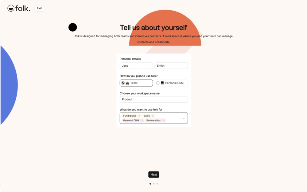
It can even be a series of interactive screens that ask questions to the user to put them in the most appropriate segment and show content that matters to their purpose.
If words confuse you, don’t worry, look at this welcome screen instead:
Or this:
Types of Onboarding Screens Based on Their Purposes
Hopefully, the examples above provide you with a sense of direction about these introduction screens. However, there are more types to be aware of.
Here are the seven most common onboarding screen types that you can adapt for your business:
Welcome Screens
Essentially, the main components of welcome screens come down to this: a visually engaging design and a friendly message that welcomes users to the app. It’s nothing more than that.
No company values or instructional content. It’s the pre-onboarding step without all the heavy feature walkthroughs or onboarding flows.
The primary goal is to just say hi to the user 👋
Video Screens
Video screens are pretty straightforward: They either welcome users to the product in a video format instead of text, show a short tutorial to warm up the user to the UI, or act as a stand-in for value proposition visually.
What’s powerful about this onboarding screen is that you have no limits with the production because you don’t rely on text. If you have the budget, you can shoot a high-budget welcome message, introduce your features in a superhero movie-style, or add humor.
It all depends on your brand voice, but it’s safe to say that you’re more likely to “ace” your message and engage users in this format as well as establish an emotional connection with the brand.
Questionnaire/Survey Screens
In terms of production value, questionnaires and survey screens are the opposite of video screens. If you want to go back to the basics, strip down your purpose to the most essential elements, these types of onboarding screens will be your best friend.
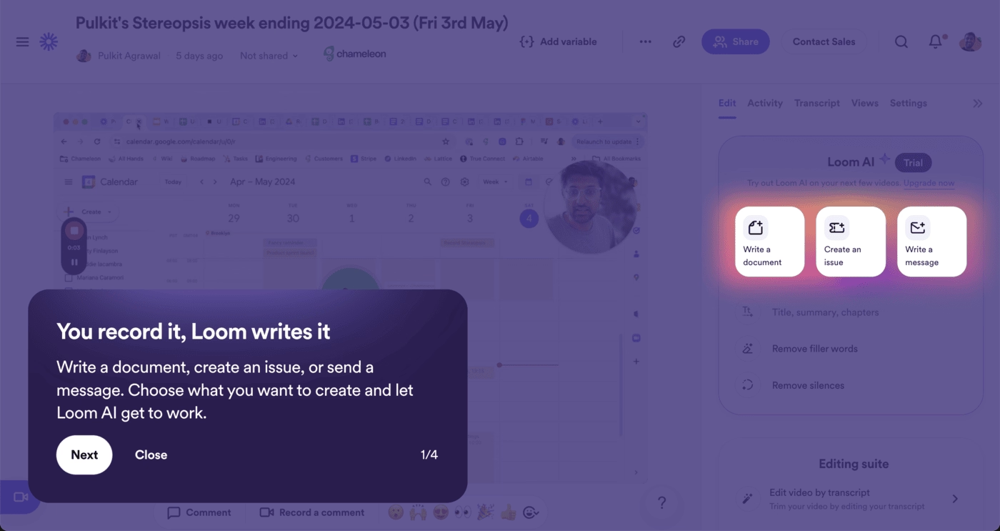
Tutorial Screens
Tutorial screens are onboarding screens that feature instructions or guides explaining how the core features of a product work. Tutorial screens can have interactive elements, pre-recorded videos, explanatory gifs, and onboarding checklists to assist the user’s learning process.
Here’s how Loom does it 👇
Gamified Screens
Just like the video screens, gamified screens can be your playground in terms of creativity. You can add progress bars, widgets, special effects, illustrations, incentives to encourage users… Again, the sky’s the limit (as long as you gamify the right steps and not create a frustrating maze). 🌀
Think about how you can grab the user’s attention in a specific step: Do they need highlighted sections, leaderboards for motivation, or modals to remind them what they can achieve?
Value Proposition Screens
Most users have a rough idea of how your product will serve them, but it’s your job to go beyond the basics and show its detailed use cases and additional features.
But… How can you make it not boring?
Again, you can include gamification (a treasure hunt perhaps?), interactive elements, as well as real-life success stories and stats from regular customers.
Filled "Empty" States
An empty state refers to an interface design that does have little to nothing to display for users. It might look like an empty dashboard with a few buttons or a list without items.
These states might be extremely discouraging and confusing to new users. They can panic, thinking there’s an error or that they’ve failed.
On the other hand, they can be a defining moment in a user’s journey to turn them into a loyal customer.
The difference lies in the way you present these empty states. You can break the ice by adding illustrations and doodles, guiding them to your CTA, or introducing contextual walkthroughs and guides.
Types of onboarding screens based on their purposes
Did you know that 74% of users never return to an app after installing and checking it for one day?

This means money left on the table, organic word-of-mouth marketing gone with the wind, and most of all your value not being recognized. 💸
Onboarding screens help create the best first impression you can. Moreover, onboarding screens can:
- Reduce user churn by engaging them from the first moment
- Improve time-to-value by introducing the core features of your product contextually
- Clarify product functionality by helping you collect user feedback and establish connections
- Increase feature adoption by encouraging users to gain first-hand experience with your app and not just telling how things work
Best practices for designing onboarding screens
Now that you know what onboarding screens can look like and why they matter, it’s time to discuss how to create the best ones.
Here are six strategies to follow for smooth user experience:
#1 Start with a clear onboarding goal
You don’t need to have it all figured out but without a goal in mind, success won’t be in sight either. Before you start designing anything, sit down and answer these questions as thoroughly as possible:
- What purpose will these onboarding screens serve? (Welcoming new users, highlighting common use cases, providing onboarding checklists, etc.)
- How will you continue onboarding after the first few onboarding screens?
Onboarding screens are just the beginning, like a trailer before the movie comes out. Once the users are done, they’ll expect you to maintain the standard and tone you set. Therefore, it’s important to analyze your product and user base first, create a map of the onboarding plan you have in mind, then actually design the first onboarding screens.
#2 Highlight value, not just features
Features can easily turn into shiny toys, meaning that users might use them but get easily bored. It isn’t enough to just put them in front of your customers. In fact, understanding how these features will help them achieve their goals and solve their problems will make it easier to adopt them.
The easiest way to highlight your product’s value? The copywriting.
For instance, change your feature-focused approach into leading with outcomes. You can say “Build life-changing habits with just a few taps a day,” to highlight value instead of “Track your habits.”
Similarly, using a problem-solution framing on your onboarding screen will make a significant difference. Each screen can follow this basic structure:
- Problem (implied or stated): “Always forgetting tasks?”
- Solution (your product’s value): “Stay effortlessly organized with smart reminders.”
#3 Make it interactive where possible
According to Wyzowl’s study, 90% of customers feel that the companies they buy from “could do better” when it comes to onboarding new users.
Interactivity is one of the ways to “do better”.
How-to guides and onboarding emails are valuable for sure, but they often require users to exit the app and switch to a new tab or browser. This is time-consuming at best and annoying at worst.
Your job is to reduce frictions as much as possible so users can maximize the time they spend on your app, which will prompt them to discover new features and use them quickly.
So, bring those guides and onboarding material inside the app. Use tooltips, hotspots, and pop-up modals to show where features are and how users can get the most value out of them.
#4 Ensure fast load times and smooth transitions
If there’s one thing all generations hate, it’s waiting for something they paid for.
According to Google, when load time goes from 1 to 3 seconds, the probability of users bouncing increases by 32%.
With apps and products for every possible pain point, users have options. If you can’t give them what they want fast, they’ll leave for the next best thing. 🏃
Similarly, if you skip too fast and introduce onboarding steps without transitioning well, their motivation to continue will dwindle.
In other words, you’ll create the best experience when your app does what it needs to do as quickly as possible, and transitions between steps in a way that supports users’ progress and logic.
#5 Offer personalization from the start
A 2021 McKinsey survey showed that 71% of customers expect personalization from brands they choose, and 76% of customers get frustrated when they don’t find it. There’s only one possible outcome when this happens: Customers will take their time and money elsewhere where they can get personalized experiences.
That is why offering personalization from the start is necessary for user engagement. You don’t have to reinvent the wheel either. Introduce segmentation elements on the onboarding screens as soon as possible and adjust onboarding content based on the user input.
Here’s an example:

#6 Test and iterate your onboarding flow
Perhaps one of the biggest mistakes you can make is setting up your onboarding screens and calling it a day. Like many components in the onboarding journey, your welcome screens require regular check-ups to keep them up-to-date and engaging.
Perform A/B tests whenever you make a change to stay in sync with your brand and audience.
Have you managed to get new success stories? Highlight them on your screens.
Are you launching new features? Create in-app announcements.
If you make a change to your product, update your onboarding screens accordingly to keep users in the loop.
Quick tips for onboarding screens
If we had to boil down all the good advice in this article, it’d look like this:
- Keep it short (3–5 screens max): Short and sweet is the motto when it comes to onboarding screens. 3–5 screens usually get the job done and keep everything focused. Anything more than 5 screens risks confusing and/or dumping irrelevant information on the user when they don’t need it yet.
👉 This brevity respects users' time and reduces friction, making it more likely they’ll complete the onboarding process. A concise experience helps maintain momentum and gets users to the actual product faster.
- Focus on value, not overwhelming info: As we’ve mentioned above, keeping the screens focused on one goal is the best practice. Don’t pitch your product again when they’re already using the app. Instead, focus on delivering value (whatever that means for your different segments) by encouraging them to interact with specific features that will help them reach the said value.
👉 This approach ensures that onboarding feels useful rather than promotional. Highlighting value early helps build user confidence and increases the chances of long-term engagement.
- Use visuals and simple copy: Text-only approach doesn’t really work with welcome screens mainly because it’s limited with what kind of information you can present. It’s also less engaging compared to visuals where you can use visual cues to associate with the information you’re sharing. When it comes to the copy on these screens, the simpler the better.
👉 Clear visuals paired with minimal copy make it easier for users to scan, understand, and retain key messages. This leads to a smoother onboarding flow and reduces cognitive load for new users.
- Match design tone with your brand personality: Do you use humor in your brand strategy? Or maybe you’re more professional and appeal to the tech-savvy crowd? In any case, your onboarding screens should reflect your brand’s personality. This sets the expectations of your user base and helps establish consistency across different platforms where they can reach out to you.
👉 A consistent tone builds trust and familiarity, which helps users feel more comfortable and aligned with your product from the start. It also reinforces your brand identity in a memorable way.
- Include a skip option: It’s natural that you want to make the most of onboarding screens and engage with your users. However, you have to think about when users want to engage with you as well. Giving the option to skip or close onboarding screens (especially lengthy ones) helps users feel in control of their own journey on your app.
👉 This sense of control can improve user satisfaction and reduce drop-off rates. Some users prefer to explore at their own pace, and honoring that choice can create a better overall experience.
Common mistakes to avoid
On the flip side of the coin are the common mistakes teams make when designing onboarding screens. Here are a few common pitfalls that can quietly derail engagement and how to sidestep them👇
- Overloading users with too much text or too many screens: When someone opens your app for the first time, they’re curious, not committed. A wall of text or an endless carousel of screens kills momentum fast. Instead of trying to explain everything up front, focus on what users need to know right now to get started. Think of your onboarding like a conversation, not a manual: Introduce only the essentials, and let users discover more naturally as they go.
- Asking for unnecessary permissions too early: Nothing breaks trust faster than being asked for camera access or location data before users even understand what your app does. It feels invasive and it puts the brakes on their interest. Make permissions feel purposeful by tying them to clear benefits. For example, rather than simply asking for access, frame it with, “Get personalized content based on your location.” Timing and context are everything.
- Focusing on features instead of user benefits: Listing off features like a product brochure might sound informative, but it misses the point. Users care about what those features do for them. Instead of saying “Syncs with all your devices,” try “Pick up right where you left off, no matter the device.” Lead with outcomes, not capabilities and use onboarding copy to show users how your app fits into their lives.
- Not testing onboarding flow with real users: It’s easy to assume your onboarding makes sense, until someone outside your team tries it. Skipping usability testing means missing out on the small friction points that quietly drive users away. Watch how real users interact with your flow, where they drop off, and what confuses them. Then iterate. Your onboarding isn’t done when it’s designed, it’s done when it works.
20 Onboarding welcome screen examples from real apps
You’ve got the tips and you know the mistakes. Now, it’s time to look at 20 different onboarding welcome screen examples from real apps to put theory into practice 👇
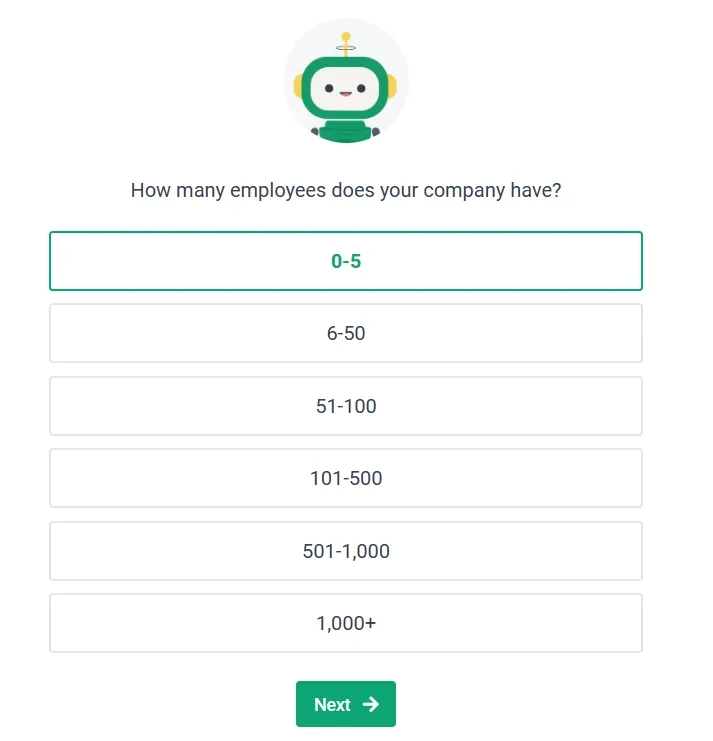
Blinkist
Blinkist is a subscription-based book summary and audiobook guide application that provides key ideas and insights from best-selling and influential non-fiction titles, known as “blinks”, which typically condense the book’s content into 15 minutes.
And it uses onboarding screens to personalize the user’s experience based on what they want to read more about and what categories they’d like recommendations on 👇

Based on users answers, the app recommends a few titles from the user’s preferred genres and adds the ones user chooses to their library 👇
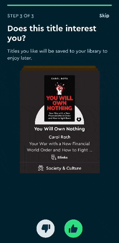
The final onboarding screen gives details about free trial and subscription options, which is great because it doesn’t seem "desperate" or “pushy” about purchases. Instead, the app organically introduces these options when it matters to the user (and after they’ve experienced its value).
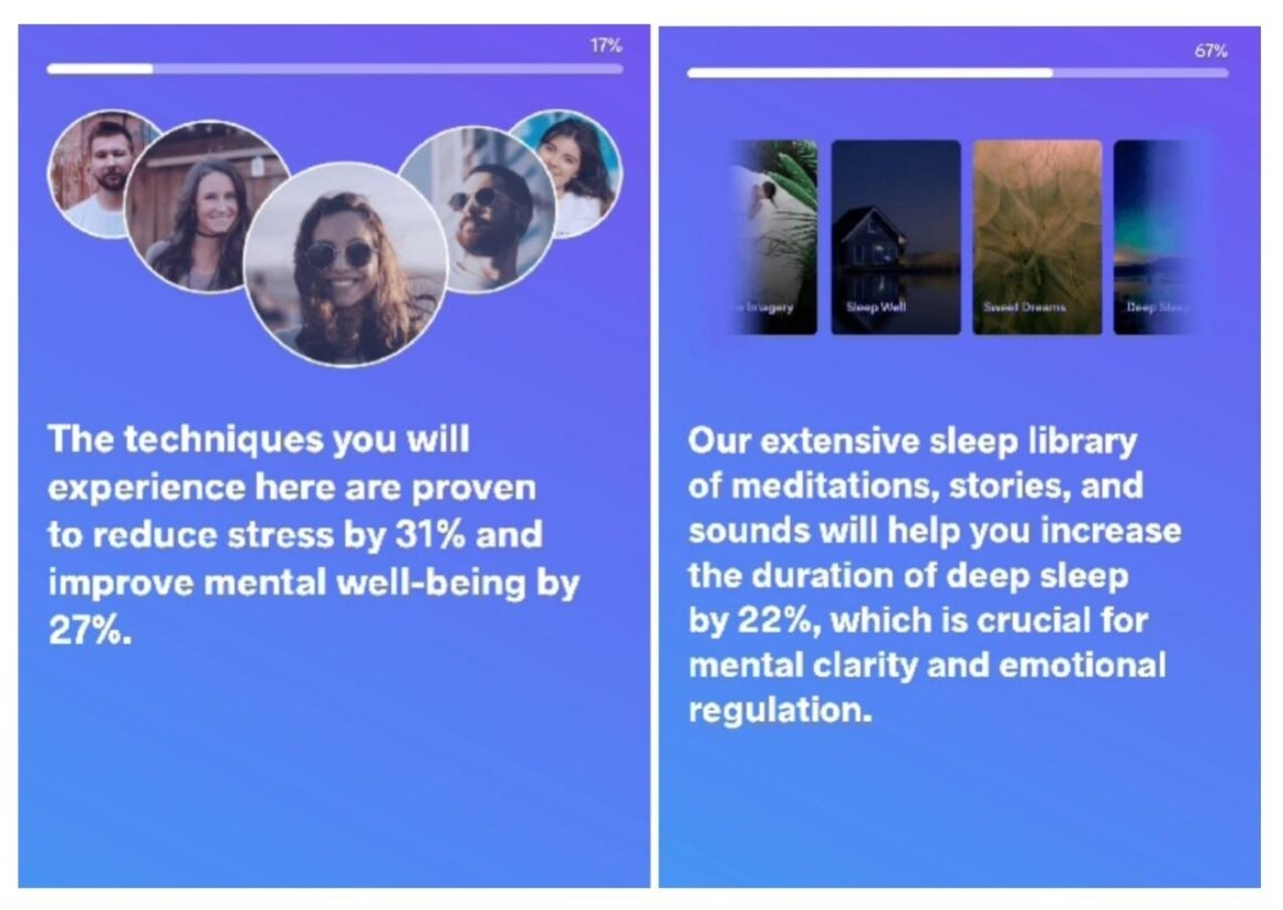
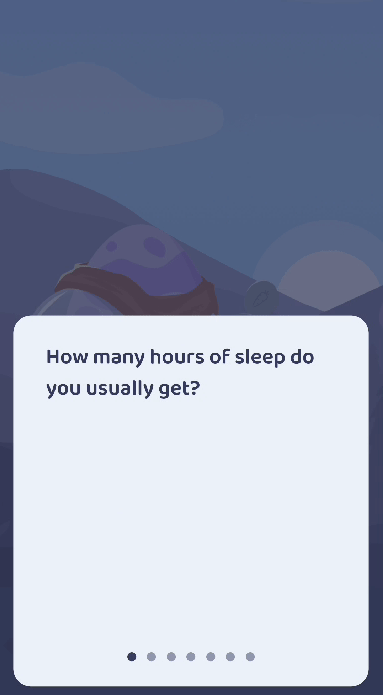
Meditopia
Meditopia is a mindfulness app designed to help users with sleep and meditation with sessions, relaxation techniques, and exercises to reduce anxiety and stress. The app’s onboarding screens reflect this calmness approach with picturesque images, affirmative copy, and practical use cases.
Moreover, it uses pit stops so users don’t feel overwhelmed and enjoy research-backed mental health and well-being stats.
Let’s break it down 👇
The onboarding screens heavily rely on a welcome survey to understand the user’s needs and segment them into the right category.
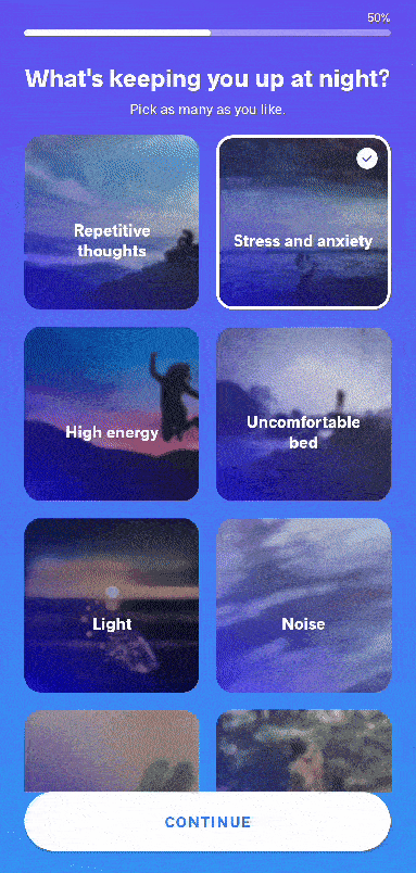
In true value proposition style, Meditopia also sprinkles in stats and research-driven results throughout the onboarding journey as well.
One criticism might be that there are more than 3–5 screens during this tour, which risks boring the user. However, the use of visuals and stats might balance the length with the value in action.
Forest
Forest is a productivity and focus app that helps you get tasks done and not be distracted by your devices. You plant virtual (and real) trees which grow during your sessions, expand your forest, and earn coins to unlock more trees and plants.
“Stop looking at your phone and work for 30 minutes,” sounds boring and doesn’t really give much incentive to finish the task. “Plant a tree for 30 minutes to earn coins or risk killing the tree by opening another app on your device,” introduces an external emotional stake and gamifies the process.
This is exactly what Forest does.
Forest has a better (and gentler) way of wording this process though 👇

Rabit
Similar to Forest, Rabit helps users track habits and set up to-do lists. By sticking to your habits, you get to grow virtual plants. A personal, gamified experience, in other words.
But Rabit takes this to the next level: The app interacts with you and your goals. It asks how you’re doing, checks in on your progress, offers suggestions, and cheers you on as you complete your tasks.
Let’s see what kind of onboarding screens they use to build this approach 👇
First, it welcomes users to the app and asks questions to understand the user’s needs and why they want to use this app to personalize the experience.
Based on the user’s answers, they get recommendations on how to achieve those goals within the app. It’s a good way to show features available and tailored to the user.
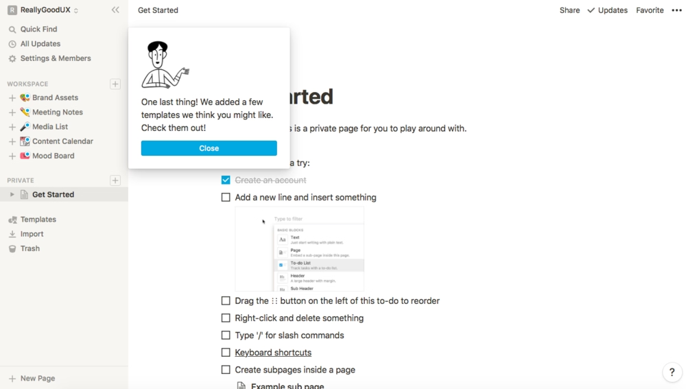
Notion
Notion might have started as a note-taking app but it has evolved so tremendously over the years that it wouldn’t make sense to introduce everything in one go. That is why Notion starts with segmentation.
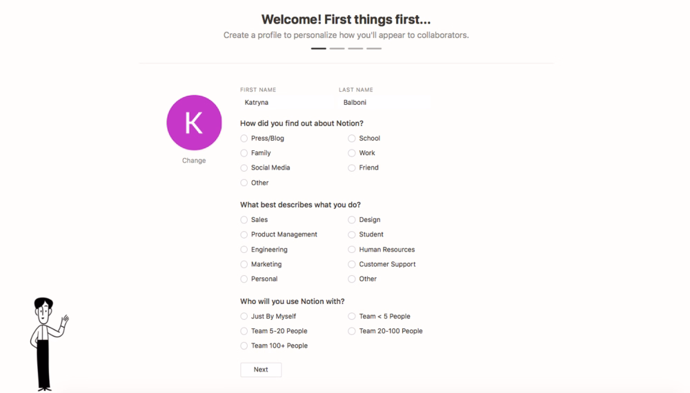
The app asks questions to understand how users will use the system. Are you going to use the app on your own or with your team? What kind of work do you do?
While you answer questions, you can follow your progress and see how many steps are left in the tour. Another thing Notion does well is giving users the choice to skip steps.
See how focused and intentional these onboarding screens are? That is because Notion only shows these screens to get a sense of what the user needs. The actual onboarding happens contextually with hotspots and pop-ups.
Hemingway Editor
Hemingway Editor is an online writing and editing tool that focuses on the clarity and readability of your document. Without the user’s input, it might look like an empty state.

However, it’s actually a “filled” empty state. The Editor shows demo content to its users with highlighted sections corresponding to how the tool actually analyzes your document.
Despite being text-based, Hemingway Editor’s onboarding screen does a great job highlighting its value through features.
Frase
Frase is an AI-powered content writing and SEO tool that simplifies content creation, research, and SERP optimization. Its home page immediately shows who the target audience is and how the tool actually works.
Once you sign up, you get a short onboarding survey that gauges your interest in the product. Simple and effective.
Evernote
Evernote is a note-taking and task management application that helps users organize and prioritize ideas, projects, and to-do lists, as well as bills and invoices. It’s designed to keep individuals and teams organized and secure so nothing falls through the cracks.
Here’s how Evernote welcomes users to its web app 👇
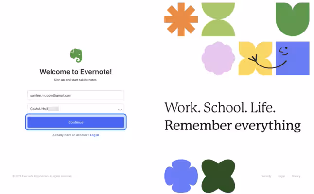
After signing up, the welcome pop-up shows the app’s value proposition with benefits instead of features 👇

Apple Music
According to Statista, Apple Music had the third largest market share in the music streaming market in 2024. With such popularity comes a great responsibility (and pressure) to create a good first impression and onboard users well.
After introducing its plans, Apple Music starts personalizing the user’s listening experience by asking them about what they listen to most 👇
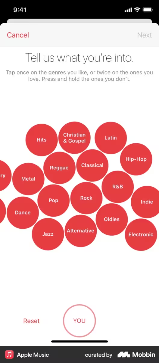
Based on the user’s answer, the app then shows popular artists in that genre to understand their taste better. The user can like, love, or remove the artist from the screen to curate their feed 👇

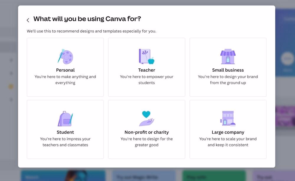
Canva
Ever since its launch in 2013, Canva has been growing at a rapid rate by filling the easy-to-use design tool for amateur designers and beginners in the market.
Canva’s onboarding screens don’t waste any time and immediately personalize the user’s experience by asking them about what they're going to use the app for 👇
Later, Canva shows a pop-up to invite the user to subscribe to their messages to get personalized design tips and recommendations. This step is entirely optional and users can opt out if they want to 👇
Canva’s optional recommendation onboarding screen
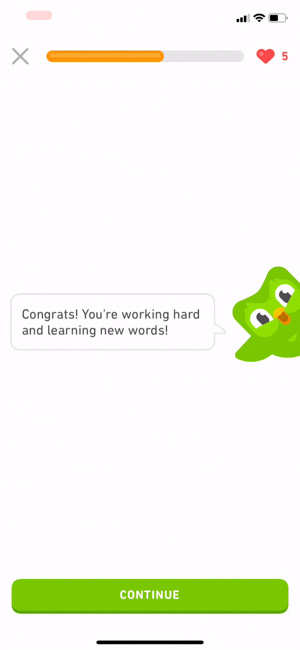
Duolingo
Duolingo is one of the tech giants that no longer needs an introduction but to keep things short, it’s a language learning platform where you can practice reading, writing, and speaking as well as collect points to be featured in a leaders’ board.
The onboarding screens begin with establishing daily goals 👇
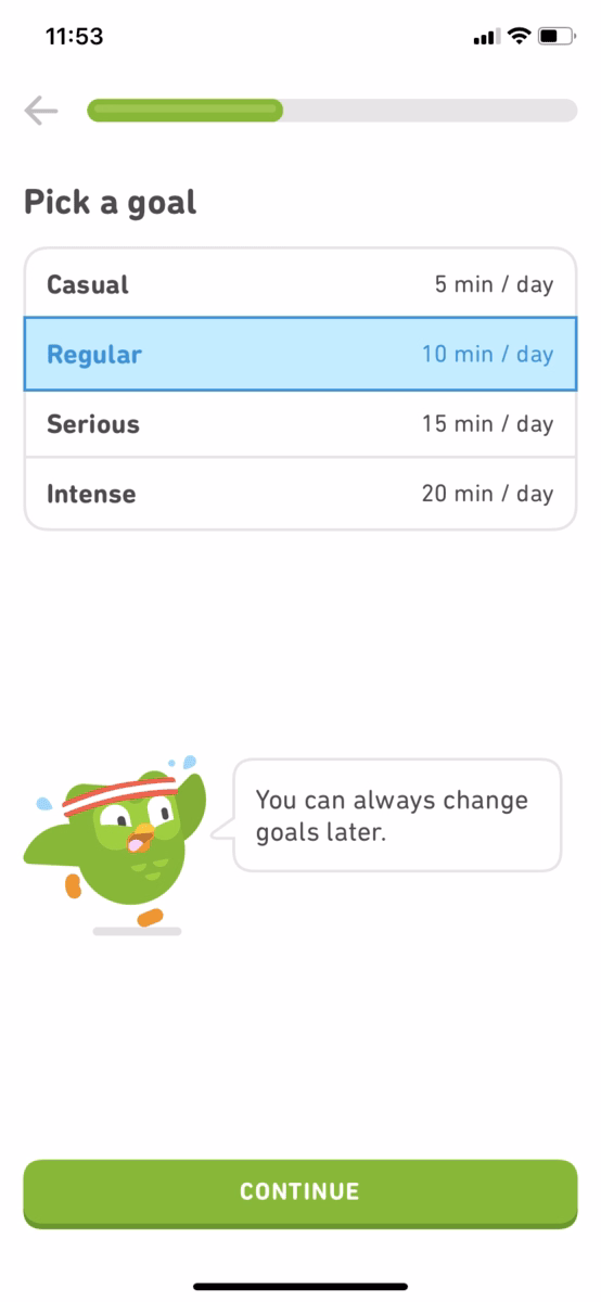
The app later segments users based on their knowledge of the language they’re trying to learn, starting easy and getting harder based on performance. Then the user begins their lessons, which feature a progress bar, a friendly owl animation, and motivational copy 👇
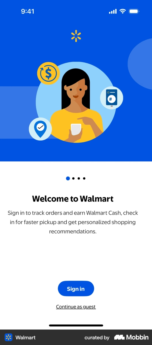
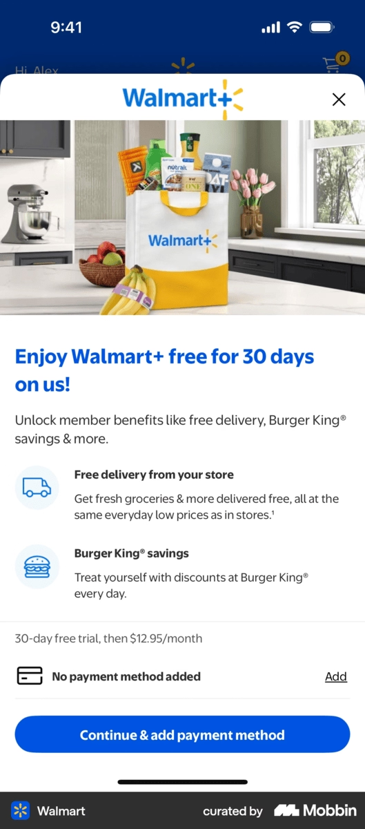
Walmart
Walmart is a U.S.-based grocery and hypermarket company that operates in all 50 states and 23 other countries around the globe. Users can browse, add, and order items for pick-up and delivery depending on their location through the Walmart app.
Here’s how Walmart onboard its users to the app 👇
The user is prompted to create a Walmart account to track orders, get saving updates, and choose a location.
Once the user creates an account, the app shares its subscription service Walmart+ with an exclusive offer. The user can exit the screen and continue their shopping experience.
Asana
Asana is a work management platform that enables users to organize, track, and manage projects, workflows, and tasks for individuals and teams. Its onboarding screens have the “it” factor — playful with no frictions.
The onboarding screen have minimal copy with accompanying illustrations and screenshots from the app to keep things light but still informative 👇
Lattice
Lattice is a mobile people management tool focused on giving and receiving feedback from your team. This feature aims to improve team health, recognize great work, and guide internal conversations as productively as possible.
Lattice’s onboarding screen cuts to the chase: The user can take a 5-step tour or watch a 5-minute video 👇

What makes Lattice a great example is that it “adapts” to different learning styles by offering options between a step-by-step walkthrough and video tutorial. It’s friendly and pressure-free because the user can also choose neither by clicking on “I’m just browsing for now”.
The copy is also clear and to the point which leaves no room for confusion or stuffs the screen with fluff. It’s just an introduction with the platform’s key features.
PayScale
PayScale is a data-driven salary compensation tool that offers features like pay structures for large corporations, AI-powered workflows, and planning for regular pay raises to keep up with inflation.
The majority of PayScale’s onboarding screens are populated with tooltips that highlight specific sections to help users navigate different dashboards 👇

The user can also go back and forth between different steps or step the tour altogether, which is a nice touch.
Chipotle
Chipotle is a U.S.-based chain fast food restaurant specializing in bowls, tacos, and burritos. It, of course, comes with an app for online pick-up and delivery methods. The onboarding screens resemble Walmart’s in that they both start with a sign up 👇

Then, instead of a subscription, Chipotle introduces its awards program where users can earn points with each purchase and use these points to claim rewards like free menu items or merch 👇

Trust Wallet
Trust Wallet is a crypto wallet for Web3, NFTs, and DEFI. The app’s onboarding screens guide users through a crypto wallet creation, setting up security features, and enabling notifications. It ends with the main wallet view.
Let’s look at the most important screens in this tour 👇
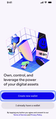
The first screen proposes the app’s value: “Own, control, and leverage the power of your digital assets.” Similarly, the CTA buttons don’t simply say, “Sign up”. Instead, it guides the user to start experiencing its value by creating a new wallet.

Once the user creates the wallet, the user can choose to fund it or skip this step. Additionally, the confetti animation creates a sense of success and acts as a positive affirmation for the user.
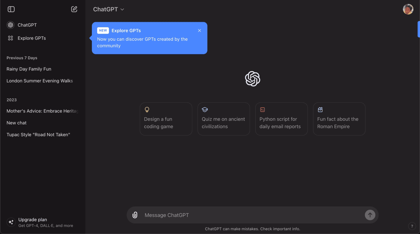
ChatGPT
ChatGPT’s rise as a LLM has introduced and changed how we create and interact with online content. Moreover, it shows us how onboarding screens can be used after the initial onboarding process is complete.
Let’s take a look at how ChatGPT introduces its flagship LLM model, GPT-4o, with onboarding screens 👇

The onboarding screens become announcement modals in this case and highlight the “shiny” parts of the new model. It shows up when users open the app (not when they’re in the middle of a task, which can be frustrating) and acts as a low-pressure invite to test the new model.
The “Try it now” button triggers a tooltip that shows what’s new with this version with clear, no-nonsense copy 👇
Monarch
Monarch is a personal finance app that helps users track all their accounts’ monthly spending, budget, plan, and goals in one platform. You can analyze your investments and collaborate with other people as well.
The app starts the onboarding with a free trial and account setup, then begins asking finance-related questions to understand the user’s needs better 👇

The survey is quick and doesn’t waste the user’s time. It only asks about the user’s financial priorities, whether they manage finances with a partner or alone, and if they work with a professional for these priorities. Then, it’s straight to the dashboard.
Swiggy
Swiggy is an Indian online food ordering and delivery company. Like many other apps with delivery options on this list, Swiggy’s onboarding screens follow a similar structure: Get the user to create an account, set their profile up, and see the delivery options.
There’s one onboarding screen that deserves to be highlighted in this post 👇

It creates a pseudo-empty state by darkening the screen. The app clearly wants you to focus on the icons at the top of the screen but with many restaurants and food options, it would be hard to do so.
Instead, Swiggy shows you what you need to focus on with a clear design break and visual cues like arrows. The copy has more of a supportive role in this instance and we’re loving it!
How to create great onboarding screens
Great onboarding screens are about giving users the right nudge at the right moment. Whether you're building from the ground up or speeding things up with third-party tools, the goal stays the same: guide users toward value as quickly and clearly as possible.
Here’s what you can do to achieve this result 👇
Build from scratch
If you want full control over your onboarding experience, start by designing directly in Figma. This tool gives you the freedom to tailor every screen to your brand, voice, and user journey.
Once your flow is mapped out, apply it in your app and test it as early as possible (not just for bugs, but for clarity). Do users know what to do next? Are they getting stuck or skipping important steps?
Remember, onboarding is more than a welcome. It’s a test of how intuitive your product really is.
Utilize third-party onboarding tools
If speed and scalability are your priority, third-party tools like UserGuiding, Appcues, and Userpilot can help you build onboarding flows without diving deep into code.
These platforms let you create in-app walkthroughs, tooltips, checklists, and modals—fast.
The best part?
You can iterate quickly based on user behavior. Instead of guessing what’s working, you’ll see where users drop off and refine the flow accordingly. These tools accelerate the process significantly when used thoughtfully.
Conclusion
Good onboarding screens do more than look nice. They drive engagement, speed up activation, and help users actually get the value your product promises. When done right, onboarding screens become the reason they stick around for the rest of it.
If you haven’t reviewed your onboarding flow in a while, now’s the perfect time.
Walk through it like a brand-new user. Is it clear? Helpful? Focused on outcomes, not just features? Use the examples and tips above to refine what’s already there, or start fresh with a version that actually guides users, not just greets them.
The sooner your users see the value, the sooner they’ll stay.
Frequently Asked Questions
What are the best onboarding screens for mobile apps in 2025?
The best onboarding screens in 2025 are clean, interactive, and focused on personalization. They use micro-animations, progress indicators, and contextual tooltips to guide users quickly without overwhelming them, while integrating AI-driven recommendations for a smoother experience.
How do you design a welcome screen that reduces user churn rates?
A welcome screen should be simple, visually appealing, and value-focused. Highlight the app’s core benefits, offer a clear CTA, and allow users to skip or customize the experience, which helps reduce early churn by respecting user intent.
What are the key differences and best use cases between onboarding screens and welcome screens?
A welcome screen introduces the app and sets expectations, while onboarding screens teach users how to use features. Welcome screens work best for building trust and brand connection, whereas onboarding screens are critical for complex apps that need guided learning.
What are the examples of onboarding welcome screens that improve user retention metrics?
Successful examples include Duolingo’s gamified onboarding, Slack’s guided setup, and Meditopia’s personalized surveys. These screens improve retention by aligning the onboarding journey with user goals from the very first interaction.
How many onboarding screens should an app include for optimal activation?
Most apps see the best activation rates with 3–5 onboarding screens. Too few may leave users confused, while too many can cause drop-offs, so focus only on essential steps that lead to the first value.
What are the best practices for creating personalized onboarding welcome screens in SaaS?
Best practices include asking minimal but targeted questions, adapting workflows based on role or goal, and using dynamic content. Personalization ensures users immediately see features relevant to their needs, improving engagement and satisfaction.
What are the common mistakes to avoid when designing app onboarding screens?
Common mistakes include overloading users with information, forcing long tutorials, lacking a skip option, and not showing immediate value. Avoiding these pitfalls helps keep users motivated and reduces abandonment.
Do onboarding screens increase user engagement compared to simple welcome screens?
Yes, onboarding screens typically boost engagement because they actively teach users how to use the app. While a welcome screen can set the tone, onboarding adds guidance that accelerates time-to-value and reduces frustration.
What are the top onboarding screen UI patterns that drive faster time-to-value?
Top UI patterns include interactive walkthroughs, checklists, tooltips, progress bars, and empty states that showcase real examples. These patterns guide users step by step and motivate them to complete setup quickly.

.png)


