


.svg)
.svg)
.svg)
.svg)
.svg)


.svg)


.svg)
.svg)

I like to imagine a world where my university had banners.
I walk onto campus and a glowing bar hovers at the top of the entrance: “Important notice: syllabus updated”. A countdown ticks down toward project deadlines, and another special offer banner flashes: “Complete the extra credit to boost your grade!”
In my sci-fi school universe, I never miss an update, a deadline, or an opportunity.
Well, not for schools, but for many websites and companies, we have that opportunity. Website notification banners deliver timely, relevant (and important) messages all day every day, on some part of the internet.
But does that cause banner blindness or irritation?
Well, in this article, we’ll show you how good banners never get missed or annoy visitors.
So, buckle up, we have a ton of examples to analyze!
But if you’re short on time and only want the best practices without the contextualizing real-life examples… then here’s the TL;DR 👇🏻
TL;DR
- A website notification banner, also called an announcement bar or hello bar, is a small, persistent message at the top or bottom of a website or app that communicates important information.
- Banners are used for many motivations, including…
- Promoting features,
- Announcing events,
- Sharing updates,
- Recommending next steps,
- Encouraging beta signups,
- Running limited-time offers, and
- Highlighting educational resources.
- The important thing with banners is to make sure they’re concise, relevant, visually distinguishable, personalized when needed, and responsive.
- You need to avoid too many banners at once, irrelevant messages, misleading CTAs, or unnecessarily persistent designs.
- If you want to create visually pleasing banners without learning to code or mastering a design tool, check out UserGuiding!
- UserGuiding is a no-code, all-in-one product adoption platform that lets you design banners (and many other product experience elements) in just minutes. Start your free trial today and see how easy it is to create banners 👈🏻

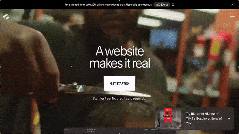
What is a website notification banner?
A website notification banner is a small, persistent message area that appears at the top or bottom of a website or app interface. Its job is to communicate something important without getting in the user’s way.
You can also hear it called an announcement bar, sticky bar, or hello bar, as well.
Placement & visibility
Most notification banners live in one of two places:
- Top of the page: Common for announcements, promotions, or product news. These are usually the first thing users see, so they work well for broad messages like feature launches or events.
- Bottom of the page: Often used for cookie consent, policy updates, or secondary CTAs. They’re visible but feel less dominant, which helps with compliance-related or informational messages.
Many banners are sticky, meaning they stay in place as the user scrolls. This is helpful when the message might become relevant at any point during the visit, like a discount code.
Formatting
The purpose of a banner is to communicate a piece of information quickly and without distracting the user/ website visitor. So, banners keep things minimal.
We don’t see long copy or complex designs.
Instead, most notification banners include:
- Short, focused copy that explains the value in one line
- A clear CTA (button or link) like “Try it free,” “Learn more,” or “Register now”
- Optional visual cues, such as icons, emojis, or subtle animations, to draw the eye without overwhelming the page
- A dismiss (close) option, especially when the banner isn’t critical
Why use a website notification banner (benefits + KPIs)
There are many reasons why banners are everywhere. And even though they’re everywhere, we don’t often stop to think about them.
That’s actually part of their success.
It’s not that users don’t care about banners; it’s that good banners don’t demand to be cared about. They stay out of the way, quietly doing their job.
Most of the time, notification banners fade into the background. And that’s fine. They’re designed to be noticeable only when the message is relevant.
For example, a banner announcing an event you’ve been waiting for or a feature you’ve been hoping for suddenly feels helpful, not promotional. That selective visibility is exactly what makes them so effective.
From a business and UX perspective, notification banners bring several clear benefits.
👉🏻 First, as we’ve just said, banners improve the user experience by being non-disruptive.
Notification banners communicate important messages without interrupting the user’s flow. Unlike pop-ups or modals, they don’t block content or demand immediate action. Users can continue scrolling, reading, or completing tasks while the message stays quietly visible.
👉🏻 Second, they increase conversions without pressure.
Because banners are persistent but non-intrusive, users can act when they’re ready. This makes them especially effective for clicks, sign-ups, demo requests, or waitlist registrations. Instead of forcing a decision in a pop-up moment, banners allow intent to build naturally over time.
👉🏻 Third, they are excellent for communicating urgent or high-value information.
Limited-time offers, important announcements, product updates, or policy changes shouldn’t rely solely on email or blog posts. A banner ensures the message is visible exactly when users are engaged with your site or product.
Common use cases & goals for website notification banners
Notification banners are flexible by nature. The same UI pattern can support growth, onboarding, compliance, and communication, depending on what you show and who you show it to.
Here are the most common use cases: 👇🏻
- Promotions, discounts, and urgency countdowns: One of the most popular uses of notification banners is promoting special offers. Discounts, free trials, and limited-time bundles benefit from constant visibility without derailing the browsing/product experience.
A banner can quietly remind users that an offer exists if they’re interested in it.
Here’s an example free trial promotion banner:
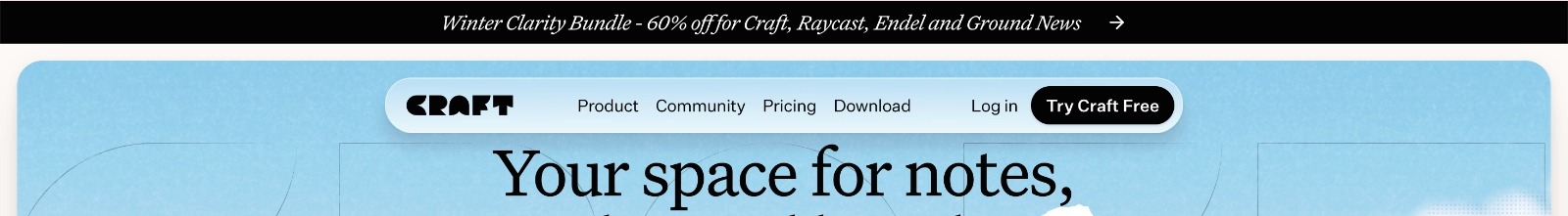
- Time and geography-specific promotions: Some campaigns only make sense for certain users, regions, or moments in time. Notification banners are ideal for these context-aware promotions, especially when paired with targeting or scheduling.
Seasonal offers, local holidays, or region-specific pricing changes can be communicated without cluttering the main UI for everyone else.
Here’s an example winter discount bundle banner:
Or, you can also think of seasonal feature promotion banners. You can frame a product differently to match what users are already thinking about.
Here’s how Synthesia promotes their AI videos during the Christmas season:

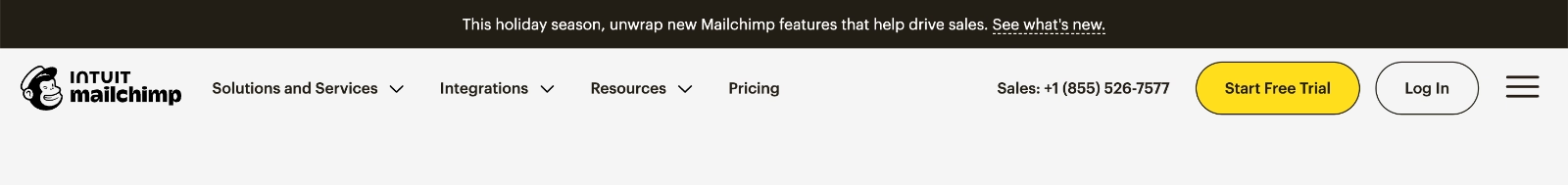
- Feature announcements: Notification banners are also a natural fit for feature launches and updates, particularly for returning users. Instead of relying solely on release notes or emails that may never be opened, banners surface what’s new right where users are already active (on the website or in the product UI).
Mailchimp, for example, announces its new features on the website with a banner. They also frame the release with time-specific copy and tie it to the holiday season:
- Webinar, event, and newsletter signups: Banners are very effective for lead generation tied to content or events, too. Webinars, conferences, newsletters, e-books, reports, surveys, benchmarks… Banners are used a lot to communicate any virtual or digital event, as well as new media content to website visitors.
Here’s an example digital event announcement banner:
- Policy updates and cookie consents: Cookie consent notices, privacy policy updates, and terms of service changes all need to be communicated clearly and consistently, without blocking access to the site.
That is why these banners are among the most common use cases for website notification banners, and they’re also the banners that website visitors see every single day, often multiple times a day, if not more.
Here’s an example cookie consent banner positioned on the bottom of the page:
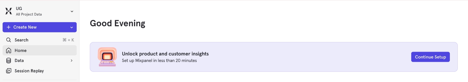
- Call to actions and recommended actions: Banners can appear both on websites and inside apps. When they appear inside apps, they often serve as guidance tools. They can recommend next steps, highlight incomplete setup tasks, or encourage users to enable important features.
Here’s an example in-app banner from Mixpanel that encourages users to complete their account setup:
Notification banner examples that actually work
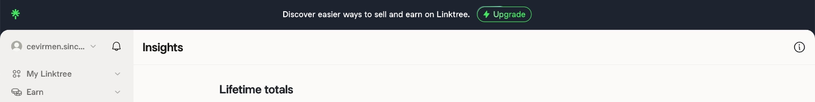
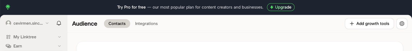
LinkTree’s changing in-app banners with different value propositions
Linktree is a link-in-bio tool that allows creators and businesses to share multiple links through a single, customizable landing page.
Instead of using banners on their public website, Linktree relies on in-app banners. At least at the time of writing, there were no notification banners on their website...
They use in-app banners to highlight the value of their paid plans, and these banners are shown specifically to users on the freemium tier. The goal is straightforward: encourage upgrades by surfacing the benefits of paid plans without interrupting the user’s workflow.
To keep things engaging, Linktree doesn’t rely on a single message. The banner copy changes over time, and we’ve seen multiple variations.
Here’s one example:
Here’s another:
And here’s the third example:
What’s actually good about this example
✅ Banners are segmented and contextual; they’re shown only to free-tier users to encourage upgrades.
✅ Multiple banner versions rotate over time, each emphasizing a different value proposition instead. This provides some level of engagement for the user, especially as the banners are not dismissible.
✅ The CTA is clear and eye-catching, and it leads directly to the pricing and plans page.
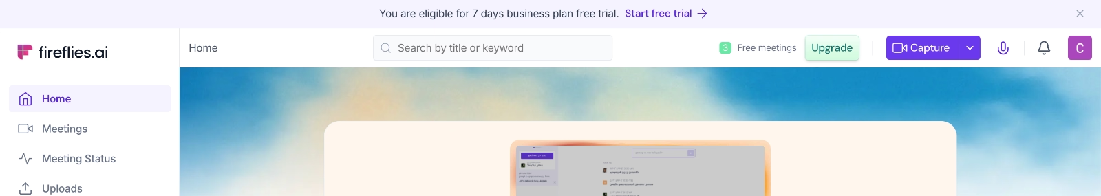
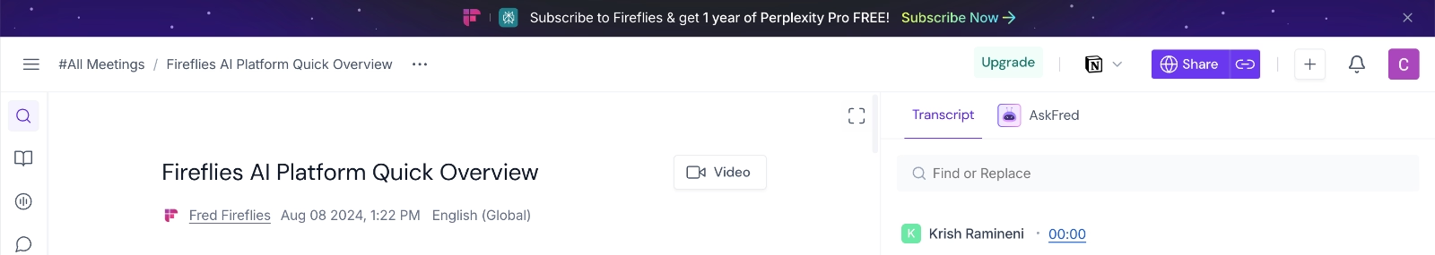
Fireflies.ai’s in-app banner to announce bundle campaigns
Fireflies.ai is an AI meeting assistant that records, transcribes, and summarizes meetings.
Similar to Linktree, Fireflies.ai uses in-app banners rather than website banners for certain announcements. In this case, the banner is used to promote a bundle campaign, a collaboration with Perplexity.
Through this campaign, Fireflies communicates that when you subscribe to Fireflies, you also get one year of Perplexity for free.
What’s actually good about this example
✅ It’s placed inside the product, where users are already engaged and more likely to consider upgrading.
✅ There are visual cues on the banner to clearly communicate the partnership even without users reading the copy. Both Perplexity’s and Fireflies’ logos are present on the banner.
✅ There’s a clear CTA (Subscribe Now).
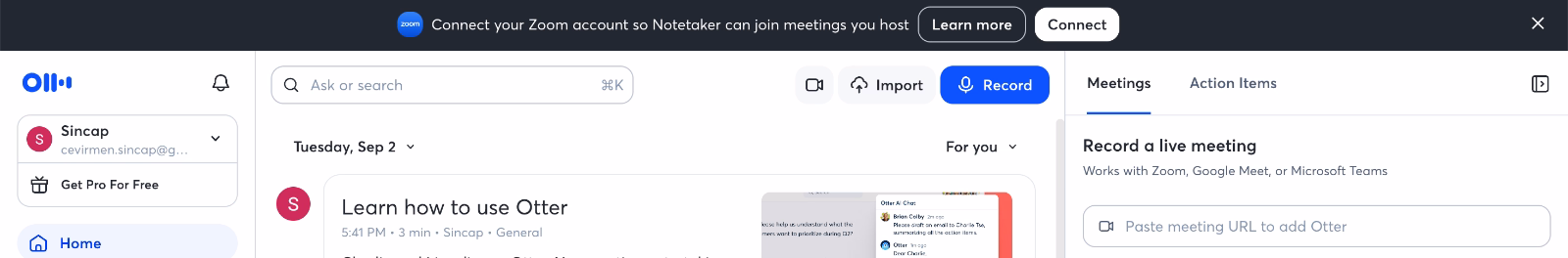
Otter.ai’s in-app banner promotes deeper feature activation
Otter.ai is an AI-powered meeting assistant that transcribes conversations, generates summaries, and helps teams capture and share meeting insights.
Otter.ai uses in-app banners to encourage deeper engagement with the product, especially for new users or users who have an account but aren’t yet using the app actively.
In this example, Otter recommends connecting the app with Zoom so its Notetaker can automatically join meetings. This is a critical activation step, because once the integration is enabled, Otter can deliver its core value with minimal manual effort from the user.
What’s actually good about this example
✅ The banner promotes a high-impact activation action that unlocks the product’s core value.
✅ It’s contextual and relevant for users who haven’t fully adopted the app yet.
✅ There are 2 CTAs, one taking the user to the relevant integration page, the other to a help article that explains the use case of the integration and how Notetaker works.
✅ The banner is dismissible.
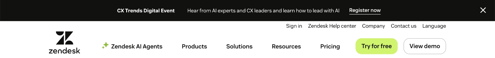
Zoom’s website banner introduces a new feature
Speaking of Otter.ai’s Zoom integration, Zoom itself also relies on notification banners to communicate important updates, but in this case, on its website landing page rather than inside the product.
In this example, Zoom uses a website notification banner to announce a major feature update. The message is short, direct, and confidence-driven:
“It’s here: Zoom AI Companion 3.0.”
There’s no long explanation and the banner assumes interest.
Very bold, very courageous, very intriguing. Even if you yourself might not have been expecting this feature update, the copy makes you wonder.
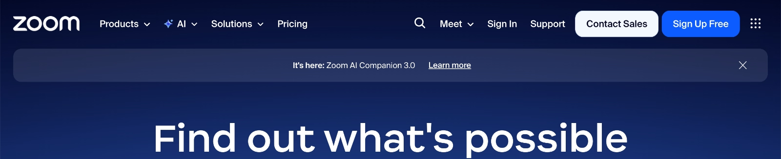
What’s actually good about this example
✅ The banner highlights a major feature release with concise, high-impact copy.
✅ Placing the banner on the landing page ensures maximum visibility for both new and returning visitors.
✅ The message focuses on availability (“It’s here”), creating a sense of anticipation.
✅ The banner style and formatting are also in harmony with the rest of the website design. The semitranslucent background draws attention without clashing with the main website design. Plus, it’s dismissible.
Loom’s in-app banner for free-tier feature usage tracking
Loom is a video messaging and screen recording tool with a freemium plan that allows users to create and share videos.
To encourage upgrades, Loom uses in-app banners that highlight users’ existing usage and the value they’re already getting from the product. Instead of pushing a generic upgrade message, the banner reflects the user’s current state.
Loom shows how many videos the user has already created and how many free-tier videos they have left.
What’s actually good about this example
✅ The banner is personalized based on real usage data, which makes the message highly relevant.
✅ It frames the upgrade around value already received, not just restrictions or paywalls.
✅ Also creates a subtle sense of urgency and FOMO.
ClickUp’s in-app banner for notification permissions
ClickUp is a project management and productivity platform.
They use in-app banners to remind users about important actions that help them get the full value from the app and complete setup. For example, they use a banner to encourage users to grant notification permissions.
The banner stands out visually, creating a strong contrast with the background to immediately draw attention to this important action. A small bell icon also reinforces the purpose visually, letting users understand the reminder even before reading the copy.
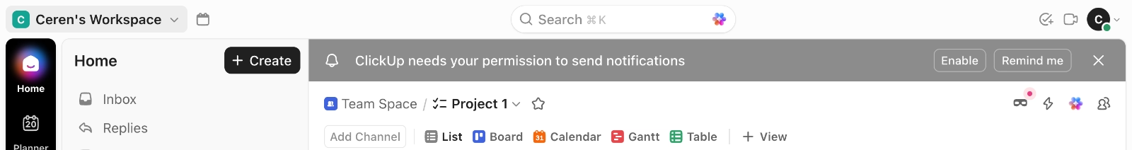
What’s actually good about this example
✅ The banner draws attention immediately through visual contrast and an intuitive icon.
✅ There are two CTAs: Enable and Remind Me. This gives users flexibility so that they can complete the action immediately or choose to be reminded later, rather than dismissing the banner entirely. A dismiss icon is also available for full control.
UserGuiding’s in-app banner for new feature announcement
UserGuiding is an all-in-one product adoption platform that helps you create engaging product experiences, changing from automated and personalized in-app onboarding flows to AI chatbots and standalone knowledge bases.
Since banners are an important part of product experience (PX) and user communication, it makes sense that you can create them with UserGuiding as well.
And when it comes to announcing this feature, UserGuiding does exactly what you’d expect.
They introduce the banner feature using a banner.
What’s actually good about this example
✅ The banner introduces a new feature and communicates multiple use cases through concise, keyword-focused copy.
✅ Using a banner to announce the banner feature acts as a live example, showing users how banners can look and function in practice.
✅ The CTA is action-oriented and takes users to the relevant feature page.
✅ The banner stands out visually while remaining consistent with the overall product design.
✅ A “Do not show again” option gives users control.
Zapier’s website banner for event signup
Zapier is a workflow automation platform that helps teams connect apps and automate repetitive tasks.
They use a website notification banner to promote their webinar events under the AI Transformation Series. Within this series, they host multiple webinars and live Q&A sessions with industry leaders, each focused on different aspects of AI usage and adoption in real business contexts.
The banner doesn’t overload visitors with details. Instead, it introduces the series at a high level and invites interested users to explore further.

What’s actually good about this example
✅ The banner copy highlights the involvement of real industry leaders and real companies, making the event feel credible and worth attending.
✅ There’s no CTA button per se, but there still is a simple hyperlink that leads directly to the webinar registration page.
Canva’s in-app banner for setup completion
Canva is a graphic design and visual content creation platform, and they use in-app banners to remind users about important setup actions that are still incomplete.
In this example, the banner prompts users to add a recovery email address.
As a design-first product, Canva makes strong use of visual hierarchy in its banners.
Simple, intuitive icons draw attention and reinforce the message at a glance. Even though the copy is short, bold formatting is used strategically so users immediately understand what action is required without needing to read every word. And there’s a dismiss button.
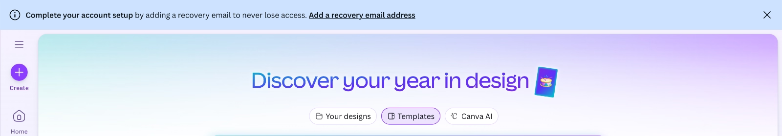
What’s actually good about this example
✅ Everything. The short and action-oriented copy. The CTA. The bold formatting. The dismiss button. The UI-supporting banner color. The icon usage.
Confluence’s website banner shares company achievement news
Confluence is a team collaboration and documentation tool developed by Atlassian. As part of the Atlassian ecosystem, Confluence not only communicates product-specific updates on its website but also shares broader Atlassian-related news and announcements.
This example falls into that category.
On Confluence’s website, a notification banner announces a recognition Atlassian has achieved.
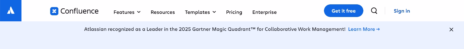
What’s actually good about this example
✅ The banner uses the same color as the background, making it almost blend in. This works well for announcements that are informative but not highly relevant to most website visitors. The message remains visible without demanding attention.
✅ The CTA reads “Learn more” and takes users to a more detailed article or news page about the recognition, keeping the banner copy lightweight.
✅ The banner is dismissible.
Perk’s website banner announces business merger news
Perk, formerly TravelPerk, is a business travel and expense management platform. They announce their business merger with Yokoy directly on the website using a bright, eye-catching notification banner.
This is the opposite approach of Confluence’s subtle announcement, and intentionally so.
A merger is highly relevant for both potential and existing customers, as it can affect product direction, pricing, and workflows. The banner makes sure the message is immediately visible and hard to miss.

What’s actually good about this example
✅ The bright banner color draws immediate attention, which makes sense given the importance of the announcement.
✅ The CTA is relatively long, so to maintain visual balance, it’s positioned on the opposite side of the banner from the copy. The message is very clear: “Read more about our new platform.”
Monarch’s website banner offers a discount code
Monarch is a personal finance and budgeting app. And as a budgeting product, they clearly understand how to use banners to encourage both product exploration and subscription.
Monarch uses a sticky banner that follows users as they scroll.
The banner is not dismissible and announces a discount code. Because the message is purely value-driven, it doesn’t feel annoying or aggressive. Instead, it works as a light, ongoing motivation while users explore the page and learn more about the app.
As visitors discover new features, the banner quietly reinforces the idea: “Oh, it does this too? And there’s a discount as well.”
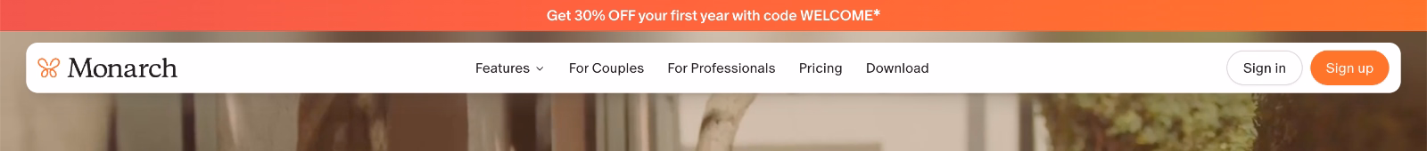
What’s actually good about this example
✅ The banner communicates a clear, immediate benefit, which justifies its persistent, non-dismissible behavior.
Clay’s website banner announces a new collaboration with ChatGPT
Clay is a go-to-market and data enrichment platform, and it now works with ChatGPT as well. They announce this collaboration through a website banner.
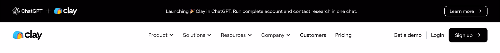
What’s actually good about this example
✅ The logos of both companies, connected with a plus icon, visually communicate the collaboration even before users read the copy.
✅ The banner copy briefly explains what the collaboration enables.
✅ A “Learn more” CTA leads users to a more detailed article.
Amplitude’s website banner shares educational resources
Amplitude is a product analytics platform, and they offer a wide range of educational resources (ebooks, templates, guides, and worksheets) to help their (potential) customers build better product experiences and get more value from the tool.
From time to time, Amplitude highlights these educational materials directly on their website using notification banners.
Like this one here:
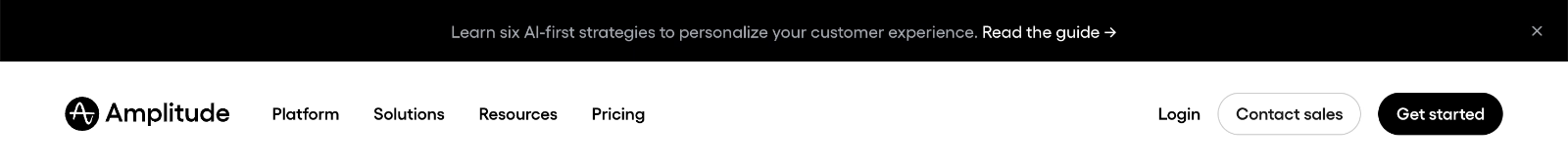
The banner directs visitors to a curated resource kit with different materials:
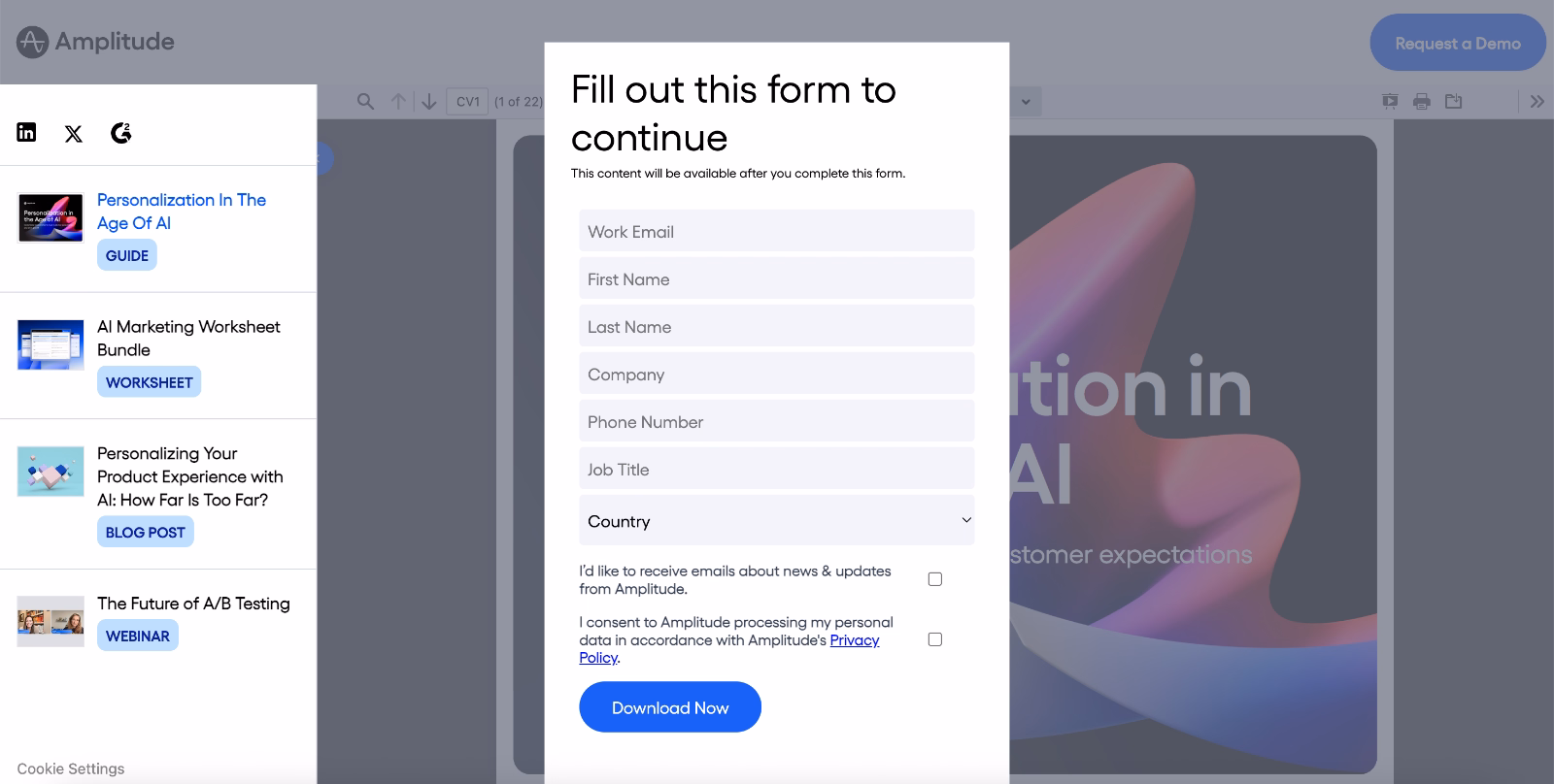
What’s actually good about this example
✅ The banner copy is intriguing and promises concrete, actionable value in customer experience personalization: “Learn 6 AI-first strategies.”
✅ The CTA is clear and sets the right expectation. Visitors know they’re clicking through to a guide or some kind of a learning resource.
✅ The CTA leads to a bundle of resources rather than a single asset. This caters to different learning preferences and experience levels, making the content useful for a broader audience.
Productboard’s website banner encourages visitors to join the beta waitlist
Productboard is a product management platform, and they use website banners for a purpose we haven’t covered yet: encouraging visitors to become beta testers for a new feature.
To increase interest and motivation, the banner highlights the potential performance and efficiency gains this feature can bring to product managers.
And they do another clever thing with their banner copy for the same reasons.
They frame the experience as something worth anticipating, rather than something users are being asked to help test. By using language like “Join the waitlist,” the banner positions beta access as an exclusive opportunity, something others are already waiting for.
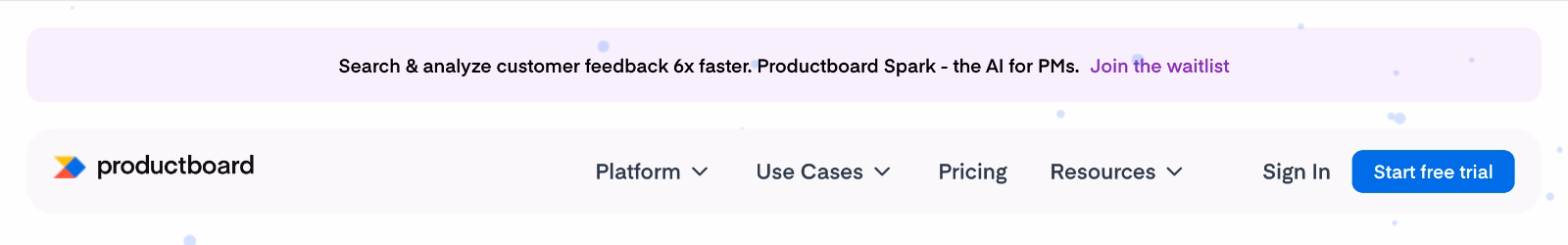
What’s actually good about this example
✅ The banner focuses on user value by emphasizing efficiency and performance benefits.
✅ Framing beta access as a waitlist builds anticipation.
How to design notification banners that users notice, not ignore
A notification banner lives in a delicate space. It needs to stand out without shouting, guide without interrupting, and persuade without pressure.
So, here’s what to pay attention to achieve the sweet balance 👇🏻
📌 Clear, concise (and engaging) copy
The first rule of banner copy is simple: get to the point fast.
Users don’t approach banners with reading intent. They scan them while doing something else, like exploring a page, completing a task, or evaluating a product.
This means your copy needs to communicate value in one quick glance.
Long explanations, vague statements, or internal product jargon almost guarantee the banner will be ignored.
But that doesn’t mean the copy has to be dry.
Good banners combine brevity with personality. A friendly tone, seasonal framing, or a benefit-forward sentence can make a banner engaging and motivate users to actually take the action you want them to take.
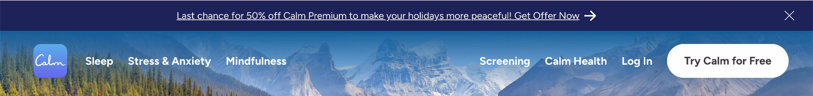
Calm’s banner, for example, combines several strategies to keep the copy engaging and concise. It creates a sense of FOMO with “last chance,” uses a CTA that emphasizes speed and immediacy, and adds a playful, seasonal tone by tying the message to peaceful holidays.
Here’s the banner we’re talking about:
📌 Strong CTA wording
If the copy explains why the banner exists, the CTA explains what happens next. Weak CTAs are one of the most common reasons banners underperform.
“Learn more” isn’t always bad, but it’s rarely the best option. Strong CTAs set clear expectations and reduce decision friction by telling users exactly what they’ll get when they click.
Are they downloading a guide? Viewing pricing? Joining a waitlist? Watching a demo?
Action-oriented, specific CTAs work better because they remove ambiguity.
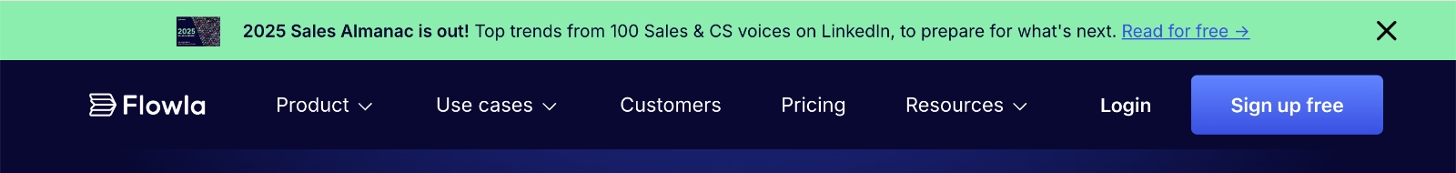
A good example comes from Flowla.
When they promote their 2025 Sales Almanac, the CTA reads “Read for free.” This makes it immediately clear that users will be taken to an ebook and that it’s available at no cost, even for people who aren’t Flowla customers.
The “for free” phrasing also adds an extra layer of motivation. It lowers the barrier to clicking and makes the value exchange feel risk-free, which naturally increases engagement.
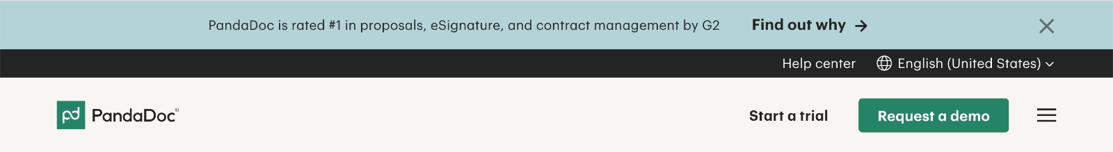
A slightly less explicit but intentionally intriguing example comes from PandaDoc.
The banner reads: “PandaDoc is rated #1 in proposals, eSignature, and contract management by G2.” The CTA simply says “Find out why.”
At first glance, the action isn’t entirely clear.
You don’t know whether the click will lead to a G2 review page, a product overview, a demo, or something else entirely. But that ambiguity is deliberate. The curiosity gap does the heavy lifting here, nudging users to click just to resolve the mystery.
So, it’s risky, but bold and fun, we should say.
📌 Visible colors that don’t disrupt the UX/UI
Visibility is non-negotiable in banner design. If users don’t see the banner, nothing else matters.
But visibility doesn’t mean visual aggression.
Effective banners use contrast strategically, often through brand-aligned colors, subtle motion, or lightweight visual cues. A slight animation, an icon, or a gentle color shift can also attract attention without pulling focus away from the main task.
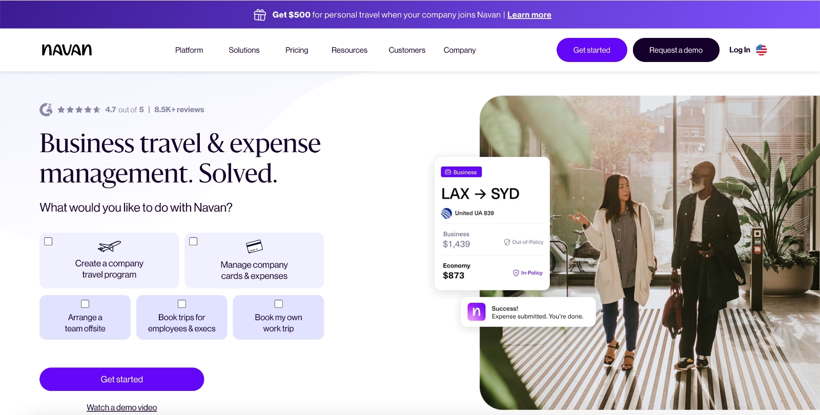
Navan’s banner, for example, uses a purple gradient slowly changing that stays true to the brand while still standing out against the mostly white interface. They also use a gift box icon that jumps slightly to communicate the message visually at a glance. Most importantly, the key phrase in the copy, “Get $5,500”, is bolded.
📌 Close/dismiss options
Not every banner is relevant to every user, and that’s okay. What matters is allowing users to opt out without friction. A visible dismiss or “remind me later” option reduces frustration and prevents banners from feeling pushy or manipulative.
That is why we’ve been drawing your attention to the dismissible banners since the beginning of the article, and list dismiss icons as best practices to adopt.
📌 Responsive (and optimized) design
Banners don’t live on desktop alone. They need to work just as well on mobile screens, tablets, and smaller viewports.
A responsive banner adapts its layout, copy length, and CTA placement to the available space. On mobile, this often means shorter copy, stacked elements, and tap-friendly buttons. Poorly optimized banners can take up too much screen real estate, overlap key UI elements, or become impossible to close.
Responsiveness becomes especially important for banners that include visual elements alongside text, such as logos, buttons, or interactive components like countdowns.
The banner UXcel uses on its website is a good example.
On desktop, it communicates a limited-time discount using both visual design and written copy, supported by a live countdown that reinforces urgency.
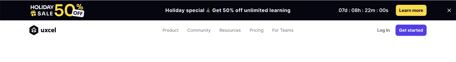
When you visit UXcel’s website on mobile, the banner changes a little bit. The text copy and the “Learn more” CTA are removed, and what remains is the visual design paired with the countdown.
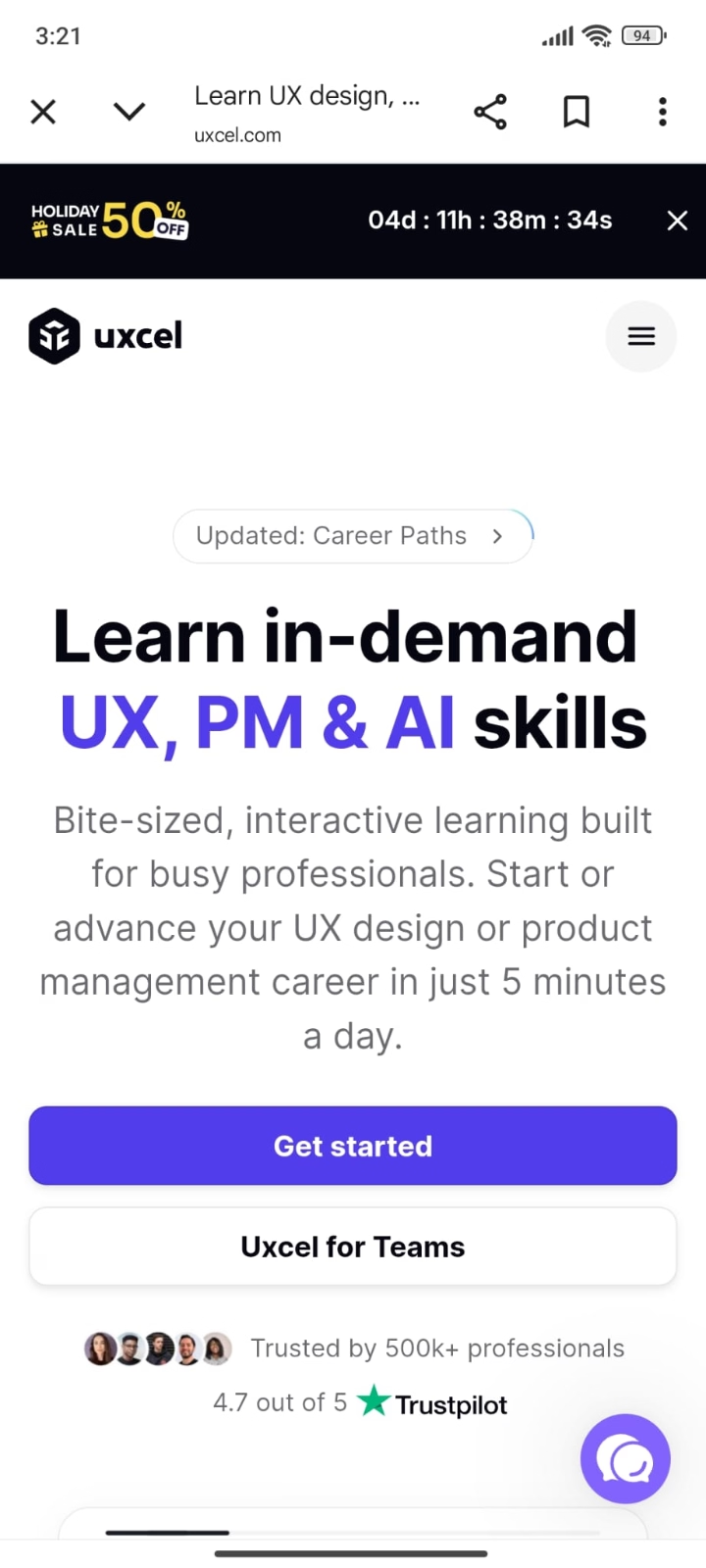
At first glance, this might feel like a “loss,” but it’s actually a strong example of thoughtful optimization and responsive design. The visual elements already communicate the core message of the banner without relying on text.
While richer copy can add motivation and clarity, that only works when you have enough space to support it.
On smaller screens, prioritization matters more than completeness. UXcel chooses to preserve the most impactful elements and adapts the banner to fit the context, rather than forcing everything into a cramped layout.
That’s exactly what good responsive banner design looks like.
You can create engaging banners with UserGuiding!
There are many ways to build notification banners. A quick search on Google will turn up plenty of videos and tutorials showing how to create banners with different design tools.
But then, you often run into the usual hurdles: needing CSS/HTML knowledge, juggling multiple tools to tweak designs, or feeling overwhelmed by the endless customization options some tools throw at you.
Some tools also have steep learning curves or require technical experience just to get started.
Here’s a better approach: use a no-code, all-in-one tool that lets you create not just banners, but many of your product experience elements and user communications.
Yes… we meant UserGuiding.
As we’ve touched on while covering UserGuiding’s banner example, UserGuiding is a no-code, all-in-one product adoption platform.
You can use it to create banners, along with many other elements.
Check out our article on what you can do with UserGuiding for an in-depth look at the app’s capabilities.
Back to banners. UserGuiding offers a variety of banner templates to help you get started quickly. There are templates for feature announcements, upgrades, events, onboarding, and more.
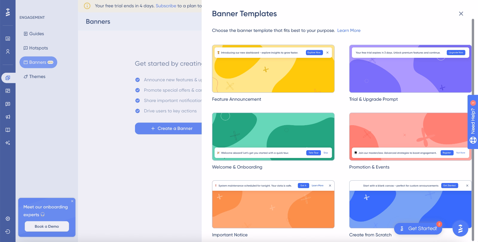
Once you start creating a banner, whether using a template or from scratch, the editor is straightforward and intuitive.
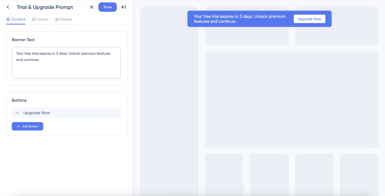
On the first screen, you manage your banner copy and CTA buttons. Simple and easy.
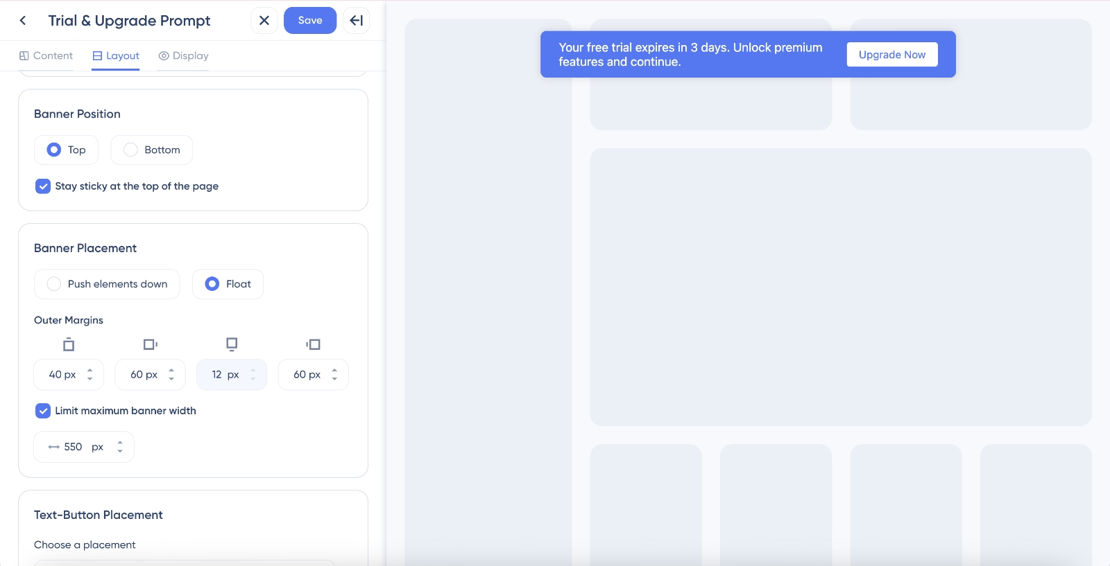
On the second screen, you can adjust layout settings, including positioning and placement. The live preview on the right side of the screen makes small adjustments easy
You can see changes in real time without going live or switching tabs.
On the third and final screen, you control display-related settings, giving you full control over how and when the banner appears.
As you can see, UserGuiding makes it possible to create engaging, professional banners in just minutes thanks to its intuitive UI and feature-rich editor.
🎁 To explore UserGuiding’s banners (and all the other capabilities it offers), start your free trial today.
Targeting & personalization strategies for banners
While some banners share information that’s relevant to everyone, like company merger announcements, ebooks, or event registrations, others work best when personalized and segmented.
For example, there’s no point showing a “connect your email” banner to users who’ve already done so.
Similarly, tools like Loom tailor banners based on individual usage, highlighting remaining free videos, credits, or days left in a trial to keep messaging timely and meaningful.
Beyond in-app behavior, banners can also be segmented more broadly.
You can personalize by language or geography, or adjust webinar banners to show event times in a visitor’s local time zone.
Mistakes to avoid when designing banners (with unsuccessful real-life examples)
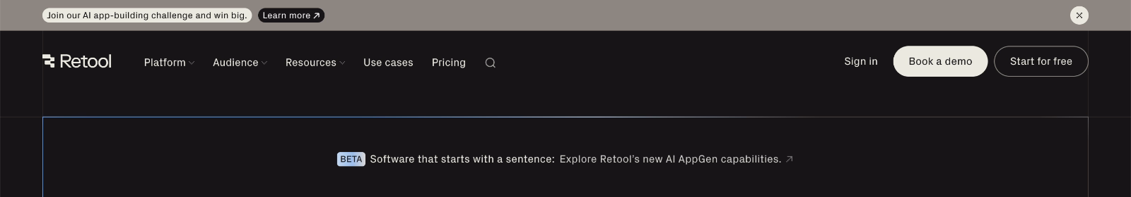
❌ Too many banners at once
One of the quickest ways to frustrate users is to overload them with multiple banners simultaneously. When visitors see more than one banner competing for attention, the messaging gets lost, and the interaction feels pushy.
Retool, for example, uses two banners at the same time.
One invites website visitors to a holiday challenge, while the other announces their new platform, which is currently in Beta.
One of the banners sits at the top of the page with strong visual contrast, immediately catching the eye. The second banner appears just below the main navigation menu and blends more with the page design, but it still draws attention thanks to the prominent Beta icon.
At least there’s some visual hierarchy between the two banners, so this isn’t the most distracting double-banner setup we’ve seen.
Still, it’s a risk we wouldn’t recommend most sites take…
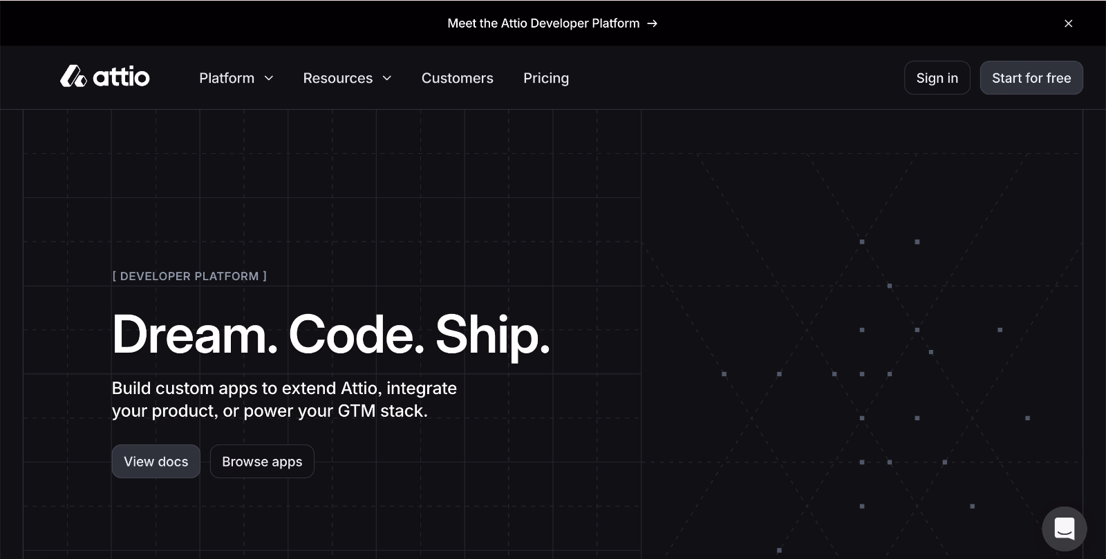
❌ Irrelevant messages / irrelevant positioning
Even a well-crafted banner can fail if it appears in the wrong context. Relevance matters as much as design.
For instance:
Attio encourages website visitors to check out its new developer platform. Displaying this banner on the CRM landing page makes sense, as it aligns with users’ interests.
But showing the same banner on the developer platform page itself?
That’s unnecessary and can feel confusing or irrelevant.
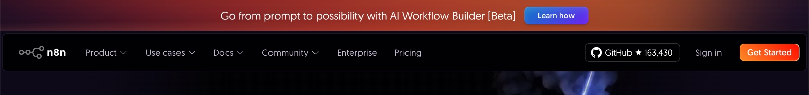
❌ Misleading CTAs
A strong banner it sets clear expectations for what happens when users click. Misleading CTAs create frustration and erode trust.
Take n8n’s beta feature promotion banner.
The CTA reads “Learn how,” which implies a tutorial, a help article, or a webinar. Instead, it redirects to a generic release notes page, without even pointing to the relevant feature note.
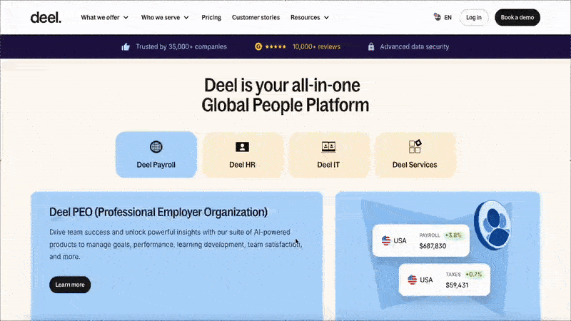
❌ Unnecessarily dismissible designs
Sticky banners are most effective when they remain visible while being relevant. If users cannot dismiss a banner, it can quickly become annoying, especially if the information isn’t critical.
For example, Deel’s banner featuring social proof, like customer numbers and G2 reviews, isn’t particularly relevant to visitors at every point of their scroll. While this information is important, it doesn’t need constant visibility.
A better approach could be to integrate it elsewhere on the site or have the banner remain fixed only at the top, instead of following the user throughout their entire scroll.
Squarespace also uses a banner that stays visible as users scroll. However, their banner delivers information that remains relevant at any moment, a discount code (that can even be copied, a nice UX touch).
Even with this stickiness, the banner is still dismissible and includes a close icon.
To Wrap Up…
Banners are great communication tools with many use cases.
Use them to promote features, announce events, recommend next-best actions, encourage beta signups, drive upsells….
The trick is to keep them concise, relevant, and timely, with copy that hooks, CTAs that guide, and designs that catch the eye without annoying your users.
Start small and experiment: try one or two banners, see how people respond, and tweak as you go.
And no need to reinvent the wheel.
You can use templates or no-code tools like UserGuiding to get started quickly.
Frequently Asked Questions
What are the best examples of website notification banners for increasing conversions?
Banners that drive conversions focus on clarity, relevance, and action. Examples include Loom’s in-app usage tracking banner, which highlights remaining free-tier videos to encourage upgrades, and Linktree’s freemium banners that promote paid plans to specific user segments. Clear CTAs, contextual placement, and subtle urgency make these banners effective.
How do you design effective notification bars for SaaS websites?
You need to carefully consider placement, color, and content. You can position banners at the top for announcements or bottom for secondary messages. You can use contrasting but brand-aligned colors, short and engaging copy, clear and action-oriented CTAs, and subtle animations or icons to draw the eye. You can also make banners dismissible or sticky, depending on the importance of the message you want to communicate through your banner.
How do high-performing website notification banners work for product updates?
Product update banners reach every visitor (new users, potential customers, and long-term clients), showing how the product evolves based on feedback. They highlight new features and improvements, communicating customer-centricity. Well-designed banners with clear copy, visible placement, and subtle visual cues increase the chances that users notice updates and activate new features, boosting engagement and adoption across the product.
How do notification bar examples work for promotions and limited-time offers?
Promotional banners highlight urgency and value without interrupting browsing. Monarch’s sticky discount banner or Uxcel’s holiday countdown banner work because they persistently remind users about an offer and visually emphasize the benefit. Strong, action-oriented CTAs and clear messaging, sometimes paired with countdowns or seasonal cues, help users understand the opportunity and act on it before it’s too late. So, banners can be used to create FOMO, as well.
How do you A/B test website notification banners for higher CTR?
A/B testing banners involves comparing variations of copy, CTA, color, placement, and timing to see what drives the most engagement. You can also measure clicks, conversions, and dismiss rates to optimize performance while keeping user experience in mind.
How do you use a website notification banner for onboarding new users?
Onboarding banners help guide new users through important setup actions and encourage engagement with key features. They can highlight unfinished tasks, recommend essential integrations, or suggest exploring core functionalities. With clear, concise copy, eye-catching placement, and supportive visual cues, these banners make it easier for users to understand the next steps.
Which notification bar examples improve user engagement and retention?
Banners that show personalized, contextual value tend to boost engagement and retention. Loom highlights users’ remaining free-tier videos, encouraging continued product use. UserGuiding promotes new feature announcements in-app to keep users aware of updates and encourages them to engage with the new feature. Productboard’s beta testing banners create anticipation, motivating users to be early adopters of the feature.
How do you personalize website notification banners by user segmentation?
You can tailor messages based on usage, account type, geography, or device. Loom, for example, adapts banners to show each user their remaining free videos.
What are some of the mobile-friendly notification bar examples in responsive sites?
Mobile-friendly banners adapt layout, copy, and CTAs for smaller screens. UXcel reduces text and keeps only the most important visual cues like countdowns, ensuring clarity without clutter.
What are the common notification banner mistakes that reduce clicks and conversions?
Too many simultaneous banners, irrelevant messages, misleading CTAs, and non-dismissible banners frustrate users and lower engagement. Retool’s double banners or n8n’s vague CTAs are good examples.

.png)


