


.svg)
.svg)
.svg)
.svg)
.svg)


.svg)


.svg)
.svg)

Ever been “in the zone” or “in a groove”?
That's the flow.
A concept coined by psychologist Mihaly Csikszentmihalyi to describe the magical state where everything just clicks. It's all about deep focus, creativity, and satisfaction.
Now, imagine your users feeling that way while navigating your product.
Sounds great, right?
Because here’s the kicker: 91% of unhappy users don’t stick around to complain —they just leave.
If your user flow doesn’t flow, they’ll go. 🚪
Now buckle up! We’ve got a journey ahead where we’ll dive into everything user flows: how to craft them, fix them, and make them as smooth as a summer breeze 🍃
TL;DR
- A user flow is a visual representation of the steps users take to complete a task or achieve a goal within a product.
- User flows are important as they:
- Improve user experience
- Help identify pain points
- Align teams on design and development
- Increase conversion rates
- Examples of user flows include:
- Log-in processes
- Onboarding processes
- Trial sign-ups
- Feedback submissions
- Help requests
- Password reset processes
- Gamification flows
- Upgrade/Upsell/ Cross-sell processes
- Best practices of user flows include:
- Keeping flows simple and intuitive
- Designing for edge cases and flexibility
- Providing clear instructions and feedback
- Testing and optimizing based on metrics
- You can create interactive and engaging in-product user flows with UserGuiding!
- UserGuiding is an all-in-one product adoption platform that empowers you with the necessary tools to improve your user experience and product engagement.
- 🎁 Start your free trial today.

What is a user flow?
A user flow is like a roadmap that shows the journey a user takes to accomplish their goal within a product, service, or system. It lays out all the steps, from how they first enter the experience to successfully achieving what they came for —whether it's booking a ticket, making a purchase, or finding information.
Think of it like finding your gate at an airport.
You start by entering the terminal, checking the flight information display, following signs through security, and walking to the right concourse and gate. Each step, from arrival to boarding your flight, needs to be clear and seamless for a stress-free experience.
A user flow does the same thing for digital journeys.
Well-designed user flows enable users to know where to go, what to do, and how to get there easily.
Before seeing an example user flow diagram, let’s first understand what makes a user flow 👇🏻
Key elements of a user flow
A user flow is essentially a visual representation of the steps a user takes to navigate a system. And it’s made up of these key elements:
1. Entry Point
Every journey begins somewhere, and the entry point is where the user steps into the experience. It could be through an ad, a search result, or a recommendation.
Let’s create an example scenario.
You get an email about a big sale at your favorite store. You click the “Shop Now” button, which takes you straight to the store’s homepage.
This is your entry point.
2. User Actions
Actions are steps the user takes to move closer to their goal, like clicking buttons, filling out forms, or scrolling through content.
User actions are also called “process” in the UX terminology.
In our scenario, these actions can be you clicking on the “Sale” section, browsing through the items, filtering by size and price, etc.
3. Decision Points
At specific moments, you face decisions that influence your path forward. These points shape your journey and can either help you progress or lead you elsewhere.
Decision points often involve "Yes/No" or "Do this/Do that" scenarios.
For example, after adding an item to your cart, you decide whether to continue shopping or proceed to checkout.
4. Possible User Paths
The path you take depends on your choices and actions. Different routes can lead to the same outcome, a new decision point, or even an end to the journey.
If you click "Continue Shopping," you are redirected to the sale section, where you encounter similar user actions and decision points. If you click "Checkout," you proceed further along the flow.
5. End Point
The final destination(s) of a user flow represent where the user either achieves their goal or exits the process. An endpoint doesn’t always signify success —for either the user or the company.
Sometimes, it simply marks the conclusion of the flow.
For example, you reach an endpoint whether you successfully complete your purchase (goal achieved, yay!) or abandon your cart and leave the website without completing the process (flow ends without success).
Here’s an example user flow diagram 👇🏻

Why is it important to keep track of user flows?
Tracking user flows empowers businesses to make their product more intuitive, maximize user satisfaction, and drive better overall results.
Here’s how:
Enhanced User Experience
When you track your user flows, you can see where users face friction or drop off. This helps you pinpoint areas that need improvement. You also gain insight into how users navigate, so you can simplify paths and make their experience smoother and more enjoyable.
So, visualizing and monitoring user flows allows you to:
✅ Identify user pain points
✅ Streamline product navigation
Improved Conversion Rates
By analyzing where users drop off in key flows like signups or checkouts, you can refine the process and boost success. You can also tailor experiences based on user behavior to guide them toward the outcomes you want.
When you check your user flows regularly, you get to:
✅ Optimize Funnels
Data-Driven Decision Making
Monitoring user flows means monitoring user behavior, and that means getting actually actionable insights about your users and how they interact with your product. This helps you prioritize features and/or updates and make better decisions.
You can also use these insights to guide A/B testing and ensure that your experiments are grounded in real user behavior.
In short, by mapping and reviewing user flows, you can get:
✅ Insights Into User Behavior
✅ A/B Testing Guidance
Higher Retention Rates
When you detect the friction points and address the problem or eliminate the struggle before it leads to churn, higher retention rates come automatically.
It’s a no-brainer!
Additionally, if you analyze how your users navigate the onboarding process, you can ensure they quickly reach those crucial "aha moments".
We can say that understanding user flows allows you to:
✅ Handle issues more proactively
✅ Improve product onboarding
Why do user flows matter in user journeys?
Although sometimes used interchangeably, user flows and user journeys are distinct concepts. However, they are closely intertwined, and a well-crafted flow is essential for creating a successful user journey.
A user flow focuses on a specific task, such as making a purchase, submitting a feedback form, creating a support ticket, or signing up for a trial –a.k.a. It provides a micro-level perspective.
Whereas a user journey encompasses the entire experience a user has with a product –a.k.a. It provides a macro-level perspective.
📌 A smooth and well-structured user flow will ensure:
- Clear navigation throughout the entire journey
- Minimal friction at each stage of the journey
- Efficient progression toward the final goal
- Consistency across all touchpoints in the journey
- Improved user satisfaction throughout the entire journey
Curious about user flows vs. user journeys and when to use each?
Let’s take you here ☝🏻
How to create effective user flows in 7 steps
A user-centric design starts with user-centric flows.
You need to understand users’ objectives, needs, and motivations, and design your flows accordingly (in a way that guides users through a sequence of interactions that lead to their desired outcomes).
Here are some steps you can follow for that 👣
1. Define Objectives
As we mentioned earlier, user flows are for specific tasks, not the entire user journey. That’s why it’s important to be specific about the purpose of your flow diagram.
Is it for user onboarding? The checkout process? Trial sign-up?
The more specific and clearer your purpose is, the cleaner and simpler your flow diagram will be. A good flow is not one giant map with arrows going up and down, left and right.
That would be unnecessarily difficult to monitor and analyze.
💡 Pro Tip: When defining your objectives, keep in mind that these objectives are not only your business goals and desired outcomes from the flow but also the user’s goals and what they want to achieve. Always include the user’s perspective in your plans.
2. Understand Your Users
We said you need to keep your users’ goals in mind while creating your user flows. After all, you create flows for them to follow and interact, right?
In order to understand their goals, you need to gather insights about their behaviors.
For that, you have several options.
You can conduct user research through interviews and surveys, or, you can also monitor user behavior through behavioral analytics tools.
3. Identify Key Entry and Exit Points
Knowing where your users come from and where they could possibly end up is crucial for creating the smoothest and most effective user flows.
Are they coming from the homepage, a targeted ad, an email link, or perhaps a social media post? Understanding these entry points helps you tailor the flow to meet users where they are.
Next, define the desired endpoint of the flow.
What marks the conclusion of their journey? Is it completing a signup, making a purchase, accessing a feature, or simply gaining the information they need?
Once you’ve nailed down the entry and exit points, mapping out the middle becomes much simpler —trust us!
4. List All Actions and Decisions
To create an effective user flow, it’s essential to break down the journey into individual steps, covering all possible actions and decisions a user might encounter.
Actions include anything the user actively does, such as clicking a button, filling out a form, or selecting an option from a menu.
These steps guide the user toward their goal and should be as intuitive as possible.
💡 Pro Tip: Never underestimate any step or skip it just because it seems small or standard. Should the user click on "Submit"? Add it to the flow. Even seemingly minor actions can reveal design flaws or friction in user intuition —details you might miss unless everything is clearly mapped out in your flowchart.
5. Organize Steps Sequentially
Arrange all the steps in a logical order, from the starting point to the final outcome. Group related steps together to maintain a clean and intuitive flow.
See how we include even the most logical, obvious steps in this guide?
Your flowcharts should follow the same principle.
However, do not overcomplicate things by dividing actions or decision points that are the same or very similar in nature. We still want a simple and clean flow.
Suppose you’re creating a flow for a user logging into an app.
If the user can either log in via email or through social media, don’t create separate decision points for "Log in with Email" and "Log in with Facebook." Instead, you can group these under one decision point, such as “Choose Login Method.”
6. Use Visual Representations
User flows are diagrams built using universal and standardized symbols to keep things simple and easy to understand. These symbols remain consistent across different UX designers, ensuring clarity and avoiding confusion.
Here are the basics:
- Ovals represent the start and endpoints.
- Rectangles represent actions or steps the user takes.
- Diamonds are used for decision points where the user must choose a path.
- Arrows indicate the flow direction, guiding the user from one step to the next.
Here are the other common symbols:

7. Incorporate Multiple Scenarios
It’s important to account for different user types, pathways, and potential outcomes in your user flow. You should include alternate flows for edge cases, such as what happens if a user forgets their password or chooses a different payment method.
Remember how we said decision points might lead to different end points?
You need to be prepared for all possible scenarios and allow the user to choose their path. A decision point that doesn't leave much room for the user to decide isn’t really much of a decision point, huh?
💡 Pro Tip: While creating your scenarios and flows, focus on the critical steps that directly impact user experience and business goals. Identify and emphasize areas where users may experience friction or complexity, as these are the points to optimize for a smoother, more efficient journey.
These are the make-or-break moments.
They can lead users to their "Aha!" moment, turning them into paying or loyal customers, or they can push users away… You need to ensure that the most important moments of the experience are as seamless as possible.
Some examples of these moments are:
- Onboarding
- Checkout
- Support request
10 user flow examples to elevate your UX design (+ real-life examples)
Examples make everything clearer and easier to understand. Plus, they’re great for sparking new ideas and inspiring new designs.
So, here are our example user flows 👇🏻
1- Log-In Process Flow
📌 Purpose:
To ensure users can securely access their accounts.
📌 Requirements:
- Should be easy, responsive, and fast
- Should be secure
- Should be consistent and intuitive
📌 Steps:
The login user flow begins when the user clicks the "Log In" button or visits the login page. They enter their credentials, and the system authenticates them.
If successful, the user is directed to their dashboard. If not, an error message or CAPTCHA prompt appears. Once authenticated, the user gains access to their account.
Optional features like "Remember Me" or multi-factor authentication may be included.
The diagram for this user flow will look like this:

Here’s what a log-in flow looks like in real life 👇🏻

The login process on Memrise starts when a user clicks on "I have an account." The user is then redirected to a decision point where they choose a sign-in method: Apple, Google, Facebook, or Email.
Each of these actions follows different paths but has the same endpoint: successful login.
On the screen, we focus on the "Sign in with Email" path. The user is prompted to enter their username or email address, as well as their password.
At this point, the user encounters another decision point.
If they click on "Sign in now" and their credentials are correct, the flow ends successfully. However, if they click on "I forgot my password," they will follow a different path until they reach the successful endpoint.
If we were to turn this into a diagram, it would look something like this:

✅ What's good in this example?
- It has easy, secure, and quick log-in options
- There are a number of alternative paths for the user to choose from
- The design and steps are pretty clear and standard
❌ What's -not really- good in this example?
- It could have a “Remember Me” option
2- User Onboarding Flow
📌 Purpose:
To help users quickly understand and get value from a product or service.
📌 Requirements:
- Should be goal-oriented and personalized
- Should be engaging and motivating
- Should be brief but value-packed
- Should be tailored to the user's technical skill level
📌Steps:
The onboarding flow begins with the sign-up/login process, followed by a personalized set-up where users can set their goals and preferences. Next, an interactive walkthrough guides them through key features.
This experience leads to the user's "Aha moment," where they fully understand the value of the product, and finally, they take their first meaningful action, such as making a purchase, completing a task, or using a core feature for the first time.
The diagram for this user flow will look like this:

Here’s what an onboarding flow looks like in real life 👇🏻

Here, the flow starts with an onboarding checklist. Or, when the user interacts with any of the guides on it, we can say.
The guide takes the user through the steps of adding a new seat to your team.
If we were to turn this into a diagram, it would look something like this:

✅ What's good in this example?
- Explanatory and to-the-point microcopy
- Original CTA usage (“I’m ready to invite my team”)
- Triggered from an onboarding checklist upon the user’s desire, not automated
❌ What's -not really- good in this example?
- The steps could wait for the user to complete the action and then continue
Like what you’ve seen?
You can create a similar onboarding flow for your own users within minutes without a single line of code!
👉🏻 Try UserGuiding out 👈🏻
3- Mobile App Onboarding Flow
📌 Purpose:
To introduce new users to an app’s features and functionality.
📌 Requirements:
- Should be responsive and mobile-friendly (obviously!!)
- Should be visually clear and clutter-free
- Should allow for easy navigation with touch interactions
- Should prioritize essential features and actions
📌 Steps:
The mobile onboarding flow begins with a welcome screen, greeting the user and setting the tone for their experience. Next, users proceed to sign-up/login, where they create an account or log in to get started.
Afterward, the app requests any necessary permissions, such as access to location or notifications. Following this, users are guided through a tutorial that introduces key features and how to navigate the app. Finally, the process culminates in the completion of the first task.
The diagram for this user flow will look like this:

Here’s what a mobile onboarding flow looks like in real life 👇🏻

Klarna offers a relatively detailed set-up process for first-time users, which is understandable given that it's a fintech product that deals with payments and transactions.
The flow begins with an animated welcome screen, followed by the log-in/sign-up process. After completing the sign-up and authentication (which is a separate flow we’ll skip for now), users are welcomed into the product’s main interface.
Klarna then guides users through a brief yet informative tour of the app.
Rather than overwhelming users with a detailed step-by-step tutorial, Klarna groups features together and provides quick, digestible explanations for only the key features and buttons.
This ensures users know where to find what they need, but they don’t get bored.
If we were to turn this into a diagram, it would look something like this:

✅ What's good in this example?
- It has a detailed and secure sign-up flow with several authentication points
- It has additional features like “Remember sign in details” and “Open email app”
- It offers localization options
- The product tour is brief and to the point
- There are engaging visuals/gifs in each tooltip
❌ What's -not really- good in this example?
- The welcome screen could be more engaging and value-packed
- The product tour is a generic one, doesn’t speak to specific use cases
4- Free Trial Sign-Up Flow
📌 Purpose:
To convert website visitors into free trial users.
📌 Requirements:
- Should ask for minimal information (only what's necessary to get started)
- Should clearly explain what users get during the trial
- Should highlight the value of the free trial
- Should be secure and protect user data
📌 Steps:
The process begins on the landing page, where users choose the plan that fits their needs. After selecting a plan, they fill out the sign-up form with their details. Once submitted, they receive an email verification to confirm their identity.
After verifying their email, users proceed to onboarding, where they are introduced to the product's key features and guided through the set-up to get started.
The diagram for this user flow will look like this:

Here’s what a trial sign-up flow looks like in real life 👇🏻

Duolingo promotes its premium plans directly within the app, emphasizing the higher success rates of premium users to inspire others to join. The free trial sign-up flow begins when the user clicks the “Start My Free 2 Weeks” CTA.
Next, the app displays its most popular plans to encourage easy sign-up and continuation after the trial period ends. Users can choose between the Family Plan, the Individual Plan, or view All Plans.
After selecting a plan, the user proceeds to the subscription/payment confirmation page. Once confirmed, the trial activates immediately, followed by a quick onboarding experience showcasing the newly unlocked premium features👇🏻

If we were to turn this into a diagram, it would look something like this:

✅ What's good in this example?
- User data-backed value promotion
- Highlighted plans for quick decision-making
- Easy exit, with no pressure to continue or close the app if you change your mind
- Onboarding for newly unlocked premium features
❌ What's -not really- good in this example?
- Nothing!
5- Help Request Flow
📌 Purpose:
To assist users in reaching out for support or assistance.
📌 Requirements:
- Should be intuitive and easy to access
- Should offer multiple support channels (e.g., form, live chat, FAQs)
- Should ensure quick confirmation of the user’s request
- Should keep the user informed about the next steps
📌 Steps:
The support flow begins when the user accesses the help section, often via a "Contact Us" button. From there, users are prompted to select an issue category to streamline their query.
Depending on their choice, they’re guided to either fill out a form or initiate a live chat session with support staff. Once the issue is submitted, the system provides immediate confirmation and assures the user that their concern has been received.
The diagram for this user flow will look like this:

Here’s what a help request flow looks like in real life 👇🏻

Quicken allows users to choose from different options for help. They can contact support, visit the help center, or look for a quick how-to guide.
When the user clicks on “Send us a message,” they are forwarded to the AI chatbot, Fin.
Here, the user is prompted to click on “Start Chat.” Once the chat is activated, the user can type in their question. Fin asks for further clarification and requests the user to choose an inquiry category related to the initial question.
The flow continues with selective questions and answers until the user either finds a solution or leaves the chat.
If we were to turn this into a diagram, it would look something like this:

✅ What's good in this example?
- It offers several paths to the user to get support
- FAQs have highlighted and easy-access guides to save time
- It informs the user about the response time and the AI support
❌ What's -not really- good in this example?
- Support channels are (though varied) fully automated and self-serve. There is no live support, or if there is, it’s not easily accessible, which might be frustrating for some users.
6- Feedback Collection Flow
📌 Purpose:
To collect user feedback to improve products, services, or experiences.
📌 Requirements:
- Should be quick to complete
- Should adapt dynamically to user responses (personalized follow-ups)
- Should allow users to stay anonymous if they want to
📌 Steps:
Feedback collection starts with a triggered request, such as a pop-up, email, or survey link. Users are presented with a feedback form containing questions like ratings, multiple-choice, or open-ended responses.
Depending on the feedback, negative responses may prompt further suggestions for improvement, while positive ones might request referrals or testimonials.
After submission, a thank-you message is displayed, and feedback is logged for backend analysis and action.
The diagram for this user flow will look like this:

Here’s what a feedback flow looks like in real life 👇🏻

Adidas triggers its feature feedback form when the user agrees to provide feedback. The form consists of only two questions: one is an emoji reaction, and the other is an optional open-ended question asking for areas of improvement.
If the user answers the open-ended question, a checkbox appears asking whether they can be contacted regarding their feedback.
The flow ends with a thank-you message.
If we were to turn this into a diagram, it would look something like this:

✅ What's good in this example?
- The feedback request doesn’t invade the screen or interrupt the user experience
- There’s a variety of questions (emoji reactions, open-ended, checkbox)
- It has a quick and simple format
❌ What's -not really- good in this example?
- The open-ended question is pretty vague and not focused enough
7- Plan Upgrade Flow
📌 Purpose:
To guide users through upgrading their subscription plan to access premium features or benefits.
📌 Requirements:
- Should be timed and targeted well
- Should be short and seamless
- Should be transparent about the offer and other relevant details
📌 Steps:
The upgrade flow starts when the user clicks an upgrade CTA (e.g., in-app notification, pricing page, or account settings). They then choose a higher-tier plan and are shown the key benefits of the selected option.
Next, the user confirms or enters payment details. After verification, a confirmation message and receipt are displayed, along with details of the upgraded plan.
The user gains immediate access to the premium features.
The diagram for this user flow will look like this:

Here’s what an upgrade flow looks like in real life 👇🏻

Otter.ai encourages users to upgrade their plan directly from the main dashboard while still showcasing upcoming and past events to highlight the tool’s value.
See how much you’re using Otter.ai? Might wanna upgrade, perhaps 👀
There's a clear value proposition with pro features and 2 CTAs.
The value proposition is clearly communicated with a focus on pro features, along with 2 CTAs for easy navigation. Upon clicking the CTA, users are presented with a detailed list of the feature upgrades and add-ons included in the pro plan, along with transparent payment details.
There are 2 subscription options for the pro plan, and users are prompted to choose between monthly or annual billing. Both options lead to a payment confirmation screen.
After that, users gain immediate access to the pro features.
If we were to turn this into a diagram, it would look something like this:

✅ What's good in this example?
- Non-invasive and non-intruding upgrade promotion
- 2-step value proposition (first a short one to catch attention, then a detailed one)
- Transparency
❌ What's -not really- good in this example?
- Nothing!
8- Upsell and Cross-Sell Flow
📌 Purpose:
To encourage users to enhance their experience by adding premium features (upsell) or by purchasing complementary products or services that align with their needs (cross-sell).
📌 Requirements:
- Should clearly communicate the value of the upsell or cross-sell
- Should be personalized and relevant
- Should be easy to accept or decline
- Should be transparent about the pricing and payment details
📌 Steps:
The upsell and cross-sell flow begins when a user’s actions trigger an offer, such as during checkout, trial usage, or feature interactions.
The offer is presented based on context: for upsells, the focus is on highlighting benefits like exclusive features or cost savings, while for cross-sells, complementary items or services are recommended with clear value (e.g., discounts or bundles).
Users then decide whether to accept the offer, adding it to their purchase, or decline and proceed with their current selection. If accepted, payment details are confirmed or collected for the upgrade or additional item.
The flow concludes with a confirmation.
The diagram for this user flow will look like this:

Here’s what an upsell flow looks like in real life 👇🏻

Sweetpass is Sweetgreen's free loyalty program.
It offers the classic perks of a loyalty program, such as rewards, birthday treats, and exclusive offers. Sweetpass+, on the other hand, provides even more benefits and additional perks, such as community membership or faster access to customer support.
It’s not a tiered plan upgrade with entirely new features or major capability increases but rather an enhancement offered as an upsell.
For this upsell, Sweetgreen highlights 2 of its most prominent value propositions to capture the user’s attention. If the user decides to upgrade to Sweetpass+, a more detailed list of value propositions is displayed.
At this point, the user is required to confirm their request to upgrade.
The plan and payment details are then presented for the user to review and agree to. Only after checking the confirmation box can the user select/enter their payment method and finalize the payment.
Once completed, the user gains immediate access to their Sweetpass+ page 👇🏻

If we were to turn this into a diagram, it would look something like this:

✅ What's good in this example?
- 2-step value proposition
- The obligatory checkbox for important information motivates the user to read
❌ What's -not really- good in this example?
- The second value proposition list could be shorter and more to the point
- There could be a short product tour for the new elements on the user interface
9- Password Reset Flow
📌 Purpose:
To enable users to reset their passwords securely.
📌 Requirements:
- Should be accessible (easy to find and complete)
- Should be secure
- Should be instructive (easy to understand and follow)
- Should end with a confirmation message
📌 Steps:
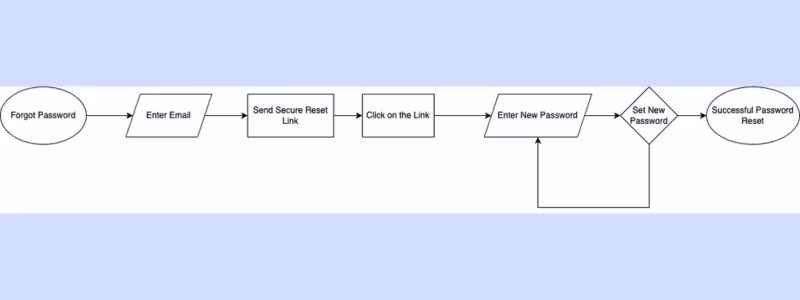
The password reset flow begins when the user clicks the "Forgot Password" link, which is typically found on the login screen. The system prompts the user to verify their identity by entering their registered email address, which triggers an email with a secure reset link.
Upon clicking the link, the user is directed to a page to set a new password.
After entering and confirming the new password, the process concludes with a confirmation message notifying the user that their password has been successfully reset.
The diagram for this user flow will look like this:

Here’s what a password reset flow looks like in real life 👇🏻

Tripadvisor’s password reset flow begins when the user clicks “Forgot Password?” on the login screen. The system then prompts the user to enter their registered email address.
Upon clicking “Send Email,” a confirmation message appears, notifying the user that an email with a reset link and instructions has been sent.
From there, the user has the option to return to the login screen or resend the email if needed. To proceed, the user clicks the reset link provided in the email, which directs them to a page where they can create a new password.
Once the new password is set, the user is redirected back to the initial login screen.
If we were to turn this into a diagram, it would look something like this:
✅ What's good in this example?
- Easy to find and follow
- Has the necessary CTAs (back to sign-in and resend email)
❌ What's -not really- good in this example?
- There could be more explanation for the users who can’t see the email in their inbox (approx. email arrival time, spam box check, etc.)
- There could be a timer/countdown for the email validity time
10- Gamification Flow
📌 Purpose:
To encourage users to engage through points, badges, or challenges.
📌 Requirements:
- Should be visually appealing and easy to understand
- Should provide clear progress tracking and feedback
- Should offer meaningful rewards or recognition
📌 Steps:
The gamification flow begins with the display of a gamified element, such as a leaderboard or challenge, to engage the user. The user interacts with the feature by completing actions or tasks, contributing to their progress.
As the user progresses, their achievements are tracked and displayed, offering a sense of advancement.
Upon reaching certain milestones, the user is rewarded.
The diagram for this user flow will look like this:

Here’s what a gamification flow looks like in real life 👇🏻

Grab lists all user challenges on one page. There, you can access the challenges you registered and are still in progress, the new challenges you haven’t registered yet, as well as the past challenges.
When you click on a new challenge, Grab shows you the roadmap of the challenge:

You see the required actions, as well as the milestone and final rewards. But here’s the catch: the rewards are limited, which creates a FOMO effect on the user and prompts them to act fast if they want the reward.
When you accept a challenge, a fun animation with confetti pops up on your screen and informs you about the deadline of the challenge.
Here’s how the continuing and past challenges look:

For ongoing challenges, there’s a progress bar for each step of the challenge, which motivates the user to continue. And the fun, motivational phrases!
For the past challenges, we can see all of the past challenges, as well as the ones we’ve completed, which is a user-friendly categorization.
The list of completed challenges might be a good motivation for some users to complete even more challenges.
Here’s how the successfully completed challenges look like:

Even though you completed the challenge in the past, when you visit it, Grab still pops a confetti for you and congratulates you for your success.
If we were to turn this into a diagram, it would look something like this:

✅ What's good in this example?
- Engaging animations 🎉
- Motivational, friendly, and fun copy
- Progress bar for each step
- Milestone rewards for longer challenges
- Countdown for limited rewards (FOMO!!)
❌ What's -not really- good in this example?
- Absolutely nothing!
Common mistakes in user flows and how to fix them
Let’s face it.
User flows can be tricky to design 🤷🏻♀️
There are some pitfalls that await you, but they’re actually easy to detect once you know them —and not that hard to bypass.
Here are the 3 most common ones.
User flow mistake #1: Overcomplicating the user flow
⚠️ Problem:
One of the most common mistakes in designing user flows is making the process too complicated. When user flows have too many steps or unnecessary interactions, it can overwhelm users.
This complexity makes it harder for users to complete their tasks or goals and, in turn, increases the chances of them abandoning the flow midway.
This mistake is especially common with onboarding and user feedback collection flows.
❓ Why it happens:
- Trying to showcase too many features at once
- Poor understanding of user goals
- Lack of prioritization in the flow design
Solution: Simplify the flow to focus on core actions
I hear you saying, “Easier said than done!!”.
But if you audit the user flow and identify unnecessary steps, conduct A/B tests, or analyze user behavior through session recordings and heatmaps, you’ll quickly spot what complicates the flow and wastes your users' time.
You can also use formatting strategies like progressive disclosure to simplify things. This helps reduce the perceived burden of a task by breaking information or steps into more manageable chunks.
💡 Pro Tip: Always aim to keep things as concise as possible.
Simply dividing a 30-step product tour into smaller chunks won’t make much of a difference…
Also, be upfront with users about the length of a walkthrough or feedback form. Tricking them into starting and then forcing them into an unknown journey doesn’t leave a great impression.
➡️ Here’s a real-life example:
Smartcat used to have a 23-step product tour that looked like this:

Now, all these steps were tooltips with short copies, some of which were only prompts to click on a button. However, it was still too long, time consuming, and intimidating.
Which, they realized quickly.
Here’s what their product tour looks like now:

Instead of one big walkthrough requiring users to go through many filler steps, moving from page to page and feature to feature, they now use different sets of modals to introduce only the relevant features on a given page.
For example, when a user creates a translation project, they are introduced to the features on the editing bar. The same applies to the jobs or workspace pages.
This new method also allows them to incorporate visuals and provide more information about the features without overwhelming or frustrating the user.
💯 for Smartcat!
User flow mistake #2: Lack of clear guidance and feedback
⚠️ Problem:
When a user flow lacks clear instructions, next steps, or feedback mechanisms, it leaves users feeling lost or uncertain about what to do next. Without guidance, they may not know how to proceed, leading to confusion and frustration.
For instance, if a form submission doesn’t provide confirmation or an error message, users might not know whether their action was successful or if they need to fix something.
Or, when you have several guides scattered across the UI for ease of use but no onboarding checklist to inform users of their existence, leaving their discovery entirely up to chance.
❓ Why it happens:
- Assumption that users know what to do
- Over-reliance on user interface intuitiveness
- Absence of in-app guidance
Solution: Provide apparent instructions and feedback at every step
To make things easier for your users, give them clear instructions and feedback at every step of the process. Add helpful touches like tooltips, checklists, or set-up wizards to guide them along the way.
➡️ Like this:

Celebrate their progress with success messages or gently alert them to errors, so they always know what’s happening and what they should do to handle the error.
➡️ Like this:

And don’t forget to make the next step super obvious —highlight those buttons and pathways so users feel confident and in control.
➡️ Like this:

HubSpot highlights the border of the button the user is supposed to click. Plus, it also verbalizes the action and writes it in bold letters.
It’s all about keeping things simple, clear, and stress-free!
User flow mistake #3: Ignoring edge cases and user context
⚠️ Problem:
User flows are often created with a perfect, "ideal" user in mind —someone who behaves predictably, uses the latest devices, and navigates the flow exactly as intended.
However, real-world users rarely fit this mold…
They may use older devices, have slower internet connections, or interact with your product in ways you didn’t anticipate.
For example, a mobile user might struggle with a flow that’s only optimized for desktop, or a user with accessibility needs might find it impossible to navigate a poorly designed interface.
Additionally, unexpected behaviors, such as skipping optional steps or attempting actions out of sequence, can break the flow entirely if edge cases aren’t accounted for.
❓ Why it happens:
- Designing for a single user persona
- Lack of real-world testing
- Failure to account for mobile vs. desktop behavior
Solution: Design for flexibility and account for user context
To avoid this pitfall, design user flows with flexibility in mind and account for varying user contexts. You can test flows across different devices, screen sizes, and environments to ensure a smooth experience for everyone.
💬 Mohammad Abbasabadi, UX Design Lead at Cambridge University Press & Assessment, says:
“In addition to the main topics, consider factors such as accessibility, device responsiveness, and scalability. Accessibility ensures that the design is inclusive and accommodates users with diverse needs. Device responsiveness guarantees a seamless experience across various devices, catering to a wide range of users. Scalability involves designing user flows that can adapt and evolve with the product, anticipating future growth and changes in user requirements. These additional considerations contribute to the overall effectiveness and longevity of user flows.”
Also, you should offer multiple paths to success, which means letting users skip steps, go back, or take alternative routes to complete their tasks.
Offering multiple paths to success includes offering enough opportunity for slow learners, as well. Some users might want to retake some of the guides or tours.
You can never know for sure, but you can be prepared.
Like HubSpot here 👇🏻

It stores all guides and tours for easy access anytime.
4 Great user flow examples to get inspired
Now that we've covered the essentials and best practices of user flows, it’s time for some inspiration ✨
1- UserGuiding’s Onboarding Flow
UserGuiding is an all-in-one product adoption platform that empowers you with features and capabilities to create interactive product experiences and more.
Here is UserGuiding’s own interactive PX:

UserGuiding welcomes you by asking about your use case. This way, you only see what interests you right away and don’t waste time or lose interest waiting for the “good” part of a generic product tour.
Here are the use cases:

And here are the capabilities:

Now, let’s see what happens when you choose a use case:
Each use case or capability triggers a personalized tour tailored to your selection.
These tours are concise, with no more than 5 steps. They guide you to the exact feature you need on the UI for your use case. You’ll learn how to get started and discover any additional capabilities the feature offers.
Since UserGuiding is an all-in-one platform with a variety of features, not all of them may be relevant to every user.
By offering goal-oriented product tours, UserGuiding ensures a more streamlined and efficient onboarding process, reducing time-to-value for users.
✅ What’s good in this example?
- A well-thought-out segmentation and personalization approach
- Concise, goal-driven tours with interactive steps
- Feature introductions and capability summaries in every tour
👉🏻 Create your own onboarding flow with UserGuiding 👈🏻
2- Duolingo’s Gamified Challenge Flow
You probably know how Duolingo works, right?
There are units that consist of several courses and exercises. You follow the order of the courses, finish the exercises, unlock the following courses, and get points along the way. If you spend a certain amount of time every day, you get streaks.
There are also badges you can collect by completing missions. They’re like milestones in a language-learning journey.
Now, sometimes, Duolingo hits you with a challenge, like this one here:

After completing a course, you can earn additional points and a shiny golden stamp on your roadmap by doing extra exercises, like translations or fill-in-the-blanks.
The amount of XP you earn from these challenges depends on your timing and correct answer ratio.
✅ What’s good in this example?
- It motivates the user to further engage with the product and spend more time
- The challenge is short, and the results are immediate
- Fun and motivating copy
- Visually appealing animations
3- Craft’s Feedback Flow
Craft is a collaborative productivity tool designed for teams to create, share, and organize content. It offers a flexible workspace that combines documents, notes, and media in one platform.
And here is its feedback submission flow:

First, users don’t have to wait for an external trigger, like a new feature, update, or free trial, to provide feedback. If you want to share your thoughts on the tool or suggest improvements, you can do so at any time by clicking “Feedback”.
The feedback form is similar to Adidas' form, which we discussed earlier in the article. It consists of 2 questions: one emoji reaction and one open-ended question.
Compared to Adidas' emoji options, Craft offers a wider selection, and you can choose more than one emoji. While the meaning of some emojis may be unclear and potentially confusing to some users, it's still a nice touch for those who want to use them.
The open-ended question is optional here as well.
There’s no “contact me about my feedback” checkbox, but once you submit your feedback, you'll receive a confirmation message and an invitation to join the Craft community.

✅ What’s good in this example?
- The feedback form is short
- There’s a wide variety of emoji reactions to choose from
- The CTA at the end invites the user to join the community
- A fun animation of flying emojis play in the background when you submit the form
4- Numo’s Mobile Onboarding Flow
Numo is a productivity tool designed to help individuals with ADHD manage their tasks and stay organized. It focuses on simplicity and clarity to reduce overwhelm.
Here’s how it onboards new mobile users:

When you create a new account with Numo, there are a couple of questions you need to (but don’t have to) answer first; these questions are about your use cases and user persona.
Numo personalizes your product experience through a quick onboarding survey.
It gets to know you, segments you, and then offers relevant content.
After the survey, Numo continues the onboarding with example screenshots from the product, explaining its main structure.

You’re still on the onboarding screen here, so you don’t actually interact with any features of the product. However, you can get a sense of the UI layout and understand what certain symbols and UI elements represent.
The onboarding then proceeds with value propositions (kind of):

And then, it asks the user to try out the main features, like creating tasks:

These final steps of the onboarding flow also count as account set-up. Numo helps users fill in the "blank slate" of their new account, making them feel familiar with the product and see a reflection of themselves when they log in.
While the entire onboarding process is skippable, these interactive set-up steps are individually optional.
This means that if a user wants to continue learning about the product without using it immediately, they can skip the interactive sections and move on to any additional informative parts of the onboarding.
✅ What’s good in this example?
- Onboarding survey to understand user needs and personalize experience
- Visuals from the product to provide more context
- Easy exit (both for the entire onboarding flow and the interactive parts)
- Guided set-up
What not to do: 2 Bad user flow examples to avoid
You can learn just as much from bad examples as you can from good ones. We’ve covered the good; now let’s dive into the not-so-great ones 👇🏻
1- Clubhouse’s Never-ending, No-exit Account Set-Up Flow
Clubhouse is a social audio app where users can join virtual rooms to participate in live conversations, panels, or discussions on various topics.
And here’s what its account set-up flow looks like:

Hm? You cannot understand what is happening on the screens?
That’s because the flow goes on and on and on…
Let me summarize it to you real quick:
- 1 welcome screen and 3 value proposition screens
- 2 phone number screens (1 for verification)
- 2 name screens (1 for real name and 1 for username)
- 1 age screen
- 1 photo screen (only skippable screen in the entire flow)
- 2 contacts screens (1 for access)
- 4 mic screens (activations, prompts, success messages…)
- 1 invitation screen
If you complete the phone number verification on your first try, choose an available username, skip the photo-adding step, and leave the mic prompt unchanged, the set-up takes 14 screens to complete.
And that’s the ideal scenario…
Something that probably won’t happen very often.
If we were to:
- remove the age, photo, and mic test steps from the set-up process,
- incorporate them into the in-app onboarding flow,
- combine the name screens and
- condense the value propositions into one screen with sliding modals,
we could reduce the set-up to just 5 screens, including the welcome screen.
This streamlined process would even fit into a single screenshot!
❌ What's -not really- good in this example?
- Too many steps for a set-up flow
- Almost none of the steps are skippable
2- Cosmos’s Unnecessarily Divided Sign-Up Flow
Cosmos is a creativity-focused platform designed to help users discover, collect, and organize inspiration across various media types, including articles, products, photos, quotes, videos, links, notes, and text.
Now, because Cosmos is a unique platform that has a whole manifesto about the internet causing mindless consumption and numbness and the need for a change, a sanctuary for creative minds, it’s perfectly fine that they want to try new UX designs and flows and set themselves apart from other creativity platforms, like Pinterest, let’s say.
Here’s how they (try to) do it:

The signup process isn’t actually long, but it feels that way because logically connected steps are spread across multiple screens.
For instance, we typically see email and password grouped together —and if not, at least the first and last name should share the same screen. Separating them seems unnecessary, aside from aesthetic preferences.
But does this bold challenge to UX design principles pay off?
Well…
Maybe they’re testing potential users to filter out those who might lose interest and drop off.
Maybe it’s part of their manifesto, reflecting their goal to slow down the fast-paced internet interactions we’re used to.
Maybe…

❌ What's -not really- good in this example?
- Dividing logically connected signup steps across screens makes the process feel longer than it is.
6 tools for creating and prototyping user flows
Creating and prototyping user flows has never been easier, thanks to the wide range of tools available. Gone are the days when pen and paper were your only go-to options (though they’re still great for quick sketches!).
These tools do so much more —they help you map out user flows, simulate interactions, and even test them in real-time.
Ready to level up your design game?
Here are some of the best tools for creating and prototyping user flows:
Design and Prototyping Tools
These tools are versatile and commonly used by UX designers for user flow creation and interactive prototyping.
Figma
Figma is a robust collaborative design and prototyping tool that simplifies the creation of user flow diagrams. It offers a range of plugins for efficient flow design and allows seamless integration of user flows into high-fidelity prototypes, making it ideal for teams working on both design and interaction.
Plus, Figma offers a lot of user flow templates for different purposes.
Here’s an example user flow template created with Figma:

Adobe XD
Adobe XD is an advanced design and prototyping tool that provides powerful features for creating interactive user flows. It allows designers to craft detailed, interactive prototypes with support for animations, transitions, and micro-interactions.
With seamless integration across Adobe’s Creative Cloud, XD offers an efficient workflow. It offers collaborative features and real-time editing capabilities, as well.
Here’s an example interactive prototype created with Adobe XD:

Flow Diagram and Mapping Tools
These tools focus on creating diagrams, wireframes, and user flows.
Lucidchart
Lucidchart is a versatile diagramming tool widely used for creating user flows, wireframes, and system maps. Its user-friendly interface and drag-and-drop functionality make it easy to design complex processes and visualize workflows.
As a web-based platform, Lucidchart enables seamless real-time collaboration. It also integrates with popular tools like Google Workspace, Microsoft Office, and Slack.
Here’s an example user flow created with Lucidchart:

Miro
Miro is a dynamic digital whiteboard tool ideal for brainstorming, mapping out user flows, and collaborating on design ideas. It offers a wide range of templates and intuitive tools that make it easy to visualize user journeys and processes.
Miro has real-time collaboration features as well as integrates with numerous tools.
Here’s an example user flow created with Miro:

User Flow Tools
These tools are purpose-built for user flow creation.
Overflow
Overflow is a tool specifically designed for creating user flow diagrams with a focus on visual storytelling. It allows UX designers to easily map out complex user journeys and flows in a clean, intuitive interface.
Overflow seamlessly integrates with design tools like Figma, Sketch, and Adobe XD, enabling a smooth transition from wireframes to user flow presentations.
Here’s an example user flow created with Overflow:

FlowMapp
FlowMapp combines user flow creation with sitemap and UX planning in one platform, which makes it perfect for web and app projects. It provides an intuitive environment for mapping user journeys, outlining user paths, and creating detailed sitemaps.
FlowMapp’s focus on UX strategy helps designers plan both the structure and experience of digital products.
Here’s an example user flow created with FlowMapp:

Measuring the impact of user flows
Measuring the impact of user flows is key to understanding how well they’re working and where there’s room for improvement. By digging into specific metrics, UX designers can uncover valuable insights.
This way, it is possible to fine-tune the flow and create smoother, more enjoyable experiences for users.
Here are some of those metrics:
- Conversion Rates
- Bounce Rates
- Task Completion Rates
- Time on Task
- User Satisfaction
To Wrap Up…
Mastering user flows is the secret sauce for creating experiences that users love.
When you understand their journey and design flows that feel effortless, you’re not just meeting their goals —you’re exceeding them.
Test, tweak, and collaborate along the way 🚀🚀
Frequently Asked Questions
What is the difference between flowchart and user flow?
A flowchart is a visual representation of a process or system, often focusing on technical steps. A user flow, however, focuses specifically on the actions a user takes to achieve a goal or complete a task within your product. It's more user-centric and tied to the overall experience.
How to do a good user flow?
You need to start by understanding your users’ goals and pain points. You can map out the flow using tools like Miro, Figma, Adobe XD, or Flowmapp to visualize the journey. You should also keep your flows simple and intuitive and avoid unnecessary steps. Finally, you should test with real users, refine as needed, and always consider edge cases. Make sure to avoid common mistakes like overcomplicating, lengthening the flow, or not providing alternative paths for different user needs.
What is the difference between user journey and user flow?
A user journey covers the broader experience a user has with your product, including emotions and touchpoints. A user flow is more focused, mapping out the specific steps a user takes to complete a single task, like signing up or making a purchase.

.png)


