


.svg)
.svg)
.svg)
.svg)
.svg)


.svg)


.svg)
.svg)

Marketplaces are everywhere.
When people hear the word, the first names that usually come to mind are big ecommerce giants like Amazon or Etsy. And yes, those are great examples, but they are not the whole picture.
A two-sided marketplace does not have to be about shopping, per se.
It can sit inside education, healthcare, logistics, or even art.
As long as there are at least two distinct audiences using the same platform (one offering something and the other receiving it), you are looking at a marketplace.
But what makes a platform a “marketplace” (the fact that it serves two or more distinct groups) is also what might be keeping its activation rates low and its success far from assured.
The simple truth is that most marketplaces struggle to turn new sign-ups into active users or paying customers.
⚡ Research shows that up to 75% of users abandon a product in the first week if onboarding is confusing.
In a marketplace, that drop-off is even more damaging, because adoption only works when both sides of the user base activate at the same pace.
- If sellers never list products, buyers never purchase.
- If teachers do not set up classes, students have nothing to join.
The chain reaction is immediate, and activation rates (then adoption rates) suffer across both sides.
As Christos Kritikos says, activation is where the business is built.
📌 In this article, we break down…
- Why user activation is such a challenge in two-sided marketplace platforms,
- What you can do to overcome these activation barriers,
- What you can learn from real-world examples.
TL;DR
- There are several reasons why user activation is an issue with many two-sided marketplaces. The most common ones can be summarized as follows:
- Smaller, more niche marketplaces cannot manage expectations and communicate their value proposition and place in the industry to their potential users, which results in high and irrelevant user expectations.
- They cannot drive adoption equally on both sides of the user base; some struggle to bring service providers, and others struggle to bring service seekers, which is also sometimes caused by not clearly communicating value to potential users, actually.
- In-app experiences feel complex and confusing due to feature overload and the crowded nature of marketplace UIs.
- In addition to the complexity, many users also suffer from lack of personalization in the communication and guidance they get within marketplaces.
- Onboarding solves these challenges by…
- Defining and shortening the path to value realization after sign-up.
- Personalizing guidance and support offered to different user personas.
- Clarifying user confusion and offering reassurance through explanations and additional information at key points, like information forms.
- Decreasing learning curves and eliminating friction points.
- Onboarding also increases feature engagement and adoption through contextual and helpful nudges, which is an important prerequisite for decreasing churn, as users who adopt 4 features are 70% less likely to churn.
- The good news is that you don’t need to go to your dev team and wait for months to create amazing onboarding materials for your marketplace users!
- You can adopt a no-code onboarding solution like UserGuiding to overcome these activation challenges and get amazing results.
- Start your free trial today and see how easy it is to create, test, and optimize onboarding flows with UserGuiding.

Challenges: Why do marketplaces struggle with activation?
Challenge #1: User expectations are at an all-time high.
When someone signs up for a new marketplace, they do not evaluate it in isolation.
They immediately measure the experience against the platforms they already know, such as Amazon, Airbnb, or Uber.
That means the bar is not set by your closest competitor in the niche but by the global leaders in user experience.
👉🏻 When a user enrolls in a new grocery delivery marketplace, they instinctively compare it to Uber Eats:
- Why does this home screen feel so crowded? On Uber Eats, I can see the main categories right away.
- How do I save my address so I don’t need to retype it every single time?
- Where is the checkout button? Where do I track my delivery? Where do I see my past orders?
- Where… How… Why…
For example, one online shop owner shares their frustrating experience with Whatnot, a live shopping marketplace, by comparing it to other marketplaces like Etsy or Shopify:
Got approved, did onboarding, but might never go live.
Selling on Whatnot requires WAY more time and effort than it ever should have, and I’ll probably never use it, even though I’ve been approved.
I already have products listed on Etsy and Shopify; I don’t need a third online store to keep track of. I just needed a simple Livesale service that doesn’t boot me off every time a good song comes on the radio, not a whole new store to manage.”
This doesn’t mean you don’t stand a chance against industry giants, or that you need to copy their exact in-app experience.
What it does mean is that users arrive with expectations shaped elsewhere, and your onboarding is the first (and sometimes only) chance to close that gap.
If users are shown where to track their delivery, how to access past orders, how to save addresses, or how the checkout flow works, they never need to wonder.
Without this guidance, every unanswered “where…?” becomes a reason to churn.
But we’ll talk about how to overcome these challenges in detail later on, so let’s stay focused on the challenges at this point, first.
Challenge #2: Activation (and also adoption) needs to be two-sided.
In most SaaS products, activation is fairly straightforward: one person signs up, gets value, and sticks around.
Marketplaces don’t have that luxury.
As we’ve slightly touched upon in the beginning of the article, too, value only emerges when at least two groups (sellers and buyers, teachers and students, hosts and guests, etc.) activate at the same time.
If one side doesn’t, the other side instantly feels the gap.
👉🏻 Imagine a new seller joining a marketplace like Amazon:
- I’ve listed my first product, but where are the buyers?
- Why hasn’t anyone visited my shop yet? Did I miss a step?
Now flip to the buyer’s side:
- Why does this marketplace feel empty? Why are half the categories blank?
- Am I wasting my time here? Should I just go back to Amazon?
Neither side is wrong.
Their frustration comes from the same core issue: activation is interdependent.
A seller’s success depends on buyers arriving, and a buyer’s success depends on sellers already being active. Without careful orchestration, both sides churn in parallel.
One marketplace founder on Reddit illustrated this challenge perfectly:
I've been developing a platform that connects homeowners with local home improvement professionals (to put it in simple terms.) While running Google Ads campaigns generates good engagement from homeowners (demand side), my organic search traffic is nearly nonexistent, probably because of the SEO issues that I'm currently fixing.
The problem is that this paid acquisition strategy isn't sustainable yet, since I don't have enough professionals (supply side) on the platform. I'm charging professionals for leads, but without sufficient demand, it's hard to demonstrate value to professionals and convince them to join the platform.”
Onboarding plays a critical role here, too.
✅ It can set expectations by letting supply-side users know, for example, that it may take some time for their first buyer to arrive while providing actionable steps they can take in the meantime.
✅ It can simulate interactions, such as a mock homeowner inquiry, so professionals experience the platform’s value even before real users arrive.
✅ It can provide guidance on how to attract buyers on the platform, like tips for promoting listings or optimizing profiles to appear in searches.
Challenge #3: Marketplaces often overwhelm users with too many or confusing features.
It’s true that single-user SaaS platforms don’t always have the clearest or simplest activation points. They can be complex and confusing, too.
But in marketplaces, this problem tends to be magnified.
➡️ In a healthcare marketplace, for example, doctors might need to set up schedules, manage patient lists, and upload credentials, while patients are expected to fill out profiles, submit insurance details, and book appointments so that they can meet with each other and truly get the value out of the platform.
➡️ Or, in an education marketplace, teachers may have to create courses, upload materials, and schedule classes, while students need to register, select courses, and navigate learning resources.
➡️ Even logistics platforms can overwhelm users with task assignments, shipment tracking, and delivery confirmations.
There are several steps both sides of the user base must complete in order to meet in the middle and complete a successful transaction.
This initial complexity often sparks a familiar set of questions from all users:
- Where do I even start?
- Do I need to complete all of these steps before I can do anything useful?
- What does this feature do? Is it mandatory?
Without thoughtful onboarding, these questions multiply, creating friction that leads to churn before users can experience value.
Not to start a war with Whatnot 👀, but according to many of their sellers’ posts on Reddit, their 1:1 onboarding meetings don’t really help new sellers set up their accounts successfully or offer any useful tips to tackle the marketplace’s initial learning curve.
This leaves new sellers confused and unsupported, if not causes them to churn…
They [Whatnot] don’t help you with anything. And it [onboarding meeting] is supposed to be 45 minutes long, but they will cut it to 25 minutes. They briefly explain policy and FAQ. That's it. They don't tell you how to nail your first sale on your first stream, nor do they help with navigating through the app or creating shows. If you don't have any seller experience, well, then you're in for a treat. The app is a waste of time.”
Challenge #4: User experiences lack personalization and relevance.
One of the biggest barriers to activation in marketplaces (or in any app in the last decade or so, really) is that experiences often feel generic. Users expect the platform to understand them, their role, their goals, and their context.
Personalization tends to be lacking in several key areas:
- Account setup and onboarding often don’t match the user’s role or skill level.
- Recommended actions (or content) are usually generic and not relevant.
- Alerts, notifications, and in-app messaging are broad and untargeted.
⚡ McKinsey’s research found that companies that excel at personalization generate 40% more revenue from those activities than average players.
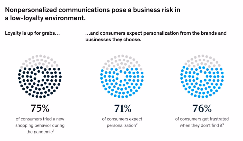
According to the same research, here’s what people mean when they say they “expect personalization”:

- 75% of customers expect you to simplify their navigation and experience.
- 66% expect you to tailor your messaging based on their needs.
- 59% expect you to send timely and contextual communications after key interactions and moments in their customer journey.
- And 51% expect you to offer personalized onboarding for their first session.
⚠️ In marketplaces, when these expectations are not met and a generic, one-size-fits-all in-app experience is offered to both ends of the user base, the lack of personalization becomes even more frustrating.
When you don’t provide tailored onboarding materials for different segments, when you don’t highlight the right interactions and activation points with checklists, when you don’t communicate your value proposition in a way that speaks to each segment’s needs, when you don’t encourage engagement with the features that matter most to that user persona, or when your in-app messages do not resonate with user needs/ goals…
You end up presenting an image that is not very user-centric, not very user-oriented.
And you wouldn’t want that, we assume.
Why does user onboarding matter for marketplaces?
We’ve talked about the barriers that make activation harder in marketplaces. Now it’s time to flip the perspective and look at why onboarding is the single most important lever to overcome those barriers.
Well, even if not “ the single most important”, one of the most crucial ones, let’s say.
Anyway.
Here’s what makes onboarding important, especially for two-sided marketplaces 👇🏻
Onboarding is the bridge between sign-up and first success.
In a marketplace, the distance between sign-up and “aha!” is longer than in most SaaS products.
A project management tool can keep someone engaged after they’ve created their first Kanban. A photo editor can delight someone as soon as they apply their first filter.
But in marketplaces, value creation is more complicated.
A buyer needs to find a seller. A student needs to connect with a teacher. A patient needs to meet a doctor. A renter needs to settle with a property owner. A job-seeker needs to interview with an HR specialist.
Without onboarding that guides both sides into activation, the two groups never meet.
And the road to activation has a lot of potential friction points.
Many two-sided marketplaces have…
- Feature bloat at the start, where both sides are presented with the full product interface immediately, making it unclear what the actual “first step” should be.
- Multi-step account setups where sellers, providers, or professionals must upload product details, certifications, schedules, or service areas.
- Know your customer (KYC) procedures that require ID verification, financial documents, or even background checks, which can feel complex and intimidating if not explained well.
- Payment setup requirements that involve linking bank accounts, adding payout details, or configuring tax information, which is often a barrier for new or less tech-savvy users.
Users, whether service providers or seekers, need to successfully complete several of these steps in order to have a chance at their value realization moment.
Onboarding lays out clear steps so users can complete key tasks and set things up correctly from the start.
Personalized guidance reduces drop-offs and support tickets.
One of the biggest reasons users churn in marketplaces is because they can’t figure out how to get value out of a new product.
Generic instructions like “upload a product” or “complete your profile” leave too much room for confusion. That confusion quickly turns into frustration, and frustration turns into drop-off.
Personalized, goal-oriented onboarding changes the story.
In a marketplace like Uber Eats, for example…
👉🏻 A seller sees step-by-step instructions on how to add their first product, connect payouts, and preview their store.
👉🏻 A buyer is guided through setting up an address, browsing menus, and placing a first order.
👉🏻 A courier is shown how to upload licenses, set availability, and accept their first delivery.
Onboarding highlights what to do and explains how to do it.
And when the process is explained in context, users don’t get stuck, and they don’t have to open a support ticket to ask basic questions.
Instead of your support team answering the same “Where do I track my order?” or “How do I get paid?” 50 times a day, the product itself handles those questions through clear onboarding.
⚡ According to Salesforce’s 2025 survey with customer service and support specialists, 77% of reps report increased and more complex workloads compared to just one year ago.
In the same survey, 81% of this overworked service workforce believes that AI agents and automation can help them work more efficiently.
These workers also estimate that they waste more than 7 hours per week on inefficient, unproductive, or low-value tasks, which could have been spent on more complex and high-value issues.

💡 Pro Tip: Just as onboarding is a great way to reduce repetitive support tickets, those tickets, especially the recurring ones, are also a great source of insight for creating better automated in-app guidance.
Your support tickets are literally a goldmine for this transition [transition from high-touch onboarding to digital onboarding]. Every repetitive question is screaming, "proactively solve this." We were sitting on hundreds of tickets asking the same 5 question, but never connected the dots...”
It builds trust early.
Consider the two sides of a marketplace again:
- Buyers want to know their payments are safe, that sellers are verified, and that there’s a way to resolve disputes, while sellers want to know they’ll actually get paid, that buyers are real, and that their time won’t be wasted.
- Teachers want confidence that the platform is secure and that their content won’t be misused, while students or parents want reassurance that lessons are high-quality and privacy is protected.
- Patients want to know doctors are vetted, while doctors want to know patient data is handled securely.
- Hosts on short-term rental platforms want to know guests are trustworthy, and guests want the property and amenities accurately represented.
Strong onboarding takes those doubts head-on and offers trust signals.
✅ It shows what to expect after completing a key interaction.
✅ It explains how payments are protected and when payouts happen.
✅ It highlights trust mechanisms, like reviews or verifications, so users know others have been through the process safely.
✅ It ensures important processes, like verification and identification, are handled correctly and the required forms are filled in the right way.
💡 Pro Tip: Eliminating certain types of friction, such as identification processes, can actually create trust issues instead of removing them.
For example, if a marketplace allows someone to create a practitioner account as a doctor and immediately access the service seekers’ side, users may question the credibility and reliability of the platform.
Verification and identification flows, therefore, are essential for ensuring trust and maintaining quality.
Like Mayara Almeida says:
However, you need to offer guidance throughout these processes so that users understand why this step is important, what will happen if they do not complete it, and how they can complete the required action.
When users are reassured with information and support, they are more likely to:
- Actually do the things you ask them to do, like uploading documents.
- Trust your business and be a part of your word-of-mouth marketing efforts.
Best practices for marketplace user onboarding
- Utilize user segmentation to personalize onboarding flows.
As we’ve been stressing from the beginning of the articles, in marketplaces, we have at least 2 distinct users with different goals, expectations, and workflows.
You differentiate them with their signup flows and screens, offer different features to them, and even different UIs.
So, it’s only logical that they have distinct onboarding flows, as well.
That means you need separate checklists, separate guides, and separate tooltips for your service providers and service seekers.
But in addition to personalizing onboarding and in-app communication for service providers and seekers, depending on your marketplace type, you might also need to create user segments within your service provider/seekers.
👉🏻 For example, in an education marketplace like Udemy, Coursera, or Skillshare, you can have these user segments among your service providers:
- A first-time instructor with no prior experience with online teaching
- A professional instructor who has utilized similar educational platforms
- An instructor who’ll give 1–2 lessons as a side-hustle
- An instructor who plans to teach full-time and make a living on the platform
- A content creator or influencer who already has an audience
- A licensed professional, subject-matter consultant, or university professor
- A hobbyist or enthusiast teaching a passion subject on the side (e.g., photography, music, gardening, sewing)
While all of these service providers may need guidance through the setup process and course creation, the level of support and features you introduce should vary.
For example, more advanced capabilities such as creating course bundles might be highly relevant to experienced instructors or those planning to publish multiple courses.
But for a hobbyist instructor who only intends to launch a single course on a specific topic, introducing bundles right away could feel irrelevant, or even overwhelming.
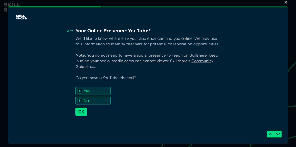
💡 Pro Tip: You can use onboarding surveys to segment your new users.
Both Skillshare and Udemy, for example, ask new instructors about their familiarity with educational marketplace platforms, their expertise in a given subject, and how much time they plan to dedicate to teaching or how many courses they intend to offer.

Skillshare also asks whether the instructor has a social media presence or an existing audience to bring to the platform, since they offer special collaboration opportunities for these creators and introduce different features specific to such partnership programs.
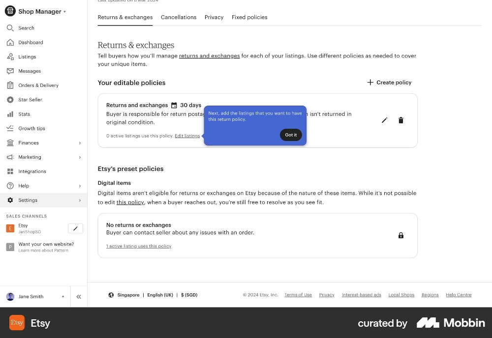
- Create interactive walkthroughs to decrease the learning curve.
Interactive walkthroughs are step-by-step guides that lead users through key actions within a product. They appear directly on the interface, highlighting buttons, text fields, menus, and other UI elements as users navigate the platform.
Because they appear in context, users don’t need to leave the app or consult a separate guide; everything is explained exactly where and when it’s needed.
This makes complex workflows more accessible and easier to complete.
Etsy, for example, uses tooltips to walk new sellers through the steps of creating return policies for their listings:
- Structure the process with checklists and milestones.
Effective activation requires onboarding, because the path to value realization can feel complicated; users might get lost, frustrated, and turn back before experiencing the platform’s benefits.
But onboarding itself can also feel confusing if it isn’t structured.
Random tooltips and scattered in-app tutorials don’t really guide users…
Checklists and milestones solve this problem by giving users a clear roadmap. They break onboarding into manageable steps, show progress, and make it obvious what comes next.
For example, in a property rental marketplace like Airbnb…
- A property owner’s checklist might include: Add property details → Set pricing and availability → Publish listing → Activate payment method
- A renter’s checklist could include: Verify your account → Search and filter properties → Save favorite properties → Send first booking request
You can then trigger interactive walkthroughs for each of these checklist items.
Here’s an example onboarding checklist from Shopify:

💡 Pro Tip: Checklists also keep users on track, ensure detours don’t happen, and provide a straight-line onboarding.
- Ensure contextuality with tooltips and hotspots.
One of the biggest mistakes in onboarding is overwhelming users with all the information upfront. Marketplaces are especially prone to this since they offer so many features.
Contextual tooltips and hotspots solve this by showing guidance in the moment, in the right place, exactly when a feature becomes relevant.
For example, Uber’s Advantage Mode rewards highly-rated drivers with bonuses and better earning opportunities, but it’s not something a new driver needs to know on their very first app session.
Instead of explaining this feature immediately on the home page; a tooltip or a hotspot can introduce it later, when a user visits their driving insights dashboard.
And when the driver has completed enough trips and earned a rating.
💡 Pro Tip: You can use tooltips and hotspots to announce new features or encourage users to interact with key buttons and UI elements, as well. Don’t think of them only as late-stage guidance for advanced or hidden features, these tools can highlight your main CTAs and essential actions.
For example, YouTube Studio, the creator editing hub, uses tooltips directly on the home page to guide creators toward engaging with the video upload button.

A tooltip like this also helps reduce cognitive load by explaining what each button on the UI does, without requiring users to click around, experiment, or guess based on prior experience with similar tools. 🧠
For non-technical users in particular, randomly exploring features can feel intimidating, as the fear of “breaking something” may prevent them from engaging with unfamiliar buttons or functions.
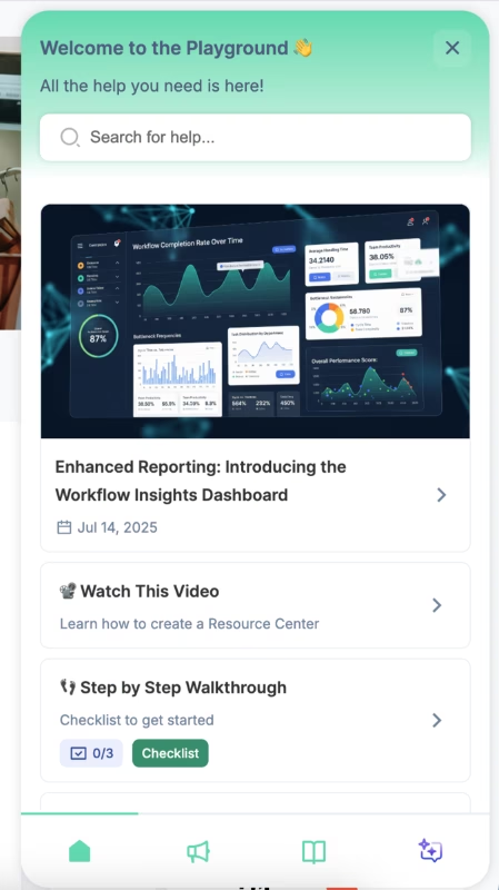
- Centralize help materials with resource centers.
Even with the best onboarding flows, users will still have questions.
Instead of sending them to an external FAQ page or forcing them to contact support, you can create a self-serve resource center that’s directly accessible inside your app.
This could include FAQs, video tutorials, case studies, or troubleshooting guides…
You can also house your in-app onboarding content here, such as step-by-step guides/walkthroughs and checklists.
This approach gives users flexibility.
They can dismiss guides when the timing isn’t right without fearing they’ll miss critical information, or revisit a guide later to refresh their memory if they forget a step.
Here’s an example in-app resource center:
Marketplace onboarding is easier with UserGuiding!
Now, guides, checklists, resource centers, segmentation… it might all sound like too much dev time, or too much money spent on multiple tools.
But the truth is, you don’t need a dozen platforms to pull this off.
You only need one: UserGuiding!
UserGuiding is a no-code, all-in-one product adoption platform that gives you everything you need to create seamless onboarding and engaging in-app experiences for your marketplace users without touching a single line of code.
🚀 With UserGuiding, you can build:
- Interactive guides and walkthroughs that show users what to do, step by step
- Onboarding checklists that motivate completion and track progress
- Tooltips, hotspots, and pop-up modals that ensure contextual communication
- In-app resource centers where users can find all your help content
- In-app surveys to gather feedback and segment users dynamically
- AI assistants to provide personalized, real-time support 24/7
- Standalone knowledge bases and product update pages for ongoing learning and engagement opportunities
UserGuiding has a very intuitive and user-friendly interface with little to no learning curve. Even capabilities that tend to be complex with SaaS tools, like analytics and personalization, are easy to set up.
For example, here’s how UserGuiding’s segmentation feature looks:

All you need to do to create a user segment is to choose your segment criteria from dropdown menus and add and/or rules as you go.
You can create user segments based on user/customer attributes (like subscription plans, user names, company names, etc.) you share with UserGuiding, browser attributes (like language), and other onboarding material engagement, as well as button click actions on materials.
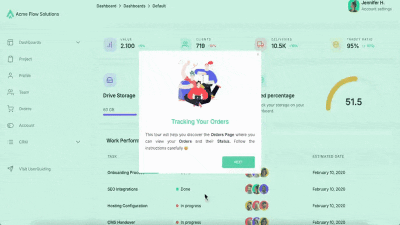
For your service providers, for example, if you have performance dashboards or seller’s dashboards on your platform, you can trigger a product tour that looks like this:
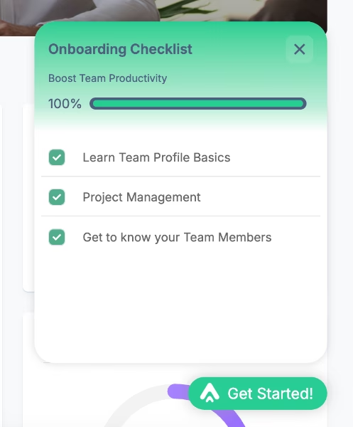
Or, you can create interactive walkthroughs and organize them into onboarding checklists so that your users understand the whole process and what they should do to experience your product's full potential.
Like this checklist here:
And you can build hotspots that look like this 👇🏻 to draw attention to new or underused features and even trigger guides from them or embed videos within to contextualize the features even more and offer guidance.

Liked what you’ve seen so far?
🎁 Start your free trial and experiment with UserGuiding’s capabilities yourself!
Examples of user onboarding in two-sided marketplaces
#1 Kariyer.net’s segmented onboarding guides for managers
Kariyer.net is Turkey’s largest employment marketplace that connects job seekers with employers.
As is any marketplace, these user personas have different workflows on the platform.
However, even on the employer side of the user base, there are different user segments, like admins and managers.
In order to increase the usability of the platform and ensure each user is getting value without getting lost, Kariyer.net adopted UserGuiding and started offering personalized in-app guidance to their different user segments.
Here’s an example tooltip Kariyer.net created to introduce the Candidate Information section on the platform to managers:

✅ They use different onboarding elements (checklists, guides, individual tooltips, etc.) to create a structured and engaging experience for first-time users.
✅ They heavily utilize segmentation capabilities to offer tailored guidance to different end-users of their marketplace, even differentiating users within the same side (admins vs. managers).
✅ Contextual and behavior-based triggered tooltips maintain the sense of self-discovery without leaving users alone and abandoned.
You can read Kariyer.net’s success story here. 👈🏻
#2 Twin Science’s personalized in-app messages and feature promotion for teachers
Twin Science is an educational platform that brings teachers, students, and parents together in one place.
With their wide user base around the world (1.5 million students and 4,000 schools wide), they realized many users, especially teachers, were not really getting the value they could get out of the platform, and new users were skeptical about the platform’s capabilities.
So, they adopted UserGuiding to highlight the most relevant features/capabilities of the platform with the most relevant value propositions.
To personalize the in-app experience and turn sign-ups into active users, in other words.
Here’s a tooltip from Twin Science’s guide introducing the “Multiplayer Mode”:

✅ Non-tech-savvy teachers used to get confused and frustrated when they first signed up to the platform, having questions about what to do next. This issue is solved with friendly welcome messages and a clear onboarding roadmap.
✅ Under-utilized features are highlighted and introduced to increase engagement.
✅ Interactive in-app guides incorporate videos that exemplify use cases and/or offer extra information about best practices.
✅ There’s a well-organized knowledge base with guides, help articles, and FAQs, ensuring users have access to 24/7 self-serve support.
You can read Twin Science’s success story here. 👈🏻
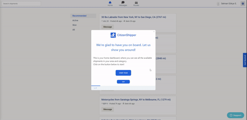
#3 CitizenShipper’s interactive walkthroughs
CitizenShipper is a shipping marketplace that connects people who need things shipped locally or long distance with people who can do the shipping.
While the platform is used by many different types of shipments like furniture, motorcycles, and even boats, it’s very popular among pet and animal parents.
As you can imagine, alignment on shipment details is critical, especially when valuable cargo or even live pets are entrusted to strangers.
To prevent key information such as requirements, dates, and quotes from being overlooked (and causing friction later), CitizenShipper consolidated their previously scattered onboarding materials and transformed them into interactive, in-app guides tailored for their drivers.
Here’s an excerpt from one of their in-app guides created with UserGuiding:
✅ CitizenShipper centralized their training materials (YouTube videos, help articles, user manuals, etc.) within their app and decreased possible frictions and barriers that prevented users from engaging with them before.
✅ The tour doesn’t just go over buttons and say, “this button is here”; it provides genuinely useful information about processes. For example, explaining that a driver must complete a security check before bidding on a post.
✅ Data collection and verification are split into stages and placed after key onboarding steps. This way, users aren’t forced to complete the entire verification process before even exploring the platform.
You can read CitizenShipper’s success story here. 👈🏻
#4 Top Hat’s onboarding checklist with interactive guides for instructors
Top Hat is an interactive learning platform that brings students and instructors together.
When you sign up as an instructor, the platform welcomes you with this checklist:
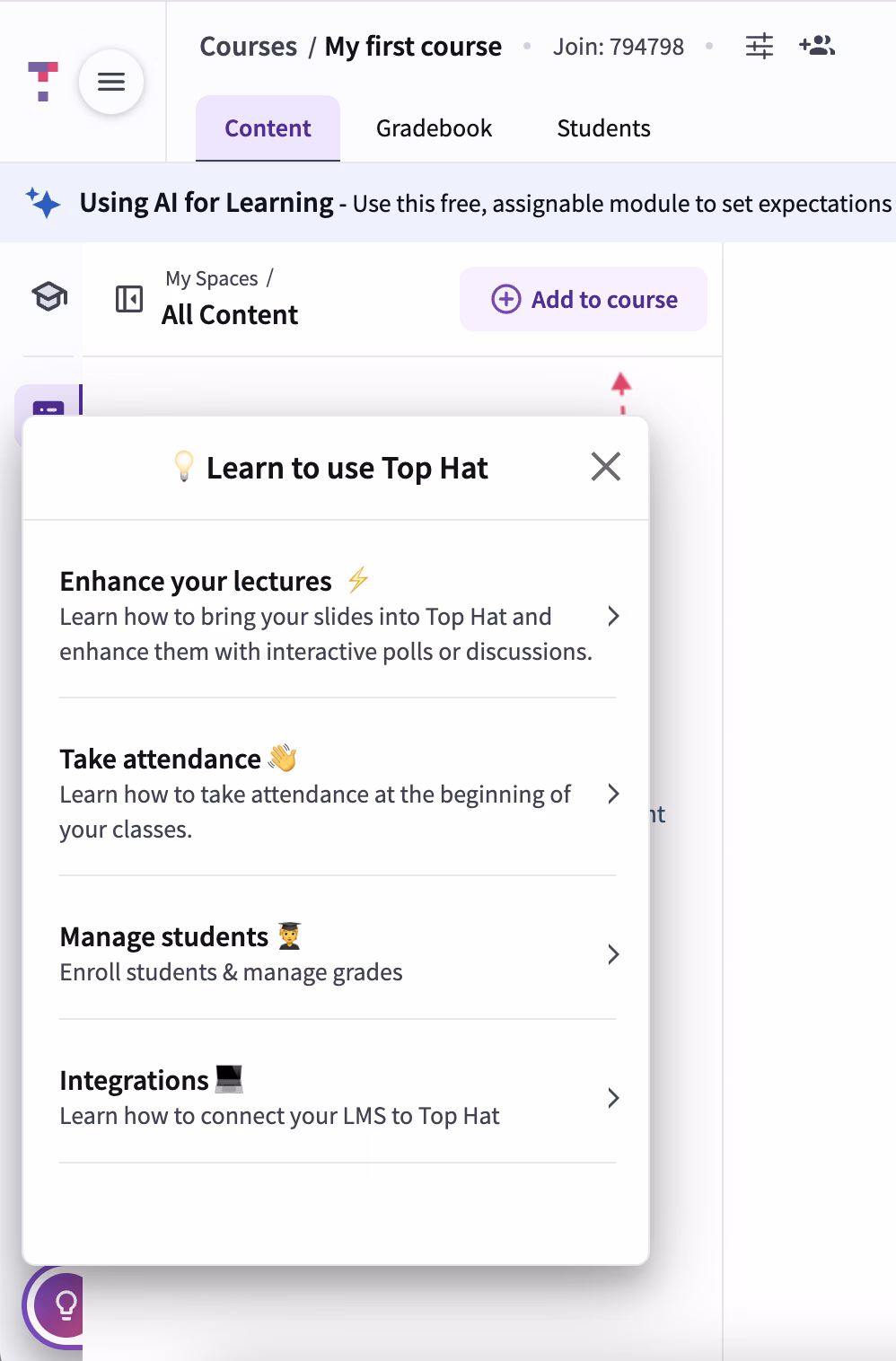
Each item on the checklist reflects the platform’s value propositions for teachers, so they’re phrased as solutions for the user rather than as feature highlights.
Some items also contain subtasks; for example, the “take attendance” task has 2 tasks.
But since these subtasks are initially hidden, the checklist doesn’t overwhelm users with too many items at first glance.
The tasks also trigger interactive guides.
Here’s an example:

✅ User-centric onboarding checklist and interactive guides.
✅ Interactive guides are mostly around 4-6 steps, some even shorter.
✅ Guide steps are well-formatted and structured with clear instructions, bullet points, bolded phrases, and progress indicators (step counters).
✅ The microcopy is storified in a way that tooltips actually guide the new user, like an experienced colleague at work helping you out. “For large classes, we recommend using the ‘import from file’ option. But for today’s walkthrough, let’s enter your email address.”
✅ For relatively more advanced settings that are not covered in detail during the guides, there are links to external support articles.
#5 Udemy’s gamified onboarding experience for both end-users of the platform
Udemy, as one of the biggest online education marketplaces, understands how hard it can be to commit to a course (either to create it or to complete it). So, in order to change the users’ perspective and add a little bit of fun to the process, Udemy utilizes gamification.
Both for learners and teachers.
Here’s how Udemy introduces Streaks to new learners:

For course creators, gamification presents a challenge in completing their course planning in a limited time frame (45 days, to be specific).
If they can do that, Udemy promises to help with the promotion of the course and share it with a social media announcement.
Here’s the roadmap for the challenge:

✅ With gamification techniques (streaks and challenges), Udemy creates regular and active engagement with the platform to ensure users spend enough time to form habits and become active users instead of ghost accounts.
✅ To increase the activation in the service supply side of the marketplace, Udemy supports course creators with educational emails full of best practices and even a free course for creating a course from scratch.
#6 Getaround’s onboarding surveys that explain users why they need specific information they ask
Getaround is a local car-sharing and rental marketplace that enables people to rent their own cars and/or rent cars from other individuals without going to car rental companies.
But because renting a car involves a lot of important legal paperwork and verification, Getaround does its best to ensure that users trust the platform during the onboarding and signup process.
Here are some example screens from the onboarding surveys:

✅ There are different onboarding surveys for different types of end users.
✅ Embedded tooltips contextualize the survey questions and reassure the user that the information they’re providing is important for the marketplace quality.
✅ For questions asking information that user might not know, there are instructions helping them to access the information. This eliminates guesswork and potential errors on users’ side, while also standardizing the data type the platform collects.
#7 Instacart’s onboarding academy for shoppers
Instacart is a grocery delivery and pick-up platform that brings people that want their groceries delivered with shoppers that do the shopping for them.
While there’s not much onboarding for the service seekers side of the marketplace, except for a few tooltips that explain buttons on the UI here and there, like this one here…
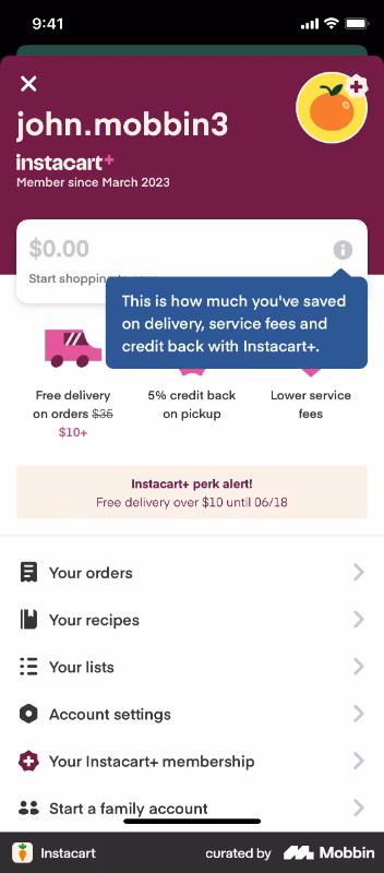
For the service providers side, the shoppers, there’s an in-app onboarding academy called Carrot Academy.

✅ Instacart doesn’t assume everyone knows how to shop groceries but offers tips and tricks of shopping groceries, completing deliveries, task management, using Instacart, etc.
✅ The onboarding lessons are short videos created by experienced shoppers.
✅ According to the Instacart shoppers on Reddit, the platform had terrible and confusing onboarding for years. So, we can assume that the introduction of Carrot Academy is a direct response to user feedback and changing expectations, which showcases the platform’s user-centricism.
Here’s what a shopper says about the platform’s old onboarding:
“Instacart onboarding sucks. Am I the only one who feels like the onboarding process doesn't sufficiently prepare you for your first order? I feel like there's so many things (especially relating to substitution) that the tutorials just don't cover…”
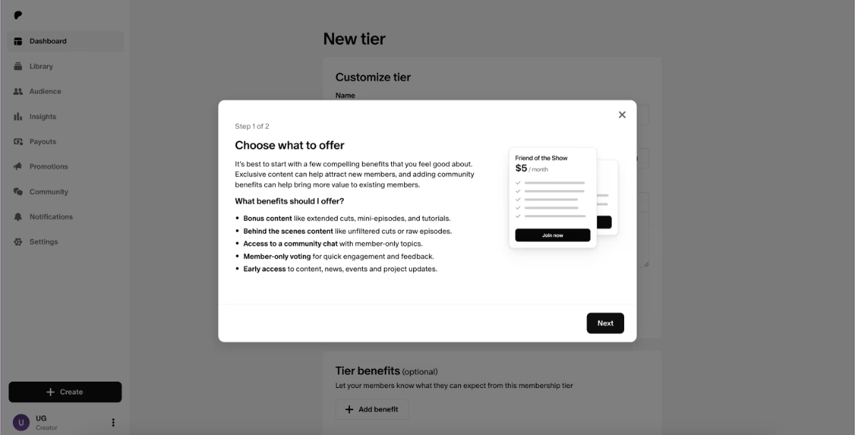
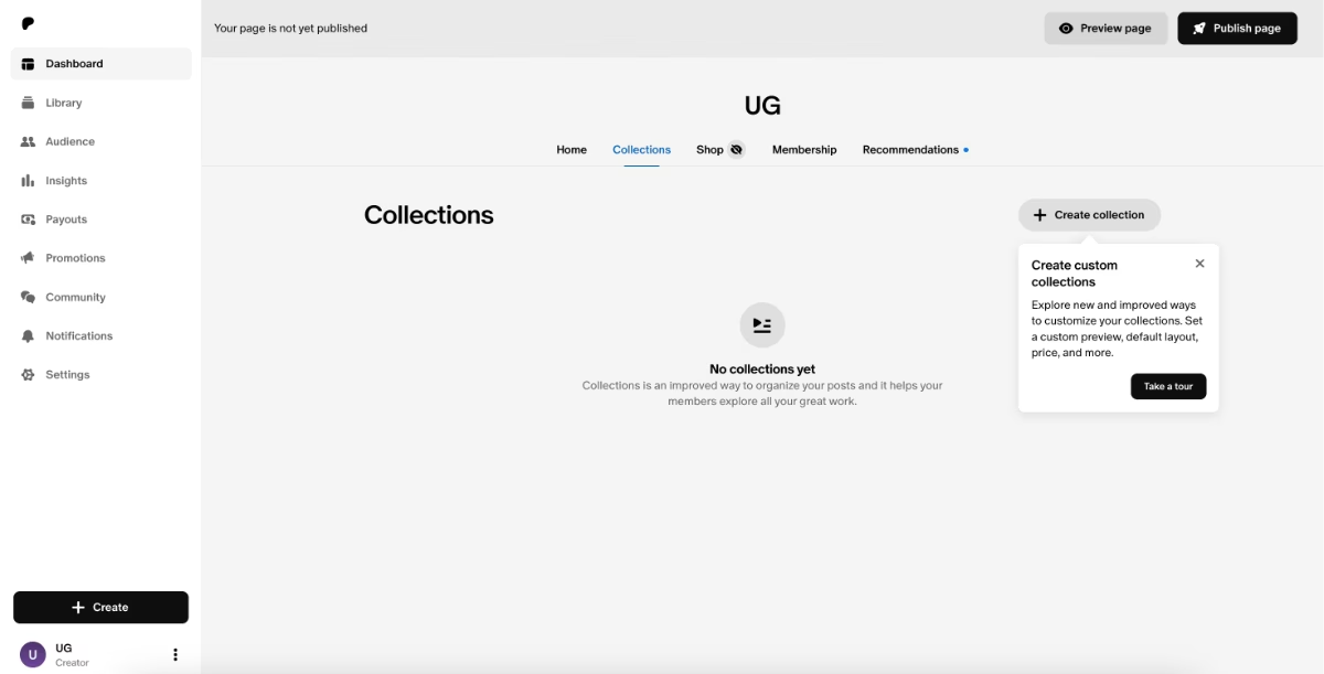
#8 Patreon’s in-app product tours and pro tips for creators
Patreon is a monetization platform that brings creators and their fans together, allowing creators offer bonus content and collections special for paid members.
For the fan side of the user base, there isn’t any onboarding material, as their workflow is much straightforward and intuitive.
With the creators side, however, things get much complicated and nuanced, so Patreon offers onboarding support with guides, contextual feature introductions, and checklists.
Here’s the onboarding checklist:

The checklist tasks are organized in the natural order of creating and publishing content in Patreon. So when a new creator signs up to the platform and follows the checklist tasks, they end up with a successfully created page and post.
However, the checklist covers only the basics in order not to intimidate non-technical creators and discourage them from adopting the platform.
The Patreon basics guide, for example, consists of 2 pop-up modals that go over the best practices of using Patreon (what can you offer to your fans on the platform, how many pricing tiers should you offers, what is the average starting price of a subscription tier, etc.).
The other tasks on the checklist are more task oriented and trigger interactive walkthroughs that go over the steps of actually completing the tasks.
Like this one here:
✅ Onboarding is organized into different modals (checklists, tooltips, guides, pop-ups).
✅ Best practices for creators are incorporated into the onboarding.
✅ There are guides “hidden” in the platform that are only triggered when a user tries to engage with an advanced feauture/capability. This ensures onboarding is accessible for everyone, but there’s guidance for more complex capabilities for users that are interested to try on.
#9 Betterhelp’s mock patient interaction cases for practitioner onboarding
Betterhelp is a marketplace that brings patients that seek online theraphy services with professional practicioners.
The platform doesn’t have therapists and health practicioners of their own, but independent therapists enroll to the platform and offer their services there.
But to ensure no one is harmed and the platform maintains its trusability, there is a long screening and verification process for therapists.
This process is obligatory for any therapist to be matched with any patient, but potential practicioners can still access to the platform, check things out, and then decide whether or not they can manage offering their services online before committing to this lengthy verification process.
So before a therapist fills in the forms and shares information about their licenses, they can go access the home page.

The home page presents mock patient interactions to allow new therapists experience a realistic session with the platform, instead of seeing an empty state.
Within each interaction, either a possible scenario/dialogue with a mock patient or a best practice is explained.
The features are also explained within the cases through tooltips.

✅ License verification and screening is ensured but not used as a weapon against therapists to check the platform out and see whether or not they can use it.
✅ Empty state is used for training and onboarding purposes.
✅ Tooltips highlight relatively hidden features/capabilities and encourage engagement.
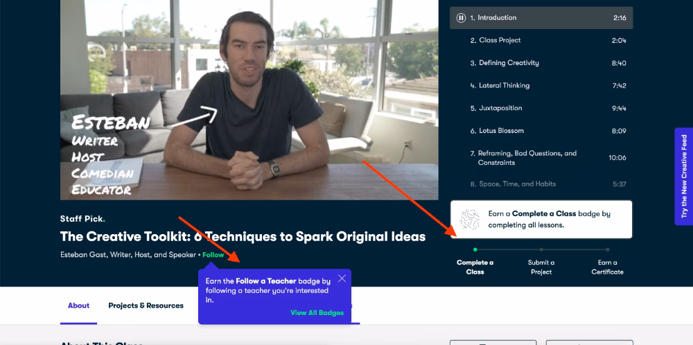
#10 Skillshare’s gamified and interactive onboarding for learners
Skillshare is an online learning and teaching platform that allows people to create and get courses from other individuals. So, it’s similar to Udemy, at heart.
But while Udemy focuses more on the habit formation and fast activation side of user onboarding, Skillshare focuses on guidance side.
They offer tooltips and product tours to learners.
⚠️ Though we need to admit that they face problems with some tooltips blending with the background due to lack of color contrast and some tooltips being triggered at the same time and causing some distraction…
Similar to Udemy, Skillshare, too, uses gamification to increase in-app engagement and feature activation.
Instead of streaks, they give badges.
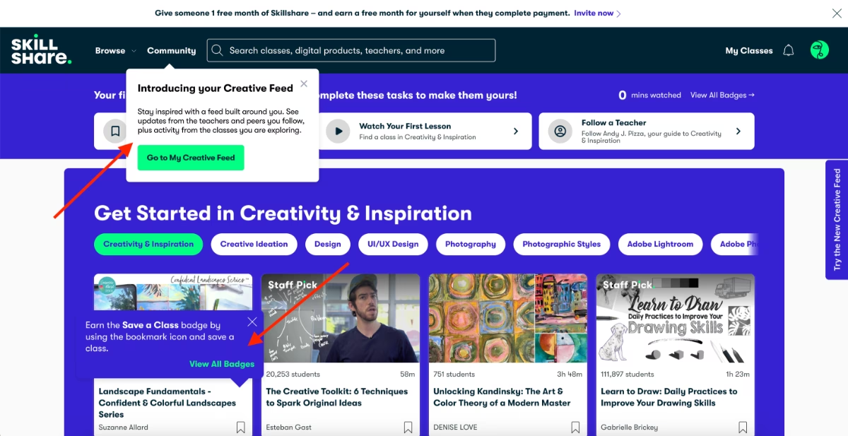
✅ Skillshare uses hover-over tooltips on important parts of their UI, for example, when you hover over the sidebar widget “Try the new Creative Feed”, a tooltips pops up and explains what the Creative Feed is.
✅ The first user session of learners are personalized with the initial onboarding survey, in which Skillshare asks the new user about their interest areas and then what specific topics they’re more interested in, as well as what software/tools they use or want to learn how to use for that interest.
✅ They then use this information to highlighight relevant courses and teachers to the new user right on the home page, which decreases the mental load and frustration of marketplaces with a lot of service providers and options to choose from.
Here’s what the survey looks like:

Bonus Bad Example: Uber Eats’ disorganized merchant onboarding
Up until now, we’ve covered mostly good examples, some were not-so-good before but then got optimized and some had room for improvements, but still, they were mostly smooth onboarding examples that offered a lot for inspiration.
However, not every marketplace offers beautiful and helpful onboarding experiences to their users. Sometimes, even the industry giants can surprise you with how little support and guidance they offer…
Like Uber Eats.
Here’s what a merchant says about the platform’s onboarding experience:
I just had the most frustrating experience trying to sign up my bakery for Uber Eats, and I need to vent. The process is an absolute mess—disorganized, slow, and borderline impossible to complete without losing your mind.
First off, the application process is unclear. You submit your business info, and then… nothing. No confirmation, no estimated timeline, just silence. Days go by, and suddenly you might get an email asking you to call a number to finish the sign up process.
Then comes the communication black hole. If you have any questions or issues, good luck getting a human response. The support system is mostly automated, and when you do get a rep, they often give vague or contradictory answers. I’ve been bounced around between departments, each one acting like it’s someone else’s problem.
The worst part? The waiting game. Even after everything is “approved,” your store might sit in limbo for weeks with no explanation. You’re stuck refreshing your inbox hoping for an update.”
❌ No clear roadmap of the signup and onboarding process.
❌ No clear support for merchants.
❌ Long setup and verification processes that barrier access to the platform.
❌ User’s trust and interest is lost before they even get access to the marketplace…
The impact of onboarding on activation rate
Higher conversion from sign-up to first transaction.
For most marketplaces, activation is defined by a user completing their first transaction: a rider booking their first trip, a tenant securing their first rental, or a freelancer landing their first client.
Well-designed onboarding ensures that the path to this first success is smooth and doesn’t cause any confusion or frustration for first-time users.
Plus, onboarding is also the stage where users form their first real opinion of your product and business, so a good start is crucial.
⚡ Aaron Humphreys highlights:
- 63% of users say onboarding influences their upgrade decision.
- But 88% rate their onboarding experiences as poor.
Faster time-to-value for both sides of the marketplace.
There can be several cool but non-essential capabilities in a marketplace. While these features can add flair to the user experience, they are rarely the main drivers of adoption.
If users are not guided toward the core capabilities of your platform, they may get distracted by these secondary features. The longer their value realization is delayed, even if they’re spending time on the platform, the higher the risk of churn.
Another factor that can slow down value realization is unnecessary or overly complicated setup tasks.
If users are not guided through the essential steps, they can spend too much time figuring things out on their own and experience frustration.
That’s why it’s critical to keep setup fast, focused, and frictionless.
Here’s what Ferenk Fekete highlights about onboarding practices and their influence on value realization:
Better feature adoption.
Users may know your value proposition and even sign up for your marketplace because of a specific feature. But once they face your UI, a completely new environment, they might not know what to do next.
Even if they find the feature that attracted them, they might not activate all the related capabilities, or they might miss complementary features that strengthen the experience.
With checklists, guides, hotspots, and tooltips, or better yet, a combination of these elements at key moments in the user journey, you can resurface underused features and prompt users to engage with them.
Improved retention and lower churn.
Diego Garay Alatrista draws attention to an important finding from Gartner’s surveys in his recent LinkedIn post:
- 80% of churn is caused by 𝗽𝗿𝗼𝗰𝗲𝘀𝘀 𝗳𝗮𝗶𝗹𝘂𝗿𝗲𝘀.
But if you can overcome frictions that cause process failures and get your users to adopt 4 features, then their likelihood of churning decreases by 70%.
And at this point in the article, we do not need to openly state the correlation between a good onboarding experience and lower user errors that cause process failures, right?
Right 👀
Success tips for marketplace onboarding
- Progressive profiling: Progressive profiling spreads out data collection into smaller, more natural touchpoints during onboarding.
For example, instead of asking a buyer for their shipping address the moment they sign up, you could start with just the essentials, like name and email. Then, when they’re ready to make their first purchase, you request the shipping details at checkout.
This approach reduces friction, increases completion rates, and ensures users provide data in context, when they understand why it’s needed.
- Keep your onboarding short and contextual: Prioritize quick wins in your guides and tours; do not offer feature dumps.
⚡According to Training Mag’s 2025 global learning insights report, the concept of bite-sized, focused training modules, also known as microlearning, garnered 20% of votes as the second most impactful trend for 2025.
85% of respondents believe microlearning will gain even more traction this year.
- Personalize your nudges and in-app communication: Behavior-triggered prompts guide users toward activation milestones. For instance, a marketplace could remind a seller, “You haven’t listed your first item yet,” after they set up their store.
Or, you can encourage a student to enroll in a course: “You have courses waiting for you in your wishlist .”
Personalized nudges are great for re-engagement and reminding features that will ensure users experience their “Aha!” moments and not stay as ghosts on the platform.
- Test and iterate using A/B testing of onboarding flows: By A/B testing flows, such as different checklist orders, tooltip placements, or messaging styles, you can uncover which approaches drive higher activation rates and lower drop-offs.
For example, you might find that showing a “List your first item” prompt immediately after sign-up outperforms waiting until after profile completion.
Continuous experimentation allows you to validate assumptions and discard ineffective patterns.
- Collect qualitative feedback with in-app surveys during/after onboarding: In-app surveys triggered after key onboarding interactions can help you identify which steps in a user flow need additional guidance, or what common problems users face, so you can address them proactively with FAQs and tutorials.
As this Reddit user puts it so effectively:
At the end of the day, user onboarding is about user education. Before you educate someone, you gotta know and pin down what to educate. If you are confident with this, then it's time to scale your onboarding. Yet, for any type of automated onboarding, you will have to optimize from the learnings you have from support tickets (the "How-to" questions).”
⚠️ You should run different surveys for different user segments and analyze them separately.
While the “signup” flow can be frictionless and superb for service providers, it might be confusing for the service seekers.
- Continuously analyze activation metrics to refine: Define what “activation” looks like for each side of your marketplace, then track how long it takes users to reach these milestones, where they drop off, and which guidance elements correlate with success.
If you map your user journey, know your activation points, gather feedback about your onboarding flows, and also A/B test different versions of onboarding materials and in-app communication, to optimize it…
Congratulations, you nailed onboarding!
To sum up…
Marketplaces only thrive when both sides reach value fast.
And that doesn’t happen by chance.
It happens through clear, goal-oriented, and personalized onboarding.
You need to guide each user type through their own path, highlight the actions most relevant to them, and explain features in their context.
Otherwise, value realization never comes.
And with a good onboarding tool, it’s not even hard or time-consuming to build tailored experiences, run tests, and offer much-needed guidance to users…
We’ve introduced you to UserGuiding, right? 👀
Frequently Asked Questions
Why do marketplaces need user onboarding to improve buyer and seller activation rates?
Marketplaces benefit from user onboarding because activation requires both sides of the platform to engage simultaneously. Onboarding helps new users understand exactly what they need to do to experience value, whether it’s listing a product, setting up a class, or completing a profile. By guiding both buyers and sellers step by step, marketplaces ensure users reach their first success faster, reducing confusion and frustration, which in turn encourages ongoing activity and engagement on the platform.
How does user onboarding increase marketplace conversion from sign-up to first transaction?
User onboarding increases conversion by creating a clear path to the first meaningful action on the platform. When users are guided through key steps, they understand what to do in the process and why it matters. Interactive guides, checklists, and contextual tooltips remove uncertainty, reduce friction, and highlight the features that lead directly to a first transaction, helping users experience value quickly and feel confident continuing to engage.
What are the best user onboarding practices for two-sided marketplaces to reduce early churn?
The most effective practices focus on personalization, structure, and context. Segmentation allows marketplaces to tailor onboarding for each type of user, while checklists and interactive walkthroughs guide users through key actions without overwhelming them. Progressive profiling collects necessary information gradually, and behavior-triggered nudges encourage timely completion of milestones. Combined, these strategies prevent early frustration, reduce confusion, and make both marketplace sellers and buyers more likely to engage continuously, lowering early churn.
What are the marketplace onboarding solutions that boost user trust and engagement metrics?
Solutions that increase trust and engagement combine guidance with transparency. Step-by-step walkthroughs, contextual tooltips, and interactive guides help users understand how the platform works and what to expect. Resource centers and in-app FAQs give users instant answers, while clear verification, identity checks, and trust signals reassure both sides of the marketplace. Together, these tools help users feel confident in transactions, encourage feature adoption, and create a sense of reliability that drives ongoing activity.
What are the common onboarding challenges in marketplaces, and how can they be solved with digital guides?
Marketplaces often struggle with high user expectations, feature complexity, and a lack of personalization. Buyers and sellers face unfamiliar interfaces and multi-step processes that can delay value realization. Digital guides, such as interactive walkthroughs, tooltips, and checklists, address these challenges by showing users exactly what to do, when to do it, and why it matters. They reduce overwhelm, highlight core actions, and make even complex workflows accessible, helping users complete activation efficiently.
How does onboarding impact marketplace KPIs like retention, lifetime value, and transaction volume?
Effective onboarding ensures users reach value quickly and repeatedly. By guiding users to complete essential actions, onboarding increases the likelihood of first transactions and continued engagement, which strengthens retention. Users who understand how to navigate the platform and leverage its features are more likely to adopt additional services or make repeat purchases, ultimately increasing lifetime value.
What are the user onboarding strategies that accelerate seller listings and buyer purchases in marketplaces?
To help sellers start listing quickly and buyers make purchases, marketplaces can provide step-by-step guidance and contextual prompts that lead users through key actions. Sellers might receive walkthroughs for adding products, setting prices, and activating payments, while buyers can be guided to browse relevant items, save favorites, and complete their first checkout. Highlighting these essential steps at the right moment and showing progress along the way ensures both sides experience value quickly, encouraging early and active participation.

.png)


