


.svg)
.svg)
.svg)
.svg)
.svg)


.svg)


.svg)
.svg)

Do you read the manual before assembling furniture, or do you just dive in and hope for the best?
Either way, you probably like knowing the guide exists. It’s a safety net. A way to avoid that one missing screw moment.
Software is no different.
Users don’t always read/ interact with user guides right away, but they rely on them sooner or later, like when they hit an error, when onboarding feels fuzzy, or when they want to try a new feature.
That’s why great user guides aren’t optional.
- ✅ They reduce support tickets,
- ✅ Speed up onboarding, and
- ✅ Help users stick around long enough to see the real value of your product.
In this article, we’ll break down what makes a good user guide, explore real examples across different formats (from interactive tours to onboarding academies), and show you how to create guides your users will actually use.
Here we go 🤸🏻♀️
TL;DR
- Guides can be found in different forms and formats. There are interactive in-app guides, pop-up and slideout modals, video walkthroughs, knowledge base articles, visual manuals, and full onboarding courses.
- Each guide format has its own best practices and tips; however, some elements improve the overall quality and usability of any guide, regardless of format. These are:
- Clarity and simplicity in copy and language.
- Structure and formatting (bullet points, lists, bolds, subtitles, etc).
- Visual support through visual cues, videos, GIFs, and screenshots.
- Interactivity through in-app modals or interactive recordings.
- Organization and categorization (for easy and quick access).
- Accessibility (fonts, color contrast, device-friendly layouts, etc.)
- Want to see what great guides look like in real life? We invite you to browse through the examples! (Don’t worry, each example comes with its own TL;DR.)

What makes a good user guide?
Did you know that only 6% of users think they know 75% of what they should actually know?
That number highlights just how wide the knowledge gap really is…
Users need more (good) guides.
But not all user guides are created equal. A 40-page PDF with walls of text might technically be a “guide,” but if it makes users cry before page three, it’s not doing its job.
Here’s what separates a good user guide from a frustrating one:
- 📌 Clarity and simplicity: The best guides talk to users in the same way users talk. That means plain language, no jargon, and instructions broken down into bite-sized steps.
Users shouldn’t have to guess what “configure the module dependencies” means.
You can instead say “Click Settings → Add Integration.”
Clarity in guides also reduces the need for customer support follow-ups, which saves time for both your users and your support team.
- 📌 Structure: The easier a guide is to scan, the better.
Organized sections, scannable headings, and a logical order help users find answers quickly. Adding a table of contents, collapsible menus, or search functionality also makes long guides much less intimidating.
The same applies to interactive tutorials and video guides.
If you’re using tooltips, keep the copy short and avoid overcrowding the screen. And if you’re using video content, add timestamps for key moments and follow a logical flow.
👉🏻 HubSpot’s old product tour tooltips were lacking a scannable structure, for example:

👎🏻 No title that summarizes the key point of this action/tooltip.
👎🏻 No highlighted/bolded value point in the main copy, only the next required action.
👎🏻 What “clicking on Alex’s name” will do is unclear without reading the full copy.
- 📌 Visuals: Screenshots, annotated diagrams, GIFs, and short videos turn abstract directions into concrete steps. A picture of where the “Settings” icon is saves far more frustration than a two-sentence description.
Plus, visuals act as mental anchors in written guides.
Readers can recall where on a page they saw a certain screenshot or diagram, which makes it easier to revisit instructions later without rereading the whole guide.
💡 Fun fact: 65% of people are visual learners, and visual aids can improve learning retention by up to 42%.
- 📌 Accessibility: Good guides (interactive or static) adapt to different screen sizes, load quickly, and consider accessibility best practices: readable fonts, strong color contrast, keyboard navigation, and alt text for images.
👉🏻 Apollo’s old product tour wasn’t accessible for many users because it didn’t create enough visual contrast between the UI and the overlay:
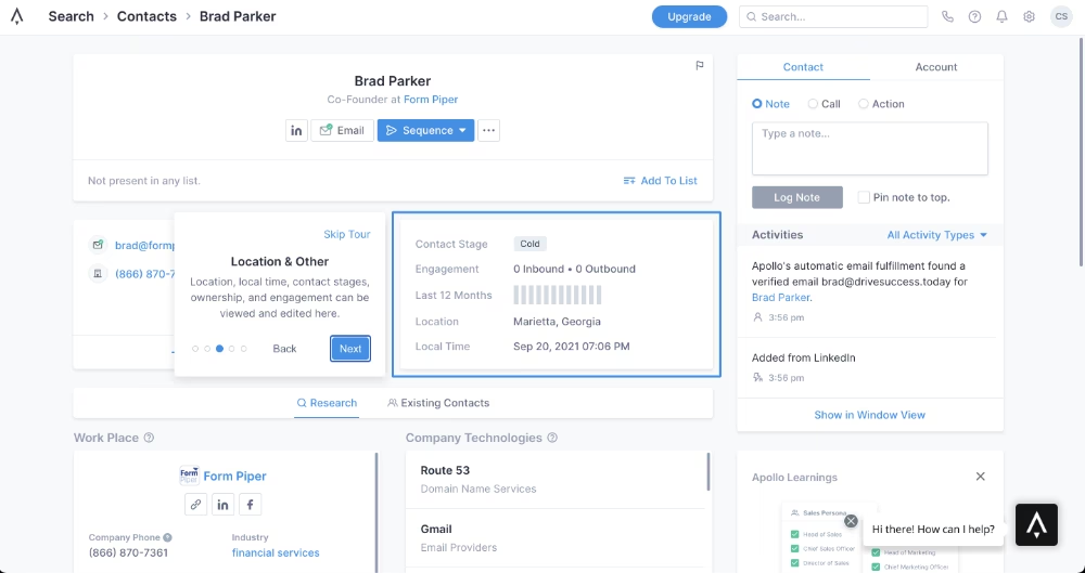
👎🏻 No dimmed background or enough highlight that catches attention.
👎🏻 No strong color contrast. The highlights, tooltips, and UI have the same color palette, causing the tooltip and the highlighted area to blend too much with the background.
💡 Pro tip: Accessibility here also means your guides shouldn’t be buried in the dark corners of your website or product.
Users should always know where to find them and be able to access the materials without friction.
- 📌 Interactivity: In this article, we’ll explore all types of guides and support materials without bias. That said, it’s worth admitting upfront: interactivity can take a guide from good to great.
Features like checklists, tooltips, and embedded tutorials let users learn by doing.
And that makes the learning experience more engaging and memorable.
👉🏻 Back when Command AI was still CommandBar, its in-app onboarding relied on slideout modals:

👎🏻 No interactivity or any visual cues.
👎🏻 A bunch of sequential orders instead of actual contextual guidance. Do this, click there, look at that…
Different types of user guides (with examples)
User guides come in many shapes, and each format has its own strengths (and weaknesses).
The right one depends on your product and your users.
Plus, you can always mix and match various guide types to support different learning styles and preferences.
Let’s look at the most common user guide types with real examples. 📖
Interactive in-app guides and product tours
Interactive in-app guides are dynamic, on-screen tutorials or prompts designed to help users navigate and engage with a product directly within the application.
They usually appear as step-by-step, concise instructions with interactive tooltips, or pop-up modals that highlight key features.
Some are triggered automatically when a user logs in for the first time, while others are launched from an onboarding checklist upon the user’s interaction.
So there’s some variance in in-app guides, too.
What makes them powerful, regardless of their triggering method or modal type, is the contextuality they all offer.
In-app guides teach users in the moment of action. Instead of reading instructions and then trying to remember what to do in the product, users click, try, and learn directly within the product.
Here's how businesses ensure contextual guidance with interactive in-app guides 👇🏻
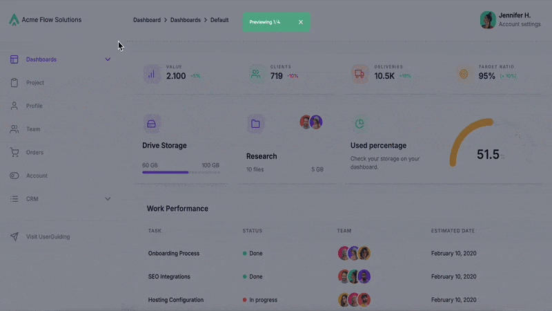
#1 HubSpot’s interactive onboarding guide
We’ve slightly 👀 criticized HubSpot’s old demo tooltips because of their structure and the difficulty of understanding what each step in a guide was for and what the next step was.
However, that is not the case anymore. Not for their in-app onboarding tours anyway.
Here’s a short excerpt from HubSpot’s current onboarding:
✅ Tooltips now have clear titles that inform users about the required action.
✅ Some tooltips have bold formatting in the body when there are important tips or instructions.
✅ Tooltips are interactive and wait for the user to complete the required action, so users don’t need to return to the same actions after the tour to create something.
✅ Within a guide, CTA buttons appear at the end of each subtask to clearly show users what the next subtask is.
The guides are also gathered in an onboarding hub for easy access, which looks like this:

Here, guides that go over different features and capabilities are categorized into their respective use cases and teams (sales guides, marketing guides, content guides, commerce guides, etc.).
You can also see the estimated time of completion for each guide and how much progress you’ve made, which means you can leave guides midway and then continue later on.
📌 Why is this an example of a good guide?
- The copy is clear and jargon-free.
- There’s a consistent structure across tooltips with titles, main body, and CTAs.
- The background is dimmed, the relevant areas on the UI are highlighted, and the tooltips create a visual contrast that is easy to follow.
- The guides are 24/7 accessible from an in-app hub.
- The steps that require users to fill in an input field are explained with interactive tooltips that wait for the user to complete the action.
#2 Jasper’s contextually triggered feature walkthroughs
Jasper showcases a great example of how product tours and walkthroughs differ from one another, and how they should be utilized for maximum guidance.
Here’s a tooltip from Jasper’s initial product tour:
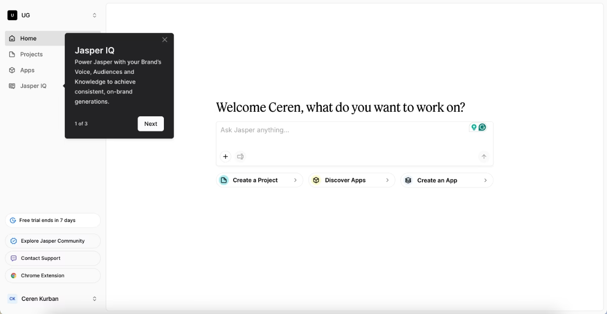
✅ The tour is short (only 3 steps) and highlights the most important buttons and UI elements on the home page.
✅ The steps list several capabilities hidden behind the buttons/feature pages, but do not go into full detail in order not to bore or intimidate the new user.
After this automatically triggered welcome tour, the user is left alone to engage with the product and explore a little bit on their own.
Until they choose to try out a relatively complex feature.
Then, a contextually triggered interactive guide pops up to explain the workflow:

✅ The guide is triggered when the user's interest is at its peak, so high engagement and relevance are ensured.
✅ The tooltip copy explains the value behind a recommended action.
✅ The guides are around 4-6 steps, so they’re goal-oriented and focused.
📌 Why is this an example of a good guide?
- The tooltips have clear instructions and value propositions.
- Tooltip copies are short, and so are the guides in general.
- The color contrast increases the accessibility and makes it easier to follow.
#3 Remote’s interactive product tour with tooltips
Remote offers its guidance in product tour mode, letting users see how features look and work with sample data and filters in action.
At first glance, this may seem less interactive since actions happen in demo mode and no real results are produced.
But for certain features and workflows, exploration isn’t possible without prior setup.
To bridge that gap, Remote uses product tour mode so users understand how everything works in a safe, commitment-free way.
Here’s how that looks:

✅ Feature-based walkthroughs are focused and go over how to use the said feature’s capabilities and filters.
📌 Why is this an example of a good guide?
- The tooltips have clear and short instructions.
- There’s a progress bar that allows users to stay engaged with the tour and stay motivated to continue.
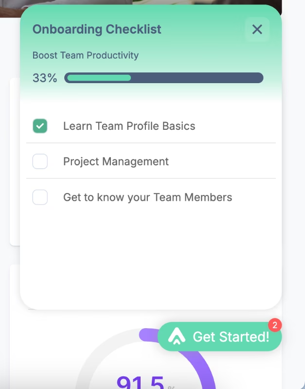
#4 Otter.ai’s product tour triggered from an onboarding checklist
As we’ve said before, interactive in-app guides can be triggered automatically, such as when a user logs in for the first time or completes a certain action (like a welcome tour).
And they can also be launched from an onboarding checklist when the user chooses to engage.
That’s exactly how Otter.ai’s guides work.
Here’s the onboarding checklist with different interactive guides:

And here’s an example tooltip from one of the guides in the checklist:
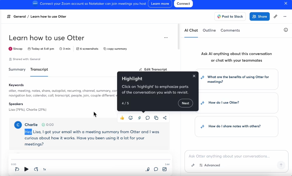
✅ The onboarding checklist acts as a roadmap to get to value realization.
✅ Completed tasks move to the bottom of the checklist, so the next action always stays at the top.
✅ The guides not only introduce the features and buttons but also offer use cases and value propositions.
📌 Why is this an example of a good guide?
- Each guide consist of around 3-5 steps, so they’re concise and to the point. (The onboarding checklist is pretty quick to complete, too. Bonus point for that.)
- The onboarding checklist creates a structured learning path, starting from the basics, then file transcription, and then app installation.
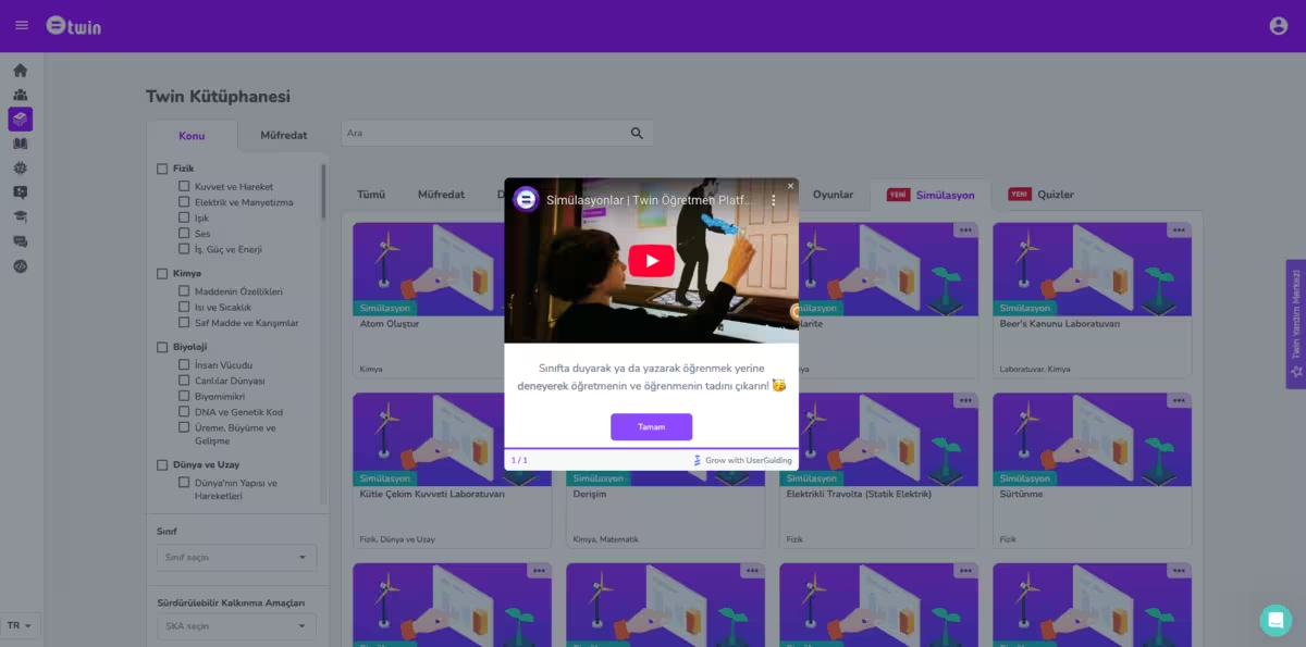
#5 Twin Science’s interactive tutorial with a friendly copy
Twin Science is another company that recognized the power of interactive guides and in-app onboarding to increase feature adoption and engagement.
To provide much-needed support for their not-so-tech-savvy teacher users, they created product tours and feature walkthroughs using modals and tooltips.
Like this tooltip here:
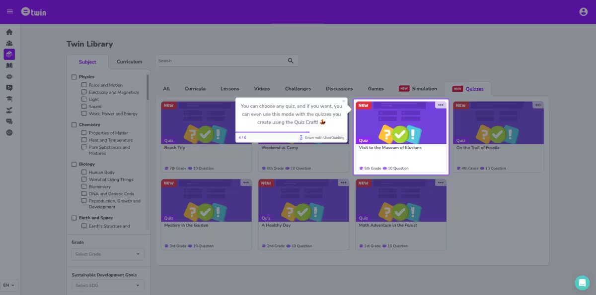
And this pop-up modal here:
✅ The tone and style of the guide copy are very friendly and fun (Emojis, too!!).
✅ There are both a step counter and a visual progress bar within the guide.
✅ Feature announcements are supported and contextualized with guides, as the guide is triggered from a feature announcement modal.
📌 Why is this an example of a good guide?
- The guide incorporates different UX modals, such as interactive tooltips, pop-up modals, and even videos so that every piece of information is explained in the most suitable and user-friendly way.
- Guides are generally less than 5-6 steps, so they’re not dragging out.
- Visuals (both in the form of videos and still images) add a level of interactivity and variance to text-only tooltips.
- The tooltip and modal design are in line with the overall UI; however, the dimmed background and highlighted areas still create a visual contrast, making it easy to follow.
In-app slideout and pop-up modals
Pop-up modals (those center-screen messages you can’t miss) and slideouts (panels that neatly appear from the side) are mostly used to:
- Announce new features,
- Welcome new users before giving a quick orientation,
- Share short video tutorials or additional resources without pulling users away from the app.
However, sometimes, they can serve as guides, too.
When that’s the case, they often come in small groups (3-5 modals, for example). Plus, to add context and avoid overwhelming users, they usually include visual aids instead of relying on text-heavy screens.
They’re less interactive than a full walkthrough created with tooltips.
But that’s exactly what makes them effective in certain cases.
When the UI is already intuitive, users don’t need every single click spelled out, as it may feel cluttered.
Or even a bit patronizing. 👀
Instead, a few well-placed modals highlighting the main steps (with visuals to back them up) keep guidance clear and helpful without overdoing it.
Let’s see some real-life examples 👇🏻
#6 WordPress’ onboarding with popup modals
WordPress uses pop-up modals for both guidance and introductions. They highlight key features and buttons for new users while also offering tips on how to use them and where to find them.
Here’s an example modal from their initial sequence:
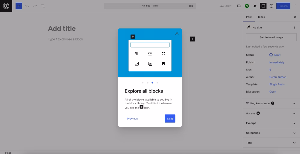
✅ Not just welcome modals or feature promotions, but also important guidance on where to find the mentioned features and how to use them. A two-for-one deal.
✅ Uses visuals to support the information and instructions in the modals.
📌 Why is this an example of a good guide?
- Communicates key information (like what blocks are in WordPress) at the very beginning of a new user’s first session, and very centrally too, so product terminology doesn’t cause any confusion or friction in the future.
- Illustrations and GIFs in the modals maintain user engagement and offer some interactivity and contextuality.
- Goes over the main features and buttons only. It’s short, value-oriented, and easy to skim with only 4 modals and short, structured copy.
#7 Healthie’s pop-up modals with videos
Healthie’s pop-up modals are clear in both format and intent. Unlike WordPress, you don’t have to wonder whether they’re meant as a welcome tour or a feature guide.
Healthie uses modals to explain how to use certain features (like Forms) and highlight their capabilities.
Here’s a modal with a video embedded in it:

And here’s a text-only modal with instructions:

✅ There’s no jargon, and even for pretty standard and self-explanatory terms, like intake flows, Healthie doesn’t assume the user must already know what that means as they’re a practitioner. They provide a short definition of the concept/term, which is also a feature in the platform, and then continue to explain how to use it.
✅ Workflows with a lot of steps are explained and contextualized with short videos, so that users don’t feel intimidated by the number of clicks and steps when they see it written.
✅ Feature guides are triggered contextually when the new user engages with the feature page to ensure peak user interest and focus to learn the processes.
📌 Why is this an example of a good guide?
- The titles and bold formatting create an easy-to-skim structure and allow users to quickly return to the modal they want to reread.
- The modals follow a logical order similar to a user naturally interacting with a Form, starting with a template and then customizing it.
- Videos in the modals (when they exist) are pretty short and to the point. They simplify the process, enhance accessibility of the information, and eliminate any possible confusion.
#8 Trello’s new feature onboarding with pop-up modals
A very good reason (and time) to offer in-app guidance is when you release a new feature, or update your existing features in a way that even long-term users might feel surprised and lost when they first encounter.
In Trello’s case, we have both reasons.
Here’s how Trello announces all the changes and improvements with a pop-up announcement modal:
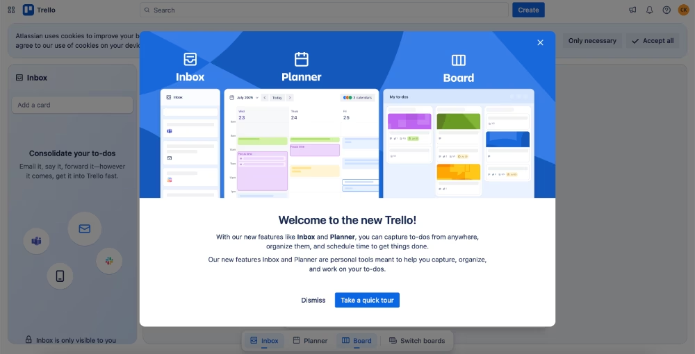
In the feature announcement, we don’t have much info about the new tools’ capabilities.
Trello promotes them very briefly by saying they’re meant to help users capture, organize, and work on their to-dos, which has been Trello's promise in general for years.
But after the short announcement copy, a CTA reads “Take a quick tour.”
Here’s what you see when you click on it and take the tour:

✅ The copy on each modal is short and value-oriented. Instead of highlighting a capability, they highlight a solution on the users’ end. They don’t say you can create time blocks in the Planner, but you can have focused time slots and meet deadlines with ease.
✅ The animated progress indicator creates an engaging and gamified experience for the user that is similar to a social media experience, almost.
✅ The GIFs act like video guides within the modals, showing where to click to create time blocks, or how to interact with Planner.
📌 Why is this an example of a good guide?
- Each feature has its dedicated slide/pop-up, so users can jump into the one they’re interested in the most.
- Titles are use case-oriented and catch users' attention.
- GIFs and animations in the modals showcase example user interactions with the features and present how they look and perform in action.
#9 UserGuiding’s slideout modal with video tutorial
UserGuiding is an all-in-one product adoption and onboarding platform, so it would be simply unfair not to showcase an example from their own guides.
What is unique about UserGuiding’s approach to in-app guides is that they’re very concise and action-driven.
No fluff, no complexity.
With interactive tooltips, they’re mostly done in under 3-4 steps.
However, for features that have longer setup instructions, like knowledge bases, UserGuiding doesn’t tire the user with 15-step guides.
Instead, they trigger a video guide with a slideout modal.
Like here:

✅ Format of the guide is determined depending on the length and complexity of a feature workflow. This optimizes the learning experience of the end user.
✅ Video guides go over different capabilities of the features and the complete setup process; however, they’re still focused and short. This one is around 2 minutes, for example.
✅ It makes use of existing support materials and makes them available within the product, too, so users don’t need to go to different hubs (help center, YouTube channel, blog, etc.) to access help.
📌 Why is this an example of a good guide?
- The slideout modal is triggered contextually when users state that they’re interested in centralizing their help materials, and thus the knowledge base feature.
- It knows the limits and potentials of different in-app UX modals and chooses the most appropriate one for different situations (or features, we can say).
- Embedded video can be played inline in the modal within the app without leaving, which eliminates frictions and distractions.
- The video is created by the support team and walks users through the entire process of creating and activating a knowledge base from scratch. It serves as a middle ground between automated guidance and human support.
Video guides and walkthroughs
Talking about video guides…
Sometimes, seeing a pro in action explains everything best.
Video guides and walkthroughs do exactly that: they let an expert demonstrate how a product or feature works in real time.
They’re especially useful for visual learners, complex workflows, or scenarios where step-by-step text would feel too heavy.
💡 Plus, 80% of website visitors are likely to watch a video, but only 20% are likely to actually read through written content.
⚠️ The key differences between an interactive guide and a video guide are:
- Voice and narrative: Video guides often include voiceover or narration, allowing you to share extra tips, context, and best practices that don’t always fit neatly into tooltips.
- Realistic data in action: Since videos are usually recorded from a support or demo account, they can showcase advanced features with data and filters already in place, which is harder to replicate in new/trial accounts with empty dashboards. Even with sample data.
- Complex workflows: For long or multi-step processes, interactive guides can sometimes feel overwhelming. A video can simplify the experience by showing the flow naturally, without drawing too much attention to each individual click.
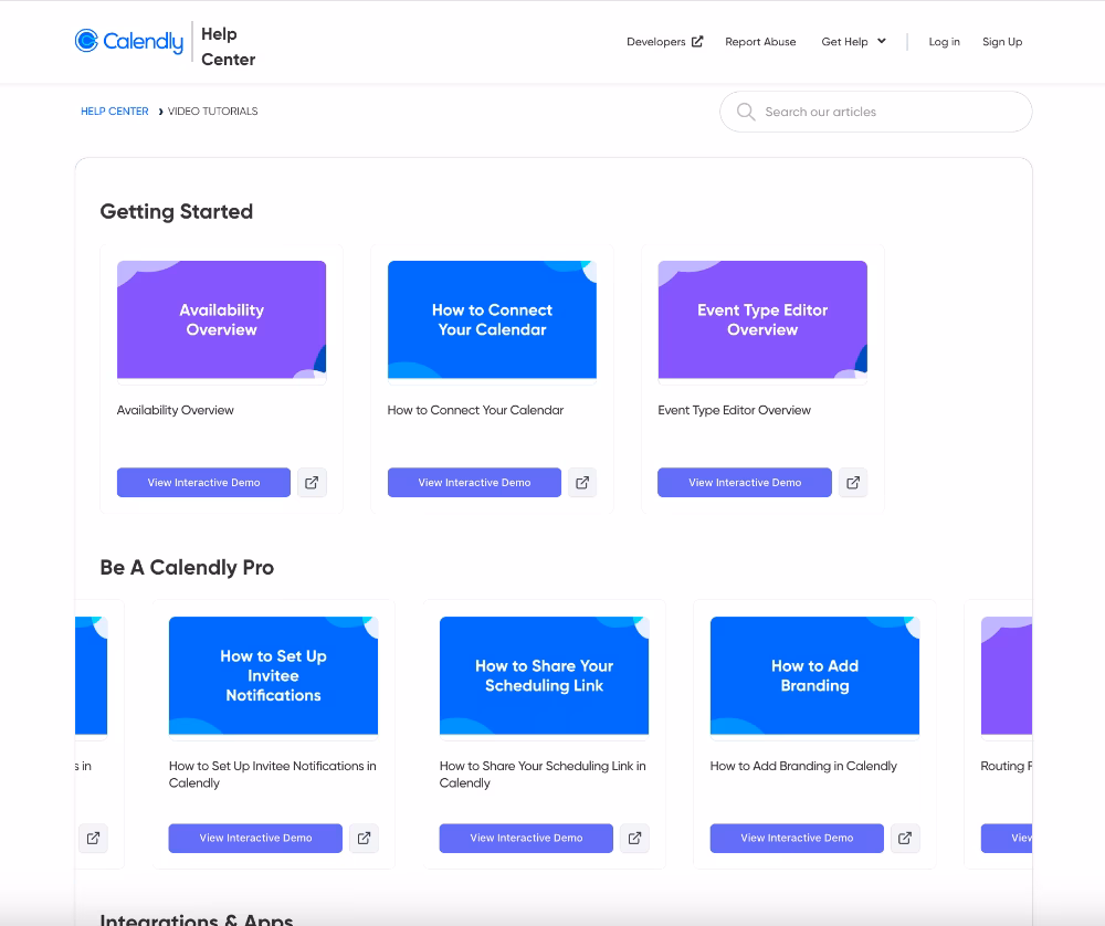
#10 Calendly’s video tutorial gallery
Calendly has a devoted team explaining the UI and features in very brief but explanatory videos.
Most of these guides take 2-3 minutes to watch (though there are some longer ones, too), and each of them walks the user through every step for completing a certain task on Calendly or changing an account setting.
Here’s their video gallery:
What sets Calendly’s video guides apart from traditional video guides is that they’re also interactive demos.
So, you can watch them perfectly as videos. There’s a narration in the background, and the steps play automatically one after the other.
However, if you want to skip explanations for easy-looking steps in the guide, you can interact with the demo and complete those steps yourself (or skip them), too.
Like this:

✅ The video guide gallery is well-organized, with guides categorized into Getting Started, Becoming a Pro, and need-based topics like integrations or admin setup.
✅ Each guide’s cover image clearly states the title of the guide so users can easily skim through the gallery quickly until they find the guide they need.
✅ Different guide types are also color-coded, such as how-to videos with blue covers and feature overview videos with purple covers.
📌 Why is this an example of a good guide?
- Making each step interactive and clearly marked on the progress bar lets users move back and forth between steps or skip them as needed.
- With one guide, Calendly supports 2 different learning methods and preferences (visual and experiential), which increases accessibility.
#11 Loom’s quick screen recording guides
Given Loom’s focus on screen and video recording, their video guides are designed to clearly demonstrate features and workflows.
Here’s the video gallery with getting started guides:
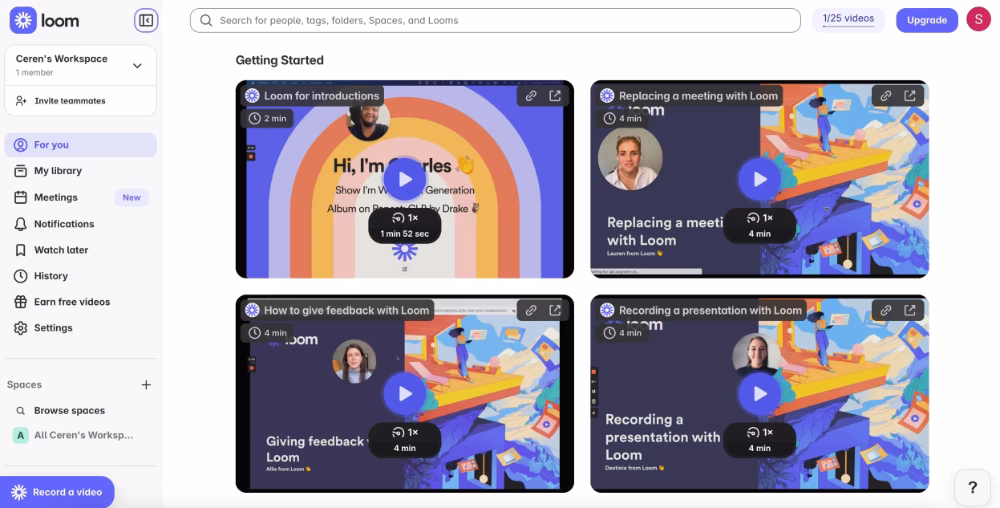
✅ The videos don’t just display the product interface; they also include presentations with key points and examples.
✅ Facial expressions are shown during the presentations, which helps some users stay engaged and focused.
✅ The guides offer unique insights, like real use cases (e.g., integrating Loom with Google Calendar) and tips on favorite frames or crucial pre-recording settings.
📌 Why is this an example of a good guide?
- Relatively short and task-oriented, but also very informative guides.
- The video library lives within the product, so it’s visible and easy to access.
- Videos are useful for both customer support as well as customer success, as there are best practices and pro usage tips, as well as step-by-step instructions.
#12 IBM Cognos Analytics’ learning hub and video tutorials
Analytics tools are, in general, complex.
IBM Cognos Analytics? Well, that’s even more complex.
But luckily, IBM is aware of that and offers different types of guidance for different user needs right in the product.
Here’s how IBM Cognos Analytics’ in-app learning hub looks:

As you can see in the image, too, IBM Cognos highlights its product videos, webinars (old and upcoming), product documentation, as well as industry and use-case-specific samples and best practices.
There’s also a product tours section, but that one is currently inactive.
Product videos play within a pop-up modal and can be watched without leaving the app.

✅ The in-app learning hub (though some materials do not open in the app and redirect you to a new tab) provides a well-organized place to find any information or guide concerning anything, whether it’s a how-to question or a best practice question.
✅ Different types of guides exist for different needs and levels of technical knowledge and technical expertise, so that non-technical users do not get frustrated but also technical users don’t feel patronized.
📌 Why is this an example of a good guide?
- The video guides have a very user-friendly structure and tone; they don’t utilize technical jargon much and don’t assume users are familiar with analytics tools.
Interactive(ish) demo experiences
Video guides are helpful, but they’re still a bit passive. You can watch every click, but you don’t get to try it yourself.
And that might create an unnecessary barrier between a user and your product.
Especially if you don’t offer a free trial or a freemium plan for people to engage with your app and try things out after watching a video.
That’s why we see interactive demos being popular with tools that have only paid plans.
They not only act as guides, but also as product tours and feature introductions.
Demos. As the name suggests.
#13 Arcade’s prerecorded interactive guides
Arcade is an interactive demo tool, so it’s normal that they exemplify prerecorded interactive flows in the best way possible.
But they don’t only use interactive demos for demo purposes.
They also incorporate them into their knowledge base guides and tutorials.

✅ A good example of how prerecorded interactive demos don’t need to be 20 steps with 3 paragraph tooltips at each step. It’s really refreshing to see a short and goal-oriented prerecording.
✅ Focuses on user click actions and navigation, and as the process is not complex, there are no tooltips with explanations until the last toggle button.
📌 Why is this an example of a good guide?
- Instead of GIFs and screenshots, using this kind of interactive recordings within a written guide increases interactivity (obviously) and also allows users with different learning styles to engage with whichever type of guidance they prefer.
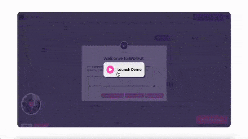
#14 Walnut’s prerecorded demo with audio guidance
Walnut is another interactive demo software, similar to Arcade. And we’ve chosen their guide as an example, as they personalize the demo based on user goal/role (which is stated by the user at the beginning of the demo).
So, here’s how to use Walnut as a marketer guide:
✅ This is actually a product demo (not a feature guide like Arcade’s example), so its tooltips and steps are longer, but there’s also not much fluff; most of the step explanations are part of Walnut’s value proposition and/or solution to common pain points.
✅ The experience is personalized based on user role (marketing, sales, etc.).
✅ There’s an example case story that the demo follows. In the Walnut for marketers guide, this is how to highlight your product on your webpage, promote demo scheduling, and integrate it with HubSpot email outreach automation.
✅ The guide steps also include audio recordings that give a bit of a human touch.
📌 Why is this an example of a good guide?
- There is some jargon in the guides, but it’s more of “speak how your customers speak” kind of jargon instead of unfamiliar technical jargon that comes from Walnut.
- Designing the guide so it isn’t solely audio-based, while still offering audio as an option, is a strong accessibility practice.
- Personalizing the demo for different roles and use cases allow Walnut to keep it short and focused, so user engagement doesn’t drop half way through.
- The tooltips have relatively long copy. But because they’re well-formatted with paragraphs, bolds, and emojis, it’s easy to skim.
- After critical points and interactions in the guide, there’s a “book a meeting” CTA beside the “next” button. It’s a very subtle but good way of catching live demo leads at the right moment.
Knowledge base and help center articles
Knowledge bases and help centers are self-serve libraries of a product, filled with guides, FAQs, and how-to articles that cover everything from getting started to troubleshooting.
💡 According to Zendesk’s findings, 98% of their consumer survey respondents have used some kind of self-serve support hub like a help center or a knowledge base.
Well-structured help centers make it easy for users to find exactly what they need, when they need it.
The challenge, of course, is keeping articles clear, up to date, and organized.
Otherwise, they become just another maze of text.
Here are some good real-life examples for you to get inspired 👇🏻
#15 AdRoll’s knowledge base getting started guides
AdRoll structures their user guides within an article instead of scattering them all around the knowledge base.
The first “getting started guide” is like a link library or a checklist.
And it allows users to quickly access the specific information they need by following the links.
Plus, they have engaging titles!

And here’s what the actual guides look like:
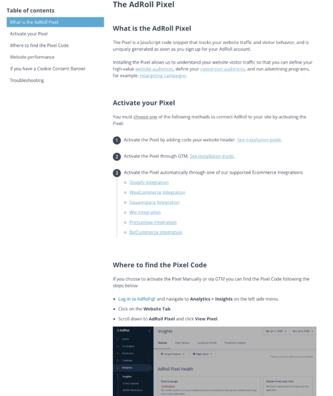
✅ There are different guides for popular tools and different ways of completing a task, so you’re not forced to follow one certain path.
✅ They explain processes step by step with screenshots.
📌 Why is this an example of a good guide?
- The first getting started guide with guide links is a good formatting and accessibility example.
- The guides have a step-by-step structure with eye-catching numbers, so it’s easy to follow along. Plus, the article body is constructed with a lot of bullet points, which also makes the article easy to skim.
- Internal linking is very strong within the whole knowledge base. So, instead of repeating the same detailed information in all articles, AdRoll just links to the relevant guide, which helps them keep the guides short and focused.
#16 Craft’s help center articles
Craft’s help center is surprisingly user-friendly, and even fun to browse, which isn’t exactly common in the help center world!
With quick-search tags right under the search bar, popular topics for easy access, and featured video guides under three minutes, it almost feels more like a blog than a support hub you go to when you have questions and frictions.
Here’s an example guide on how to install, set up, and use the Craft Web Clipper:
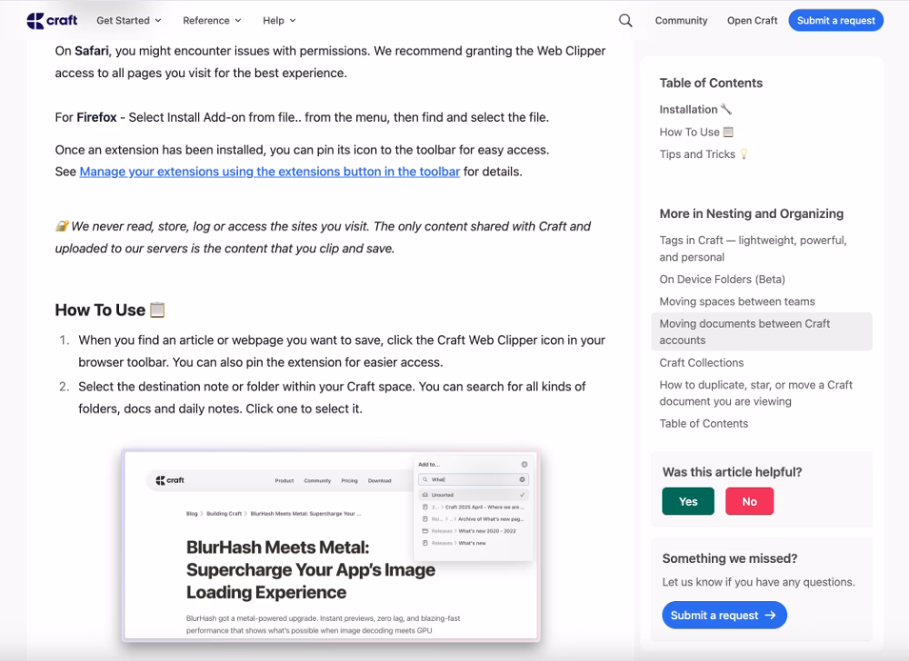
✅ The tone and style of the guide are very friendly and casual. Instead of short phrases for instructions, Craft uses full sentences and repetitions sometimes. This adds some length to the article, but also lightens it and makes it an easier read for the user.
✅ The steps are numbered in the how to part of the article.
✅ They collect quick feedback on the article with a one-question survey.
📌 Why is this an example of a good guide?
- The guide has a logical structure, starting with installation steps, then the setup, and then practical usage tips and tricks. With only one guide, you can start from nothing and then become a pro user.
- There are visuals at key steps of the guide to show where the buttons/features are and what they should look like after the required interaction.
User manuals with lots and lots of visuals
You might be thinking, “Wait, aren’t these just knowledge base guides?”
Fair question.
But when we say user manuals with visuals, we mean guides that lean heavily on screenshots, diagrams, and videos, so much so that the visuals become the core of the guide, not just supporting material.
That level of visual focus deserves its own spotlight.
#17 Notion’s onboarding manuals
Notion’s help center is known for being detailed, user-friendly, and easy to navigate.
A big reason behind this positive reputation is the way they support manuals and articles with plenty of screenshots, GIFs, and videos.
It’s almost a standard practice at Notion to pair written instructions with a matching visual so users can see exactly what’s being explained.
Here’s an example:
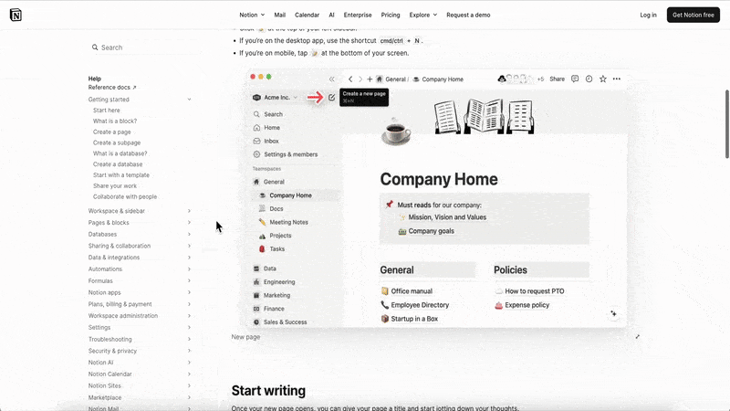
✅ Different types of visuals are utilized depending on the information and instruction, so users are not bombarded with unnecessary GIFs. Sometimes, a basic screenshot with an arrow is enough, too.
✅ Real buttons and icons from the UI are utilized in the guide (in the text parts) to help users recognize them based on the design.
📌 Why is this an example of a good guide?
- Language is very simple and explanatory; there’s no jargon, technical language, or terminology.
- Different types of visuals are utilized.
- The formatting and structure of the guide are very well-organized and easy to skim.
#18 Scribe’s presentation-like user manuals
Scribe is a screen capturing and guide creation tool. And as you might guess, they of course use their own product to create their help center guides.
Here’s an example guide:
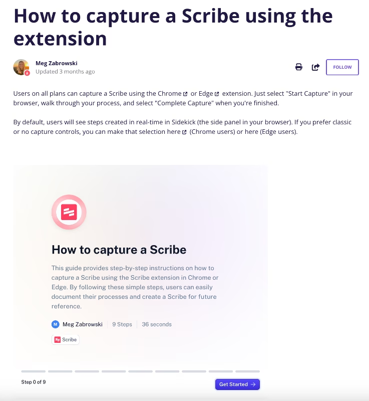
✅ They promote their own tool by utilizing and showing what can be achieved with it.
✅ In their screenshots, they highlight the important buttons/text boxes by keeping them at the center of attention with a red circle.
📌 Why is this an example of a good guide?
- Scribe guide recordings are kept short, they can be completed under a minute. In different guides for more complex workflows, the process is often explained over several Scribe recordings to keep each one short and focused.
- Scribe recordings are action-focused, perfect for users who already know the tool and just need the steps to complete a task.
- For users that would appreciate more explanation and guidance in general, the articles also include written instructions, as well.
#19 Writer’s getting started manual with videos and screenshots
What AdRoll does with their getting started guide (curating it like a link library for onboarding resources), Writer does something similar with their own 4-step guide
But instead of links, they use embedded videos for steps.

✅ Steps are explained in a short paragraph (what you’re supposed to do, why it's important, how it’ll help you use Writer better, etc.), but the actual guide part happens in the videos.
✅ Video lengths differ between 2 minutes and 8 minutes, but as they’re timestamped, you can skip some parts or continue from where you left off later on pretty easily.
📌 Why is this an example of a good guide?
- Video guides follow accessibility practices like time stamps and captions.
- Each video in the user manual is introduced with a short explanation or definition, so users are prepared and primed for what they’re about to watch.
- Within the videos, users are walked through the steps of using a specific feature and shown example real-life use cases.
Onboarding courses and academies
So far, we’ve covered guides that help users tackle specific tasks or onboarding steps.
Most in-app, video, or help center guides focus on solving small, immediate problems.
But some guides aim for bigger goals.
Like use-case guides tailored to a particular industry or user role.
In these cases, companies often create full courses made up of multiple lessons, where the entire course functions as a comprehensive guide.
Let’s see some examples.
#20 Canva Design School
From quick tutorials and individual lessons to full-blown courses, Canva Design School is an amazing example of a product academy.
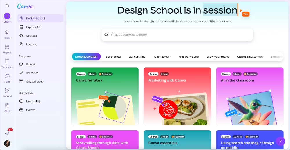
✅ The courses are curated for different user personas and segments. So, there are courses for teachers to use Canva in classroom settings, courses for marketers, for graphic designers, etc.
✅ They include lessons, activities, and cheatsheets. And at the end of each course, there’s a test you need to take if you want to get a certificate.
✅ Most of the courses are around 1-2 hours in total, but there are longer ones, too. Like the course on Human-Centered Design (HCD), which takes more than 3 hours.
📌 Why is this an example of a good guide?
- The course structure (different lessons, videos, and activities) is easy to follow and the visual map of the course creates a motivation for user to continue the course, similar to checklist effect.
- The activities and cheatsheets reinforce the learning experience.
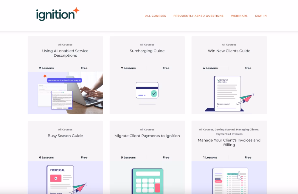
#21 Ignition product learning center courses
Ignition has an extensive library of courses that cover not only Ignition features but also business-related topics.
Some courses consist of a single lesson, which increases the total number of courses and can make navigation a bit tricky.
Still, the courses are categorized, so finding what you need isn’t too difficult.
Anyway, here’s the course library:
And here’s an example course overview:

And an example lesson from the same course:
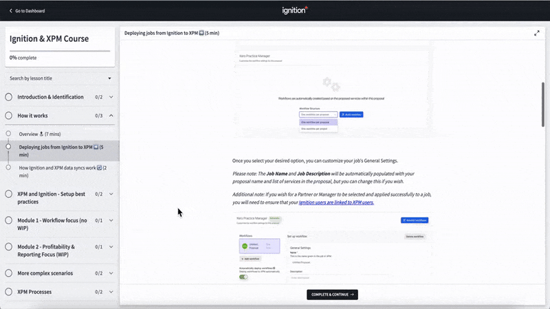
✅ Even in courses with many lessons, each lesson takes no more than 5–7 minutes to complete, with most actually under 5 minutes.
✅ The courses include both written instructions and visual support.
✅ Within their manuals, they provide pro tips, best practices, and warnings in different colored text boxes to draw attention.
📌 Why is this an example of a good guide?
- From the course overview to the lessons, everything is well-structured and easy to follow.
- Visuals and the best practice/warning boxes add a lot of context.
- The estimated time of completion and the progress bar increase user motivation and make courses feel more approachable.
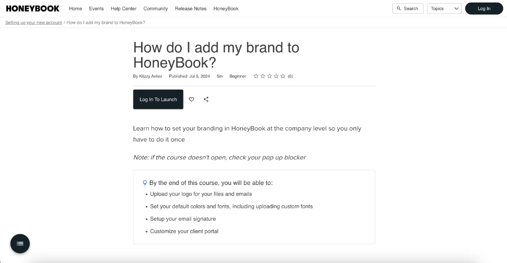
#22 HoneyBook Academy for different use cases
HoneyBook takes a different approach to course organization.
Instead of naming courses after their products or features, they focus on their customers’ pain points and goals.
Courses are categorized by client stages, such as capturing business, booking clients, or maintaining relationships. Within each stage, lessons address common goals and challenges, like following up with leads or creating a client-forward system.
Here are guides for the qualifying leads stages:

Alongside these value-first lessons, HoneyBook also offers courses on their own features and how to use them to their full potential.
Like this one:
✅ The academy prioritizes customer satisfaction and success. So, they offer guidance even on topics that are not closely linked to HoneyBook’s product and services.
✅ Different courses are offered by different speakers and specialists.
✅ Courses include learning goals and outcomes that are listed before a lesson.
📌 Why is this an example of a good guide?
- All business jargon and terminology in a lesson is defined and explained in the beginning of the guide, no matter how basic it is (there’s a definition for leads).
- Courses are well formatted with a lot of bullet points, titles/subtitles, etc.
- The visuals in the courses are varied; there are static screenshots, animated GIFs, and interactive frames that allow you to try out different settings within the guide page.
How to create your own effective user guides
You’ve seen plenty of great examples by now. But how do you actually go from “we need a guide” to creating one that your users love (and actually use)?
Here’s a step-by-step approach you can follow:
➡️ Step 1: Understand user needs.
The best user guides don’t start with writing; they start with listening.
You can use surveys, customer interviews, and behaviour analytics to figure out:
- Where users get stuck most often
- Which features are misunderstood or underused
- What questions support teams answer over and over again
This insight keeps you from wasting time writing guides nobody reads and helps you prioritize the pain points that matter most.
➡️ Step 2: Pick the right format.
Sometimes a quick FAQ article is enough, while other times you need an interactive product tour or a short video. The best format depends on your product, your users’ behavior, and the type of information you’re sharing.
The format of a guide should match the complexity of the task it’s written for.
Choosing the wrong format for a guide can create more questions in your users’ minds and drive them to contact support.
➡️ Step 3: Write clearly.
You should always be straight to the point with your guides so users don’t lose interest or focus midway through.
👉🏻 Use active voice instead of passive voice.
👉🏻 Use familiar, user-friendly terms instead of advanced terms or technical jargon.
And clarity here is not limited to the language aspect of your guide.
You should also be clear about the required steps of a task or the instructions of a process. This means using the right verbs, and phrases, as well utilizing formatting like bullet points or numbered lists to keep the actions visible within the guide.
➡️ Step 4: Add visuals and interactivity.
Guides become easier to follow when text is supported with visuals.
Screenshots, GIFs, diagrams, and videos act as mental anchors that help users remember what they’ve learned.
- Use visuals to clarify each step and make instructions concrete.
- Add interactivity where possible: tooltips, checklists, or embedded demos let users practice while they learn.
- When users can try tasks directly in the product, the knowledge sticks better.
➡️ Step 5: Update regularly.
Even the best formatted and structured guide takes time to read/watch/interact with. So you need to make sure that the time spent on a guide is a good investment for your customers, not a waste.
It’s a pretty upsetting experience to realize the information on a guide is not up to date and you learnt all those steps for nothing.
So, you need to revisit and update your guides after…
- A UI change or improvement.
- A new feature/capability release.
- Analytics show users struggling with certain steps or abandoning the guide.
And after you get user feedback about them, of course.
(Which indicates you need to monitor the performance of your guides as well as collect feedback about them.)
Build, launch, and monitor guides in minutes with UserGuiding!
UserGuiding is a no-code, all-in-one product adoption platform that enables you to create interactive and engaging in-app experiences and onboarding flows for your users.
And interactive guides are a big part of that promise, of course.
🚀 With UserGuiding, you can:
- Add videos, GIFs, images, and links to make your guides more engaging.
- Choose from different tooltip and modal templates or create from scratch.
- Customize colors, sizes, and styles to match your brand and create visual contrast where needed.
- Preview and update guides instantly without any coding or developer help.
Here’s an example interactive guide created with UserGuiding:
If you liked the pop-up or slideout guides, UserGuiding offers templates for those UX modals as well.
Or, if you liked Otter.ai’s approach of triggering guides from a checklist, you can create a similar checklist like this one here 👇🏻 and launch your guides from there, too.
What’s great is that, as an all-in-one solution, UserGuiding isn’t limited to in-app guides.
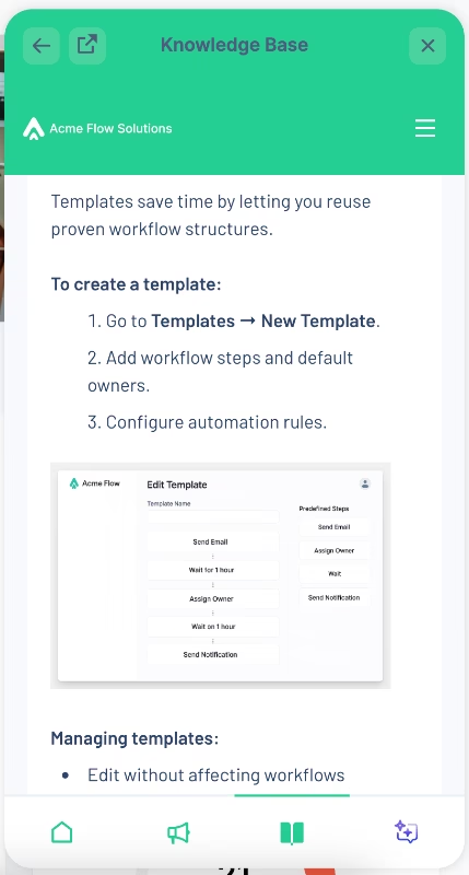
With its knowledge base feature, you can create a standalone help center and publish all your guides in a single hub.
You can then add this knowledge base to your in-app resource center as a separate tab, and allow your users to access guides and tutorials without leaving the app.
Here’s how a knowledge base article looks within the in-app widget:
In short, with UserGuiding, you have a lot of options and freedom to choose the right format and structure for your guides.
And the best part is, no matter what you choose to create, it’s so easy!
UserGuiding is really a no-code tool.
And that means the learning curve is almost non-existent.
Everything you’ve seen so far is created with a drag-and-drop builder. So, you can easily run A/B tests for your guides to find the most suitable combination of copy, modals, and visuals.
Before we wrap things up, let us show you how you can monitor your guides’ performance using the analytics dashboards and reports.
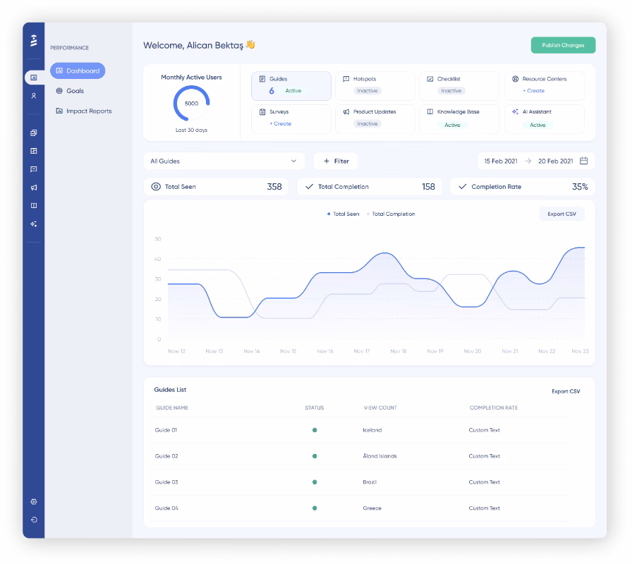
📊 Through these dashboards and guide engagement reports, you can track:
- Total Seen (how many times a guide was viewed).
- Total Completion (how many users finished it).
- Completion Rate (% of users who went all the way through).
- Step Completions (where users drop off in a guide).
- Click Actions (which CTAs/buttons are clicked, with % and counts).
🎁 Get started with a free trial today and see how easy it is to create effective guides.
Key takeaways…
If there’s one thing you get from this article, it should be the importance of guides.
Because great guides drive results.
They help reduce churn, increase feature adoption, and scale support without overwhelming your team.
And if you can take more insights with you, here are 5 key learnings:
- 📌 Clarity and structure enhance the usability of a guide.
- 📌 Visuals and interactivity improve comprehension.
- 📌 Guides triggered at the right time for the right target audience create more meaningful learning experiences.
- 📌 The format of a guide affects engagement.
- 📌 No-code tools (like UserGuiding) simplify guide creation.
Frequently Asked Questions
What are the best user guide examples for SaaS products in 2025?
Otter.ai stands out with its use of checklists that trigger interactive walkthroughs, letting users progress through tasks step by step without confusion. Trello takes a proactive approach by pairing new feature announcements with immediate in-app guides, removing friction before it can even begin. Calendly combines video guidance with interactive demos, creating an engaging blend of learning styles. Together, these examples highlight how varied formats can meet different user needs while keeping onboarding seamless and efficient.
What are the user guide examples that reduce customer support tickets and improve satisfaction?
The most effective resources prevent tickets from being created in the first place. Interactive guides solve problems proactively by tackling issues before they grow, while in-app knowledge bases and tooltips give users answers without leaving the product. Easy access is key. When guidance is available in context, users are far less likely to abandon the app and turn to support, resulting in fewer tickets and greater satisfaction.
How do you structure a user guide for complex enterprise software?
For enterprise-level tools, guides need to balance depth with navigability. Breaking content into modules or chapters based on workflows or user roles ensures users can quickly find what they need. Visual aids like annotated screenshots, flow diagrams, and short clips clarify complicated processes. Adding a searchable table of contents and cross-links between related sections helps guide users through multi-step tasks. This modular, layered approach allows both new and advanced users to learn at their own pace.
What are some user guide examples with interactive elements like tooltips and checklists?
Many in-app guides rely on interactive elements such as tooltips, pop-up modals, and slideouts. These guides move with the user, highlighting exactly where to click and continuing seamlessly as they navigate through the product. Engagement can be boosted even further when guides are triggered from UX elements like checklists or hotspots. These not only capture attention but also introduce the right guide at the right moment, keeping the experience smooth and contextual.
How do PDF and online knowledge bases compare as user guides?
PDF manuals still serve as offline resources, but they lack the flexibility and interactivity of online knowledge bases. A knowledge base can be updated instantly, include embedded media, and offer search and categorization for quick navigation. PDFs, by contrast, often become outdated as you can never be sure whether a user relies on a guide they’ve downloaded months ago. While PDFs may be useful for printable quick-start references, living knowledge bases deliver a better long-term experience for both users and support teams.
What are the top step-by-step user guide examples for onboarding new app users?
Effective onboarding guides strike a balance between clarity and personalization. The first experience sets the tone for a user’s journey, so presenting the right instructions to the right target audience at the right moment is critical. Short, jargon-free walkthroughs help users feel supported without overwhelming them, while segmentation ensures they only see what’s relevant. Twin Science’s step-by-step guide we’ve analyzed in the article is an excellent example of an onboarding guide that feels friendly, approachable, and genuinely helpful to users.
What are some popular user guide examples that boost feature adoption and retention rates?
The best way to get users to actually use a feature is to meet them where they are. Contextually triggered in-app guides pop up when a user is interacting with a feature, showing them exactly what to do and why it matters. By guiding users at the moment of peak interest, these interactive tutorials remove friction, make the experience feel effortless, and increase the chances that users will return, explore more, and adopt the feature for the long term.
How do leading companies design effective user guides with visuals and templates?
Top companies structure their guides with a mix of clear copy, visuals, and interactivity. They use screenshots, GIFs, videos, and consistent templates so users always know what to expect, while formatting like headings, bold text, and bullet points keeps everything scannable. Another thing top companies do is avoid relying on just one type of guide. They mix and match formats so users can learn in the way that suits them best. This approach also reinforces important information.
What are some user guide examples that are tailored for e-commerce websites and customer self-service?
For e-commerce sites, the main goal of guides is to keep the experience friction-free. Any hiccup like confusing checkout steps, unclear product options, or account issues, can make users abandon their carts or leave the site entirely. Well-designed guides step in at exactly the right moment, highlighting actions, explaining features, or offering quick tips. By preventing confusion before it happens, these guides help users move smoothly through the site, boosting satisfaction, conversions, and long-term loyalty.
What are the top user guide examples that show best practices for mobile-first documentation?
For mobile-first guides and technical documentation, less is often more. Users don’t want long walls of text or intrusive pop-ups on smaller screens, so it’s crucial to pick formats that fit the mobile experience. Step-by-step guides, short interactive tooltips, or concise videos work best, and copy should be clear and scannable. Visuals need to be optimized for mobile screens, ensuring readability and accessibility.

.png)


