.svg)
.svg)
.svg)
.svg)
.svg)


.svg)


.svg)
.svg)

TL;DR
- Trial-to-paid conversions often fail not because users lose interest, but because they never reach their “aha!” moment during the trial. Without proper in-app guidance, trials feel meh, which leads to early churn.
- The best practices for improving trial conversions include:
- Identifying what value looks like for each persona and guiding users to those first “aha!” moments right away.
- Replace long onboarding materials with digestible, action-oriented flows that feel achievable and motivating.
- Delivering contextual and timely nudges to help users stay on track without overwhelming them.
- Measuring which actions drive conversions, identifying drop-off points, and continuously improving onboarding.
- With UserGuiding, you can put all of these best practices into action without breaking the bank or learning how to code!

Why are trial-to-paid conversion rates so low?
For most SaaS and digital platforms, the gap between trial signups and paid conversions isn’t about loss of user interest, but about the trial experience.
Users enter trials curious, but many never make it far enough to see the real value of the product.
And if trial users can’t quickly experience the product’s core value (for their use case and needs), they lose motivation and churn before upgrading.
⚠️ So, users don’t reach their “aha” moments fast enough. Or ever.
But why?
Because when there’s no in-app guidance during the trial period, users fail to discover critical features, and even if they discover them, the workflow feels too complicated or confusing.
And you probably know that story ends.
A trial that should drive excitement and engagement instead feels overwhelming or underwhelming, both of which lead to missed conversions.
But don’t go into mourning just yet.
You can change this sad story into a successful one, where trial users become happy customers.
Here’s how 👇🏻
What are the best practices for improving trial conversions?
Offering contextual in-app onboarding during the trial period ensures that users don’t feel unattended or lost. That’s the first practice you need to adopt.
Like, now.
But for a proper onboarding, you need more than a generic home page tour.
👣 Let’s go over your action plan and the steps you need to take to keep trial users engaged, hooked, and ready to become paying customers.
#1 Map out key activation points and highlight them early
Your trial users don’t have months to figure things out. They need to experience value fast. And that means you need to first understand what a valuable experience looks like for your users, and what proves that you can help them.
Only then can you create an onboarding flow that highlights the right features, capabilities, and value-realization moments.
⚡ Pro Tip: Different user personas and segments can have different activation points.
You should understand each user type (their needs, expectations, goals, and pain points) to guide them to the right solution.
Onboarding is truly effective only when it’s personalized, as personalization delivers the most value and guidance. And it all starts at this step.
#2 Break onboarding flows into smaller, task-based steps
Just like complex features and workflows can intimidate new users, long or overly complicated onboarding flows can cause confusion and hesitation, too.
Your trial users might think:
- “If the guidance is this long and complicated, I can’t even imagine how the tool works…” → They feel frustrated and overestimate the learning curve.
- “This is way too much, I’m not going to sit through all of it.” → They skip onboarding and either feel lost unnecessarily or miss key features/capabilities.
To make your onboarding more friendly and approachable, you need to present it in digestible chunks. And to do that, you can…
✅ Create multiple guides instead of one long walkthrough.
✅ Use onboarding checklists to create a manageable onboarding path.
#3 Provide contextual guidance at the right time
Users don’t need to learn everything during the trial, only what matters most for immediate value. Even the features that could be valuable have a time and place for introduction.
Creating interactive guides for every feature and cramming them into one onboarding checklist will often backfire, as users are less likely to engage when overwhelmed.
Instead, you can keep some information for smaller nudges, like tooltips and hotspots, and trigger them when the information is relevant to the user’s current actions.
And if a user needs more guidance, you can always launch a full guide from those tooltips and hotspots.
And if you still need to offer more guidance on the topic, you can always trigger a guide from a hotspot, too.
⚡ Pro Tip: Onboarding shouldn’t kill the natural sense of product discovery. Your trial users are already interested in your product and want to check it out.
But they’re not a passive audience for a demo.
- ✅ Provide guidance while still allowing self-discovery and active engagement.
- ❌ Don’t turn interactive experiences into passive, show-only tutorials.
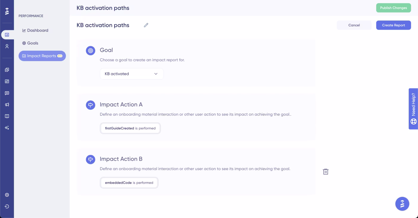
#4 Track impact reports to identify friction points and optimize
A proper onboarding flow has many moving parts. To understand which parts are working (and which are not), you need to measure, compare, and analyze each element.
Impact reports let you do exactly that.
They show how specific user actions contribute to your conversion goals and help you pinpoint friction points in your onboarding.
They reveal the impact of each action individually and in combination, so that you also get to know what works well with what.
Though that might sound confusing and hard, it’s actually pretty easy with UserGuiding!
All you need to do is create your goals and then choose your impact actions from a drop-down menu. No coding or advanced analytics skills required.
UserGuiding can help you!
Now that we’ve started talking about the tools and how to use them, let us show you how UserGuiding can help you implement all these best practices with its intuitive, no-code features 👇🏻
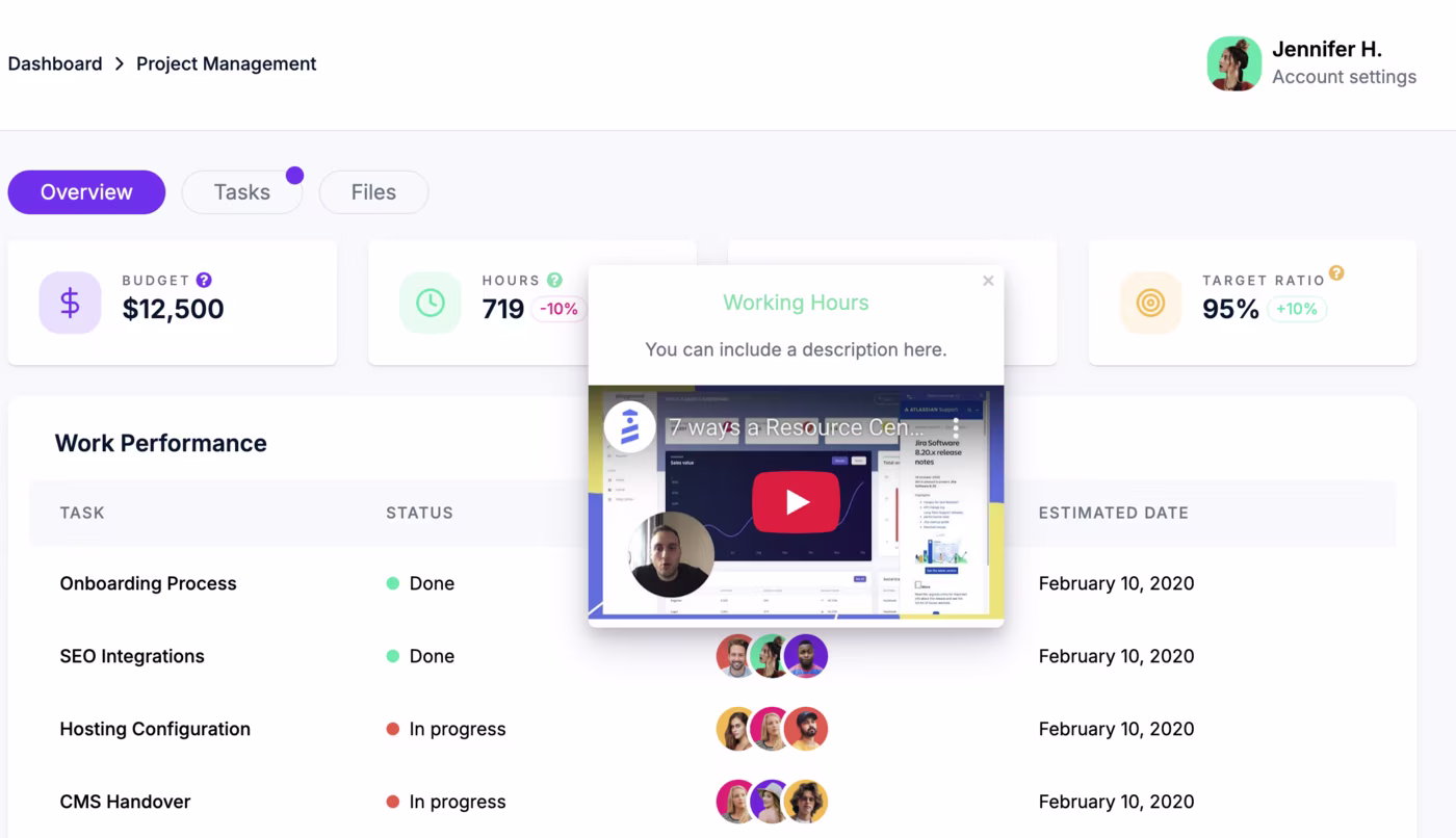
1) In-app guides to lead users through complex workflows
You can use interactive guides to walk users step by step through your product’s important workflows.
This way, they stay hands-on as they click buttons, fill in fields, and actually use your product, rather than passively watching a demo video.
Meanwhile, tooltips and modals inside the guide smooth out any friction or confusion.
Like a driving license teacher pointing the way, minus the pressure.
🚀 With UserGuiding’s in-app guides, you can:
- Personalize guidance based on user roles, goals, or behavior.
- Link guides to checklists or resource centers to support self-paced learning.
- Use visuals in your guides to increase interactivity and contextuality.
- Choose from a variety of templates or design guides from scratch to match your needs.
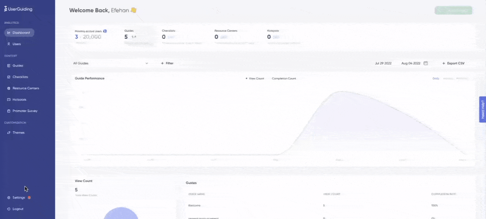
Here’s an example guide created with UserGuiding:
⚡ Pro Tip: Just like onboarding flows, guides work best when they’re short (ideally under 6 steps) and focused.
Instead of one long guide that covers every capability and use case, break it into smaller guides focused on individual actions, and make them accessible through a different checklist in the resource center.
2) Checklists to drive completion of critical actions
From your trial users’ perspective, checklists give them a clear roadmap of what to do next and break down onboarding flows into bite-sized, achievable steps.
Each completed task also provides a sense of progress, motivating them to continue.
From your perspective, they allow you to organize (and highlight) guides and other important onboarding materials in one accessible place.
Here’s an example onboarding checklist experience:
⚡ Pro Tip: You can create different checklists for different user personas and highlight different guides and materials based on use cases.
On average, a company manages 3 checklists with an average of 5 tasks on each.
3) Hotspots to trigger during high-friction steps
Hotspots are small, non-distracting, but still eye-catching UI modals that allow you to offer contextual tips and information.
They are triggered when the user interacts (hovers over or clicks on) with the hotspot beacon, which can be static or pulsating.
You can use hotspots to:
- Point out (new) features/buttons on the UI,
- Highlight underused functions, or
- Offer additional guidance (like pro usage tips) right beside features/buttons
UserGuiding’s hotspots also allow you to add videos and visuals to your hotspots, as well as trigger surveys or guides from them.
⚡ While hotspots are generally non-distracting UI modals, they can still become distracting if too many appear at once on the same page.
So, be mindful of positioning and spacing.
On average, a company uses around 5 hotspots, spread across different pages, of course.
4) Tooltips to decrease mental load
Tooltips are other small UI modals you can use for contextual nudges. They can be triggered automatically or based on user interactions like hover-overs or clicks.
Because they offer quick and contextual guidance on the user interface, tooltips eliminate user confusion right on the spot.
They ensure users are confident in their workflows and can continue without checking support materials or thinking about what a specific input field wants or a button icon to stand for.
Hello, faster and smoother flows, bye-bye frictions and mental load.
You can use tooltips to:
- Explain certain features, buttons, input fields, and menus on the UI.
- Encourage users to click or complete certain actions.
Here’s an example tooltip:

5) Contextual upgrade promotions with modals and banners
Upgrade prompts work best when they feel timely and relevant, rather than pushy.
By showing modals or banners at the right moment, like when a trial user hits a usage limit or explores a premium feature, you can encourage upgrades naturally.
🚀 With UserGuiding, you can encourage users to upgrade by:
- Showing modals or slideouts based on user actions or signup date attributes.
- Displaying banners to highlight limits, usage milestones, or feature upgrades.
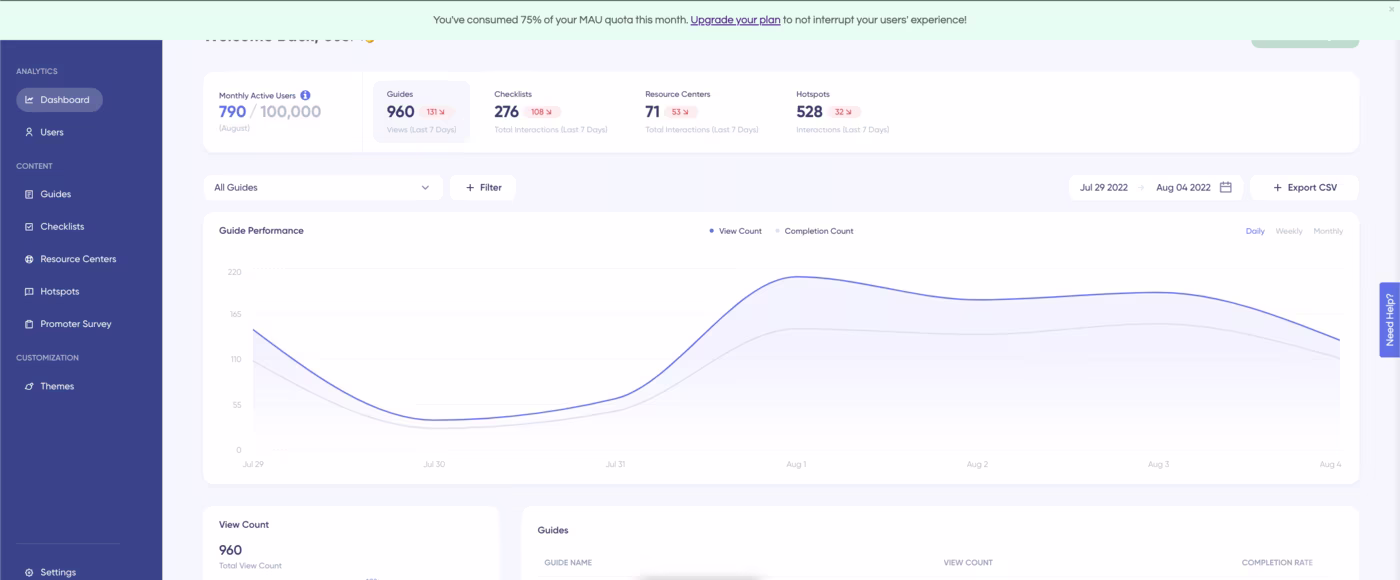
Here’s an example slideout modal that prompts the user to add more seats to their plan when they visit their team page.
And here’s an example banner that informs the user that they’ve consumed 75% of their MAU quota for the month and invites them to upgrade their plan:
6) Segmentation for quicker value realization
Segmentation is one of the most powerful levers for accelerating user value realization. Instead of sending the same onboarding and in-app experiences to everyone, you can tailor guidance based on user roles, goals, or behaviors.
It plays a huge role in in-app messaging, adoption campaigns, upsell/upgrade promotions, and onboarding experiences, of course.
You can tailor experiences through…
- Onboarding Surveys: Use quick surveys to learn about user roles, goals, or needs. You can direct them to the most relevant guides, checklists, or features based on their answers.
- Automated Triggers: Set rules that automatically trigger guides or messages based on attributes (e.g., location, plan, role) or behaviors (e.g., using a feature, skipping a tutorial).
Here’s an example survey modal that directs users to different tutorials based on their needs and answers to the question:

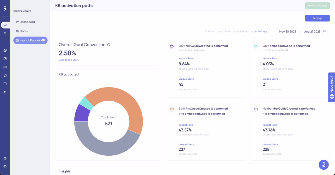
7) Goal tracking and impact reports to optimize onboarding materials
Impact reports take the guesswork out of onboarding by showing which actions actually lead to conversions.
For example, you can see if checklist completion, guide usage, or hotspot engagement moves users closer to their goals, and then optimize accordingly.
We’ve already talked about how easy it is to compare different user interactions’ impact on your goals with UserGuiding’s intuitive and user-friendly reports feature in the best practices part, so let us show you an example impact report now 👇🏻
Pro usage tips for higher trial-to-paid conversions
1️⃣ Personalize workflows to user roles or goals. As we’ve said, for onboarding to truly resonate with the user and offer value, you need to tailor it to their specific use cases and interests.
2️⃣ Showcase quick wins that demonstrate product value fast. When users see value right away, they’re more likely to stay engaged and continue exploring your product.
3️⃣ Use progress indicators to motivate completion. Visible progress can make tasks feel more achievable and rewarding.
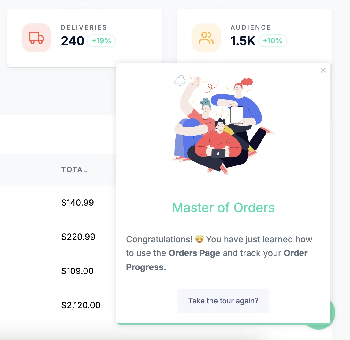
4️⃣ Gamify the onboarding experience with celebratory animations, achievement messages, challenges, and badges. These things work pretty much the same way as progress indicators.
- They increase motivation and positive feelings associated with the onboarding tasks.
Here’s an example celebratory modal after a product tour:
5️⃣ Offer incentives for onboarding material engagement and completion. Animations and badges are fun, but they don’t really have tangible benefits to users.
If your trial tasks require more effort and investment, and therefore more user motivation, you can offer incentives such as extended trial days or in-app credits upon completion of onboarding tasks.
6️⃣ A/B test guidance flows to maximize impact. Creating the perfect onboarding experience (with the checklists, walkthroughs, and other contextual in-app messaging) is impossible on the first try.
So, you need to try a few different combinations of guides, different checklist orders, and even different hotspot copy to get the best-performing flow.
What positive outcomes can you expect with UserGuiding?
Companies that streamline their trial experiences with UserGuiding’s guides, checklists, and contextual nudges have seen faster activations and higher conversion rates.
Here are some example success stories:
- Flowla increased their activation rate by 24% with product tours they trigger after sign-up.
- Grupo IOB increased the completion rate of their main onboarding flowabove 75% with checklists, guides, and tooltips. Plus, they reduced their support tickets.
Final words…
Improving trial-to-paid conversions starts with improving the trial experience. And that begins with offering proper, goal-oriented onboarding.
When users…
- ✅ see value quickly,
- ✅ understand how to reach their goals, and
- ✅ feel supported along the way,
they’re far more likely to become paying customers.
👉🏻 Start your UserGuiding journey today and create engaging onboarding experiences.

.png)