.svg)
.svg)
.svg)
.svg)
.svg)


.svg)


.svg)
.svg)

The first few minutes that a potential customer tries out your software are crucial, as it is in those moments that the customer decides if your solution is worth their time or not.
Among the SaaS teams, the priority of a strong onboarding process has gained attention.
There is a growing realization that if you can’t capture a user’s heart in the first session, you’ve likely lost them forever.
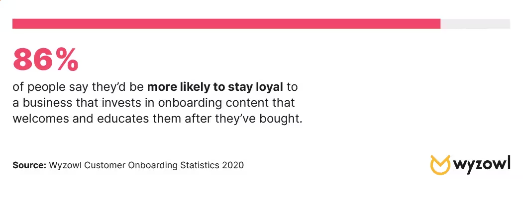
And according to Wyzowl’s onboarding research, 86% of people say they’d be more likely to stay loyal to a business that invests in onboarding content that welcomes and educates them after they’ve bought.
However, realizing that you need a powerful onboarding process is not the same as identifying where you need to support your customer to show your true value.
If you fail to monitor the specific feature adoption metrics that actually correlate with success, you are essentially operating in the dark.
Luckily, in this article, we will go through how you can measure and eventually improve your onboarding process.
Let’s dive in!
- 86% of users are more likely to stay loyal to a business that invests in educational onboarding content.
- Essential Metrics to follow to ensure conversion success:
- Feature Adoption Rate: Measures the percentage of active users engaging with a specific tool to determine its value.
- Activation Rate: Tracks the percentage of users reaching their "Aha!" moment; it is the strongest predictor of retention.
- Trial Conversion Rate: The ultimate indicator of success, measuring how many free users transition to paid subscriptions.
- Strategic KPIs: Beyond simple usage, teams should monitor the Breadth (how many users) and Depth (how often/intensely) of adoption to prioritize development.
- Friction Identification: Metrics like Checklist Drop-off and Support Ticket volume highlight exactly where users struggle, allowing for data-driven improvements.

What Does a Successful Onboarding Look Like?
Let’s say, just like Andrew Melnychuk here, your goal is clear. You are also sure about the value that your software adds to the customer’s life 👇
However, you are not seeing promising results.
If you are stuck in the same position as this post, let’s look at exactly how a successful onboarding looks.
Personalized and segmented
A successful onboarding is not a “one-size-fits-all” situation, but it is a specifically tailored suit for each customer.
According to McKinsey & Company’s report on personalization, 71% of consumers expect companies to deliver personalized interactions.
You can achieve personalized onboarding flows by making use of onboarding surveys.
This way, you are letting users identify their role or goal upfront, and the signup process stops being a generic profile creation but becomes a person with a specific problem entering into your software for a specific solution.
Through these surveys, you can segment users and bring them closer to the path of seeing your value, meeting them where they are.
With use-case-oriented product tours, individuals can bypass irrelevant features and be guided directly toward the tools that solve their specific issue.
To keep users on track without making them get overwhelmed, personalized checklists serve as a gamified roadmap.
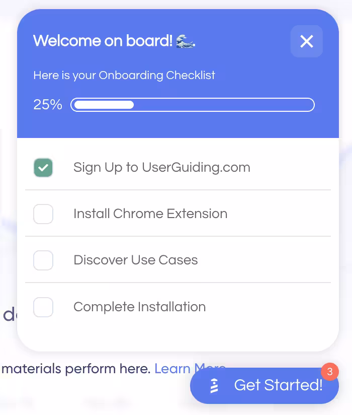
These lists allow users to see their progress in real-time, directing their focus on the high-value actions that lead to their unique “Aha!” moment.
By tailoring the journey to the individual’s intent, you don't just show them how the product works; you show them how it works for them, drastically increasing the likelihood of a successful trial-to-customer conversion.
User-centric, not you-centric
It is important to understand that the onboarding should satisfy the needs of your user, not you.
Onramp argues that 1 in 3 leaders admit they don’t know where the customers stand in onboarding, creating a visibility gap.
You can breach this gap by making sure your user gets the help they need at the right time, reducing the churn rate mentioned below 👇
When creating an onboarding flow, do not drown out the user with more information than they need.
Instead of forcing the onboarding with an in-your-face attitude, making every step skippable and strictly action-oriented, empowers users to explore at their own pace rather than feeling like they’re trapped.
Moreover, instead of being guided at an irrelevant time, through contextual hotspots and hover-over tooltips, you can make sure that the help arrives at the exact time where the user needs it.
Rather than shouting for attention, these subtle cues wait for the user to engage with a specific feature before offering a "pro tip" or a helpful nudge.
Finally, for those who prefer to self-serve, a permanent resource center acts as a safety net.
By keeping onboarding guides and support materials tucked into a persistent menu, you ensure that help is always available on demand.
This shift from "interruption" to "availability" transforms onboarding from a hurdle into a continuous, supportive conversation.
Gamified and automated
Just like how successfully completing a game level with a perfect score fills us with confidence, making progress in an onboarding flow and seeing your progress visually represented through gamification elements fills your user with confidence.
Seeing a progress bar move from point zero to 80% not only gives that nice touch of dopamine and confidence, but also keeps a user engaged and maintains their curiosity.
Research also shows that gamification can boost user engagement by 60% and productivity by 50%.
By incorporating gamification elements such as progress bars, achievement badges, and interactive checklists, you transform boring “to-do” lists to quests for your users.
However, a successful onboarding also engages back with the user thanks to automated onboarding flows and AI-powered assistants.
For instance, UserGuiding’s AI assistant, Dylan, acts as an always-on co-pilot, ready to resolve hindrances the moment they appear.
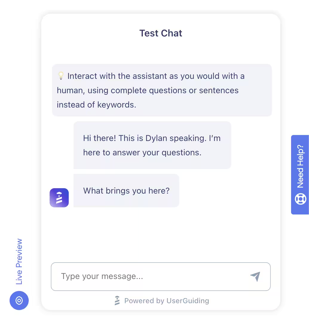
If a user comes across a specific problem, they can ask Dylan, and it can trigger relevant in-app guides to walk the user through the solution in real-time.
This seamless blend of psychological motivation and instant, automated support ensures that even when users get stuck, they never lose their momentum
Open to improvements and customer feedback
Keep in mind that your onboarding flow is a living part of your product that constantly needs to be evolving and improving alongside the product.
A successful onboarding makes use of in-app surveys in order to gather how the onboarding experience went for the user right after key moments, such as setting up their first project, in order to capture their “gut reaction”.

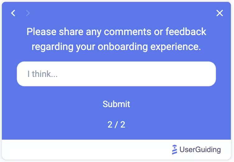
Thanks to this real-time data, you can learn the friction points, exactly where and why the users drop off, what is working, and what is keeping them away.
In addition, you can use the data collected from these surveys to run A/B tests.
By experimenting with a few versions of an onboarding flow, you can clearly see what your user responds to.
Therefore, your onboarding process is dictated by user actions, not random guesses.
Key onboarding KPIs and metrics to monitor Trial conversion and retention
So, now that you built an onboarding flow, what should you monitor to make sure it is benefiting both you and your customers?
Here are some questions you should ask yourself (and your product team) that will help you prioritize what metrics to monitor 👇
#1: Feature Adoption Rate
Feature adoption rate measures the percentage of your active users who engage with a specific feature.
While a product's overall success is measured by total retention, this metric pinpoints exactly which tools provide value and which are ignored.
It serves as a vital KPI when launching new updates, helping teams determine if a feature is discoverable, easy to use, and actually solving a user's problem.
How to calculate feature adoption rate:
Feature Adoption Rate = (Number of Users Meeting Adoption Criteria / Total Active Users) × 100
#2: Breadth of Adoption
Breadth of adoption measures how widely a feature is used across your entire user base.
While the adoption rate focuses on specific tools, breadth evaluates the percentage of unique users who have engaged with a feature at least once.
It is a critical KPI to identify which tools provide general value and which tools serve niche use cases. This way, it helps you prioritize feature developments.
How to calculate the breadth of adoption:
Breadth of adoption = (Number of people who used the feature / total user base) x 100
#3: Depth of Adoption
Depth of adoption measures how frequently users engage with a feature over time.
It highlights the intensity and the consistency of users who engage with the feature.
High depth indicates a "sticky" feature that has become an essential part of the user's workflow.
It serves as a key KPI when assessing long-term retention and product-market fit.
How to calculate the depth of adoption:
Depth of Adoption = Total number of feature interactions / Number of users who used a feature
#4: Time to Value
Time to value measures the duration between a user’s first exposure to a feature and their initial interaction with it.
This is a vital KPI for assessing onboarding efficiency. A short time-to-adopt highlights clear positioning of your value and a smooth onboarding process where the feature meets with the user along the way.
Adoption almost always comes down to timing and context more than explanations. If the feature shows up exactly when the user is already trying to solve that problem, it lands. If it’s introduced out of flow, even great messaging gets ignored."
How to calculate time to value:
Time to Value = Date of First Value Moment − Date of Start
#5: Duration of Adoption
Duration of adoption measures the total length of time a user continues to actively engage with a specific feature after their initial discovery.
Unlike "time to value," which focuses on the start, duration tracks the feature's long-term utility.
It is an important KPI when identifying which features become core features that provide sustained value and have lasting effects on your product’s overall retention.
#6: Free-to-Paid Conversion Rate
Free-to-paid conversion rate measures the percentage of users who transition from a free trial or freemium tier to a paid subscription.
This KPI evaluates your product’s ability to demonstrate real-world value and successfully monetize its user base.
A high conversion rate suggests that your premium features are effectively positioned and provide solutions for the user’s pain points.
How to calculate Free-to-Paid Conversion Rate:
Free-to-Paid Conversion Rate: (Total number of customers who convert from free to paid / total number of free trial users during the same time frame) x 100
#7: Onboarding Completion Rate
Onboarding completion rate measures the percentage of users who complete the required steps of your onboarding flow, such as a full setup guide or a multi-step product tour.
This KPI directly influences both trial conversion and long-term retention, because users who successfully navigate onboarding are far more likely to see the value of your software and commit to a paid plan.
A high completion rate indicates a frictionless user experience. However, if this rate is low, it shows that the process is too complex or irrelevant to the user’s needs.
How to calculate Onboarding Completion Rate:
Onboarding Completion Rate = (Number of users who completed onboarding / number of users who started onboarding) x 100
#8: Product Tour Completion Rate
Product Tour Completion Rate measures the percentage of users who complete your guided product tours.
Since the goal of product tours is to showcase key features, a high completion rate suggests that users find your tour relevant and engaging. It highlights that your onboarding process is successful at bridging the gap between the value of your software and the user needs, which results in turning casual trial users into loyal customers.
If the rate is low, review the tour length, whether steps are skippable, or if the content is truly contextual and action-oriented.
How to calculate Product Tour Completion Rate:
Product Tour Completion Rate = (Number of Users Who Complete a Specific Tour / Number of Users Who Start the Tour) x 100
#9: Checklist Drop-off Rate
Checklist Drop-off Rate measures the percentage of users who start but fail to finish your onboarding tasks, namely your checklists.
It highlights exactly where friction occurs during the initial user journey. By monitoring where users stop, you can identify confusing steps that cause friction and simplify them.
Minimizing this rate is crucial for trial conversion and long-term retention, as a completed checklist ensures users reach the core value of your product.
How to calculate Checklist Drop-Off Rate:
Checklist Drop-off Rate = (Number of users who started but didn’t complete the checklist / Total users who started) x 100
#10: Activation Rate
Activation rate measures the percentage of new users who experience the “Aha!” moment of your product.
This KPI is a strong predictor of trial conversion and long-term retention.
With a successful onboarding flow, you can maximize this rate. When users reach activation quickly, they are significantly more likely to transition from a trial period to loyal customers.
How to calculate Activation Rate:
Activation Rate = Activated users / Users in that onboarding cohort
#11: Onboarding Drop-Out Rate
Onboarding Drop-Out Rate measures the percentage of users who abandon your setup process before reaching the final step.
This KPI identifies friction points that directly hinder trial conversion and long-term retention.
When users drop out early, they do not get to experience your product’s core value.
A smoother, more engaging onboarding experience allows you to minimize this rate and ensure turning hesitant newcomers into activated customers.
How to calculate Onboarding Drop-Out Rate:
Onboarding Drop-Out Rate = (Total number of customers who did not complete the process / Total number of customers who started the process) x 100
#12: Level of Onboarding Path Personalization
The level of onboarding path personalization measures how effectively your setup process adapts to specific user roles, goals, or industries.
This KPI is one of the key metrics to measure when trying to drive trial conversion, because, as we already discussed above, customers are more likely to stay if they feel personally valued by your product.
A tailored onboarding process skips irrelevant steps for individual use cases and makes them reach their unique “Aha!” moment faster.
By delivering high personalization, you reduce friction and demonstrate immediate value.
How to calculate the Level of Onboarding Path Personalization:
Level of Onboarding Path Personalization = (Number of onboarding customers who got tailored treatment / The total number of onboarding customers in that time frame) x 100
#13: Frequency of Use
Frequency of use measures how often a user returns to engage with your product within a specific timeframe.
As a KPI, it reflects the power of successful onboarding; if users discover the value of your product quickly, they will adopt it quickly as well.
High frequency of use signals that the product has transitioned from a novelty to an indispensable solution for the user.
How to calculate Frequency of Use:
Frequency of Use = (Total number of user sessions / Total number of active users)
#14: Customer Churn Rate
Customer churn rate measures the percentage of users who stop using your product over a specific period.
This cornerstone KPI is a direct reflection of the success of your onboarding process, because if a user fails to reach their “Aha!” moment during first onboarding, they are more likely to abandon the product.
High churn counteracts growth and signals that customers are no longer receiving value. Minimizing churn is critical for long-term growth.
How to calculate Customer Churn Rate:
Customer Churn Rate = Number of customers lost during a period / Total number of customers at the start of the period) x 100
#15: Number of Support Tickets during Onboarding
The number of support tickets measures the total volume of assistance requests submitted by users during their initial onboarding journey.
This KPI reflects the influence of onboarding on the user. If your support tickets are high, it showcases that there is a confusing step that stalls conversion.
While a lower volume both suggests a frictionless onboarding flow and shows that your self-serve support is successful.
Reducing this rate is important because users would be more inclined to commit to your product if they feel confident in navigating it on their own.
How to calculate Number of Support Tickets:
Number of Support Tickets per customer = Total support tickets during the onboarding period / Number of customers onboarded in that period
UserGuiding can help you!
Luckily, you are not alone in handling all of these by yourself.
There is UserGuiding to help you along the way!
With UserGuiding, you can create, monitor, optimize, and run quick A/B tests, make immediate updates, and collect feedback all in one platform.
UserGuiding is a no-code, all-in-one product adoption and user engagement platform designed to help teams onboard users, drive feature adoption, and enhance in-app engagement, while also supporting self-service customer support.
📌 Here’s what you get with UserGuiding in terms of features:
- Product tours
- Onboarding checklists
- Hotspots and tooltips
- Announcement modals (banners, slideouts, pop-ups, etc.)
- NPS and custom in-app surveys
- AI assistant
- Resource center (in-app)
- Knowledge base (standalone)
- Product updates (standalone)
- Segmentation
- Analytics
- Session Replays
- UserGuiding MCP Server
- No-code Event Tracking
If you’d like to learn more about UserGuiding’s capabilities, here’s our in-depth article on UserGuiding’s use cases 👈🏻
UserGuiding’s analytics dashboard, seen below, gives you valuable insight into how your users are interacting with the onboarding flow.
Within the Analytics Dashboard, UserGuiding offers graphical and numerical reports of the following:
- ✅ The total number of unique users
- ✅ The total number of users who saw and/or completed your guides, along with a completion rate
- ✅ The total number of users that interacted with your Hotspots, Checklists, Resource Center, etc.
- ✅ The total number of people who completed your Checklists
- ✅ The total number of people who saw and responded to your Surveys, along with a response rate
And even more!
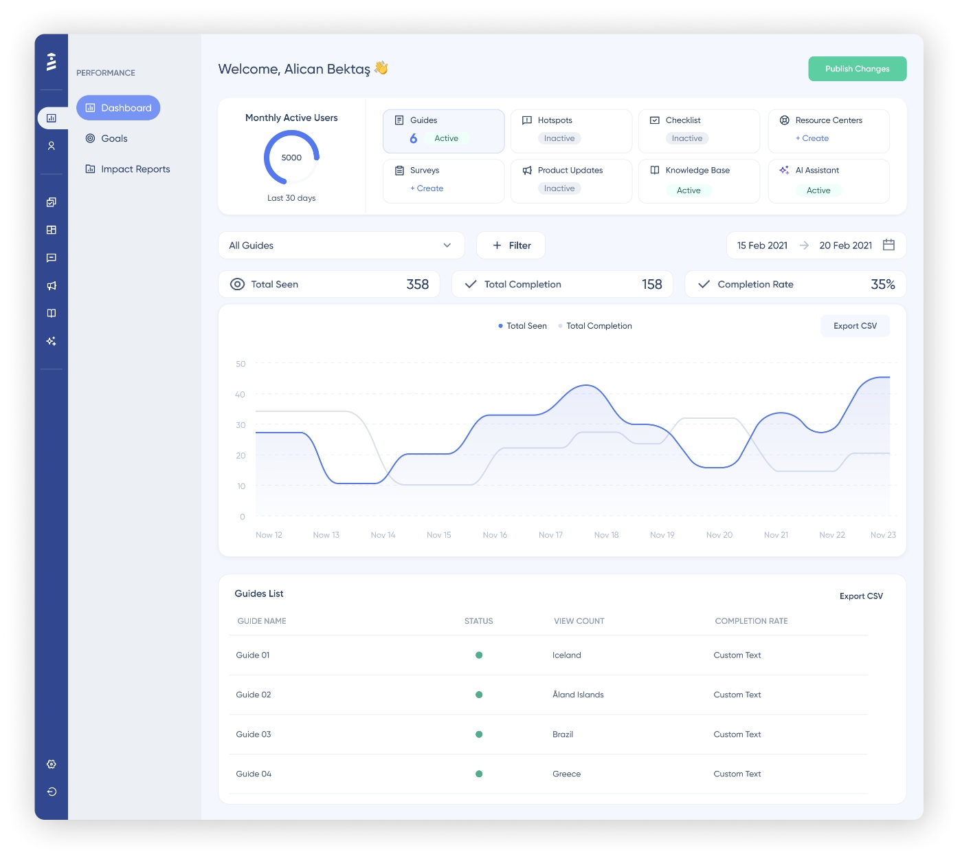
UserGuiding’s intuitive UI simplifies the bulk of analysis that you need to make in order to understand what is working, or what needs improvement, in your onboarding.
By default, upon entering your dashboard, the line chart above shows how your guides have performed daily for the last seven days. In order to explore other contents, you can easily switch between content tabs.
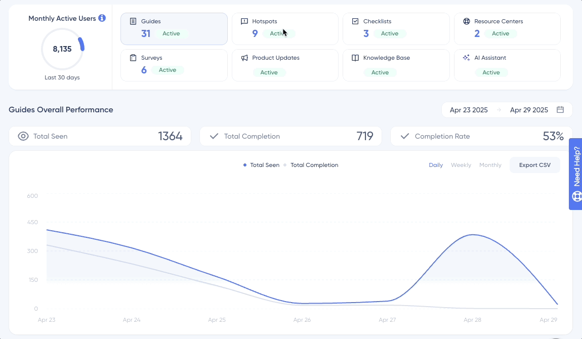
For example, if a guide is seen more than it has been completed, you can understand that it might be too long or complex for the users to finish it.
Don’t believe us yet? Let’s hear from some of our customers! 👇
- Keyhole improved the number of trial conversions by 550% with UserGuiding’s onboarding checklists.
- Indicata achieved a 47% feature adoption rate thanks to UserGuiding’s product tours and hotspots.
- Eon Dental achieved 85% guide completion rate by implementing UserGuiding’s personalized, multilingual onboarding experiences.
If you want to see UserGuiding in action and experience impressive results like above, try it out yourself!
Conclusion
Well… There are many ways to define what successful onboarding looks like, and even more ways to monitor whether or not you’re reaching that success.
Moreover, deciding which KPIs to monitor in order to set yourself up for success can be tricky.
Bad news, too many metrics and dashboards are not answers to your onboarding bottlenecks…
Great news, on the other hand, is that having a powerful and comprehensive onboarding tool that helps you manage all your creation, monitoring, and optimization actions in one place definitely helps a whole bunch.
That’s why, we recommend you check out UserGuiding today!
Frequently Asked Questions
How do you measure onboarding success?
To measure onboarding success, you should track KPIs that bridge the gap between initial sign-up and long-term value. Key metrics include the activation rate, which identifies when users recognize the promised value of your product, the “Aha!” moment, and the onboarding completion rate, which shows if there is any friction that users experience when navigating your product. By monitoring these alongside trial conversion rates, you can determine if the onboarding process is effectively guiding customers to the product’s value.
How do you measure success of a feature?
In order to measure the success of a feature, you need to analyze both its reach and its impact on the user’s experience. You need to track feature adoption rate to see the percentage of users who interact with it, while also evaluating the breadth and depth of adoption to understand how widely and deeply it is integrated into workflows. Typically, if the engagement rate is high, it signals that the feature successfully solves a problem and adds value to your product.
What are KPIs to measure customer conversion?
When monitoring the transition from trial members to committed customers, the trial conversion rate is the direct indicator. This KPI directly tracks the percentage of users who move from a free trial to a paid plan. Additionally, you can track the activation rate, which shows the percentage of users who successfully achieved the “Aha!” moment. If these metrics are high, it signals successful customer conversion and long-term growth for your product.

.png)