.svg)
.svg)
.svg)
.svg)
.svg)


.svg)


.svg)
.svg)

PX, UX, CX… the SaaS world is full of “experiences,” but in this article, we’re zooming in on just one: product experience (PX).
If UX is about how easy a certain aspect of a product or a feature is to use, PX steps back and asks a bigger question.
What is the overall experience a user has with the product itself, from the very first touch to the day they become loyal, confident power users?
PX encompasses everything that influences how someone understands, navigates, and derives value from your product, including onboarding flows, guidance, feature discoverability, UI clarity, documentation, and the manner in which updates are introduced.
And we’ll talk about all of these in detail in this article.
So, let’s get started!
TL;DR
- Product Experience (PX) refers to the complete product journey a user has, including navigation, usability, feature discovery, performance, support, and every interaction that happens inside or around the product environment.
- So, PX entails user experience (UX) and is part of the bigger customer experience (CX).
- Core aspects of a good and smooth PX are…
- Frictionless signup that gets users into the product quickly.
- A clear, supportive onboarding and first-time experience.
- Intuitive usability and UI that reduce cognitive load.
- Strong feature discoverability with contextual guidance.
- High performance, stability, and reliability across devices.
- Ongoing engagement and accessible support materials.
- Personalized experiences and meaningful feedback loops.
- While paying attention to the core components of a good PX, you should also avoid common pitfalls and mistakes that can compromise the quality of your PX, such as…
- Prioritizing initial activation over long-term engagement.
- Rolling out UI changes without context or explanation.
- Overlooking performance and stability.
- Making decisions based on assumptions instead of data.
- Ignoring accessibility and inclusivity in design.
- You can adopt a product adoption tool like UserGuiding to optimize multiple aspects of your PX in one platform without writing a single line of code!
- With UserGuiding, you can:
- Create interactive onboarding flows, product tours, and checklists.
- Improve feature discovery with tooltips, hotspots, and in-app messages.
- Collect in-product insights with NPS, CSAT, and custom surveys.
- Guide users contextually and reduce support tickets.
- Personalize onboarding and user paths based on behavior and segments.

What is product experience (PX)?
Product Experience (PX) is the complete experience users have with your product. PX primarily refers to the interactions that happen inside the product, such as navigation, feature discovery, usability, and so on, but it also includes the experience across different platforms, such as mobile, web, and desktop.
If the interaction happens in or around the actual product environment, it sits under PX.
This means:
- The signup flow users complete before they even reach your dashboard? That’s part of PX.
- The mobile app someone uses while commuting, and the desktop app they return to at work? Both are PX.
- That moment when a user tries a new feature but can’t figure out how it works and checks out support resources? Also PX.
Many teams mistakenly narrow PX down to “the UI” or “how polished the dashboard is.” But the real scope is far wider.
A strong product experience touches several dimensions:
- Usability: How easily users accomplish tasks.
- Stability: Crashes, error states, unexpected behaviors, and edge cases.
- Performance: Load times, responsiveness, sync speed, and reliability across devices.
- Design: Visual clarity, hierarchy, readability, and consistency across platforms.
- Feature discoverability: How effectively users find and understand what’s available to them without feeling lost or overwhelmed.
- In-product support: Tooltips, help centers, in-app guides, and ways to get unstuck without disrupting their workflow.
- Emotional impact: Confidence, trust, delight, frustration, or anxiety, all of which form user perception.
- Lifecycle coverage: Onboarding, activation, daily use, new feature introductions, updates, and ongoing support.
How is PX different from UX and CX?
Since we’ve now established what PX covers, let’s place it in context.
User Experience (UX) deals with the quality of specific interactions: a workflow, a screen layout, a user path, a form. UX is microscopic and focused on the craft and usability of individual pieces.
PX, meanwhile, is macroscopic. It inherits UX, but zooms out to consider the entire in-product journey:
- How the workflows connect
- How the experience feels over time
- How changes or updates shape user behavior
- How support, guidance, and product value come together
A workflow can be perfectly designed from a UX standpoint and still contribute to a poor PX if the user discovers it too late, gets stuck earlier in the flow, or can’t understand how it fits into the broader product value.
Now, what about Customer Experience (CX)?
CX is broader than both PX and UX. It includes every touchpoint a person has with your brand, even the moments that happen far away from your product:
- Sales conversations
- Marketing materials
- Website messaging
- Billing interactions
Some interactions do sit at the intersection of PX and CX, especially support and customer success.
A support conversation that helps users troubleshoot a confusing feature, for example, can be both CX (brand interaction) and PX (directly shaped by how the product works).
⚠️ Some SaaS leaders see product experience (PX) as an evolution of user experience (UX), or even its replacement.
This belief that PX is “the new UX” largely comes from Duolingo’s recent shift from UX to PX, after which Mig Reyes publicly referred to UX as “antiquated.”
Naturally, the conversation exploded, and many began declaring the death of UX and the rise of PX as the new standard.
We wouldn’t go that far. UX isn’t irrelevant, far from it.
What UX represents is still very much embedded within PX. While the broader, more holistic perspective of PX is valuable and encourages SaaS teams to think beyond isolated features, calling UX obsolete is unnecessary and can even undermine what makes strong PX possible in the first place.
Why (good) product experience matters for SaaS success
✅ Strong PX helps users reach value faster, which directly improves activation.
✅ It also increases user confidence, making people more willing to explore and rely on your product.
✅ It builds virality, improving organic growth and word-of-mouth marketing.
✅ It improves the success of new feature launches, ensuring your development investment actually pays off.
✅ It reduces the need for lengthy documentation or manual training.
✅ It supports product-led growth motions by letting the product do the teaching, selling, and onboarding on its own.
✅ A well-designed in-product journey lowers support ticket volume and keeps teams focused on higher-impact work.
✅ A polished, reliable experience sets your product apart in markets where features alone are no longer differentiators.
Core pillars of great product experience
Strong PX is the result of several interconnected pillars working together to help users understand, trust, and get value from your product.
When one of these pillars is weak, the entire experience feels heavier than it should.
Here are the core foundations that shape a great product experience 👇🏻
Frictionless sign-up flow
A smooth sign-up flow is part of the product experience because it determines whether users even make it to the product in the first place. Every extra field, unexpected step, or confusing requirement increases the chance that someone abandons the process before they ever see your value.
A frictionless flow keeps the entry barrier low.
Allowing Google login, email-only sign-up, or a short form helps users get in quickly without feeling like they’re committing to something heavy.
You should avoid unnecessary questions, postpone setup steps until after onboarding, and make the entire process feel lightweight.
This matters for PX because a clean sign-up creates an immediate sense of momentum. Users start with a tiny win, “I’m already in”, instead of frustration. And once that momentum is established, everything that follows (onboarding, activation, feature exploration) becomes easier and more successful.
Onboarding and first-time user experience
Your onboarding is the user’s first real impression of your product, and most people decide whether they’ll stick around within the first few minutes.
In practice, onboarding sets the tone for the rest of the PX:
- If users feel lost here, every later interaction becomes harder.
- If they achieve a small win quickly, they’re far more likely to explore deeper features and develop a habit around your product.
Onboarding also shapes the emotional memory users form about your product.
They may forget the UI you used, the exact steps you guided them through, or which tooltips appeared. But they absolutely remember the feeling: whether they felt supported or on their own, confident or overwhelmed, welcomed or dismissed.
These emotional traces show up later.
For example, when they consider recommending your product or deciding whether it’s worth giving the product a second chance.
Usability and intuitive UI/UX
Usability is about clarity, flow, and predictability. Users should understand where they are, what they can do, and what will happen next.
One of the biggest advantages of great usability is reduced cognitive load. When the interface feels natural, users don’t waste mental energy trying to decode layouts, icons, or steps.
SaaS tools with strong usability often share the same traits:
- Navigation makes sense without explanation
- Important actions stand out
- Empty states guide users instead of leaving them stuck
- Accessibility considerations make the experience inclusive
Usability is a reflection of customer-centric design thinking, as well. It shows that the team has mapped real workflows, observed real user challenges, and intentionally built the product to support those paths.
Areej Sader, a UX researcher, highlights how UX design has evolved over the last decade and how usability, accessibility, and a PX-centric mindset have shaped that shift 👇🏻
Feature discoverability and guidance
Having great features isn’t enough. If users can’t find them or don’t understand when or why to use them, they might as well not exist.
This is one of the biggest gaps in SaaS today.
Teams build powerful capabilities, but users only ever interact with a small fraction of them.
When you think about feature discoverability, two things must stay in balance:
- New features shouldn’t go unnoticed
- Users shouldn’t feel overwhelmed or interrupted
👉🏻 So, then, strong discoverability is about showing the right thing at the right moment.
Good SaaS products do this through contextual help and guidance.
Tooltips that appear when a user is exploring a relevant area, checklists that introduce features step-by-step, walkthroughs, onboarding tours, and in-app messages that help users understand what problem(s) a feature solves.
❗ Jamie McDermott points out that when users start asking questions like “Where is X?”, "Am I doing this right?", or “What do I do now?”, you’re probably losing customers.
Performance, stability, and reliability
No matter how elegant your design is, weak performance breaks trust instantly. Slow loading, laggy transitions, sync issues, or unexpected crashes all create micro-frustrations that accumulate quickly.
Users rarely remember the moment a flow works as expected.
But they always remember the time your product froze during a meeting or lost their progress during an edit.
So, in terms of performance and reliability, great PX requires:
- Fast load times across devices
- Smooth transitions and scrolling
- Reliable syncing (especially for collaboration tools)
- Stable releases that don’t introduce regressions
⚠️ Just as backend performance matters, perceived performance is equally important. Users need to feel the speed and reliability of your product, not just benefit from it behind the scenes.
Because perceived performance shapes how reliable and high-quality the product feels overall.
Ongoing engagement and support
As we established at the beginning of the article, product experience spans every interaction users have with your product. That means ongoing engagement and support are just as essential as UI or functionality.
Strong support can take many forms:
- In-app support, so users don’t have to leave the product to get answers.
- A well-organized help center with clear categories and updated content.
- Support materials that match different learning preferences, like videos, interactive tutorials, step-by-step guides, example templates, and best practices.
Beyond automated, self-serve support practices, it’s equally important to offer accessible human support and customer success for users who prefer real interaction.
Some situations simply require a conversation with someone who understands the context and can provide direct guidance…
👉🏻 Customer success teams also play a critical role in shaping PX.
They connect product behavior with real customer goals and help users achieve outcomes they might not reach on their own.
Here are some best practices for customer success and support teams:
Emotional and user perception-driven factors
Emotional perception (how users interpret, trust, and connect with your product) shapes their entire experience. Two factors play an outsized role here:
Feedback and personalization.
Feedback, when treated as a two-way relationship rather than a survey pop-up, helps users feel genuinely heard. When people see that their requests shape the roadmap, that bugs they report actually get fixed, or that their suggestions spark new improvements, they stop feeling like passive users.
They become active contributors to the product’s evolution.
“I’m part of this. They listen to me. What I say matters.”
That emotional bond significantly boosts long-term loyalty.
Or, as in this example 👇🏻, not asking for feedback (or dismissing it when it comes in) can quickly create frustration and make customers feel disregarded.
Personalization strengthens customer connection differently.
Beyond tailoring screens or recommendations, personalization communicates a message like “This product sees me, understands how I work, and adapts to my needs.”
When users feel understood, whether through personalized onboarding, relevant nudges, adaptive workflows, or saved preferences, the product becomes a partner, rather than a mere tool.
⚠️ One thing to be careful about with personalization is not letting it erode the essence of your product. Personalization should make the experience feel more “for me,” but it shouldn’t distort the brand or create a sense of inconsistency.
Mayara Almeida explains how hyperpersonalization can easily slip into inconsistency if it isn’t anchored in a stable product structure 👇🏻
Product experience examples & patterns (real-world cases)
PandaDoc’s in-app guidance for feature discovery and engagement
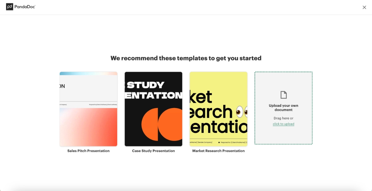
PandaDoc is a document workflow platform, and its product experience leans heavily on in-app communication and steering to drive fast feature activation and deeper user engagement.
To help users start strong and see immediate relevance, PandaDoc begins with an onboarding survey that asks about the user’s role and primary use cases. Based on these answers, the product recommends 3-4 templates tailored to the user’s workflow.
For example, sales teams are presented with templates that match their typical document needs:
There isn’t much guided help within the templates themselves or in the presentation editor UI, but the layout is intuitive enough that anyone familiar with basic document or presentation tools can navigate independently.
Where PandaDoc excels is in identifying users who start editing but don’t meaningfully engage with the template or don’t send the document. These users see a re-engagement prompt as a banner on the home page:
“Looks like Market Research Presentation is waiting to be sent. Need a quick walkthrough?”
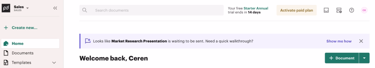
Instead of triggering an interactive walkthrough, the CTA opens the AI chatbot directly inside the editor and automatically asks how to send a document.
The chatbot then provides step-by-step instructions right where the user is working.

On the home page, PandaDoc also offers a setup checklist using progressive disclosure. Each item links directly to its corresponding feature page, making navigation easy, though the tasks themselves don’t include additional in-app guidance.

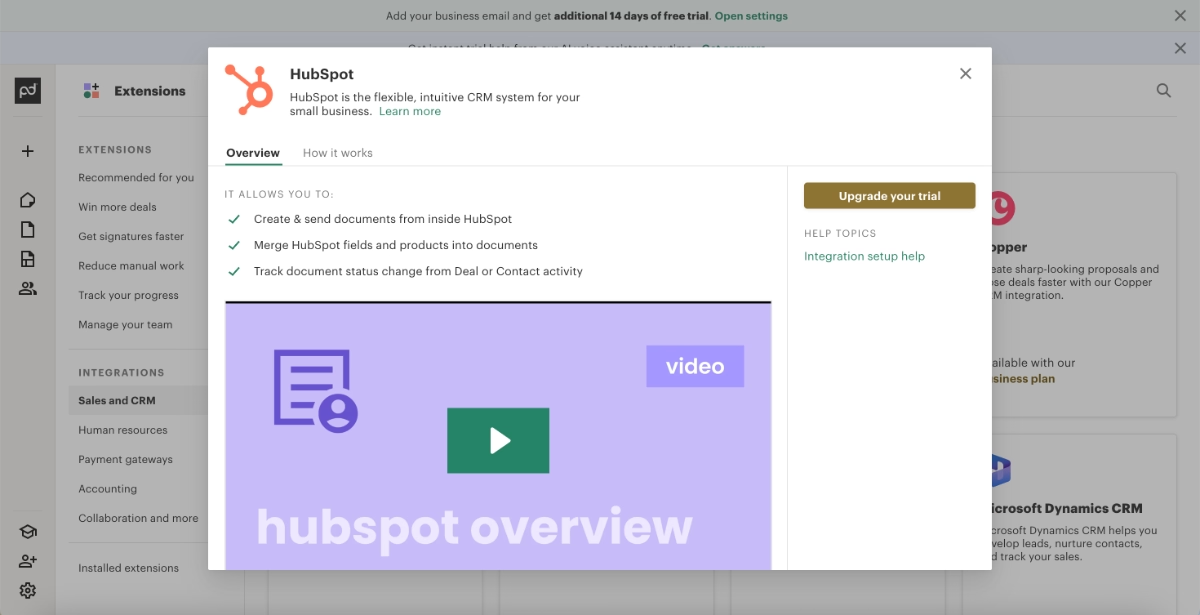
Below the checklist, a “Discover more” section introduces users to advanced features and integrations.
Integrations tied to the tools users selected in the onboarding survey also appear here, encouraging them to connect PandaDoc with their existing workflow and turn it into a habit-forming part of their toolkit.
For these advanced features and integrations, PandaDoc triggers a popup modal that includes explanations, value propositions, example use cases, and clear “how to use” steps.
Some even include embedded video instructions.
What product experience (PX) best practices do we see in this example?
➡️ What the user is recommended to do next is always clear, from the onboarding survey to template interactions and setup completion. There are clear CTAs at every step of the journey.
➡️ Very light in-app guidance is offered through the AI chatbot and popup modals.
➡️ Advanced features are highlighted for engagement, but there’s a visual hierarchy in how they’re introduced after the basic setup and initial engagement.
HeyPros’ tooltips around the UI
HeyPros is a workforce management and operations platform.
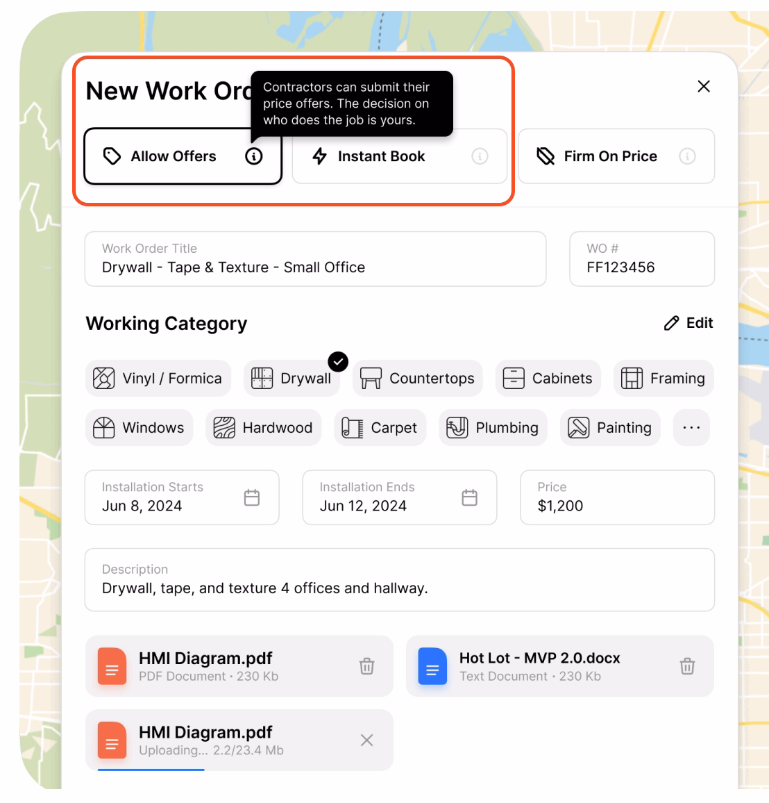
With its PX approach, HeyPros relies heavily on contextual guidance to reduce cognitive load and help users understand the interface effortlessly.
Hover-based tooltips are used extensively across the product from clarifying icon meanings to explaining feature behavior and limitations. These lightweight cues support users in navigating the app with minimal friction.
Here’s an example tooltip explaining the task hierarchy/priority system and why you cannot select a crew member before choosing a lead contractor:

And here’s another tooltip explaining the different order pricing/offering options available to contractors:
What product experience (PX) best practices do we see in this example?
➡️ Navigation becomes much smoother thanks to the icon, button, and menu contextualization provided by tooltips. Users are less likely to click into the wrong feature pages or bounce back and forth between incorrect menus.
➡️ Workflows become easier and faster to complete because important input fields and buttons are clearly explained. The constant availability of quick reminders also helps standardize processes (orders/contracts/etc.) and reduce user errors.
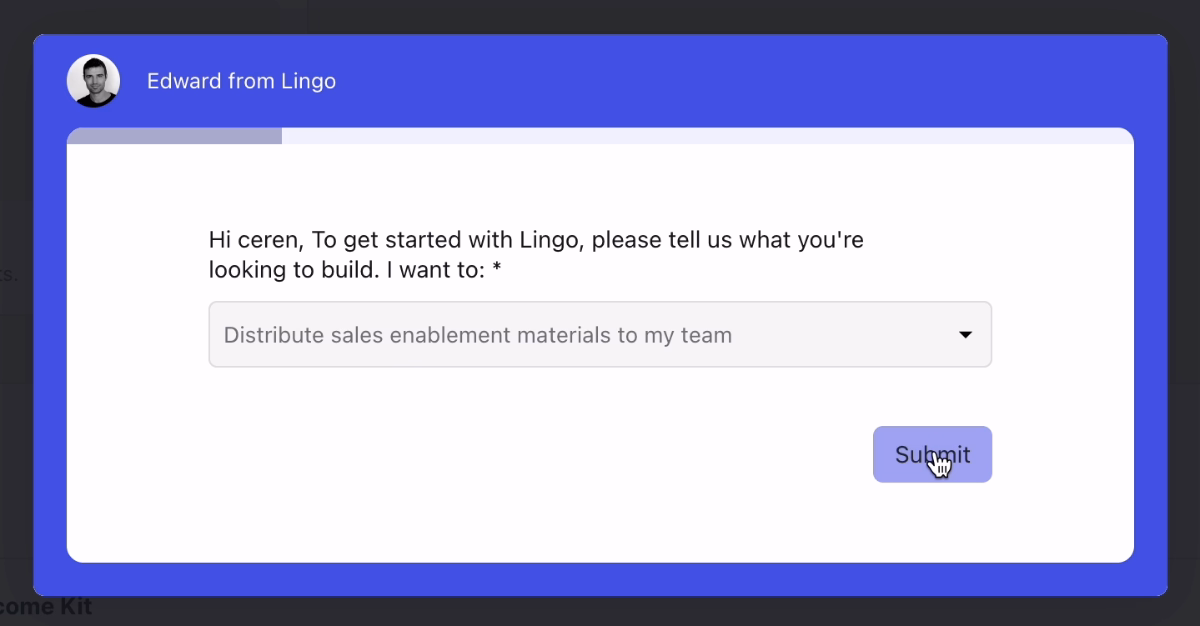
Lingo’s personalized onboarding checklist
Lingo is a brand management and content organization platform.
Like many PLG-driven tools, Lingo, too, begins with a quick onboarding survey to understand each user’s role, team structure, and use cases.
But unlike more generic personalization flows, Lingo’s adaptations are instantly visible: the onboarding checklist is dynamically shaped into a “path to success” tailored specifically to the user’s stated needs.
Here’s a screen from the onboarding personalization survey:
And here’s the use-case-oriented onboarding checklist:
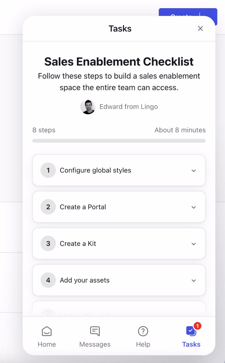
Do you want to create sales-enablement materials? Perfect. Here’s what you need to do for that.
What product experience (PX) best practices do we see in this example?
➡️ The onboarding survey is intentionally short, and its purpose is immediately clear to the user. Many SaaS products collect onboarding data without offering visible personalization in return, even if they use the information behind the scenes. Lingo, however, delivers instantly perceived personalization, which sets a positive tone and builds trust early in the user journey.
➡️ The onboarding checklist is fully value oriented. Even though it contains (too) many steps (8, to be exact), it provides a clear path to value, and the next recommended action is always visible, which keeps users confidently moving forward.
Mintlify’s onboarding
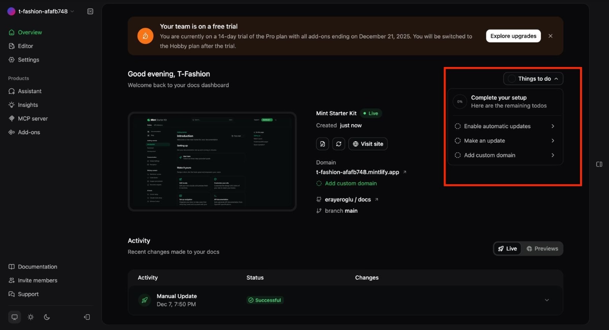
Mintlify is a documentation platform built for engineering teams, and its early product experience is centered around fast setup and early activation.
When you first sign up, Mintlify immediately prompts you to connect your GitHub account and create a demo repository, two core steps that help users experience the product’s value in context rather than in theory.
Inside the app, new users are guided by a short, action-oriented checklist that outlines the essentials: enable automatic updates, make an update, and add custom domain.
Mintlify also reinforces onboarding outside the product.
Shortly after sign-up, users receive a personalized onboarding document via email. This doc expands on the in-app flow with more detailed, step-by-step setup instructions.
Here’s the document:

To support deeper engagement, Mintlify includes recommendations for advanced features in this quickstart document as well. These highlight opportunities like custom components, and design tweaking.

What product experience (PX) best practices do we see in this example?
➡️ While connecting a GitHub repository may feel like an early commitment, and even a barrier, for some users, it also helps establish emotional investment and ensures that users interact with the product in a real, value-driven context.
➡️ The in-app checklist and step-by-step onboarding guide clearly outline the actions users need to take to unlock the product’s full value.
Bites Recipe mobile app onboarding
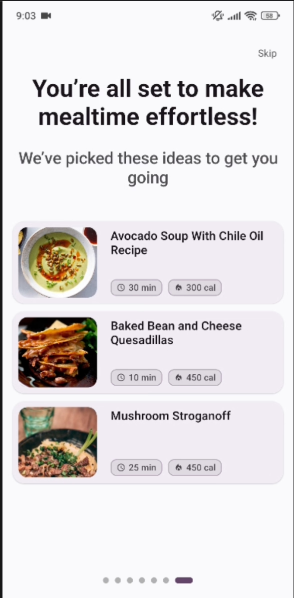
Bites is a recipe discovery and meal-planning app that personalizes the cooking experience based on users’ tastes and dietary preferences.
Its onboarding flow is designed to be both motivating and immediately rewarding.
Right from the start, Bites uses a compelling hook, supported by simple yet striking statistics, to encourage users to complete the onboarding survey that powers its personalization engine.

Once users finish the survey, the app instantly recommends recipes tailored to their preferences. This immediate payoff helps users understand the value of personalization within seconds, reinforcing that the information they shared actually shapes their experience.
In terms of guidance, Bites takes a non-intrusive approach.
Instead of long tours, it uses contextual, interest-triggered walkthrough modals that appear only when relevant to the user’s current action, for example, showing how to save recipes from a blog or website.
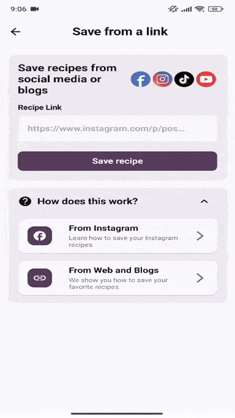
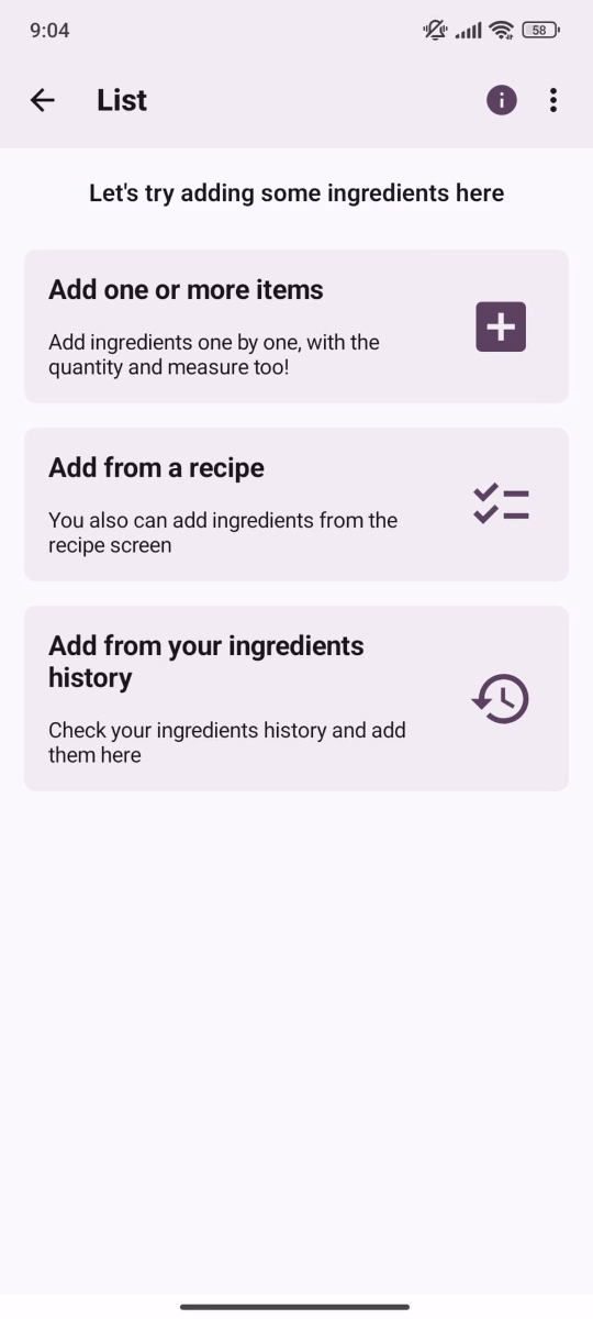
The app also embeds lightweight guidance throughout empty states, menus, and early feature interactions. This ensures first-time users understand key capabilities without feeling lectured or overwhelmed.
For example, when you first create a list, the app communicates with you within the flow and guides you through short copy incorporated into the feature menus:
What product experience (PX) best practices do we see in this example?
➡️ The onboarding survey delivers immediate value, and the perceived personalization is very high. Users receive relevant recipe recommendations from their very first interaction with the app.
➡️ By weaving guidance into empty states, feature workflows, and optional in-app modals, the product maintains a sense of self-directed discovery while still offering support. This approach empowers users, avoids a “lecture-like” feel, and helps build confidence and early accomplishment.
Google Ads’ new UI walkthrough
Google Ads introduces its redesigned interface with an eight-step guided walkthrough that uses focused tooltips to highlight key elements of the updated layout.
Each step explains what specific buttons do and how core workflows have shifted within the refreshed UI.
This approach helps returning users quickly understand what has changed and where to find the tools they rely on, reducing confusion and speeding up reorientation after a redesign.
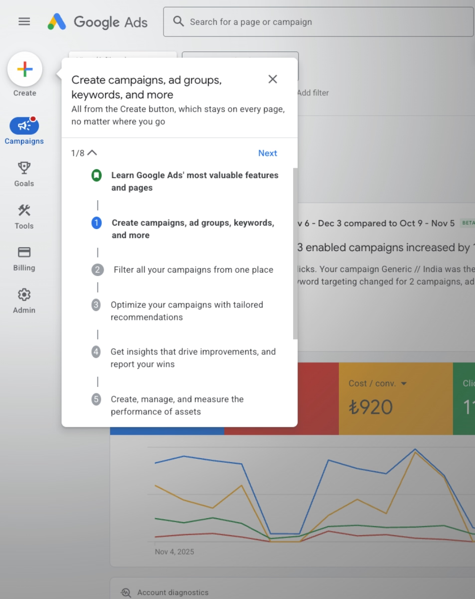
What product experience (PX) best practices do we see in this example?
➡️ A structured, step-by-step walkthrough reduces friction during major UI changes and helps users quickly rebuild familiarity.
➡️ The guidance is contextual and supports users directly inside the new interface rather than relying on external documentation.
Deel’s onboarding satisfaction survey
Deel is a global HR and payroll platform.
In its product experience, Deel places a strong emphasis on closing the feedback loop immediately after onboarding.
Once users complete the onboarding flow, the app triggers a celebratory popup modal with animations that reinforce a sense of progress and completion.
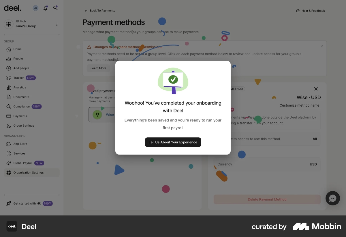
The satisfaction survey appears directly within this modal. On the first screen, users are asked two simple questions:
- an emoji-based rating about their overall onboarding experience, and
- a multiple-choice question identifying what they liked or didn’t like during onboarding.

Deel also includes an optional prompt asking what type of feedback the user wants to provide, specifically whether they’d like to suggest an improvement. If the user selects this option, they’re taken to a second screen featuring an open-ended question.
Here, users can share detailed recommendations for improving the onboarding experience or elaborate on any friction points they highlighted earlier.
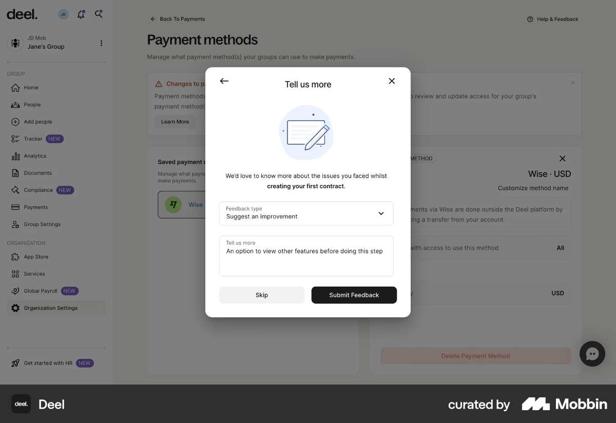
What product experience (PX) best practices do we see in this example?
➡️ Celebratory visuals and message at the end of the onboarding flow provide positive reinforcement, which boosts emotional engagement and increases survey completion rates.
➡️ Questions are contextual and timely (asked right after onboarding) so feedback is fresh, specific, and more actionable for the product team.
➡️ The feedback flow is lightweight at first but expands only if the user opts in. This helps maintain high response rates for the initial survey and surface general trends, while still creating space for deeper insights through the optional open-ended follow-up.
Customer.io’s clear signup flow
Customer.io is a marketing automation platform, and its signup experience is designed to reduce uncertainty by clearly communicating what happens at each step.
On the first screen, the CTA button dynamically reflects your signup method: if you enter an email, the CTA reads “Verify your email”; if you use Google One Tap, the platform handles verification automatically and moves you directly to the company/account information screen.
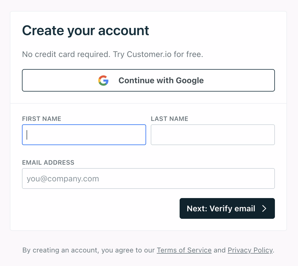
Once you complete the company details, there are no extra steps or surprise forms. The CTA on this screen, “Go to my account”, sets the right expectation that you’re headed straight into the product.
This transparency keeps the flow predictable and prevents unnecessary friction during onboarding.
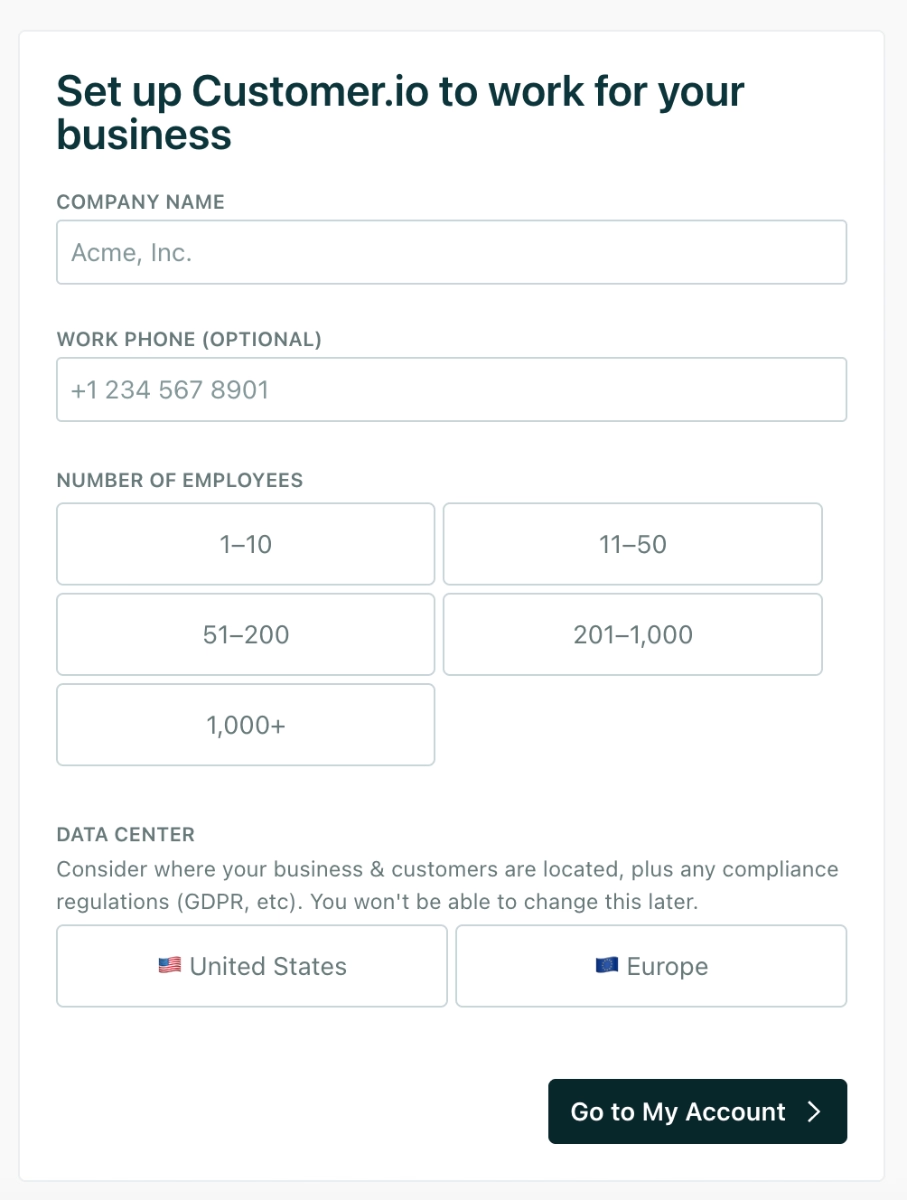
What product experience (PX) best practices do we see in this example?
➡️ Minimal steps and no unnecessary screens help users reach the product faster and lower friction.
➡️ Dynamic CTA text adapts to the user’s chosen signup method and makes the flow feel responsivel. The CTAs also set accurate expectations at every step of the signup flow and reduce uncertainty.
How to evaluate your product’s PX: Metrics & feedback methods
KPIs and metrics to track
📊 Adoption rate: Measures how many users using a product or feature meaningfully after it becomes available. This can apply to new users adopting the product as a whole, or existing users adopting newly released features.
A low adoption rate usually signals one of the following PX issues:
- The feature is hard to discover.
- Its value is unclear.
- It requires too much setup or prior knowledge.
- The onboarding or guidance doesn't point users toward it.
What you need to pay attention is that adoption rates might be misleading if you do not look at the “who”s, “when”s, and “how much/how long”s of the data you collect.
Monitoring the depth and breadth of adoption will allow you to understand how different user segments and personas interact/adopt your product/features and optimize your product experience specifically for segments with lower adoption trends.
📊 Time-to-value (TTV): Measures how long it takes for a new user to experience meaningful value from your product.
Shorter TTV = smoother product experience and faster activation.
A high TTV often indicates:
- Onboarding friction
- Too many setup requirements
- Poorly guided user flows
- A vague or hard-to-reach value moment
📊 Churn rate: Measures the percentage of users who stop using or cancel your product over a given time period.
Churn is one of the clearest indicators of deeper PX issues. High churn usually reflects:
- Unmet expectations
- Slow time-to-value
- Overly complex interfaces
- Missing features or product friction
- Low perceived value relative to alternatives
However, just like broad adoption rates, broad churn rates can be misleading or not so helpful to detect where the problems and frictions happen in the user journey.
You need to analyze your churn rates by user segment, acquisition channel, activation level, or feature usage patterns to reveal what parts of the experience need the most attention.
📊 Customer satisfaction (CSAT): Measures how satisfied users are with a specific interaction, feature, or experience, usually by using a quick rating survey after a task or interaction.
CSAT helps you understand:
- Whether a workflow or feature meets user expectations
- How users feel immediately after onboarding
- Pain points that appear during frequent or high-value actions
Because CSAT is interaction-specific, it provides granular signals about what to improve in your PX.
📊 Net promoter score (NPS): measures how likely users are to recommend your product to others, which reflects overall trust, perception of value, and long-term loyalty.
- Users who rate you 9–10 are Promoters. These are your most loyal and enthusiastic users. They’re the most likely to repurchase, upgrade, adopt add-ons, and recommend your product to others. They are the backbone of organic growth.
- Users who rate you 7–8 are Passives. They’re generally satisfied but not emotionally committed. They’ll stay as long as your product remains convenient, but they’re vulnerable to switching if a competitor offers a better deal or experience. Think of them as “content but not convinced.”
- Users who rate you 0–6 are Detractors. These users are at risk of churning and may already be exploring competitors. They may also share negative feedback with peers, which makes their experience especially important to understand and resolve.
The goal of monitoring NPS isn’t simply to categorize users into happy or unhappy buckets.
The real value comes from understanding why users feel the way they do.
NPS becomes powerful when paired with follow-up questions that reveal what’s driving positive sentiment (for Promoters) and what's causing friction (for Detractors).
But we’ll talk more about survey design and follow-up questions in a moment.
📊 Support ticket volume: tracks how often users reach out for help, which is a direct measure of friction and usability gaps in your product.
While the total number of tickets is useful, the real insight comes from looking at what kind of tickets users create and how often they appear.
Here are the key aspects to monitor:
- Types of issues: Categorize tickets by themes such as setup difficulties, feature confusion, bugs, performance issues, billing questions, or integration problems. This shows which parts of the experience consistently create friction.
- Repeated issues: If the same question or problem shows up frequently, it’s a sign that something in the UX isn’t clear enough, or that a workflow is broken.
- Ticket spikes after releases: Sudden increases in volume often signal issues introduced by new features or UI changes.
- Time-to-resolution: Slow resolution times negatively impact trust and overall user sentiment.
Working closely with customer support teams to understand which types of tickets are being raised and by which user segments also allows you to take proactive steps to prevent many of these issues from occurring in the first place.
User feedback channels and qualitative signals
To monitor some of the metrics we’ve just talked about (like CSAT and NPS), you need to conduct in-app surveys and communicate with users directly, rather than just monitoring their behavior.
For example, you need a CSAT survey like this:
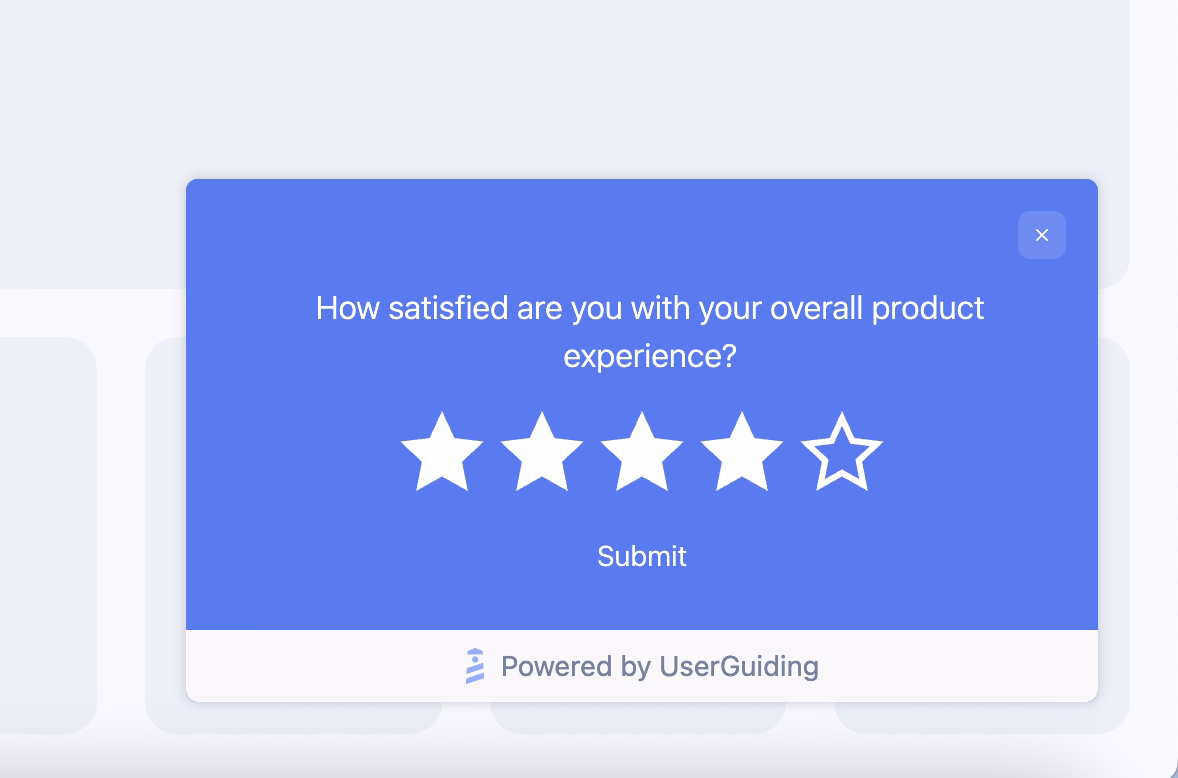
Or an NPS survey like this:

But ratings aren’t the only valuable in-app survey format for understanding product experience (PX).
Remember Deel’s onboarding satisfaction survey?
That’s a great example of an in-app survey that digs into PX and uses multiple question types to collect richer data.
By combining ratings, multiple-choice questions, and open-ended fields, you can detect general trends and uncover deeper, actionable insights.
You can run in-app surveys to…
- Gauge onboarding satisfaction
- Get feedback on a new feature release/UI improvement
- Measure confusion or friction on key workflows
- Identify which features users want you to build next (feature request polls)
- Understand cancellation reasons with exit and churn deflection surveys
Here’s an example churn deflection survey template:

🎁 Start your free trial with UserGuiding to collect user feedback with in-app surveys!
A practical framework to improve product experience
📌 Step 1: Audit current product journey:
This stage involves gaining a clear understanding of how users move through the product today.
You should map major user flows from signup to activation to recurring usage and observe where friction, confusion, or drop-offs occur.
To get a detailed picture of your existing PX, you can look at usage data, drop-off patterns, session replays, feedback logs, and support tickets.
📌 Step 2: Prioritize quick wins:
Once the landscape becomes visible, certain improvements tend to stand out. These might be moments where a single sentence of guidance could reduce confusion, or a UI tweak could make a key action more obvious.
Quick wins often become the early victories that lift user confidence and energize teams. They don’t transform the entire experience at once, but they start nudging it in the right direction.
Some popular ways to get quick wins are…
- Adding light in-app guidance or helpful tooltips
- Highlighting important features with clearer UI cues
- Improving confusing copy or microcopy in key flows
- Making next steps more visible with checklists and recommended actions
- Bringing more visibility to your existing help materials (videos, articles, tutorials)
📌 Step 3: Implement iterative improvements:
Once quick wins and larger PX enhancements are in place, the work doesn’t really end, this step becomes an ongoing loop. Every improvement introduced into the product needs to be observed in the wild to see how users actually respond to it.
That often means tracking performance changes, running A/B tests to validate assumptions, and keeping an eye on behavioral metrics.
As user feedback, expectations, and habits evolve, even well-designed improvements may need refinement.
📌 Step 4: Embed PX mindset across teams:
Some would argue this step should come first, and they wouldn’t be wrong.
Throughout the article, we’ve emphasized that product experience spans far more than feature workflows or UI decisions. Many PX touchpoints sit outside the product team’s daily responsibilities.
Support interactions, documentation quality, onboarding communication, success handoffs, even marketing messages that set expectations before someone signs up.
When only the product team carries the PX torch, gaps appear quickly.
A stronger approach is when every team, product, design, support, engineering, marketing, and growth, shares a common understanding of what great PX looks like and how their work contributes to it.
But while ensuring “alignment”, do not fall into the trap of “agreement”.
Tom Haak explains the difference between the two like this:
Common mistakes and pitfalls to avoid in PX strategy
❌ Focusing only on UI polish while ignoring onboarding and onboarding flows.
❌ Dismissing inclusivity practices while designing experiences.
❌ Overloading users with feature drops, leading to overwhelm.
❌ Ignoring feedback and not measuring actual usage and satisfaction.
❌ Relying solely on support tickets to understand user pain.
❌ Making decisions based on internal assumptions rather than real usage data.
❌ Using personalization without guardrails and creating inconsistent experiences.
❌ Failing to maintain performance and stability when scaling the product.
❌ Introducing UI changes without communicating why they matter to users.
❌ Assuming power users represent the entire user base.
❌ Optimizing for activation without thinking about long-term engagement.
To conclude…
Product experience has become the new buzzword in the SaaS world, especially after Duolingo’s very public shift from “UX” to “PX,” framing UX as yesterday’s news.
It’s a fun headline, but the reality is a bit more nuanced.
As much as PX encourages a more holistic view of the user journey, it doesn’t erase the crucial role UX plays within that journey.
If anything, UX becomes one of the core building blocks of PX rather than something replaced by it. And whether you choose to treat UX as a component of PX or simply as two sides of the same coin is, honestly, a bit of a “potayto–potahto” situation.
What truly matters is understanding the full scope of your user’s experience from their first impression to long-term usage and knowing how to identify improvement areas that actually move the needle.
At the end of the day, the terminology matters far less than the commitment to creating a product people enjoy using, return to willingly, and feel confident recommending.
Frequently Asked Questions
What is product experience in SaaS and why does it matter for retention?
Product experience (PX) refers to how users interact with your product across the entire journey from onboarding to feature adoption, support, and long-term engagement. It captures how intuitive, helpful, and valuable your product feels day-to-day. Strong PX helps users find value faster, encounter fewer frustrations, and stay engaged. This usually leads to higher retention, because users who experience consistent value and smooth workflows have fewer reasons to churn.
How do product experience and user experience differ?
User experience (UX) focuses on the usability and design of individual screens or interactions. Product experience (PX) covers the bigger picture: how users perceive value across onboarding, feature discovery, support, performance, and ongoing engagement. UX might shape how a flow works, while PX determines how the entire product journey feels. You can think of PX as the holistic umbrella that includes UX along with guidance, communication, and support.
What are the key product experience metrics PX teams should track?
PX teams benefit from monitoring metrics like adoption rate, feature usage depth, time-to-value, retention, churn, CSAT, NPS, and support ticket volume. These metrics highlight how easily users activate features, how often they return, and where frustration may occur.
How do you improve product experience using in-app guidance?
In-app guidance can help users understand features faster, reduce cognitive load, and make progress without confusion. Tooltips, onboarding checklists, walkthroughs, and contextual modals support users right at the moment of need. This kind of embedded guidance usually boosts activation and reduces support ticket volume.
What are the product experience best practices for onboarding new users?
Effective onboarding often involves short surveys, clear checklists, personalized recommendations, and gentle guidance within the product. These elements help users reach early value quickly and understand where to go next. You can also incorporate contextual tips, empty-state explanations, and walkthroughs to reduce uncertainty. Onboarding that adapts to user roles or use cases generally drives higher activation rates and builds early confidence in the product.
What are the ideal PX frameworks for mapping friction points in digital products?
PX teams often use journey mapping, behavioral funnel analysis, and friction audits to understand when and why users get stuck. These frameworks can highlight drop-off patterns, confusing workflows, or unclear value moments. Pairing analytics with qualitative feedback, such as usability tests or in-app surveys, usually gives a full view of the experience.
What are the most well-known real product experience examples from high-performing SaaS companies?
SaaS companies often use PX elements such as personalized onboarding (like Lingo), AI-assisted guidance (like PandaDoc), contextual tooltips (like HeyPros), and step-by-step setup documents (like Mintlify). Others rely on lightweight walkthroughs, celebratory progress moments, and targeted feedback surveys (like Deel).
How does product experience impact activation and time-to-value?
A strong product experience typically helps users understand features faster and reach meaningful outcomes sooner. When users feel supported throughout their journey and know what to do next, activation rates increase and time-to-value shrinks. This early momentum also often leads to stronger long-term engagement and reduces the risk of early churn.

.png)