.svg)
.svg)
.svg)
.svg)
.svg)


.svg)


.svg)
.svg)

According to Rocketlane’s 2025 State of Customer Onboarding Report, nearly 90% of organizations are actively investing in automation and AI to streamline onboarding processes, reduce manual workload, and achieve faster time-to-value. Additionally, 47% of respondents cited efficiency improvements as their top onboarding goal for 2025.
So, chances are, you’re trying to make your onboarding smoother and faster, too. Probably by looking into a user onboarding tool.
But… there are a lot of them.
And the thing is, most of these tools offer pretty similar features on paper.
So, how do you actually choose one?
We’d say: focus on ease of implementation. Things like the learning curve, setup process, in-app guidance, templates, documentation, AI support… all of that matters more than a long list of features.
Because at the end of the day, you probably don’t want to spend months figuring out a “no-code” tool or have to knock on your dev team’s door every time you want to update a flow.
Right?
So, in this article, we’ll look at the most popular user onboarding tools and break down which ones are actually quick to set up and which ones take a bit more effort.
Here’s the TL;DR 👇🏻
TL;DR
- UserGuiding: The easiest to implement with a clean UI, strong templates, and fast setup.
- Userflow: Intuitive once you get used to its flow-based logic, with solid in-app guidance.
- Product Fruits: Great for quick starts thanks to use-case templates and AI-assisted creation.
- Appcues: Clean UI and strong resources, but more complex features increase the learning curve.
- Chameleon: Powerful AI and automation, but crowded UI and setup complexity slow things down.
- Userpilot: Feature-rich but harder to navigate, with limited guidance and no ready-made templates.
- Pendo: Very powerful analytics platform, but complex setup, weak guidance, and long implementation.
- WalkMe: Enterprise-level capabilities with steep learning curve and lengthy, technical implementation.

Quick Side-by-Side Comparison: Which Onboarding Tool Is Quicker to Set Up and Easier to Use?
Key Factors That Make Onboarding Tools Easy to Implement
There are many (seemingly) no-code or low-code solutions on the market that are, surprisingly, confusing. Some come with lengthy, hands-on setup processes, steep learning curves, crowded user interfaces, complex workflows, or outdated support materials.
So beyond the “no-code” label or “AI-powered” features, it’s important to pay close attention to other aspects of the product experience, if you don’t want to be stuck with a software you cannot crack even if your life depended on it...
Luckily, we’ve done the research for you. 🔎
We explored several onboarding tools ourselves, testing their workflows and navigation, while also analyzing user discussions across the internet to understand what long-term onboarding tool users actually value when it comes to usability and easy implementation.
Based on all that, we identified 6 key factors that have the biggest impact on how quickly and easily you can set up and start using an onboarding tool 👇🏻
➡️ In-App Guidance and Onboarding of the Platform:
A good onboarding tool should also be good at onboarding its own users. Does the tool run a quick survey to get to know you and understand your needs? Does it personalize your onboarding and offer the most relevant tips? Does it offer different types of guidance materials for different preferences and learning styles (interactive guides, video walkthroughs, in-app resource center articles, etc.)?
The onboarding process of an onboarding tool should also showcase the potential of the platform and be an inspiration to you.
If the onboarding looks bland, there’s not much material variety, then, or, if the materials feel clunky and lagging, then it might mean…
- The tool isn’t very flexible and customizable
- The tool isn’t very lean and it creates frictions while building/editing materials
➡️ Intuitive UI/UX:
A software platform can very quickly become frustrating if the interface is cluttered or difficult to navigate. Even with the no-code or low-code onboarding solutions, sometimes (not naming names just now 👀), settings related to the same workflow are scattered across different sections of the platform, forcing you to constantly jump back and forth.
An intuitive UI/UX means…
- The tools and capabilities are organized logically, not scattered across the platform or hidden under a single collapsible menu just to “tidy up” the interface.
- UI icons and widgets are recognizable and easy to understand.
- There is contextual guidance (hover-over tooltips or hotspots) around important buttons and input fields.
- Menus and settings pages follow the natural workflow and appear sequentially rather than all at once, for example, seeing the survey builder first, then the customization page, and finally the targeting settings.
➡️ Ready-to-Use Templates:
An important part of implementation is actually building something useful with the tool. The initial setup and account creation might be quick. The onboarding flow of the platform itself might be smooth. But if teams struggle to start building their own guides or announcements, the implementation process quickly becomes frustrating.
If you have to spend hours thinking through structure and design before even creating your first experience, that’s a sign the tool adds unnecessary friction.
That’s why a template gallery with modern and varied designs can make a huge difference. Good templates help teams skip the blank-page problem and start building immediately.
Now, “having templates” can mean very different things depending on the onboarding tool. In general, most platforms fall into 3 categories:
- Minimal template libraries: tools that offer only 2-3 basic templates with small design differences (for example, guides with buttons vs. guides without buttons).
- Use-case-driven template libraries: tools that build templates around common onboarding scenarios like welcome flows, feature announcements, webinar invitations, or upgrade prompts while also offering design variations.
- No templates at all: yes, some platforms still offer absolutely nothing in this department. Nada. Niente. And let’s just say… that’s not something we’re particularly fond of around here.
➡️ Integration, Automation and AI Capabilities:
Many onboarding platforms offer integrations with popular product management, analytics, customer support, and CRM tools. Simply having these integrations (and the ability to automate certain workflows between them) can make the implementation process much smoother.
Besides integrations, built-in AI capabilities can also make the early stages of implementation easier. For example, if you’re just getting started with product adoption, analyzing the engagement patterns of your guides, hotspots, checklists, and resource centers can feel overwhelming. AI-powered insights can help interpret this data, highlight trends, and even suggest ways to improve your onboarding experiences.
Or, AI can also help you with content creation and localization.
If you have a global user base with a lot of locales, for example, your implementation will include translating and adapting onboarding materials for different languages and regions, in addition to creating the materials. In that case, having AI-powered localization and translation features can significantly reduce your implementation time and effort.
➡️ Strong Documentation and Support:
Besides in-app onboarding and guidance, a well-organized and up-to-date support hub is crucial for smooth implementation, at any stage of the product experience, really.
A good support ecosystem usually includes step-by-step guides, searchable help centers, video tutorials, and real examples of common use cases. The articles should also contain visual support through screenshots/GIFs from the product, as well. (And they should be updated regularly, especially after UI changes and improvements.)
If you visit an onboarding software’s support page, and find:
- No useful categorization of help articles/videos
- No collection of featured articles for you to get started with the app
- Articles with no visual support (or with outdated visuals)
We recommend you run away. 🏃🏻➡️
➡️ Transparent and Flexible Pricing:
When people think about implementation and ease of setup, they often focus only on the product itself. But in reality, the experience starts much earlier, with pricing pages, free trials, and sales conversations.
If getting access to the tool requires long sales cycles, complicated contracts, or unclear pricing tiers, the “implementation process” heads to a bumpy start.
What's New in Onboarding Practices and Tools in 2026
The main shift in onboarding practices and tools is how much more involved AI has become in the process. While AI was already present in 2025, it was mostly limited to chatbots used for automated support.
Now, its role goes beyond that.
We’re starting to see onboarding tools offering AI copilots designed for internal use. These aren’t just there to answer user questions or provide support. They work more like assistants for product and customer success or support teams. For example, they can automate certain tasks, flag issues, or alert teams when something changes in user behavior or onboarding performance.
AI is increasingly used to help create and optimize onboarding elements like guides, banners, hotspots, tooltips, and announcement modals. Instead of just building flows manually, teams can now get assistance with structuring and improving them as they go.
We’re also seeing more AI-driven analytics and insights. Rather than digging through data yourself, these tools can highlight what’s working, what’s not, and suggest areas for improvement in your onboarding flows.
On top of that, AI-supported localization is also becoming more and more common.
Popular User Onboarding Tools Ranked by User-Friendliness
If you’ve done any research on user onboarding or product adoption platforms, chances are you’ve already come across some of the names we’re about to cover. Tools like UserGuiding, Userflow, Appcues, and Pendo pop up frequently in Reddit discussions, comparison articles, and review platforms like G2.
They also tend to rank pretty high in search results.
So instead of simply (re)introducing these tools by only listing their features, which you can easily find on their websites, we’re going to look at them from a slightly different angle.
We’ll focus on things that actually affect how easy these tools are to start using in real life, such as:
- Their setup processes
- UI/UX navigation and overall usability
- Workflows and template availability
- Learning curves for new users
- Implementation time and how much support or hand-holding is typically required
Taking all of these factors into account, here’s how the most popular user onboarding and product adoption platforms rank in terms of usability and ease of implementation:
#1: UserGuiding, the Easiest and Quickest to Implement
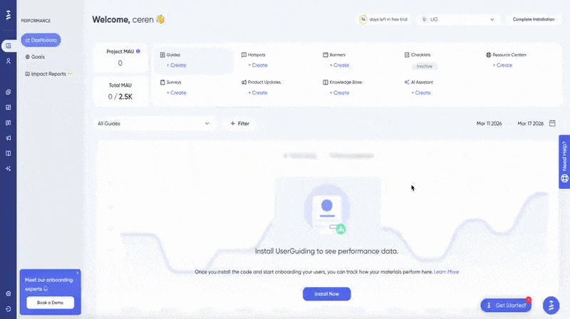
UserGuiding is a no-code, all-in-one product adoption platform that offers features and capabilities for user onboarding, feature adoption, customer support, and in-app communication.
👉🏻 You can check out our detailed UserGuiding features and use cases articles, if interested.
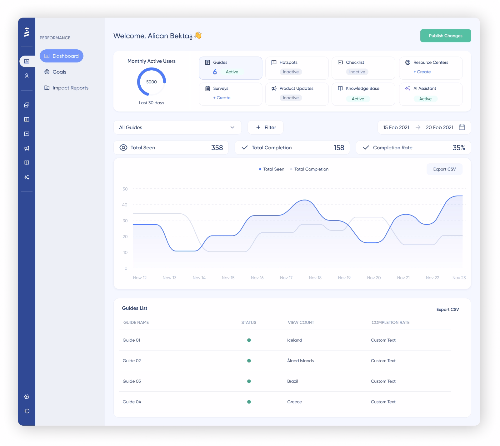
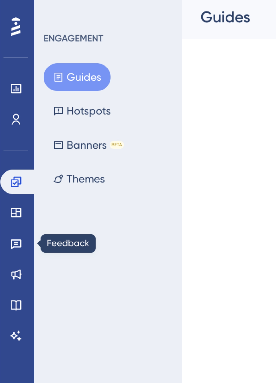
As you can see, UserGuiding has a modern and clean UI, with features and capabilities categorized into meaningful groups and neatly organized in the left sidebar menu.
In-app navigation is very easy and intuitive, with universally recognizable UI icons and design.
Beyond the navigation of the main platform, the app’s usability and workflows are also very self-explanatory and user-friendly.
For example, here’s what the checklist builder looks like:
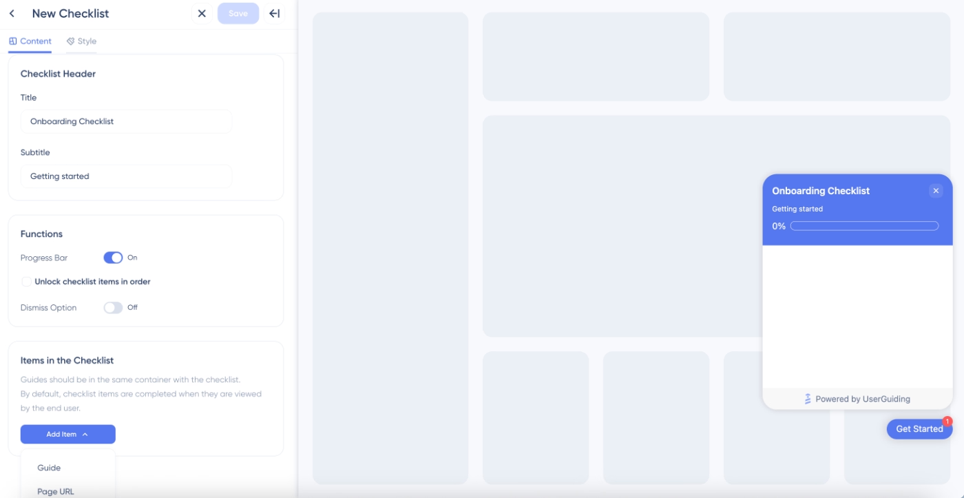
On the left, you have the content and style editors. Sections consist of dropdown menus, toggle switches, and input fields. On the styling page, settings related to typography, colors, and checklist launcher design are also very easy to go through.
The preview on the right side of the builder makes even the smallest changes visible and helps non-technical users experiment with their designs until they’re happy with the end result.
Once the design is saved, the builder automatically takes you to the configuration page, where you can manage page targeting, audience segmentation, and other advanced settings related to your checklist.
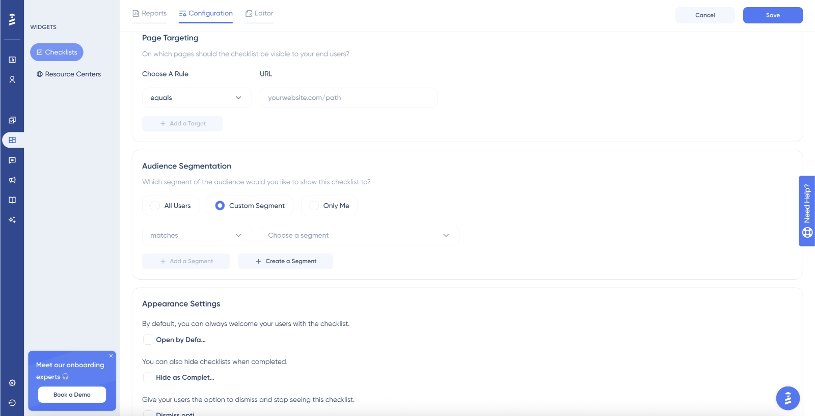
Here, too, all the settings come with contextual guidance and explanations, along with easy-to-use dropdown menus and controls.
Overall, UserGuiding’s interface and workflows are very easy to get started with, making it simple to build onboarding materials quickly. Many UserGuiding users mention that they were able to complete their setup and initial implementation in under an hour, or even within minutes.
I use UserGuiding to create in-app guides, product tours, and tooltips that help new users learn how to use our product quickly without needing any code. I like that it is easy to use and lets me create clear onboarding guides quickly without needing any coding. The setup was easy and quick; we were able to create and launch our first guides in just a few hours. I would give it a 9 out of 10 as it is very helpful for onboarding.”
To create a guide, all I need to do is add URL details, triggers, and templates, and I can train any of my team members on creating guides in less than 10 minutes and get the job done. The initial setup took around 30 minutes, which I find reasonable.”
Besides the ease and intuitiveness of its workflows, UserGuiding also provides contextual guidance for first-time users during setup and container installation.
Whether you prefer to handle the container setup yourself or pass it to your development team to embed into the codebase, UserGuiding offers interactive, in-app guidance throughout the entire process.
Here’s the in-app tutorial for non-technical users:
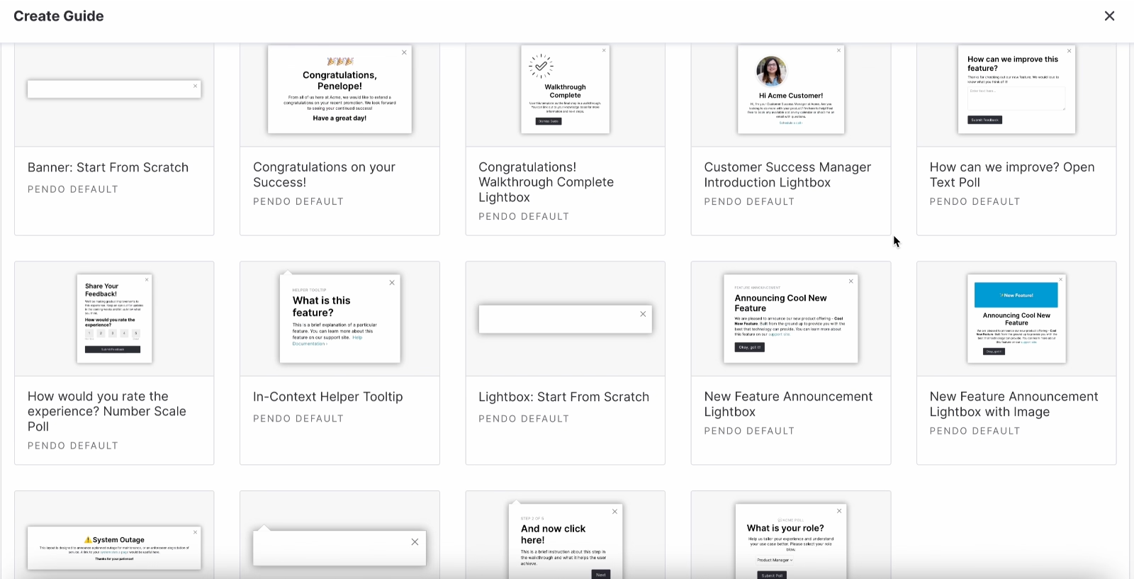
Finally, UserGuiding also offers a wide range of use-case-oriented templates, which makes the implementation process much faster and easier for new users. These templates are built directly into the feature builders, so you can access survey templates on the survey page, banner templates in the banner builder, and so on.
Here are some of the modal templates for announcements and tours, for example:
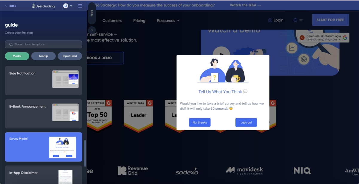
What sets UserGuiding’s templates apart from many other onboarding tools is their focus on user needs and real use cases, rather than just different button styles or layout variations.
For users who are completely new to user onboarding and in-app communication, these templates also act as inspiration. They showcase practical use cases of different onboarding elements and provide example copy and modal designs tailored to specific scenarios.
What makes UserGuiding an easy-to-implement onboarding solution?
✅ Quick setup with in-app tutorials available for different setup methods
✅ Modern, clean, and organized user interface
✅ Intuitive workflows with contextual guidance and explanations
✅ A rich template gallery for tours, announcements, surveys, and banners
🎁 Start your free trial and experience UserGuiding’s ease-of-use yourself!
#2: Userflow
Userflow is a no-code onboarding platform with an organized interface.
👉🏻 Check out our in-depth Userflow features and use cases analysis.
At first glance, the UI feels simple and structured. However, the way workflows are built might feel a bit different if you’re coming from other onboarding tools.
Once you get used to this logic, the workflows become fairly intuitive, though.
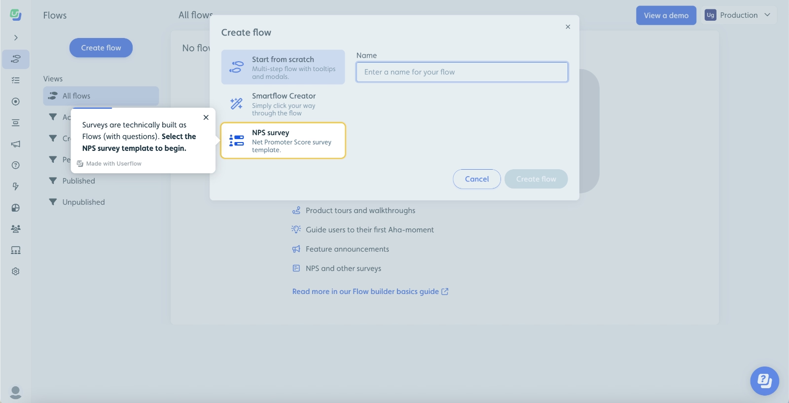
The builder itself follows a visual flow structure, where you add steps side by side and introduce branches or splits for things like survey logic. While this layout provides a clear visual representation of the user journey, it can feel slightly crowded at times, especially for first-time users.
Another thing to note is that most settings (configuration, targeting, and other advanced options) are located within the same builder page. While this keeps everything in one place, it can also create some initial confusion around what to set up first.
To help with this, Userflow offers detailed in-app guidance and tutorials for new users.
The onboarding tours are comprehensive and walk you through the platform step by step. That said, they can feel a bit long at times, and if you move away from the intended flow, the guide may try to pull you back into the tour, which can feel slightly overwhelming, to be honest…
But, here’s an excerpt from their onboarding guide:
What makes Userflow easy to implement?
✅ Visual flow builder with clear logic
✅ Detailed in-app guidance and tutorials
#3: Product Fruits
Product Fruits is a no-code product onboarding solution with a lot of AI capabilities, ranging from material creation to AI insights.
👉🏻 Check out our in-depth Product Fruits features and use cases analysis.
Product Fruits stands out with its use case-driven templates, which are prominently highlighted across feature pages. This makes it easier for new users to get started without having to think too much about what to build first.
The platform also highlights its “create with AI” feature wherever it’s applicable.

Feature builders in Product Fruits are designed more like a design tool. They operate on a whiteboard-style canvas, where you can freely place elements, drag and drop blocks, and customize them directly.
Here’s the banner builder, for example:

One downside is that Product Fruits doesn’t offer in-app guidance for code installation or initial setup. Instead, it redirects you to a separate documentation page, which can feel a bit inconvenient during the initial implementation.
That said, for the rest of the platform, there is solid contextual guidance within the app.
What makes Product Fruits easy to implement?
✅ Strong, use case-driven template library
✅ AI-assisted content and flow creation
✅ Flexible, visual builder with drag-and-drop controls
#4: Appcues
Appcues is a customer engagement platform that offers onboarding capabilities, as well.
👉🏻 Check out our in-depth Appcues features and use cases analysis.
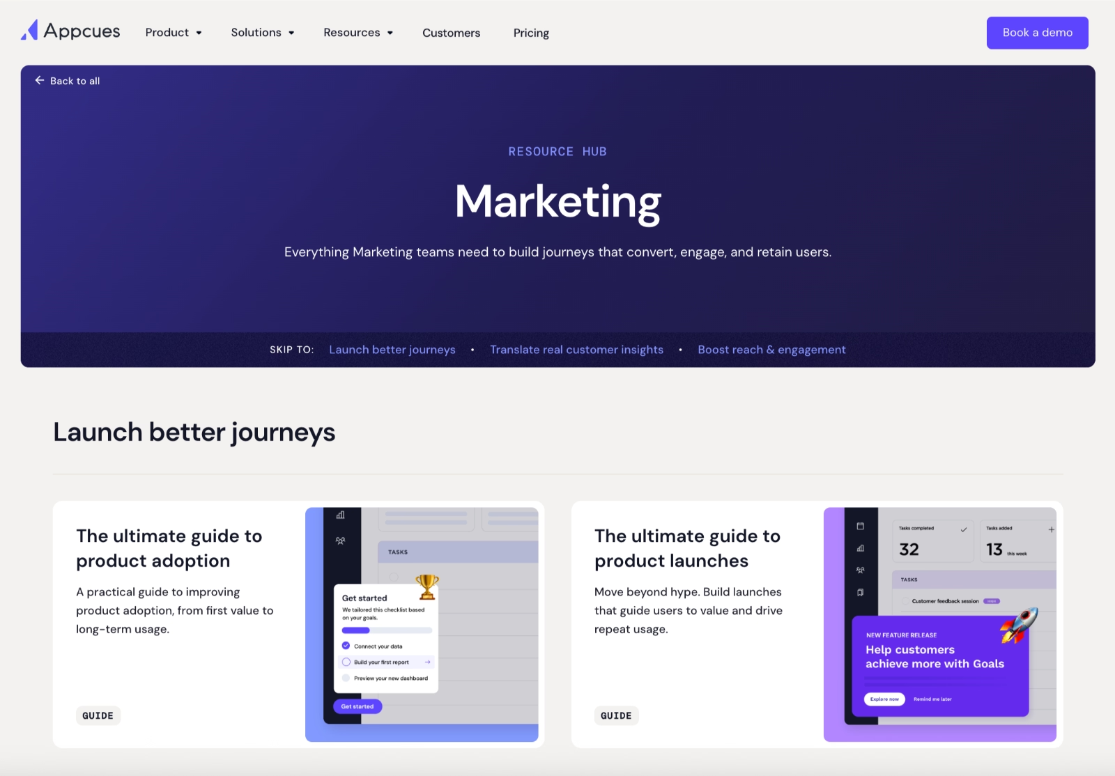
One thing it does particularly well is providing interactive demos and guides tailored to specific features and workflows. Its resource hub is also organized by team roles and use cases, making it easier for users to find relevant tutorials based on what they’re trying to achieve.
Here are the guides tailored for marketing teams:
The UI itself is clean and minimal.
Most features are grouped under collapsible menus, mainly within the “Experiences” section. Some might find this approach a bit too minimal, as it can feel like features are being hidden rather than logically distributed.
In fact, some users have pointed out navigation challenges in reviews, especially when trying to locate specific features quickly.
That said, once you open the menus, everything is still accessible.
Here’s a peek from the platform:
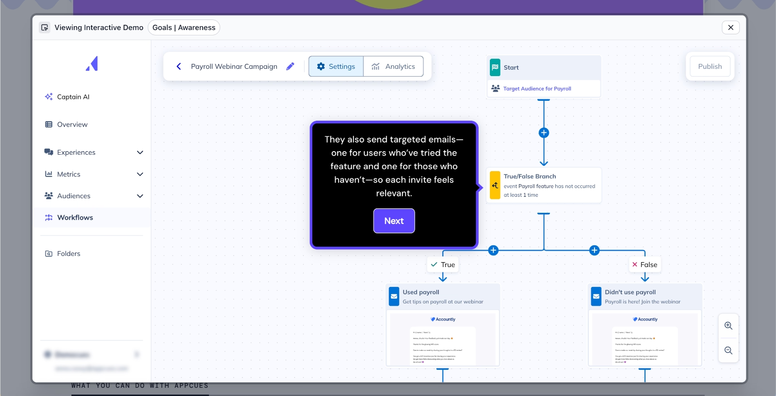
The builders in Appcues follow a familiar structure, similar to many other onboarding tools like UserGuiding, Chameleon, and Userpilot. You create flows by adding blocks and editing their content step by step.
Here’s what the flow builder looks like:
Appcues also offers templates to help you get started. However, these are more focused on visual styling rather than specific use cases, so they may not provide as much inspiration or guidance when deciding what kind of onboarding experience to build.
What makes Appcues easy to implement?
✅ Strong use-case-oriented resources and demos
✅ Familiar, easy-to-use flow builder structure
⚠️ Starting with Appcues, the complexity of onboarding solutions and the level of learning curve start to increase. Appcues’ features like event tracking, analytics, and workflows are not very easy-to-learn features. While they’re still “no-code” capabilities, they require some level of technical knowledge, previous experience, or, dev team support to implement successfully, especially tracked events.
So, if you’re planning to use the platform to its full potential, keep in mind that it might require a longer implementation time and some level of support, either from your technical teams or the Appcues team.
#5: Userpilot
Userpilot is a product growth platform with onboarding and in-app communication capabilities.
👉🏻 Check out our in-depth Userpilot features and use cases analysis.
Compared to some of the other onboarding tools we’ve covered so far, Userpilot’s interface feels a bit more dated and crowded.
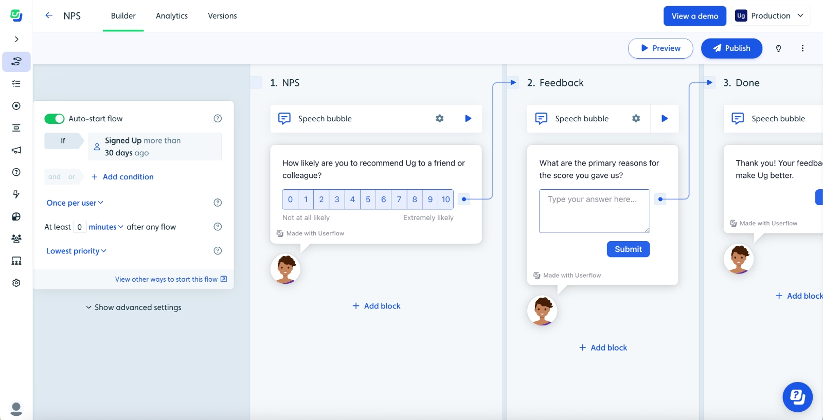
Here’s what the survey builder looks like, for example:
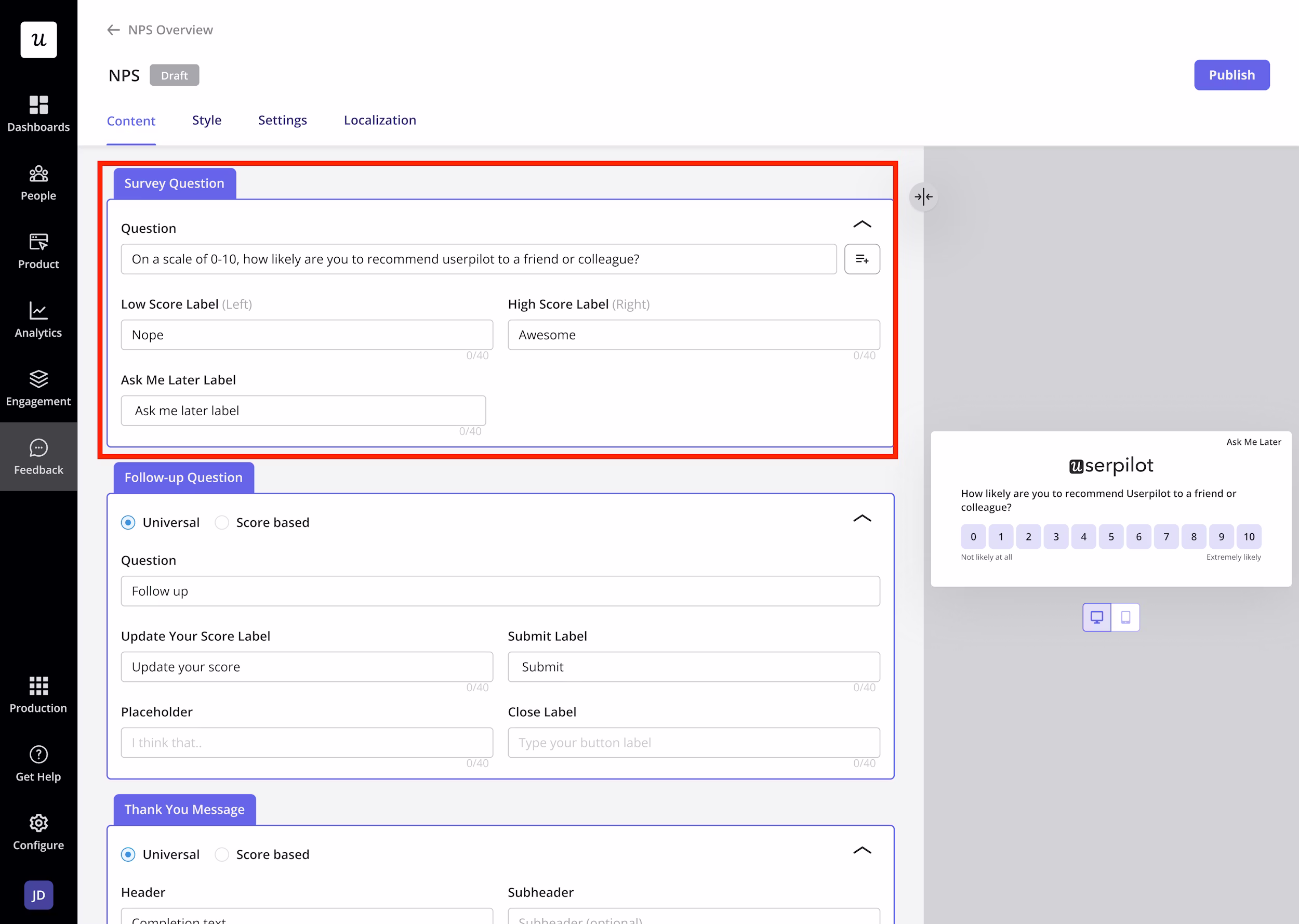
The same applies to the reporting side. The dashboards can feel quite busy, with a lot of buttons and options on the screen, but very little contextual guidance to help you understand how to use filters or switch between different views.
Because of this, navigation isn’t the most intuitive. In fact, it can feel a bit overwhelming at first, with many elements competing for attention all at once.
When it comes to templates, Userpilot allows you to save your own templates once you’ve created a few flows. However, it doesn’t offer ready-made templates to help you get started during the initial implementation phase, which can slow things down for new users.
What makes Userpilot harder to implement?
❌ Crowded and somewhat outdated interface
❌ Limited contextual guidance within the UI
❌ No ready-to-use templates for quick setup
❌ Steep learning curve
While one could argue that the learning curve is due to the platform’s advanced capabilities, several Userpilot customers compare its learning curve and complex implementation to other onboarding solutions and say that Userpilot makes things that don’t need to be complex unnecessarily complicated.
One Userpilot user says, for example:
There's a decent learning curve with Userpilot where it's not necessarily with other products like this, so ease of use could be better.”
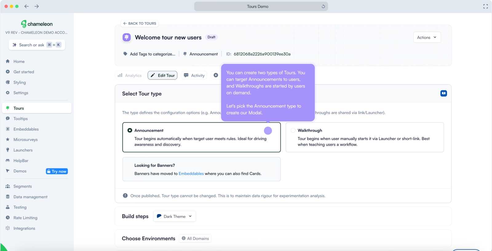
#6: Chameleon
Chameleon is a product adoption platform with a strong focus on AI capabilities, including content creation, user engagement research, and product analytics. Its AI co-pilot, in particular, is often praised for helping speed up certain workflows.
👉🏻 Check out our in-depth Chameleon features and use cases analysis.
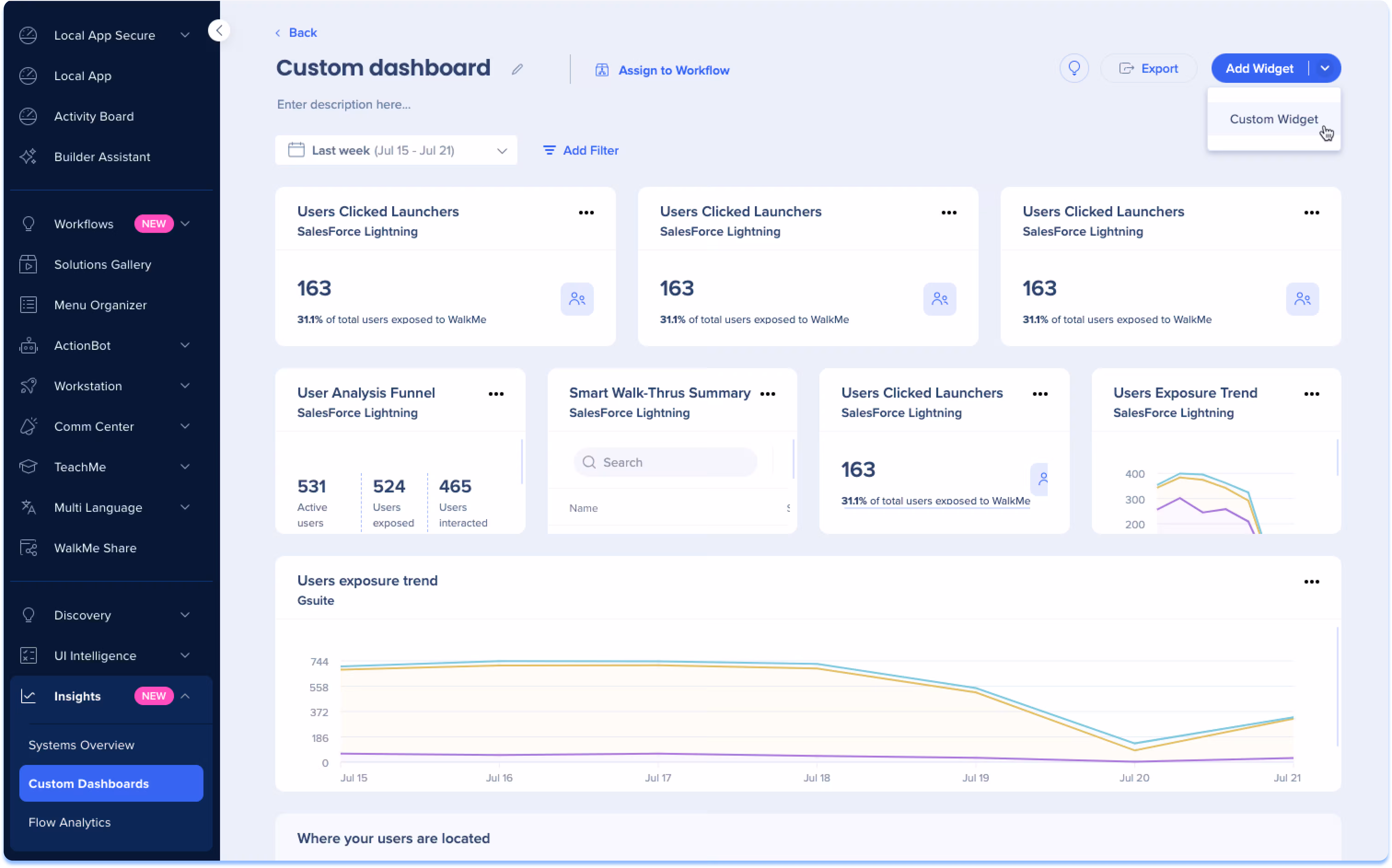
The platform also offers a wide range of integrations and “custom recipes,” which enable workflow automations across different tools. However, having these capabilities doesn’t necessarily mean they’re easy to implement. To truly get value from the AI co-pilot and automation features, users often need to invest time in setup and experimentation.
When it comes to the UI, things feel a bit more crowded.
Features are listed without clear categorization in the main menu, which can make navigation less intuitive. The overall design also feels slightly boxy and somewhat outdated.
Here’s the guides page:
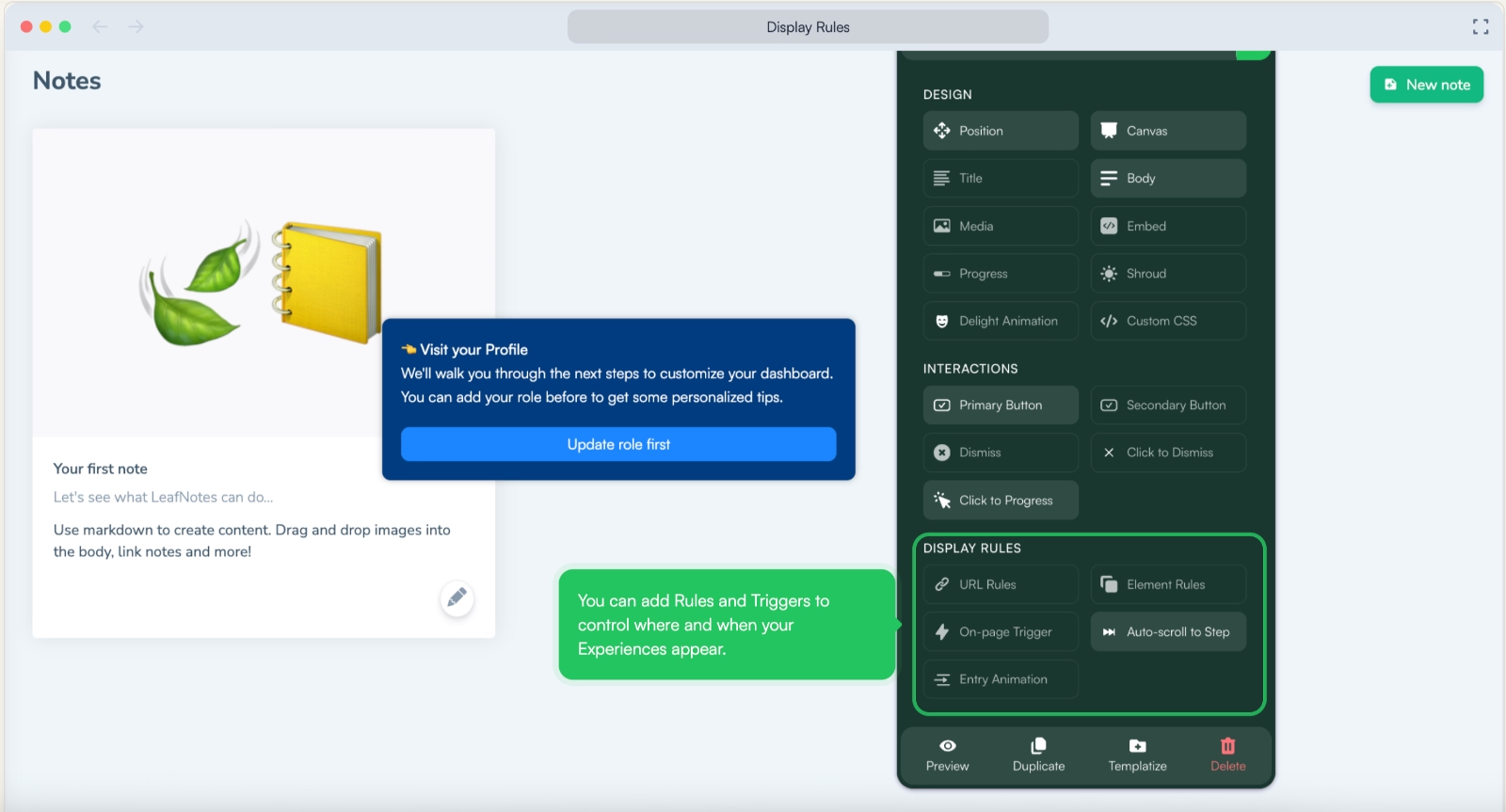
This “everything in one place” approach extends to the browser extension as well.
For example, while some tools separate targeting and advanced configurations from the builder interface, Chameleon includes most of these settings directly within the extension. While this can be convenient, it can also make the interface feel cluttered and harder to manage, especially for new users.
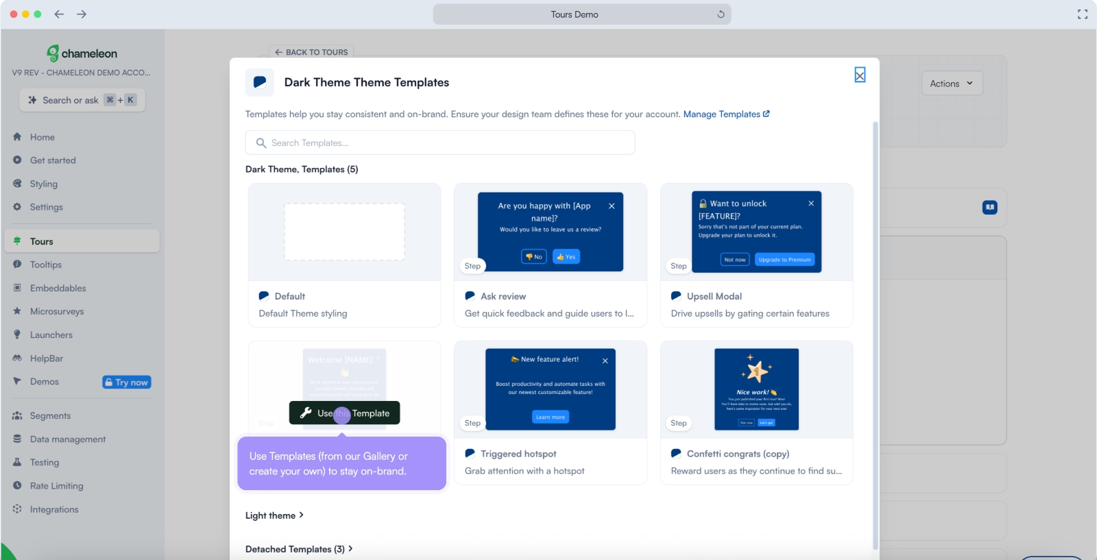
Finally, let’s talk templates.
Chameleon does offer templates, but they are somewhat limited in both design variety and use-case coverage.
What makes Chameleon harder to implement?
❌ Crowded interface with limited feature organization
❌ Advanced AI and automation require time to fully leverage
❌ Limited template variety for quick onboarding*
#7: Pendo
Pendo is a product experience and analytics platform that goes beyond onboarding, offering capabilities for product planning, analytics, and user feedback.
👉🏻 Check out our in-depth Pendo features and use cases analysis.
One of the first challenges with Pendo is its opaque pricing. Plans and feature limits aren’t publicly shared, which often leads to longer sales cycles and contract discussions before you can even get started.
When it comes to templates, Pendo does offer the, but in a somewhat disorganized way. Different elements like banners, tooltips, and surveys are grouped together under “guides,” without clear separation or structure.
The UI also feels a bit boxy and outdated.
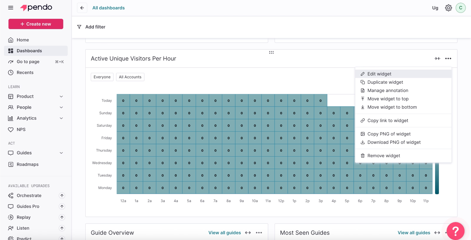
Since Pendo is heavily focused on analytics, the platform includes a wide range of reporting capabilities and dashboard views. You can customize these dashboards to fit your needs, which is powerful, but it comes with a tradeoff.
There’s exactly zero in-app guidance when it comes to analytics and dashboard configuration. This means you’re largely on your own when figuring out what each metric represents, how to structure your dashboards, and which views work best together.
If you don’t already have experience with analytics platforms, learning and implementing Pendo can take a significant amount of time.
Plus, Pendo also falls short when it comes to documentation, not just in-app guidance. Many users report that the available resources aren’t detailed or clear enough to help them navigate the platform on their own.
As a result, several customers mention that they were unable to fully configure the tool without external help and needed significant hand-holding during the implementation process.
I think Pendo's documentations need to improve a little bit more because it is actually difficult to understand what's going on. Just by reading documentations itself and educate myself, I have to actually try an error to use the product as well as attend some webinars in order to learn how to use it. Not that easy, it takes a while for us to understand the initial setup. We actually work with the client success manager in Pendo to understand how to do it thoroughly.”
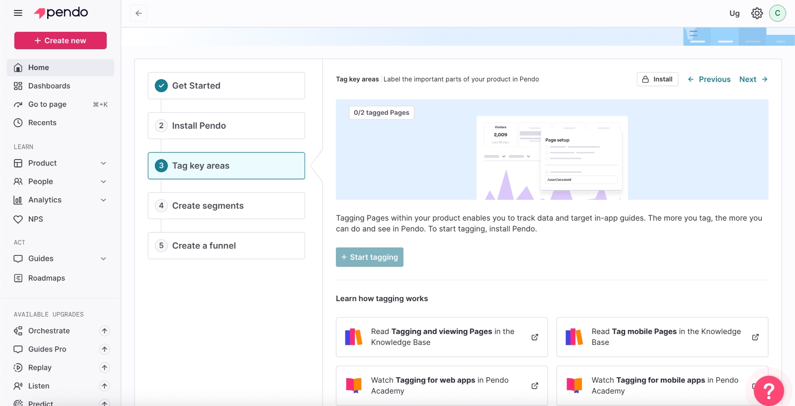
The initial setup process also adds to this complexity. Pendo expects you to define segments, create tags, and build funnels early on, which can make the onboarding process longer and more demanding than with simpler tools.
What makes Pendo harder to implement?
❌ Opaque pricing and longer sales process
❌ Complex, analytics-heavy interface with little guidance (in-app and off-app)
❌ Lengthy and demanding initial setup process
#8: WalkMe
WalkMe is a digital experience platform that supports both user onboarding and employee onboarding.
👉🏻 Check out our in-depth WalkMe features and use cases analysis.
Similar to Pendo, it comes with opaque pricing and is known for lengthy sales processes, negotiations, and contract discussions, which means the implementation journey can get off to a slow start.
The UI is quite crowded and can feel confusing at times.
Many features are buried under multiple dropdown menus, so navigating the platform often involves a lot of clicking back and forth.
Customization and advanced targeting or segmentation capabilities are powerful, but they often require a fair amount of technical knowledge.
It’s not the kind of platform you can easily pick up just by exploring the UI. You'll likely need dedicated time and training to get comfortable with it…
WalkMe does offer a wide range of advanced features, but that also means there’s a lot to configure and learn. Many users mention that mastering the platform takes significant time, with initial implementation sometimes stretching into weeks or even months.
There is a learning curve when building advanced flows or handling complex use cases. Initial setup and customization can take time, especially for large applications with many paths. Some features feel powerful but require training to use efficiently.”
What makes WalkMe harder to implement?
❌ Complex and crowded interface
❌ Requires technical knowledge and training
❌ Long implementation time, especially for advanced use cases
Frequently Asked Questions
What is the easiest user onboarding software in the market?
Tools like UserGuiding and Product Fruits stand out because they’re quick to set up, easy to navigate, and don’t require technical help. With ready-made templates and built-in guidance, you can go from setup to live onboarding flows in a short time without much friction.
What is the best onboarding tool for small businesses?
For smaller teams, it really comes down to ease and cost. You want something you can pick up fast, afford comfortably, and run without extra technical help. Product Fruits and UserGuiding are solid options because they’re straightforward, reasonably priced, and don’t require a lot of time or resources to get value from.
What is the typical time-to-value for no-code onboarding platforms?
Time-to-value really depends on how you define “value.” For some teams, it’s seeing higher engagement or feature adoption; for others, it’s faster onboarding or positive user feedback. But across the board, implementation time and effort play a big role. If a tool is easy to set up and use, teams can start seeing results within days or weeks. On the other hand, complex setups, frequent support needs, or high costs can significantly delay value realization.
Which AI tools are best for automating user onboarding in 2026?
In 2026, the most effective AI tools for onboarding are those that go beyond basic automation. AI copilots and AI-powered analytics tools stand out by helping teams create flows and answer user questions in real time. Chameleon, Product Fruits, and WalkMe offer really advanced AI and automation capabilities in the onboarding tools market.
What are the compliance and security standards for onboarding software in 2026?
Onboarding software is expected to meet standards like GDPR, SOC 2, and ISO 27001, often with options for data hosting in the EU or the US. However, requirements can vary by industry and region. For example, healthcare companies may need HIPAA compliance, while businesses in Brazil might look for LGPD in addition to or instead of GDPR. So, it’s important to choose a tool that aligns with your specific regulatory environment and data handling needs.

.png)