UX modal windows suck.
Or so we were conditioned to think. Let's admit it, we do want to get prompted with an email newsletter modal sometimes.

The truth of the matter is, a UX modal window is one hell of a handy tool in UX when used right.
The tricky part is to know what exactly is right. But worry not, we'll talk all about it in a minute.
Brace yourself for:
- What a UX modal is,
- Why you might need a UX modal,
- What makes a UX modal different from a popup,
- What some cool examples of UX modals are,
- How you can create one in-house and with no-code
Without further ado, let's dive in.
What is a UX Modal?
A UX modal window is a type of dialog box that pops up when you click or tap something on your current screen. They’re also known as “popup windows”, “modal windows” or “modal popups”. UX modals are often used to notify and inform users or ask them certain questions about their preferences. A UX modal can pop up at any stage of a user experience in the forms of confirmation boxes, signup forms, or notification windows.
Throughout our lifecycle as internet users and website users, we come across hundreds of UX modal windows, several of them in a day, even.
So, we are well aware of what a UX modal is.
What we don't know is a UX modal's impact on the user experience and user action. Let's take a look at that.
Are modals bad for UX?
No.
That is if you are doing it right.
As we said up above, designing a UX modal is quite a tricky task. Just like the rest of the UX patterns in a given website or tool, it'll work properly only if it is designed right.
On the other hand, if it is not designed to match your website/tool's general function, your users' needs, and the user interface altogether, then yes, a modal is a bad idea for your UX.
So, are modals good UX?
Yes.
But just like what I said above: only when it is designed right.
A lot of human psychology goes into figuring out when and where it is okay (or even good) for a UX modal to pop up. Let's look at an example.
A user logs into your website/tool, possibly with a certain series of tasks in their mind. Boom. Modal pops up. Day ruined.
Chances are they won't even read the modal.
What about this though: a website visitor is on your website to read a blog, check pricing or features. You prompt them with a sign-up modal right before they leave.
They are already done with your website. They will even be intrigued because of the fact that they could have missed the modal if they left a second early (of course, that's not how it works, but that's how the human brain works)
Boom. you got them to read it. Maybe even interested.
So yes, (hopefully saying this for the last time) if you use a UX modal the right way, it will work miracles.

Why you might need a UX modal
So now you are thinking, "okay, but do I really want to bet on whether my users will be annoyed or not when I use a modal dialog?"
You just might.
Truth is, certain in-app messages work better with a UX modal. And there are three reasons for that.
Nature of design, space for content, and functionality.
Nature of design
The way a UX modal looks is pretty much default.
The design patterns for a modal dialog are simple: An app or a browser window with a modal header, maybe a footer, even some interactive element here and there.
A big child window on the parent page is a good way to describe it. And like every child ever, it can be a little annoying.
But at the same time, children are loud enough to get your attention.
If we were to exemplify this, getting a visitor to sign up to your tool or do a series of tasks is cumbersome unless you address that need directly. Tooltips won't work effectively, slideouts will disrupt their current task, emails can go to hell.
Modal overlays will get their attention right away, and if the modal content is good enough and the cue time is right, it is bound to work.
Space for copy
Compared to other user experience patterns, a UX modal naturally has the most space for content, be it copy or media.
But yet again it gets tricky.
Because the more you put on the modal content, the less likely it is that the users will read it.
So it all boils down to effective copywriting, which still has more potential with a UX modal than with any other UX pattern.
Functionality
All UX patterns have specialized case uses and functions, and UX modals are no different.
In fact, they are the best functioning piece of UX pattern for announcing something important or making sure you have the full attention of a user/website visitor on a browser window.
Thus, you might need to use a modal dialog when you really need to talk to your users straight up.
Good designing, good timing, and good copy are your best friends when it comes to functionality.
Before I make it clearer with examples, let's first address a tiny misconception.
Is a Modal a Popup?
The quick and painless answer is: yes, a modal is a popup.
But a modal window is NOT a popup window. Let me explain the similarities and differences.
How are they similar?
👉 A modal window or a modal box is innately a popup since it literally pops up on a parent application as a child window.
👉A modal also serves more or less the same purpose as a popup window, that is communicating a message or a requirement to the users/visitors.
👉 A modal and a popup can have very similar content, be it the modal titles, modal header, or other elements.
However, there are many differences between a modal and a popup that eventually makes it really clear that they are not the same thing.
Differences between modals and popups
👉 A modal is actually inside the website/tool you are visiting, a popup is a separate window.
👉 A modal is designed to be less disruptive while a popup may be too disruptive or not disruptive at all by hiding behind open windows.
👉 A modal can be tolerated or even liked by users while a popup window is too similar to popup ads to be tolerated.
Now that everything is in its right places, let's take a look at some cool UX modal window examples.
7 Great Modal Box Examples for Inspiration
1- ClickUp
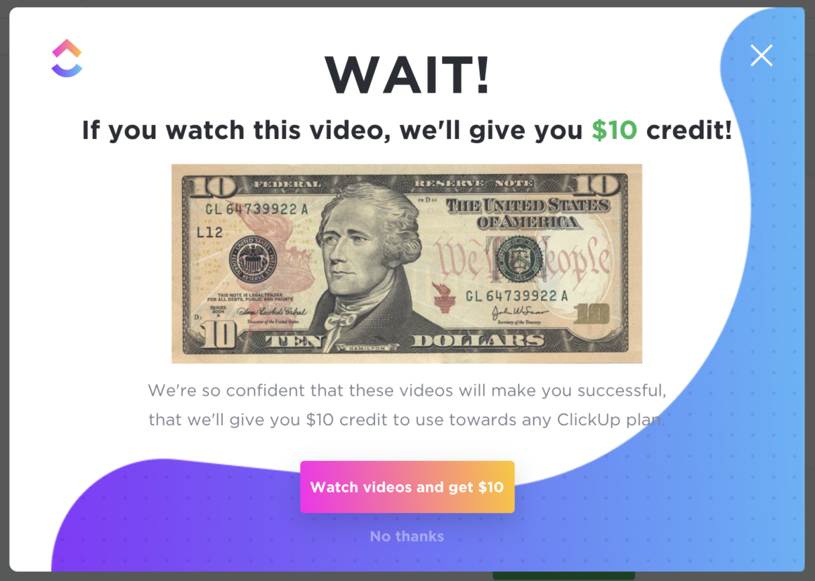
ClickUp triggers the perfect modal when a user takes too long to watch the onboarding videos. What makes it perfect?
The copy.
The way every piece of text is situated, the size of the dollar bill image, and the money-green "$10" all come together to create a perfect, compelling, and fun modal.
Well played, ClickUp 😎
2- Typeform

Typeform's onboarding modal is so laid-back and fun to look at that the users can't help but read the small but convincing piece of copy.
After grabbing the users' attention using a fun little doodle, Typeform proceeds to explain in an extremely human voice, one you just can't not listen to.
3- Pinterest
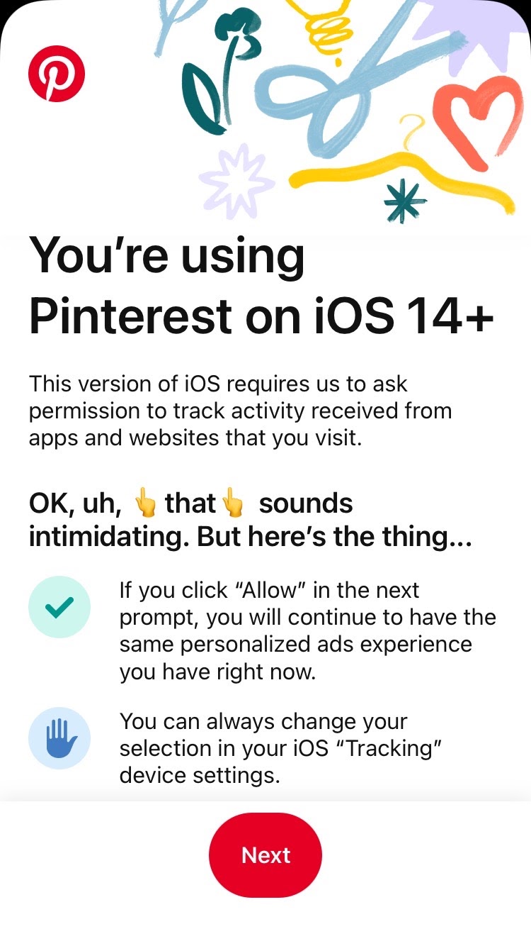
Modals on mobile is a whole another level of a dialog window.
Pinterest is among the apps and tools that are known to be user-friendly and personalized, but with this modal they use on their mobile app, they really prove it.
Instead of prompting users with an annoying modal about the update, they answer the real questions in the users' minds, and they do so in the most fun, eye-catching way possible.
Kudos to that.
4- Grammar.ly
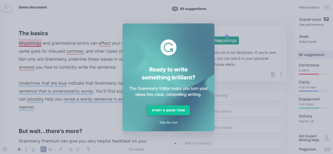
Grammar.ly's first step on their onboarding tour is a great example of onboarding modals. When your users are in an onboarding environment for the first time, they need the hard ground to step on first and foremost.
A welcome modal or a modal that'll start off your onboarding is the perfect solution for onboarding deserters. Once they know they are in safe grounds, users become more likely to proceed with your onboarding.
And believe it or not, a skip or a cancel button makes it even more reassuring.
5- Visme
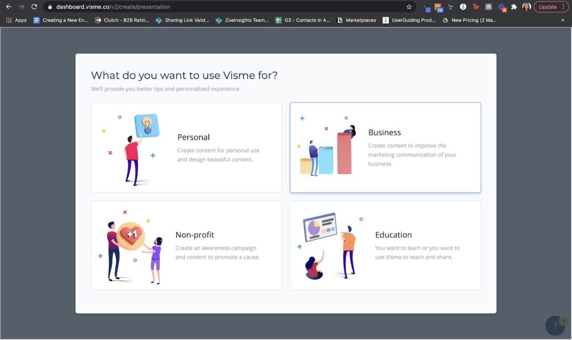
Asking people about their use cases when they step into your product is among the best practices in UX in the last couple of years. And Visme does it perfectly.
Using a modal, Visme prompts users with the question "what do you want to use Visme for?", the answers feature fun little illustrations and short explanations.
Media? Check. Good copy? Check. Proper use of modals? Check.
6- Flourish
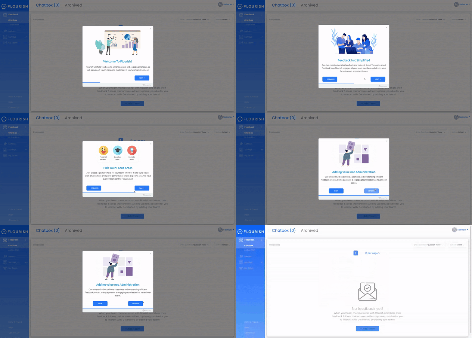
Flourish uses a modal to onboard its users. Yes, we have seen it.
But they also use a previous button and a next button to let users navigate through the onboarding flow. At first, a button may not look like much but because it makes the modal more interactive, it actually has a great impact on the success and engagement rates of the modal.
A good design for sure.
7- Cuepath
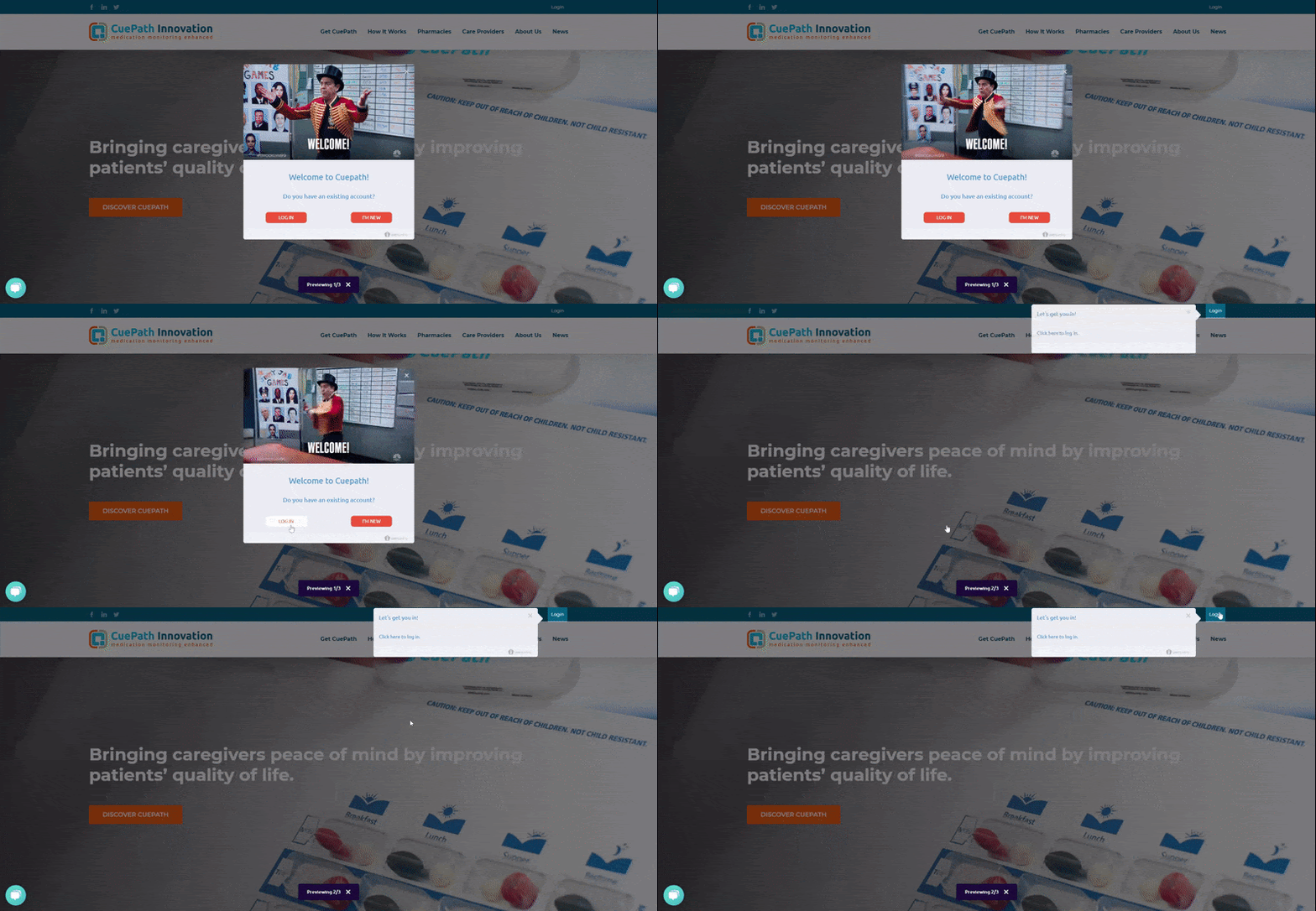
Cuepath's welcome modal is one of the most fun ones you'll ever see.
It's always a fun idea to put a gif on your banner for the maximum eye-catchiness and Cuepath understood that exactly right. Because it's a welcome modal, it is already non-disruptive as can be and even needed to some degree.
Cuepath, you got this.
8- Grove HR
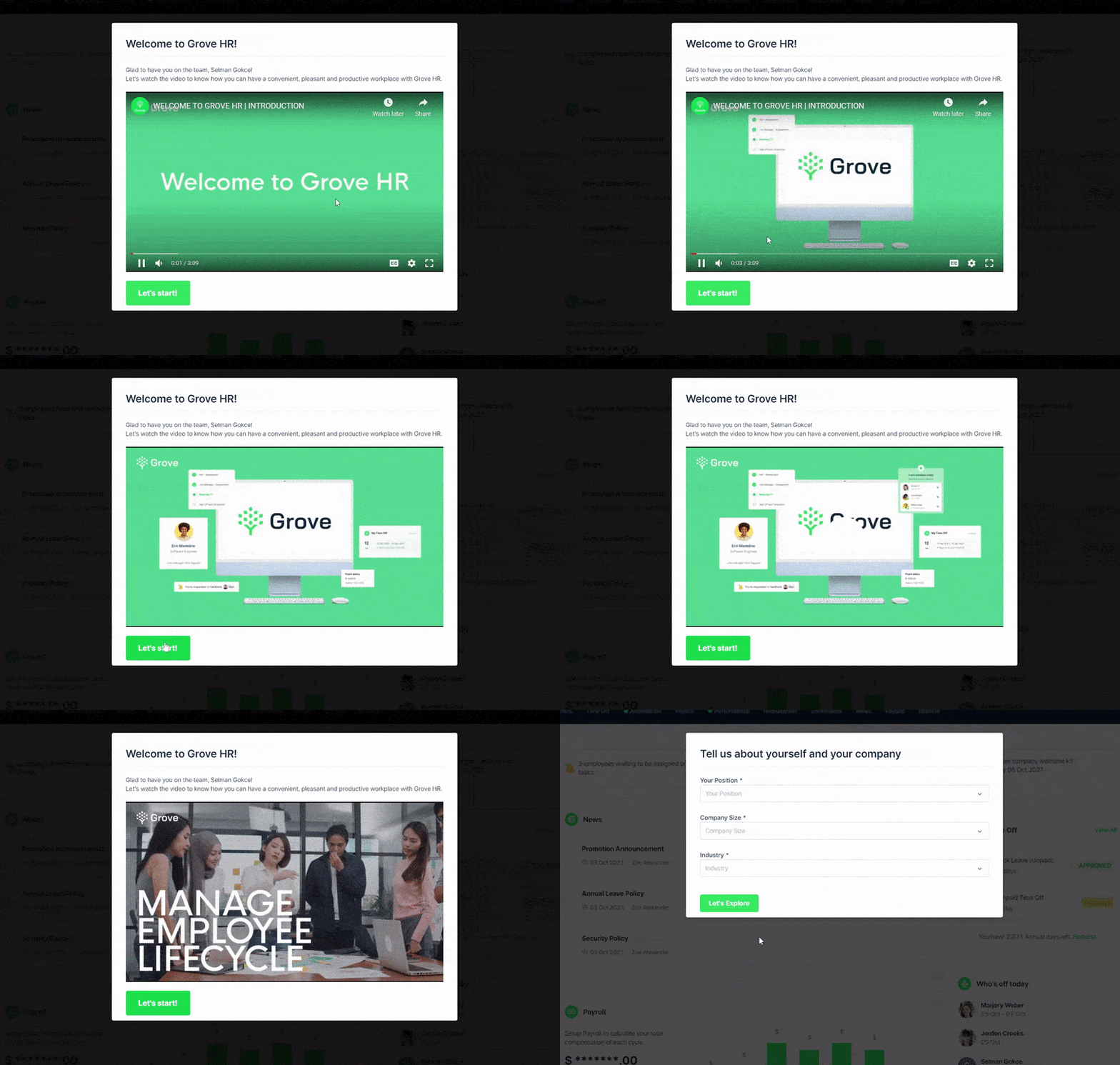
Take Cuepath's welcome modal. Double it down. You got Grove HR.
Putting media content in your modals is one thing, but a video in your modals could work wonders if your product is fit for it.
Grove HR seems to have solved their onboarding problems with it, so if your product s anything similar, I say give it a try.
"All these great examples, but how do I create one MYSELF?"
I got you. Let's take a look at how you can create a UX modal using two different methods.
How to create a UX Modal Window in 5 minutes (or in 5 hours)
Creating a UX modal is easy peasy lemon squeezy. If you are using the right tools.
Otherwise, it'll take a lot more for you to actually design, write, code, and launch it. But hey, let's take a look at both methods.
Method 1: No-code way to create UX Modals
You can use no-code tools to create UX modals with ease, in 5 minutes or even less, to be exact.
Let me walk you through UserGuiding's modal creation flow in three steps.
1- Create a guide
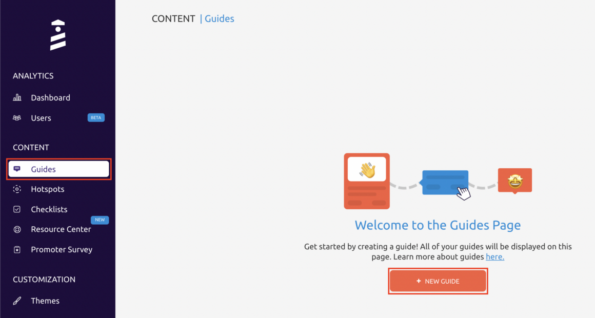
Go to the "Guides" tab on UserGuiding and click on the "New Guide" button.
You will be asked to enter the URL of the website you want to use UserGuiding on and will be sent there right away.
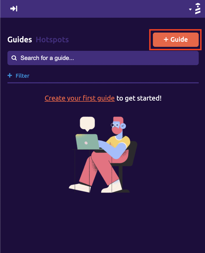
On the sidebar that appears on the website, click on "Guide" to start.
2- Pick and customize
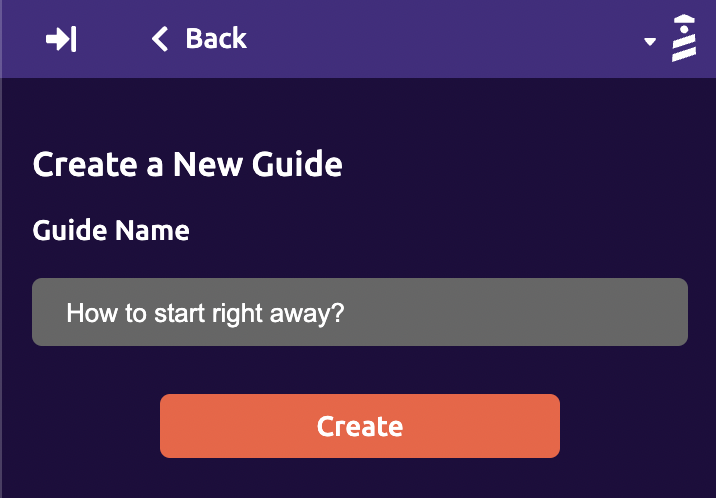
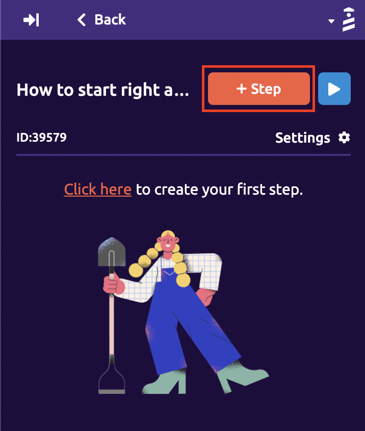
Name your guide and click on the "Step" button to pick a modal.
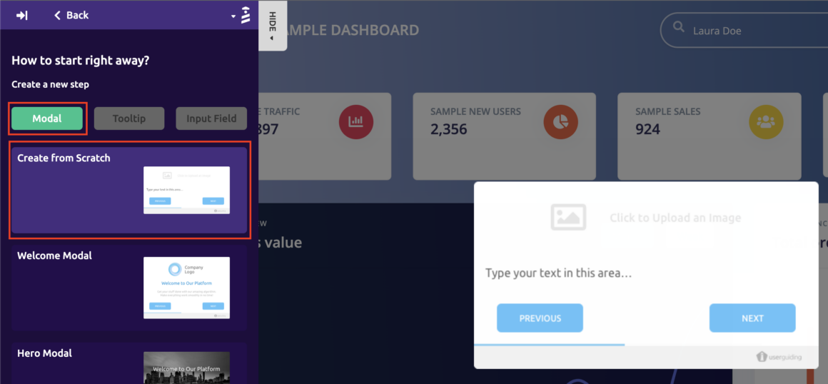
Click on the "Modal" button and pick the kind of modal you want to use on your website. Add your content, pick your colors and add elements. Customize that bad boy.
You can easily add more steps that will follow your modal or leave it as it is at one step.
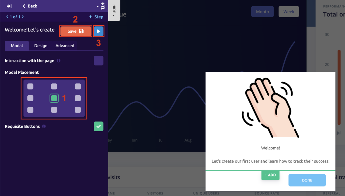
Pick the modal placement, save your progress, and preview it by hitting the play button.
3- Save and publish
Once you are done, you can go back to the UserGuiding dashboard.

Find your new guide and click on the Settings button to add your container code, this way you will be able to activate your modal.
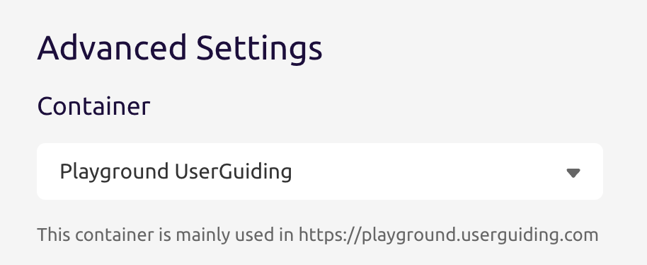

Lastly, turn your guide into active, save it, and publish changes. And so your modal is ready.
Interested?
Method 2: The hard way to create UX Modals
Now, if you have the time, the funds, and the brains to go in-house, you can create UX modals using, you guessed it, good ol' code.
The first thing you want to do is plan your UX modal and figure out a map of interactions. You can use Adobe XD for this, or any other UX/UI tool.
The rest is coding.
Using HTML, CSS, and Javascript, you can create simple UX modals. For more complicated ones, however, different tools and elements may be required.
Conclusion
A UX modal could be a great addition to your UX elements, or a user repeller.
It all depends on the execution.
To make sure you have the luxury to be mindful of the details of your modal, I say you need a no-code tool. But if you can, going in-house is totally on the table as well.
Go with what you can and come up with a killer modal. You got this.
Frequently Asked Questions
What is a modal in UI design?
In UI design, a modal is a user experience element that comes in front of a larger parent window as a child window. It is different than a popup window in that it doesn't prompt a new window but a smaller box within a window.
What are modals in web design?
In web design, a modal is a UX pattern that pops up on a parent application or window. Modals are known to be disruptive, however, they don't necessarily have to be that way if they are designed insightfully.
Can modals scroll?
Although most modals are non-scrollable, the contents of a modal can be scrolled, especially when it contains term updates and/or a long piece of similar copy.
What can I use instead of a modal?
Modals can easily be replaced with tooltips, slideouts, banners, and more. However, because of the specific way modals are designed, they can serve the purpose of drawing full attention to a message or content better.
When should I use modals?
Although modals are quite handy, they can be disruptive. So it is best to use them only when you need the utmost attention of a user or when you want to make sure they know of a certain piece of information.


.svg)
.svg)
.svg)
.svg)
.svg)


.svg)
.svg)


.png)


