


.svg)
.svg)
.svg)
.svg)
.svg)


.svg)


.svg)
.svg)

79% of SaaS companies shift to product-led growth, and the pressure is on to deliver fast, intuitive user experiences, starting with onboarding.
And the data backs it up: Tech-enhanced onboarding can boost customer experience by up to 43%. If you want to reduce churn, accelerate activation, and stay competitive, a great software walkthrough isn’t optional; it’s essential.
In this article, we break down everything you need to know about software walkthroughs:
- What they are,
- Why they matter,
- What makes one truly effective,
- And how you can build your own.
Let’s do it. 🚀
TL;DR
- A software walkthrough is an interactive guide that helps new users learn your product step by step.
- It can help you increase user activation by accelerating TTV, reduce support volume and user frustration, and boost feature adoption by making onboarding clearer and more engaging.
- What sets apart a good walkthrough from meh ones is personalization, flexibility to skip steps, and contextual guidance that matches user needs.
- Great walkthroughs also require you to act on user feedback, run A/B tests, and incorporate a mix of user interface (UI) elements, visuals, and clear formatting to keep users engaged and continuously improve the experience.
- You can easily create walkthroughs without involving your dev team by using no-code tools like UserGuiding!
- UserGuiding is a no-code, all-in-one product adoption platform that lets you create in-app experiences, track user engagement, and optimize your walkthroughs using detailed reports and feedback without writing a single line of code.
- Start your free trial and see it with your own eyes today.

What is a software walkthrough?
A software walkthrough is a step-by-step, guided experience that helps you understand how to use key features inside an app. Like its name suggests, it walks you through the process of activating and using a feature.
For example, when you open Slack for the first time, you’ll see a tooltip near the message bar suggesting you try sending a message.
The tooltip takes you to your first channel, highlights the text box, and shows a few editing tools that can come in handy.
It’s short, it’s relevant, and it helps you interact with the core feature.
You might think that in Slack’s case, you wouldn’t feel lost without the walkthrough and could figure out how to send a message, which is probably true.
But in a less intuitive UI or a more complex product, a walkthrough gives you a clear and reassuring path to success.
Here’s an example walkthrough from Zendesk:
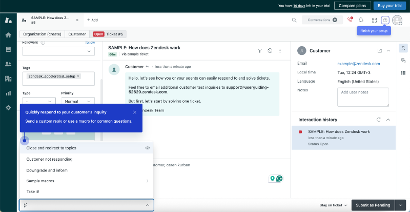
In this walkthrough, Zendesk guides users through the steps of responding to and resolving customer inquiries within the platform.
Software walkthrough vs interactive product tour
Product tours and walkthroughs are often used interchangeably, but they serve slightly different purposes.
A product tour gives a general overview of the interface, where things are, what buttons do, and how the layout works. It’s usually one of the first things you see.
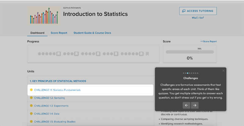
Here’s an example interactive product tour from Sophia Learning:
A walkthrough goes deeper.
It’s a guided flow that shows how to use specific features and take meaningful actions. It helps you actually do things, not just look around.
So, if a product tour is like showing someone where the kitchen and coffee equipment are, a walkthrough is like walking them through the whole brewing process, from grinding the beans and placing the filter to adding water and hitting start.
Step by step, until there’s coffee in the cup ☕
Why is a software walkthrough important?
A good walkthrough gives users the confidence to start using a product without second-guessing themselves. It speeds up the first few steps, helps users see value quickly, and keeps them from dropping off before they’ve done anything meaningful.
When done right, it becomes one of the quiet reasons people stick around.
Here are other advantages of a walkthrough 👇🏻
They accelerate time-to-value
Walkthroughs guide users through the first actions and cut out the guesswork.
Instead of wandering around the UI trying to figure out what to do first (and how to do it), users follow clear steps and reach their first outcome faster. Less friction, more clarity.
Which means users are up and running before they even think about quitting.
⚡ 90% of users churn if they don’t understand a product’s value within the first week, so early guidance is make‑or‑break.
They improve feature adoption
Even valuable features often go untouched, either because users don’t notice them or because they seem too complicated to try out.
Without a little guidance, it’s easy to skip over something that actually makes a big difference.
A walkthrough can break those features down into simple, manageable steps.
It removes the hesitation by showing how things work in real time, without overwhelming the user. What felt complex now feels doable, and that’s when adoption starts to grow.
If users don’t understand a feature, how can they make it part of their routine?
⚡According to 2025 feature adoption benchmarks, interactive walkthroughs drive higher adoption (31%) compared to traditional documentation (16.5%).
👉🏻 Check out other strategies to improve your feature adoption.
They reduce support volume and user frustration
A lot of support tickets come from simple confusion:
- “Where’s that setting?”
- “How do I save this?”
- “Why isn’t this working?”
Walkthroughs catch those questions before they even turn into issues.
You can add tooltips next to tricky areas or short self-help modals right where users need them. This way, they get the help while they’re using the feature, not after they’ve hit a dead end.
Less frustration for your users. Fewer tickets for your team. Win-win.
⚡ According to McKinsey’s 2022 survey, 65% of leaders believe that enhancing self-service options (offering automated walkthroughs, for example) reduces these tickets significantly.
What makes a software walkthrough great?
A great walkthrough guides users with clarity and purpose. It follows real user flows and fits naturally into the product experience.
It's also built with flexibility and user segmentation in mind.
But let us give you some more tangible aspects of a successful walkthrough (with real-life examples), so you can get a better sense of what it means to “follow the real user flow” or “build flexible walkthroughs”.
Keep it short and purposeful
When creating a walkthrough, less is often more.
Users tend to lose patience quickly if they feel bombarded with information or too many steps. Focus on the must-know actions and essential first moves that get users to value quickly.
Wes Bush says that around 30-40% of interactive onboarding steps can usually be removed without sacrificing the overall value of the onboarding experience.
If you have optional steps or steps with information you can introduce later on or as part of another tutorial or onboarding element, like a small, singular tooltip, then take it out of your walkthrough. Please.
⚡ According to Chameleon’s 2025 user onboarding benchmarks report:
- Walkthroughs with 4 steps have a 44% completion rate.
- When the steps increase to 5, the completion rate drops sharply to 22%.
This shows that keeping onboarding short can nearly double the chances that users actually finish it.
A great example of finding the sweet spot for walkthrough length comes from Jira.
They keep their walkthroughs focused on specific use cases, like visualizing project dependencies, and guide users through the relevant feature (the timeline), showing exactly how to use it.

To keep things concise, Jira includes explanations and key capabilities in the checklist descriptions. This way, they can deliver the how-to instructions in just 2 steps.
✅ What’s good about this example?
- Use case-focused walkthrough.
- “Guide me” CTAs on the checklist look pretty cool.
- The value proposition is highlighted on the checklist.
- Short and clear instructions on how to activate the timeline view.
❌ What could make it even better?
- The steps in the walkthrough could wait for the user to complete the action; currently, they just provide instructions.
- Some checklist items could be replaced with UI tooltips, as the current checklist feels a bit crowded, even though completing all the tasks doesn’t take much time.
Include interaction (not just information)
Walkthroughs shouldn’t just be static blocks of text or modal popups explaining what to do. Users learn best by doing.
That means interactive steps are crucial, as they let users actively engage with the interface as they’re being guided.
Including interaction could mean clicking a button, filling out a form field, or toggling a setting while the walkthrough directs them.
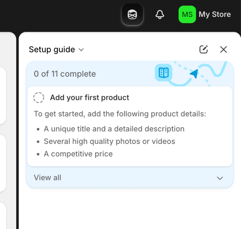
So, while Shopify’s setup guidance on the sidebar does count as in-app onboarding and even product walkthrough, it doesn’t do wonders in terms of engagement.
It’s actually not that different than reading product documentation from the help center on the next tab, really…
Instead, a better example to follow is TCP Humanity’s walkthrough. It not only clearly communicates the steps you need to take but also guides you to the right pages and waits for you to complete each action before moving on.
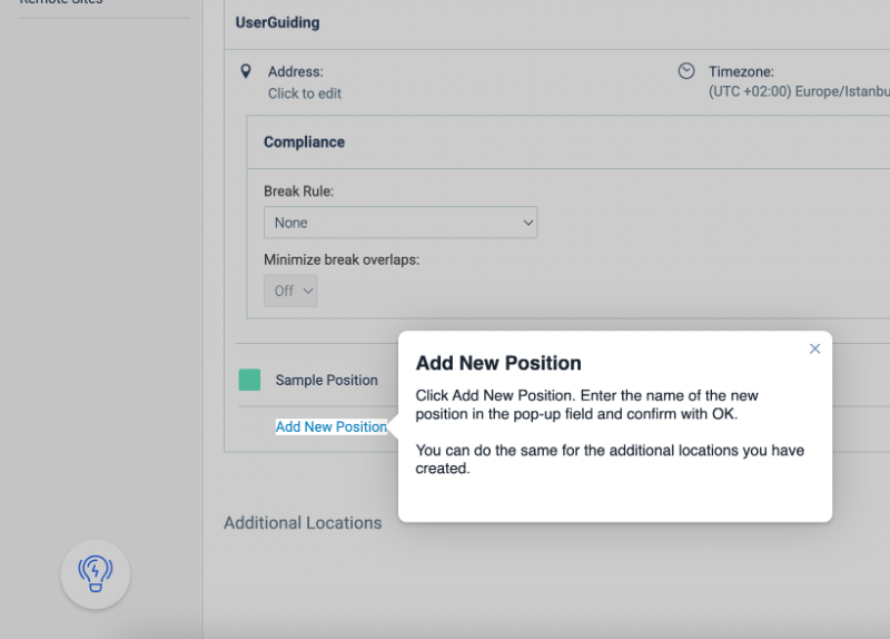
When a step asks you to click a button, the walkthrough advances as soon as you do.
f it requires filling in a text field (like an employee’s name and surname), it waits for you to type and hit enter before automatically moving to the next step.
In addition to the interactive walkthrough, Humanity also provides video walkthroughs for tasks that require input, like creating payroll reports.
While these videos aren’t interactive, they still add a level of engagement by visually showing how to navigate the platform and which buttons to click to complete the action.
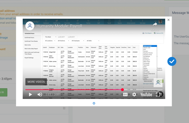
Both the interactive tutorials and video walkthroughs are easily accessible through the onboarding checklist.
✅ What’s good about this example?
- Walkthrough steps are interactive and wait for the user's action.
- The main step and the additional instructions are clearly separated using microcopy formatting, with a bold heading and a smaller description.
- Supporting visuals are used for less interactive tooltips and UX modals used in the onboarding.
❌ What could make it even better?
- The walkthrough modals look outdated and boxy, there could be more styling that fit the brand and the UI of the platform.
- There could be progress indicators, like the number of steps.
- There could be mock data to create interactive walkthroughs for the features that are currently explained through video tutorials.
Offer optional skips for fast learners
Not everyone needs the same amount of hand-holding. Some users pick up software quickly, while others prefer to explore on their own or return later for guidance.
Giving users the ability to skip, dismiss, or come back later respects their learning style and pace. It helps experienced users dive right in and prevents them from feeling slowed down by things they already understand.
This kind of flexibility is especially useful in products with returning users or trial users who re-sign up. They might not want a full walkthrough every time.
Retool, for example, lets users who are already familiar with app-building platforms skip the interactive walkthrough and jump straight into building.
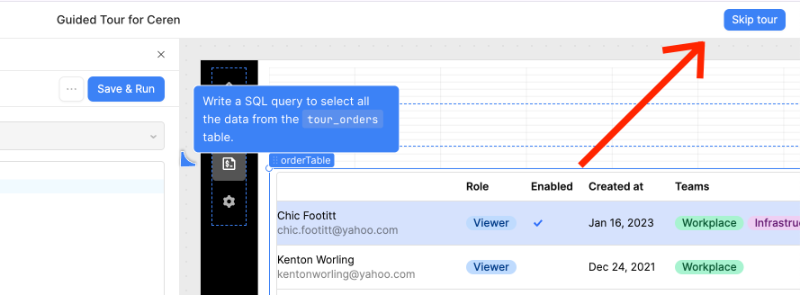
If you choose to take the tour later, you can find it on your homepage under the app named “Guided Tour for X.”
It’s a fun and engaging walkthrough that uses animations, auto-completed steps, and interactive moments where you’re asked to enter inputs or complete tasks to learn the platform.
It even triggers error tooltips when you make a mistake, like entering the wrong input, and the error messages change depending on what went wrong.

✅ What’s good about this example?
- Users are not forced to go through a tour if they’re not interested in it.
- However, they can take the tour whenever they want, as the tour doesn’t disappear into thin air when you skip it the first time.
- Engaging microcopy, especially the changing error messages.
- High level of interactivity with animations, automated steps, and user inputs.
❌ What could make it even better?
- There could be “skip the step” buttons. Currently, you can only skip the whole tour, not individual steps.
- There’s no progress bar or step count anywhere, which can be frustrating for some users.
Support contextual learning
Walkthroughs work best when they show up at the right moment, not all at once. Contextual learning means the product responds to where the user is, both in terms of screen location and their behavior so far.
For example, if a user has just created their first campaign, that might be the perfect time to show them how to analyze performance metrics.
You can use event-based triggers to show walkthroughs when a user clicks on a certain tab, completes a specific action, or lingers on a screen for too long. This makes the walkthrough feel like a natural part of the experience instead of an interruption.
Contextual learning is especially useful for deeper features that only become relevant once a user gets past the basics.
There’s no need to explain advanced filtering options in a dashboard if the user hasn’t created any data yet.
Canva does a great job with behavior-triggered tutorials!
They use a slideout modal to introduce features right when they become relevant. For example, their AI-powered image editor only appears once you upload multiple images into a design.
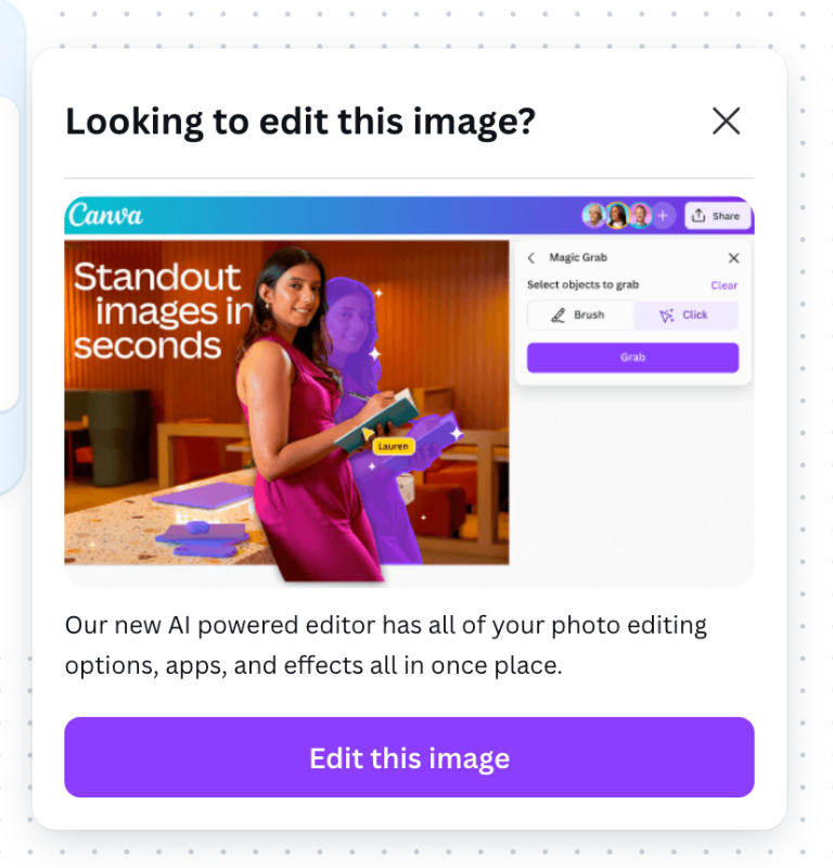
The slideout modal introduces the feature and includes a CTA button that takes you to the feature and triggers a short interactive walkthrough on how to use it effectively.
✅ What’s good about this example?
- The timing boosts the chances of engagement and completion.
- It doesn’t bore the user with seemingly unnecessary tutorials when they first sign up.
- Introducing the walkthrough first with a slideout modal helps minimize disruption.
❌ What could make it even better?
- The microcopy could include more detail about the feature’s capabilities; currently, the value proposition is not very clear.
Combine with other UI patterns
Walkthroughs don’t have to carry the onboarding weight alone. They work best when they’re paired with other UI patterns that reinforce learning.
Here’s how you can combine elements effectively:
- Checklists give users a clear sense of progress and encourage completion.
- Tooltips provide quick hints tied to specific elements.
- Hotspots draw attention to areas that need interaction without overwhelming.
- Modals are useful for showing short videos or quick overviews when something new is introduced.
This layered approach helps you educate users without cluttering the screen or overwhelming them with too much info at once. Each pattern supports a slightly different learning preference or attention span.
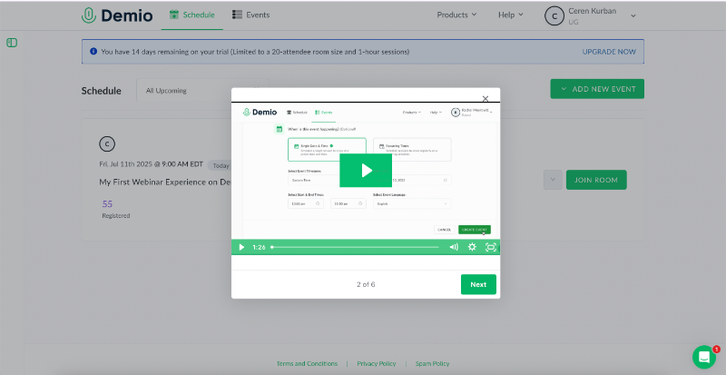
➡️ Demio uses modals to welcome users and give a quick overview of the platform with a video before prompting them to start a walkthrough for creating events. This approach helps diversify the onboarding experience, rather than relying solely on tooltips.
➡️ Teamwork uses standalone tooltips to introduce advanced features instead of cramming them into their already packed walkthroughs, which usually run 5 to 9 steps.
The tooltips come with visuals and clear CTAs for users who want to explore further. But for most trial users, they aren’t essential, at least not until a few key “aha!” moments happen.
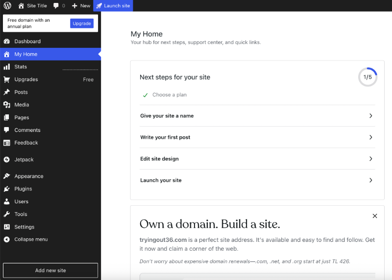
➡️ WordPress uses a checklist to guide new users through setting up a blog, from naming the site to publishing it live. Not every item on the checklist comes with an interactive tutorial, but the content editor does. Other steps rely on blank states within relevant pages to provide guidance.
✅ What’s good about these examples?
- Teamwork’s tooltip uses visuals, emojis, and an action-oriented CTA to grab users’ attention and spark interest.
- WordPress’s onboarding checklist offers a clear, step-by-step path to help users set up their site and start getting value from the platform.
- There are exit buttons and/or progress indicators in all 3 examples.
❌ What could make them even better?
- Demio’s pop-up modal video runs a bit long for a product tour. It could be shortened or split into smaller, focused videos.
- WordPress’s checklist isn’t connected to any interactive walkthroughs. Adding engaging tutorials that trigger directly from the checklist could make the experience more hands-on and helpful.
How to create a good software walkthrough (with examples)
Great software walkthroughs don’t happen by accident. They're built using strong UX principles, a clear understanding of user personas, and behavior-based triggers that make each step relevant.
Let’s break down how to build a successful walkthrough, step by step 👇🏻
Map the ideal first-time user journey
Before designing any onboarding flow, define what success looks like in a user's first session. Ask yourself:
- What action delivers value?
- What are the “aha!” moments for new users?
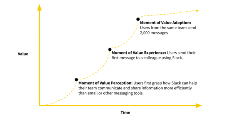
Ramli John debunks the myth of a single, magical "aha!" moment in his book Product-Led Onboarding.
Instead, he explains that users experience multiple small “aha!” moments, starting from the first time they hear about your product or visit your website, all the way to when they decide to make a purchase.
Each moment builds on the previous one, gradually increasing the user's perceived value and emotional investment.
According to Ramli, there are actually 3 major value realization milestones: the moment of value perception, the moment of value experience, and the moment of value adoption. He visualizes this progression using a Time-to-Value graph:
At this step, your goal is to identify the key actions users take as they move from initial signup to their first moment of value perception, and eventually to full value realization.
This way, you…
✅ Anchor walkthroughs around meaningful goals to avoid overwhelming users.
✅ Ensure the walkthrough is rooted in the user’s success, not just feature exposure.
Choose the right UI patterns (tooltips, modals, checklists)
Each UX element plays a different role in a walkthrough. When used intentionally and in combination, they build a cohesive experience.
Here are some UI patterns you can incorporate into your walkthroughs, along with what they’re best used for:
🧩 Tooltips
- Pros: Lightweight, contextual, great for explaining single actions or buttons.
- Cons: Easy to miss and can be annoying if overused.
🧩 Modals
- Pros: Good for major announcements, introducing features, or offering quick video overviews.
- Cons: Can be too vague if used without proper visual support, or interrupt the user onboarding flow if overused (especially with videos).
🧩 Checklists
- Pros: Help users track progress and offer a clear overview of tasks.
- Cons: Can feel overwhelming if too long or poorly organized.
At this step, your goal is to determine the best way to present information and structure it into an engaging (yet not overwhelming) learning experience.
What sets a successful in-app walkthrough apart from standard product documentation is the level of engagement and how effectively the information is communicated to guide users toward realizing value.
By enriching the onboarding with different UI patterns, you…
✅ Increase the chances for your users to actually complete your walkthroughs.
✅ Reduce cognitive overload by spacing out information.
✅ Support different learning and engagement preferences.
➡️ Twilio Segment, for example, integrates a detailed and well-structured onboarding checklist into its walkthrough experience. The checklist is organized into 3 progressive categories: Basics, Instrumentation, and Optimization, each containing around 5–6 steps.
The Basics section guides users through the initial setup and helps them reach their first value realization moments.
The Instrumentation and Optimization sections build on that foundation by introducing more advanced features and helping users deepen their engagement with the platform.
To make the experience more engaging, Segment gamifies the process by grouping these categories into skill levels like beginner, intermediate, advanced, and pro.

✅ What’s good about this example?
- The checklist categories are visualized as individual boxes, so tasks don’t overwhelm the user.
- Each item includes a clear action statement, along with an explanation of why it matters and how it provides value.
- The progress bar is presented as a skill level rather than a basic task completion rate, which gamifies the experience and motivates users to complete more tasks.
❌ What could make it even better?
- If the CTAs under the checklist tasks triggered automated guides or interactive tutorials instead of just navigating the user to the relevant feature page.
Make it skippable and flexible
Some people pick up new software quickly and want to jump right in, while others appreciate step-by-step help. Giving users control over their onboarding experience shows respect for these different learning styles and prevents frustration.
Adding clear options like “Skip,” “Remind Me Later,” or “I’ll Come Back” buttons on modals or checklists empowers users to engage with onboarding on their terms.
In other words, they ensure that users don’t feel trapped in an onboarding process.
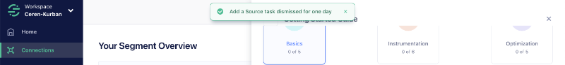
➡️ To continue with Twilio Segment’s example, they allow users to temporarily dismiss tasks from their onboarding checklists for a day.
This way, users don’t constantly see tasks they’d rather postpone until after completing other items. They can focus on what’s most relevant right now and easily return to the dismissed tasks later.
As they put it: “Let this be tomorrow me’s task.”
✅ What’s good about this example?
- The one-day dismissal ensures key user actions are reminded to users, possibly at a time when they’ll be more willing to complete them.
- However, it still gives the users freedom and flexibility to control their onboarding experience.
❌ What could make it even better?
- Currently, dismissed tasks disappear entirely from the checklist and the platform, so users must wait until the following day to see them again. If there were a separate list, in a resource center, for example, where these tasks remained visible, users could revisit and complete them anytime before the reminder reappears.
- Tasks can only be dismissed for a day, not skipped entirely. A “Skip this action” option would offer more user control.
Personalize the walkthrough based on user segment
Every user comes with different needs, roles, and goals, so one-size-fits-all onboarding can feel generic or even irrelevant. Personalizing walkthroughs based on user segments makes the experience feel tailored and more relevant.
This can be done by collecting information during signup with onboarding surveys (progressive profiling) or letting users self-select their use case.
➡️ If you’re not planning to run a user survey to segment users, you can follow Gumloop’s approach and lay out your walkthroughs for users to choose from and let them segment themselves based on their needs.

Gumloop lets users choose which guided tour they want to take, based on their use case.
Say you want to use it for social media listening, you click on that option, and a walkthrough launches that shows you how to build an automated social media listening flow.
You see the steps listed in a checklist and experience them through interactive guidance.
Some parts are automated, with a pink arrow completing them for you, while the key steps are left for you to try yourself, so you actually learn how it works.
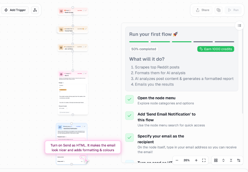
✅ What’s good about this example?
- Allows users to start experimenting with the product without going through lengthy signup flows.
- Use cases highlight specific features and provide focused walkthroughs; there’s no generic product tour to sit through.
- Walkthroughs are built around realistic, practical scenarios, such as setting up automation for Reddit mentions.
❌ What could make it even better?
- There could be skip buttons for individual tooltips, especially for users who just want to observe how the use case is realized within the product. Currently, the walkthrough requires users to fill in important information, like connecting Gmail or social media accounts, before it can continue with the next step.
Incorporate feedback and iterate
Launching a walkthrough isn’t the end of the journey; it’s just the beginning.
To keep improving, it’s vital to collect user feedback regarding the experience (and you should do it directly in the app). Simple mechanisms like thumbs up/down questions, or mini in-app surveys at the end of a walkthrough allow users to share their thoughts in real time.
➡️ Teamwork, for example, requests user feedback shortly after the walkthrough is completed, once the user has explored a few feature pages and gotten a feel for the platform’s capabilities.
The survey focuses on the sample data provided during onboarding, asking users to rate the statement: “Having sample data helped me understand Teamwork’s features better.”
There’s also an optional open-ended question where users can share additional insights if they’d like.

✅ What’s good about this example?
- The optional open-ended question allows users to share detailed insights without pressuring those who prefer not to respond.
- Asking for user feedback about the onboarding experience creates a positive first impression, signaling a strong user-centric mindset and a commitment to continuous improvement.
❌ What could make it even better?
- The survey modal overlaps with the final walkthrough modal; it would be better triggered after the walkthrough is fully completed and closed.
- Triggering a feedback survey about the sample data might be more effective after the user has had more chances to interact with it. Asking for feedback immediately after the walkthrough can feel premature, as users may not have explored the sample data enough to provide meaningful input.
Test on real users and track completion rates
Guesswork isn’t enough when it comes to onboarding success; you need data.
Tracking analytics on where users drop off, which steps are skipped, and overall completion rates gives a clear picture of how your walkthrough performs.
Running A/B tests on different copy, the number of steps, or the layout can reveal what drives engagement.
By closely monitoring key metrics like time-to-value and step conversion rates, you can:
✅ Identify bottlenecks,
✅ Optimize content, and
✅ Create a more seamless path to value.
As Ramli John jokes about it, user research can actually save you and your users!!
Include help options or live support links
Some products are complex, and even the best walkthroughs won’t cover every question a user might have. That’s why it’s critical to offer easy access to additional support channels during onboarding.
This can include links to a comprehensive help center, live chat options, or video tutorials for deeper dives.
➡️ Twilio Segment, for example, keeps all key support resources easily accessible within its in-app resource center (at least their links). Users can find links to the Segment Community, an example repository showcasing best practices, product documentation, and the support center. They can also submit support tickets or leave feedback directly from the resource center.
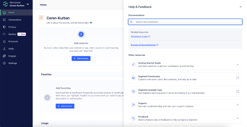
✅ What’s good about this example?
- You can submit a support ticket or send feedback directly from the RC.
- All the important links are available within the product.
- Important documentation is highlighted separately for easy and fast access (“Segment for developers”, “Segment for data users”, etc.)
❌ What could make it even better?
- Although there is a search bar in the resource center, it doesn’t return any results. Users need to navigate to the external help center to access the actual support content, which can be upsetting.
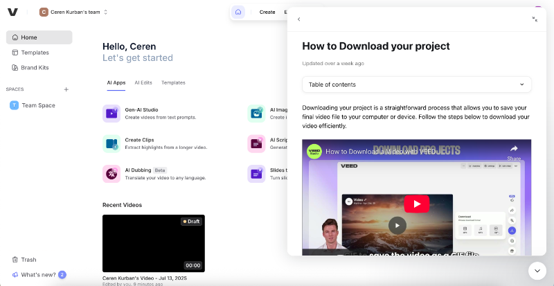
➡️ A better example is Veed.io’s resource center, which lets users view help content directly within a modal, without leaving the platform. Triggered via a widget, the resource center provides access to help articles and also includes their AI assistant, Fin, for real-time support.

The articles are roughly categorized for easier access, with onboarding-related content grouped under the "Getting Started" section. Users can also find any article using the built-in search bar.
Here’s how the articles look within the resource center:
Veed.io also has another “help center” available in the platform with a separate widget, which consists of its video content only. The materials are organized by both skill level and feature/capability, making it easy to browse beginner or advanced-level tutorials.
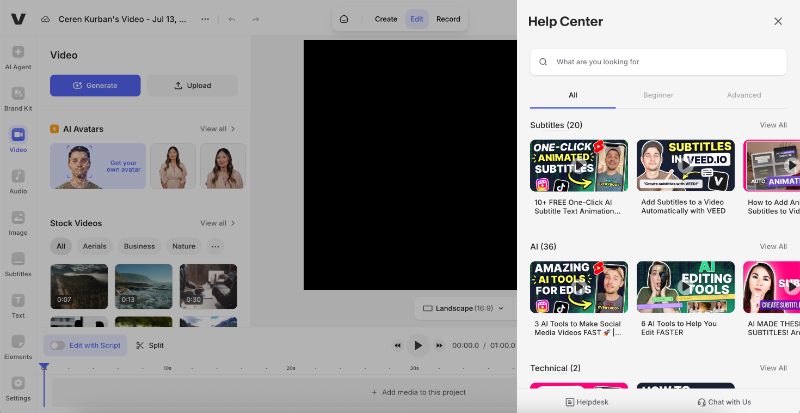
✅ What’s good about this example?
- The search bar actually works and returns content (in both centers).
- Help content does not require you to leave the app; you can even leave feedback for the articles with emoji reactions.
- FAQs and onboarding-related materials are highlighted for easy access.
❌ What could make it even better?
- 2 help centers/resource centers can be confusing for users.
Use a third-party software walkthrough tool
Building all these onboarding features in-house can be time-consuming and technically demanding.
Third-party tools (like UserGuiding 👀) simplify this process by offering no-code platforms to create interactive walkthroughs, checklists, modals, and tooltips. These tools often include user segmentation, behavior triggers, and analytics out of the box.
For example, with UserGuiding, you can:
- ✅ Create welcome screens with visuals, buttons, and links.
- ✅ Guide your users to success with interactive walkthroughs and tutorials.
- ✅ Offer contextual and quick tips with tooltips and hotspots.
- ✅ Personalize the content based on user roles or behavior using segmentation.
- ✅Track onboarding success, set goals like task completion or feature usage.
- ✅ Run quick A/B tests to compare variations of a guide.
- ✅ Collect customer feedback through in-app surveys and ratings.
All from one single platform, without writing a single line of code!
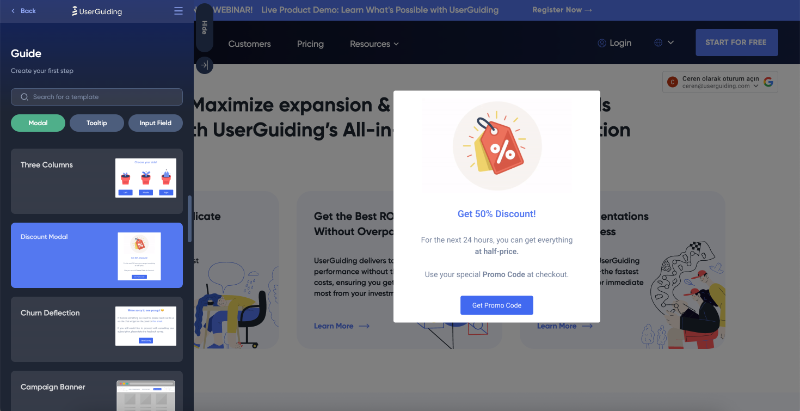
Here’s what UserGuiding’s drag-and-drop editor looks like:
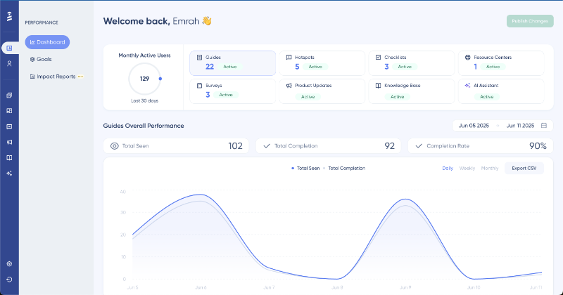
Even analytics and goal tracking in UserGuiding require no coding knowledge or technical background.
From a single dashboard, you can monitor engagement trends across your onboarding materials, identify your best- and worst-performing walkthroughs or steps, and create impact reports to understand which guides contribute most to your engagement and adoption goals.
Here’s the analytics dashboard:
Best software walkthrough tools in 2025
Once you understand how to create effective walkthroughs, the next step is choosing the right tool to bring them to life.
Here are 5 tools to create interactive product walkthroughs in 2025, each with unique strengths depending on your needs, team size, and level of technical expertise.
1- UserGuiding
- G2 Score: 4.7 ⭐/5 (631 reviews)
- Pricing information: Has a free plan called Support Essentials.
UserGuiding is a no-code, all-in-one product adoption platform built for product teams that want to launch onboarding flows quickly, and without needing help from developers.
You can create modals, tooltips, checklists, guides, and NPS surveys with a drag-and-drop interface.
What sets UserGuiding apart is how simple yet powerful it is: you get segmentation, goal tracking, and analytics built into a very beginner-friendly dashboard.

Plus, as an all-in-one solution, it offers additional capabilities that most alternatives don’t, such as a built-in knowledge base, a standalone product updates page, and an AI assistant that lives directly within your app.
2- Appcues
- G2 Score: 4.6 ⭐/5 (336 reviews)
- Pricing information: Starts at $300/mo (paid annually).
Appcues is another user engagement and communication platform that enables you to create interactive flows and user onboarding experiences for your users. It’s also a no-code tool (with a bit of a learning curve, though).
What sets Appcues apart is:
- Advanced A/B testing and event tracking capabilities.
- Email messaging feature.
- Mobile app support.
3- Whatfix
- G2 Score: 4.6 ⭐/5 (369 reviews)
- Pricing information: Custom quotes.
Whatfix is a comprehensive product adoption suite made up of 3 tools: the Digital Adoption Platform (DAP), Product Analytics, and Mirror.
The DAP enables you to build engaging user experiences and walkthroughs, and track their engagement at a basic level.
For deeper insights, Product Analytics provides more detailed user behavior tracking and feature usage data.
If you want to create interactive flows in a protected, no-risk environment, such as a sandbox for demos or training, you can use Mirror, Whatfix’s sandbox simulation tool.

What sets Whatfix apart is:
- Multi-platform support (web apps, mobile apps, desktop apps, and OS).
- Advanced analytics.
- Sandbox-style guidance capabilities.
4- Pendo
- G2 Score: 4.4 ⭐/5 (1,501 reviews)
- Pricing information: Has a free plan called Pendo Free.
Pendo is a software experience management platform that combines product analytics with in-app guidance tools. It also offers features like roadmaps and idea validation for product managers.

What sets Pendo apart is:
- Pendo Listen (roadmaps, idea validation, AI-powered feedback analytics).
- Advanced analytics and event tracking capabilities, including session records.
- Web app, mobile app, and iFrame support.
5- WalkMe
- G2 Score: 4.5 ⭐/5 (496 reviews)
- Pricing information: Custom quotes.
WalkMe is an enterprise-level digital adoption platform (DAP) designed to create onboarding flows and walkthroughs for both customers and employees.
It primarily focuses on internal use cases, offering features tailored to employee productivity, workflow automation, process standardization, and monitoring SaaS usage and tool adoption.
However, compared to UserGuiding (and even Appcues), WalkMe requires some level of coding knowledge, especially for features like product analytics, and comes with a very steep learning curve.

What sets WalkMe apart is:
- Employee training focused features.
- Advanced AI capabilities, especially for workflow automation.
- Mobile app support.
Conclusion
In 2025, software walkthroughs are no longer a nice-to-have, they’re a non-negotiable part of effective onboarding and user activation. With increasingly complex products and higher user expectations, helping users quickly find value is key to driving user adoption and retention.
Throughout this guide, we covered:
- What makes a great walkthrough: short, interactive, and tailored to the user’s context.
- Why it matters: faster activation, reduced support burden, and better feature discovery.
- How to build it right: with a clear journey, flexible skip options, and smart user segmentation.
If you're serious about improving your onboarding experience, it's time to take action. Start building your own walkthroughs using one of the tools we recommended.
✅ Want a no-code way to get started fast?
UserGuiding offers a free trial so you can start creating personalized walkthroughs within minutes.
A better onboarding experience leads to happier users, fewer drop-offs, and stronger product loyalty. We’re just saying… 👀
Frequently Asked Questions
What is a software walkthrough, and how does it improve user onboarding?
A software walkthrough is an interactive guide that shows users how to use your product step by step. You can use tooltips, modals, checklists, and automation to walk users through important actions. It helps you onboard users faster by removing friction and providing timely guidance. Instead of leaving users to figure things out, you give them a structured path to value, which improves their experience and boosts product activation.
What are the best software walkthrough tools for SaaS companies in 2025?
Some of the top software walkthrough tools in 2025 include UserGuiding, Appcues, Whatfix, Pendo, and WalkMe. Each tool supports different use cases. For example, UserGuiding is ideal for no-code teams, Whatfix is great for multiple-platform projects, and WalkMe offers advanced features for employee training and internal use cases. You should choose your tool based on your goals, whether that’s onboarding customers, training employees, or managing a big project that includes several apps.
How do you create an interactive software walkthrough without coding?
You can create a no-code walkthrough using tools like UserGuiding. These platforms offer drag-and-drop editors that let you design modals, tooltips, and checklists. You can define steps, add progress tracking, and personalize flows for specific user segments. Once your walkthrough is live, you can track engagement, gather feedback, and make updates easily. You do not need a developer. Everything can be done by your product, marketing, or support team.
What are the key differences between software walkthroughs and product tours, and when to use each?
A product tour gives users a quick overview of key features, often using tooltips or highlights. A software walkthrough, on the other hand, provides step-by-step, interactive guidance that helps users complete tasks and reach value. You should use personalized product tours for first impressions or highlighting new features. You should use walkthroughs when you want users to learn by doing, such as setting up workflows or completing onboarding tasks.
What are the top KPIs to measure the effectiveness of a software walkthrough?
To measure walkthrough success, you can track KPIs like walkthrough completion rate, drop-off rate at each step, time to value, and overall activation rate. You should also look at user feedback collected during or after the walkthrough. If your tool supports analytics, you can monitor how walkthrough engagement impacts retention, product usage, or feature adoption. These metrics help you improve your flows and increase their impact over time.
Which software walkthrough tool is a better fit for small businesses in terms of pricing?
UserGuiding is a strong fit for small businesses due to its cost-effective pricing, no-code setup, and all-in-one capabilities. You can create walkthroughs, checklists, and modals without needing a developer. It also includes built-in analytics, goal tracking, and a customizable resource center. This makes it easier for smaller teams to deliver a high-quality user onboarding experience without a large budget or technical expertise. Product Fruits is another onboarding tool that comes with a slightly cheaper starting price, but fewer capabilities. If you have a very limited budget and can sacrifice a few cool features and capabilities for a cheaper solution, you can consider Product Fruits.
How do software walkthroughs increase feature adoption and customer retention?
Walkthroughs guide users to explore your product’s most valuable features through hands-on interaction. Instead of waiting for users to discover features themselves, you show them when and how to use them. This builds user confidence and drives habit formation. You can highlight key actions, reinforce value, and make sure users return to the product. As a result, adoption increases and retention improves because users see consistent value.
What are the software walkthrough tools with real-time user behavior tracking?
Tools like Pendo, WalkMe, and Whatfix offer real-time behavior tracking alongside walkthrough creation. These platforms help you monitor how users interact with onboarding flows, where they drop off, and what they click. You can use this data to personalize flows and optimize your walkthroughs. UserGuiding also provides engagement analytics and goal tracking, allowing you to measure performance and improve walkthroughs based on live usage data.
Which software walkthrough tool offers the best value for enterprise onboarding?
UserGuiding offers the best value for enterprise onboarding by combining powerful features with ease of use and flexibility. You can create personalized walkthroughs, checklists, onboarding flows, and resource centers without coding. It supports advanced targeting, goal tracking, and user segmentation to help large teams deliver tailored onboarding experiences. You can also monitor performance with built-in analytics and improve flows continuously. For enterprises looking for a scalable, cost-effective, and user-friendly solution, UserGuiding is a strong choice.

.png)


