


.svg)
.svg)
.svg)
.svg)
.svg)


.svg)


.svg)
.svg)

Picture the scene: you've just typed in some important data into an app you're installing for work.
You hit "install" and…

What's your likely response in this situation?
If you're like most people, it's:
- Confusion: why is the app not telling me what's going on?
- Panic: did I do something wrong?
- Frustration: am I going to have to restart this installation process from the beginning?
All in all, not the most pleasant user experience.
So as UX designers and developers, this is something we want to avoid putting our users through.
The solution? A progress tracker that shows users what's going on and how long they'll need to wait. Think something like this:


What Is a Progress Indicator?
A progress indicator is a UX element that displays how much progress a user has made towards completing a certain task in your product.
These tasks include things like:
- Processing a payment
- Loading an uploaded document
- Downloading a desktop version
- Installing a software update
Do you notice a common element to this list of tasks? They all consist of multiple UI steps.
A process indicator tells the user where they are in the sequence, what your app is currently working on, and how long they can expect to wait until the next step.
Why Progress Indicators are Important in UX
There are 4 main benefits of using progress indicators:
Immediate feedback
By presenting your users with a progress tracker, you're immediately telling them why they need to wait for a moment.
This means that the user isn't worrying about whether they did something wrong. They know what's going on because you're telling them directly.
Specifically, it's a good idea to communicate to the user:
- What just happened: e.g., the user just submitted a form
- What's currently happening: e.g., we're processing your form
- What is about to happen: e.g., we should be done processing your form in 5 seconds, and then you'll be able to upload the next form.
Clear path to completion
If there's one thing all humans hate, it's uncertainty.
Interestingly, this tendency only grows as we become more invested in a particular task. One study found that we're more open to tolerating stalling and inconsistent progress in the technology we use at the beginning of a process than at the end.
By using a progress indicator, you're visually communicating that a user needs to wait X amount of time for Y reason, and the next step is Z. This means that the user knows what's coming next, which reduces that feeling of uncertainty.
Reduce friction
In the vast majority of cases, good UX design involves reducing friction for your users to an absolute minimum.
(There are some rare counter-examples where you need to add friction to your onboarding because that friction is necessary for user activation, but these go beyond the scope of this article.)
To give a simple example of this principle, if there's a particular action inside your app that users currently do in 3 clicks but could do in 2, eliminating that extra click benefits everyone.
The anxiety of not knowing what your product is doing while it loads is a type of friction. It's wise to eliminate this if you can.
Reduce feature churn
The worst outcome for you as a UX designer is that your customer gets frustrated with the features you've made and stops using them.
Adding progress indicators to your UI is scientifically proven to make this less likely.
Researchers from the University of Nebraska-Lincoln found that users who view an animated progress bar wait 3 times longer before clicking away than a control group who saw no such progress indicator.
Different Types of Progress Indicators
There are lots of different UI patterns you can use to indicate progress to your users.
What follows is a list of the main types. It's worth noting that many of these can be combined with each other – for example, you could easily have a spinner on top of a percentage indicator.
Determinate
Determinate patterns tell the user how much longer they'll need to wait.
That waiting time can be measured in a number of ways, depending on which pattern you choose.
There's a time estimate bar that tells the user how many seconds or minutes (hopefully not hours!) they have left. Very often, this pattern ticks down or auto-updates every second:

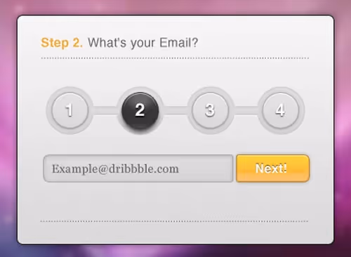
You can measure time as a percentage. For example, you could use a progress indicator that tells the user they're 50% done with their task.
We often see percentage indicators in onboarding flows:

Then, there's a steps-left progress bar. As the name suggests, this tells the user how many steps they've completed and how many steps they still have to go through.
This one is particularly compelling because of the Zeigarnik effect, which is the observation that humans are more likely to remember incomplete tasks.
By highlighting the number of steps that are incomplete, you give your user a nudge to finish off whatever they've started.
Indeterminate
Indeterminate patterns communicate to the user that your app is doing something and they need to wait, but not how long they'll need to wait.
These can be useful if you don't know how long a particular process will take or if the user will only need to wait for a few short seconds. For longer waits, users are likely to appreciate knowing how long they'll need to be patient for.
Skeleton loaders have become popular over the last 5 years or so. If your UI is graphically complex and will take a while to load, consider pre-loading a skeleton version of your UI while the proper UI loads behind. This gives your users something to look at and reassures them that your product is doing something!

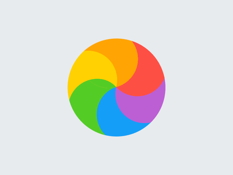
Perhaps the most popular progress indicator is a spinner. This is a simple wheel graphic that turns around repeatedly, showing the user that something is happening.
If you're going to use this, just make sure the wheel resolves fairly quickly. Otherwise, you'll end up with the Spinning Wheel of Doom that so many Mac users love to hate!
If your product is especially right-brained, playful, or visually unique, you might also consider adding an animated icon as a progress pattern. This is particularly appropriate for video game UX.
Here's a nice example from the family-friendly game NagiQ 2:

Determinate and/or indeterminate
Next up, we've got some progress indicators that can be either determinate OR indeterminate, depending on how they're used
For example, a progress bar can have no clear endpoint. In this instance, it's indeterminate.

Alternatively, you could add a percentage tracker to the bar to make it determinate.
In a similar vein, a progress circle can either contain an animation that has the circle filling up more or less indefinitely, or it can include a percentage indicator to let the user know how much longer they'll need to wait for:

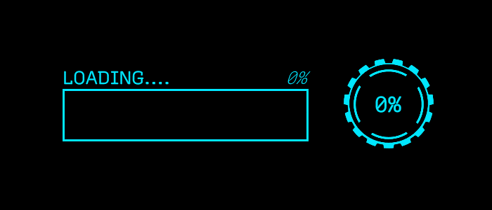
If you want a more retro vibe for your product, you could use text that simply says "loading." It's up to you if you want to include something that says exactly how much longer it will be loading for:

6 Examples and Best Practices
Example 1: UserGuiding
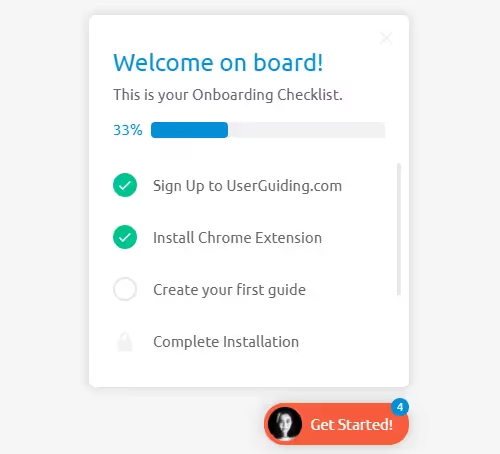
This progress tracker is from UserGuiding's onboarding process.
It's both a percentage tracker and a steps-left tracker, telling users how many onboarding actions they've done and how many they've still got to go before activating.
Best practice: giving users credit for action already taken
Before the user received this checklist, they firstly had to sign up to UserGuiding. The user gets credit for this action in the first part of the checklist. This is good UX design because:
- It makes the user feel good about an action they've already taken.
- It makes completing the rest of the checklist feel less overwhelming because they've already started.
- Due to the Zeigarnik effect, users are more likely to remember to complete tasks that are incomplete.
Click here to see how you can use UserGuiding to build checklists like this for your app without having to code.
Example 2: TaskHero

This next example is from TaskHero, a task management app that takes everyday chores and turns them into fun activities.
It's a progress bar that is struck through when the task has been completed. There's also a nice motivating green check mark on the left-hand side.
Best practice: Gamification
I love how playful this example is. TaskHero has managed to take something that no one enjoys (taking out the trash) and turn it into a hero fighting an epic monster.
The user is not only notified that they've completed an activity; they're made to feel like a true hero. Talk about a surge of dopamine!
Example 3: CodeMyUI
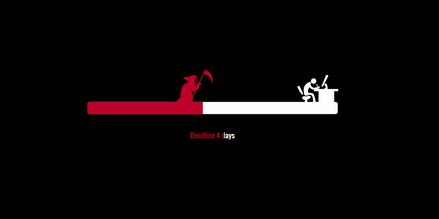
This is a hilarious example of a determinate progress bar! The animation shows the worker working faster and faster until the deadline approaches, culminating at the point that he bursts into flames!
Best practice: don't artificially prolong loading times just to show off your animation
This is such a unique (and relatable!) take on the progress bar that it would be tempting to extend the animation further. We all want to see what happens when the Grim Reaper reaches the worker, right?
Instead, the graphic has a finite end and doesn't go on forever. Remember, UX designers: your user is here to use your product, not look at your cool animations!
Example 4: Google Drive

This next example comes from when you upload a file to Google Drive.
It's a classic determinate progress bar that tells the user how long they'll need to wait until the file upload is complete. Every second or so, the time estimate for the completion of the upload updates, so that the user has an accurate time estimate.
Best practice: use determinate patterns for longer waits
Put yourself in the shoes of this user for a moment and imagine if the progress bar was indeterminate – in other words, didn't have a time estimate of when it would be finished.
For a larger file like this one, this would be a frustrating user experience. The user would be sitting around wondering how much longer the upload will take.
A good rule of thumb is to use a determinate pattern for anything that will require the user to wait for longer than 10 seconds.
Example 5: NPM

This is an example of a determinate progress bar that fills up as files are copied.
The user gets an update on how the copying is progressing once or twice a second, which is good for reducing any sense of uncertainty about how long they'll need to wait.
Best practice: when using a determinate progress bar, ensure the bar never decreases in value
Have you ever tried downloading a large file and had the estimated time until completion increase over time rather than decrease? It's not a fun user experience, especially for longer waits.
We like this example because the progress bar fills up smoothly and linearly, without undoing any sense of prior progress.
Example 6: Amazon

This is a neat example of a progress bar from Amazon that shows the user exactly what stage of the delivery process their order is in at any given moment.
Best practice: allow the user to keep using the system during lengthy processes
Can you imagine how frustrating Amazon's user experience would be if the user's entire screen was blocked by a progress bar modal and they couldn't do anything else but wait?
Instead, the user can keep shopping as they please, and they can return to the order updates part of the website at any time they want.
Wrapping up
Having read this article, you should now be in a position to understand the various different types of progress indicators and know which ones are a fit for your projects.
Feel free to take inspiration from the examples and best practices that we shared.
And let us know which one is your favorite!So, in this article, we'll show you how you can use progress indicators to improve user experience and reduce frustration.

.png)


