
fIf you had access to a computer in the 2000s, you'd know exactly what a software wizard is.
I lost count of how many buggy antivirus software I downloaded, so you can guess how many times I used one.
Quick recap in case you didn't have a computer back then: also known as a setup wizard, this UI element was something you'd have to go through in order to launch anything on your PC.
And it looked a little something like this:
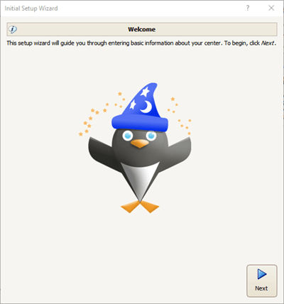
Looking back at it now, we can say that it was a primitive form of user onboarding.
We can also say that the onboarding UX patterns we use today, especially onboarding checklists, are descendants of this ancient form of technology.
And yet, we can still come across direct descendants of this UI element, called onboarding wizards.
So today, let's talk about:
- What an onboarding wizard is,
- Why it's important for user onboarding,
- Why you might want to consider different options, and
- Some good examples of onboarding wizards (and user checklists)
Let's get right into it.
What is an Onboarding Wizard?
An onboarding wizard is a UX/UI element designed to help users get through their initial onboarding process on a product. Similar to setup assistants, onboarding wizards are onboarding coordinators that are launched or prompted when a user first runs a product. As these onboarding guides aren't necessarily very sophisticated, the primary goal of onboarding sequence is not a complete onboarding of the product but an initiator of the rest of the user onboarding experience.
In theory, an onboarding wizard can be a lot similar to a signup flow. But because onboarding wizards usually delve into no personalization or feature custom fields, they are not necessarily considered signup flows.
An important distinction between onboarding wizards and other similar user onboarding experience elements would be that onboarding wizards often consist of one modal window with an explicit list of tasks and that they don't necessarily work on a user persona-based onboarding flow.
Doesn't sound that fun, huh?
Let's talk about why they still matter in the larger picture.
Why do onboarding wizards matter?
When considered from a SaaS in today's point of view, an onboarding wizard is quite the outdated idea.
But fundamentally, there being an onboarding workflow that takes place in a matter of minutes and with the main focus on taking key actions in preparation for the actual product serves the idea of an amazing onboarding process more than user onboarding experiences with hundreds of onboarding flows with no substantial onboarding content in it.
So, what makes an onboarding wizard so important is the idea behind it:
Even if a business takes up no form of onboarding, let alone a contextual onboarding experience, some form of onboarding can still take place through elements like onboarding wizards.
But does that really mean we should be actively using onboarding wizards? 👀
Why onboarding wizards might not be what you need
It should be clear to you by now that an onboarding wizard is not necessarily a favorable form of user or employee onboarding.
Let's unpack that.
1- Innately limited reach
Though an onboarding wizard is essentially a viable method for initial onboarding for on-premise software, it could never work effectively as an entire onboarding process or an element for essential functions onboarding.
This is because onboarding wizards innately have a limited reach on the product it is used for.
In a common scenario, an onboarding wizard is prompted upon the download of a probably complex tool or later during the first use of the said tool to get users started.
But this process is often dedicated to setting up and understanding the technical prerequisites of using the tool.
During this initial step toward using the product, almost no meaningful action toward understanding how to use the product is taken.
2- No hands-on opportunity
Because an onboarding wizard is often a modal window of its own, there is usually no in-app actions taking place.
Meaning, the users don't get to experience the tool hands-on.
Now, this might not sound so horrible, but knowing that 63% of customers consider the onboarding period when deciding to subscribe to a service or purchase a product, a hands-on experience might be necessary.
3- Outdated format
If we were to overlook every problem associated with onboarding wizards - that they are too limited for a complete onboarding process or that they are not user-friendly and they tend to isolate users from the product - there is but one big problem still.
The format of an onboarding wizard is pretty much outdated.
The design of a typical onboarding wizard and that it is one big popup window go against the most basic usability principles.
Keeping the users outside of the product is a big enough risk as it is.
But then, again, what can you do; right?
Wrong.
Reject tradition, embrace modernity: UserGuiding
When I first found out about in-app onboarding, I was but a mere mortal, familiar with only onboarding wizards and their kind.
But I soon realized that in-app user onboarding ticked all the boxes.
You could use tooltips to point at UI elements, hotspots to get the users' attention, welcome modals as well as exit modals, and, best of all, user checklists that would work exactly like onboarding wizards with one big difference - in-app.
And with UserGuiding, you can do all that with no code at all.
UserGuiding is a no-code product adoption tool, especially perfect for small to enterprise-level B2B software companies.
Wanna upgrade an onboarding wizard with UserGuiding?
It would look a little something like this:
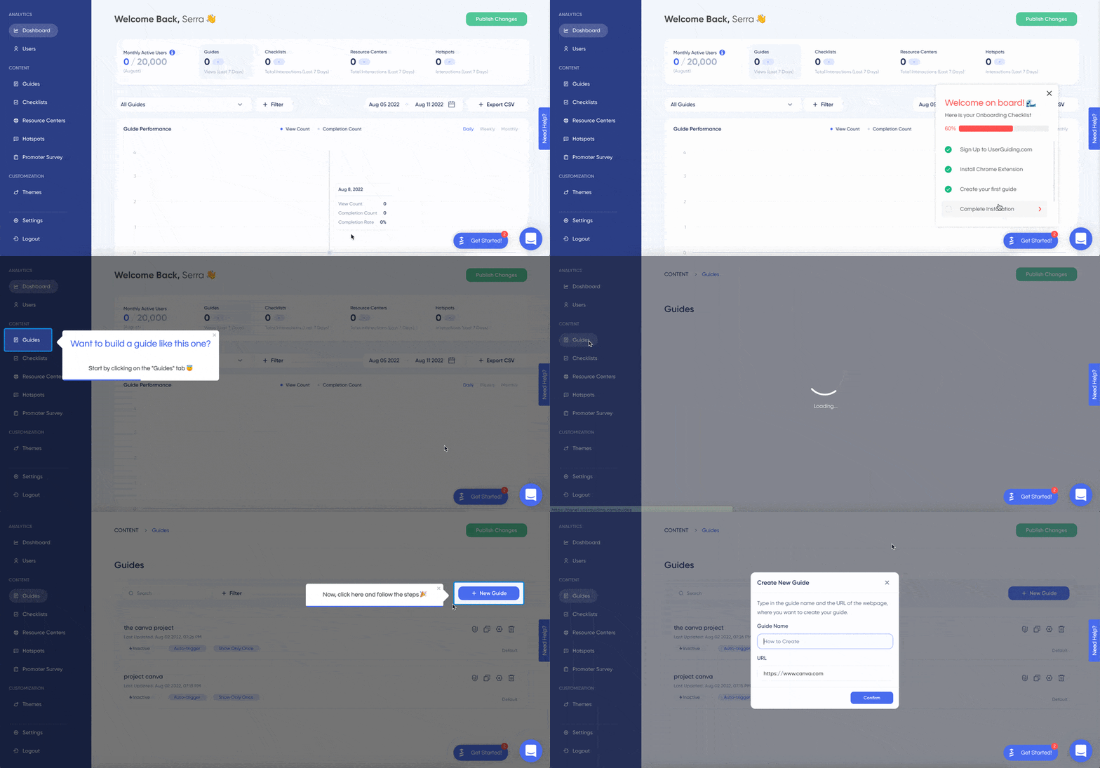
Plus, user checklists aren't the only thing you can do with UserGuiding 😎
Some of the essential features of UserGuiding are:
✅ Product tours and walkthroughs,
✅ Interactive guides,
✅ User checklists,
✅ Tooltips and hotspots,
✅ Resource centers, and
The product features also include user segmentation and targeting, powerful analytics, and high customization.
👉Try UserGuiding for FREE 👈
But I'm not here to defame onboarding wizards.
There are so many great onboarding wizard examples out there. Let's take a look.
Best Onboarding Wizard Examples
1- Shopify
A popular product, Shopify, uses an onboarding wizard, or as they like to call it, a setup guide to make sure users complete important tasks to help them find value in the product.
The onboarding wizard consists of 5 steps alongside a progress bar and tiny images dedicated to each step for a more engaging user experience.
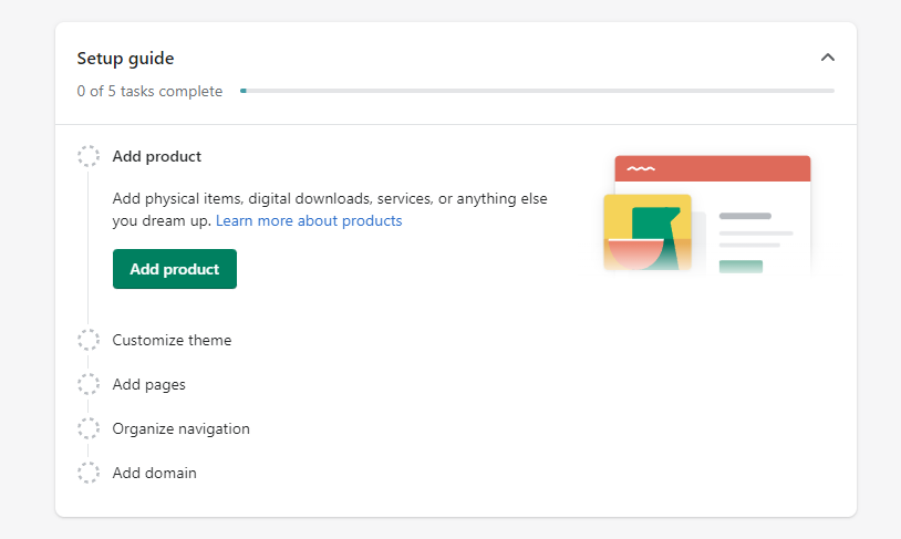
Shopify's example of an onboarding wizard is top-notch, thanks to its concise content and the addition of elements like progress bars and imagery to make the UX more seamless and engaging for users.
2- CiviHR
CiviHR uses an onboarding wizard to keep records of its staff and managers on an 8-step onboarding workflow.
The onboarding sequence can be skipped to be reminded later, and with the next and previous buttons, the wizard can be navigated easily.
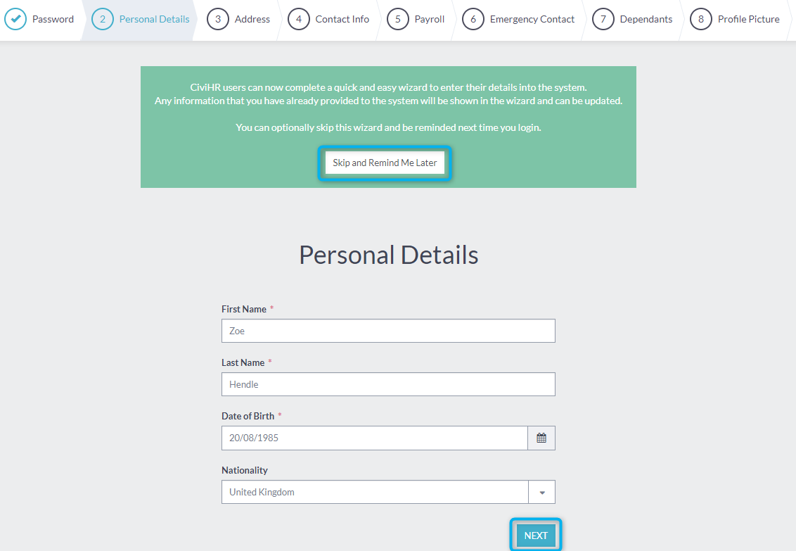
Though the wizard is kind of long, it still uses up-to-date onboarding UX elements, which makes CiviHR's onboarding wizard viable and easy to use.
3- JFrog
JFrog prompts users with an onboarding wizard that walks users through a 5-step onboarding sequence.
Though the onboarding wizard essentially works more like a setup wizard, it still uses onboarding material to help users take the initial step into its new platform.
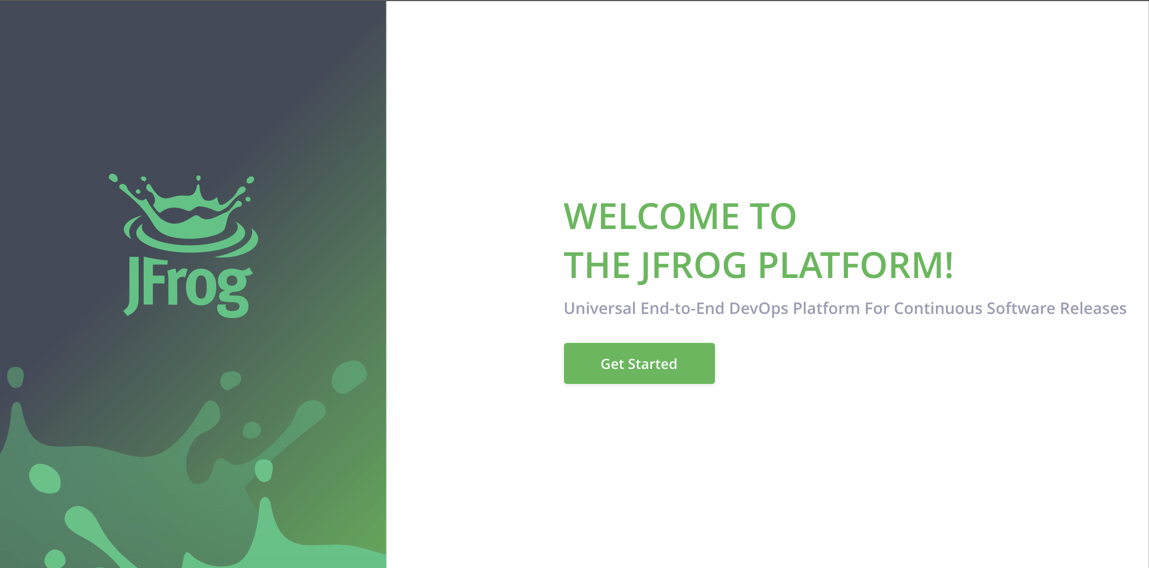
Much like a proper signup flow, JFrog's onboarding wizard features a welcome message and a get started button, which sets the mood for onboarding even though the entire onboarding process is not an in-app one.
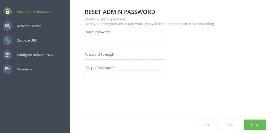
JFrog also has previous, next, and skip buttons, and at the end of the onboarding guide, users see a congratulations message indicating the end of the onboarding workflow.
Though it is not a user persona-based onboarding flow, and the primary goal is just to help users set up the tool properly, JFrog does a good job with the onboarding copy.
4- Navattic
Upon signup, Navattic gets users to go around the platform and perform tasks using an onboarding step consisting of 4 steps.
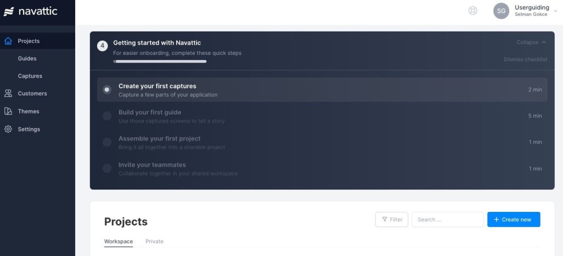
What makes this a great example is that Navattic both utilizes a progress bar at the top and time indicators for each step on the side, giving users a full sense of what to expect when onboarding to the platform.
Moreover, the visual hierarchy of the wizard is also a good factor in the success of the element; it is not a full-screen onboarding wizard, which might give users a sense of a gateway before actually using the tool.
Instead, Navattic utilizes an onboarding wizard design to appear inside the platform itself so that users can explore and go around the app while still knowing how to get onboarded.
A Better Alternative: User Checklist Examples
1- Keyhole
Though the examples above are good enough for setup, onboarding, and signup, they don't necessarily take into account the human factor of onboarding - we always want a bit more.
And our next example, Keyhole, does a pretty good job showing how to reform an onboarding wizard into something more user-friendly (using UserGuiding!)
Keyhole uses a user checklist to help users quickly see value in the product while also learning a thing or two about the notable features of the platform.
The checklist consists of a list of tasks that trigger interactive guides inside the app.

After an interactive guide is completed, the progress bar gets filled, and the key actions are checked.
The best part is that the users don't need to skip or postpone the user onboarding experience; the entire onboarding process is available at all times down on the bottom right-hand side of the screen.
Check out the rest of Keyhole's success story here 👈
2- Flourish
Another great optimized onboarding wizard is Floursih's user checklist, with 4-steps and a progress bar that fills up quickly thanks to easy-to-perform interactive guides embedded into the checklist.
The onboarding wizard experience is enhanced thanks to the interactive walkthroughs and the visual learning opportunity.

Here's how an interactive guide is triggered inside the checklist.
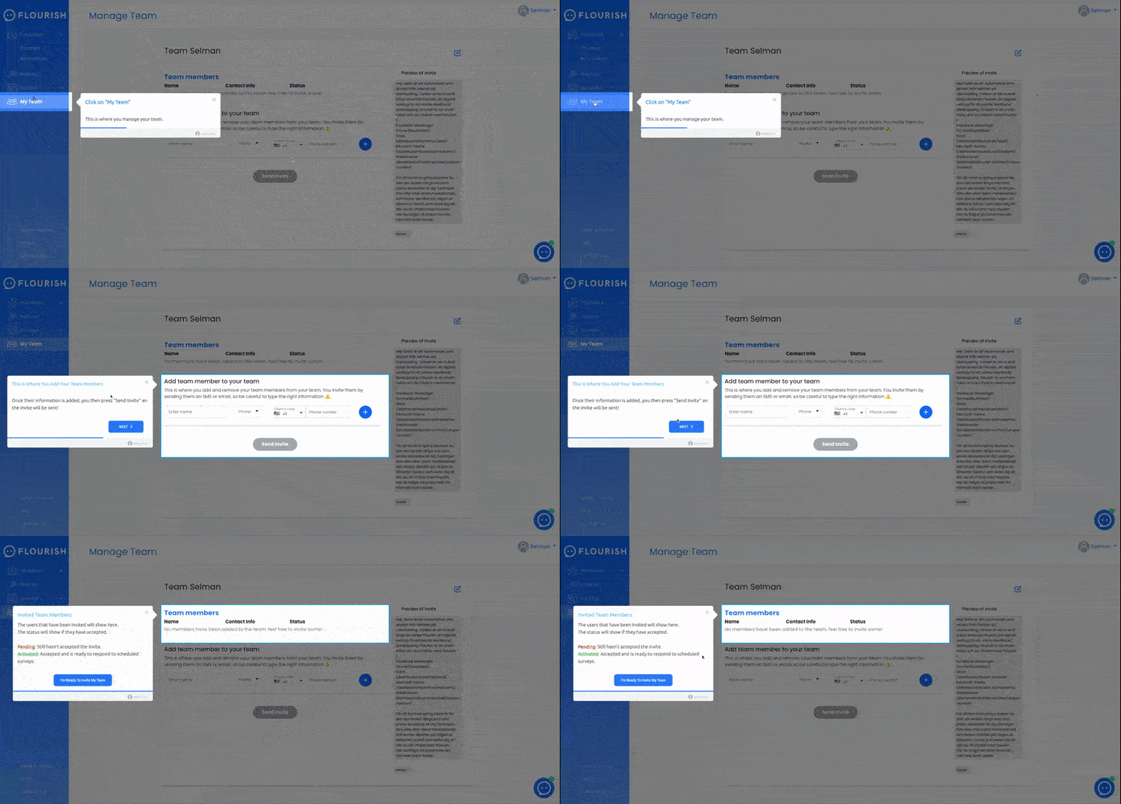
Just like in Keyhole's case, Flourish's onboarding wizard is available at all times for users to complete when they think is best to complete.
How they pulled off such a cool wizard?
Read the rest of Flourish's success story here 👈
To Wrap It Up...
When it comes to user onboarding, what counts is NOT just the thought.
One slip and your users might have been better off without the guidance of an onboarding wizard.
But now you know that the chances of failure are a lot minimal with a more up-to-date onboarding UX element like user onboarding checklists.
So, why not check out how you can come up with a killer checklist?


.svg)
.svg)
.svg)
.svg)
.svg)


.svg)
.svg)


.png)


