.svg)
.svg)
.svg)
.svg)
.svg)


.svg)


.svg)
.svg)

This case study covers more than 30 SaaS products and their onboarding strategies in four different industries, rating their effectiveness and highlighting their key elements.
- AI Industry products that are examined, from most effective to least: Perplexity, HeyGen, Claude, Lovable, Replit, Otter.ai, ElevenLabs, Gamma, tl;dv, teal.
- EdTech Industry products that are examined, from most effective to least: Ensora Health, Carepatron, Healthie, Simplybook.me, NoterroLearnyst, Graphy, Vedubox.
- FinTech Industry products that are examined, from most effective to least: BILL, Zoho Books, HoneyBook, bonsai, FreshBooks, Xero, Clio, FreeAgent.
- HealthTech Industry products that are examined, from most effective to least: Ensora Health, Carepatron, Healthie, Simplybook.me, Noterro, Tebra, Zanda, Doxy.me, NextGen, Jane.
If you want to take a closer look to all the screenshots, videos and sequences collected by our team, you can check out our Notion report!

Product Onboarding UX Collection: 2025 at a Glance
2025 was a prolific year for user onboarding UX.
The UserGuiding team researched and curated hundreds of screenshots, videos, and sequences from a variety of SaaS products across platforms and built this database as a library that covers these experiences.
Below you will find captures from websites, signup flows, onboarding elements, help interactions, and email campaigns from products in the AI, Health Tech, EdTech and Fintech industries that were curated for our various case studies, blog articles, and content in 2025.
Product Onboarding in AI Industries
Our team analysed 10 SaaS products from AI industries, breaking down their onboarding types and UX elements.
The efficiency of the onboarding is rated out of 5 for all the products.
Take a look at how AI industry got people on board in 2025!
Perplexity
💻 Platform: Web, Mobile (IOS & Android)
📲 Onboarding Type: Welcome tour, Checklist, Free Roam
🧩 Key UX Elements: Checklists, Progress Bar, Personalization
⭐ Effectiveness: 5/5, Excellent!
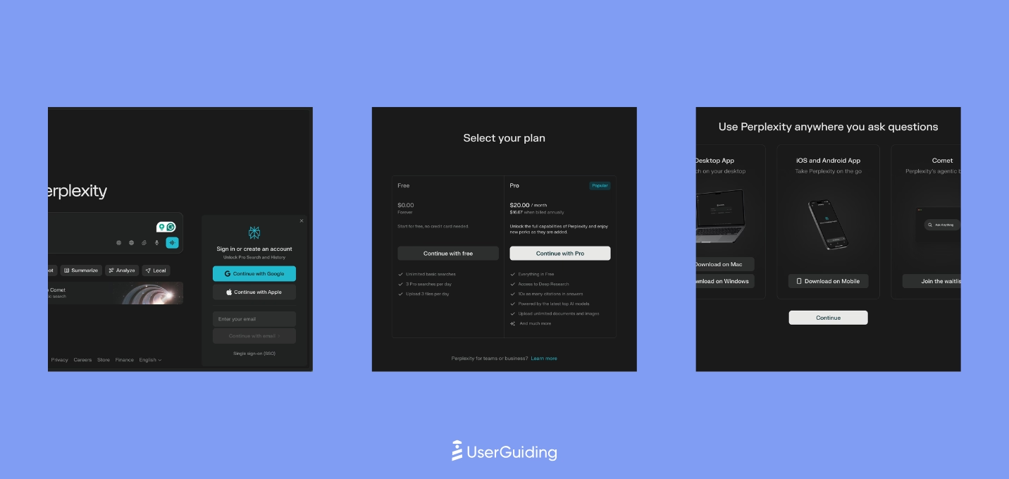
Perplexity skips the traditional website flow and drops users straight into the product, which creates instant immersion but leaves discovery mostly to muscle memory and microinteractions. The experience relies on strong empty states, contextual prompts, and subtle onboarding cues rather than structured guidance.
Its early pricing exposure and cleverly worded mobile/app nudges act as conversion accelerators, placed only after users experience value. While emails are nearly nonexistent, the interface makes customization and shortcuts visible enough to support a self-directed learning path.
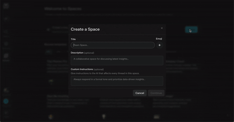
HeyGen
💻 Platform: Web
📲 Onboarding Type: Welcome tour, Interactive Guide, Free Roam
🧩 Key UX Elements: Welcome Survey, Progress Bar, Feature Highlights, Empty States, Help Widget, Contextual Guidance, Milestone Celebrations
⭐ Effectiveness: 5/5, Excellent!

HeyGen’s onboarding leans into visual momentum and hands-on creation, using strong CTAs, early surveys, and playful microinteractions to keep users moving forward. The short guide inside the editor behaves more like a co-pilot, encouraging users to experiment rather than follow a rigid sequence.
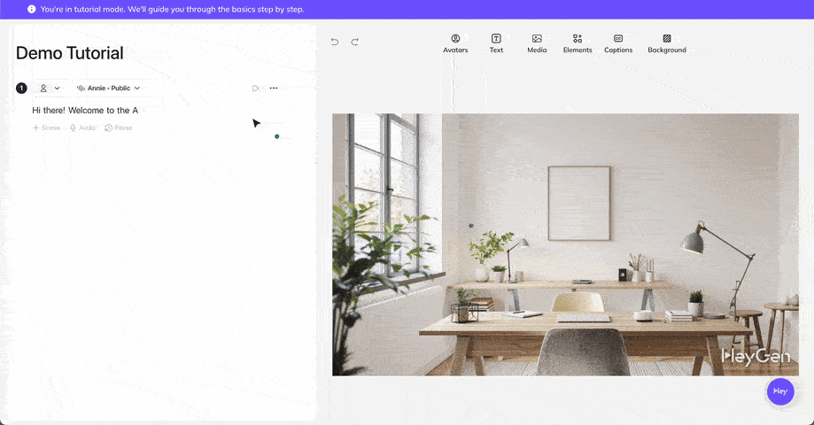
Empty-state cards, hover descriptions, and a clearly branded help widget reinforce confidence as users explore. The only friction point is the video-heavy signup page, which is beautifully executed but distracts from the primary action.
Claude
💻 Platform: Web
📲 Onboarding Type: AI-Centered, Free Roam, Email Centered
🧩 Key UX Elements: Welcome Survey, Personalization, Gamification, Contextual Guidance, Empty States, Help Widget
⭐ Effectiveness: 5/5, Excellent!
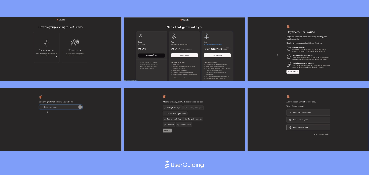
Claude’s onboarding feels intentional and minimal, guiding users toward value through segmentation, human-like interactions, and smartly constrained choices.
The early flow blends reassurance with personalization, using age verification, intent selection, and simple option sets to reduce friction and accelerate the first aha moment. Rather than relying on heavy onboarding, Claude leans into learn-by-doing with contextual nudges and prompt suggestions.

The UX reinforces its positioning by gradually revealing capabilities, from embedded pro tips to subtle micro-interactions that make the product feel more human. Support remains accessible through an always-visible widget, and the website anchors its narrative with a strong singular CTA.
Overall, Claude prioritizes clarity and emotional trust over traditional UI guidance, which keeps users moving quickly toward meaningful output.
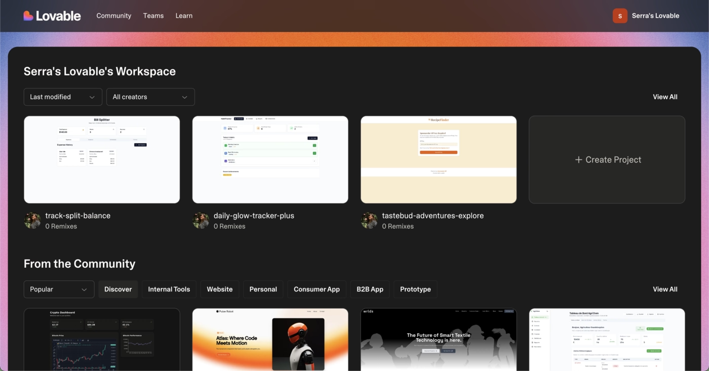
Lovable
💻 Platform: Web
📲 Onboarding Type: Free Roam, AI-Centered
🧩 Key UX Elements: Welcome Survey, Interactive Website, Progress Bar, Personalization, Empty States, Gamification
⭐ Effectiveness: 5/5, Excellent!
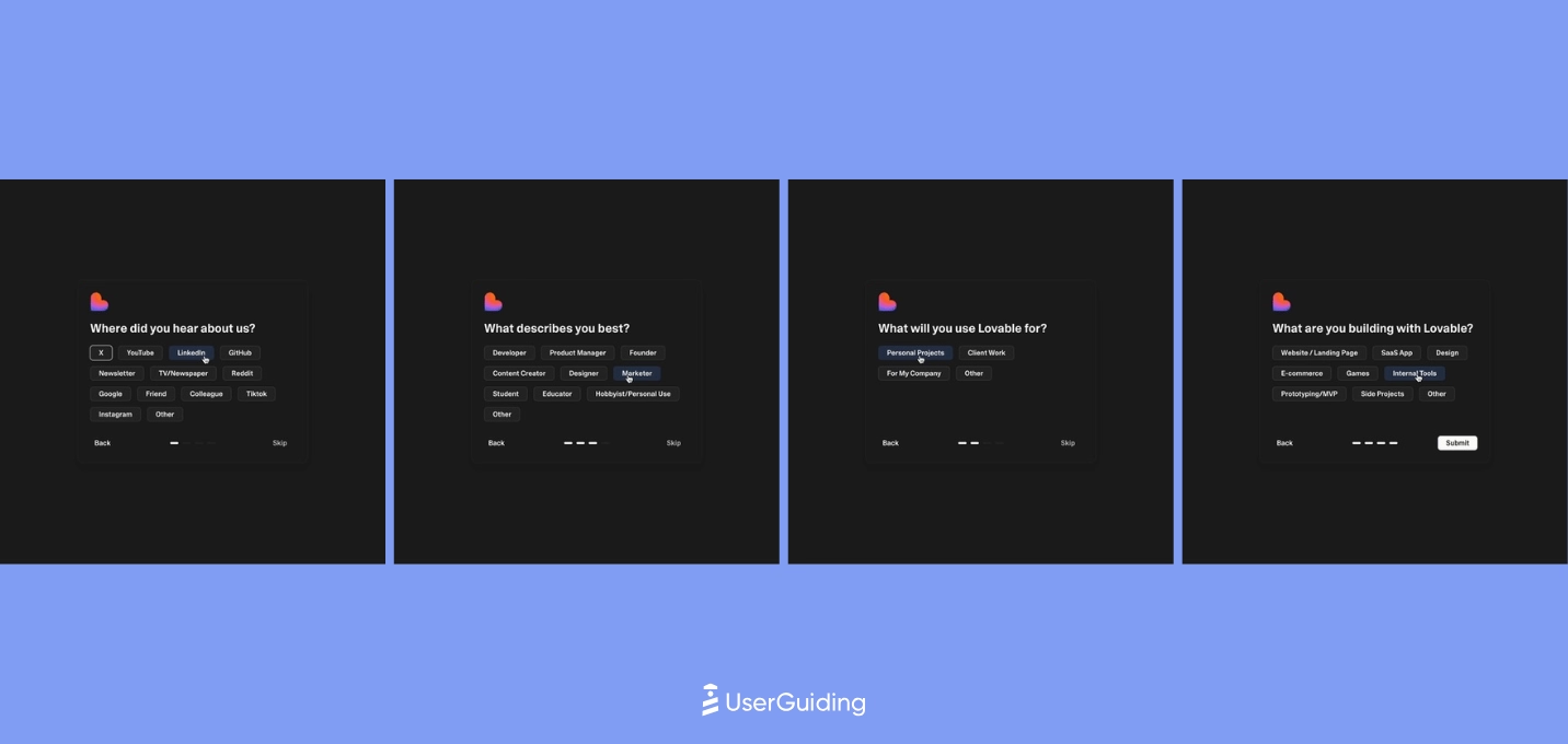
Lovable’s onboarding leans heavily on instant value.
The login-less first interaction, prompt-based flow, and fast survey create a frictionless path to an early aha moment. The combination of no-touch onboarding + optional high-touch training strengthens learning without slowing users down.
Inside the product, Lovable stays intentionally minimal.
Instead of tutorials or guides, it relies on prompt suggestions, labor-illusion animations, and rapid output to trigger momentum for a tech-savvy audience.
The result is an onboarding experience built on speed, clarity, and natural discovery rather than hand-holding.
Replit
💻 Platform: Web
📲 Onboarding Type: Free Roam, Interactive Guide, AI-Centered
🧩 Key UX Elements: Interactive Website, Empty States, Welcome Survey, Help Widget, Guided Tour
⭐ Effectiveness: 4/5, Very Good!

Replit’s onboarding leans heavily on accelerated value delivery.
Users hit their first aha moment before even signing up thanks to interactive prompts, labor-illusion moments, and a smooth continuation from website to product. The experience rewards curiosity and keeps momentum high with smart, developer-minded cues.

Where Replit diverges from mainstream onboarding is in its minimal hand-holding and documentation-first approach, which aligns well with its technical audience.
Some moments create cognitive load, like unclear wait times or delayed surveys, but overall the journey keeps users focused, motivated, and quickly immersed in real output.
Otter.ai
💻 Platform: Web, Mobile (IOS & Android)
📲 Onboarding Type: Interactive Guide, Checklist, AI-Centered, Email Centered
🧩 Key UX Elements: Welcome Survey, Progress Bar, Checklists, Guided Tour, Contextual Guidance, Tooltips, Empty States, Help Widgets, Feature Highlights, Personalization, Gameification
⭐ Effectiveness: 4/5, Very Good!
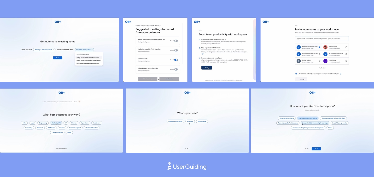
Otter’s onboarding leans on checklists, simple guides, and meeting-based aha moments, but the experience feels fragmented because flows lack a clear sense of progress.
Emails and in-product prompts push users toward deeper feature usage, though the abundance of CTAs dilutes focus.

Once inside the product, Otter highlights collaboration and AI features through examples, micro-interactions, and contextual nudges, but untriggered pop-ups risk disrupting flow.
The help experience is less discoverable than it should be, which slows self-serve support even though the broader UX encourages exploration.
ElevenLabs
💻 Platform: Web
📲 Onboarding Type: AI-Centered, Video Walktrough, Free Roam
🧩 Key UX Elements: Personalization, Guided Tour, Feature Highlights, Help Widget, Empty States, Welcome Survey, Progress Bar, Contextual Guidance, Product Updates
⭐ Effectiveness: 4/5, Very Good!
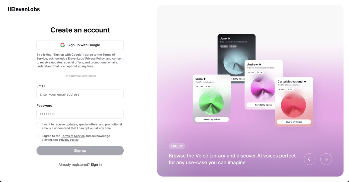
ElevenLabs’ onboarding is easy to navigate and the overall UX is intentionally crafted to accelerate discovery.
Empty states, feature highlights, and contextual nudges appear at the right moments, guiding users without restricting exploration. It encourages free-roam behavior while subtly steering users toward meaningful first actions.

The experience is reinforced by thoughtful details across the journey, from time-sensitive greetings to smooth signup flows and well-placed templates that reduce friction.
Even without heavy onboarding elements, ElevenLabs leverages structure, clarity, and smart defaults to help users reach value quickly and confidently.
Gamma
💻 Platform: Web
📲 Onboarding Type: Interactive Guide, Email Centered
🧩 Key UX Elements: Tooltips, Guided Tour, Contextual Guidance
⭐ Effectiveness: 4/5, Very Good!
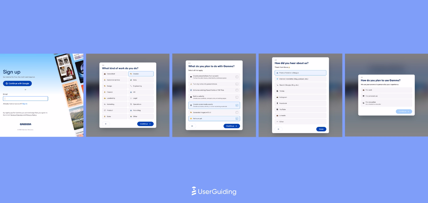
Gamma’s onboarding leans into visual momentum, guiding users with a lively interface that makes early exploration feel intuitive.
Smooth signup flows, empty-state prompts, and a focused use-case selection help accelerate the first aha moment without cognitive friction.
The system is designed to push users into creation quickly while offering thoughtful nudges along the way.
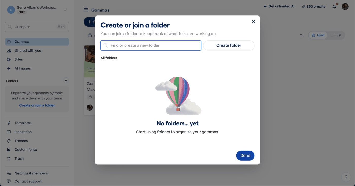
Where the experience stretches thin is in the length of emails and an onboarding checklist that slows down hands-on learning.
Still, Gamma maintains engagement with clean CTAs, contextual guidance inside the editor, and support that’s always within reach, producing a user journey that’s energetic without feeling overwhelming.
tl;dv
💻 Platform: Web, Desktop
📲 Onboarding Type: Interactive Guide, Checklist, Video Walkthrough, Email-centered
🧩 Key UX Elements: Welcome Survey, Progress Bar, Milestone Celebrations, Contextual Guidance, Empty States, Gamification, Checklists, Feature Highlights, Help Widget
⭐ Effectiveness: 4/5, Very Good!
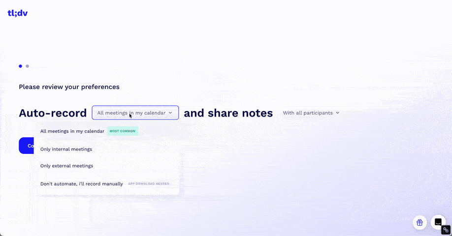
tl;dv’s onboarding is dynamic and highly guided, mixing videos, milestone animations, and fast shortcuts to value.
The use of meeting-based aha moments and human-led onboarding videos helps reduce resistance to automation and accelerates early confidence. CTAs, pro tips, and embedded training elements are everywhere, keeping momentum high.

Where the experience struggles is cognitive load. Overlapping animations, dense emails, and multiple onboarding layers compete for attention, risking fatigue.
Still, tl;dv maintains strong engagement through visible support, clear navigation, and celebratory moments that keep users moving forward.
teal
💻 Platform: Web
📲 Onboarding Type: Welcome Tour, Interactive Guide,Video Walkthrough, Checklist, Email Centered
🧩 Key UX Elements: Welcome Survey, Progress Bar, Personalization, Guided Tour, Checklists, Empty States, Feature Highlights, Help Widget, Gamification
⭐ Effectiveness: 3/5, Good!
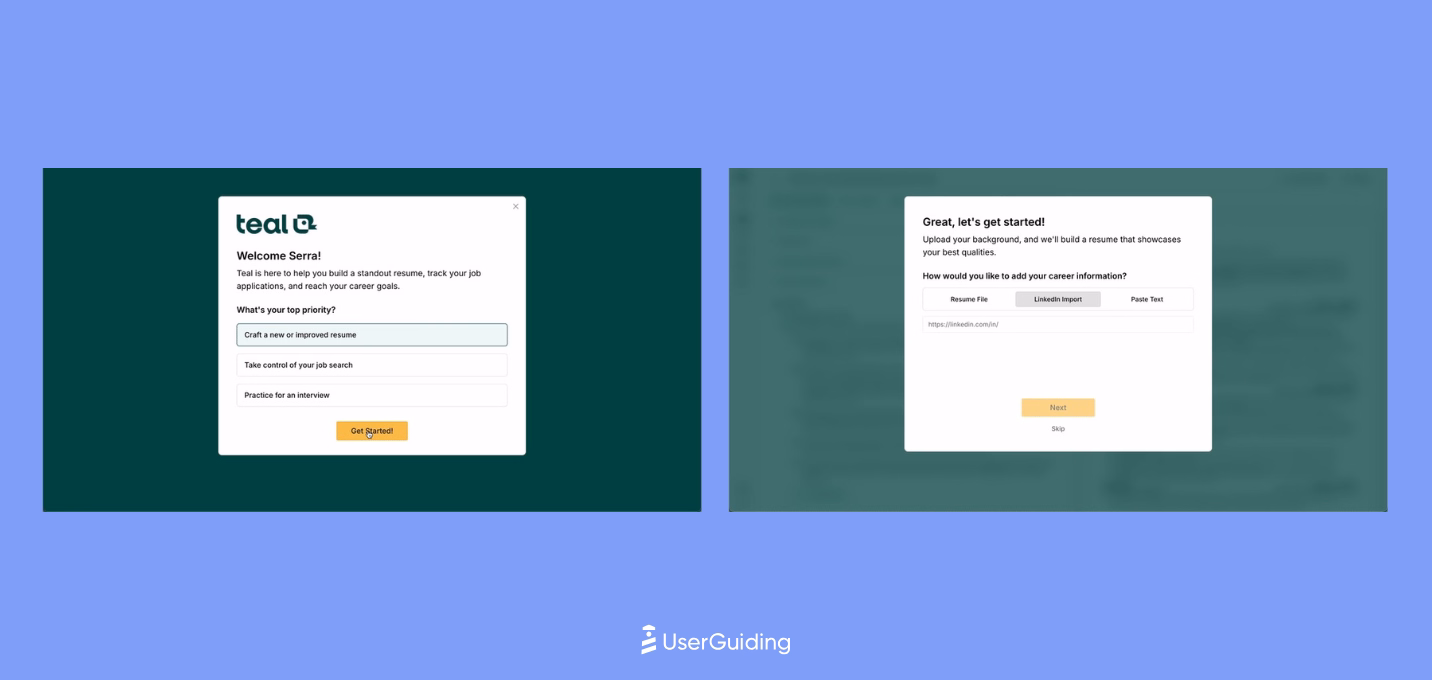
Teal’s onboarding is structured to deliver an immediate aha moment by anchoring the first task around the user’s resume. Uploading it upfront allows Teal to demonstrate value instantly while guiding users with contextual hints and a rotating carousel of editor tips.
A 7-step in-app walkthrough quickly builds confidence, though the level of hand-holding may feel heavy for tech-savvy users.
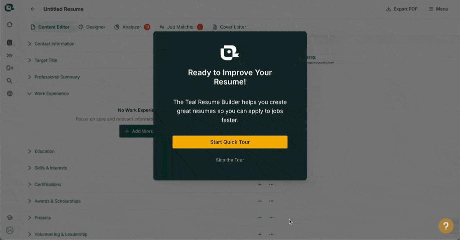
As the journey progresses, Teal mixes interactive guidance with progress cues, light gamification, and simple empty-state cards to keep momentum. The delayed signup flow reduces friction early on, but it’s a calculated risk that may affect long-term activation.
Overall, Teal’s onboarding balances clarity and momentum well, even if the UI feels a bit crowded at times.
Product Onboarding in EdTech Industries
Below is the analysis that our team conducted with 8 SaaS products in the education technologies, arranged from the most effective to the least.
Colossyan
💻 Platform: Web
📲 Onboarding Type: Welcome Tour, Checklist
🧩 Key UX Elements: Interactive Website, Welcome Survey, Contextual Guidance, Empty States, Checklists, Feature Highlights, Onboarding Videos
⭐ Effectiveness: 4/5, Very Good!

Colossyan pushes users into value quickly with a “build first, sign up later” flow that reduces friction and sets up an early aha moment.
Clear CTAs, simple copy, and a modal-based creation experience make the first interaction feel guided without slowing users down.
Empty states and a checklist keep momentum high as users move deeper into the product.
Where Colossyan stands out is in adding a personal touch to its onboarding email, featuring the CEO and early-action guidance, which reinforces trust and nudges users toward first output.
The overall experience balances autonomy with lightweight guidance, helping users stay oriented without interrupting their natural flow.
SafetyCulture
💻 Platform: Web
📲 Onboarding Type: Welcome Tour, Interactive Guide, Checklist, Email Centered
🧩 Key UX Elements: Welcome Survey, Progress Bar, Personalization, Checklists, Guided Tour, Contextual Guidance, Empty States
⭐ Effectiveness: 4/5, Very Good!
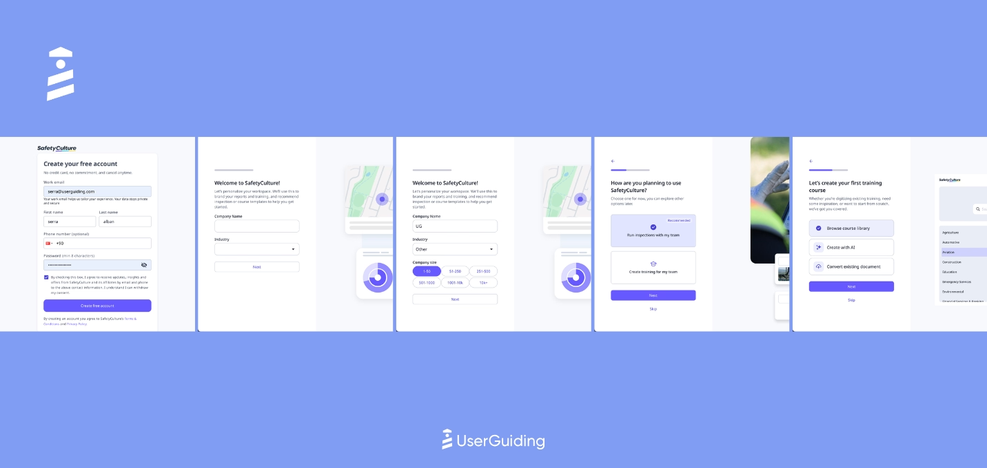
SafetyCulture starts the onboarding journey with simple, clear CTAs and keeps signup lightweight, ending with a question that immediately tees up the first aha moment.
Once inside, users see a mix of modals, tours, and a modern onboarding checklist, which becomes the primary navigator for early success.
The platform relies on empty states and embedded instructions to guide deeper actions without breaking flow.
SafetyCulture also reinforces adoption with strong onboarding emails that offer resources, use-case inspiration, and clear paths to expand product usage.
articulate
💻 Platform: Web, Desktop
📲 Onboarding Type: Welcome Tour, Email Centered
🧩 Key UX Elements: Welcome Survey, Progress Bar, Guided Tour, Contextual Guidance, Personalization, Tooltips, Milestone Celebrations, Help Widgets
⭐ Effectiveness: 4/5, Very Good!
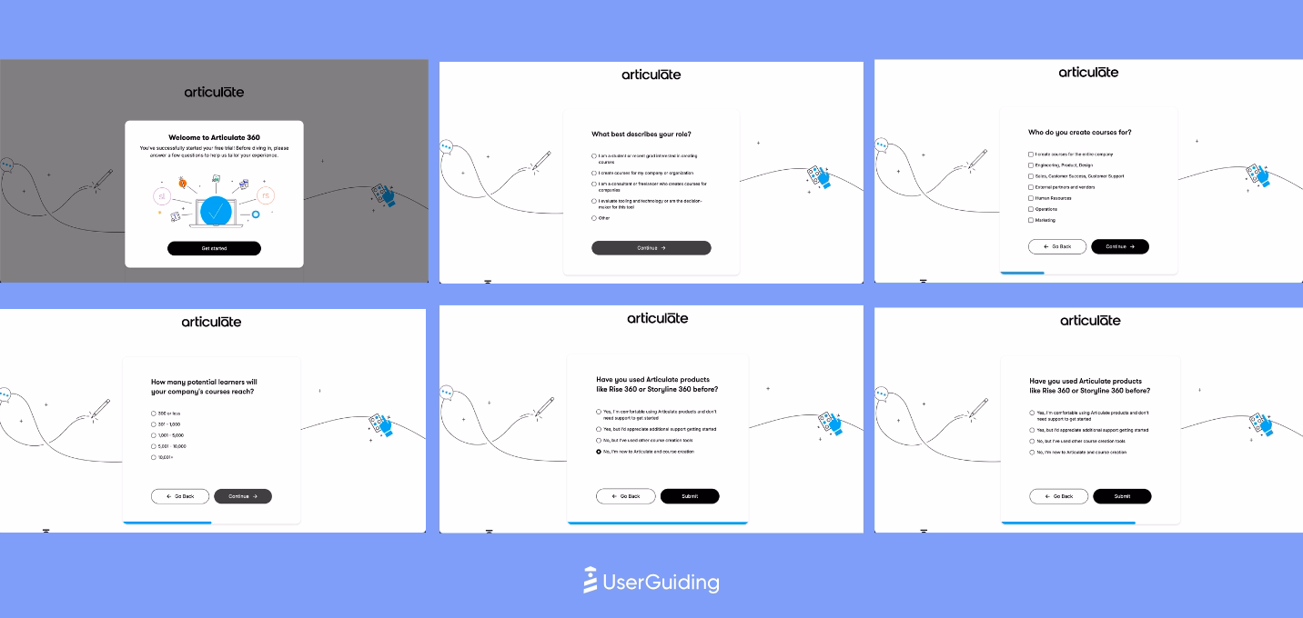
Articulate keeps onboarding clear and structured through strong copy, layered tours, and well-timed prompts.
The long welcome survey is softened with a progress bar, and the 6-step product tour anchors users on the essentials.
As users go deeper, additional tours surface contextually to guide exploration without overwhelming them.
The experience relies on crisp CTAs and light gamification rather than heavy onboarding flows.
Confetti moments reinforce progress, and feature-focused modals highlight what matters across the UI.
Overall, Articulate guides users with steady direction, offering enough structure to onboard effectively while letting the product speak for itself.
360Learning
💻 Platform: Web
📲 Onboarding Type: Free Roam
🧩 Key UX Elements: Welcome Survey, Tooltips, Contextual Guidance, Emtpy States, Milestone Celebrations, Gamification
⭐ Effectiveness: 4/5, Very Good!
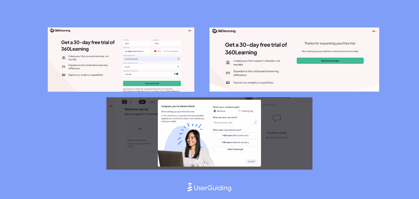
360Learning’s onboarding relies on embedded instruction rather than traditional guided flows, which keeps the first-time experience light and momentum-driven.
A short welcome survey, paired with immediate exposure to the core product, sets up an early aha moment without slowing users down.
The platform uses gamified UX cues like badges, confetti, and celebratory messages to reinforce progress.
Most training happens outside the app through resource-rich emails featuring videos, making onboarding feel simple while still giving users the depth they need.
Synthesia
💻 Platform: Web
📲 Onboarding Type: Interactice Guide
🧩 Key UX Elements: Interactive Website, Welcome Survey, Personalization, Guided Tour, Feature Highlights, Contextual Guidance, Empty States, Product Uptadates, Help Widgets
⭐ Effectiveness: 4/5, Very Good!

Synthesia’s onboarding leans on clean design, strong visual cues, and an aggressive but effective push into first value.
The website funnels users quickly into signup, even triggering an exit-intent modal to capture hesitant visitors. A 7-question welcome flow and a brief two-step briefing set up a personalized first video, giving users immediate momentum.
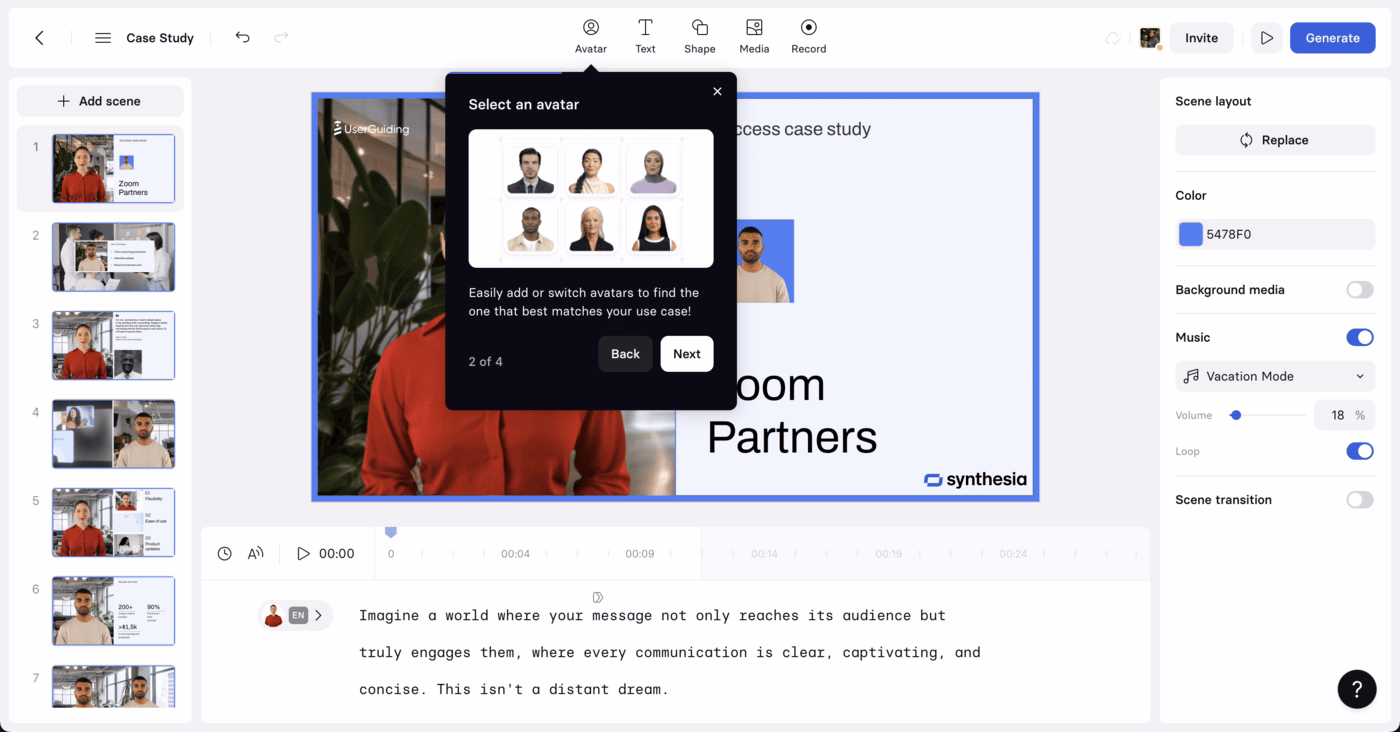
Inside the product, the 4-step product tour is tightly integrated with the first-creation experience, which keeps the journey cohesive rather than interruptive.
From there, modals drive feature discovery and upsell, while short, task-oriented emails reinforce action and highlight social proof without overloading users.
Synthesia keeps friction low, value high, and the aha moment front-and-center.
Learnyst
💻 Platform: Web
📲 Onboarding Type: Welcome Tour, Interactice Guide
🧩 Key UX Elements: Welcome Survey, Progress Bar, Milestone Celebrations, Tooltips, Guided Tour
⭐ Effectiveness: 3/5, Good!
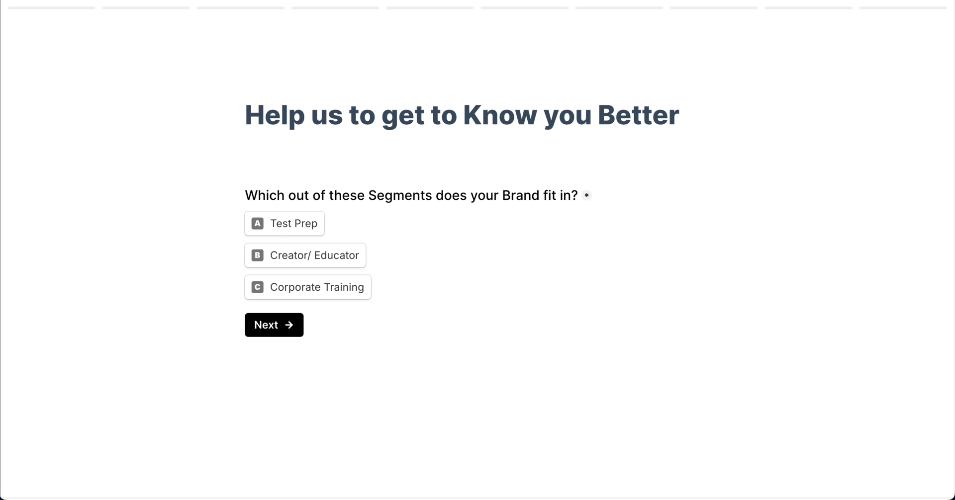
Learnyst’s onboarding feels structured and intentional. A detailed signup survey sets the stage for personalization, and a cheerful end animation keeps it light.
Once inside, traditional product tours, progress indicators, and interactive steps guide users smoothly toward first value.

Throughout the journey, Learnyst reinforces progress with frequent milestone celebrations and clear directional cues.
Its onboarding emails mirror this clarity with a mission-led welcome, followed by simple CTAs, resources, and demo links that keep users moving without overwhelm.
Graphy
💻 Platform: Web
📲 Onboarding Type: Free Roam, Email Centered
🧩 Key UX Elements: Welcome Survey, Progress Bar, Personalization, Empty States, Feature Highlights, Tooltips
⭐ Effectiveness: 3/5, Good!
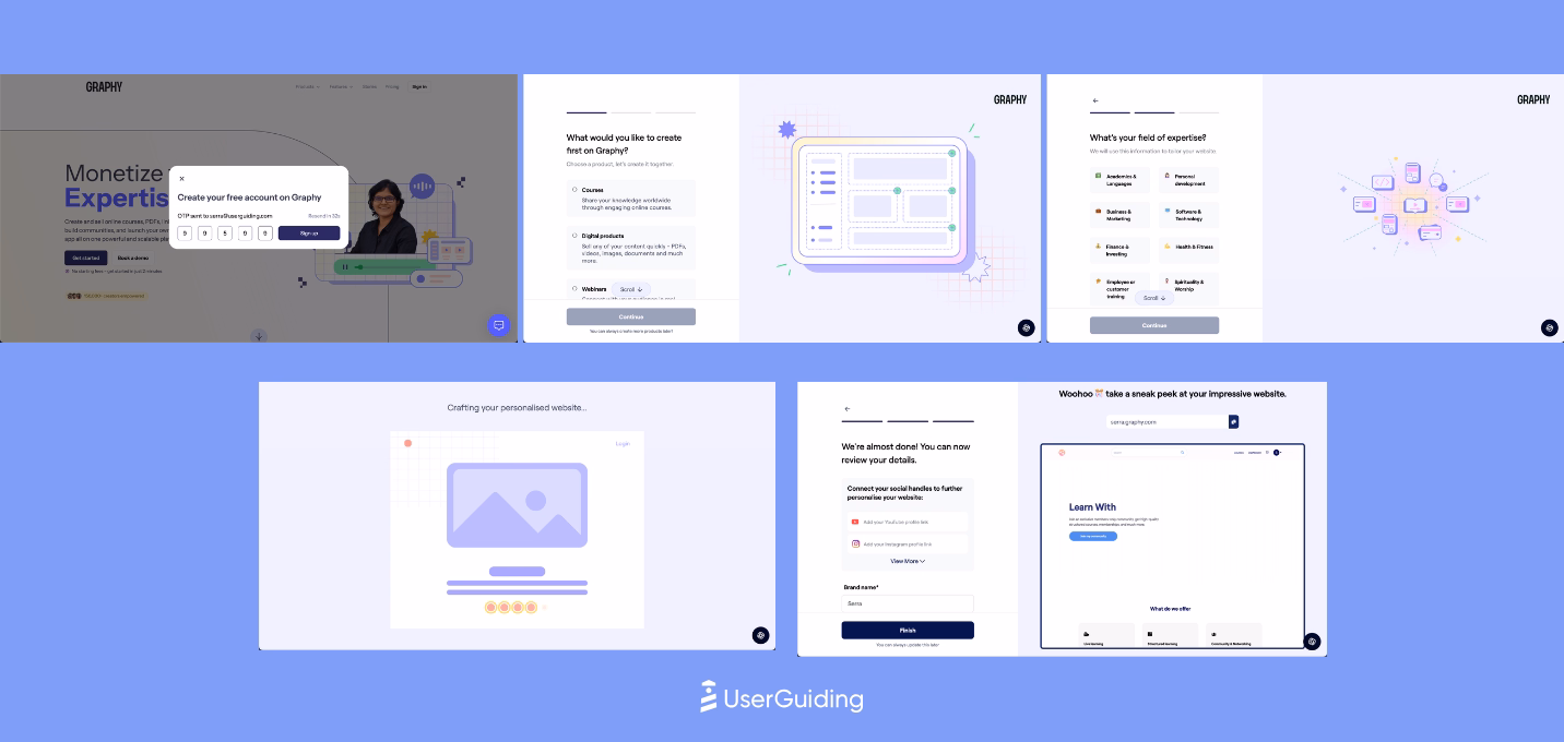
Graphy keeps onboarding understated yet intentional, relying on empty states and gentle cues rather than overlays or tours.
A short welcome survey sets up personalization, and most guidance appears contextually only when needed. Even key actions like finding help are introduced through minimal tooltips.

Vedubox
💻 Platform: Web
📲 Onboarding Type: Welcome Tour
🧩 Key UX Elements: Welcome Survey, Milestone Celebrations, Contextual Guidance
⭐ Effectiveness: 2/5, Fair.
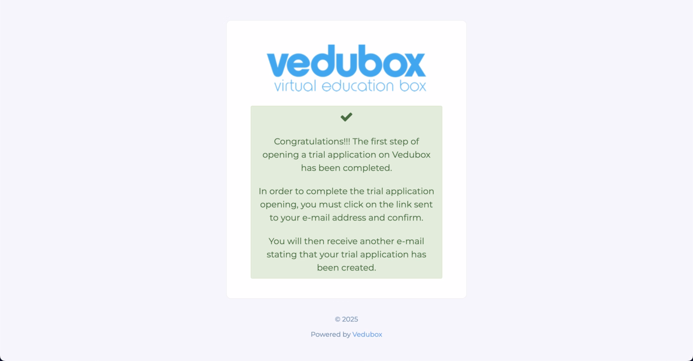
Vedubox’s onboarding is simple and momentum-friendly.
The website leans heavily on clear CTAs for demos and free trials, making the first step obvious even with a modest design.
The signup flow stays short, celebrates progress, and leads users into the product without friction.
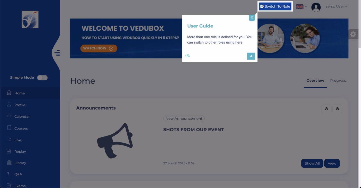
Inside the platform, the onboarding relies on light, traditional UX patterns.
Short product tours guide users through essentials, while embedded announcements and simple modals fill gaps without interrupting flow.
Vedubox reinforces learning through onboarding emails that offer a team meeting, an educational video, and easy next steps to help users deepen adoption early.
Product Onboarding in FinTech Industries
Our team researched 8 prominent SaaS products in the finance technologies industry.
Here is what they found, arranged from the most effective onboarding strategy to the least.
BILL
💻 Platform: Web
📲 Onboarding Type: Interactive Guide, Welcome Tour, Video Walkthrough, Checklist, Email Centered
🧩 Key UX Elements: Welcome Survey, Progress Bar, Guided Tour, Checklists, Empty States
⭐ Effectiveness: 4/5, Very Good!

BILL’s onboarding moves quickly thanks to a short three step survey with a progress bar, reinforced with social proof and a smooth loading screen that reduces friction.
Once inside, BILL guides users with focused, full screen walkthroughs that feel optional but intentional, and supports early setup with a simple checklist for tasks like email verification.
Throughout the journey, BILL supplements learning with video explanations and sends behavior based onboarding emails that trigger depending on what users have or have not completed.
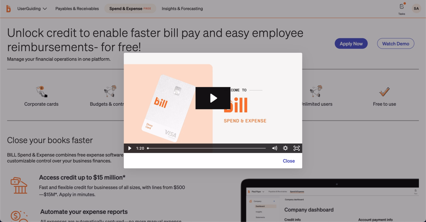
The mix of guided steps, flexible formats, and timely reminders makes the experience structured without slowing momentum.
Zoho Books
💻 Platform: Web
📲 Onboarding Type: Video Walkthrough, Welcome Tour
🧩 Key UX Elements: Welcome Survey, Guided Tour, Milestone Celebrations, Product Updates, Empty States, Progress Bar, Tooltips, Gamification
⭐ Effectiveness: 4/5, Very Good!
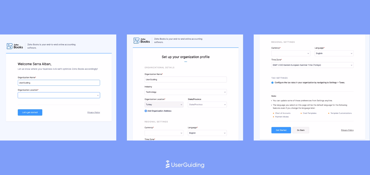
Zoho Books directs users to a dedicated product page with a clear value proposition and prominent CTAs that simplify activation.
The signup flow is short but smart, revealing extra questions contextually so users progress without friction.

Once inside, users see a custom welcome modal with confetti, followed by a 7 step walkthrough that establishes early product confidence.
Zoho Books continues onboarding through embedded elements like promotional cards, empty state videos, and visual cues that support exploration without interrupting workflows.
HoneyBook
💻 Platform: Web
📲 Onboarding Type: Free Roam, Interactive Guide, Checklists
🧩 Key UX Elements: Progress Bar, Milestone Celebrations, Personalization, Gamification, Checklists, Empty States
⭐ Effectiveness: 4/5, Very Good!

HoneyBook’s onboarding stands out with bold visuals, a fun color palette, and excellent use of progress bars that make both signup and the onboarding survey feel faster and lighter.
The primary onboarding flow is a simple 3 step setup capped with a celebratory animation, which creates early momentum without overwhelming the user.
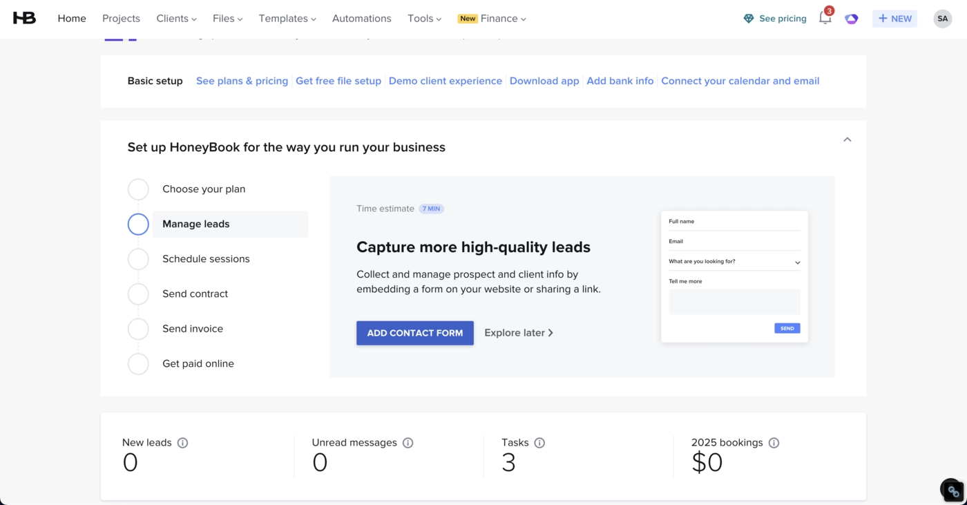
HoneyBook reinforces this with a flexible checklist, allowing users to choose their own starting point while encountering helpful micro interactions like “tip of the day.”
The experience is supported by a strong onboarding email that uses visuals, clear copy, and effective CTAs to guide users back into the product with confidence.
bonsai
💻 Platform: Web
📲 Onboarding Type: Free Roam, Checklists
🧩 Key UX Elements: Welcome Survey, Progress Bar, Checklists, Empty States, Feature Highlights, Help Widget, Contextual Guidance, Personalization
⭐ Effectiveness: 4/5, Very Good!

Bonsai keeps its onboarding clean and reassuring through sleek design, clear CTAs, and early social proof.
The signup flow uses a progress bar to reduce friction and pairs it with trust signals to keep users moving.
Inside the product, Bonsai relies on a minimal set of onboarding elements, mainly a short checklist and intuitive UI choices.
Secondary onboarding stays subtle with embedded empty states and info cards that guide without interrupting the flow.
Bonsai also reinforces momentum with simple onboarding emails that arrive during the first session and follow up with daily actionable tips to help users settle into a steady usage rhythm.
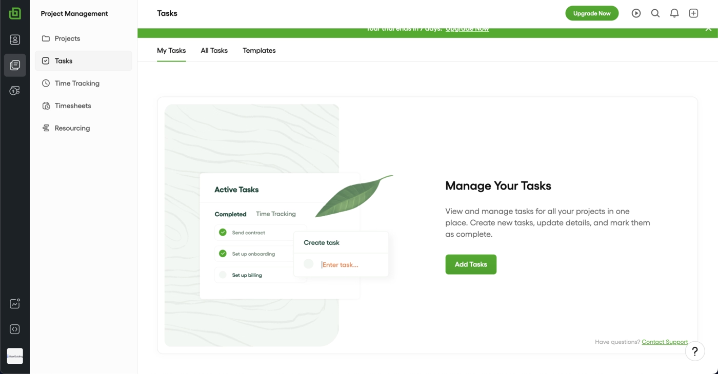
FreshBooks
💻 Platform: Web
📲 Onboarding Type: Welcome Tour, Interactive Guide, Free Roam
🧩 Key UX Elements: Personalization, Guided Tour, Empty States, Welcome Survey
⭐ Effectiveness: 3/5, Good!

FreshBooks keeps the early journey simple and clear. The onboarding survey is only two steps with a progress indicator, which reduces friction and keeps users moving.
A six step starter guide appears right away to establish the first aha moment, and FreshBooks reinforces learning through subtle UI-embedded cues that point users toward the most important setup tasks.
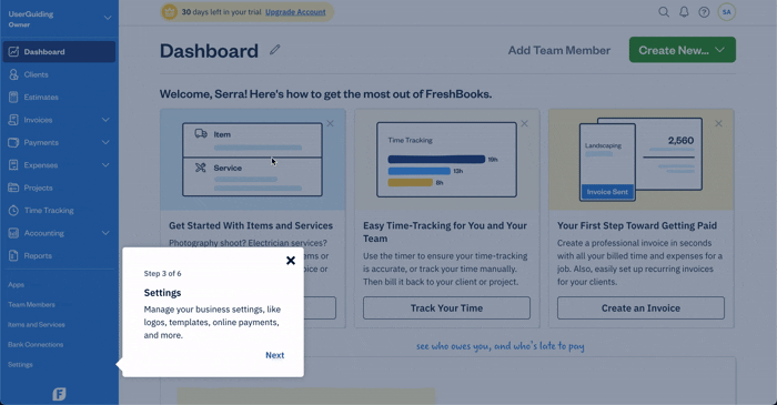
FreshBooks handles the rest with lightweight reinforcement.
Secondary onboarding stays quiet and contextual, and their reactive email strategy brings users back to the product with timely nudges and direct CTAs.
The overall flow gives new users direction without overwhelming them and helps them reach value quickly.
Xero
💻 Platform: Web
📲 Onboarding Type: Interactive Guide, Checklist
🧩 Key UX Elements: Welcome Survey, Progress Bar, Tooltips, Guided Tour, Checklists, Contextual Guidance, Feature Highlights
⭐ Effectiveness: 3/5, Good!

Xero keeps onboarding clear and structured. The website is simple and the single CTA is still easy to notice because of the color contrast.
The signup flow reduces friction with no credit card required messaging and then moves users into a short in-product modal to finish setup.

Inside the platform, Xero relies on an onboarding checklist as its main driver of activation, supported by task-level progress bars that help users feel momentum.
Secondary elements like pulsing hotspots and tooltips highlight key features, including AI capabilities.
The onboarding email stays focused on the three essential setup steps, keeping the early journey practical and straightforward.
Clio
💻 Platform: Web
📲 Onboarding Type: Welcome Tours, Interactive Guide, Video Walkthrough
🧩 Key UX Elements: Guided Tour, Help Widget, EmptyStates, Tooltips, Contextual Guidance
⭐ Effectiveness: 3/5, Good!
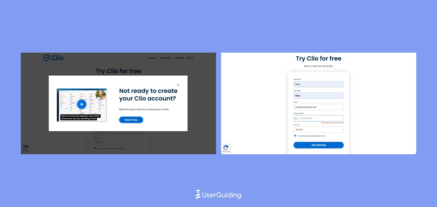
Clio’s onboarding is shaped around clarity and confidence.
The website leads with strong social proof and highly visible CTAs, and the signup flow stays intentionally simple so users can get inside the product fast.
Once they arrive, Clio uses a short three step guide that immediately redirects people to the help center, a fitting choice for a tool that serves complex workflows.
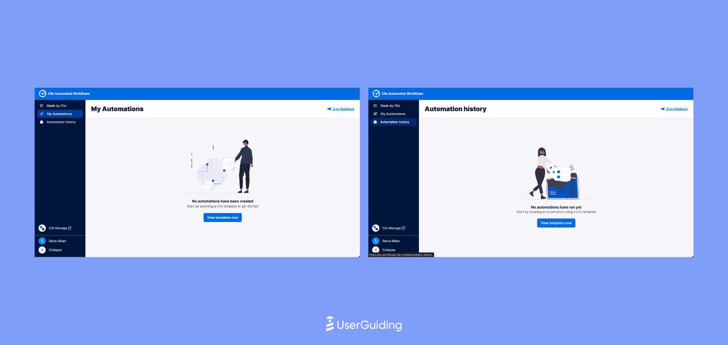
From there, Clio relies on well crafted empty states, subtle hotspots, and a mostly no touch approach to keep users moving.
The platform avoids clutter and maintains momentum, while the decision to send only an activation email reinforces a lightweight path to first value that suits users who prefer discovering features on their own.
FreeAgent
💻 Platform: Web
📲 Onboarding Type: Free Roam, Checklists
🧩 Key UX Elements: Progres Bar, EmptyStates, Checklists, Personalization, Feature Highlights
⭐ Effectiveness: 3/5, Good!
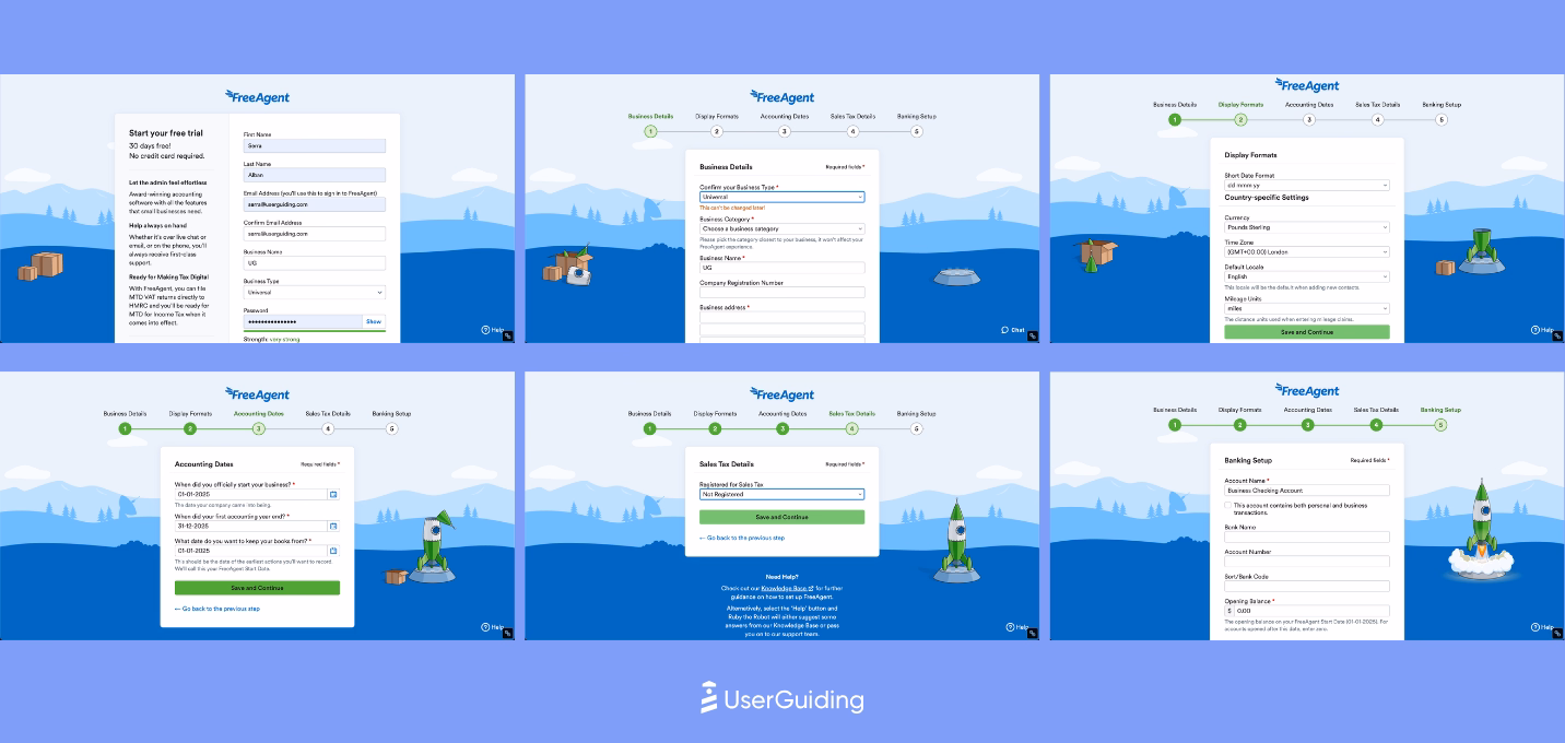
FreeAgent keeps onboarding clear, structured, and expectation-free.
Its long signup survey is softened by a strong progress bar and helpful explanations that reduce friction.
Once inside, a dashboard-level checklist guides users through the core setup and anchors the first aha moments without relying on heavy UX elements.
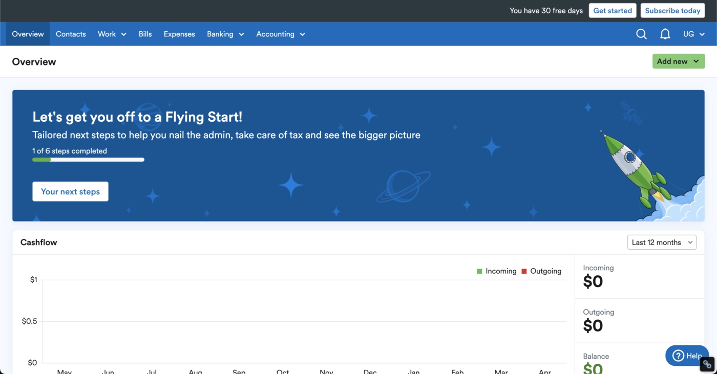
Beyond that, FreeAgent focuses on quiet, contextual onboarding.
Empty states carry most of the educational load and nudge users forward naturally.
Email touchpoints are minimal, limited to a confirmation message, which aligns with a lightweight, self-serve onboarding philosophy.
Product Onboarding in HealthTech Industries
The UserGuiding team also conductedan in-depth analysis for 10 SaaS products in the health technologies industries.
Check out how they rated each tool below.
Ensora Health
💻 Platform: Web
📲 Onboarding Type: Interactive Guide
🧩 Key UX Elements: Checklists, Milestone Celebrations, Progress Bar, Contextual Guidance, Onboarding Videos, Gamification, Welcome Survey, Guided Tour
⭐ Effectiveness: 5/5, Excellent!

Ensora Health delivers a clean, structured onboarding flow, beginning with a short 5-step setup that users can adjust or skip.
A visible resource center and checklist guide the first actions.
Interactive tutorials walk users through the important workflows, while sandboxed tours for advanced features prevent overwhelm and support progressive discovery.
Carepatron
💻 Platform: Web, Desktop, Mobile (IOS & Android)
📲 Onboarding Type: Checklists
🧩 Key UX Elements: Welcome Survey, Personalization, Empty States, Tooltips, Help Widget
⭐ Effectiveness: 4/5, Very Good!
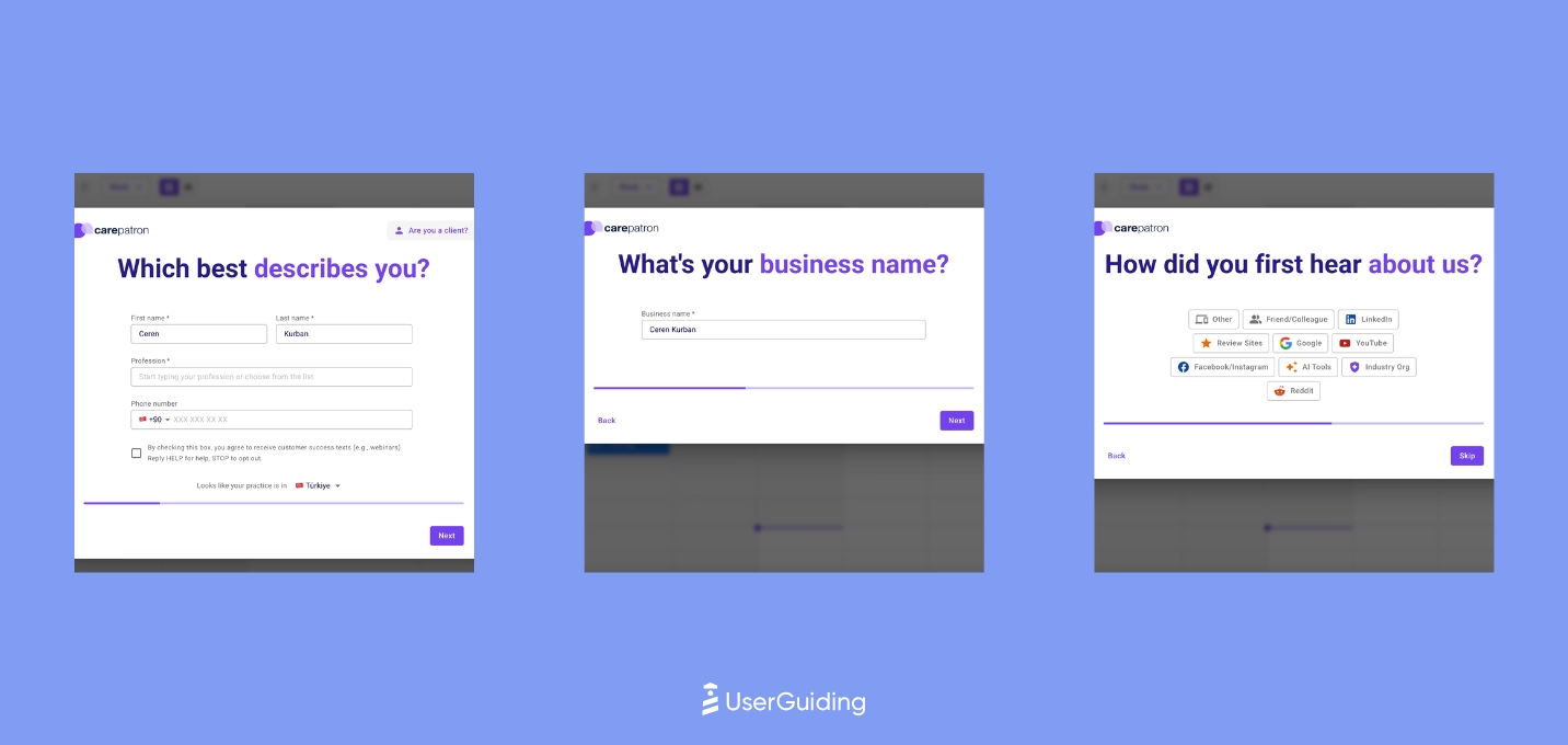
Carepatron shows the onboarding checklist immediately on the sidebar, giving users a quick first win with one pre-completed step.
Tooltips and a clear resource center support exploration without heavy tours.
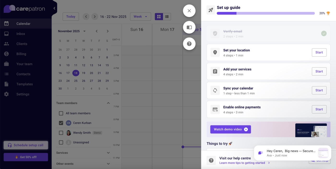
Users can test features through sample data and dashboards, creating a low-friction path to early understanding.
Healthie
💻 Platform: Web, Mobile (IOS & Android)
📲 Onboarding Type: Welcome Tour, Video Walkthrough, Checklists
🧩 Key UX Elements: Personalization, Checklists, Onboarding Videos, Contextual Guidance, Gamification
⭐ Effectiveness: 4/5, Very Good!

Healthie welcomes new users with a short demo video and a clear guided setup option.
Each checklist item expands into subtasks with interactive tutorials, followed by contextual help articles.

Sample data allows risk-free exploration, helping users experience the platform’s value before committing real data or workflows.
SimplyBook.me
💻 Platform: Web
📲 Onboarding Type: Welcome Tour, Interactive Guide, Video Walkthrough, Checklists
🧩 Key UX Elements: Checklists, Guided Tour, Welcome Survey, Personalization, Onboarding Videos, Contextual Guidance
⭐ Effectiveness: 4/5, Very Good!
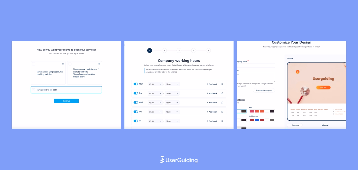
SimplyBook.me focuses on minimalism and essential setup, allowing users to start quickly while still personalizing their workspace.
A short setup guide is paired with a curated playlist of onboarding videos.
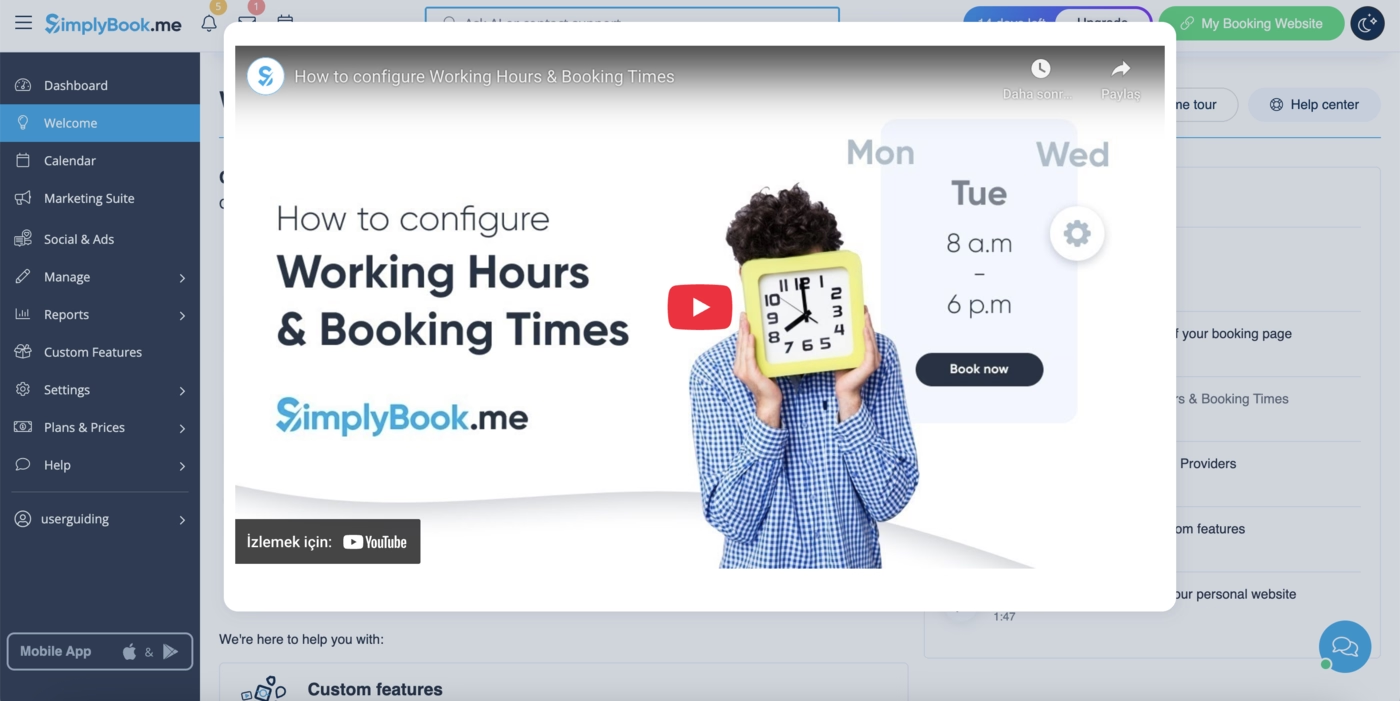
The experience removes friction and encourages ownership early, rather than slowing users down with heavy onboarding.
Noterro
💻 Platform: Web
📲 Onboarding Type: Welcome Tour, AI-Centered
🧩 Key UX Elements: Guided Tour, Onboarding Videos, Checklists, Contextual Guidance, Welcome Survey, Help Widget
⭐ Effectiveness: 4/5, Very Good!
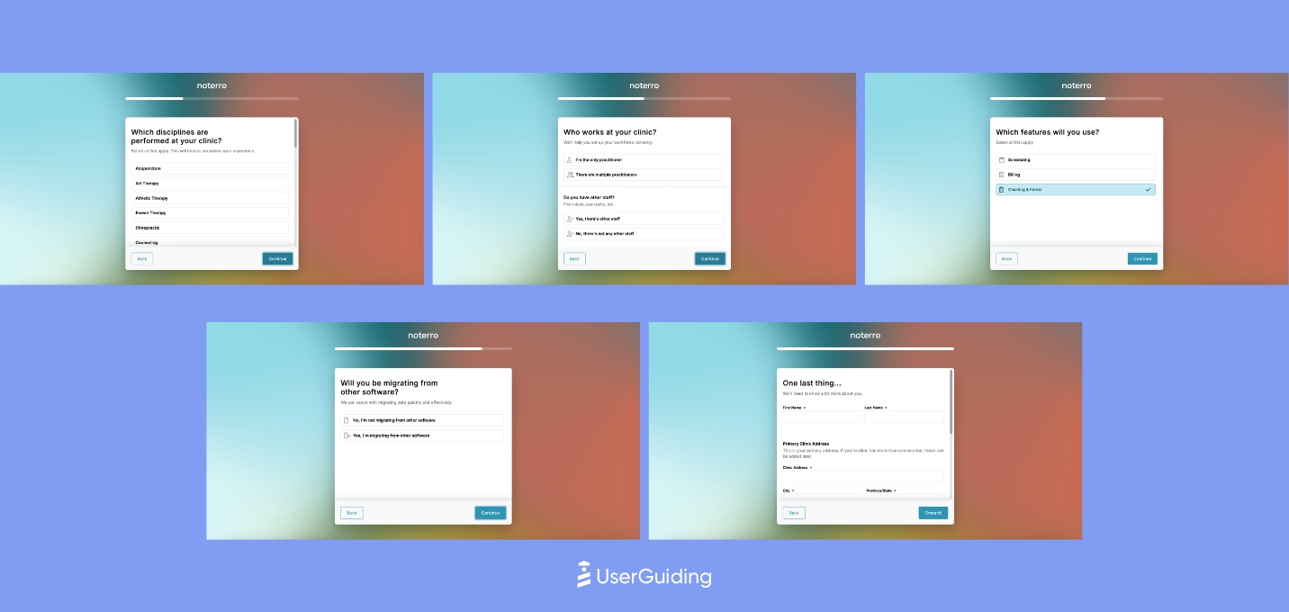
Noterro keeps onboarding lightweight and flexible, using its in-app AI assistant Lucy for step-by-step help exactly when users need it.
This lowers the barrier to first actions and removes the pressure of a fixed onboarding sequence.
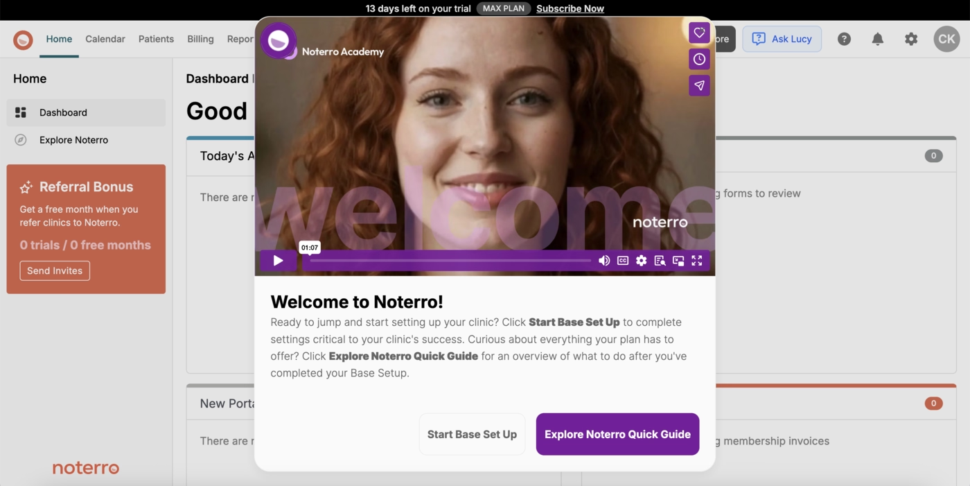
Beyond that, Noterro leans on contextual guidance and empty-state education, offering subtle prompts that keep users moving without overwhelming them.
Tebra
💻 Platform: Web
📲 Onboarding Type: Welcome Tour, Interactive Guides, Checklists
🧩 Key UX Elements: Checklists, Guided Tour, Progress Bar
⭐ Effectiveness: 3/5, Good!
Tebra avoids forcing onboarding and instead offers a self-serve demo experience with pre-recorded tours filtered by a short role-based survey.
Tooltips and embedded video commentary guide users through real workflows.
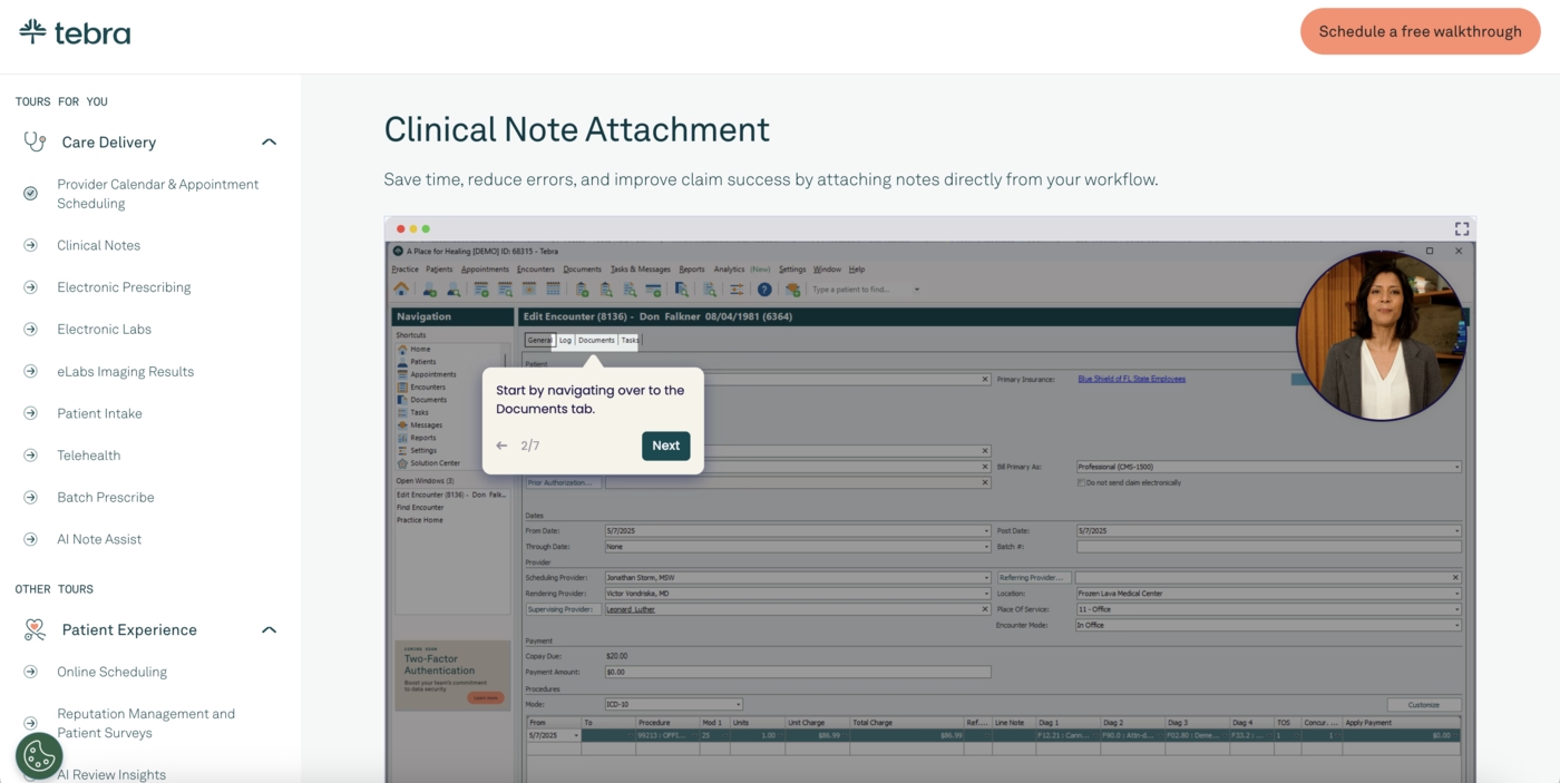
This flexible discovery model works well for users who want to explore at their own pace while staying aligned with their job role.
Zanda
💻 Platform: Web
📲 Onboarding Type: Video Walkthrough, Checklists
🧩 Key UX Elements: Onboarding Videos, Checklists, Welcome Survey, Milestone Celebrations
⭐ Effectiveness: 3/5, Good!
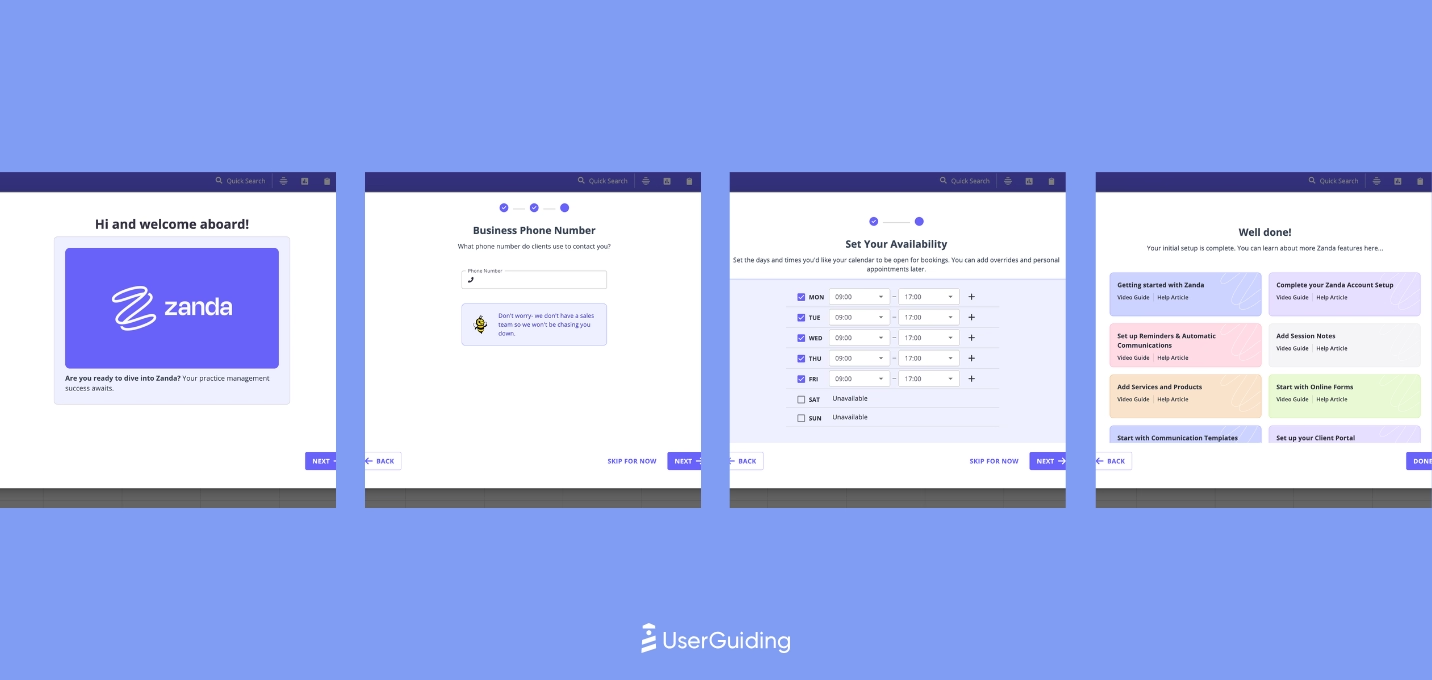
Zanda uses well-organized, updated video guides with clear visual cues that make complex workflows easy to follow.
The categorization supports different learning paths and roles.
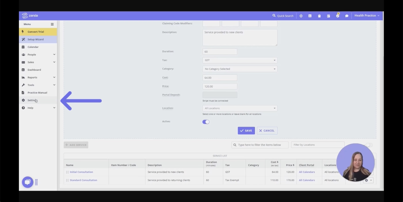
It is a strong fit for users who prefer visual, self-paced education and want structured learning without mandatory walkthroughs.
Doxy.me
💻 Platform: Web
📲 Onboarding Type: Free Roam
🧩 Key UX Elements: Welcome Survey, Personalization, Empty States
⭐ Effectiveness: 3/5, Good!
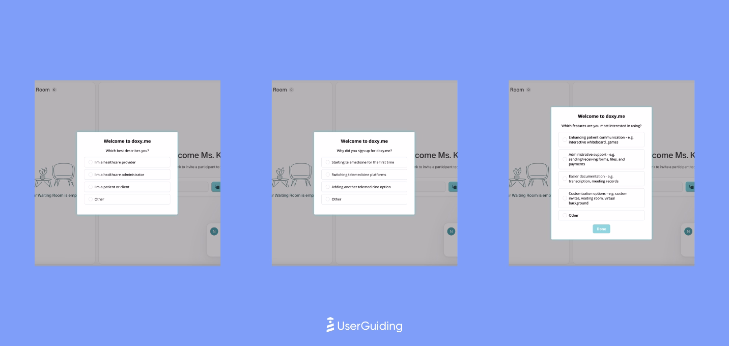
Doxy.me keeps onboarding minimal but intentional, using empty states to surface FAQs and embedding small UX cues right where new users typically get stuck.
The experience is quiet but effective.
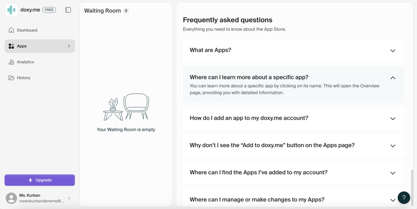
This results in a simple onboarding flow that hits the essentials without friction, letting clinicians and staff adopt the tool quickly.
NextGen
💻 Platform: Web
📲 Onboarding Type: Video Walkthrough
🧩 Key UX Elements: Onboarding Videos, Tooltips, Empty States, Gamification
⭐ Effectiveness: 3/5, Good!
NextGen uses use-case based demos to personalize onboarding and make the platform feel instantly relevant.
Features appear in context and video walkthroughs are tailored to specific roles or workflows.
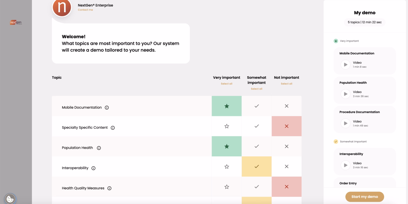
This targeted format avoids scenario overload and creates a clear path to value for each type of user.
Jane
💻 Platform: Web, Mobile (IOS & Android)
📲 Onboarding Type: Video Walkthrough
🧩 Key UX Elements: Onboarding Videos
⭐ Effectiveness: 2/5, Fair.
Jane focuses on tutorial videos rather than interactive onboarding.
The structure is simple, and while some videos feel dated, the content still supports first steps.
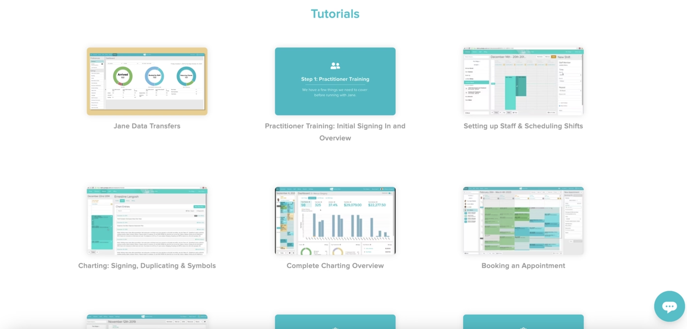
The onboarding exists but is more passive and less engaging, relying on users to take initiative.
In Conclusion...
2025 has been a very diverse year for product onboarding, as the examples from 30+ products in varying industries shows in our case study.
If you want to take a closer look to all the screenshots, videos and sequences collected by our team, you can check out our Notion report!

.png)