.svg)
.svg)
.svg)
.svg)
.svg)


.svg)


.svg)
.svg)

Product experience matters. Everyone agrees on that.
But when it comes to what actually makes a good product experience, things get a little less clear.
How does strong PX show up in real products? What does “good” look like beyond theory and frameworks? And where do you even start if you want to improve your own product experience?
These are all fair questions.
And in this article, we’re tackling them by looking at real SaaS products in action.
We’ll walk through both good and bad product experience examples, break down what makes them work (or not), and highlight the patterns you can borrow to improve your own PX along the way.
¡Vamos!
TL;DR
- Front removes friction from product discovery by letting users explore realistic workflows through interactive and video demos before signup.
- Perplexity delays account creation until after users experience real value, framing signup as a benefit rather than a barrier.
- Customer.io turns onboarding into an engaging learning loop by combining guided tutorials with practice-based challenges and sample data.
- Lingo personalizes onboarding around user goals and reinforces learning with real-world examples and templates instead of generic walkthroughs.
- Linear uses onboarding checklists and informative empty states to teach users features exactly when they encounter them.
- Miro drops users directly into a meaningful first workspace and introduces new features in context to encourage early engagement and habit formation.
- Syllaby.io uses a short, focused product tour to orient users quickly and help them start experimenting without overwhelm.
- Workable enables low-risk exploration by providing sample data and contextual tooltips that support discovery without forcing rigid onboarding.
- Capsule gives users full control over their learning with an on-demand video library that clearly communicates time investment upfront.
- Salesforce Trailhead motivates long-term learning through personalized paths and heavy gamification that rewards progress and consistency.
- Loom builds virality directly into the product by rewarding team invitations and visualizing progress through light gamification.
- GitHub encourages continuous engagement by tying gamification to meaningful work and making achievements socially visible.
- WeTest overwhelms users by dumping external resources and vague setup instructions instead of providing clear, in-context onboarding guidance.
- QuinAI undermines its interactive demo by prioritizing click instructions over explanations, use cases, and narrative flow.
- Postman limits onboarding effectiveness by hiding the full setup journey and restricting user control over progression.

Quick recap: What does product experience mean?
Product experience (PX) is the complete experience users have in and around your product. It includes everything from signup and onboarding to feature discovery, usability, in-product guidance, performance, support, and how the experience evolves over time across devices.
In other words, if an interaction happens inside the product environment (or directly affects how users use it), it’s part of PX.
PX looks at how interactions connect to help users reach value, build confidence, and form habits.
If you want the full breakdown of product experience, how it differs from UX and CX, and why it matters for SaaS growth, let’s take you to our complete PX guide 👈🏻
Product experience (PX) examples across the user journey
Website + Pre-signup experience:
Front offers both an interactive demo and a video demo before signup
Front is a customer support operations platform.
Before asking users to create an account, Front invests heavily in pre-signup product exposure. On the landing page, visitors immediately see looping GIFs that showcase key workflows, such as handling customer messages and automating tasks.
These visual previews allow users to explore the interface passively.
But Front goes a step further and offers deeper discovery through video walkthroughs and an interactive demo experience.
To make sure these options don’t go unnoticed, Front uses an AI chatbot on the landing page to proactively guide visitors. The chatbot triggers a modal that highlights recommended actions and asks whether the user would like to explore the product through a guided tour.
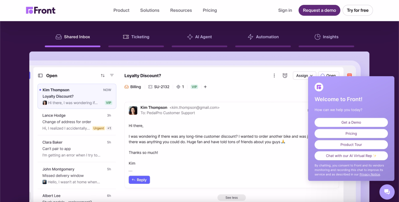
If the user selects the product tour option, the AI agent routes them to a dedicated product discovery page.
Here, users can choose between two learning paths: a video-based walkthrough or an interactive demo that lets them experience the product directly.
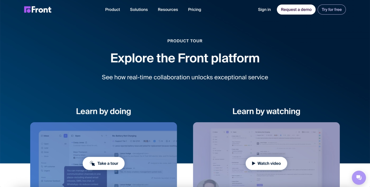
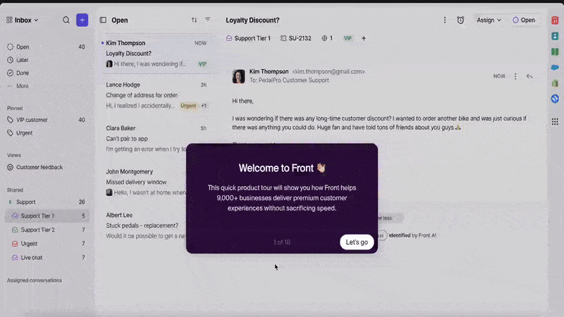
The interactive demo follows a single, predefined workflow rather than allowing users to choose individual features or use cases. While this makes the demo relatively long, it also creates a coherent experience that mirrors how the product is used in a real workday.
In total, the tour includes around 15 steps.
Each step builds on the previous one and walks the user through a realistic customer conversation using sample data, helping potential users understand not just where features live in the UI, but how they work together in practice.
What makes this a good PX example?
✅ Product interaction and exploration are actively encouraged before signup, lowering the commitment required to understand the product’s value.
✅ Multiple learning formats (interactive and video-based) are offered to accommodate different learning styles and levels of intent.
✅ The interactive demo focuses on a realistic end-to-end workflow with sample data, helping users understand how features connect rather than presenting them in isolation.
Perplexity allows users to experience the product without creating an account
Perplexity is an AI-powered search and research platform.
Instead of gating the core product behind a signup flow, Perplexity allows new users to start using the app immediately. Visitors can enter a query, explore responses, and interact with the interface without creating an account or completing any setup steps.
In this experience, account creation is positioned as a voluntary next step rather than a prerequisite.
Users are prompted to sign up only after they’ve experienced the value of the product and want to save searches, personalize results, or continue longer research sessions.
To reduce decision friction for first-time users, Perplexity also presents a set of recommended searches directly in the interface. These examples give users a clear starting point and help them engage without needing to think about what to ask first.
What makes this a good PX example?
✅ Core product value is accessible without mandatory signup.
✅ Recommended starter actions reduce cognitive load and help new users engage immediately with minimal effort.
Onboarding and activation experience:
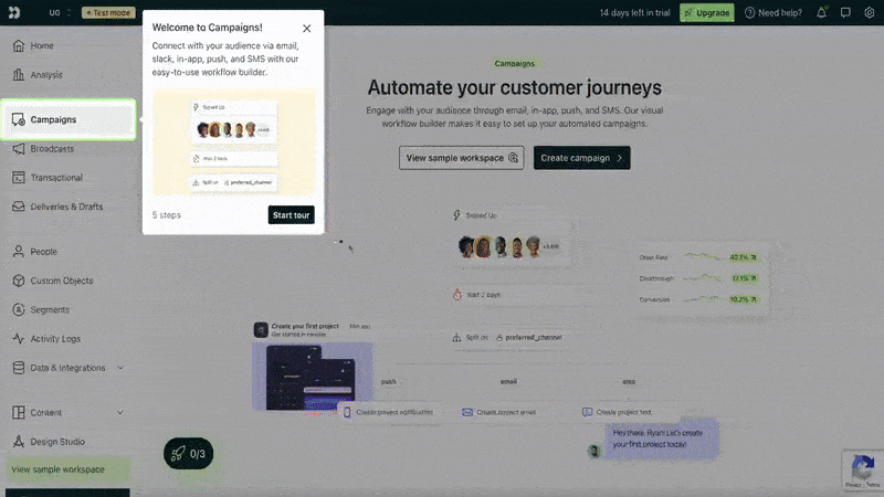
Customer.io gamifies the in-app onboarding experience and offers pro tips for better activation
Customer.io is a customer engagement and messaging platform.
Customer.io’s new user experience starts with a structured but lightweight onboarding flow designed to introduce the product’s core features without overwhelming the user. Upon first login, users are welcomed on the home page with an onboarding checklist that focuses on three foundational areas of the platform.
Each checklist item triggers an interactive tutorial that walks the user through how to use the corresponding feature in context.
Here’s the checklist:
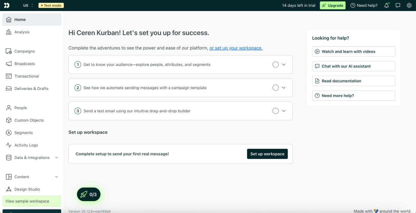
And here’s an example tutorial:
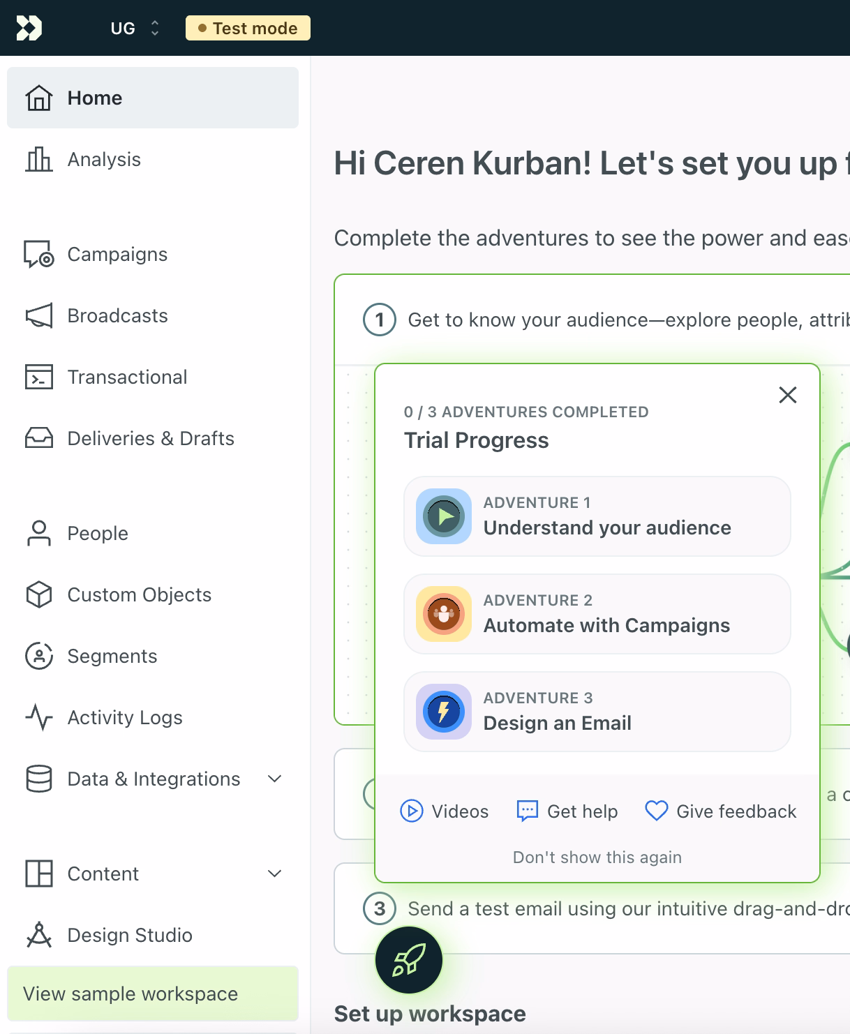
At the end of each tutorial, Customer.io acknowledges completion with a small celebration and then recommends concrete next steps -a.k.a. Adventures.
These suggested actions encourage users to apply what they’ve just learned independently.
In a way, Customer.io moves them from passive learning to active feature usage.
What is an adventure? You might ask.
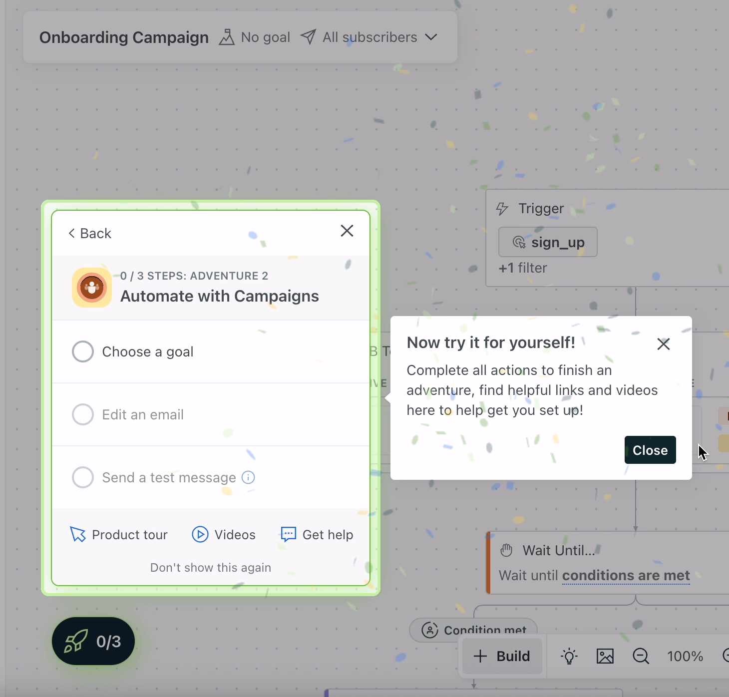
Well, in addition to the onboarding checklist, Customer.io introduces a second layer of engagement called “adventures.” While the onboarding checklist focuses on guided learning, adventures are interaction-driven challenges tied to the same core features: audiences, campaigns, and emails.
Each adventure breaks a feature down into practical tasks.
For example, the campaigns adventure includes steps like choosing a campaign goal, editing a campaign email, and sending a test message.
These tasks do not trigger tutorials.
Instead, they are designed to validate whether users can complete important workflows on their own.
What makes this a good PX example?
✅ Onboarding guidance is available but not forced, allowing users to explore features at their own pace without blocking product usage.
✅ The transition from tutorials to interaction-based challenges encourages deeper feature engagement and reinforces learning through practice.
✅ Sample data lowers the risk of experimentation and enables users to reach activation without needing to set up real workflows immediately.
Lingo offers goal-oriented in-app onboarding
Lingo is a sales enablement and content management platform.
Immediately after signup, Lingo runs a short onboarding survey to understand the user’s role and primary goal for using the product. This information is then used to personalize the onboarding experience, starting with the onboarding checklist.
For example, users who indicate that they will use Lingo for sales enablement are presented with a checklist tailored specifically to that use case.
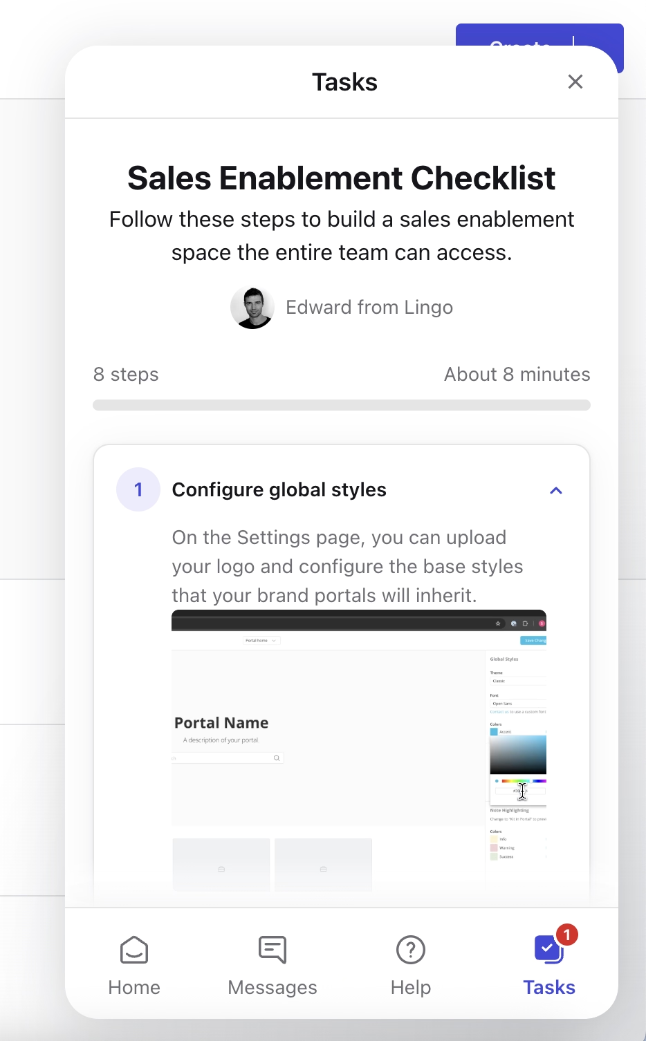
The checklist provides static guidance through clear text and visuals rather than triggering interactive tutorials. While the guidance is not hands-on, each step is well explained and includes an estimated time to completion.
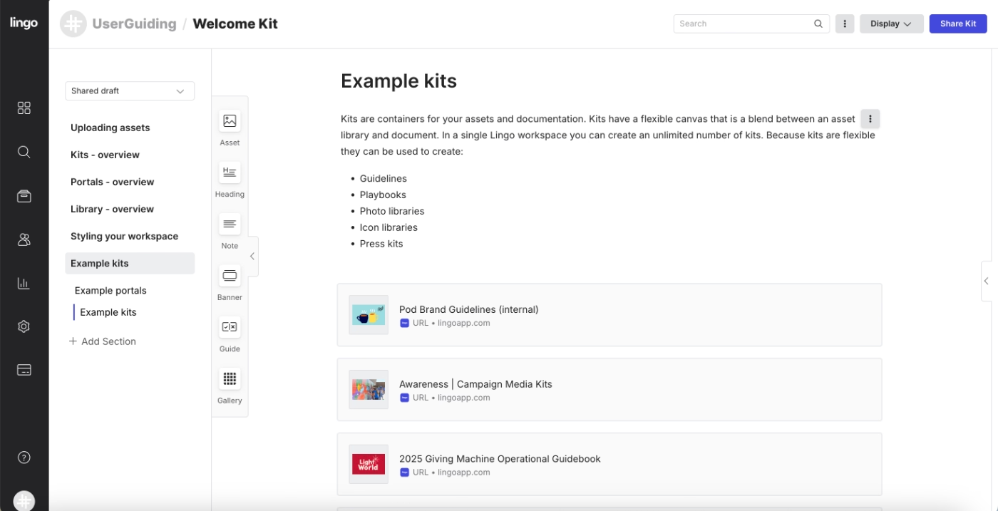
Beyond the checklist, Lingo also offers a welcome kit that is accessible directly within the product.
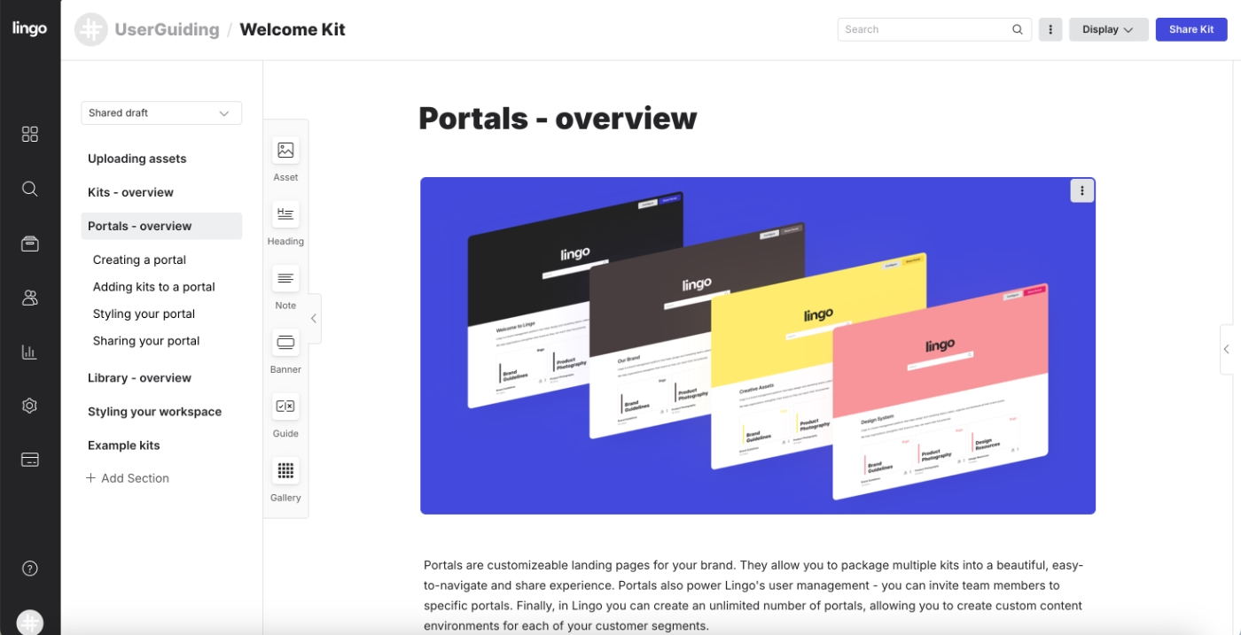
This welcome kit serves multiple purposes.
It acts as onboarding documentation, feature explanation material, and a source of inspiration for new users.
In addition to describing core workflows and capabilities, it includes example kits and portals that show how to use Lingo in real scenarios.
What makes this a good PX example?
✅ Onboarding is personalized based on user goals. The immediate and visible personalization also sets the tone for the rest of the product experience, as well.
✅ Real-world examples and templates provide inspiration and context.
Linear uses empty state to onboard its new users and introduce them to features
Linear is a product management and issue-tracking platform.
When new users first enter the product, Linear welcomes them with an onboarding checklist that functions as a structured to-do list.
The checklist includes nine steps in total, but not all tasks require the same level of effort.
Some steps are lightweight, such as a welcome message that explains Linear’s value proposition or quick setup actions like connecting accounts. Others are more involved and focus on introducing key platform features.
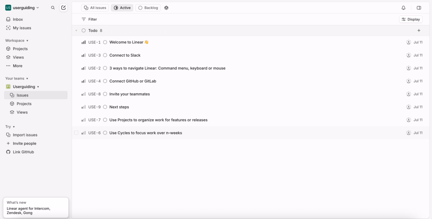
Each checklist item opens in a separate view where users are guided through the task with written instructions and, in some cases, supporting visuals.
This keeps the main interface uncluttered while allowing users to focus on one setup action at a time.
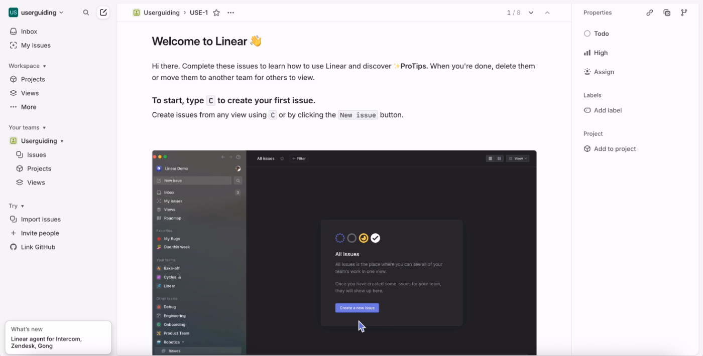
In addition to the checklist-driven onboarding, Linear also makes extensive use of empty states across feature pages.
When users land on a feature for the first time, the empty state explains what the feature is for, how it’s typically used, and which actions to take next. These screens often include best practices, usage tips, and keyboard shortcuts.
What makes this a good PX example?
✅ Onboarding tasks are broken down into manageable steps, mixing quick wins with deeper feature introductions to maintain momentum.
✅ Task pages double as feature showcases and allow users to see and use Linear’s capabilities in action.
✅ Empty states on feature pages are used as teaching moments.
Feature discovery and continuous adoption:
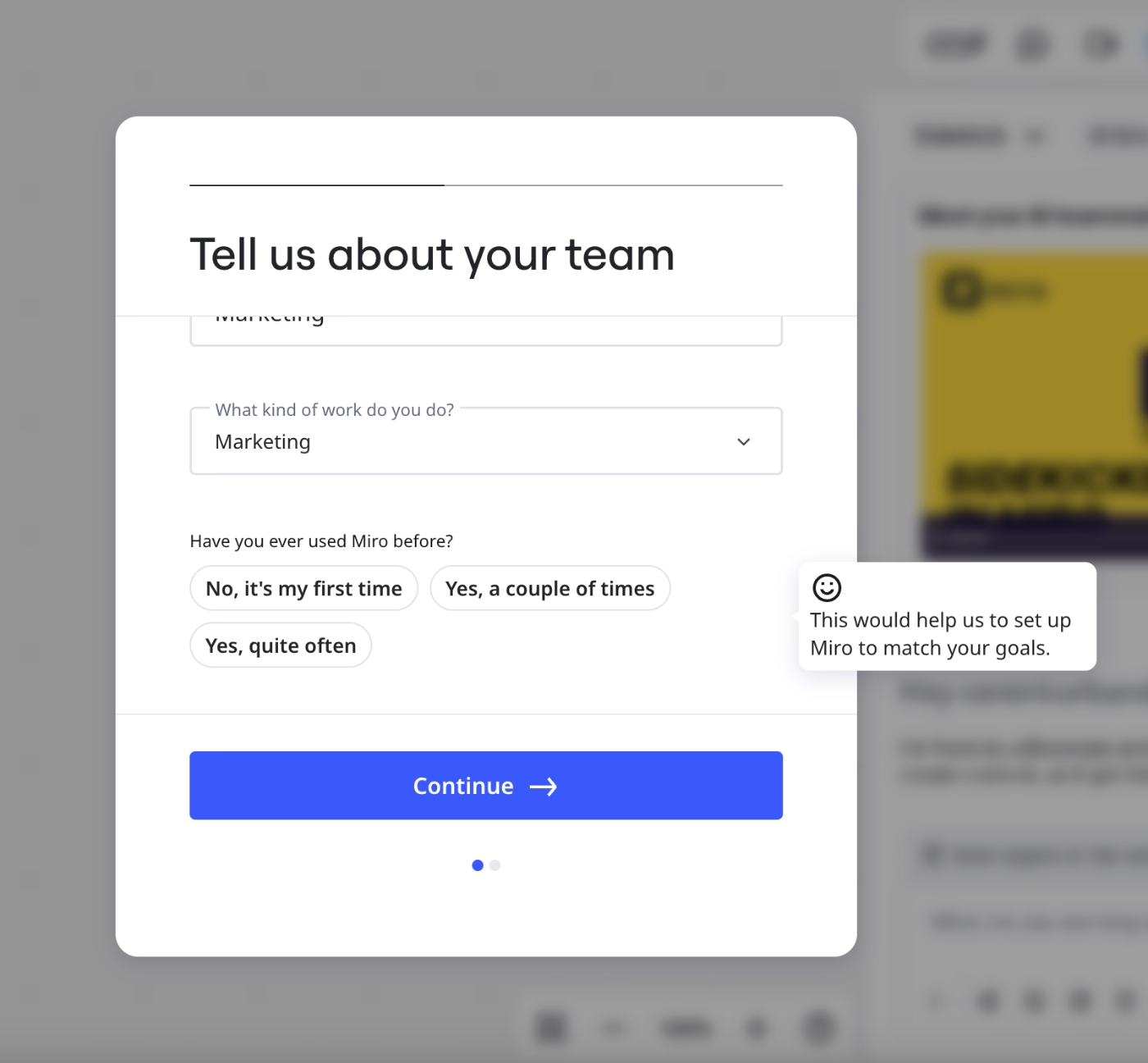
Miro welcomes new users directly within their first board
Miro is an online collaborative whiteboard platform.
During the initial setup, Miro runs a short onboarding survey to understand the user’s team, use case, and prior familiarity with the product. For each question, Miro provides a small tooltip explaining why the information is being collected and how it will be used to tailor the experience.
For example, next to the question “Have you ever used Miro before?”, Miro clarifies that the answer helps configure the workspace according to the user’s goals and comfort level.
Once the survey is completed, Miro automatically introduces Sidekick, its AI assistant (currently in beta). They present Sidekick through a short video walkthrough that explains what the tool does and how it can help users get started.
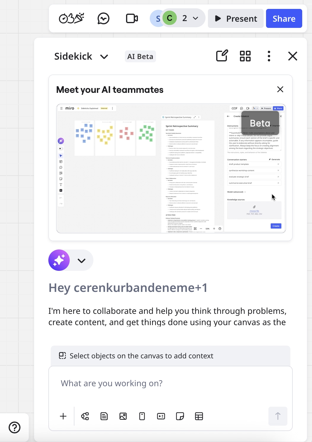
At the same time, Miro creates the user’s first board automatically and places the user directly inside it. Rather than landing on an empty dashboard, users are welcomed in a working space where they can immediately start interacting with the product.
Even after closing the Sidekick panel, the AI assistant remains visible within the board, offering ready-to-use prompts and brainstorming suggestions in the center of the canvas.
So, Miro encourages engagement with their new AI agent through different methods.
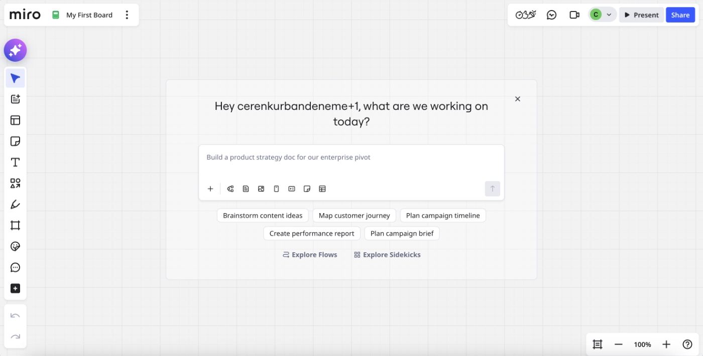
What makes this a good PX example?
✅ New features are introduced both to new users and existing users, encouraging early adoption and habit formation.
✅ Users are placed directly into a meaningful first experience within their first board.
Syllaby.io triggers a quick product tour to highlight important features
Syllaby.io is an AI-powered content planning and video scripting platform.
Immediately after signup, Syllaby.io launches a product tour that introduces new users to the interface.
The tour focuses on highlighting key buttons and primary features, pairing each UI element with a brief explanation and example use cases.
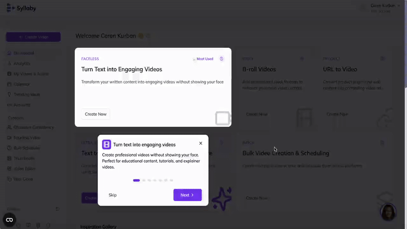
What makes this a good PX example?
✅ Key features are introduced with example use cases. This lowers cognitive load and helps users move from orientation to experimentation faster.
Workable offers sample data and dashboards for early deep engagement without commitment
Workable is a recruiting and hiring platform.
To help new users engage meaningfully with the product from the start, Workable provides a sample workspace populated with sample data. This allows users to explore dashboards, reports, and core hiring workflows without needing to import real candidates or set up live job data.
Workable makes this low-risk environment explicit.
Through a tooltip, the product explains that the sample data can be deleted at any time, reassuring users that they can experiment freely without worrying about affecting real hiring processes.
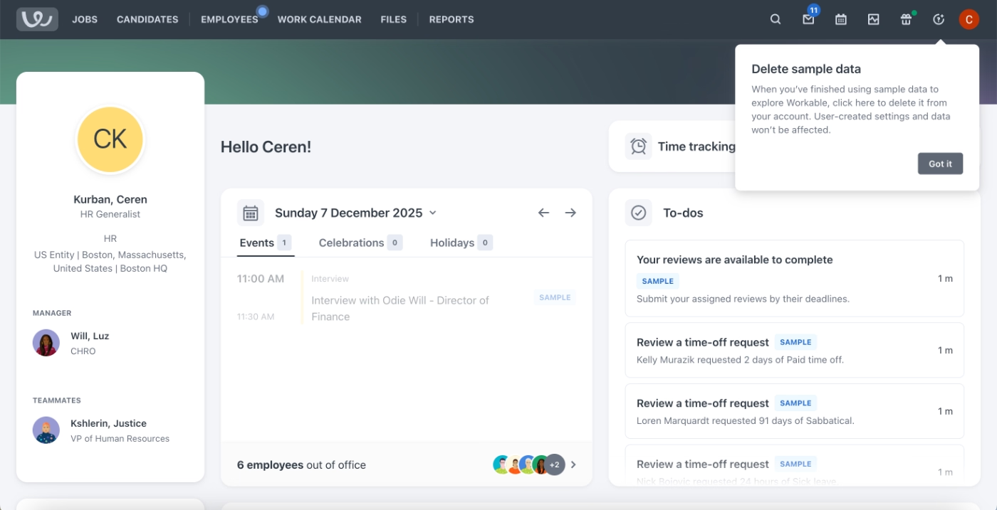
Workable also uses contextual tooltips to support users as they explore.
These tooltips appear across different features and workflows, offering explanations, usage tips, and clarifications exactly when users interact with specific UI elements.
Because the guidance is embedded contextually, users discover it gradually as they move through the product.
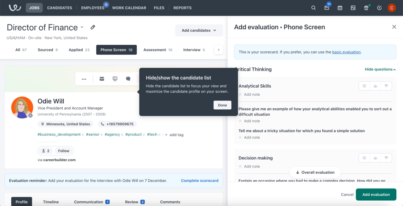
What makes this a good PX example?
✅ Sample data lowers the barrier to deep product exploration by allowing users to engage with real workflows without committing their own data.
✅ Contextual tooltips provide timely guidance without forcing users through a rigid onboarding sequence.
Support and self-serve experience:
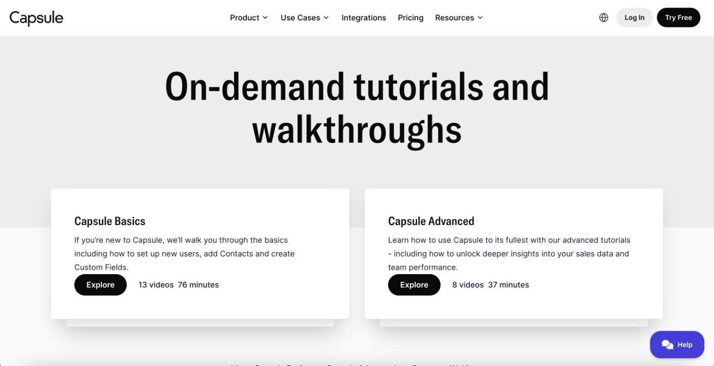
Capsule’s on-demand video walkthrough gallery
Capsule is a CRM platform whose onboarding approach relies heavily on self-serve video education. They provide a centralized library of video tutorials that users can access on demand.
The video content is organized into two clear categories: Capsule Basics and Capsule Advanced. In total, the library includes 21 videos, with 13 covering core concepts and workflows, and 8 focused on more advanced features.
Importantly, Capsule displays the total duration of each category upfront.
This allows users to decide whether they want a quick introduction or a deeper learning session, and understand the time commitment required before starting.
Within each category, individual video lengths vary significantly.
Some basic tutorials are under two minutes, while others run longer than eight to ten minutes, with at least one in-depth video extending to around fifteen minutes.
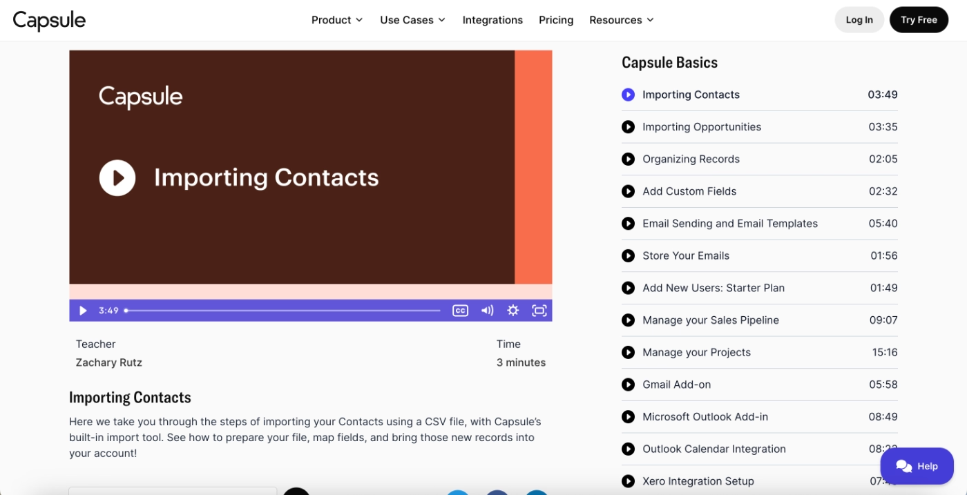
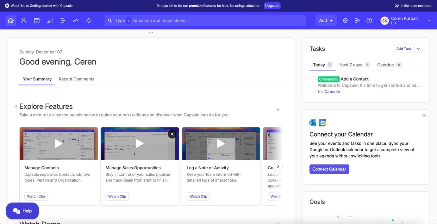
While most tutorials live in a dedicated onboarding hub, Capsule also surfaces selected videos directly inside the product. Core feature overviews and foundational tutorials appear on the home page.
This dual placement ensures that new users can discover educational content both proactively (by visiting the tutorial gallery) and contextually (while navigating the app for the first time).
What makes this a good PX example?
✅ On-demand video onboarding gives users control over how and when they learn.
Salesforce Trailhead gamifies product education and creates a community of power users
Salesforce is a customer relationship management (CRM) platform used by sales, marketing, and service teams and Salesforce Trailhead is Salesforce’s dedicated product education platform.
It is designed to help users learn Salesforce tools, develop skills, and progress from basic usage to advanced expertise.
When users first sign up for Trailhead, Salesforce runs a short onboarding survey to understand their role, the products they’re interested in, their familiarity with Salesforce, and their learning goals. This information is then used to personalize the learning experience.
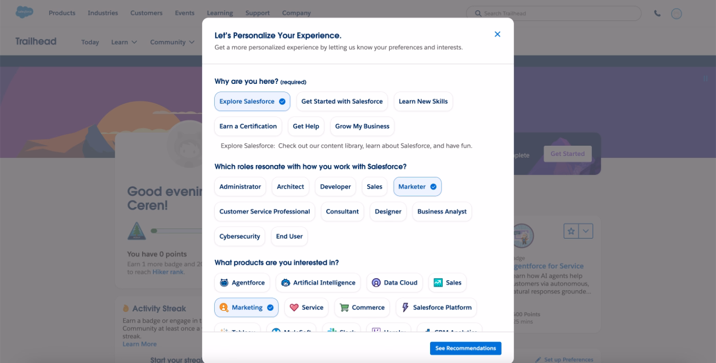
Based on the survey responses, Trailhead recommends specific courses and learning paths that are most relevant to the user. This reduces decision paralysis by narrowing down the options in a platform that contains a large volume of educational content.
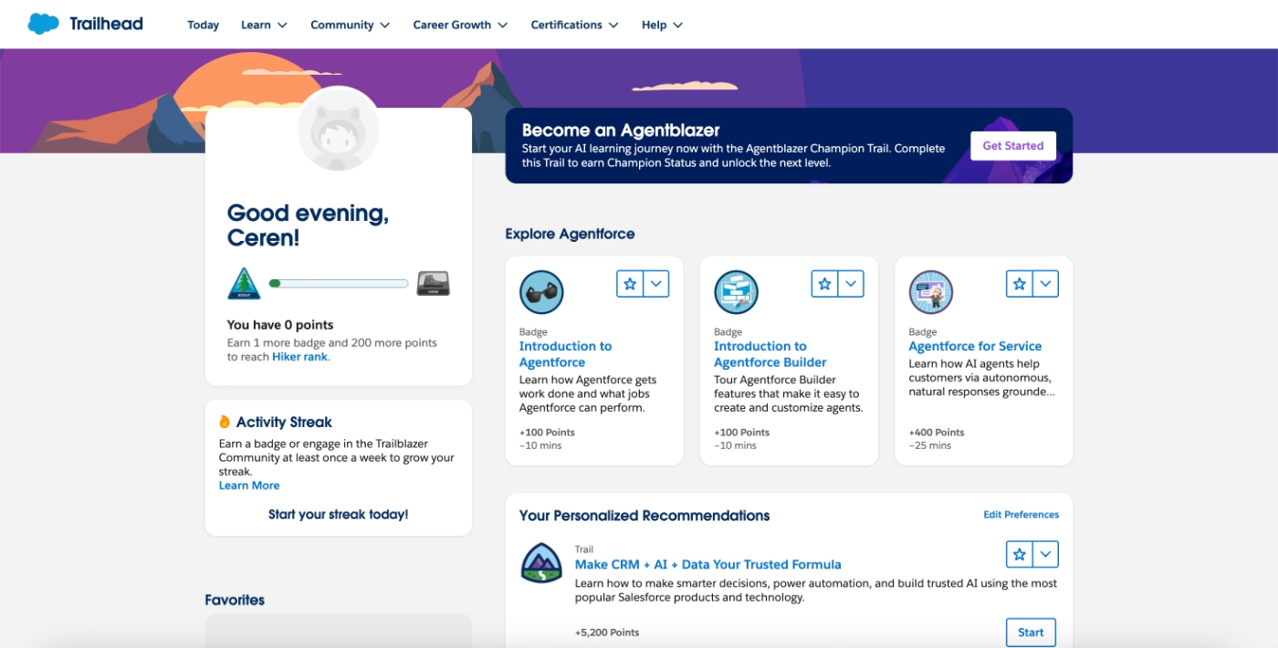
Trailhead also heavily gamifies the learning experience.
Educational content is structured around badges, points, paths, and streaks, creating a sense of progression and achievement as users complete modules.
However, the level of gamification can actually feel dense at first for some users. 👀
What makes this a good PX example?
✅ Learning paths are personalized based on role, goals, and experience level, reducing overwhelm in a content-heavy platform. It also eliminates decision paralysis.
✅ Gamification elements create motivation and a clear sense of progress.
Retention and ongoing engagement:
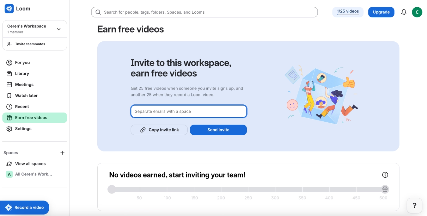
Loom maintains product virality through gamification and incentives
Loom is a video messaging platform that enables teams to record, share, and collaborate through short videos.
Because Loom is most effective when adopted across a team or organization, the product places a strong emphasis on workplace-wide adoption and ongoing engagement.
To support this, Loom incentivizes users to invite coworkers into their workspace.
Users receive 25 free videos when a coworker signs up through their invite, and an additional 25 free videos when that coworker records their first Loom video.
This structure encourages not just invitations, but meaningful activation of new users.
What makes this a good PX example?
✅ Virality is embedded into the core product experience, supporting long-term adoption through team-based growth.
✅ Loom provides a dashboard that tracks earned free videos and visualizes progress toward usage limits, which adds a light layer of gamification.
GitHub uses gamification elements to motivate users to continuously engage with the app
GitHub is a software development platform that helps teams host code, collaborate on projects, and manage version control through Git.
To encourage consistent usage and long-term engagement, GitHub applies gamification through two main mechanisms: usage-based achievements and contribution tracking.
GitHub awards badges based on the completion of meaningful workflows, such as contributing to repositories or maintaining activity over time. These badges appear publicly on users’ profile pages under the achievements section.
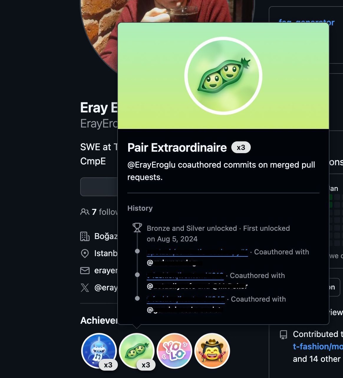
In addition to badges, GitHub tracks activity through a contributions dashboard that visualizes coding and committing behavior over time. This contribution table allows users to see patterns in their engagement and build habits around regular contributions.
For many developers, this dashboard becomes more than just a tracking tool.
Some users turn it into a personal challenge or a creative outlet, while others share their contribution graphs publicly on social media. This social visibility reinforces motivation and encourages ongoing engagement with the platform.
What makes this a good PX example?
✅ Gamification is tied to real, value-creating workflows.
✅ Public visibility of achievements reinforces motivation through social recognition.
Examples of “Bad PX” (and what we can learn from them)
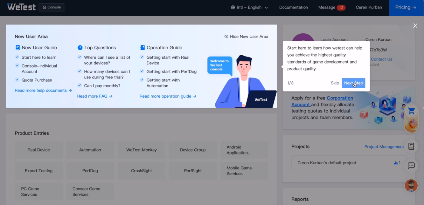
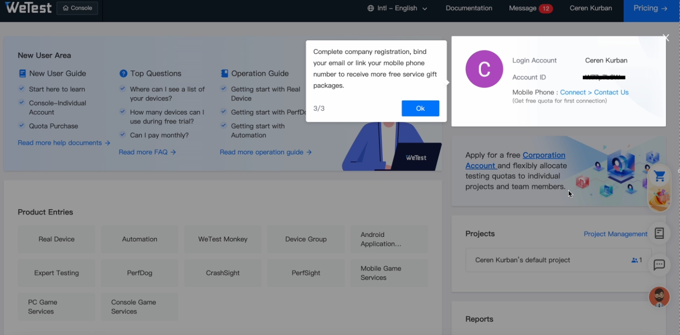
WeTest bombards users with unclear onboarding tasks
WeTest is a mobile app testing and quality assurance platform.
They do attempt to onboard new users by suggesting actions and providing educational resources. However, while the intent is clearly to help users get started, the execution creates friction rather than clarity.
WeTest relies heavily on external onboarding materials.
A large number of tutorials and guides exist, but they are surfaced as outbound links rather than being contextualized inside the app. These links are grouped together and highlighted with a single in-app tooltip, effectively asking users to leave the product and figure out what to read on their own.
This creates a cognitive overload problem.
Users are presented with many learning options at once, without prioritization or guidance on why a specific resource is relevant at that moment.
Here are all our guides, good luck reading them!
A similar issue appears in the setup flow.
Instead of guiding users step by step, WeTest uses a single tooltip to point at a broad area of the interface and lists several required actions, such as completing registration, binding an email address, or linking a mobile number.
How? Where? Figure that out yourself.
What makes this a poor PX example?
❌ Onboarding guidance is disconnected from the product experience, forcing users to rely on external documentation instead of in-context help.
❌ Too many tasks and resources are introduced at once, without prioritization or clear next steps, increasing cognitive load and confusion.
How could it be improved?
➡️ Replace link-heavy tutorials with interactive in-app walkthroughs or tooltips that explain how and why to complete each setup task, one at a time.
➡️ Even if you rely heavily on static onboarding materials (like how-to tutorials and videos), you can still make them accessible within the app through resource centers and pop-up modals.
➡️ Also, try to prioritize and personalize the guidance you offer to first-time users instead of drowning them in education materials and scaring them away.
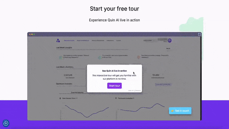
QuinAI’s interactive demo doesn’t offer any explanation or value to potential users
QuinAI is an AI-powered data analysis and behavior prediction platform.
Similar to Front, QuinAI offers an interactive demo that can be accessed without creating an account. In theory, this lowers the barrier for potential users and allows them to explore the product before committing to signup.
However, the execution of the demo undermines its purpose.
Before the actual product tour begins, users are forced through several steps that repeat the value propositions of the app. These tooltips delay interaction with the product and add friction to what should be a fast, exploratory experience.
This information would be more effective if integrated contextually into the tour steps or summarized at the end.
Once the tour does begin, the guidance provides little to no explanation.
Tooltips instruct users to click on various UI elements without explaining what those features do, why they matter, or how they fit into a broader workflow.
The tour also lacks a coherent narrative.
Instead of walking users through a realistic use case or end-to-end scenario, it jumps between pages and repeatedly returns users to the same screens. This creates confusion and prevents users from understanding how the product is meant to be used in practice.
What makes this a poor PX example?
❌ The interactive demo delays hands-on exploration with repetitive value statements instead of guiding users into meaningful product interaction.
❌ Tour steps focus on mechanical clicks rather than feature explanations or real-world use cases.
How could it be improved?
➡️ Structure the interactive demo around realistic use case(s) that demonstrate how key features work together from start to finish.
➡️ Use tooltips to actually explain what each feature and button does instead of just giving click instructions.
➡️ You can also add a progress indicator (step counters or a progress bar) to communicate the length of the tour transparently.
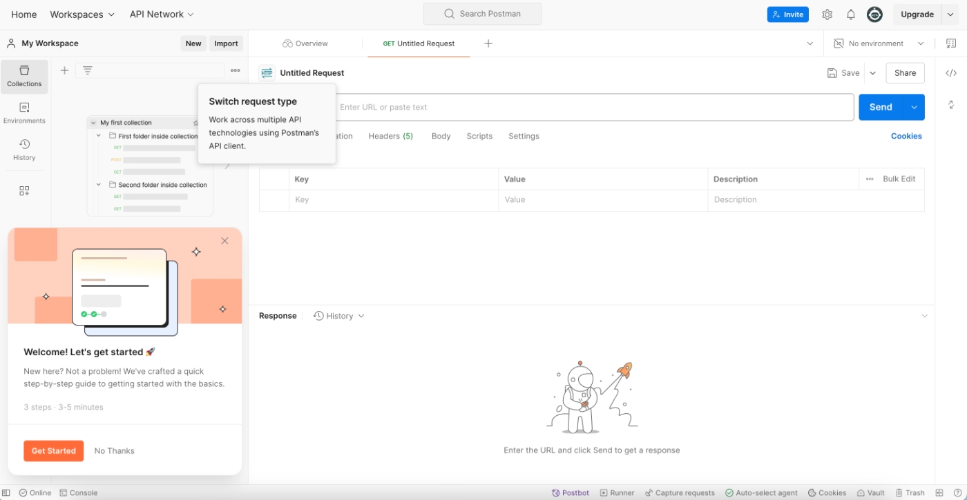
Postman’s onboarding guidance doesn’t provide users with an overview of the full process
Postman is an API development and testing platform.
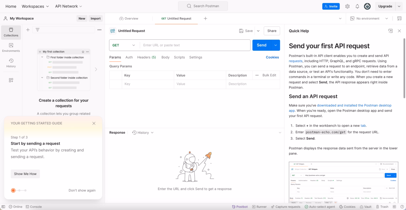
When users first sign up, Postman introduces onboarding and setup guidance through a slide-out modal. The modal frames the experience as a step-by-step guide designed to help users get started with the basics of the platform.
However, once users begin the guide, the structure becomes unclear.
The onboarding flow does not show all steps upfront, nor does it allow users to skip ahead or preview what’s coming next. Instead, each step is gated.
Users are required to read static instructions provided via the resource center and then complete the corresponding action on their own. Only after finishing the current step does the next one become visible.
This creates a lack of transparency in the onboarding process.
Until a step is completed, users have no visibility into how many steps remain, what the overall setup involves, or whether the process aligns with their immediate goals. Users are effectively forced to either complete each step sequentially or abandon the onboarding flow entirely.
What makes this a poor PX example?
❌ Users are not given an overview of the onboarding journey, making it difficult to assess effort, time commitment, or relevance.
❌ Gated steps reduce user control and flexibility, increasing the likelihood of abandonment when users get stuck or lose interest.
How could it be improved?
➡️ Provide a checklist or progress overview that shows all onboarding steps and allows users to understand the full setup process upfront.
➡️ Allow users to skip, revisit, or complete steps on their own terms so onboarding can adapt to different expectations and immediate needs.
How to apply these product experience patterns to your own product
The examples above show that great product experience is about understanding when users need guidance, what they’re trying to achieve, and how much help is appropriate at each stage of the journey.
Here’s a checklist to translate these patterns into action for your own product 👇🏻
Map your user journey
A strong product experience starts with understanding how users actually move through your product, not just how you expect them to.
This means looking at both the ideal journey you designed and the real paths users take once they’re inside the app.
👉🏻 Check out our article on how to map user journeys.
👉🏻 And on how to map onboarding flows.
Identify friction points in onboarding and early usage
More often than not, friction shows up as hesitation, abandonment, or underused features. Users might technically “complete” onboarding but still leave without understanding how the product fits into their workflow.
These moments are usually visible through behavioral signals such as low activation rates or repeated support questions.
When users ask things like “What should I do next?” or “Where can I find this feature?”, the product experience is already asking too much of them.
👉🏻 Check out our article on how to conduct onboarding flow teardowns and analysis.
Adopt progressive disclosure
One of the most common mistakes in onboarding is trying to explain everything too early. Products with strong PX avoid this by introducing features gradually, based on readiness rather than availability.
Progressive disclosure allows users to focus on what matters now.
Core actions come first, followed by more advanced workflows once users gain confidence.
You can ensure progressive disclosure through contextually placed and triggered tooltips/hotspots, and personalized onboarding checklists. With a product adoption tool like UserGuiding, you can create all these in-app engagement materials from one platform without writing any code.
👉🏻 Check out our article on how UserGuiding can help you increase product feature discovery and adoption.
Add contextual help where decisions are made
Strong product experience embeds help directly into the interface rather than relying solely on external documentation.
This might look like a tooltip explaining why a field matters, an empty state showing an example of what “good” looks like, or a short walkthrough that appears only after a user clicks into a feature for the first time.
Contextual help reduces guesswork and helps users experience value faster.
👉🏻 Check out our article on how UserGuiding can help you bring users to value realization moments faster.
👉🏻 And on how to simplify complex products with contextual in-app guidance.
Test, measure, iterate, repeat
In time, products evolve, and so do user expectations.
What worked well during early onboarding may become less effective over time, or even create friction as the product becomes more complex.
Observing how users interact with the product on an ongoing basis helps teams understand which parts of the experience are supporting adoption and which parts are being ignored or skipped.
Small changes in the interaction trends, such as users abandoning a formerly popular tutorial, repeatedly hovering over the same UI elements, or submitting support tickets for a specific feature, can be important indicators of a need for a PX update.
👉🏻 Check out our article on how to measure user experience.
Conclusion
We’ve looked at the good, the bad, and the ugly of product experiences across the SaaS industry. What becomes clear is that PX is shaped by many interconnected factors, from frictionless sign-up flows and quick access to the product, to in-app navigation, feature discovery, guidance, and ongoing education…
Adopting a product adoption solution (like UserGuiding) can allow you to experiment with several strategies to improve your product experience from one platform.
All the checklists, surveys, guides, tooltips, in-app resource centers, AI agents, and knowledge bases we’ve talked about in the article?
You can create all of them with UserGuiding!
UserGuiding is not, of course, the only way to create an engaging PX for your customers, but it surely is an easy and effective way to do it 👀
Frequently Asked Questions
What are the best product experience examples from modern SaaS tools?
Some of the strongest modern PX examples come from tools like Front, Perplexity, Linear, and Miro. These products reduce friction early, guide users contextually, and let people experience real value before asking for commitment. Whether it’s Front’s interactive demo, Perplexity’s no-signup usage, or Linear’s instructional empty states, they all focus on helping users understand how the product works in real scenarios rather than just explaining features in isolation.
What are the best product experience examples that improve activation and time-to-value?
Customer.io, Perplexity, and Miro are strong examples of products that shorten time-to-value. Perplexity lets users search immediately without signing up, while Miro drops new users directly into their first working board. Customer.io combines guided tutorials with practice-based challenges, helping users apply what they learn right away. In all three cases, users reach a meaningful “aha moment” quickly instead of getting stuck in setup or documentation.
How are the top companies designing product experience across the user journey?
Top companies treat PX as a continuous journey rather than a one-time onboarding flow. They think beyond signup and onboarding and design for discovery, learning, and long-term engagement. For example, Linear uses empty states to educate over time, Workable supports exploration with sample data, and GitHub reinforces habits through contribution dashboards. These teams design experiences that evolve with the user instead of front-loading everything at the beginning.
What are the real PX examples for onboarding new users effectively?
Effective onboarding examples include Customer.io, Lingo, and Linear. Customer.io mixes interactive tutorials with hands-on challenges, helping users learn by doing. Lingo personalizes onboarding based on user goals and reinforces learning with examples and templates. Linear keeps onboarding structured and calm through task-based checklists and educational empty states. All three focus on clarity, momentum, and confidence rather than overwhelming users with too much information upfront.
What are the best product experience examples that boost feature adoption?
Products like Miro, Workable, and Syllaby.io are great at driving feature adoption. Miro introduces new features directly inside the user’s first board, Workable uses sample data and contextual tooltips to encourage exploration, and Syllaby.io highlights key features through a short, focused product tour. These approaches meet users at the right moment, making it easier to discover and try features without feeling interrupted or lost.
What are the PX examples for reducing churn and improving retention?
GitHub, Loom, and Salesforce Trailhead show how PX can support long-term retention. GitHub motivates ongoing usage with visible achievements and contribution graphs, while Loom embeds virality and rewards into everyday workflows. Salesforce Trailhead keeps users engaged through personalized learning paths and gamified progress. These experiences build habits, reinforce value over time, and give users reasons to keep coming back beyond the initial use case.
What are the product experience patterns used by high-growth SaaS companies?
High-growth SaaS companies tend to follow similar PX patterns: progressive disclosure, contextual guidance, early value exposure, and continuous education. Instead of explaining everything at once, they introduce features gradually, using tooltips, empty states, and checklists. They also often rely on sample data or demos to lower risk and make learning feel safe.
How do AI-powered tools enhance product experience with examples?
AI-powered tools enhance product experience by guiding users toward value without requiring deep setup or prior knowledge. Syllaby.io is a strong example of this. The platform uses AI to help users generate content ideas and scripts, but it introduces these capabilities through a short, focused product tour. By pairing AI features with clear explanations and example use cases, Syllaby helps users understand how to use the app immediately in real workflows.
How do product experience examples from B2B vs B2C products differ?
B2B products often focus on structured onboarding, education, and long-term adoption, while B2C products prioritize speed and immediate value. For example, Customer.io and Salesforce Trailhead invest heavily in guided learning and skill-building, whereas Perplexity removes signup barriers to deliver instant value. That said, the best B2B products increasingly borrow from B2C patterns, such as reducing friction and improving clarity early in the experience.
What are the bad product experience examples, and what teams can learn from them?
WeTest, QuinAI, and Postman highlight common PX mistakes. WeTest overwhelms users with external resources instead of in-app guidance, QuinAI’s demo lacks explanations and narrative flow, and Postman hides the onboarding journey behind gated steps. The key lesson is that good intentions aren’t enough. Guidance needs to be contextual, transparent, and user-controlled. Otherwise, onboarding becomes a blocker instead of a bridge to value.

.png)