


.svg)
.svg)
.svg)
.svg)
.svg)


.svg)


.svg)
.svg)

Think your onboarding is clear? Try mapping it out.
According to Precursive’s 2021 onboarding report, poor onboarding is the 3rd most important reason for customers to churn, right after the wrong product fit and lack of customer engagement.
It’s not always a broken product that drives people away.
Sometimes, it’s just a confusing first experience…
This is why visually mapping your new customer onboarding process makes such a difference. It gives you a clear picture of every step a new user takes from signup to setup to seeing their first real value, along with everything your team does behind the scenes to support that journey.
By laying it all out, you spot friction points, gaps, and missed opportunities.
In this article, we cover:
- What a customer onboarding flowchart is (and why it matters)
- Real-world examples from SaaS and service companies
- How to build and optimize your own flowchart, step by step
- Tips to keep it clear, helpful, and scalable
Let’s get goin’!
TL;DR
- A customer onboarding flowchart is a visual representation of your onboarding process, mapping out each step a user takes from signup to activation, including decisions, touchpoints, and key actions along the way.
- The advantages of onboarding flowcharts include:
- Ensuring clarity and consistency (both internally and externally, with your customers).
- Faster identification of friction points in the customer journey, and thus, easier optimization and problem solution.
- Improved customer experience and more satisfied customers.
- If you want to create a flowchart for your own onboarding process (or wanna improve the one you’re using currently), you should pay attention to…
- Differentiating automated steps, manual steps, and actions taken by you or your users,
- Utilizing icons and colors for better readability and understanding,
- Capturing branching paths for different user behaviors, and
- Keeping the flow high-level enough to stay readable still but detailed enough to be useful.
- The final tip we can recommend when it comes to user flowcharts is to choose tools that cover multiple needs, keeping your tech stack small, manageable, and easy to maintain.
- If you’re interested in a step-by-step guide on creating an onboarding flowchart, let’s take you to the article 👇🏻

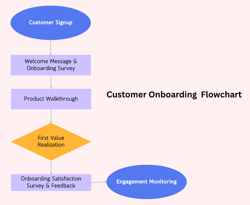
What is a customer onboarding process flow chart?
A customer onboarding process flow chart is a visual diagram that outlines the key steps a new customer takes after signing up for your product or service.
Think of it like a map.
It shows each stop along the customer’s journey from the moment they say "yes" to when they’re fully set up and confident using what you offer. Instead of having to explain the entire process in words or documents, the flow chart lays it out clearly so anyone (your team and stakeholders) can understand what comes next.
By following a well-planned flow, your onboarding feels intentional rather than scattered. Each stage builds naturally on the one before it. Even if your customers never see the diagram itself, they feel the benefits in how clearly everything unfolds.
Here’s an example customer onboarding flow chart:
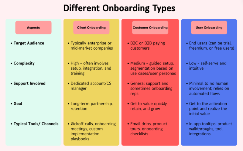
Customer onboarding vs. client onboarding: What’s the difference?
The terms “customer” and “client” can have slightly different meanings. Generally, a customer buys a product, while a client receives ongoing services or a more personalized relationship.
In SaaS, though, the two are often used interchangeably.
Most teams refer to onboarding as “customer onboarding” regardless of the exact relationship. That said, some SaaS companies do make a distinction: clients might be the high-paying accounts that get access to professional services, a dedicated customer success manager, or custom onboarding/ implementation help, while customers follow a more standard onboarding path.
Still, in most SaaS contexts, there’s no major difference, as both go through an onboarding process aimed at helping them succeed with your product.
P.S. There’s also a 3rd term, user onboarding 👀
Why use a flow chart for customer onboarding?
Can’t you go as the wind flows while creating your onboarding flows? Do you really need a visual map, a flow chart?
Well, you can, but you really shouldn’t.
Winging it might feel flexible at first. You react as customers come in, adjust on the fly, and figure things out as you go. But over time, this leads to inconsistencies, delays, and missed steps.
Here’s why having a flow chart for your onboarding flows is important 👇🏻
1- Clarity across teams
Customer onboarding usually involves more than one person; often, it spans across multiple teams like sales, customer success, support, and product. Without a clear visual guide, it’s easy for things to fall through the cracks.
Especially when tasks aren’t automated.
Communication becomes messy, and the purpose behind each step can get lost.
A flow chart gives everyone a shared reference. It clearly shows what needs to happen, when it needs to happen, and who’s responsible for doing it.
This is especially useful when bringing new team members on board. Instead of shadowing people and piecing things together from Slack messages and side comments, they have a structured path to follow.
Let’s say you, as the product team, expect customer success to send a personalized email to new users after their setup call. If you only mention it casually over lunch, chances are it won’t happen.
But when it’s part of the flow chart, it becomes an established part of a procedure.
2- Consistency in execution
When your onboarding steps are mapped out in a flow chart, it’s much easier to stay on track. If you're an onboarding rep, you don't have to guess what comes next or rely on memory. The path is already laid out.
Instead of juggling scattered notes or second-guessing whether you sent that trial reminder or skipped the product walkthrough, you have a clear, step-by-step guide in front of you.
The structure helps ensure nothing gets missed.
Flow charts also make adjustments easier.
Let’s say you need to create different onboarding experiences for startups, enterprise customers, or agencies. With a visual map, you can easily spot where things need to branch off. You’ll see what parts of the flow should stay consistent across the board and where to introduce personalization for different segments.
❌ Following a script word-for-word.
✅ Following the right version of the script for the right user.
3- Faster identification of bottlenecks
When something isn’t working as expected, the flow chart acts as a diagnostic tool. You can look at each step and ask: Where are users dropping off? What’s causing the friction?
This kind of reverse engineering is much easier when your flow is clearly laid out. For example, if users consistently stall after the setup checklist, you know where to focus your attention.
- Is the checklist too long?
- Too vague?
- Are users getting stuck on a technical task?
Without a flow chart, you’d have to dig through scattered data and rely on guesswork. With a flow chart, the problem areas stand out faster.

4- Easier process optimization
Not sure if you're a visual learner, a hands-on learner, or someone who just figures things out as they go, but there’s something undeniably helpful about seeing a process laid out in front of you.
Probably all the shapes, colors, and arrows.
When you have your onboarding flow mapped out, it becomes much easier to spot opportunities for improvement. You’re not working from a vague list or trying to remember how things “usually” go. You’re looking at the full journey, stage by stage.
- Want to shorten time to value? You can clearly see where you might remove a redundant step.
- Need to test two different onboarding emails for new users? You know exactly where to place them in the flow and track how they affect the experience.
5- Improved customer experience
When your onboarding flow is clearly mapped out, customers feel it, even if they never see the chart itself. They’re guided through each step without confusion or delays. Nothing gets skipped, and nothing shows up out of order.
This creates a more predictable, reassuring experience.
Customers know what to expect next, and they move through setup with more confidence.
✅ It also means:
- fewer tickets for your support team,
- smoother handoffs between teams,
- and stronger first impressions.
How to create a customer onboarding process flow chart
Onboarding flow charts are definitely valuable, we get it.
But how do you actually create one? What should it include, and what do you need to keep in mind while building a flow chart?
In other words, what does the flowchart for building a flowchart look like?
Well, here’s the answer.
Step #1 Define your customer journey stages
To create a smooth and effective onboarding flow, you first need to understand how it fits into the bigger picture of the entire customer journey. Knowing where onboarding begins and ends helps you position each part thoughtfully, and sometimes even stretch out certain steps to give customers the time they need to get comfortable.
In a typical customer journey, you’ll find 5 main stages: Awareness, Consideration, Purchase, Retention, and Advocacy. Some models include extra steps like product evaluation or user experience in between, depending on the business.
Mapping out the entire customer journey is a detailed process on its own, complete with its own best practices and challenges, which we won’t dive into here.
But to give you a clearer picture, here’s an example of a customer journey map from Qualtrics:
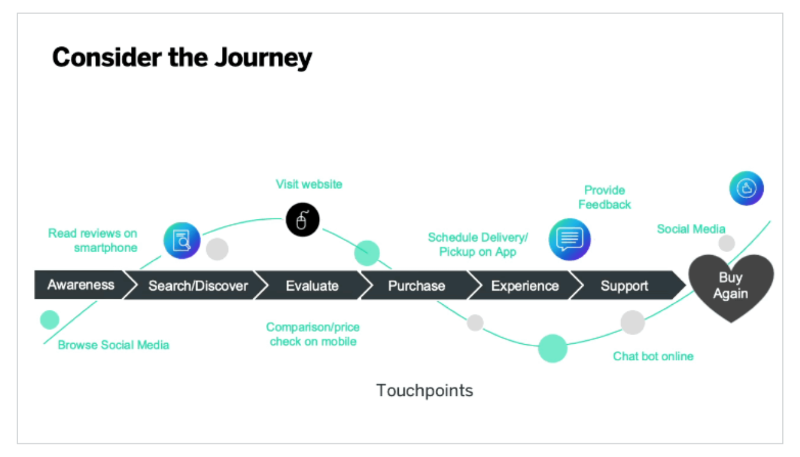
Starting from conversion and moving toward activation and success, you can shape your user journey using stages like Welcome, Setup, Training, and Value Realization.
These milestones help break the process into clear, manageable phases and create a solid framework that sets the foundation for the next steps in building your onboarding flow.
Step #2 List key touchpoints and actions
Once you have your user journey mapped out, you’ll then list key touchpoints like onboarding emails, sales calls, product walkthroughs, and setup tasks.
This part is not just about seeing what happens during the journey, but also about identifying what user actions are key to success and value realization. So, rather than simply listing tasks, prioritize goals you want to achieve at the end of each journey stage.
That means prioritizing certain user actions and interactions over others.
You can utilize the prioritization matrix (impact/effort matrix, in other words) for that.
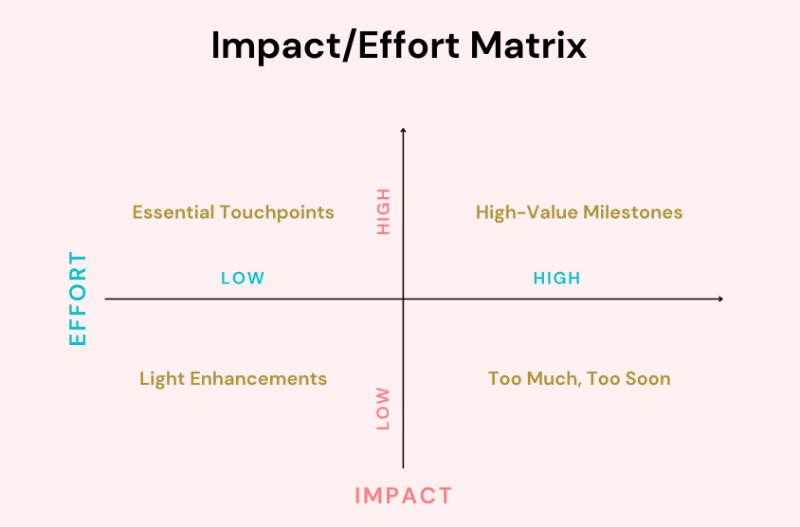
And don’t forget, you need quick wins that build momentum towards “aha!” moments for your users.
Step 2.1 Distinguish between automated and manual steps
Some key touchpoints require manual steps taken by your team members, like organizing an in-person demo call. However, you can still automate many of the actions you’ve listed as must-haves in the user journey, like those onboarding email sequences or in-app walkthroughs.
Automating the actions you can automate will save you (and also your clients) a lot of time, ensure consistency, and just make the world a better place 🕊️
Maybe not the last one, but anyway.
You can later highlight the manual tasks in your flow chart and clearly show who on your team is responsible for each one. This makes communication much easier and keeps everyone aligned on their roles.
At the same time, you can use this step to spot which actions could be automated. That way, you’ll have a handy checklist when it’s time to explore onboarding tools or workflow automation platforms.
Step #3 Create your in-app onboarding flow
This is where your users first get hands-on with your product. In-app onboarding is often the most visible part of the journey, so it needs to feel helpful, timely, and personalized.
Step 3.1 Start with your signup flow and welcome messaging
Everything starts with the signup.
It may seem like a tiny door into your product, but it sets the tone for what’s coming. A smooth, focused signup flow without unnecessary steps or distractions reduces friction and lets users get to value faster.
Once people are in, you can welcome them with a popup modals, a message form the CEO, or a welcome video.
➡️ Here’s what Basecamp’s signup flow looks like:
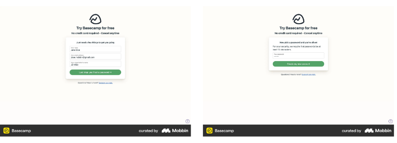
There are two signup screens. On the first one, you provide your name, email, and where you work. On the second, you set your password. No credit card information is required, no questions about how many people are in your company, no address fields, nothing complicated.
The CTA button on the first screen clearly communicates the next (and last) step.
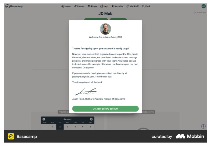
After you set your password, you get immediate access to the platform. Once your account is set up, Basecamp welcomes you with a message from their CEO, Jason Fried.
Here’s what this flow looks like as a flowchart:

💡 Pro Tip: Verification emails are a big no no these days. People want quick access to the product.
According to a recent case study by a fintech company, email verification causes the biggest drop-off in the entire registration and onboarding process, with a 30% decrease in user completion.
Step 3.2 Conduct a quick onboarding survey to personalize the rest of the flow
If you want to build personalized onboarding flows, you need to understand 2 things: your overall customer base and the specific user in front of you. That means knowing which segment they belong to and what they actually need from your product.
You can personalize based on things like their goals and expectations, how comfortable they are with tools like yours, or company details such as team size, department, or role.
Maybe they're a marketer on a small team, or a developer from a large enterprise, the experience should reflect that.
An onboarding survey helps you gather this context right from the start.
It gives you a broader view of who’s signing up and lets you guide different types of users into the most relevant onboarding flows for them.
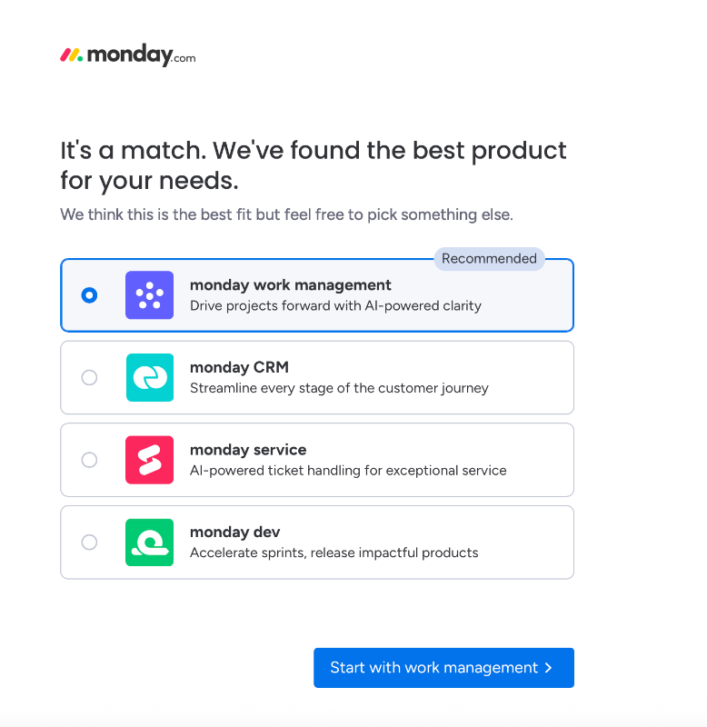
➡️ Monday.com, for example, has a 4-5 step onboarding survey that they use both to personalize the user experience and to recommend the best fit from their product suite.
The number and type of questions depend on your answers, so even the survey itself isn’t static. The first question asks about your use case in broad terms, whether you’re using Monday.com for business, school, personal projects, or a non-profit organization.
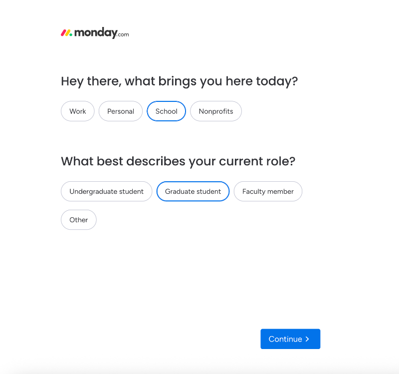
Depending on your answer, a follow-up question appears.
For example, if you select “school,” you're asked about your role, whether you're an undergrad, grad student, or faculty member. If you choose “business,” you'll get questions about your company size and team structure. If you go with “personal,” no additional questions are asked.
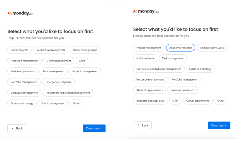
In the next step, the use cases become more specific and tailored to your previous responses.
So if you picked “education,” you might see options like academic research, curriculum management, or group assignments. For non-profits, use cases like donor management, grant tracking, and emergency response appear.
Some use cases, like goal setting and strategy planning, are shown across all categories, regardless of your initial answer.
The final question in the survey asks how you heard about Monday.com.
Once you complete the survey, you're presented with a recommended product from the Monday.com suite based on your answers and use case. That said, the recommendation is just that. A suggestion. You still have the freedom to choose which product you want to continue with.
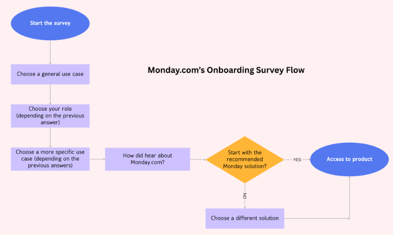
Here’s what this flow looks like as a flowchart:
Step 3.3 Provide a personalized product walkthrough going over relevant features
Now that you’ve learned a little about your user, show them the product in a way that actually speaks to their needs. This isn’t the time for a grand tour of every button and feature. Instead, you need to walk them through just the tools or workflows that help them achieve what they came for.
This part should feel more like a helpful nudge than a classroom lecture.
You can use tooltips, modals, or customer onboarding checklists –whatever suits your product. What matters most is relevance. If they get to value quickly, they’re much more likely to come back.
➡️ UserGuiding, for example, conducts the welcome survey directly within the platform (so there’s no delay or waiting for access) and then triggers a product walkthrough that highlights the most relevant features based on the user’s chosen use case.

The welcome survey consists of 2 modals. The first asks about your general interest in the platform, while the second follows up with more context and detail. The initial question offers two answer options, each triggering a different follow-up.
Depending on your response to the second question, which focuses on what you’re specifically interested in or what you want to use UserGuiding for, a different walkthrough is triggered.
Let’s say you choose “collecting customer feedback” as your goal. In that case, you’ll be guided through a walkthrough of the platform’s in-app survey feature.
Here’s what that looks like:

This specific walkthrough includes five steps in total.
It starts with an introductory modal, followed by interactive tooltips that guide you to the relevant feature page. These tooltips show you exactly what to click, wait for you to choose a template to begin with, and then lead into the final step, which highlights additional capabilities like brand customization.
The number of steps, as well as the content of the welcome and end messages, varies from one walkthrough to another.
For example, in the knowledge base walkthrough, a slideout modal with a video appears. In others, like the segmentation tour, the welcome message might include listed value propositions and use cases.
Here’s what this walkthrough looks like as a flowchart:

Step 3.4 Deliver contextual guidance with additional UI modals
Most users won’t remember everything from your initial product tour or even a walkthrough.
And that’s okay.
That’s why it’s helpful to offer guidance exactly when they need it, right where they are.
Contextual help like UI modals, side panels, or hotspots gives you a way to assist without overwhelming.
Say a user clicks into a feature for the first time, that’s a great time to offer a little explanation or prompt. This kind of timely guidance builds confidence, reduces confusion, and keeps users moving forward.
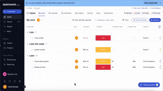
➡️ Teamwork, for example, doesn’t automatically trigger a product tour or feature walkthrough when you first sign up. Instead, it offers an onboarding checklist with key actions to help you start getting value from the platform. There are also opt-in walkthroughs you can launch yourself from specific feature pages, like this one:
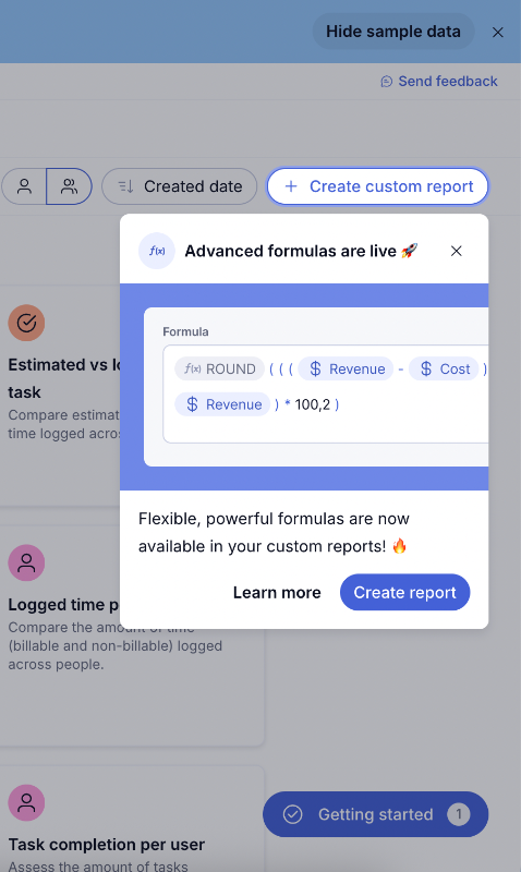
But that doesn’t mean the entire onboarding experience is left up to the user. Teamwork still triggers helpful tooltips for new feature announcements and shares pro tips to help you get more out of advanced functionalities.
Like this one:
In-app onboarding isn’t just about tours and tutorials. You can also use individual tooltips and hotspots to highlight specific features or offer quick tips. A single tooltip like this one won’t overwhelm or interrupt the user experience, unlike an 8-step product tour.
If the user’s interested, they can click the CTA to explore the feature. If not, they can simply close it and carry on without disruption.
And here’s how their checklist looks:
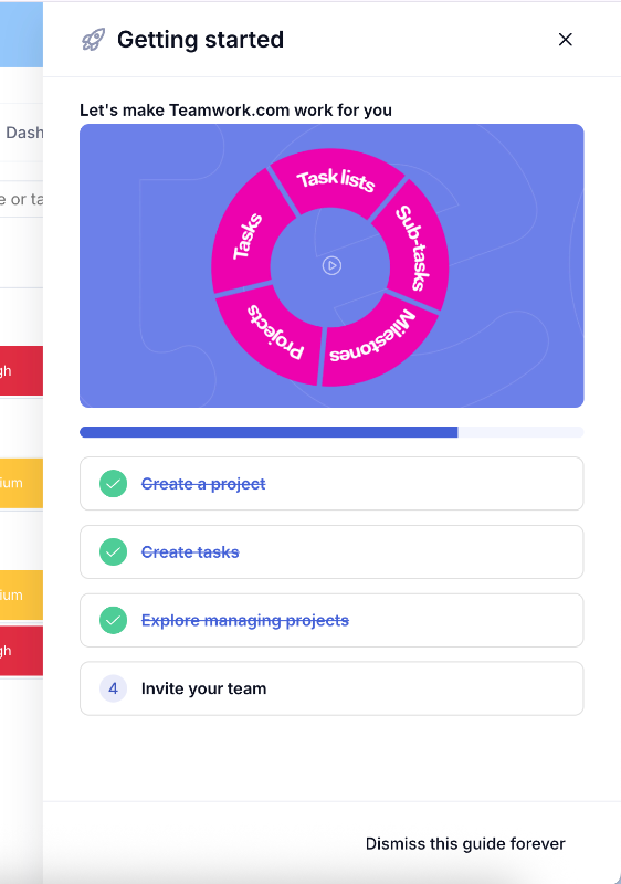
The checklist isn’t automatically triggered either, but it shows up as a shiny little widget at the bottom right corner of the screen, pretty hard to miss. When you click on any item in the checklist, a walkthrough built with slideout modals launches to guide you through that specific task.
Here’s how triggering a walkthrough from the checklist would look in a flowchart:

Step 3.5 Gamify the experience by incorporating milestones, challenges, and scoreboards
Onboarding can feel a bit like a maze at times. A little motivation goes a long way in helping users stay engaged. Gamification is one way to do that, and no, it doesn’t have to mean confetti and fireworks.
But you can go for it, too if that’s your thing.
Asana flies unicorns and phoenixes across your screen to celebrate task completion.
But if you want to keep things a little less extravagant, you can simply break onboarding into milestones or steps and show progress as users complete them. Maybe throw in a badge or an encouraging message when they finish something big.
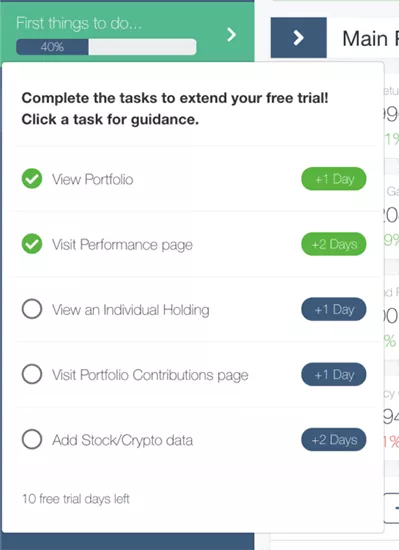
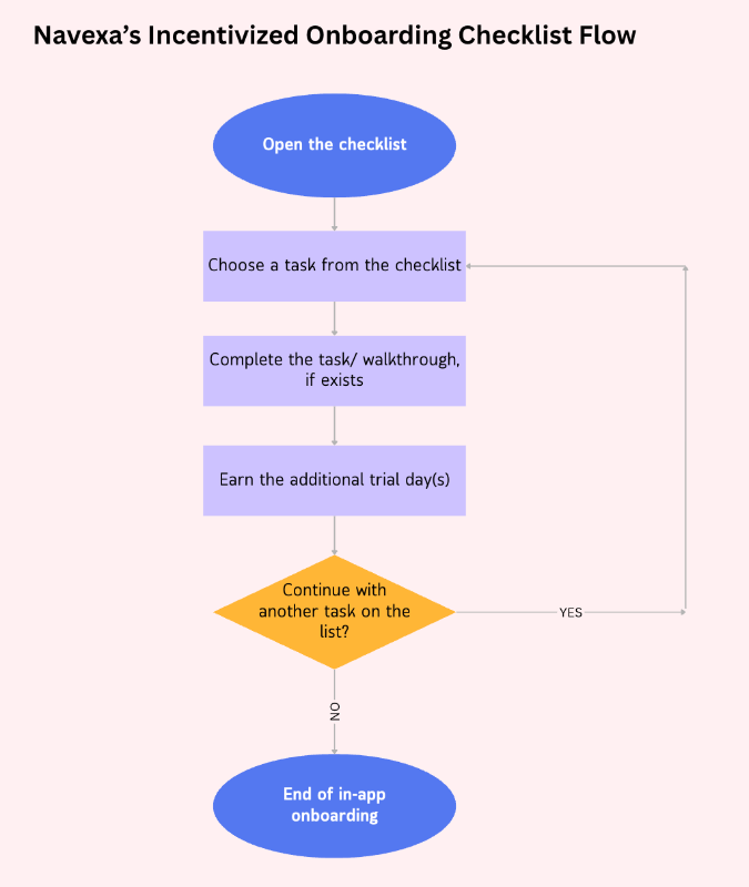
➡️ Another great example of onboarding gamification is offering incentives, just like Navexa does. To encourage trial users to explore the platform and reach key milestones, Navexa rewards them with extra trial days for each completed task on the onboarding checklist.
Viewed your portfolio page? Congrats, you just earned 1 extra day on your trial.
Checked out the performance page and took the walkthrough? Boom, that’s 2 more days added (on top of anything else you’ve earned)!
Here’s what an incentivized onboarding flow like this looks like in a flowchart:
Step #4 Map your off-product onboarding flow
At this stage, you begin to gather all the pieces of your onboarding puzzle and lay them out in a clear, visual map. This map includes every interaction your customer has, not just what happens inside your product, but also emails, phone calls, meetings, support chats, and any other human touchpoints.
The goal is to connect these dots across the entire customer journey.
By visualizing both in-app and off-product activities side by side, you get to…
- ✅ Spot overlaps, gaps, or bottlenecks that might confuse your users or slow down their progress.
- ✅ See the bigger picture to understand how each step relates to the others.
- ✅ Ensuring the entire process feels smooth and logical from start to finish.
Plus, this map becomes a valuable tool for aligning different teams like sales, success, support, product, and marketing around a shared understanding of the customer’s path.
Step 4.1 Think about sales, success, support, and marketing involvement points
Not every step in the customer onboarding journey happens inside your product. Especially in B2B or more complex SaaS tools, a lot happens through emails, calls, documents, and human touchpoints.
So, you might have several different teams interacting with a customer during onboarding, and they don’t always talk to each other.
That’s why this step matters.
Map out who gets involved and when. For example:
- Does customer success lead a kickoff call?
- Does sales hand over the account after the deal is closed?
- Does marketing send an onboarding sequence?
- Is support handling technical setup and implementation during the client onboarding?
Step 4.2 Review with your internal teams and stakeholders
Once you have the off-product steps mapped, don’t keep them to yourself.
Bring in your teams.
Ask your teams questions like: Are there any steps that cause confusion or delays? Are the handoffs between teams smooth and clear? Is everyone confident about their responsibilities at each stage?
Sometimes what looks great on paper doesn’t quite match the day-to-day reality, and this is the time to catch those gaps.
Remember, flowcharts are more than just pretty visuals.
They’re a tool to build shared understanding, align efforts across departments, and ultimately create a smoother onboarding experience for your customers. Getting input from sales, customer success, support, and marketing helps make sure you’re all moving in sync.
Step #5 Choose a tool to build the chart
You’ve gathered all your steps, touchpoints, actions, and decisions. Now it’s time to bring it all together visually.
Don’t worry, you’re not going to be sketching this all out by hand today.
Using a good tool will make the process smoother, help keep things organized, and make it easy to share your onboarding map with the team.
When it comes to choosing the right tool, there are plenty of options out there.
Some, like Lucidchart, Miro, and Whimsical, specialize in flowcharts and diagrams. Others, like Figma and Canva, are more design-focused but still work great for mapping flows. Then there are collaboration and task management platforms that include flowchart features, so you can assign tasks and track progress alongside your map.
The best choice depends on what you already use and what you need.
If you just want to create clear, simple maps, a dedicated flowchart tool will do the trick. But if you want to integrate the onboarding flows into your team’s daily work and task management, then a more collaborative platform might be the way to go.
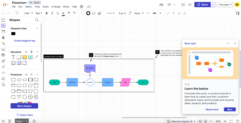
Here’s what Lucidchart, a diagramming tool, looks like:
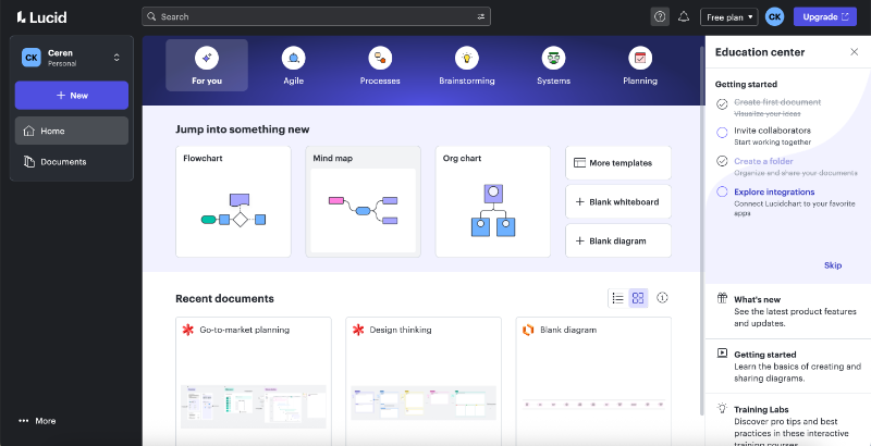
Inside the flowchart builder, you’ll find flowchart symbols, containers, arrows, and text editing tools. It really looks like a standard whiteboard tool.
If you’re not familiar with similar design tools, the platform usually offers a walkthrough inside the builder that covers basics like customizing shapes or sharing your flowchart.
Lucidchart even lets you use generative AI to create a flowchart automatically.
Step 5.1 Identify decision points and create alternative scenarios
Onboarding isn’t a straight line. Even though you offer a structured product tour and an onboarding checklist to guide the users through the key actions, you can never force someone to follow your path 100%.
Some users skip steps, some take their time, and others follow their own order through the walkthroughs.
Your flowchart should capture these alternative paths so your process can stay flexible.
For example, if a user hasn’t completed onboarding within five days, that might trigger a reminder email or a check-in call from your success team.
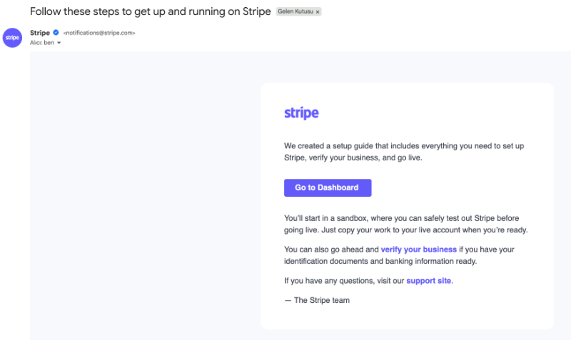
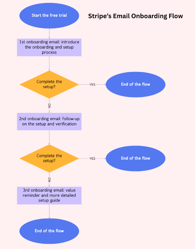
➡️ Take Stripe as an example.
"In their onboarding email sequence, Stripe first lets you know that they’ve set up a sandbox environment, a mirrored version of the main product filled with sample data, so you can explore and test features safely.
The email also outlines the overall onboarding and setup process, covering both the training steps and the required verification tasks to get fully up and running.
If you don’t complete the onboarding and setup steps on the first day of your trial, Stripe follows up the next day with a reminder email. The copy and CTA buttons are slightly different, but they all lead you back to the same place in the product and encourage you to complete the guides and verify your account.
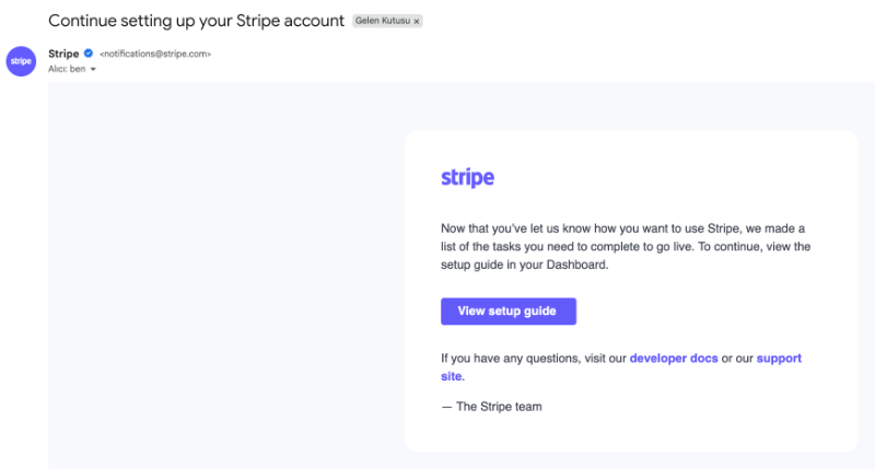
If you still haven’t completed your setup after that, they don’t keep bugging you with the same reminder over and over. Instead, they give you some space, about 2 more days, and then send a value-focused email.
This one doesn’t ask you to take any big action; it simply restates the value you likely saw when you first started your trial.
The message is framed as a setup guide.
So while you’re reading about what you can achieve with Stripe, you’re also seeing how to finish setting up your account and which features or capabilities to explore next.

Here’s what the flowchart for this email onboarding sequence looks like:
Step 5.2 Define the level of detail for each node in the flowchart
Your onboarding flowchart isn’t a pixel-perfect master plan. It’s more of a bird’s eye view, clear and simple. It’s there to highlight the big, important moves: key actions, decisions, and who’s responsible for what.
You want to include meaningful stops like “Send welcome email,” “Schedule kickoff call,” or “Trigger product walkthrough.” But don’t get bogged down with every little detail.
Step #6 Continuously improve it
Your onboarding process isn’t static. Products change, customers change, expectations change. That’s why a good onboarding flowchart isn’t something you make once and forget.
It’s a living tool, one that helps you learn and adapt.
Step 6.1 Ask for customer feedback
Your users are the ones actually going through your onboarding flow, so they know better than anyone what’s smooth, what’s clunky, and what feels confusing.
That is why it’s always a good idea to keep the conversation going with surveys.
Don’t worry, you don’t need to send a 20-question survey. A quick form after they’ve finished onboarding can give you valuable clues. You might find out that the “helpful” tooltip is getting ignored, or that people expect something completely different from your onboarding flow.
This kind of feedback helps you catch small problems before they snowball into bigger problems like support tickets, or even churn.
➡️ Here’s how Teamwork collects user feedback about their onboarding:

Teamwork provides sample data during the onboarding process so users can explore the platform and try out features without having to bring in their own data right away. It lowers the barrier to entry and helps users get a feel for how things work before fully committing.
Once users have spent some time in the platform and completed a few onboarding tasks or walkthroughs, Teamwork asks for feedback, specifically whether the sample data helped them better understand the platform’s capabilities.
Here’s how to add a feedback step in your onboarding flowchart:

Step 6.2 Run A/B tests
There’s no perfect onboarding flow right out of the gate, and that’s okay.
The best way to improve it is to experiment, little by little.
You can try things like:
- Switching up the subject line of your welcome email
- Moving the in-app tour to start later (or earlier)
- Adding a milestone to celebrate an “aha!” moment sooner
Then, track what happens.
Did more people activate? Did fewer people drop off at step 3? That’s the kind of data that helps you grow with confidence.
You’re not trying to overhaul everything overnight. Just take small, smart steps that move you closer to an onboarding experience that feels clear, helpful, and, ideally, a little delightful too.
Real-world examples of customer onboarding flow charts
Let’s explore more examples from their sign-up process to the end of their onboarding and map out the experience for educational and inspirational purposes.
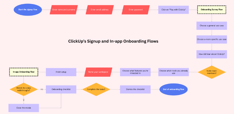
ClickUp’s Customer Onboarding Flow
ClickUp’s signup flow includes a 7-step setup survey, which sounds a little bit extensive, but manageable. The on each survey modal, there’s only 1 question, so you do not see them all at once. There’s also a progress bar on the modals.
Here’s how it looks:
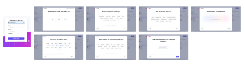
The survey asks questions about your use case, your existing toolkit, and which ClickUp features or capabilities you're interested in. There’s also a modal asking where you heard about ClickUp, and another prompting you to invite team members, the latter can be skipped.
On the first signup screen, there’s no address information, credit card information, or company name/size information. You only put your email address, name, and password.
There’s also no email verification process before onboarding.
You get immediate access to the product.
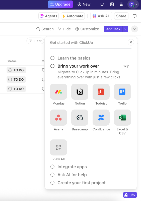
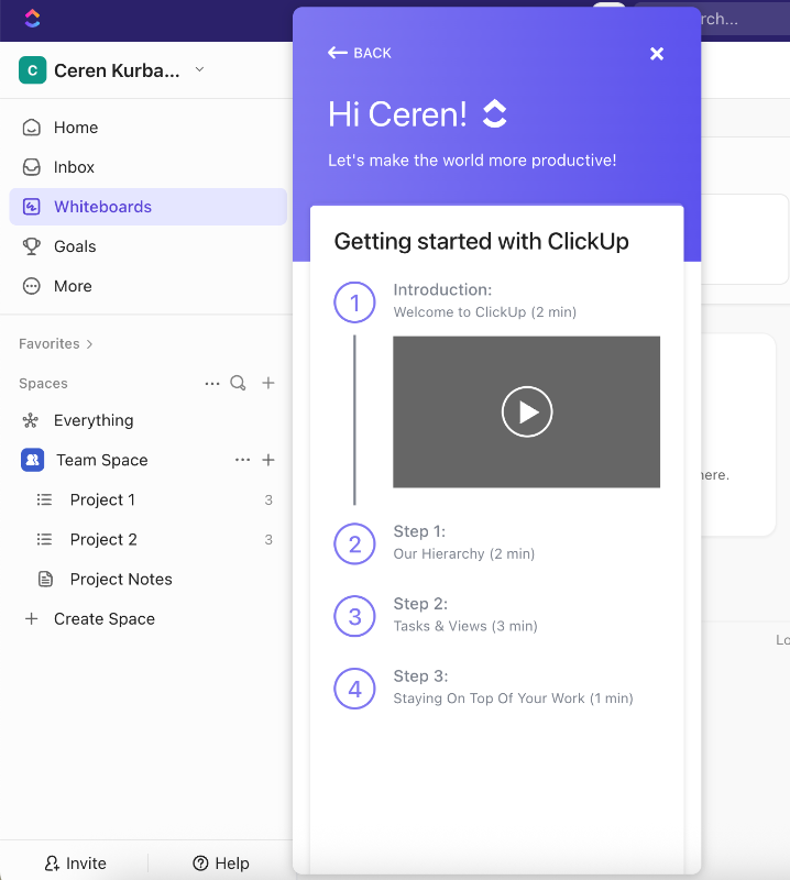
After the survey, ClickUp welcomes you with video onboarding walkthroughs.
There are 4 modals dedicated to 4 main offerings of the platform and they explain what these features are, what you can use them for, how you can use them, and where you can find them on the UI.
While there are human agents walking you through the setup process, there are also visuals from the platform and you see where to click and what you need to do, as well.
Here’s one of the walkthroughs:

You can watch them in any order, skip a few, or even skip them entirely.
When you close the video modals, an onboarding checklist is automatically triggered in the bottom-right corner of the UI. You’re now inside the platform and free to explore on your own.
To help guide you, the checklist highlights key tasks to complete for a successful setup, such as migrating your existing tasks from other platforms or creating a new list.
Most of the checklist items simply navigate you to the relevant feature pages and don’t trigger any in-app flows or tutorials. The only exception is the “Learn the Basics” step, which reopens the same video onboarding modals you saw when first entering the platform.
If you complete the onboarding checklist and dismiss it from the UI but still want to revisit the basics videos, you can access them anytime through the in-app resource center.
Just head to the onboarding section there, and you’ll find the same introductory videos available to watch again. The onboarding checklist is not available through the resource center, however, as it doesn’t include any additional tutorials or explanations other than the videos, you’ll not need it when you complete the steps once, anyway.
Now, let’s turn all these user interactions and automated onboarding steps into a flowchart to visualize the full journey and see how everything connects 👇🏻
What’s good about this user flow?
✅ Welcome survey allows users to skip some steps/questions.
✅ Personalized the onboarding checklist based on the welcome survey answers.
✅ In-app onboarding incorporates videos.
✅ Walkthroughs are optional, users can choose which one to watch or watch at all.
✅ Walkthrough videos stay accessible from the resource center.
✅ Flexible, customized, and short flows.
Calendly’s Customer Onboarding Flow
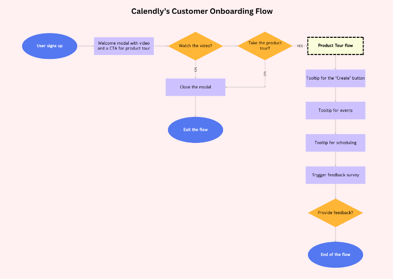
Calendly’s signup flow consists of a single signup page. There’s no onboarding survey or any verification process between the sign up and your access to the platform.
On the signup page, Calendly promotes both their paid plan and its free trial.
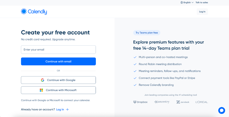
No onboarding survey means no segmentation, and therefore, one single path for all users. So, when you enter the platform, you’re shown a welcome modal with a video introducing the user interface.
There’s also a CTA that triggers an interactive product tour.
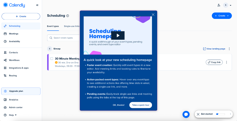
The modal highlights the improved UI and new capabilities with bullet points. However, the modal’s copy is written as an onboarding for existing users, as it introduces the updates. The tone might feel confusing for a totally new user.
So, this is an onboarding flow initially intended for existing customers, but also used for new users, as well.
No segmentation here, too.
The product tour consists of 3 tooltips going over important features and buttons on the UI that have been improved and updated. The tooltips provide information about how to use them, what capabilities they offer now, as well as some pro tips and important information, such as expiration dates for the single-use links.

Right after the product tour, Calendly triggers a feedback survey asking for the user’s opinion on the tour they just completed. It’s a single open-ended question, and you can close it without answering if you prefer not to respond.
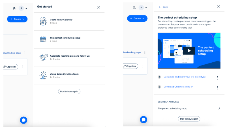
There’s also an onboarding checklist, but it doesn’t open automatically, you need to click the widget to access it. The checklist includes four main items, but each one is actually a group of related tasks, bringing the total to seven.
This grouping helps keep the checklist from feeling overwhelming.
Each task includes helpful explanations and videos, which is especially important since there aren’t any interactive tutorials guiding users through the steps.
Here’s what this flow looks like in a flowchart:
What’s good about this user flow?
✅ Immediate access to the product with quick signup.
✅ Welcome modal with an introduction video.
✅ Optional product tour with pro use tips.
✅ Feedback survey after the tour.
✅ Well-structured checklist with substeps, explanations, and videos.
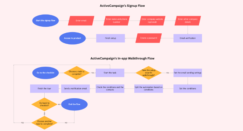
ActiveCampaign’s Client Onboarding Flow
ActiveCampaign has a 6-step signup flow, which includes an email verification step (the first instance of this in our article). Aside from verification, the flow covers the usual steps like personal details, company information, and account password setup.
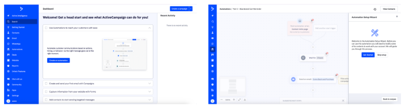
After signing up, you land directly on the platform. Since email verification is built into the signup process, and you can’t proceed to set your password without it, it almost feels like you get immediate access.
But we know that’s not quite the case… Anyway.
ActiveCampaign is a relatively complex platform, so a simple, generic product tour wouldn’t be very helpful for first-time users, and that’s exactly why they don’t offer one.
Instead, they provide detailed, self-initiated walkthroughs accessible through an onboarding checklist. The checklist is a bit long and crowded, but given the platform’s depth, it makes sense.
From the checklist, you have two options:
- You can head to the feature and explore it on your own, and use the checklist more as a guide to help you navigate the platform.
- Or, you can choose to follow a step-by-step interactive walkthrough from the setup wizard, which guides you through setting up that specific feature.
Here’s what the walkthrough for the "Create an Automation" task looks like:

As you can see, ActiveCampaign’s in-app onboarding flow is not directly linked to the signup flow. So, if we are to create a flowchart for their client onboarding process in general, here’s what it would look like:
What’s good about this user flow?
✅ No generic product tour each walkthrough is interactive and action-based, and only progresses once the user completes the step.
✅ By the end of each tutorial, the user has built something real and usable.
✅ The checklist is goal-oriented and each task launches an interactive tutorial.
✅ The checklist sits on a dedicated “Getting Started” page, so users can complete it at their own pace without a hovering widget.
✅ Tooltips are placed contextually around the UI, and empty states offer helpful inline guidance as users explore.
Healthie’s Client Onboarding Flow
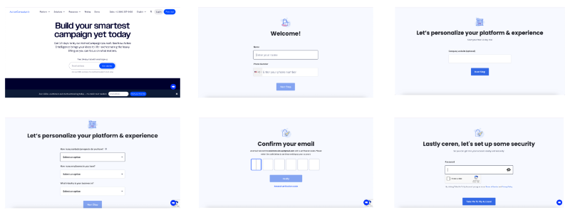
Healthie’s signup process is spread across 3 pages. On the first page, you’ll find general questions like your name, email, and phone number. The second page covers payment and address information, and the last page includes questions about your business, such as your medical specialty.
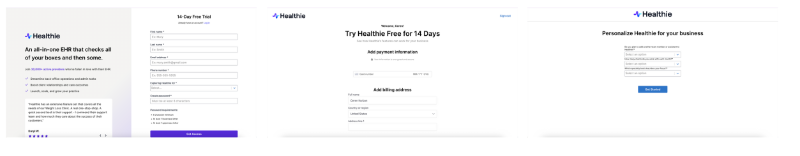
After the signup flow, there’s no onboarding checklist or product tour.
So, at first, you might assume there’s no onboarding at all. However, once you start exploring the product and checking out different features, walkthroughs begin to appear here and there, like this one:
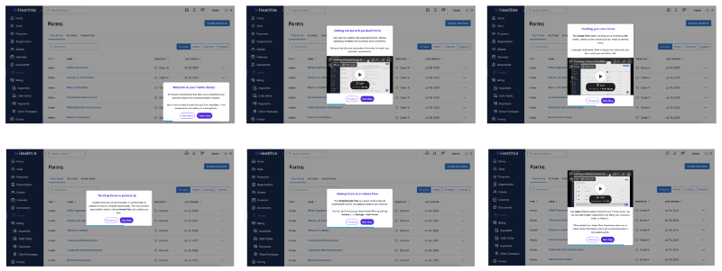
The walkthroughs are triggered when the user interacts with a relevant feature or visits a specific feature page, which helps ensure the guidance appears when interest is at its peak. Though effective, this approach can be a bit risky, as some users may miss the help if they don’t explore enough.
The walkthroughs themselves are made up of modals and slideouts, rather than interactive tooltips that guide you through each action step by step. Still, they provide clear instructions on how to use the feature, along with helpful videos.
Some modals even include example use cases and best practices.
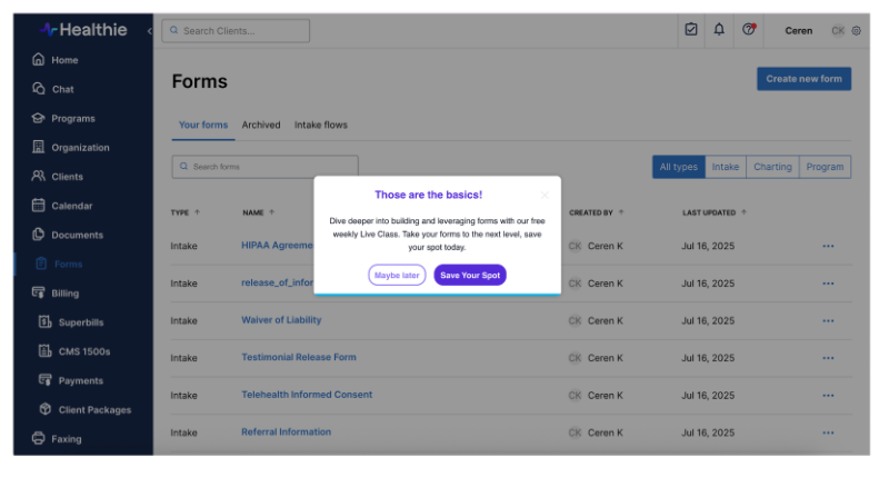
After the walkthrough (or, as the last step of the walkthrough, we might say), a modal encouraging the user to attend the next live class pops up on the screen.
Here’s what Healthie’s client onboarding flow looks like as a flowchart:

What’s good about this user flow?
✅ Progress bar in the walkthrough
✅ Contextual walkthrough triggering (when the user is on the relevant feature page)
✅ Incorporation of visual elements, like Loom videos in the walkthrough
✅ Instructions on how to use the feature plus pro tips and example use cases
✅ Encouragement and CTA to join a live product demo after the walkthrough
Tips for optimizing your customer onboarding flow chart
A messy, overwhelming chart won’t help anyone (and will probably get ignored). A well-structured one, on the other hand, becomes a living, breathing part of your onboarding system.
Here are a few simple but powerful ways to make your flowchart more effective:
Tip #1 Keep it high-level (don’t micro-manage every task)
Your flowchart isn’t meant to include every button click or email subject line. Think of it as a navigation map, not a turn-by-turn GPS. You want it to give clarity, not complexity.
Stick to big, meaningful steps like:
- “Trigger welcome walkthrough”
- “Send trial extension email”
Avoid trying to track every tooltip or modal in this same chart.
If needed, create sub-charts for things like the sign-up flow, or the in-app experience. That way, each part stays focused and easier to follow.
Tip #2 Use icons and color-coding to aid quick understanding
Visual cues make your flowchart easier to scan, and way easier to understand at a glance. By combining icons with color-coding, you help your team (and yourself) quickly spot what’s happening at any step of the flow.
Here’s how you can do it:
- 💬 Conversation icons for communication touchpoints (like emails, calls, messages)
- ⚙️ Gear icon for automation steps
- 🧑💼 People icons for team-specific actions (sales, success, product)
- 🎯 Milestones in bold or with a unique highlight color
And when it comes to color-coding, a great trick is to differentiate actions by who owns them:
- One color for internal actions (your team sends a message, triggers a guide, reviews something)
- Another one for user actions (user signs up, completes a walkthrough, books a demo)
Tip #3 Include exit ramps or support escalation paths
Not every user will follow the happy path. Some will stall. Others will need help. Build those forks and fallback plans into your flow:
- What happens if a user doesn’t finish onboarding after 3 days?
- What if they hit an error or ask for help?
- Do you escalate to a live call? Trigger an automated support message?
Adding these “exit ramps”or escalation points ensures your flow is realistic, and helps you respond to real user behavior, not just the ideal journey.
Tip #4 Add automation markers
Your flowchart should show where automation tools are doing the work, so your team knows what’s happening behind the scenes. For example:
- Email sequence sent via HubSpot? Label it.
- In-app checklist or tooltip triggered by behavior? Mark it.
While we’re on the topic of automation…
You don’t have to manually handle every step in your onboarding process, nor should you. That’s where automation tools come in. Whether it’s to guide users inside your product or to gather feedback, tools like UserGuiding, Userflow, or Appcues let you build and manage onboarding flows without writing any code.
With these tools, you can:
- Trigger in-app walkthroughs and tooltips based on user behavior
- Send personalized welcome emails or reminders automatically
- Announce new features contextually, right when they matter
- Collect feedback with micro surveys
- Tailor onboarding based on user segments
It’s also worth noting that UserGuiding in particular can cover your entire in-app onboarding, from the first welcome message to walkthroughs, checklists, and even surveys, all from a single platform.
👉🏻 Check it out, if you’re interested in. 👈🏻
Final thoughts…
A clear onboarding flowchart helps you spot friction, align your teams, and create smoother, more thoughtful experiences for your users from day one.
But don’t worry about building the perfect flow from the start.
Begin with what you know.
Map out the big moments, note the key decisions, and mark where automation or human touchpoints come in. Then, refine it over time as you learn more from user behavior and feedback.
If you haven’t already, now’s a great time to audit your existing onboarding process. Walk through it as a new user would. Are there any dead ends? Missing handoffs? Is it clear who owns what?
Visualizing it will give you the answers, and the confidence to improve.
So pull up a blank canvas, grab your team, and start mapping! 🗺️
Frequently Asked Questions
What are the essential steps in a client onboarding process flowchart for SaaS companies?
A solid SaaS onboarding flowchart usually covers the full journey, from sign-up to activation. You’ll typically start with account creation, continue with welcome emails or in-app surveys, guide users through setup with walkthroughs or checklists, and offer support touchpoints along the way. It should also include off-product steps like kickoff calls, training, or feedback collection. Every key action or decision point should be clearly visualized.
How do you create a visual onboarding flow chart that improves customer retention rates?
Start by mapping both in-app and off-product steps, like emails, calls, and human touchpoints. Keep it high-level, focusing on actions that move users closer to value. Make room for branching paths, like what happens if a user skips a step or gets stuck. Include support escalation or feedback moments too. A well-designed flowchart helps you spot friction early and adapt your onboarding based on real user behavior, and that’s how retention improves.
What are the best tools to design a customer onboarding process flowchart with decision points?
Tools like Lucidchart, Miro, Canva, Whimsical, and Figma are great for creating clear, flexible onboarding flowcharts. If you want to combine mapping with task assignment, tools like Creately, Whimsical can help with that too. The best tool depends on your needs, whether it’s just flow visualization or also collaboration, project tracking, and even automation tagging. Some tools even offer AI to speed things up when building the chart.
What are the differences between the employee and customer onboarding process flowcharts?
While both types of onboarding aim to build familiarity and confidence, customer onboarding focuses on product adoption, while employee onboarding covers internal tools, policies, and team culture. A customer onboarding chart includes flows like product tours, use case selection, and activation milestones. Employee onboarding usually includes HR checklists, internal system access, and training. The audience is different, so are the tools, tone, and goals across each chart.
How do you automate key steps in your onboarding flow chart using UserGuiding or HubSpot?
With tools like UserGuiding or HubSpot, you can automate actions like sending welcome emails, triggering product tours, showing tooltips at the right moments, or launching surveys. In your flowchart, mark these automated steps with clear indicators so your team knows what’s handled by the tools. UserGuiding in particular can run the entire in-app onboarding from one dashboard; walkthroughs, checklists, segmentation, and feedback prompts all in one place, no code needed.
Which metrics should be tracked within a customer onboarding flowchart for activation and time-to-value?
You’ll want to track how long it takes a user to reach “aha” moments like completing setup, launching their first project, or using a key feature. These moments help you understand time-to-value. Drop-off rates at each step in the flow, NPS or feedback scores, and task completion (like finishing checklists or walkthroughs) are also critical. These metrics help you see where users struggle and what drives successful customer onboarding processes.
How do client onboarding process flowcharts for financial services and tech startups compare?
Financial services often have more off-product onboarding steps like identity verification, compliance documents, and human reviews, which makes those flowcharts more dependent on forms, email exchanges, and phone calls. Tech startups tend to focus more on in-app flows, self-service onboarding, and fast time-to-value. But in both cases, a clear, visual onboarding chart helps bring structure, align teams, and personalize the experience across varied customer types.
How does a visual onboarding flow chart improve handoffs between sales and customer success teams?
A visual flowchart helps everyone see what’s next, who’s responsible, and when to step in. For example, once a deal is closed by sales, the chart can clearly show the next action for success like sending a kickoff email, scheduling a call, or assigning a success manager. Without a visual plan, these handoffs often get messy. But with one, teams stay aligned and users enjoy a smoother, more cohesive experience.

.png)


