Have you ever been on an app and felt like something is missing?
Have you found yourself going through the features looking for whatever you were looking for?
And when you found it you thought:
“Now, how do I use this thing?”

If you can’t relate to that you are either very tech-savvy or you have never come across an app with no walkthrough.
I am not joking when I say an app walkthrough can make or break a deal.
I have deleted enough apps to know.
Today we will talk about:
- What an app walkthrough is,
- Why you need a (good) app walkthrough for your product,
- What some good (and bad) examples of app walkthroughs there are,
- How you can build the best app walkthrough possible.
Don't have the time? Here's the TL;DR ⬇️
Creating App Walkthroughs / TL;DR
- An app walkthrough is a UI element used to get users engaged with the most valuable features of a given product by demonstrating the value of the features and preferably getting interactive.
- App walkthroughs are essentially different than product tours because the latter tends to be more surface-level while an interactive walkthrough dives deep into how a feature or tool works. A walkthrough is also not the same as an interactive guide since the former is generally lengthier and the latter is often a contextual product tour.
- A good app walkthrough is an absolute must because:
- You might be underestimating the complexity of your product,
- Your customer support team's workload can be decreased by solving problems before they arise,
- Better onboarding through good app walkthroughs can help get more customer loyalty
- Evernote can be a great example of a good user onboarding with a walkthrough while Figma is relatively mediocre, Canva's walkthrough, on the other hand, is non-existent.
- Some best practices for a better app walkthrough are:
- Knowing your users well and their pain points,
- Deciding the strategy and methods of the walkthrough, especially whether you will code it or not,
- Preparing a user journey map,
- Launching the app walkthrough,
- Testing and optimizing regularly for an evergreen experience
So, let’s dive into it.
What is an app walkthrough?
An app walkthrough is a user onboarding pattern that gets users to proactively take part in the onboarding process rather than sitting through it. Similar to website walkthroughs, app walkthroughs aim to educate users by direct interaction with the tool/app. App walkthroughs can come in the shape of interactive walkthroughs if they get users to take meaningful actions hands-on, or a product walkthrough if it gets users to go through core features or shows around the user interface.
To put it simply, mobile app walkthroughs or web app walkthroughs are processes that help users learn and internalize using a product and its features by taking action on them. Mobile and web app walkthroughs increase activation, and retention, and reduce churn.
App Walkthroughs vs. Product Tours vs. App Guides
Though it seems as though walkthroughs, product tours, and app guides are terms used interchangeably, they just might not be so.
✅ App walkthroughs are essentially step-by-step guides that are:
👉 Typically long,
👉 Preferably interactive,
👉 Focused on user education on key features
✅ Meanwhile, a product tour isn't necessarily about user education, it dwells more on where the core features are rather than teaching how to use them.
✅ An interactive guide, on the other hand, is like a combination of the two.
Guides are relatively more contextual than product tours but more concise than walkthroughs.
And that, folks, is how a walkthrough is different.
Since literally everyone with a phone uses a minimum of one app every day (yes, the phone app also counts) an app walkthrough is nothing we are unfamiliar with.
But a good app walkthrough just might be foreign to some of us.
Sadly, most app companies share the opinion that a product tour is enough – it isn’t – and we are in a subconscious draught for good user onboarding.
But hey, let me explain to you in detail exactly why your product needs a proper app walkthrough.
Let's take a look:
Why you need a good app walkthrough for your product
So, as I always say, everyone needs an app onboarding.
And if I had the power, I would get everyone to use app walkthrough tools and software.
But I can't force you.
So instead, let me explain why a good app walkthrough is an absolute mustso that you make the decision yourself.
There are 3 main reasons why your product needs a good app walkthrough:
1- Your product isn’t as simple as you think 🧩
The first reason why you need an app walkthrough is that your product is way more complex than you think.
Developers, marketers, and probably everyone else working on your product get too accustomed to it.
To the point that they start to find it easy to use.
And that is a problem.
Even in a scenario where you have managed to create the world’s simplest app, you still need an app walkthrough.
Remember this real-life example from Apple?
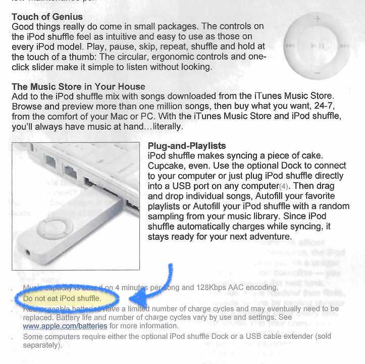
You might want to assume that everyone in your user persona will figure it out.
Meanwhile, those who can’t figure it out will assume your app is garbage.
You don’t wanna take the risk.
2- A breather for the customer support team 😮💨
A good app walkthrough automatically equates to fewer tickets for support.
By interactively explaining the most important parts of your app – or even all of the app in an explain-when-needed method – you resolve user problems from the start.
Don’t believe me? I have solid proof.
Cuepath, a medication reminder app for the elderly and their caretakers, managed to decrease their support calls to 72% with better onboarding. (Hey, but how?)
I think we can all agree that good onboarding is where good support starts.
3- Good onboarding means high customer loyalty 🤝
Let’s say you don’t have a good app walkthrough.
You probably know the answer, but what could possibly go wrong?
They can delete your app.
According to Wyzowl, 80% of users delete apps because they can’t figure out how to use them.
We all already know that user retention is way harder on apps, but we also know why it is so hard.
Why not do something about it?
Good onboarding gets you user retention, and if you have an app, good onboarding means a good app walkthrough.
But hey, let me show you what I mean by a good app walkthrough.
3 Examples of Good & Bad App Walkthroughs
1- EverNote: Contextual & Diverse
Evernote is known for offering one of the best user onboarding experiences out there.
And let me tell you, it is no lie.
Evernote starts user onboarding with a 4-step survey designed to help you get the most personalized user experience with the app.
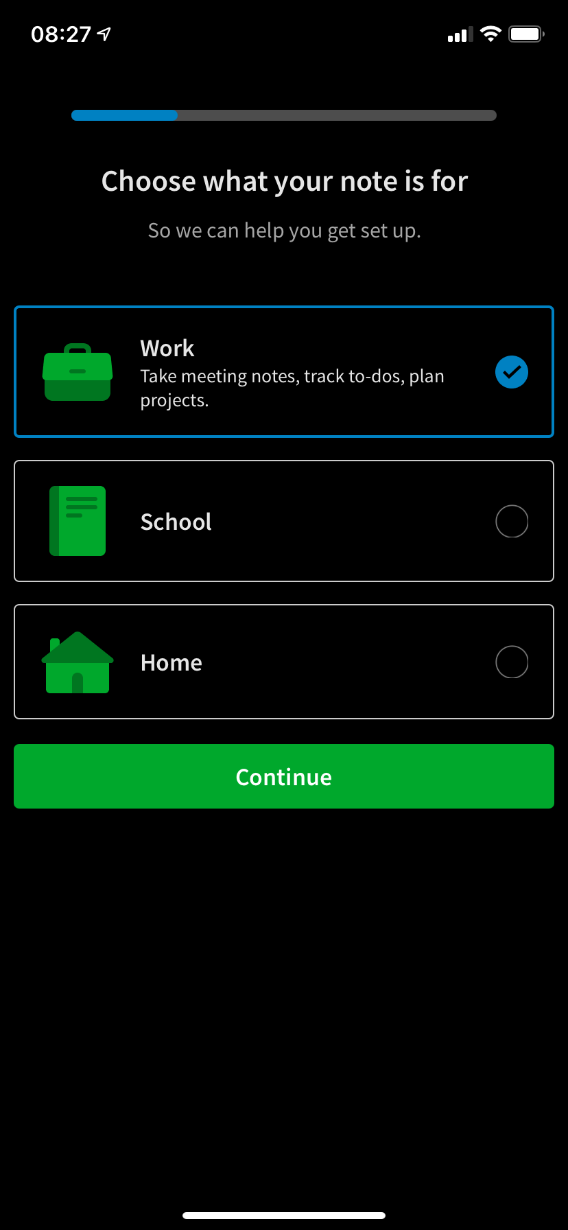
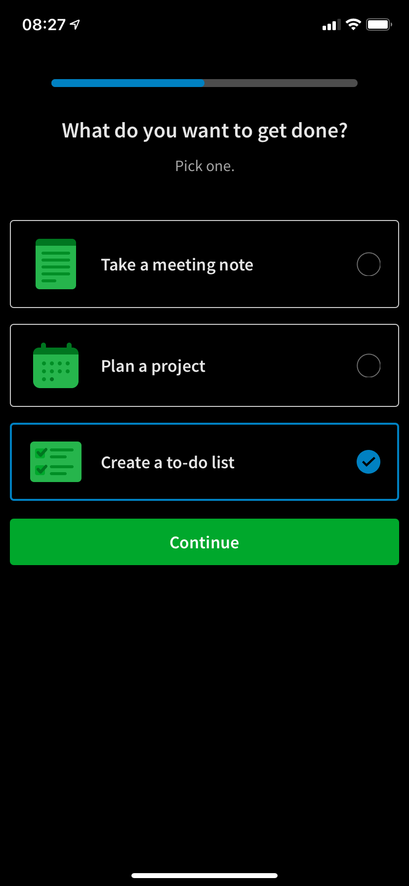
But that’s not even the good part.
After you have successfully gone through the survey and got to the app itself, the app walkthrough takes place as you click on the app features.
Meaning, contextually.
If it’s an easy task, the app tells you about it through tooltips.
For the more complicated ones, you can always click the “show me” button.
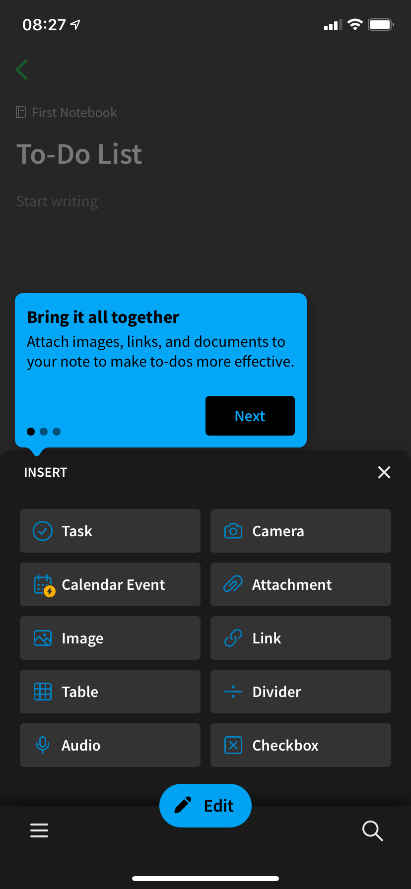

The app shows you a small video of what you are supposed to do with the feature, and then actually leads you to it using hotspots.

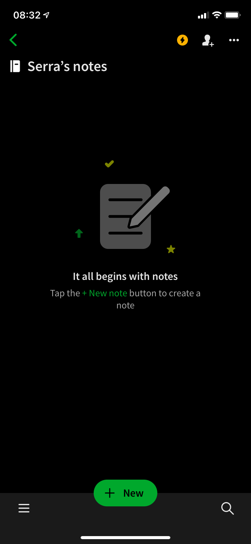
Furthermore, the Evernote app makes use of empty states as well.
Keep it cool and non-pushy Evernote, you got this 😎
Key Takeaways ✍️
✅ Using a variety of different onboarding UX elements helps Evernote offer a great onboarding experience.
✅ The walkthrough being contextual is one of the best practices as it aids the feature adoption experience greatly
✅ The personalization process helps users feel seen and gives more data for the rest of the walkthrough
2- Figma: Focused & On-Premise
Figma also offers a personalization process to segment users for a better user experience.
This process takes place inside a welcome modal which makes it quicker and more focused than similar elements.
In fact, the process ends with a quick action prompt where the user chooses between two creation options.
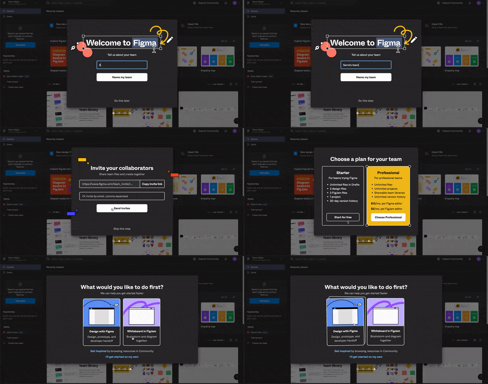
Moving on, Figma offers a walkthrough inside its editing studio.
Although Figma doesn't try to offer an interactive walkthrough, its product walkthrough is still a good element to show valuable features and help users take meaningful actions.
The walkthrough looks like this:

It is a rather long walkthrough, but thanks to app walkthrough elements like the progress indicator and the close button as well as the visual aid, it becomes a great onboarding element.
Key Takeaways ✍️
✅ Figma's using its welcome modal as a personalization opportunity makes the broader user base divide itself into more manageable segments,
✅ The headstart that happens by the end of the modal is the perfect setup for an app that won't be abandoned early on, helping users take the correct actions,
✅ The app walkthrough is far from perfect, but its design helps users once again jumpstart their design process
3- Canva: contextuality lost
Canva’s app walkthrough has one big problem.
It doesn’t exist.
When you are signing up, you get a personalization survey similar to Evernote’s, and then the rest is up to you.
It is survival mode 💀
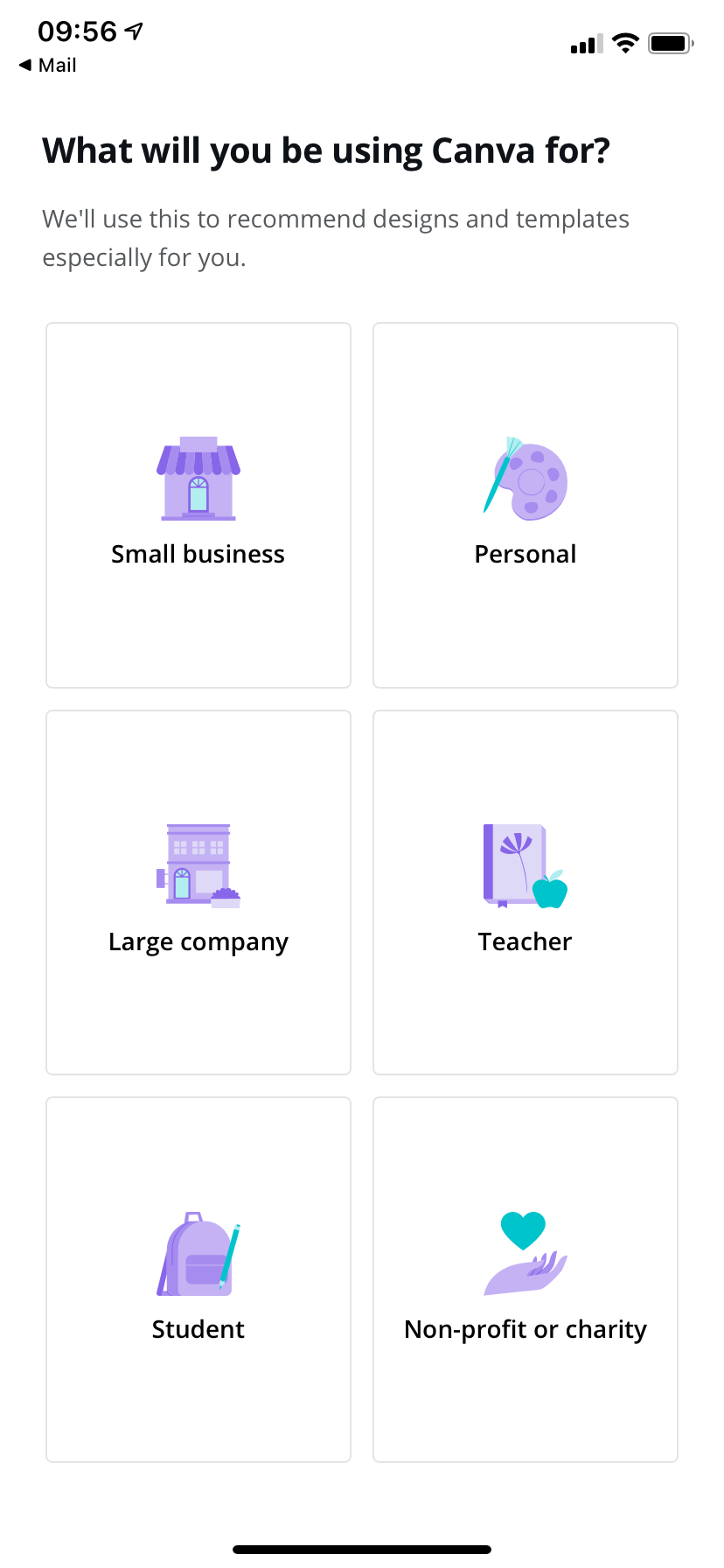
When you actually start to design, you get one little tooltip like this:
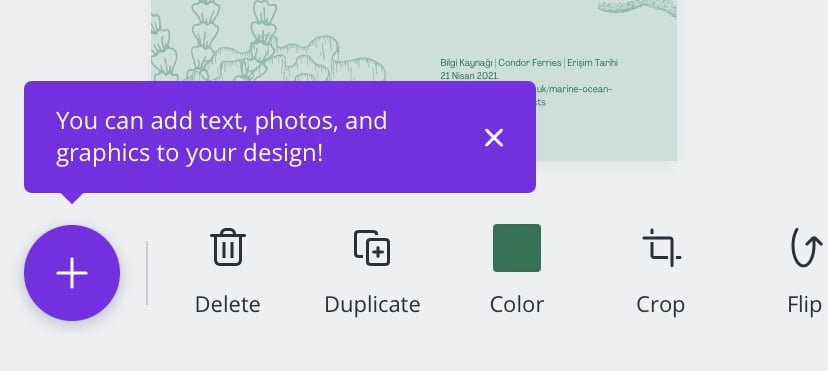
Knowing Canva does a great job with website onboarding, it is interesting to find out that their app walkthrough straight-up sucks.
Sorry Canva, it’s on you 🤷
Now that we have seen some ‘what to dos’ and ‘what not to dos’, let’s talk a bit about ‘how to dos’.
5 Steps to Create the Best App Walkthroughs Possible
Let me guess, you are thinking, “even Canva couldn’t do it, how am I going to do it?”
In 5 steps.
Let’s take a look:
1- Figure out user needs and pain points
If you are going for an app for your product in SaaS, chances are you already have customers and users.
And they already have needs and pain points.
Now, the success of your app and app walkthrough depends on how well you understand these needs and pain points.
What you need to do is pull out a big old whiteboard and write ‘em all down.
Nothing left undocumented.
Then you can choose what onboarding UX patterns match your needs best or what patterns your app walkthrough needs.
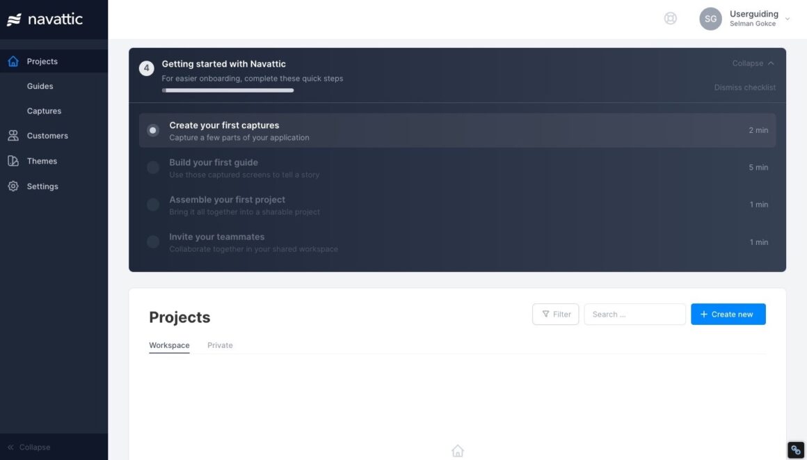
For example, in planning ahead, it is best to work on a user onboarding checklist basis.
Here's a cool example from Navattic:
Don’t forget one thing at this point:
Always assume that your users need a full explanation.
2- Decide how you will create the app walkthrough
When creating an app walkthrough – or any other onboarding UX pattern for that matter – there is a big decision to make:
Whether to go in-house or go with a third-party tool.
If I know anything about app development, your developers probably have way more than they can handle on their hands.
So, my professional advice is to always go with third-party tools.
How am I so sure?
Let me give you a full comparison.
In-house
❌ Coding required
❌ Time and money consuming
❌ Needs to be maintained frequently
❌ Hard to change and optimize
Third-party
✅ No-code
✅ Affordable and fast
✅ Self-maintained
✅ Easily changed and optimized
No-code user onboarding has never been easier 💪
Imagine how much less stressful heist movies would be if only there was a no-code hacking tool for hackers.

Thankfully, we don’t have to deal with coding as SaaS people anymore.
Great news for onboarding!
With all its sales, marketing, and user psychology value, user onboarding doesn’t have to be a burden on developers’ backs anymore.
Meet UserGuiding, a no-code user onboarding tool designed to be easy to use, easy on the eye, and easy on your pocket.
Did I say quick too?
I created this walkthrough in under 5 minutes ⬇️
Some more features to mention:
✅ Product tours, interactive guides, walkthroughs,
✅ Hotspots, tooltips, in-app messages,
✅ User onboarding checklists,
✅ In-app surveys,
✅ Resource centers,
✅ Localization,
And more, like powerful analytics, customization, user segmentation, targeting, and many integrations.
👉No code, yes free trial. Wanna give it a shot? 👈
3- Prepare a user journey map
Having mastered your users’ needs and decided your path in creating the best app walkthrough, the next step is to prepare a user journey map.
Although it looks like a simple task, a lot of psychology is involved at this stage.
Asking the right questions is the starting point.
❓ Who is the user?
❓ Which UX pattern is the best for the app?
❓ Do we use hotspots or tooltips?
❓ What are the most vital features?
And so on.
Remember, your goal is to educate your users so well that they won’t need customer support.
In the long run, the right answers to these questions will guarantee customer retention.
4- Get down to business
You researched, decided, and planned alright.
Now’s the time to get your app walkthrough running, and more questions await.
You need to answer 3 questions:
❓ Is the app walkthrough running smoothly?
❓ Who sees the app walkthrough – everyone or just new users?
❓ How is the user response to the app walkthrough?
According to the answers to these questions starts the final step ⬇️
5- Test and optimize it
All UX patterns need maintenance and optimization.
And app walkthroughs aren’t an exception.
After you have answered the 3 questions during the launch step, the final step is where you act on them.
👉 Firstly, a test phase must be initiated.
If there is a backlash or simply negative feedback, there is a call for change.
👉 Secondly, you need to fix any issues that might be present in the app walkthrough.
Be it technical or content-related.
👉 Lastly, to make sure the app walkthrough is optimized regularly, an optimization period must be decided.
If you have the right tools, this should be easy enough.
Remember, the worst kind of walkthrough is one that does not exist.
As long as you keep optimizing and maintaining your app walkthrough, your users will be happy.
To Wrap Up...
Times are changing and there is a huge demand for mobile apps.
In such a climate, you can’t just launch an app and dump it in the app store.
You need proper user onboarding.
And this is the same for any web app walkthrough.
Hopefully, now you know how a good app walkthrough looks and how to build one. May you have great luck with it.
Frequently Asked Questions
What is a good walkthrough?
A good walkthrough is one that answers all the questions for users before they can ever ask them to customer support. It is easy to see that bad onboarding becomes a burden on customer support teams. A good solution is making sure to adopt app walkthroughs.
How do you create a walkthrough?
When creating a walkthrough, the first question to ask is whether to go in-house or use a third-party tool. While in-house requires intense work from the developers, third-party tools are almost always no-code and most probably more affordable than coding in-house.


.svg)
.svg)
.svg)
.svg)
.svg)


.svg)
.svg)


.png)


