Everyone wants their product to be talked about, recommended, and loved.
But turning that dream into reality takes more than just a great product.
The path from awareness to adoption is filled with challenges, and without a solid strategy, even the best products can fall short.
It’s not just about being noticed; it’s about guiding users through each stage of the journey, from curiosity to commitment.
In this article, we’ll explore real-life examples of the best product adoption practices at each stage of the journey.
So let’s get started 🏃🏻
TL;DR
- There are 5 stages of product adoption:
- Awareness: The stage where potential users first learn about your product.
- Interest: The stage where users seek more information about the product.
- Evaluation: The stage where users assess the product’s fit for their needs and compare it with alternatives.
- Trial + Activation: The stage where users experience the product through a trial and start using key features.
- Adoption (or rejection): The stage where users decide to fully integrate the product into their routine or choose not to continue using it.
- Product adoption examples for the awareness stage include:
- Conducting industry research and publishing trends reports,
- Sending out newsletters with valuable tips and tricks,
- Creating databases and using them to talk about common strategies.
- Product adoption examples for the interest stage include:
- Covering use cases in help articles,
- Offering additional value with courses and certifications,
- Creating targeted landing pages for different user personas.
- Product adoption examples for the evaluation stage include:
- Recording interactive demos,
- Writing detailed competitor comparison articles,
- Writing content to explain the product algorithm in detail.
- Product adoption examples for the trial stage include:
- Creating interactive onboarding flows to ensure higher feature activation,
- Conducting onboarding surveys to offer personalized content suggestions,
- Gathering educational materials/guides in one hub within the product for easy access.
- Product adoption examples for the adoption stage include:
- Encouraging upsells and add-ons with in-app announcement modals,
- Listing down the value propositions in the onboarding checklist,
- Leveraging trial emails to share success stories and create motivation.
- In order to understand whether your product adoption strategies are successful or not, you can:
- Track key user events for each stage of the product adoption process,
- Utilize behavioral analytics to better understand usage patterns,
- Use in-app surveys to collect feedback and ask your users follow up questions about their experience with your product.
5 Stages of Product Adoption with Examples
Product adoption encompasses the journey users take from initially hearing about a product to becoming loyal, long-term customers.
There are mainly 5 stages of product adoption:
- Awareness,
- Interest,
- Evaluation,
- Trial,
- Adoption.
Some professionals add an extra step, known as activation, between the trial and adoption stages. However, many incorporate this step within the trial phase itself, as feature activation plays a crucial role in making product trial effective.
Let’s break down each stage individually and explore real-life examples of strategies that can effectively boost each one 👇🏻
Stage 1: Awareness
Awareness is the initial stage of product adoption.
This is where your potential users encounter you and your product for the first time.
This encounter might happen in several ways:
- They may come across your social media posts.
- They might see your ads on Google or social media.
- They might hear about your product through word-of-mouth from existing users.
- They might find your research report, webinar, or e-book while searching for a solution to their problem.
⚠️ Not all leads generated at this stage are equally likely to progress through the adoption process.
Those actively searching for a solution or trying to understand their problem are the most likely ones to move forward.
Here's how leading companies create and leverage educational materials to connect with high-quality leads and keep their brand top of mind:
Example: Zendesk’s trend reports and webinars nourish industry professionals
Zendesk is an all-in-one customer service solution.
From customer communications to support and sales management, it offers a wide range of functionalities. While many people may have heard of it in some way, they might not be fully aware of everything it has to offer.
To address this, Zendesk organizes expert meetings and educational webinars on relevant topics.
These webinars not only connect them with potential customers but also leave a strong, customer- and industry-focused first impression.

Zendesk conducts extensive research and publishes benchmarks and trend reports, as well.
Whenever you search for industry data on customer-facing teams or customer service practices, there's a high chance you'll come across Zendesk’s annual CX Trends Report.

Example: Databox’s newsletter shares valuable tips and insights
Databox repurposes its existing content by publishing a bi-weekly newsletter called “Move The Needle.”
In this newsletter, they share tips on ROI, resource management, marketing campaign management, and sales funnel management.

✅ It is inspirational, educational, and, most importantly, easy to consume.
That’s why it often appears in blog posts recommending newsletters and blogs to follow.
Databox’s newsletter not only provides tips and tricks but also includes internal data from its data-benchmarking service. This gives readers a sample of what Databox offers, accompanied by a call-to-action to try it.

In other words, it's a two-for-one approach: boosting brand awareness while also serving as a product teaser.
Example: Gong’s research team analyzes sales data and strategies
Another example of enhancing brand awareness through high-quality industry reports and analytics comes from Gong, the revenue intelligence platform.
Gong Labs is a data-backed sales insights hub.

Gong Labs analyzes sales conversations/deals, and turns them into actionable insights and benchmarks.
–By using Gong's Revenue Intelligence Platform, of course.
So, when a sales manager searches for industry benchmarks on cold calls or follow-up sales emails, they are likely to come across Gong Labs.
Stage 2: Interest
The second stage of product adoption, interest, occurs when potential users show enthusiasm for your product and are eager to explore its use cases.
So, they’re no longer looking for inspirational content or general solutions to their problems.
They’re specifically going through your website and resources to understand your value proposition.
Here’s how companies leverage this “interest” to enhance product adoption:
Example: UserGuiding’s website and help center covers use cases
UserGuiding is a no-code product adoption and onboarding tool.
It offers many features, such as:
- Announcement modals,
- Interactive guides,
- Onboarding checklists,
- Tooltips and hotspots,
- In-app surveys,
- Resource centers,
- Knowledge bases,
- Product updates pages,
- Analytics, and more.
However, knowing about a feature's existence doesn’t equate to understanding its value or use case.
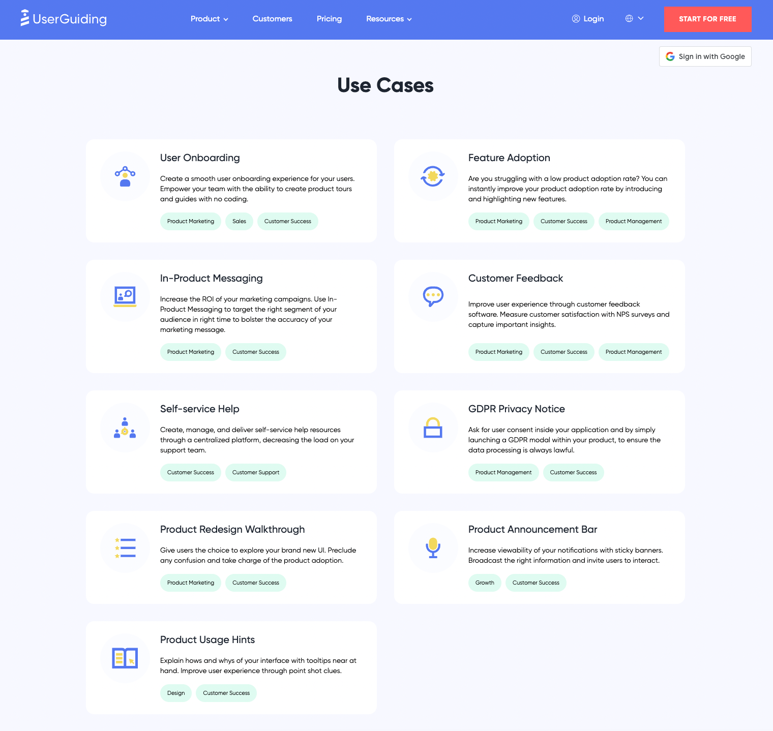
UserGuiding addresses this by explaining main use cases separately from the features themselves.
❌ We have tooltips and hotspots.
✅ You can communicate with your users right within your product with in-product messaging and increase the ROI of your marketing efforts.
❌ We have interactive guides.
✅ You can design product walkthroughs and user onboarding flows to showcase your UI seamlessly and prevent any potential user confusion.
In addition to covering broad use cases, UserGuiding also provides detailed guides and use case articles for more specific scenarios and individual product features.
Like this:

For example, if you want to learn more about how to use in-app surveys to capture upsell opportunities, there’s a detailed article explaining:
- How to craft an upsell survey and which questions to ask in it,
- How to selectively target users,
- How to analyze user responses and outcomes.
So, even if you don’t read all the articles about all the use cases, you know there’s a detailed guide and/or explanation on how you can actually do it.
In other words, you know it’s not just a marketing claim, but it’s an actual use case.
🚀🚀Interested in any of these use cases? Try UserGuiding out yourself!
Example: Canva’s Design School offers courses and certifications
Canva consolidates all its value propositions and use cases into its Design School, offering them as short courses and certification programs.
Do you wanna learn how to manage content in Canva? There’s a course about Canva’s content management system.
Or maybe how to plan and post on your social media? There’s another course on how to post, schedule, and track your social media posts on Canva.
How about brand management? Guess what? There’s a course explaining how to set up brand kits and templates.

It’s not the traditional approach to use cases, that’s true.
However, it’s compatible with the brand image and the product itself.
With the Design School, Canva not only creates an educational hub for its features but also:
- Reemphasizes its value propositions,
- Explains its use cases in detail with pro tips and tricks,
- And provides a unique experience.
Example: Sleeknote’s PPC landing pages feature dynamic and targeted content
Another way to turn interested users into promising leads is by using personalized content.
Sleeknote does this effectively with its dynamic landing pages:

This is the landing page you get when you’re looking for Shopify popups ☝🏻

And this is the landing page you get when you’re looking for web popups ☝🏻
At first glance, the only difference between these 2 pages is the CTA buttons and the keyword in the shortened value proposition.
However, as you explore the more detailed value propositions for specific use cases, you’ll notice that Sleeknote’s targeted landing pages present different designs and example popups tailored for each use case.
For example, here’s what the page looks like for Shopify popups:

And here’s what it looks like for web popups:

Stage 3: Evaluation
The evaluation stage is when potential users assess whether your product meets their needs and if they’re satisfied with its features and tools. This evaluation involves several factors, including:
- Product Category: Whether they truly need a product like yours.
- Product Features: How well your features align with their requirements.
- Pricing: Whether the cost fits their budget.
- Customer Services: The level of support and service provided.
While you have little to no control over the product category or the budget constraints of potential customers, you need to make a strong impression with your product features and customer services.

There are 2 types of product evaluators:
- Those who prefer demos,
- Those who prefer comparison articles.
Here’s how companies address each of them 👇🏻
Example: Walnut’s demo offers interactive(-ish) product walkthrough
Walnut is an interactive demo tool that enables sales teams to capture their product and record guides for leads.
And they use their own product for their own demo, as well!

What makes this specific demo interesting is that…
- It doesn’t include any sales fluff,
- It showcases the product UI without setting up an account,
- It’s available 24/7, with no waiting time for an in-person demo meeting.
Of course, it’s limited compared to real in-app walkthroughs and guides, as this is a pre-recorded video.
However, compared to other video demos or live demos, it’s accessible, to the point, and product-oriented.
Example: Figma’s competitor comparison articles answer every possible question
There are plenty of design and web-app-building tools out there, each catering to different types of designers.
Some, like Miro, are perfect for those with less technical backgrounds. Others, like Adobe XD and Sketch, are geared toward more technically inclined designers.
Figma, however, strikes a balance.
It’s a tool that works just as well for designers with little to no technical knowledge as it does for those who are almost coders themselves.
To stand out in such a diverse market, Figma confidently tackles potential users’ concerns head-on in its competitor tool comparison articles.

For potential users with technical concerns, such as design workflow integrations and performance issues, Figma answers every question with thorough technical explanations and detailed information.
Plus, the excuses and oppositions, such as plugins…

And in comparison articles with less technical competitors (and likely less technical users), Figma provides a lighter read, focusing on direct feature comparisons without diving into technical details.
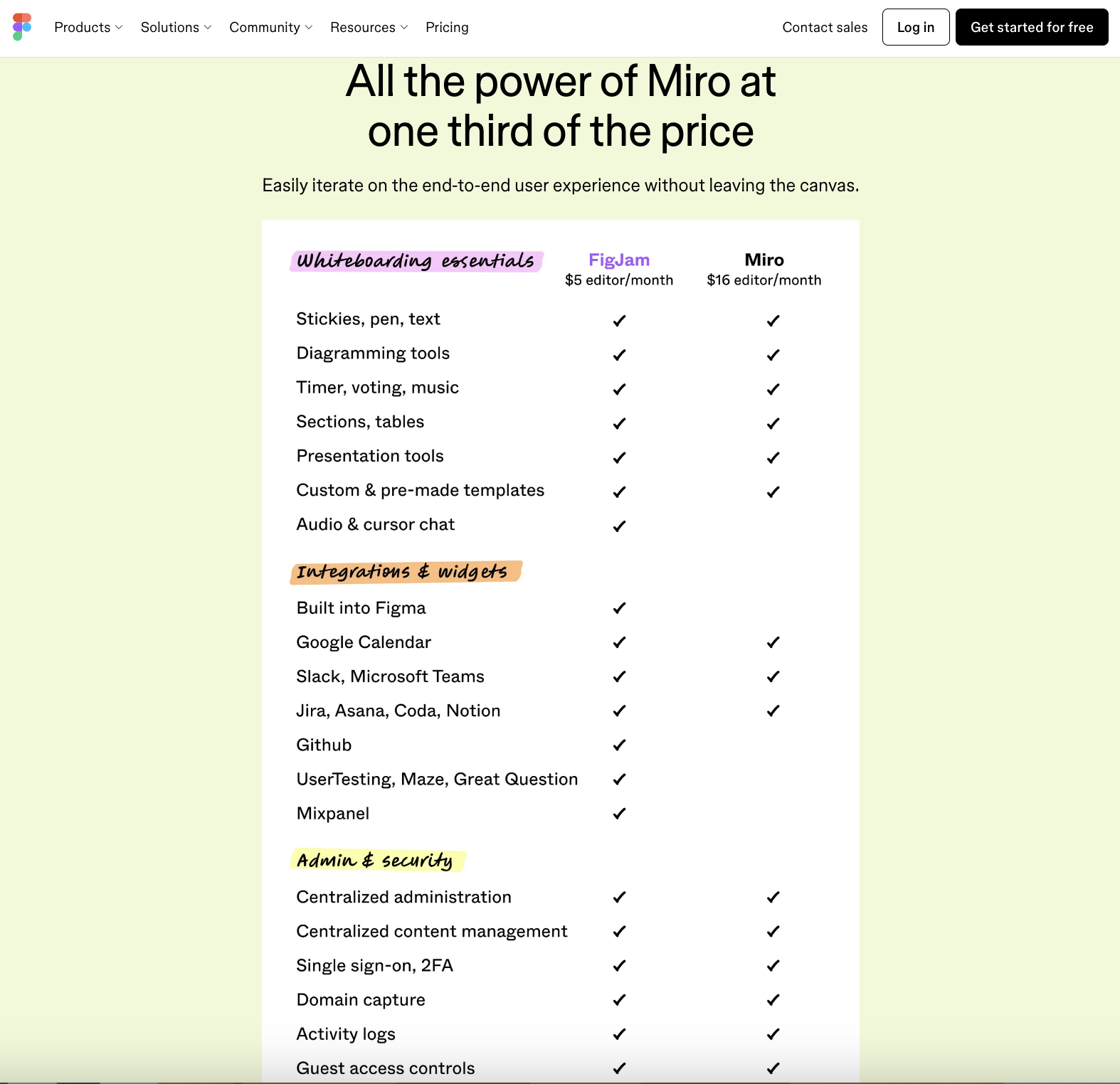
💡 Just as different target audiences need tailored use case articles, different competitors with varying target audiences may require differently formatted comparison articles.
Don’t worry about “spoiling” your consistency.
Consistency is about maintaining quality and relevance, not rigidly sticking to the same format for all your content.
Example: Planta’s website explains how the product algorithm works
Planta is a plant care app that helps you manage your watering schedule, identify new plants, and learn more about the plants you have.
It doesn’t offer a competitor comparison article to its potential users.
However, Planta provides a detailed article on its algorithm, explaining the logic behind it and helping potential users understand how it differs from a standard calendar or scheduling app.

The article breaks down each parameter and explains its importance in determining the optimal watering frequency.
Like this:

Basically, what Planta does is compare its product with a product category (calendar/scheduling apps) instead of individual popular competitors. However, it still:
- Offers a value proposition,
- Explains its features and algorithm in detail,
- Provides a comparison to other solutions, even if they aren’t direct competitors.
Stage 4: Trial and Activation
Up until this stage, the heavy lifting has been on your internal teams.
No matter how incredible your product and its features are, if you can't reach your potential customers or clearly convey your value, your amazing product, unfortunately, doesn’t stand a chance.
But the good news is…
Now is the time to shine for your product.
Trial is the stage where potential users become real users –even for a short period of time– and get hands-on experience with your product, testing its features and functionality in their environment.
However, there are a few obstacles you need to overcome:
- Some features might be complex and intimidating for first-time users,
- Product UI might be confusing and hard to navigate,
- The learning curve might be too high,
- Some features might go unnoticed,
- The trial period might end before users get to the “AHA!” point.
Here’s how successful companies tackle these challenges and advance their trial users to the next phase of adoption 👇🏻
Example: Flowla’s interactive onboarding flow ensures higher feature activation
Flowla is a sales enablement tool that allows teams to create engaging individual digital journeys for clients.
It offers a wide range of functionalities, each tailored to suit the specific needs of different teams. This makes every day of the trial period and every moment spent using the product crucial for users.
To ensure the onboarding process is both effective and user-friendly, Flowla employs product tours, tooltips, and guides.
Like this:

And this:

This way, Flowla ensures:
- Smooth onboarding experience,
- User education,
- Feature activation.
🚀 After revamping their adoption strategy with UserGuiding, Flowla achieved a 24% increase in feature activation rates.
Here’s the full success story of Flowla!
Example: Pinterest’s onboarding survey collects data for personalization
One effective way to engage trial and first-time users is to provide them with a personalized experience, helping them quickly feel comfortable and confident using your product.
Pinterest ensures this by collecting data with a short onboarding survey:
With this approach, Pinterest ensures that when you create your account, you'll immediately get value and see content tailored to your interests on your feed.
You won’t have to start from scratch or spend excessive time setting things up.
Example: HubSpot’s onboarding guides offer thorough user education
HubSpot is another platform with a lot of features, tools, and use cases.
So many features that if they were to showcase and explain all of them in a single guide, it could rival the length of the Lord of the Rings movies!
Fortunately, HubSpot takes a different approach.
They categorize their features/ tools into use cases and hubs and then create separate guides for each use case.
Like this:

They organize the guides into a checklist format and include a progress tracker to motivate users, helping them feel a sense of accomplishment as they complete each step.
Additionally, this hub is always accessible within the product, and users can revisit the guides as many times as they like.
This means you can refresh your memory whenever needed or complete a guide as you start using a specific feature, rather than having to go through everything all at once when you first create your account.
Stage 5: Adoption (or Rejection)
The last stage is about turning trial users —or occasional freemium users— into loyal, regular, and preferably paying users.
Your goal should be to help users unlock the full potential of your product and derive the maximum value from it.
Here’s how leading businesses ensure that 👇🏻
Example: Crunch’s in-app modals encourage add-ons and upgrades
Crunch is an accounting software that is used by many freelancers, contractors, and businesses.
Because they cater to various user personas with different needs, their plans include diverse features and tools. However, they don’t restrict expansion.
Instead, they offer add-ons to enhance functionality.
And to promote these add-ons or upgraded plans, they utilize tooltips:


Plus, banners and announcement modals for promotions and campaigns:
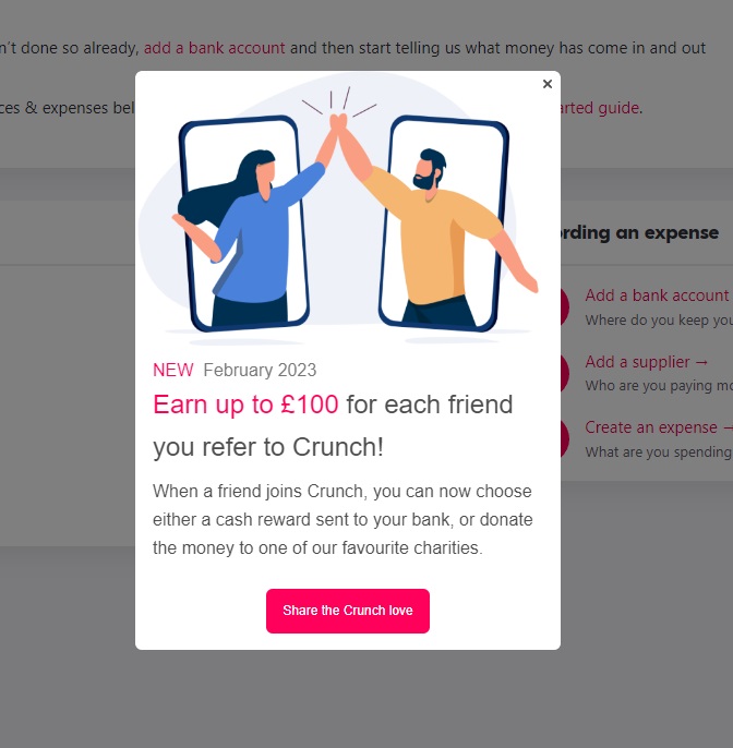
With these tooltips, banners, and in-app modals, Crunch ensures:
- Referral campaign announcement,
- Premium feature awareness,
- User engagement,
- Increase in the number of add-on purchases and upgrades.
Here’s the full success story of Crunch!
Example: Keyhole’s onboarding checklist summarizes the value proposition
Checklists are useful onboarding elements.
With checklists, you can:
- Streamline the onboarding process,
- Ensure users complete essential setup steps,
- Provide a clear path for new users,
- Track progress and identify completion rates.
But with great checklists, you can:
- Facilitate faster feature activation,
- Shorten time to key action (aha moment),
- Drive conversion and product adoption.
That is exactly what Keyhole achieved with its onboarding checklist, they experienced a 550% increase in the number of trial-to-paid-user conversions.

After implementing this onboarding checklist with interactive guides as steps, they observed remarkable improvements in conversions.
So, for many, simply seeing the list of benefits was enough to drive their decision.
Here’s the full success story of Keyhole!
Example: Livestorm’s trial emails tell success stories and provide social proof
Another way to transform trial users into subscribers is through their email inboxes.
Livestorm is an all-in-one video engagement and web conferencing platform that enables you to organize and host webinars/ virtual events.
And they know how to write trial email sequences for better conversion/ adoption 👇🏻

They share their success stories to inspire and illustrate the potential future for trial users who choose to stick with Livestorm.
To further motivate hesitant users and simplify their onboarding, they also send separate emails with step-by-step lists of tasks to complete, showcasing the product’s value.

👉🏻 Check out what you can include in your free trial emails for better conversion.
How Will You Decide If Your Product Adoption Is Successful?
Not every strategy works for every product. Even if it does, there’s often room for improvement with small tweaks.
But how do you figure out which strategies to implement or what changes to make?
Sure, you could run A/B tests or benchmark against industry standards, but what exactly will you benchmark? Or what will you A/B test?
A lot of the advice out there is vague and impractical, making it difficult to take actionable steps.
Here’s what you can actually do to understand what’s working –and what’s not working- in your product adoption:
Monitor The Relevant User Events for Each Adoption Stage
Event tracking helps you identify where potential users drop off during the adoption process and pinpoint which stages may need additional strategies for better engagement.
Sometimes, reaching the right audience at the awareness stage can be a challenge, leading to wasted energy and resources on unqualified leads. Other times, the issue arises between the trial and adoption stages—users who sign up for a free trial may get lost within the product and miss their "Aha!" moment.
Not everyone who knows your product will adopt it.
That would be magical and extraordinary 🔮 ✨
However, if you notice a significant drop-off from one stage to the next, it's a sign that this stage may need extra attention with targeted strategies and practices.
And for that, you must first identify the problem by tracking key, actionable user events.
Here are some user events you can monitor for adoption processes👇🏻
For Awareness stage:
- Social media/ blog engagements
- Content downloads
For Interest Stage:
- Email opens and clicks
- Feature page views
- Add clicks
For Evaluation Stage:
- Comparison page views
- Demo views/ sign-ups
- Pricing page visits/ pricing queries
For Trial Stage:
- Key feature activation/ interactions
- In-app tutorial/checklist interactions
- Onboarding drop-off points
For Adoption Stage:
- Subscription conversions
- Upsell and cross-sell engagements
- Cancellation requests
Analyze User Engagement and Usage Patterns with Behavioral Analytics
Behavioral analytics is an advanced form of event tracking.
While event tracking tools provides an overview of user actions and metrics, behavioral analytics tools delves deeper into the detailed interactions of individual users.
Behavioral analytics examines how users engage with specific elements, such as buttons and content, and tracks their navigation paths and time spent on various parts of your website or product.
With behavioral analytics, you can see:
- Which parts of your website receive the most engagement,
- Which buttons and CTAs are clicked,
- How long users spend on specific content, and more.
Behavioral analytics tools, such as Hotjar and Fullstory, allow you to create heatmaps, session recordings, and sentiment analysis.
👉🏻 Read more on behavioral analytics.
Evaluate Customer Feedback and Support Tickets
You should always listen to what your users are saying.
Feedback and support tickets are goldmines of information about what’s working and what isn’t.
- Is your onboarding process too long or confusing?
- Are your features hard to find in the UI?
- Can your users understand how to use certain features or do they struggle a lot?
- Do your users require more detailed documentation and/or courses?
All of these problems can be detected with in-app surveys.
And by addressing these concerns –no matter how small or easy-to-solve they are–, you can improve the user experience and overall user satisfaction drastically.
Which, leads to better conversion and smoother progress through the product adoption stages.
To Sum Up…
Product adoption can be challenging for even the most experienced and established businesses.
First, the process is lengthy, and transitioning from awareness to adoption takes time.
Second, it’s challenging, with many users dropping off between stages.
But don’t worry or get discouraged.
With the right strategies and practices, you can improve each stage. Identify where you’re struggling most and apply targeted strategies to overcome those challenges.
If the companies we've analyzed can do it, you can too 💪🏻


.svg)
.svg)
.svg)
.svg)
.svg)


.svg)
.svg)


.png)


