


.svg)
.svg)
.svg)
.svg)
.svg)


.svg)


.svg)
.svg)

Here are a few stats that might be interesting for people in Fintech:
The Fintech market is projected to be worth $394.88 billion in 2025 and reach $1,126.64 billion by 2032.
90% of people now use at least one fintech product and the average is 3-4 fintech products, study finds.
Let’s go to the realm of product adoption:
A study finds that 50% of apps are uninstalled within 30 days of installation, and 4 out of 10 finance apps are also deleted within a month.
One last stat:
Retently finds that the top reason for customer churn (in our case, also app uninstalls) is poor user onboarding, making up 23% of the leading causes for churn.

Now, this calls for a thorough investigation of fintech user onboarding, and you have come to the right place.

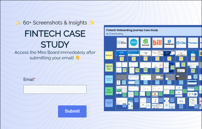
Fintech Products User Onboarding Flow Insights
For this case study, we examined the user journeys of 8 top Fintech products and analyzed their websites, signup flows, onboarding overlays, other overlays, and onboarding emails.
Check out the Miro Board here:
1- Zoho Books
Website
Zoho has a different page for Zoho Books under its website where its value proposition is displayed.
There is a ribbon of information including features and pricing and the CTAs are very eye-catching.

Signup Flow
Zoho Books has a short but substantial signup flow where they prompt extra questions as the user answers the first ones, making it easier to go through even without a progress tracker.

Onboarding Overlays
Zoho Books welcomes users with a custom modal and confetti animation.
Later on, as the user is exploring the tool, a 7-step walkthrough with simple copy is prompted.

Other Overlays
Zoho Books uses embedded onboarding elements throughout its entire platform.
Users can come across simple promotional cards, embedded videos for empty states and visual directions.

Onboarding Email
Zoho Books sends a short, unpolished email right after signup which doesn't look like much but its simplicity makes it stand out for users who prefer human interaction over fancy emails.

Key Takeaways ✍️
- Zoho Books website is well-designed with good CTA button placements and a clear message.
- Their onboarding flows are on the more traditional side but they refrain from user frustration using low-intrusion elements like empty states.
- Their onboarding email campaign might need more polishing and more than one email.
Overall Score: 3.7/5 ⭐
2- Xero
Website
Xero's website is plain and simple with clear messaging. Though the CTAs aren't perfectly clear, the color scheme still makes the single CTA eye-catching enough.

Signup Flow
Xero's signup flow starts with a signup form that first removes some mental obstacles like 'no credit card required' and 'cancel anytime'.
The rest of the signup is also smooth, with a few more questions prompted as a single modal when inside the platform.

Onboarding Overlays
Xero's primary onboarding UX element is an onboarding checklist with different categories that come with their own tasks and progress bars.
The guides, prompted via the tasks, are simple but also feature progress bars of their own.

Other Overlays
Xero's secondary onboarding elements aren't too subtle.
They use pulsing hotspots on one page and a tooltip with ready-to-go steps to promote their AI feature.

Onboarding Email
Xero's onboarding email focuses on the setup, pointing out the 3 steps that help get started with the product.


Key Takeaways ✍️
- Xero excels at its extensive use of user onboarding checklists, but it might not be the most accessible design for users who are unfamiliar with such UX elements.
- Xero’s strong point is definitely its first onboarding email with a good summary of starting tasks for those who’ve left the platform early.
Overall Score: 3.4/5 ⭐
3- Bonsai
Website
Bonsai is among the websites that favor a sleek design.
It features simple messaging, clear enough CTAs and uniquely, a star rating and count of reviews right under.

Signup Flow
Bonsai uses a very smooth signup flow that features a progress bar, which helps minimize the otherwise long onboarding survey while also displaying social proof.

Onboarding Overlays
Bonsai is minimalistic with its onboarding elements and entrusts the process to its simple UX. Still, they feature a 5-step checklist to make sure all important initial onboarding tasks are completed.

Other Overlays
Bonsai's secondary onboarding elements are also very subtly embedded into the product as empty states and information cards.

Onboarding Email
Bonsai greets the users with a welcome email during the first user session. Later, they send helpful tips to help get comfortable with the tool every day.

Key Takeaways ✍️
- Bonsai offers strong onboarding UX elements every step of the way, the best executed one being its signup flow with a progress bar and social proof.
- Bonsai’s in-app onboarding elements are less traditional than most tools in the study, yet paired with good design, they work just as good as traditional onboarding if not better by eliminating the user frustration a bit more.
- Bonsai’s emails are also exemplary thanks to their content that highlight tips and best practices, though the frequency might be offputting to some.
Overall Score: 4.1/5 ⭐
4- BILL
Website
BILL's website seem crowded at first glance but it makes up for it with an email input field and a 'get started' button.
Though this CTA is nothing special, its delivery is what makes it work.

Signup Flow
BILL uses a very short and smooth onboarding survey with 3 steps and a progress bar.
The questions are super short and social proof is also displayed during the process. The loading screen is the cherry on top for good onboarding UX.

Onboarding Overlays
BILL uses fully-fledged guides with progress bars and simply copy at certain parts of the user journey.
With dimmed backgrounds and a close button, these guides feel focused yet optional to the user.

Other Overlays
BILL is among those who make use of a simple checklist for the most important onboarding tasks like email verification.
They also use video explanations at certain points and thus offer onboarding in different formats.

Onboarding Email
BILL has a well established email campaign that are sent depending on the tasks you've finished on the platform.
These can be setup reminders or ways to make a late start if you haven't setup fully.
Key Takeaways ✍️
- BILL’s website and overall platform UI fall under average in terms of smooth UX and good design, however, they make up for it using short onboarding interactions accompanied by progress bars.
- BILL also prioritizes visual storytelling on its platform via an abundance of illustrations which make the product easier to adopt and progress with. We can see this in the empty states and even the onboarding checklist.
- Their onboarding emails are also well-timed and feature short but important messages to get users to reach Aha! Moments.
Overall Score: 3.9/5 ⭐
But that’s not all of it…
We have more insights, screenshots, and GIFs from other products like Freshbooks, Clio, FreeAgent, and Honeybook inside our Fintech Case Study Miro Board!
Don’t wanna do that now? Check out our rating of each interaction from each product below.
Overall, most Fintech products show a tendency toward good onboarding practices, and some even excel at certain practices.
But as there is no perfect product, there is no perfect product onboarding.
Here are the overall scores from our case study:

And that’s a wrap, folks.
By the way, if your Fintech product needs to get its onboarding up to speed fast, you’re at the right place.

.png)


