

.svg)
.svg)
.svg)
.svg)



.svg)




.svg)
.svg)

First impressions inside a product happen in a blink. Those initial moments dictate whether a new signup reaches value or churns.
It is stated that a complicated onboarding process will drive 74% of potential customers away, meanwhile customers are 50% more likely to remain loyal to a company with an effective onboarding process.
Making sure that you turn your initial sign-ups into loyal and recurring customers comes down to contextual guidance, that is, helping users learn by doing directly inside your interface.
In this guide, we’ll explore what in-app tutorials are, and how you can use them in order to build guidance users actually finish and realize the value that your product brings them.
- In-app tutorials are interactive guides built directly into your software that help users learn workflows by taking action in real time.
- You can deliver guidance in seven common formats, from interactive walkthroughs and subtle tooltips to onboarding checklists and self-serve help centers.
- The best moments to trigger tutorials are during first-time onboarding, when introducing new features, or right where users regularly get stuck.
- To build tutorials that work, find where users drop off using analytics, tailor the guides to specific user roles, and test them internally before rolling them out.
- Track your success by keeping an eye on tutorial completion rates alongside product health metrics like retention, feature adoption, and churn.
- No-code platforms like UserGuiding make it easy to create, test, and update in-app guidance without taking up developer time.
What are In-App Tutorials?
In-app tutorials are contextual and interactive elements layered directly on top of your product’s interface to guide users through key feature discovery, task completion, and product adoption.
Instead of forcing users to leave your product for support, through watching long video guides, or digging through knowledge bases, in-app tutorials deliver relevant information in real time right where the user is working.
At their core, in-app tutorials bridge the gap between initial user intent and core value realization, namely the “Aha! moment”. These tutorials rely on UI components like interactive walkthroughs, tooltips, hotspots, and onboarding checklists to help users learn by doing.
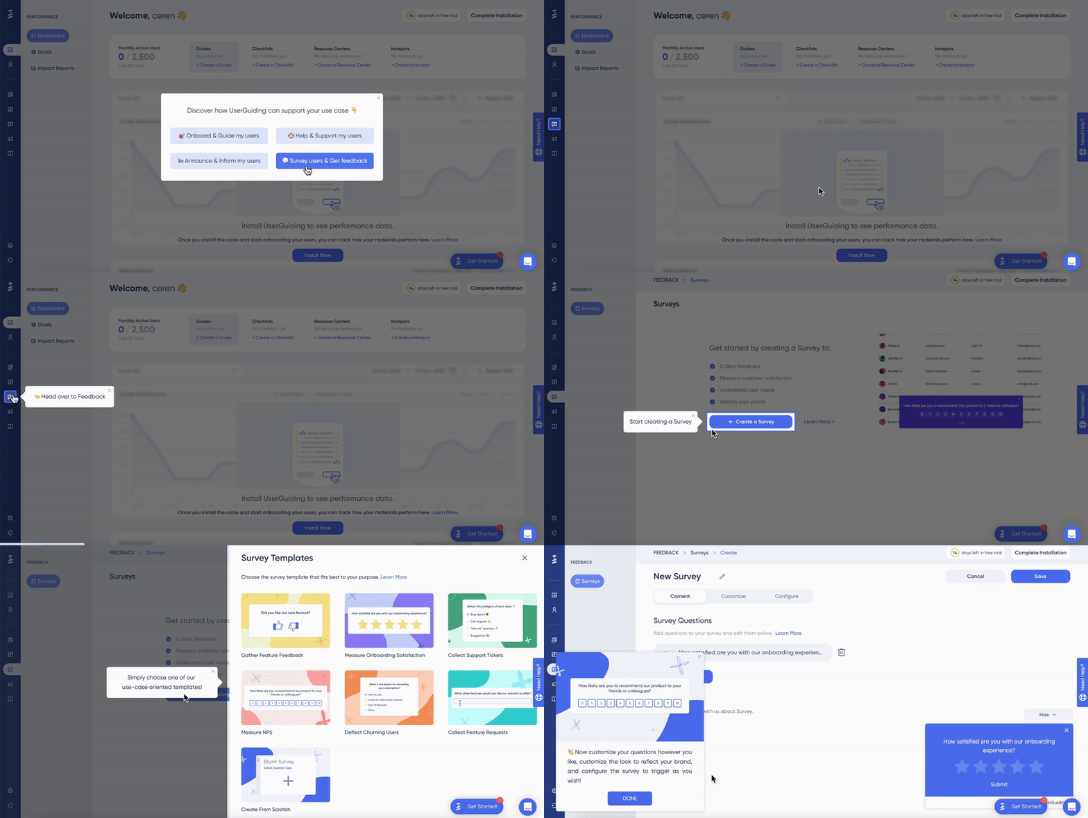
Unlike passive user manuals, in-app tutorials that make the guidance work are action-driven. Instead of explaining to users what a feature does; in-app tutorials prompt the user to take specific actions to build muscle memory within the software.
These actions can be creating their first campaign, inviting a team member, or setting up an integration, changing regarding your product’s specialty or the feature’s core value.
To see what this looks like in practice, consider how Notion onboards new users.
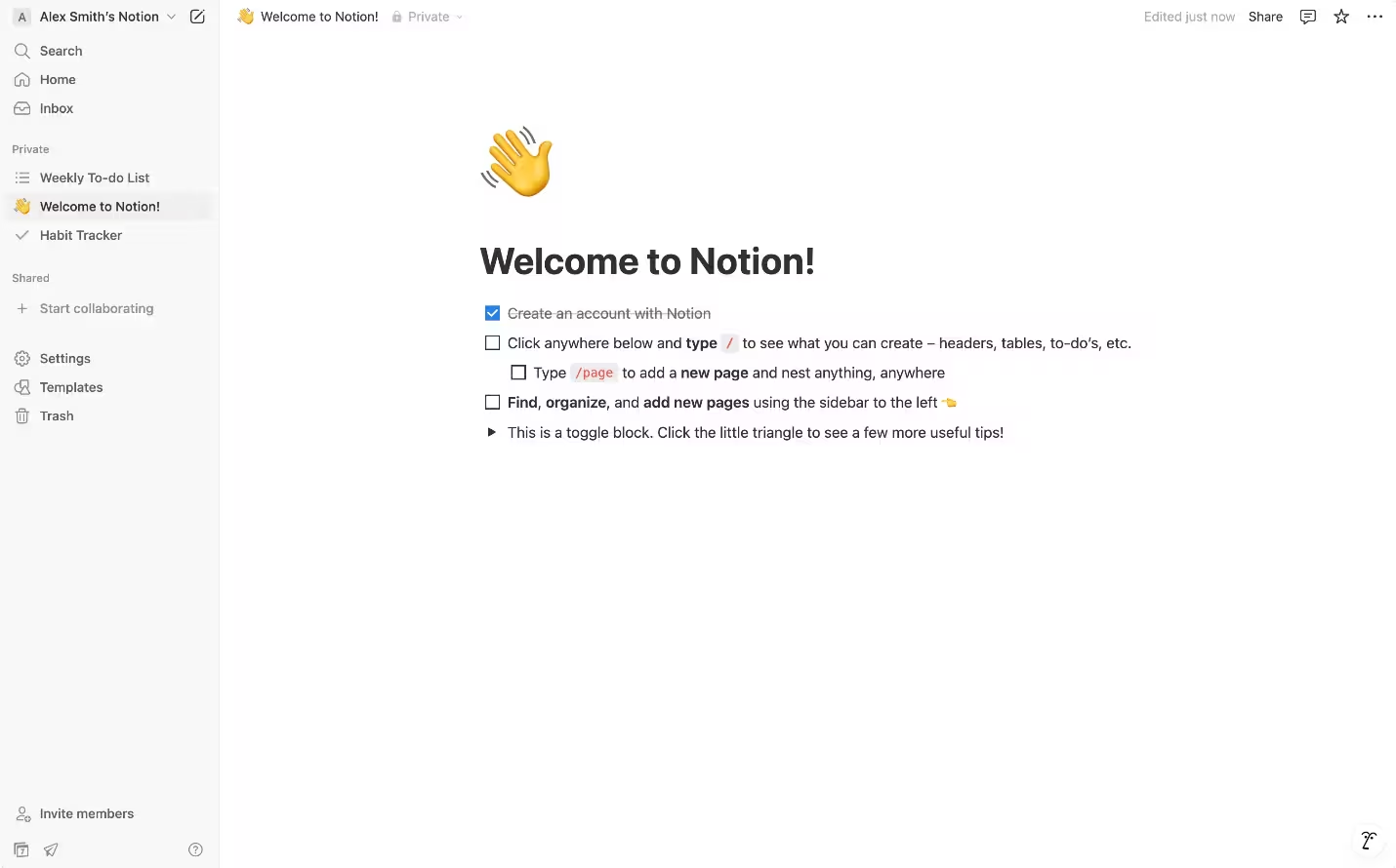
Instead of overwhelming you with database configurations or complex formulas right away, Notion opens with an interactive "Welcome" page built around an guided onboarding checklist.
It guides you through foundational actions: like typing “/” for commands, clicking “+” to add new content, or checking off your first completed task. In this way, Notion allows you to build muscle memory directly inside the workspace while tracking your progress in real time.
In-app Tutorials vs. Human-Led Onboarding
When designing customer onboarding strategies, SaaS companies often debate whether to rely on automated, self-serve in-app guidance or high-touch, human-led onboarding managed by Customer Success (CS) or Account Management teams.
Let’s examine the strengths and limitations that might come up with both approaches.
Having looked at all that, rather than choosing one over the other, you can choose to blend self-serve in-app tutorials with human-led CS touchpoints in order to achieve a more holistic onboarding experience.
In a hybrid model, you can handle baseline navigation, administrative setup and signup flows, as well as repetitive feature walkthroughs. This allows your Customer Success Managers to focus on strategic consulting, change management, account expansion and business reviews.
You can also check out this video in order to learn more about self-serve and human-led onboarding types and how to blend them for success:
Why Do In-App Tutorials Matter?
Leaving users to navigate a software platform through trial and error or off-site documentation introduces friction at critical moments in the user lifecycle.
In-app tutorials bring guidance directly into the interface, delivering value across three primary areas.
1) Accelerated Activation & Feature Discovery
New signups are most vulnerable to churn during their initial session. Interactive in-app tutorials guide users step-by-step through initial setup and core features, later highlighting secondary features when the time arises.
This ensures users reach key value milestones without getting overwhelmed by the full feature set.
For example, social listening platform Keyhole used targeted in-app onboarding walkthroughs (which they made with UserGuiding!) to guide trial users through initial account setup, resulting in a 116% increase in user activation rates and a significant reduction in early drop-offs.
If you would like to read more about their success thanks to UserGuiding’s tooltip and checklist features, you can read more from here!
2) Reduced Support Overhead & Friction
Repetitive support tickets regarding basic platform navigation—such as finding settings, exporting data, or inviting team members—consume valuable Customer Success bandwidth. In-app guidance acts as a front-line, self-serve resource that solves common usability blockers right where they happen.
According to a survey conducted by Aspect (via HubSpot) in 2017 73% of customers want the ability to solve issues relating to basic product questions independently instead of waiting for a support agent.
3) Scalable Expansion & Retention
In-app tutorials continue to drive value long after initial onboarding.
Triggering contextual slideouts or tooltips when users reach plan limits or interact with gated features helps communicate the ROI of premium tiers at the exact moment of user intent.
For example, Cloud collaboration platforms like Dropbox use contextual in-app slideouts when users approach storage limits, demonstrating the immediate functional benefit of upgrading to team spaces rather than relying on generic email upgrade campaigns.
Types of In-App Tutorials (& When to Use Them)
Different UI patterns serve different learning needs.
Choosing the right format depends on the complexity of the feature, the user's current intent, and how much friction you are trying to resolve.
Let’s jump in all the different types of in-app tutorials examples you can use to ensure your user’s success in product or feature adoption.
1. Interactive Walkthroughs / Product Tours
An interactive walkthrough guides users step-by-step through a core workflow, requiring them to complete specific actions (like clicking a button or filling out a field) before moving to the next step.
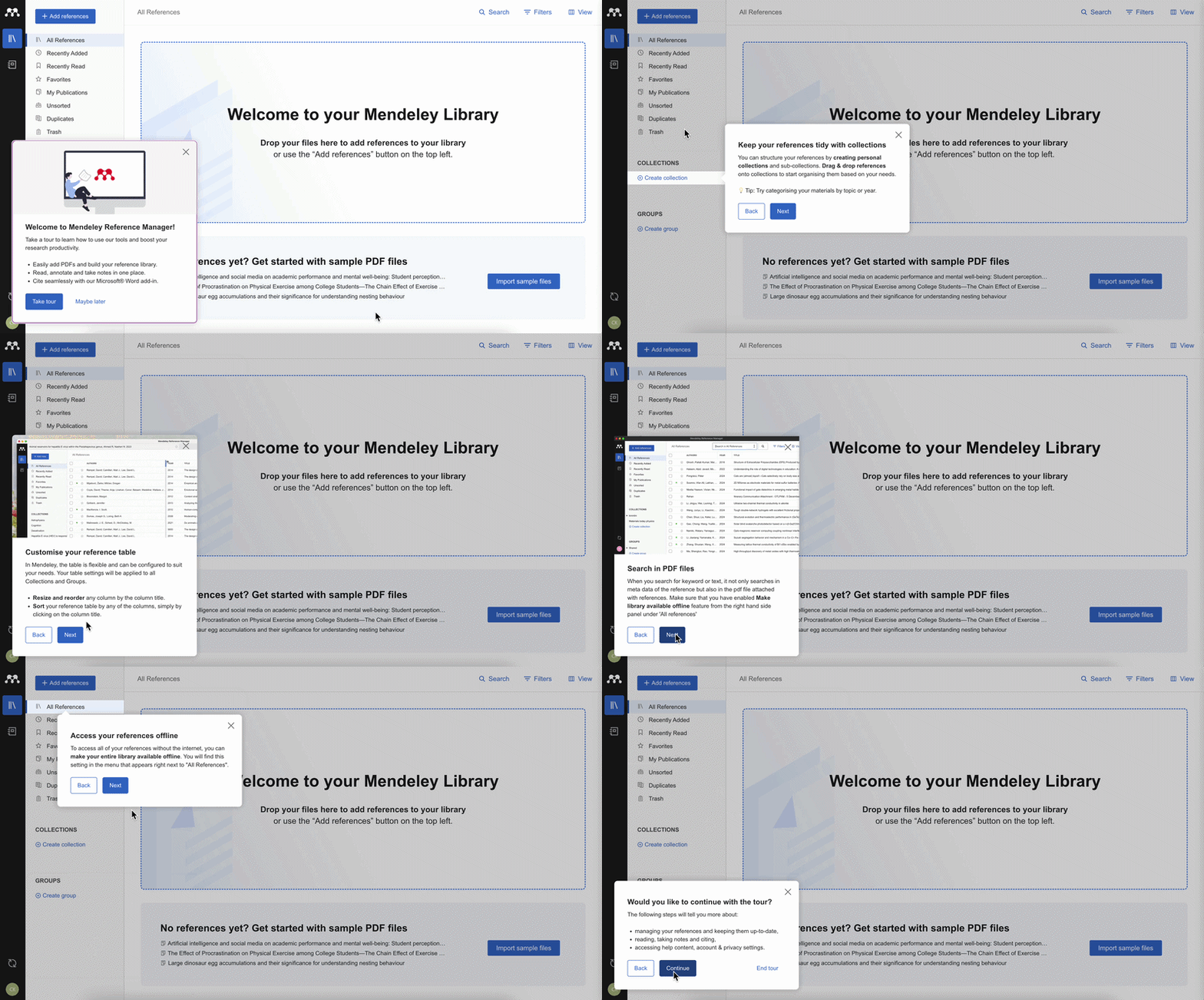
Unlike passive video tours, walkthroughs teach users by driving immediate hand-on engagement within the live interface.
💡 When to use: Use interactive walkthroughs during initial onboarding for complex, multi-step key workflow to ensure users hit their primary "Aha!" moment early.
2. Hotspots & Tooltips
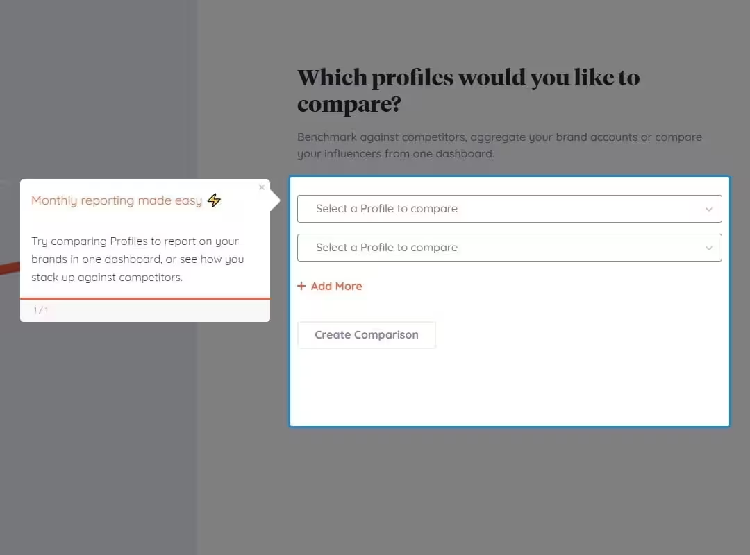
Hotspots are subtle, pulsing icons that catch a user's eye.
Tooltips, on the other hand, are small text boxes anchored to specific UI elements that explain what a feature does when clicked or hovered over.
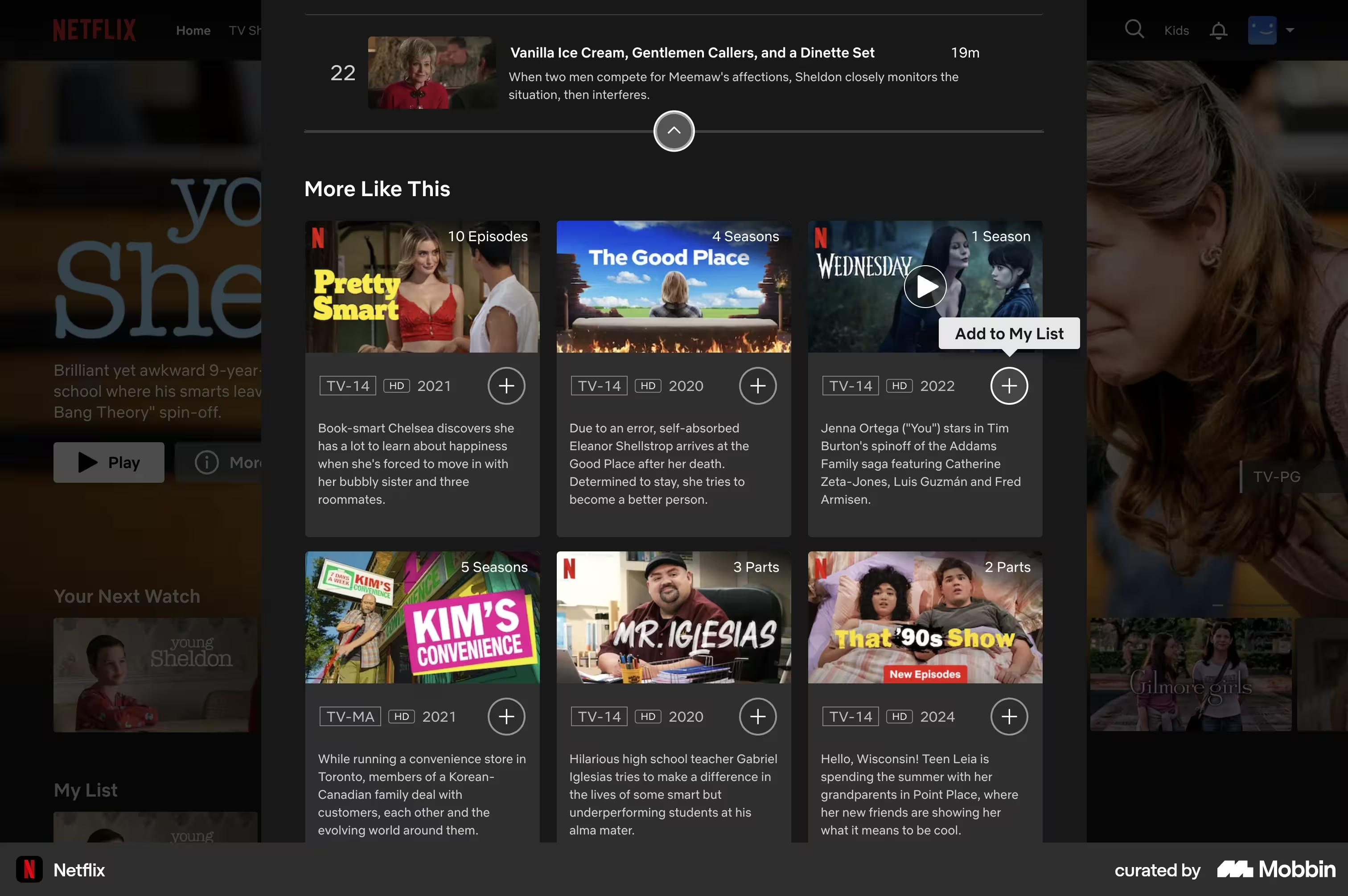
Together, they offer lightweight, non-intrusive micro-guidance without interrupting the user's primary workflow.
💡 When to use: Use hotspots and tooltips for contextual nudges, highlighting redesigned buttons, explaining new micro-features, or clarifying complex inputs directly on the page.
3. Onboarding Checklists
Onboarding checklists list essential setup tasks in an expandable widget, providing a clear visual roadmap for platform activation.
They leverage basic human psychology (don’t we all desire to complete lists!) to motivate users to systematically explore key features.
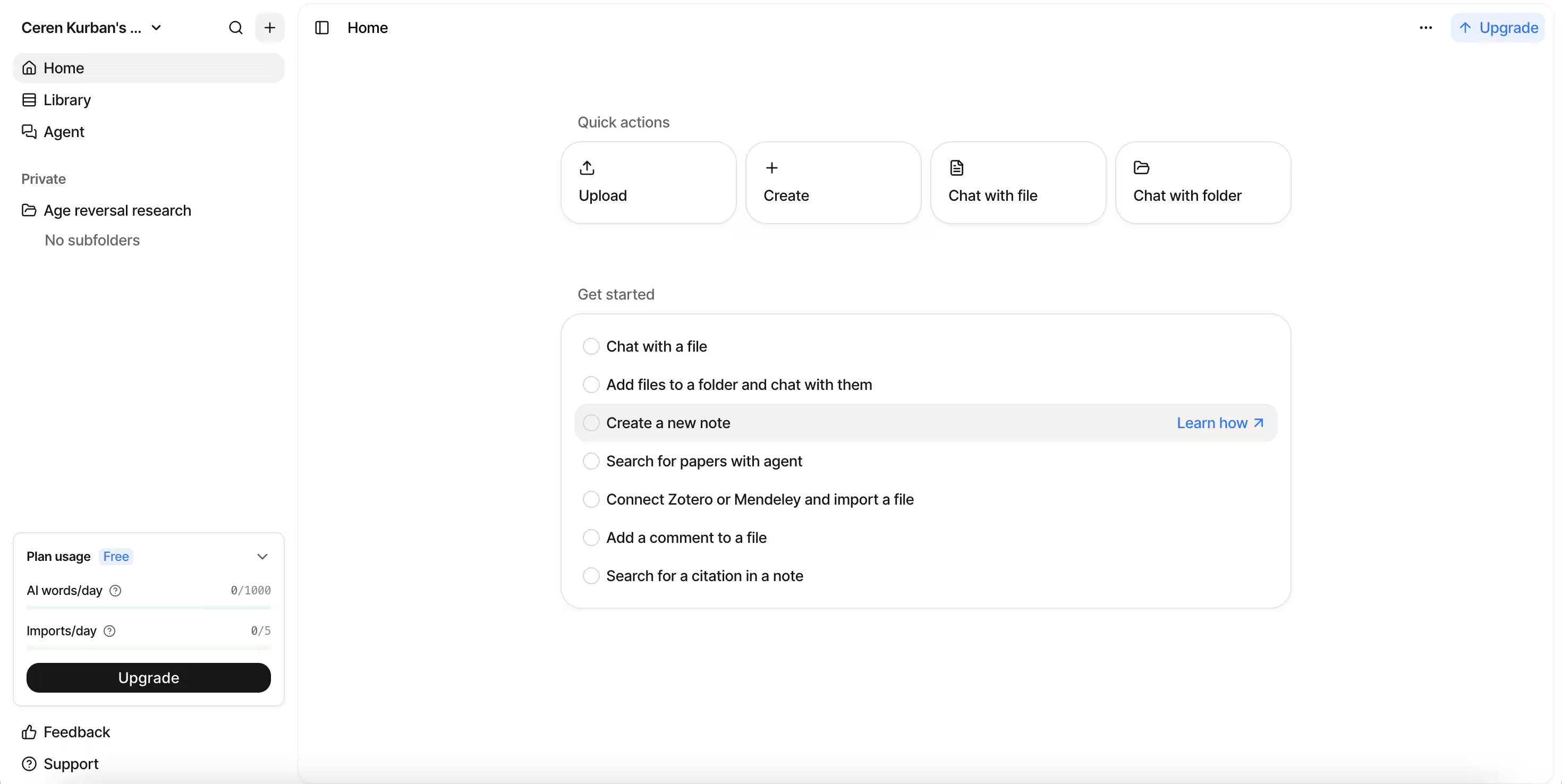
💡 When to use: Use checklists as the central hub for first-time user activation, linking each checklist item directly to an interactive walkthrough or setup page.
4. In-App Video Tutorials
In-app video tutorials embed short, targeted screen-recordings or visual demonstrations directly inside modal windows or slideouts.
They allow users to visually grasp multi-faceted concepts or multi-screen workflows without leaving the application environment.
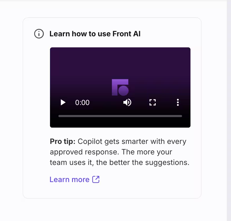
💡 When to use: Use in-app video tutorials where text and tooltip fall short, such as visually intricate processes or explaining abstract concepts.
5. Self-Serve Help Menus / Resource Centers
A self-serve help menu (or resource center) is an on-demand, persistent launcher widget inside your app where users can search knowledge base articles, launch walkthroughs, or view product updates.
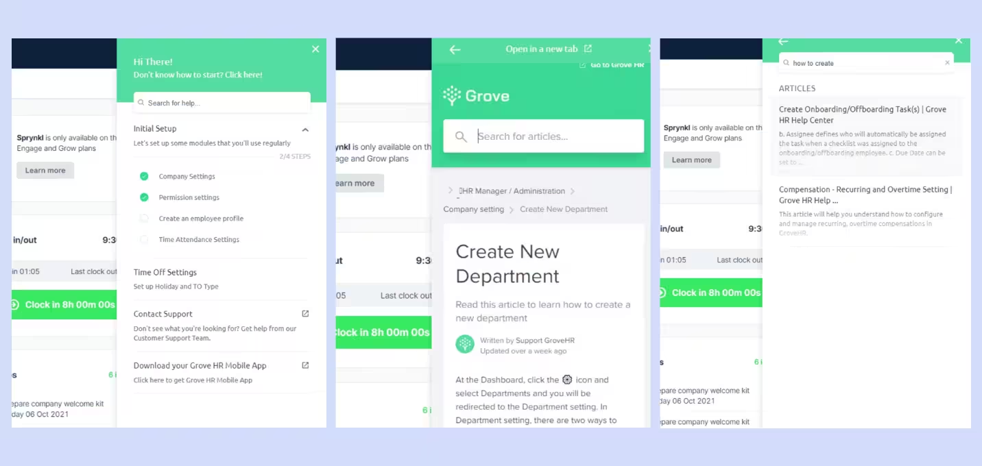
It consolidates all learning resources into a single click, providing friction-free support whenever users get stuck.
💡 When to use: Use resource centers globally across your app as a 24/7 self-service layer to deflect basic support tickets and offer ongoing, user-initiated learning.
6. Pop-ups, Slideouts & Banners
Pop-ups (modals), slideouts, and top-bar banners are high-visibility overlay messages used to capture user attention immediately.
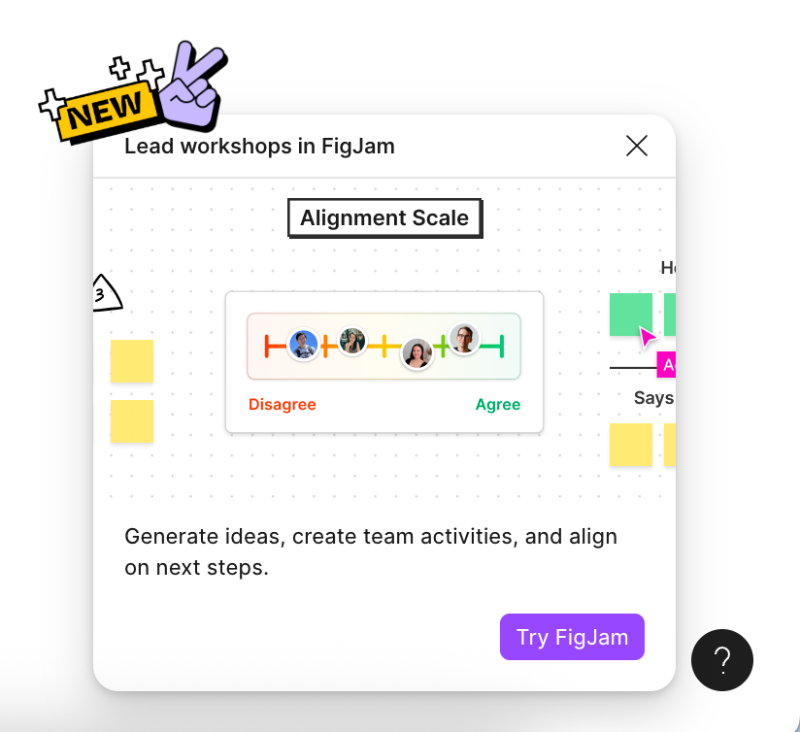
While modals temporarily take focus to announce major updates, slideouts and banners offer less intrusive messaging that slides in from the screen edges.
💡 When to use: Reserve pop-ups and slideouts for high-priority announcements, new feature releases, plan upgrade prompts, or time-sensitive platform notices.
7. In-App Courses
In-app courses organize multiple lessons, videos, and interactive tasks into structured multi-module learning paths directly within the platform.
They offer a comprehensive learning experience for power users without forcing them out to an external LMS.
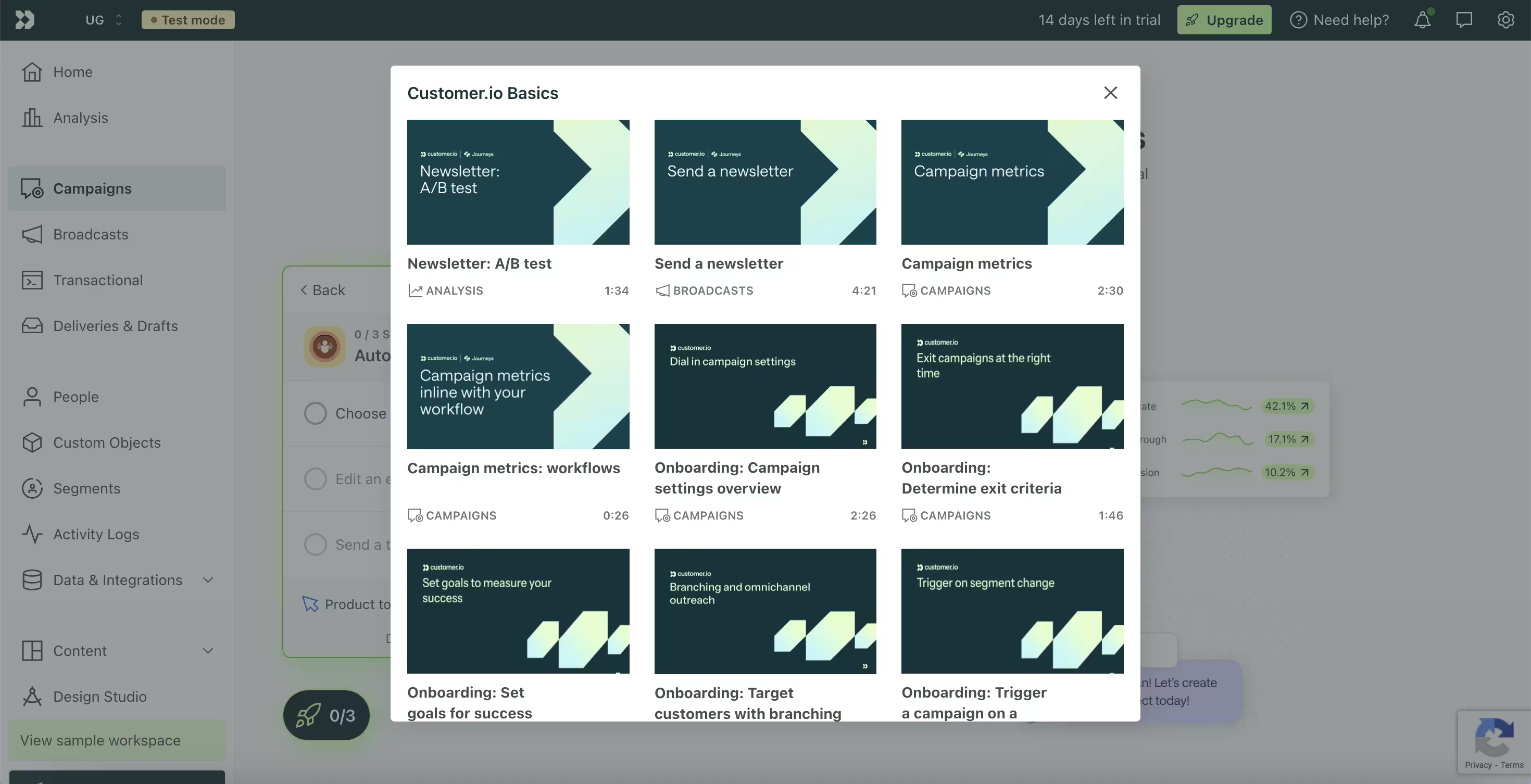
💡 When to use: Use in-app courses primarily for enterprise software platforms requiring role-specific certifications, administrator training, or advanced platform mastery.
When to Use In-App Tutorials?
In order to ensure that your in-app tutorials are doing the job right, you should utilize them at precise moments, when they are contextually relevant in the user's lifecycle.
Do not forget that triggering guidance at the wrong time can disrupt a user's workflow; while triggering it at the right time turns friction into immediate momentum.
There are three primary trigger moments when deploying in-app tutorials yields the highest ROI:
1) First Time User Onboarding
The most critical moment for an in-app tutorial is during a new user's first login session.
At this stage, users are eager to see if your product fulfills the promise that made them sign up, but they lack familiarity with your interface.
Rather than overwhelming new signups with every single feature you have up in your sleeve, trigger an onboarding tutorial that guides them through 2–3 fundamental actions required to reach their first "Aha!" moment.
🚀 Why this moment? : You can drive early activation, reduce initial churn, and shorten time to value (TTV).
💡 What to do? : An onboarding checklist paired with a short interactive walkthrough.
Check out UserGuiding’s capabilities when it comes to customer activation here 👈
2) New Feature Announcements and Redesign
When launching a new feature or updating an existing UI, your current users might miss the update or resist changing established habits.
In this case, relying solely on release notes or email announcements usually results in low adoption because the message is disconnected from the product interface.
Contextual in-app tutorials introduce updates right inside the workflow where the feature lives, explaining what changed and why it helps them.
🚀 Why this moment? : You can boost feature discovery, drive secondary feature adoption, and minimize friction during UI updates.
💡 What to do? : A non-intrusive banner or slideout introducing the value, followed by a hotspot or 2-step tooltip tour.
You can check out how UserGuiding helps for driving engagement right here 👈
3) Unblocking Friction Identified from Support and Product Data
Every software product has subtle usability drop-off points. These can vary from setting up a domain to exporting a complex report.
When analytics or support ticket data show that users repeatedly get stuck at a specific step, an in-app tutorial can intercept and solve the issue preemptively .
By placing automated guidance directly at known friction points, you offer instant self-service resolution without forcing users to submit a ticket or leave the app.
🚀 Why this moment? : You can reduce support ticket volume, eliminate workflow drop-offs, and increase overall user satisfaction.
💡 What to do? : Contextual hotspots anchored to tricky UI elements or self-serve launcher menus.
You can discover UserGuiding’s capabilities in reducing support tickets via in-product support from here 👈
How to Create an Effective In-App Tutorial?
By now, it is clear that building successful in-app tutorials isn't about covering every feature in your interface.
Rather, it is about guiding your users past friction points toward fast activation.
How to do that, though?
Following a structured framework ensures that your guidance addresses real user drop-off points, reaches the right audience segments, and delivers measurable product value.
Step 1: Identify Where Users Get Stuck
Before creating any in-app guidance, it is crucial to pinpoint the exact screens, buttons, or workflows where users feel confused and drop off.
Avoid guessing what users need; rely on qualitative and quantitative product usage data to uncover drop-off points.
Here are a few things you can do in order to understand the drop-off patterns:
- Product & Behavior Analytics: Audit user funnels to identify high-dropoff steps (e.g., users signing up but failing to complete workspace configuration).
- Session Replays: Watch recorded user sessions around drop-off points to spot UI confusion, rage clicks, or misleading navigation elements.
- Usability Testing & Micro-Surveys: Run targeted, single-question in-app surveys or observational usability tests to collect direct feedback on feature friction.
- Support Ticket Patterns: Categorize recurring support queries to spot administrative tasks that should be self-serve.
Step 2: Design and Segment Your Tutorials
Once friction points are identified, design your tutorials around specific user roles and onboarding stages.
Keep in mind that broad, one-size-fits-all tutorials introduce unnecessary noise for experienced users while overwhelming new signups.
Organize your guidance into three distinct priority levels:
- Primary Tutorials (Activation Phase): The critical path required to reach the primary "Aha!" moment during first-run onboarding.
- Secondary Tutorials (Feature Adoption Phase): Deepening engagement with key sub-features after initial setup is complete.
- Tertiary Tutorials (Advanced & Upsell Guidance): Power-user capabilities, administrative setup, and feature expansion prompts triggered at usage milestones.
Here’s a valuable tip for you! Through segmenting particular tutorials by user role (e.g., Admin vs. Viewer), lifecycle phase (e.g., Day 1 Signup vs. Day 30 Active User), and current behavioral triggers you can make sure that guidance appears only when relevant.
Step 3: Launch, Test, and Repeat
Deploying an in-app tutorial is a constant process in which you need to keep testing to see what works and what does not, and keep on improving from there.
A phased rollout prevents widespread user disruption and provides clear data on tutorial effectiveness.
- Internal QA: Test step-by-step flows internally across multiple browser configurations, screen resolutions, and mobile responsive views.
- Small-Group Testing (Beta Rollout): Release the tutorial to a specific 10%–20% user cohort or test group to measure initial drop-off and completion behaviors.
- Full Launch & Analytics Monitoring: Roll out globally while tracking performance via your analytics dashboard. Monitor both step-by-step tutorial completion rates and broader product activation metrics to refine step sequencing over time.
Best Practices for In-App Guidance
If you want to design in-app guides that actually get completed by your users, then you need to balance being helpful with respect for user attention.
Here are five core habits that you might need in order to build guidance that drives engagement without causing friction!
1. Keep It Short and Focused
Long, 10-plus step product tours cause fatigue and lead to immediate skipping.
To avoid tiring your users out before they achieve their “Aha!” moment, try to limit walkthroughs to 3–5 actionable steps focused strictly on reaching a single milestone.
A good onboarding flow example can be seen with GitKraken’s intro tutorial.
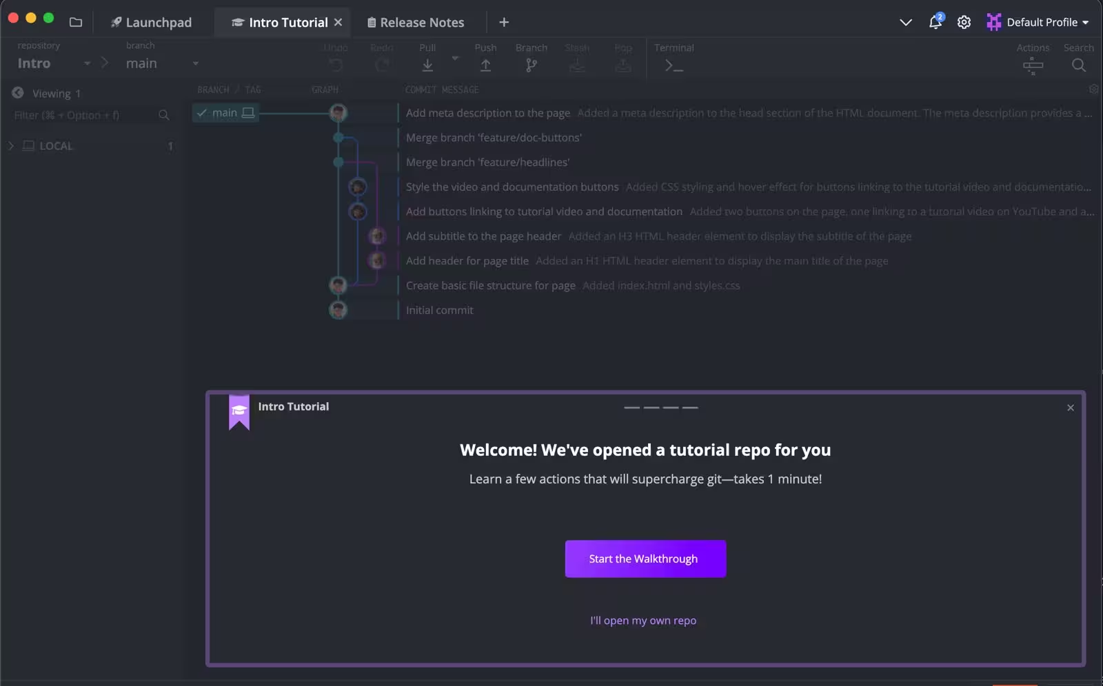
Upon signup, GitKraken avoids touring its entire workspace. Instead, its initial onboarding tour focuses solely on understanding the basics of coding through their software.
2. Personalize Guidance by User Role & Intent
Not every user needs the same onboarding path. By segmenting tutorials based on user roles, account permissions, or goals declared during sign-up welcome screens you can set your users for success from the get go.
Let’s look at Flowchart’s example:
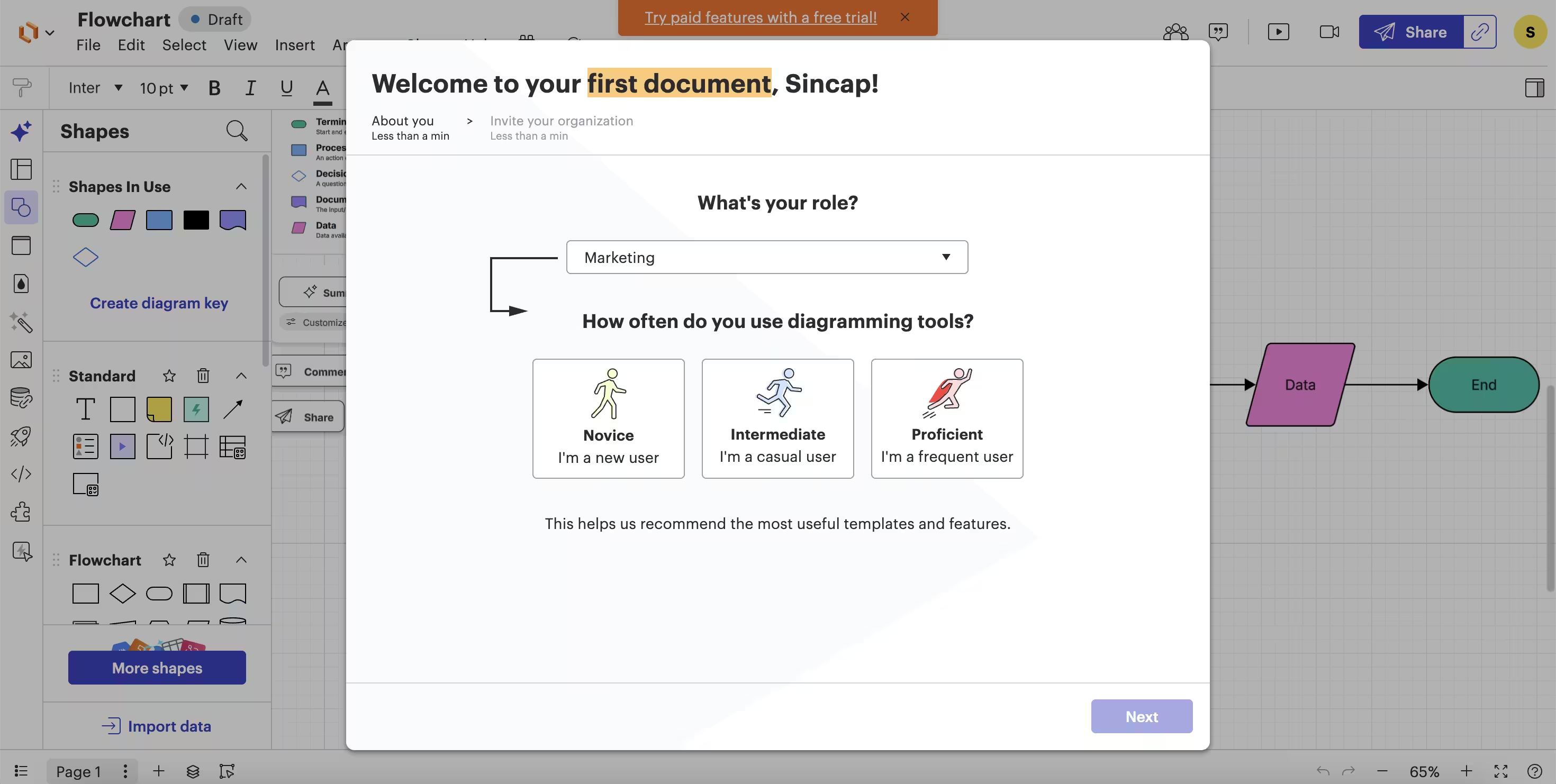
Instead of using one-size-fits-all onboarding, Flowchart asks new users their role and their level of familiarity with diagramming tools, launching tailored walkthroughs specific to that declared focus.
3. Make Guidance Interactive (Learn by Doing)
Passive, text-heavy tooltips that simply explain features are easily forgotten.
Turn your users into active participants within your product by requiring them to take real actions such as clicking a menu, uploading a logo, or filling out a field to progress through each step.

4. Ensure Guidance Is Contextual and Action-Triggered
Avoid launching intrusive pop-ups as soon as a user opens the dashboard.
It is more effective to trigger tutorials only when a user navigates to the relevant feature screen or performs a specific initiating action.
Let’s examine this Grammarly pop-up:
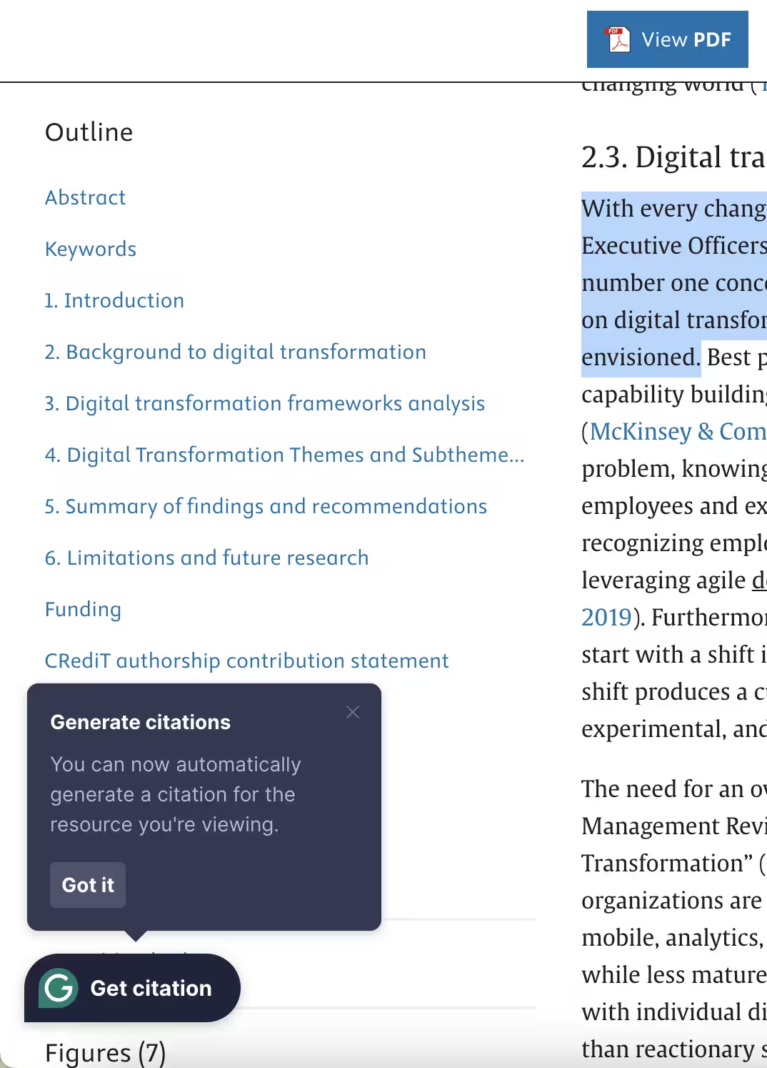
Grammarly displays a subtle tooltip introducing its automated citation generation only after a user highlights a full sentence inside the document editor.
5. Continuously Gather Feedback and Iterate
In-app tutorials shouldn't be static set-and-forget elements.
Make sure to embed quick thumbs-up/thumbs-down ratings or micro-feedback prompts at the end of guidance flows to identify confusing steps and optimize completion rates.
Check out Jira’s Customer Effort Score (CES) survey that pops up after a user completes an action, namely publishing a page.
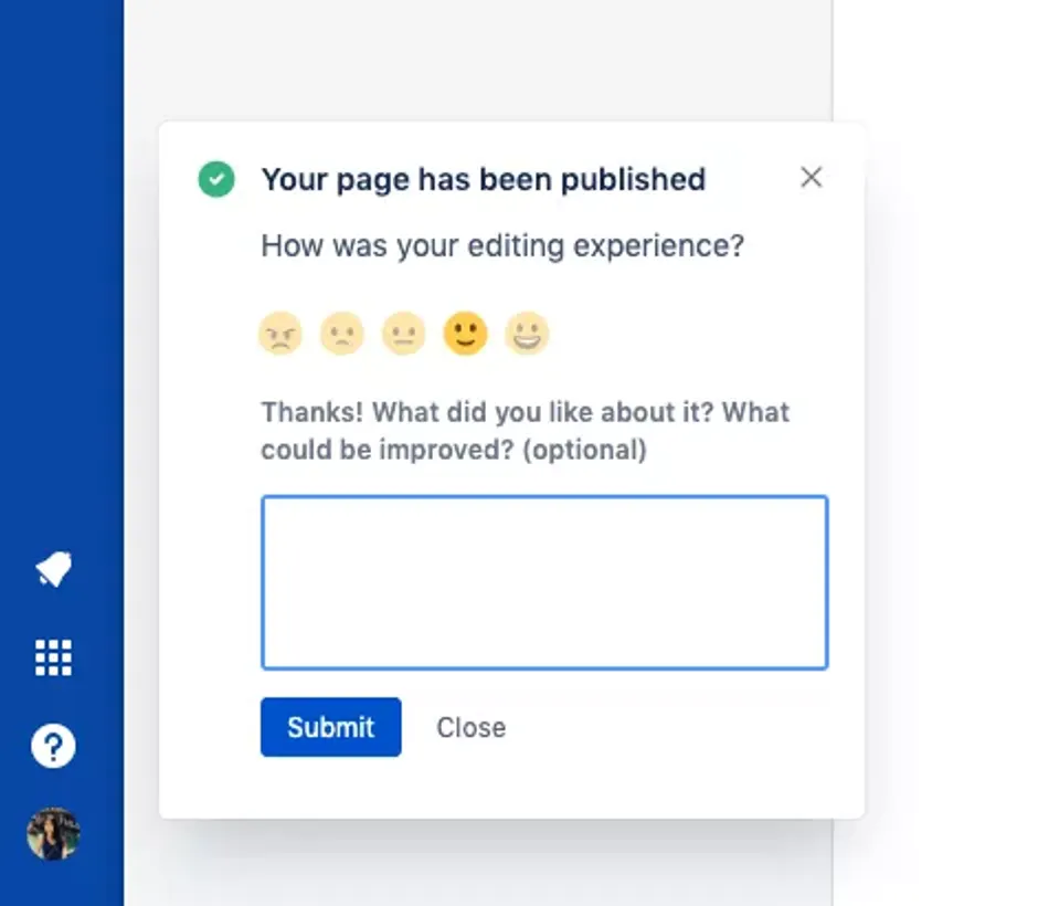
While the experience within the product is still fresh in a user’s mind, making use of simple surveys like this one to get feedback helps you clearly define and polish your in-app guides for ultimate results.
How to Measure In-App Tutorial Success
To thoroughly understand whether your in-app guidance is effectively acquired by your users and drives product adoption, you need to track metrics at two distinct levels:
- Micro-level tutorial performance: Are users engaging with and finishing the guide?
- Macro-level product impact: Is the guide actually improving overall user retention and feature usage?
Evaluating both of these levels ensures high completion rates on a tutorial and actually translates into long-term product adoption.
Here are some success metrics you should keep in mind when evaluating the success of a guide!
Tutorial Completion Rate
Tutorial completion rate measures the percentage of users who finish every step of a guide once it is triggered.
A drop-off between any given steps signals that a specific point during the guide is confusing to the users, or that it is demanding.
Tutorial Completion Rate = (Users who completed the guide / users who started the guide) x 100
🌟 Top performing onboarding guides are the ones that foreground completion rates step-by-step. This allows them to identify exact points of frustration and allows the product teams to shorten or refine the problematic steps.
Feature Adoption Rate
Feature adoption looks into the percentage of your active user base that regularly utilizes a specific feature highlighted by that particular in-app guide.
Feature Adoption Rate = (Users who used the target feature / Total active users) x 100
DAU / MAU Ratio
The ratio of Daily Active Users (DAU) to Monthly Active Users (MAU) showcases how often your users return to your platform.
In other words, it highlights if your product has stuck with your users or not.
Product Stickiness = [Daily Active Users (DAU) / Monthly Active Users (MAU)] x 100
🌟 Effective onboarding and feature guides increase stickiness by making daily workflows habit-forming.
Retention Rate
Retention rate measures the percentage of users who remain active over a given period (e.g., 30 or 60 days after sign up).
Retention Rate = (Users activate at the end of period / Total users at the start of period) x 100
🌟 Higher initial guide completion correlates directly with improved 30-day retention rates.
Churn Rate
Churn rate tracks the percentage of users that cancel their subscription or stop using the product within a given time period.
Churn Rate = (Users lost during period / Total users at start of period) x 100
🌟 With effective in-app tutorials you can resolve early setup friction and reduce customer churn early in the lifecycle.
Top 5 Tools for Creating In-App Tutorials
Thankfully, building effective in-app guidance does not require months of custom engineering work.
Digital Adoption Platforms and product guidance tools provide necessary support to your product, marketing, and CS teams for them to design and deploy interactive tutorials without writing code.
Here are 5 leading tools that can help you build in-app tutorials:
1. UserGuiding
UserGuiding is a no-code product adoption tool with a wide range of use cases and intuitive UI that makes building effective in-app tutorials easy even for your non technical staff.
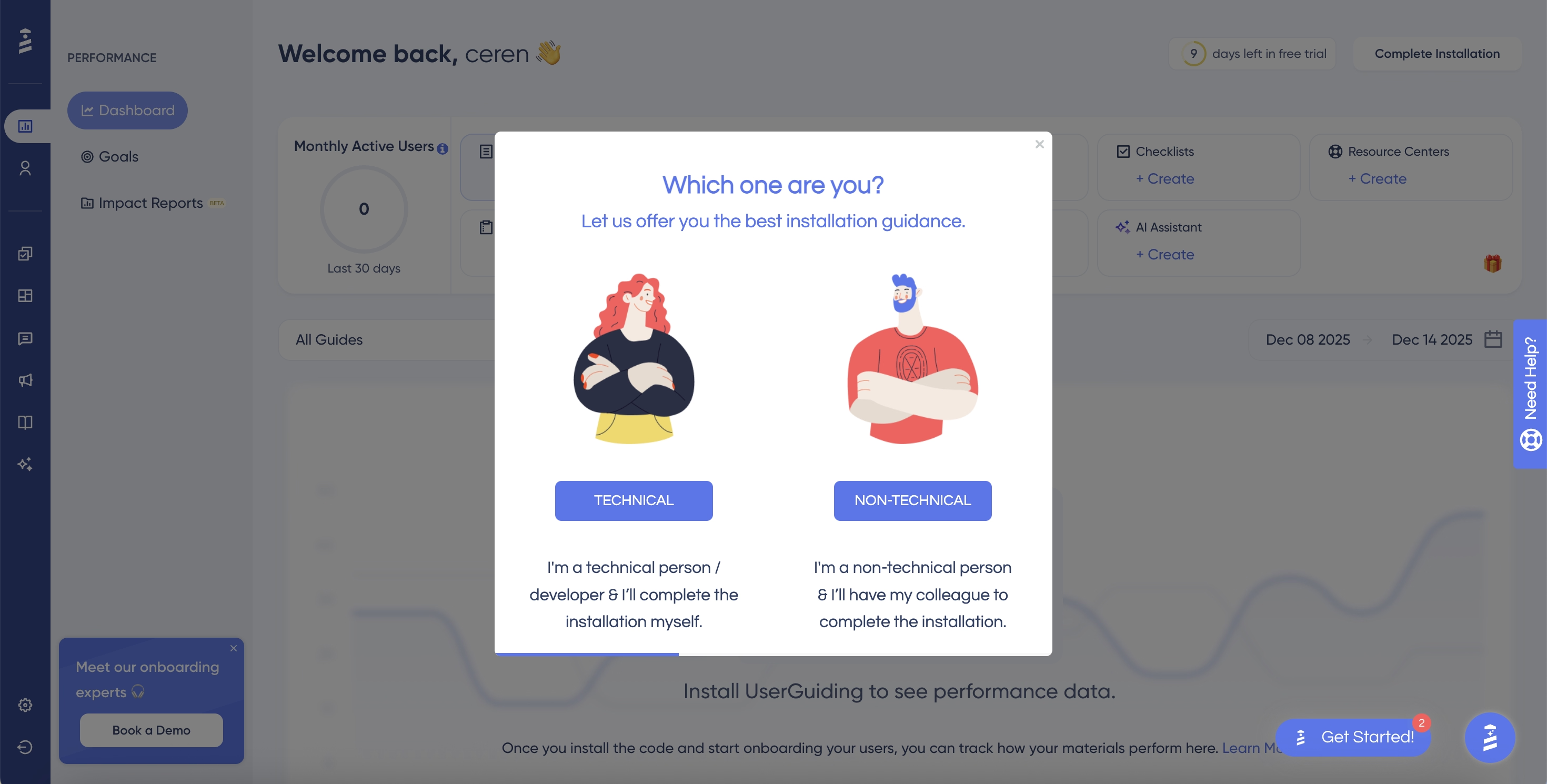
With UserGuiding you can create interactive walkthroughs, tooltips, onboarding checklists, resource centers, and in-app banners.
It combines ease of use with detailed analytics, user segmentation, and an AI assistant.
Don’t take our word for it, check out what real users have been saying about UserGuiding!
⭐ Best For: Mid-market and scaling SaaS teams seeking an all-in-one,no-code digital adoption platform.
🚀 Standout Feature: AI assistant and no-code chrome extension builder.
➡️ Free Trial? : Yes, a 14 day free trial is available.
2. Userpilot
Userpilot is a product growth platform that is designed specifically for web-based SaaS products hoping to deliver personalized in-app experiences.
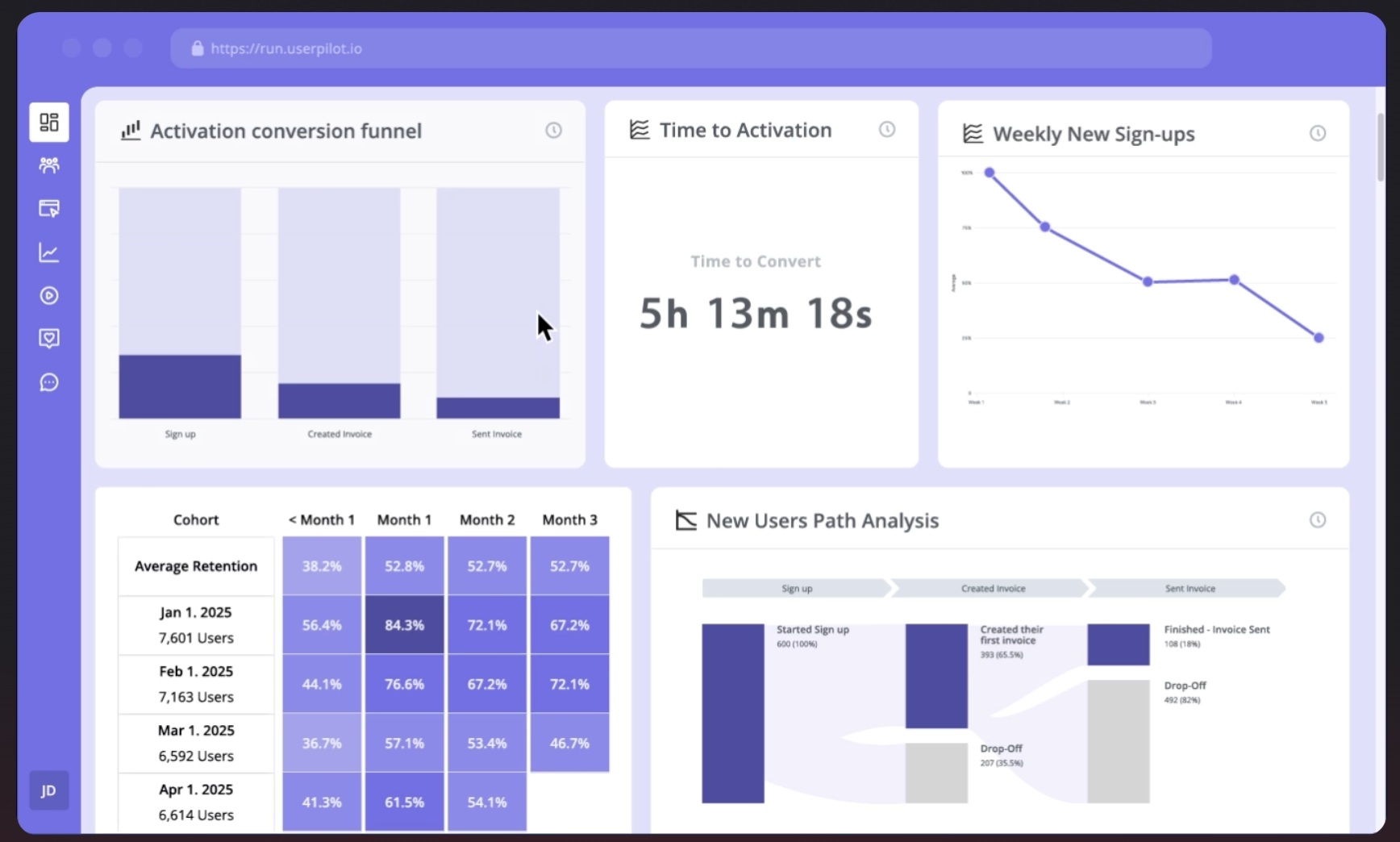
It offers a wide range of UI capabilities, including walkthroughs, hotspots, and slideouts. In addition, it has feature-tagging analytics to trigger guidance based on real-time user behavior.
If you want to learn more about the user experience of Userpilot, check out what real users have been saying about Userpilot!
⭐ Best For: Product-led SaaS companies focused on deep user segmentation and event-driven product analytics.
🚀 Standout Feature: Behavior-triggered flows and product usage analytics.
➡️ Free Trial? : Yes.
If you wish to learn more about Userpilot’s pricing or its use cases, check out these two articles!
3. Appcues
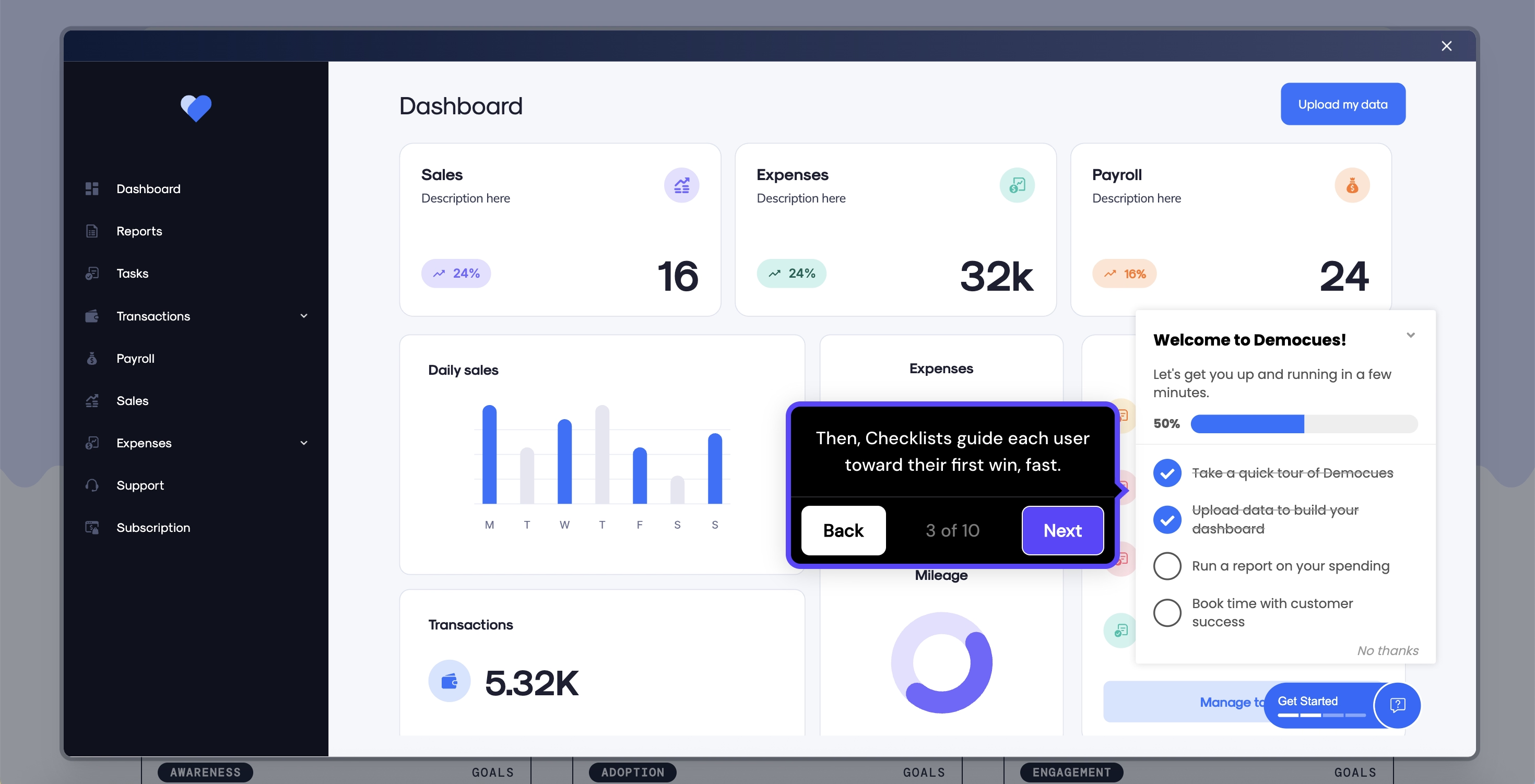
Appcues is an AI-first customer engagement platform allowing your product teams to build onboarding flows, modals, tooltips, and checklists.
In order to learn more about people’s experiences on using Appcues, check out what they have been saying about Appcues!
⭐ Best For: Mobile and desktop apps looking for flexible design customization and multi-platform support.
🚀 Standout Feature: Cross-platform web and mobile onboarding capabilities.
➡️ Free Trial? : Yes.
If you wish to learn more about Appcues, explore our guide on the top Appcues alternatives!
4. Whatfix
Whatfix is an enterprise-grade digital adoption platform built to support both customer-facing SaaS products and internal employee desktop software.
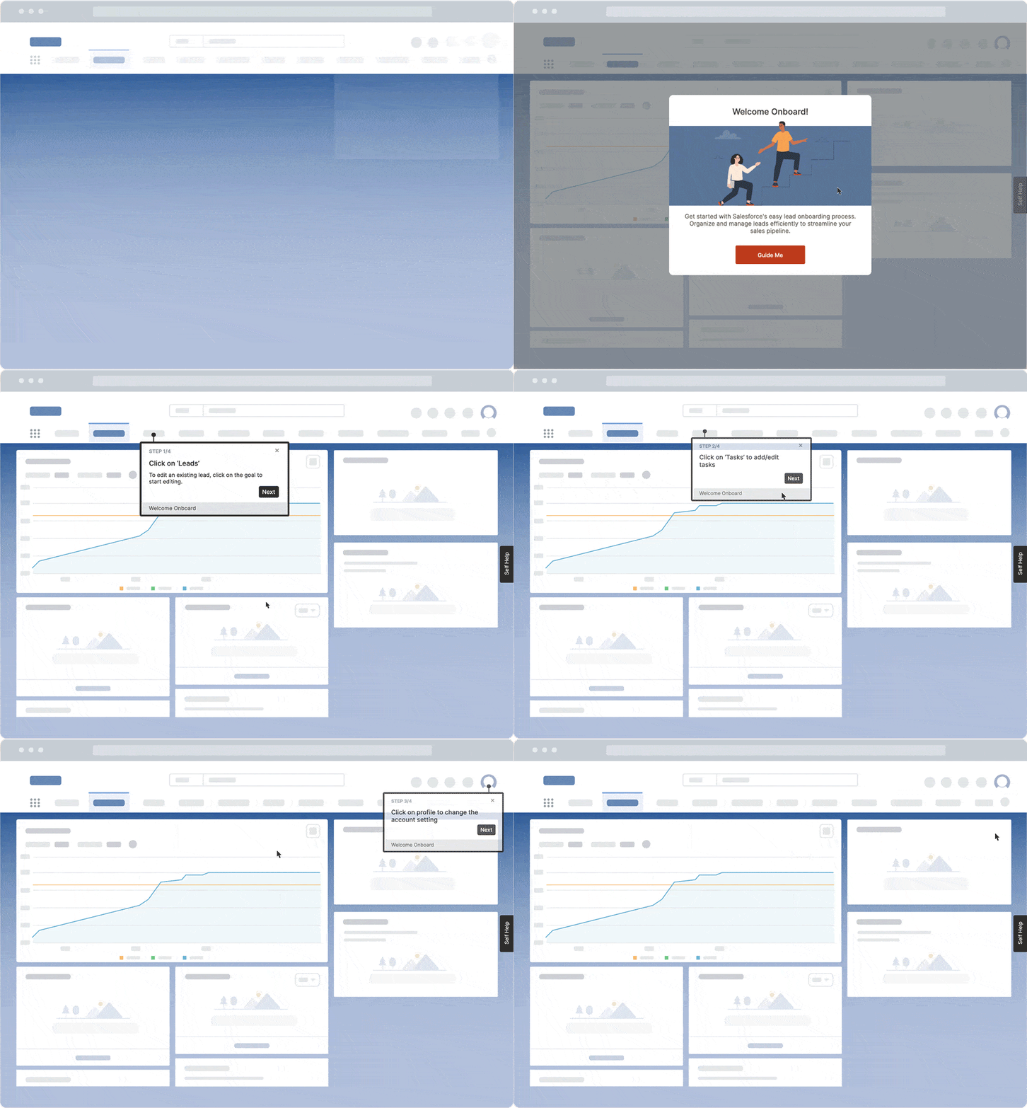
It specializes in overlaying interactive guidance across complex enterprise tech stacks, integrating with LMS systems, and providing offline learning exports.
In order to learn more about Whatfix’s use cases, read our breakdown of the tool!
⭐ Best For: Large enterprise organizations requiring complex cross-application guidance and employee training.
🚀 Standout Feature: Cross-application guidance and enterprise LMS integrations.
➡️ Free Trial? : Available by request/demo-first model.
You can compare enterprise options in our exploration of Whatfix competitors!
5. Chameleon
Chameleon caters to product and design teams that want complete control over how in-app elements render in the finished product.
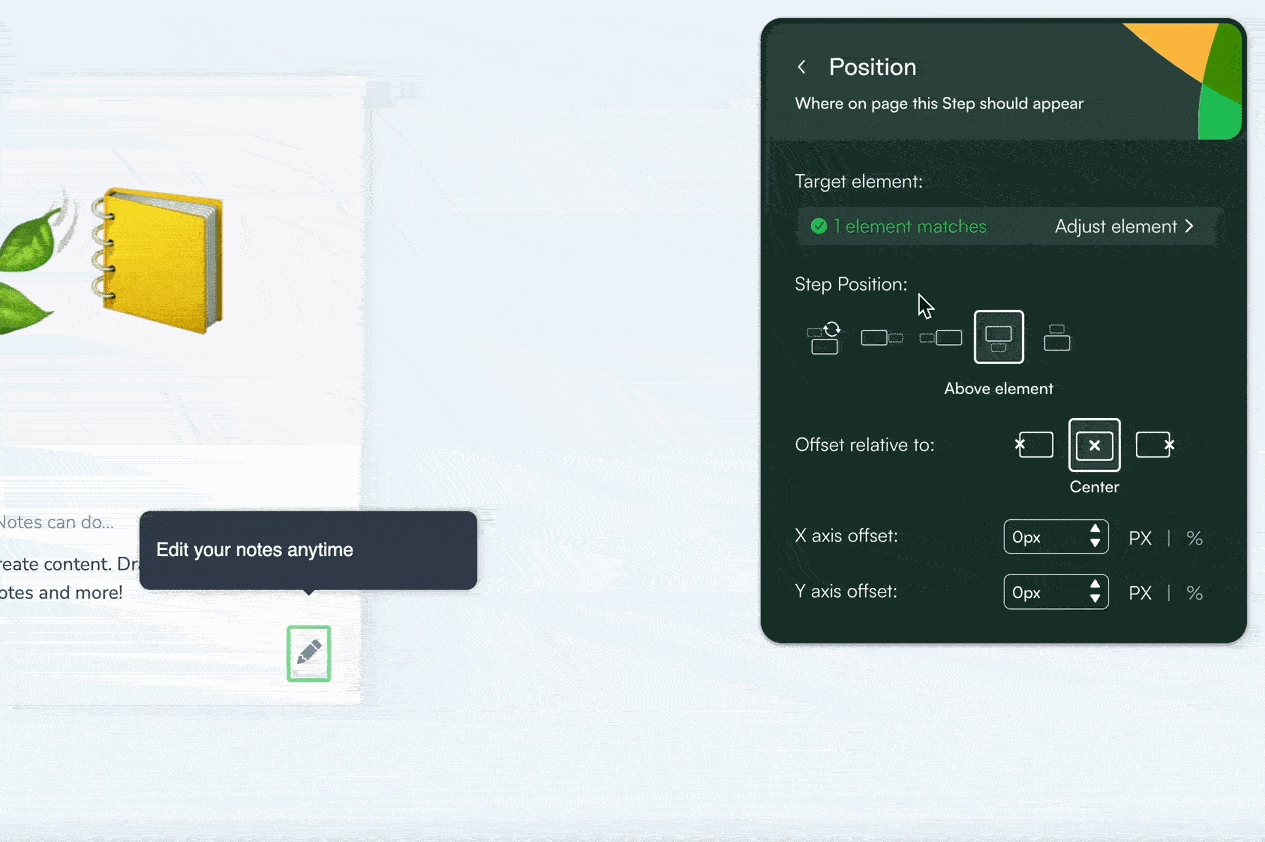
In addition to standard walkthroughs and tooltips, Chameleon offers customizable launchers and in-product micro surveys to collect user data.
In order to learn more about Chameleon’s use cases, read our breakdown of the tool!
⭐ Best For: Highly technical product teams wanting deep UI customization and advanced micro-surveys.
🚀 Standout Feature: High-degree CSS customization and native widget launchers.
➡️ Free Trial? : Yes.
You can compare enterprise options in our deep dive of Chameleon alternatives and competitors!
The Future of In-App Tutorials
In recent times, in-app tutorials have been evolving from static, predetermined step sequences into dynamic, adaptive learning experiences.
A 2024 study highlights that 76% of consumers expect companies to understand their needs and preferences, with 72% saying they only engage with personalized content.
These statistics show that the future of product guidance relies on adaptive tutorials that dynamically modify their steps based on a user’s role in the company, live progress, and previous feature interaction history.
In a LinkedIn article Ali Quadri claims that in pairing behavioral analytics powered with AI, they saw results in reduced frustration and increased adoption. Their feature discovery increased 67%, while time to completion rates decreased 31%.
Similarly, they mention using AI in the design process. Moving on from their idea, AI can help analyze and draft multi-step flows, or translate existing guides into other needed languages without manual localization tickets.
Another trend concerning AI is the contextual assistants and conversational search engines.
With these AI agents, users do not have to hunt for an article, but rather can ask directly and receive immediate guidance.
For example, UserGuiding’s AI assistant, Dylan, is integrated directly into the resource center.
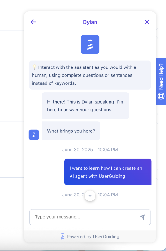
It learns your knowledge base and documentation to answer user queries instantly while highlighting exact UI actions required inside the live-app.
Learn more about UserGuiding’s AI assistant!
To wrap up…
As you can see, in-app tutorials are more than just cosmetic product overlays. They are a critical engine for driving activation, feature discovery, and long-term retention across the SaaS customer lifecycle.
By bringing interactive, contextually triggered guidance directly into your interface, you create a self-serve environment where users learn by doing and reach meaningful value faster.
Building effective in-app guidance doesn't require overhauling your entire application or tying up engineering resources for months. Identifying key friction points, segmenting guidance by user role, and continually making better based on tutorial completion metrics sets you up for success.
Moreover, UserGuiding can help you build onboarding experiences that feel helpful and impossible to skip. Give it a try!
Frequently Asked Questions
What is the difference between an in-app tutorial and an in-app guide?
An in-app guide defines any in-product visual prompt, including banners, tooltips, and announcements. An in-app tutorial is a specific, action-driven format within that category. While general guides often just display information, tutorials require users to complete certain tasks step-by-step to build muscle memory and complete workflows.
How do you create an in-app tutorial without writing code?
You can build no-code in-app tutorials using a Digital Adoption Platform (DAP) like UserGuiding. These platforms provide browser extension builders where you visually select UI elements on your live product screen, attach tooltips or modals, customize the copy, and set behavioral trigger rules.
What is a good example of an in-app tutorial?
A standout example is Keyhole’s onboarding flow, built using UserGuiding. Instead of dumping piles of documentation on trial signups, Keyhole uses an interactive onboarding checklist paired with short, step-by-step walkthroughs. It guides users through tracking their first hashtag and building a report, helping them reach value immediately, driving a 550% increase in trial conversions in the process.
Should in-app tutorials be skippable?
Yes, in-app tutorials should always include an easily accessible exit or "skip" option. Forcing experienced users or returning customers through mandatory, unskippable product walkthroughs causes friction and increases drop-off rates. If users dismiss a tutorial early, keep it accessible inside a persistent self-serve resource center so they can relaunch it whenever they need assistance.
How long should an in-app tutorial be?
An effective in-app tutorial should take less than two minutes to complete and consist of only 3 to 5 actionable steps. Extensive walkthroughs with more than five steps suffer from completion drop-offs. If a workflow requires more complex steps, break the process into smaller, modular micro-tutorials linked inside an onboarding checklist.
.png)