Welcome to the new age, friends. Undeniably, this is the 'Age of the Customer.'
A perfect hurricane of technology, constantly evolving user personas, growing customer needs, and new business models have changed how many businesses operate. It has become even more challenging to attract -and keep attracting- customers to make them stick around.
This is why I'm writing this article today to help you get a good start with your customers by making them feel welcome and appreciated through simple yet effective welcome messages.

Here are 20 engaging welcome and greeting messages and real-life examples to inspire you.
Let's go!
1- Medium
The primary aim of welcome texts is to onboard your customers in the most engaging way possible. By sending out warm welcome messages to your users, you can offer a quick glimpse into the customer experience you're about to deliver.
Medium has achieved a great example of delivering a greeting message to their customers - they have provided a detailed introduction to their services and made sure customers are fully exposed to the basics.

The design of their welcome message is very easy to look at; not complicated or overwhelming but still able to maintain attention. It's also clearly explaining what to expect from Medium itself while getting started.
2- Grammarly
Addressing your customers with their names is significant while sending out welcome messages. Most companies even build their entire marketing strategies around this method, and they certainly gain a lot in return.
Mentioning the customer's name in your welcome message will enable you to offer a more personalized start and instantly build a positive first impression along the way. And since your customers write down their names while filling out the subscription form, it's not even that difficult to put in a little extra effort!
Grammarly, a grammar-checking tool used by many, welcomes users by saying 'Hello' with their name included in the very first message that they send out.

You can step up this example by taking other personal information into consideration as well - location info, language options, and more. If you're operating offline, you can let the users know about your services in different areas that could be closer to them.
3- Kate Spade New York
The subscription notification, I would imagine, would be the best way to start your day - finding out a new user got on board and finally clicked that subscribe button! What a joy.
Well, since your users manage to make you this happy, why not send them a 'Thank You' note just to let them know how much you appreciate them?
Kate Spade is one of those brands that definitely want to make their users feel seen and appreciated, in fact, they're so passionate about it that they use an envelope-like image on their welcome email template saying ''Thank You'' in a big white font, letting their users know how much they mean to the brand.

4- Wistia
Wistia is a video marketing software for businesses, providing numerous hosting and marketing tools. Once a potential user first interacts with their website, the platform instantly creates a good first impression and pops up a warm welcome message that makes visitors smile.
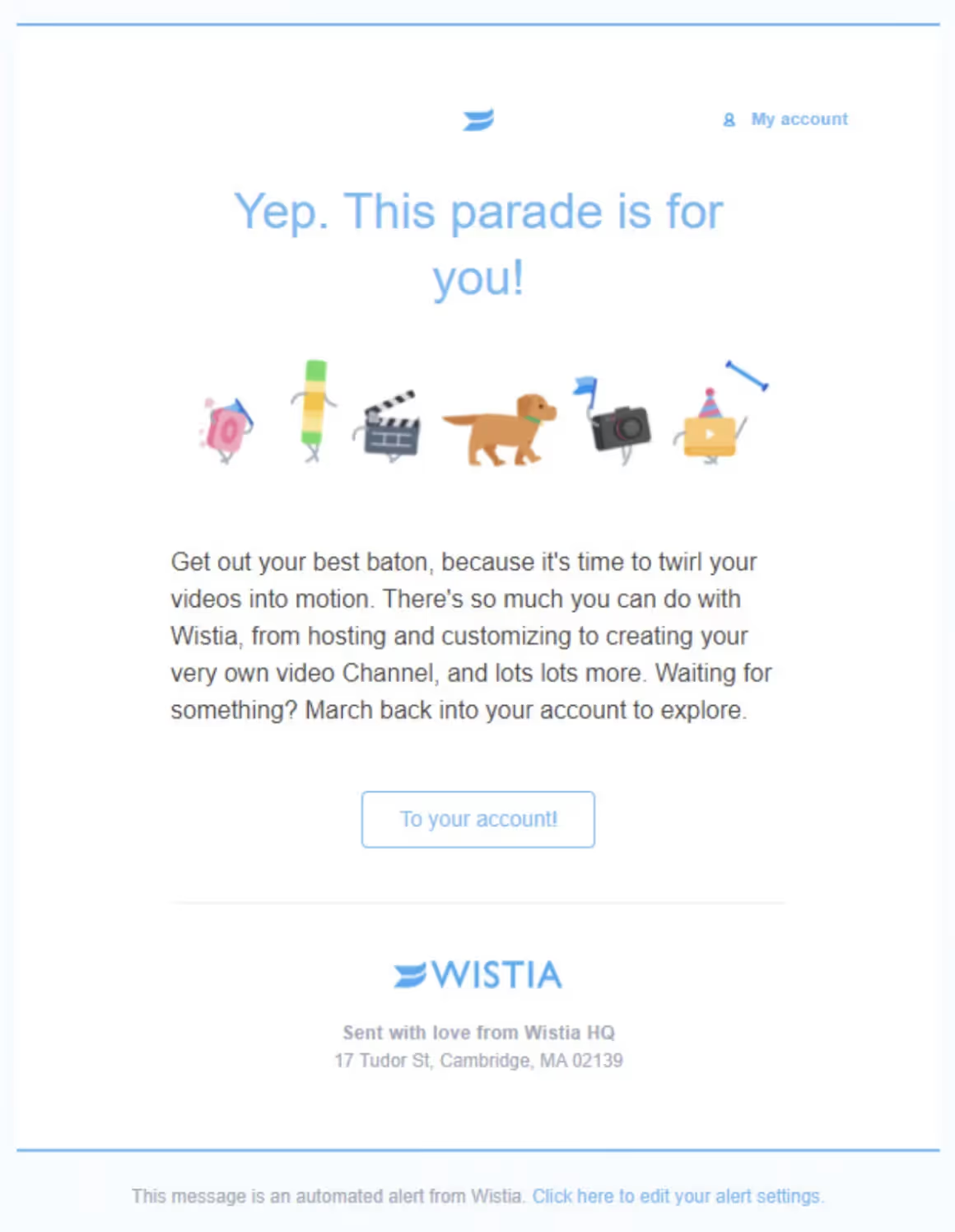
There are lots of things to like about this welcome message - the CTA is clear enough to leave no question marks for the visitor. It's linked to a further step, enabling the user to follow what's next easily, and is quite informative in that it talks about the advanced features of the platform in a rather quick and engaging way.
5- IKEA
One thing about welcome messages is that they need to be engaging. Engaging in more than one way? Even better.
IKEA's welcome message includes a specific invitation to join a customer loyalty program, motivational indicators to complete the user profile, optional communication channels, various links to other social networks, as well as the IKEA blog. All are provided in the same old welcome message.

6- Ralph Lauren
The very first interaction with a potential client is the ideal time to provide customer engagement and attract them even further by introducing them to special offers, prices, and gifts.
This enables the customer to feel appreciated and even rewarded for their interests and effort, which helps them build a positive attitude towards your services and will most likely cause them to talk about you here and there.
Furthermore, a special offer will motivate the customer to instantly start shopping for more, or at least take a quick look at the products.
Ralph Lauren, the famous fashion company, sends a welcome message to their customers with a 10% offer for their next purchase and makes sure they will be, from now on, the first ones to get the latest news about discounts and new products.

7- Kommunicate
You can get as creative as you wish with your welcome messages. Kommunicate has decided to implement chatbots into their welcome process to create a short and cute -and effective- welcome message.

This specific message aims to generate leads by offering them a quick free trial and asking them whether they would like to improve the onboarding experience they provide and generate more leads as a result. The attractive message also does a great job of being informative enough to let the customers know about the further benefits of being involved.
8- WooCommerce
Another way to show how much value you see in your strong relationship with a customer is to send heartfelt, sincere greeting messages. As customers, people are always more likely to buy and stick around more when they feel encouraged, motivated, and remembered.
Taking the time to wish your customers a happy birthday can really make their day - and turn things around for you.
Birthday texts are a part of personalized messages that are easy to implement, and they often lead to brilliant results, from building a brand reputation to conversions.

Here's an example from WooCommerce above. They definitely understood the assignment right when they decided to include a coupon code and personalized their email even to enhance the impact it has on the customer.
9- LARQ

Less is more.
This welcome email example from LARQ does a fantastic job showing us readers the impact of a particular image to describe a brand.
The chosen photograph of a black bottle touched by a wave creates an adventurous, cool, and stylish look for the brand. Followed by a few simple sentences explaining what else is on the way for the customer, this example by LARQ manages to keep it simple yet effective.
10- Notion
Notion, a workspace app for notes, tasks, and more, is definitely among the apps that have excelled in the art of sending welcome messages.
It's a great tool used by many; however, for beginners, it might be a little too versatile. That's why this great welcome email lets users go through the introduction and customer onboarding process process with a detailed guide along the way - helping them set up and become familiar with the functions.

The first step to get you started is a basic one: ''Just start typing.'' After you get the hang of it, you can follow the provided link to the Notion page and further examine the tool's functionality.
11- Fiverr
Fiverr is a freelance services marketplace that comes up with great matches between freelancers and businesses.
Their very first opening message makes sure customers are encouraged to think of themselves as involved in something bigger than themselves, being parts of a community rather than just clients with buying histories.

What's great about this message is the fact that the CTA definitely stands out once you give it a quick look. Appealing to the target audience with a slang phrase and a quick guide to the top services, Fiverr manages to attract attention while maintaining functionality.
12- Curology

I just love this welcome email by Curology! I mean, what business does it have being this cute with all the soft colors, balloons, a heart, and a sign with the cutest font?!
Since they're all about spa solutions, they aimed for a calm spa experience-like introduction to their services; it's obvious that email design and choice of colors can definitely help you achieve your goal if you have a similar one to that of Curology.
13- Casper

Similar to the example of Curology, the use of colors and their relation to the brand's service is evident here. Casper is a sleep-schedule organizer that lets users adjust their lighting for optimal sleep, practice nighttime rituals, schedule their sleep, and more.
What I absolutely love about their welcome message is how they manage to portray their brand's personality via the choice of color and wording.
Saying ''1,000,000 well-rested sleepers'' instead of users or simply customers, Casper provides a trustworthy welcome email that achieves to offer throughout guidance.
14- Urban Outfitters

Urban Outfitters has always been cool. Their unique email design is not just any old welcome email that you're used to seeing in your inbox every day.
Managing to highlight its benefits while promoting its app, Urban Outfitters has all that it takes to be stylish and effective at the same time.
15- Beauty Bay
Some welcome emails may prefer to avoid being 100% promotional, and Beauty Bay sets one of those examples.
In the brand's welcome email, none of its products or a special offer is being directly promoted, rather, it talks more about the brand's online store and what it has to offer.

The mail opens up with a cute GIF showing very quickly some of the most popular products you can purchase, but doesn't provide a long time for you to see them, just enough to make you curious and look for more.
16- The Body Shop
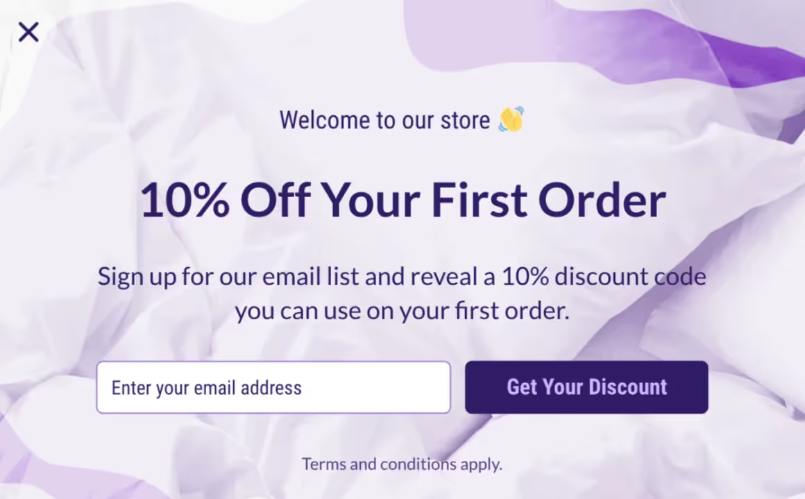
Special welcome offers have always been one of the top methods used by businesses to create a solid first impression for their customers. It's the same old technique used by many, but there's a reason why it's so popular: It works.
Welcome discounts are proven to encourage the potential customer to place their first orders in addition to signups, and The Body Shop is one of those companies who mastered this strategy.
In their welcome email, they offer a discount promise and provide no further information before ensuring you get your discount code first.
17- Taylor Stitch

Making a welcome email really stand out is never easy. Taylor Stitch is one of those rare companies that just know how to make it.
In their unique welcome email, they went for a stylish photograph-like page demonstrating what they have to say, their offer, and their simple ''Welcome to the family.'' message.
18- Waking Up
Waking Up is one of my favorite meditation apps that's been quite popular and effective for some time now.
Their welcome email is all about the philosophy behind meditation and its background - enabling the visitor to gain a better understanding of the subject instantly.

Opening up with an introduction to the app by Sam Harris, the bestselling author, the email then explains how the app was created and what it aims to achieve alongside its key benefits.
Furthermore, toward the end of the email, the email provides a special offer through which they enable a FREE account for people who truly cannot afford it; how amazing is that!
19- Hotjar
Hotjar is an analytics company that lets customers examine how viewers interact with their webpage through the help of numerous tools, including recordings, heatmaps, surveys, and more.
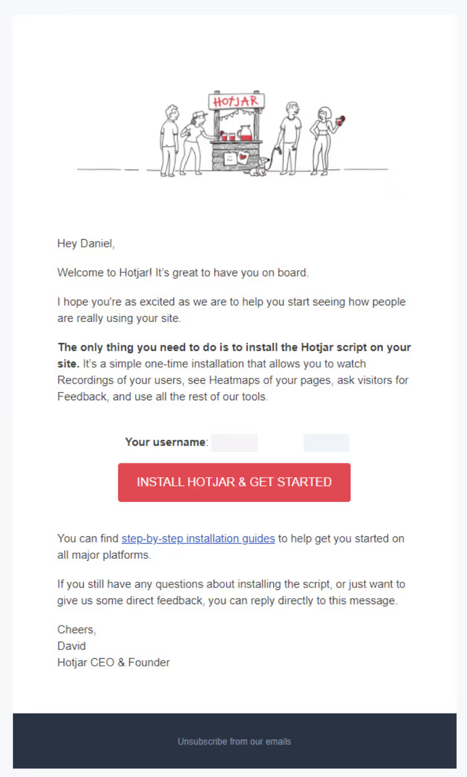
What I like about their welcome email is that it has a single clear goal: to lead users to install the essential script on their webpage finally.
You may think it might be a little overwhelming to deal with scripts and codes the moment you get started as a customer, but Hotjar makes sure the process is manageable thanks to their step-by-step guide to get you through it.
20- Gmail
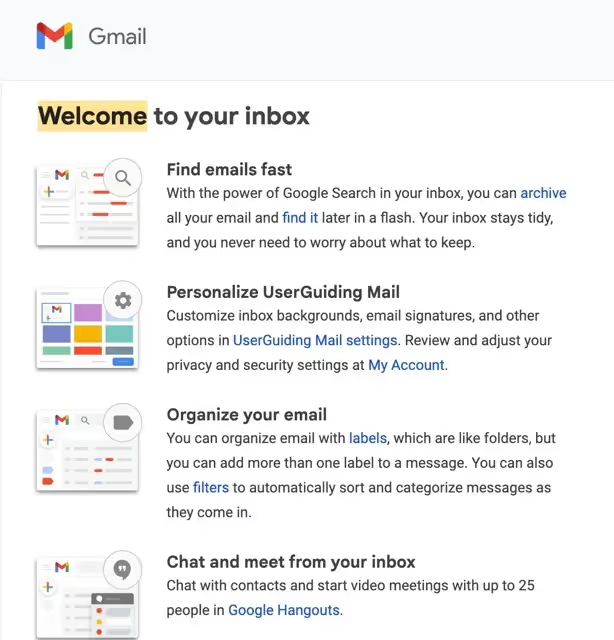
Well, one example that I appreciate a lot when it comes to greeting is Gmail because it knows what to bring up and it knows how to bring it up.
With its first email, it teaches how to make use of the platform it's offering; thus, it mentions the functions one by one.
While doing so, it benefits from minimal images with an easy-on-the-eye color palette, which I'm thankful for.
In short, Gmail explains the core features of the platform in its introductory email for people to get started right away.
Wrapping Up
Sending personalized messages, for sure, creates a strong bond that guarantees an increase in brand loyalty and can help you build stronger-than-ever relationships with your clients.
Welcome and greeting as well as promotional messages are just an example that shows how you can let your users know how much you care about them and how much you value strong customer communication. So, it's high time you implemented these effective messaging methods to reach out to your customers!
Frequently Asked Questions
What is a good welcome message?
A well-crafted welcome message usually consists of a sincere text saying ''Hello, Welcome to the team, family, it's great to see you, etc.'' It sometimes mentions a special discount that motivates the prospect to move forward and stick around.
What do you say in a welcome post for customers?
You can say things like ''Hello, welcome on board, we cannot wait to serve you, we hope you'll be happy with our service, see you next time'.' etc.


.svg)
.svg)
.svg)
.svg)
.svg)


.svg)
.svg)


.png)


