.svg)
.svg)
.svg)
.svg)
.svg)


.svg)


.svg)
.svg)

TL;DR
- Users churn when they don’t notice updates, miss their “aha!” moment, or feel your product is stagnant.
- The best practices for reducing churn include:
- Put updates directly in front of users where they are active.
- Communicate benefits in a way that shows users how your product helps them immediately.
- Tailor messages to different users so each sees what’s most relevant to their role, plan, or activity.
- Reinforce new features with interactive cues like guides, tooltips, and hotspots.
- Keep users engaged and motivated by breaking tasks into smaller steps with checklists.
- The good news? With UserGuiding, you can handle all of this in one platform, no code required.

Why are users churning?
Every few months, there’s a new GPT model release. Notion sends update emails almost every month.
And a new SaaS tool seems to launch every week. Users have grown accustomed to quick releases and frequent improvements.
Chances are, your product delivers useful updates too.
👉🏻 But here’s the problem: most of these updates go unnoticed, buried under a mountain of email newsletters, notifications, and announcements from other apps.
When users don’t see what’s new or improved, your tool can start to feel stagnant, even if it’s constantly evolving.
And when that happens, they leave.
👉🏻 This lack of effective product update announcements isn’t just a problem for long-time users. New customers and trial users churn for the same reason.
This time, it’s not that they miss a cool new feature, it’s that they don’t see the value-promising capabilities that would help them reach their “aha!” moment.
They sign up, explore a little, don’t immediately grasp the benefits, and churn before ever realizing what your product can truly do for them.
↩️ In short, users churn because:
- They don’t notice new features, updates, or improvements.
- They miss their “aha!” moment and fail to realize value quickly.
- The product feels stagnant or disconnected from their needs.
What are the best practices for reducing churn?
To reduce early churn and disengagement, you need to help users experience your product’s value quickly and consistently.
Here’s what you should do for that:
#1 Announce updates in-app, where users are active
Emails get lost, and calls are a big no-no. So where should you announce updates and communicate with users, you ask?
Well, right where they are, inside your product.
In-app announcements put updates directly in front of users while they’re actively engaging with your product, so the announcement feels timely and relevant.
📌 You can use…
- Banners for short, important messages like policy updates, maintenance alerts.
- Pop-up announcement modals for major feature releases.
- Slideouts for webinar invites, upcoming events, or detailed product tips.
- Hotspots for new or underused features.
You can also link your standalone product updates page with your in-app resource center and boost your release notes within your product, too!
#2 Use clear, benefit-focused messaging
It can be hard to understand how an update or improvement can benefit me, the user, and my workflow or overall experience with a product.
“Oh, there’s some new feature. Cool.” **Closes the announcement modal.**
So, when announcing a new feature (or introducing an existing feature to a new user), you need to be clear about the expected positive outcomes for the user, like saving time in a process, matching a brand design better, improving team collaboration, etc.
❌ New dashboards!
✅ You can now track team performance and spot trends from dashboards.
#3 Segment announcements by user role and activity
Not every update matters to every user.
A sales manager doesn’t need the same information as a developer, and trial users don’t care about advanced admin features (yet).
Sending the same announcements and messaging to everyone often leads to clutter and, over time, it decreases users’ interest in anything you try to communicate.
Instead, you can segment your announcements based on role, plan, and activity, and show each user only what’s most relevant to them.
📌 For example…
- An active user sees a tooltip for a faster ticket-creation shortcut.
- An inactive user gets a slideout with three major updates since their last login.
- A higher-tier user sees a modal introducing exclusive features.
#4 Reinforce information with tooltips and hotspots
Users often close a modal, thinking, “I’ll check this out later,” and then never do.
But popping up the same announcement modal will annoy users, so you need more subtle and varied ways of feature promotion the second and even third time.
Tooltips and hotspots can give you that subtlety.
They can remind users where to find new features and how to use them without disrupting their flow.
Plus, they offer more context.
Promoting a share feature right after a user creates a playlist, for example, will drive far more engagement than showing it on the welcome page. Especially if the user opened the app for a completely different purpose at that moment…
👉🏻 Moral of the story: Never assume users are 100% interested or available to try a feature just because they’re in your app.
They might have other priorities, and your feature could still go unnoticed.
That’s why it’s a good practice to guide users to the feature multiple times, using different in-app approaches.
#5 Guide users with interactive walkthroughs
Even if users notice a new feature, they may not know how to use it.
Sometimes awareness isn’t enough.
With interactive walkthroughs and product tours, you can show users exactly what to do, step by step, to get value out of the feature.
Unlike static docs or one-off calls, walkthroughs are contextual and interactive, making users more likely to engage and actually learn.
They work for new feature activation and for boosting engagement with existing features, so you can use them for both trial users and long-term customers.
📌 You can also…
- Trigger walkthroughs directly from announcement modals or hotspots.
- Structure them in onboarding checklists as a roadmap to value, especially for new or trial users.
#6 Increase user motivation with checklists
Ever noticed how satisfying it feels to tick things off a list? That same psychology works wonders in your product, too.
Checklists give users small, achievable steps (like trying out core features that will help them adopt your product) and keep them motivated as they progress.
Remember: Churn happens when users don’t see value.
A checklist is a literal list of tasks/actions that will take the user to that value.
Checklists also:
✅ Decrease the mental load, as they show what to do next.
✅ Break down onboarding into bite-sized tasks and visualize the progress.
UserGuiding can help you!
Checklists, walkthroughs, segmentation…
All of these churn-fighting best practices might sound complex or expensive, like you’ll need a whole stack of tools.
But all you really need is one: UserGuiding.
With UserGuiding, you can create, optimize, and track all your in-app communication and guidance.
And the best part? You can do it all without writing a single line of code.
👇🏻 Here’s what you can do with UserGuiding:
1) In-app modals for product updates
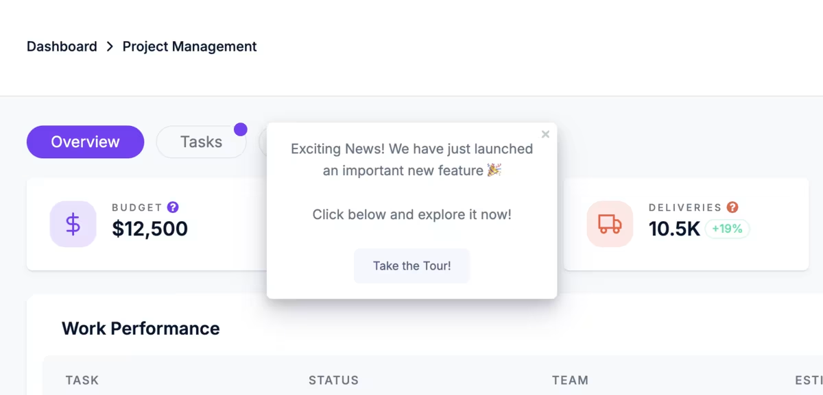
If we’re talking about the importance of in-app communication and feature announcements to deflect churn, then the feature that should take center stage is announcement modals.
Announcement modals are attention-grabbing pop-ups that put your news front and center.
Here’s an example modal that announces a discount:
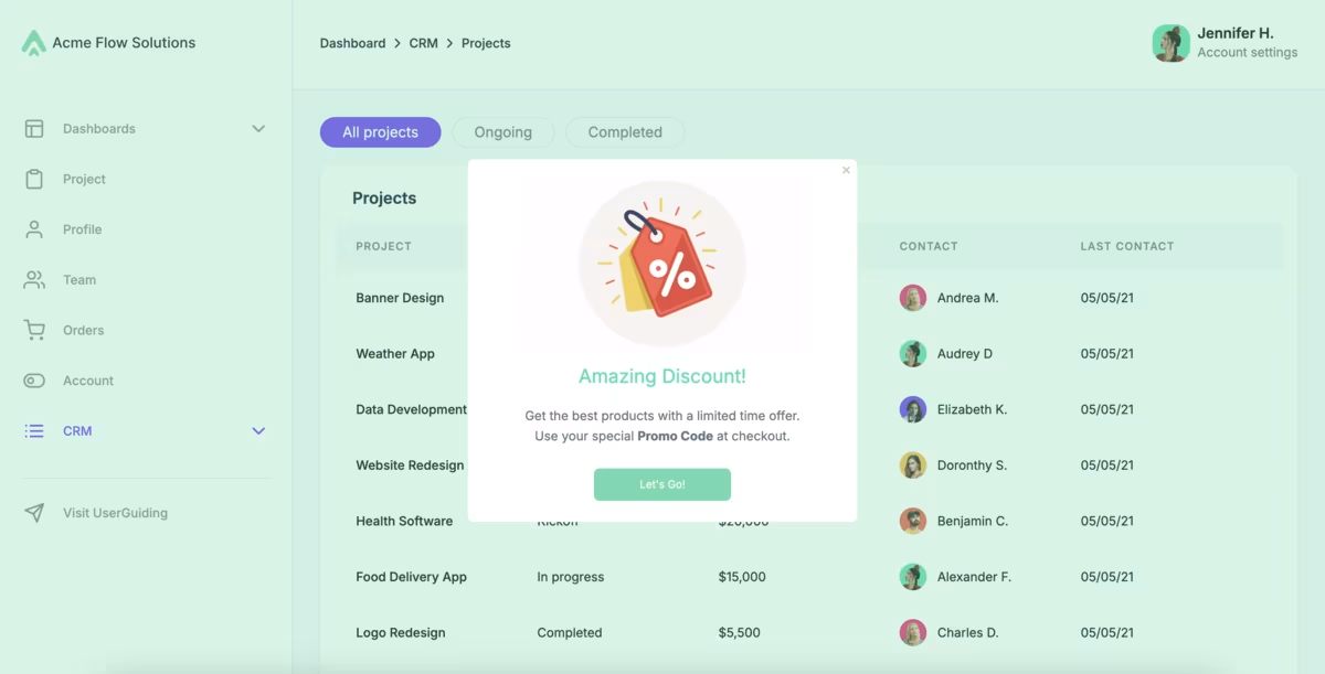
🚀 With UserGuiding’s in-app modals, you can:
- Add visuals, GIFs, or even short videos.
- Trigger guides and surveys directly from modals.
- Personalize messaging so only relevant users see the update.
- Choose from a variety of modal styles (slideouts, campaign popups, feature announcements, e-book announcements, etc.)
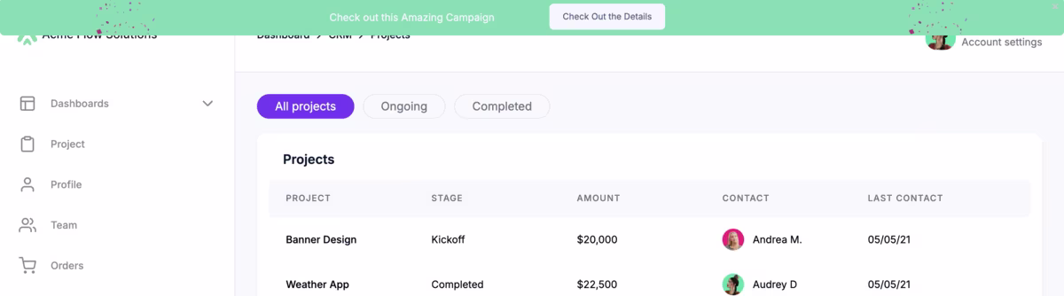
2) Product updates to keep each update organized in one accessible place
Even if your announcements are great, they’re easy to miss in the flow of daily work.
That’s why keeping a standalone hub for your important announcements and release notes is always a good idea.
Like a product updates page that looks like this:
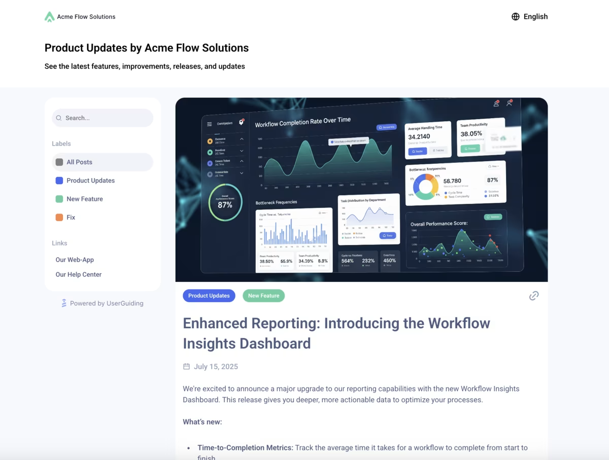
✅ With UserGuiding’s product updates, you can:
- Publish all your product news and feature launches in one hub.
- Make updates searchable and filterable for quick reference.
- Collect customer feedback right under your release notes.
You can also link your product updates with your in-app resource center.
This will allow you to boost your release notes in your app and increase their engagement.
Here’s how product updates looks within the resource center:

3) Banners for important announcements
Some information deserves to stay visible longer, things like policy changes, ongoing campaigns, webinars, or service updates.
Banners sit quietly at the top or bottom of the screen, making them perfect for messages that need to stick around without interrupting the user’s flow.
Think of them as the digital equivalent of a sticky note: always in sight, but never in the way.
Here’s an example:
4) Hotspots to draw attention to changes
Hotspots are great for highlighting updates to existing features. They strike the perfect balance between tooltips and announcement modals by staying contextual and unobtrusive.
The beacons, whether shiny and pulsating or static and subtle, catch users’ attention and signal that more information or guidance is available. And since they’re triggered by user interaction (like a click or hover), they don’t interrupt the user’s flow.
Users can return to them anytime after finishing their current task and explore at their own pace.
You can also trigger product tours or surveys from hotspots to make your announcements even more interactive.
Here’s an example:
You can use hotspots to:
✅ Drive feature discoverability.
✅ Provide contextual tips right where users need them.
✅ Highlight feature improvements/updates and encourage user adoption.
5) Analytics to track engagement to refine future updates
The job doesn’t end with creating in-app guidance and announcements. You also need to track how users interact with them and optimize based on real data.
Luckily, UserGuiding makes this easy, too.
With detailed analytics, you can see which modals, banners, hotspots, and product tours get the most engagement, which messages drive feature adoption, and where users drop off.
Plus, click-action tracking lets you see which buttons or CTAs drive the most engagement, and you can A/B test them to optimize results even further.
Here’s what performance analytics looks like with UserGuiding:

Pro usage tips for successful in-app announcements
1️⃣ Keep it short and visually engaging. In-app modals aren’t product docs. So you should use concise and value-focused messaging.
You can also utilize visuals and GIFs to make announcements more engaging and provide additional context.
2️⃣ Show value early. You should guide new/trial users through walkthroughs that help them achieve their first meaningful win within minutes, so they quickly see the benefit of your product.
Similarly, for new features and onboarding, you can trigger interactive tours from announcements to reinforce value through engagement.
3️⃣ Be contextual and start small. You should trigger hotspots or tooltips only when they are relevant to the user’s current task, and you can introduce features in short, task-focused guides to avoid overwhelming them with everything at once.
- On average, a company that offers in-app guidance uses 5 hotspots at the same time.
4️⃣ Keep training materials visible and accessible. You can use checklists and resource centers to organize your training materials.
Make sure users can revisit tutorials anytime, at their own pace.
- 52% of companies that value user onboarding utilize checklists, and on average, they manage 3 checklists at the same time to personalize the UX.
5️⃣ Collect feedback. You can conduct in-app surveys to understand how updates are received and refine your messaging over time.
Listening to users ensures your messaging stays helpful and effective.
- 42% of companies with onboarding experiences use in-app surveys to improve their onboarding based on real user insights.
👉🏻 Check out our product adoption report to see how 500+ companies across 50+ industries are onboarding their users.
What positive outcomes can you expect with UserGuiding?
Companies using UserGuiding to promote product updates and feature announcements see higher engagement, faster adoption, and reduced churn.
For example:
- Straico → The product updates page boosted feature visibility and engagement by promoting new features and updates organically.
Final words…
User churn often happens because updates and improvements go unnoticed.
By announcing features in-app with clear messages and offering contextual guidance, you can keep users informed, help them reach value faster, and reduce early churn.
Ready to turn updates into engagement and adoption?

.png)