
You need user personas for various reasons: alignment across teams, improved product decisions, better marketing, and so on… However, without good examples to inspire and guide you, user personas can be difficult to make it specific and even be misleading.
So today, we’ll make it easier for you to create these fictional representations of a target user, based on research and data that’ll serve your needs.
Let’s get started.
TL;DR
- A user persona is a semi-fictional character that represents a segment of your target audience.
- User personas take demographics, pain points, needs, challenges, and behaviors into account.
- The common mistakes when creating user personas include being too generic without supporting your claims with data, creating too many personas and losing direction, and using assumptions instead of research to create these profiles.
- It’s important to adapt user persona examples to your own research findings and use them in cross-team workshops. You should also revisit these personas and connect with real people for interviews or surveys regularly.
What is a user persona?
You can’t create a user-oriented product without knowing who your users are and what they like.
This is where user personas come in.
A user persona is a semi-fictional character that represents a segment of your target audience. It’s based on your company’s historical research and data, and helps your teams understand user needs, behaviors, and motivations to guide business decisions.
You can think of a user persona as a novel’s character: they’re based on real traits and experiences. Then, your team can design them as if they were a real customer. It typically includes details like demographics, behaviors, goals, pain points, and preferred communication channels. In other words, they are “packaged” stories to help your team apply knowledge they have about users to the products.
💡 Also, keep in mind that user personas are more user experience (UX) and product-focused than a buyer persona, which is often sales- and marketing-oriented.
But… When should you create them?
“As soon as possible” is recommended by Norman Nielsen Group, so you can get rid of the vagueness around who your “users” are as soon as possible.
As Interaction Design Foundation points out, without user personas, you only have “a collection of assumptions rather than insights.”
What makes a good user persona?
Before we dive into the nitty-gritty of good user persona examples, let’s talk about what makes a good user persona. Use this checklist to build yours or modify it:
- Clear demographic details: Who they are at a glance (like age, gender, or location).
- Behavioral patterns: How they use your product and what they prefer.
- Pain points and needs: The problems they face and what they’re looking for to fix them.
- Goals and motivations: What they want to achieve and why it matters to them.
- Preferred channels and tools: Where they spend time and the tools they rely on.
How to create user personas
Knowing what makes a good user persona is only half the battle. The trick is creating user personas that convert well.
To be able to do this, you’ll have to do lots of research on your real potential customers or analyze direct competitors if you haven’t launched yet. The key point is working with real people to bring everything together.
As long as your personas reflect the wants and needs of real customers, it’ll be easier to attract them when you’re designing.
15 user persona examples (+ templates)
If you’re new to creating user personas, these user templates and their analysis will help you get started:
Persona #1: John, an entrepreneur
- Name: John Shaw
- Occupation: Owner of a bookshop, self-employed
- Demographic: 36 years old, lives in New York City. Married with a 3-year-old child, has a middle-income level.
John’s story: John quit his corporate job after he realized that he didn’t have much leisure time. He invested his savings in a passion project: a bookshop.
What challenges John: He wants to keep his bookshop open but he’s not great at accounting. He’s having a hard time figuring out how much profit he makes each month and what his expenses are. His financial analysis takes too much time.
What John needs: John needs an easy solution that will handle the analysis of his monthly earnings, expenses, and profit. Ideally, the product should shorten the time he spends on managing the shop.
Here’s what John’s profile looks like:
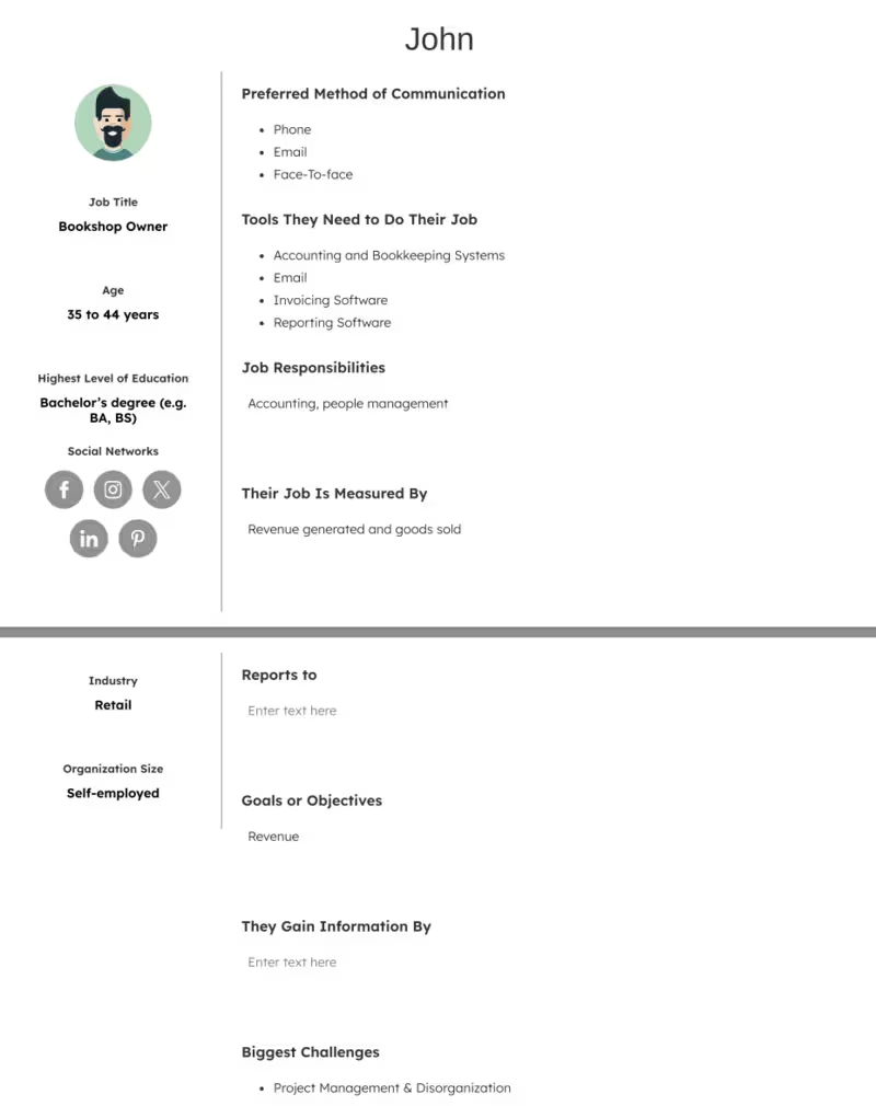
John represents the passion-driven entrepreneur: someone who has traded corporate stability for personal fulfillment but now faces the reality of running a small business. His persona highlights a common challenge among independent business owners: they excel in their craft or passion but often lack the technical or financial management skills to sustain it.
This makes him a critical user type for products that prioritize simplicity, automation, and clarity in areas like accounting, reporting, and operations. By meeting John’s needs, a solution can position itself as the behind-the-scenes partner that enables entrepreneurs to focus on what they love most while still staying profitable.
Persona #2: Catelyn, a customer success manager
- Name: Catelyn Brady
- Occupation: Customer success manager
- Demographic: 29 years old. Lives in London, UK. Married, has a middle-income level.
Catelyn’s story: Catelyn is a customer success manager for an investment and trading software. She’s having trouble at work because customers struggle to understand the core features of the software, which affects her position.
What challenges Catelyn: Catelyn’s boss wants to find a customer onboarding solution to solve this problem. However, Catelyn knows neither coding nor design. Therefore, she has difficulty communicating with her developers and designers on what the onboarding should look like.
What Catelyn needs: A customer onboarding tool that she can use by herself as a non-tech-savvy person that doesn’t require coding.
Here’s what Catelyn’s profile looks like:
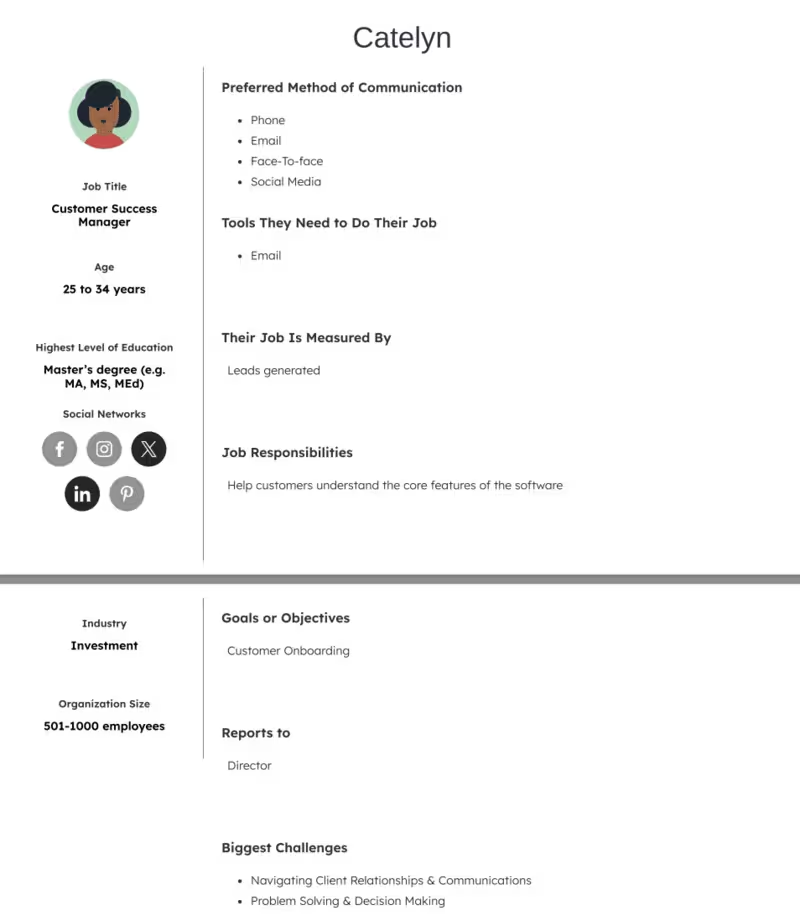
Catelyn embodies the non-technical professional caught between customer needs and internal technical teams. Her struggle reflects a common pain point in SaaS companies: customer-facing employees see the problems firsthand but lack the technical skills to implement solutions independently.
This makes her persona especially important because it highlights the demand for no-code, user-friendly tools that empower customer success managers to act quickly without relying heavily on developers. A solution that addresses Catelyn’s needs must prioritize intuitive design, autonomy, and measurable impact on customer adoption. By solving her problem, a product improves the overall customer experience and strengthens retention for the company as a whole.
Persona #3: Rebecca, a YouTuber
- Name: Rebecca Stone
- Occupation: YouTube
- Demographic: 20 years old. Lives in Austin, Texas alone. Has money thanks to her family of high-income level.
Rebecca’s story: Rebecca creates travel content on her YouTube channel. However, her parents don’t support her dream of becoming a full-time travel influencer. She might lose the financial support from her parents due to this, so she needs a tool to understand her statistics quickly.
What challenges Rebecca: Rebecca is stuck between recording videos and distributing them. While the former is easier, reaching her target audience has been challenging so far. Moreover, she doesn’t know how to analyze her channel’s statistics.
What Rebecca needs: Rebecca needs a tool that will show her the keywords that her primary audience uses to search content on YouTube, whether her videos are optimized for search engines, which platforms her audience uses the most, and how her videos are performing.
Here’s what Rebecca’s profile looks like:
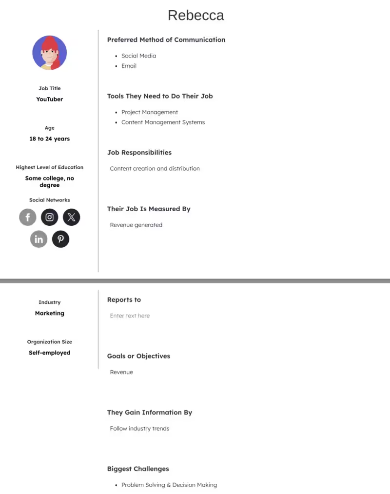
Rebecca’s persona highlights the struggle many early-stage influencers face: creating content is the enjoyable part, but growth depends on mastering analytics, SEO, and distribution. These skills, unfortunately, aren’t always intuitive. Tools designed for Rebecca must emphasize simplicity, actionable insights, and guidance rather than overwhelming dashboards.
This persona underscores the importance of bridging creativity and strategy, enabling creators to focus on their craft while making data-driven decisions that lead to sustainable growth.
Persona #4: Phoebe, a UX designer
- Name: Phoebe Miller
- Occupation: UX designer
- Demographic: 44 years old. Previously lived in Boston, Massachusetts, but moved to Chicago for a new job with a startup company. Has a high-income level. Married with three kids.
Phoebe’s story: Phoebe works at a global digital marketing agency that aims to provide an optimized engagement level between users and their product. Phoebe knows that user research is the first logical step, however, her boss isn’t proactive.
What challenges Phoebe: Phoebe is a newcomer to the job and the town, so her resources to conduct user research are highly limited. She’s struggling because she’s not giving the proper guidance or instructions within her area of work.
What Phoebe needs: Phoebe needs a budget-friendly research tool as her new company is just starting to grow. Online surveys and focus groups are informal and inexpensive methods to get users involved.
Here’s what Phoebe’s profile looks like:
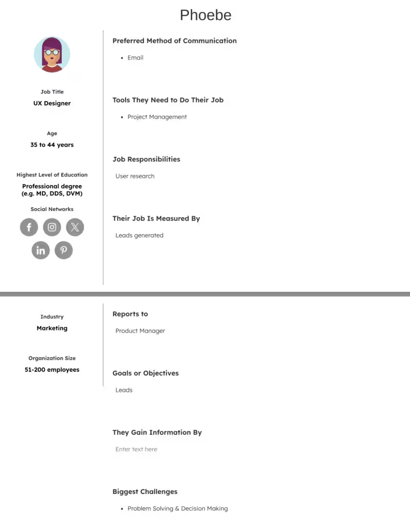
Phoebe reflects the junior professional eager to prove herself but limited by resources and leadership support. Her challenges highlight a common tension in growing companies: the recognition that user research is essential, but the lack of time, budget, and executive buy-in to do it effectively. This persona emphasizes the importance of affordable, accessible research tools that allow newcomers like Phoebe to generate insights independently and demonstrate value quickly.
For Phoebe, the solution must lower barriers to entry by offering cost-effectiveness, ease of use, and credibility in data collection. Supporting her helps the entire company adopt a research-driven mindset that strengthens long-term product development and user engagement.
Persona #5: Jason, a regional director
- Name: Jason Carter
- Occupation: Regional director
- Demographic: 34 years old. Lives in San Francisco, but travels a lot. Single and has a high-income level.
Jason’s story: Jason is a regional director in San Francisco but he travels for work very often (as often as 7-8 times a month). His company has assigned him to specific cities so his travel rotation stays more or less the same.
What challenges Jason: Jason isn’t really happy with his travel responsibilities as work. Trying to book hotels and flights feels, at the very least, inconvenient and a waste of time. He also doesn’t like jumping through several hoops and phone calls to make reservations.
What Jason needs: Jason needs a quick and easy way to control his travel arrangements. He values comfort, convenience, and speed. A site or a mobile app without many steps would simplify the process, and help him regain the time he’s been losing. He also wouldn’t have to carry his laptop everywhere with him.
Here's what Jason's profile looks like:
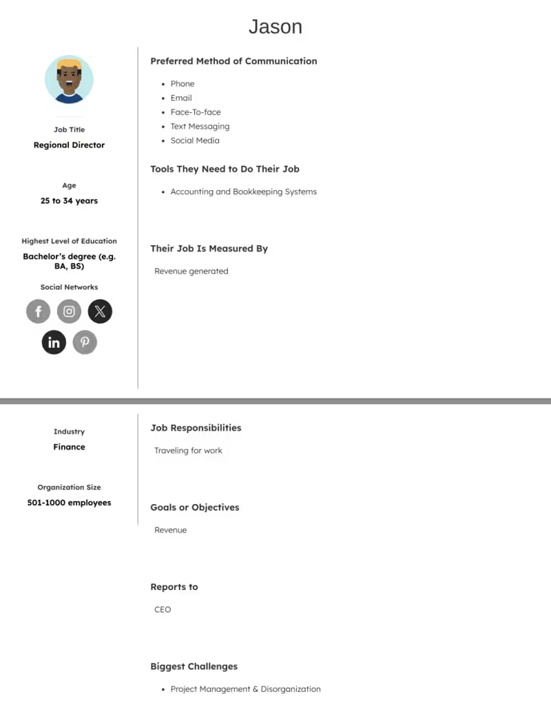
Jason fits the frequent business traveler persona whose professional success comes at the cost of convenience and personal satisfaction. His frustrations highlight a common issue among corporate travelers: the sheer inefficiency of managing bookings across flights, hotels, and itineraries, especially when travel is repetitive and high-frequency.
This persona emphasizes the need for streamlined, mobile-first solutions that prioritize speed, comfort, and minimal effort. For Jason, the ideal product reduces cognitive load by offering one-stop booking, automated preferences, and real-time updates. Addressing his needs improves his productivity, job satisfaction, and work-life balance. In essence, Jason’s persona showcases how simplicity and automation can transform a draining routine into a manageable process.
Persona #6: Eric, a social media manager
- Name: Eric Garcia
- Occupation: Social media manager
- Demographic: 31 years old. From San Diego, but travels a lot as a digital nomad.
Eric’s story: Eric works fully remote as a social media manager at a small digital marketing agency. His company has experienced a surge in new clients recently and now he has to manage more accounts than he’s used to.
What challenges Eric: With the new surge in clients, Eric now has to manage more accounts, clients, while also delegating tasks to his team for content across social for visibility and engagement for each specific client.
What Eric needs: Eric could really benefit from a social media management platform where he can schedule posts ahead of time, collaborate with team members, and review content. A platform where clients can directly get involved for feedback and revision would be a great fit as well.
Here’s what Eric’s profile looks like:
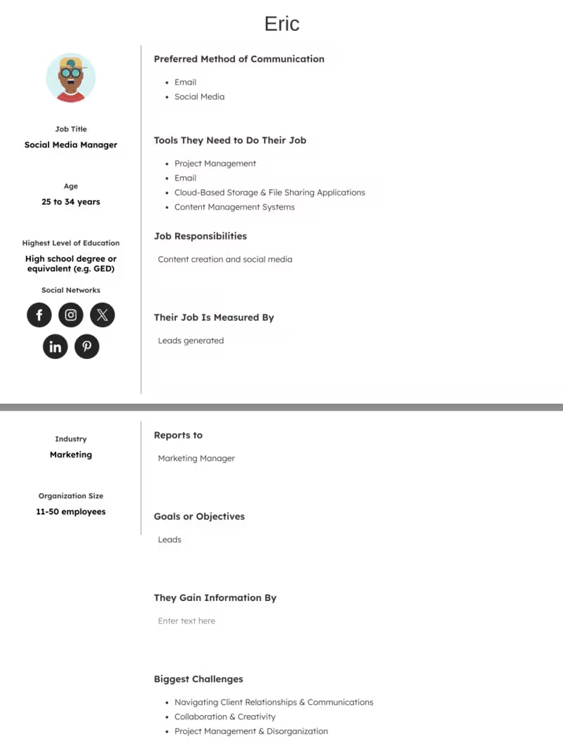
Eric represents the remote digital professional balancing growth with scalability challenges. His story reflects a common pain point in small agencies: sudden success brings new clients, but without the right infrastructure, it also brings disorganization and stress. Eric’s workload is about coordinating across a team, tailoring strategies to different clients, and maintaining high engagement.
His persona highlights the demand for centralized, collaborative social media management tools that allow for scheduling, teamwork, and client input in one streamlined platform. By addressing Eric’s needs, a solution can not only improve efficiency but also elevate client satisfaction and retention. This persona is particularly important because it shows how the right tool can scale with a growing business, turning a potential bottleneck into a competitive advantage.
Persona #7: Linda, a retiree exploring hobbies
- Name: Linda Brown
- Occupation: Retired school administrator
- Demographic: 65 years old, lives in Florida. Widow, grown children, on a fixed income.
Linda’s story: Linda recently retired and is eager to spend her time exploring hobbies like painting, gardening, and volunteering. She also wants to stay connected to her family online.
What challenges Linda: She feels overwhelmed by new technology and struggles to adapt to digital platforms.
What Linda needs: An easy-to-navigate platform for learning new hobbies, connecting with family, and joining online communities for seniors.
Here’s what Linda’s profile looks like:
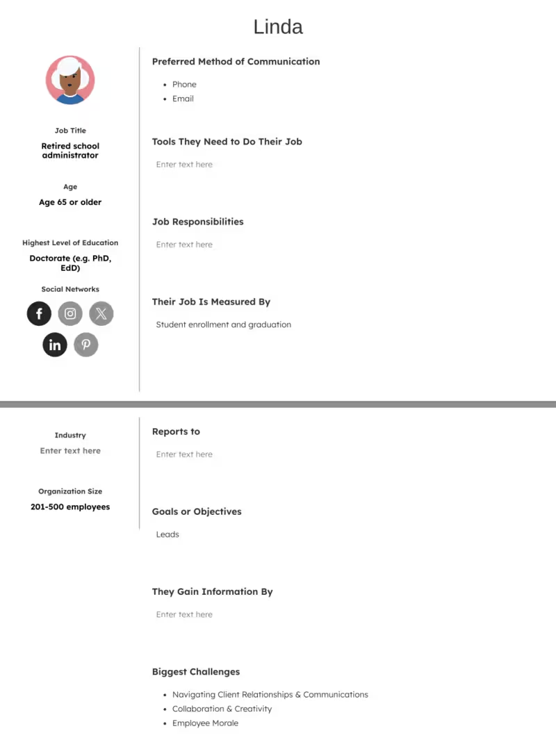
Linda represents an often-overlooked segment: retirees eager to stay active and connected but intimidated by technology. Her persona reveals that accessibility, simplicity, and trust are the top priorities.
Products that resonate with Linda will emphasize ease of navigation, clear instructions, and community support. This persona underscores the importance of inclusive design, reminding us that usability must extend to all age groups. Serving Linda well builds trust not only with seniors but also with their families, who often recommend tools on their behalf.
Persona #8: Sarah, a marketing manager
- Name: Sarah Kim
- Occupation: Marketing manager at a SaaS startup
- Demographic: 28 years old, lives in San Francisco. Single, has a master’s degree in communications, mid-to-high income.
Sarah’s story: Sarah has been working in marketing for six years. She thrives in fast-paced environments but often feels overwhelmed by juggling multiple campaigns at once. She values creativity and innovation but doesn’t want to get lost in spreadsheets.
What challenges Sarah: She spends too much time switching between different analytics tools, making it hard to measure ROI quickly. Team collaboration is also tricky when everyone uses different platforms.
What Sarah needs: She wants a unified platform that allows her to track marketing campaigns, collaborate easily with her team, and quick insights without crunching numbers manually.
Here’s what Sarah’s profile looks like:
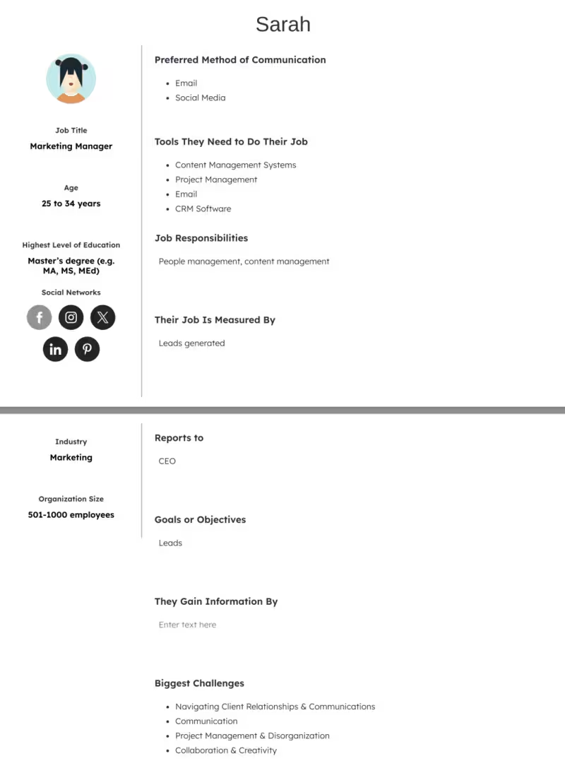
Sarah represents the modern marketing professional who thrives on creativity but struggles with operational overload. She doesn’t want to waste time consolidating reports or switching between platforms; she wants insights quickly so she can act.
This persona is critical because it reflects the growing need for integrated, collaborative tools in marketing departments. A product that simplifies complexity while allowing space for creativity will resonate strongly with users like Sarah.
Persona #9: David, a university student
- Name: David Ortega
- Occupation: Undergraduate student studying computer science
- Demographic: 21 years old, lives in Minneapolis, Minnesota. Lives with two roommates, part-time job at a café, budget-conscious.
David’s story: David is passionate about coding and gaming. He is motivated but often stretched thin between classes, work, and social life. He dreams of landing an internship at a tech company but struggles with time management.
What challenges David: Balancing coursework, part-time work, and personal projects. He also finds it hard to afford expensive tools or platforms.
What David needs: An affordable, easy-to-use learning tool that helps him practice coding, organize his study schedule, and track progress.
Here’s what David’s profile looks like:

David is part of a younger demographic that is both tech-savvy and resource-limited. His willingness to learn is high, but his time, energy, and budget are not. Products aimed at David should prioritize affordability, gamification, and accessibility.
This persona is valuable because it demonstrates how a user group may not bring immediate financial gain but represents future loyalty and word-of-mouth growth if nurtured early.
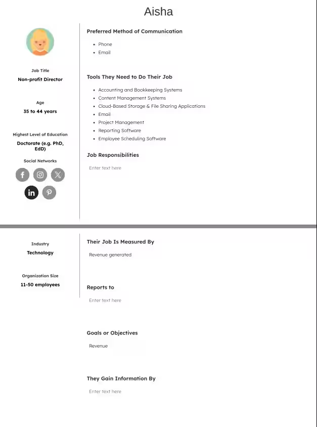
Persona #10: Aisha, a non-profit director
- Name: Aisha Hassan
- Occupation: Director of a small non-profit organization
- Demographic: 42 years old, lives in Washington D.C. Married with two teenage children, mid-income.
Aisha’s story: Aisha has dedicated her career to building community-based initiatives. She loves her work but often feels stretched between fundraising, program management, and reporting. She wants to maximize impact but lacks advanced tech support.
What challenges Aisha: Managing limited resources while needing to demonstrate transparency and measurable outcomes to donors.
What Aisha needs: A platform that simplifies donor management, automates reports, and helps her visualize the impact of her programs without requiring deep technical expertise.
Here’s what Aisha’s profile looks like:
.avif)
Aisha embodies the resource-constrained leader who is highly motivated by mission but hindered by lack of infrastructure. Her persona highlights how clarity, transparency, and simplicity are non-negotiables for organizations accountable to donors and communities. Products that serve Aisha must emphasize impact measurement and ease of use rather than technical complexity.
This persona underscores the importance of creating solutions that remove administrative friction so leaders can focus on purpose-driven work.
Persona #11: Tim, a freelance graphic designer
- Name: Tim Nguyen
- Occupation: Freelance graphic designer
- Demographic: 35 years old, lives in Austin alone. Enjoys music and digital art, mid-income.
Tim’s story: Tim left his agency job to pursue freelance work. He enjoys the flexibility and creative freedom but struggles with the business side of freelancing.
What challenges Tim: Managing invoices, keeping track of clients, and finding consistent projects. He also feels isolated at times.
What Tim needs: An easy-to-use client management and invoicing tool that helps him stay organized and spend less time on admin.
Here’s what Tim’s profile looks like:
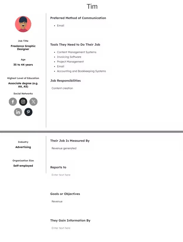

Tim reflects the rise of the freelance economy, where independence is appealing but also isolating. His struggles are less about creativity and more about the business side of freelancing.
This persona highlights the gap between artistry and entrepreneurship, showing that freelancers need practical, time-saving tools to balance both. Products that appeal to Tim should emphasize streamlining and self-sufficiency, positioning themselves as silent partners in his business growth.
Persona #12: Maria, a stay-at-home mom
- Name: Maria Coughlin
- Occupation: A new stay-at-home mom (former HR coordinator)
- Demographic: 30 years old, lives in Dallas. Married, baby daughter, budget-conscious.
Maria’s story: Maria paused her career after giving birth. She loves spending time with her baby but misses adult interaction and personal growth. She’s looking for ways to manage parenting tasks while staying connected to learning opportunities.
What challenges Maria: Feeling overwhelmed by baby care and household responsibilities, while wanting to maintain her own identity.
What Maria needs: Mobile-friendly parenting resources, easy-to-use planning tools, and online communities for new moms.
Here’s what Maria’s profile looks like:
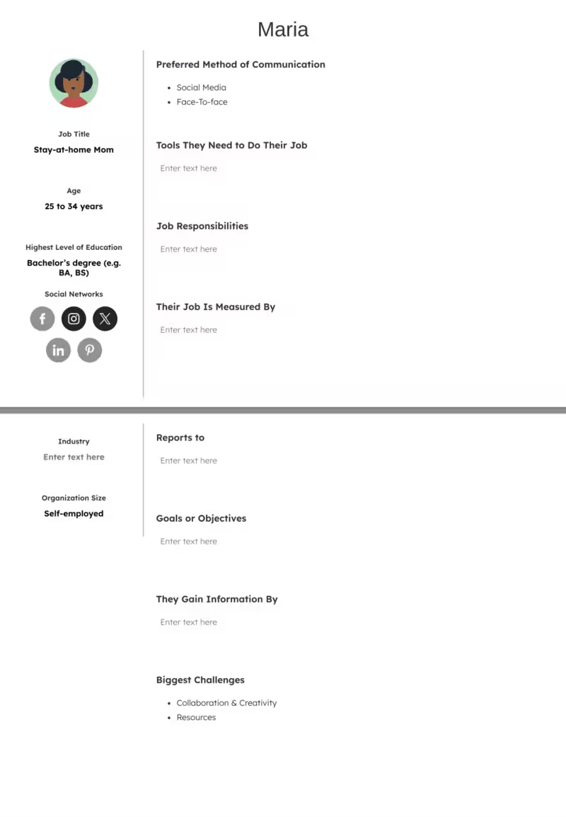
Maria illustrates a user group defined by life transition: someone adapting to new routines, responsibilities, and priorities. Her persona demonstrates how products that support this transition must combine convenience, emotional reassurance, and community.
This persona is significant because new parents are often highly motivated users who rely on tools to create balance and confidence. For Maria, ease of use and trustworthiness outweigh flashy features.
Persona #13: Raj, a small business owner
- Name: Raj Mehta
- Occupation: Owner of a small restaurant
- Demographic: 47 years old, lives in New Jersey. Married with three children, middle-income.
Raj’s story: Raj runs a family-owned restaurant that has been around for 10 years. He cares deeply about food quality and customer satisfaction but struggles to keep up with marketing trends and online orders.
What challenges Raj: Balancing day-to-day operations with growing competition from food delivery apps and larger chains.
What Raj needs: A simple digital ordering system, marketing automation tools, and analytics to track customer loyalty.
Here’s what Raj’s profile looks like:
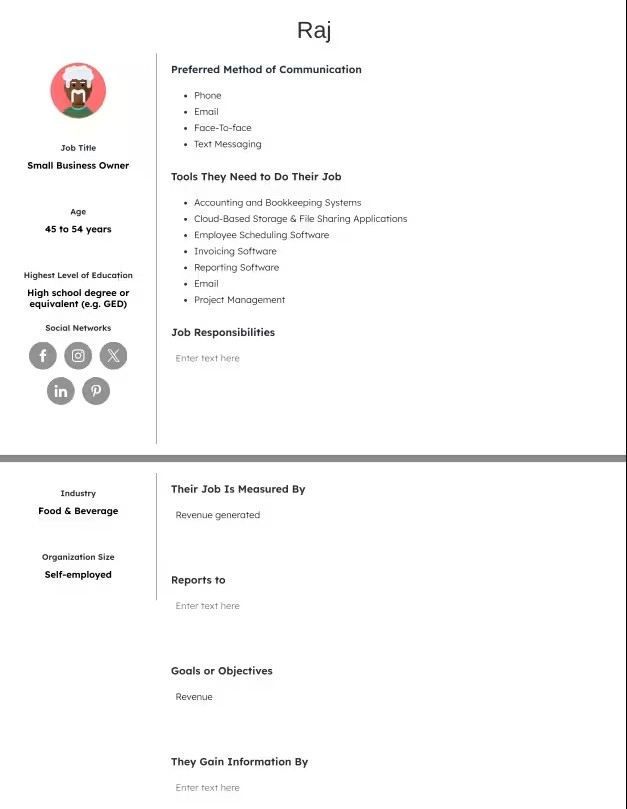
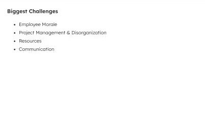
Raj represents traditional entrepreneurs facing digital disruption. His challenges highlight how small business owners often juggle operations while struggling to stay competitive with larger players.
This persona shows the importance of solutions that combine accessibility, automation, and customer engagement tools. By meeting Raj’s needs, businesses can capture a segment that values practicality and ROI over trendiness. This persona shows that small business owners often become long-term loyal customers once a tool proves its worth.
Persona #14: Emily, a high school teacher
- Name: Emily Carter
- Occupation: High school English teacher
- Demographic: 38 years old, lives in Seattle. Married, two children, middle-income.
Emily’s story: Emily has taught for over a decade. She’s passionate about her students’ growth but feels bogged down by administrative tasks and grading. She wants more time to focus on teaching.
What challenges Emily: Managing lesson planning, grading, and administrative reporting while ensuring engaging classroom activities.
What Emily needs: A classroom management tool that helps her organize lessons, reduce grading time, and track student progress effectively.
Here’s what Emily’s profile looks like:
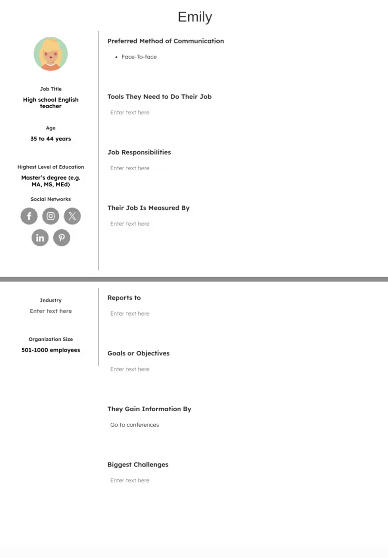
Emily’s persona reflects the education sector’s push for efficiency and student engagement. Her pain points center on time constraints, which are nearly universal among teachers.
This persona highlights that the winning solution will be one that saves time without compromising educational quality. Emily also shows how teachers often serve as decision influencers: if she adopts a tool in her classroom, it can lead to broader institutional adoption.
Persona #15: Omar, a remote developer
- Name: Omar Ali
- Occupation: Remote software developer
- Demographic: 26 years old, lives in Toronto. Single, mid-income, works fully remote for a U.S. company.
Omar’s story: Omar enjoys the flexibility of remote work but often struggles with communication across time zones. He values productivity but sometimes feels disconnected from his team.
What challenges Omar: Collaboration and staying aligned with teammates in different regions. Managing distractions while working from home.
What Omar needs: A collaboration tool with strong project management features and communication channels.
Here’s what Omar’s profile looks like:
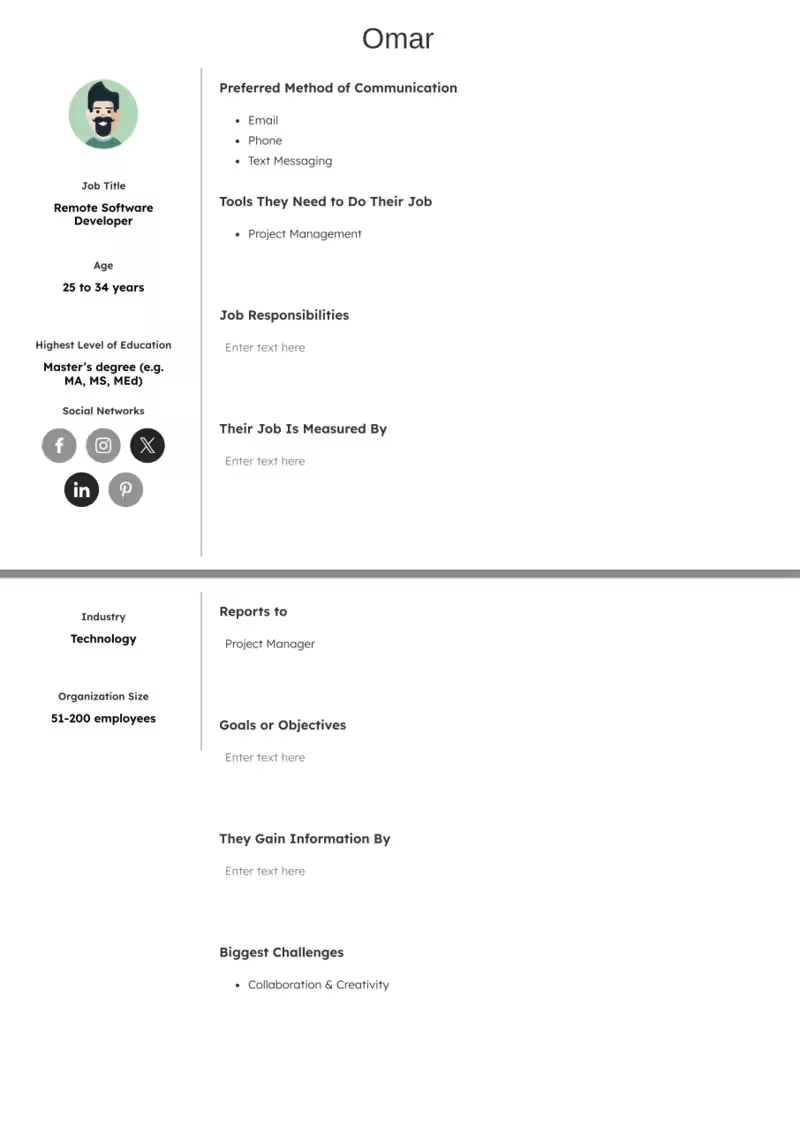
Omar exemplifies the growing population of remote workers who are highly skilled but face collaboration and isolation challenges. His persona emphasizes that productivity tools must go beyond functionality and foster connection, alignment, and focus.
Solutions aimed at Omar should offer seamless integration and real-time collaboration features. This persona is critical because it mirrors the global shift toward remote-first teams, making it highly relevant across industries.
Common mistakes when creating user personas
Personas are fictional characters. That’s why it’s sometimes hard to imagine them as living, breathing customers who're looking for a product just like yours. Such abstractness leads to mistakes when creating user personas.
Here are four common pitfalls to avoid:
Too generic (“Tech-savvy millennial”) without data.
It’s easy to rely solely on demographic data sprinkled with a generic descriptor (welcome to the stage… tech-savvy millennial) for user personas. However, demographic qualities only tell half the story of a person, let alone a fictional persona.
That’s why it’s important to focus on qualifiers or user stories that you can actually support with historical data like pain points and challenges.
Maya Moufarek’s LinkedIn post on how you can accidentally target King Charles and Ozzy Osbourne at the same time is a good reminder for anyone who’s trying to find the perfect persona for their product:
Too many personas, making them unusable.
The more the better doesn’t really apply to user personas. Instead, having many personas can actually be harmful. You’ll probably get confused and have less of a direction to target the right segment.
Instead, as Alex Cowan suggests, start with a hypothesis and test the persona. If it can stand on its own, aka gather actionable data, you can continue building its profile to reflect what you’re looking for in a customer.
Based purely on assumptions, not research.
Assumptions without research is just a projection of what you want your customers to be like. You think you know what their pain points and challenges are but you don’t have data to support your claims. This can lead to creating horribly off-track personas, which then will result in mistargeted marketing campaigns, sales calls, webinars, and so on…
To save everyone time and energy (and avoid frustration in your team), slow down your process. When you make an assumption, ask yourself, “Do I actually know what my persona needs or am I forming assumptions based on my past experiences?”
Do research, talk to other people in your industry, take inspiration from other products. For example, Nielsen Norman Group suggests interviewing 5–30 people to get a decent sample size.
The more data you collect, the more ground you’ll feel when it’s time to put the personas to test.
How to use these examples in your own process
Now that you know how to create user personas, it’s time to take action. Here’s what you need to know:
- Adapt examples to your own research findings: User personas should never be a one-size-fits-all explanation for your ideal customer. Integrate your own research findings into the process to get as close to an actual representation as possible.
- Use the user personas in cross-team workshops: The best persona template is one that you’re using with multiple teams. This will eliminate different interpretations of these personas and simplify the marketing and sales campaigns.
- Revisit personas quarterly or annually: People change and so do their problems and needs. This applies to user personas as well. That’s why you should revisit your personas annually, or even better, quarterly, to make sure that you’re still creating an accurate representation of your target segment.
- Start with customer interviews, then analytics review, and sales team insights: To do research, schedule some customer interviews. Then, you can analyze how customers interact with your product, and talk to the sales team to hear from current customers.
Conclusion
To wrap it up, keep in mind that user personas are living documents – not generalizations from a single observation, as Kim Flaherty states. In the same vein, these examples are meant to be starting points for you to get inspired. Real value will come from research and iteration relevant to your product.
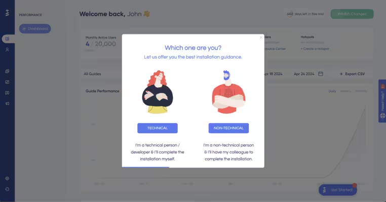
Tools like UserGuiding can help you get started with this process by segmenting your users according to different attributes like their engagement levels, demographics, and more.
Frequently Asked Questions
What are the best user persona examples for SaaS product teams?
Best user personas rely on real customer insights and pain points. Here are some examples to guide you:
Onboarding Manager Olivia: needs quick activation, values in-app guides.
Power User Priya: advanced workflows, wants deep integrations/APIs.
Budget Buyer Ben: price-sensitive, needs clear ROI.
IT Gatekeeper Ivan: security/compliance, SSO, audit logs.
Executive Sponsor Eva: outcomes, dashboards, adoption metrics.
How to create a user persona with real-world examples?
- Pull data (analytics, CRM, interviews).
- Segment by goals/behaviors, not just demographics.
- Map pain points, jobs-to-be-done, success metrics.
- Validate with 5–10 users per segment.
- Name + snapshot (role, goal, pains).
Example:“Support Lead Sam: reduces ticket backlog; needs macros, collision detection, SLA alerts.
What are the user persona examples for e-commerce conversion rate optimization?
Deal Hunter Dana: filters by price, coupon-driven.
Last-Minute Logan: fast checkout, reliable delivery dates.
Researcher Riya: reviews, comparisons, rich content.
Loyalty Leah: points, subscriptions, easy reorders.
First-Time Farid: trust badges, guest checkout, clear returns.
What are the detailed UX persona examples for mobile app design projects?
Offline Olivia: flaky connections; needs caching, sync.
Privacy-First Pia: granular permissions, local storage.
Battery-Saver Bao: low power modes, lightweight assets.
Newcomer Nia: progressive onboarding, empty-state guidance.
What are the user persona examples to guide content marketing strategy?
Educator Eli: how-tos, webinars, templates.
Evaluator Eve: comparison sheets, ROI stories.
Executive Ezra: briefs, benchmarks, case studies.
Practitioner Pax: playbooks, checklists, code snippets.
Champion Cara: community stories, advocacy kits.
What are the B2B user persona examples for enterprise software solutions?
CIO Chris: risk, scalability, TCO.
Security Lead Sal: compliance, auditability, DLP.
Finance Fiona: budgets, usage metering, forecasts.
Ops Owner Oksana: uptime, SLAs, runbooks.
Department Head Deon: team adoption, onboarding speed.
How do you build a UX persona with examples step-by-step?
- Collect: surveys, interviews, usage logs.
- Cluster: goals, tasks, context (JTBD).
- Prioritize: top 2–3 segments by impact.
- Draft: name, role, scenario, pains, needs, success.
- Evidence: add quotes/metrics.
- Test: design reviews with real users.
- Maintain: refresh quarterly.
Example: “Field Tech Tara — repairs in low-signal sites; needs offline forms + photo capture.”
What are the real-life user persona examples from successful digital products?
Streaming: Binge Watcher, Family Planner, Niche Explorer.
Ride-hailing: Daily Commuter, Airport Traveler, Driver Maximizer.
Fintech: Budget Beginner, Cashback Chaser, Small Biz Owner.
Edtech: Self-Paced Learner, Credential Seeker, Career Switcher.
Productivity: Team Coordinator, Solo Maker, Executive Reviewer.


.svg)
.svg)
.svg)
.svg)
.svg)


.svg)
.svg)


.png)


