.svg)
.svg)
.svg)
.svg)
.svg)


.svg)


.svg)
.svg)

Imagine you’re running a new fitness app.
Dozens of people sign up in January, and another big wave comes in March.
At first glance, your overall numbers might look great, lots of new users sound pretty good, right?
But here’s the catch: if you only look at averages, you might miss the fact that January’s users stuck around, explored premium workouts, and invited friends, while March’s users tried one class and disappeared.
That’s where cohort analysis comes in.
As Jordan Gordon explains in episode 524 of the DTOC podcast, understanding the four core cohort profiles every brand should know is essential for shaping retention strategy, whether you're optimizing conversion flows, fighting churn, or building sustainable growth for any retention model.
In SaaS and product adoption, this isn’t just about numbers, it’s about understanding how different groups experience your product, from the moment they first see value to whether they become long-term loyal users.
This article will walk you through how to use cohort analysis to track adoption step by step: starting with onboarding actions, identifying those early “aha!” moments, and finally connecting the dots to retention.
The goal? To help you see adoption not as a single event, but as a journey that can be measured, improved, and sustained.
TL;DR
- Cohort analysis helps SaaS teams move beyond vanity metrics by grouping users by timeframes or actions (e.g., signup week, onboarding completion).
- Activation playbooks built with cohorts spotlight early drop-offs (7–14 days) and allow targeted nudges like onboarding checklists, tooltips, and contextual guides.
- Retention playbooks identify healthy vs. unhealthy retention curves and enable tactics like re-engagement emails, feature education campaigns, and upsell timing.
- Success tips include keeping cohorts simple, aligning them with business goals, blending quantitative (charts) and qualitative (surveys), and sharing insights cross-team.
- Tools like Mixpanel allow filtering by cohort, comparing user groups, and running experiments backed by real engagement data.
- Expected outcomes: sharper visibility into what drives activation, tailored onboarding, improved retention, reduced churn, and proof of adoption strategies with hard data.

Why Cohort Analysis Matters for Product Adoption
Looking at averages can feel comforting, you get a single number that sums everything up.
But the problem is, averages blur the details.
If your dashboard says your retention rate is 30%, that doesn’t mean all users are equally engaged.
Maybe half of them drop off by Day 3, while a small group becomes power users and sticks around for months.
The average hides both stories.
Cohort analysis fixes that by breaking users into groups and tracking how each group behaves over time.
As Ranjan Singh explains in his #100dayschallenge post, this approach reveals patterns that averages mask, like how January users might churn fast while March users stay engaged after improved onboarding.
Suddenly, you can see the full picture:
- Which onboarding cohorts reach first value quickly, and which ones struggle.
- How product updates affect users who signed up before vs. after the change.
- Whether users coming from one marketing channel churn faster than users from another.
👉🏼 This same logic doesn’t just apply to SaaS, it’s also visible in other industries.
As Demian Lazurko recently shared on LinkedIn, Amazon CPG brands rely on cohort analysis to track long-term customer engagement and repeat purchase behavior, helping them avoid short-sighted decisions based only on first-order margins.
The lesson is the same: when you follow behavior over time instead of averages, you uncover what truly drives growth.
How To Define Cohorts
Cohorts only become useful when they reflect real adoption milestones, not just signup dates.
That’s why in UserGuiding, you can go beyond default attributes and create custom cohorts based on the behaviors that matter most to your product.
Some data points, like location or device, are available by default.
🤩 But the real value comes when you tailor cohorts to your own adoption signals.
Here’s how you go there with UserGuiding:
- Enable user identification: This connects actions to individual users instead of anonymous sessions, so you can follow their journey across onboarding, adoption, and retention.
Here’s how you can do this step by step on our panel:
First, start with going to ‘’Settings’’ on the UserGuiding Panel.

Then, find the ‘’Installation’’ tab under the settings.
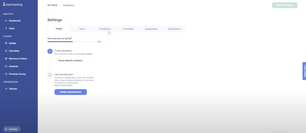
Here, you click on ‘’Enable Identification’’ and, voila.

- Send data: After enabling user identification, you’ll use specific functions to pass user and company attributes like signup date, trial status, team size, etc.
You are going to log custom events that reflect important product actions like inviting a teammate, clicking a button, submitting a support ticket, etc.
Once sent, these attributes and events appear right alongside the defaults in your drop-down menus, making them available for building segments and cohorts.
⭐️ With these capabilities, you’re not limited to “users who signed up in March.”
Instead, you can build segments like “users who invited a teammate within the first week” or “users who completed onboarding but never tried Feature X.”
That’s when cohort analysis becomes a powerful engine for understanding product adoption and improving retention.
1- By onboarding actions
Defining cohorts by onboarding milestones means grouping users by whether they complete key “first-value” steps.
These are the actions that give users a taste of what your product can do.
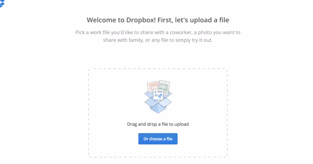
You know how uploading your first file on Dropbox is a classic milestone? Well, that’s exactly how it works.
Basically, if someone signs up but never uploads, they might never actually see the value of the app’s cloud storage, and that’s what an onboarding action is, at its core.
The same thing happens when you send your first message or join a team/channel on Slack.
This is when you start interacting meaningfully with the product.
👉🏼 By comparing cohorts who did vs. did not complete these similar onboarding actions, you can see their retention curves diverge.
The idea is: early momentum aka first actions often predicts whether someone sticks around.
2- By feature usage
This cohorting method groups users based on whether they adopt particular features early on, rather than just using basic functions.
The comparison of “feature-adopter vs non-adopter” cohorts often reveals strong differences in retention and long-term value.
An example would be users who use search in their first week, because they often retain much longer than those who don’t, since search signals deeper engagement.
Another feature might be “sharing” or “collaboration”. Users who share something or invite others early often build a network effect and are less likely to churn.
👉🏼 You can see how retention rates at 1,2, and 6 months are given for varied cohorts in this B2B User Retention Benchmarks report, showing how retention drops but how early activation or core feature usage tends to improve those percentages.
3- By lifecycle stage
Defining cohorts by lifecycle stages gives you a macro lens on how segments of users behave over time.
You can group users based on:
- Signup month / acquisition period (e.g. “January cohort,” “Q2 cohort”)
- Subscription tier / plan level (e.g. “Free trial,” “Basic,” “Pro,” “Enterprise”)
- Customer segment / persona (e.g. “small business,” “mid-market,” “enterprise,” or by vertical such as “e-commerce,” “agencies,” etc.)
Why this matters:
👉🏼 By signup month cohorts, you may spot that users who sign up during holiday months or promotional periods behave differently (higher churn, lower engagement) than those acquired in quieter months.
👉🏼 Users on higher tiers might adopt advanced features faster or retain better; comparing retention across tiers helps you gauge whether your pricing/packaging is aligned with value.
👉🏼 Different customer segments may have distinct adoption curves. For example, enterprise users might take longer to fully adopt but show stronger long-term retention, while SMBs may adopt quickly but churn earlier.
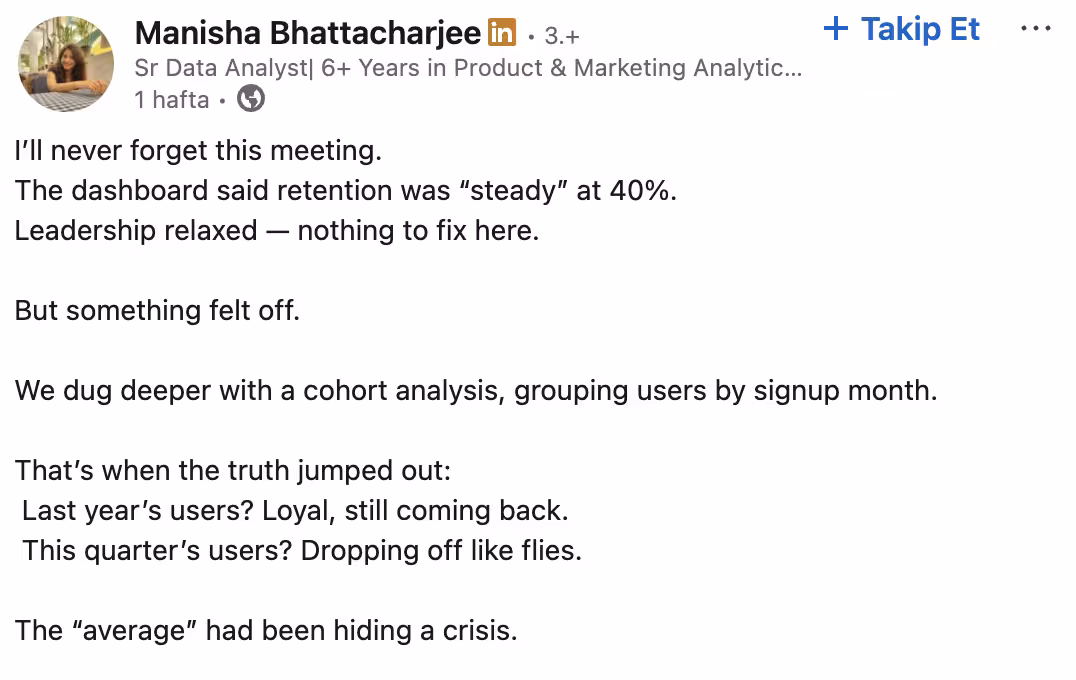
You can see how analyzing cohorts by acquisition period or subscription plan can reveal hidden patterns in this LinkedIn post. 👇🏻
Say, that a cohort from a heavily discounted month underperformed later, or that a particular segment responded better to feature releases.
You can see how they contrasted month-based cohorts and their retention curves over time.
By using lifecycle-stage cohorts, you gain strategic insights into how external timing, pricing, and customer types influence adoption and retention and you can tailor interventions accordingly.
Building Activation and Retention Playbooks with Cohorts
Defining cohorts is only the first step, the real value comes when you act on what the data reveals.
Once you know where users are dropping off or which actions separate stickiness from churn, you can design playbooks that directly target those gaps.
Think of cohorts as your compass: they point out exactly where adoption struggles begin, so you can build strategies to guide users back on track.
#1 Activation playbooks
The first 7–14 days are make-or-break for most SaaS products.
Cohort analysis often shows that if users don’t hit their first value within this window, they’re far more likely to churn later on.
That’s why activation playbooks focus on spotting drop-offs early and designing nudges that help users cross the adoption bridge.
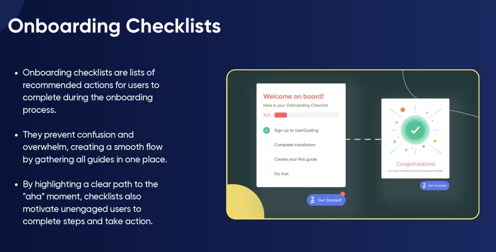
This is where onboarding elements like checklists, tooltips, and contextual guides shine.
They don’t just “show” features, they actively move users from curiosity to value.
With UserGuiding, you can build these flows without writing code:
- Onboarding checklists: According to our Product Adoption Trends report, 52% of companies already use them, averaging 3 checklists with 5 steps each. UserGuiding makes it easy to set these up and track completion rates inside your cohorts.
- Interactive guides: On average, companies launch 15 guides, but leaders in industries like Customer Experience push this number even higher. With UserGuiding, you can deliver interactive guides at scale, ensuring users take the right steps at the right time.
- Tooltips & contextual nudges: Instead of waiting for users to get lost, you can proactively highlight features and milestones, whether it’s Slack users sending their first message or Dropbox users uploading their first file.
You can learn more about how UserGuiding helps you do all that with our new Product Adoption Trends report. 👇🏻 🚀
Here’s a sneak peek:
#2 Retention playbooks
If activation is about getting users to their first “aha!” moment, retention is about making sure they keep coming back for more.
And this is where cohort analysis really shines, it helps you spot whether your users are on a healthy curve (steady engagement over time) or an unhealthy one (sharp early drop-offs).
Once you see the difference, you can act on it.
Maybe your early cohorts are engaged, but later ones are slipping?
That’s your cue to send re-engagement emails or roll out feature education campaigns that remind users of what they’re missing.
Or, if certain cohorts show strong adoption after a few weeks, it might be the perfect moment to introduce upsell offers, because you’ve already proven the value.
There’s real-world proof this works.
Buildertrend, a leading construction SaaS platform, used Churnkey’s cancel and reactivation flows to tackle churn at the source.
Instead of letting users silently drop, Buildertrend introduced personalized “returning user” flows, ranging from tailored discounts to onboarding refreshers.
As a result, they recovered a significant share of accounts that would have otherwise churned, while also improving long-term retention curves.
In other words: retention playbooks aren’t just about keeping people around, they’re about making sure users find renewed value every time they log back in.
Practical Steps to Run Cohort Analysis
If all this sounds a bit abstract, don’t worry, running cohort analysis is less about complex math and more about building habits of looking at user behavior over time.
Here’s a practical framework you can follow:
Step 1: Choose an analytics tool
Start with a tool that can handle cohort visualization.
Depending on your stack, this could be a dedicated analytics platform (Mixpanel, Amplitude, Heap) or built-in analytics from your onboarding/product adoption tool (like UserGuiding’s segmentation features).
The goal is simple: you need to be able to group users by actions or timeframes and see how their engagement unfolds.
Step 2: Define your “first value” event
Before you can measure retention, you need to define what “success” looks like for a new user.
This is often called the first value event, the moment a user experiences the core value of your product for the very first time.
📊 In Mixpanel, you can configure these events by tracking specific user actions.
For example:

- A Page Viewed event → Useful for content platforms where consuming content is the first value.
- A Signed Up event → Helps you measure if signups are coming from organic vs. referral sources.
- A Song Played event → Perfect for music apps, since listening to a track is the user’s first moment of value.
- An Order Completed event → Common for eCommerce, where the first purchase signals true value.
This is how SaaS products often define it in real life:
- Notion → Creating the first page or document.
- Canva → Designing and exporting the first graphic.
- Trello → Adding the first task card to a board.
By setting up these first value events in Mixpanel, or any analytics tool, you’re not just logging activity, you’re creating benchmarks that let you see if onboarding actually drives users to that first moment of value.
From there, you can segment cohorts around these milestones and analyze how long users stick around afterward.
Step 3: Segment cohorts (by onboarding action, feature use, lifecycle)
Now, break users into meaningful groups. The goal here isn’t just to slice data for the sake of it, but to see how different behaviors map to long-term retention.
Some useful starting points include:
1- Onboarding action
Did they complete the onboarding checklist, or skip halfway through?
You’ll often find that users who finish even a single checklist step are far more likely to stick around, while those who skip tend to drop off before Day 14.
With UserGuiding, you can tag checklist completions as events and see exactly how those users perform against others.
2- Feature use
Did they activate a key feature in their first week, or did they ignore it?
Tracking this across cohorts helps you pinpoint which features drive stickiness versus which ones are just “nice to have.”
3- Lifecycle stage
Were they free trial users, freemium explorers, or brand-new paid subscribers?
Each group has a different motivation.
Trial users might need nudges to hit the “aha” moment before the clock runs out, while freemium users may need education around premium features to convert.
Comparing these cohorts shows whether your upgrade paths are working, or where they leak.
When you look at these groups side by side, you start to see clear stories: the behaviors that correlate with healthy retention curves, and the ones that consistently predict churn.
That’s what makes cohort analysis so powerful, it turns raw activity into patterns you can act on.
Step 4: Track retention at set intervals (Day 7, Day 30, Day 90)
Cohort analysis gets powerful when you check how each group behaves over time.
Instead of just looking at a flat retention rate, track survival curves at meaningful intervals, 7 days, 30 days, 90 days.
- Day 7 tells you if onboarding worked.
- Day 30 shows whether users are integrating your product into their workflow.
- Day 90 reveals long-term stickiness.
Step 5: Compare cohorts and run experiments
Once you’ve defined cohorts, the real value comes from comparing them side by side and experimenting with strategies to improve retention.
📊 Again in Mixpanel, you can filter analyses by cohort to focus on a specific subset of users.
For example, if you’re analyzing onboarding performance, you can filter down to “New Users” who signed up in the past 7 days.
This way, all the retention charts and reports you create will only reflect this targeted group.
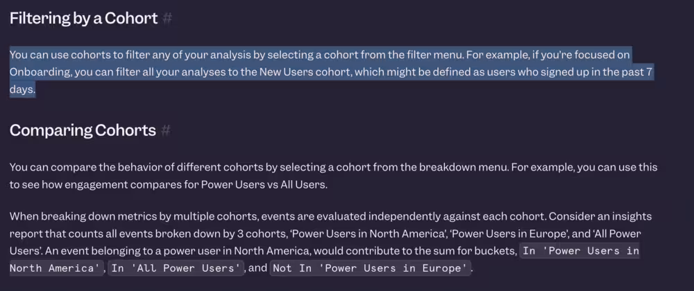
Beyond filtering, you can also compare cohorts directly to see how different groups behave.
For instance, you could compare:
- Power Users vs. All Users
- New Signups from North America vs. Europe
- Users who completed onboarding vs. those who skipped it
Each of these comparisons helps you understand how engagement differs across segments.
If one group consistently retains better, you can design experiments (like changing onboarding steps, feature prompts, or marketing messages) to replicate that success in weaker cohorts.
💡 The takeaway: Cohort comparison isn’t just about spotting differences, it’s about running data-backed experiments to learn what drives better retention, then scaling those insights across your user base.
Success Tips
Here are a few practical tips to make your analysis sharper and easier to act on:
1- Keep cohorts simple at first (avoid over-segmenting)
It’s tempting to create hyper-specific groups, “users from Germany who signed up in Q3 and tried Feature X within the first 48 hours.”
The problem? You end up with slices too small to reveal meaningful patterns.
Instead, start broad: group users by signup month, onboarding completion, or first feature usage.
This helps you spot the big trends (like where churn spikes) without drowning in noise.
Once you’ve nailed down the high-level story, you can layer in more segmentation for nuance.
2- Align cohort definitions with business goals
Cohorts aren’t just data buckets, they’re reflections of what your business cares about. If your main challenge is activation, define cohorts around “time-to-first-value.”
If you’re focusing on expansion revenue, segment by feature adoption or account growth.
By tying cohorts directly to your goals, you make sure the insights actually drive strategy instead of becoming “interesting but irrelevant” charts no one acts on.
3- Combine quantitative (retention charts) and qualitative (feedback surveys)
Retention charts and graphs give you the “what.”
For example, you might see a sharp drop after week two.
But the “why” comes from qualitative data, feedback surveys, user interviews, even support tickets.
When you put the two together, the story gets much clearer: a dip in retention might actually link back to a confusing feature, a missing integration, or even unclear pricing.
Quantitative + qualitative is how you turn analysis into action.
4- Share cohort learnings cross-team (product, success, marketing)
Cohort insights are too valuable to stay locked in your analytics tool.
Product teams can use them to prioritize which onboarding friction points to fix. Customer Success can flag churn risks earlier.
Marketing can refine targeting to bring in higher-quality leads. When everyone rallies around the same retention signals, it creates a shared language for growth.
Think of cohort learnings as a bridge that connects teams, each one sees the data through their own lens, but the end goal is the same: healthier, happier users.
Results you can expect:
When you start running cohort analyses and building playbooks around them, here’s what typically comes to the surface:
- Clear visibility into what drives activation and retention → You’ll see exactly where users are thriving and where they’re dropping off.
- Smarter onboarding and feature promotion → Tailor checklists, tooltips, and nudges to guide users toward their “aha” moments faster.
- Improved long-term retention (and less churn) → Cohorts help you catch unhealthy curves early, so you can course-correct before users disappear.
- Proof-backed strategy → Test different adoption tactics, measure the impact, and double down on what actually works—with data to back it up.
In short…
Cohort analysis isn't just a technique, it's a shift in perspective for product teams.
Instead of asking "what's our overall retention rate?" you start asking "which user groups are thriving, and which are churning, and why?"
That simple reframing unlocks insights that aggregated metrics simply cannot provide.
As Steve Groccia, Head of Customer Success at Mosaic, discusses in Episode 11 of Roll Forward podcast, modern teams are leveraging cohort analysis to move beyond surface-level dashboards and become strategic drivers of growth.
By tracking user cohorts from signup through activation and beyond, product and growth teams can identify which onboarding flows convert best, which features drive long-term engagement, and which acquisition channels bring the highest-quality users.
For SaaS products, this is critical.
Your January cohort might have experienced a buggy onboarding flow, while your March cohort benefited from your new activation email sequence.
Cohorts reveal these patterns so you can double down on what works and fix what doesn't.
The next time you see an average retention rate on your dashboard, ask yourself: what's hiding beneath it?
Because once you start thinking in cohorts, you'll never build a product the same way again.
Frequently Asked Questions
How do you use cohort analysis for SaaS retention analytics and churn prediction?
By grouping users by signup date or activation milestone, you can see how long each cohort stays active and spot churn patterns early, making it easier to predict and address drop-off points.
What are the best practices for defining activation cohorts in subscription-based products?
Define cohorts around meaningful milestones like completing onboarding, reaching first value, or subscribing, rather than just by signup date, to capture true adoption.
Does cohort analysis or funnel analysis drive better retention insights?
Cohort analysis shows how user groups behave over time, making it stronger for retention insights, while funnel analysis is better for identifying friction in conversion steps.
What are the examples of retention analytics dashboards using cohort segmentation?
Dashboards often visualize retention curves, heatmaps of user activity by week or month, and comparisons of feature adoption across cohorts to highlight long-term engagement trends.
How do activation cohorts impact long-term user engagement and revenue growth?
Users who activate early tend to retain longer, adopt more features, and generate higher lifetime value, making activation cohorts a leading indicator of future growth.
What tools offer built-in cohort analysis for product adoption tracking?
Popular tools include Amplitude, Mixpanel, Heap, and Pendo for product analytics, while ChartMogul and Baremetrics focus on subscription cohorts.
Which cohort analysis metrics should every SaaS team measure for retention improvement?
Key metrics include activation rate, feature adoption by cohort, retention curves, churn rate by cohort, and time-to-first-value.
What are the common mistakes to avoid when interpreting activation cohorts in SaaS?
Avoid defining cohorts too broadly, ignoring external factors like seasonality or marketing channels, and over-relying on averages instead of segment-level insights.

.png)