


.svg)
.svg)
.svg)
.svg)
.svg)


.svg)


.svg)
.svg)

You know that moment when you visit a new site and feel completely lost?
Buttons everywhere, tons of features, and no clue where to start. That's exactly where website walkthroughs come to the rescue.
A website walkthrough is basically your digital tour guide.
It's a sequence of interactive steps, tooltips, or overlay messages that gently guide new users through your site's key features.
Here's why these matter so much: when someone lands on your site, you've got maybe 30 seconds to prove your worth before they bounce.
It's your chance to reduce overwhelm, highlight your best features, and set people up for success right from the start.
But there's definitely a right way and a wrong way to do walkthroughs.
Done poorly, they become annoying interruptions that users skip through as fast as possible.
Done well, they create those "aha!" moments that turn casual browsers into engaged users.
Throughout this article, we're going to explore real examples of websites that absolutely nail their walkthrough experience, plus some practical strategies you can apply to your own site.
Let’s go.🚀
TL;DR
- Website walkthroughs act as digital tour guides, reducing confusion for new users.
- A great walkthrough boosts first impressions, activation, and long-term retention.
- Types include product tours, onboarding checklists, hotspots/tooltips, and hybrids.
- Real-world examples like Duolingo, Coda, and Mailchimp show how to do it right.
- Best practices: keep it short, personalize steps, use visuals, and allow skipping.
- Common mistakes: long, text-heavy, one-size-fits-all, or non-skippable flows.
- Tools like UserGuiding, Appcues, WalkMe, Userpilot, and Pendo make building walkthroughs easy.
- Done well, walkthroughs turn “aha moments” into lasting engagement and conversions.

Why website walkthroughs are important
1- First impressions matter
Let's get real about something: your users are making split-second judgments about your website.
63% of customers consider the onboarding period when deciding to subscribe to a service or purchase a product, which means your walkthrough isn't just nice to have, it's make-or-break territory.
Website walkthroughs reduce friction in that crucial first session by eliminating confusion before it starts.
Instead of letting users wander around clicking random buttons, you're guiding them straight to the good stuff.
This matters because 80% of users reported that they had uninstalled an app because they didn't know how to use it.
Ouch, right?
The thing is, users today expect instant clarity.
They want to understand what you're offering and how it benefits them within seconds, not minutes.
A well-crafted walkthrough gives them that "aha!" moment right away, showing them exactly why they should stick around and explore more.
2- Guided value discovery
Here's where walkthroughs really shine: they help users faster by showing them your most valuable features upfront.
Think about it, you know which features drive the most value, but your new users don't.
They might spend their entire first visit poking around secondary features while completely missing your main value proposition.
The numbers back this up in a big way. 97% of companies say good user onboarding is necessary for effective product growth. That's not just important, that's practically universal agreement.
And here's something that should grab your attention: 75% of users tend to abandon a product if it's hard for them to grasp how to use it within a week.
You've got one week to prove your worth, and most of that decision happens in the first few minutes.
A strategic walkthrough ensures users discover your core value before they have a chance to get frustrated and leave.
The best part?
When you nail the guided discovery process, a good experience with an application has a 50% possibility of ending up with a higher retention rate.
That's the kind of ROI that makes walkthroughs a no-brainer investment.
3- Retention & conversion
A clear walkthrough directly impacts your bottom line by reducing bounce rates and boosting trial-to-paid conversions, and the numbers prove just how significant this impact can be.
Let's start with bounce rates.
When users land on your site and immediately understand what to do next thanks to a well-designed walkthrough, they're far more likely to stick around and explore multiple pages instead of hitting the back button within seconds.
But the real magic happens with trial-to-paid conversions.
The industry benchmark for opt-in trials is 18.20% conversion rate, but companies that nail their onboarding experience see dramatically different results.
For B2B companies, you should aim for conversion rates between 15%-30%, and the difference between hitting that low end versus the high end often comes down to how well you guide users during their trial period.
Here's a perfect example: adding an interactive walkthrough doubled Rocketbots' activation rate from 15% to 30%.
That's literally doubling your conversion rate with the right walkthrough strategy.
🚀 Think about what doubling your trial conversions would mean for your revenue, it's not just a nice-to-have improvement, it's potentially business-transforming.
🎯 The key insight here is that when users quickly understand your product and reach that "aha!" moment through a strategic walkthrough, they're exponentially more likely to become paying customers.
And those customers who experience great onboarding? They tend to stick around longer and have higher lifetime value, making your walkthrough investment pay dividends for years to come.
Types of website walkthroughs (with mini-examples)
Not all walkthroughs are created equal.
Different types work better for different products, user types, and business goals.
Let's break down the main categories you'll encounter and when each one shines.
1- Interactive product demos
Think of these as "try before you buy" experiences that let users actually interact with your product without signing up.
Instead of just showing screenshots or videos, users can click buttons, fill out forms, and see real responses. It's like test-driving a car, you get to feel how everything works before making any commitment.
These demos work particularly well for complex software where users need to understand the interface and workflow before they're willing to start a trial.
You're giving them a taste of the actual experience, which builds confidence and reduces signup friction.
Calendly nails this with their interactive demo that lets you actually book a fake meeting and see exactly how their scheduling flow works.
You can click through the entire process, picking times, adding meeting details, sending confirmations, without creating an account. Check it out:
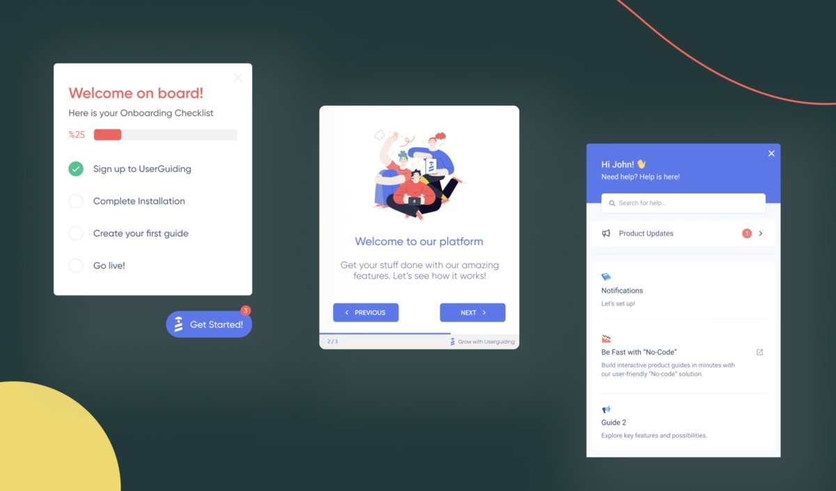
2- Onboarding checklists
This is your step-by-step orientation approach.
When users first sign up, they see a clear list of tasks to complete, usually with progress tracking and checkmarks.
It might include things like "Upload your profile photo," "Connect your first integration," and "Create your first project."
The psychology here is brilliant, people love checking things off lists, and it gives new users a clear roadmap instead of that overwhelming "what do I do now?" feeling.
Each completed task builds momentum toward full activation.
Notion perfects this with their setup checklist that includes tasks like "Create your first page," "Invite team members," and "Try a template."
Each completed task shows a satisfying checkmark and moves you closer to 100% completion.
3- Hotspots & tooltips
In walkthroughs, hotspots and tooltips act as guiding markers that keep users on track, similar to what Wes Bush refers to as “product bumpers’’ in his podcast.
These bumpers provide simple, intuitive directions, like prompting users to click through each step in sequence.
Instead of overwhelming the user, walkthrough tooltips and hotspots offer just enough instruction, often supported by short, clear microcopy, to make the process feel seamless and easy to follow.
It's like having a helpful assistant who only speaks up when you're looking confused.
Here’s how the Evernote app uses a tooltip to notify the user of a feature that they may want to utilize, and clicking on it launches a video that explains how it works. 👇🏻
.avif)
4- Guided tours
The classic multi-step overlay experience where a series of pop-ups walks users through key features in a specific sequence.
These usually dim the background and highlight specific elements while explaining what they do and why they matter.
When done right, guided tours create a controlled introduction to your most important features.
The key is keeping them short, relevant, and skippable, nobody wants to sit through a 15-step tour just to get started.
Canva offers one of the smoothest guided tours out there.
When you first sign up, they walk you through creating your first design with overlay bubbles that highlight the template library, drag-and-drop editor, and publishing options.
It's short (about 3 minutes), skippable, and gets you creating immediately.
5- Hybrid models
These combine walkthroughs with self-serve resource centers, giving users both guided and on-demand help.
You might start with a quick interactive tour, then provide easy access to help docs, video tutorials, and FAQs right within the interface.
This approach acknowledges that different users learn differently, some want hand-holding, others prefer to figure things out themselves, and most want something in between depending on the situation.
Shopify is a fantastic example of this hybrid approach.
When you first set up your store, they offer a guided setup wizard that walks you through adding products, configuring payments, and setting up shipping.

But throughout the entire process, you'll see their help center widget in the bottom corner, giving you instant access to detailed articles, video tutorials, and their community forums.
Plus, they have contextual help bubbles that appear based on what page you're on, so if you're setting up taxes, you'll see tax-related help content without having to search for it.
Website walkthrough examples
1- Duolingo
- Walkthrough format used: Guided tours
Duolingo skips lengthy explanations and gets you translating words within 30 seconds of opening the app.
Their walkthrough is disguised as your first lesson, complete with progress bars, celebrations for correct answers, and gentle corrections for mistakes. 👇🏻
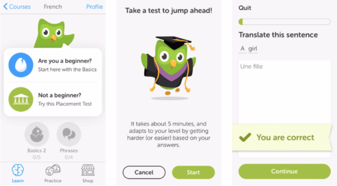
Why It Works Well
The onboarding doesn't feel like onboarding at all, it feels like using the product.
This approach leverages what behavioral psychologist BJ Fogg calls the "success cycle" where immediate small wins create motivation for continued engagement.
The gamification elements (streak counters, XP points, celebrations) tap into intrinsic motivation patterns that keep users coming back.

Most importantly, users start building their target habit (daily language practice) from the very first interaction, rather than postponing it until after they "learn the app."
Key Takeaways:
- Disguise onboarding as immediate value delivery whenever possible
- Use micro-achievements to build confidence and motivation from the first interaction
- Start habit formation immediately rather than after users "learn the system"
- Celebrate small wins to create positive emotional associations with your product
2- Coda
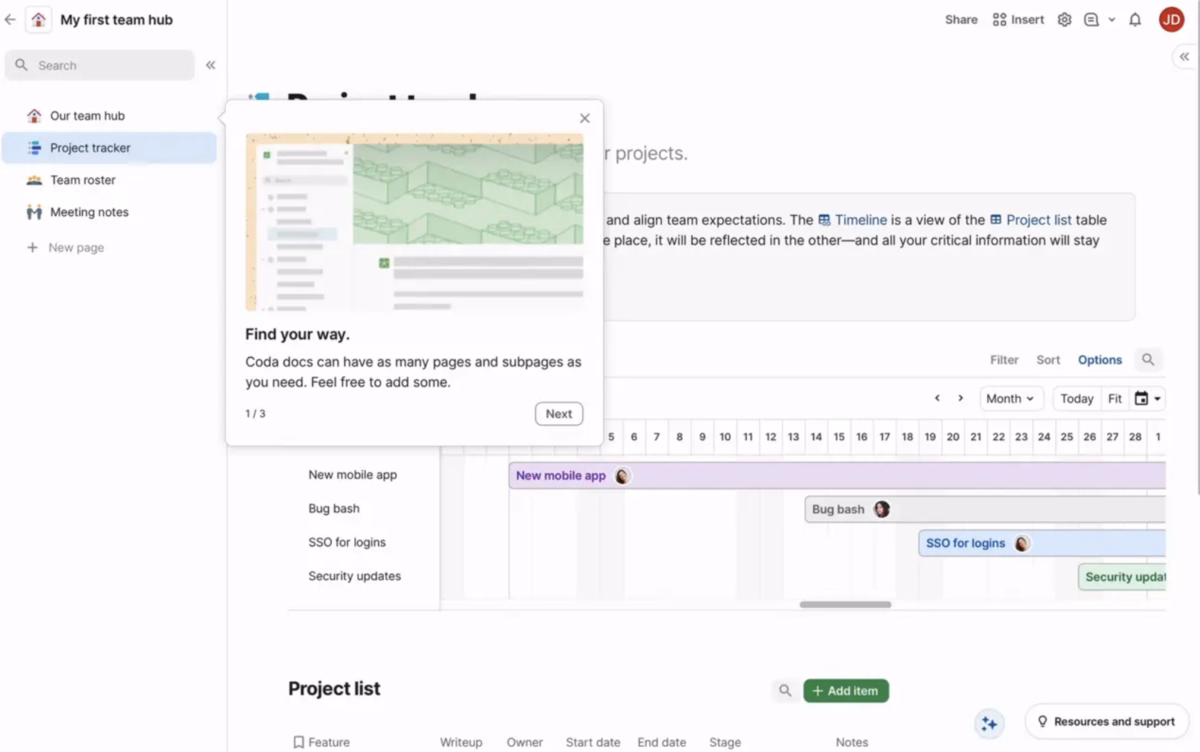
- Walkthrough format used: Interactive product demos
Coda presents new users with a fully functional sample workspace called "My first team hub" that includes realistic project data like "New mobile app," "Bug bash," and "SSO for logins."
Users can interact with live tables, timelines, and project views while a guided overlay explains key concepts like document structure and navigation.
Why It Works Well
The demo approach lets users experience Coda's unique document-database hybrid functionality with realistic data that shows practical applications.
You can actually click through project items, explore different views, and understand how information flows between different sections.
The sample data is well-crafted, showing real project management scenarios that most users can relate to.
Key Takeaways:
- Use realistic, relatable sample data that demonstrates practical use cases
- Let users interact with live functionality rather than static screenshots
- Avoid competing modalities, either guide users through specific actions or let them explore freely
- Provide clear next steps after the demo to transition users to their own content
- Consider sequential revelation rather than showing everything at once
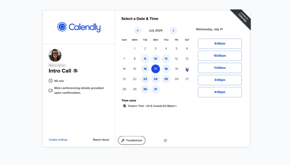
3- Calendly
- Walkthrough format used: Interactive product demos
Calendly's demo lets you actually book a meeting with "John Doe" from their team.
You can browse available times, enter meeting details, and see confirmation emails, all without signing up.
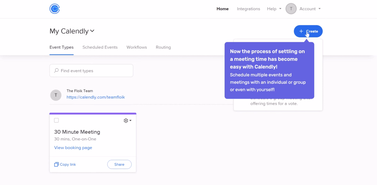
It's the full experience minus the actual calendar integration.
Why It Works Well
Scheduling tools live or die based on the booking experience, so letting potential users test drive that exact workflow eliminates uncertainty about product fit.
The demo removes the biggest barrier to adoption, fear that the tool won't work smoothly for important business interactions.
Users can test edge cases like time zones, meeting types, and customization options before committing.
This builds confidence that the tool will handle their specific requirements.
Key Takeaways:
- For workflow-dependent products, let users experience the complete workflow before signup
- Remove adoption barriers by letting users test scenarios specific to their use case
- Build confidence by demonstrating reliability in realistic conditions
- Address common concerns (like time zones or customization) proactively in the demo
4- Notion
- Walkthrough format used: Onboarding checklists
Notion presents new users with a welcome checklist that includes tasks like "Create your first page," "Try a template," and "Invite team members."
Each task is designed to introduce a core concept while building something useful.
Why It Works Well
The checklist format leverages completion psychology, people are intrinsically motivated to finish started tasks.
Each checklist item is designed to be accomplishable within 2-3 minutes, creating a series of small wins rather than one overwhelming setup process.

The template-based approach means users experience Notion's power without having to architect everything from scratch.
This is particularly important for productivity tools where the learning curve can delay time-to-value significantly.
Key Takeaways:
- Break complex setup into small, accomplishable tasks
- Design each task to deliver value while teaching core concepts
- Use templates to demonstrate advanced functionality without requiring advanced skills
- Leverage completion psychology to maintain momentum through complex onboarding
5- Trello
- Walkthrough format used: Onboarding checklists
Trello creates a "Welcome Board" that teaches the system through actual use. You learn about cards, lists, and collaboration by moving sample cards through a project workflow.
The board includes tasks like "Try dragging a card" and "Add a team member."
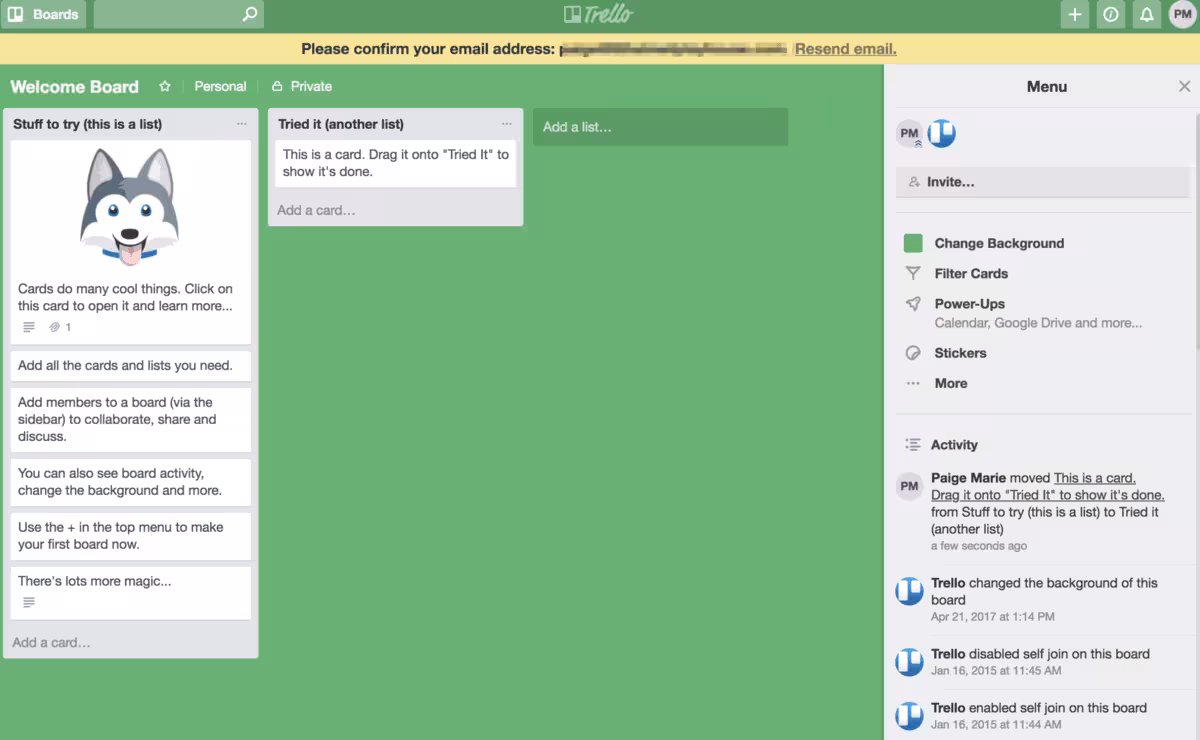
Why It Works Well
Trello's methodology is best learned through practice rather than explanation.
The sample board shows realistic project scenarios while letting users experience the satisfying interaction of moving work through stages.
This kinesthetic learning approach helps users understand not just how to use features, but when and why to use them in real project contexts.
Key Takeaways:
- For methodology-based tools, teach through practice rather than explanation
- Use realistic scenarios that demonstrate when and why to use features
- Design interactions to be satisfying and confidence-building
- Show the methodology in action rather than describing it abstractly
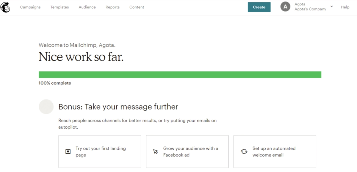
6- Mailchimp
- Walkthrough format used: Guided tours
Mailchimp walks new users through creating their first email campaign with a step-by-step wizard that covers audience selection, email design, and scheduling.
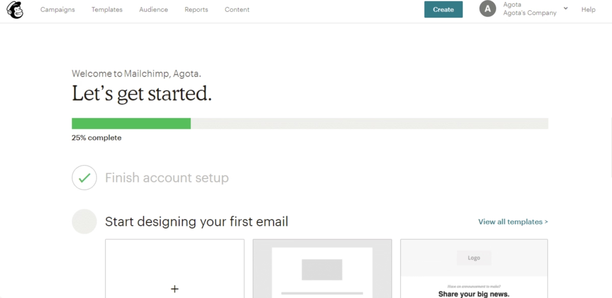
Each step includes helpful tips and best practices.
Why It Works Well
Email marketing involves many technical and strategic decisions that can be overwhelming for beginners.
The wizard structure prevents users from skipping crucial steps (like audience segmentation) while the embedded tips help users make better strategic decisions.
The result is a real campaign users can send, which provides immediate value and confidence in the platform's capabilities.
Key Takeaways:
- Break complex workflows into logical, sequential steps
- Embed education and best practices within the workflow
- Prevent users from skipping steps that are crucial for success
- Result in real, usable output rather than just tutorial completion
7- Airtable
- Walkthrough format used: Hotspots & tooltips
Airtable starts users with pre-built templates for common use cases like project management or content planning.
Hotspots and tooltips reveal advanced features like filtering, linking, and automation as users explore.

Why It Works Well
Database tools can be abstract and intimidating, but templates provide immediate context for how the features apply to real work.
The progressive disclosure approach means users can start simple and discover advanced features as their needs grow.
This prevents the overwhelming feeling that often comes with powerful, flexible tools while still making the full feature set discoverable.
Key Takeaways:
- Use templates to provide immediate context for abstract features
- Progressive disclosure lets users grow into advanced functionality
- Start with familiar use cases before introducing unique capabilities
- Make powerful features discoverable without overwhelming initial experience
8- Zoom
- Walkthrough format used: Interactive product demos
Zoom's first-time user experience includes testing your camera and microphone, trying screen sharing, and exploring meeting controls.
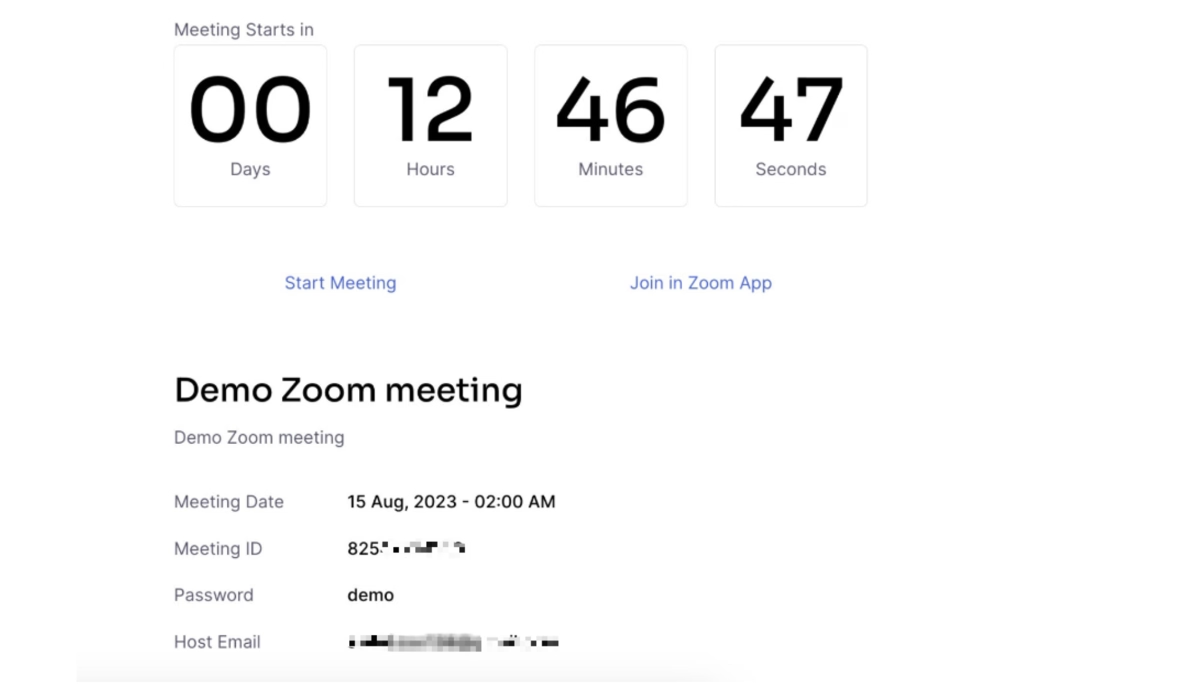
It's designed to build confidence before your first real meeting. It’s simple yet so effective.
Why It Works Well
Video conferencing anxiety is real, so letting users test everything in a safe environment reduces stress.
The technical check ensures users won't have embarrassing technical difficulties during important meetings.
This approach addresses the psychological barrier that prevents many people from trying video conferencing tools, fear of technical failure in professional settings.
Key Takeaways:
- For products with performance anxiety potential, provide safe practice environments
- Address psychological barriers alongside functional ones
- Let users build confidence through risk-free testing
- Ensure technical reliability before high-stakes usage
9- Asana
- Walkthrough format used: Guided tours
Asana creates a sample project where you work alongside "teammates" to complete tasks, set deadlines, and track progress.
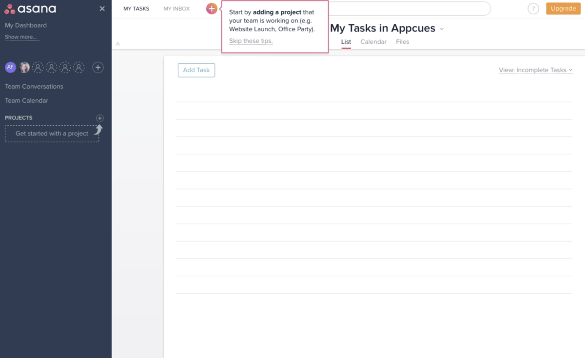
You experience the full collaborative workflow in a realistic context.
Why It Works Well
Project management is inherently collaborative, so experiencing that collaboration (even with simulated teammates) helps users understand the platform's value.
The tutorial project demonstrates common use cases and best practices while letting users experience the satisfaction of completing work and seeing progress.
Key Takeaways:
- For collaborative tools, simulate the collaborative experience during onboarding
- Use realistic project scenarios that reflect common use cases
- Show the satisfaction and value of completion, not just the process
- Demonstrate team dynamics and communication patterns
10- Spotify
- Walkthrough format used: Onboarding checklists
Spotify's onboarding focuses on music taste preferences through artist selection, genre preferences, and listening habits.
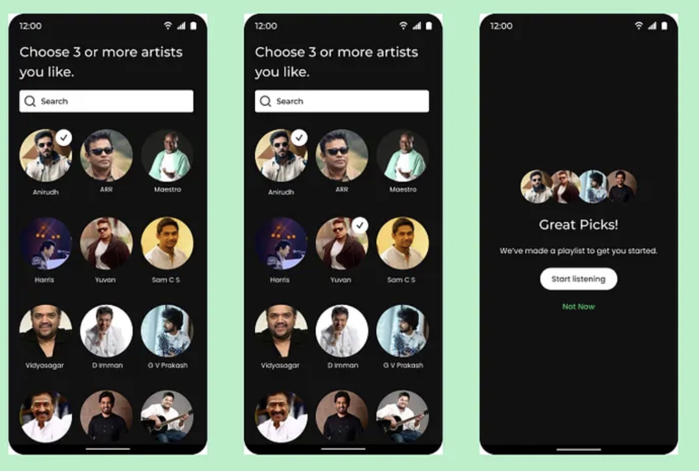
The walkthrough is really a preference collection disguised as music discovery.
Why It Works Well
Users are engaging with music content they actually like while teaching the algorithm about their preferences.
It doesn't feel like onboarding, it feels like music discovery, which is why people use Spotify in the first place.
The personalization data collected improves the product experience immediately, creating a positive feedback loop.
Key Takeaways:
- Disguise data collection as value delivery when possible
- Start personalization immediately rather than after extended use
- Make setup feel like the core product experience
- Create immediate value from user input
11- Google Docs
- Walkthrough format used: Hotspots & tooltips
Google Docs uses contextual tooltips and interface cues to guide users through feature updates and changes.
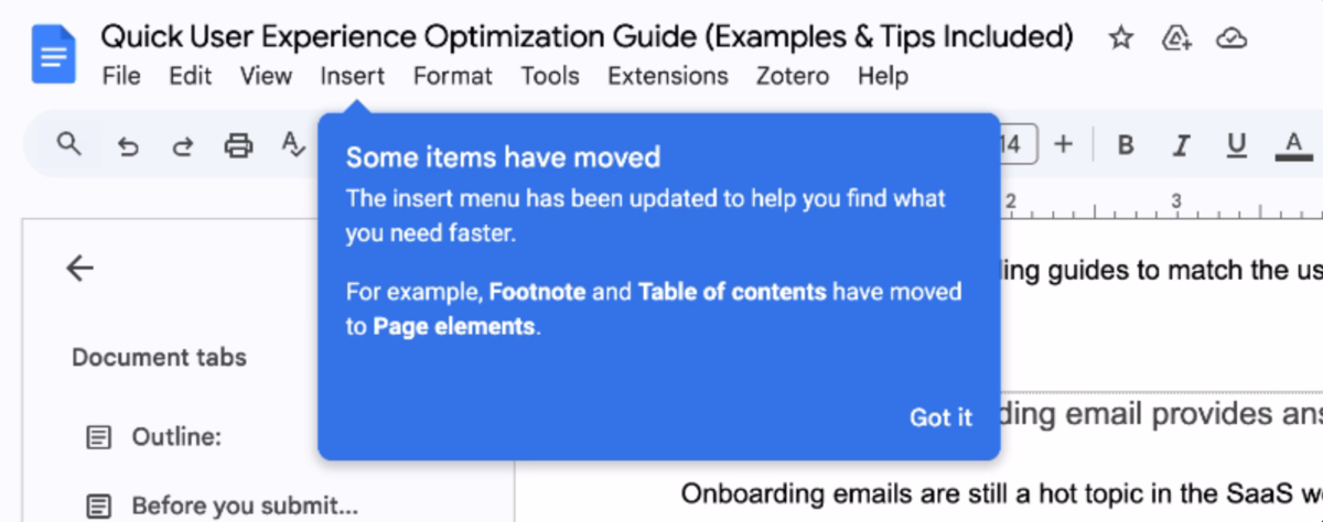
When you hover over menu items or buttons, subtle tooltips appear to provide information about functionality or explain where features have moved, like when footnote and table of contents options were relocated to different menu sections.
Why It Works Well
The tooltip approach respects users' existing familiarity with the product and provides help exactly when and where it's needed.
Rather than interrupting workflows with prominent overlays, tooltips appear on hover, giving users control over when they access additional information.
This progressive disclosure means users can work uninterrupted while still having access to contextual help when they pause to explore or look for specific features.
The tooltips are particularly effective for communicating interface changes because they appear precisely where users expect to find certain functions, then guide them to the new location.
This reduces frustration during transitions and helps users adapt to interface updates without feeling lost.
Key Takeaways:
- Use tooltips to communicate interface changes at the point of confusion
- Let users control when they see help information through hover interactions
- Keep tooltip content brief and specific to the immediate context
- Focus on guiding users to new locations rather than re-explaining familiar concepts
- Leverage existing user behavior patterns rather than forcing new learning
12- Circle
- Walkthrough format used: Onboarding checklists
Circle presents new community creators with a comprehensive setup checklist that guides them through essential steps like completing their profile, setting up payment options, inviting first members, and configuring community access.
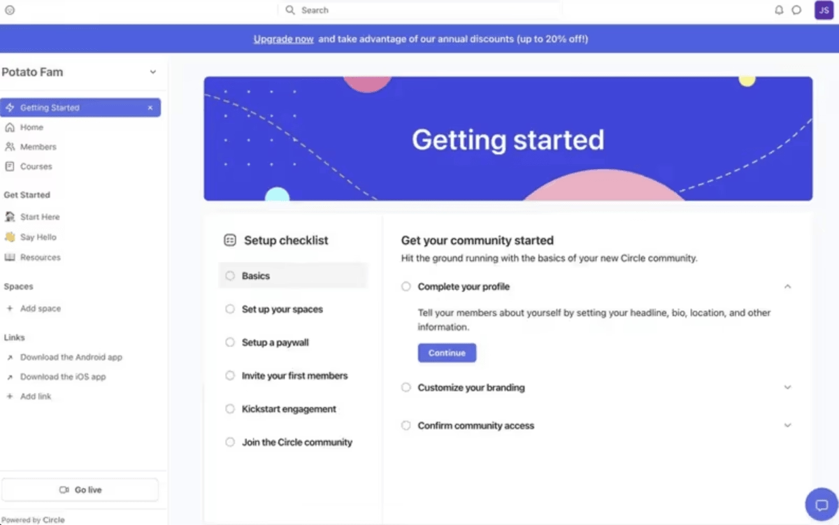
The checklist is prominently displayed in a "Getting started" section with clear progress tracking and actionable tasks.
Why It Works Well
The checklist approach works particularly well for community platforms because launching a successful community requires multiple interconnected steps that are easy to forget or overlook.
Circle's checklist ensures creators don't skip crucial elements like member invitation or community branding that directly impact initial engagement.
The visual progress tracking creates momentum, while the logical sequencing helps creators understand the relationship between different setup tasks.
What's especially smart is how the checklist subtly encourages community growth by including tasks like "Invite your first members" and "Join the Circle community."
This builds both the user's specific community and connects them to Circle's broader ecosystem where they can get help and inspiration from other community builders.
Key Takeaways:
- Design checklists that lead users through interconnected setup tasks in logical sequence
- Include community-building actions alongside technical configuration
- Use progress tracking to create momentum through complex multi-step processes
- Connect users to your broader ecosystem as part of the onboarding checklist
- Make help resources easily discoverable within the checklist interface
13- ChatGPT
- Walkthrough format used: Guided tours
ChatGPT uses a multi-step guided tour that introduces new users to key features through overlay modals and interactive demonstrations.
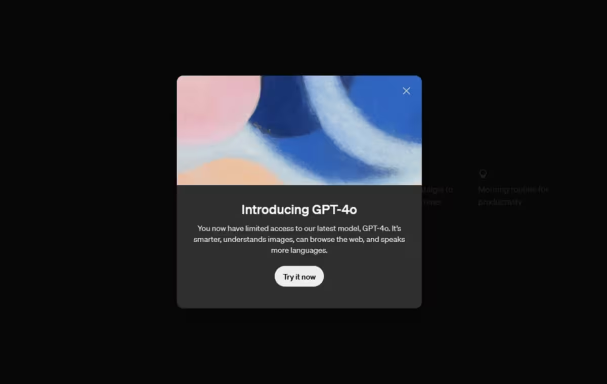
The tour walks users through essential capabilities like conversation basics, prompt writing techniques, and understanding AI limitations, with each step building on the previous one to create a comprehensive introduction to effective AI interaction.
Why It Works Well
The guided tour approach works particularly well for ChatGPT because effective AI interaction requires understanding both capabilities and limitations that aren't immediately obvious from the interface.
Unlike traditional software where buttons and menus are self-explanatory, conversational AI requires users to learn new interaction patterns like prompt engineering and iterative refinement.
The tour helps users understand not just what ChatGPT can do, but how to communicate with it effectively.
The sequential structure ensures users grasp foundational concepts before moving to advanced techniques.
By showing examples of good and poor prompts, the tour sets realistic expectations and helps users avoid common frustrations that lead to abandonment.
Key Takeaways:
- Use guided tours when the product requires learning new interaction paradigms
- Show both capabilities and limitations to set realistic expectations
- Include examples of effective vs. ineffective usage patterns
- Build from foundational concepts to advanced techniques sequentially
- Address common user misconceptions proactively during onboarding
14- Canva
- Walkthrough format used: Tooltips
Canva uses a step-by-step walkthrough supported by tooltips to introduce new users to the platform.
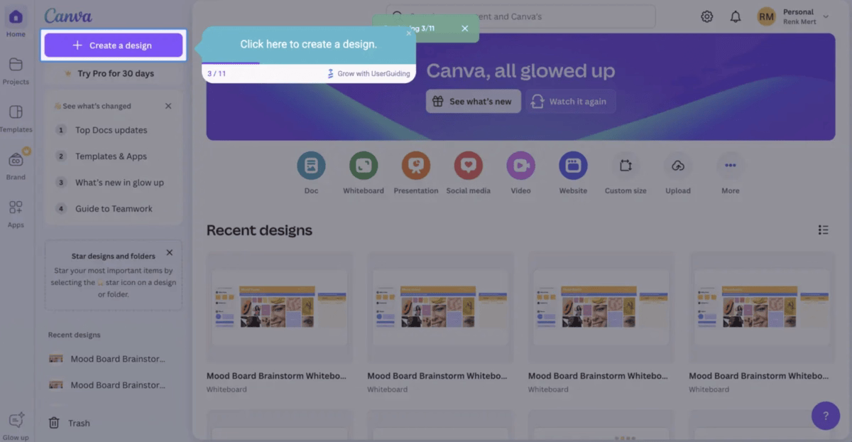
The walkthrough highlights essential actions, such as creating a design, by pointing directly to the relevant interface elements with clear, short instructions.
Why It Works Well
The tooltip-driven walkthrough helps new users quickly grasp Canva’s core functionality without overwhelming them.
Each step focuses on a single action, reducing cognitive load and making it easier to start designing right away.
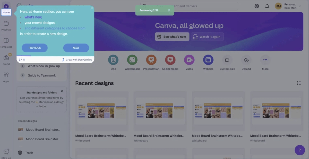
The clear labeling and sequential structure also build user confidence, as they always know what to do next.
By keeping the microcopy concise, like “Click here to create a design”, Canva ensures that the walkthrough feels approachable while still being highly instructional.
This direct guidance shortens the learning curve and encourages users to engage with the product immediately.
Key Takeaways:
- Streamline onboarding with simple, sequential tooltips
- Use concise, actionable microcopy to guide users
- Highlight the platform’s primary value early on
- Boost user confidence by removing guesswork
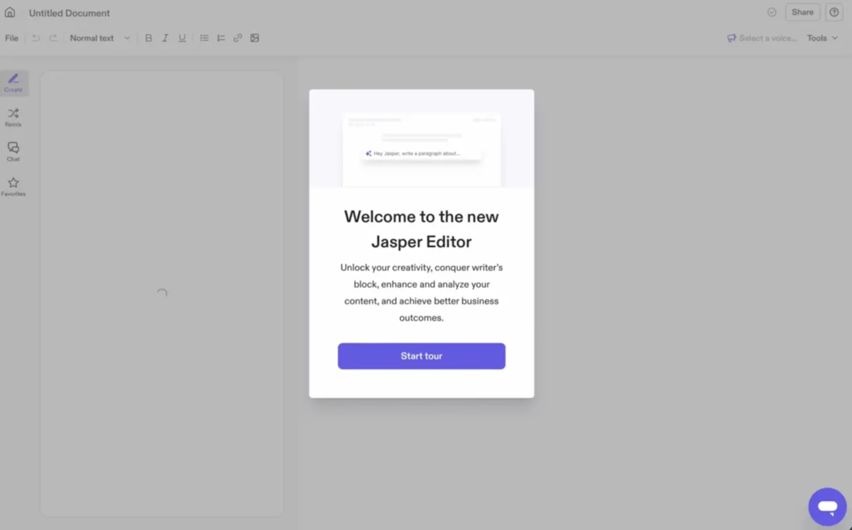
15- Jasper
- Walkthrough format used: Welcome modal & tooltips
Jasper introduces its editor with a welcome modal that sets expectations and invites users to start a guided tour.
The walkthrough then progresses with tooltips that highlight key actions, like creating new content, ensuring users immediately understand how to get value from the platform.
Why It Works Well
The welcome modal establishes context by clearly communicating Jasper’s value proposition and reassuring users about what they can achieve.
From there, the tooltips provide step-by-step guidance without overwhelming the interface, keeping the focus on creating content.
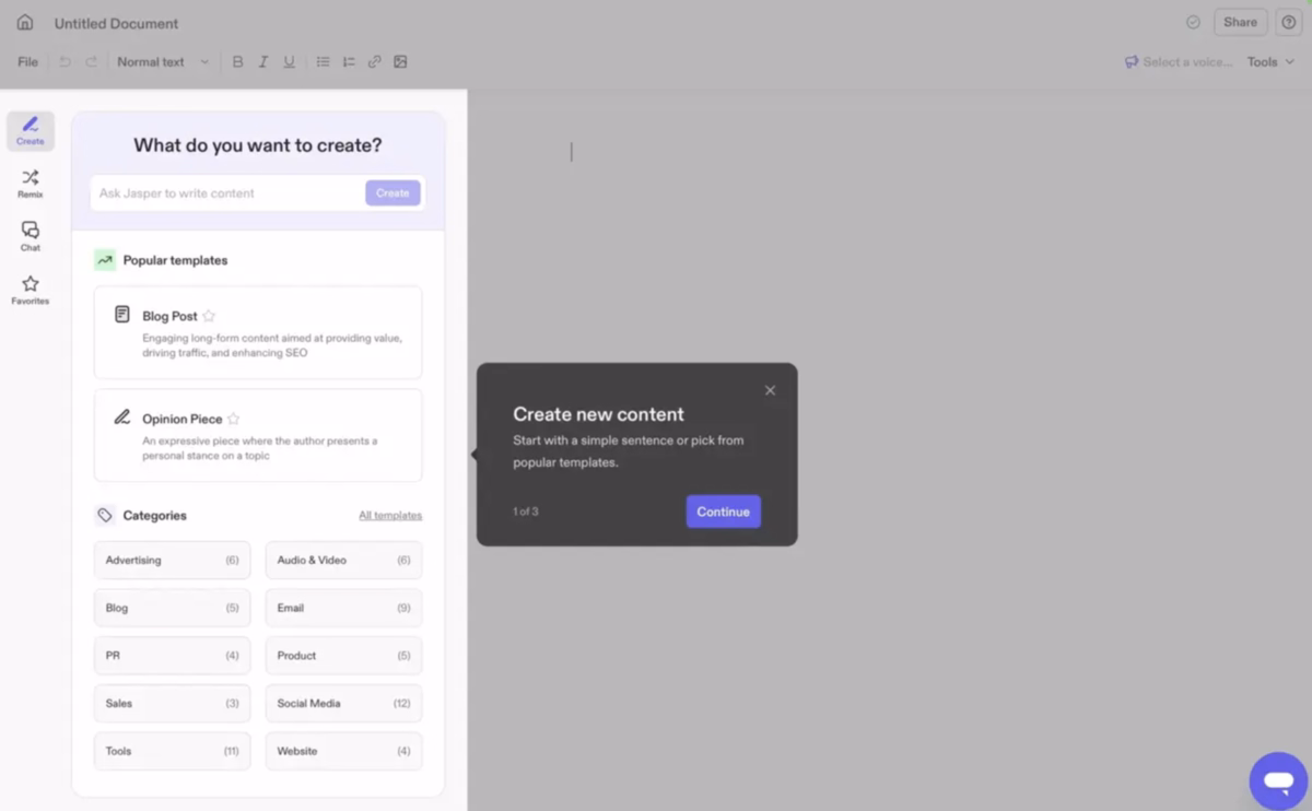
This combination of a modal followed by tooltips strikes a balance: the modal sets the stage, and the tooltips walk users through practical actions.
By structuring the experience this way, Jasper helps new users bypass uncertainty and engage with core features right away.
Key Takeaways:
- Set expectations with a clear, value-driven welcome modal.
- Guide users step by step with focused tooltips.
- Highlight core features early to drive adoption.
- Reduce uncertainty by combining context with action.
Best practices from the examples:
When we look at the most effective website walkthroughs in the wild, certain practices keep appearing.
They’re not just clever design choices, they’re proven ways to guide new users without overwhelming them.
Below, we’ll explore these best practices alongside real product examples, and contrast them with the common pitfalls that weaken many onboarding flows.
1. Keep it short, focus on quick wins
The best walkthroughs get users to their first “aha moment” quickly.
Instead of trying to showcase everything, they focus on one or two actions that deliver immediate value.
Kommunicate, for instance, introduces new users to its chatbot builder with a short checklist and a tooltip that nudges them toward creating their first bot.
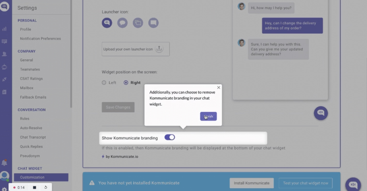
The process is fast, simple, and confidence-building, exactly what a new user needs.
Common possible mistake here: The opposite approach is the never-ending tour.
Some platforms still present users with a marathon of steps that explain every feature in the product.
Not only is this overwhelming, but it also delays the moment of success. Most users lose patience long before the tour is complete.
2. Personalize walkthrough steps (progressive profiling)
The strongest walkthroughs adapt to a user’s specific goals instead of pushing everyone down the same path.
Kontentino, for example, uses a quick onboarding survey along with step-by-step tooltips to segment new users, whether they’re marketers managing multiple brands or individuals scheduling content for one channel.
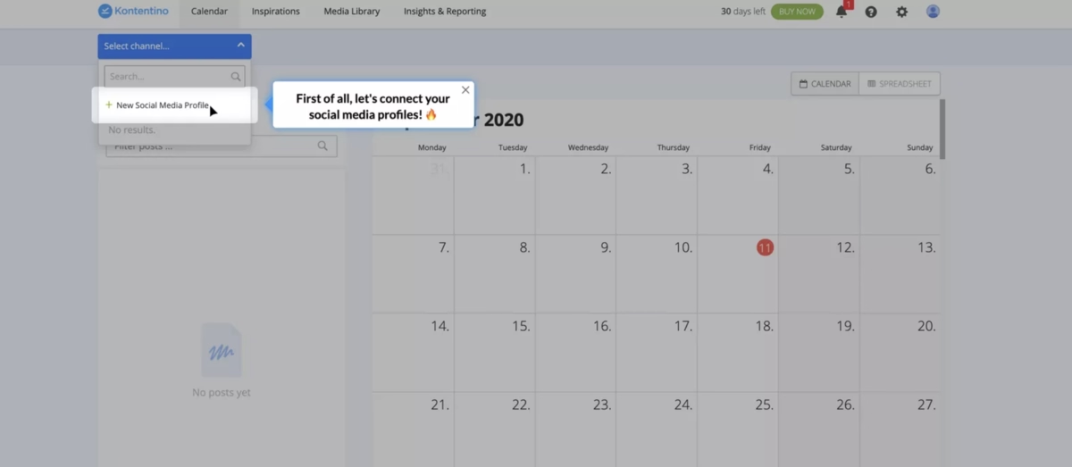
This makes the guidance more relevant and reduces unnecessary noise.
As Wes Bush, author of Product-Led Growth, points out, too many onboarding flows still include steps that don’t actually matter:
“Well over 30% of required user onboarding steps are rubbish… Your goal should be to get your user to value in the shortest time possible. Aim for no more than 3–5 profiling questions.”
This highlights why progressive profiling works: it gathers just enough context to personalize the journey without overwhelming the user.
Common possible mistake here: Delivering the same generic walkthrough to everyone. A one-size-fits-all approach not only feels irrelevant but can actually slow users down, making it harder for them to see value.
See this checklist from Zapier.
It is too long, for starters. It feels overwhelming, and it is presented without any clear prioritization or personalization.

3. Use visuals, not just text
The most effective walkthroughs rely on visual cues, hotspots, overlays, and tooltips, rather than long paragraphs of explanation.
Figma does this especially well, layering subtle tooltips over sample content to guide users through features in a way that feels intuitive and memorable.
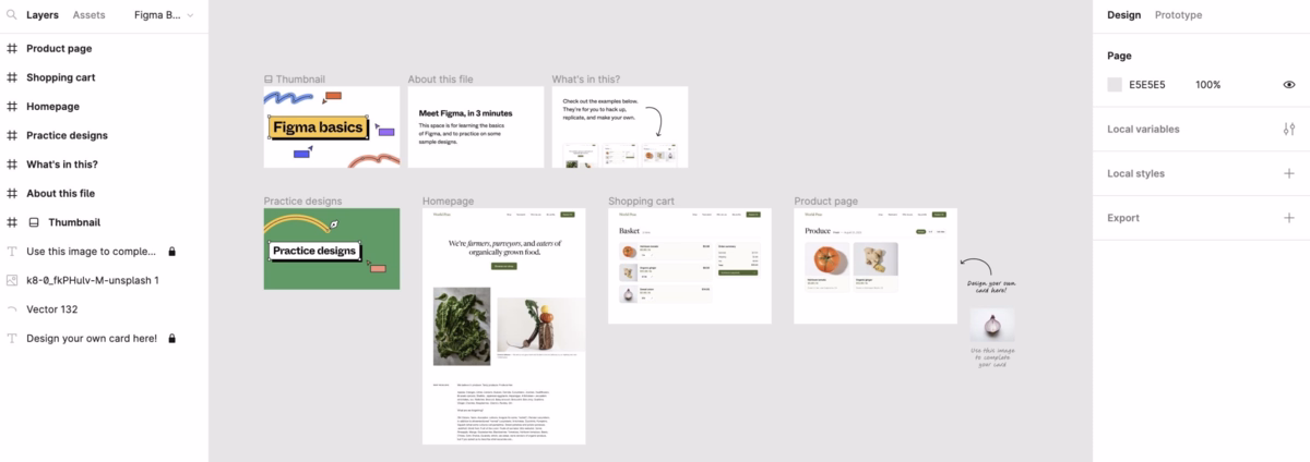
By showing instead of telling, the product reduces cognitive load and helps users learn by doing.
This ties back to a core principle in UX championed by Alan Cooper, often called the “father of Visual Basic.”
Cooper emphasized that good design should be tailored to real user goals and feel natural to interact with.
👉🏼 In the context of walkthroughs, that means avoiding walls of text and focusing on clear, visual interactions that match how people actually learn.
Common possible mistake here: Treating onboarding like a manual, stuffed with long-form text that most users will skip or forget.
4. Allow an exit or skip option
Effective walkthroughs respect user autonomy by giving them the choice to skip or exit the tour if they prefer.
Salesflare, for example, offers a clear “Take the Tour” or “Skip” option, letting users decide how they want to explore the product.
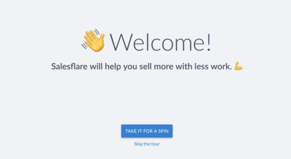
This simple control makes the experience feel less pushy and more user-friendly.
Giving users that flexibility in the product, whether in choosing their onboarding path or in how guidance is delivered, supports both autonomy and engagement.
Common possible mistake here: Forcing users through a rigid tour without an escape. When users feel trapped, it can create frustration and leave a negative first impression.
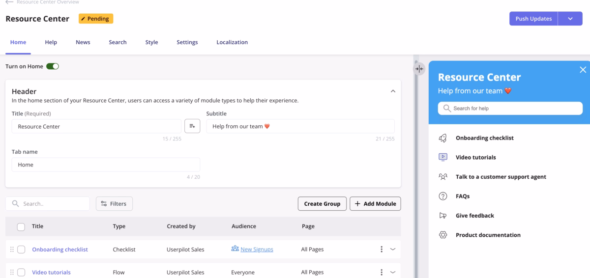
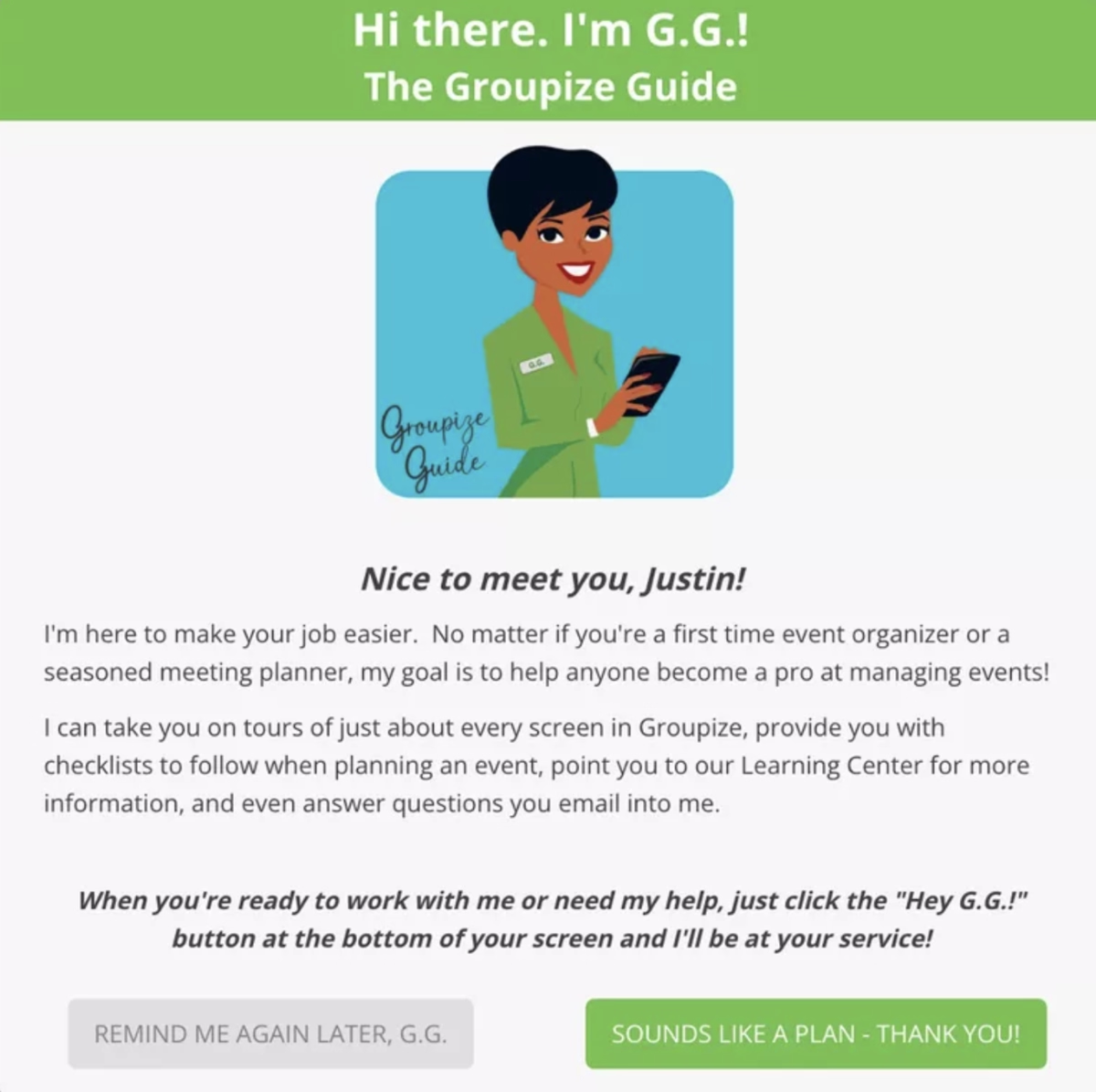
5. Combine walkthroughs with self-serve support
The best walkthroughs don’t stop after the first tour, they pair guided steps with embedded help, tooltips, and a resource hub so users can find answers whenever they need them.
Groupize, for example, integrates an interactive assistant alongside a resource center, allowing users to revisit guidance at any point in their workflow.
Common possible mistake here: Relying only on a first-time walkthrough.
Without ongoing support, users who forget a step or encounter friction later may get stuck, reducing engagement and increasing churn.
Tools to create website walkthroughs
Choosing the right tool for website walkthroughs can make a huge difference in how quickly your users understand and love your product.
Some tools focus on speed and simplicity, while others offer advanced analytics or enterprise-level customization.
Here’s a detailed look at some of the top options and what makes each stand out.
UserGuiding
UserGuiding is a no-code platform perfect for creating interactive product tours, onboarding checklists, and helpful tooltips.
You don’t need technical skills to get started, making it ideal for small teams or non-technical founders.
Why it’s great: Super intuitive drag-and-drop interface, your team can build guides without needing a developer.
Features: Step-by-step product tours, interactive checklists, hotspots, modals, and in-app messaging. Supports user segmentation and targeted onboarding flows.
Pricing: Starts at $209/month for up to 2,500 monthly active users, with flexible plans for larger teams. UserGuiding also provides ayou with a free plan that covers for your in-app support needs, called Support Essentials.
Best for: Companies looking for a simple, fast solution to create engaging walkthroughs. Ideal for SaaS products aiming for quick activation.
Appcues
Appcues is designed for teams that want to combine onboarding with data-driven insights.
It’s slightly more advanced than UserGuiding but still approachable for non-developers.
Why it’s great: It offers granular control over who sees what content, letting you personalize onboarding for different user segments.
Features: Modals, slideouts, tooltips, surveys, and advanced segmentation. Supports A/B testing to optimize onboarding flows.
Pricing: Starts at $300/month for up to 1,000 monthly active users; enterprise plans available.
Best for: Teams looking for advanced personalization and analytics in their onboarding, without needing to code.
WalkMe
WalkMe is a robust enterprise-grade digital adoption platform for guiding users through complex workflows.
It’s best for larger products with many features or cross-departmental usage.
Why it’s great: WalkMe combines walkthroughs with workflow automation and analytics, helping enterprises track user engagement and adoption.
Features: Interactive walkthroughs, task automation, in-app guidance, onboarding analytics, and multi-channel support.
Pricing: Custom pricing, typically targeted at large organizations.
Best for: Enterprises with complex products, multiple user roles, or a need for compliance and training integration.
Userpilot
Userpilot blends simplicity with advanced engagement features.
It’s perfect for SaaS companies wanting interactive onboarding without heavy technical setup.
Why it’s great: Drag-and-drop editor makes creating tours, tooltips, and checklists simple, while analytics track feature adoption.
Features: Product tours, interactive checklists, tooltips, feature adoption tracking, analytics dashboards, and targeting by user behavior.
Pricing: Starts at $249/month for up to 1,000 monthly active users, with customizable plans for larger teams.
Best for: SaaS products looking for a mix of ease-of-use and actionable product engagement insights.
Pendo
Pendo is more than a walkthrough tool, it combines in-app guidance with powerful product analytics, making it easy to understand user behavior while providing help where needed.
Why it’s great: Walkthroughs and guidance are tightly integrated with analytics, so you can see which features are used and optimize flows accordingly.
Features: Product tours, tooltips, in-app messaging, surveys, analytics dashboards, and user feedback tools.
Supports segmentation, targeting, and NPS tracking.
Pricing: Custom pricing, typically suited for mid-size to enterprise teams.
Best for: Teams wanting onboarding and analytics in a single platform, especially for feature adoption tracking and retention improvement.
Long story short…
Great website walkthroughs do more than just show users around, they guide them to value quickly, reduce friction, and make the first experience with your product memorable.
The key takeaways are simple: keep tours short and focused, personalize steps to your users, use visuals instead of long text, let users skip if they want, and combine walkthroughs with self-serve support.
When these principles are applied thoughtfully, onboarding stops being a chore and starts becoming a smooth, delightful introduction to your product.
If you’re ready to put these ideas into action, we created UserGuiding to make it easy for teams to build interactive, engaging walkthroughs, no coding required.
As Ramli John, growth expert and author, explains the best onboarding solutions are flexible:
The number 1 question I get the most: ‘What’s the best tool for user onboarding?’ … It depends. … High-growth startups should use a no-code solution that lets marketing or customer success teams own it.
With drag-and-drop simplicity, checklists, and tooltips, UserGuiding lets you do all that, guide your users toward value from day one, just like the examples we’ve explored.
Frequently Asked Questions
What are the best website walkthrough examples for SaaS onboarding in 2025?
Asana’s quick-start checklists, Notion’s modular tours, and Mailchimp’s action-driven prompts are standout examples, each designed to get users to value in minutes.
How do you measure conversion rates improved by website walkthroughs?
Track activation milestones, feature adoption, and trial-to-paid upgrades before and after walkthroughs.
Do website walkthroughs or product tours drive higher user activation?
Yes, interactive tours like Figma’s consistently push users to their first “aha moment” faster.
What are the top website walkthrough tools for startups with limited budgets?
UserGuiding and Appcues offer affordable, no-code options that scale with small teams.
What are some website walkthrough examples that boost trial-to-paid conversion rates?
Notion’s tailored flows and Mailchimp’s action-driven onboarding both help free users upgrade faster.
How do website walkthroughs impact customer satisfaction and retention?
They reduce friction, shorten the learning curve, and boost long-term satisfaction by helping users succeed early.
What are the best practices for designing website walkthroughs for e-commerce sites?
Keep them short, visual, and focused on key actions like checkout or wishlist creation.
What is the best website walkthrough platform in terms of pricing?
UserGuiding offers one of the most budget-friendly plans while still packing in full walkthrough features.
What are the common mistakes to avoid when building website walkthrough experiences?
Avoid long, text-heavy tours, one-size-fits-all flows, and forcing users through without a skip option.

.png)


