


.svg)
.svg)
.svg)
.svg)
.svg)


.svg)


.svg)
.svg)


Have you ever wondered why supermarkets tend to put chewing gum and tiny chocolates right next to checkout?
Well, it’s not a coincidence.
They place the products that way because the products sell the most when they are there.
They do it to make a profit.
You might ask how. When you design your supermarket as you want your customers to experience it, you can profit from fundamental changes. However, to do that, you have to understand how your customers think.
- What do customers go to the market to buy? Where do they find it?
- Which aisles do they pass through to get that item?
- Where do they go most?
In a very similar fashion, if you have a website or an app, you should figure out the user flow to ensure that your website/app places chewing gum in the right place.
You have to find your website’s user flow. This article tells you all about the user flow.
What is a User Flow?
User Flow is the steps that your users take on your website on application. It can be shown visually on a digital platform or can be written on paper. Either way, it displays all the ways your users take while using your product.
User Flow starts when a user enters your platform, and the User Flow chart shows the different paths your users choose and how they operate. In the end, a user could purchase your product or subscribe to your service as their final action.
By creating a user flow chart, you can observe your users’ actions and design your website accordingly. If you offer the best website design to your users, they will continue using your website and maybe even sign up. Thus, you will reduce the churning and increase the customer conversion rate.
All this talk about paths and directions might remind you of another term related to our subject. Yes, I’m talking about the user journey. These terms sound similar, but user flow and user journey are inherently different terms.

Let’s take a look at it.
What is the difference between a User Flow and a User Journey?
User Flow is the map of the paths your user takes on your website or application. It starts with their interaction with your website or application and ends with the final action on your website/application. Here, the keyword is the website.
User Flow is a map of your users making decisions on your website.
User Journey, however, starts way before users reach your website. The rumors they hear about your product, the advertisements they see on the internet, the newsletters they get are all a part of their user journey.
If user flow is a state, the user journey is the whole country.
I’m highlighting this difference because the beginning and end of user flow are definite. Once users stop interacting with your website, user flow ends. User journey, however, continues.
This means that you can create a map of their thought process more effortlessly.
But you might ask, why should I focus on the smaller picture? Well, here’s why.
Why do you need a User Flow Diagram?
Remember the supermarket example, but it’s not a supermarket; it’s your website or application this time. You wonder why you don’t get many sign-ups, although you have a pretty neat website design and many visitors interact with your product every day.
You think that your website is good, but is that what your users think?
Product and User Experience teams use User flow diagrams to answer this question. First, they create a diagram that shows the actions users take on their website.
Like a map of users’ minds when they’re using your product.
It’s essential to improve and change the design of your website or application according to the needs of your users. User Flow diagrams help visualize the most efficient user experience you want to offer your users and bring that to life.
When you use diagrams, it’s easier to notice the elements and act upon them. This visualization helps your UX team to analyze user flow without missing essential details. So they can design the best website for your users.
Changing the design of your website or application would cost a lot, so it’s crucial to find your user flow and design your website according to it. By using user flow diagrams, you can find the best option for you earlier and save money.
Before I show you how to create the perfect user flow diagrams, let me give you some examples.
Here are 5 examples of user flow diagrams that you should see before creating one for yourself:
1. Apple Watch Health App User Flow
This user flow diagram is a perfect example. It shows the steps users are supposed to take when using the HealthMes application on the Apple watch. It’s simple yet detailed and displays every action the users take while checking their notifications on the Apple Watch.
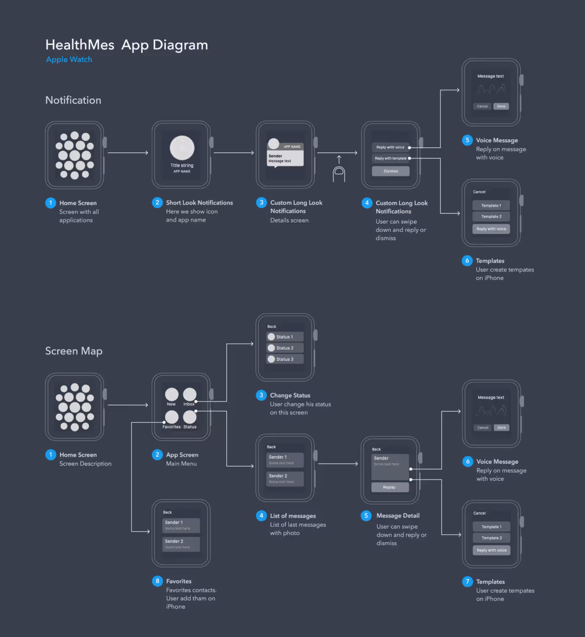
Instead of using shapes, this flow shows the screen of the watch. The flow is from left to right, and commands are straightforward.
2. Music Player User Flow
This user flow is more complex than the previous one. The flow uses the color red for the flow and the options between steps. This way, with a black background, important data gets highlighted.
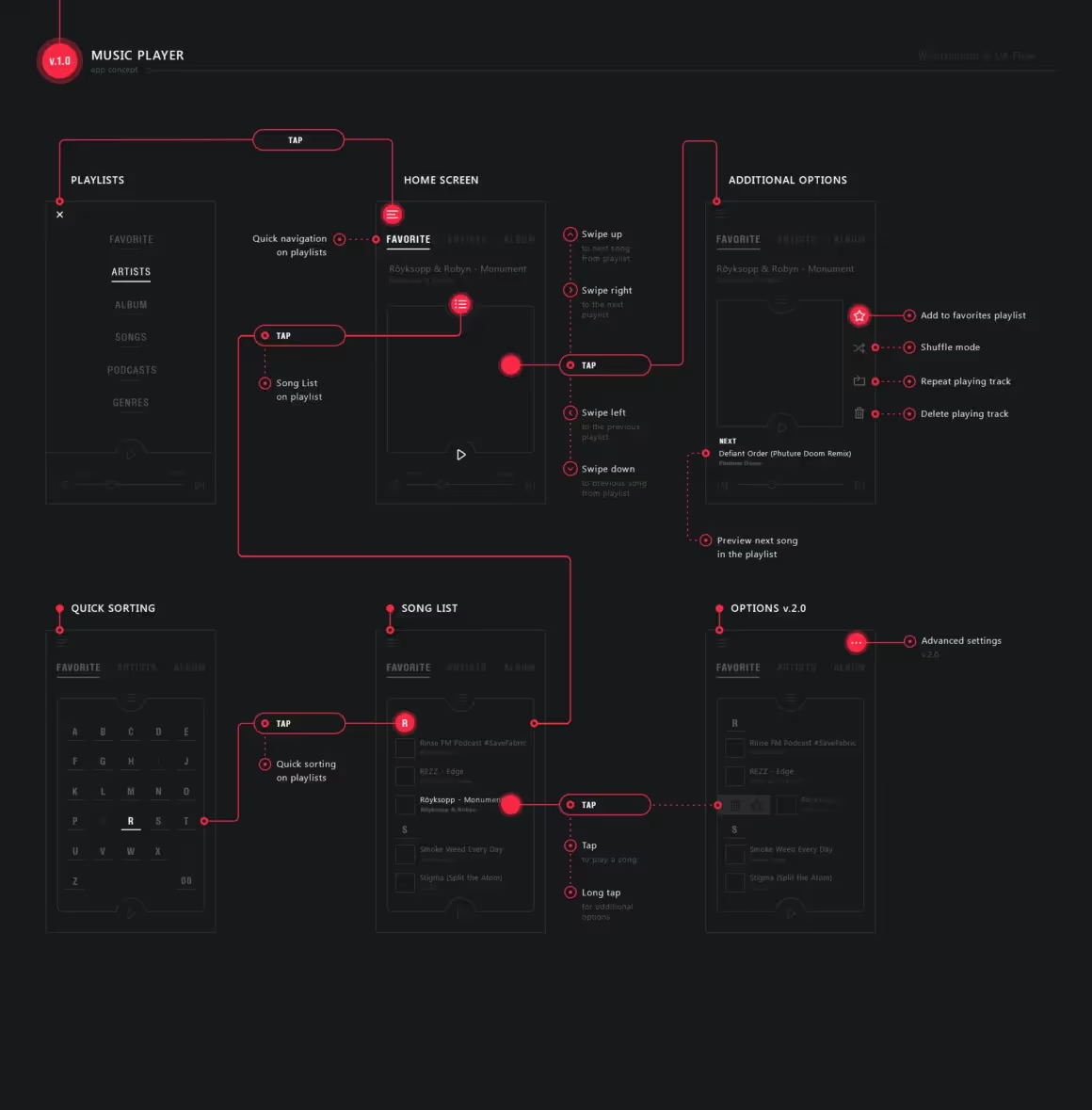
Note that this flow displays every action the user takes, as you can see “the taps.” Not only the changing screens.
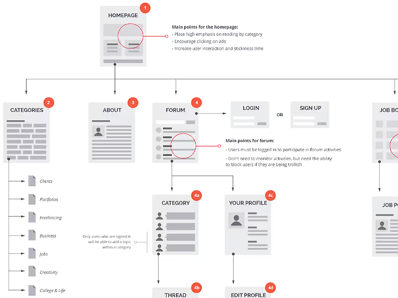
3. Student Guide Website User Flow
This user flow has wireframes instead of flow diagram shapes, so it’s also a wire flow diagram. The diagram starts with the homepage and shows other pages they can navigate to, such as categories and user forums.
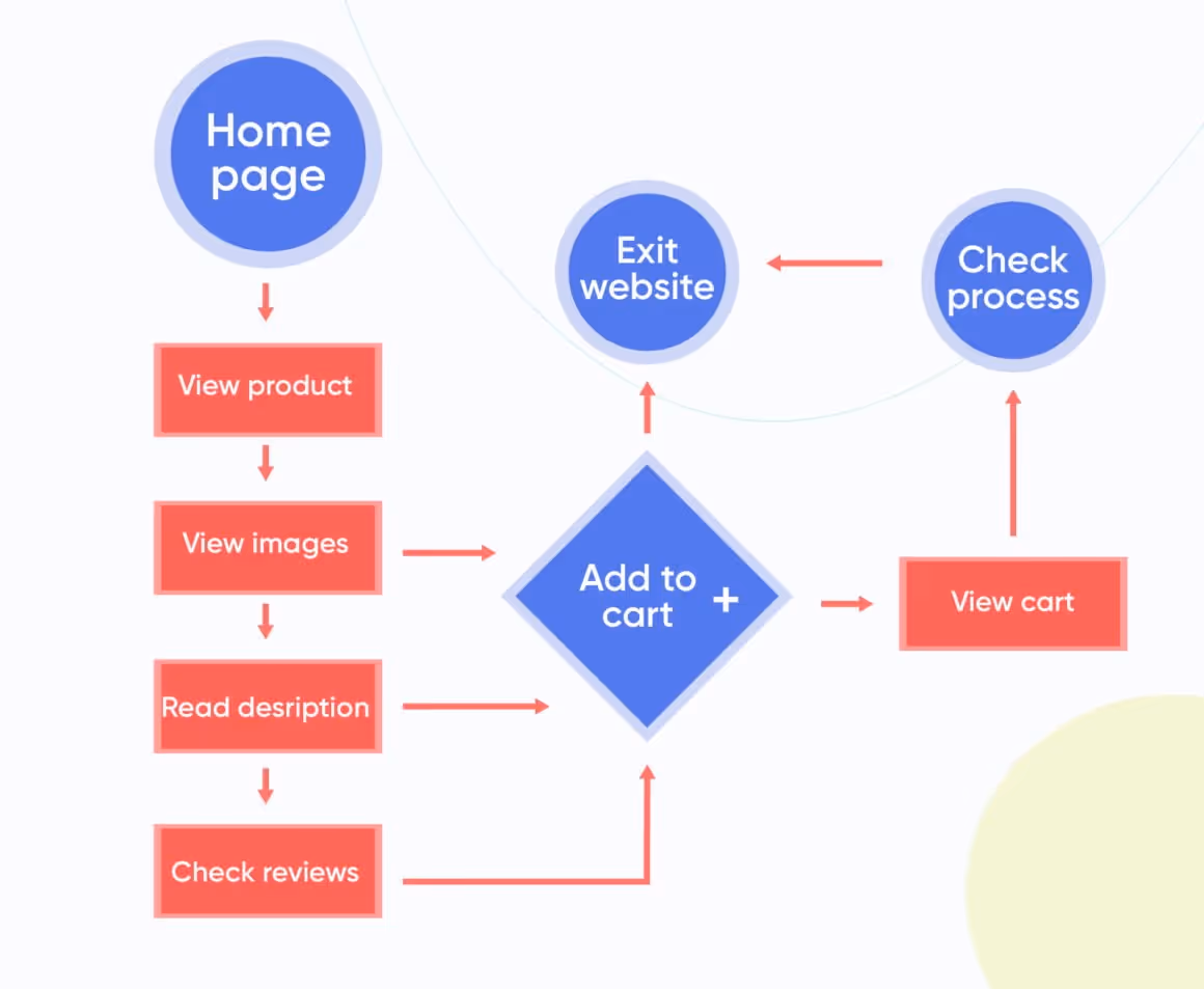
4. Shopping Website User Flow
Let’s go back to the basics. This colorful and straightforward user flow diagram does its job really well.
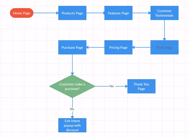
The user flow diagram shows the process of purchase with a discount pop-up. Shapes are colored accordingly, and the diamond shape carries a question.
5. Detailed Shopping Website User Flow
This user flow starts with the user adding an item to their shopping cart and then proceeding with the following options. The map flows from left to right, and the diagram is multi-dimensional. The main steps are written above the diagram. White and grey separate the phases from each other.
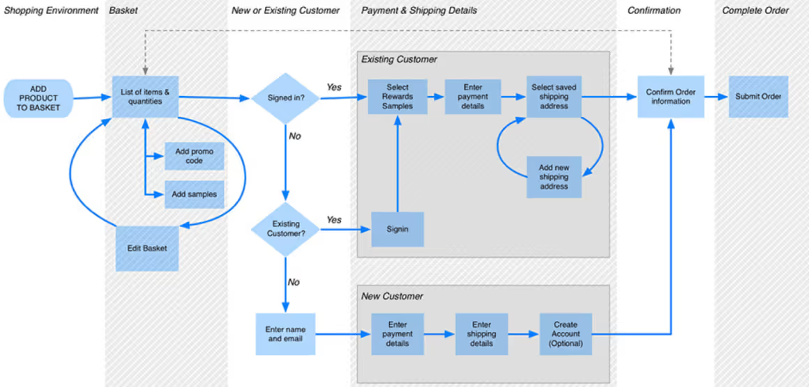
Meanwhile, UX diagram shapes show the actions taken by the users. There are different routes for existing and new users, but they all connect to the final step of placing an order.
What are the 6 Steps to Create a User Flow Diagram?
1) Determine what you want and what your users want 📊
Let me use the market example again. Do you know what your customers want to buy? Which aisles do they go to the most often? Which aisles do you want your customers to visit the most?
Where do you want your users to go on your website?
Collect all the data you have and decide on your goals. Remember, you can’t design a website without having reasonable goals in mind.
Once you decide on your goal, try to see things from your users’ side. Which problems they would probably have, which features they would like to use, which questions they would likely ask, and so on.
Creating a customer journey map would help you visualize what kind of experience you want to offer your users. Then, you can use customer journey map software to smooth the way.
2) Make an outline 📋
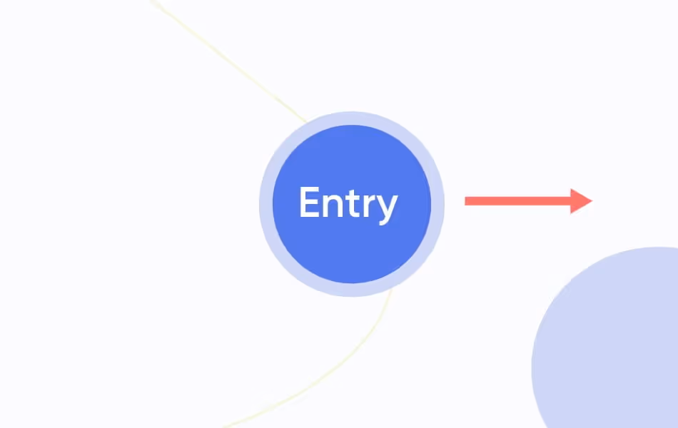
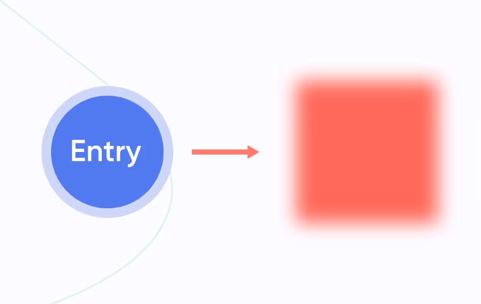
1️⃣ Determine the entry point.
From where are your users?
Users can enter your website through various channels: a Google search, a hyperlink from a site, or an ad on Facebook.
If you have an application, the possibilities of different entry points are fewer since users have to download your application from an app store or already own a device where your application is installed. However, links and ads can also be entry points for your application.
2️⃣ Fill in the steps.
You have customers in your market, so where are they going?
This is the juicy part since it will contain most of the information. However, try to keep it as simple as possible at the beginning. These are just basic steps your users should follow to accomplish what they want.
This part could contain login or sign-up pages, onboarding pop-ups, a home screen, or any other screens they open along the way. Remember, you don’t have to start with something complicated; focus on the primary goal of your users on your website.
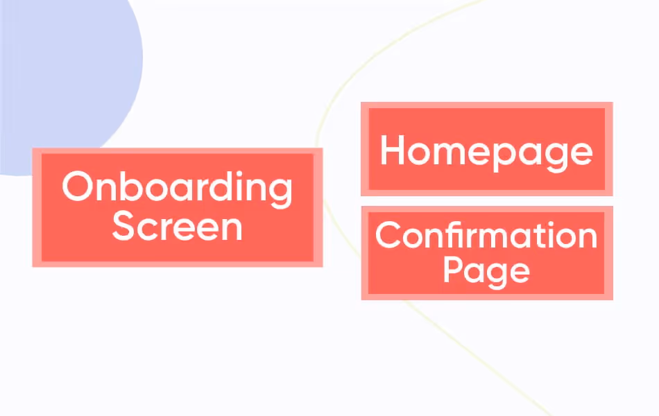
3️⃣ Finish with the final action.
The final action is the last step of your user flow diagram. It means that your user has reached the goal. For example, maybe they signed up for your website, bought a product, or signed up for a newsletter. Whatever it is, the final action means completion.
So what will your users see on their screen when they reach the final act?
A confirmation message, a thank you page, a homepage, or a login page… There are many possibilities. You have to decide which one is the better option.
Once you complete your outline, you can move on to designing it.
3) Design your user flow diagram ✍️
1️⃣ Use the right shapes.
There are many shapes you can use while creating a user flow diagram. Of course, you won’t simply choose the shapes you like or find aesthetically pleasing. Flow diagram shapes have different purposes, and they symbolize other actions and processes.
There are five primary shapes used in creating flow diagrams. These are:
- Ovals
- Rectangles
- Arrows
- Diamonds
- Parallelograms
Let’s take a look at what these symbols represent:
1. Ovals
The oval shape represents the start and endpoints. This means that your entry point and final action will be most likely an oval. Other than that, oval shapes can also represent an action that must be done by the user to reach the additional step.
For example, to sign up for your page, the user should click on the sign-up button. “Click Sign-up” is the step.
As you might have noticed, oval shapes should be labeled with verbs because they represent actions.

2. Arrows
To connect the steps to each other and keep users “flowing,” you use arrows. Arrows connect the representative shapes and form the map structure of the user flow diagram. They can go in different directions but usually left to right and top to bottom, connecting other shapes.
3. Rectangles
In user flow charts, rectangles represent pages or displays. Because of that, they are the most used shaped in user flows. You have your entry point and your connector from previous steps. So let’s assume that they completed the first step, which page they will see next.
Just place it on the rectangle. Remember, clear and brief.
4. Diamonds
Diamond shapes represent the decisions users make. That’s why they are called “decision diamonds.” These shapes are only used to represent decisions and help to visualize the decision-making process of users.
If your diamond has a question with different answers, you can symbolize it with a diamond shape with several arrows going in different directions.

5. Parallelograms
The final shape I will mention is the parallelogram. In flow charts, parallelograms represent the input or the output. For example, if your user flow focuses on online shopping, the billing information page would be the step on the diagram where users put their info; hence it should be displayed with a parallelogram.
Below you can see a user flow example with the shapes I’ve mentioned. Remember that you don’t have to use all of these shapes at once; there’s not only one way to create a user flow diagram.
However, templates do come in handy.
Here is another user flow example:
4) Polish your outline 📝
Now you have your user flow outline, but it’s not complete yet. There are a few things you still need to check and improve. Since you are creating a visual representation for your website design, similar website design rules apply to your UX flow chart as well.
But what are those?
1️⃣ Function before preference.
As I’ve mentioned before, there is not only one way to create user flow diagrams since you can design UX flow diagrams for anything that can be done on a website or in an application. Since you are making a visual representation for your website design, you should use colors to your advantage.
Like any other diagram, your user flow chart doesn’t need to look stylish; it needs to be easy to read. To ensure this, you can color-code essential parts in your user flow diagram. Using colors to highlight necessary actions will help you to read your diagram more easily.
2️⃣ Write less, tell more.
One of the reasons why UX flow diagrams are efficient is that they are diagrams. I already mentioned that when it’s visualized, it’s easier to grasp user flow. So you should be careful with the words you put on your diagram.
Make your labels precise and clear. No need for long sentences or details.
All you have to do is make sure that the labels describe the steps and the goal of the user flow diagram correctly.
3️⃣ Coherent visual structure is the key.
You have rectangles, ovals, arrows, diamonds, maybe parallelograms, some labels, different colors and labels, and so on… You might make a mistake and confuse a diamond for a parallelogram.
It’s not unlikely, especially if you’re working on a very detailed user flow diagram.
Just make sure that you are consistent. Make sure that all shapes have their own purposes on the diagram, respectively. For example, you can say that ovals are for actions, red is for essential steps, green is for arrows, and so on.
Double-check everything, and you’re almost done.
5) Final touches and feedback 🗣️
Feedback from your stakeholders is vital if your website or application is new. With a visual representation, you can show your stakeholders what you’re planning to offer your users and make proper modifications according to their feedback.

6) Share your user flow diagram 📩
After the last adjustments, you can share your UX flow diagram with web developers, software engineers, UX designers, and other team members. You can guide them through the user flow diagram and give context about your objectives.
Then they can design the best website and application for you.
Conclusion
User flows are crucial when it comes to utilizing your website or product. By creating user flow diagrams, you can understand your users better and design your website or application according to their needs. In addition, preparing your UX diagram before designing your website would save you time and money in the long run since you offer your users the best version of your product.
To create the most effective user flow diagrams, you must practice. You can start by creating user flow diagrams of already existing websites or the applications you use often.
With a little bit of practice and the tips listed above, you can create the perfect user flow for your website or application.
Frequently Asked Questions
When should you make user flows?
Often right after user testing and research, user flows are made. This also means a user flow is made during the planning stage and before you start executing the UX design.

.png)


