


.svg)
.svg)
.svg)
.svg)
.svg)


.svg)


.svg)
.svg)

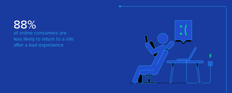
88% of users are less likely to return to a site after a bad user experience.
That means nearly 9 out of 10 potential customers could leave, not because your product lacks features, but because the experience isn’t smooth enough. Whether it’s confusing onboarding, overwhelming interfaces, or slow performance, small UX flaws can cost you signups, retention, and trust.
Sounds bad, right?
But you are not totally powerless against this situation.
In this guide, you’ll find actionable, proven strategies to optimize user experience, so poor UX doesn’t become your product’s reality.
Let’s go 🚶🏻♀️➡️
TL;DR
- User experience optimization (UXO) is the process of improving how users interact with your product to increase satisfaction, engagement, and retention.
- The main principles of UXO include understanding your users through research, simplifying workflows, personalizing experiences, and continuously testing and iterating.
- You also need to pay attention to simplicity, clarity, and responsiveness.
- Good examples of UXO include:
- Adding micro-moments like small animations or celebrations to boost user engagement.
- Breaking long onboarding tours into smaller, context-relevant modals.
- Personalizing experiences based on user behavior.
- Combining A/B testing with predictive personalization.
- Streamlining popular workflows by removing unnecessary steps.
- Reducing cognitive load by setting relevant default options.
- We invite you to check out the article for real-life examples and screenshots!

What is user experience optimization (UXO)?
User experience optimization (UXO) in the SaaS context refers to improving how users interact with your product after they sign up. It’s about refining the full journey users take as they navigate your app, from onboarding to daily usage.
So it’s not just visual design enhancement, which we’ll differentiate in a minute.
Effective UXO helps you ensure that users not only understand how to use the product but also experience consistent value from it.
To understand why you need to “optimize” your user experience (UX), let’s first touch on the importance of UX and what good UX means for you and your business.
UX directly impacts core product KPIs such as activation, retention, and conversion.
✅ A smooth and intuitive experience can…
- Shorten the time to value,
- Encourage repeated engagement, and
- Reduce churn.
For example, if users get confused during onboarding, they may never reach the activation point, which lowers retention rates later on.
UX vs. UI: What’s the difference in optimization?
UX (user experience) is about the overall feel of using a product, including how intuitive, helpful, and smooth the journey is. UI (user interface) focuses on the visual elements like buttons, layout, and typography.
For example, if users are dropping off during onboarding, that’s a UX issue. If the button they need is hard to see or click, that’s a UI issue.
Both are important, but they solve different problems in the user’s path.
💡 Around 80% of purchasing decisions and user satisfaction are shaped by design. Research by Peter Zec shows that lasting success depends on having a carefully planned design strategy. Without it, poor design can lead to predictable failure.
So, UI optimization is an important part of UX optimization, actually.
But that’s another day’s topic.
Why does user experience optimization matter?
- Direct impact on business KPIs:
User experience optimization has a clear influence on performance metrics across the SaaS lifecycle. A smoother, more intuitive experience can lower churn, increase retention, and raise conversion rates, especially during activation and trial-to-paid transitions.
One key figure underscores this: 88% of users are less likely to return after a bad experience. That makes UX a direct lever for improving activation rates and boosting customer lifetime value (CLTV).
Even minor UX improvements, such as reducing steps in onboarding or clarifying feature usage, can help users reach value faster.
This early momentum is often what determines whether they convert and stay.
- User expectations have evolved:
In recent years, users of B2B software have started expecting the same level of simplicity, speed, and clarity they’re used to in consumer apps.
This shift is largely due to broader digital habits. People interact daily with tools like Spotify, Airbnb, or Notion, which emphasize ease of use and immediate value. As a result, when they use professional tools, they bring those expectations with them.
Clunky interfaces, long onboarding processes, or unclear navigation are no longer tolerated simply because a tool is “for work.”
This change in expectations has helped fuel the rise of Product-Led Growth (PLG), a strategy where the product experience itself drives user acquisition, activation, retention, and expansion.
In a PLG model, users’ decision to buy, upgrade, or expand a product is based almost entirely on their experience inside the product.
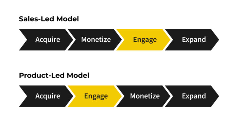
The core idea is that if the product delivers value quickly, users will naturally engage more, adopt features, and convert into paying customers without needing heavy sales or marketing input.
That puts UX at the center of growth.
If the experience is confusing or inconsistent, the strategy breaks down.
- Efficient support and reduced friction:
When you optimize your UX, you also optimize your customer-facing teams’ (especially support and success teams’) experiences and workflows, as well.
A better UX typically leads to fewer support tickets and faster onboarding, freeing up your team’s resources and reducing costs.
A clear example comes from Brian Study, who implemented UserGuiding’s knowledge base and resource center. Within six months, they saved over $15,000 in support costs. As they explained:
“Reducing support tickets wasn’t just about saving money; it was about efficiency. The knowledge base and resource center worked together to free up both users and our team.”
- Ralph Forsbach, Co-Founder and CEO
Support queries often highlight friction points in the product. So, by identifying and addressing those UX issues, you can improve both user outcomes and internal efficiency.
Core principles of great user experience in SaaS
Great UX in SaaS is built on a few core principles that guide how users interact, learn, and succeed with your product. Here they are 👇🏻
Simplicity –or at least well-managed complexity
SaaS products often solve complex problems, so some level of complexity is unavoidable. The challenge is in how that complexity is presented.
“Complexity is not bad. It’s confusion that’s bad. Forget about simplicity; long live well-managed complexity.”
Instead of removing complexity entirely, good UX helps users focus only on what’s relevant at a given moment.
In the NN group’s UX podcast, Paige Laubheimer compares this to Google Maps: when you zoom in on a neighborhood, you know the larger city is still there, but you don’t have to think about it.
Similarly, in your product, you can guide users to engage with what matters now, without overwhelming them with everything at once.
This idea aligns with Tesler’s Law (the law of conservation of complexity), which suggests that every application has an inherent level of complexity that can't be removed, only shifted.
The question becomes, as Laubheimer puts it:
“Are we trying to hide the complexity from the user, or are we trying to just show the piece of it that is applicable at the moment?”
However, on the other hand, cognitive load is a real constraint.
Your users likely have other tasks competing for their attention, and short-term memory is limited. If onboarding or signup flows (flows that don’t need to be complex, inherently) are too long, disorganized, or unclear, users may disengage before reaching value.
Even small UX elements like CTAs and buttons play a role here.
Clear, timely calls to action reduce decision-making effort and help users move forward with confidence.
Clarity
Clarity ensures that users understand where they are, what they can do, and what happens next. Without it, even the best-designed product can become frustrating.
“A fragmented customer journey creates confusion and erodes trust.”
In other words, if users feel lost at any point in the flow, it undermines their confidence in the product.
Clear UX relies on small but powerful elements.
- Microcopy, such as button labels, error messages, or field descriptions, guides users moment by moment.
- Tooltips provide on-demand help without cluttering the interface.
- And walkthroughs ease users into new or complex features.
Clarity applies not just to labels or screens but also to user flows and user interactions. It’s about giving actions meaning.
For example, if you include an onboarding survey to personalize the user’s experience later, it’s important to explain that purpose clearly. Letting users know why you’re asking for input (not just what you’re asking) adds transparency and builds trust.
It also increases motivation. When users understand how their actions lead to a better experience, they’re more likely to complete the task.
Speed & responsiveness
Speed is often overlooked in UX discussions, but it plays a central role in how users perceive a product. Every delay, no matter how small, adds friction.
And frictions upset everybody.
Google’s study on response time showed that a delay of just 500 milliseconds led to a significant drop in user engagement and conversions. According to the results, half a second delay caused a 20% drop in traffic.
And that was back in 2006, during the Web 2.0 era, when attention spans were longer and expectations from digital products were far more forgiving…
Users today expect interactions to feel instant.
When a page or dashboard loads slowly, it breaks focus and lowers confidence in the product’s reliability.
Responsiveness also refers to how quickly the interface reacts to user actions. If a button takes too long to register or transitions lag, the experience feels sluggish and unpolished. These small moments collectively shape the user's impression of quality.
So, in short:
Better technical performance = Better user experience.
Personalization
Personalization helps make the user experience feel tailored, not generic. In SaaS, this often starts with progressive profiling, a.k.a. collecting key information about the user gradually. It continues with adapting the onboarding experience and product journey based on user goals, skill levels, or behaviors.
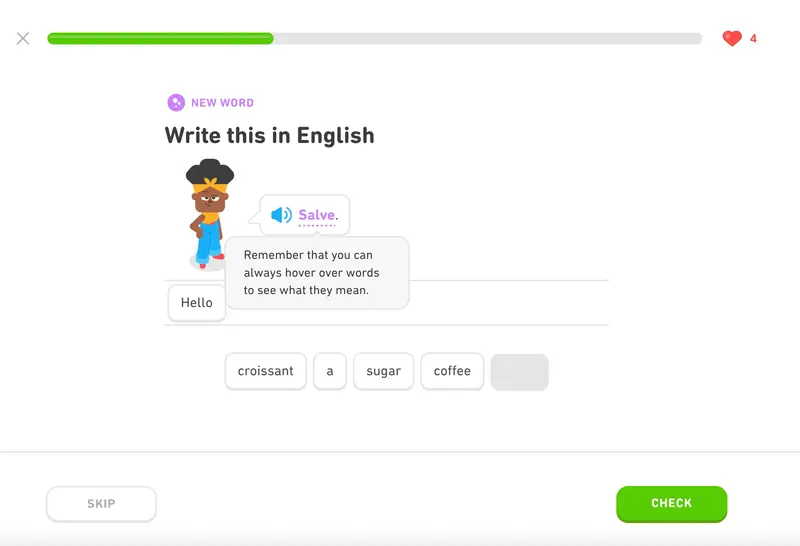
A great example of this in action comes from Duolingo.
Instead of sending every new user through the same starting point, it begins by asking how familiar the person is with the language they’re learning. If someone says they're a beginner, they’ll be guided through foundational lessons. If they already know the basics, the app skips ahead to more advanced material.
This helps users avoid repetition and feel like the product “gets” them from the start.
This kind of adaptive onboarding is now being used by smart B2B tools too.
Many SaaS tools ask new users whether they’ve used similar software before. Those who are new get more guidance and examples, while experienced users are encouraged to dive right in and explore more advanced capabilities.
👉🏻 See how to personalize your product experience step by step.
12 real examples of UX optimization in SaaS
UX optimization becomes much clearer when you see it in action.
Here are 12 real examples from SaaS products that improved key user journeys through thoughtful, data-informed changes:
1- Duolingo’s friendly microinteractions
Learning a new language requires commitment, dedication, and a lot of effort.
That’s why Duolingo adopts gamification. To make the learning experience and process more engaging and bearable for the user.
The friendly microinteractions begin right from the onboarding.
To help you understand how the courses progress, what types of activities and questions they include, and what additional features Duolingo offers to reinforce your knowledge and vocabulary, the platform walks you through an example lesson.
During the lesson, you can explore the features and receive contextual tips through tooltips and modals.
The onboarding is also very flexible.
You can skip certain steps (activities within the lesson) or exit the flow entirely.
To keep users motivated, Duolingo incorporates gamified microinteractions throughout the platform and user journey. Streaks, badges, leaderboards, and challenges that reward you with extra points, along with Duo the owl’s daily reminder notifications, are all part of this approach.
You also occasionally receive encouragement and in-app messages during lessons to help maintain momentum.

➡️ What UX problem(s) Duolingo solves with these microinteractions?
Duolingo’s microinteractions address two key challenges in language learning: motivation and retention. By using gamified elements, Duolingo creates small rewards that encourage consistent daily engagement. These features tap into users’ intrinsic motivation and make progress feel tangible, even when the lessons get repetitive.
The in-app encouragement, reminders from Duo the owl, and real-time feedback during lessons also help reduce drop-off by keeping users emotionally invested.
You can monitor the impact of this kind of UX improvement through:
- Session Frequency
- Session Duration
- Retention Rate (Day 1, 7, 30)
- Completion Rate (onboarding, lesson, activity, challenge, etc.)
➡️ Takeaway tips:
- Use gamification to encourage consistency and engagement.
- Keep user interactions lightweight and optional.
- Personalize the journey early (based on goals, expectations, needs, etc.)
- Use friendly reminders sparingly but strategically.
- Provide immediate feedback with tooltips, in-app messages, and visual cues.
2- Figma’s contextual guidance and feature reminders
Since launching in 2012, Figma has become one of the most popular and prominent product design tools among designers. But when Figma introduced FigJam in 2021, it didn’t quite meet the same hype. In fact, it caused a bit of confusion about when should you use Figma, and when should you switch to FigJam?
So, to boost the visibility and adoption of their newer product, Figma started promoting FigJam within Figma using slideout modals.
Here’s one example:
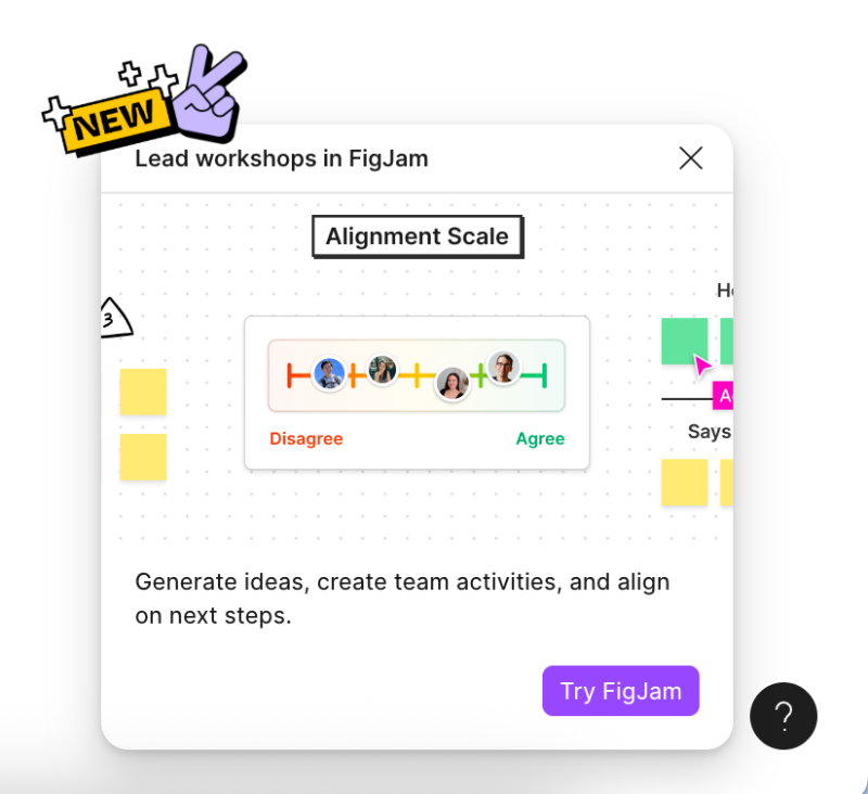
These modals include sample use cases, a quick visual (like a GIF) showing FigJam in action, and a clear CTA that directs you to try it out.
But the encouragement doesn’t stop there.
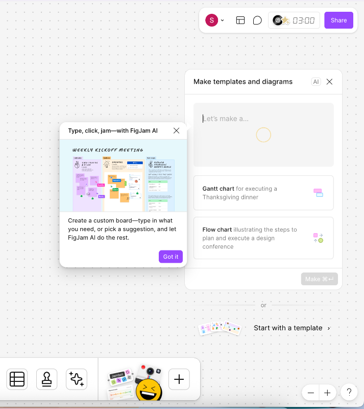
Once you click the CTA and land in the whiteboard, another modal appears that invites you to take a short product tour that introduces the main menus, toolkits, and overall layout. The tour is quick (just three steps) and doesn’t walk you through how to use each feature. It just shows you around.
These are here, those are there…

Around the FigJam editor, you’ll also find standalone tooltips that activate when you interact with specific buttons or features. For example, clicking on “Share this board” triggers a tooltip that explains the file-sharing settings available.
This info is intentionally not included in the initial tour.
Because at that stage, users are just getting a feel for the interface. They probably don’t have anything to share yet.
Very contextual, very demure.

And it doesn’t end there.
Once you've spent some time exploring the basics and trying out a few tools, FigJam gradually introduces more advanced features, like AI-generated templates and diagrams.
Tooltips like this one here appear to explain what the feature does and how to use it 👇🏻
➡️ What problem(s) Figma solves with these tooltips and modals?
Figma uses modals and tooltips in FigJam to address two common problems: lack of awareness and onboarding friction. Many users weren’t clear on what FigJam was for, or when to use it instead of Figma. By promoting it directly inside the tool and offering a lightweight tour, Figma creates visibility without forcing a hard sell.
The contextual nature of the tooltips also helps reduce cognitive overload. Rather than dumping all the information at once, users get relevant guidance only when they need it.
You can monitor the impact of this kind of UX improvement through:
- Feature discovery rate
- Time to value (TTV) in FigJam
- Activation, retention, and user engagement metrics
➡️ Takeaway tips:
- Use in-product promotion for cross-product discovery. Don’t assume users already know what your other tools do.
- Keep product tours short and focused and let tooltips do the contextual heavy lifting.
- Avoid overwhelming new users.
3- Spotify’s personalized daily playlists
If you’re anything like me, you probably bounce between artists and genres depending on your mood, the weather, or even the time of day.
And no matter how carefully you curate the perfect playlist with smooth transitions, there are times when you want something just a little different. Maybe a fresh mix. Maybe a discovery to add to your oddly specific playlist.
That’s where Spotify’s “Made for You” section comes in.
With personalized, daily-updated mixes, Spotify keeps users engaged by blending familiar favorites with new suggestions. This creates a balance of comfort and discovery, something that feels tailored but not repetitive.

➡️ What UX problem(s) Spotify solves with these personalized playlists?
Spotify’s personalized daily playlists address two key problems: decision fatigue and lack of variety. With millions of songs available, users can easily feel overwhelmed by choice. Curated mixes based on listening habits remove the pressure of choosing while still feeling tailored to individual tastes.
By blending new songs with familiar ones, Spotify helps users explore without straying too far from their comfort zone. It’s a smart way to keep users engaged, reduce app fatigue, and encourage regular listening, even when users aren’t sure what they’re in the mood for.
You can monitor the impact of this kind of UX improvement through:
- Playlist interaction rate (saves, likes, skips, etc.)
- Engagement time per session
- Song discovery metrics
- NPS or satisfaction surveys
➡️ Takeaway tips:
- Use data to reduce choice overload. Smart defaults can simplify user decisions without limiting options.
- Personalization should feel effortless.
- Blend familiarity with novelty when introducing features, songs, or content.
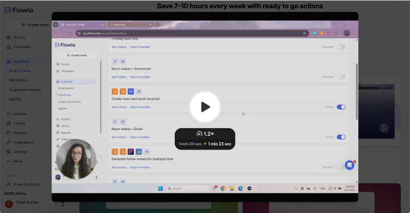
4- Flowla’s suggested workflow automation recipes
Sometimes you don’t want to decide what to do next (hello, decision fatigue). Other times, you simply don’t even know what your options are.
In Flowla’s case, this is often the situation with their AutoPilot workflow automations. There’s a lot you can automate in your workflow, you just might not know where to start.
Or rather, you wouldn’t know if they didn’t offer suggested automation recipes right on the feature page.
But they do, thankfully!

Before creating a new workflow, you can explore the suggestions and ready-to-use recipes. These help you understand the scope of automation possible with Flowla and give you inspiration to get started.
Alongside the recommendations, there are inline modals that explain how the recipes and automations work using simple visual cues. They also make sure you remain in control, as you're encouraged to review and approve drafts before anything is sent.
They save you time, but you still have the final say.

Since these modals are meant to build user confidence and provide quick context, Flowla also offers another UI modal that includes a Loom video. The video walks you through the steps of creating a workflow and editing it before final approval.
It’s embedded within an inline modal that then triggers a pop-up overlay.
Here’s the video:
➡️ What UX problem(s) Flowla solves with these recipe suggestions?
Flowla tackles two common issues: uncertainty and lack of guidance. Users often don’t know what’s possible within a feature or where to start, especially when it comes to something as open-ended as automation.
Without clear direction, many users either skip the feature or miss its full value.
By offering suggested automation recipes upfront, Flowla helps users quickly understand what kinds of workflows they can create.
The inline explanations and visuals also provide enough context to build confidence.
You can monitor the impact of this kind of UX improvement through:
- Click-through rate on suggested recipes
- Support tickets related to automation setup
- Workflow creation rate
- Time-to-first-automation
➡️ Takeaway tips:
- Provide concrete starting points like templates for complex features.
- Make sure help content appears at the right moment in the flow.
- Layer guidance (e.g. tooltips, videos, modals) for different levels of detail.
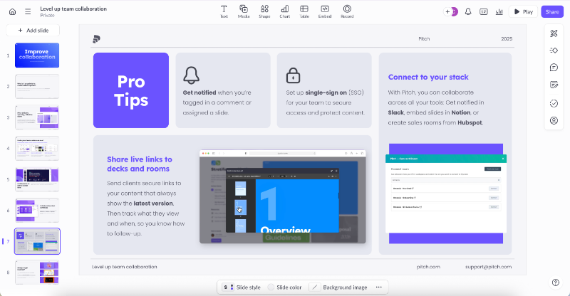
5- Pitch’s goal-oriented onboarding materials
Conducting user surveys during onboarding to uncover use cases and user needs, and then using that information to personalize the UI or toolkit, is a strategy many SaaS companies adopt.
Especially those serving a broad range of personas and user goals.
But even if you don’t offer deep personalization or different features for different roles, you can still tailor your onboarding experience based on what the user wants to achieve.
In Pitch’s case, these onboarding materials come in the form of presentations, naturally.
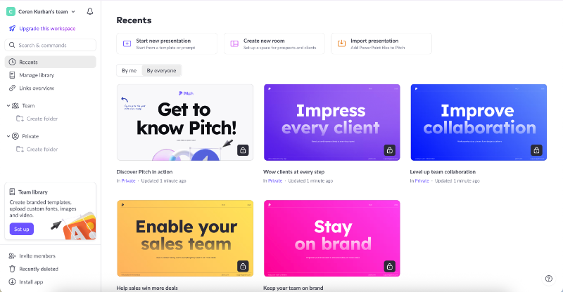
Each presentation is built around a common use case or user goal, like impressing clients, improving team collaboration, enabling sales teams, or maintaining brand consistency.
There’s also a general Pitch basics presentation for new users.
These presentations include helpful information, feature explanations, and practical examples of how to use Pitch for that specific scenario. They’re visually rich, too, with diagrams and real-life use cases.
At the end of each deck, users get a slide of best practices and pro tips tailored to that use case.
For example, here’s how Pitch recommends getting the most out of the platform when collaborating with a team:
In addition to onboarding content, Pitch shares regular presentation tips and tricks through their newsletter. But instead of tossing in a tiny checkbox under the signup form, they go all in: a dedicated screen with a fun illustration and value-focused copy.
- ❌ They don’t ask, “Do you want to sign up for our newsletter?”
- ✅ They ask, “Do you want our top presentation tips and tricks?”
That’s what we call good copy and smart application of JTBD thinking.
Here’s how it looks:

➡️ What UX problem(s) Pitch solves with these goal-oriented presentations?
Pitch tackles two common onboarding issues: unclear value and information overload. New users often struggle to understand how the product applies to their specific needs, while also facing too much information at once.
By offering goal-based example presentations in a clear, visual format, Pitch helps users grasp relevance without overwhelming them.
It also continues to offer pro tips and tricks through its newsletter, and makes the value of subscribing clear.
You can monitor the impact of this kind of UX improvement through:
- Activation rate by persona or use case
- Engagement with onboarding content (e.g. presentation views or completion)
- Newsletter opt-in rate from the signup flow
➡️ Takeaway tips:
- Use onboarding as a space to teach, inspire, and build trust.
- Design onboarding content around your most common use cases or user goals.
- Don’t just tell but show users how to succeed with real examples and visuals.
- Reinforce onboarding with ongoing value (like newsletters or tips).
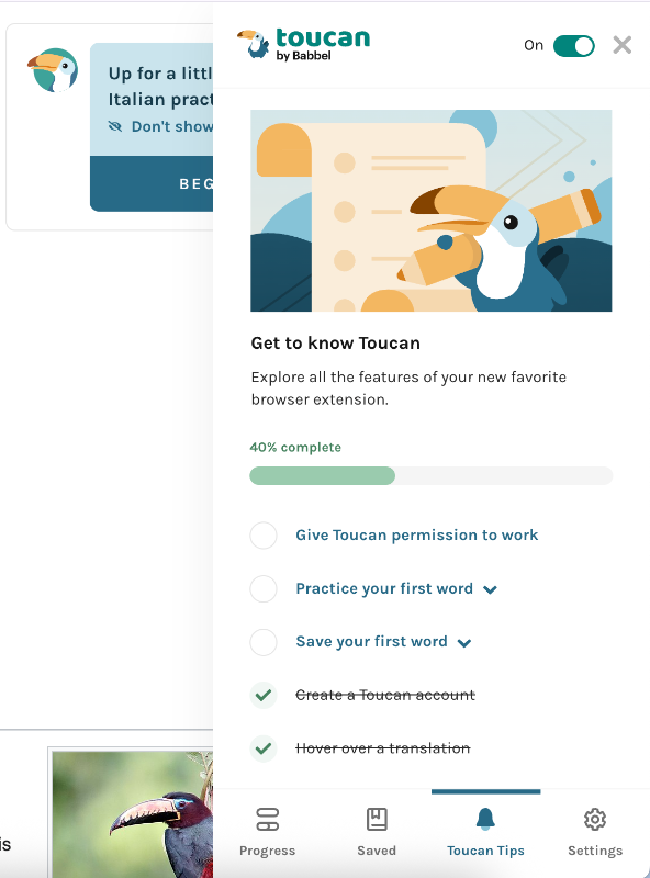
6- Toucan’s gamified onboarding
Here we are with another gamification example from another language learning app, Toucan. Toucan works via a Chrome extension and helps you learn new vocabulary as you browse other websites. It provides definitions, builds custom dictionaries, and offers quick pronunciation exercises.
During its setup and onboarding, Toucan delivers a gamified experience similar to Duolingo’s.
While asking about your learning goals, it provides examples of the types of vocabulary included in each goal. This makes it easier for users to decide what they want to achieve and gives them a motivational push to keep going.

Much like Duolingo’s first-lesson approach, Toucan offers a sample screen where users can explore the interface and learn how the extension works. The product tour is short, just 3 steps, and walks you through a mock webpage, explaining what happens when you click a highlighted word or add it to your vocabulary list.
After the tour, a congratulatory popup appears to celebrate your progress.

After the whole personalized setup flow and product tour, you might think onboarding ends there, but you’d be wrong.
You haven’t actually used Toucan in a real-world setting yet. While the tour offers value and direction, real-life usage often calls for a little more handholding.
That’s why Toucan prompts you to try what you’ve learned on a live website.
It offers guided experiences on pages like Wikipedia, Google, or Twitter, so users can apply what they’ve just learned in a real-world context.

Let’s say you pick Wikipedia.
Toucan takes you to the Wikipedia page for toucans (the bird). There, you’ll see some words in your chosen language (e.g., Italian), and when you interact with them, tooltips and subtle animations appear.
Each interaction earns you points, and occasionally a little celebratory animation.

From the extension panel, you can also access an onboarding checklist with small tasks to complete on the sample page, such as saving a word to your dictionary or practicing pronunciation.
➡️ What UX problem(s) Toucan solves with these gamified interactions?
Toucan addresses two key UX challenges: low engagement during onboarding and user frustration when left to figure things out alone. By blending gamified guidance with practice, Toucan keeps users motivated while gradually introducing complexity.
Instead of throwing users into the deep end, it walks them through the experience in a playful, structured way.
Both in real-life websites and in a safe controlled environment like onboarding screen.
You can monitor the impact of this kind of UX improvement through:
- Onboarding task completion rates
- User activation rates
- Frustration signals (age clicks, early drop-offs, etc.)
➡️ Takeaway tips:
- Focus on eliminating early user doubt and confusion with clear microcopy, examples, and visual cues.
- Incorporate celebratory messages, feedback, and animations.
- Layer your onboarding guides to match the user’s stage and context.
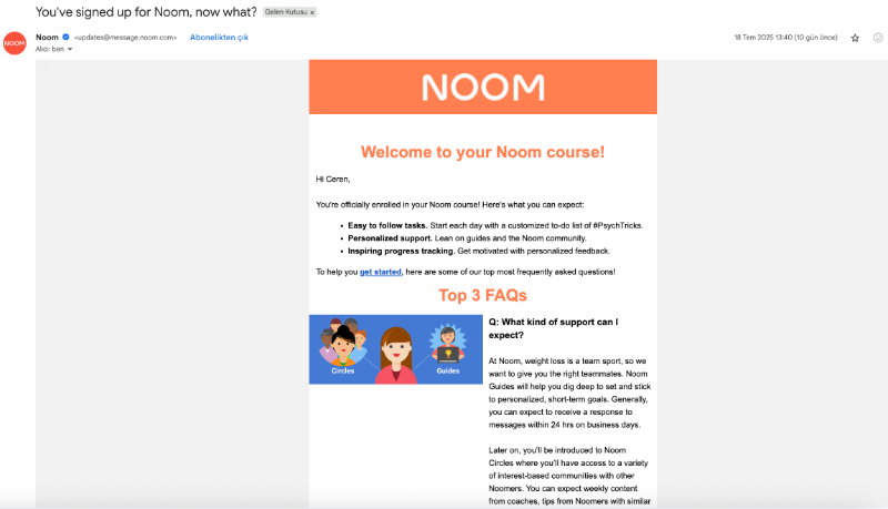
7- Noom’s onboarding email provides answers to FAQs
Onboarding emails are still a hot topic in the SaaS world.
How many should you send? How often? What should they include? Should you personalize them, and if so, how?
The truth is, emails can either reengage inactive users or push active ones away.
And obviously, you want the former.
Noom offers a great example of how to do it right. After users complete the setup, answer the onboarding survey, and download the app, Noom sends out its first onboarding email.
The email does 2 things really well:
- It introduces the app in a simple, friendly tone, and
- Answers 3 of the most frequently asked questions about how the system works and what users can expect.
By doing this, Noom gets ahead of confusion before it arises.
➡️ What UX problem(s) Noom solves with this email?
Noom addresses early confusion and reduces the volume of support tickets caused by common onboarding mistakes. By proactively answering frequently asked questions right after setup, they clarify expectations.
This builds trust early and helps users feel supported without having to ask for help.
You can monitor the impact of this kind of UX improvement through:
- Volume of early support tickets (especially related to common misunderstandings)
- Open and click-through rates of the onboarding emails
➡️ Takeaway tips:
- Address common user questions or mistakes before they escalate to support.
- Time your email based on user behavior.
- Leverage off-app engagement (like emails or notifications) to bring users back and keep them moving forward in their journey.
8- Mailchimp’s user-friendly signup screen
Signup screens don’t vary that much.
Some ask for more information, like billing details or an address, while others keep it basic with just a name, username, and password. Some offer Google one-tap, others don’t.
It’s rarely the most exciting or engaging part of the UX flow.
To make it a little more pleasant and user-friendly, Mailchimp uses friendly copy and clear guidance for the username and password inputs.
For example, if the username you’ve picked is already taken, instead of a dull error message like “choose another username,” Mailchimp responds with a playful: “Great minds think alike!”
As for passwords, they ask for quite a bit in terms of security.
Rather than listing what you’re missing one by one, they show a checklist of all the required criteria. Each time you meet one, like adding a symbol or capital letter, it turns green with a checkmark.
This gives you a sense of progress and makes things much more manageable.

➡️ What UX problem(s) Mailchimp solves with this signup screen?
Mailchimp addresses poor usability and friction in completing a typically dull, repetitive process. By using friendly, human copy and real-time guidance, like a password checklist and playful error messages, they reduce cognitive load and help users complete the form faster and with more confidence.
The experience feels smoother, more intuitive, and less frustrating.
➡️ Takeaway tips:
- Add a layer of personality to keep users engaged.
- Use clear, in-line guidance and visual feedback to speed up completion.
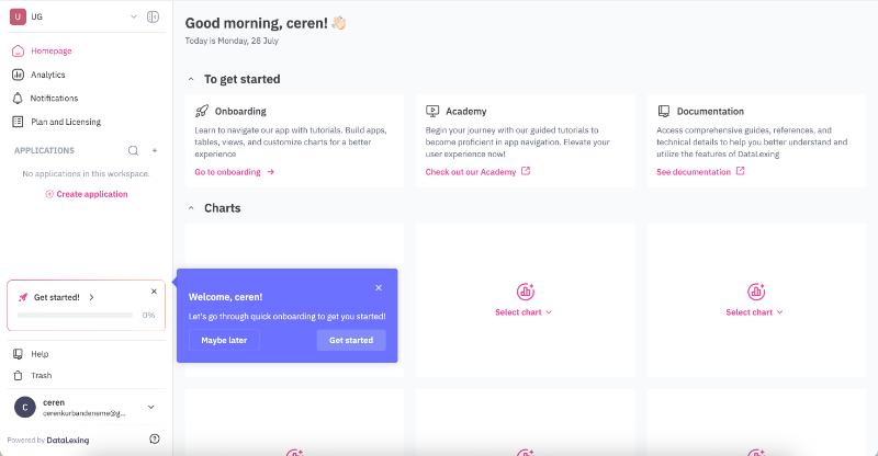
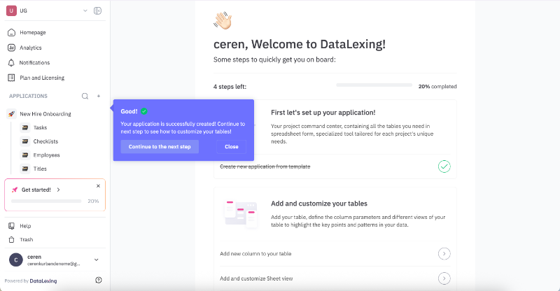
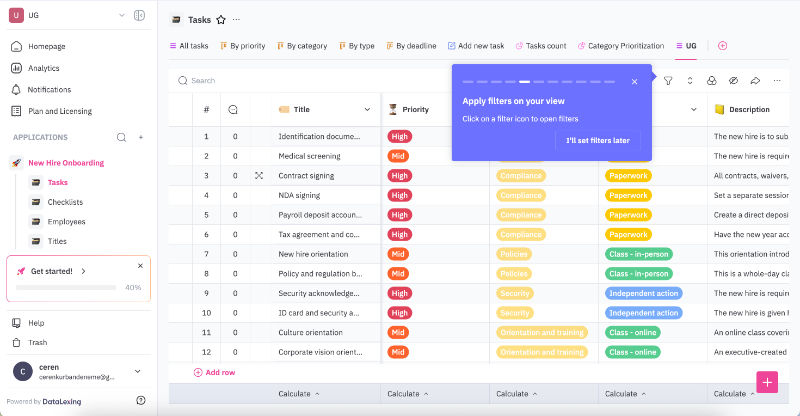
9- Datalexing’s interactive walkthroughs
Datalexing offers a set of welcome modals that introduce the main features of the platform with visuals and short copy when you first create your account.
The modals cover 4 key features.

After the modals, you land on the homepage and see a tooltip inviting you to explore the rest of the onboarding, which consists of interactive walkthroughs. The onboarding checklist lives on a separate page within the platform, allowing users to return to it later if they prefer.
Both the tooltip copy and the platform’s messaging use the user’s name for a personalized experience.
The onboarding checklist consists of 2 main tasks, one of which includes 4 subtasks.
Each main task comes with an explanation of what you’re expected to do, and the subtasks include clear CTAs and linked walkthroughs triggered directly through them.
The walkthroughs can be viewed and completed at any time and in any order. However, if you start from the first tooltip and continue without closing the modals/tooltips, the walkthroughs flow sequentially, prompting you to move on to the next task on the checklist.
At the end of each walkthrough, you’re automatically returned to the checklist page, where you’ll see a congratulatory message and encouragement to continue with the next tutorial.
Here’s the checklist:

And here’s an example of an end-of-tutorial message:
Each tour includes around 8–10 steps. While that might sound like a lot, especially with five walkthroughs in total, each step is short and clearly written, so they don’t overwhelm the user.
The walkthroughs are interactive, meaning they wait for the user to complete an action, whether it’s filling in a field or clicking a button.
For longer, more optional tasks, there’s an “I’ll do this later” option so the onboarding doesn’t drag on more than the user is willing to tolerate.
There are also progress bars in each tutorial to show how many steps remain.
➡️ What UX problem(s) Datalexing solves with these walkthroughs?
Datalexing tackles 2 key UX challenges: time-restrained onboarding and low feature engagement. The onboarding doesn’t vanish into thin air the moment you dismiss it. You can choose to be reminded later or revisit the checklist on your own terms.
Onboarding isn’t a one-time-only opportunity.
The structure and the level of interactiveness also ensure that users are exposed to core features early on, and get their hands-on experience.
You can monitor the impact of this kind of UX improvement through:
- Time to first meaningful action (TTFMA)
- Drop-off rate between steps
- Return visits to onboarding materials
➡️ Takeaway tips:
- Personalize the copy and flow to build user trust and engagement.
- Let users move at their own pace, but give them nudges to continue.
- Use progress indicators and milestones to maintain motivation.
- Always include a “do this later” option for optional or time-consuming tasks.
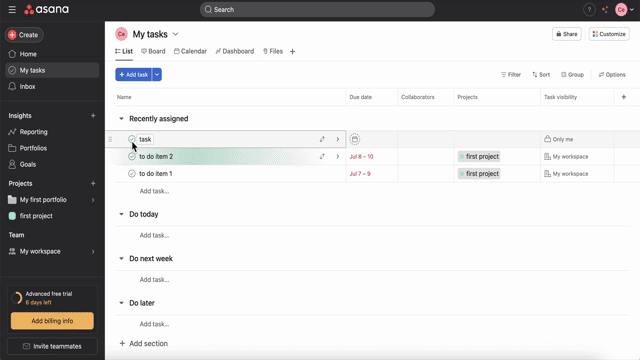
10- Asana’s celebration animations after task completion
By now, you’re probably used to (or maybe even slightly over) Asana’s celebratory animations. But think back, do you remember how you felt the first time you saw one?
That shock, that surprise, that happiness…
Asana sprinkles these colorful, whimsical animations when you complete certain tasks, not all tasks, and not every time. They appear at random, which adds a fun layer of mystery: Will I get the rainbow phoenix this time?
You can even assign celebrations to specific tasks, or turn them off entirely if you prefer your task manager without sparkles. 👀
➡️ What UX problem(s) Asana solves with these animations?
Asana tackles the challenge of sustaining user motivation and engagement, especially during repetitive or mundane task management. These playful animations serve as tiny rewards that make completing tasks feel more satisfying and even fun.
The default randomness adds surprise and delight, keeping users curious and emotionally invested.
You can monitor the impact of this kind of UX improvement through:
- Feature opt-in/opt-out rates (for celebrations)
- User feedback and NPS related to animations
➡️ Takeaway tips:
- Add randomness to create anticipation and joy.
- Let users personalize or opt out of playful elements to respect different preferences.
11- Lokalise’s additional tasks for active trial users
Lokalise is another tool that comes with a well-organized onboarding, consisting of different modals, tooltips, and checklists.
On their welcome modal, they highlight the value the new user can get out of the onboarding flow, and invite the user to get started with the initial checklist (yes, there’s another one, if you stay tuned).
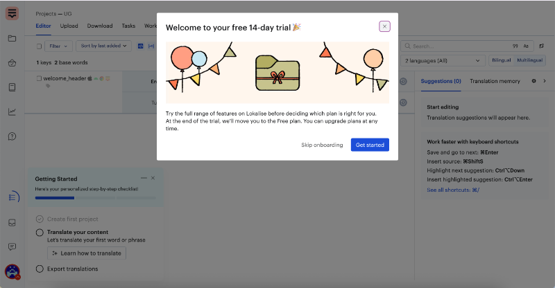
The first checklist includes 3 tasks.
One of them, creating your first project, is already completed during the signup flow. This “pre-checked” task is a common UX strategy in SaaS onboarding; it provides an early sense of progress and commitment, encouraging users to continue.
Anyway, back to Lokalise’s checklist.
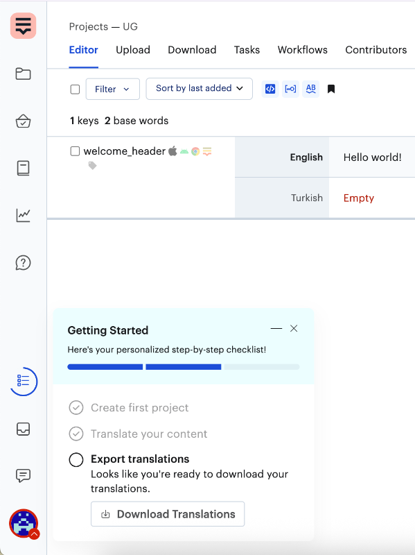
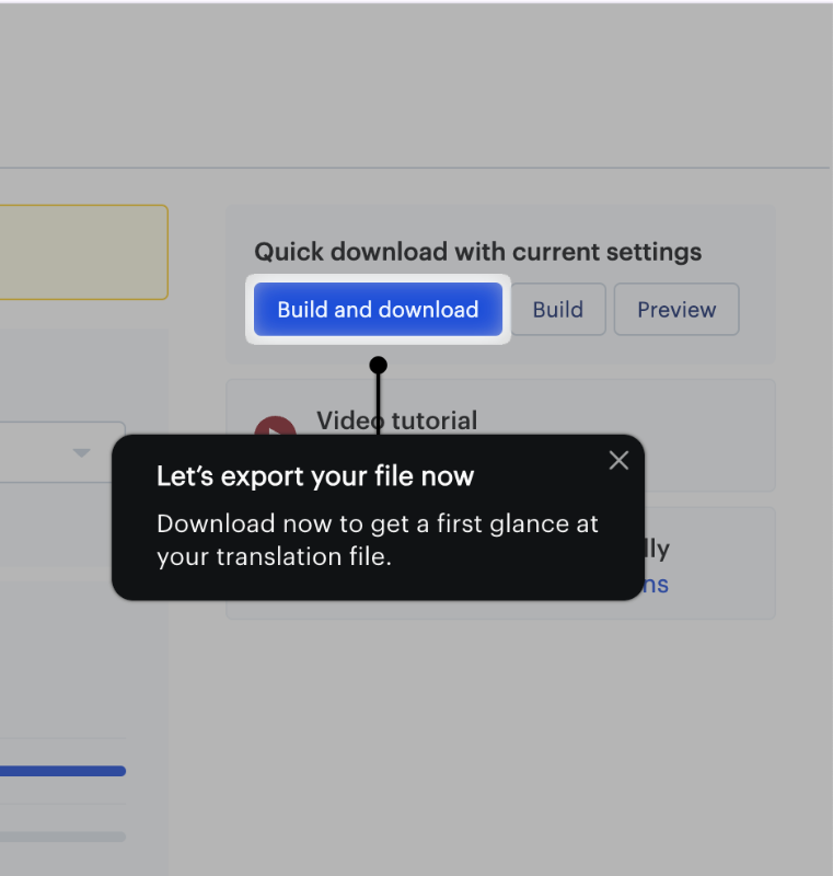
The remaining 2 tasks, translating content and exporting translations, each trigger short, interactive tutorials.
Similar to Datalexing’s tours, Lokalise’s tours also consist of tooltips with clear instructions, and they also wait for you to complete the action. However, the tours are shorter, and there’s no progress bar, this time.
Up until this point, it’s a good, but pretty standard, in-app onboarding experience.
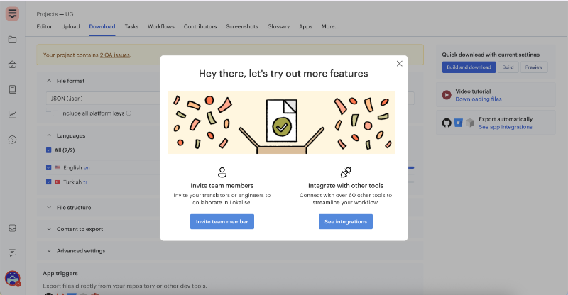
Where Lokalise’s onboarding experience becomes truly unique is when you complete the checklist tasks and receive a celebratory screen right on the checklist.
Hooray, you’re all set! You know the basics.
Now what?
You can either close the checklist and explore the platform on your own, bring in a translation project and start working on it, or continue with the onboarding to discover more advanced features and learn how to use Lokalise more effectively and efficiently.
The decision is yours.

Let’s assume you decided to continue with the onboarding flow and unlock more features. Then, you get a pop-up modal that offers 2 different options:
- You can learn how to invite team members to collaborate
- Or, you can check out the integration capabilities to streamline your workflow.
Both options have CTA buttons that take you to the relevant pages and help you with the flow.
➡️ What UX problem(s) Lokalise solves with these checklists?
Lokalise solves several UX problems with its checklists.
It helps users discover the core value of the platform by guiding them through key features. The onboarding is segmented and it focuses on active trial users who are ready to explore more.
It also asks for deeper commitment only after users have had time to try the basics, which feels less pushy.
This staged approach helps users feel more engaged and less irritated.
You can monitor the impact of this kind of UX improvement through:
- Checklist completion rates (for both of them)
- User engagement with key features post-onboarding
You can also compare the completion rates of advanced tasks between users who follow the second checklist and those who explore these features on their own, without guided onboarding. This helps measure how much the checklist improves feature adoption and user confidence.
➡️ Takeaway tips:
- Design onboarding checklists that balance early wins with gradual exposure to advanced features.
- Tailor onboarding paths to different user segments.
- Time your requests for user commitment.
12- From bad UX to good UX: Smartcat’s product tour
One very visible and relatively recent UX optimization is Smartcat’s user onboarding revamp. Three years ago, they didn’t offer any onboarding or in-app guidance, and users were understandably frustrated, especially considering the platform’s frequent updates, new feature releases, and UI changes.
Then came guided tours with tooltips. Yay.
But while the tour was helpful and had friendly copy, it was criticized for being too long and overwhelming.

Smartcat took the feedback seriously and optimized the experience again.
Instead of one long tour, they broke the onboarding into smaller parts using pop-up modals. While these modals reduced the interactivity compared to tooltip walkthroughs, they significantly sped up the process and allowed more space to explain feature value and use cases in detail.
These modals are grouped into 3–4 sets and are triggered contextually, only when the user is on the relevant page.
For example, translation editing tools are introduced on the editor page, while marketplace features are explained on the marketplace page.

From no onboarding to less effective onboarding, and finally to optimized onboarding, Smartcat shows how user feedback and behavioral insights can drive meaningful UX improvements.
➡️ What UX problem(s) Smartcat solves with these popup modals?
Smartcat addresses two key UX challenges: poor feature discovery and user dissatisfaction caused by either no onboarding or overly lengthy walkthroughs. With the new modals, they strike a balance and offer timely, contextual guidance that doesn’t overwhelm users but still delivers enough value to support confident exploration.
You can monitor the impact of this kind of UX improvement through:
- Onboarding completion rates across different flows
- Feature adoption timelines (especially for new tools/ features)
- Drop-off rates during long tutorials vs. segmented modals
- Changes in support queries related to initial setup or usage
➡️ Takeaway tips:
- Find the middle ground between “too short” and “too much” in onboarding.
- Break onboarding into contextual chunks to reduce cognitive load.
- Use user feedback to continuously improve the format and pacing of onboarding.
Top 11 actionable tips to optimize user experience today
Define your audience through user research
Understanding your audience is the foundation of any successful user experience, and it starts with solid user research. Without it, you’re just making assumptions.
And assumptions are UX’s worst enemy.
Instead of building based on what you think your users need, user research lets you uncover what they actually need, how they behave, and why they behave that way. It shines a light on patterns, motivations, frustrations, and workarounds that can’t be captured by intuition alone.
But how do you conduct user research? Well, there are only so many ways…
Here is a map of different user research methods:
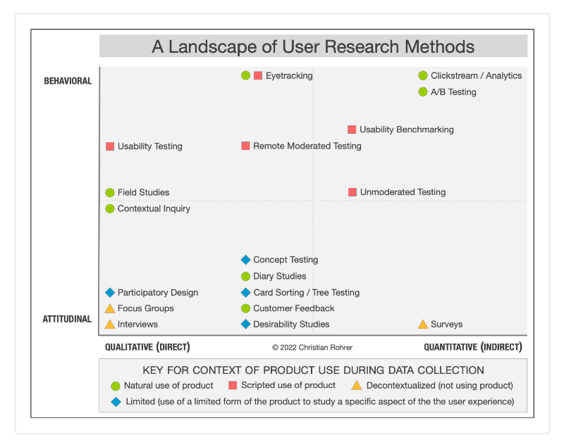
So, there are 3 dimensions in user research, let’s go over them one by one.
🕵🏻 The Attitudinal vs. Behavioral Dimension
This is the classic “what users say vs. what they actually do.”
People may say they want fewer emails, but they’ll still open and click through onboarding tips if they find them helpful. So you need to make sure you not only listen to your customers and users but also monitor how they behave.
For attitudinal user research, you can use interviews and surveys, while for behavioral user research, you can use usability tests, heatmaps, and analytics.
🕵🏻 The Qualitative vs. Quantitative Dimension
Qualitative data gives you depth. It tells you why people behave a certain way through direct observation, conversations, or diary studies. Quantitative data, on the other hand, tells you what’s happening at scale with click-through rates, conversion drop-offs, and time on task.
You’ll often need, again, both to see the full picture.
🕵🏻 The Context of Product Use
Always consider where and how the user is experiencing your product.
Are they trying it in a natural setting, like using your budgeting app while out shopping? Or are they in a lab or test environment? Are they interacting with a live product or a prototype?
Understanding this helps you gauge how realistic the findings are and whether you're looking at actual behavior or a rehearsed version of it.
⚡ Pro Tip: Great UX teams build continuous feedback loops. And they don’t wait for problems to arise before listening to users. You can start small: run short interviews, watch how users complete a task, or even look for recurring themes in support tickets.
Adopt Jobs-to-be-done framework
When you design your product, user flows, or while conducting research, it’s important to see things from your customers' and users’ eyes. Because after all, you design something (a product or an onboarding flow) for them, and how they feel about it or how they actually utilize it is more important than what you started with in your mind.
Jobs-to-be-done (JTBD) framework roots from this perspective.
Instead of thinking in terms of features or personas, JTBD helps you focus on what your users are trying to accomplish; their underlying goals, needs, and progress. It asks one simple but powerful question:
“What job is the user hiring this product to do?”
For example, someone doesn’t download a task management app because they want checklists, they download it because they want to stop forgetting important things.
They don’t use a budgeting tool because they love charts; they use it because they want to feel more in control of their finances by the end of the month.
This shift in mindset is critical.
You can apply this to your user experiences, like onboarding flows or newsletter emails, as well.
Map user journeys to visualize how users interact with your product
User journey maps help you visualize the end-to-end experience of someone using your product, from their first interaction to long-term engagement (or churn). When done right, these maps reveal friction points, emotional highs and lows, and unexpected detours that can derail even the most beautiful UX.
Let’s take onboarding as an example.
If you map out your onboarding flow and notice a consistent drop-off between steps 2 and 3, that’s a sign that something’s unclear, boring, or asking too much from the user too soon. That single insight can lead to redesigning a step, introducing tooltips, or reducing form fields.
Similarly, you can apply mapping to many flows, like:
- Signup flows
- Customer support flows
- In-app interaction flows (for features and tools)
To see the full picture of your user journey, you need to connect these smaller flow maps and touchpoints into one cohesive story, and analyze how users move through each stage, not just in isolation, but as part of a bigger experience.
⚡ Pro Tip: You need to differentiate the user journey from the customer journey and take a look at the customer journey, as well. With customer journey mapping, you see the pre-signup flows and interactions like demo calls, contract processes, reach-outs, as well as post-signup interactions with success teams, for example.
With user journey mapping, your focus is on the interaction points where your customers are users who actively use your products and services.
Combine A/B testing with personalization
A/B testing and personalization are two powerful UX strategies that work best when combined thoughtfully.
According to CXL, using A/B testing alongside personalization lets you experiment with tailored experiences while validating what truly resonates with different user segments. This approach helps you optimize your product for a variety of audiences rather than a one-size-fits-all solution.
Take Airbnb as an example.
While they do personalize recommendations based on past user behavior (like recommending stays in places or on dates you’ve searched before), they could enhance this even further by incorporating geo-location data more effectively.
They list certain places as “Near you,” but the algorithm doesn’t work very well.
For example, two cities in the same country might be shown, with one tagged as “near you” and the other labeled as a vacation spot abroad.

This strategy ties in well with Hick’s Law, which states that the time it takes to make a decision increases with the number and complexity of choices.
Personalization helps reduce cognitive load by filtering down options to what’s most relevant, and makes the decision process faster and easier for users.
By combining this with A/B testing, you ensure that the personalized experiences you offer actually improve decision-making and user satisfaction.
You can also keep Hick’s Law in your mind while designing your A/B test variants.
Adopt predictive personalization
Traditional A/B testing shows you which version of a page or feature performs better for a general audience, but users aren’t a monolith. Personalization helps you go beyond averages by tailoring experiences to individual needs, behaviors, or preferences.
Predictive models, on the other hand, continuously learn from user behavior.
These systems identify user segments in real time, test multiple ideas simultaneously, and automatically serve the experience most likely to convert that specific user at that specific moment.
They optimize and automate.
As your campaigns evolve or your traffic sources shift, predictive personalization adjusts in the background, keeping the experience relevant without requiring manual retesting.

Boost self-service support to eliminate friction
Users don’t always want to talk to someone to solve their problems, and they shouldn’t have to. Especially in product-led growth models, where self-serve is core to the experience, customers expect quick, intuitive, and independent access to answers.
That’s why we need well-organized self-service support systems.
✅ When done right, self-serve support reduces reliance on human support, speeds up problem-solving, and builds user confidence.
❌ When done wrong with outdated docs, vague walkthroughs, or impossible-to-navigate help centers, it does the opposite: increases frustration and churn.
Take Intercom or Notion, for example. Their help centers feel like extensions of the product with clear categories, in-depth articles, visual walkthroughs, and search functions.
You can also add in-app self-serve support systems, like resource centers and AI assistants. And for these practices, UserGuiding is a great example.
Here’s what its in-app resource center looks like:
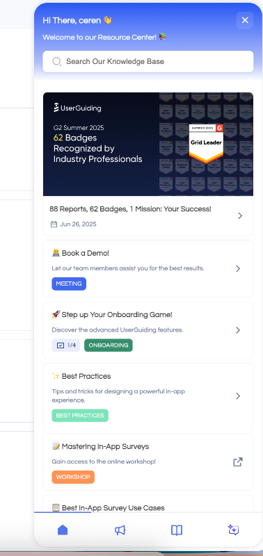
From this widget, you have access to the articles and videos in the knowledge base without leaving the app, plus the AI assistant. You can also find the interactive tutorials and checklists in the RC.
Offer interactive content to nudge users, don’t push them
If we return to the earlier discussion on simplicity vs. complexity, there’s another powerful lever in your UX toolbox: interactive content.
This doesn’t mean gamifying everything or overwhelming the UI with elements that move and glow. It means designing hands-on experiences that guide users (not force them, though) through action.
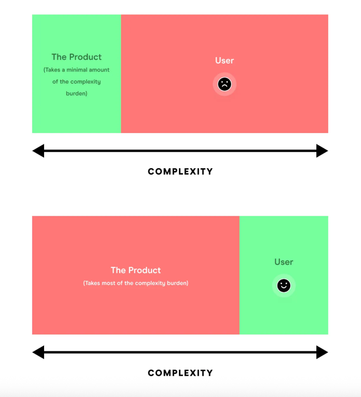
Interactive product experience reduces the complexity burden on the user and puts it on the product.
Interactive product experiences reduce the mental burden on your users by giving them just-in-time context, nudges, and room to explore.
Instead of relying on static documentation, you let the product show rather than tell.
Now, there are several tools and strategies you can use to create interactive content. You can… 👇🏻
🎯 Use onboarding checklists to reduce drop-off
Checklists help users visualize progress and reduce the intimidation factor of learning a new platform. Thanks to the Zeigarnik Effect, users feel compelled to complete tasks once they’ve started. It creates a healthy tension.
That’s why tools like Lokalise and ClickUp show pre-checked items like "Create your first project" or “Learn the basics”. It signals progress even before effort is made, increasing the likelihood of users sticking around to finish the rest.
Keep your checklists:
- Short and goal-oriented
- Contextual to the user journey
- Dynamic, with real-time tracking and rewards
Here’s an example checklist:

🧭 Guide users with tooltips instead of modals
Don’t get us wrong, we love pop-up modals and slideouts. They are good for product announcements, welcoming users, conducting surveys, even.
But when it comes to tutorials and guidance…
They can be risky, as their interactivity level is limited, and to provide contextual guidance, they require visual support.
Tooltips, on the other hand, are safer and come with high interactivity inherently.
Tooltips appear in context, which means users can follow along without trying to find the buttons and features on the UI to complete the actions. What needs attention and engagement is already highlighted!
⚡ Pro Tip: If you require more space to explain a feature, you can incorporate modals with visuals and videos into your flows for more advanced feature explanations and pro tips, while still providing the basic information with tooltips.
UserGuiding, for example, offers quick, interactive tutorials with tooltips on its features. At the end of the tutorial, it triggers a slideout modal that links to a video covering more advanced capabilities and use cases of the related feature.

🎉 Add micro-moments (celebrations after task completion)
You don’t have to go all out like Asana’s rainbows and flying unicorns. Sometimes, small, subtle celebrations work just as well. Take Toucan, for example, when you answer an exercise correctly, a tiny animation pops up.
It’s a small but satisfying moment that keeps users engaged.
These little micro-engagements tap into that dopamine boost, help build habits, make tasks feel more rewarding, and add a friendly, human touch to the experience.
They’re especially effective when:
- Tasks feel repetitive or dull
- Users are new and could use some positive reinforcement
- You want to encourage users to explore more features
Pinpoint user experience shortcomings to overcome them
Before you improve anything, you need to see where the friction is. This requires a combination of behavioral insights, real user data, and continuous testing.
Here are a few ways to uncover what’s slowing your users down:
- Session audits: Watch real user sessions to identify where people hesitate, rage click, or abandon flows.
- Funnel analysis: See where most users drop off in your signup, onboarding, or conversion funnels.
- Path analysis: Understand the different routes users take across your product and which ones lead to success or churn.
- Usability testing: Test early designs or current UX with real users to identify confusing interactions.
- Surveys and feedback loops: Ask about satisfaction and ease-of-use directly, using tools like Hotjar, Typeform, and UserGuiding.
📈 Important metrics to monitor at this stage include:
- Customer satisfaction score (CSAT)
- Task completion rate
- User retention rate
- Net promoter score (NPS)
- Time to value (TTV)
Add in-app feedback surveys after key actions
Collecting user feedback right after important actions can give you fresh, relevant user insights into your product’s usability and customer satisfaction.
Short and timely in-app feedback surveys help you capture users’ thoughts when their experience is still top of mind. This boosts the accuracy and honesty of responses compared to generic, delayed surveys.
For example, after a user completes onboarding, finishes a purchase, or submits a support ticket, a quick one- or two-question survey can reveal pain points.
Or where your product shines.
Feedback isn’t inherently negative, after all.
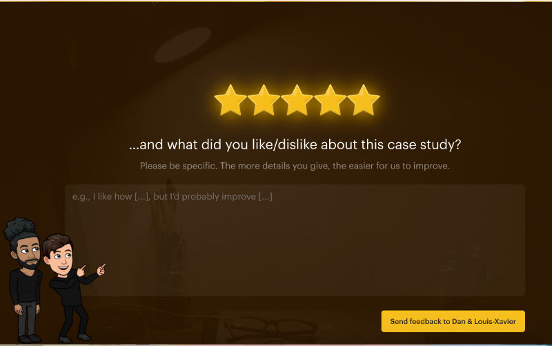
Growth design asks for feedback when you complete one of their UX studies, for instance. 👇🏻
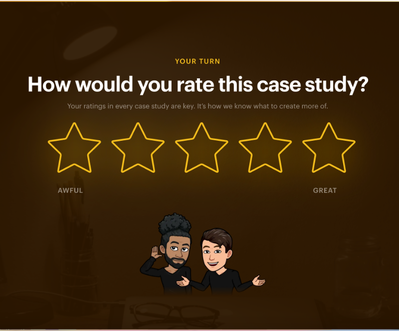
The survey consists of 2 questions: a star rating and an open-ended question asking for more details. The follow-up question appears only after the star rating, so users don’t feel intimidated by having to write a long response right away.
In the text input box, there’s a template sentence to guide users on how to provide feedback, encouraging them to mention both the positive and negative points.
⚡ Pro Tip: Personalize the follow-up question in your surveys based on users’ initial responses. For example, in a CSAT survey, if a user gives a high star rating, thank them and ask what they liked most. If the rating is low, express your regret that their experience wasn’t satisfactory and ask what could improve it.
Optimize your sign-up form to be concise enough
A concise and well-structured sign-up form is critical for reducing user friction and increasing conversion rates. Here are some key practices to consider:
- Rethink Email Verification: If your signup process requires email verification, consider delaying it until after users have experienced some value from your product.
For example, instead of blocking access until verification is complete, allow limited access and remind users later. This reduces early drop-off.
- Separate Setup from Onboarding Surveys: Avoid overwhelming new users by mixing account setup with detailed onboarding questions. Keep the initial signup simple (name, email, password) and move optional surveys or preference questions to the onboarding phase.
This improves completion rates and user satisfaction.
- Add Skippable Steps in Longer Flows: If your signup requires multiple steps or gathering detailed info, make sure non-essential steps are optional or skippable.
Users appreciate control over how much info they provide upfront and can return to complete profiles later.
- Enable one-tap or social signups: Allow users to create accounts quickly using Google, Apple, Facebook, or other social logins. One-tap signup reduces friction by eliminating form filling, and leads to faster onboarding and higher conversion rates.
Plus, it leverages existing verified accounts, reducing the need for immediate email verification.
⚡ Pro Tip: Many platforms and apps have started to skip the account creation process to access the product. OpenAI, Gumloop, DeepL, Spotify, and several other companies do not ask the user to create an account before using the platform.
You can use ChatGPT, create workflow automations, or listen to music without an account.
Once users experience the value of the product and want to have a history of their actions, like saved workflows or chat history, they understand the value of having an account as well.
Jerry Noel explains why they don’t ask for account creation for any of their tools in JustQuick Tools, unless the account is really, really necessary.
Noel says that the average person manages 100+ online accounts, receives 120+ emails daily, and spends 12 minutes per day just managing digital accounts…
And they prefer to separate themselves from this noise and crowd.
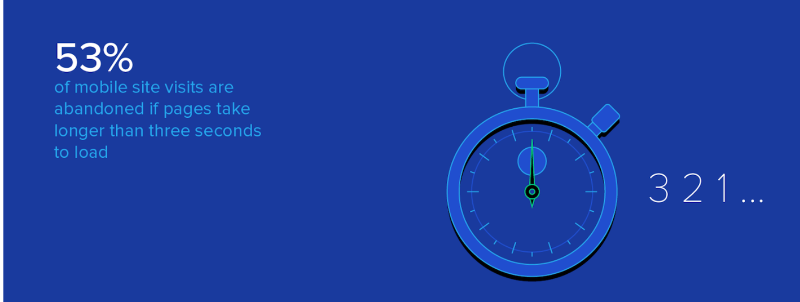
Compress long loading times or add skeleton loaders
Long loading times can frustrate users and lead to higher bounce rates. Even a few extra seconds can feel like an eternity and cause users to lose patience or abandon your product altogether.
💡 According to statistics, 53% of mobile users abandon pages that take more than 3 seconds to load.
One effective way to combat this issue is by compressing your loading times as much as possible. This involves optimizing images, minimizing code, leveraging caching strategies, and using faster servers or CDNs to reduce the actual wait time your users experience.
But these are hard and expensive optimization projects.
And sometimes some loading time is inevitable.
That’s where you resort to skeleton loaders.
Instead of showing a blank screen or a generic spinner, skeleton loaders display a lightweight placeholder that mimics the layout of the content that’s about to appear. This visual cue reassures users that the page is actively loading and gives a sense of progress.
Plus, they reduce the perceived waiting time and create an engaging experience.
⚡ Pro Tip: If your tool works on top of another page, like an extension, and you cannot dynamically load the page it will work on, then you can add engaging copy and animations on your blank loading screen.
Like UserGuiding does here:

Remove unnecessary steps from your most-used workflow
When users engage with your product, they often come with specific goals in mind. Every extra step, button, or piece of information that isn’t directly related to their goal creates friction. This can slow them down, increase frustration, and even cause drop-offs.
To improve usability and satisfaction, analyze your most frequently used workflows and identify steps or elements that aren’t essential. Ask yourself:
- Is this step absolutely necessary to complete the task?
- Can this action be simplified or combined with another
- Does this call-to-action (CTA) distract or confuse users?
By cutting out these unnecessary details, you reduce cognitive load (the mental effort required to process information), which helps users focus on what truly matters.
If certain options or actions aren’t critical to completing the core workflow, consider moving them to later stages or secondary menus, so they’re available but don’t interrupt the flow.
In Gmail, when composing an email, the interface keeps the core actions (writing, adding recipients, and sending) front and center.
Advanced options like scheduling, formatting, and adding attachments are tucked away in expandable menus or symbols/buttons. This way, users can quickly send emails without distraction, and only access extra features if needed.

Pay attention to behavioral psychology
Throughout the article, we’ve been talking about UX laws and common practices, like Hick’s Law or Zeigarnik Effect, rooted in human psychology and behavioral patterns.
But these are just the tip of the iceberg.
Behavioral psychology offers a deep well of insights you can tap into to design more intuitive, persuasive, and satisfying user experiences.
UX design is about how users feel and behave when interacting with your product. If you understand how people think, what motivates them, and what confuses or overwhelms them, you can build products and experiences that are naturally easier to use.
So, the goal isn’t to trick users; it’s to design with empathy, based on how people actually behave.
Here are a few powerful behavioral principles you can apply in your UX:
👥 Social Proof:
We’re wired to follow the crowd. People are more likely to take an action if they see others doing it too.
Example: Adding customer testimonials, usage stats (“Trusted by 10,000+ teams”), or user reviews during onboarding or checkout builds trust and encourages action.
🎁 Reciprocity:
When you offer value upfront, people feel more inclined to give something in return, whether that’s signing up, giving feedback, or upgrading.
Example: Offer a free tool, checklist, or guide before asking for an email address. You build goodwill first.
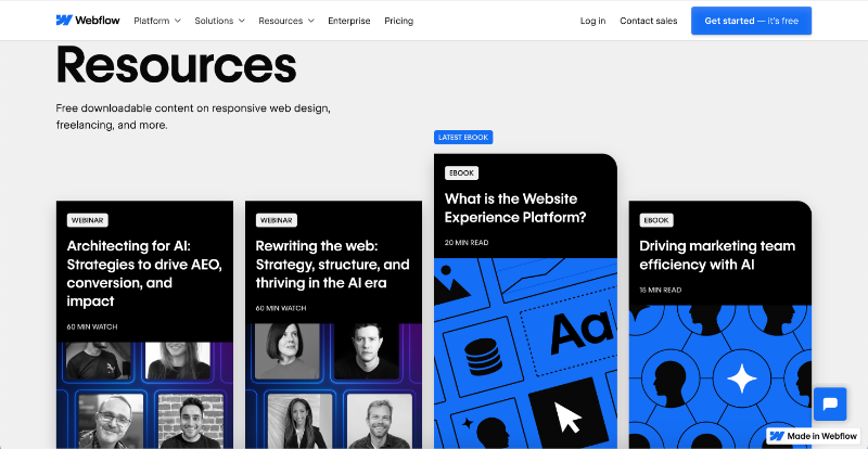
Webflow shares detailed ebooks, whitepapers, reports, and webinars about emerging industry trends and best practices, even if you don’t have an account.
🎲 Loss Aversion:
People fear losing something more than they value gaining something of equal size.
Example: Remind users what they’ll lose access to when a trial ends, or show “You’re missing out on X” if a key feature is unused.

Grammarly reminds users what they will lose when they sign out of their business account.
Tools that help you optimize UX in SaaS
Here are 5 SaaS-friendly UX tools that help you build better user experiences, each solving a different piece of the puzzle 🧩
UserGuiding – for onboarding and in-app UX
UserGuiding is a no-code, all-in-one product adoption platform designed to help you onboard and educate users directly inside your product. It lets you create interactive walkthroughs, onboarding checklists, tooltips, and hotspots without any engineering effort.
You can also use it to offer automated self-serve support to your customers through standalone knowledge bases, product updates pages, as well as in-app resource centers and AI assistants.
✅ How UserGuiding helps you optimize your UX:
- Lowers friction, especially during onboarding or while learning a new feature.
- Reduces support burden by helping users help themselves.
- Improves retention by giving users confidence and clarity from the start.
Fullstory – for behavioral analytics
Fullstory is a behavioral analytics platform that helps you understand what your users are doing on your platform, and why.
It automatically captures every click, scroll, hover, and tap, then lets you replay those sessions to analyze user behavior in real time. You can see exactly where someone got stuck, where they rage-clicked, or how they moved through your site.

Beside Fullstory Analytics, Fullstory also has a product called Fullstory Workforce, which allows you to improve employee workflows, streamline IT support and troubleshooting, and understand how employees use tools and software.
✅ How Fullstory helps you optimize your UX:
- Identifies friction points and helps you prioritize design fixes based on real user behavior.
- Captures real user sessions so you can see exactly how users interact with your product.
Hotjar – heatmaps and surveys
Hotjar is another behavior analytics tool that offers a mix of visual insights and user feedback tools. With its heatmaps, you can see where users are clicking, scrolling, or dropping off, and its built-in surveys and feedback widgets allow you to capture the "why" behind their behavior.
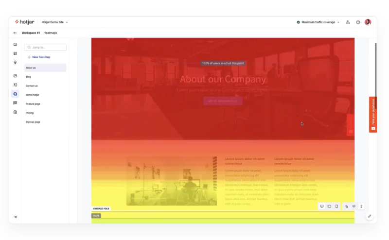
✅ How Hotjar helps you optimize your UX:
- Uncovers usability issues through recorded user sessions.
- Collects real-time feedback via surveys and feedback widgets.
- Combines qualitative insights with easy-to-digest visual data.
Amplitude – retention tracking
Amplitude is a product analytics and event tracking tool that helps you understand user engagement and retention at a macro level. It’s ideal for tracking conversion funnels, analyzing cohorts, and identifying the behaviors that correlate with long-term product use.
This kind of data is essential for prioritizing your UX improvements based on what actually moves the needle.
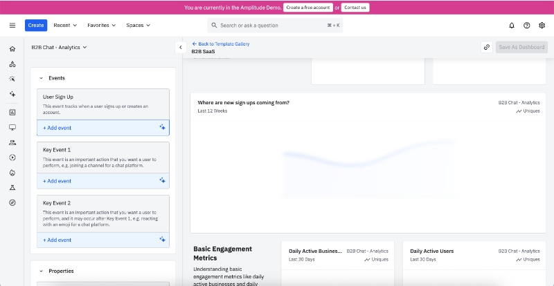
Amplitude differs from the other tools in its depth of quantitative insight.
It’s built for data teams and product managers who want to optimize UX through patterns, not just individual sessions.
✅ How it helps you optimize your UX:
- Helps you identify which features drive long-term product adoption.
- Enables segmentation of users by behavior, cohort, or lifecycle stage.
- Lets you visualize funnels and paths to pinpoint optimization opportunities.
Maze – for usability testing
Maze is a user research platform that allow you to validate your product designs before they go live. You can run everything from click tests and preference tests to full usability studies and surveys with real users.
You can use Maze for:
- Moderated research/ AI moderated research
- Usability and prototype testing
- Participant recruitment & targeting
- Card sorting & tree testing
- Feedback surveys
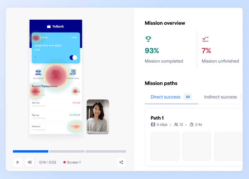
✅ How it helps you optimize your UX:
- Helps validate design decisions before development.
- Collects both qualitative and quantitative feedback on prototypes and live flows.
- Lets you test wireframes, Figma designs, or even live products asynchronously.
3 ways to continuously improve your UX over time
User experience isn’t a one-time task.
As your product and user expectations evolve, ongoing UX improvement is essential. Here are three practical ways to keep your experience aligned and effective over time.
Set up feedback loops
Creating regular channels for user input helps you identify what’s working and what’s not. In-app surveys are a lightweight and quick way to capture user sentiment at specific points in the journey, such as after onboarding or completing a task. These can surface recurring pain points or feature gaps.
Support ticket tagging is another useful method.
By categorizing support requests by topic or theme, you gain qualitative insights into UX friction. Often, repeated tickets point to issues in usability or clarity that may not appear in metrics alone.
Use A/B testing for UX hypotheses
A/B testing lets you test different versions of a design or feature to see which one works better. For example, you can compare two onboarding flows to find out which leads to higher activation rates.
However, don’t forget that what’s “best” changes from user type to user type.
So, you need to combine A/B testing with dynamic personalization and segmentation.
Dynamic A/B testing goes a step further than traditional A/B testing by delivering different experiences to specific user segments in real time. For instance, new users might see a different homepage than returning users.
Or, you can run separate A/B tests for product managers and marketers who visit your landing page.
The goal is to improve the user experience while avoiding over-standardization that makes it feel generic or irrelevant to individual users. And that’s why you combine (or at least, you should) A/B testing and customer segmentation.
Monitor UX KPIs and metrics monthly
Keeping track of UX-related metrics helps you spot trends and act early.
📌 Useful indicators include:
- Time-to-value (how quickly users reach a meaningful outcome),
- Feature adoption rates,
- Net Promoter Score (NPS) and Customer Satisfaction Score (CSAT),
- User Effort Score (UES),
- Interaction costs (Both physical and mental),
- Time on task,
- Error rates, and
- Churn reasons.
Reviewing these metrics and KPIs monthly gives you a clearer picture of how experience changes are affecting user behavior and where to focus next.
Wrapping Up
UX is an ongoing loop of testing, learning, and improving. And even the smallest tweaks can create meaningful, compounding gains over time.
So take this as your sign to audit your own product experience.
Use the tips we covered, spot friction points, and start making small, intentional changes. Your users (and your growth metrics) will thank you.
Good luck!
Frequently Asked Questions
What are the key steps in the user experience optimization process for SaaS products?
You can start by conducting user research to better understand user behaviors, needs, and frustrations. From there, you should map user journeys to spot friction points, then iterate with usability testing and small user interface design or copy improvements. You may also want to implement A/B testing and behavioral analytics to validate your changes. UX optimization works best as a continuous cycle where you learn, test, and improve regularly.
How does user experience optimization improve customer retention and activation metrics?
You should expect better retention and activation when users can easily understand and navigate your product. UX improvements help users find value faster, feel more confident in using features, and encounter fewer blockers. As a result, users are more likely to activate fully and continue using your product over time. You can think of it as removing friction from the customer journey, which naturally supports stronger retention.
What are the best tools for user experience optimization in web applications?
You can explore tools like UserGuiding to create no-code onboarding guides and tooltips that improve feature adoption. Tools such as Fullstory or Hotjar are useful for understanding user behavior data through session recordings, heatmaps, and surveys. You may want to use Amplitude to analyze retention patterns and feature usage, or Maze for testing usability concepts. Each tool serves a different purpose but together, they give a full picture of your UX.
What does a user experience optimization checklist for improving product onboarding include?
You may want to include things like a frictionless signup process, an onboarding checklist to guide first steps, contextual tooltips, progress indicators, and early feedback prompts. It’s also helpful to separate setup from value delivery, so users can start using the product quickly. You should ensure that users can skip steps or return later, so onboarding doesn’t feel like a barrier. Personalization and guidance at the right moments make a big difference.
What are the real-life examples of user experience optimization in B2B SaaS platforms?
You can look at platforms like Lokalise, which introduced step-by-step onboarding checklists to reduce user confusion. Smartcat redesigned its feature tours into contextual tips triggered by user actions. Asana added celebratory animations to boost motivation after task completion. These examples show that small, thoughtful UX optimizations can drive higher engagement without requiring major design overhauls or large dev cycles.
What delivers faster ROI: user experience optimization or UI redesign?
You should expect user experience optimization to deliver faster ROI than a full UI redesign. UX optimization focuses on improving flow, clarity, and usability, often through minor, data-informed adjustments. These can be implemented quickly and measured easily. A UI redesign can have a big impact too, but it tends to be slower and riskier. You can often make meaningful gains without reworking the entire interface.
How do you measure the impact of user experience optimization on conversion rates?
You should measure improvements using both quantitative and qualitative data. Conversion rate, funnel drop-offs, and task completion rates will help you see what’s working. You can also collect user feedback through surveys or NPS to get context behind the numbers. Tools like Amplitude, Mixpanel, or Fullstory can show how behavior changes post-optimization. Ideally, you’ll want to see smoother user flows and higher rates of key actions completed.
What are the common mistakes to avoid during the user experience optimization process?
You may want to avoid jumping to solutions without real user research. It’s also common to overcomplicate interfaces with too many CTAs, distractions, or unclear copy. Another mistake is treating UX as a one-time project rather than a continuous process. You should test assumptions with real users, prioritize clarity over cleverness, and be mindful of introducing new friction while solving existing issues.
What are the steps to take for a user experience optimization process to reduce churn in subscription-based apps?
You can start by identifying churn patterns and understanding user behaviors through funnel analysis or session replays. From there, you should work on improving onboarding, simplifying the path to key features, and providing value early. It also helps to gather feedback to spot issues before users leave. You might need to add reminders, support nudges, or loyalty reinforcements. Reducing churn often means showing users ongoing value, not just once, but continuously.
What are the top metrics to track during a user experience optimization project?
You should monitor both engagement and satisfaction metrics to get a full view of UX health. Common metrics include task completion rate, time-to-value, feature adoption, retention, and conversion rates. On the qualitative side, you can track Net Promoter Score (NPS), CSAT, or direct feedback from in-app surveys. These metrics help you understand where users struggle and where UX changes have a measurable impact.

.png)


