


.svg)
.svg)
.svg)
.svg)
.svg)


.svg)


.svg)
.svg)

Think about all the software and apps you regularly use. What do they have in common?
You accomplish what you need to do and don’t think about the interface for a minute. For users, what makes an experience great is how little they’re distracted by everything else: the interface, the navigation, and the effort required to get something done.
When 88% of users quit using a product after a bad experience, understanding UX basics becomes more than necessary to build a long-lasting digital product.
This guide covers everything from UX fundamentals to actionable tips you can implement quickly.
✅ User experience (UX) is how someone feels when interacting with a product. But contrary to popular belief, it extends beyond the interface of your website or app to everything that affects your experience with the product, including talking about it.
✅ UX and UI (user interface) are mistakenly used as synonyms: UI is what users see and touch; UX encompasses the entire experience design process.
✅ Jakob Nielsen’s 10 usability heuristics provide the foundation for evaluating and improving any interface.
✅ The UX design follows four stages: user research, ideation, prototype and testing, iteration and revision.
✅ Tools like UserGuiding help implement UX best practices through in-app guidance, tooltips, and user feedback creation.

What is user experience (UX)?
Instead of offering a dictionary-style definition of user experience, it’s more useful to step back and let the person who coined the term explain what UX really is (and just as importantly) what it isn’t.
Don Norman, co-founder and board member of Nielsen Norman Group, came up with the term at Apple. Here’s how he defines user experience:
[User experience] is everything that touches upon your experience with the product. And it may not even be near the product. It may be when you’re telling someone about it.”
Norman also points out the term is misused today and narrowly applied to individual interfaces, such as an app or website. While a UX designer may work on an app, the user experience itself doesn’t stop at the boundaries of that product. As Norman puts it, UX is “the way you experience the world … your life … the service.”
This broader view means that user experience extends far beyond isolated interactions within an app or website.
Over time, a product or service becomes synonymous with the problem it solves or the value it delivers. That’s how the most successful B2B SaaS brands have earned a place in users’ mental models: HubSpot as a go-to resource for content marketing, Loom for quick screen recordings, and Amplitude for product analytics.
Jesse James Garrett’s The Elements of User Experience makes this point explicit. His five interconnected elements show why UX can’t be reduced to visuals or interface polish:
- Strategy: Conducting user research to understand who you’re designing for and why
- Scope: Defines what solution you’ll be designing
- Structure: Defines the blueprint on how the product or solution works behind the scenes and how the users interact with it
- Skeleton: Laying out the initial interfaces of the solution and tangible elements of the user experience
- Surface: Fleshed out version of the skeleton; the design users see and interact with
All these elements are like an iceberg. There’s more than what meets the eye and each decision affects above or below the surface. But the most important part for SaaS is that a great UX is invisible, it only helps you get things done.
UX in SaaS context
Seen through Norman’s lens, user experience in SaaS is less about screens and more about creating a system where every interaction a user has with your product (before they ever log in and log after they close the app).
This means UX includes onboarding emails, documentation, error messages, customer support, pricing clarity, performance, and even how confidently users can explain your product to a colleague. The interface is only one touchpoint in a much larger system that shapes trust, adoption, and long-term retention.
Designing user experience for user experience, then, isn’t just about making features usable; it’s about reducing friction across the entire lifecycle of use.
When the experience works, the users think about the outcome the product helps them achieve, whether that’s shipping faster, collaborating more effectively, or making better decisions. And that comes from empathy backed by user research.
UX vs. UI: What’s the difference?
It’s a common misconception that user experience (UX) is interchangeable with user interface (UI). But they’re not the same. What we define as user interface (UI) is the “cosmetics of the experience: typography, color, spacing, grids, icons, buttons.”
UI is part of the UX, which is the larger system that shapes how users interact with, understand, and feel about a product or service over time.
Let’s put it to perspective with an example👇
A UX designer working on a SaaS analytics tool focuses on how people actually use data. Do users come in with a specific question, or explore dashboards first? What happens when metrics are confusing or incomplete? The UX designer maps the full journey (from onboarding to daily use) identifying friction points and opportunities to support better decisions.
The UI designer then designs dashboards with clear visual hierarchy, chooses charts and typography that make data easy to read, and creates buttons and icons that guide users naturally through the interface.
Jeff Johnson, Assistant Professor in the Computer Science Department of the University of San Francisco, makes a fair comparison:
One cannot design a user experience, only design for a user experience. In particular, one cannot design a sensual experience, but only create the design features that can evoke it.”
In other words, UX and UI go hand in hand, and so do their designers. Here’s a visual to demonstrate the relationship between the two 👇
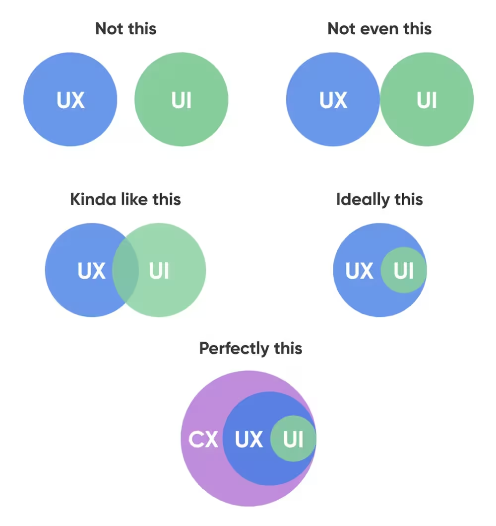
Note: CX refers to customer experience in this context.
While a UX designer conducts research, identifies needs, and creates taskflows and prototypes, a UI designer composes layouts, creates visuals, and builds mockups.
UX myths we’re leaving behind in 2026
If the definition of user experience is still up for debate, myths are bound to stick around. In 2026, however, we’re done with them. After scouring forums and industry conversations, we pulled together the five most common UX myths people still run into:
1- The 7+-2 rule
George Miller's magical 7+-2 theory argues that the average human cannot hold more than 7 (plus or minus 2) objects in their short-term memory. In UX, this is widely mistranslated as limiting navigation items, menus, or items to seven options.
What Miller suggested was people’s capacity to remember varies in one dimension, and the performance of short-term memory only decreased (not stopped) after the initial 6 stimuli.
Miller was shocked by the misinterpretation himself, saying that “The point was that 7 was a limit for the discrimination of unidimensional stimuli (pitches, loudness, brightness, etc.) and also a limit for immediate recall, neither of which has anything to do with a person’s capacity to comprehend printed text.”
On a webpage or app, the user doesn’t have to recall information as it is virtually present, so policing the number of menus on the screen doesn’t have guaranteed benefits.
In fact, broad and shallow menus or navigation items may work better than in-depth menus. Similarly, link-rich e-commerce homepages (like Amazon’s) are found to be more useful than homepages with only a few links.
2- Users don’t scroll
“Bed rotting” isn’t associated with “doomscrolling” for no reason. There’s a misleading concept that users hate scroll, so there’s no point in placing information at the bottom of a page or a mobile app.
Chartbeat’s analysis from 2 billion visits shows that 66% of attention on a normal media page is spent below the fold. On mobile, half of the users start scrolling within 10 seconds and 90% within 14 seconds.
It is still better to put the most necessary information to page top, but if your UX is well-designed (aka gives users a reason to scroll), the users will, in fact, scroll to find what they’re looking for.
For example, in SaaS, good documentation surfaces the key takeaway or next step at the top, but detailed explanations, examples, and edge cases live further down the page. Users routinely scroll because the content is clearly structured, well-labeled, and signals value ahead (table of contents, jump links, progressive disclosure).
Similarly, the first required action in onboarding flows is often visible immediately, while detailed instructions, explanations, and troubleshooting tips appear below. Users scroll because the layout reassures them that help exists exactly where they expect it.
3- Fewer clicks, longer time on page
Less is, in fact, not always better. A widespread yet inaccurate heuristic, 3-click rule, is the proof of that.
3-click rule claims that no page should take more than 3 clicks to access. In other words, navigation and informative tasks should be completed in under 3 clicks. The reason behind the heuristic seems in line with UX basics at first: Don’t frustrate users and don’t give them any reason to abandon a task. What users see and interact with should only be the necessary building blocks to the key action.
But it overlooks one major problem. A Reddit user puts it best:
This myth completely ignores the value of a well-designed information architecture, and why those clicks have a high interaction cost in the first place.”
Nielsen Norman Group has three reasons why 3-click rule should be ditched:
1. The number of clicks needed to complete the task will depend not only on the design, but also on the task complexity — so an absolute number, applicable for all tasks, is not possible.
2. Not all clicks are equal: Some result in long wait times (if, for example, a new page is loaded) and others are instantaneous — for instance, if an accordion is expanded.
3. The number of clicks will rarely tell the whole story — there are many aspects of the design that contribute to its usability, whether the task flow involves 2 clicks or 10. In the real world, users make mistakes, misunderstand things, and get confused along the way. Simply counting the number of steps in a process misses out what users actually do, and the opportunities to provide them with a less frustrating experience.
So what’s the fix?
What really matters here is the simplicity and ease of information. Ensure you place information scents along the user’s path, include clear wayfinding labels that tell users where they are, and when applicable, allow users to save progress, come back to the task, and move bit by bit.
4- Simple = minimal
Pendulum swings. It moves from “Only good-looking UX can ‘wow’ your users,” to “Only minimal design helps users.” The truth is neither. And while the pendulum keeps swinging, it’s bad UX that persists, with users paying the price.
You shouldn’t have icons without text or non-standard elements without contextual guidance for the sake of reduced complexity.
“A dysfunctional experience won’t be saved by a slick interface,” as one LinkedIn user says, but it won’t be saved by oversimplified interfaces either. In fact, this is what Julie Zhuo, former product design VP at Facebook, calls “overvaluing simplicity and style at the cost of clarity.”
On the other hand, a pretty design can’t singlehandedly deliver a functional experience. It surely can help users feel relaxed, motivated, and open to trial and error, but it won’t make the product “magically click” for the user.
Yes, be easy on the eye. But also guide users to smart choices.
5- Data solves everything
Collecting and analyzing data can be a solution to a lot of uncomfortable situations. But “Data solves everything,” has become another buzzphrase to desperately apply data whenever and wherever, without thinking about the experience teams are trying to create.
A Reddit user criticizes this trend and says, “... by focusing on data too early, you risk spending a ton of time deciding between A and B, and never think about C, D, or E, all of which might be orders of [better] magnitude.”
Another user adds, “The constant push for specific answers … efficiency, aggregation … means we don’t actually get very creative in our solution explorations.”
So heavy reliance on data can actually add bias to the UX design process to confirm what you already think is working for your or other big companies. Data isn’t cognizant of human behavior and can’t imitate it. It shouldn’t surpass or replace human sentiment, and must be treated as a supplementary source in decision-making.
Core UX design principles
Jakob Nielsen’s 10 usability heuristics set the standard foundation for many industries, including SaaS. These practical guidelines help you lower the interaction cost and engage users with your product:
1- Visibility of system status
This principle can be summarized in a single sentence: Don’t blindfold your users or breadcrumb information.
You should always keep users informed about what’s happening in the product, so they can make an informed decision in the next steps: show when a task is in progress, clarify why it might take time, and confirm the outcome once the action is complete.
2- Match between the system and real world
Few things push users away faster than using industry-specific jargon, concepts, or images your target audience may not be familiar with.
Put yourself in your users’ shoes for a moment: Would they describe key actions in the way you described and in the same order? If not, you’re assuming your definitions and conventions match those of your users.
Instead, conduct user research to understand users’ real-world terminology and mental models surrounding the concepts you’re working with.
3- User control and freedom
When was the last time you ragequit the app because you performed an action by mistake but couldn’t undo it? It happens more often than you think.
To avoid falling into this trap, include undo and redo buttons in your design. Give an easy exit to the user with a cancel button and make sure users can easily locate it.

4- Consistency and standards
Users expect the same patterns in your product: search bar at the top of your website or app, arrows to signal progression, and a “Post” button to publish your content. There should be no room to misinterpret whether different words, situations, or actions lead to the same result.
5- Error prevention
Mistakes happen. Though the ideal situation is preventing errors from happening in the first place, sometimes the gap between “How do I work with this tool to accomplish my goal?” and “Did this work how I wanted it to?” is too wide because users don’t get enough help.
To get ahead of this gap, introduce constraints, preview results, and use clear labels.
6- Recognition rather than recall
Users shouldn't be forced to play "Where's Waldo?" to find key information. They shouldn't have to remember information from one part of the interface to another either. Make elements, actions, and options visible and easily retrievable.
7- Flexibility and efficiency of use
You’ll have novices and experts using your product at the same time, so you need to keep both of their journeys in mind. Have step-by-step walkthroughs for novices and keyboard shortcuts for expert users.
When these shortcuts are hidden from new users, expert ones will be more efficient and novices will train their memory to retain steps and actions.
8- Aesthetic and minimalist design
There’s a fine line between pleasant to look at and visually overwhelming. Every extra (and non-essential) element competes for attention, no matter how pretty it looks on the UI. Keep the focus on essentials so users aren’t distracted easily.
9- Help users recognize and recover from errors
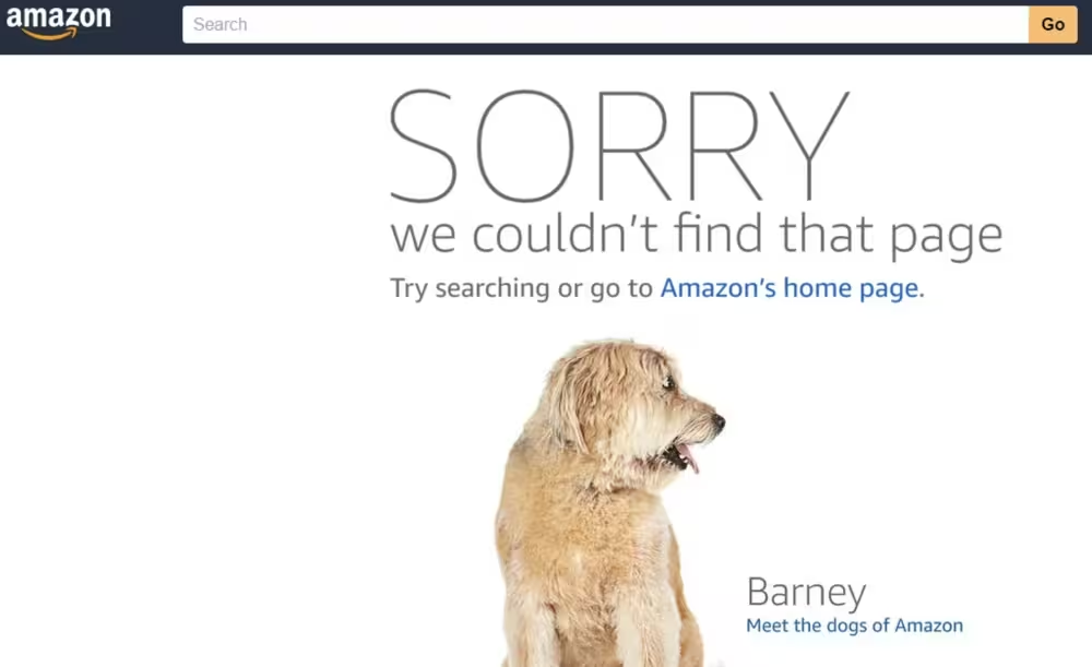
Neither “404 Not Found” nor “503 Service Unavailable” means much to an everyday user. Explain what went wrong with traditional signals like bold or red text.
Instead of error codes, use plain language and offer a solution: “Sorry, we couldn’t find that page. Try checking the link or go back to the homepage.”
10- Help and documentation
Help and documentation content should be easy to find and focused on whatever task the user is working on. Give them a concise list of steps to follow and make sure that basic tasks like setting up a profile shouldn’t require reading help documents.
4 steps of the UX design process
A structured approach to the UX design process makes building a great user experience much easier. Not every structure follows the same steps, but all great structures have a built-in consideration for five core areas.
Below, you’ll find the iterative stages and tips on how to leverage them.
Step 1 – User research
Research gives design something real to respond to. After all, you can’t design for users you haven’t listened to yet.
To get into your users’ heads, you’ll rely on different research methods, all of which focus on different aspects of user intent. These include user surveys, interviews, and observing how people actually use products.
Additionally, you need to build user personas and empathy maps to understand your target segment’s pain points and motivations.
UX research methods
For projects that are already live, your research will look different. With users already interacting with your product, it’s easier to find where to search for information to build, understand, and refine your user experience.
At UserGuiding, we emphasize contextual feedback because it helps zero in on what users say they want and how they take action in the product to achieve their goals.
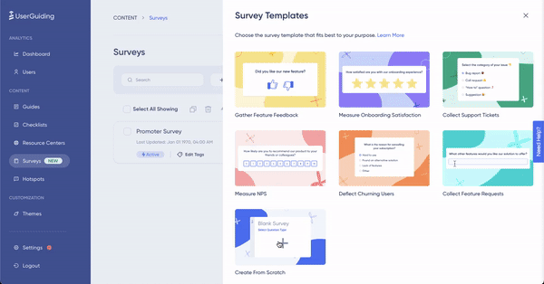
UserGuiding’s in-app surveys meet users where they are without all the noise. If, for example, you trigger a survey when a user is interacting with a new feature for the first time, you can get insights into how they feel about that feature.
Similarly, NPS surveys help you track satisfaction and triggering them within the app increases engagement.
👉 Ready to take a deep dive into user research? Check out our article on the subject.
Step 2 – Solution ideation
Once you have enough information, it’s time to brainstorm. What do you make of the data? This step usually seems the easiest but many UX designers draw a blank when they are asked to find solutions based on the data they helped collect.
Design workshops, mind mapping, SWOT analysis, and other design thinking exercises help your team not settle on the first solution that comes to mind, and approach the UX challenge from multiple angles.
Step 3 – Prototype and testing
Rome wasn’t built in a day, and neither is good UX. You don’t start with marble; you start with scaffolding. Rough wireframes and early mockups give your ideas shape, but it’s real users who reveal the cracks.
Put prototypes in front of them early, watch where they hesitate, and let usability testing expose what doesn’t hold up. Then you reinforce, adjust, and rebuild. As the design matures, A/B testing helps you compare approaches and choose what actually stands the test of use, not what simply looks finished.
Testing tools and methods
Here are other popular testing methods you can try to make sure your design is customer-centric:
- Moderated and unmoderated usability testing: In moderated usability testing, a person guides the participant through the test and answers their questions, while unmoderated testing depends on the participant figuring out tasks and answering questions on their own.
- Task completion analysis: This method breaks down how users complete a specific task in your product, including what triggers them to start, the actions they take, and how they know the task is complete.
- Think-aloud protocols: These protocols invite participants to verbalize (or think aloud) what they think while they’re using your product and move through the UX.
Step 4 – Iteration and revision
UX is never “done.” You start with a design, use feedback to see what’s working or not, and refine as customer needs change. Your analytics dashboard helps you track key metrics like feature adoption, engagement, and retention to measure the effectiveness of your UX.
In other words, you treat UX as a continuous improvement cycle where every release informs the next decision, so the experience keeps getting easier for users.
How to apply UX basics in your product
Building a great UX goes hand in hand with clear in-app guidance. Your user research, design workshops, and feedback loops lead to the moment when a user opens your website or app to log in to their accounts or sign up.
That’s where in-app guidance immediately starts supporting your UX design. Product tours for the first time users, tooltips for feature discovery, and onboarding checklists for activation milestones help you prioritize progress by impact.
Two key points to consider:
- Using interactive elements in your in-app guidance steps pays off.
- You don’t have to rely on coding to create these elements.
Tools like UserGuiding enable non-technical teams to create guidance without developer resources. Our content library ranges from micro surveys to product tours to announcement modals.

👉 Ready to add interactive guidance elements and improve your product’s user experience? Try UserGuiding for free for 14 days and discover how easy it is to drive users to adoption.
In short…
Myths, design principles, building a product that users associate with the problem it solves… UX comes down to understanding people and what they’re willing to do for value.
And whether you’re a PM, developer, or marketer, understanding UX basics makes you more effective at your job.
The good news? You don’t need to start as a UX expert to create solid experiences. UserGuiding can help you apply UX principles, all without writing code.
Frequently Asked Questions
What are the 5 elements of user experience?
The five elements of user experience come from Jesse James Garrett’s framework and describe how UX is built from abstract strategy to concrete interface. These elements are strategy, scope, structure, skeleton, and surface. And they work together, not in isolation, to show how decisions at every level shape the user’s overall experience.
- Strategy defines user needs and business goals.
- Scope translates those needs into features and content.
- Structure organizes information and defines user flows.
- Skeleton arranges interface elements, navigation, and layout.
- Surface focuses on visual design and sensory details.
What is the difference between UI and UX?
UX (user experience) is the entire system of interactions a user has with a product or service, while UI (user interface) is the visual and interactive layer users directly engage with.
UX focuses on questions like:
- Is this product useful?
- Is it intuitive and efficient?
- Does it support users’ goals across their entire journey?
UI focuses on:
- Layout, colors, typography, and icons
- Buttons, inputs, and visual feedback
- How the interface looks and feels moment to moment
In short, UI is part of UX. A product can have a visually appealing UI and still deliver poor UX if it’s confusing, slow, or misaligned with user needs.
How do I start learning UX design?
The best way to start learning UX design is to focus on users before tools. UX is about understanding problems, not mastering software.
Start with these steps:
- Learn the fundamentals: usability principles, information architecture, and user-centered design.
- Study real products: analyze apps or websites and identify what works, what doesn’t, and why.
- Practice user research: conduct interviews, surveys, or usability tests, even informally.
- Create rough artifacts: wireframes, user flows, and simple prototypes are enough to start.
- Iterate based on feedback: observe real users and refine your designs accordingly.
UX design is learned through continuous iteration, so design something that improves with every round of feedback.

.png)


