80% of users have deleted an app before because they didn't know how to use it.
Are you surprised to hear this?
I don’t think you should be because there are a lot of alternatives to an app in the world of mobile apps.
Why would users spend their time trying to figure out how they can use an app?
They can easily find another app that provides an onboarding experience that will help them easily learn how to use the app.
I know that you are here because you know that this is common sense, and you would do the same thing if you couldn’t figure out how to use a product and feel at home when using a product.
No worries, I got your back!
In this article, I will share some guidelines and best practices with examples to help you not let your users down.
Let me start by explaining what mobile onboarding is so that we can be on the same page when talking about what you should do in your onboarding process.
Don't have the time? Watch our quick video that covers it all ⬇️
What is Mobile Onboarding?
Mobile onboarding, or more precisely, mobile app onboarding is the process of helping your users learn what your product is (what they can do with your product), how they can start using it, and how they can easily find value in it. It is a process that begins with the first interaction of users with your product, and it goes on continuously.

People often mistake user onboarding with a product tour. They may think that user onboarding is all about helping users learn how to use their product.
This is where you distinguish yourself from competitors who may have fallen into making this mistake.
Here I am telling you how to refrain from this mistake:
You need to know that the onboarding process begins the moment users learn about your product. From the where and how they learn about your product to the moment they download and register to it, the onboarding process already begins.
Your responsibility is to attract users to your app in the best way and make it easier for them to download, sign-up, and make use of and find value in your app.
A good onboarding helps users through each step of their journey with a product; a product tour is only a step of it.
Why is onboarding important for mobile apps?
I believe the fact that 80% of users have deleted an app before because they didn't know how to use it is a striking statistic to give you an idea about why onboarding is essential for mobile apps.
As a matter of fact, it is not only important for mobile apps, but it is important for many products that are out there.
The success of your product is calculated through the extent of the value that users can find in it.
Now, when they struggle to learn what value they can find from your product and how to find it, they will most probably delete your app as they do many others.

Research suggests that 90% of users feel that the companies they buy from could do better in their onboarding processes.
90% is a huge number, and it shows how many people there are out there for whom you can shine among your competitors.
Now, when they struggle to learn what value they can find from your product and how they can find it, they will most probably delete your app as they do many others.
So, please take this opportunity to make a difference, and guide users to their “Aha!” moments, starting from their first interaction with your product.
How is mobile onboarding different than website onboarding?
Although it is the same for the most part, there is a significant difference between them.
Most of the time, people visiting a website for an app have a different purpose than people downloading an app.
If someone goes to a website for a product, it is mainly because they like to discover and learn more about it.
So, website onboarding is more about marketing to attract users to use your product. It first aims to convince users that they can find value in the product.
For this reason, website onboarding should be more focused on helping users understand what value they can find in your product and helping them get past the initial steps to downloading or signing up.
People who downloaded a mobile app, on the other hand, did so because they most probably already know about the app and what kind of value they can find in it.
In this regard, you can focus more on retaining those customers by showing them that they’ve made the right decision and assisting them in finding the value they are looking for.
Since people who downloaded your mobile app already have an expectation, and it is easier to engage with users through mobile devices, the ability to increase product adoption with a well-prepared mobile onboarding is a great advantage.
Mobile app onboarding UX/UI patterns
Onboarding UX/UI patterns are tooltips, product tours, and everything that directs users in user onboarding.
It starts in the sign-up screen when welcoming users, and the further users go on in their journey, UX/UI patterns help give an idea and guidance through app features.
Let’s take a look at them one by one.
1- Sign-up Screen
As I said earlier, well, not only in just this article but also in many other articles I have written, onboarding starts way before a product tour.
This example from Wwater app is a perfect one not just because of its design but also because of the way it simply explains what value users can find from using the app.

You can see that on the welcome screen, they simply say, “We deliver water at any point of the Earth in 30 minutes.”
This is it! This is the value users can find using the app.
And, you can see the choice of color blue perfectly reflects the purpose of a water delivery app.
2- Product tours (tooltips)
I deliberately wanted to explain tooltips within product tours because it is one of their best use cases, and I thought it would give you a better idea of where and how you can use them.
However, tooltips can be used elsewhere as well.
Let’s take a look at a product tour by Zakeke created with UserGuiding:

Tooltips help you highlight the necessary information, which in return helps users understand your product better. This gives you the chance to provide much better UX and increase product adoption.
3- Checklists
Checklists are crucial in helping users where they are in their journey.
I have said it a million times, and I am still not tired of saying that your users’ time is the most valuable thing you can get from them.
With the help of checklists, you can help your users better organize their journey and time.
ClickUp did it, and they did it so well!

4- Hotspots
Hotspots are also essential elements for onboarding.
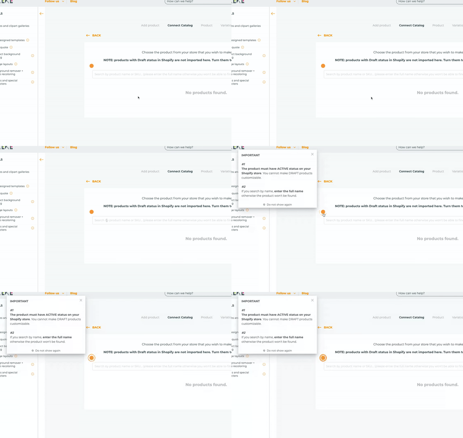
Let me show you a good example of hotspots from Zakeke:

It is good to use hotspots this way because instead of interrupting users with constant pop-ups, hotspots highlight the critical information that people often may need.
What metrics should you track for mobile app onboarding

#1 Retention Rate
Retention rate is one of the strongest indicators of how you are doing with your onboarding process.
It basically shows what percentage of users you are retaining.
So, it can be said that the higher your retention rate, the better your onboarding experience.
Here is how you can calculate the retention rate:
[(CE – CN) / CS] x 100
CE – the number of customers at the end of the period measured
CN – the number of new customers during the period
CS – the number of customers when the period started
#2 Churn Rate
Churn rate is simply the rate at which users stop using your product or services.
In comparison to a high retention rate, which indicates success, a high churn rate is an indicator of failure.
A high churn rate tells you that you are maybe doing something wrong during onboarding.
You calculate your churn rate by dividing the number of customers who leave within a given period by the number of customers who join at the start of the period.
#3 Percentage of Daily/Monthly Active Users (DAU/MAU)
This is also an important metric as it shows you success in a time frame.
Looking at this metric, you will have a better understanding of the success of your onboarding. The better the onboarding, the more daily/monthly active users you will have.
If people are not giving up using your app, then the onboarding process is effective.
Calculation: Total number of users / daily/monthly active users.
#4 Stickiness
This metric shows how often users come back to your app.
The closer the number of DAU to the number of MAU, the more you can tell that you run a successful onboarding process.
It shows that users have learned how to find value in your app, and they can’t get enough of it.
You can calculate Stickiness by dividing the number of Daily Active Users (DAU) to Monthly Active Users (MAU)
#5 Feedback
I know this is just common knowledge, however, I would like to remind you that feedback is a direct way of learning whether your mobile app onboarding is successful or not.
Asking for regular feedback during the onboarding process will give you a better idea about what you can do better.
The crucial point here is that you shouldn’t ask for too much information, and you should make users sure that you are asking for feedback to improve their experience.
Mobile app onboarding best practices and examples
Let’s take a look at some best mobile app onboarding practices and examples.
Interactive Guides
Users love interactive guides for a reason; it makes the onboarding process much easier and better to follow.
Here is an example from Duolingo:

Duolingo's interactive guide is good in so many ways such as adapting to the level of users, briefly informing them about the guide, how long it takes etc,.
It helps users better learn how they can make use of the app.
Push Notifications
Push notifications are perfect for encouraging your users to continue the onboarding process.
With the help of well-prepared push notifications, you can remind users about your app and invite them to complete the steps of onboarding, learning about the features of your app, or making use of some good offers.
Here is an example:

Personalization
58% of smartphone users feel more favorable toward companies with mobile sites or apps that remember who they are.
I will use an earlier example from ClickUp that I used for checklists because it is excellent in many ways.

You can see that ClickUp calls users by their name and I believe that it is a great way to engage with your users.
It is inviting the user to do something “together” by saying “Let’s make the world more productive”.
As I said earlier, by using this checklist with time indicators and personalizing it, ClickUp encourages users to take these steps.
Time-to-value
You need to know that you have a little amount of time to catch users’ attention during their initial interaction with your app.
You should be able to be quick to show them the value of your product to retain them.
As an example of time-to-value, you can take a look at Whatsapp, a great app to provide value to users instantly.


You can see that it only takes a few steps to get started with messaging via Whatsapp.
They do not ask for too much information and effort.
Users find value after completing the first couple of steps.
Using CTAs
If your users need to go through a chain of actions, you should guide them with the help of CTAs.
You should briefly inform users about the each step and encourage them taking action with the help of CTAs.
It is always better to give users the option to skip each step because not everyone uses your app for the first time. For users who have used your app before, taking each step can be discouraging.

You can see it is engaging and it briefly explains what users should expect from each step.
Conclusion
In this article, I wanted to help you understand what mobile app onboarding is and how you can distinguish yourself from your competitors with a successful onboarding process.
The success of your product is highly related to the success of the onboarding experience that you provide to your users. I believe you will take every necessary step and do your best to improve your onboarding process.
When you do so, it will not only be your users who benefit from a better onboarding experience but it will also be you who make the most out of it.
So let's get into it!
Frequently Asked Questions
Which apps have the best onboarding?
My top three picks for the best onboarding are LinkedIn, Whatsapp, and Instagram because they are so simple to follow and so good to help users understand how they can benefit from their apps.
Why do we need onboarding screens?
We need onboarding screens because we want to help users get through the initial steps quicker and find value from our apps in the best way possible.


.svg)
.svg)
.svg)
.svg)
.svg)


.svg)
.svg)


.png)


