Struggling to find answers shouldn’t be part of anyone’s user journey.
In a world where 79% of users expect self-service support, the trend is clear: people want solutions at their fingertips, not long waits or support tickets. Empowering users with intuitive, self-help tools and self-paced onboarding isn’t just a nice-to-have —it’s the key to boosting satisfaction and streamlining support.
Ready to meet these expectations and elevate your user experience?
Let’s take you to the article!
TL;DR
- An interactive user manual is a tutorial that provides users with step-by-step instructions on how to use a product. It is also called an interactive guide.
- You can use interactive manuals to:
- Educate and onboard new users.
- Improve user engagement and satisfaction.
- Reduce your support team’s workload.
- Ensure easy updates and maintenance of your informational materials.
- There are 5 types of interactive guides:
- Walkthrough guides.
- Chatbot-assisted guides.
- Resource center & knowledge base guides.
- Embedded tooltips and hotspots.
- Pop-up & slideout modal guides.
- Best practices of interactive user guides include:
- Segmenting users based on their needs and technical expertise level.
- Integrating the guides into the product experience and making them interactive.
- Keeping the guides simple, precise, and to the point.
- Collecting feedback from users and updating the guides regularly.
- You can create all these types of guides with UserGuiding in just a few minutes –no coding or long tutorials are required!
What is an Interactive User Manual?
An interactive manual —also called an interactive guide— is a tutorial that provides users with step-by-step instructions on how to use a product. As the name suggests, an interactive manual consists of interactive elements and in-app modules such as clickable buttons, hover-over-triggered tooltips, videos, gifs, and fillable text boxes.
They enhance the learning experience for the new user and ensure a smooth onboarding.
Here’s an example interactive user guide:
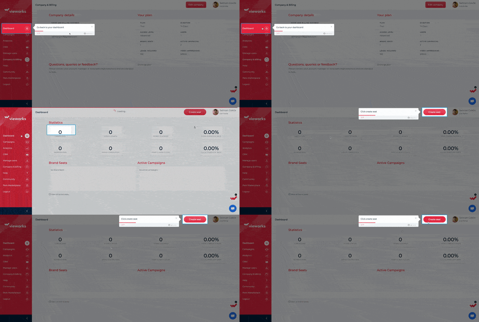
Viework’s in-app tutorial on adding a seat is an excellent example of an interactive guide.
Because…
✅ It walks the user through each step and doesn’t skip any important action.
✅ It prompts the user to fill in the input boxes during the guide, ensuring that by the time the guide ends, the action is fully completed. This eliminates the need for the user to revisit each step later to fill in the required information.
Interactive manuals have 2 key traits:
- They’re interactive —fun, dynamic, and engaging.
- They’re instructive —giving clear, helpful guidance.
👆🏻 This example from Vieworks nails both traits perfectly!
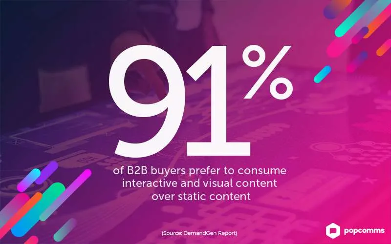
💡 Statistics show that 93% of marketers believe interactive content is a more effective way to educate users compared to static material. And it’s not just a belief —91% of B2B customers agree, stating they prefer interactive and visual content over static alternatives.
Benefits of Interactive User Manuals
The primary benefit of an interactive guide is, of course, user education.
But that’s just the beginning! Interactive guides offer plenty of other advantages, such as:
Improved user engagement and user satisfaction
The interactive elements such as videos, gifs, and tooltips in your guides hold users’ attention and make learning enjoyable. These features actively involve users in the process and foster a deeper connection with your product.
These tutorials provide a fantastic opportunity to deliver real-time personalization for your users.
By tailoring the guide’s content, language, and level of detail to match user preferences, you can significantly boost their satisfaction and overall experience.
👉🏻 Remember, the more goal-oriented and interactive your guides are, the higher the engagement you’ll achieve with your users. And the higher the user engagement is, the higher the revenue you generate.
💡 Data speaks: Engaged customers spend 23% more over their lifetime than the average customer, and their engagement increases cross-sell revenue by 22% and up-sell revenue by 38%.
Reduced support requests and time to value
Think about it.
When your users don’t know how to complete an action in your product, they basically have 2 choices:
- Search for a tutorial or piece of information to figure it out.
- Leave the product entirely.
Naturally, you want them to choose to learn, not leave.
But at the same time, you don’t want every user reaching out to your support team for itty-bitty issues, like how to add another team member.
That’s where interactive, in-app tutorials come in!
These guides simplify the onboarding process, making it easy for users to understand and complete tasks. By doing so, they reduce the need for support teams, which means fewer support tickets and more efficient operations.
Plus, interactive guides help users reach their goals faster, shorten the learning curve, and let them experience the value of your product much sooner.
Easy updates and maintenance
Due to their short and structured nature, interactive guides are incredibly easy to update.
If an update or new feature is released, you can improve and optimize your guides accordingly simply by adding new steps, tooltips, or hotspots.
This ensures your users always have access to the latest, most relevant information without the frustration of outdated documentation or processes.
5 Types of Interactive User Manuals
There are several ways to transform your static, boring guides into interactive, engaging experiences.
You can add videos and GIFs, turn them into in-app walkthroughs, or use tooltips, hotspots, and slideout modals. Another option is to make the instructions feel more conversational with the help of an AI chatbot.
Let’s explore the different types of interactive guides, and then you can decide which one works best for your product and user base.
1. Walkthrough Guides
Walkthrough guides are step-by-step, in-app tutorials guiding users through specific tasks or features. Their purpose is to onboard new users or demonstrate how to use advanced features.
They can be more generic tours that welcome the user to the platform and introduce them to the key features and buttons on the UI, or they can be more goal-oriented and help the users complete key actions that will take them to their “AHA!” moment.
Here are some examples:
Remote’s Walkthrough Guide
Remote is a comprehensive HR platform that provides services such as international hiring, payroll, compliance, and employee benefits all in one platform.
Here’s one of their interactive guides that walks you through the process of adding a new employee 👇🏻
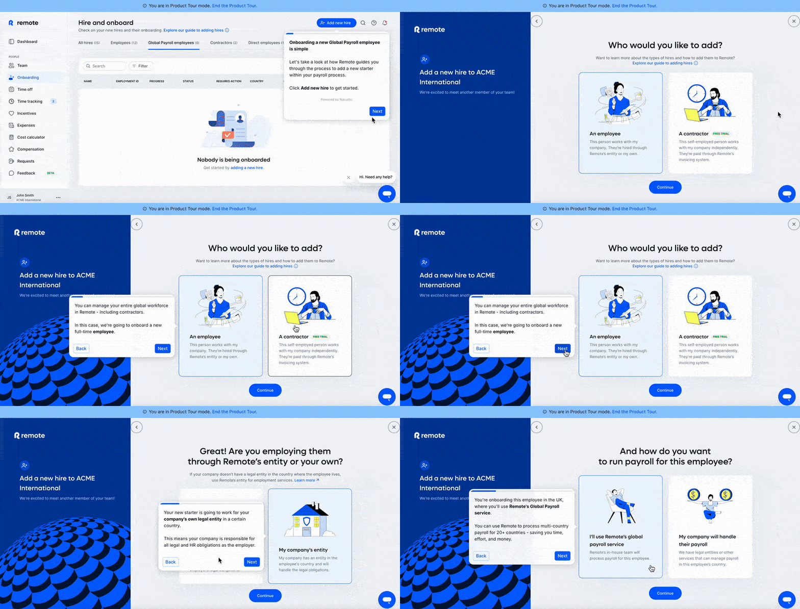
Remote displays this guide when the user is in "product tour" mode, which means it's not the actual user dashboard or settings page but rather a demo page.
However, the layout is the same, and with some demo data in place, it becomes easier for users to visualize how the product functions and appears when populated with real data.
Although this preliminary mock data may not be directly relevant to this specific guide, it is still helpful for other guides where seeing real data in context can improve understanding.
This is a good example because:
✅ The tone in the tooltips is friendly, engaging, and conversational.
✅ Important parts and details are bolded in the microcopy to catch the user’s attention.
✅ Each button and text box relevant to the action (employee adding) is explained.
✅ There’s a progress bar on the tooltips, and also each important step is shown and labeled on the left side of the page.
Loom’s Walkthrough Guide
As we said before, walkthrough guides can be more generic, which is not necessarily a bad thing.
If your product has an intuitive UI or if your users share similar needs and goals, a short and clear product tour covering just the basics will likely be enough. This keeps things easy to follow without overwhelming anyone.
Loom’s guide is a great example of a short, clear, and effective guide:
Loom has a very user-friendly interface with minimal buttons and tools, so it doesn’t need extensive tutorials to explain how to trim or share a video.
Still, Loom doesn’t leave anything to chance.
In just 4 simple steps and fewer than 50 words, it quickly guides new users, making it easy for them to understand where everything is and what they can do.
This is a good example because:
✅ It’s short.
✅ It uses plain language to explain symbols, icons, and buttons on the UI.
✅ It reminds the capabilities of the tool without overwhelming the user.
2. Chatbot-Assisted Manuals
You can jump on the AI train and use chatbots to provide your users with contextual support and step-by-step guidance.
These smart assistants deliver quick, dynamic answers, ensuring users get the help they need right when they need it through natural language understanding (NLU).
By integrating your chatbot with FAQs and your knowledge base, you can let the AI find and share relevant information.
Let’s see an example 👇🏻
UserGuiding’s Chatbot Dylan
UserGuiding is a comprehensive product adoption and user onboarding platform that enables you to create interactive and engaging product experiences for your users.
Beyond providing detailed instructions, step-by-step guides, and tooltips, UserGuiding also offers assistance through its AI chatbot, Dylan.
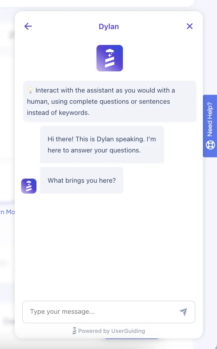
Dylan is an AI-driven chatbot designed to assist users with product adoption, user engagement, and onboarding. It understands your questions related to these areas and responds with tailored answers.
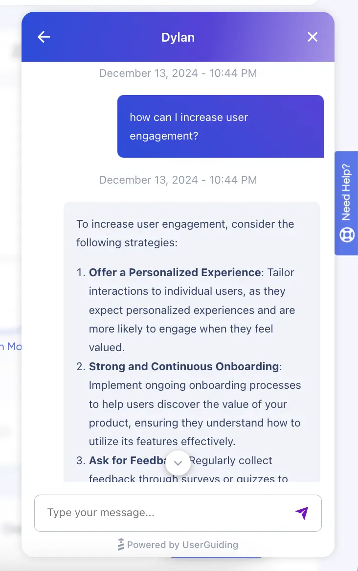
Depending on the question, Dylan provides either a list of actionable strategies like this:
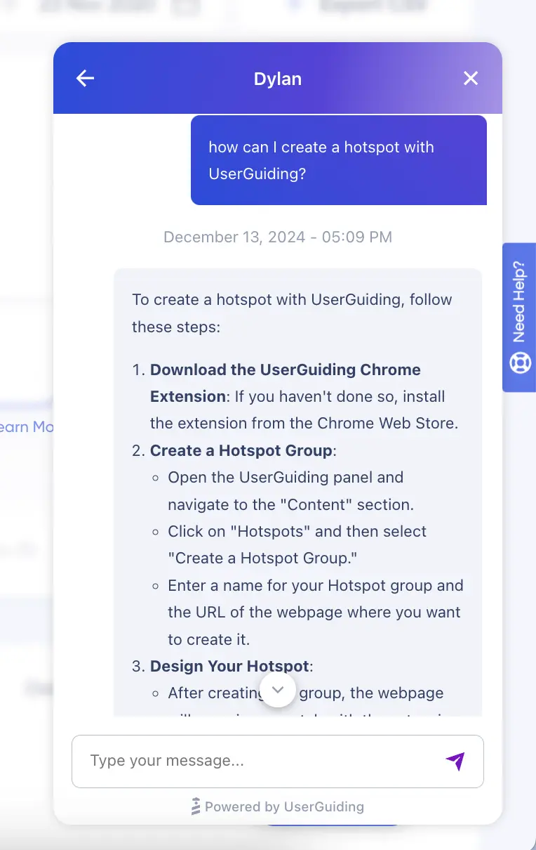
Or, step-by-step instructions like this:
This is a good example because:
✅ It doesn’t limit the user to pre-written questions and prompts but enables them to engage in a conversation.
✅ It provides detailed explanations that may not fit into tooltips or walkthrough guides.
✅ It answers the user’s questions in a structured, easy-to-read format.
✅ It directs the user to relevant help articles for further information.
Do you like what you see?
🚀 Start your free trial and create your own AI-powered chatbot in just minutes with UserGuiding —no coding or hours of learning required!
3. Resource Center & Knowledge Base Guides
A knowledge base is an online hub where users can access help articles, how-to guides, and (video) tutorials to find important information. It provides comprehensive, self-service support, allowing users to resolve issues and learn at their own pace.
On the other hand, a resource center is a more compact version of a knowledge base.
While it serves a similar function, it consolidates guides, checklists, and knowledge base articles in one place. Though smaller in scale, it offers quick access to essential resources, helping users find relevant information more easily within your product.
GroveHR’s Resource Center Guides
GroveHR is a cloud-based HR management platform that enables you to manage various HR functions, including employee recruitment, onboarding, performance reviews, time-off management, and attendance tracking.
They utilize a resource center to bring their articles together and make them available right where the user needs them, within the platform itself:
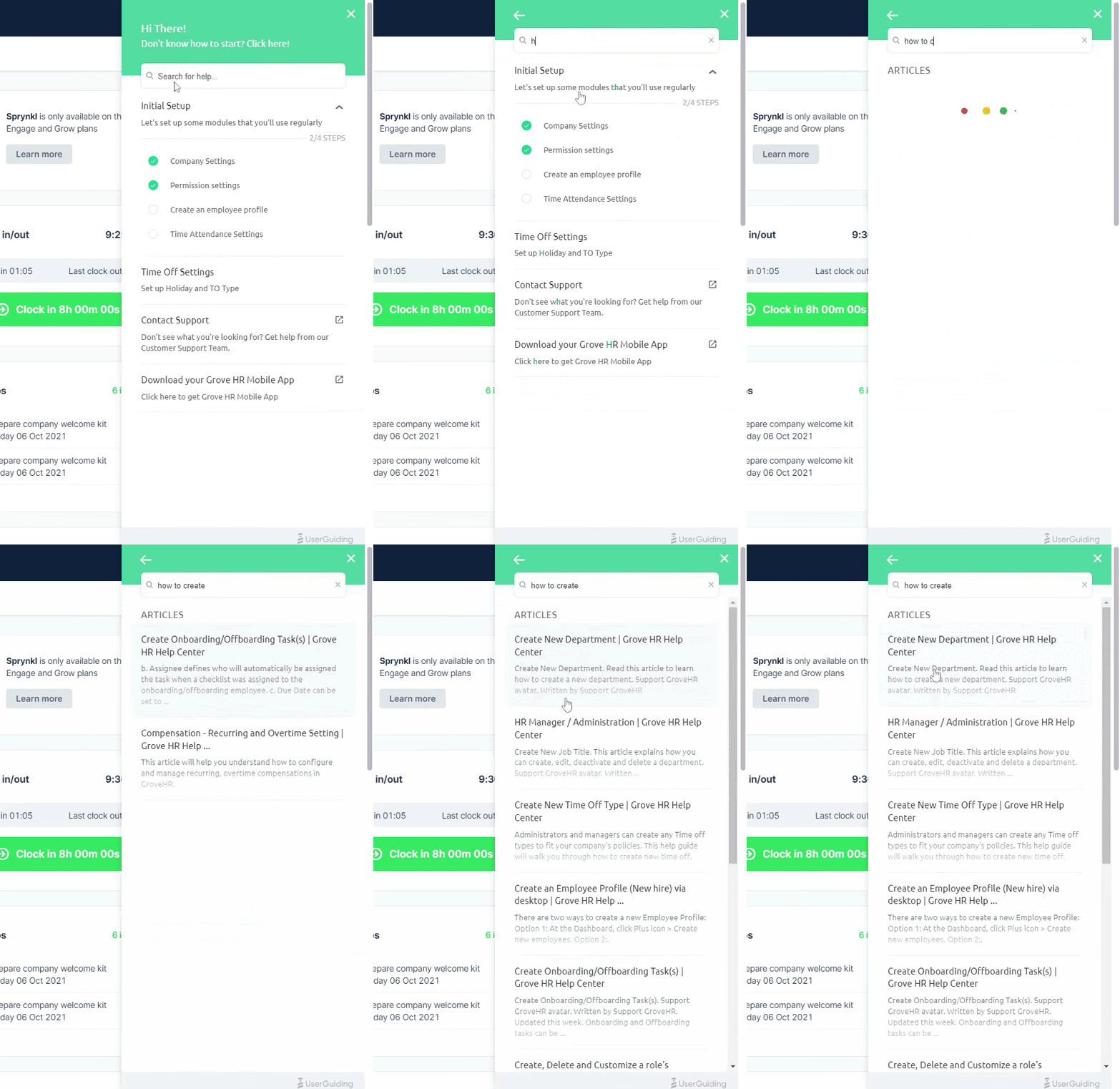
As you can see, the information is organized into a clear, step-by-step guide and is supported with helpful gifs and visuals from the UI, showing each step and providing context.
This approach ensures that users can stay engaged within the platform without needing to leave to search for answers elsewhere.
Grove HR keeps the user experience seamless by offering all interactive guides and onboarding checklists within the resource center, as well.
If a user forgets how to complete a task they’ve previously worked through in a guide, they can easily return to the tutorial and go through it again.
Like this:
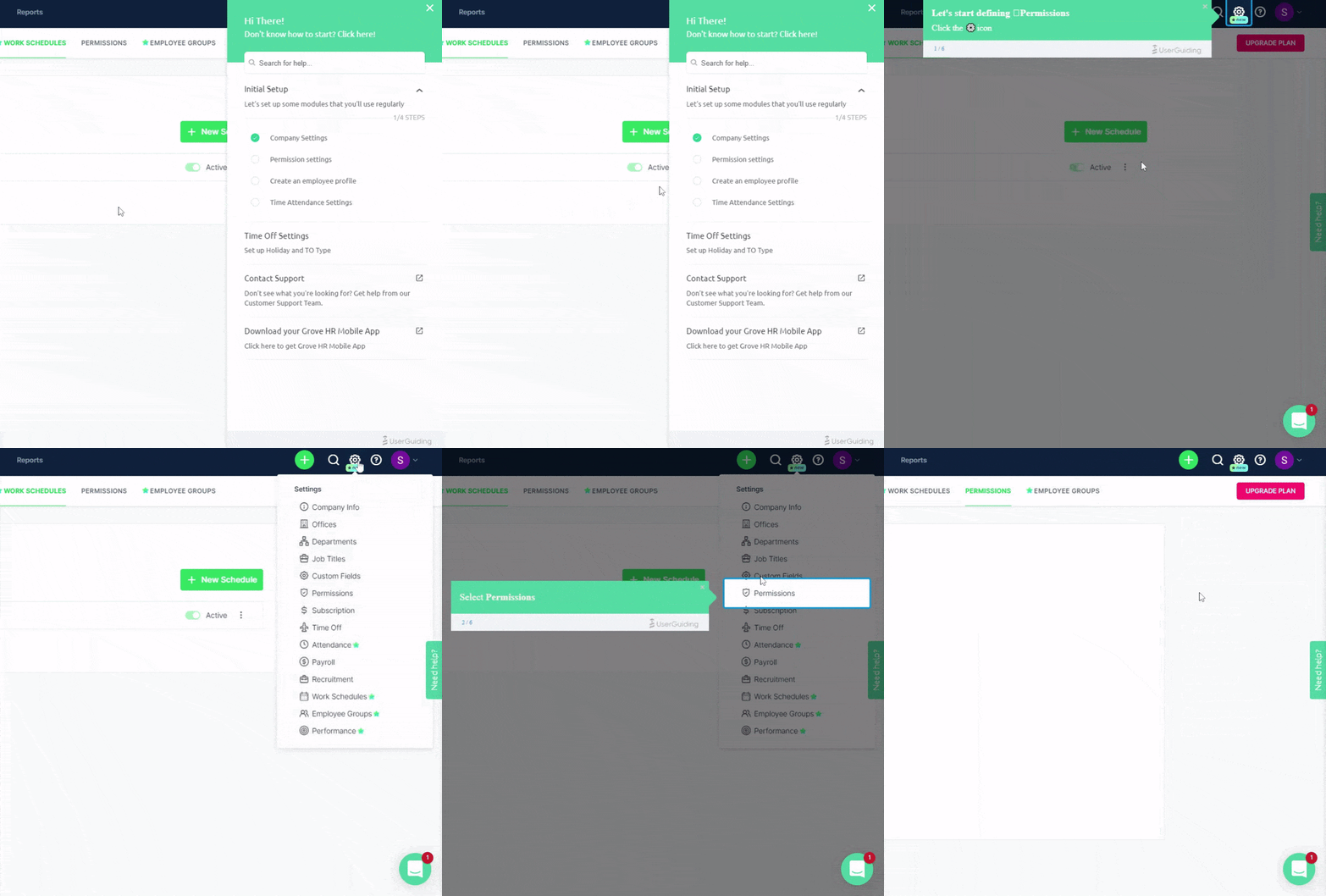
This is a good example because:
✅ It doesn’t require the user to leave the platform in search of answers, minimizing distractions and preventing users from losing interest.
✅ It offers the option to repeat product tours and interactive guides so users can revisit steps as needed and reinforce their understanding.
✅ It makes users feel safe and supported at all times, knowing they can always access helpful resources directly within the platform.
⚡ UserGuiding can help you with resource centers, knowledge bases, onboarding checklists, and interactive guides –a.k.a. whatever you see here on GroveHR’s screens!
👉🏻 Try UserGuiding out and see for yourself 👈🏻
Canva’s Knowledge Base Guide
Canva, the graphic design tool we all love and use, successfully combines two powerful methods of user education: static knowledge base articles and AI-powered, real-time personalized tutorials.
This blend creates a knowledge base that caters to a wide range of users, no matter their preferences or learning styles. For those who prefer reading, Canva offers well-structured, detailed articles that explain everything from basic design concepts to advanced features.
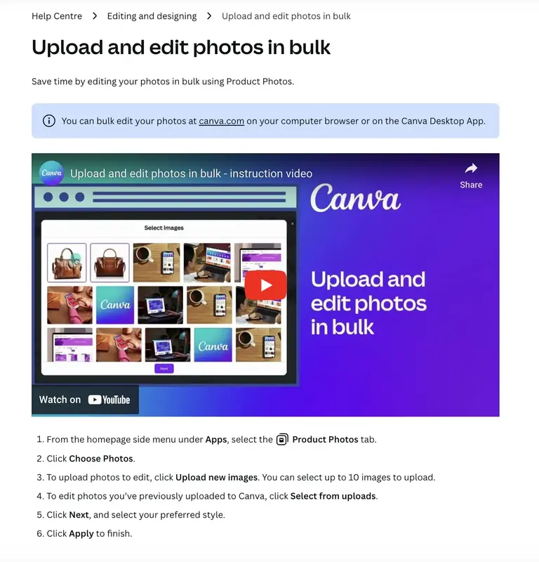
The guides consist of short and clear steps, as well as supportive video instructions.
And when it comes to the AI-driven tutorials…
Canva creates them based on your question.
And they are very short and to the point, like the static and pre-written ones.
This is a good example because:
✅ Even the "static" knowledge base articles are interactive in a way, thanks to the use of visual aids and videos that enhance the learning experience and make it more engaging for users.
✅ The AI-generated manuals offer real-time support, eliminating the need for users to sift through the knowledge base to find the specific content they need.
4. Embedded Tooltips and Hotspots
Tooltips and hotspots are both UI modals that provide users with contextual tips and guidance, but they differ in size and the level of detail they offer.
Tooltips are typically smaller, providing quick, concise information when users hover over or click a specific element. They’re great for offering brief, to-the-point explanations.
Like this:
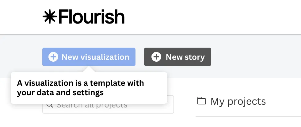
On the other hand, hotspots tend to be larger and more interactive, often including additional visuals like videos, gifs, or images. Hotspots can give users a deeper dive into various features, offering a more comprehensive explanation in a single modal.
They also feature eye-catching, pulsating triggers that draw the user’s attention.
Like this:
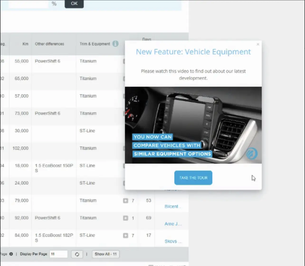
Or this:
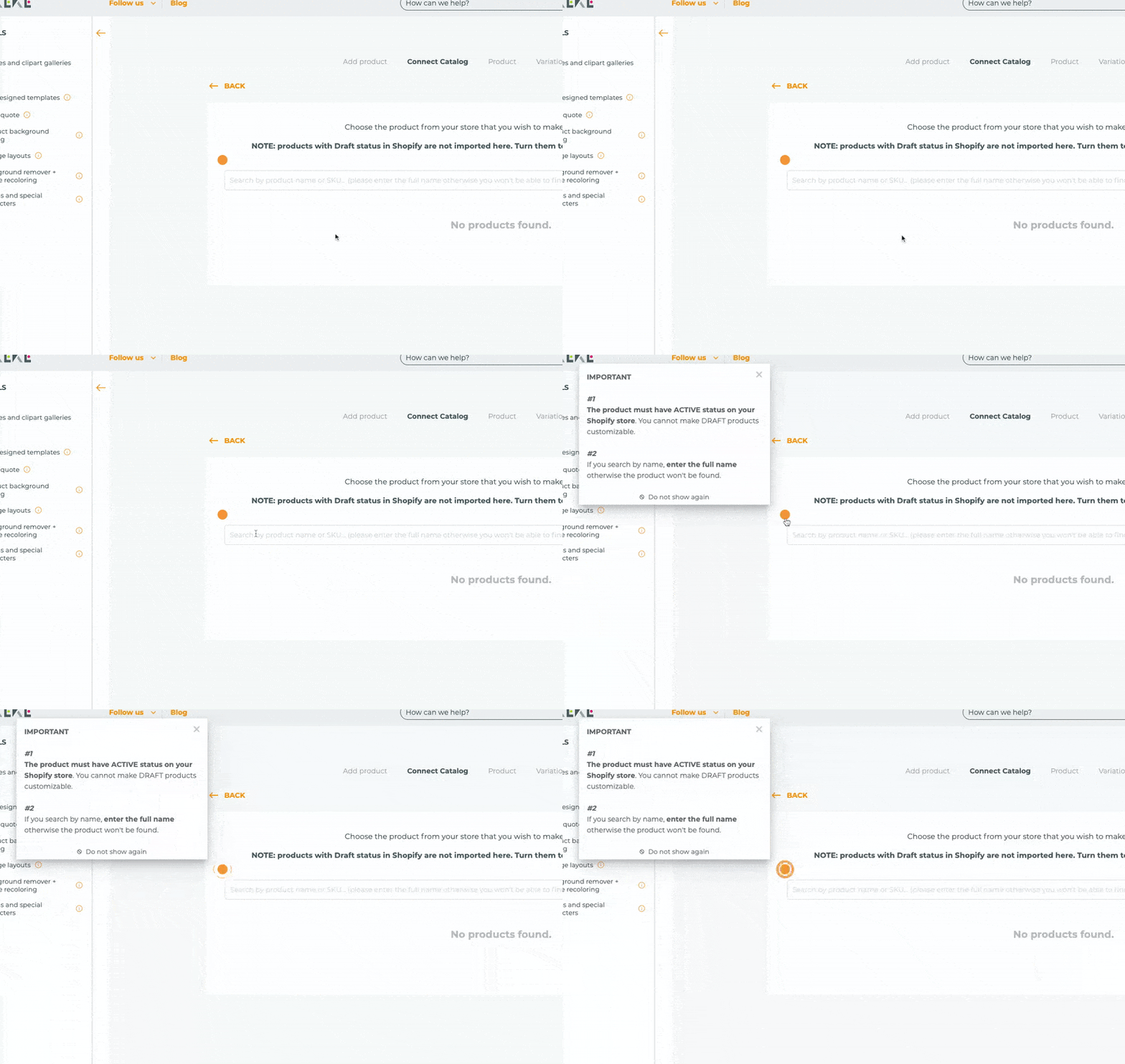
Both tooltips and hotspots help maintain a clean and organized interface by keeping information hidden until the user actively seeks it. This ensures the interface remains uncluttered while still offering valuable, context-driven support.
Let’s see some examples to understand how you can use them as user manuals 🔍
Todoist’s Tooltips
Todoist is a popular task management and to-do list application that allows you to create tasks, set deadlines, prioritize them, and categorize them with labels and filters.
There’s no structured onboarding checklist or interactive guide walking you through the product UI or showing you how to use each feature. However, for almost every feature and UI element, such as filters and search bar, there are detailed tooltips like this:
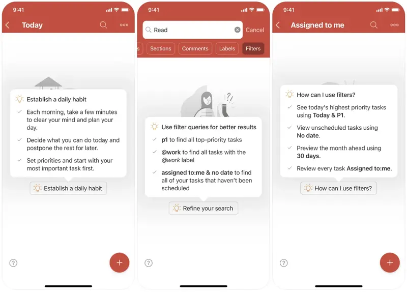
As you can see, Todoist's tooltips go beyond simple explanations of buttons; they also provide insights on how to use features like a pro.
For example, they include shortcut commands and offer detailed usage tips that help users maximize their productivity.
These tooltips not only guide users through functionality but also serve as subtle value propositions as well, reminding them of the full capabilities of the app.
This is a good example because:
✅ Its bullet list structure and bold usage make it easy to read.
✅ It educates the user without taking too much time.
✅ It informs users about the most useful commands and shortcuts, helping them reach pro-level usage of the product as quickly as possible.
Typeform’s Hotspots
Typeform uses hotspots to explain the important buttons and features on the UI.
And they look like this:
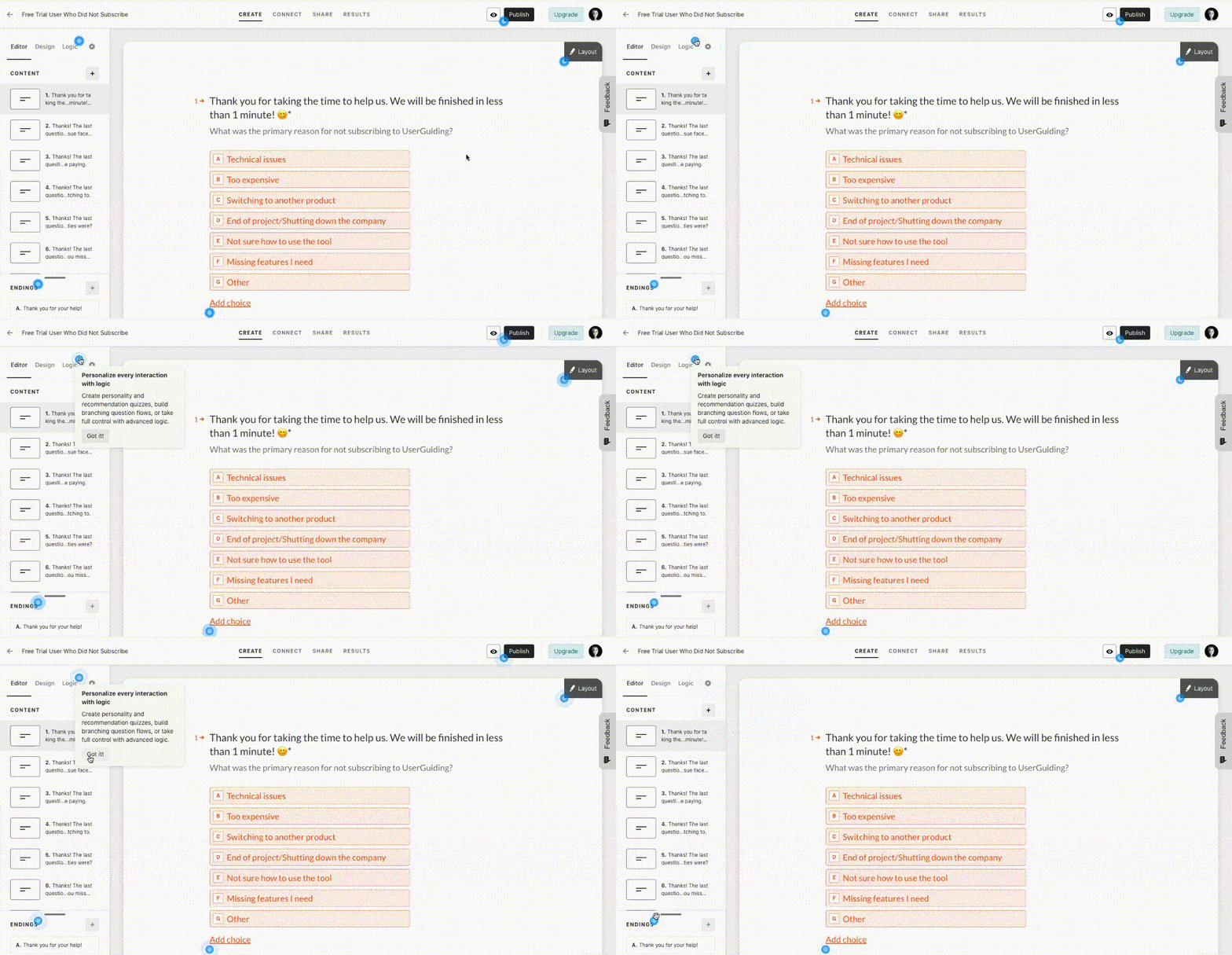
Each hotspot features a concise one-paragraph description, and a "Got it!" button to deactivate the hotspot. The titles give users a quick overview of the feature or button, while the descriptions offer more context on how to use it effectively, along with examples of potential use cases.
The hotspots are activated when users click on the pulsating blue dots, which are designed to attract attention without interrupting the user's flow.
Nevertheless, 5 shiny dots on the same screen might be kind of annoying for some users…
This is a good example because:
✅ It keeps the UI tidy and neat.
✅ It allows the user to learn whenever they feel ready to dive deeper.
✅ It doesn’t completely hide the information but subtly hints to the user that there’s something valuable they might want to know or learn.
5. Pop-up & Slideout Modal Manuals
Pop-up and slideout modals are semi-interactive tutorials that help users understand key features within a product without the need to guide them step-by-step through the interface.
These modals typically appear as welcome windows or side panels.
They are often structured as sequential steps/modals, with each modal focusing on a different feature or update. Due to their larger size, these modals are usually rich with visuals, which help reinforce the information and keep users engaged.
They often serve multiple purposes at once: introducing new features, explaining key value propositions, providing use cases, and offering instructional content.
Make’s Pop-up Manual
Make is a no-code automation platform that enables you to visually create workflows and automate complex tasks. These automation sequences that run across apps and services are called "scenarios".
Here’s how Make explains the process of creating a scenario for its users:
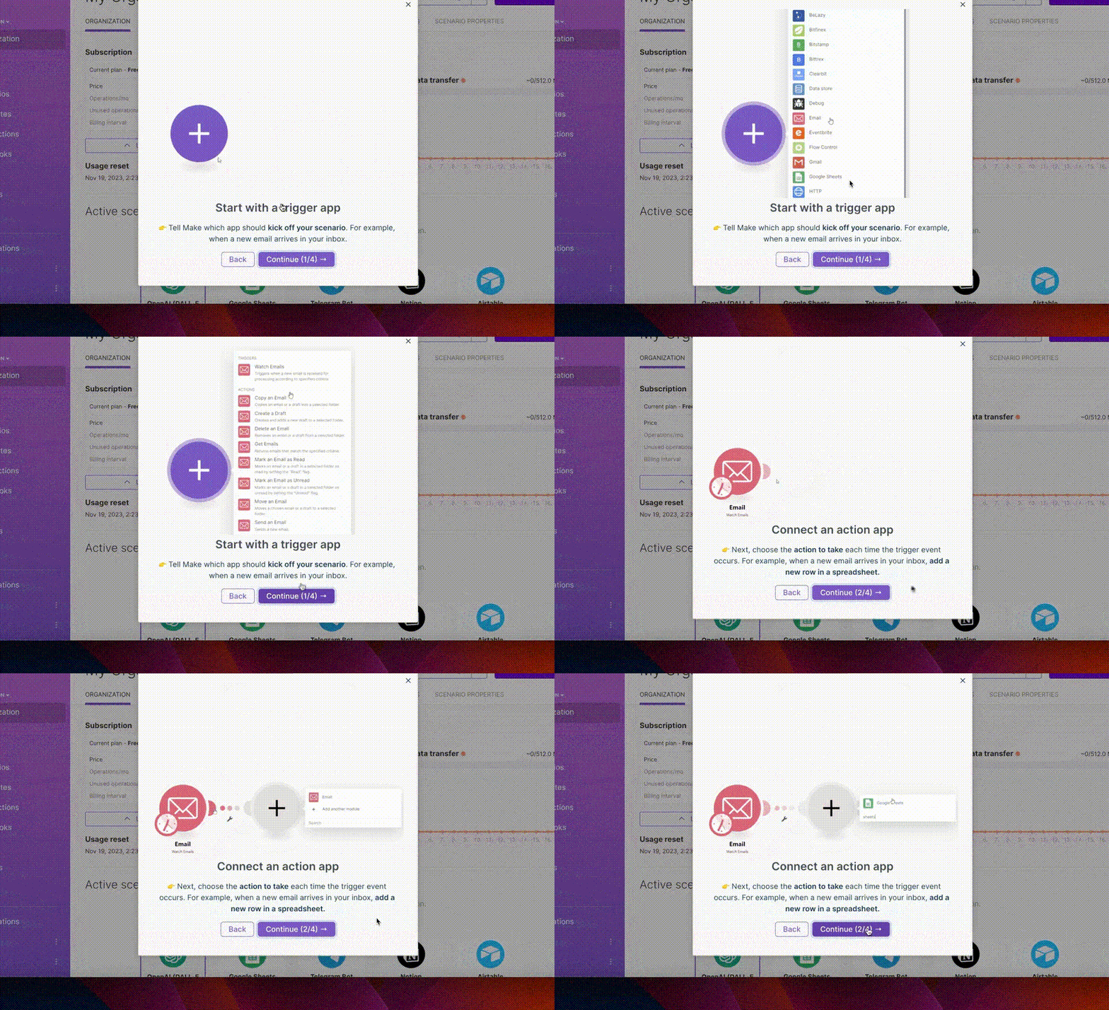
The pop-up manual consists of 4 steps, starting with an introductory welcome screen. Each step is clearly named and explained, with a helpful gif showing where to click and how to complete the action.
Additionally, the "Next" button displays the current step and the total number of steps remaining, guiding users through the process smoothly.
This is a good example because:
✅ The steps users need to complete are clearly outlined both in writing and with visual cues.
✅ Example use cases are provided to give context and help users understand how to apply the features in real-world scenarios.
✅ A progress bar is included to visually track the user's progress throughout the guide.
Monday.com’s Slideout Manual
Monday.com, one of the most popular project management and collaboration tools available in the market, combines slideout modals with pulsating dots to offer user education 👇🏻
As shown here, each slideout modal explains the function and benefits of a different button or feature in the UI. When the slideout modals change, a pulsating dot appears next to the relevant button/feature, helping to guide the user’s focus.
While there is no numerical progress bar, there is a visual one, and because there are only five concise and straightforward modals, the user isn’t overwhelmed or frustrated by the process.
This is a good example because:
✅ It contextualizes the information in the modal with a pulsating dot, guiding the user’s attention to the relevant feature.
✅ It combines various UI elements —such as slideout modals, animations, and pulsating dots— to engage the user and maintain their interest.
✅ The titles of the slideout modals address potential user pain points and provide value.
Pro tip: UserGuiding is an all-in-one no-code tool
We’ve been mentioning what you can do with UserGuiding here and there, but let’s get into detail and see all the capabilities once and for all, shall we?
🚀🚀 UserGuiding is an all-in-one product adoption that you can use to:
- Create interactive in-app flows (guides, product tours, onboarding checklists, hotspots, tooltips, etc.),
- Announce new features within your app through banners, slideout modals, and welcome screens or, outside of your app with a product updates page,
- Communicate with your users and gather feedback with NPS and in-app surveys,
- Personalize your users’ experience through segmentation and localization,
- Gather all your educational material in a standalone knowledge base or an in-app resource center,
- Support your users with an AI assistant right within your product or
- Monitor your engagement with analytics.
But let’s get back to interactive manuals and see some examples you can create with UserGuiding in just minutes (if not seconds) 👇🏻
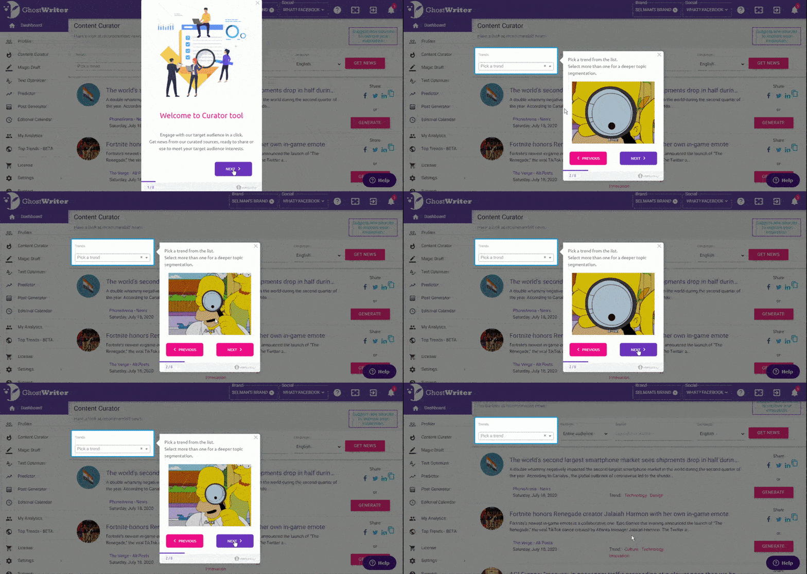
Here’s an example interactive tutorial from GhostWriter.ai. It starts with a welcome message and continues with fun and engaging steps with lots and lots of visuals. It has a progress bar to motivate the user to continue and a dimmed background to keep them focused on what is important.
Clear instructions and a friendly tone are there, too.
Another example comes from Flourish, a user-friendly feedback solution.
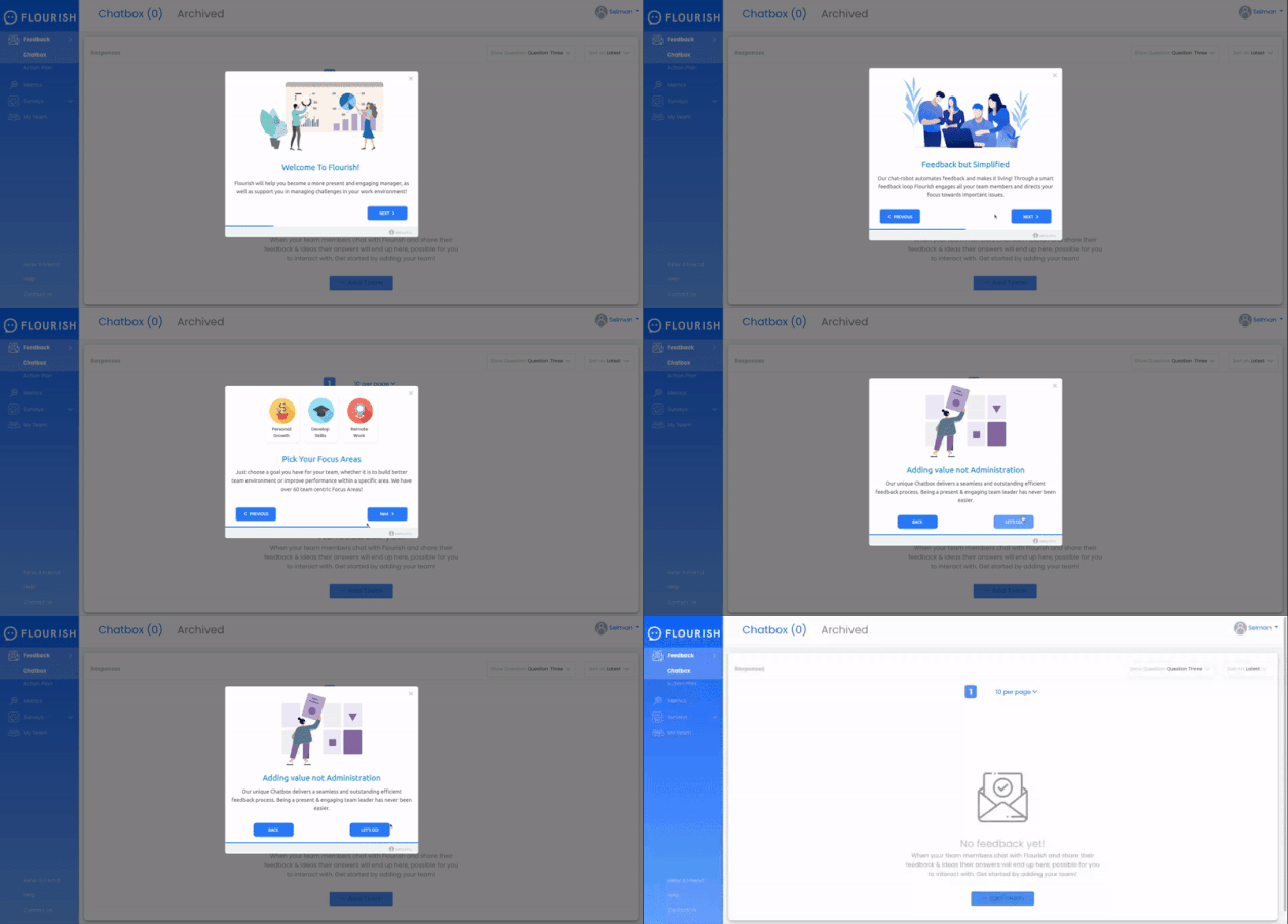
Flourish has a fairly simple and intuitive UI. So, instead of walking the user through each and every button on the UI with tooltips, they opt to explain important information on how to use the tool with modals.
They still use visuals and illustrations to keep the user engaged. There isn’t a numeric progress status.
However, there are only 4 modals, so the visual progress bar is more than enough for the user to guess more or less how many more steps they have left on the guide.
With their titles and copy, Flourish not only explains important features and capabilities but also reminds the user of their value propositions.
Here are all the other tooltip designs and modals you can use for your guides with UserGuiding:
Small tooltips with just text, bigger tooltips with images, tooltips with buttons and input boxes…
Shortly, you can create pretty much anything you can think of.
So… What are you waiting for?
Start your free trial and get started with your interactive product experience journey!
Best Practices for Interactive User Manuals with Examples
Nothing is inherently perfect.
You need to put in some effort and hone it until it reaches perfection.
Well, at least for product experiences –and definitely for interactive user manuals.
Here are some best practices you can adopt to improve your guides 👇🏻
Create an in-app flow
You can achieve interactivity and engagement through various strategies and platforms.
Canva’s interactive, real-time personalized AI chatbot in its knowledge base is amazing. Or, its learning hub that is structured as different courses to complete.
However, when you put your educational material anywhere else outside of your product, you risk the user’s attention and willingness to learn –no matter how engaging, interactive, and fun your material is.
And trust us, you wouldn’t wanna test that 👀
You should keep the user within your app as much as possible until they get see the value of your product and decide to come back again, and again, and again.
In-app guides, walkthroughs, and onboarding checklists help you with that.
With an in-app flow, you ensure:
✅ Your users need all the support and education they require right where they need.
✅ They do not lose valuable time and energy to look for tutorials to start using your product.
✅ They are presented with what is relevant to their use case and technical expertise level.
✅ They get to their “AHA!” moment as quickly as possible.
Let’s see a complete in-app flow now:
Here, Phrase –a translation and localization management platform– creates guides for the user to see the full value of the platform and then brings them all together with an onboarding checklist.
The checklist consists of 5 items, and each guide has no more than 4 steps.
Small and easy steps, such as giving a name to the project or choosing the source language, are listed together in one tooltip.
✅ What’s good in this example?
- The onboarding checklist consists only of value-driving features and tasks, not account setup processes.
- The guide is interactive and educational enough but not boring and time-consuming.
- Before moving on to the second guide, you must first complete the initial guide and create a project. This approach ensures you actively engage with the tool, exploring its features while investing time and data.
By the end of the onboarding process, you’ll already have a project ready, fostering a sense of accomplishment and increasing your commitment to the platform.
❌ What’s -not really- good in this example?
- The forced commitment strategy might be risky and irritating for some users. Phrase could use a mock document to educate the users instead of waiting for them to create a project of their own.
Segment users for personalization
User manuals are, first and foremost, for your users to learn how to use your product, right?
Sure, they bring bonus perks like increased engagement and better feature activation. But for any of these benefits to actually happen, your guides must resonate with your audience. That means tailoring them to suit your users’ specific needs and technical knowledge.
A guide that’s too technical can alienate beginners, while oversimplified instructions might frustrate advanced users.
In order to personalize your users’ learning experience and make your guides effective and valuable for them as much as possible, you can utilize user data.
You can segment your users based on their:
- Experience level (beginner, intermediate, expert).
- Role or job function (manager, admin, team member).
- Product usage patterns (frequent, occasional, power users).
- Goals or objectives (efficiency, problem-solving, collaboration).
- Industry or sector (finance, healthcare, tech).
- Language or region (localization needs).
- Device type (mobile, desktop).
- Feature adoption stage (new, active, advanced).
Here’s an example segmentation strategy from UserGuiding 👇🏻
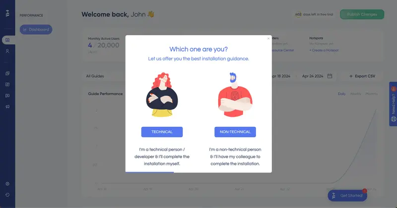
UserGuiding adapts to your technical knowledge level by tailoring its guides to match your expertise. Based on your input, it triggers the most appropriate guide —avoiding overly technical jargon for beginners and cutting unnecessary steps for advanced users.
This personalized approach ensures users feel confident and engaged rather than overwhelmed or bored.
It’s all about meeting your users where they are and making the learning process seamless!
💡 According to data, segmentation can lead to a significant boost in business outcomes, with conversion rates increasing by up to 50%. Additionally, businesses that customize their offerings for specific customer segments see 10% to 15% higher revenue compared to those that don’t.
Simplify the process with concise steps
Your user manual should feel like a helpful guide, not a daunting textbook. For that, you need to keep the language clear and simple.
You can break down complex tasks into easy, step-by-step instructions, and use headings and subheadings to keep things organized and scannable. You can utilize tooltips to organize the information in your guides and onboarding checklists to organize your different guides.
However, you need to be careful while using tooltips and checklists, too.
Just because they empower you with organizational opportunities, it doesn’t mean they turn 10-page-long documentation into fun and engaging learning experiences…
Your guide steps should be:
- Short, concise, and to the point
- Easily understandable and actionable
- Well-structured and formatted
For example, this example 👇🏻 from HubSpot is a tricky one…

It’s well-structured and formatted with separate paragraphs and bolded sentences.
However, as you can see, it’s the 7th step in a 10-step guide… So, it’s already a lengthy and patience-testing guide. 2 paragraph tooltip –no matter how friendly and flowy the language is– is unnecessary.
At this stage, it could have been more concise and to the point, like:
“Click ‘Save and sync’ to proceed (demo mode—no real sync yet).”
Gather user feedback
In order to make sure your user guides are effective –and stay effective– you should collect user feedback about your onboarding guides regularly.
This will allow you to identify areas of improvement, optimize the guide's clarity, and adapt it to better meet your users’ needs. You can do this through surveys, in-app feedback mechanisms, or even tracking user behavior as they engage with the guides.
For example, you can create quick in-app surveys like these:
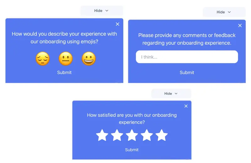
All these surveys are created with UserGuiding just within seconds!
You can also create in-app surveys with number ratings, thumbs up/down, or multiple-choice options, as well.
👉🏻 Give UserGuiding a try and see how it works for you.
Not-So-Good Interactive User Manual Example
There can be several factors that decrease the quality of your user guides, making them less effective and even confusing for your users.
Some of these factors are:
- Hiding the guide in the UI
- Overloading it with too much information
- Lack of clear structure
- Using technical jargon or complex language
- Inconsistent design with poor or no visuals
- Over-complicating steps
- Failing to address common issues
- Not updating the guide
Let’s see a real-life example that suffers from a few of these factors 👇🏻
PostHog’s User Guide
PostHog is a product analytics platform that helps you track and analyze user behavior to optimize their product experiences. It provides tools for tracking user actions, identifying trends, and improving user engagement.
When you first enroll in the platform, you’re welcomed with an onboarding checklist that consists of guides explaining different features and capabilities.
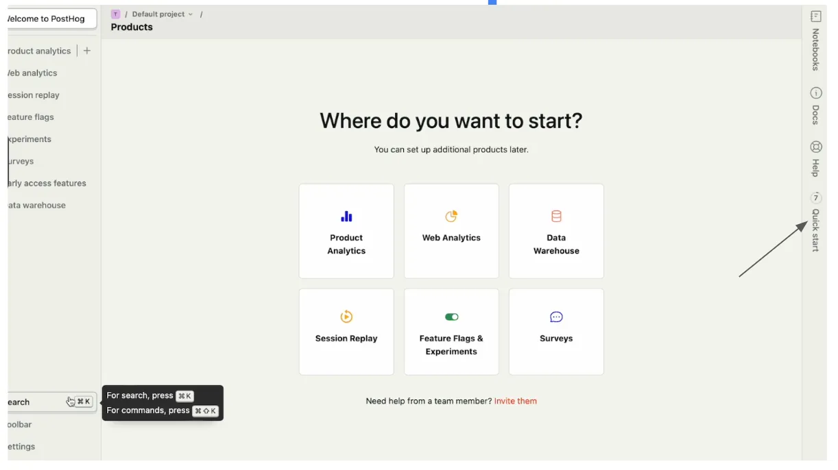
However, the checklist is hidden on the right bar. Even though it has value-packed guides inside, it’s a little bit hard to detect it at first glance.
When you actually find and click on it, you see these guides:
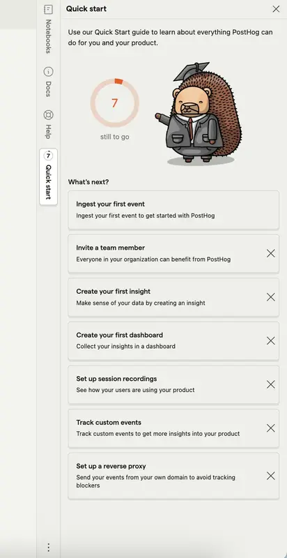
Each step on the checklist takes you to a different product page and each product page has a user guide explaining how to use the feature and/or complete the key actions.
Like this:

There’s an image to support the user and help them understand how the product will look like when they enter their data. There are arrows and explanations to provide context, as well.
However, it doesn’t really guide the user on how to add data or create a graph.
It shows just the end result and gives a vague prompt/instruction to the user without really explaining the process step by step.
So, it’s not-so-good, because:
❌ The guide is hidden on the UI
❌ Instructions are unclear
❌ It doesn’t walk the user through each step to complete the desired action
❌ There’s a visual that could be helpful; however, it might also be confusing for some users
Measuring the Success of Interactive User Manuals
Analyzing User Behavior & Tracking Key Metrics
To ensure your interactive user manual is effective, you need to analyze how users are interacting with it. This will help you identify areas that are working well and areas that need improvement.
By analyzing these key metrics, you can determine if users are engaging with your manual as intended or if there are any obstacles that need to be addressed.
Here are some metrics to follow:
- Time on page: Indicates how long users spend on the manual.
- Bounce rate: Shows users who leave the manual after viewing only one page.
- Click-through rate (CTR): Tracks how often users click on links or buttons.
You can also monitor Net Promoter Score (NPS) and Customer Satisfaction (CSAT) to determine user satisfaction, as well.
Tools for Creating Interactive User Manuals
Selecting the right tool for your interactive user manual is crucial. Different tools offer varying features, and migrating your manual later can be cumbersome. It's wise to understand each tool's offerings before making a choice.
Here are some options to consider:
UserGuiding
⭐ G2 Score: 4.7/5 (492 reviews)
We’ve been mentioning UserGuiding throughout the article, so you’re probably already familiar with its capabilities. Nevertheless, in case there are readers who jumped right into this part, let’s introduce it very quickly.
UserGuiding is an all-in-one product adoption platform that empowers you with different tools to create engaging and interactive product experiences for your users.
Interactive in-app user manuals are one of them.
Here’s what UserGuiding customers say about it:
Whatfix
⭐ G2 Score: 4.6/5 (358 reviews)
Whatfix is a digital adoption platform designed to help you create interactive in-app flows. It enables you to build and customize guides, walkthroughs, and product tours for onboarding, training, and customer support.
Here’s what Whatfix customers say about it:

Scribe
⭐ G2 Score: 4.8/5 (254 reviews)
Scribe is a tool that helps you create step-by-step guides, tutorials, and process documentation by automatically capturing workflows. The tool allows you to capture clicks, keystrokes, and actions to automatically generate detailed guides.
Here’s what Scribe customers say about it:

Conclusion
With a little planning, the right design, and the best tools, you can build a guide that not only helps users but keeps them engaged along the way.
All you need to do is follow some simple best practices, and you’ll create something that supports your users and makes their experience smoother.
Ready to get started?
UserGuiding can make it happen for you!
Frequently Asked Questions
How do I create an interactive user manual?
You can create an interactive user manual by coding it yourself for full customization or by using third-party tools like UserGuiding, Whatfix, or Scribe. Coding offers flexibility but requires time and expertise, while tools provide quick, no-code solutions. Choose the approach that best suits your needs and resources to deliver a seamless user experience.
What is the best program to use to create a manual?
The best program depends on your needs. UserGuiding is great for in-app guides and onboarding, Whatfix is perfect for enterprise-level training with analytics, and Scribe excels at creating quick step-by-step guides in video or PDF format. Each tool makes it easy to create engaging manuals without coding, helping you deliver effective user support.


.svg)
.svg)
.svg)
.svg)
.svg)


.svg)
.svg)


.png)


